Marking both required and optional fields in the checkout is a controversial area of form usability.
When we first benchmarked this issue in 2012 only 9% of sites explicitly marked both fields, in 2016 things had improved a little with 14% of sites marking both. Our 2021 benchmark shows only little improvement, with only 14% of sites marking both fields.
This is despite our large-scale Cart & Checkout testing revealing that failing to explicitly mark both required and optional fields leads to unnecessary validation errors, user confusion over which fields they must complete, a slower checkout process, and even abandonments.
The issues caused by failing to mark required and optional fields were first observed during our first rounds of checkout usability testing dating back to 2010. Since then this behavior has been reconfirmed during all subsequent checkout usability testing, including our most recent 2021 Checkout usability study, our 2021 Mobile web and Mobile App usability studies.
Required Fields UX Findings From Our Own Usability Study
In this article, we’ll discuss the test findings from our large-scale Cart & Checkout testing usability study related to marking required fields and optional fields. In particular, we’ll discuss:
- Why optional fields are nearly always included in e-commerce checkout forms
- Why generic page-level statements (e.g., “All fields required”) should be avoided
- Why it’s problematic to only indicate optional fields
- Why it’s problematic to ony indicate required fields
- Why both required and optional fields should be marked
Note: the findings shared in this article relate to e-commerce checkout forms and long account creation forms. Other forms, in particular short sign-up and contact forms, don’t seem to be affected anywhere nearly as much by the issues described and may therefore employ alternative designs.
Why Optional Fields Are Part of Almost Every Checkout
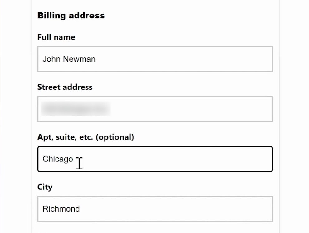
At Victoria’s Secret, as at almost all checkout flows, there are at least a few optional fields for users to consider alongside required fields.
When we first published these research findings in 2014, some readers asked if it wouldn’t be easier to simply have only required fields in checkout.
While it’s true that’s the ideal case, in the “real world” of e-commerce checkouts optional fields are simply a fact of life — 98% of sites in our benchmark have at least one optional field.
That’s not to say that the amount of form fields can’t be reduced — in fact, we’ve found that most sites have nearly twice as as many form fields as they actually need.
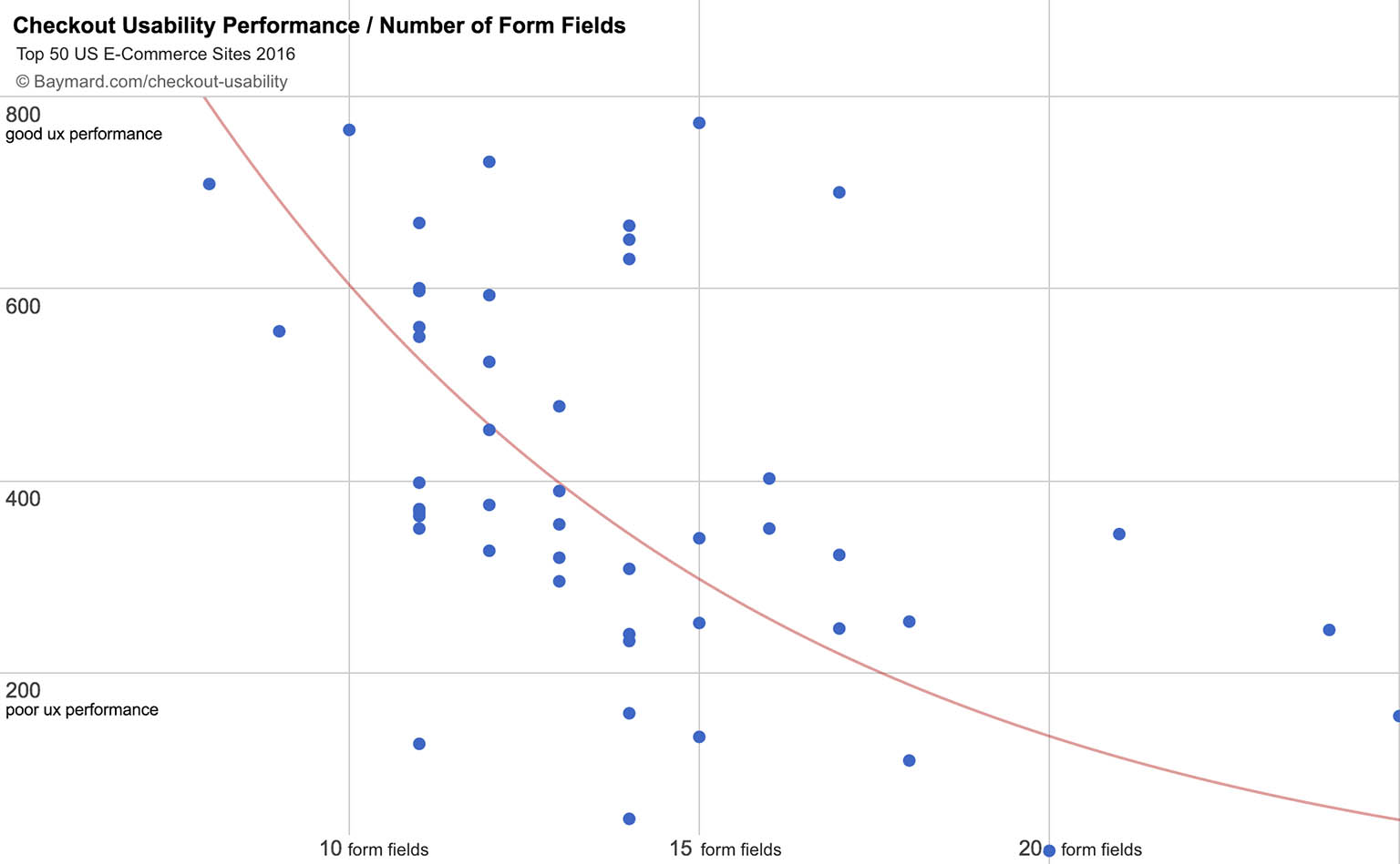
Our benchmark reveals that the number of form fields in a checkout is correlated with a site’s overall UX performance — the fewer form fields, the more likely a site will have a good overall UX performance (and vice versa).
Therefore, the first evaluation point for all optional inputs should be a close examination of whether the input is truly needed at all.
That said, checkout forms aren’t created in a vacuum. While the best course of action for users may be to severely limit or eliminate optional fields, often business interests are given as much (or even more) say in what fields are included in the checkout.
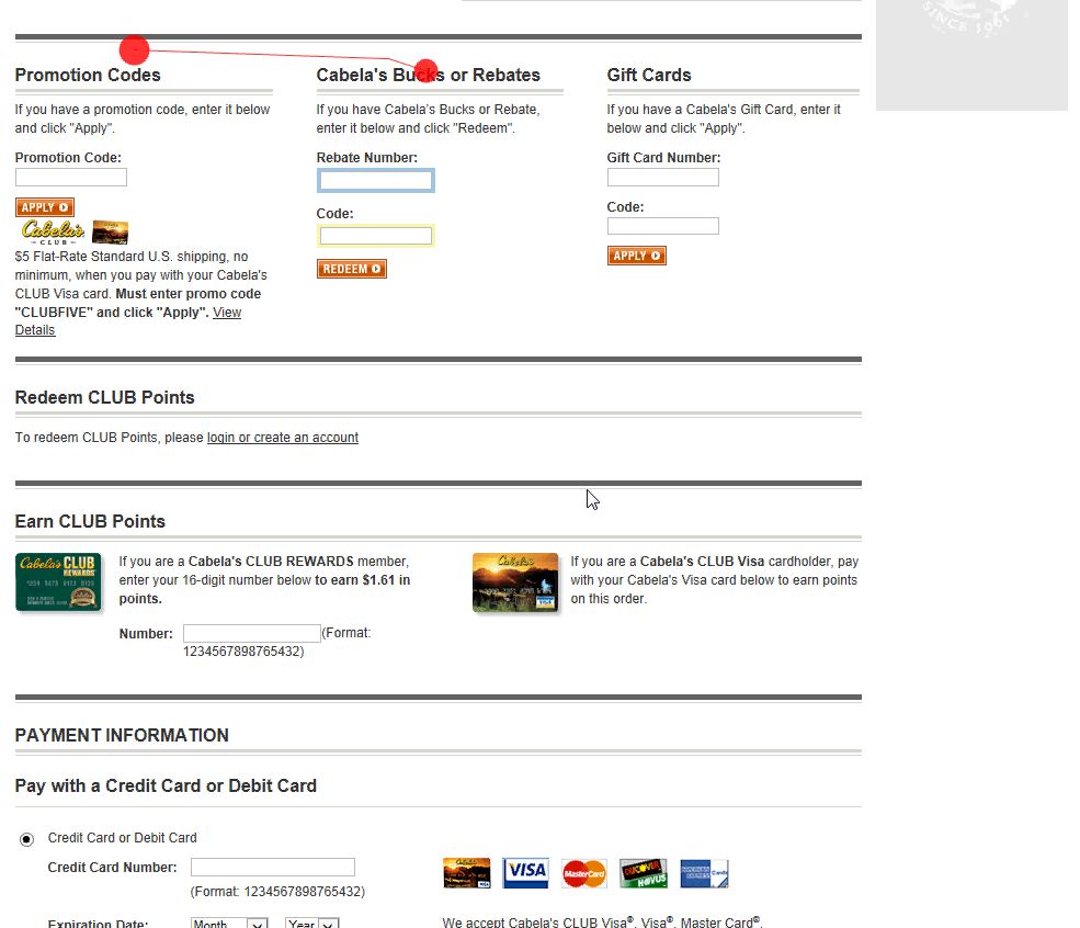
At Cabela’s, 66% of users came to a full stop in completing the payment form when first reaching a massive section of promotional fields. Some never found the credit card fields below and ended up abandoning the purchase.
These can include many optional fields depending on the business context — such as newsletters, address type, company name, delivery instructions, title, “Address line 2”, phone, coupon codes, gift certificates, order gifting, order comments, billing address, site-specific features, loyalty programs, PO numbers, etc.
The rest of this article will assume that the checkout flow is fully simplified, and any optional form fields are there for a very good reason.
Why Generic Page-Level Statements (e.g., “All Fields Required”) Should Be Avoided
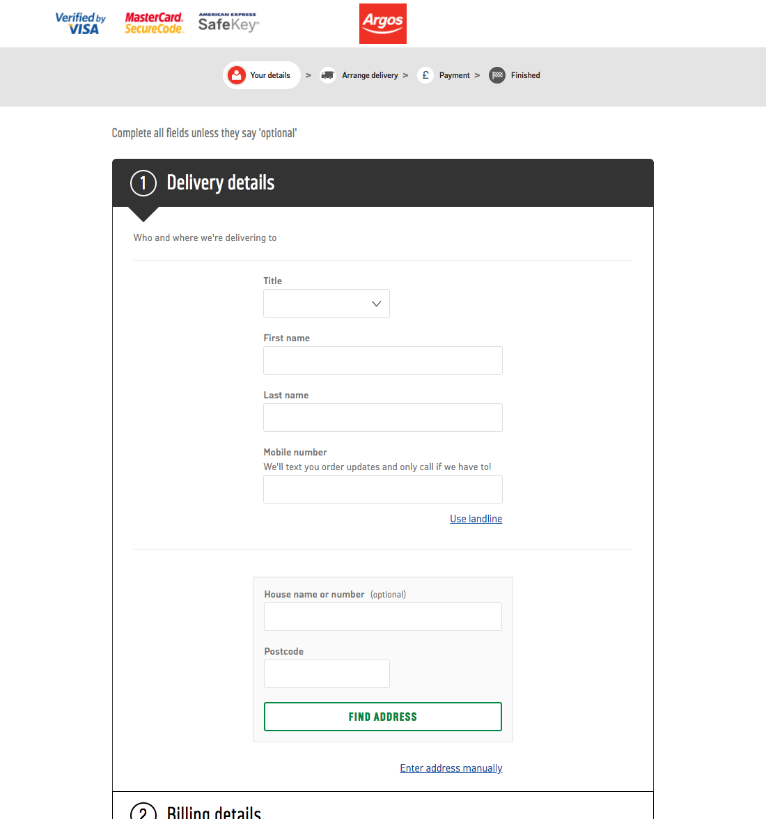
Argos has a single generic statement at the top of the page: “Complete all fields unless they say ‘optional’”. Unfortunately, many users during testing overlooked these types of statements and would begin speculating whether some of the required fields were in fact optional. Obvious candidates on this page would be “Title” and “Mobile number”, which could reasonably be optional as not all e-commerce sites require these details.
While nearly all sites have optional fields at some point in checkout, many sites will have particular checkout steps where all fields are required. This frequently occurs, for example, at the Payment step, where often all payment fields must be completed.
In these instances, one may be tempted to simply indicate at the top of the page that “All fields are required”.
However, our testing shows that this doesn’t suffice, as some users inevitably end up overlooking the message.
When users fail to notice such “All fields are required” statements, they often begin to question if perhaps some of the fields are optional even at the “Payment” step during checkout, where they obviously know that some of the fields are required. In particular, users often question payment-validation related inputs such as billing phone, cardholder name, and billing zip code.
This problem is largely a result of these fields being inconsistently required across different e-commerce sites. Different sites require different types of payment details, so what may be optional on one site is required on another.
Note: It bears repeating that these test findings, and hence recommendations, apply to checkout processes and long account creation forms. A 3-field sign-up form may certainly suffice without individually denoting all fields as required.
Why It’s Problematic to Mark Only Optional Fields
Our benchmark reveals that 37% of sites mark only optional fields.
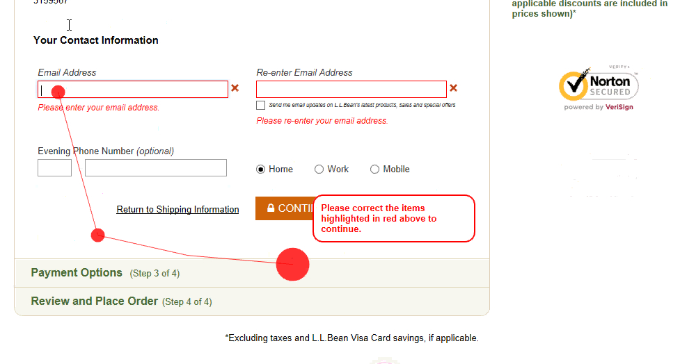
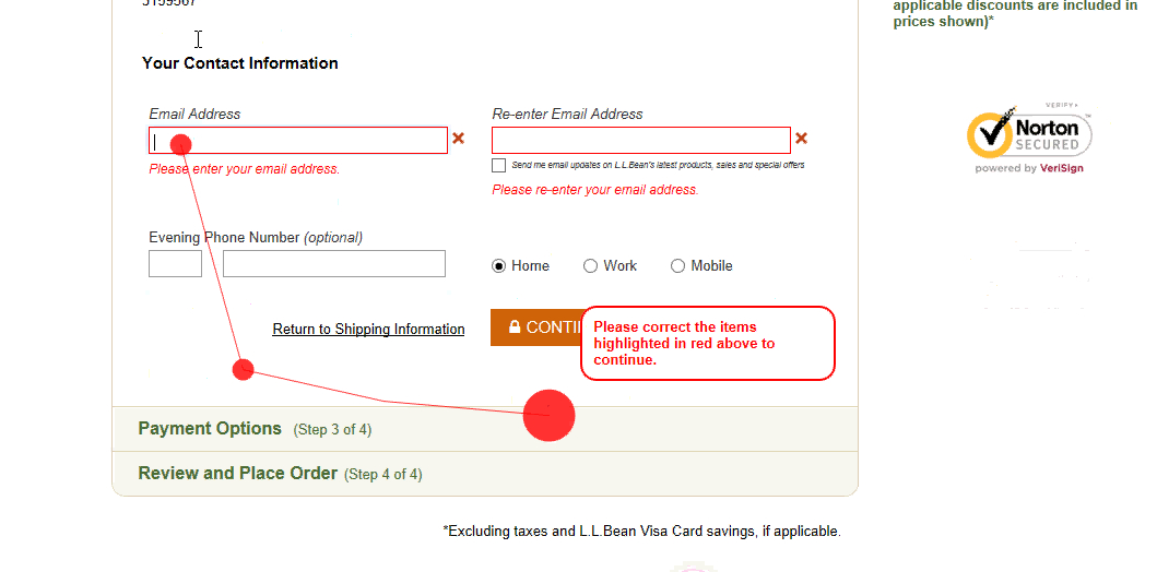
At L.L. Bean, 22% of users during testing tried to proceed without entering their email address for confirmation, as neither this field nor the email field were marked as required.
Indeed, it may be tempting to reduce the visual noise in a form by only marking optional fields (or vice versa). However, when encountering forms where only the optional fields were marked, 32% of users during testing had a validation error because they did not complete a required field.
As most fields in a form will be required fields, only explicitly marking optional fields has the downside of it being relatively difficult to see which fields are optional.
If only marking optional field types many users no longer look at each individual form field as an individual task.
![44% of users came to a complete stop when reaching the last section of the shipping address form at Amazon, where only optional fields were marked. Users were unsure if the fields were required or optional (despite the header “Optional Delivery Preferences”). As one user said, “Access code? Do they have that? Do you need something for the door in the UK? Is it something that I have to make up, or…? I’d call him [UK-based friend for whom the user was purchasing the item] and ask what it means”.](https://baymard-assets-cdn.imgix.net/research/media_files/attachments/31641/original/research-media-file-8073e056dcb24a60e37461165bad314a.jpg?auto=format&dpr=2&fit=max&q=50&w=880)
44% of users came to a complete stop when reaching the last section of the shipping address form at Amazon, where only optional fields were marked. Users were unsure if the fields were required or optional (despite the header “Optional Delivery Preferences”). As one user said, “Access code? Do they have that? Do you need something for the door in the UK? Is it something that I have to make up, or…? I’d call him [UK-based friend for whom the user was purchasing the item] and ask what it means”.
Users looking elsewhere in the form to deduce for themselves what a nonmarked field might mean will only have relatively few optional fields to help them detect the pattern for how fields are marked.
This is particularly problematic for information that some users will be reluctant to provide, like their phone number or date of birth, as they will simply leave these required fields blank.
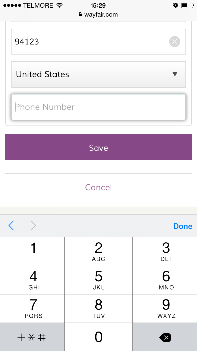
Is the phone number field required? When a field is unmarked some users will have to guess to figure out whether an unmarked field is required or optional. This is especially problematic on mobile, where users have little page overview.
In short: not marking required fields as “Required” or with an asterisk has been consistently observed to lead to an increase in form completion time and a high rate of needless validation errors.
Why It’s Problematic to Mark Only Required Fields
Our benchmark reveals that 42% of sites mark only required fields.
It should be noted that forms where the required fields were marked and the optional fields were not did fare better in testing when it came to decreasing the rate of needless validation errors, compared to when only optional fields were marked.
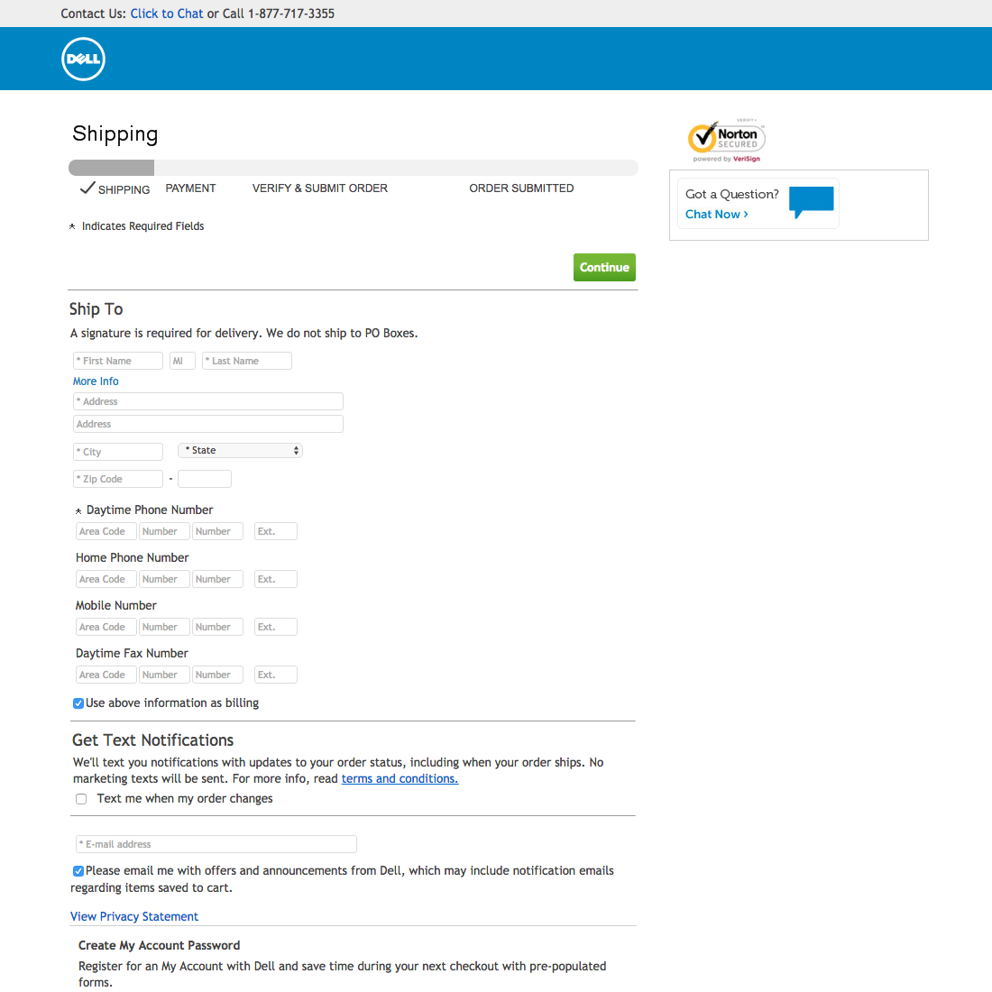
At Dell only required fields are marked. Users must determine for themselves whether all phone and fax numbers are required, only some are, or all are optional. This implementation is made more confusing by indicating which fields are required with an asterisk as part of the placeholder text for most fields, then for the “Daytime Phone Number” field using an asterisk next to the field label. Users who assume a fax number is required, and who don’t have one, may abandon, assuming they can’t complete the checkout.
However, when testing forms where only required fields were marked, the completion rate of an optional phone number field was almost identical to sites where it was required — for example, 86% of users completed an optional but unmarked phone number field at one test site (AllPosters), while 89% of users completed a clearly marked phone number field at another (L.L. Bean).
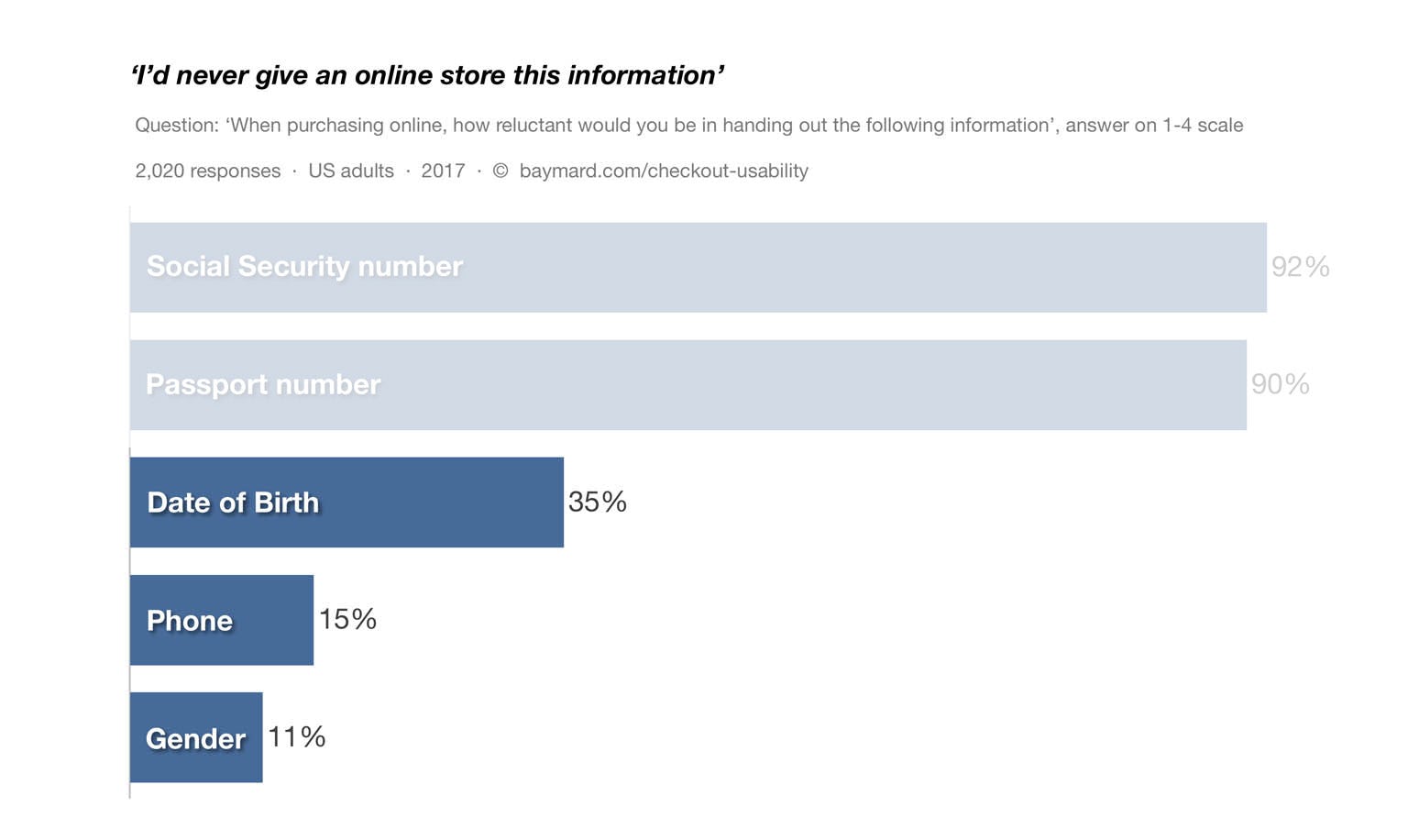
Our 2017 survey of 2,020 US adults finds that 35% would never give out their date of birth, 15% would never get out their phone number, and 11% would never disclose their gender. This has implications for users who think, for example, an optional phone number field is in fact required, because the field hasn’t been explicitly marked, and who therefore abandon due to privacy concerns.
This may have larger implications, where users may feel pressured into providing information they’d rather not disclose. As privacy is a common reason for checkout abandonments, the implications of just a few users making such misinterpretations can often be read directly in the checkout abandonment stats.
Even more severely, we also observed that on sites that only mark the required fields, a smaller group of subjects completely mistook optional fields as being required (particularly when testing mobile sites).
This can have dire consequences as these users will start to hunt for more information on the cryptic field they have misinterpreted as being required. If the matter remains unresolved, the typical consequence is either bogus information submitted or site abandonments.
Furthermore, it’s often difficult for users to determine whether fields such as phone, title, email, billing zip code (for credit card), card security code (CVV), issuing bank, and cardholder name are required or optional if only required fields are marked, as these fields are highly inconsistent across e-commerce sites when it comes to being required or optional.
What to Do Instead — Mark Both Optional and Required Fields
Not marking both optional and required fields makes it difficult for users to approach each form field as a separate task to either complete or skip. Consequently, users are much more likely to get bogged down in the form and (1) come to a complete stop and go backwards in the form to see what other fields have been marked as, or (2) guess what an unmarked field means and, therefore, encounter validation errors, leave important fields blank, or abandon out of frustration or confusion.
Therefore, rather than only marking optional fields, or only marking required fields (or, even worse, not marking any fields), both required and optional fields should be explicitly marked.
At Microsoft required fields are denoted with asterisks and optional fields with “(Optional)”. It’s extremely clear to users glancing at the form as a whole, as well as at the individual field level, which fields are required and which are optional. Note, however, that “Address Line 2” should ideally be hidden behind a link.
Explicitly marking both required and optional fields provides users the information they need to quickly move through a form. By explicitly denoting both optional and required fields, users aren’t forced to infer anything and don’t have to look backwards at prior form fields — but can instead stay focused on just the one form field they are filling out.
Users are consequently able to progress more seamlessly through the entire form, field by field, as they don’t have to backtrack and scan previous fields to make sure they haven’t skipped a required field or filled out an optional field they on second thought prefer not to.
During testing it was also verified that using an asterisk was sufficient to indicate required fields when used on steps where the optional fields were marked as “Optional” after or close to the field label.
Note, however, that many of the commonly optional form fields are better to collapse entirely behind a link (e.g., “Address Line 2”, which during testing was verified to act as sufficient indicator of the input being optional.
Help Users Quickly Comprehend What Fields Must Be Completed
Throughout all our testing we find many sites have misconceptions of the amount of knowledge users are bringing to their checkout processes.
While it might seem obvious to site designers that, for example, the phone field isn’t required on their site, but all the other payment fields are, this will by no means be obvious to the average user (because in fact of 87% sites do require phone number during checkout).
Users simply have no way to “intuitively know” a particular site’s information requirements beforehand. They need to figure it out on a site-by-site basis for each and every form they fill out. This is why it’s necessary to indicate which fields are required and which aren’t — so users don’t have to deduce it themselves.
By explicitly marking both optional and required fields — as seen here on Grainger’s mobile site — users can focus on completing each field individually without having to scroll and deduce the nature of each field based on how other fields are, or aren’t, marked. Note, however, that ideally “Optional” should be placed adjacent to the field label (not as placeholder text).
The issue is even more pronounced on mobile, where 75% of users during testing experienced severe form usability issues due to form design on sites that failed to mark both required and optional fields clearly.
Users on mobile must make do with a much smaller interface, where getting an overview is always difficult, especially for long or complex forms, and other issues are common as well (e.g., difficulty typing, external interruptions such as texts and phone calls, etc.).
It’s therefore equally if not more important to mark optional and required fields in mobile checkouts.
And yet only 14% explicitly mark both required and optional fields on desktop, and only 6% do on mobile.
This article presents the research findings from just 1 of the 700+ UX guidelines in Baymard – get full access to learn how to create a “State of the Art” ecommerce user experience.