There’s a major difference between form validations and warnings. Form validations enforce a set of rules and won’t allow the user to proceed, while warnings alert the user about possible problems but will allow them to proceed.
While e-commerce sites would do well in adopting both strategies, it’s unfortunately few that make use of warnings (our checkout benchmark study found that 64% don’t have ‘address warnings’), and similarly regrettable we often observe sites enforcing overly restrictive form validations that completely block a (small) sub-group from completing their purchase.
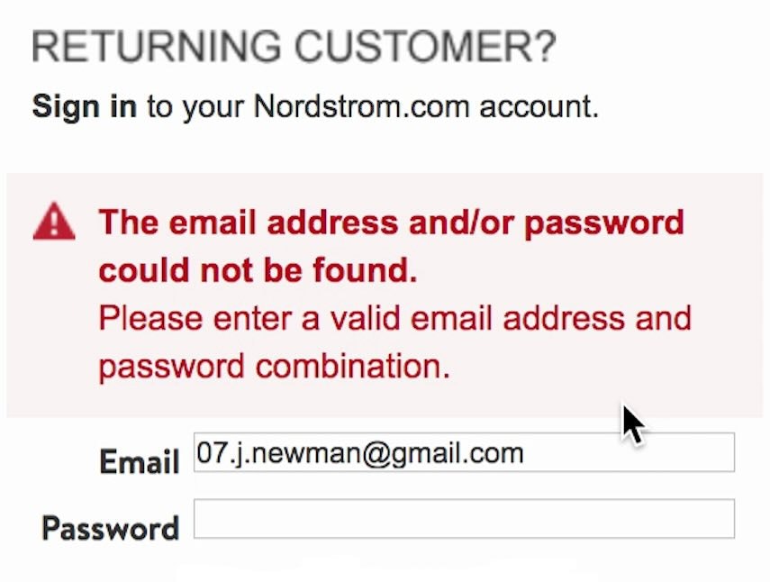
Validators: “Incorrect E-mail!” (Obstructive)
The problem with form validators is that they effectively block the user from proceeding. This, of course, is their purpose, but unless the validation rules can be and are implemented 100% flawlessly (i.e. zero false negatives), users will eventually run into unintended roadblocks.

Here an e-mail validator rejects any input with a ‘+’ character in it. Now, while this may be an uncommon character in e-mail addresses, it certainly isn’t invalid. This validator unfortunately locks out any user with such an e-mail (a warning would have been a better option).
During usability testing, one of the most common examples we observe of this are e-mail validators during the checkout process. Here, users with atypical (but real and entirely valid) e-mail addresses are blocked by overly sensitive e-mail validators that effectively prevent the user from finishing their checkout (barring they go create an entirely new e-mail account simply to purchase from this one particular store).
Of course, that’s not to say that validations don’t have their merit. For example, it’s great to validate that required fields aren’t left empty, that numeric inputs are indeed numbers and dates are within required ranges. What’s key here is that those types of rules can be implemented flawlessly – implementing a system that checks if an input field is empty, whether a numeric input indeed contains nothing but numbers, and that a credit card hasn’t expired are all possible without invoking false negatives.
E-mail validators can be great too, they just have to be a lot more forgiving, because they are extremely difficult to validate meticulously without provoking false negatives. This is true of most open-ended text inputs. For example, while the inclusion of characters such as ‘+’ and ‘_’ will often indicate that the user misspelled, they are valid characters in an e-mail address and having a validator invoked on them will therefore be disastrous because it locks out all users with those characters in their e-mail address from using the site. Any validations therefore must be very basic and forgiving lest they run the risk of locking out users.
In fact, the inspiration for this article came after we’ve conducted site audits for three completely different and unrelated sites – all with more than $50 million in online sales – and none of them allowed users to have a ‘+’ in their e-mail address.
But without strict validations how can sites ensure high-quality customer data with minimal typos and errors? The answer is warnings.
Warnings: “Are You Sure?” (Confirmation)
Form warnings are fundamentally different in nature from validators as they only alert the user to potential problems but doesn’t prevent them from proceeding. This makes warnings ideal for inputs that tend to follow certain patterns yet can’t be validated without invoking false negatives.
Take our earlier e-mail validator example. While only the very most basic rules should be enforced (e.g. checking for the existence of an @-character followed by a domain) a whole host of typical e-mail patterns can be checked for to determine whether the entered e-mail address is likely to be misspelled (e.g. the inclusion of uncommon characters, or a top-level domain not matching the usual options), and if so, a warning can be displayed, asking the user to double-check their input and make sure it is correct. The user may even be asked to re-type their input into a confirmation field on an error-fields only page.

Walmart uses an address lookup database to detect possibly unrecognized addresses and suggest known ones that are similar. Also note how they let the user know that a recognized address will ensure the “order arrives on time”.
The trick is to warn the user without obstructing them – you want the user to double-check and verify what seems to be an unlikely input without preventing them from proceeding if they so wish. Indeed, the user may even be alerted to the potential consequences of erroneous input, and be asked to “proceed at their own risk”.
Because of the non-obstructive nature of warnings, sites can go a whole lot further in what invoke them (compared to validators). Alerts may be set for an e-mail address that appears flawed or a phone number seems off – even uncommonly short (2-3 characters long) street and city names could invoke warnings.

Target asks their users to verify potentially problematic addresses instead of denying them from proceeding. They even indicate what the issue might be.
Furthermore, warnings may prove particularly useful on mobile sites where our mobile usability study shows that users are even more likely to provide erroneous input due to mistyping, auto-(in)correct, and misinterpreted fields (provoked by a lack of context.
Ideal Partners in Crime
Form validations are great for any pattern that can be checked against without producing false negatives yet fall come up short in dealing with data that is likely to be wrong even if it is technically valid. Meanwhile form warnings offer us a great way to catch potential misspellings and seemingly erroneous input without unintentionally creating impenetrable barriers to those users who happens to have an uncommon e-mail address, live on a street without a street number, or in a country where phone numbers are only 7 digits long or formatted curiously.
This makes validations and warnings ideal “partners in crime”. By combining the two a baseline of data validity can be ensured (through validators) while misspellings and other likely input errors can be sorted out as well (by warnings). This strikes the ideal balance between ensuring reliable, high-quality customer input without locking out users with rare or unusual data.
While implementing both validations and warnings may require a little extra work for the tech team, the investment is easily offset on e-commerce sites considering its upshots: a decrease in support cases (due to more accurate customer input being submitted), and a possible increase in sales (as users aren’t prevented from completing their checkout because of edge-case inputs).
So consider this article a warning to all e-commerce owners who rely solely on validators. (Ok, we promise to skip the bad puns in future articles if e-commerce sites promise to begin relying on warnings as much as they currently make use of validators).