Key Takeaways
- Providing multiple order-fulfillment options can be very helpful to users, as some will take advantage of “store pickup” or local delivery options to fulfill their order
- However, our benchmark reveals that on 50% of sites these options are not included in the fulfillment-selection interface, where many users are actually making their fulfillment decisions
- As a result, some users will fail to realize that they can choose an alternative fulfillment method, while others will be forced to backtrack to the “right” interface to make their change
Depending on their circumstances and available fulfillment options, users may end up preferring store pickup, local delivery, or warehouse-based shipping for order fulfillment.
Across multiple rounds of Baymard’s UX testing, we observed that many e-commerce sites provide the option for alternative fulfillment methods on product pages or in the cart.
However, this wasn’t enough for participants who changed their minds during the checkout process.
Requiring users who change their mind at the fulfillment-selection step to navigate back to an earlier stage of checkout becomes burdensome and potentially disorienting.
Yet our e-commerce UX benchmark reveals that 50% of sites fail to include all fulfillment options in the fulfillment-selection interface.
As a result, some users will abandon checkout because they think their preferred fulfillment method isn’t available — when in reality it’s just not presented in the right place for them.
In this article, we’ll discuss our Premium research findings related to shipping and order fulfillment:
- How only showing shipping options in the fulfillment-selection interface increases checkout friction
- How displaying all fulfillment methods in the fulfillment-selection interface helps users proceed more smoothly to placing their order
How Only Showing Shipping Options in the Fulfillment-Selection Interface Increases Checkout Friction
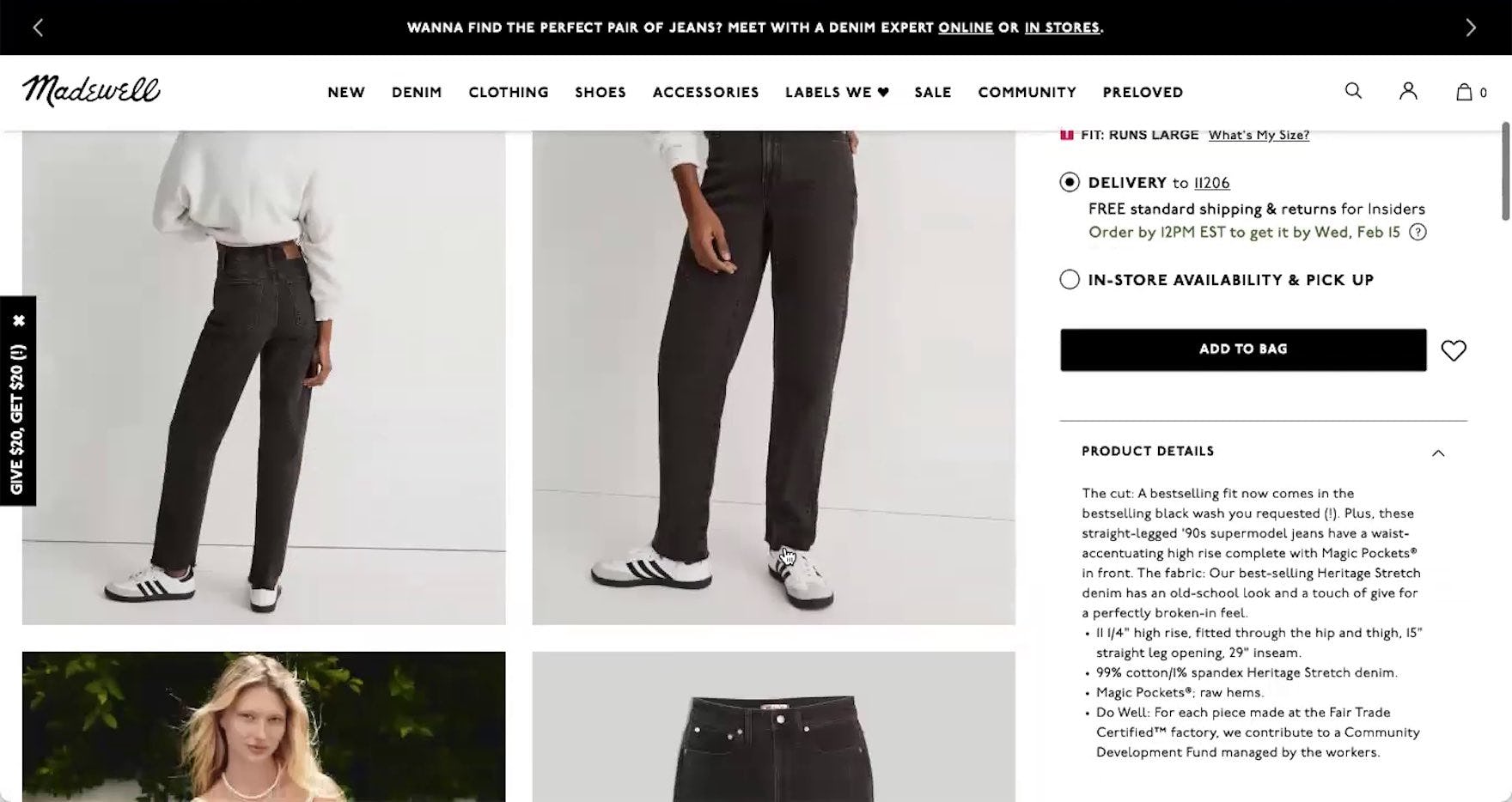
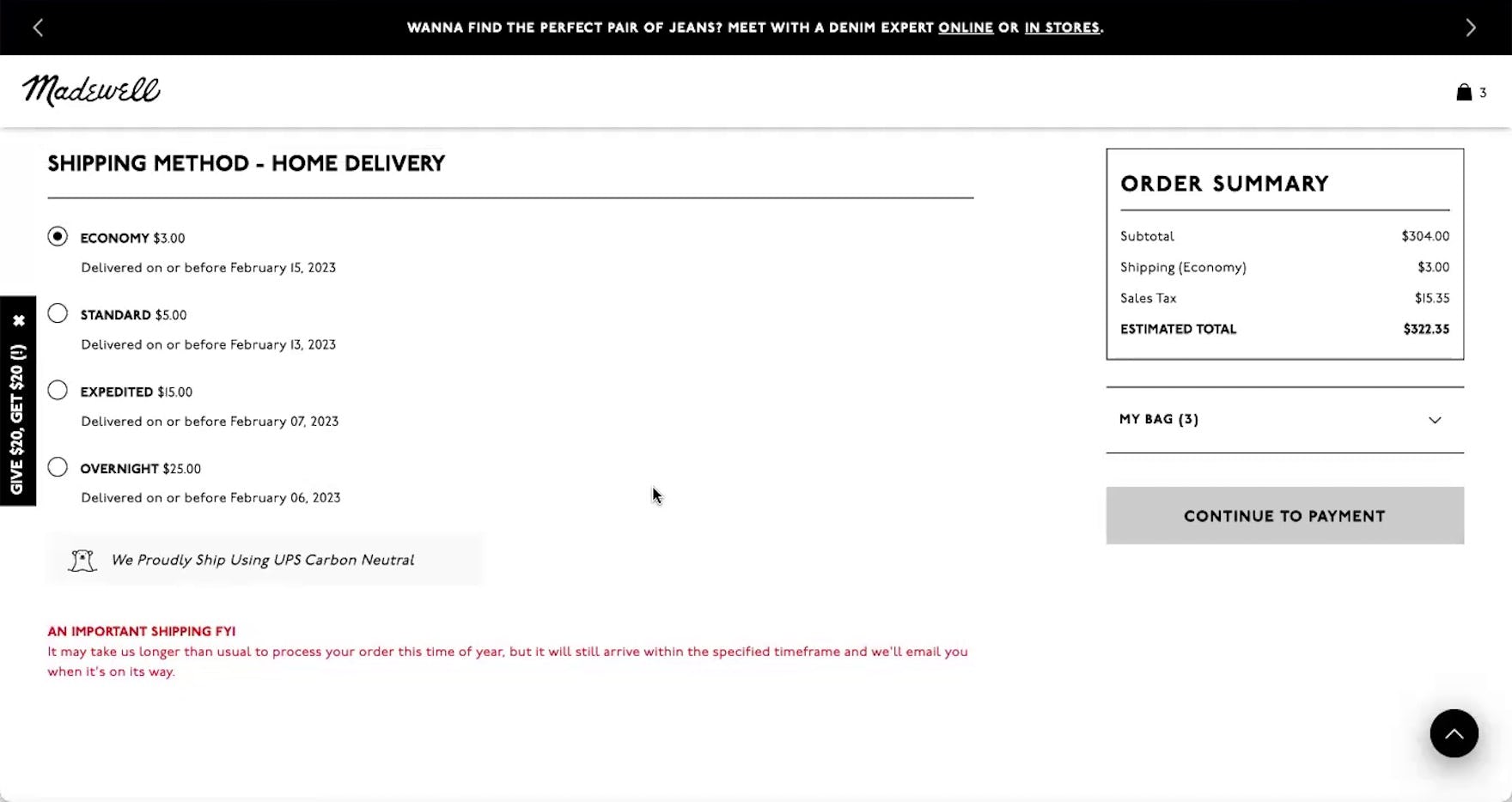
“I’m trying to see…if they would let me just go ahead and ‘ship to store’ right from here, which I guess it doesn’t. At least, I’m not seeing that there.” Despite in-store pickup being featured on product details pages (first image), this participant on Madewell was unable to switch to this option during checkout after wanting to avoid shipping charges (second image). The need to return to the cart or product page to see available alternative fulfillment methods and switch among them presents an undue burden on users who are trying to compare options.
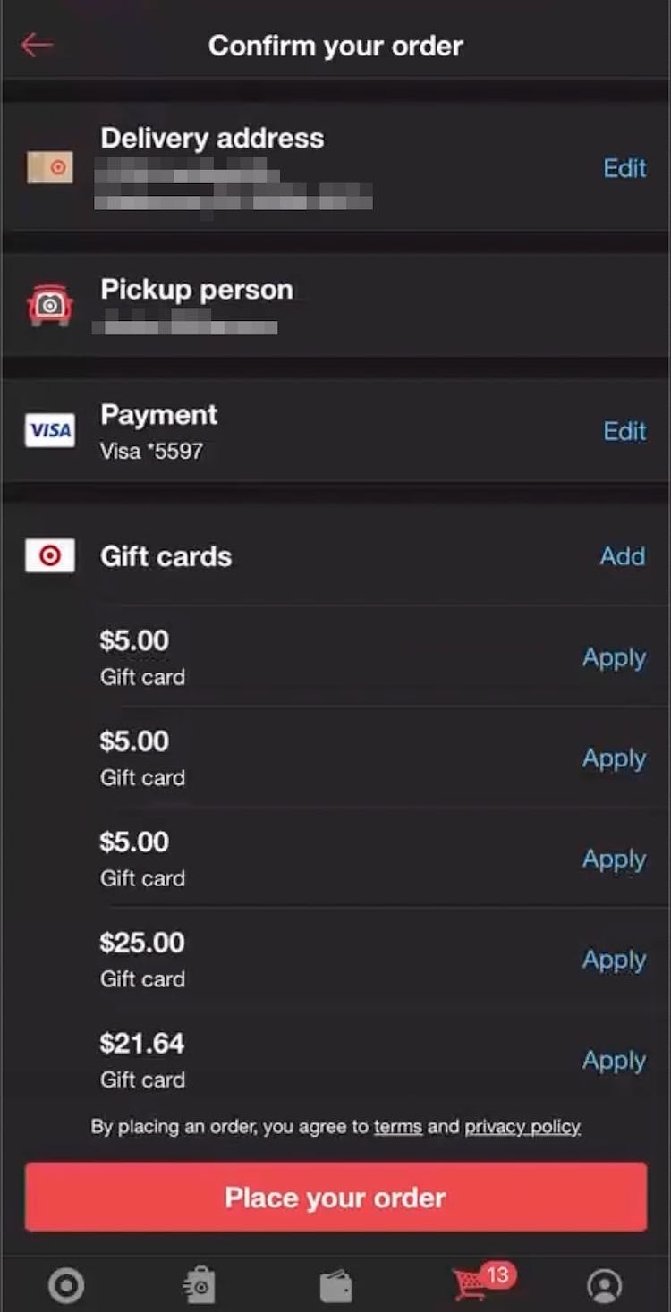
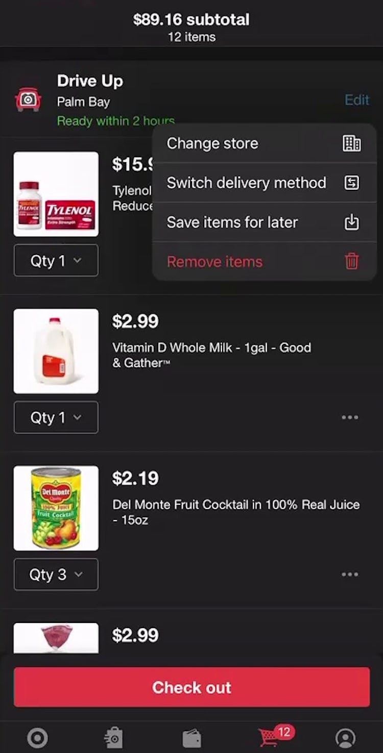
“I’m trying to click ‘Pickup person’, but that’s not it.” This participant shopping for groceries on Target’s mobile app looked for a way to switch from store pickup to local delivery during the one-step checkout process (first image), but there wasn’t a way to switch the fulfillment method. She returned to the cart to select an alternative fulfillment method (second image): “So I’m gonna go back again with my red arrow…‘Switch delivery method’, there we go.” The need to return to the cart to switch among fulfillment methods slows users moving through checkout.
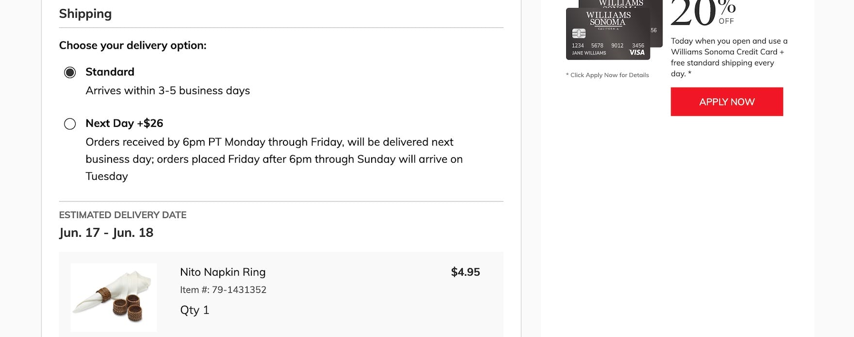
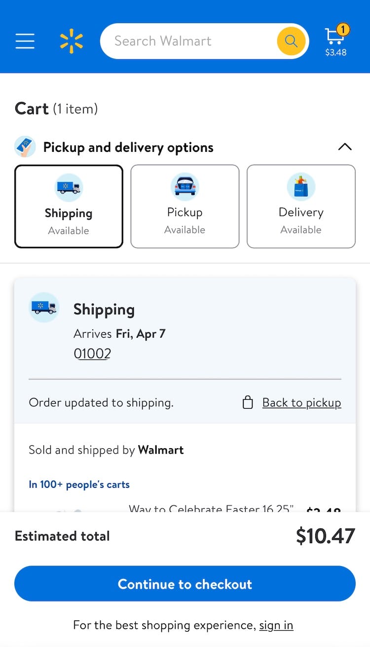
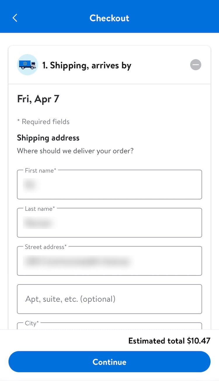
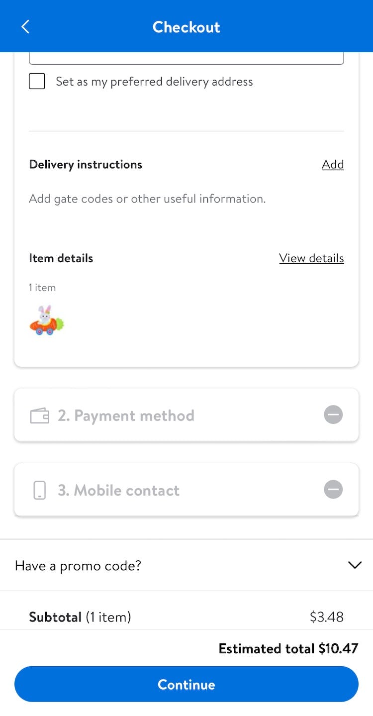
On Walmart’s mobile site, multiple fulfillment methods are offered in the cart (first image) but are completely absent from later steps of the checkout process (second and third images), limiting users’ ability to switch among them.
Users may decide to use a different fulfillment method after beginning checkout for a number of reasons, such as needing their products sooner or available shipping options being too expensive.
Whatever the reason, users who change their mind will look for the ability to switch among fulfillment options within the fulfillment-method selector during checkout — as that’s when they’re being asked to decide on their fulfillment method.
If the only options in the fulfillment-selector interface are shipping options, some users will assume the site doesn’t offer alternative fulfillment methods, while others will be forced to backtrack to the “right” place where an alternative fulfillment method can be selected.
When timing or cost is of the essence, this misunderstanding can lead to abandonment for those who neglect to take the extra steps of navigating back to an earlier step to explore alternative fulfillment options.
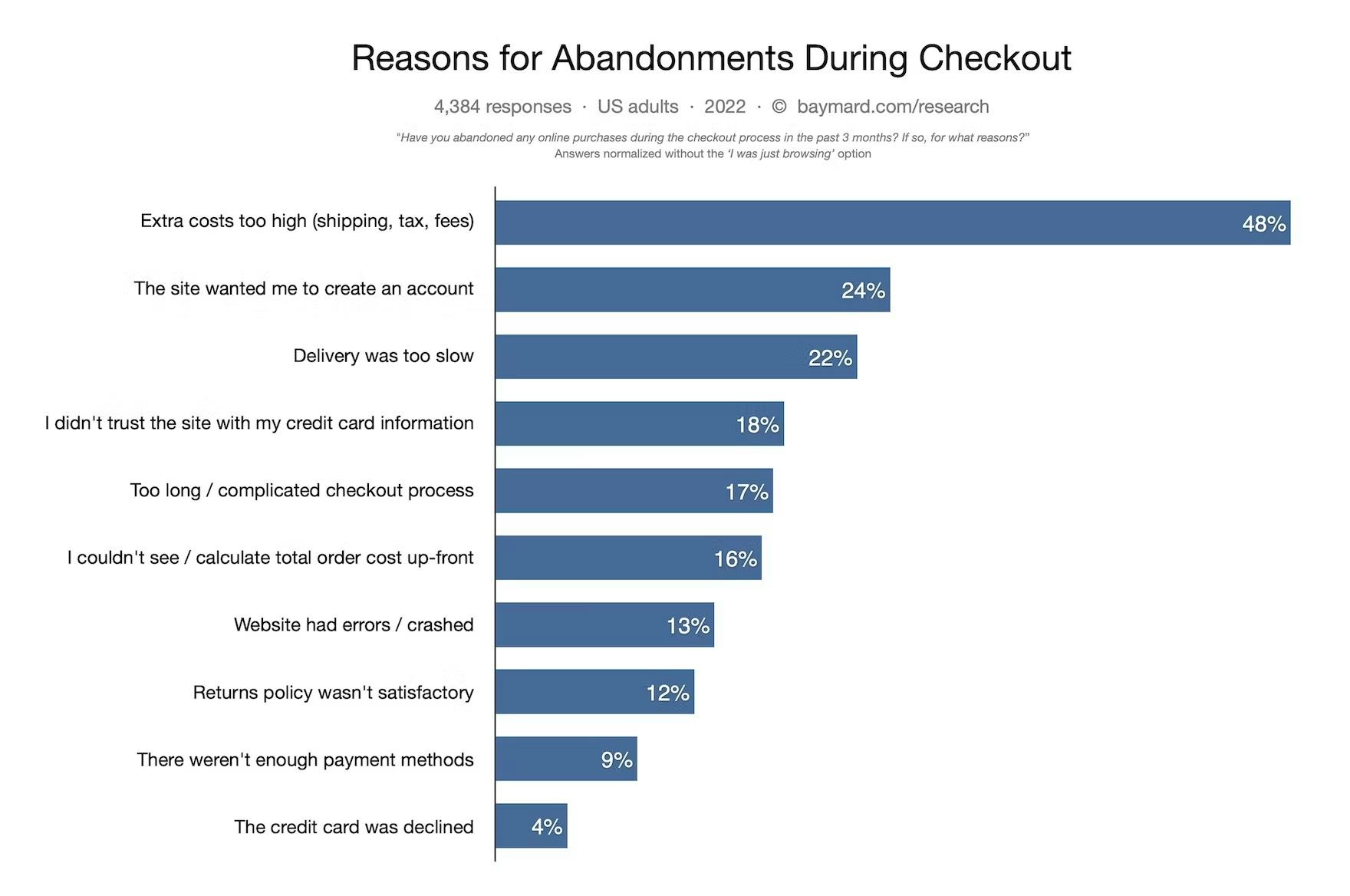
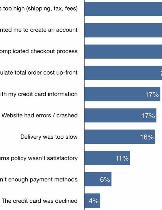
Indeed, our quantitative study on overarching reasons why users abandon during checkout reveals that 48% of US online shoppers have abandoned orders in the past quarter due to “Too high extra costs added” (typically shipping), and that 22% have abandoned due to “Delivery being too slow”.
Thus, the final fulfillment of the order is a crucial consideration for many users — to the extent that it may be the deciding factor on whether or not they complete their purchase.
How Displaying All Fulfillment Methods in the Fulfillment-Selection Interface Helps Users Proceed More Smoothly to Placing Their Order
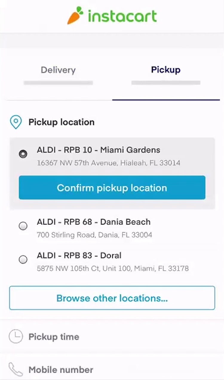
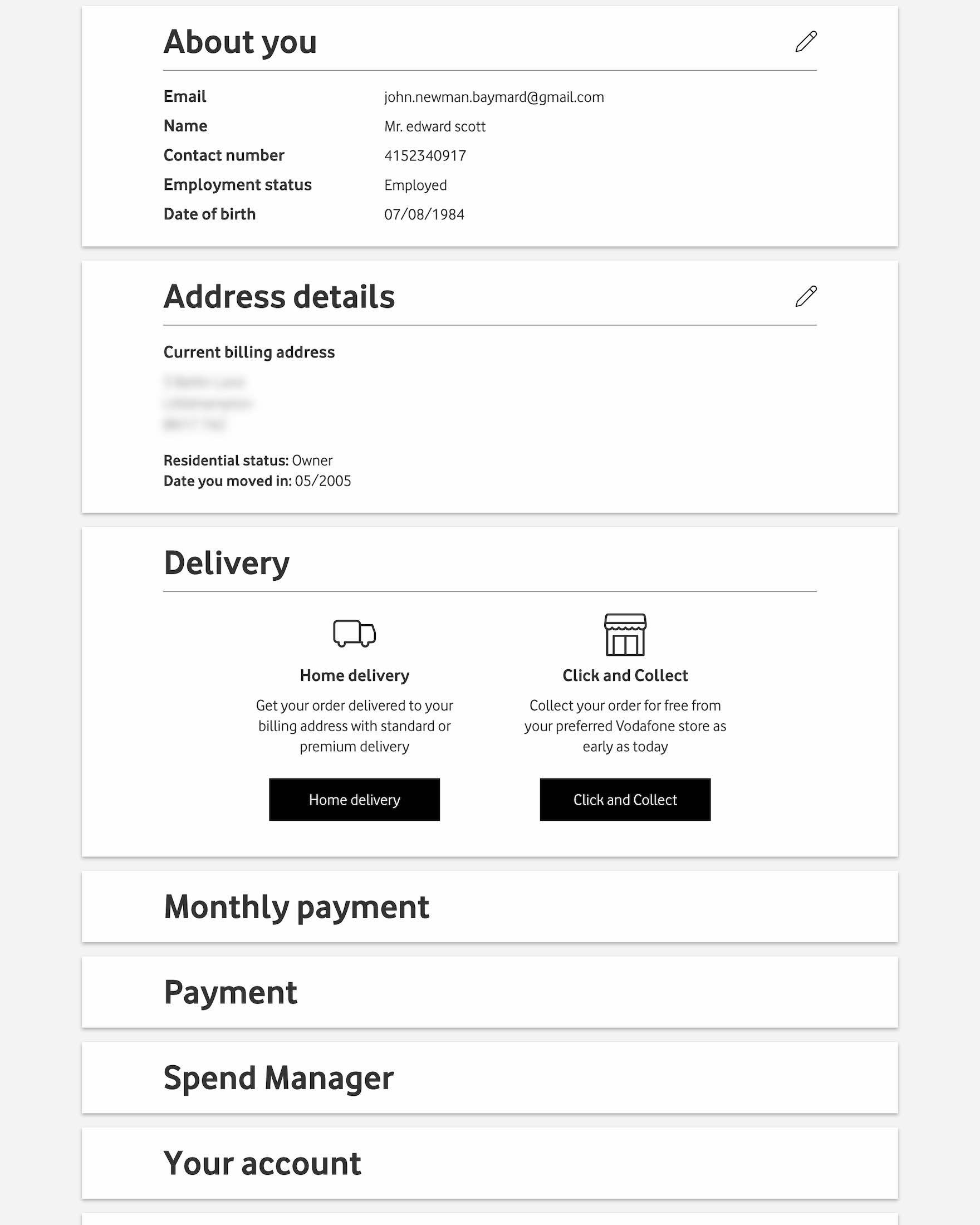
Instead, all available shipping and fulfillment methods — including traditional warehouse-based options, local store delivery, and in-store pickup — must be provided directly within the fulfillment-selection interface of checkout.
As one participant from testing shared, “Sometimes I’ll be in this situation where I’ll be at the final stage of a checkout, and…I’ll be thinking about picking something up, and then for some reason or another, I’ll decide that I’m not going to and I’m actually gonna use shipping. So I do like that there’s still an option even at this stage to update it rather than having to manually go back to the cart and do it yourself.”
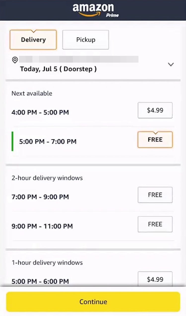
Importantly, users deciding among shipping and fulfillment options during checkout need the most relevant details of cost and timing to make an informed decision.
Additionally, it’s important to display the available pickup time or estimated local delivery time, since many participants were observed to assume “store pickup” or “local delivery” would always be available on the same day. (Generally, users have a difficult time distinguishing between the subtle nuance between a site offering “store pickup” vs. “ship to store”. Stating when the item will be available clarifies the consequences for choosing these alternative options.)
Furthermore, allow users to change the pickup store easily.
Geotargeting might simplify the process for some users, but it’s important that users can always override the selection themselves and choose any store.
Finally, when allowing users to select alternative fulfillment options, such as store pickup, before the checkout or as the first step in the checkout, consider customizing the entire checkout as significant simplifications are now possible.
Provide Users with the Flexibility They Need When Selecting a Fulfillment Method
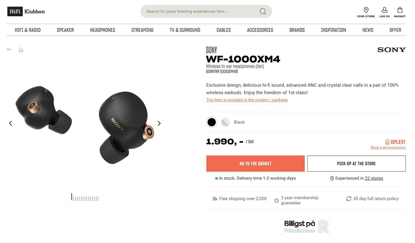
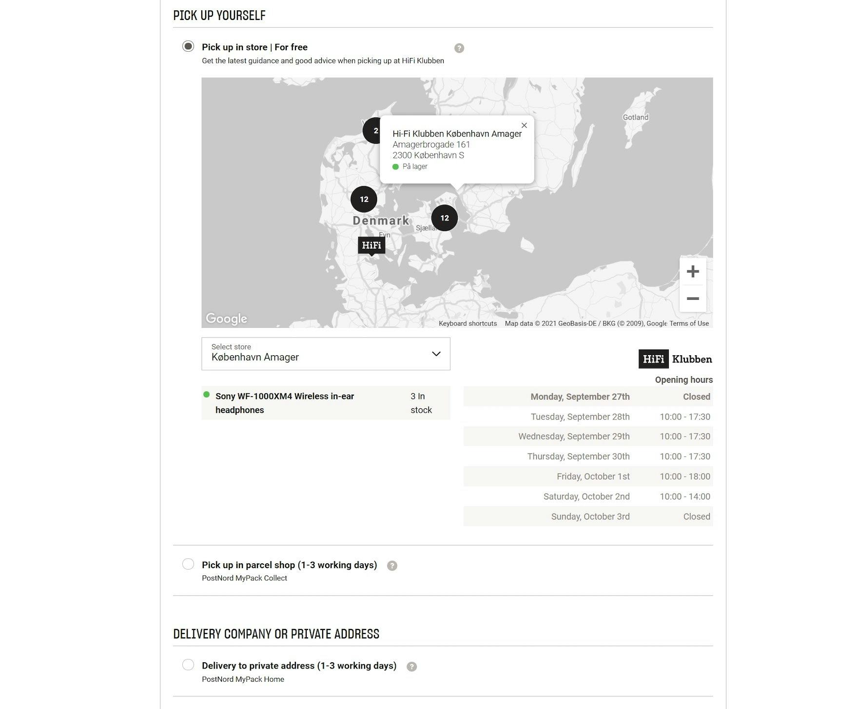
“So here I get to actually pick how I want it delivered or picked up with the price before putting in any of my actual information. That’s nice.” As well as offering store pickup on the product page (first image), the Hi-Fi Klubben site offers it in the fulfillment-selection interface (second image; though the spacing between options could certainly be improved). As this test participant commented, those who choose store pickup don’t have to enter their addresses first.
Presenting comprehensive fulfillment options together in the fulfillment-selection interface not only aids users who change their minds at the last minute but also allows sites to further leverage alternative fulfillment options as an advantage they hold over pure online retailers.
For instance, by framing store pickup as a “Free Shipping Method” available for even the smallest of orders, an omnichannel’s online store can put forward a much more attractive and competitive offer compared to their pure online competitors, while simultaneously drawing users into physical stores (as they go to pick up their items).
Likewise, highlighting local delivery as a time-saving convenience to having to physically go to a store can be a valuable option that users decide to opt in to even after beginning the checkout process.
Despite these benefits, 50% of sites that offer multiple fulfillment options fail to present all of them in the fulfillment-selection interface — making it more difficult than necessary for users to complete their order.
This article presents the research findings from just 1 of the 700+ UX guidelines in Baymard – get full access to learn how to create a “State of the Art” ecommerce user experience.
If you want to know how your website performs and compares, then learn more about getting Baymard to conduct a UX Audit of your site.

