This article focuses on mobile e-commerce ‘Product Finding’. The above graph summarizes our entire benchmark dataset of 5,200 manually assigned usability benchmark scores, plotted across four themes central to mobile e-commerce. Each dot in the scatterplot represents the summarized score of one site across the 17-35 guidelines within each theme, with the black lines denoting the benchmark average. Red dots indicate “poor” usability, yellow indicate “acceptable” performance, and green denotes “good” usability.
Mobile is still among the hottest web design topics – especially within e-commerce, where it frequently constitutes 30-50% of all traffic. Yet IBM has for the second year in a row documented that mobile conversion rates are roughly half of that of their desktop counterpart. After completing an extensive mobile e-commerce benchmark study, it’s easy to understand why some cry out for caution.
Our just-released benchmark of the usability performance of 50 major US mobile e-commerce sites provide a clear picture of the general state of mobile e-commerce user experience performance, and it isn’t pretty. Luckily, these aren’t unfixable things, and based on mobile usability research studies and this benchmark database we’ve been able to identify the most common design flaws as well as strategic oversights and opportunities for achieving a competitive advantage.
In this first article in a mini-series on the current state of mobile e-commerce usability, we’ll provide a full analysis of the current usability performance within the theme of Product Finding. That is, the mobile navigation and product browsing, mobile search, mobile product lists, filtering and sorting, and cross navigation.
We’ll present the typical product finding issues that the average mobile site faces, along with mobile site elements that are particularly important to pay attention to, as well as some opportunities that can be seized upon to leap ahead of the competition.
Product Finding on Mobile
As seen in the scatterplot above, the average product finding experience across the 50 benchmarked mobile sites is fairly mediocre. In fact, even the best sites in Product Finding only score what’s considered an “acceptable” usability performance.
“Acceptable” corresponds to an experience where we observed that during usability testing, dedicated test subjects were able to complete the purchase, but the experience and process towards that purchase was filled with detours, misunderstandings, and various annoyances. Clearly there’s room for improvement when the best-performing sites suffer from such issues.
That said, it’s not that all aspects of the product finding experience is broken or that users at large are entirely unable to find any products. Many product finding functions can be used – they’re just not as good or easy to use as they could be. More critically, while most users will be able to find products, when product finding is poor, many users won’t be able to find the products most relevant to them and their unique context.
During usability testing this lead numerous test subjects to draw false conclusions about a site’s product catalog, thinking the site didn’t carry the items they were looking for when in fact it was just that they couldn’t find it due to a poor interface or feature set. Such misunderstandings are critical, because not only do they typically lead to abandonments here and now, but they also negatively affect future sales because those users are very unlikely to return to the site when they need that type of product (because they think it isn’t carried by the site and therefore naturally don’t go there to look for it).
Our mobile e-commerce usability research has resulted in 146 design guidelines, which means the benchmark database (which is based on this exhaustive research study) has a range of sub-components within each of the four main themes. We can therefore “zoom in” on the performance within mobile Product Finding to get a better understanding of what is causing the general mediocrity across of the 50 mobile sites.
We can break Product Finding into the following topics: Navigation & Product Browsing, Search, Product List, Filtering & Sorting, and Cross Navigation & Compatibility. When analyzing the performance across these sub-components, it’s clear that Navigation & Product Browsing, Search, and Cross Navigation & Compatibility are worst off.
In fact, the average mobile e-commerce site has no need to spend immediate resources or attention on either Product Lists (such as list layout or list item design), or on Filtering & Sorting design and capabilities. For Product Lists the average site performs well, and for Filtering & Sorting the average sites works decently. Resources are therefore better spent fixing other aspects of the mobile Product Finding experience, which in turn are severely broken on many sites. (Although please make sure you have clear hit areas in your product lists, something that 28% of sites fail to do.)
The mediocre performance of Search and Navigation & Product Browsing is problematic because in order for users to buy a product, they must first be able to find it. When faced with an inadequate Product Finding experience, users in practice often end up relying on external sites (e.g., web search engines, social media sites, review sites, etc.), making it likely that they end up at competing sites instead.
Mobile Navigation & Product Browsing
For mobile Navigation & Product Browsing the average site performance is poor (red dots), with only a small selection of sites performing well (green dots). This means that on most of the mobile sites the design misaligns with user expectations and behaviors to such a degree that it results in users overlooking the very items they are looking for. Naturally, this tends to lead to a high number of site abandonments.
When looking closer at the benchmark dataset a number of “missed opportunities” become apparent. These are mobile site elements where there’s a large discrepancy between their observed impact during usability testing, and the corresponding level of site compliance found during benchmarking (i.e. high-impact usability guideline with low site compliance).
4 typical missed opportunities within mobile navigation to watch out for are:
Note how on Best Buy’s homepage (left) it’s difficult to accurately infer that the site also carries large amounts of appliances, audio, health and home products. This stands in contrast to sites such as Williams-Sonoma (right) that feature a diverse selection of their top level categories at the homepage. In the case of Williams-Sonoma, this makes it possible for the user to deduce that the site also carries outdoor and furniture products despite these not being depicted in the image promos at top of the page.
1) 42% of mobile e-commerce sites do not have a homepage design that enable users to accurately infer the type of site they’ve landed on. When testing mobile e-commerce site 70% of the test subjects consistently scrolled up and down the entire page when first landing on a homepage, in order to “get an overview of my options.”
To support and tap into this user behavior, it’s important that the homepage design displays a selection of primary navigation categories or images that allow users to infer the diversity and breadth of site’s product catalog. It’s worth noting that even the test subjects who didn’t click the links still utilized them to establish a more accurate mental map of the site’s offerings, which often proved helpful later on in their product hunt (e.g. when choosing to search).
While we haven’t yet tested the long-term impact of this, it would seem plausible that a more accurate understanding of the breadth of a site’s product catalog will make it more likely for users to return to the site, as users are of course more likely to go to a site they know carry the type of product they are looking for.
Thematic product browsing such as the “Suit Up for Spring” guide at Nordstrom or the gift finder at Sears, allow users to browse by a theme – such as “spring” or “occasion, personality, recipient”. These were observed to be a powerful tool for users who aren’t product domain experts, yet 34% of mobile sites do not have any thematic browsing features.
2) 34% of mobile e-commerce sites do not offer “thematic” product browsing – making it very difficult for users with common thematic purchase patterns to find e.g. a pair of “casual men’s shoes”, a “spring jacket”, a “high-end pocket camera”, etc.
Thematic product browsing doesn’t necessarily have to be “traditional” product categories. It can also be product guides or “finders”, which help the user locate the right product through a series a thematic criteria. For instance, a camera finder or gift finder where users can specify recipient or usage type, rather than specific product attributes. (For more details we’ve previously covered desktop thematic filters in an article at Smashing Magazine – the principles are essentially the same in the mobile context.)
Category redundancy often cause users to select an overly narrow scope, unaware that they will see a smaller selection than they had intended. For example, when searching for chargers at Newegg, users are presented with 21 different categories related to “cables” (12 categories) and “adapters (9 categories), instead of showing a few top-level categories and then allowing for additional product-type filters if needed.
3) 38% of mobile sites have a category hierarchy that is either too deep, too shallow, or have overlaps that make it very difficult for users to grasp and navigate the site structure. A typical usability issues observed are users choosing one partially matching category before noticing the “correct” high-level category elsewhere in the list.
Another common pitfall is too deep categories which force user to go through endlessly detailed category selections, often requiring them to navigate through 5-7 categories before being able to see a list of products. Both issues lead users into overly narrow category scopes without them fully realizing it – something that caused major detours during testing, and frequent site abandonments as the subjects (understandably but wrongly) perceived the site’s product selection to be too narrow.
A common mobile pitfall is the use of auto-rotating carousels, as seen on L.L. Bean (left). Carousels require utmost caution on desktop, however, on mobile we downright recommend against them as usability testing showed that the lack of hover (to pause the carousel) resulted in a number of usability issues. A better-performing alternative is to display all important slides as static permanent content, as seen in the redesign L.L. Bean launched 6 months later (right).
4) 30% use auto-rotating carousels on their mobile homepage despite auto-rotating carousels causing major issues on all touch devices. The test subjects repeatedly opened wrong slides or were disrupted while focusing on a specific slide. Not to mention that some subjects generally ignored the animating carousel content as they perceived it as “ads”.
A better-performing alternative is to display the most important slides as static content on the homepage. This approach also tends to make it more obvious to organizational departments that curation is important, which can help address the issue many carousels suffer from: namely being stuffed with slides from every department, rather than based on what is truly important to the user.
So keep those four tips for mobile navigation and product browsing in mind: 1) make sure users can infer the breadth of your product catalog from your homepage content, 2) offer “thematic” browsing features, 3) avoid overly narrow and shallow product categories, and 4) don’t use auto-rotating carousels. If you want to explore sites with a high Navigation & Product Browsing usability performance, take a look at Nordstrom, Etsy and Vitacost.
For design inspiration, you can also explore the 53 mobile homepage examples, 74 mobile navigation menus, and 57 mobile category pages, available in our public benchmark database.
Mobile On-Site Search
Search was generally the preferred product finding strategy of the test subjects during the mobile e-commerce usability study, as they perceived it to be faster than category navigation. Unfortunately, search is almost entirely broken on most mobile e-commerce sites in practice.
This comes as little surprise, as we’ve already documented how severely desktop E-Commerce Search misaligns with users’ search behavior. For example, 70% of (desktop) e-commerce search implementations are unable to return relevant results for product-type synonyms (requiring users to search using the exact same jargon as the site) and 34% don’t return useful results when users search for a model number or misspell a word with just a single character in the product title. For more on this, read our in-depth article on search query types and compliance.
When it comes to mobile e-commerce search, there are 2 missed opportunities, where the discrepancy between user importance and site compliance is particularly notable.
Our mobile testing revealed that search scopes led to a higher discoverability rate – yet 72% of mobile sites don’t have scope suggestions in their autocomplete functionality. Scope suggestions can be implemented in a couple of different ways, as seen here in Hayneedle’s and Target’s mobile search – both types of implementation performed well. (Note however that on Hayneedle, keyboard auto-correct should be set to ‘off’ as this is built into the site’s autocomplete suggestions and therefore takes up unnecessary space.)
1) When searching, 72% of mobile sites don’t suggest highly relevant categories to search within in their autocomplete recommendations. This is despite our research findings indicating this is the best place to suggest search scopes, as users have not yet shifted their mindset to scanning search results.
Our mobile usability study showed that users who apply search scopes often get much better search results and have a higher product finding success rate – typically due to the search scope providing better filters, curbing irrelevant matches, and allowing users to sort the search results (which in practice is often impossible for unscoped search – see Faceted Sorting).
A blank “no results” page as seen here at HP (left) is essentially a dead-end for the user. Pages that had generic tips and categories weren’t of much help either, and saw frequent site abandonments during testing. This stands in sharp contrast to the sites that had contextual category or search query suggestions at the no-results page, as seen in the Amazon example (right).
2) When users search, some will inevitably end up at a “no results” pages – in particular when performing query types that tend to be poorly supported by e-commerce sites (although frequently used by users), such as Feature queries, Thematic queries, and Product Type queries. From the mobile usability test sessions it’s clear that there’s two groups of “no results” pages.
- Generic – These “no results” pages display generic search tips and suggest a static set of top level categories. Unsurprisingly, these consistently performed poorly during testing as they are essentially a dead-end to the user.
- Intelligent – These “no results” pages are dynamic and suggest paths based on the user’s search context. This includes suggesting alternative search queries, synonyms, or suggesting lower query specificity (as seen in the above Amazon) – all things which can help the user along towards a new path.
During testing even relatively low-quality suggestions proved better than no suggestions, as users then at least had a new path to follow, often finding the right path over a few iterations. Alas, the benchmark reveals that 88% of mobile e-commerce sites have “no results” pages that don’t contain any “intelligent” help based on the user’s context – and thus end up becoming a dead-end with generic tips and categories that only a few highly committed users will try out.
If you want to explore sites with good on-site mobile search usability, there’s only Amazon, as this is the only site that performed well within this sub-chapter. For design inspiration, you can also explore the 46 mobile search field designs, 37 mobile search autocomplete examples, and 49 mobile search result page layouts.
Mobile Cross-Navigation & Compatibility
Sideways navigation and finding compatible products are central themes within Cross Navigation & Compatibility. Cross navigation refers to the user’s ability to move cross-ways through the site hierarchy, rather than browsing the site in a linear, vertical fashion.
During testing, we found the subjects to generally be very positive toward relevant cross-sells – to a far greater degree than what we observe during our desktop e-commerce studies. Likely because of how cumbersome it is to find products on mobile.
The benchmark dataset reveals strong discrepancies between usability impact and site compliance in 2 areas in particular.
On mobile, cross navigation is so cumbersome that relevant cross-sell are considered “a service” by some users. Yet 50% of sites have either no cross-sells, such as Lowe’s (left), or cross-sells that don’t ensure the suggested products are related. The ideal implementation is to have two separate sections, one for supplementary products and one for alternative products, as seen on Hayneedle (right).
1) 50% of mobile sites don’t have cross-sells or have a logic that frequently cause highly irrelevant relevant products to be suggested as the suggestions are primarily based on what other users browsed or bought (i.e. the suggestions aren’t restricted to somewhat related product verticals).
Only few mobile sites have the ideal implementation with two types of cross-sells: suggesting both alternative products to help users find the “right” product, while also suggestion supplementary products to help users find additional items to go along with the currently viewed product, helping them “finish the package” or “complete the look.”
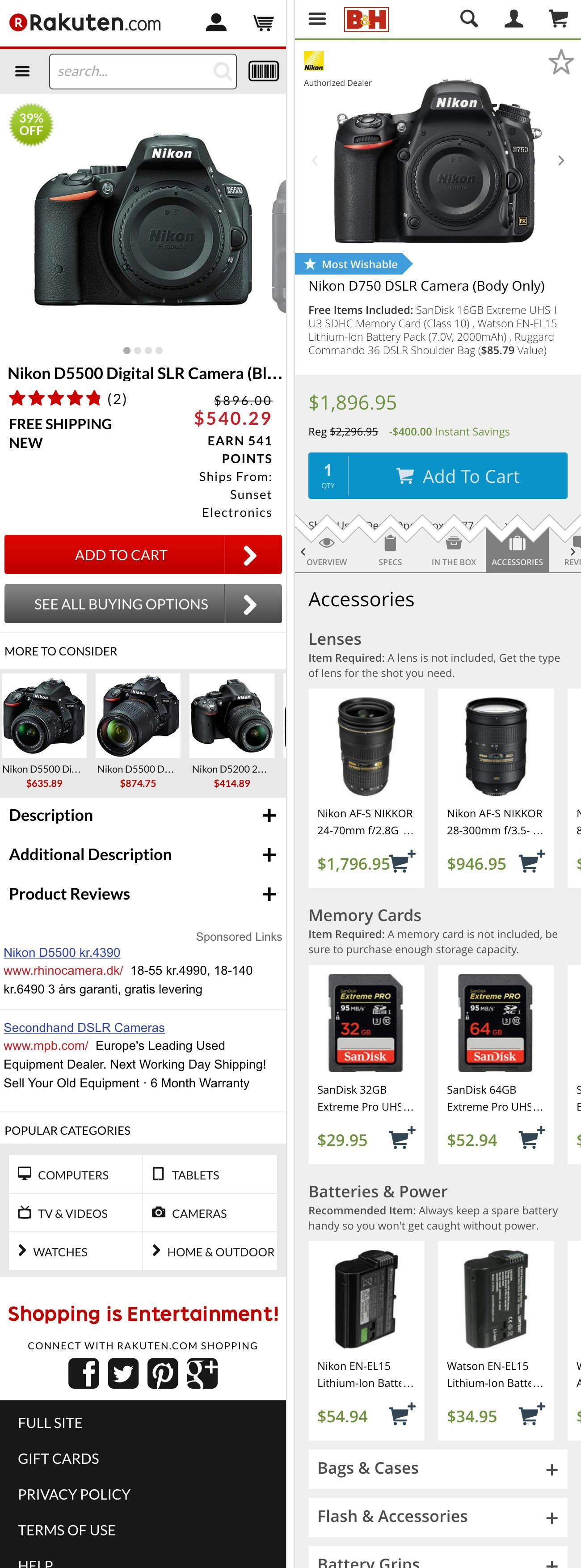
Finding compatibility-dependent items is next to impossible on mobile sites where the products aren’t interlinked at the product page – as seen on this DSLR camera page at Rakuten (left), and observed at 56% of sites. Compare this to the experience at sites that have a full compatibility database, such as B&H Photo, and can therefore can show the compatible items directly at the product page.
2) Out of the benchmarked mobile sites that sell compatibility-dependent products (hardware, tools, consumer electronics, etc), 56% fail to interlink compatibility-dependent items on their product pages, making it almost impossible for users to find the right compatability items. This failure or inability to list and interlink compatibility-dependent items on the product page (through a list of compatible products), is typically because the site hasn’t invested in an actual compatibility database which allows them to map out these types of compatibility relationships.
Finding compatibility-dependent items is a particularly difficult type of cross-navigation because the user not only has to perform the traditional cross-navigation into a path of related items (which as we’ve seen above can be tricky enough in and of itself), but it also requires the user to do extensive due diligence of checking product specs to actually verify the compatibility of each of those items.
Product compatibility is one of those areas where there’s a very high correlation between what’s good for usability is also good for business, as sites tend to see significantly higher average order values when users are can easily find compatible items and feel confident that they will indeed work together.
If you want to explore sites with a great Cross Navigation & Compatibility performance, then take a look at Build, Northern Tool and B&H Photo. For design inspiration, you can also explore the 51 mobile product page examples.
Optimization in Mobile Product Finding
The lackluster overall product finding usability performance represents ample opportunity to distinguish your mobile e-commerce site from the competition.
While the benchmark dataset revealed that the average mobile site does not need to spend immediate resources on the product list layout and filtering tool (which generally perform well), you may want to review your site across these parameters to ensure your site is on-par in these areas. When it comes to mobile product navigation and search, most mobile sites can be significantly improved. Thus any improvements you make in these areas will likely help you move ahead of the competition.
A good place to begin is of course with the site elements described throughout this article, which all suffer from a particularly severe discrepancy between their performance impact observed during mobile usability testing, and the level of site compliance found during benchmarking:
- 42% of mobile e-commerce sites do not have a homepage design that enable users to accurately infer the type of site they’ve landed on.
- 34% do not offer “thematic” product browsing – making it very difficult for users to find e.g. a pair of “casual men’s shoes”, a “spring jacket”, a “high-end pocket camera”, etc.
- 38% of mobile sites have a category hierarchy that is either too deep, too shallow, or have overlaps that make it difficult for users to grasp and navigate the site structure.
- 30% use auto-rotating carousels on their mobile homepage despite these causing major issues on touch devices.
- 72% of mobile sites don’t suggest highly relevant categories to search within in their autocomplete recommendations.
- 88% have “no results” pages that doesn’t contain any “intelligent” help based on the user’s context, essentially leaving the user at a dead-end.
- 50% of mobile sites either have no cross-sells or cross-sells that don’t consistently show related items.
- 56% of the sites that sell compatibility-dependent products fail to interlink these on their product pages, making it next to impossible for users to find compatible products.
A crucial takeaway from this benchmark and usability study of mobile e-commerce as well as our other studies devoted to desktop navigation and search, is that a poor-performing product finding experience will often aesthetically look just as good as a high-performing one. This is due to the non-visible nature of most of the high-impact factors in product finding usability.
This is actually great news because competitors have a hard time copying non-visible factors. Therefore investments in properly evaluating, testing and improving your mobile product finding experience can lead to a significant and lasting UX competitive advantage because they cannot easily be piggybacked upon.
Furthermore, while several of the core product finding components are more severe in a mobile context, many of them are actually platform agnostic. Investments in optimizing the on-site search capabilities or in improving product tagging are directly transferable to other platforms, and can therefore be utilized to benefit desktop, tablet, and mobile users alike.
To explore the benchmark dataset yourself and see how each of the 50 sites perform, take a look at the Mobile Usability Benchmark. If wanting to explore the handful sites with an overall good Product Finding experiences, take a closer look at B&H Photo, Sears, Wayfair, and Musician’s Friend.
This article presents the research findings from just 1 of the 700+ UX guidelines in Baymard – get full access to learn how to create a “State of the Art” ecommerce user experience.


