Key Takeaways
- Our 2024 Mobile UX benchmark includes ratings of 25,000+ UX elements across 138 leading e-commerce sites
- Compared to 2022, e-commerce mobile UX performance still hasn’t changed drastically, with the average mobile site performance remaining “mediocre”
- Avoid the 15 common UX pitfalls identified in the article to begin improving your site’s mobile UX
Baymard’s 2024 benchmark of mobile e-commerce UX — based on our extensive Premium research findings — contains 25,000+ mobile site elements that have been manually reviewed and scored by Baymard’s team of UX researchers (benchmark embedded below).
Additionally, we’ve added 14,000+ worst and best practice mobile examples from leading e-commerce sites in the US and Europe (performance verified).
In this article we’ll analyze this dataset to provide you with the current state of Mobile UX, and outline 15 common mobile UX pitfalls and corresponding mobile e-commerce best practices applicable to most mobile e-commerce sites.
The Mobile UX Benchmark Scatterplot
For this analysis we’ve summarized 25,000+ mobile usability scores over 48 topics and plotted the 138 benchmarked mobile sites across these in the scatterplot above.
These individual site scores are represented in the scatterplot. Each dot, therefore, represents the summarized UX score of one site, across the guidelines within that respective topic of the mobile e-commerce experience.
The overall Mobile e-commerce UX performance of each individual site is listed in the first row. The rows that follow are the UX performance breakdowns within the 48 topics that constitute the overall mobile e-commerce performance.
The 2024 Current State of Mobile UX
As the scatterplot shows, the Mobile e-commerce UX performance for the average top-grossing US and European e-commerce site is “mediocre”.
Indeed, nearly all sites are in a tight cluster with 62% being “mediocre” and 38% “decent”.
Furthermore, there aren’t any standout performances, and there are few “poor” performances.
The most noticeable change from the previous benchmark (2022) is the continued decrease in sites that perform “poorly”, with the percentage dropping from 9% in 2022 to 1.5% in this year’s benchmark.
Yet the improvement is still slight, as the percent of “mediocre” sites increased from 54% to 62% and the percent of “decent” sites stayed largely unchanged (37% in 2022 to 38% in 2024).
Also, similar to the 2022 benchmark, still no sites perform either “good” or “perfect”.
This indicates that there remains ample room for improvement when it comes to the e-commerce mobile user experience.
In the following we’ll provide a more detailed walkthrough of Mobile e-commerce UX performances and their competitive landscape, along with “missed opportunities” to be extra alert for.
In particular, we’ll discuss 15 general mobile UX pitfalls to be aware of for 9 of the 48 topics, across 5 different themes of Mobile UX:
- Mobile Homepage & Category Navigation: Main Navigation
- Mobile On-Site Search: Search Autocomplete
- Mobile On-Site Search: Results Logic & Guidance
- Product Lists & Filtering: List Item Features
- Product Lists & Filtering: Filtering: Scope & Logic
- Mobile Cart & Checkout: General Form Design and Checkout Layout
- Mobile Cart & Checkout: User Information & Address
- Mobile Site-Wide Design & Interaction: Site-Wide Features & Navigation
- Mobile Site-Wide Design & Interaction: Touch Interfaces
(Note: these topics were chosen as they are the most interesting or the most suitable for discussion in an article. Premium members can access the full list by navigating to the Mobile study. If you’re interested in trying out a Premium subscription, head over to our Premium research page for more details.)
Mobile Homepage & Category Navigation: Main Navigation
The Mobile Main Navigation is the weakest topic within the Mobile Homepage & Category Navigation theme, with 69% of benchmarked sites performing either “mediocre” or worse, and only 31% performing “decently” or higher.
This is broadly due to users struggling more to navigate and understand a mobile site’s structure compared to on desktop, which has a more even spread in performance.
This indicates that there are potentially helpful design elements not being provided to mobile users.
In particular, there are 3 issues sites get wrong when it comes to the Mobile Main Navigation.
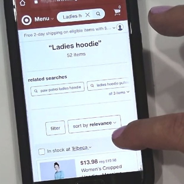
1) 97% of Mobile Sites Don’t Highlight the Current Scope in the Main Navigation

At Fat Brain Toys, a user arriving at a product page for a toy (first image) would not have been able to rely on the main navigation to provide them with a sense of where they were in the site hierarchy (second image).


A participant who arrived directly at B&H’s “TVs & Entertainment” category page from off-site was disoriented and struggled with the site’s terminology as she was unfamiliar with the site (first image). Looking for wireless speakers, she opened the main navigation and tapped the “TVs & Entertainment” category (the category page she was currently on; second image) — the only effect being that the main navigation closed since she was already on that category page. On mobile, even though the main navigation isn’t permanently displayed, some users still rely on it to gain a sense of where they are on a site.
On mobile, there’s typically no permanently visible main navigation.
However, mobile user behavior was observed in testing to be similar to desktop user behavior, in that several participants during mobile testing tried to open the main navigation to get a sense of where they were within the site hierarchy (especially mobile participants who arrived directly on a product page from off-site).
When the current scope wasn’t highlighted in the main navigation, participants had a more difficult time orienting themselves within the site hierarchy — putting more strain on both breadcrumbs (which were often absent, inconsistently implemented, or truncated) and terminology to perform perfectly to help them learn the site hierarchy.


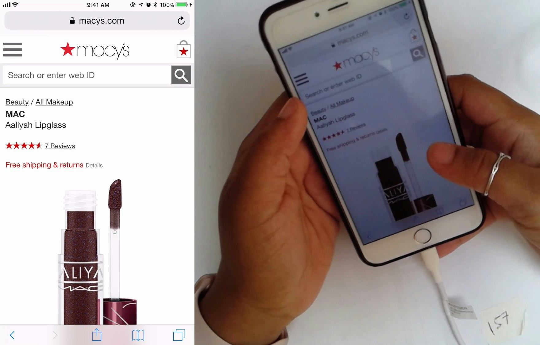
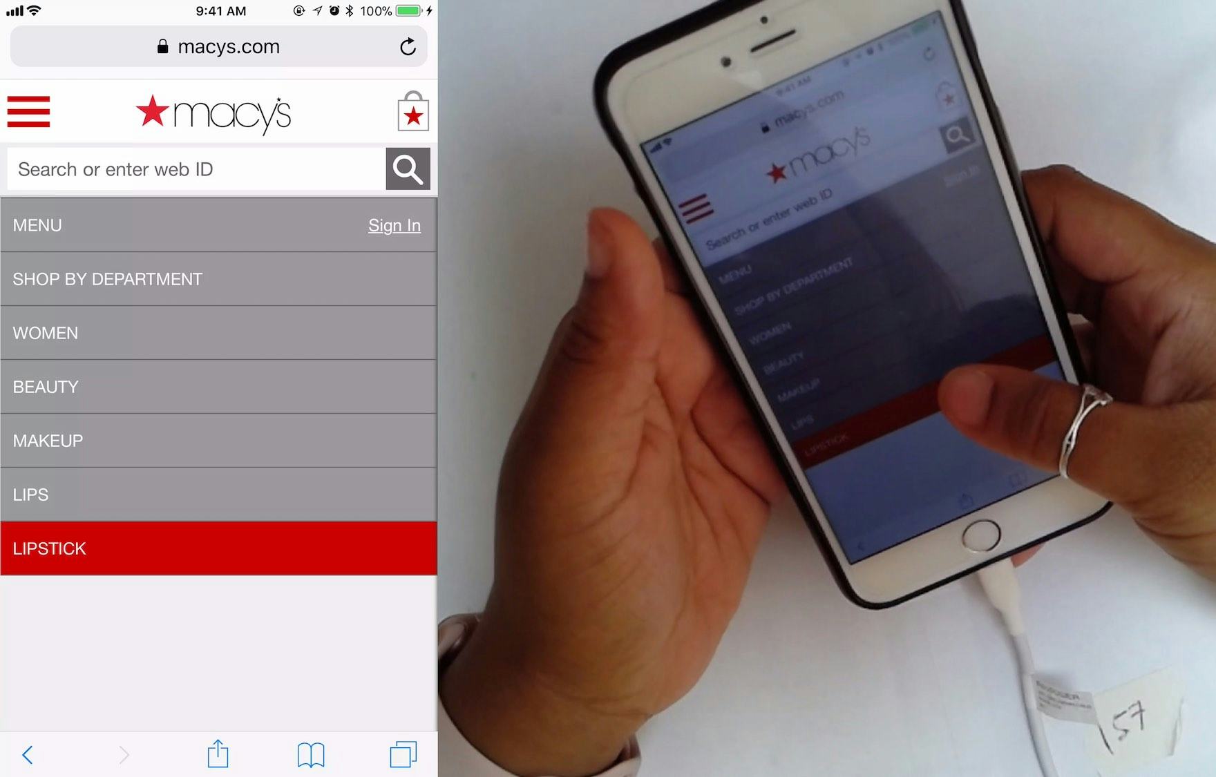
At Macy’s, a participant arrived directly to the product page for a lipstick (first image). Wanting to explore more lipsticks, she opened the main navigation and immediately understood where she was in the site hierarchy because the trail of the top-level category and subcategories were displayed, and the current scope was highlighted with a red background (second image). She then tapped the highlighted “Lipstick” subcategory to get a lipstick product list. (Note how the mobile breadcrumbs on the product page wouldn’t have allowed her to navigate to “Lipstick” as quickly, since the only breadcrumbs provided there were “Beauty” and “All Makeup”.) On mobile, when there’s sufficient space in the main navigation (e.g., the main navigation is the entire viewport), users can be shown a more detailed hierarchy structure to help them orient themselves within the site.
Fortunately, providing information on where users are in the main navigation has a somewhat “low-cost” solution: simply highlight their current scope in the main navigation.
On mobile, this also means styling the current scope differently from the other principle navigation options within the main navigation viewport (rather than highlighting this scope in the header, as on desktop).
A prerequisite for both mobile and desktop implementations, however, is that the main navigation must be the first level of product categories; otherwise, “Shop” or “Products” would be highlighted for users — which wouldn’t help them determine where they were.
2) 48% of Mobile Sites Don’t Provide a “View All” Option at Each Level of the Product Catalog
Many mobile users want the broadest scope possible within a category; for example “All Men’s Shoes” or “All Backpacks”.
However, because there’s no hover option for mobile users, mobile sites have to determine whether users tapping a main category should expand the subcategories within it, or whether to take users to the landing page for the broad main category item (e.g., a broad product list or an intermediary category page).
In practice, most mobile sites choose the design pattern whereby users keep drilling down the category taxonomy as they tap on a main category option, and only bring users to the category’s landing page or product list when there are no additional subcategories layers left to reveal.
Consequently, during mobile testing some participants had difficulty navigating to the broadest product scopes, making it hard for them to access the most relevant category pages and product lists.
Furthermore, some users become stuck in much too narrow and deeply nested subcategories.

”Wow, that’s a lot of different types of bracelets! I’m just going to click on “All Bracelets”.” A participant at Pandora buying a bracelet for a friend — but unsure what type of bracelet to get her — was pleased that there was a “View All” option in the menu.
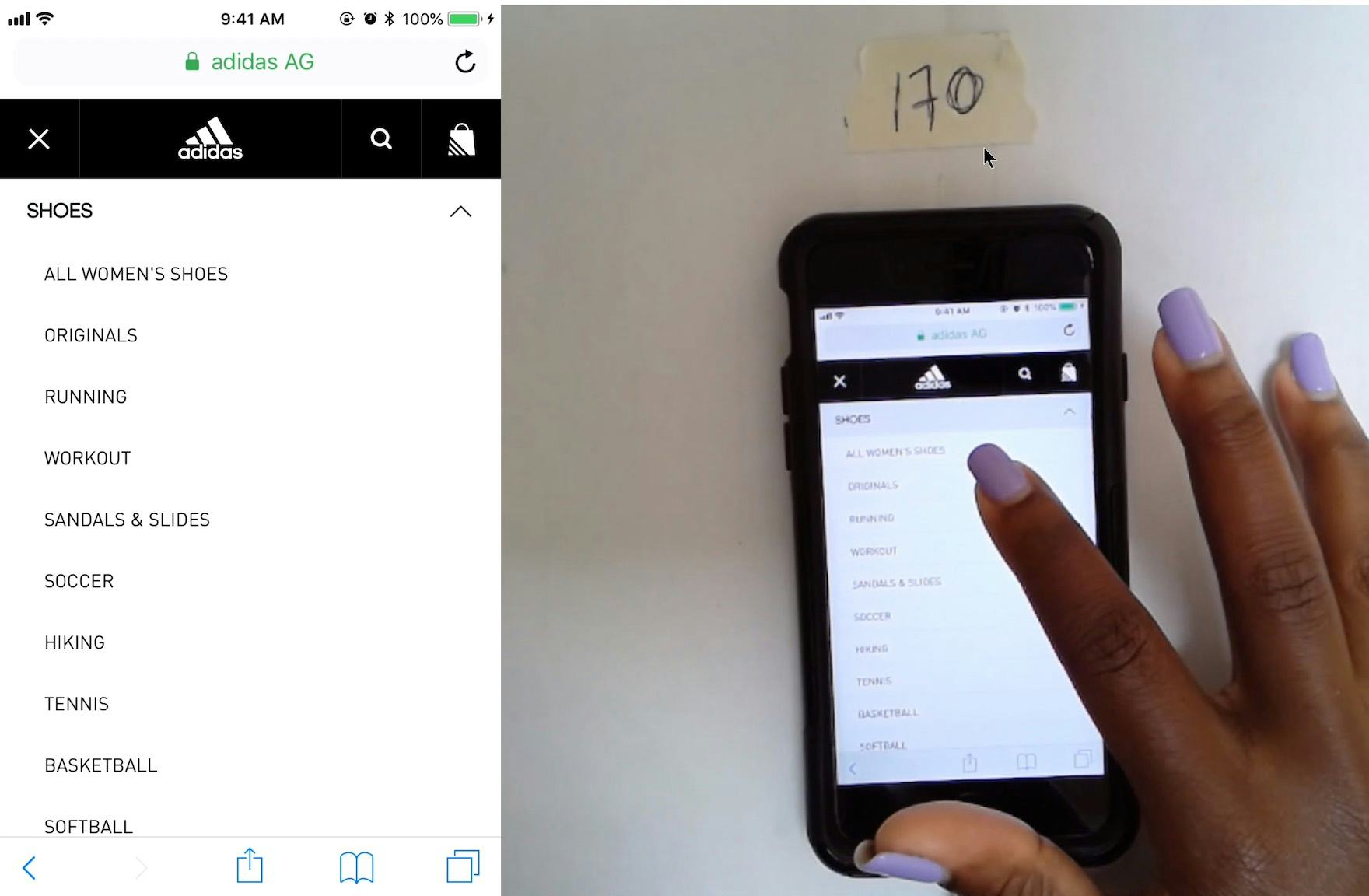
Adidas included a “View All” menu option at each layer in the hierarchy, ensuring that users could easily access a product list containing all the products available in a particular subcategory.
What was observed to consistently perform well during testing was to have a “View All” menu item nested within every product category in the hierarchy.
For example, a site with the category “Women” and the subcategories “Clothing” and “Coats” would have a “View All” menu item at each level — thus, “View All Women’s”, “View All Women’s Clothing”, “View All Coats”.
This approach provides users with options when it comes to viewing products — either to keep drilling down until the right subcategory is reached, or to stop and view the current list of products.
For inspiration on “perfect” Mobile Main Navigation implementations, see Staples and Disney Store.
Mobile On-Site Search: Search Autocomplete
The Mobile Search Autocomplete performance for most e-commerce sites is “poor”, with 51% of sites overall performing below “decent”.
Autocomplete query suggestions are implemented on 96% of e-commerce sites and should, therefore, be considered a “web convention” for e-commerce search fields.
Generally, mobile sites perform well by quickly loading autocomplete suggestions, not using redundant or irrelevant autocomplete options, and supporting keyword queries.
However, there are 2 aspects that could be much improved:
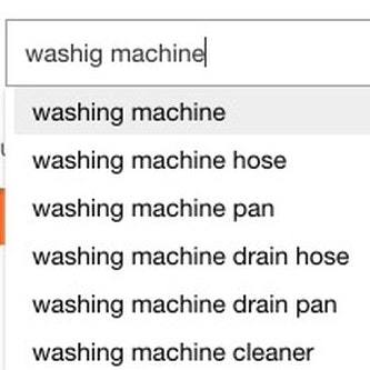
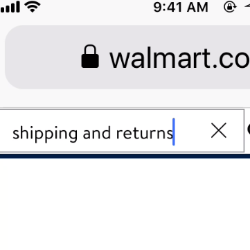
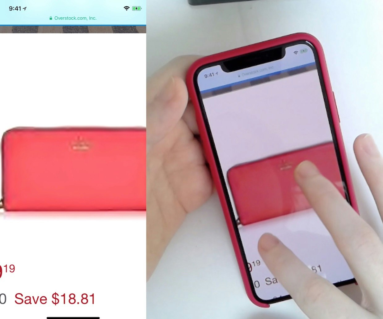
3) 79% of Mobile Sites Don’t Include the Search Scope in the Autocomplete Suggestions


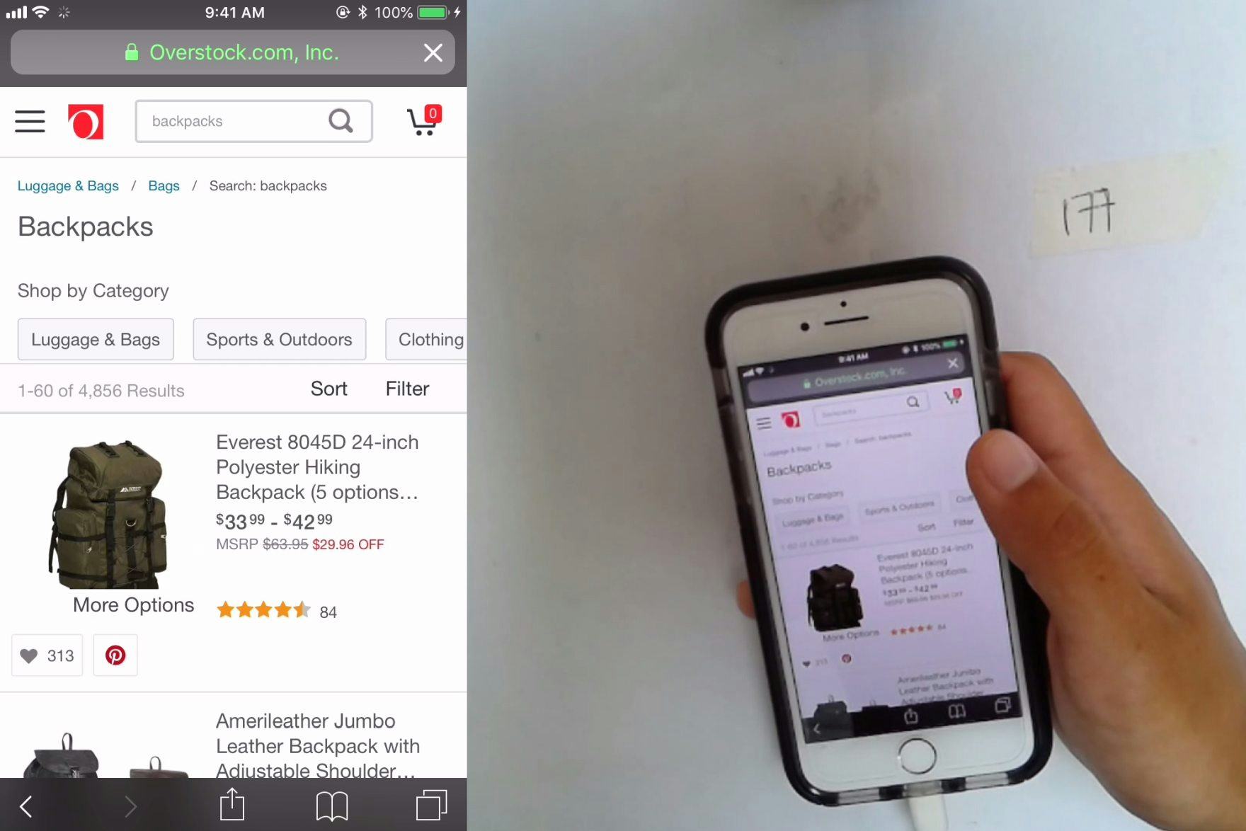
“Oh my goodness.” At Overstock, where autocomplete category scope suggestions were not present, a participant selected a query suggestion for “backpacks” (first image). When he reached the search results, he was overwhelmed by the 4,856 products presented (second image). From there, he had further difficulty with the promoted filter options and selected “school backpacks”, which was overly narrow, offering only 2 products: “So, only two results?”. He spent several minutes attempting to use and then backing out of various filter options to narrow the large results set — all of which could have been avoided had relevant category search scope suggestions been offered while he was devising his query.
Applying a search category scope, such as a user seeking “Pots in Gardening” vs. “Pots in Kitchen”, is not a natural part of most users’ thought process — rather, they’re thinking of the type of product they want and trying to come up with terms that may prove well-suited for producing such results.
However, once users are exposed to category scope suggestions, these can be a useful way to preselect a narrower and more relevant list of products, instead of conducting a sitewide search.
Without category scope suggestions or if category scopes are not obvious, users can select sitewide query suggestions that span many categories and end up arriving at an overwhelming number of results.
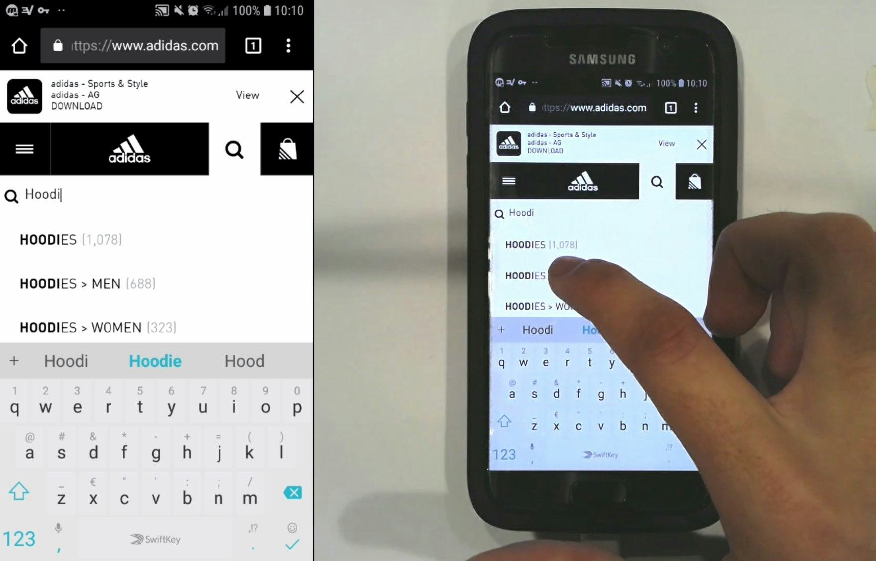
“Oh, this is handy. I was looking up ‘hoodies’ and they’re giving ‘Men’, ‘Women’. I like that.” A user at Adidas seeking “hoodies” was pleasantly surprised by the category scope options that helped him limit his search results in advance of submitting the query. The category scope suggestion that he selected allowed him to focus only on products in “Hoodies > Men”.
The overall goal of category scope suggestions in autocomplete is to help users restrict searches to a smaller subset of relevant results in advance.
When well implemented, category scope suggestions help users avoid wading through excessive and irrelevant results, ultimately saving time and helping them home in on the most relevant results more quickly.
If seeking inspiration, consider looking closer at J.C. Penney, Best Buy, Albertsons, and Disney Store.
For additional inspiration, see the Page Design tool where we have collected design examples of the Mobile Search Autocomplete.
Mobile On-Site Search: Results Logic & Guidance
When it comes to Mobile Search Results Logic & Guidance, our testing shows that 54% of e-commerce sites perform below “decent” — however, Results Logic & Guidance is no longer the worst-performing topic within Mobile On-Site Search.
Indeed, this is due to a notable improvement from 2022, when 62% of sites were below “decent”.
In particular, the following issue disrupts sites’ Results Logic & Guidance performance:
4) 73% of Mobile Sites Don’t Suggest Alternate Queries and Paths

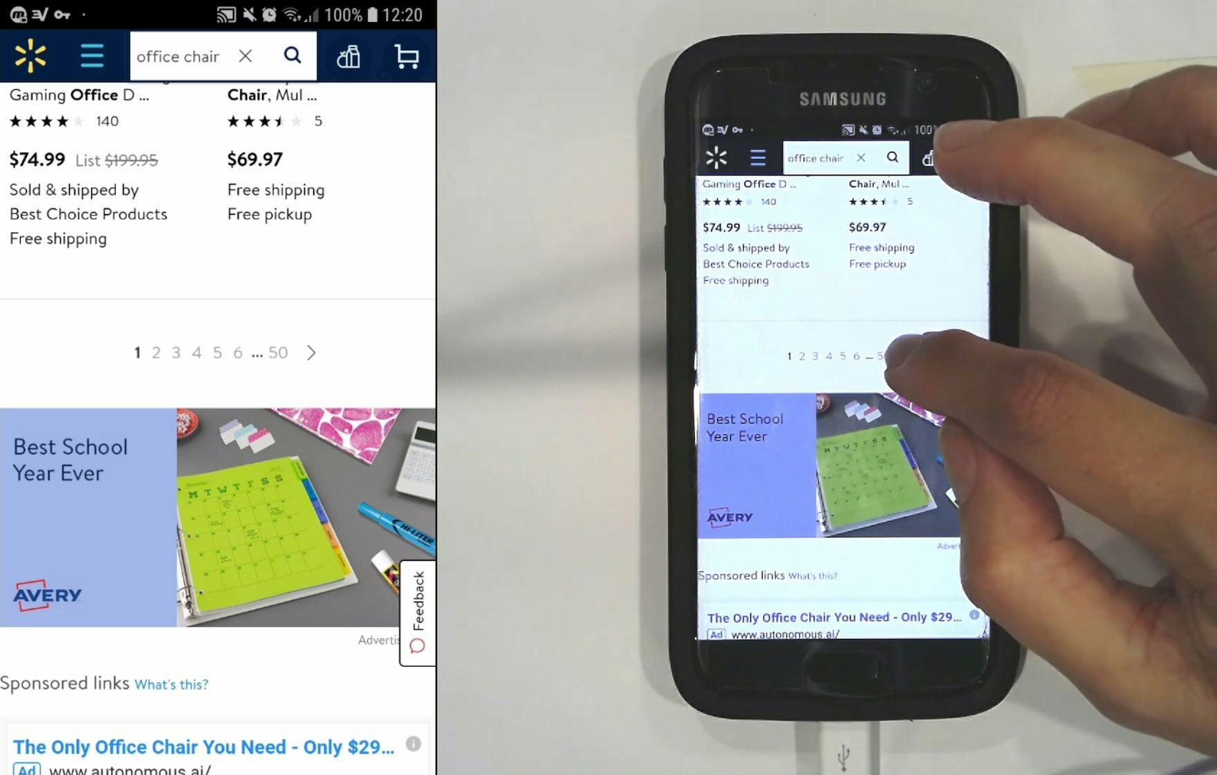
“In all honesty I’d probably already move on from this site because it’s super bizarre why it pulled up a painting when I typed ‘office chair’.” This participant at Staples searched for “office chair blue casual”, which returned only a single irrelevant result. Without any clear paths to relevant related queries, users might consider leaving the site.
Unless a site is narrowly targeted at users with a very high level of domain knowledge, many users will often use terminology that differs from the site’s.
Obviously, the search engine’s ability to handle synonyms is a great start, yet there are cases where synonyms tend to be insufficient because the user’s terms are approximations, or the user is searching for neighboring concepts.
Without clear suggestions for related and adjacent queries, some users will miss out on relevant search results and fail to find a suitable product.

At Cole-Parmer, related searches were provided on the search results page, giving users who were unsatisfied with the results a chance to easily try again.
On the other hand, testing revealed that exposing users to alternate queries — that are relevant to their original search but broad enough in scope to return quality results — offers users who might otherwise reach an impasse valid and reliable options to explore.
Alternate queries may point the user toward another (related) set of products, recommend the removal of a model name or brand from an overly specific query, or suggest searches for associated and compatible products.
In all cases, alternate queries help users recover from suboptimal search results by shifting or broadening the scope of their search.
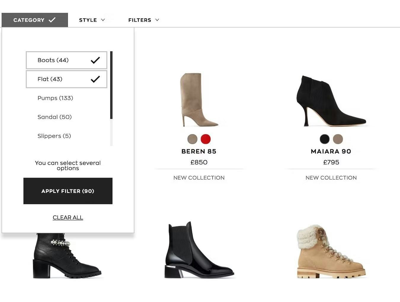
Product Lists & Filtering: List Item Features
While the average Mobile List Item Features performance is “decent” and no mobile site in our study has a performance of “poor,” it is still important to address areas for improvement in order to understand what makes a product list easy to scan and identify suitable products from.
Notably, sites continue to struggle with the following issue:
5) 61% of Sites Don’t Make All Color Swatches Available in Mobile List Items for Visually Driven Products

“It’s annoying when you have to click [into the product page] just to visualize it or just to see it in another color…Like this one for instance, this one here has 11 options. If I’m going to be picky, I’d like to see all 11 of course.” When some swatches aren’t shown in mobile list items, as here on The Company Store (iOS), users have to go to product pages to see the full range — introducing more friction into the process of judging suitability.
In industries such as Apparel and Home Furnishings, items often come in multiple colors.
But if users only see a limited number of swatches in list items, some could assume that the visible swatches represent the only options.
Indeed, during mobile testing, a subset of participants moved very quickly through product lists and search results, and sometimes overlooked small indications of additional color options, such as “+7” or “more colors available”.
Moreover, if only a subset of colors are available to users in product lists, they’ll either have to visit product pages to see if any of the “hidden” colors are suitable, or abandon their search if none of the visible colors are suitable.
On mobile, displaying all swatches in a horizontal scrolling area had a number of advantages for test participants, who easily scrolled swatches using a swipe gesture (as long as hit areas were sufficient) — an intuitive behavior honed through using their mobile device.
Additionally, horizontal scroll areas were observed in mobile testing to be capable of accommodating a potentially very large number of swatches since there are no space limitations — as long as users are fine to keep scrolling, they’ll eventually see all color options available.
However, easy-to-discern scroll arrows should be provided at each side of the horizontal scroll area so that users don’t mistakenly think that there are no more swatches to view.
Alternately, the rightmost swatch should be clearly truncated to indicate that action is needed to see the full swatch — and in turn that there are more available to view.
Finally, the swatches visible by default should be chosen to show a diverse set of colors, or the most popular ones.
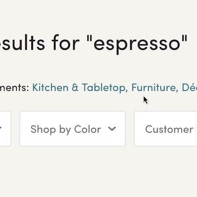
Product Lists & Filtering: Filtering: Scope & Logic
The average performance within Mobile Filtering: Scope & Logic is very encouraging, with half of the sites ranging from “good” to “perfect” — even “state of the art.”
Notwithstanding, the only shortcoming in this topic is the 78% of sites that don’t explain industry jargon to users:
6) 77% of Mobile Sites Don’t Always Explain Industry-Specific Filters
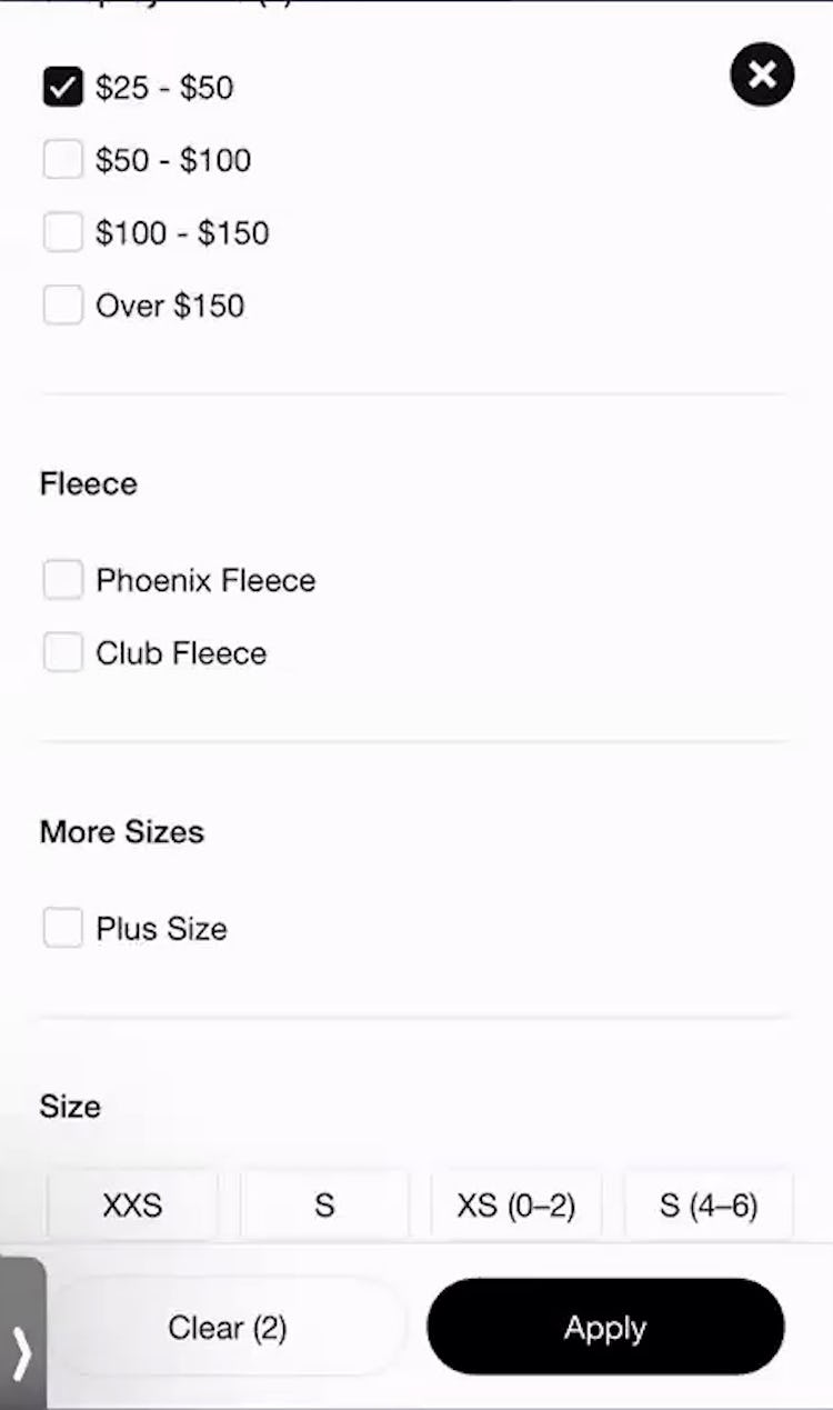
”I don’t know the differences between those types of fleece or else I might pick one but I’ll just leave it since I don’t know the difference.” This participant at Nike avoided the “Fleece” filter option she didn’t understand — but by avoiding filter options they can’t figure out, users run the risk of excluding suitable items in the product list.
When sites use technical or unfamiliar language in filter types or options, users may be less likely to apply filters — and overlook what in reality are very suitable filters.
Additionally, users who encounter ambiguous filter options can end up using up time applying and removing filter options just to understand their effect on the product list.
Mobile users will have an especially difficult time if they must use a separate filtering interface that sends them back to the product list after each filter option is selected.
Finally, a subgroup of users intent on looking up the meaning of an unclear filtering term might leave the site just to figure out what a word or phrase means (“I’ll just Google it”) — which carries the risk that they find alternative product options on other sites and not return.

The explanations beneath each filter option for “Grinding Method” helped novice users at Wayfair understand how these methods differ.
As our research has shown, exploring and refining e-commerce product lists) can be challenging for users.
Thus, to encourage customer stickiness, it’s important that all users, not just domain experts, are able to use product filters quickly and accurately.
It’s therefore important to:
- Forgo jargon or provide explanations of filter types and options or
- provide explanations for industry-specific filters (including visual explanations such as thumbnails where appropriate).
Doing so will allow users to adequately narrow product lists — yet 77% of sites use technical or ambiguous filtering language (with no in-component help for users) or lack visual thumbnails that more easily identify product attributes, forcing some users to leave sites due to filtering problems.
For inspiration in this topic, look to Lowes and Crutchfield for their “state-of-the-art” implementations.
Mobile Cart & Checkout: User Information & Address
The average Mobile User Information & Address performance is “good”, with an impressive 39% of sites being “good” or higher.
This is one of the higher-performing areas in Mobile Checkout, with nearly all sites providing helpful time-saving features such as offering zip code autodetection.
That said, the experience here can be further optimized by resolving the following issue:
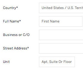
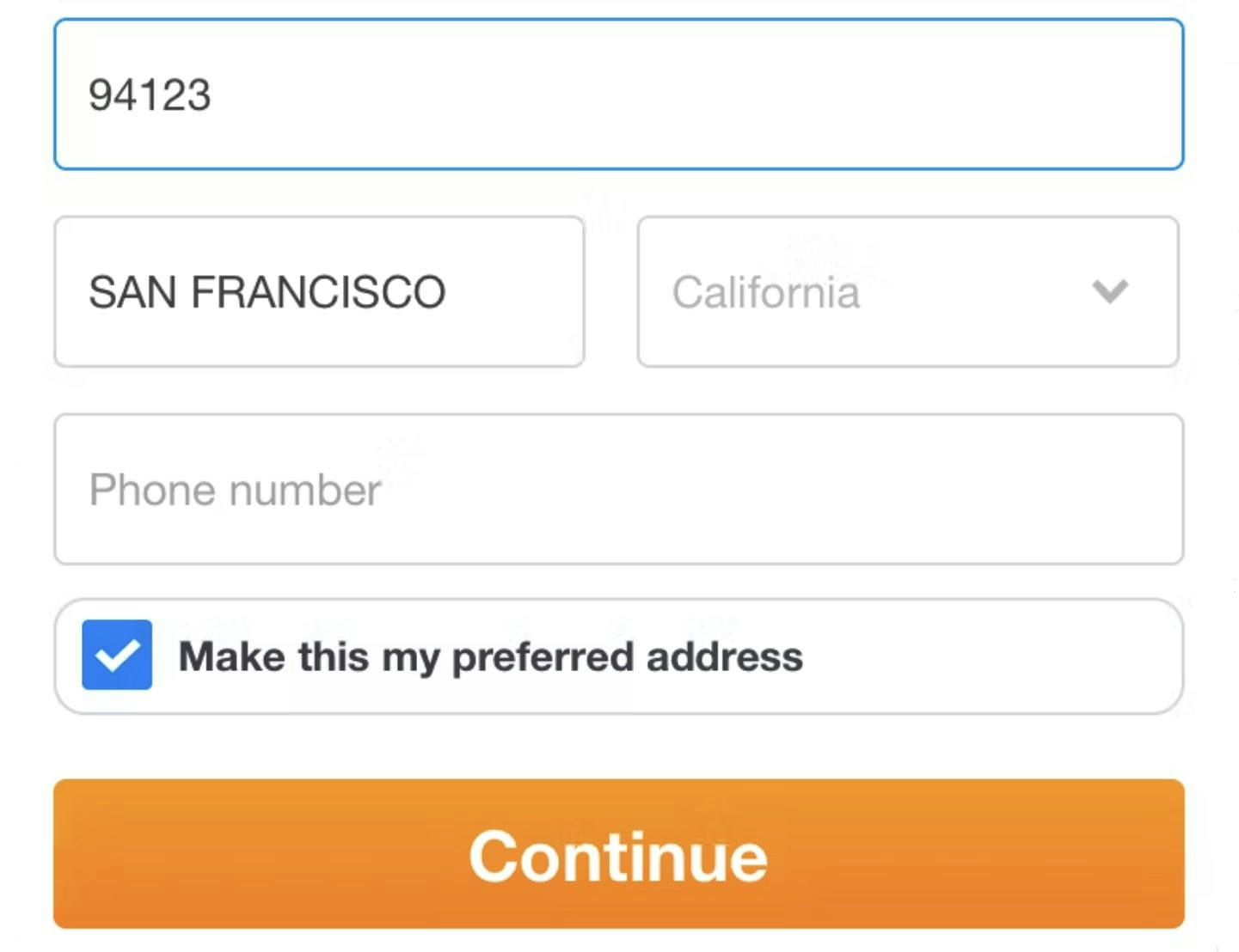
7) 35% of Mobile Sites Don’t Have an Address Validator or Address Lookup Feature


ECS Tuning (first image), Netonnet (second image), and Menards (third image) all allowed users to continue through checkout despite entering an address with misspellings or other errors — risking delivery problems down the line.
Inaccurate addresses cause multiple, cascading issues.
Users may have problems receiving their orders, or not receive them on time — or not receive them at all.
Sites have to provide extensive customer support when there are delivery issues and often also face broken customer experiences — and the consequent negative site reviews — with the end result being lost a sale due to a returned, undelivered order.

”I like that. It lets you know what you’re doing…especially if you’re buying something in a hurry — [there’s] somebody around you, you’re distracted — it allows you to quickly change it.” The address validator at Musician’s Friend (iOS) caught multiple address errors for this participant, including typos in the street name and ZIP code.
Address validators function by querying an address database (e.g., the USPS) to ensure that the address the user typed matches the address the postal service has on file.
While not perfect, address validators allow sites to perform a basic verification of a user’s typed address, helping ensure there are no problems delivering orders.
For instance, mobile testing showed that, due to keyboard autocorrect and the difficulty of typing on a small touch keyboard, users make errors far more frequently when entering their address on mobile devices.
Furthermore, users on mobile devices have more difficulties noticing errors due to the lack of page overview caused by the small screen.
Therefore, to prevent such severe issues, sites that ship physical products should always integrate an address validator into the “Shipping Address” step of checkout.
If seeking inspiration, consider looking closer at Chewy, Musician’s Friend, and ASOS.
Mobile Cart & Checkout: General Form Design and Checkout Layout
Within mobile General Form Design and Checkout Layout, the average site is “decent”, with a strong showing of 64% of sites having a “decent” or “perfect” performance.
However, the two issues below have been observed to trip up many test participants:
8) 72% of Mobile Sites Don’t Properly Introduce, Position, and Style Error Messages


Shopping for groceries on Walmart’s mobile site, this iOS participant tried to save her delivery address, but tapping the “Save” button didn’t result in any visible changes (first image). Only after scrolling up to the top of the address form did she see the error message about a missing apartment unit number (second image).
During checkout testing, participants experiencing errors was a common occurrence.
While a number of users will inevitably experience errors across a site, what’s key is the user’s error-recovery experience.
The first step in users being able to resolve an error and proceed with their purchase is understanding that an error has even occurred, and what input or inputs caused the error.
Requiring users to hunt down the fields with errors themselves not only leads to user frustration but was also observed to lead to checkout abandonment, as users were unable to resolve the errors.
Moreover, on mobile sites, it’s even more difficult to recover from errors compared to desktop sites, due to the inherent issues of Mobile e-commerce UX.

At Target, users who attempted to submit a form containing errors were scrolled up to see both a prominent error message as well as the fields in error.
Our testing revealed some very consistent patterns for how well-performing error messages should be positioned and styled.
Under all circumstances, the incorrect field must always be marked up, typically by using red field borders, a red field background color, or red arrows.
This will immediately grab a user’s attention, and represents the conventional styling for erroneous form fields.
Additionally, the error message must always be displayed right next to the erroneous field to allow users to understand what went wrong and how to correct it.
However, the exact implementation depends on how many errors there are on the page.
If there is only one error on a page, autoscroll can be utilized in order to present the error to the user so that it is right within their viewport.
But when there are multiple errors on pages taller than one viewport, the implementation becomes a little more complicated.
Testing showed that simply scrolling users to the first error performs poorly, as it makes them likely to overlook the subsequent errors.
A better-performing technique is to take users to the top of the page and inject an error statement outlining the multiple errors that have been detected, and ideally what those are.
This is, of course, in addition to then highlighting each of the fields throughout the page, each with its own unique error message.
9) 98% of Mobile Sites Don’t Improve Validation Errors with Adaptive Messages

This generic error message at GameStop suggested that the issue was that users hadn’t entered a phone number — whereas the real issue was that the phone number was incomplete and didn’t have enough digits to be valid.
Even when taking logical steps to minimize the number of users who run into validation errors — for example, indicating both required and optional fields, providing explanatory text, and showing input masks — some degree of error messaging will be unavoidable.
In the worst scenarios, participants in testing were unable to resolve the issue, preventing them from continuing due solely to vague or generic error messages, and ultimately forcing them to abandon the process.
As a result, overly general error messages force the burden of determining what the problem is — and what needs to happen for the issue to be resolved — onto users, turning what may have been merely a small speed bump into a major roadblock.

During testing at Lowe’s mobile site (iOS), this participant received a specific error message that helped him quickly find the issue with his address entry.

An earlier version of Wayfair’s mobile site let users know that the zip code entered appeared to be for “San Francisco”, rather than the user-misspelled “An Francisco”.
To give users the clearest indication of the issue and how to resolve it, sites should instead use “Adaptive Error Messages”.
Rather than providing the same generic message for all validation errors, “Adaptive Error Messages” change depending on the exact subrule that invoked the validation error, using this detail to provide the user with instructions on how they can correct their input.
In other words, “Adaptive Error Messages” dynamically change to best match the user’s situation — for example, if a user inputs “john.newman@gmail” in an email field, an adaptive validation error message would read, “This email address is missing part of the domain (such as ‘.com’).”, whereas if they had typed “john.newmangmail.com” the message would read, “This email address is missing the @ character”.
Letting the user know why an error occurred makes it easier for them to fix it.
In practice, providing “Adaptive Error Messages” is about letting users know on the front-end what the back-end error logic has already specified.
To prioritize resources, consider starting by closely tracking all validation errors that occur within the checkout flow.
With better error tracking, sites can start by implementing “Adaptive Error Messages” for the 2 groups of validation errors that a) occur most frequently and b) have the highest checkout abandonment rate after receiving an error.
While it’s possible to write specific microcopy for up to 160+ error messages for a single form field, testing showed that specifying at least 4–7 messages for the most complex inputs — like site-specific or unconventional form fields, card number, cardholder name, security code, password, phone, and email — goes a long way towards improving the error-recovery process.
For inspiration, John Lewis has a “perfect” implementation for General Form Design and Checkout Layout.
Mobile Site-Wide Design & Interaction: Site-Wide Features & Navigation
The performance for Site-Wide Features & Navigation has a fairly wide spread with 56% of sites performing “decently” or better.
Most sites are adept at common web conventions, such as correctly placing a prominent cart icon in the right-hand corner, breaking up footer links for scannability, having easily legible text on imagery, and minimizing bugs and overlay dialogs.
However, there are 2 implementations that sites still tend to get wrong when it comes to Site-Wide Features & Navigation:
10) 81% of Mobile Sites Don’t Always Provide Load Indicators Whenever New Content Is Loading
When there are no load indicators, users on mobile devices tend to quickly assume that whatever action they had just attempted (e.g., tapping on a list item in the product list) did not register.
Therefore, users tap again, which often leads to inadvertently tapping on some other content or even starts the loading process over again.
While consequences of not having load indicators can be minor — users tend to quickly recover after tapping on unintended content, for example — they are, however, cumulative.
During testing, participants were observed to have multiple issues related to missing load indicators while on the same site — a consistent drag throughout the user’s browsing experience.
Therefore, always provide high-contrast, noticeable load indicators whenever new content is loading.
Moreover, to ensure the load indicators perform well, it’s also important to display the load indicator immediately after a user’s action (< 1 second), use a conventional design (such as a “spinner”, circling arrows, or “Loading” text), and update the load indicator after 10 seconds.
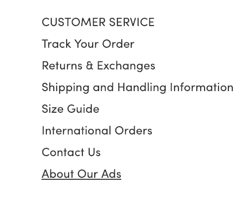
11) 57% of Mobile Sites Don’t Have Direct Links to “Return Policy” and “Shipping Info” in the Footer

At Home Depot, users wouldn’t be able to find a return policy in the footer — leading to possible delays as they browse products.
In testing, it was often observed that users need information about the site’s return policy or shipping options before they are able to make a purchase decision.
While this information can (and should) be available through multiple paths — for example, via the site header, on the product page, or via sitewide search — testing revealed that a subgroup of users consistently will head to the footer when seeking such information.
When it’s not there, users must go “information hunting” — which, depending on how easy it is to find the information elsewhere on the site — often results in a substantial delay in product browsing.
More seriously, if users have difficulty quickly accessing basic returns and shipping information, some may reconsider whether they want to use the site to make their purchase.

”I’d look up their return and exchange policy just in case, ‘cause it looks like some of their shoes have like mixed reviews.” At Cole Haan, a participant who looked for details on exchanges in the footer immediately found the “Returns & Exchanges” link she needed.
Providing links to the return policy and shipping information in the footer is a small and simple implementation that can greatly help users seeking information specific to their order.
Of all the benchmarked sites, Lyko shows an almost “perfect” performance in this topic.
Mobile Site-Wide Design & Interaction: Touch Interfaces
Touch Interfaces is one of the worst-performing topics for mobile websites: 42% of sites have a very poor performance, while only 21% of sites offer “decent” or stronger performances.
On the positive side, almost all sites have optimized their content for mobile, including strong pinch-to-zoom functionality.
However, many sites struggle with these common violations:
12) 74% of Mobile Sites Don’t Provide Enough Space between Tappable Elements
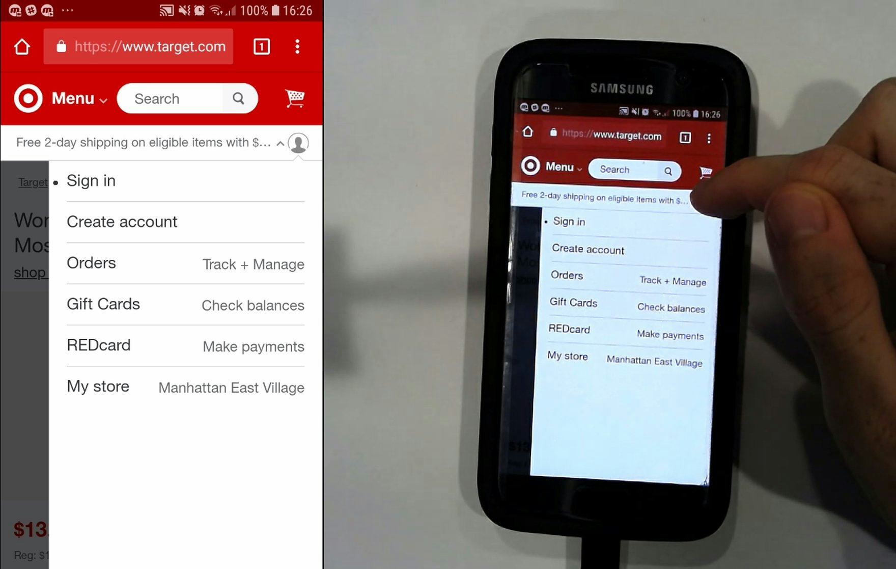
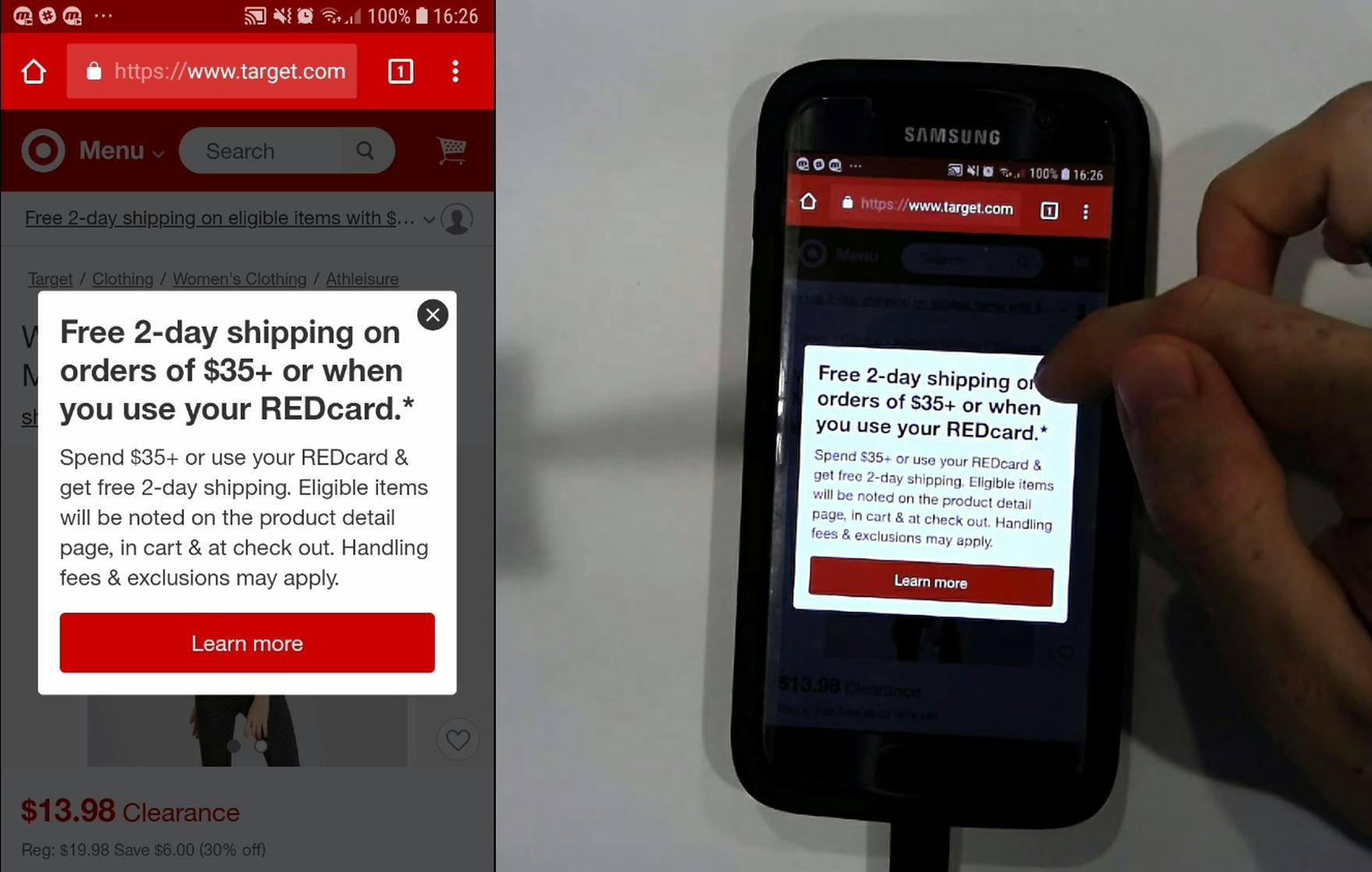
A participant at Target unintentionally tapped a free shipping offer which was placed immediately adjacent to the profile icon he was actually trying to tap (first image). The free shipping overlay then popped up (second image). Unintentional taps such as this can lead to reactions ranging from mild annoyance and slight detours to abandonments, if users become completely disoriented.
The issue of spacing between tappable elements is closely related to the size of tappable elements (see below).
Both issues often combine to make it difficult for the end user to reliably navigate the mobile interface (yet it should be noted that the two issues of sizing and spacing are unique and can occur separately).
In short, inadequate spacing between elements will lead to mistaps, unintended detours, and even abandonments.
Furthermore, inadequate spacing was a persistent issue throughout our mobile testing, observed extensively ever since our first mobile testing in 2013, and remaining an issue even today.
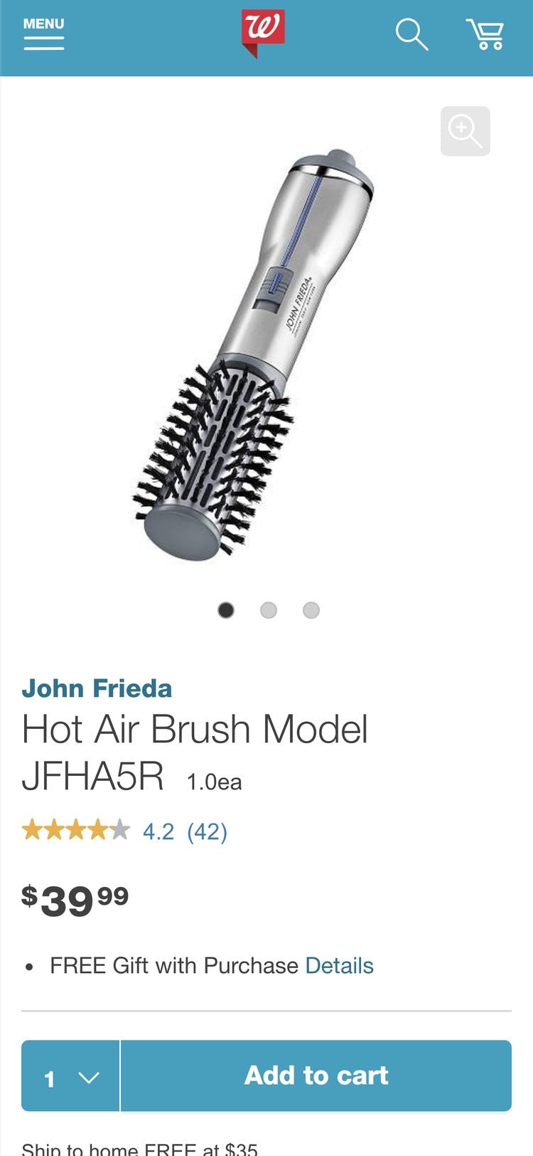
Walgreens had adequate spacing between tappable elements, as illustrated in this product page for a hot air brush.
So what is adequate spacing? Some device manufacturers’ design guidelines stipulate a minimum spacing of 2mm and Baymard’s testing supports the same general recommendation.
However, in cases where the consequence of unintentionally tapping an element due to spacing issues are graver (e.g. in the Target example above), spacing should be much higher (~10 mm).
Finally, elements should never be placed right at the very edge of the screen, as that area is typically unresponsive and users will thus have difficulty selecting those elements.
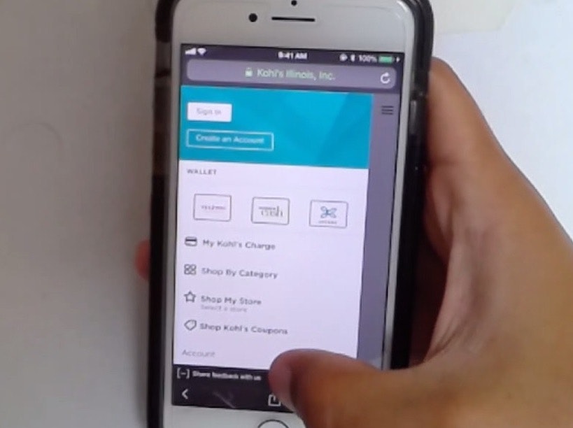
13) 86% of Mobile Sites Don’t Make Tappable Elements Sufficiently Large

Despite hit area sizing being a “basic” for mobile design, time and again sites in testing implemented elements and links using overly small hit areas.
Again, just as is the case with inadequate spacing of elements, the disruption to the user can range from mild annoyance at having to tap multiple times before they hit the right spot, to severe frustration and abandonment if they mistap and end up in another area of the site or lose data (e.g., during checkout).
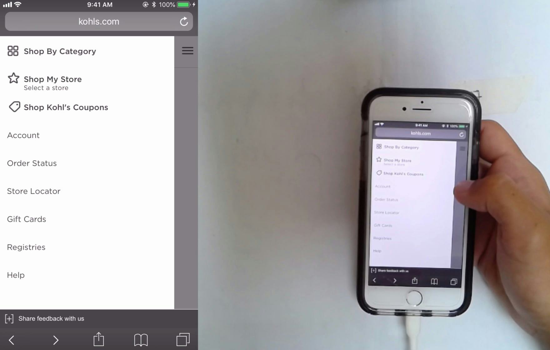
At Kohl’s, the vertical hit area of these main menu list items was a more generous ~9.4mm. An adequate hit area helps ensure users don’t suffer from mistaps — which are still endemic to the mobile experience.
Yet the solution to this issue is straightforward: ensure a hit area of at least 7mm x 7mm (measured on the smartphone display).
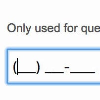
14) 67% of Mobile Sites Don’t Use the Right Keyboard Layout for Relevant Fields


At B&H, users typing their email address are presented with the standard mobile keyboard layout (first image). To type their full email address, they are forced to switch multiple times between the default alphabet layout and the secondary layout containing numbers and symbols in order to access the “@” and period (second image) that are components of all email addresses.
By changing an attribute or two in the code of the input fields, sites can instruct a user’s phone to automatically show a specific type of keyboard that is optimized for the requested input.
For example, a numeric keyboard can be invoked for the credit card field, a phone keyboard for the user’s phone number, and an email keyboard for their email address.
This saves the user from having to switch from the standard keyboard layout and, in the case of numeric inputs, minimizes typos, as these specialized keyboards have much larger keys that reduce the chance of accidental taps.
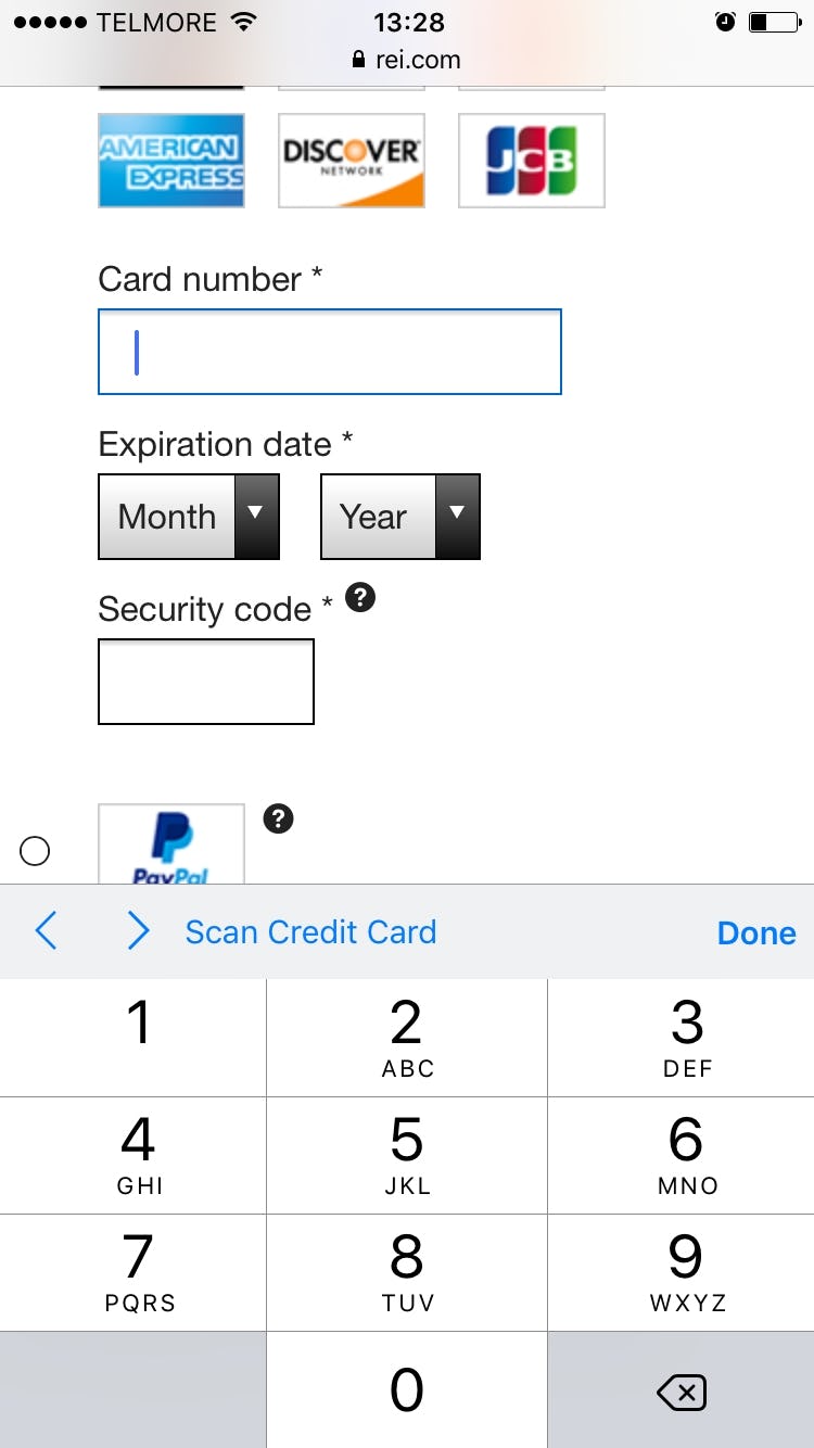
When users input their data in the “Card number” field at REI, a special numeric-optimized keyboard appears, showing a set of buttons that are multiple times larger than the numbers on the standard keyboard.
Technically there are a few different ways to invoke the numeric keyboard layouts, and there are also small distinctions between those keyboard layouts, with slightly different behaviors across platforms (iOS, Android, etc.).
In general, there are 2 HTML attributes that will invoke numeric keyboard layouts, namely the type and pattern attributes.
For example, for any numeric fields use:
<input type="text" inputmode="decimal" pattern="[0-9]*" novalidate autocorrect="off" />
For a complete list of field and code combinations for all field types commonly found in a checkout flow, see baymard.com/labs/touch-keyboard-types.
15) 85% of Mobile Sites Don’t Disable Mobile Keyboard Autocorrect When Appropriate


During mobile testing at Walmart, this participant began typing the first characters of her last name, ”Ri”, only to have them changed to ”To” by her device’s autocorrect feature, forcing her to delete the “correction” and begin again.
Autocorrect is one of several mobile features that can assist — or, in some cases, hinder — a user’s typing, and it can be either enabled or disabled in their device keyboard settings.
When enabled, autocorrect is supposed to automatically correct misspelled words as they are typed or submitted (e.g., correcting “camra” to “camera”).
However, autocorrect often works very poorly for abbreviations, street names, email addresses, person names, and similar words that are not in the dictionary.
The keyboard autocorrect feature has caused significant usability issues throughout multiple years of mobile usability testing, resulting in much erroneous data being submitted as users try to manually override “helpful” autocorrections.
That said, typing is quite difficult on mobile and autocorrection does prove very helpful in scenarios where it corrects invalid input to valid input.
Therefore, autocorrect shouldn’t be disabled on all fields.
Instead, use discretion and disable it on fields where the autocorrect dictionaries are weak — for instance, this typically includes names of various sorts (e.g., street, city, person names) and other identifiers (e.g., email address).


At B&H Photo (first image) and Urban Outfitters (second image), users typing in the
The keyboard auto-correct can be disabled by adding the autocorrect attribute to the input tag and setting it to “off,” like this:
<input type="text" autocorrect="off" />
(Note: decisions regarding the search field are a complicated matter; Premium users should consult the last section in guideline #948.)
Of all the benchmarked sites, both IKEA and Target shows a “perfect” performance in this topic.
Many Opportunities Exist to Improve Mobile UX
This high-level analysis of the current state of mobile UX focuses on only 9 of the 48 mobile topics included in our e-commerce UX benchmark analysis.
The 39 other topics should be reviewed as well to gain a comprehensive understanding of the current state of mobile UX, and to identify additional site-specific issues not covered here.
Although our benchmark has revealed that no sites have a completely broken mobile UX, it’s clear that there’s much room for improvement, since 62% of sites have a “mediocre” or worse performance, and no sites have a “state of the art” mobile experience.
Adhering to the 15 Mobile e-commerce UX best practices described in this article is the first step toward improving users’ mobile experience:
- Highlight the current scope in the main navigation (97% don’t)
- Provide a “view all” option at each level of the product catalog (48% don’t)
- Include the search scope in the autocomplete suggestions (79% don’t)
- Suggest alternate queries and paths (73% don’t)
- Make all color swatches available in mobile list items for visually driven products (61% don’t)
- Explain industry-specific filters (77% Don’t)
- Have an address validator or address lookup feature (35% don’t)
- Properly introduce, position, and style error messages (72% don’t)
- Improve validation errors with adaptive messages (98% don’t)
- Provide load indicators whenever new content is loading (81% don’t)
- Have direct links to “return policy” and “shipping info” in the footer (57% don’t)
- Provide enough space between tappable elements (74% don’t)
- Make tappable elements sufficiently large (86% don’t)
- Use the right keyboard layout for relevant fields (67% don’t)
- Disable mobile keyboard autocorrect when appropriate (85% don’t)
Note: In comparison, in most of the other e-commerce UX studies we’ve conducted at Baymard Institute, the average UX performance also amounts to “mediocre” but tends to have a wider spread of variation and performance scores (see our overall e-commerce UX benchmark).
Also, note that this is an analysis of the average performance across 138 leading US and European e-commerce sites.
When analyzing a specific site there are nearly always a handful of critical UX issues, along with a larger collection of worthwhile improvements to make.
This is the case even when we conduct UX audits for Fortune 500 companies.
For inspiration regarding other sites’ implementations and to see how they perform UX-wise, head to the publicly available part of the Mobile e-commerce UX benchmark. Here you can browse the mobile implementations of all 138 benchmarked sites.
For additional inspiration, consider clicking through the Mobile Page Designs (click the “Mobile” filter for the specific page design you’re viewing), as these showcase mobile implementations at hundreds of leading US and European e-commerce sites and can be a good resource when considering redesigning a mobile site for what to emulate — but also for what to avoid.
This article presents the research findings from just a few of the 650+ UX guidelines in Baymard Premium – get full access to learn how to create a “State of the Art” e-commerce user experience.
If you want to know how your desktop site, mobile site, or app performs and compares, then learn more about getting Baymard to conduct a UX Audit of your site or app.