

Amazon uses beautiful large lifestyle images in multiple of their categories. Unfortunately, when scaled down on their mobile site there’s severe contrast issues with white text overlaid images, making it almost impossible to read some of the sub-category options. Fairly problematic considering that navigating the category links are the main purpose of these pages!
If a site is broken, the user experience will likely be as well. The importance of having a site largely free of bugs and layout quirks is therefore pretty obvious. Yet layout bugs and quirks are one of the most common and consistent issues we run across on e-commerce sites during our usability testing, benchmarking, and auditing.
During our usability research we’ve observed layout bugs to be the direct cause of site abandonments as test subjects were unable to find products, or began to distrust these flawed sites, deeming the sites unprofessional or even suspicious, sometimes thinking that perhaps the site had been hacked. And most critically, there’s of course all the layout bugs that technically prevent users from completing their purchase and thus force users to abandon their purchase!
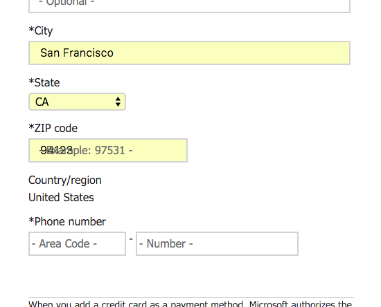
At the Microsoft Store, a test subject’s browser auto-fill clashed with the non-native placeholder text, making the auto-filled zip-code unreadable. It’s advisable to use native UI components where available, and crucial that any custom UI implementations are tested for compatibility in all common browsers and in combination with common browser features such as auto-fill.
What’s striking is how often these problems occur, and the class of sites on which it happens. Many of the sites we review are Fortune 500 companies or businesses with online sales well beyond the $100 million mark. Indeed, we’ve covered the issue before, as some of our long-time readers may recall. Unfortunately, things haven’t improved in the two years that has passed since then. Layout bugs and interactive quirks continue to plague e-commerce sites.
So why does this happen? Why do layout and interaction quirks occur with such frequency?
Not Unwilling but Unaware
If a server crashes or part of the site goes down, most organizations turn upside down – meetings are canceled, and everyone rush to fix the issue. Server errors and 404 pages are easy to monitor but they only represent a fraction of the bugs that we encounter when testing and auditing e-commerce sites.
Meanwhile CSS layout quirks and flawed interactive (JS-enabled) features tend to be much harder to identify because they don’t invoke a server alert and therefore aren’t brought to anyone’s attention – and thus often get to linger around for months before they’re discovered (and consequently fixed).
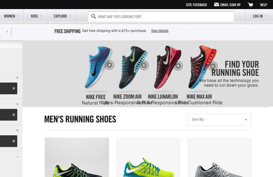
At Nike’s responsive e-commerce site, the layout and alignment of the category pages are perfect when viewed on typical mobile and desktop devices. Yet, at several widths the layout breaks, and the descriptions for each of the 4 running shoes seen here stacks on top of each other, rendering them unreadable. (While Nike has switched design since this test session, a similar layout bug is present in their current design.)
We’ve tested countless multi-million dollar sites over the years, and revisited just as many, and observed instances of the same layout bug sticking around for years without getting fixed. Yet the problem is hardly a lack of motivation or potential return on investment – fixing these issues would clearly pay good dividends considering the size of these sites and the severity of the quirks. In our experience with e-commerce clients the problem is not one of being unwilling, but rather one of being unaware. In short: it’s largely a visibility issue – if people in the organization knew about these layout bugs, they would get fixed.
Unfortunately, just because layout bugs aren’t as “visible” as a server outage, doesn’t mean their impact can’t be just as harmful. So what is an e-commerce site to do? Clearly nobody is implementing layout bugs on purpose, yet it is surprising how few appear to purposely plan and design with layout quirks and interaction bugs in mind.
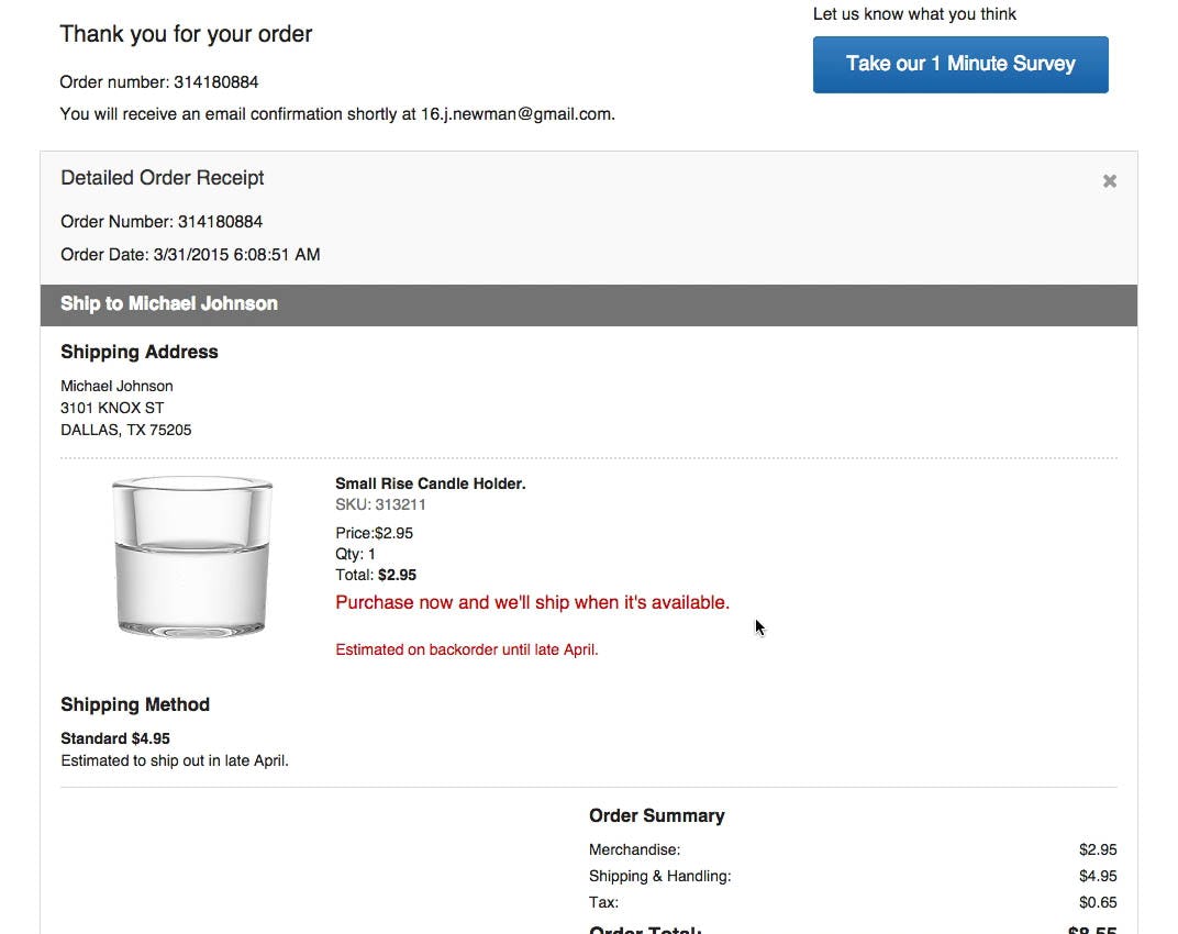
“Maybe I haven’t purchased it?” this test subject said during a checkout study of Crate & Barrel, and continued by reading aloud the message he was trying to interpret: “‘Thank you for your order. Purchase now and we’ll ship when in stock’. Hmm, that doesn’t really make any sense. It’s a bit misleading. I think I’ve purchased it.” The subject was naturally confused by seeing this message after clicking the “Place Order” button. Note how the text in red reads “Purchase now and we’ll ship..” which is downright misleading when the product is already purchased. It’s key to test content in all the contexts in which it will appear.
The challenge must be approached both organizationally and technically. Organizationally, there’s the obvious importance of developing good quality assurance procedures that go well beyond testing “ideal conditions”, but things like content production guidelines must also be considered. Technically, best practice web development principles must be adopted to build resilient web pages that don’t break apart due to a single JavaScript error or because they are being served to an old and feature-deficient device. Let’s take a closer look at these two, that is, the organizational and technical challenges.
Organizational: Content Production & Context Matrix
Computers do as they are told (at least for the next decade or two), which means the underlying cause of bugs and quirks is ultimately human. The code we wrote is faulty or produces unintentional outcomes. Or the user performs an action or submits an input that the software wasn’t instructed on how to handle. Because of this human underpinning to layout bugs, many of the solutions will be human in nature as well. In short: the challenge must be tackled organizationally.
In recent years, the number of screen sizes, input methods, and browser features, has exploded. Yet it seems that the testing procedures of many sites haven’t followed suit. Our test subjects constantly stumble upon layout bugs occurring due to responsive scaling, art direction that doesn’t take the mobile experience into account, input formatting examples that cannot be entered on touch devices – the list goes on and the examples are numerous.

While a hero image with text might look perfect on desktop, and acceptable on a tablet, they will often be seriously flawed on mobile since the embedded text will be scaled down so much that it becomes unreadable, as seen here on HP’s mobile site.
21st century e-commerce sites will either need to be designed with content flexibility in mind (putting limitations on layout) or need strict content production guidelines. For instance, if text is to be placed on top of images, the design must either place a translucent box between text and image to ensure the necessary contrast for good legibility. Alternatively, strict content production guidelines can be developed and enforced to ensure content managers never insert images that will hurt legibility (note: this must take all versions of the page into account, from mobile to tablet to desktop screen). Another common challenge is if graphic designers are allowed to embed text into images, in which case art direction guidelines must be in place to make sure at least mobile and desktop versions of the graphic exists to avoid illegible text sizes as the graphics are scaled down.
Besides purposely designing for context flexibility (with the constraints that brings) or having strict content production guidelines (with the resource-tax that brings), sites will furthermore need to be regularly tested across a matrix of contexts. Common contexts to test across include different:
- Screen sizes – Make sure to test page designs across a wide array of screen sizes – phone, tablet, laptop, and desktop at a minimum, and preferably some states in-between if your site is responsive and scales fluidly.
- Input methods – Nowadays we can’t assume the user has a mouse and keyboard. Many will use a touch device, and some will dictate inputs. Hybrid forms are becoming popular too. Make sure your site doesn’t restrict users to a single input method as it can render a site useless if the user’s input method isn’t supported. Pay special attention to input fields, touch keyboards, and hover states.
- History and states – A page may existing in different variations depending on the state and history of the user. For instance, a user may have submitted invalid data and see another variation of the page. Another user might have form field auto-filled by their browser or a plugin. Make sure to test all common user and page states, from a completely “pristine” environment to users with plenty of browser features enabled.
- Multi-page content – Some content may appear on multiple pages. Make sure to preview the content in all the contexts in which it appears to avoid presenting conflicting messages to users. Ideally the content management system is designed to clearly communicate or preview all use contexts.
Any serious e-commerce site should develop a list of user and content contexts and use that to develop their own “context matrix” which can be tested against at regular intervals and upon each feature launch. (Tip: parsing web analytics logs can help determine the most common user conditions.) The combinations may run into three-digit territory for complex and/or important pages (such as the Checkout Flow).

While formatting examples can be great (see our article on Adding Descriptions To Checkout Form Labels – 92% Get It Wrong), note how it’s impossible for mobile users to follow the phone formatting example at REI as the phone-optimized keyboard on iOS doesn’t allow entry of the parentheses and dashes shown in the example. This is likely to be extremely frustrating for the users who are actively trying to preempt validation errors by following the site’s own formatting example. This is a classic example of not testing alternative input methods.
Alas, humans will be humans, and bugs will creep past even the best of testing procedures. Which brings us to the second part of the strategy of how to effectively deal with layout bugs and flawed interactive features: relying on technology that promotes resilience and eases recovery.
Technical: Designing for Resilience & Recovery
Instead of assuming everything is fine and will tend to stay that way, consider designing for exceptions. We may call this “exceptional design” (for those into wordplays). It flips the typical mindset on its head by assuming that bugs will occur, putting its emphasis on resilience and recovery over building a perfect 100% flawless website. The aim is to minimize bugs that creep in over time (that’s the ‘resilience’ part) and to handle them gracefully when they do occur (the ‘recovery’ part).
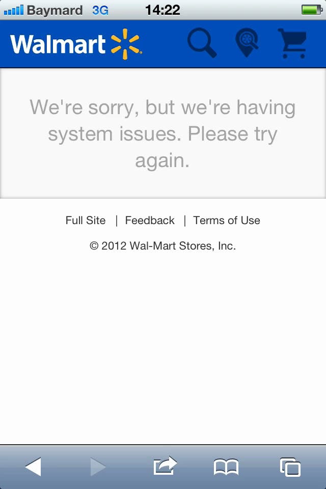
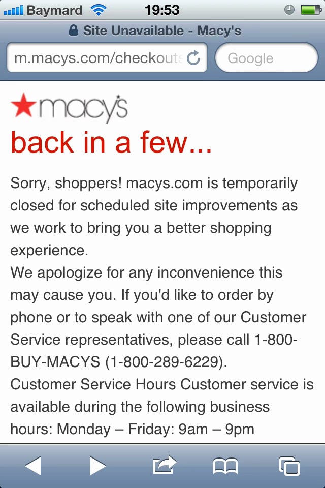

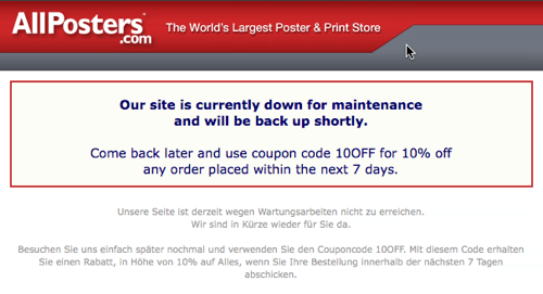
When errors do occur, how easy is it for users to recover? Contrast Walmart’s rather unhelpful message to Macy’s error page that offers alternative options (like calling customer service). Possibly even better is AllPosters’ approach which offers users a 10% coupon “bribe” for the inconvenience if the user will just return a little later.
We’ve written plenty about recovery techniques in the past, including coupon “bribes”, better handling of card declines, distinguishing between form warnings vs validations, and implementing adaptive error messages. However, when it comes to layout bugs and flawed interactive features, it’s typically best to focus on resilience first.
In practical terms, a resilient web design requires adopting best practice web development principles such as progressive enhancement, where a pared-down but highly robust baseline experience is developed and then served to everyone regardless of their physical and device capabilities. This baseline experience is then upgraded for those users with extra capabilities and more powerful devices, adding in additional and increasingly complex site features based on that user’s context, taking the “pared-down baseline experience” and turning it into an increasingly “feature rich experience” – but only up to the point the user and their device is capable of handling them.
“Exceptional design” assumes bugs will occur and therefore focuses on building resilient web experiences that handle those situations gracefully rather than trying to achieve and maintain a 100% flawless site
A progressively enhanced site never subjects the user to an experience their device isn’t capable of handling, which is obviously a very common cause of layout bugs and flaws in interactive features. Instead, advanced features are only ever served to devices that natively support them. Furthermore, because the user is served the baseline experience first, which is then progressively built upon, if at any point one of the feature enhancements should invoke an error, the improvement simply fails and doesn’t get applied, leaving the user with the perfectly usable baseline experience – just without a few of the fancy upgrades. In other words, even when bugs do occur, they will often be isolated to a particular feature rather than break the entire experience.

J.Crew clearly hadn’t tested their menu navigation and product list designs properly as the two clashed in this epic mess during one of our test studies. It’s critical to test all the different states of a page, including things like hover-enabled fold-outs (typical of navigational menus).
The baseline experience would typically be put through a more exhaustive “context matrix” since this is served to everyone and is thus the foundation which everything else is built upon, and must therefore be rock-solid. However, where organizational testing procedures can’t (or simply aren’t) automated, it may be possible to save on expensive testing of some site enhancements because they can rely on native modern browser and device features and simply be skipped where unsupported.
Taking Bugs Seriously
The number and combinations of screen sizes, browser features, input modes, and device capabilities, have grown to staggering figures in recent years. Unfortunately, it would seem that the testing procedures and technological underpinnings of many e-commerce sites haven’t been (and still aren’t) equipped to handle this onslaught of different contexts that must be supported, making layout bugs a commonplace occurrence.
We believe the problem isn’t one of unwillingness on the part of e-commerce sites, but rather one of awareness. However, besides simple awareness of the issue, we’re also in sore need of vastly better organizational testing procedures (to increase awareness and discoverability) and technically more resilient designs (to lower the occurrence and impact of bugs when they do occur), and that it is easy for users to recover from bugs when they do occasionally occur.
Take a second to scroll back up through this article looking only at the examples while considering the size of the sites and the severity of the layout bugs – and that’s just the tip of the iceberg! Now, ask yourself, if bugs like these can occur en-masse on sites like those, might they just be creeping their way onto your site as well? Do you have the proper technology and organizational procedures in place to discover and squash them?