
Video Summary
A significant part of external e-commerce traffic doesn’t land directly on your homepage and then navigate linearly downwards through category pages, product listings, and then product pages. Instead many users land deep into the site’s catalog. As it is impossible to control exactly where a user is going to enter your website, it’s integral that users can understand where they currently are and where they’re able to go.
Having breadcrumbs is a core component of this awareness, however, during Baymard’s large-scale usability testing, when users were trying to determine “where they were at” on a site, some users consistently looked at the site’s main navigation.

L.L. Bean clearly highlights the user’s current scope within the main main navigation. This way users are, at a glance, able to understand where they are currently at in the site’s category hierarchy.
During testing, we observed that, when users’ current scope isn’t highlighted in the main navigation, it makes it unnecessarily difficult to quickly determine where they are in the site hierarchy, makes it more difficult to learn and internalize a site’s structure, and it makes it harder to navigate to a new top-level scope.
Despite of this, our benchmark reveals that 66% of sites don’t highlight the user’s current scope within their main navigation.
In this article, we’ll discuss our Premium research findings relating to the importance of highlighting the user’s current scope within the main navigation as well as:
- Why breadcrumbs aren’t enough to rely on for navigation
- When and how you should highlight the user’s current scope
Why a Site Needs More Than Just Breadcrumbs
It’s true that during our testing many users relied on breadcrumbs to orient themselves. Well implemented breadcrumbs allow the user to gain their bearings, review where they are in the grand scheme of the site catalog and hierarchy, and even use them as a way of navigation.
However, our testing also revealed that breadcrumbs are often poorly supported and inconsistently implemented across sites – as described in our article “E-Commerce Sites Need 2 Types of Breadcrumbs - 68% Get it Wrong”.
But even when breadcrumbs are implemented perfectly, some users still rely on the main navigation to help quickly understand where they are or to reassure themselves that they are where they thought they were.
One reason why some users rely on the main navigation in addition to or in lieu of breadcrumbs could be due to the inconsistent implementation of breadcrumbs across sites. Here, J.C. Penney has “skipped” the “Accessories” top-level category in the breadcrumbs, and instead only shows users they’re in the “Jewelry & Watches” subcategory. Failing to highlight a user’s location in the main navigation increases the risk that some users will become disoriented, while others will have a harder time learning how the site is organized.
This is especially true for nonlinear navigation, where users haven’t navigated through the full hierarchy to get to their current location. For internal traffic, nonlinear navigation will often be the case for users clicking on featured and crosslinked products, as well as all users using on-site search. Additionally, external traffic sources that link to pages other than your homepage will be nonlinear as well (such as referrals, search, social media, and advertising traffic that leads to curated pages, categories, or product pages).
In other words, for a large part of e-commerce traffic, the top-level product scope has not been actively selected by the user. On desktop sites, if the current top-level scope isn’t highlighted in the permanently visible main navigation, users have to work harder to gain a sense of where they are on a site. Despite this, 66% of desktop sites fail to highlight the current scope in the main navigation.


This user arrived directly at B&H Photo’s “TVs & Entertainment” category page from off-site (first image). She experienced severe disorientation, as she was unfamiliar with the site and struggled with the terminology. Looking for wireless speakers, she opened the main navigation and tapped the “TVs & Entertainment” category (the category page she was already on; second image), which simply closed the main navigation. On mobile, even though the main navigation isn’t permanently displayed, some users still rely on it to give them a sense of where they are on a site.


At Argos, the top-level “Technology” category isn’t highlighted in the main navigation. Furthermore, when opening the main navigation (second image) the site offers “Shop all categories” as the first navigational layer. Even when the user reaches the “Technology” sub-category it is still not highlighted (third image).
On mobile, the situation is different, as there’s typically no permanently visible main navigation.
However, we observe that the mobile user behavior is similar to the user behavior observed on desktop sites, as several users during mobile testing tried to open the main navigation to get a sense of where they were within the site hierarchy (especially mobile users who arrived directly on a product page from off-site).
When the current scope wasn’t highlighted in the main navigation, users had a more difficult time figuring out where they were within the site hierarchy — putting more strain on breadcrumbs (which were often absent, inconsistently implemented, or truncated) and terminology to perform perfectly to help them learn the site hierarchy.
When and How You Should Highlight the User’s Scope
Fortunately, providing information on where users are in the main navigation has a somewhat “low-cost” solution: simply highlighting their current scope in the main navigation.

At Marks & Spencer, the top-level “Home” category is highlighted in the main navigation, clarifying to users this product is placed within “home” and not “furniture”. Highlighting the current scope in the main navigation can be as simple as a change in the font color: the key is to make sure the “current scope” styling in the main navigation is sufficiently distinct from the other main navigation options.
On desktop, this means the top-level main navigation option the user is currently located within should have a different styling than the other top-level main navigation options in the permanently visible main navigation.


At Macy’s, a user arrived directly to the product page for a lipstick (first image). Wanting to explore more lipsticks, she opened the main navigation and immediately understood where she was in the site hierarchy, as the trail of the top-level category and subcategories were displayed, and the current scope was highlighted with a red background. She then tapped the highlighted “Lipstick” subcategory to get a lipstick product list. (Note how the mobile breadcrumbs on the product page wouldn’t have allowed her to do this as quickly, as the only breadcrumbs provided were “Beauty” and “All Makeup”.) On mobile, when there’s sufficient space in the main navigation (e.g., the main navigation is the entire viewport), users can be shown a more detailed hierarchy structure.
On mobile, this also means styling the current scope differently from the other main navigation options, but within the main navigation viewport (rather than in the header).
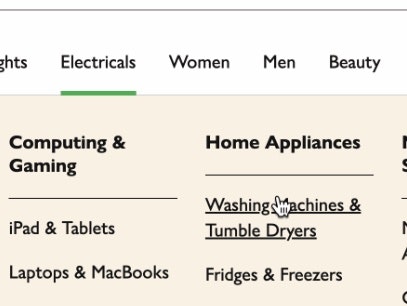
A prerequisite for both desktop and mobile implementations, however, is that the main navigation must be the first level of product categories (see The Main Navigation Should Display Product Categories — 18% Don’t); otherwise, the navigation item that will be highlighted for users is simply “Shop” or “Products”, which doesn’t help users determine where they are.
There are, however, a few things to be aware of when highlighting the current scope in the main navigation.


Even during some of our first testing, back in 2013, users struggled. Here some of the tested sites highlighted the current scope in the main navigation, but then failed to make the highlight unique, defeating the very purpose of the highlight. For example, if the “current scope” highlight clashes with other highlights of the same style (first image) or there’s simply too many other highlighted main menu elements (second image).
-
Make the scope highlight unique: At some sites that did highlight the current scope in the main navigation, it was pointless as the styling of the chosen parent page clashed with other types of navigation and page highlights. When multiple other navigation items also have a “highlighted” style, it will not be immediately and abundantly obvious to the user that one of the highlights indicates the current scope (especially for external traffic).
-
Link activation and redirection: Remember that even though the current scope in the main navigation should have a “selected” styling, it is very important that the link is not deactivated (if you have Premium access, see guideline #255 for more on when to deactivate links), but instead (most often) leads to an intermediary category page, as described in our article “Implement the First 1-2 Levels of the E-Commerce Hierarchy as Intermediary Category Pages”.
This article presents the research findings from just 1 of the 700+ UX guidelines in Baymard – get full access to learn how to create a “State of the Art” ecommerce user experience.