Over the past 2+ years we’ve conducted our most exhaustive study to date, exclusively focused on the mobile e-commerce experience.
It’s notable that, despite the 2,597 mobile UX issues encountered, most users across most sites were able to browse, explore, and add products to the cart while on their mobile devices.
This represents a change from when we first started tested mobile e-commerce UX in 2013, where most users ran into such egregious issues that they abandoned mobile shopping altogether, sometimes in favor of continuing on their desktop device.
Yet this isn’t to say that there were no significant issues encountered by users during this round of mobile testing.
In fact, quite the contrary: abandonments of products and mobile sites, due to UX performance issues, were observed to be a common occurrence — 63% of mobile users abandoned a product or site at least once during testing solely due to preventable mobile usability issues.
The Overarching Mobile E-Commerce UX Issues We Identified
In this article we’ll showcase a number of UX design examples and discuss 5 overarching issues of mobile UX identified during testing, in order of most-to-least severe.
These 5 issues are foundational to understanding the mobile user experience, particularly regarding how it differs from desktop, and highlight the unique challenges mobile users face when shopping online:
- A Lack of Page Overview
- A Sense of Disorientation
- Tech Issues and Quirks
- Inadvertent or Unregistered Taps or Selections
- External Interruptions
1) A Lack of Page Overview
“I’ll have a look at the reviews….Reviews….Has Amazon changed?…I’m looking for the reviews….Nope. For some reason I can’t find the reviews. Yeah I can’t see the reviews. Have I gone blind? Is it here?…Okay I can’t find the reviews…Either I’m blind or…the page is too long…”
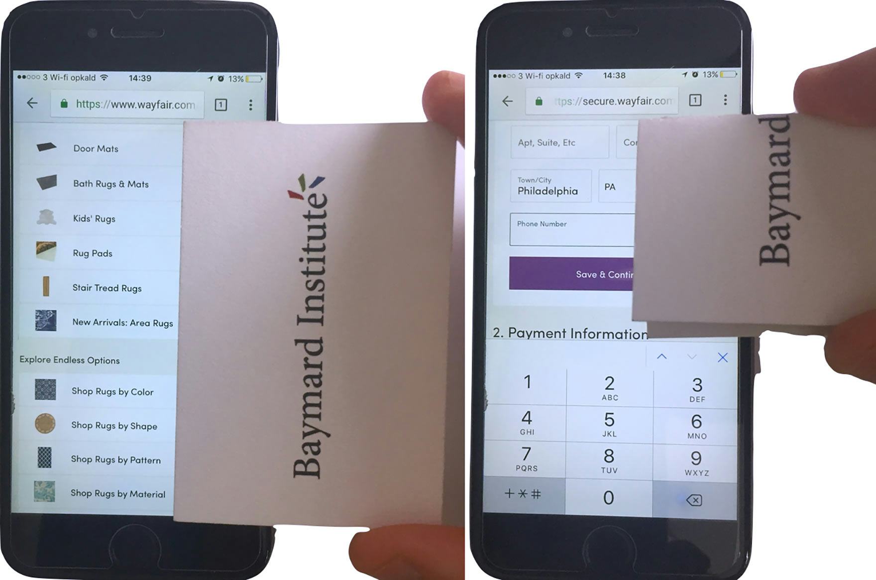
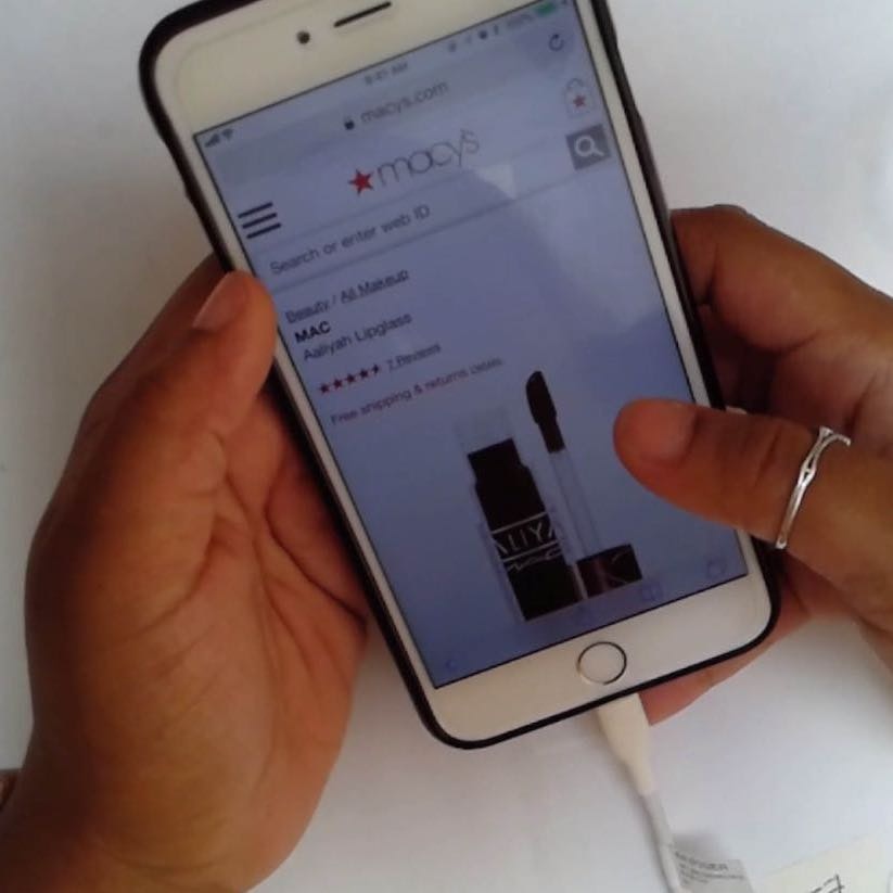
A fundamental challenge users face on mobile e-commerce sites is a lack of overview. In the first image, we see how users are essentially browsing mobile sites through a viewport that’s the size of a typical business card. In the second image we see the user’s view during checkout when the keyboard is open: the user’s view of the form is reduced by approximately 40%.
The most severe and most common issue users face when browsing mobile e-commerce sites is a lack of page overview.
During testing most of the users’ issues with finding, understanding, and interacting with page content stemmed from being unable to have a good sense of the page layout and interface as a whole.
On mobile users are forced to view a page in chunks — what they see is confined to what will fit within the mobile viewport.
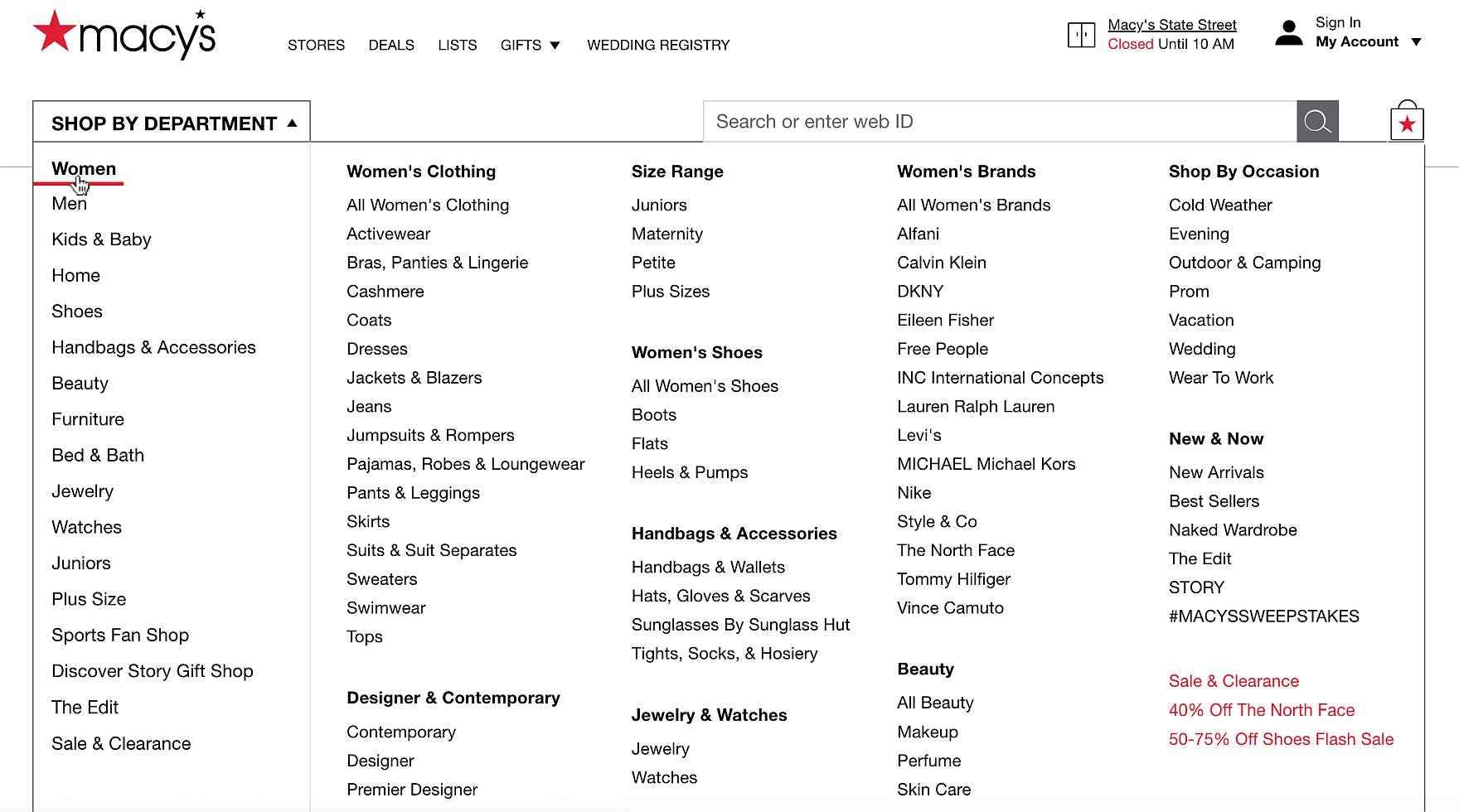
On desktop sites, it’s easier to get an overview of content compared to mobile sites, as seen here in Macy’s main navigation.
Take the main navigation as an example. On desktop, users can hover the main navigation menu and often see all the site’s parent categories and subcategories at once — hence it’s relatively easy for users to get a firm idea of the products sold and the site’s hierarchy.
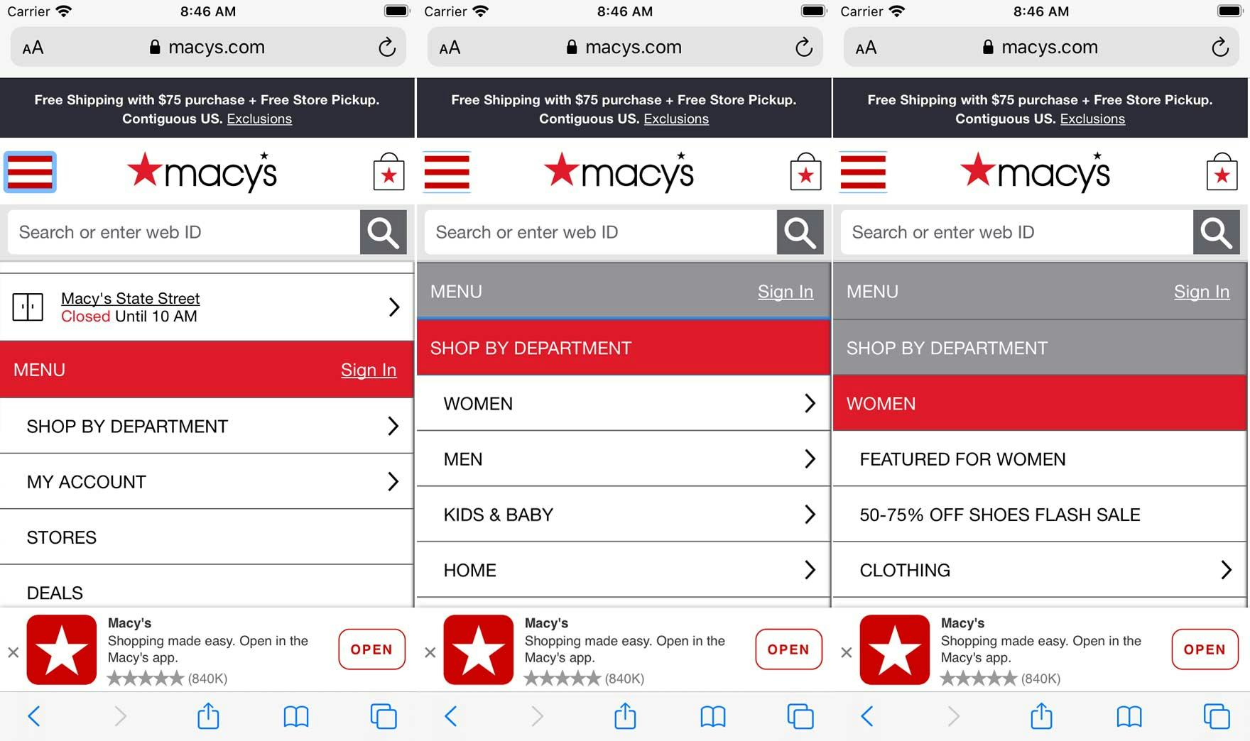
On mobile it’s much more challenging to establish and maintain an overview of content. Here, at Macy’s mobile site we see users’ first experience of the main menu navigation (first image), then “Shop by Department” (second image), then “Women” (third image). A mobile user has already tapped the interface three times, compared to a desktop user of Macy’s main nav, who hasn’t had to click at all (only hover to expand the navigation). And the mobile user still has far less information at hand compared to the desktop user.
In contrast, on mobile sites the main navigation must first be opened, then typically be scrolled, before users can see all of the categories. Then to see subcategories users must first select a main category; to see sub-subcategories, users must select a subcategory, and so on.
If users find themselves in too narrow a scope, they have to back out by physically tapping the interface or “Back” button on their device, typically multiple times; they can’t just rehover the main nav, as on desktop, to “start again”. And at no point in time will mobile users be able to view much more than 10–15 menu items within the same browser viewport — approximately 80% less than a desktop user.
The same goes for the homepage. On desktop users can often see the entire homepage in 2 or 3 viewports; on mobile the homepage can stretch well beyond 5, and often 10, viewports before users reach the footer. The same goes for filtering interfaces, checkout forms, search results, etc.
The issues caused by a lack of overview lead users to miss important information, select incorrect options, or draw conclusions that aren’t correct (e.g., a particular product isn’t available, when it’s simply out of view in a product list). During testing we observed many users abandoning a product or site because they couldn’t locate critical information.
A lack of overview is inherent in the mobile e-commerce experience. It impacts the homepage, main navigation, product listings, filtering lists, product pages, and especially the checkout flow (where moreover the touch keyboard takes almost half of the already-confined mobile screen — effectively cutting the mobile viewport in half).
As long as users are browsing on devices with comparatively small screens, they’ll continue to suffer from a lack of overview.
63% of test participants abandoned during their mobile browsing sessions, solely due to preventable usability issues…
That said, a general solution was observed during testing which can help to mitigate some of the issues caused by a lack of overview: Keep It Simple.
There’s always a tendency to add more features, more links, and highly interactive content to a site — all of which can benefit end users in certain circumstances.
Yet the primary goal of the site should never be forgotten — helping users find, explore, and purchase products — and it’s often observed in testing that this extra content, while perhaps well intentioned, harms users’ ability to maintain an overview of the current interface.
One may assume that, for example, having an extra promoted category in a product list is “no big deal”, or adding a sitewide free shipping ribbon won’t matter much, or having an “Install App” callout isn’t a “deal breaker”, but all of these can greatly harm users’ ability to get an overview of the mobile page — especially when the multiple additions are experienced at once — and consequently these issues are often observed to be a direct cause of mobile site abandonments.
In short, resist the urge to overcomplicate the mobile interface. Simple, clean designs were observed in testing to almost always support users better than complex designs that demand a lot of user attention.
Testing also revealed ways that sites with simpler overall designs can avoid being perceived as “boring”; for example, by using bespoke imagery, providing many high-quality images of products, offering rich user-generated content in the form of reviews and Q&As, and providing engaging videos, to name a few.
2) A Sense of Disorientation (Mobile UX Issues)
“Why are there only 3 other options here for footwear…when it seemed like there were more…I don’t see any way to get back to the main menu of ‘Women’s Shoes’. And the fact that there are these three other options [‘Athletic Shoes’, ‘Cleats & Spikes’, ‘Lifestyle Shoes’]…I’m confused. [Later] I don’t like this one [Under Armour’s website]. It’s hard to get back to…I guess it would be one menu level back, from what I’ve seen…yeah this site is kind of frustrating. I would be gone by now.”
A closely related issue to a lack of page overview is a sense of disorientation.
However, during testing, whereas a lack of overview was often observed to become an issue when users were on a page and couldn’t find content they were looking for, a sense of disorientation often occurred when users were navigating between pages or interfaces, or the site briefly took control of their navigation (e.g., with autoscroll).
Thus a sense of disorientation often occurs when users get lost while navigating a site, and typically has the consequence of users being unsure how to get back on track.
In general, there are three questions users typically ask when they’ve become disoriented:
- “Where am I?”
- “How did I get here?”
- “How I get to [x]?”
There are many issues that contribute to disorientation — for example, users misunderstanding their current scope, users being unsure how to navigate to a page or feature of interest, or the site navigational implementation misaligning with users’ perception of how the navigation should function.
Mitigating Mobile E-Commerce UX Issues
The keys to mitigating disorientation issues are
- always ensuring it’s clear to users where they are in the site hierarchy,
- ensuring any site-provided navigational features (e.g., “Back” links, autoscrolls) function as most users expect them to,
- ensuring any browser or device functions (e.g., “Back” buttons, page refreshes) produce the outcome that most users expect when initiated,
- making it easy to “step back” and get a broader scope when necessary, and
- avoiding tech bugs and quirks (see #3 below), which often contribute to disorientation.
During testing, when users became disoriented, a subset of users fell “down a rabbit hole”, unsure of where they were, how they got there, or how to get back on track.
Some of these users abandoned out of frustration, feeling they’d wasted enough time already at a site and were ready to move on elsewhere.
It’s thus key that the mobile e-commerce site is as intuitive as possible to navigate, and builds users’ navigational expectations into the navigational structure of the site.
3) Tech Issues and Quirks
“It’s just slow now. [Tapping fingers] I don’t know whether that is my internet connection or my phone or whether it’s the website. So, who do I direct my impatience to? At this stage I would normally go, ‘Okay’. I’d go ‘No’ and go out of the website and go on to something else…the website should be faster…it’s bad for me personally because I just don’t have the patience…if it was going on too long, I would just go on and search for them somewhere else.”
The quote above is one of 83 separate quotes from users during testing related to tech issues, layout bugs, laggy sites, and the like.
Tech issues have haunted the mobile user experience ever since our very first mobile study in 2013, and unlike what you may expect tech quirks remain a consistent and very real mobile UX issue today — and this despite the fact that we primarily test mobile sites in the billion-dollar class.
The fact that tech issues persist points to the fact that it’s likely not possible to develop and maintain an error- and quirk-free mobile e-commerce site.
As issues are unavoidable it’s then a matter of how these tech issues are planned for, both organizationally and technically, that matters in terms of both the frequency and severity of how users will experience them.
“I don’t know where the website went.” A user during testing, scrolling a product list at Sephora, was surprised when the page “disappeared”. Page content only reappeared after a 15-second wait.
While some degree of tech quirks are a “a fact of life” or inevitable on mobile e-commerce sites, they should not be underestimated, as we observed that users are seldom as forgiving as we “web professionals” hope they are.
In fact, tech quirks were a common abandonment reason for users during testing.
Furthermore, it’s noticeable from testing how users’ levels of frustration were much higher when encountering tech-related issues than when encountering any of the other broad usability issues discussed in this article.
It may be that, for example, not understanding a particular site’s hierarchy because of category taxonomy issues is frustrating, but users in general have a sense they’ll have to do some bit of learning with regards to how a particular site is structured — even if they have to learn to navigate around a site’s flaws.
Tech issues, however, can’t be “learned away” — users often have no control, which drives their frustration to points that are noticeably higher than at other friction points in the mobile e-commerce shopping experience.
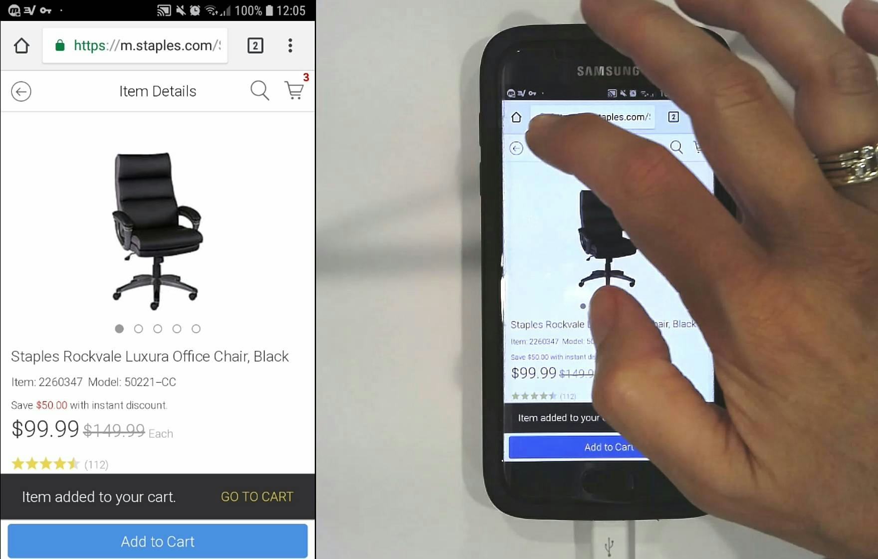
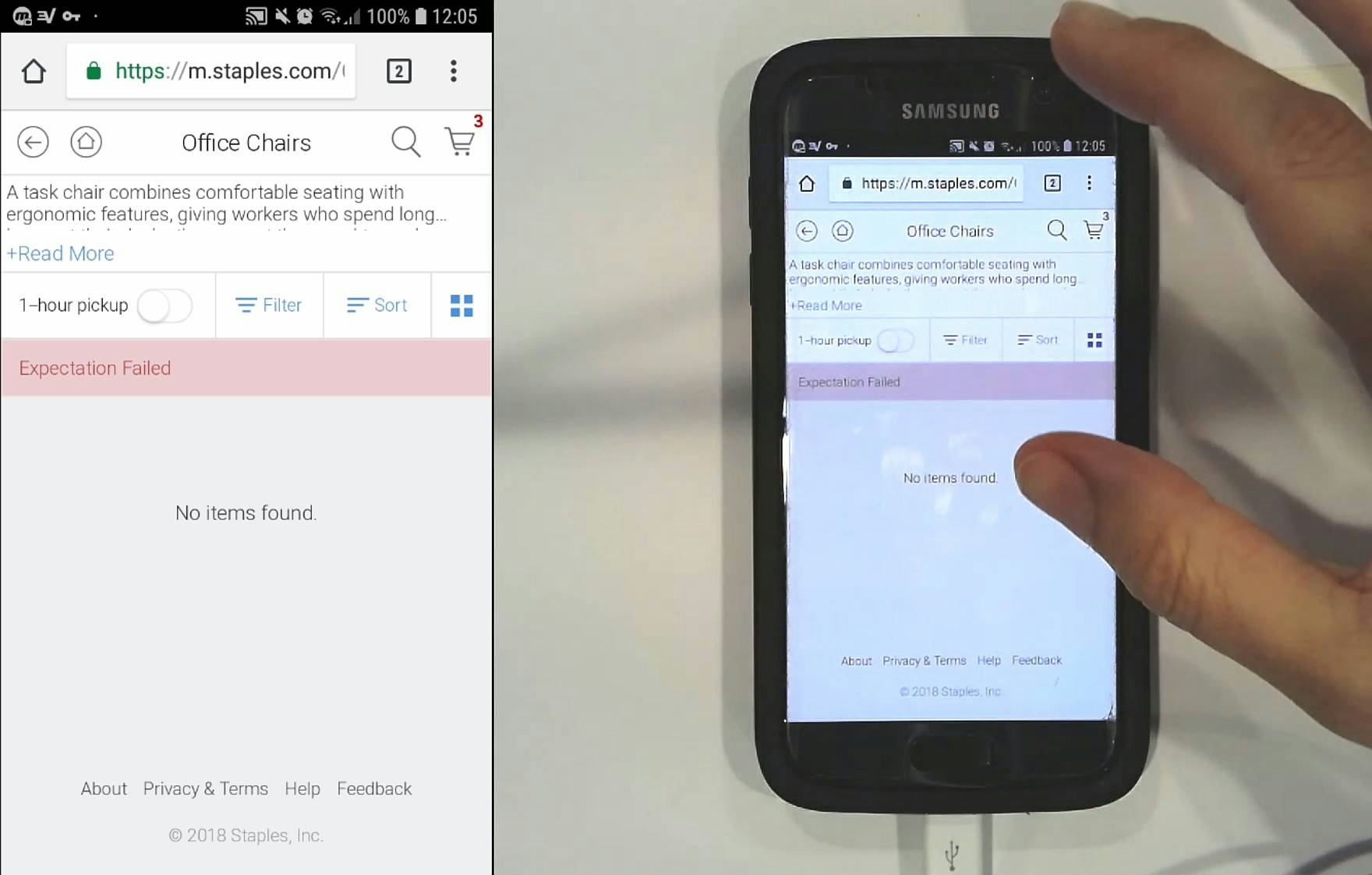
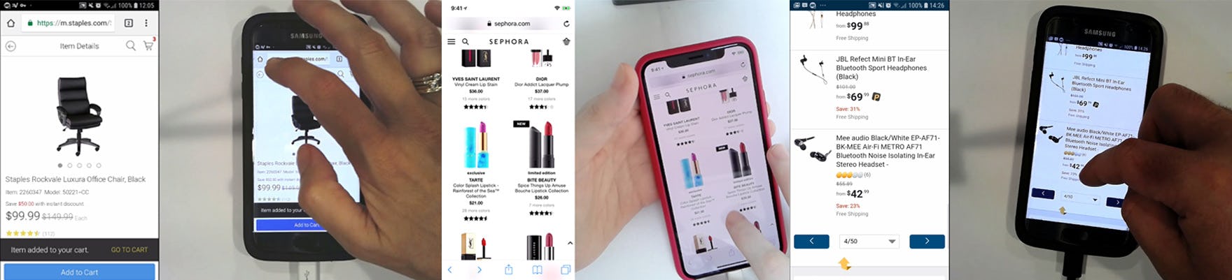
A user at Staples, after adding a product to the cart, tapped the site-provided “Back” button to return to the product list (first image). However she encountered a strange error (second image). She eventually reoriented herself by opening the main navigation.
Tech bugs are pervasive — all 15 of the sites tested, most of which are among the largest e-commerce sites that exist, had tech issues at one point or another — persistent, and a direct cause of abandonments.
It’s therefore worthwhile taking the issue seriously by investing in a UX process to continually investigate for tech issues and quirks (across a wide variety of user devices and contexts), allowing for graceful degradation so that a user’s experience isn’t broken simply because they’re using dated devices or technology, and helping users understand and recover from technical issues. See our related article How Layout Bugs Keep Haunting E-Commerce Sites – It’s Time to Fix This.
4) Inadvertent or Unregistered Taps or Selections
“Just by accident, it got clicked. I don’t know why.”
Mobile users are constantly physically interacting with site interfaces. For example,
- To select a link they have to tap it
- To scroll through a page they have to swipe their finger up multiple times
- To select text they have to tap and hold, then drag their finger
This is in contrast to desktop users, who don’t have to physically interact with the site interface at all. It’s noticeable in testing both desktop and mobile users how many inadvertent or unregistered taps or selections mobile users have, compared to desktop users.
In the vast majority of cases, an inadvertent or unregistered tap or selection is a minor annoyance for users. Users recognize something went wrong — often immediately — and are generally able to simply continue on with their product browsing.
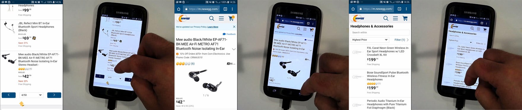
A user during testing at Newegg inadvertently tapped the last item on a product list page (first image). He then tapped back from the product details page to return to the product list (second image). However, he found himself at the top of the product list page, and had to scroll all the way to the bottom to return to where he was (third image).
However, more serious issues can occur when users are taken to an entirely new view as the result of an inadvertent tap or selection.
For example, a user in a product list who inadvertently taps a product list item and who winds up on a product details page. On some sites, users will simply tap “Back” and get back to where they were in the product list. However, on others users will tap “Back” and wind up at the top of the product list, far from where they were in the list previously.
These users must then scroll — sometimes for a minute or more — to refind their place in the list. All the while there’s a danger of again tapping a product list item unintentionally, winding up on a different product details page, and having to again repeat the process.
It’s clear how such an inefficient and frustrating back-and-forth can easily lead to users abandoning a site.
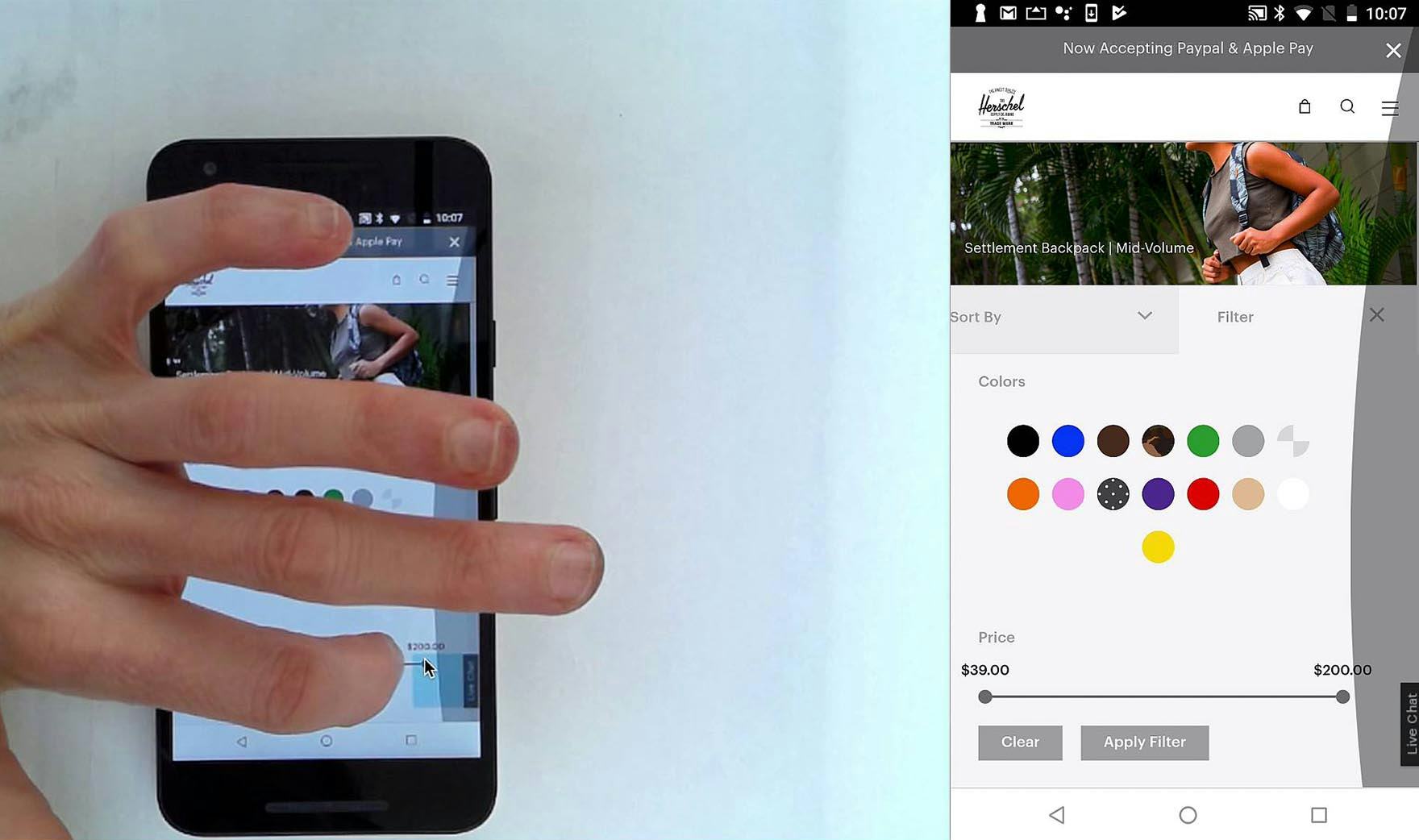
“It’s not working….Their site kind of sucks.” At Herschel, a user struggled to use the price slider to set a maximum price. The experience negatively affected her perception of the site. The hit area of the slider end-point circle is quite small at ~1.9mm x 1.9mm.
Then there’s the issue of unregistered taps or selections.
While, like inadvertent taps or selections, the vast majority of these instances are minor annoyances, these issues compound if a user experiences them within a short duration at a particular site.
Unregistered taps or selections are often caused by insufficient hit areas — an issue that was widely observed on all sites, even for such critical features such as the shopping cart or the main menu.
Like tech issues, inadvertent or unregistered taps or selections are likely going to always be part of the mobile e-commerce experience.
However, it’s not enough to simply excuse the issue as a “fat finger problem”. During testing, the fault of inadvertent or unregistered taps or selections almost always rested with the site; for example, by having too small hit areas or insufficient spacing between elements.
While users can be imprecise making selections, either intentionally or unintentionally, sites can greatly minimize the occurrence of these issues by adhering to appropriate sizing and spacing guidelines.
5) External Interruptions
“Oh shoot. Do you mind if I take this?”
Interruptions to the product-browsing experience are not exclusive to mobile e-commerce.
Indeed, your cat can jump on your keyboard while browsing a desktop site, or you can have a call relayed from your phone to your laptop computer, but those desktop interruptions are rare compared to what we observe on mobile.

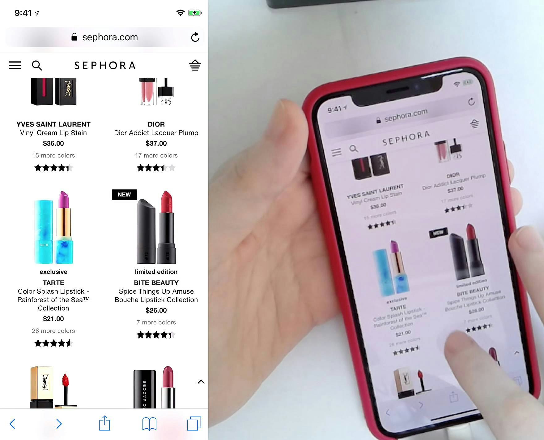
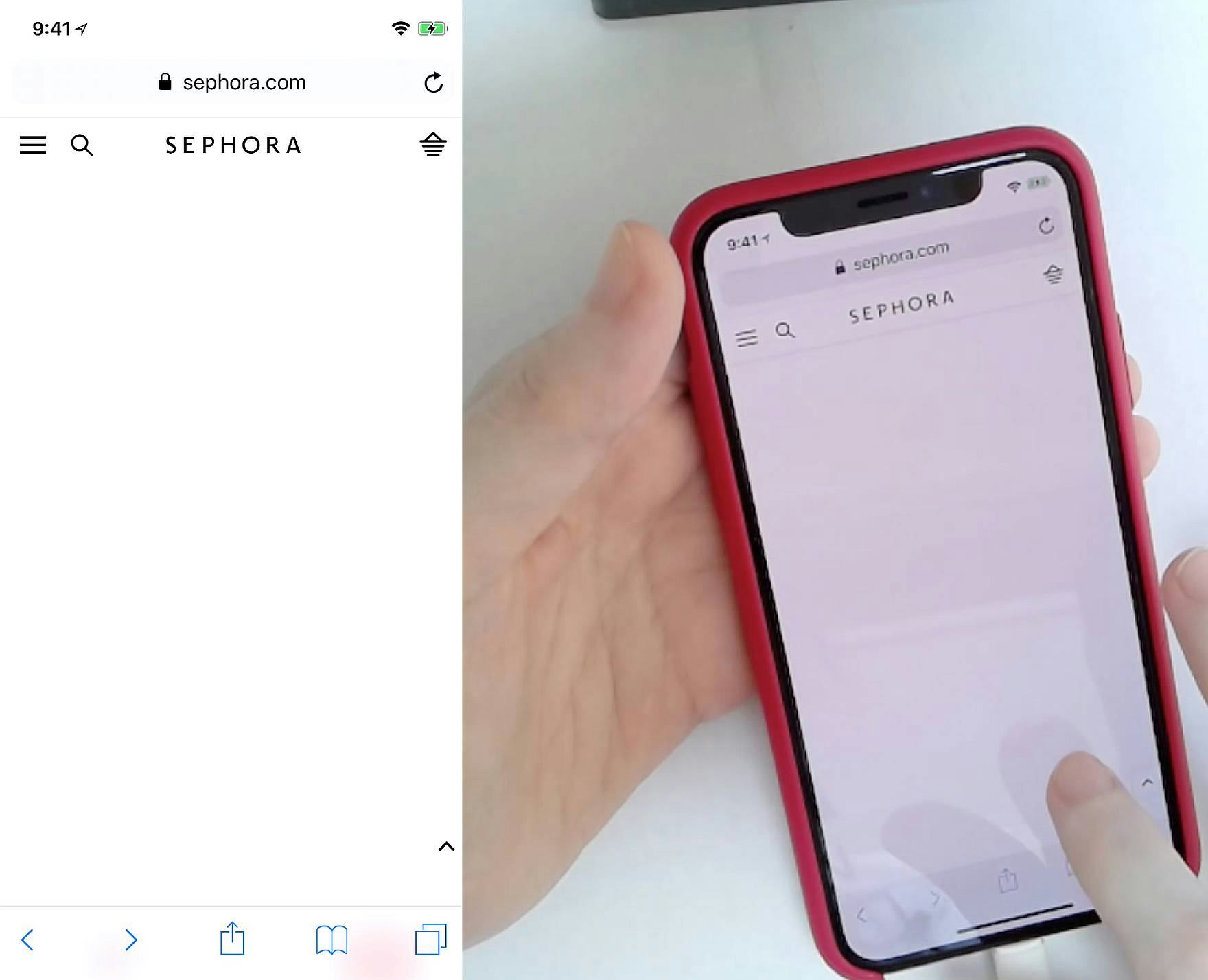
Interruptions are quite common to the mobile e-commerce browsing experience, whether phone calls (first image), email notifications (second and third images), other app notifications, etc. Note how in the second image the notification obscures part of the product image the user was viewing, while in the third image the notification obscures the entire browser header. Some users will simply be briefly interrupted if the notification disappears, while others will have to interact with the notification to remove it if their settings have the notifications persist. Still other users may decide the notification is more important than the shopping they’re doing — and thus it becomes an abandonment point.
Many desktop users can avoid interruptions if they want to — at least interruptions stemming from the computer itself.
Mobile devices, however, are designed to act as a notification aggregator and for most users function as their primary phone and texting device, their social media presence, and their news, work, alert, or gaming device.
Phone calls and texts are disruptive, as they often take precedence over whatever the user is currently working on. (This was true during testing as well, when the user who’s the source of the quote beginning this section took a phone call during the test session.)
On average, users during testing were interrupted once every 20 minutes by a phone call, text message, or other notification.
However, some users had many more interruptions, with the max during testing being an interruption every 4.5 minutes.
Therefore the number of interruptions your users will experience is highly dependent on your target audience.
Sites can’t control how many interruptions mobile users get, or how mobile users choose to respond to the interruption. It’s simply a fact of the mobile e-commerce experience that many users will be interrupted at some point while product browsing.
But it’s important to have this context in mind when designing the mobile e-commerce experience, as there are some strategies that can be employed to assist users who have been interrupted.
For example, by
- ensuring that there are no data persistence issues when users are working in forms,
- providing easy ways to save desired items (e.g., with an easy-to-use “Favorites” feature),
- ensuring the cart is robust and can serve as a temporary storage tool (so users who get distracted can return to the cart “homebase” later and pick up where they left off), and by
- ensuring all pages have structures and clues that makes it easier for users to resume where they left off, and to reorient themselves (e.g., through headers, form field context, product page breadcrumbs, checkout process steps, etc.)
The above general principles are key to avoiding unnecessary lost sales.
(To stay current on mobile UX best practices, consider taking specialized UX design courses and exploring our UX certification which includes modules on mobile UX for e-commerce.)
Mobile Is Popular among Users, but Impossibly Challenging to “Get Right” for Sites
“I probably wouldn’t buy anything from the mobile experience. For something like a backpack, I’d need more information…and I just don’t feel like I’m capable of getting that from here. Cause it seems to just be fed to me on a one-by-one basis, and if I want to look at a second backpack, this is almost impossible to keep all in my head. I might buy like more visual things, but probably not a backpack on my phone.”
The quote above, from a test participant exploring backpacks on Herschel, is illustrative of the general challenges mobile sites face when it comes to ensuring a high-performing user experience.
Mobile testing revealed how most if not all mobile users will struggle with issues that they don’t face to the same degree when browsing desktop sites.
Yet the trend toward mobile e-commerce continues apace — for most e-commerce sites, more than half of their traffic is on mobile, and some verticals have almost exclusively mobile traffic.
Despite the often very difficult mobile-browsing experience, users are continuing to migrate more of their e-commerce activity to their mobile devices.
It’s therefore critical to understand the 5 overarching issues mobile users will face when browsing e-commerce websites:
- A Lack of Page Overview
- A Sense of Disorientation
- Tech Issues and Quirks
- Inadvertent or Unregistered Taps or Selections
- External Interruptions
Understanding the general challenges mobile users face is the first step to designing interfaces that mitigate or avoid these issues.
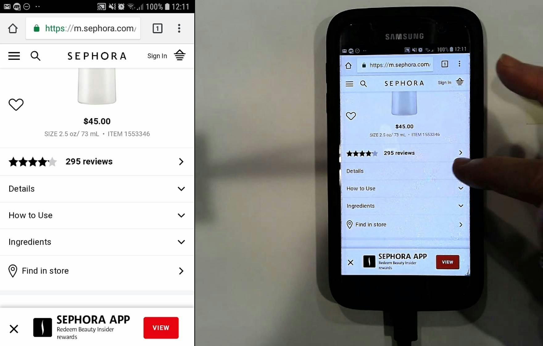
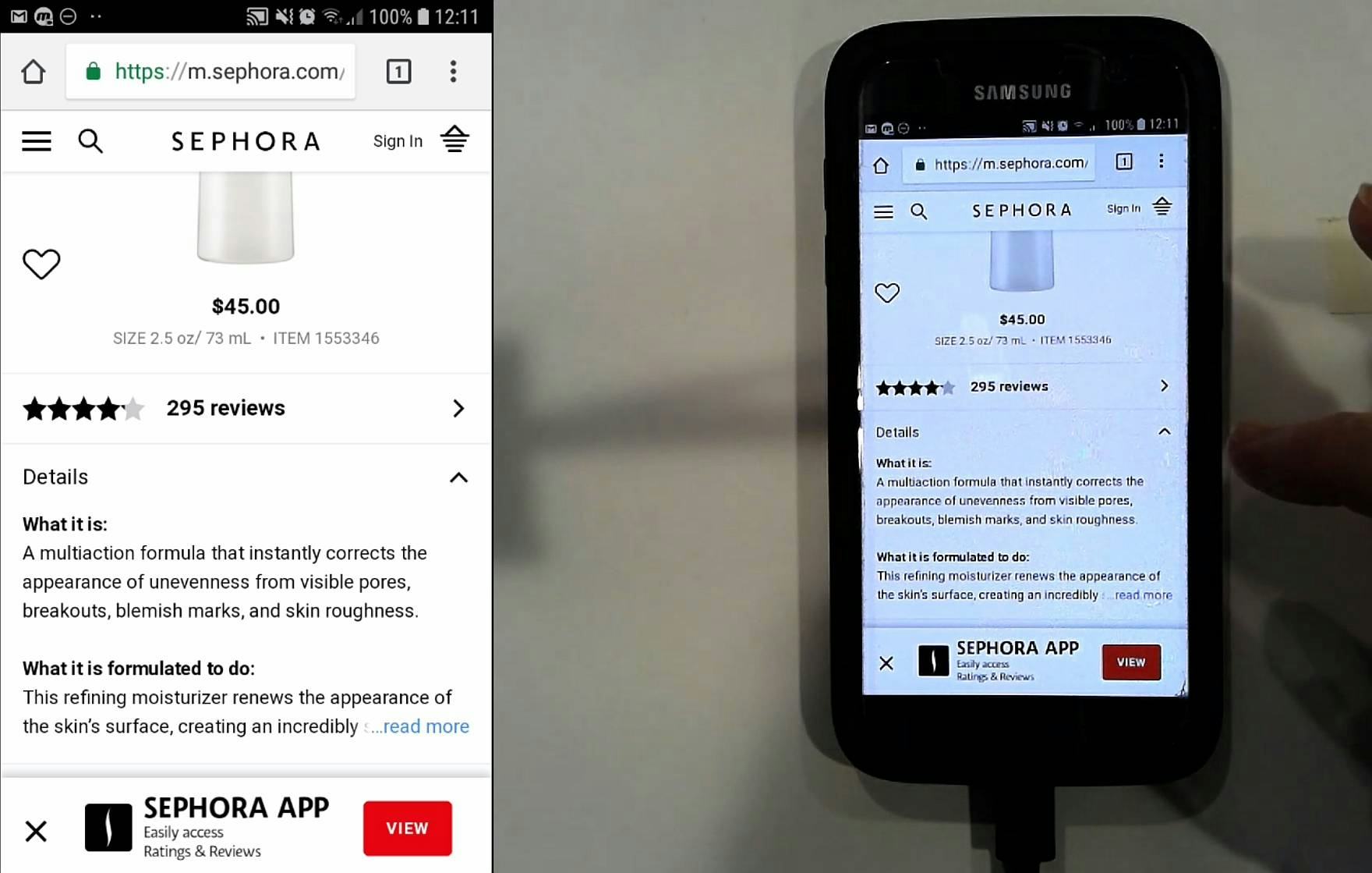
“This is easy enough to navigate.” A user at Sephora had no trouble accessing the product details for a moisturizer. Thoughtfully designed mobile e-commerce sites can perform very well for end users.
Indeed, many users during testing also had relatively smooth experiences: they were able to find products of interest, investigate and compare them, and make purchase decisions with relative efficiency.
As more and more e-commerce activity takes place in the mobile context, it’s important that the mobile user’s experience is high performing from arrival on the site through successfully placing an order. Implementing the recommendations provided in the 348 mobile UX guidelines in our mobile research is key to ensuring a high-performing mobile user experience.
This article presents the research findings from just 1 of the 700+ UX guidelines in Baymard – get full access to learn how to create a “State of the Art” ecommerce user experience.