Key Takeaways
- Where a tour or experience departs from is key information for most users
- Yet many sites provide only textual descriptions, which testing revealed is insufficient
- Providing a map of the location was observed to be vastly easier for users and reduced booking friction
Nearly all users shopping for guided tours and experiences at some point or another want to understand the location of the particular tour or experience under consideration.
Indeed, a significant concern for users considering a guided tour or experience to book — especially in an area they are unfamiliar with — is “Where do we meet?”.
Yet, many sites during Baymard’s large-scale testing of Travel Tours and Experience Booking sites made it difficult for participants to understand this basic information — with participants dropping tours and sites from consideration as a result.
In this article we’ll discuss our latest Premium research findings for our Travel Tours and Experiences Booking research study:
- Why a textual description of the meeting place is not enough
- How a route map can quickly answer most users’ questions regarding a departure point
- 2 key implementation details when providing route maps for tours and experiences
Why a Textual Description of the Meeting Place Is Not Enough
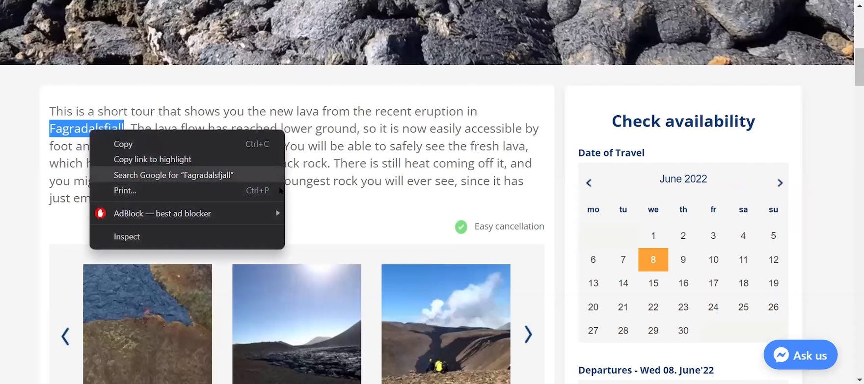
”I don’t think the average person’s going to be able to pick out which volcano in Iceland they’re going to. So they’re going to have to Google this separately, which I can do, but it seems like an unnecessary step.” A participant at Gray Line Iceland was annoyed by the lack of information about the meeting point for the “Fagradalsfjall Volcano Lava Tour”, prompting him to conduct a Google search.
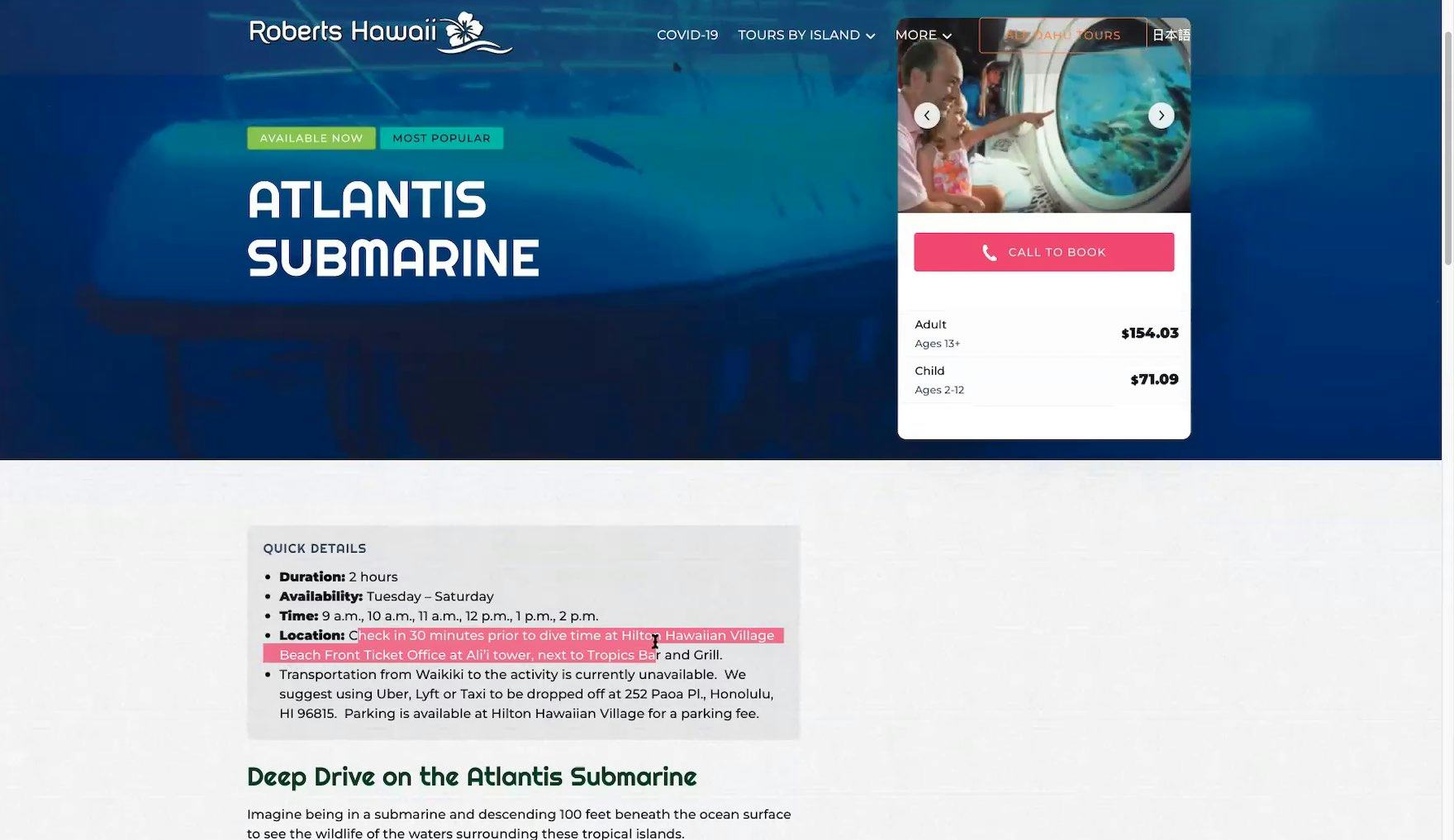
”Tells you where it is. So then I would have to look to see where it’s at and how long it would take to get there from wherever we’re staying”, explained a participant the “Tour Details” page for the “Atlantis Submarine” tour at Roberts Hawaii. During testing, participants frequently wanted to know where the tour or experience was located in context to where they were staying.
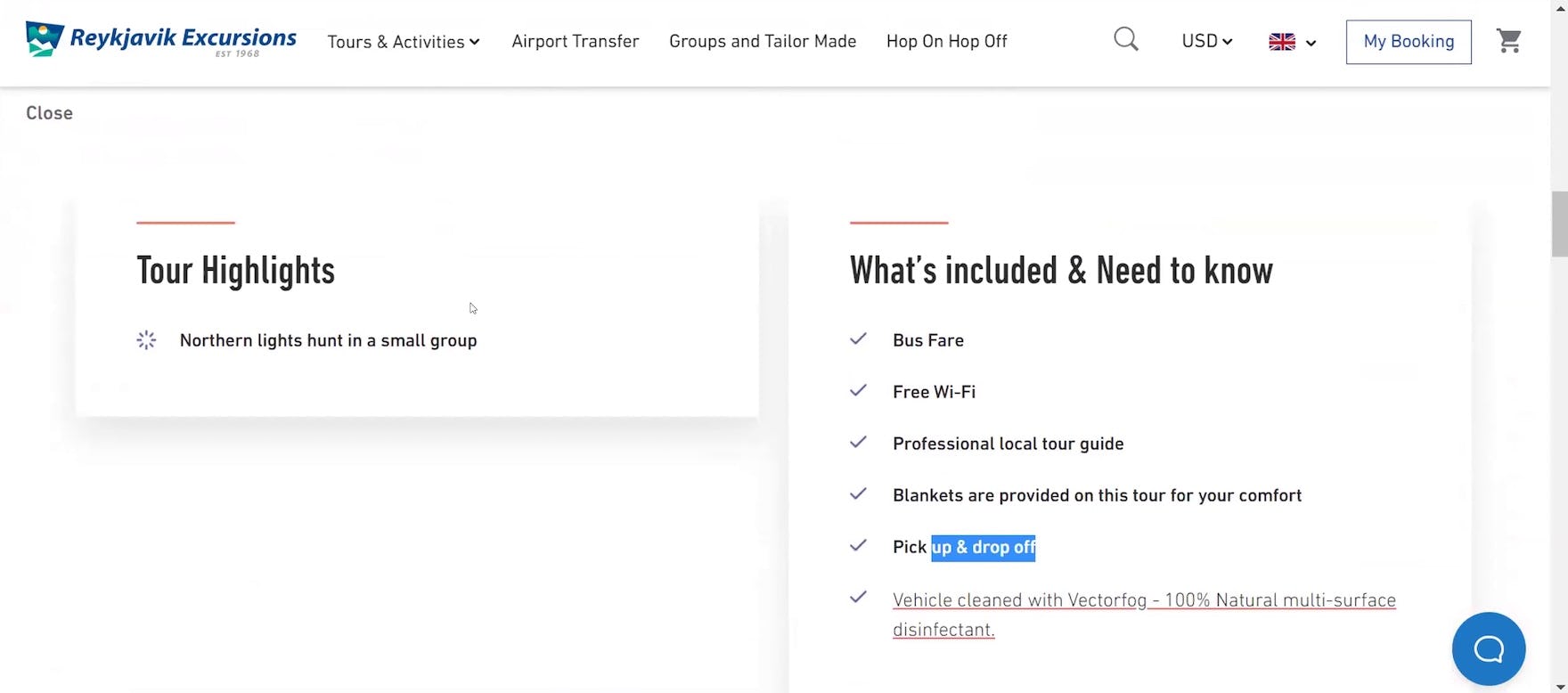
”I assume I’m going somewhere north from Reykjavík — like an hour or so — but I’d like to know where I’m actually going. I’m not crazy about a three-hour tour if two-and-a-half hours of it is going to be in the bus”, complained a participant considering booking the “Northern Lights Small-Group Tour” at Reykjavík Excursions.
During testing, it was observed that, without sufficient visual information about the tour departure or meeting point, a subgroup of users will lack the details they need to make a purchase decision.
These users will search in vain for a visual indication of where the tour departs from, growing increasingly frustrated, with some eventually choosing to give up and leave the site.
Another subgroup will spend additional time pasting the textual description into a Google search — which of course risks that, once they’re off-site, they won’t return, or will be enticed to view a competing tour.
After all, users’ booking decisions are heavily influenced by details like how far the tour or experience is from where they plan to stay and how they will get there — for example, if it can be reached via public transportation or if parking is available.
As observed during testing, some users will be unwilling to book a tour or experience if getting there requires too much time and effort; as one participant said during testing, “I would not want to have to go to some wacky place. I want to be able to get to the place easily!”
Furthermore, users’ concerns regarding the tour location will not necessarily be eased when a tour or experience includes pickup.
On the contrary, when pickup is offered, users need to understand where they will be picked up — whether at their hotel or a designated shuttle stop — and the meeting point for the tour itself.
As observed during testing, a subgroup of users will find it challenging to understand the distance and, therefore, the amount of time it will take to reach the meeting point for the tour without visual assistance.
Additionally, users will often be interested in what other attractions or amenities are available nearby.
For example, during testing, participants frequently planned to incorporate dining at a nearby restaurant before or after the guided tour or experience under consideration.
Meanwhile, a few participants wanted to build an itinerary for the entire day around that particular tour or experience; as one participant said, “Where am I meeting? Because especially if this is a short tour and I want to plan my day around this, you know, I might want to say like, all right, ‘Well what are the things in the area?’ so that way I can plan.”
Crucially, during testing it was observed that textual descriptions of the departure points for tours was not enough.
While many of the test participants were frequent travelers, the vast majority of them were considering tours for an area they’d never been to, or had only a vague idea of.
Therefore, a description such as “Meet outside Barbican Tube” won’t mean much to them by itself.
How a Route Map Can Quickly Answer Most Users’ Questions Regarding a Departure Point
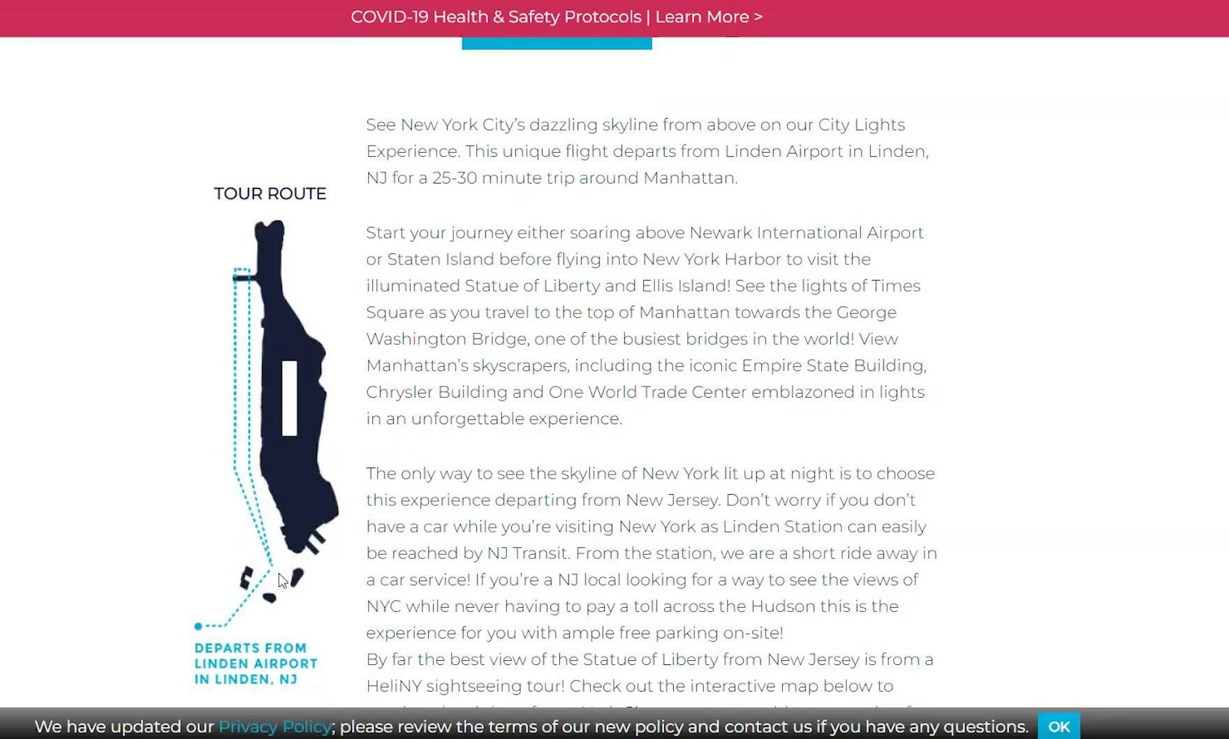
”‘Departs from Linden Airport’. So this is pretty clear where you leave from. I’m leaning towards this one because of the location it goes out of. It’s convenient.” A participant shopping for helicopter sightseeing tours at HeliNY appreciated the thumbnail route map confirming the departure point for the “City Lights Experience” tour.
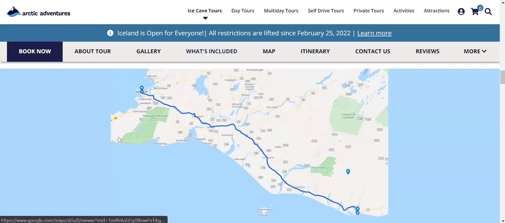
”Here, they actually tell you where you’re going specifically. So, I like that very much”, remarked a participant shopping for guided tours in Iceland at Arctic Adventures. He was able to use the Google map on the “Tour Details” page indicating the pickup and meeting points for the “Katla Ice Cave: Under the Volcano” tour to visualize the distance from the pickup location in Reykjavík to the tour meeting point in Vík two-and-a-half hours away on the southern coast, and felt confident to book the tour.
To prevent needless friction, always have a map identifying the departure or meeting point visible on the “Tour Details” page.
In practice, a map makes it easier for users unfamiliar with the area to visualize the departure or meeting point location generally and in context to other potential points of interest.
Indeed, during testing, sites that offered a map in conjunction with the textual description of the departure or meeting point for the tour helped to dispel participants’ uncertainty about where they would need to go to join the tour and thus helped to enable them to make a confident booking decision.
In practice, the absence of a map indicating the departure or meeting point for the tour implants a negative perception of the site — and the tour company itself — at a critical point in the evaluation process, risking uncertainty and frustration, and thus an increased likelihood of abandonment.
Moreover, participants during testing were generally satisfied with any map (e.g., a customized map or an embedded Google (or another service) map), as long as it was easily visible on the “Tour Details” page and gave enough of an indication of the geography to allow users to visualize the points of interest.
2 Key Implementation Details When Providing Route Maps for Tours and Experiences
Additionally, testing revealed 2 important implementation details with regards to having a map on the “Tour Details” page indicating the departure or meeting point.
1) Ensure the Map Is Easy to Find on the “Tour Details” Page
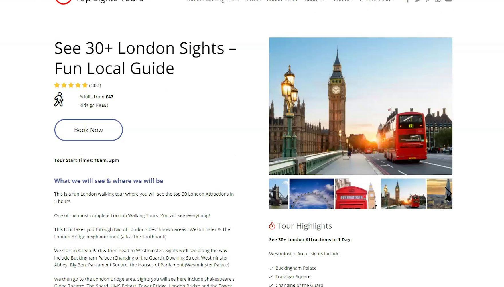
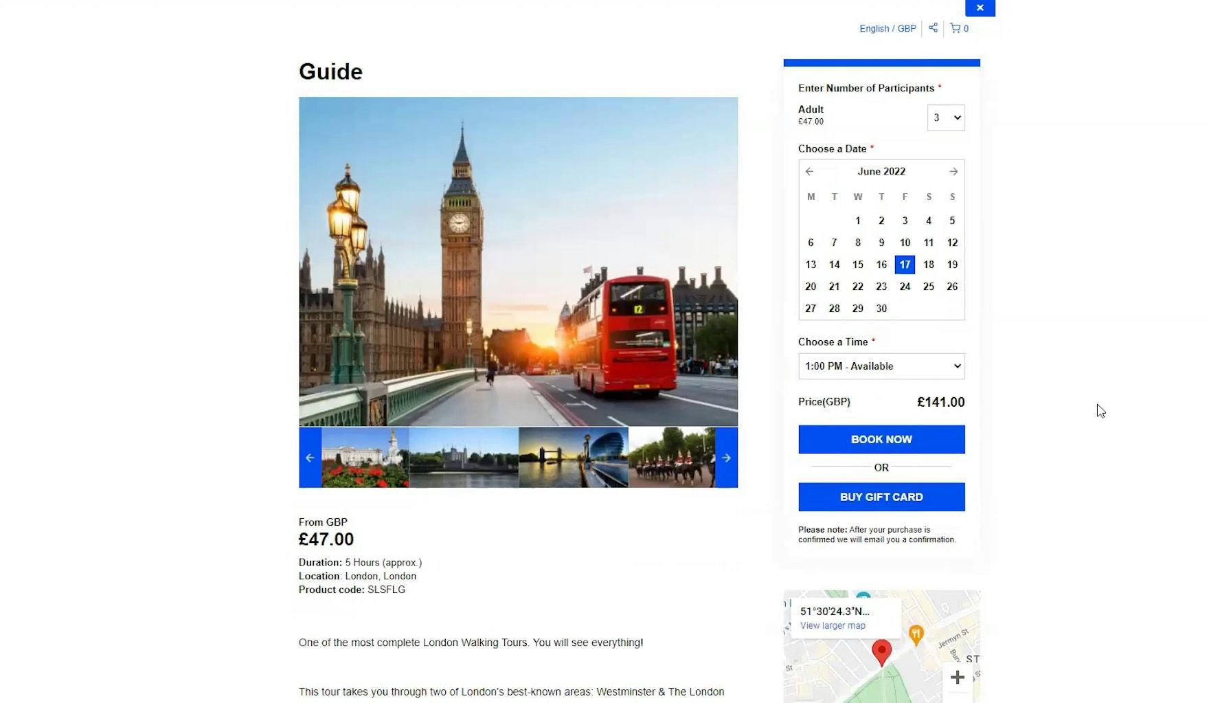
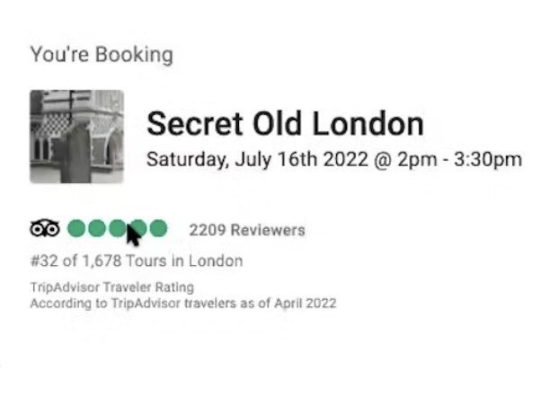
”It would be nice, again — I’m a visual person, I guess — to have a map of where we’re going…There might be a map buried in here somewhere. It’s just not super obvious. Probably like the very last picture or something like that”, laughed a participant clicking through the image carousel on a “Tour Details” page at London Top Sights Tours (first image). She later overlooked the meeting place map thumbnail, which was only available in the “Booking” overlay (second image), displayed after she’d clicked the “Book Now” button on the “Tour Details” page.
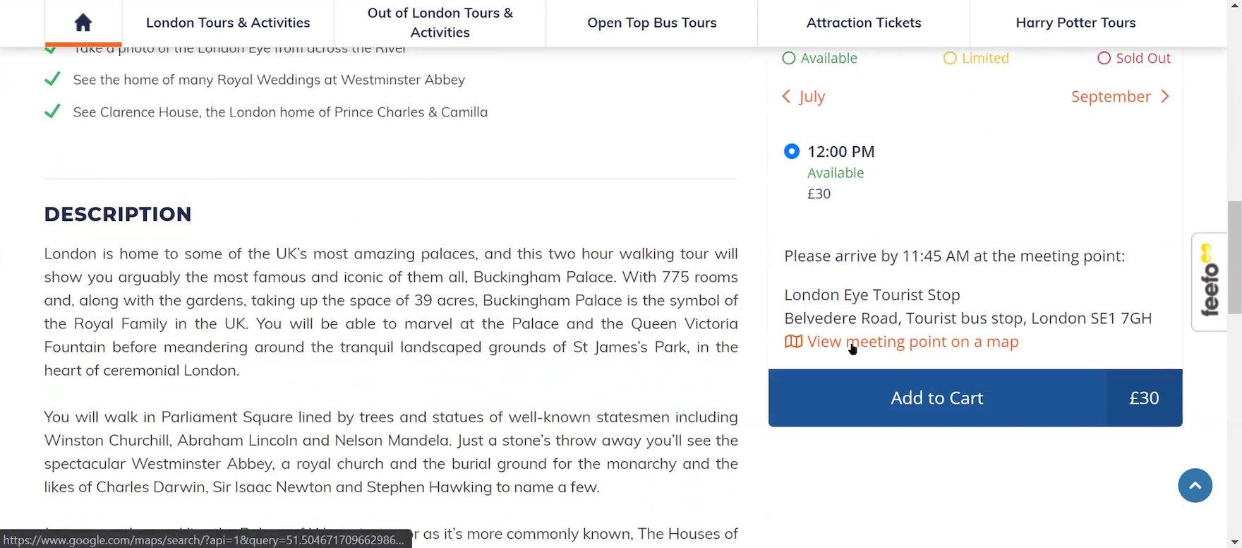
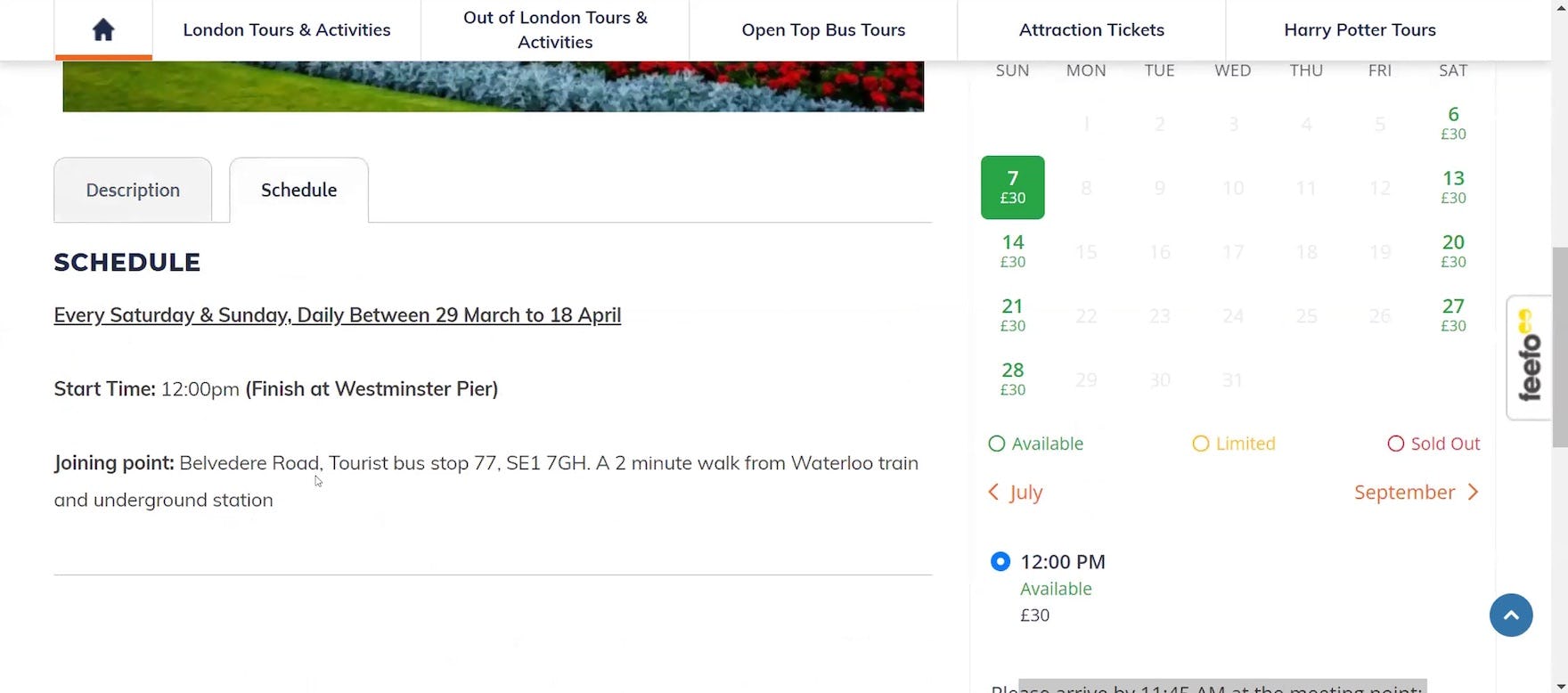
”Oh — ‘View meeting point on a map’. So I see that here. So, it is available. So, it seems like this information, this ‘view meeting point’ could have been on the ‘Schedule’ [tab], right here at this ‘Joining Point’. Glad I ran into it”, complained a participant at Golden Tours, annoyed that the meeting point map link for the “London’s Royal Palaces & Parliament” walking tour only appeared after he’d selected the guest count, date, and time (first image), instead of displaying near the textual description of the joining point directly on the “Schedule” tab (second image).
As observed during testing, the “Tour Details” page is the key area where users evaluate a tour and search for the information they need to make a booking decision.
Thus, when a map is unavailable on the “Tour Details” page or is located elsewhere on the site, users have to leave the page to hunt it down — which can result in frustration and abandonment.
Meanwhile, a subgroup of users will either overlook the existence of a map or not bother to take the time to seek it out.
However, 67% of test sites failed to either provide a map indicating the tour departure or meeting point on the “Tour Details” page or made the map overly difficult to find.
Consequently, participants frequently had to rely on only a textual description of the location and were thus unable to visualize where they would need to go to join the tour.
For example, two test sites delayed access to the map until participants entered the booking process by clicking the “Book” button, or interacted with the booking module embedded on the “Tour Details” page.
In practice, concealing the map this way denies users access to it when they’re likely to desire it most and risks users who have turned their focus to the booking process overlooking it altogether.
Note: an exception could be sites that offer only one tour (a type of site not included in testing) — for these tour operators, displaying the map along with other tour details directly on the homepage or on a dedicated “About Us” page would most likely be sufficient for users.
2) Indicate the End Point When Different
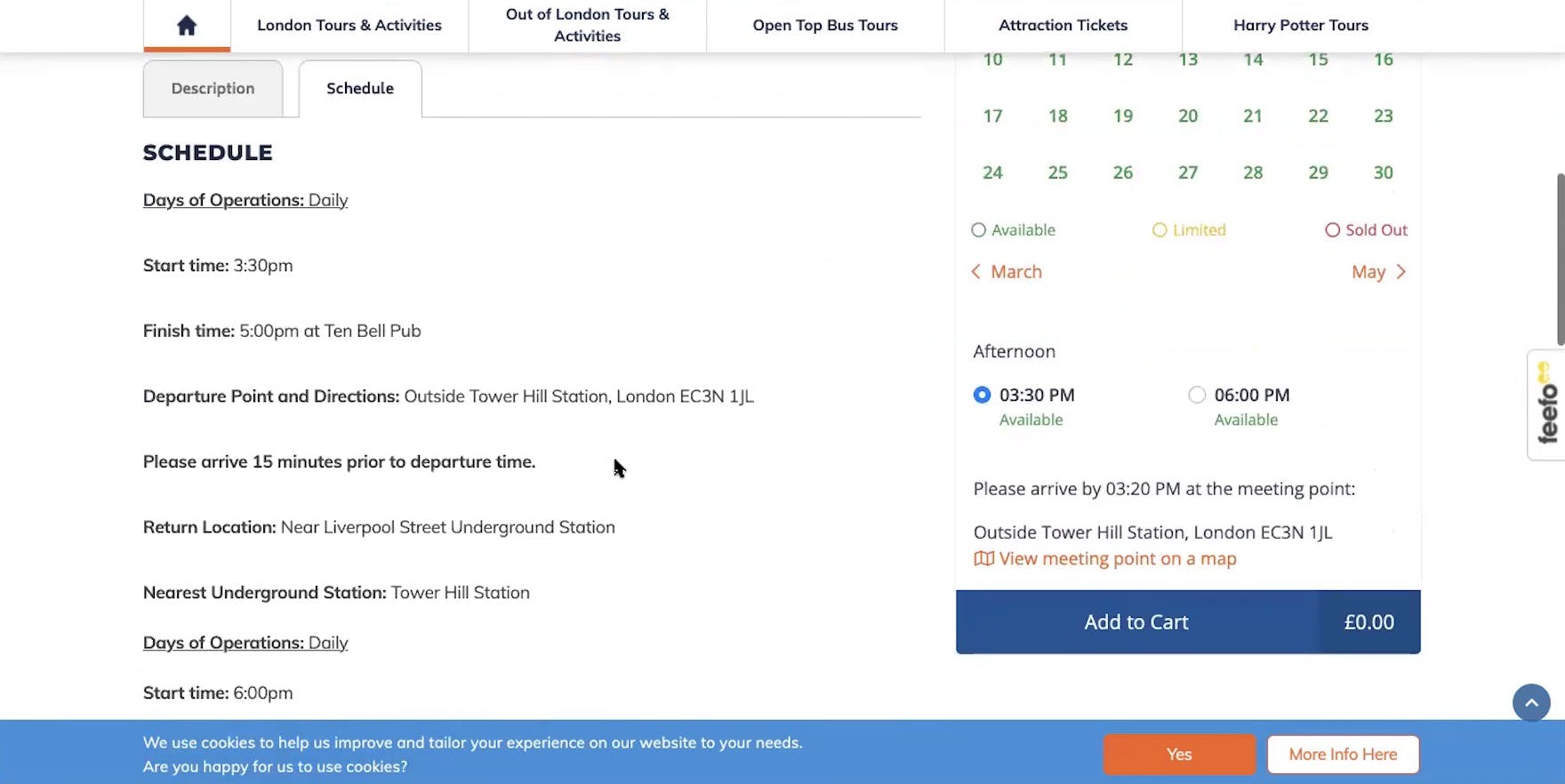
Although Golden Tours provided a textual description of the departure and return points for the “Jack the Ripper Walking Tour” on the ‘Schedule’ tab (first image), when this participant viewed the map, it only identified the departure location (second image). Excluding the end point when different means users will have to search for it manually, not to mention risking a subgroup of users overlooking this detail entirely.

This map on the “Tour Details” page for a guided walking tour of Berlin at New Europe Tours (not included in testing) indicates both the departure and end points for the tour. Including the end point when it differs increases users’ awareness that the tour concludes in a different location and saves them the time and effort required to search for it manually.
Finally, it’s worth noting that not all guided tours and experiences end in the same location from which they depart.
However, as observed throughout testing, users have a propensity for planning additional activities directly before or after a guided tour or experience; as one participant said during testing, “Now that I’m seeing lunch is not included, just knowing where we would stop [would be good], so that I could already have something in mind for where I’d want to go right after, since it would be lunchtime by the time we finished”.
Therefore, to ease users’ efforts, sites should ensure the map indicates the end point in addition to the departure or meeting point for guided tours and experiences that begin in one location and conclude in another.
Provide Users with the Visual Location Information They Need When Considering Tour Bookings
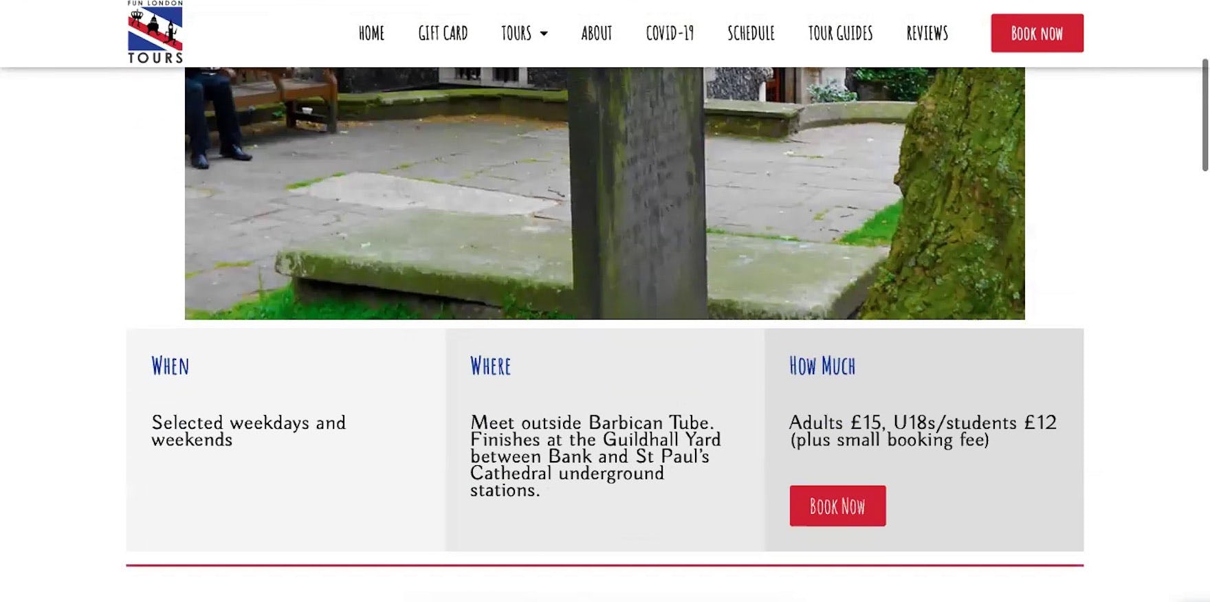
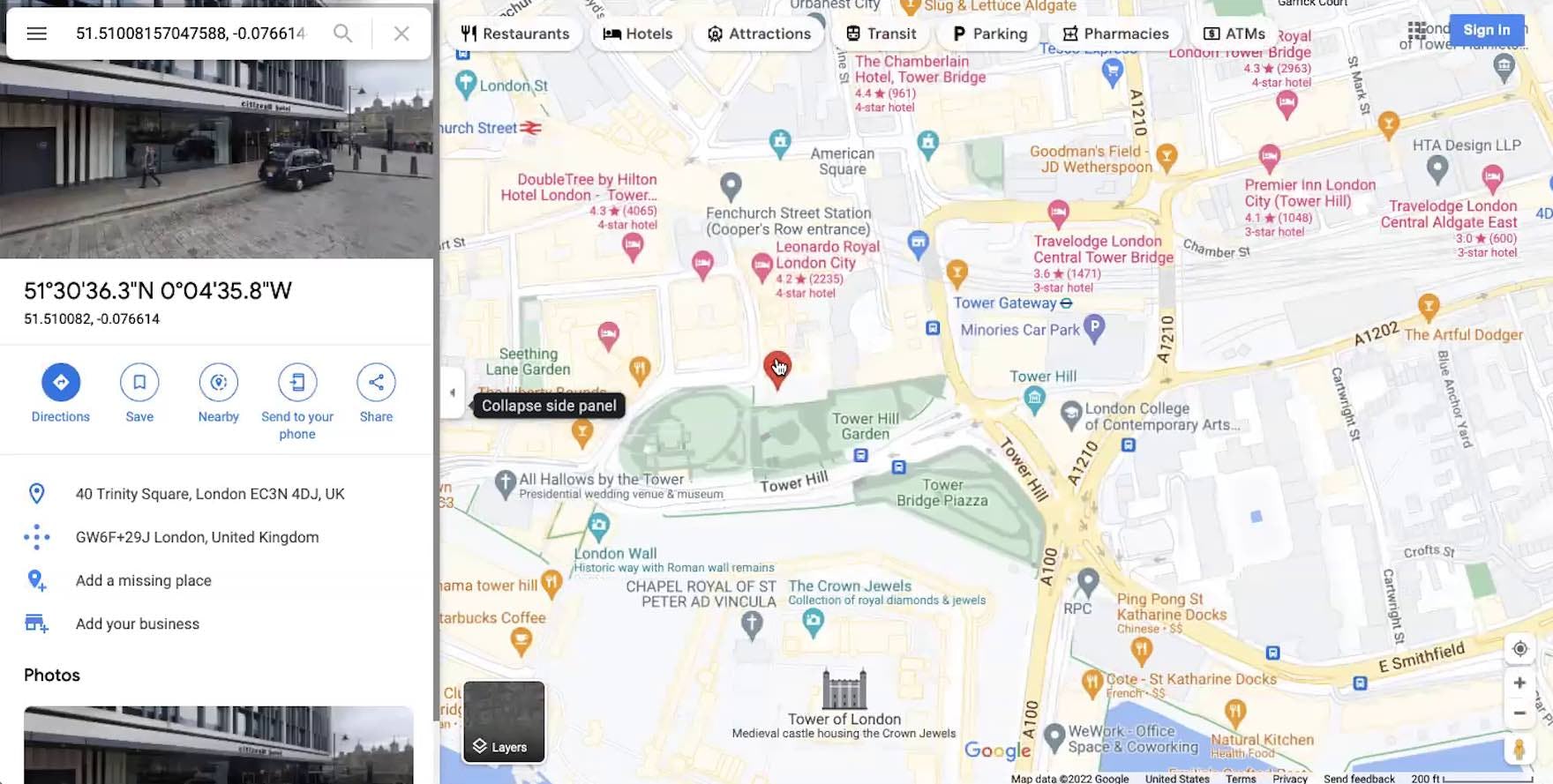
”As someone who’s never been to London and I’m not really familiar at all with the layout, when it says that they ‘meet at this place’ and they ‘finish at this place’, I don’t have any point of reference for that.” A participant shopping for guided walking tours at Fun London Tours was dissatisfied with the textual description of where to go to join the “Secret Old London Walking Tour”.
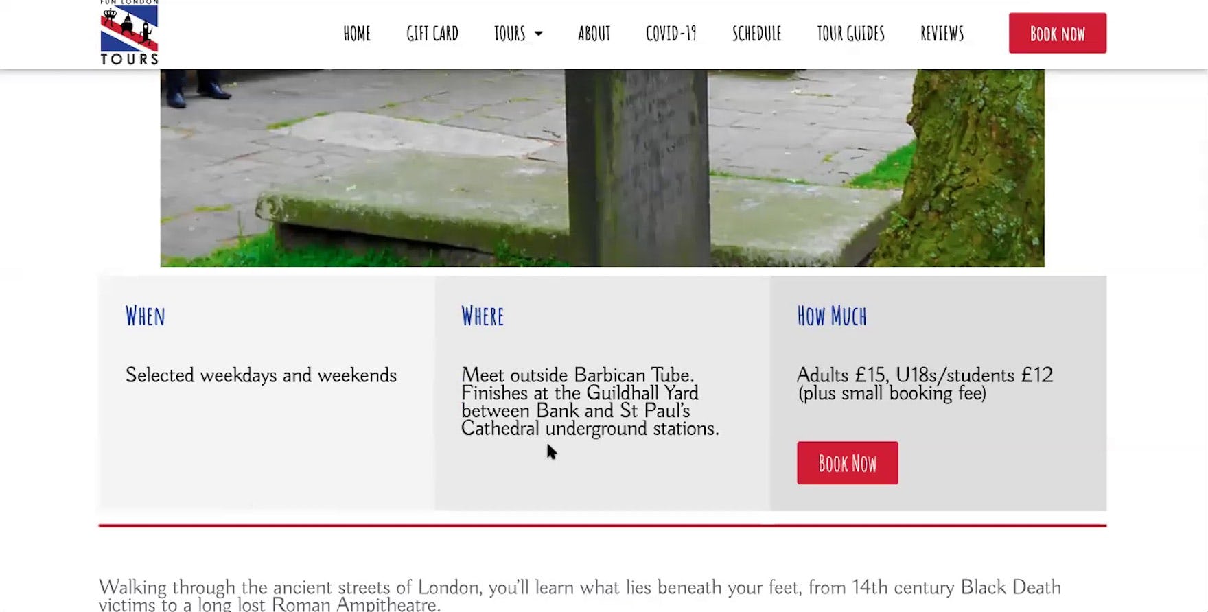
”’Meet outside’ — I always wonder, is this image where I’m supposed to meet?” asked another participant, considering the same guided walking tour at Fun London Tours. When the departure or meeting point for a tour or experience is unclear, some users will feel compelled to venture off-site to search for the information, increasing the risk of abandonment. Meanwhile, others will simply drop it from consideration.
Tours and experience bookings sites — especially if catering to nonlocal customers — should keep in mind that many of their users will have little familiarity with the geographic location of the offered tours.
Yet our testing revealed that many of these sites only offer text descriptions of tour starting and end points — leaving participants during testing puzzling over where the tour would actually take place.
While perhaps seemingly a minor detail, testing also revealed that for some users this is critical knowledge, as they consider if a tour is “worth it” to book, or are trying to plan the rest of their day around a tour.
Moreover, with the abundance of mapping applications available (e.g., Google maps), and the finding from testing that users don’t need bespoke maps, providing a map should be a straightforward implementation for most sites.
Therefore, it’s key to provide a map indicating the departure point of the tour (and the end point if it’s different).
Getting access: all 280+ Travel Tours and Experience Booking UX guidelines are available today via Baymard Premium access. (If you already have an account open the Travel Tours & Experience Booking study.) If you want to know how your Travel or Booking website performs and compares, then learn more about getting Baymard to conduct a Travel Tours & Experience Booking UX Audit of your site.