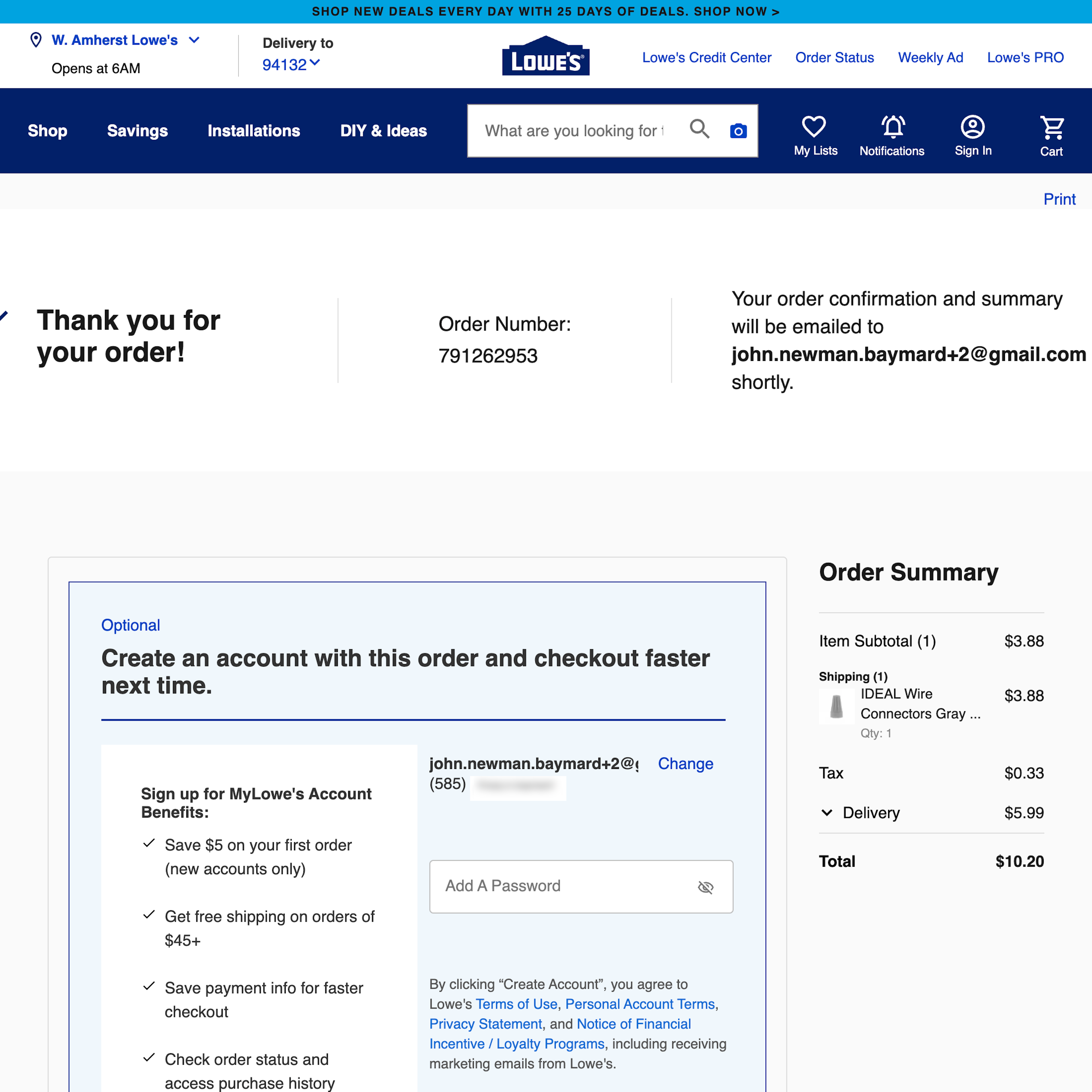
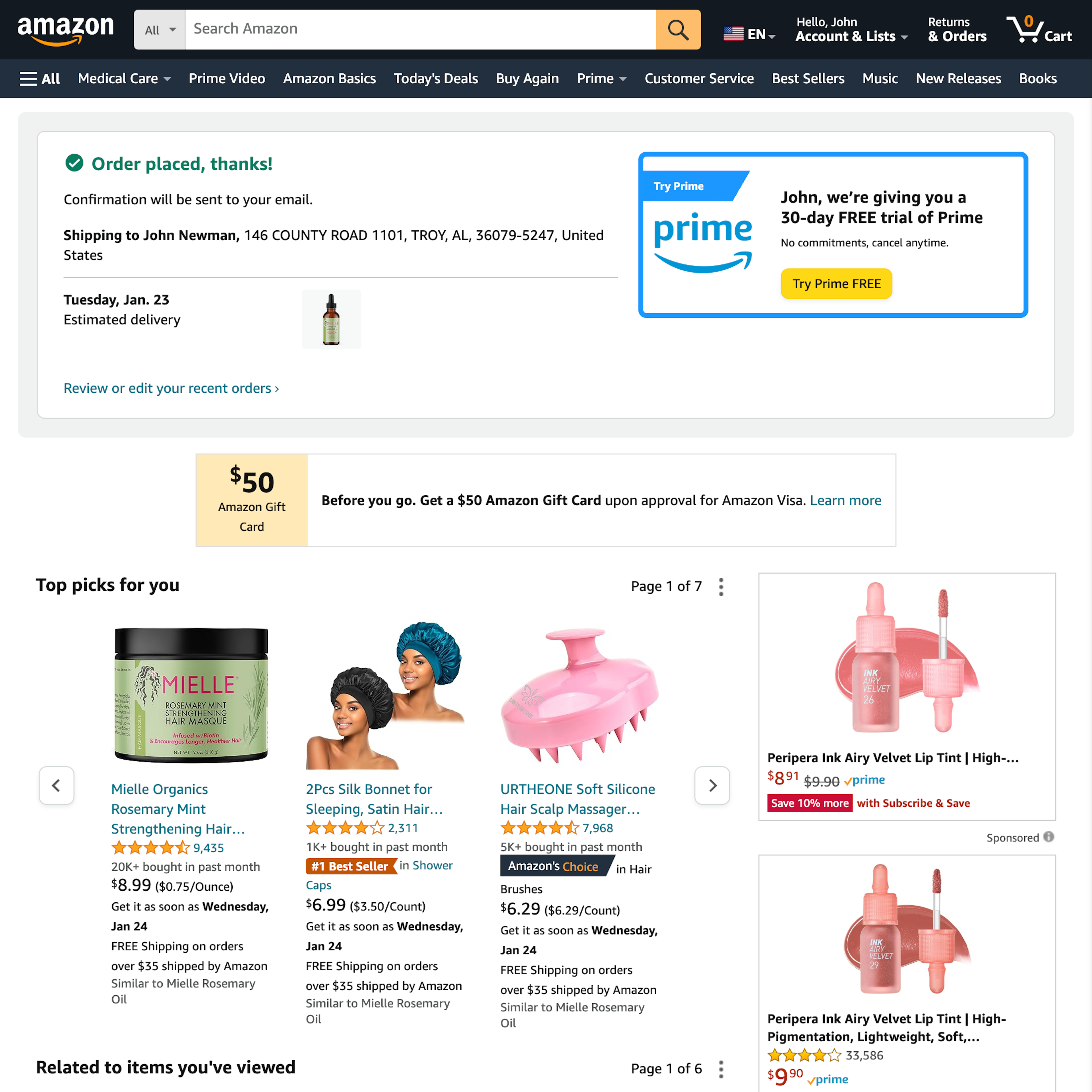
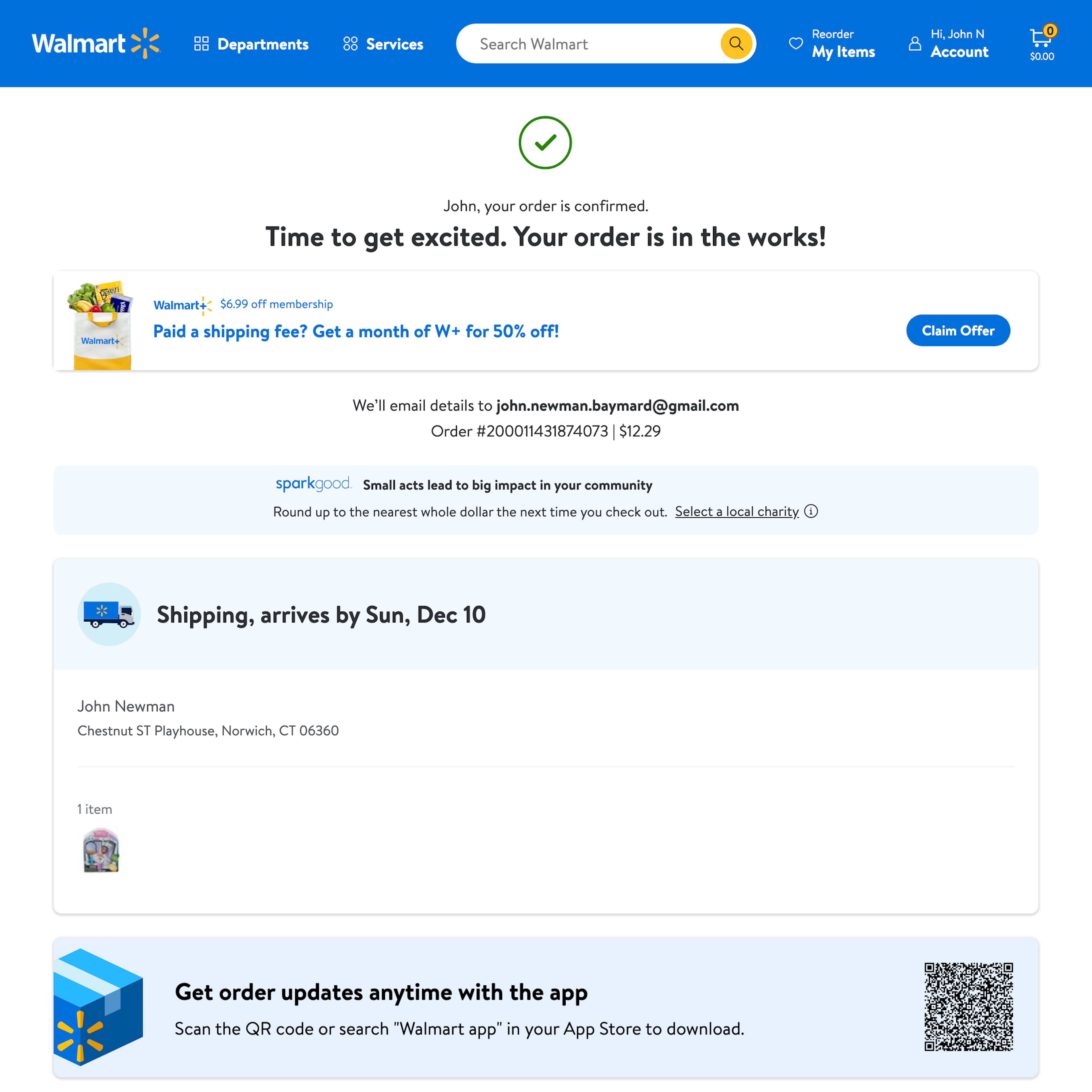
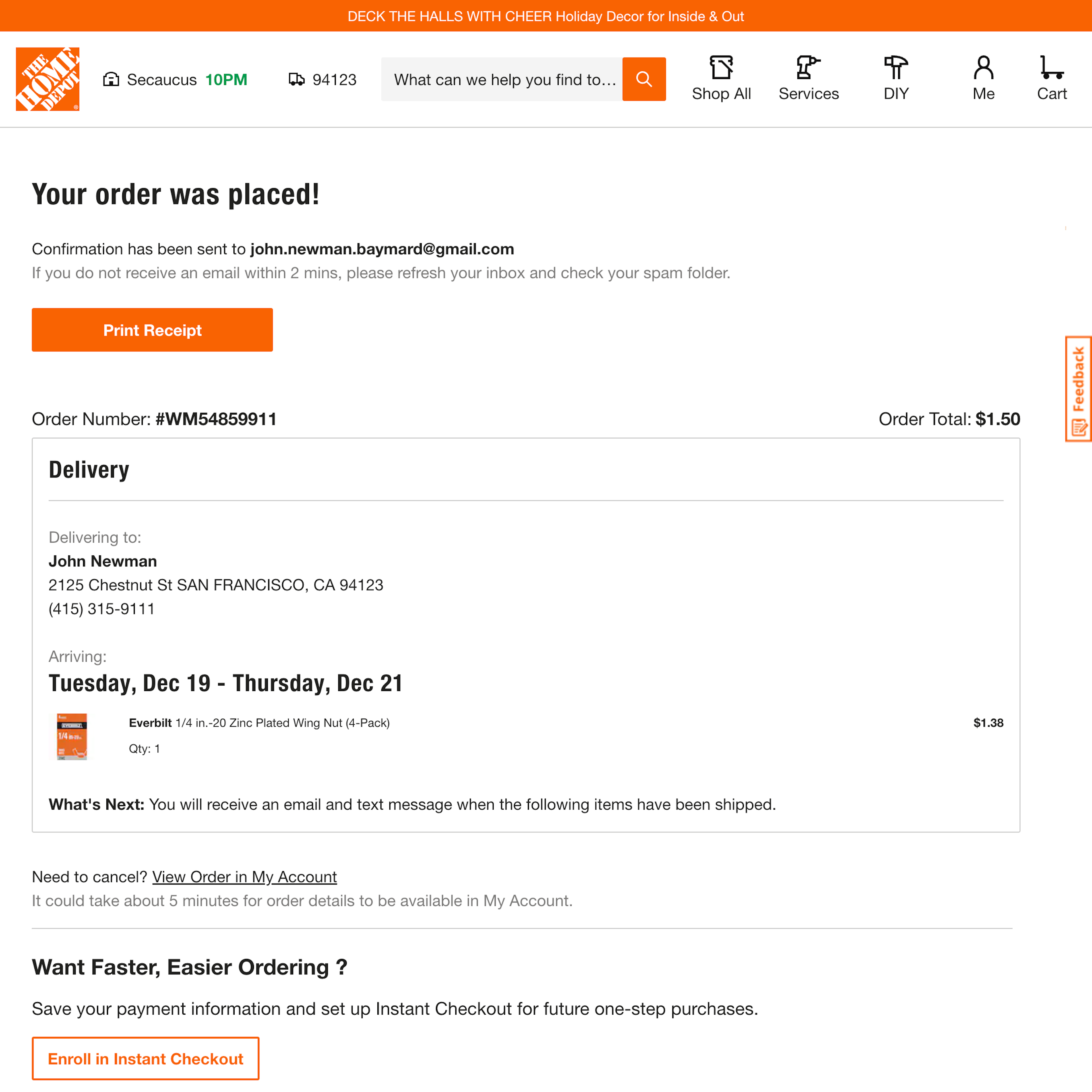
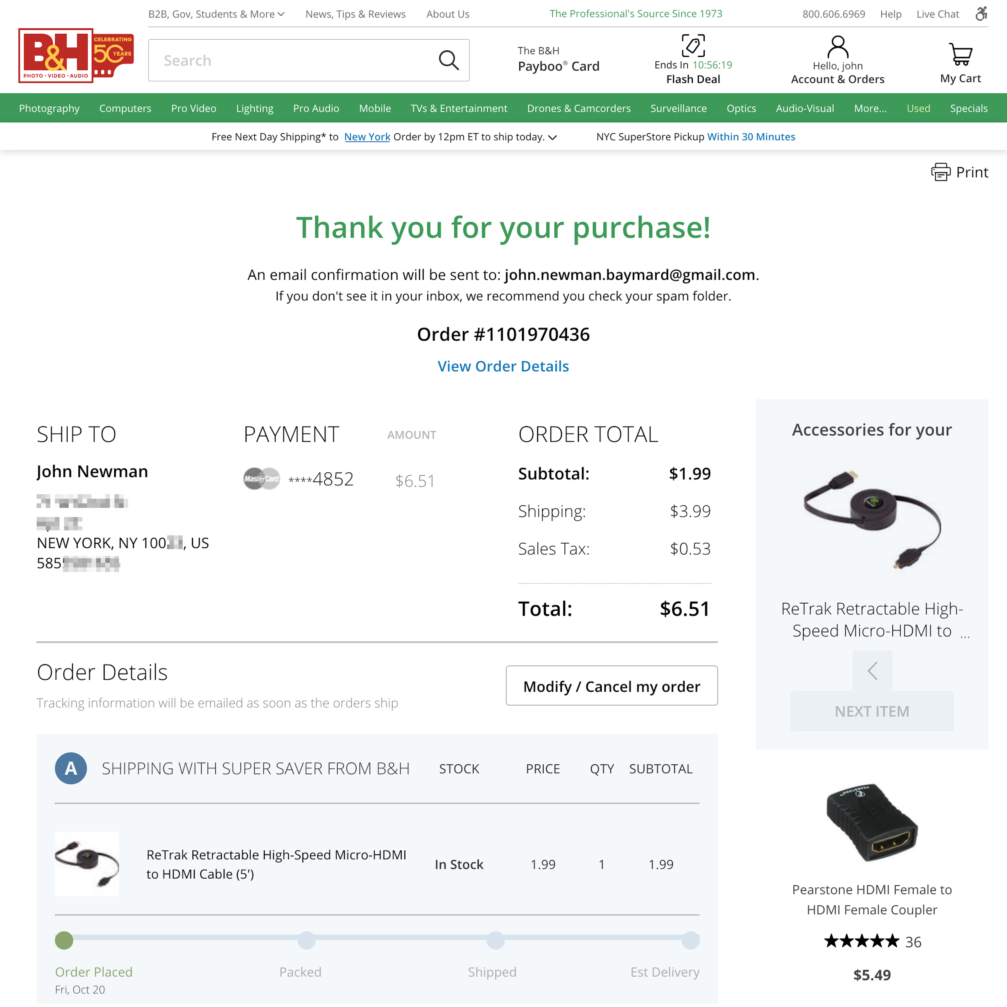
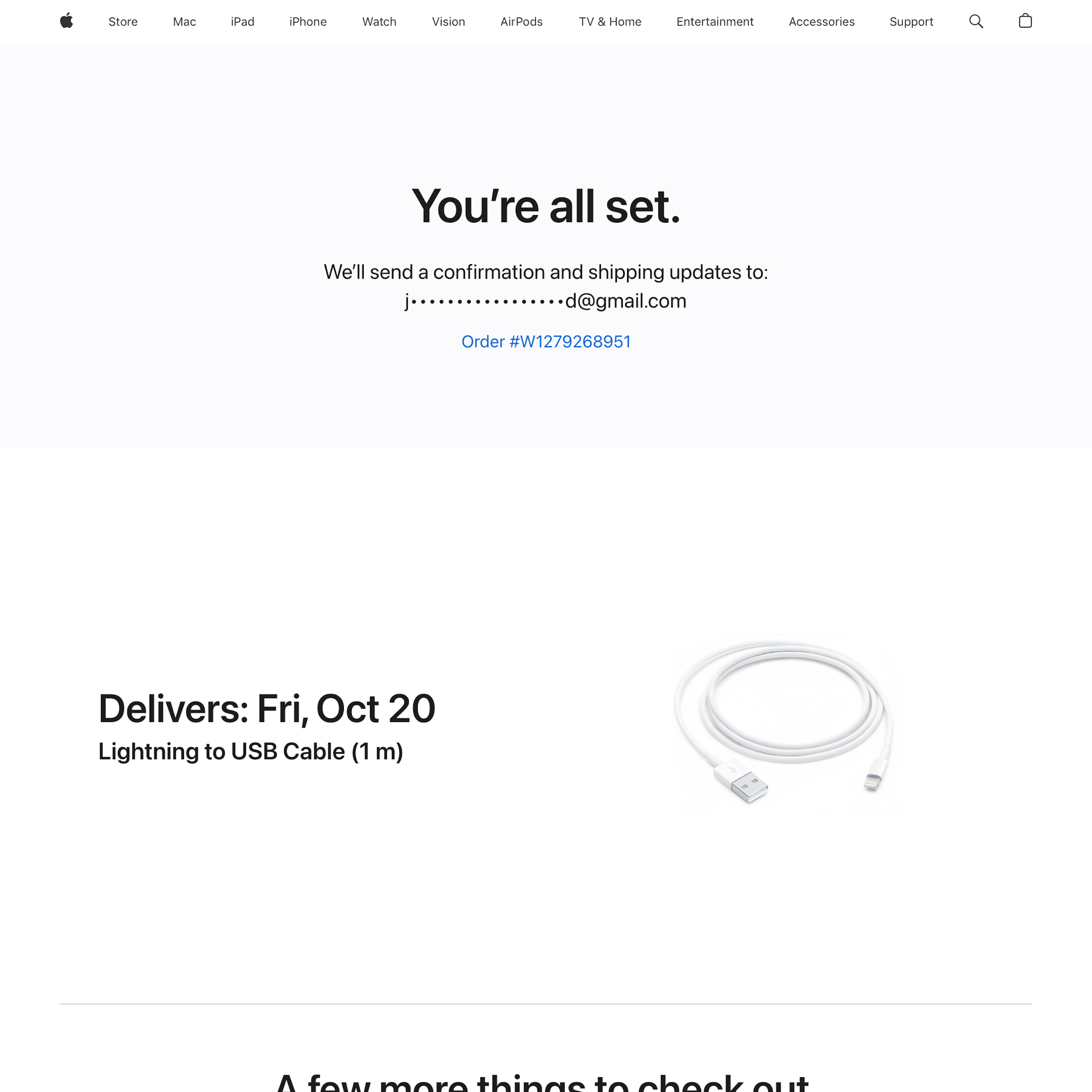
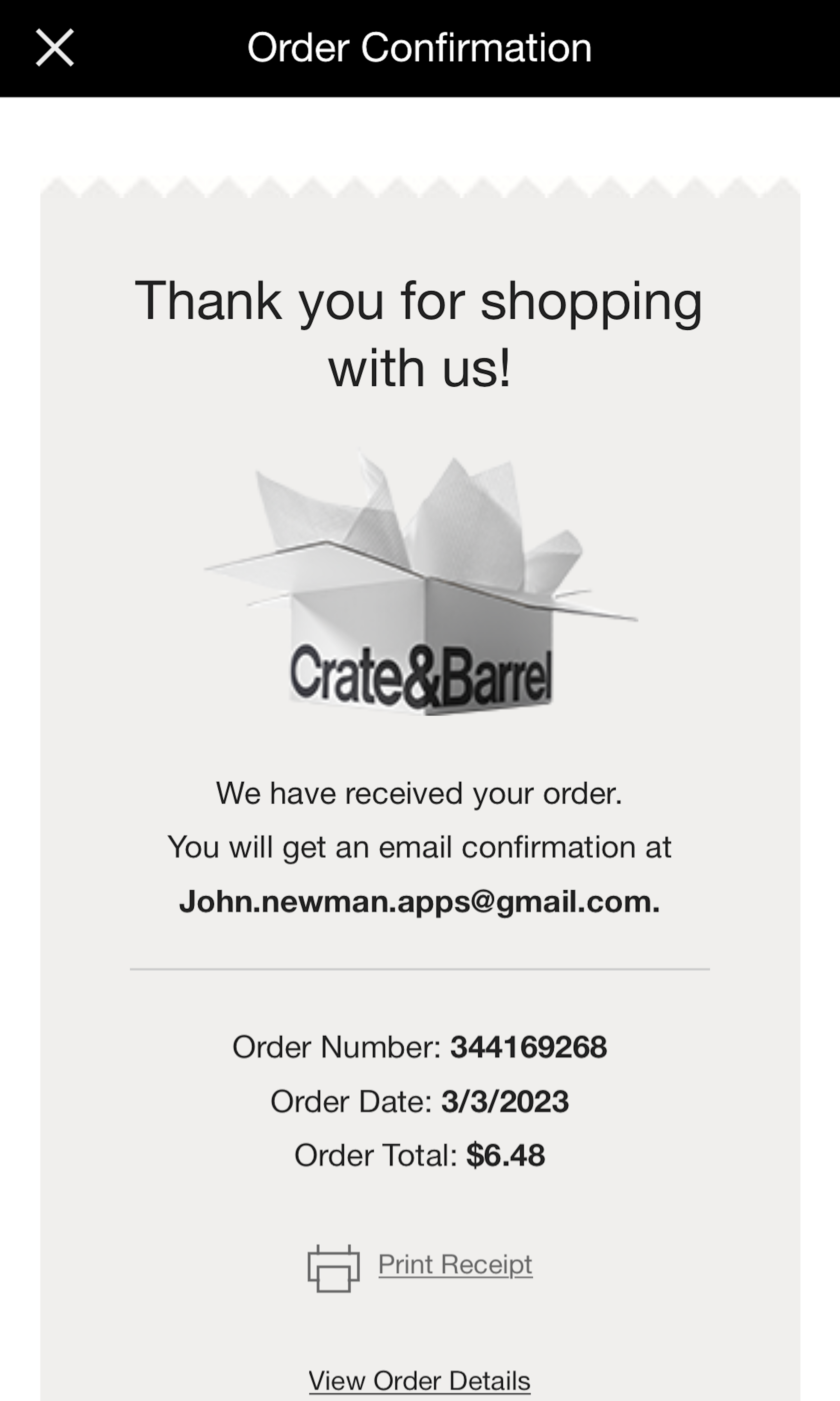
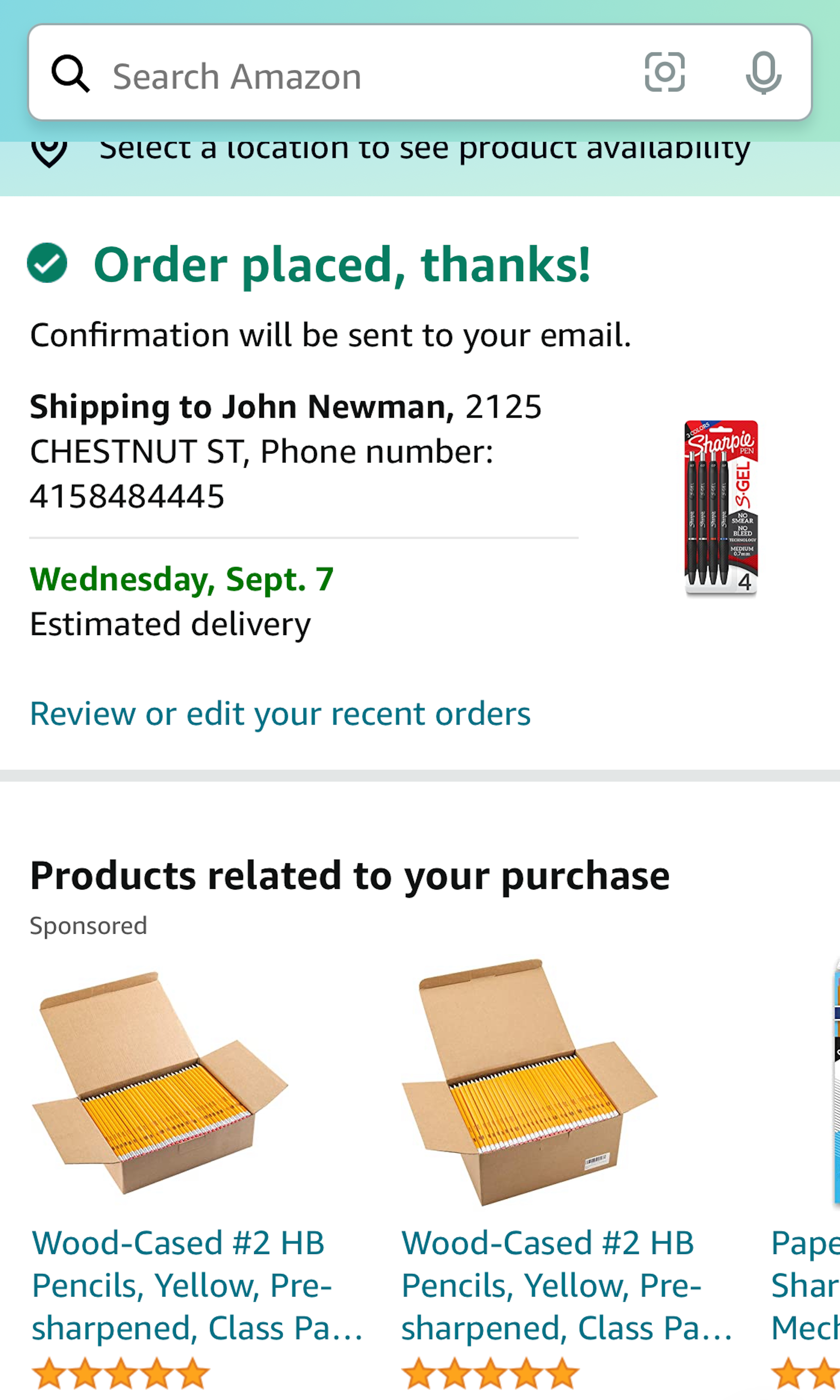
862 ‘Receipt / Order Confirmation’ Design Examples
Also referred to as: Order Thank You, Confirmation Page, Confirmation Email
What’s this? Here you’ll find 862 “Receipt / Order Confirmation” full-page screenshots annotated with research-based UX insights, sourced from Baymard’s UX benchmark of 325 e-commerce sites. (Note: this is less than 1% of the full research catalog.)
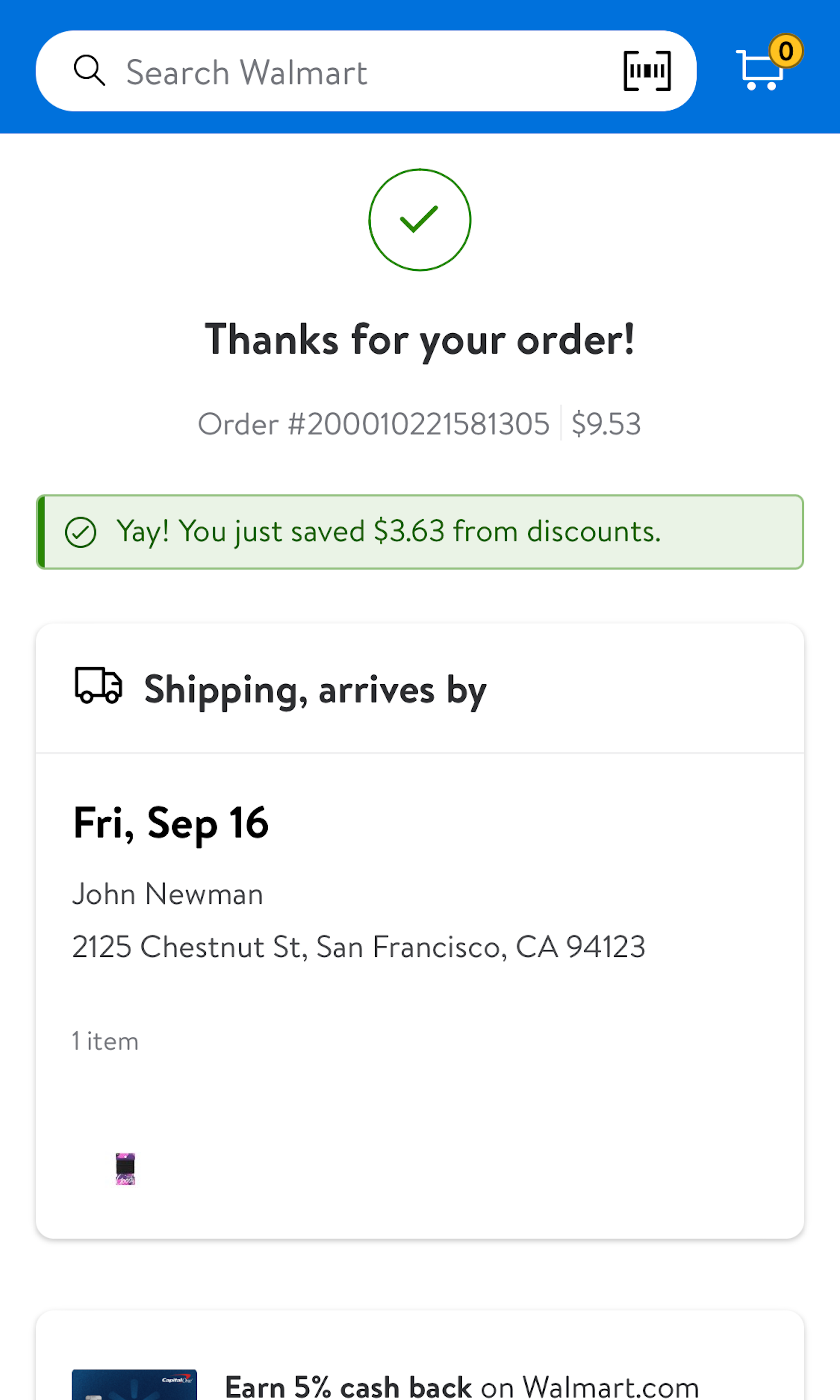
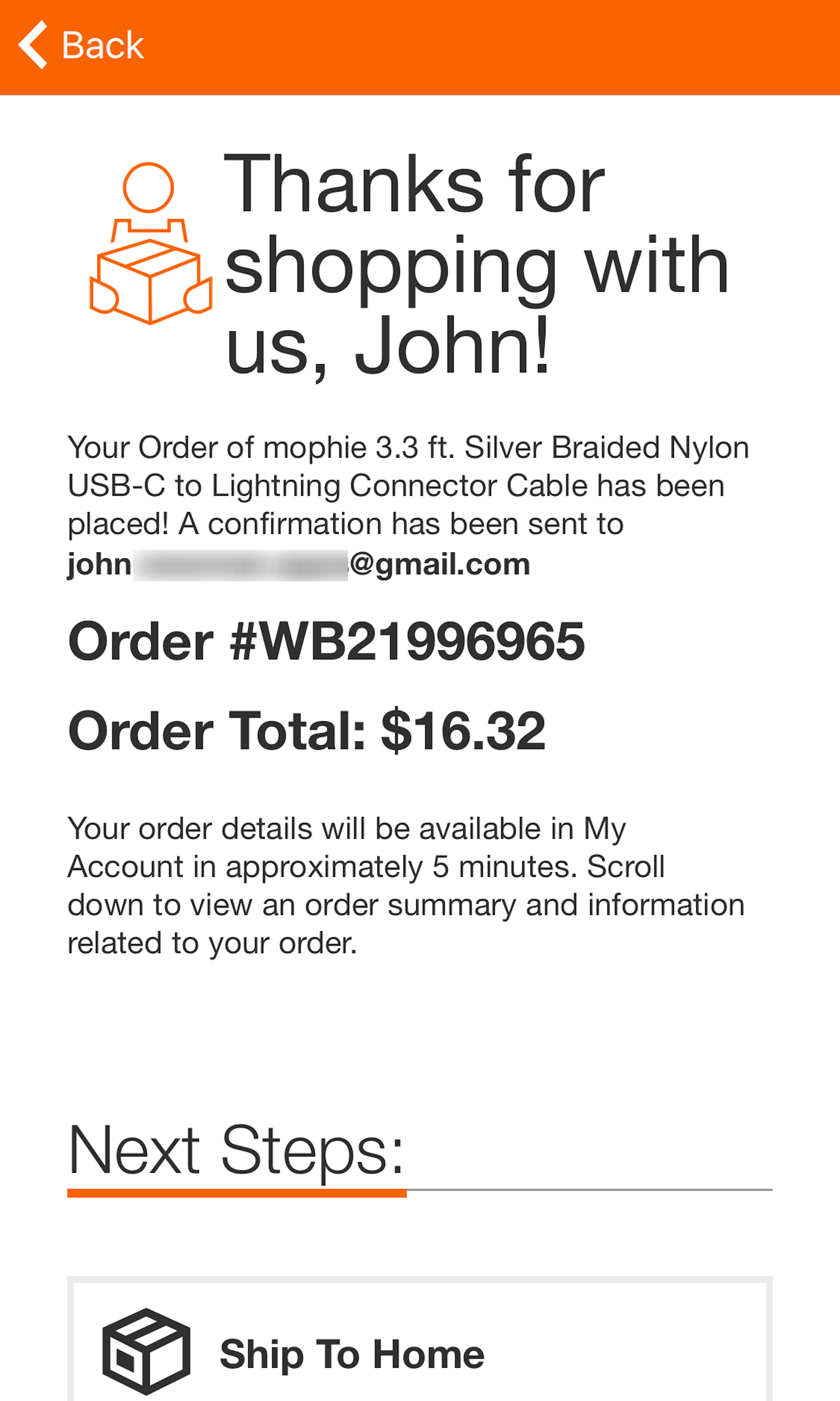
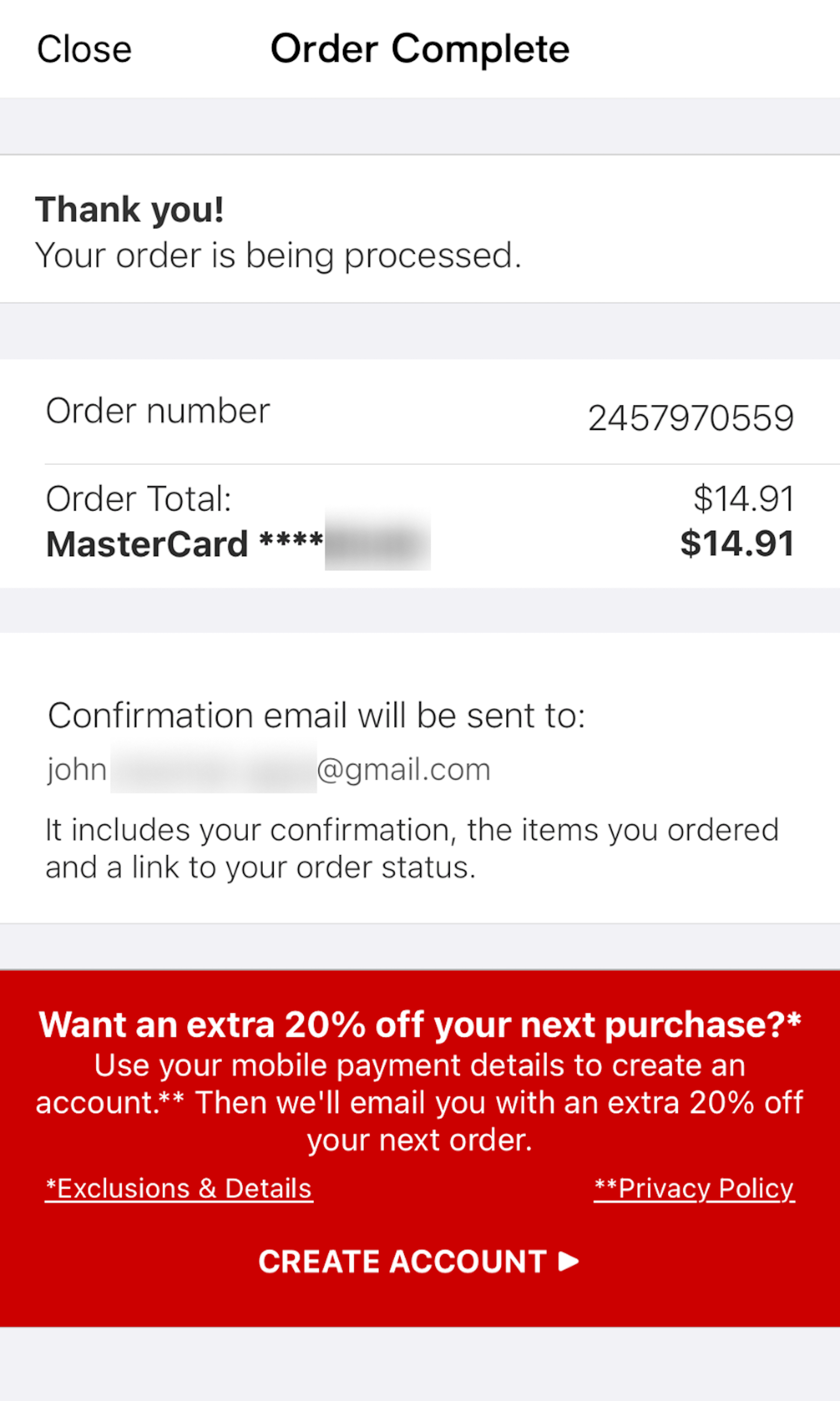
After users have successfully placed their order, an order confirmation step and email will follow. The order confirmation step is often a somewhat overlooked part of the checkout flow.
More ‘Order Confirmation’ Insights
-
Common issues observed are users struggling to verify their purchase, or hanging around waiting at the page for minutes until they can confirm they’ve received the order confirmation email. Our testing also shows that the confirmation step is often the best place for nonorder auxiliary actions.
-
Learn More: Besides exploring the 862 “Order Confirmation” page design examples below, you may also want to read our related articles “Offer ‘Delayed Account Creation’ at the Confirmation Step – 38% Don’t” and “6 Ways to Get More Out of Your Order Confirmation Page”.
-
Get Full Access: To see all of Baymard’s cart and checkout research findings you’ll need Baymard Premium access. (Premium also provides you full access to 200,000+ hours of UX research findings, 650+ e-commerce UX guidelines, and 275,000+ UX performance scores.)
User Experience Research, Delivered Weekly
Join 60,000+ UX professionals and get a new UX article every week.

User Experience Research, Delivered Weekly
Join 60,000+ UX professionals and get a new UX article every week.

Explore Other Research Content

300+ free UX articles based on large-scale research.

325 top sites ranked by UX performance.

Code samples, demos, and key stats for usability.


