
39 ‘Time Booking Interface’ Design Examples
Also referred to as: Scheduling Interface, Time Scheduling, Date & Time Selector
What’s this? Here you’ll find 39 “Time Booking Interface” full-page screenshots annotated with research-based UX insights, sourced from Baymard’s UX benchmark of 327 e-commerce sites. (Note: this is less than 1% of the full research catalog.)
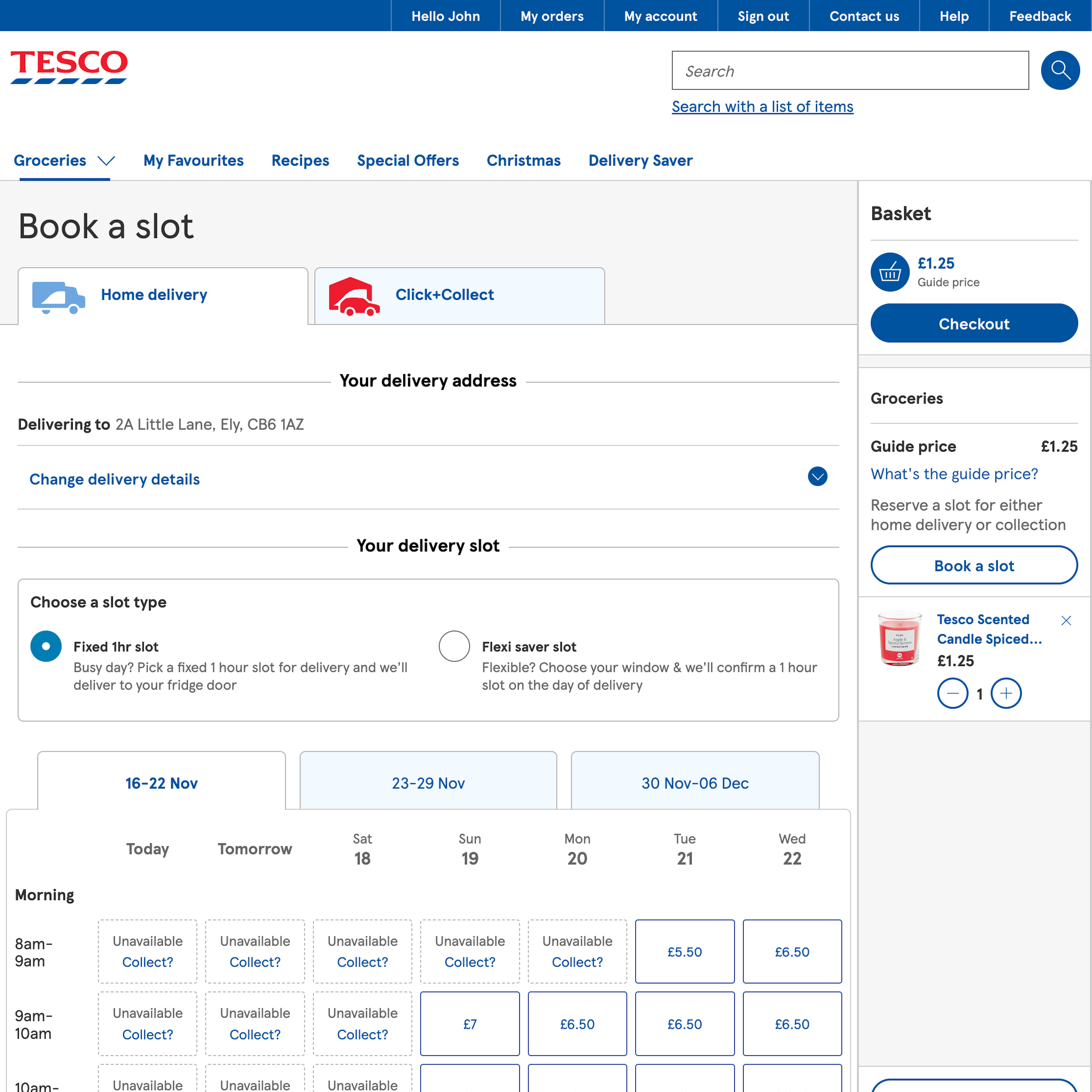
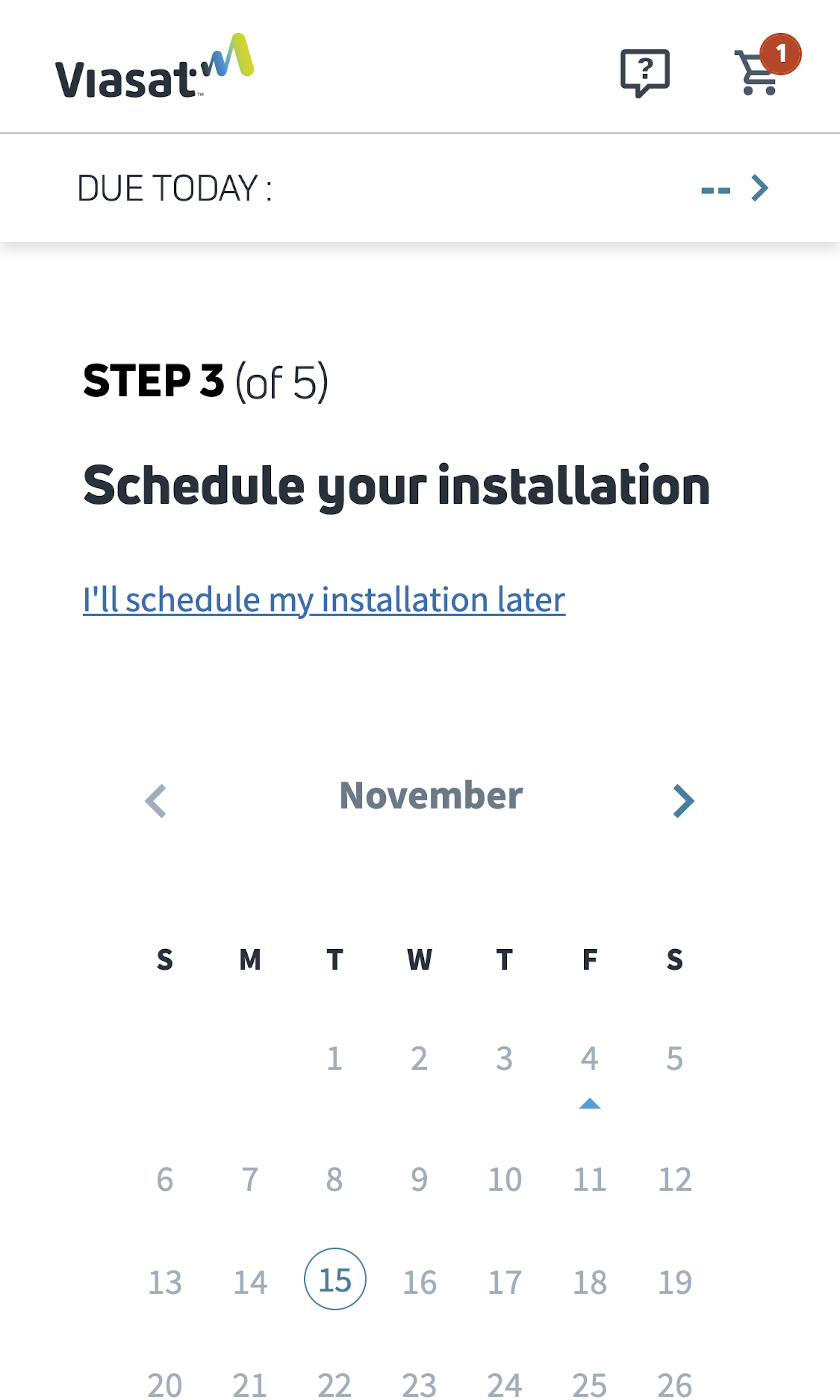
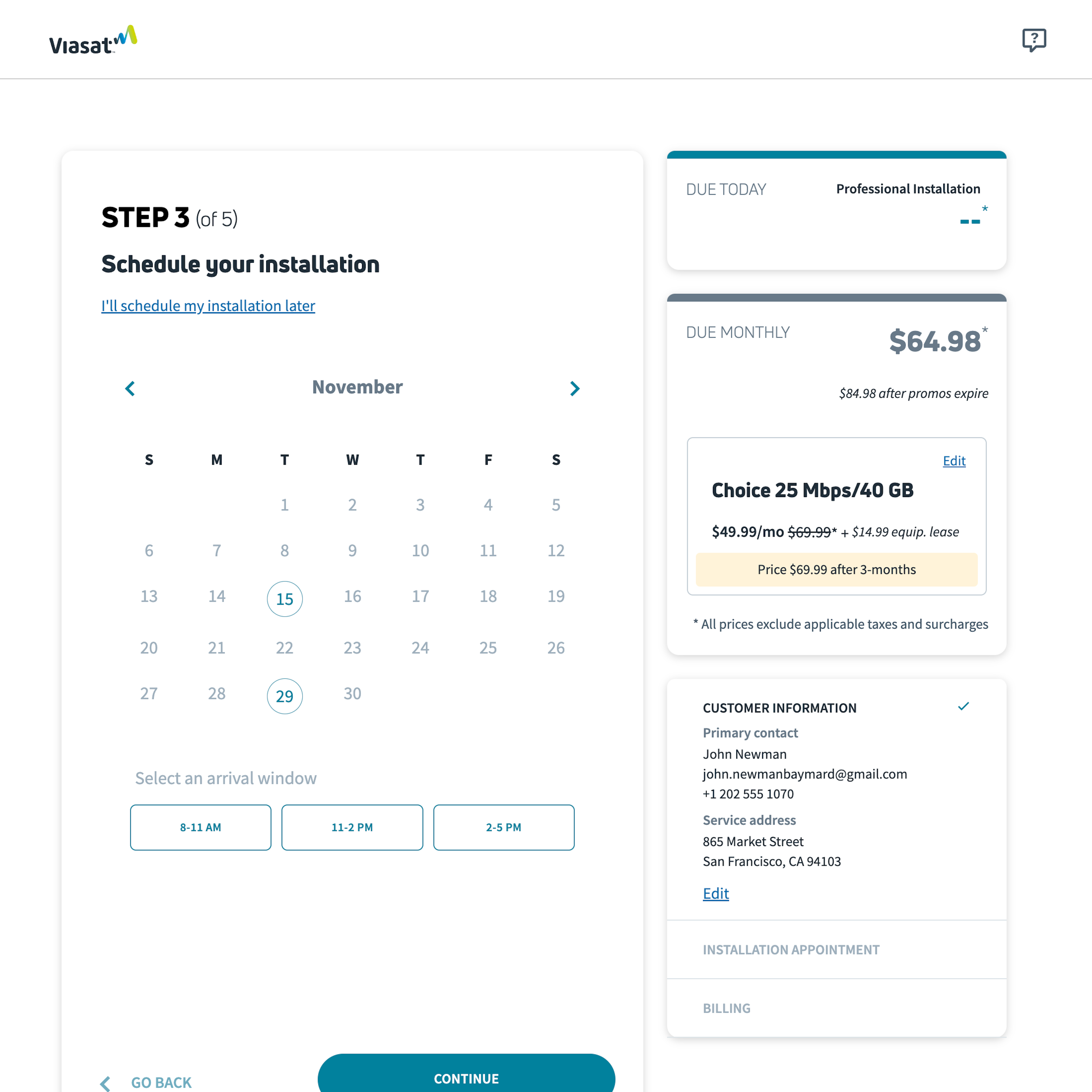
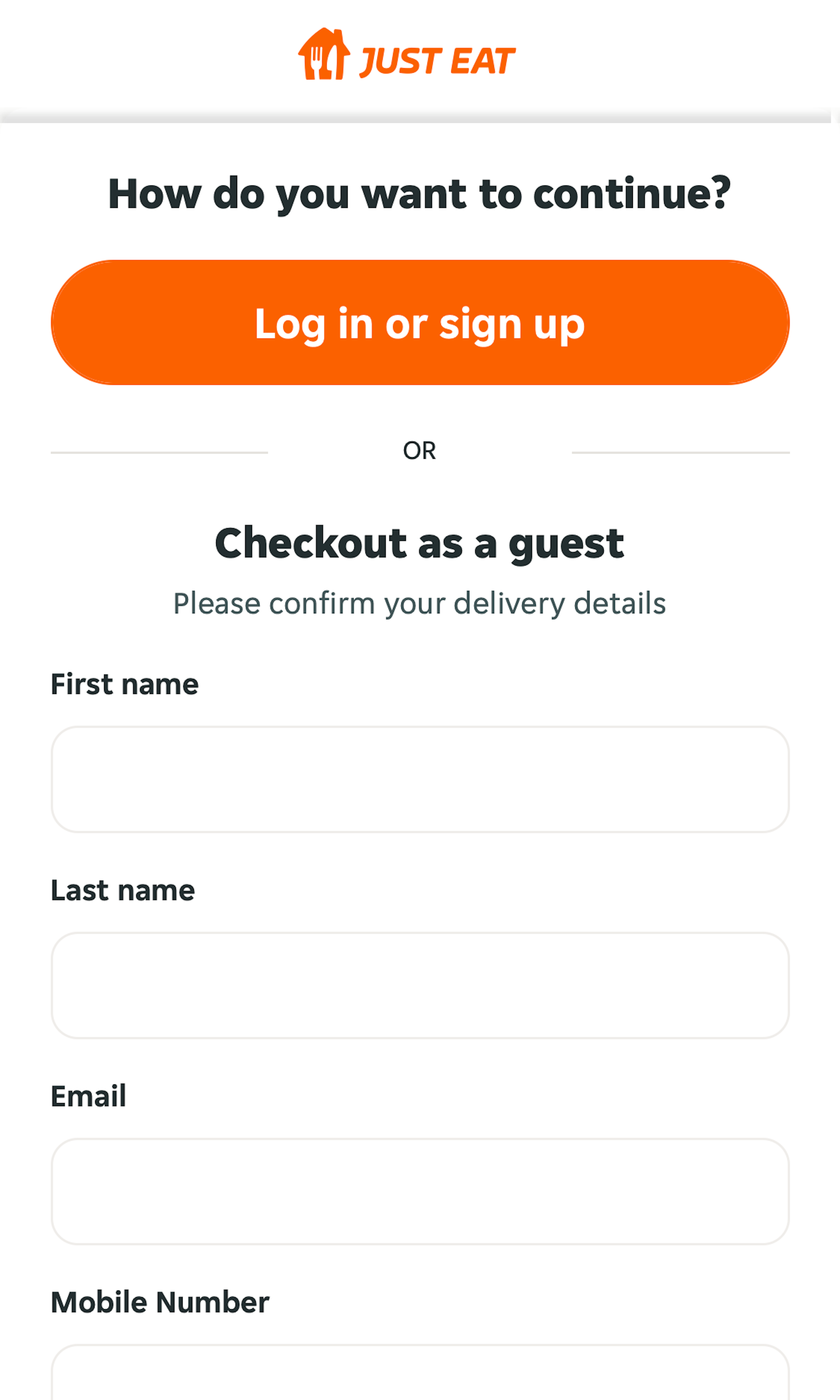
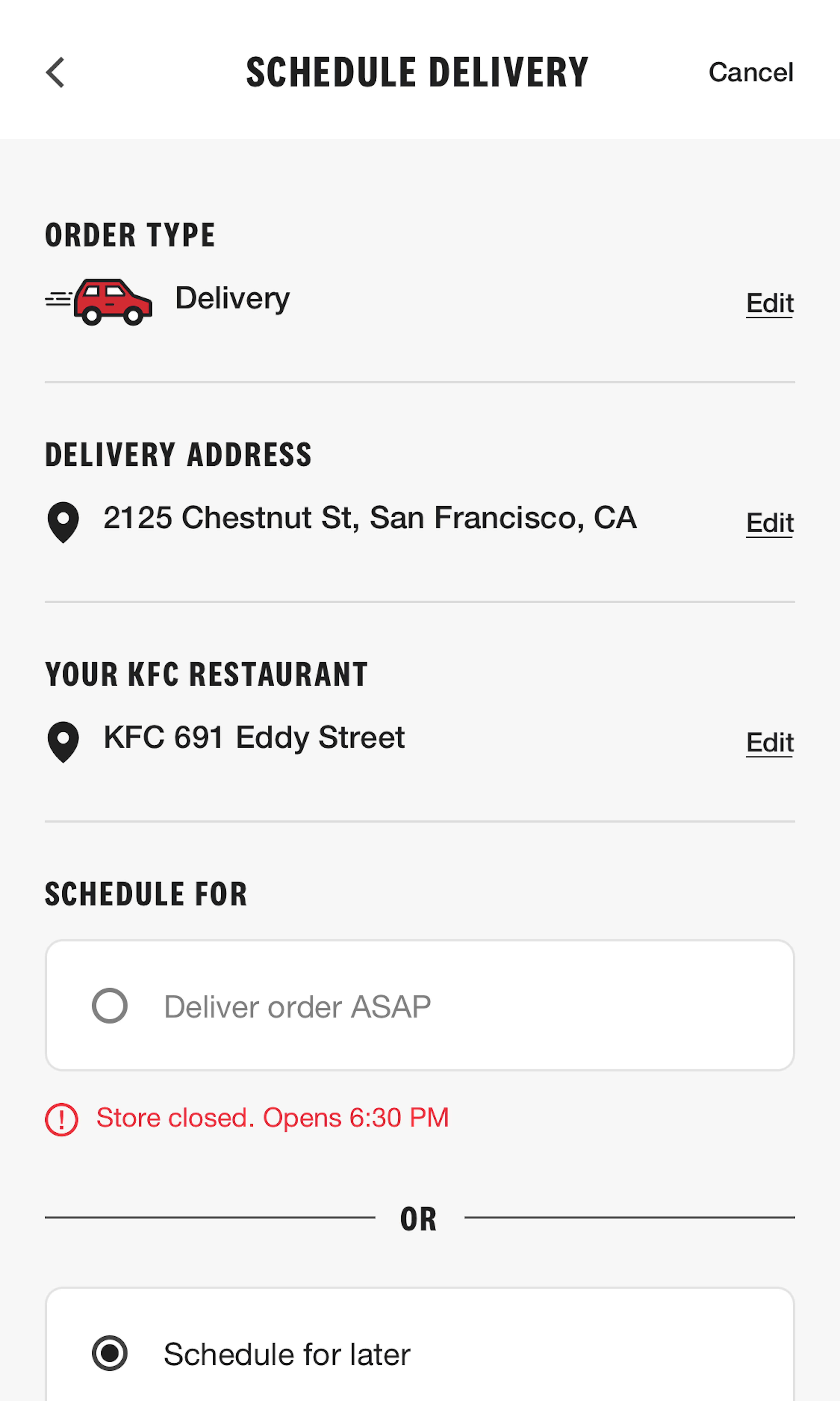
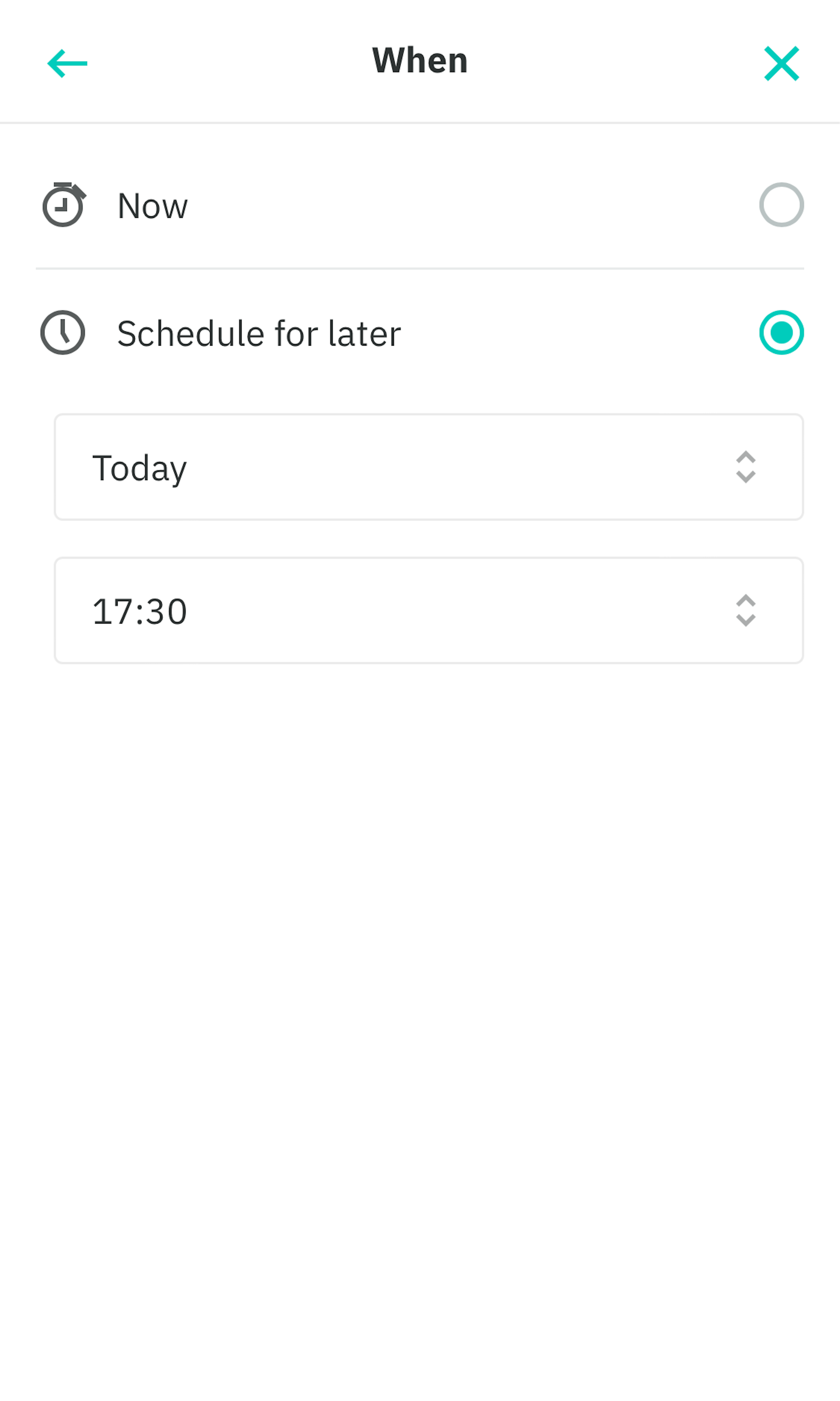
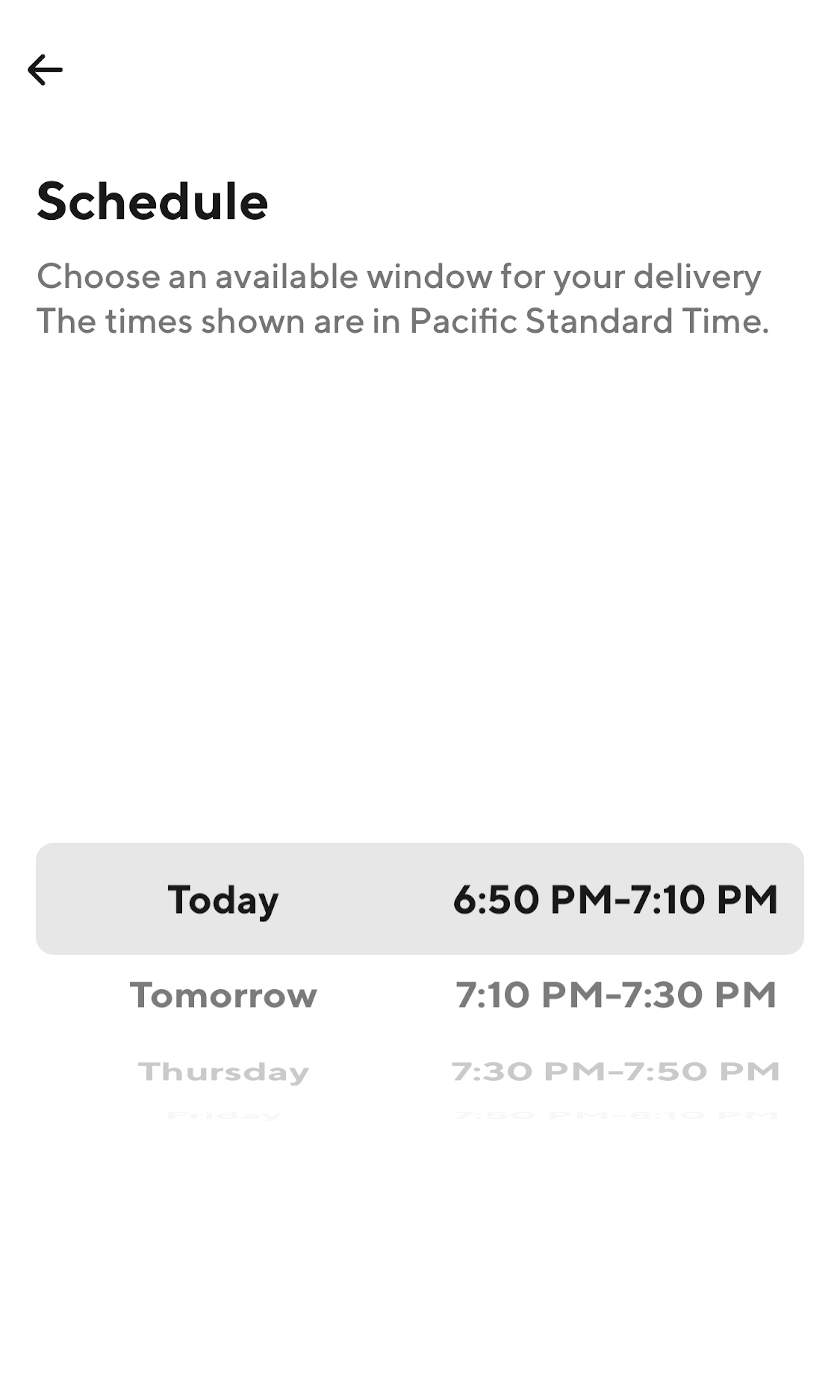
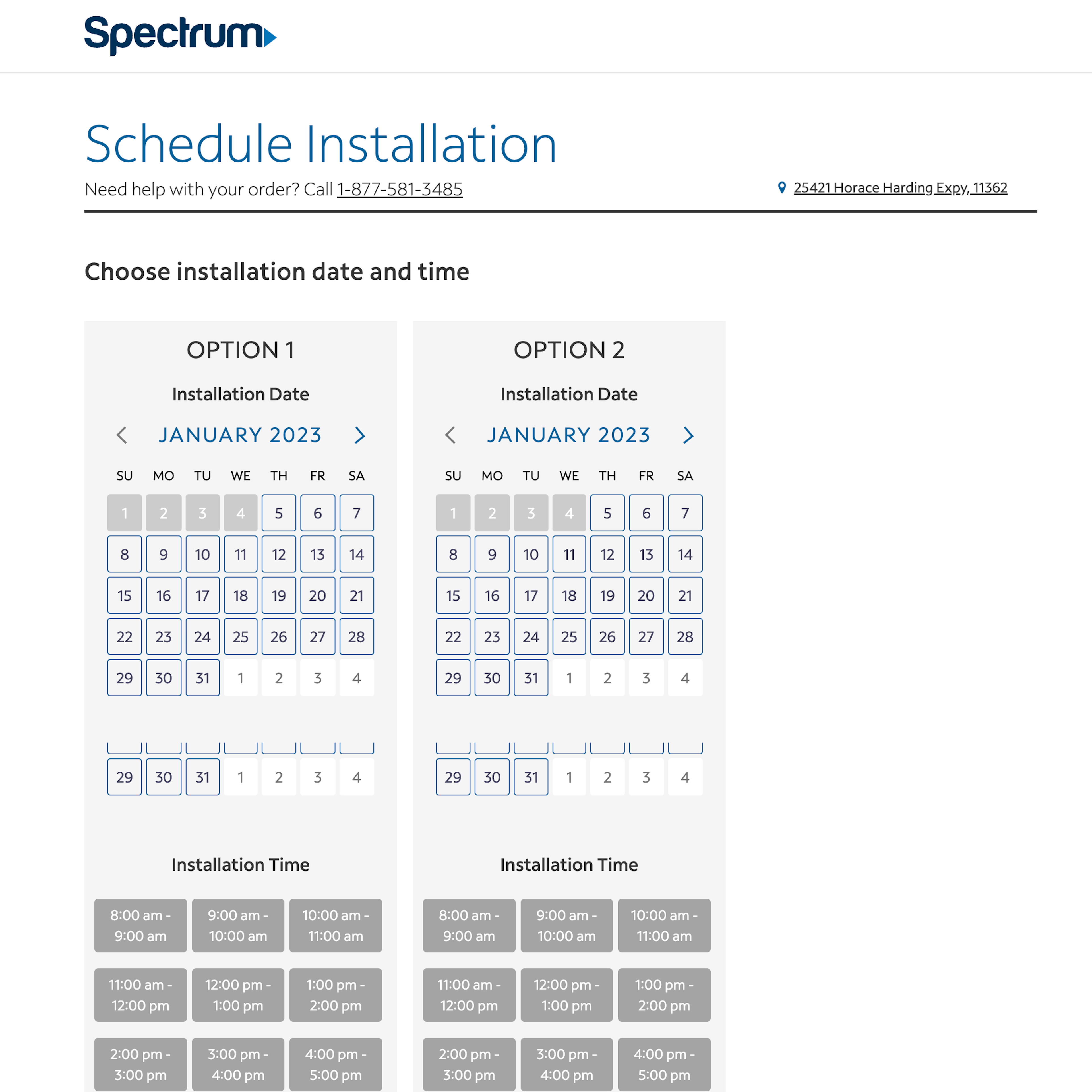
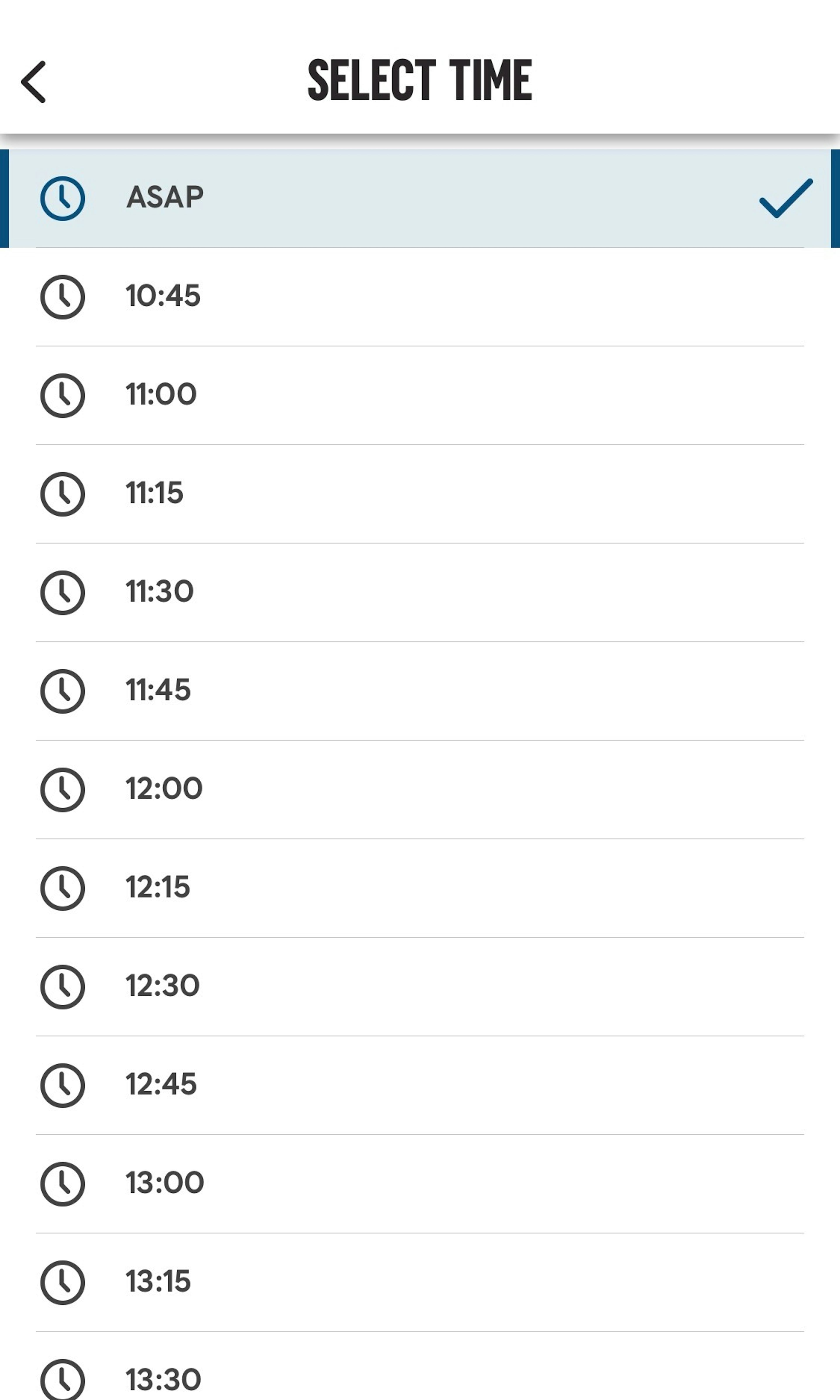
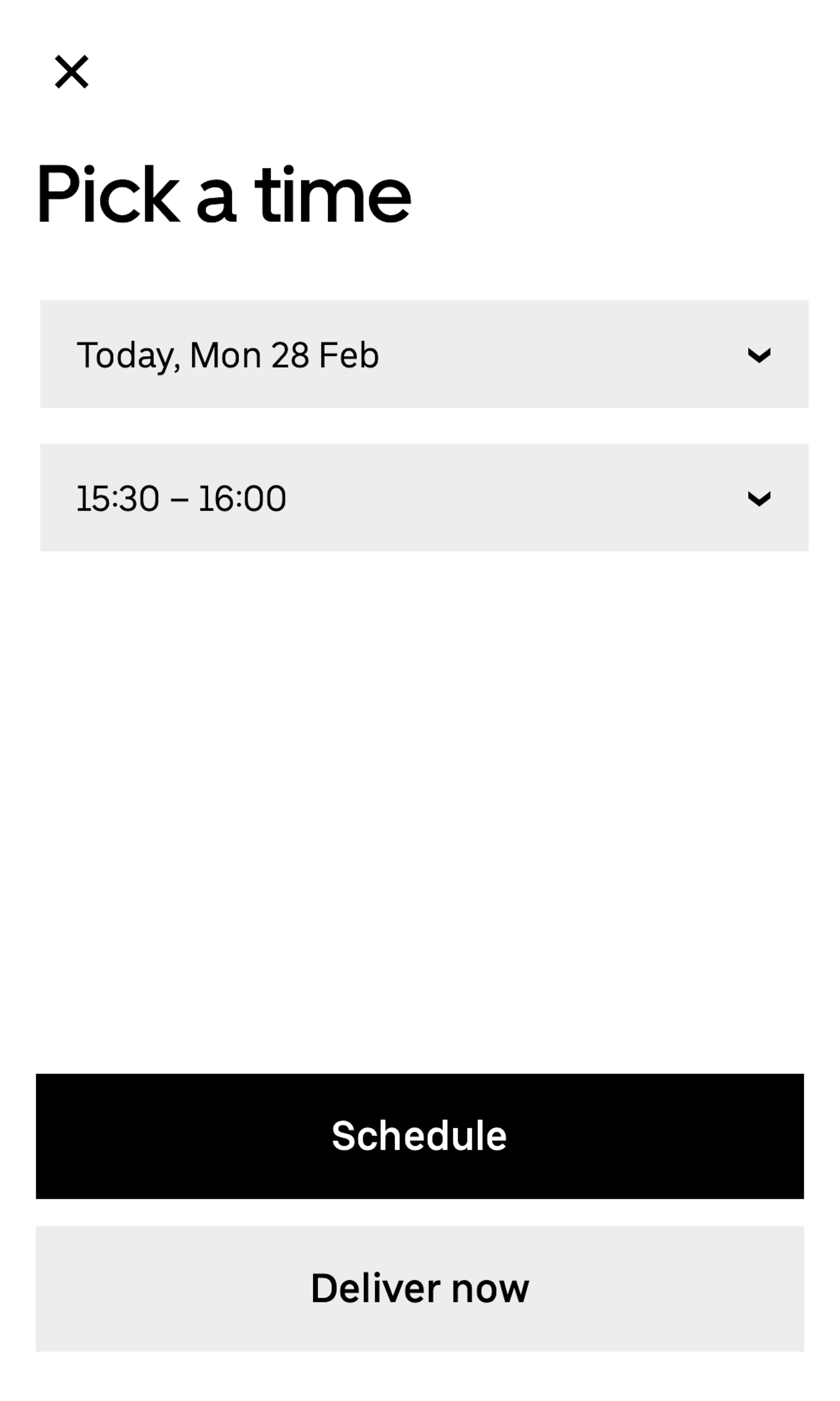
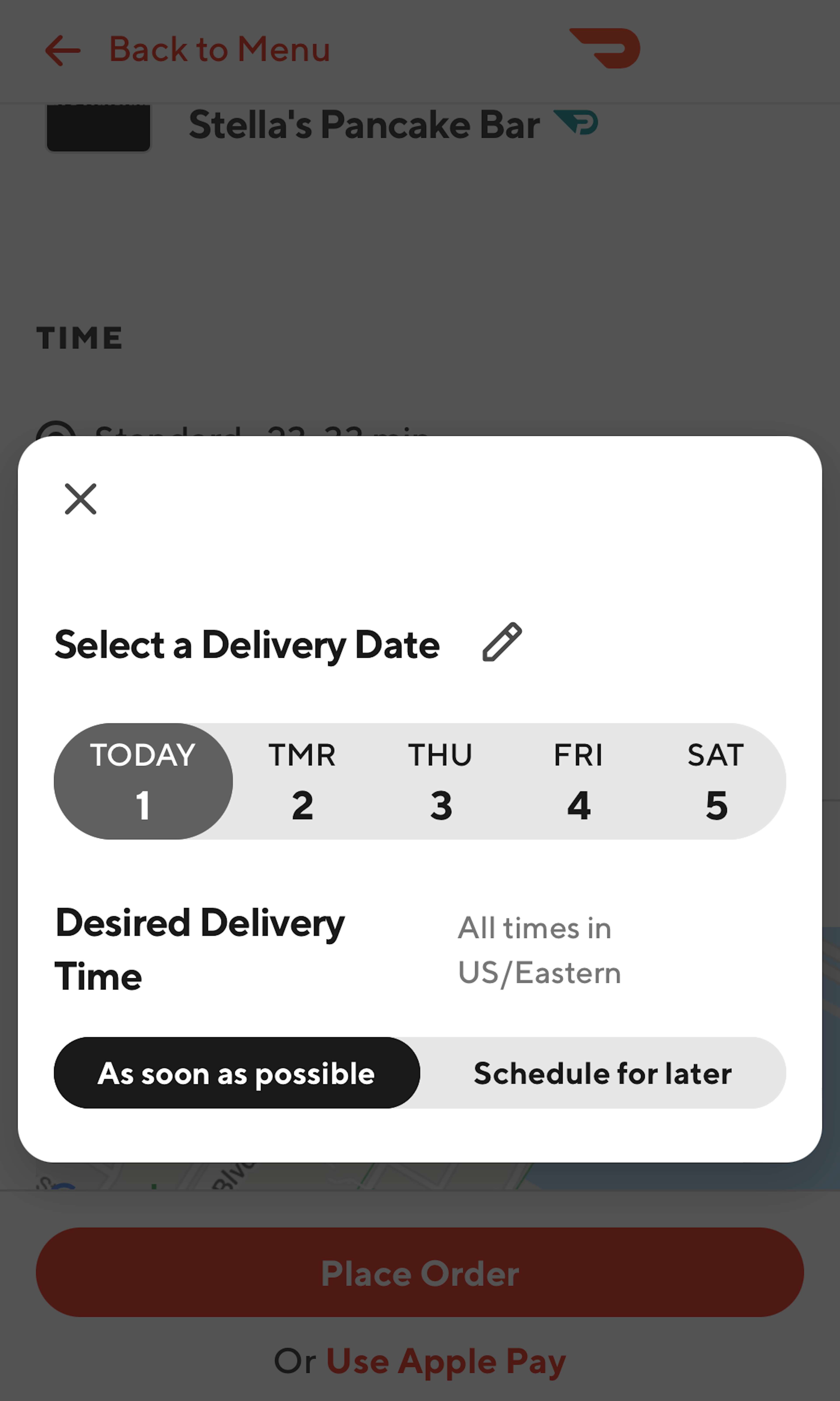
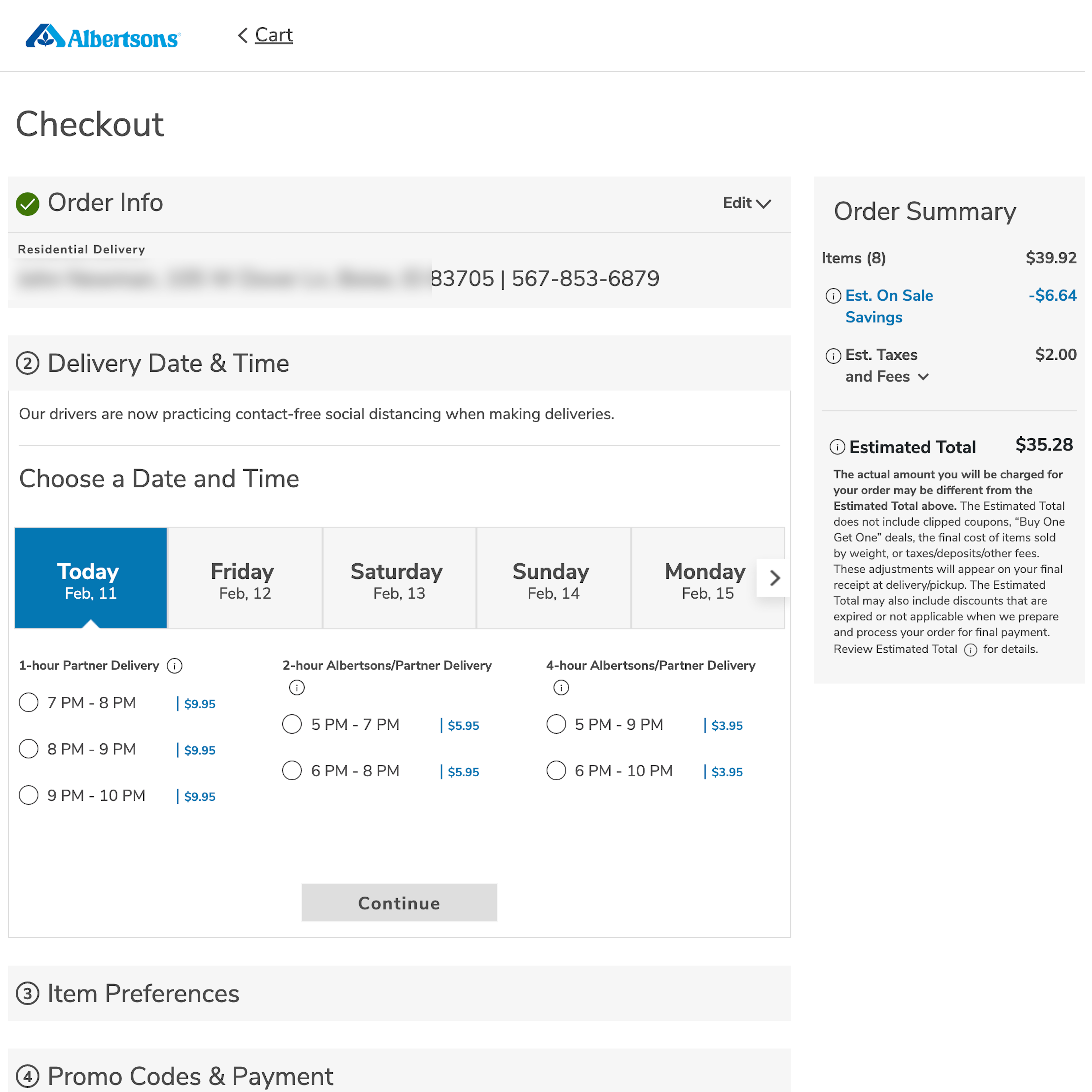
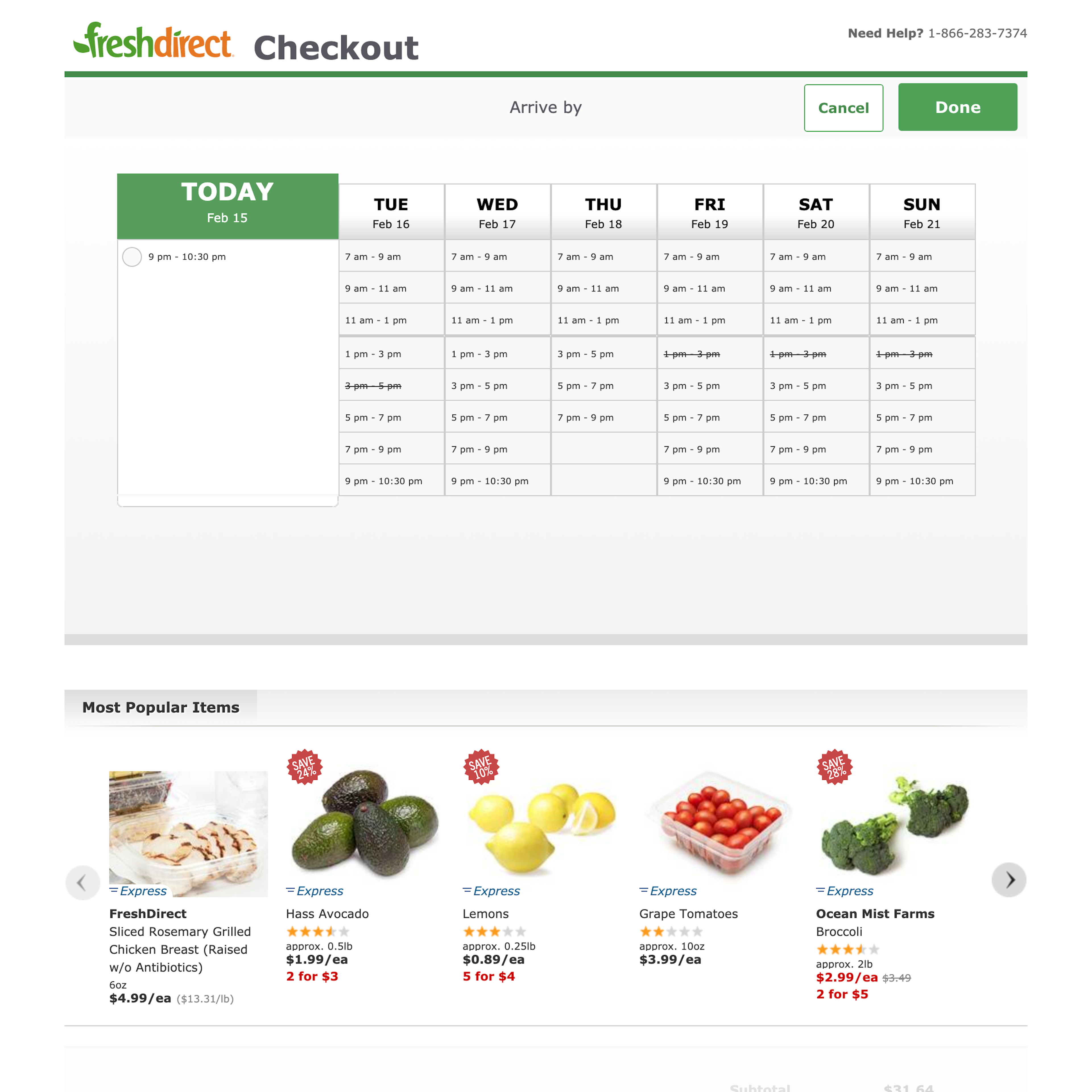
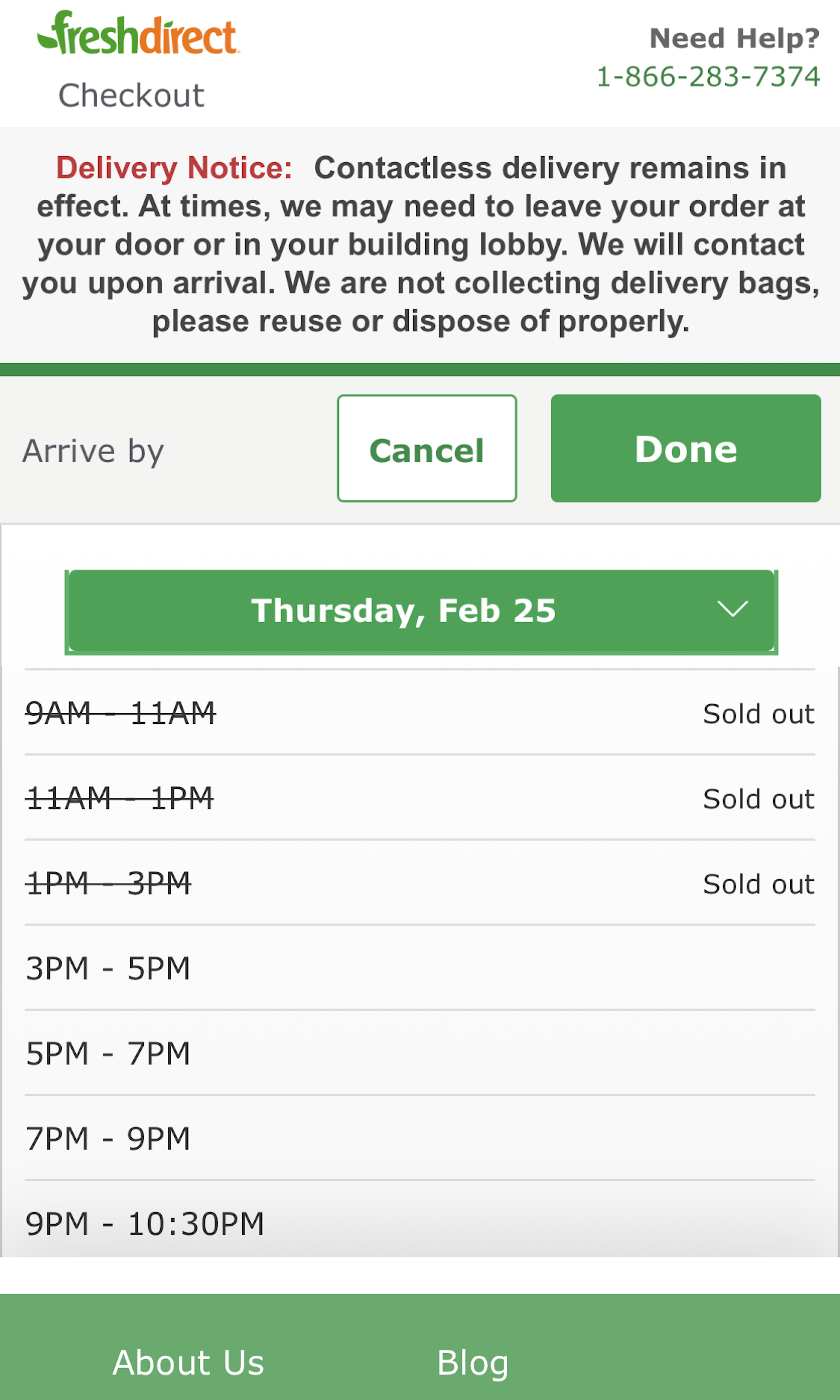
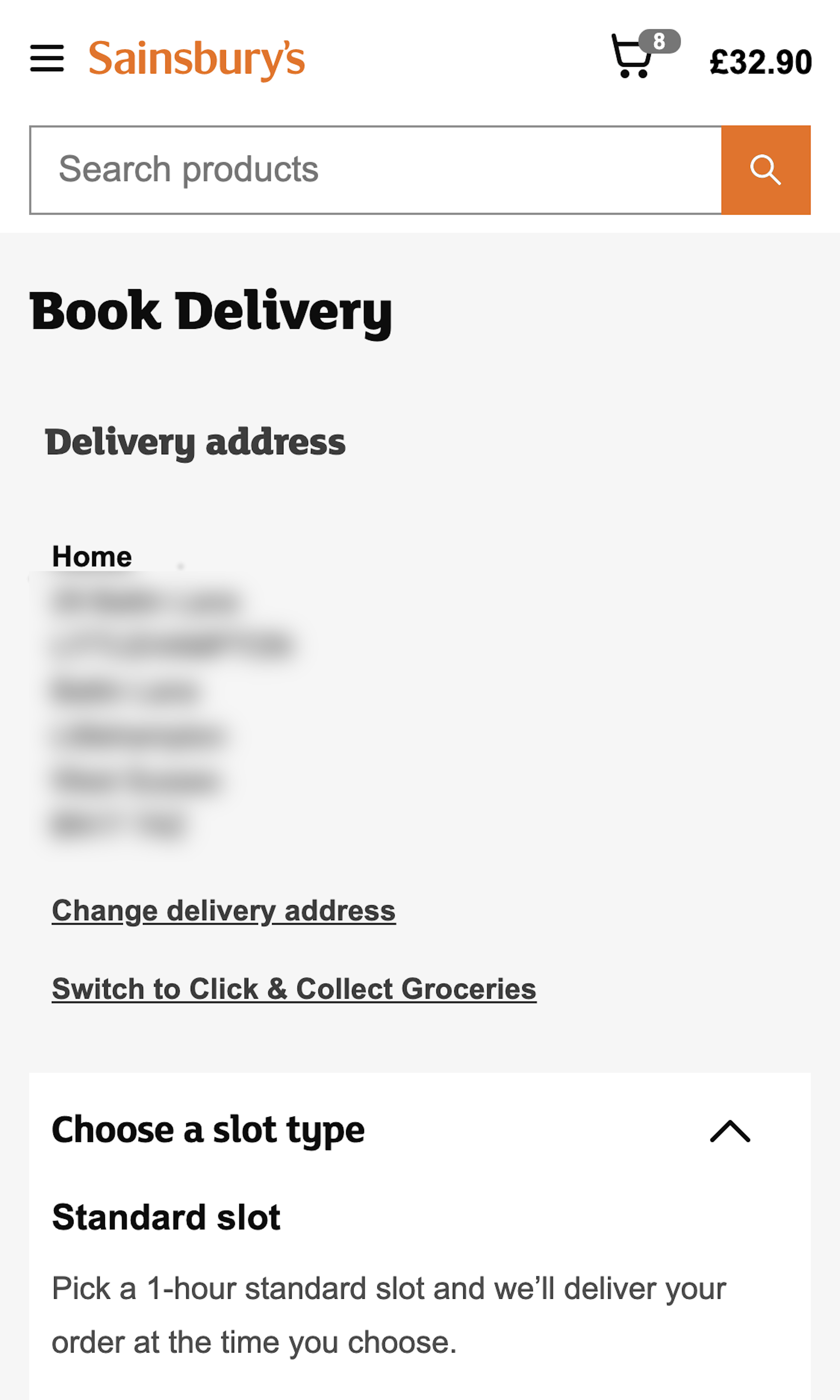
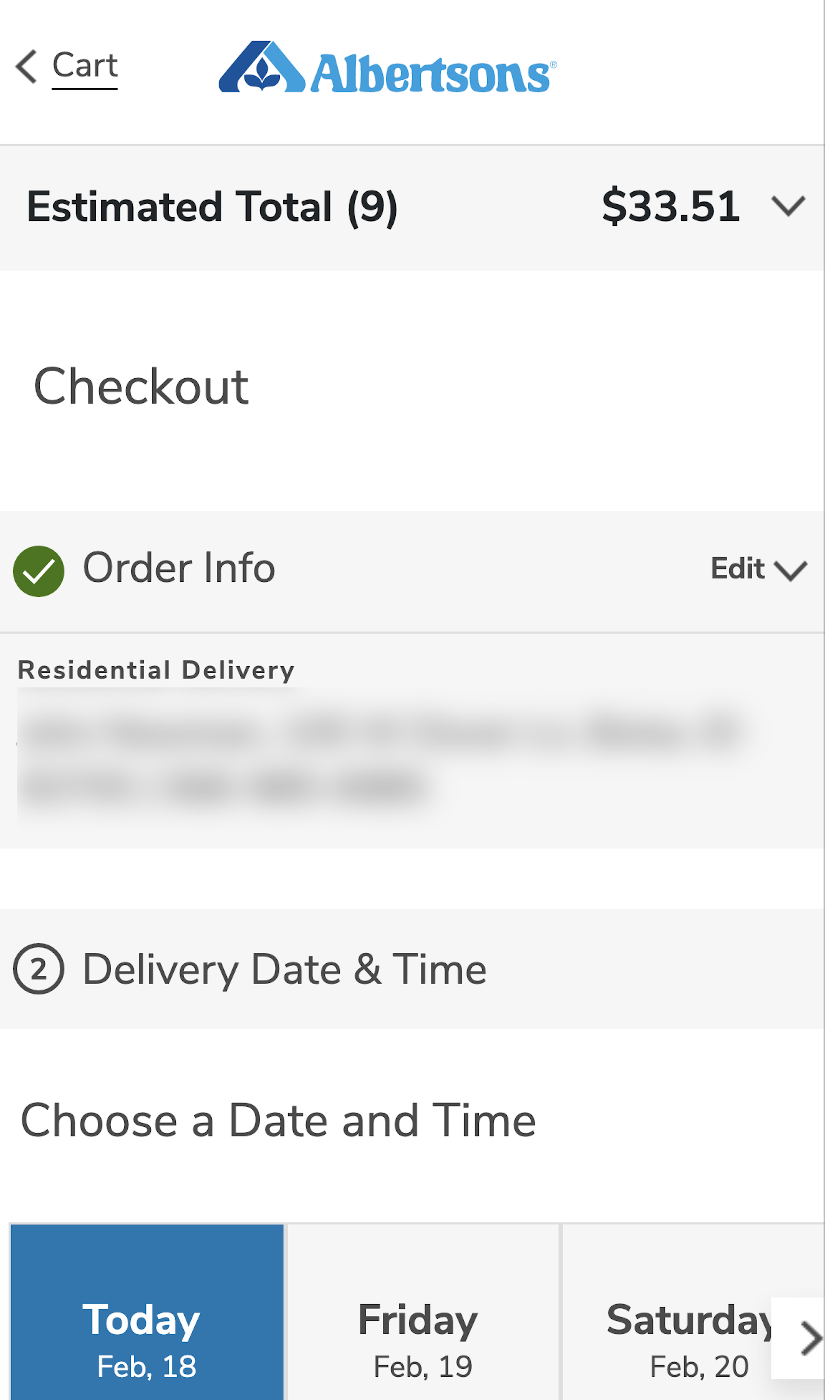
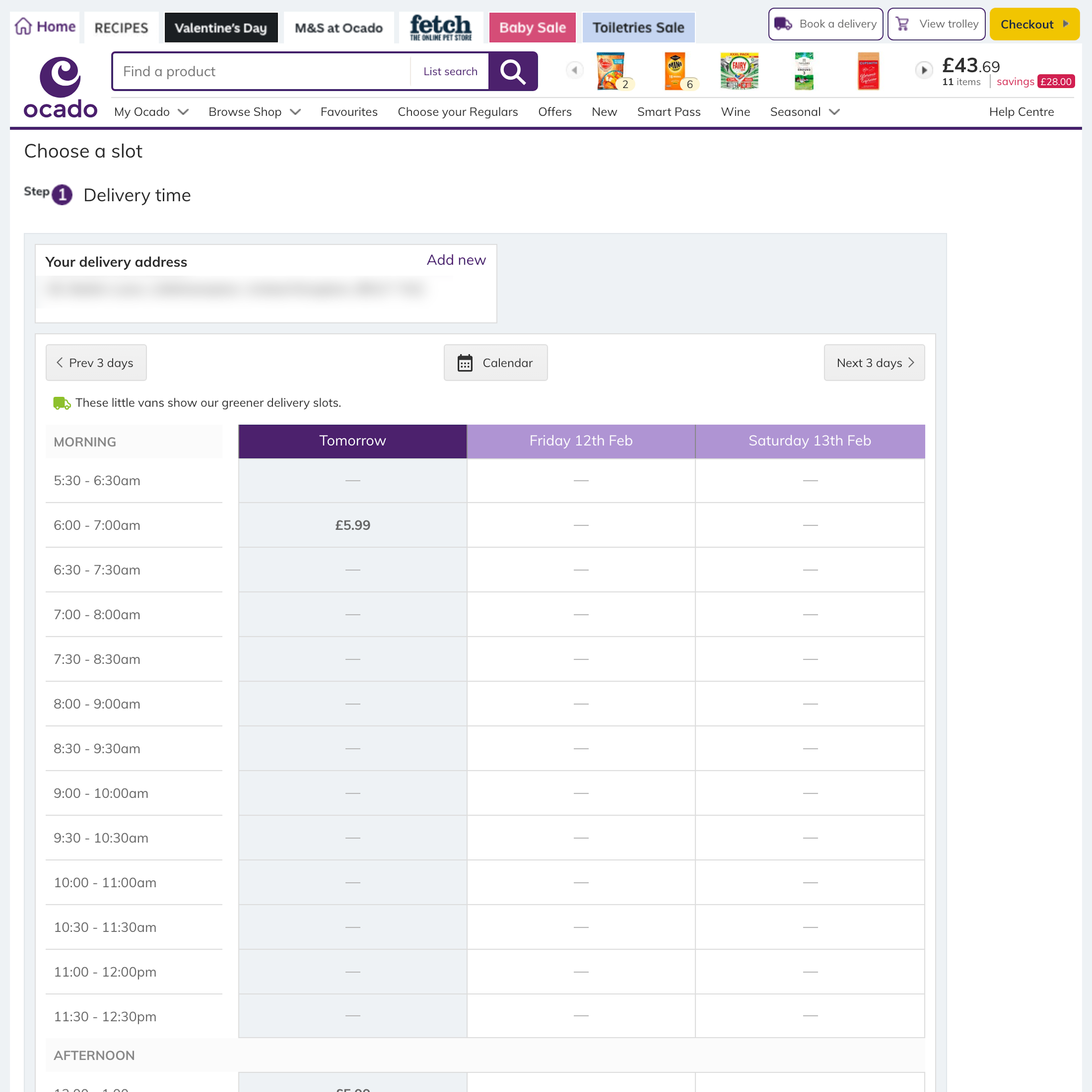
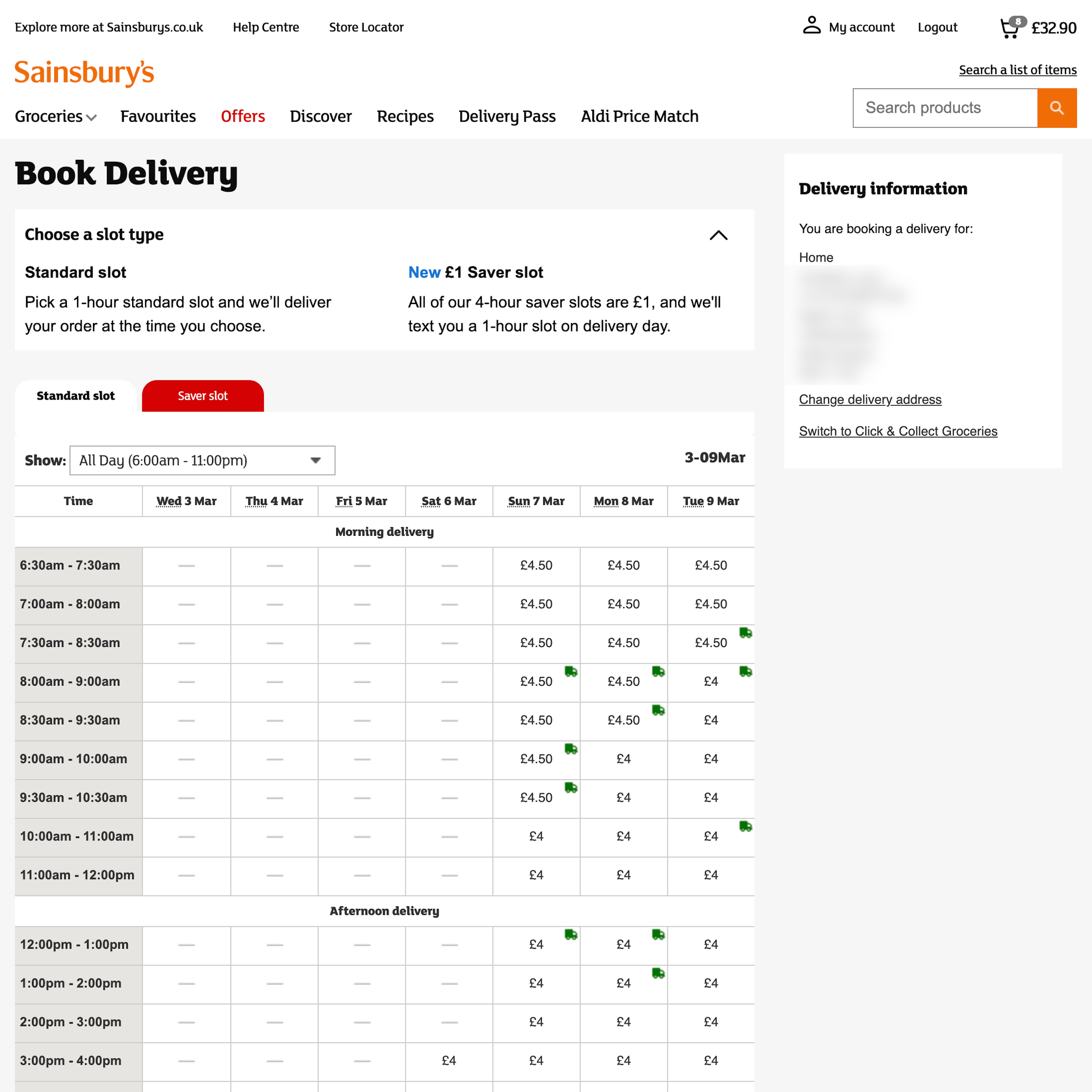
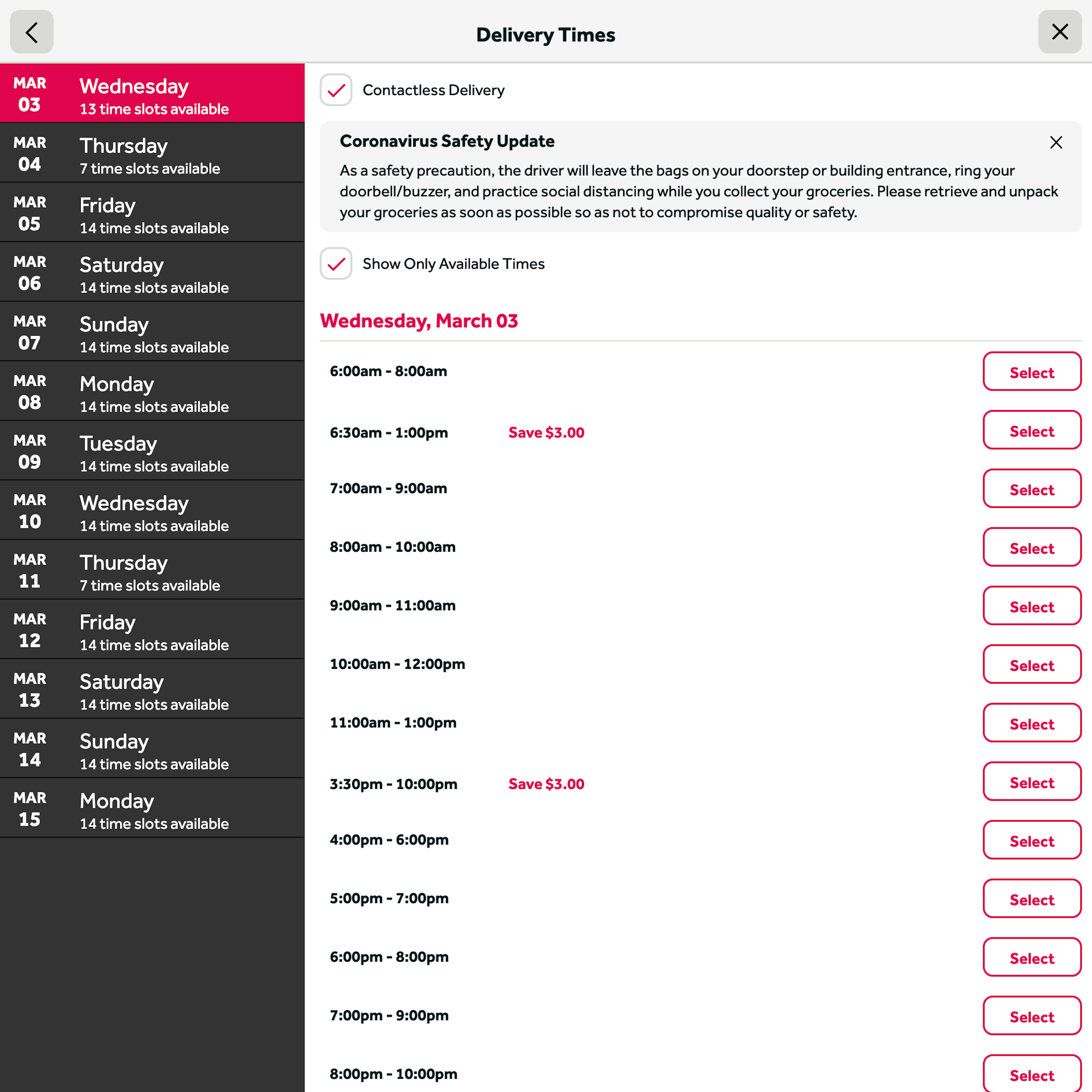
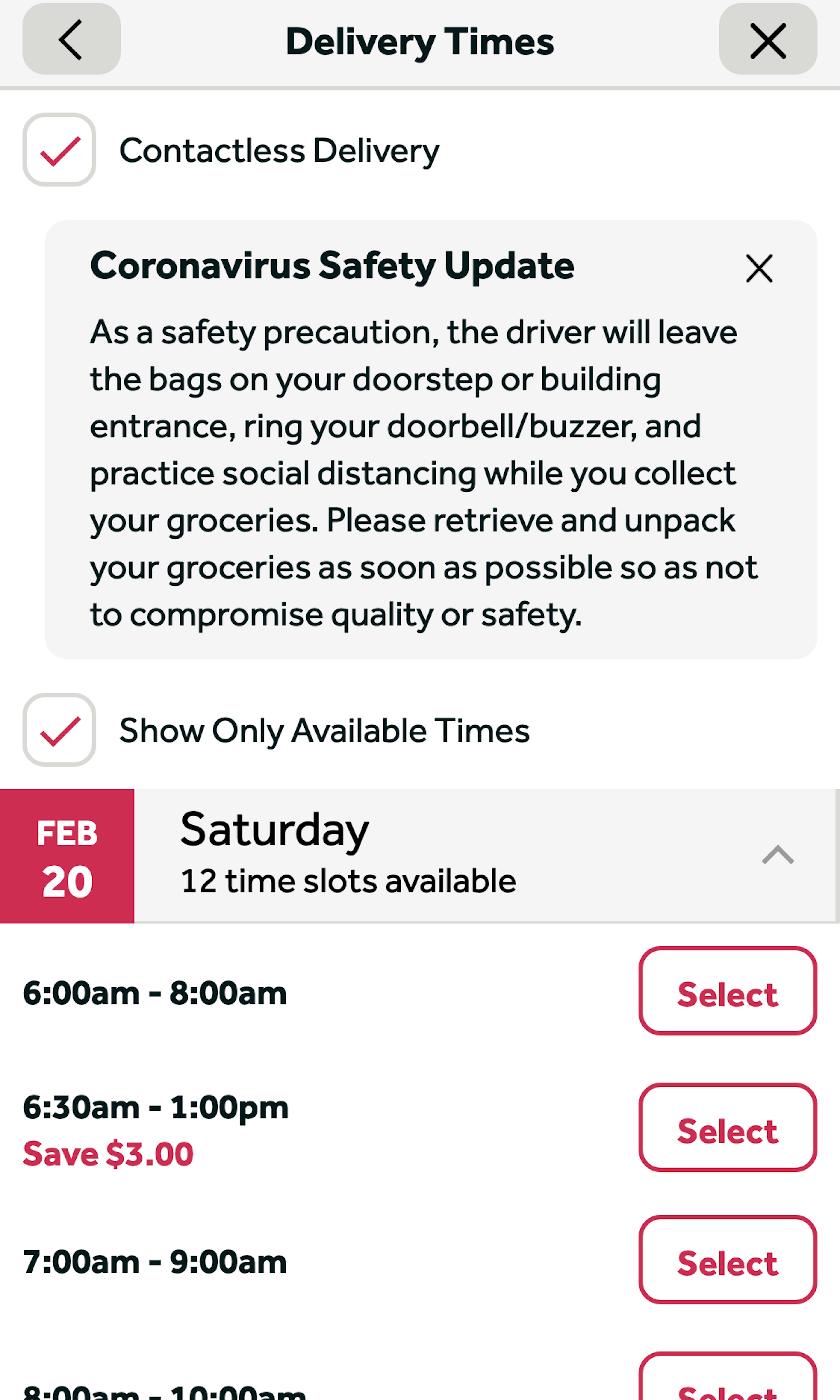
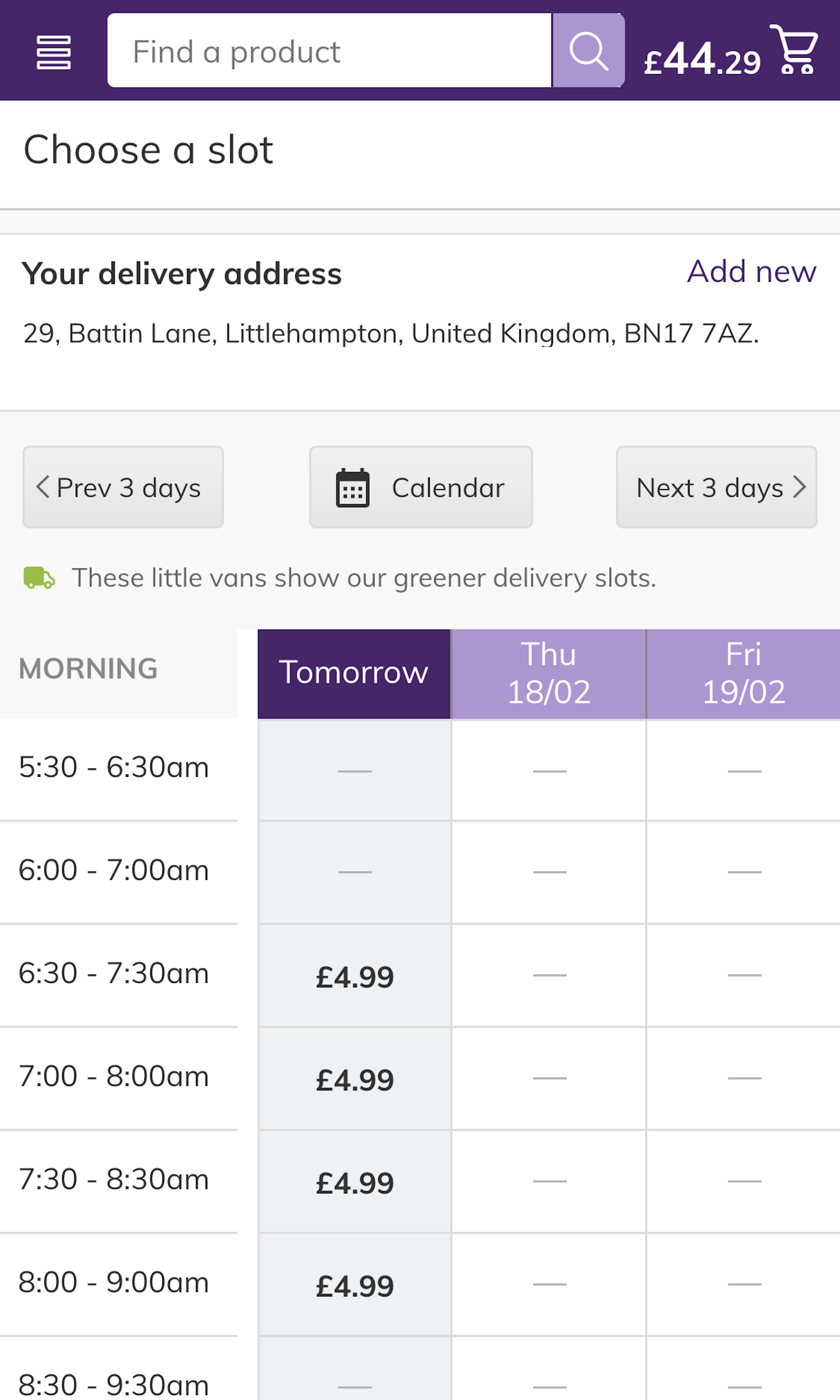
Scheduling, be it for groceries, a takeout, or the installation of a service, plays a crucial part in these types of orders, and it is usually placed somewhere close to the end of the ordering process. It is essential the users are provided with clarity on all the available date and time options accompanied by the fee within the “Time Booking Interface” to make sure that they book the suitable date and time for their needs and can quickly complete their order.
More ‘Time Booking Interface’ Insights
-
During testing, participants often struggled to understand the dates and times that were available due solely to the way in which they were presented. Consequently, participants were slowed in their progress towards completing checkout — while some even misunderstood the available options, underestimating possible dates and times and overlooking potentially viable alternatives.
-
Testing revealed the best-performing solution was to present date and time slot options in a clear visual hierarchy.
-
Learn More: Besides exploring the 39 “Time Booking Interface” design examples below, you may also want to read our related article “3 High-Level UX Takeaways from 1100+ Hours of Testing Leading Food Delivery and Takeout Sites”.
-
Get Full Access: To see all of Baymard’s “Time Booking Interface” research findings you’ll need Baymard Premium access. (Premium also provides you full access to 200,000+ hours of UX research findings, 650+ e-commerce UX guidelines, and 275,000+ UX performance scores.)


User Experience Research, Delivered Weekly
Join 60,000+ UX professionals and get a new UX article every week.

User Experience Research, Delivered Weekly
Join 60,000+ UX professionals and get a new UX article every week.
Explore Other Research Content
300+ free UX articles based on large-scale research.

327 top sites ranked by UX performance.

Code samples, demos, and key stats for usability.