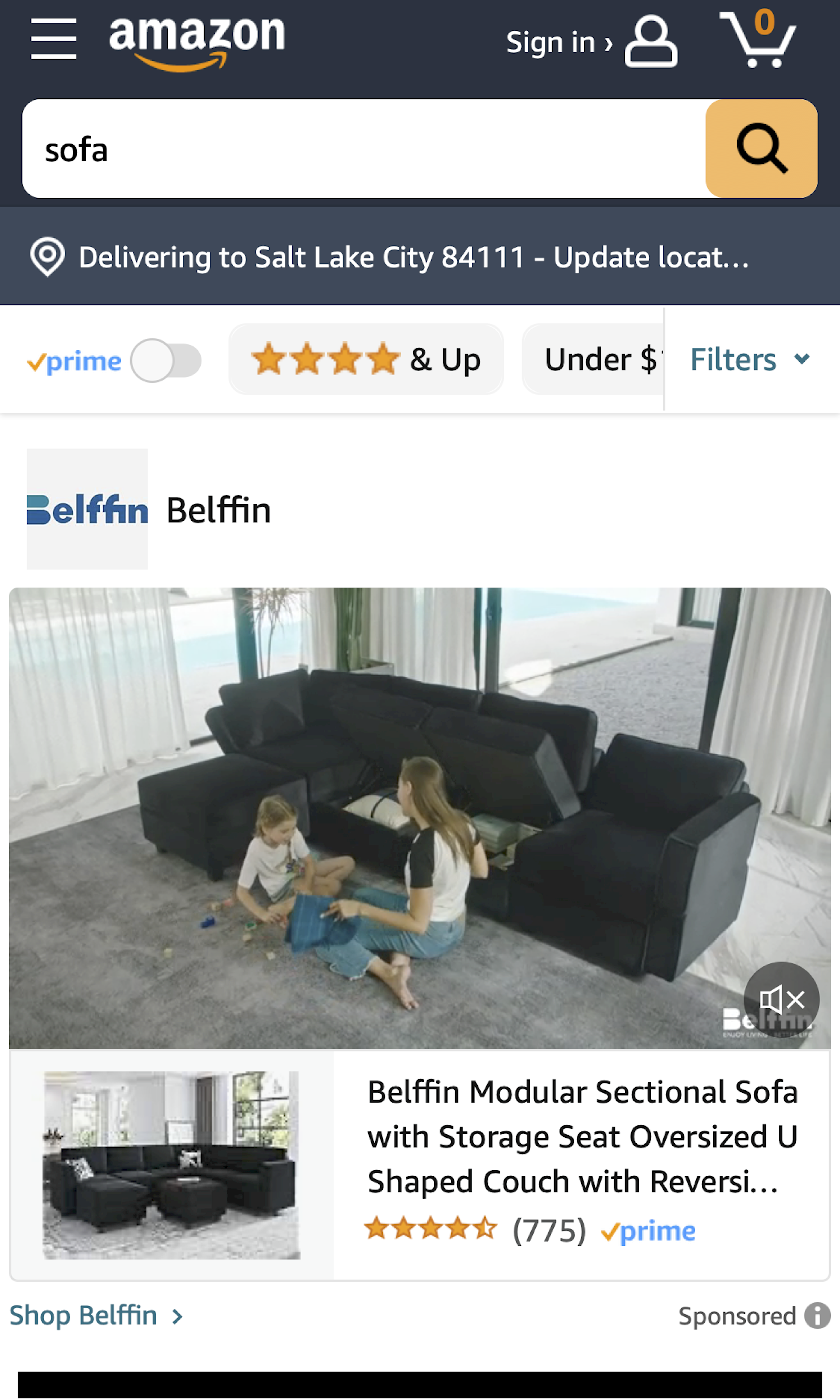
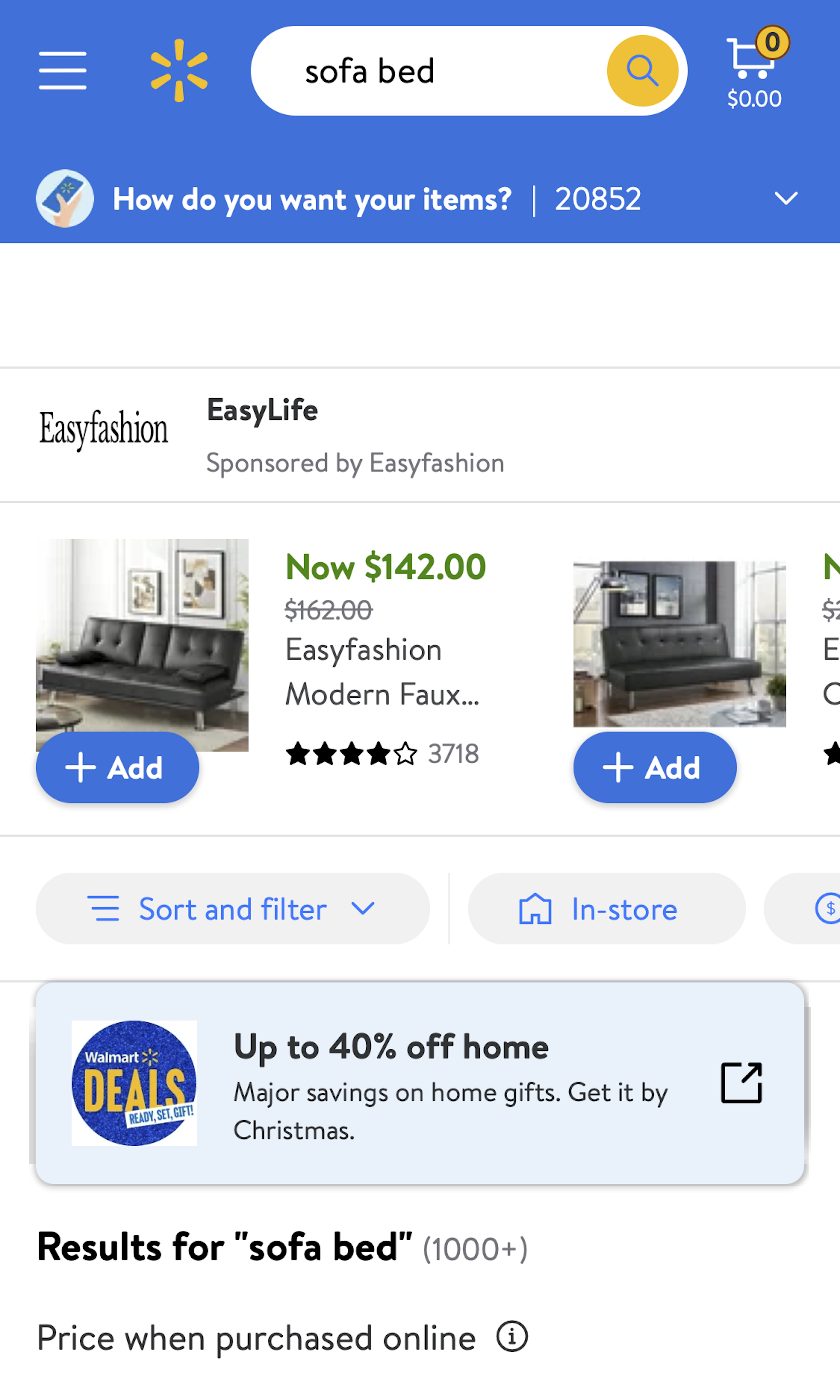
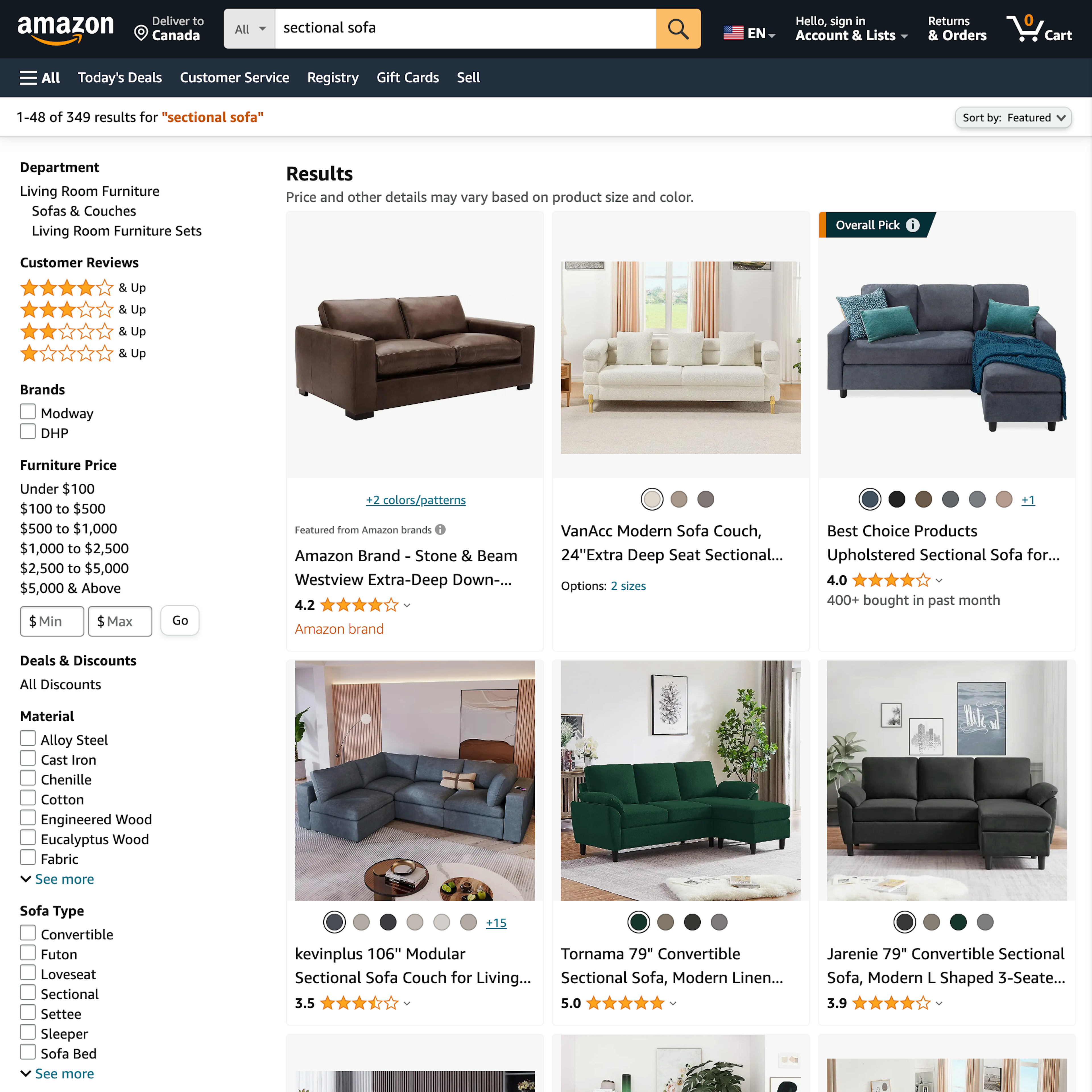
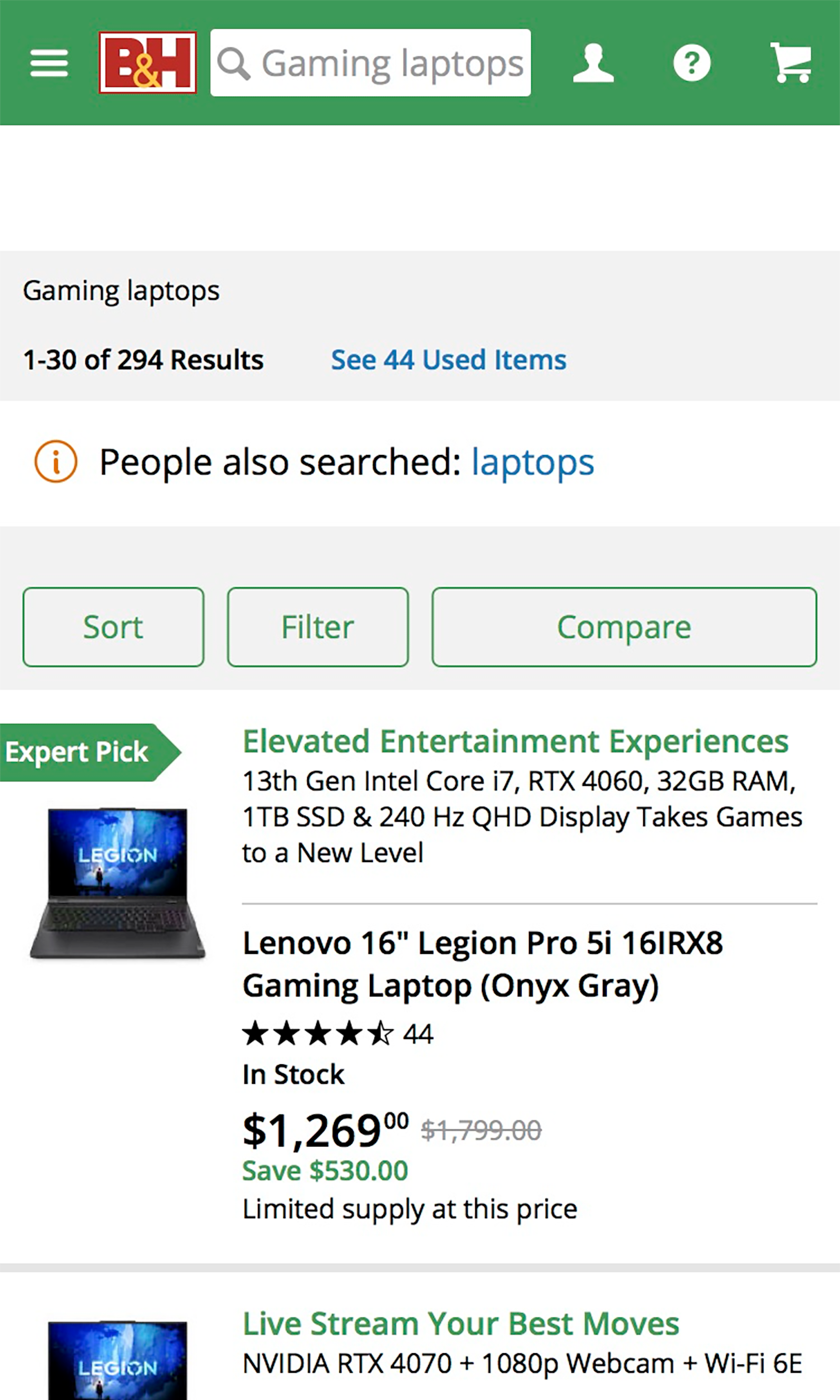
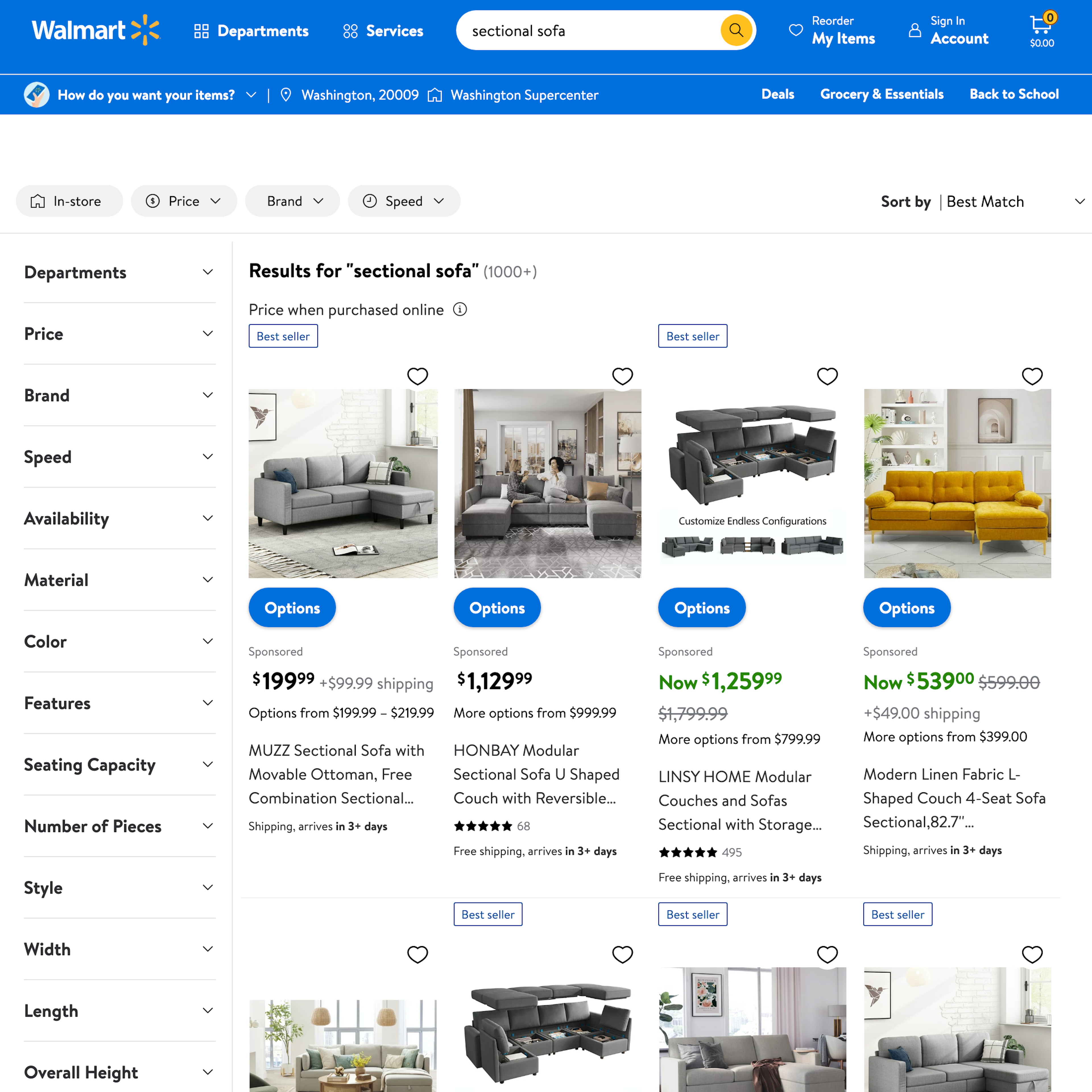
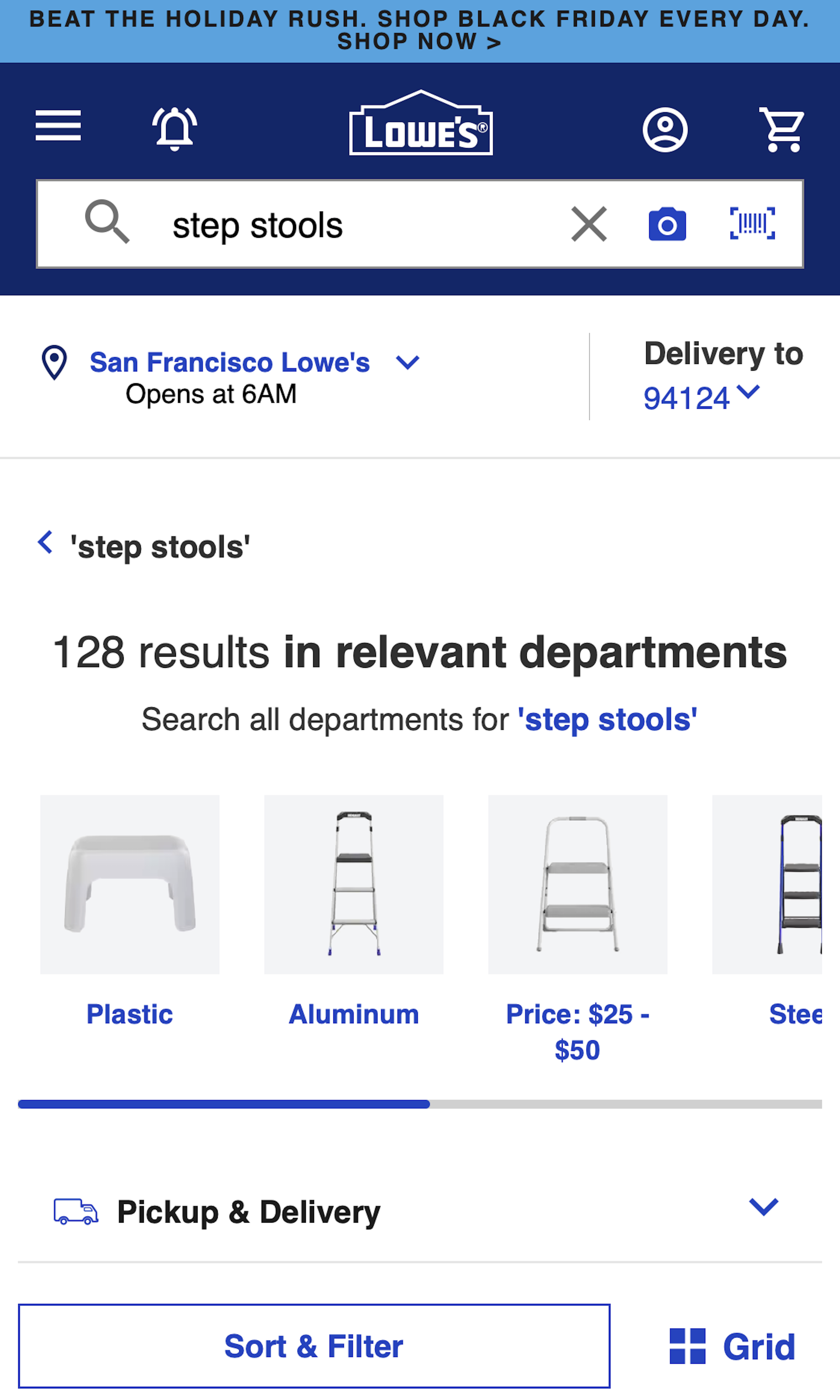
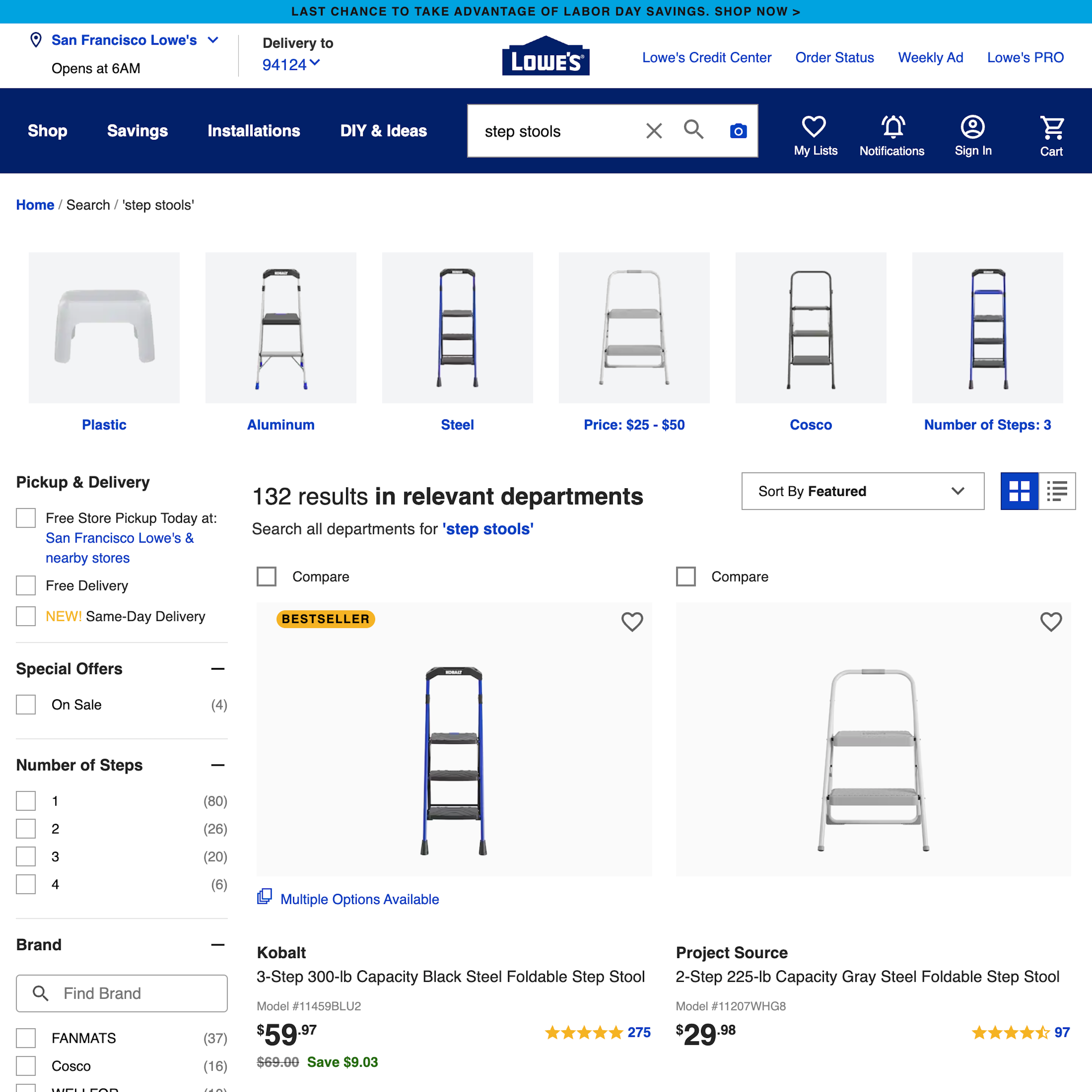
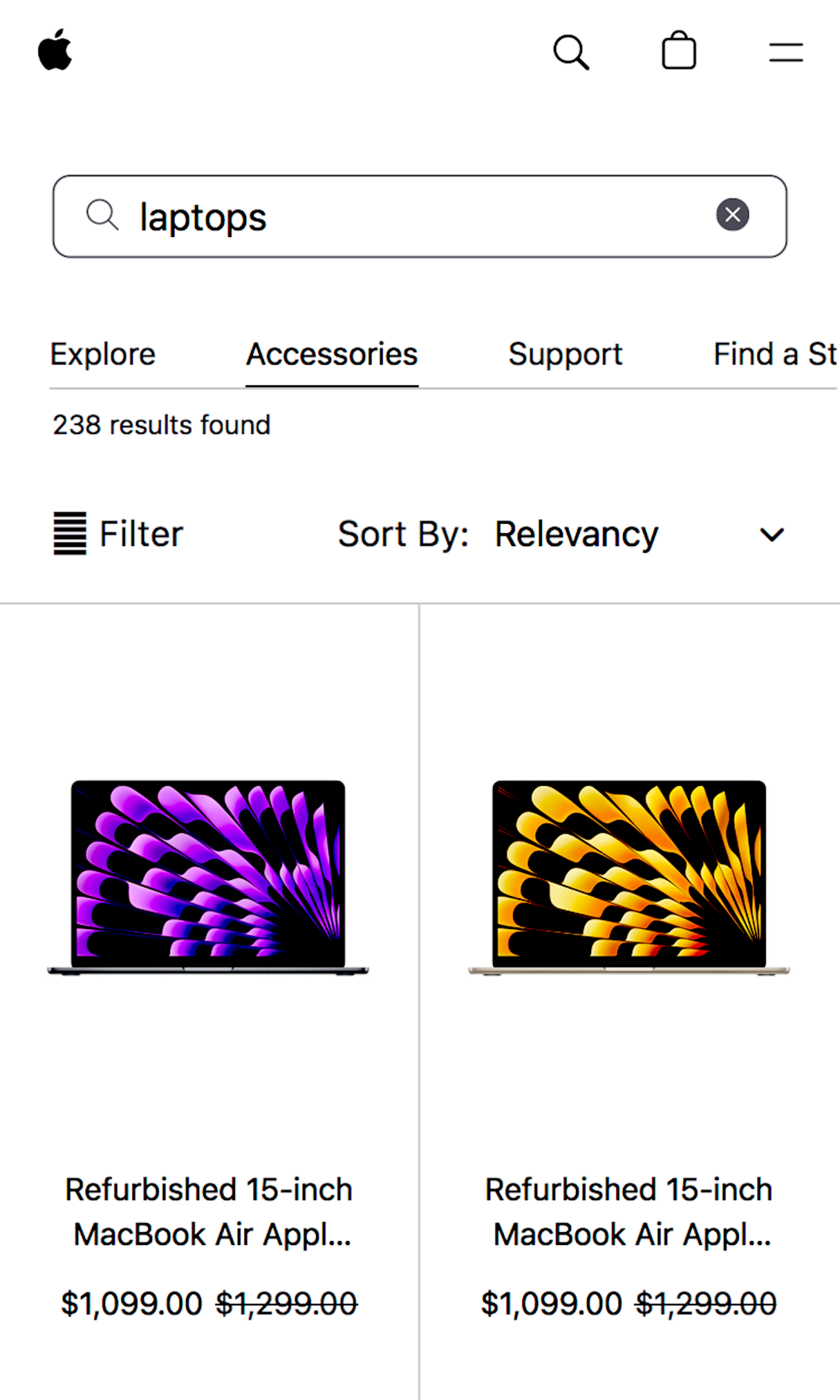
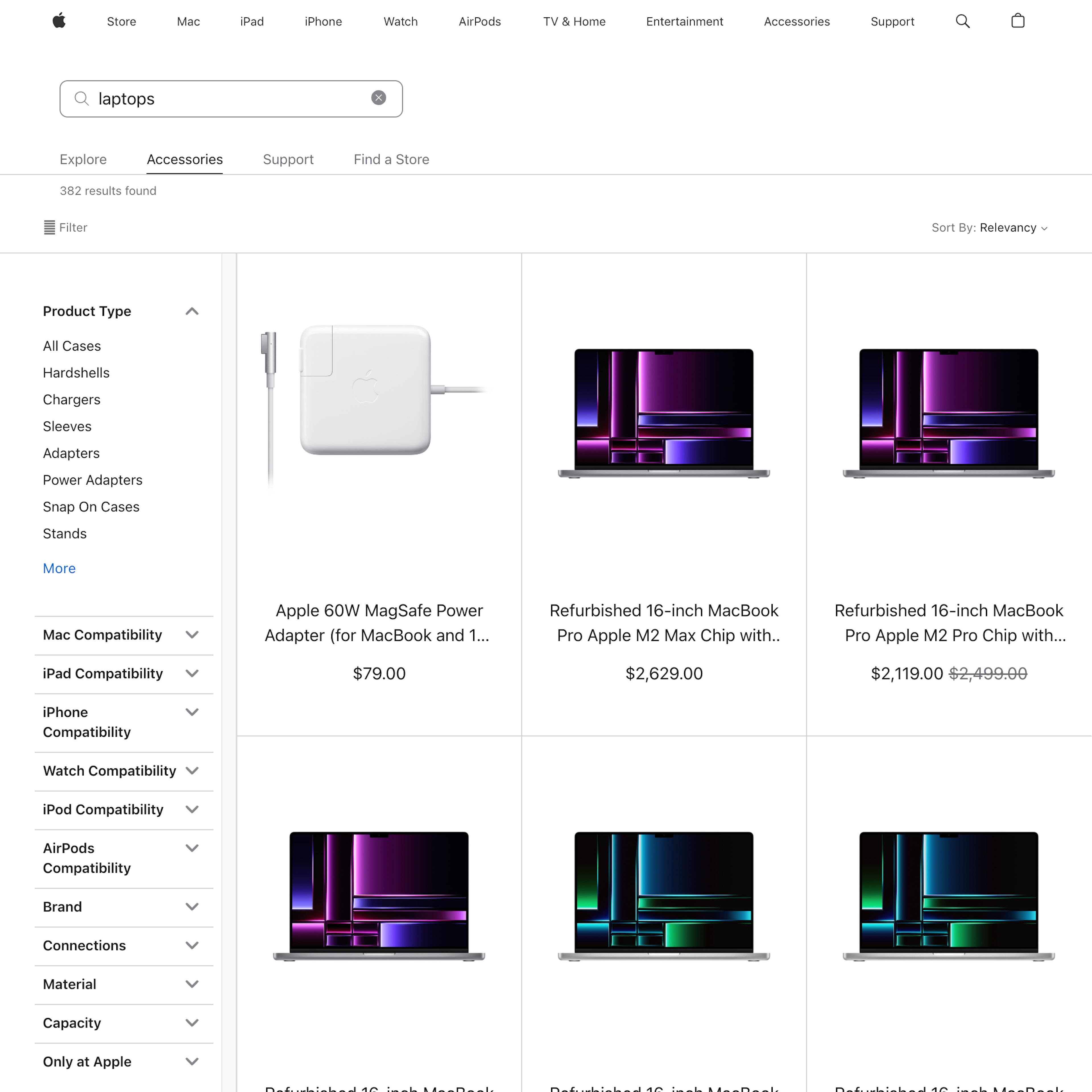
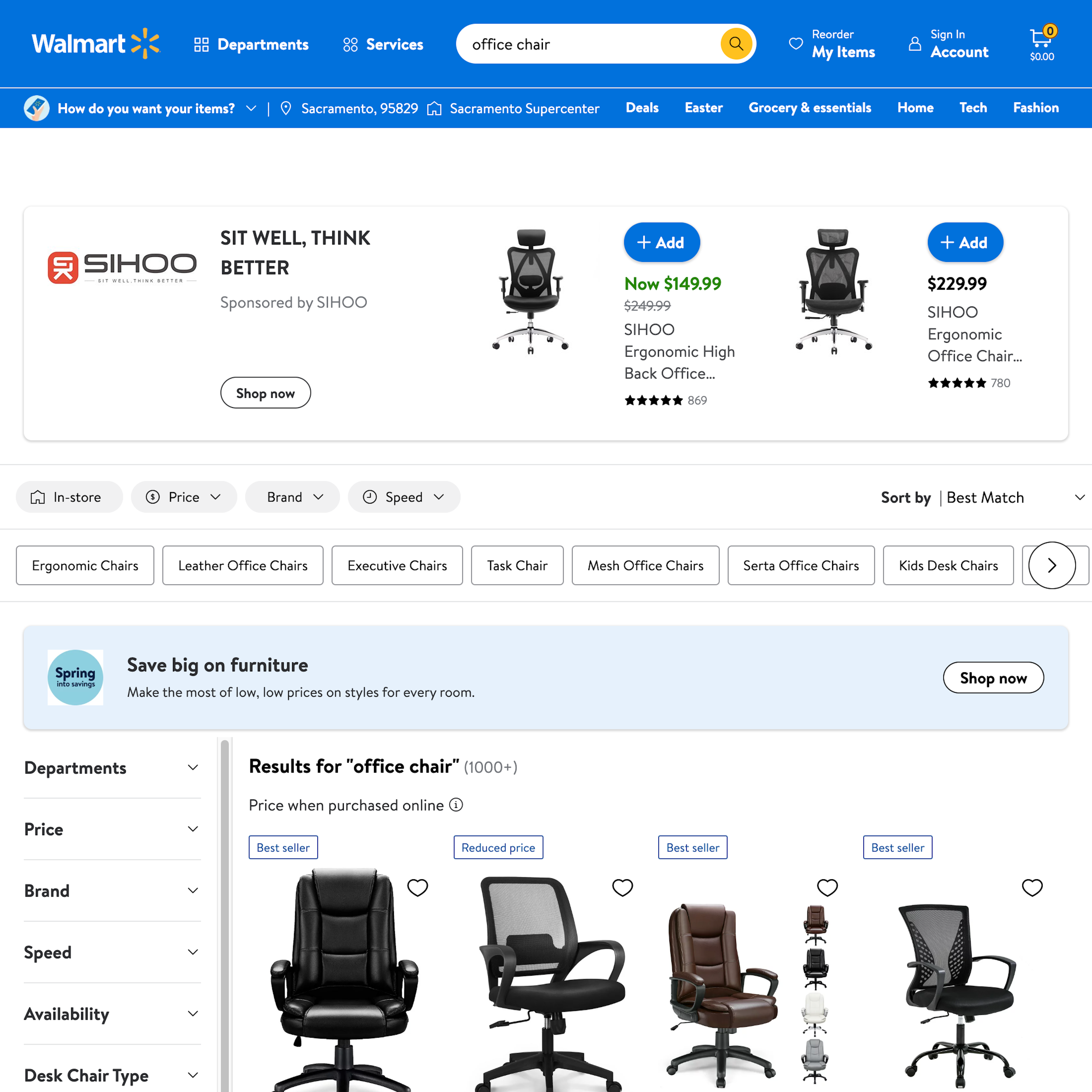
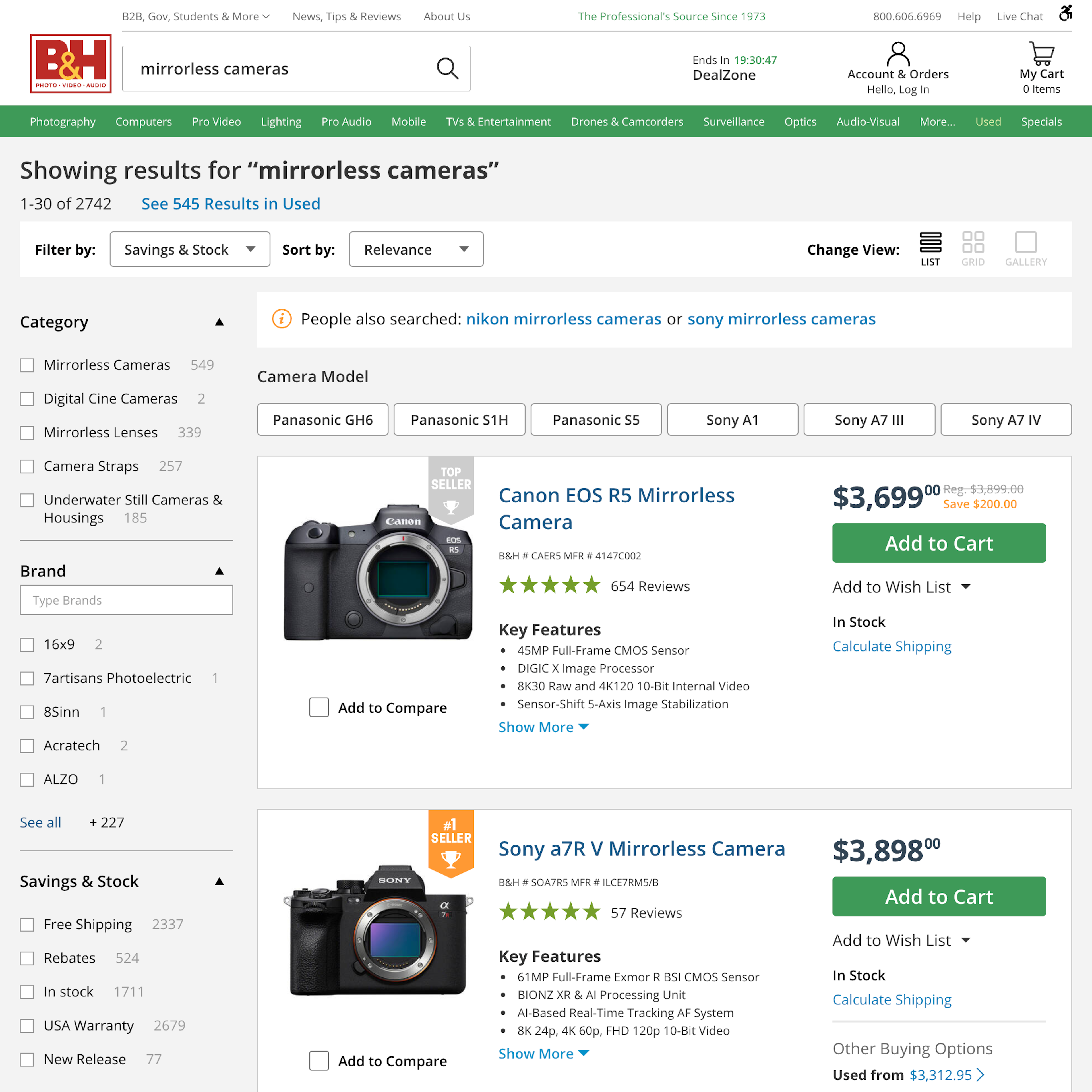
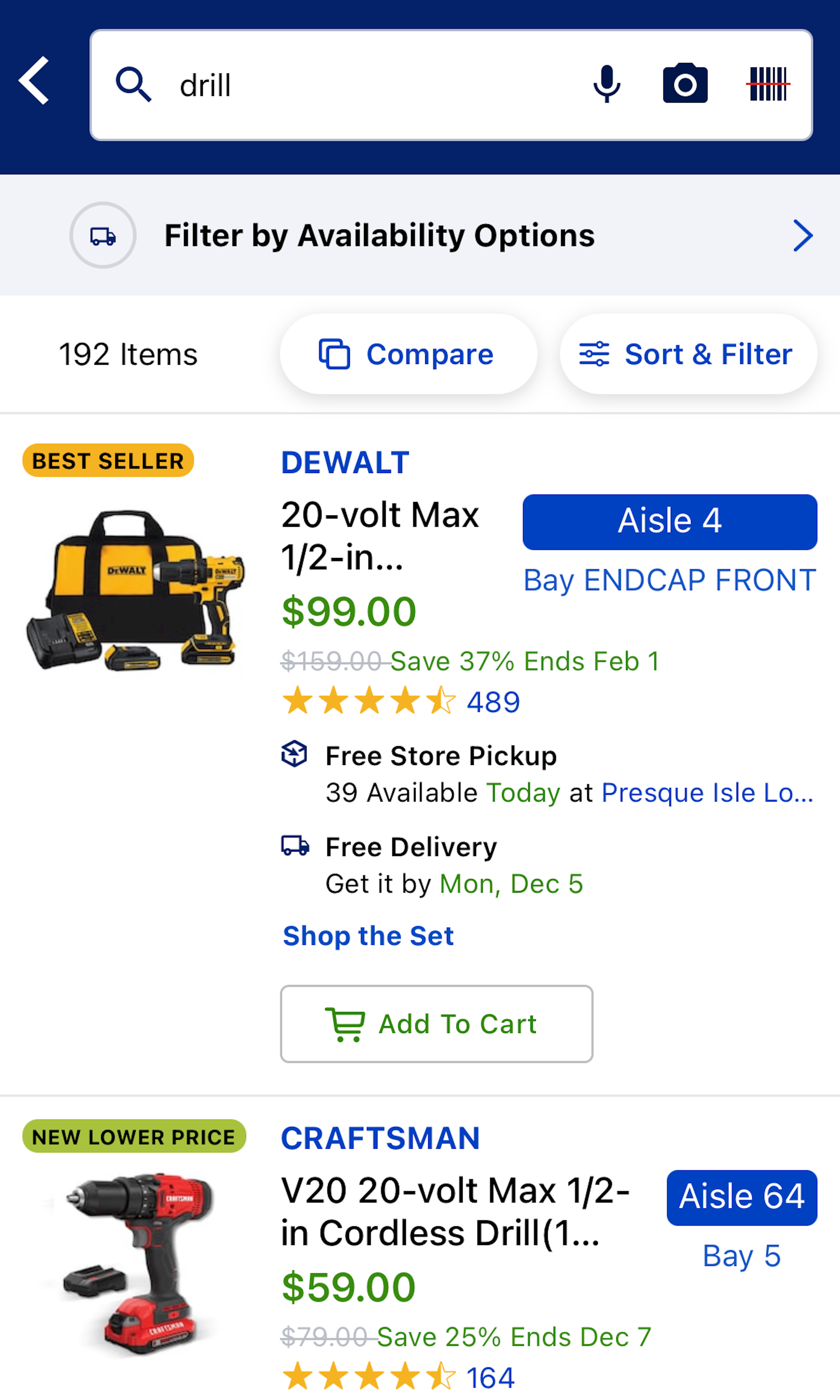
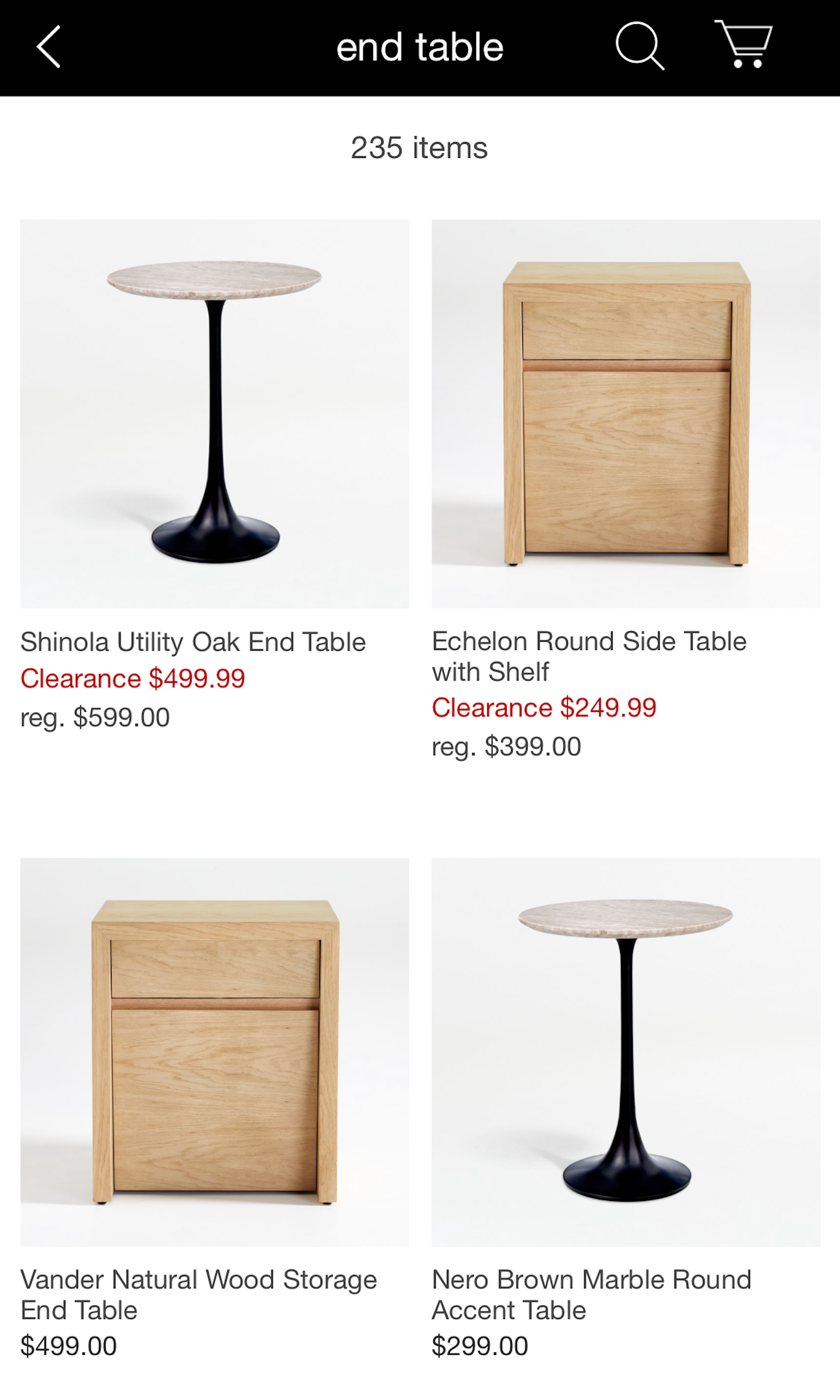
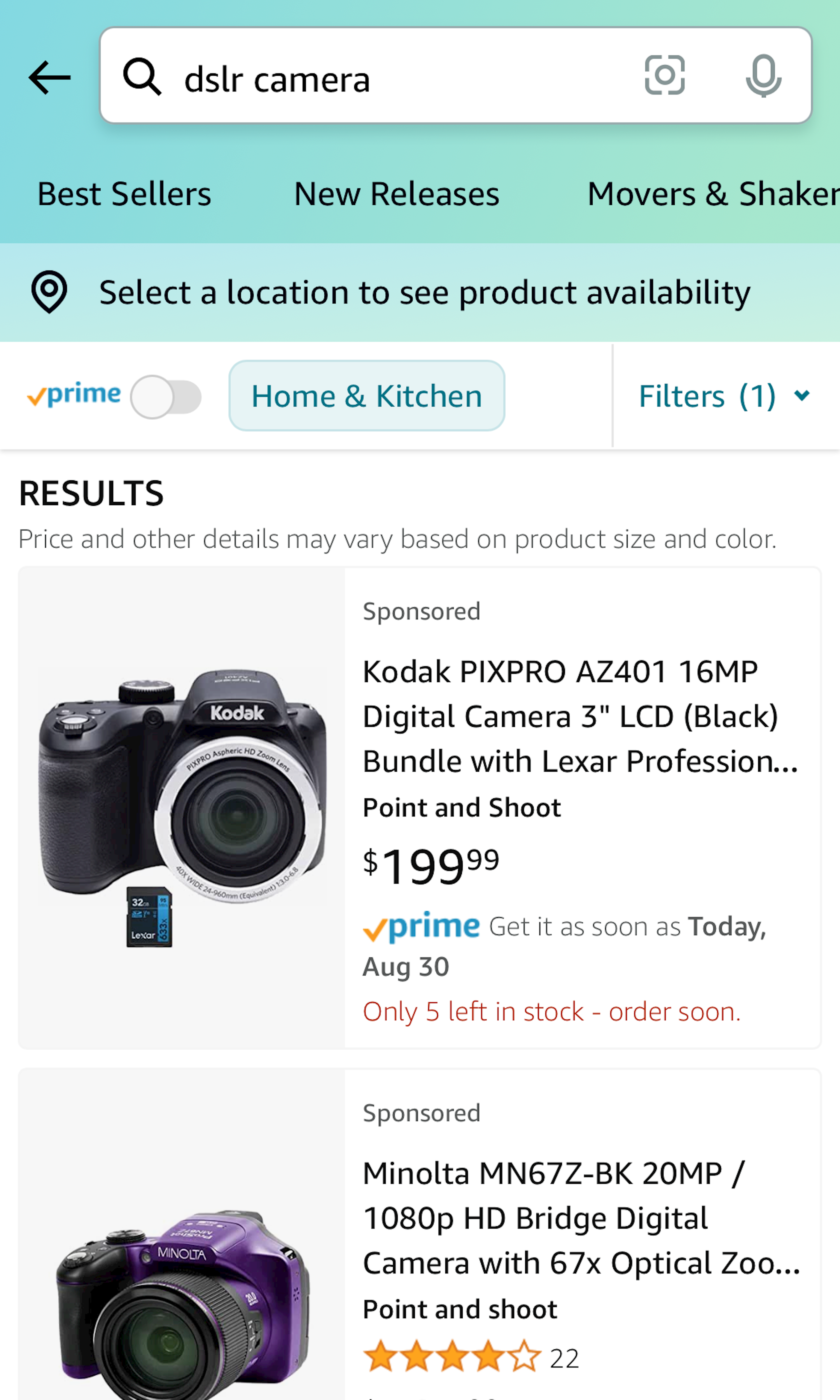
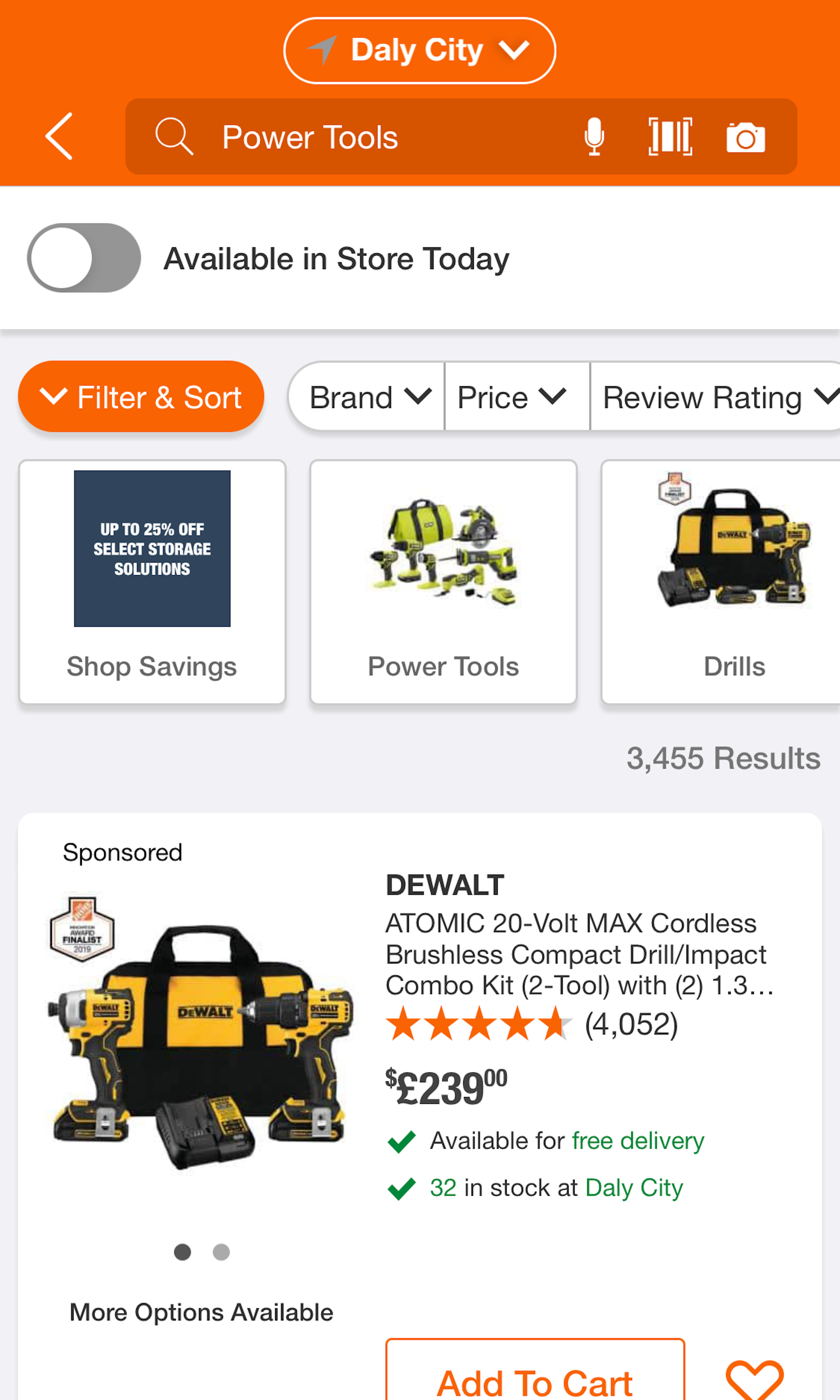
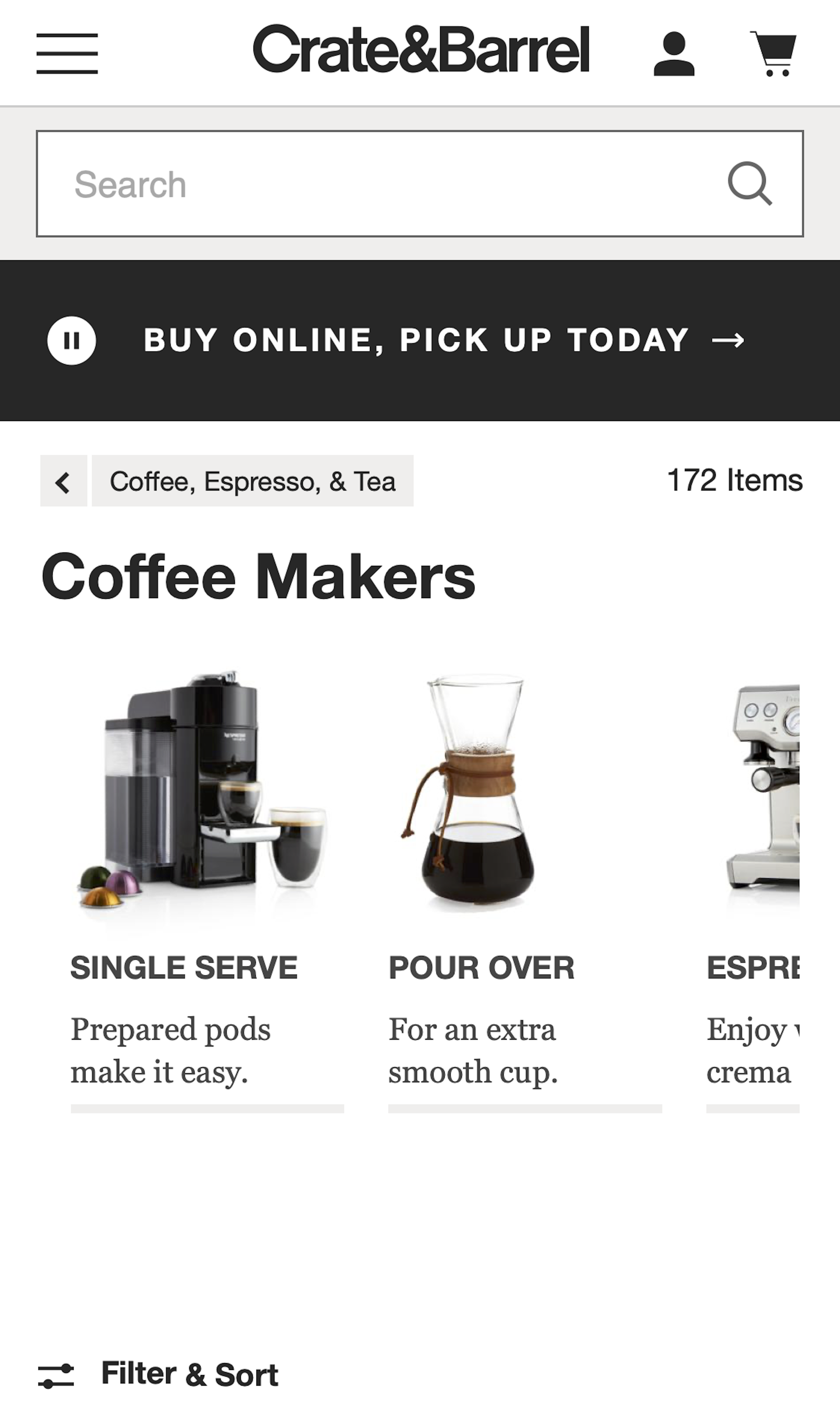
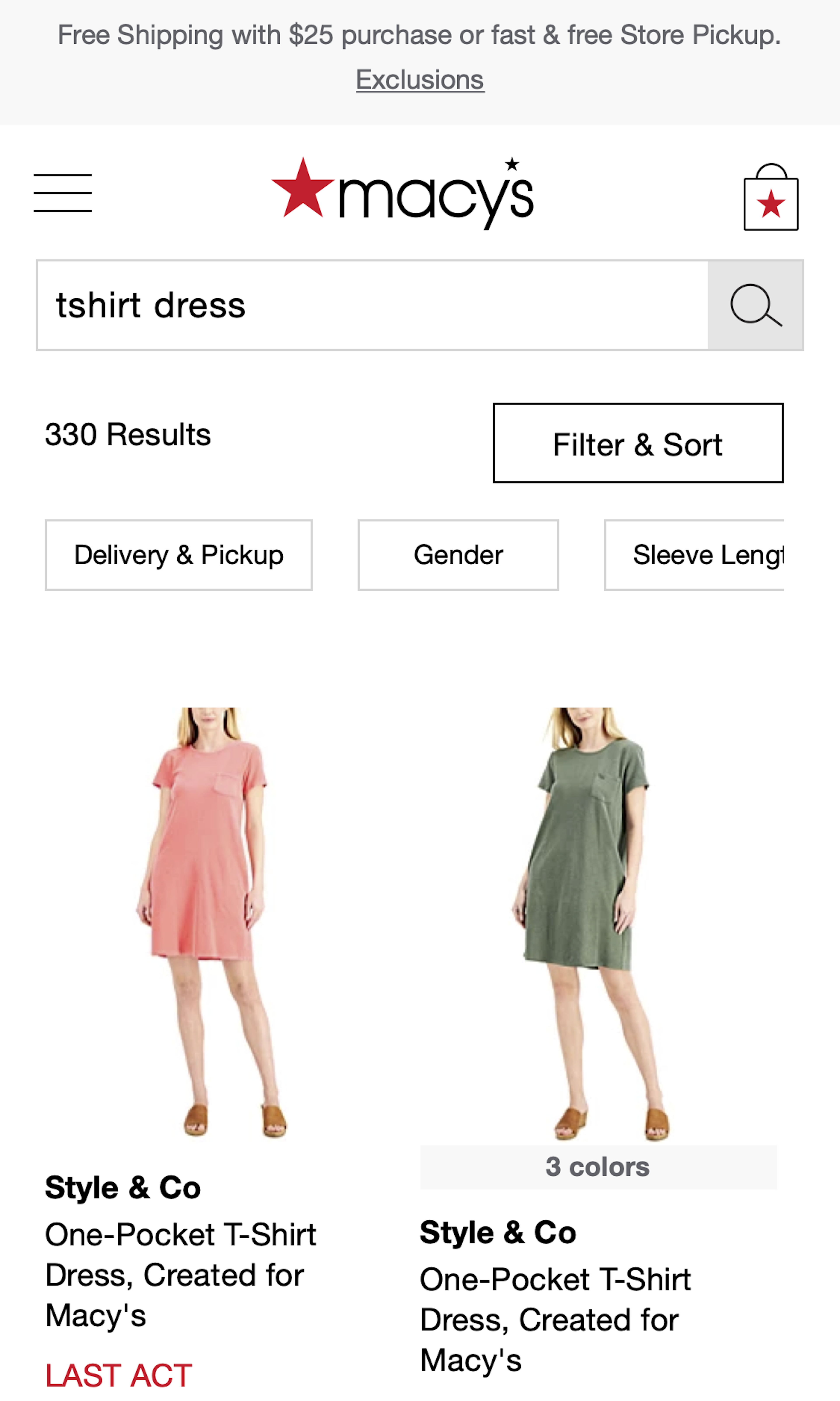
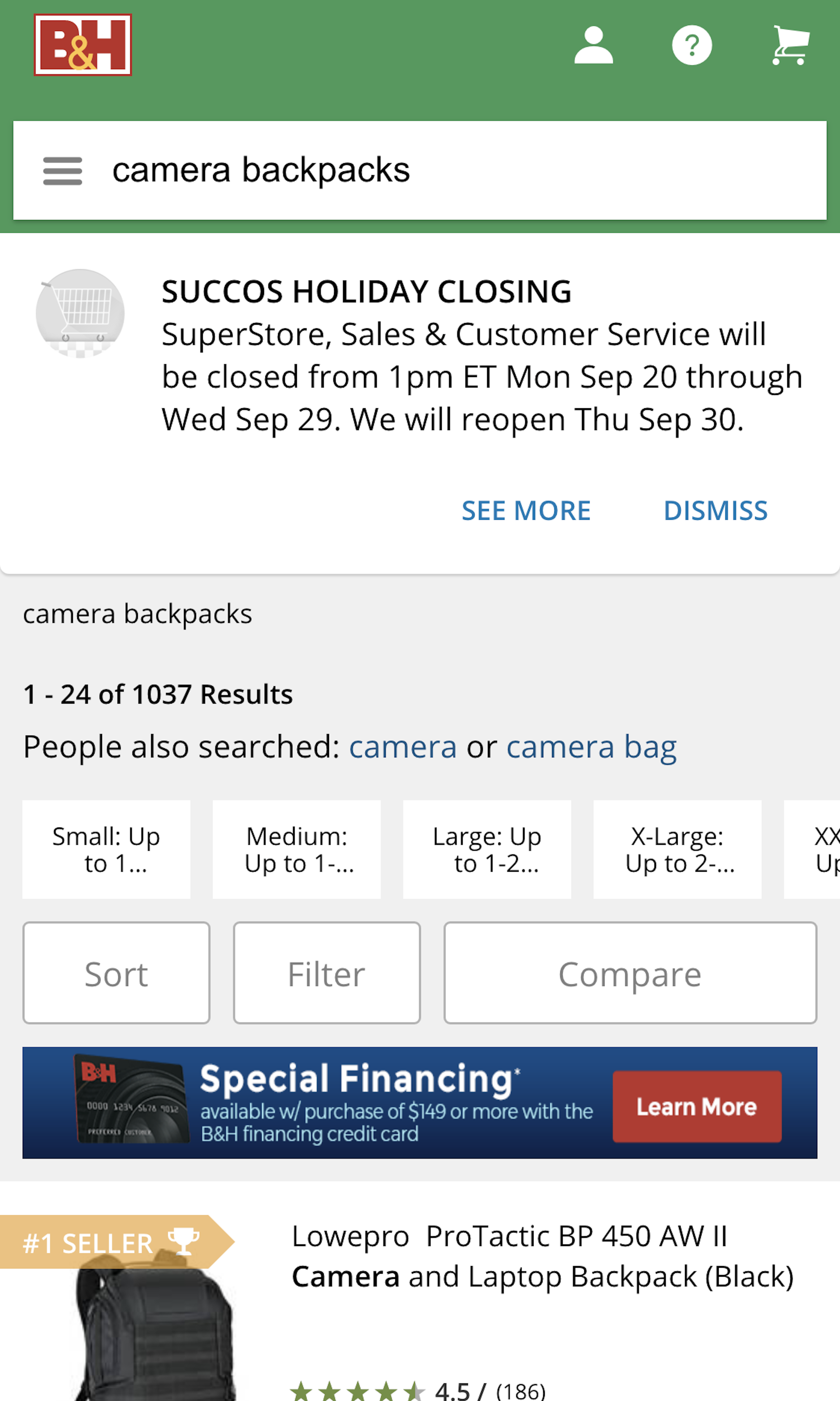
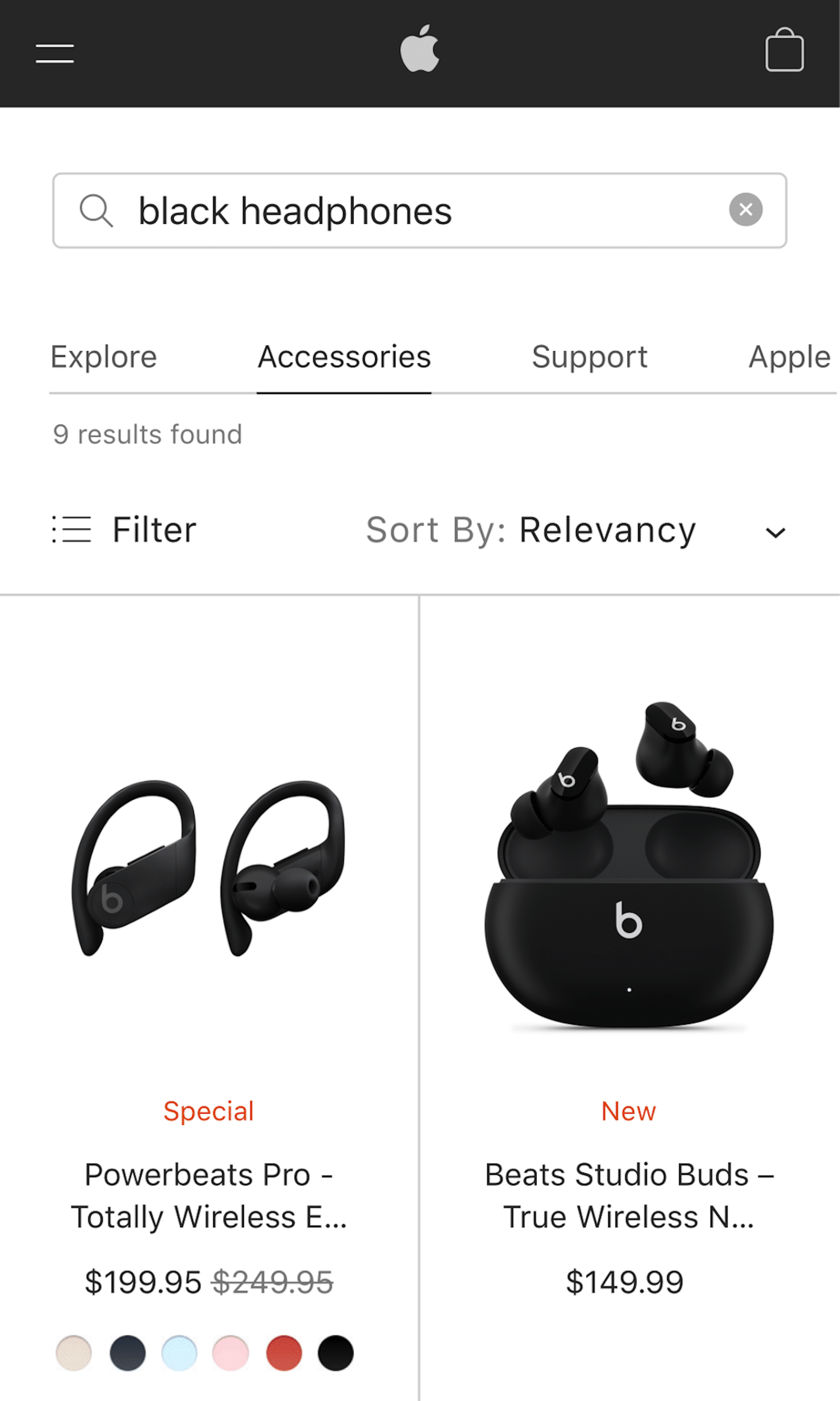
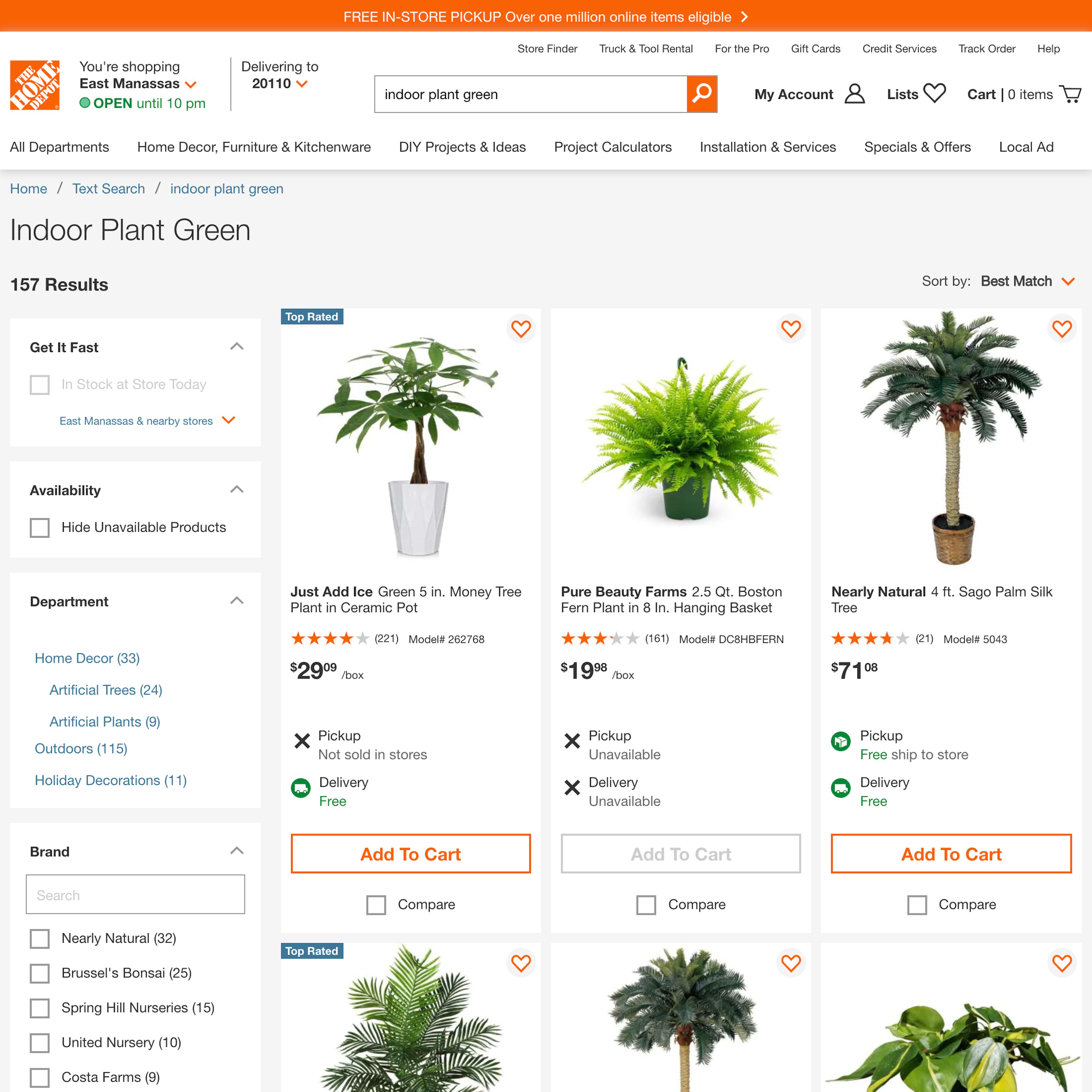
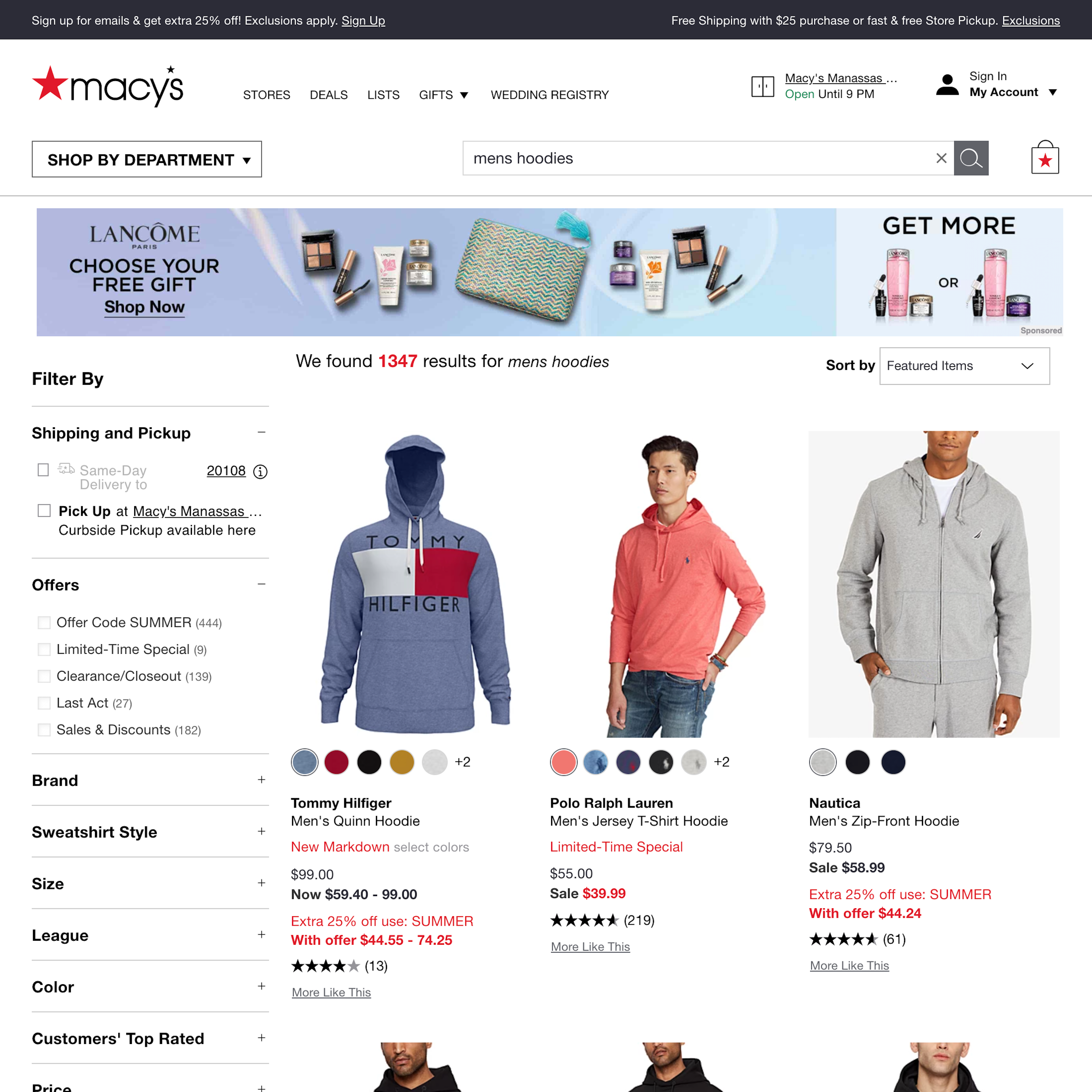
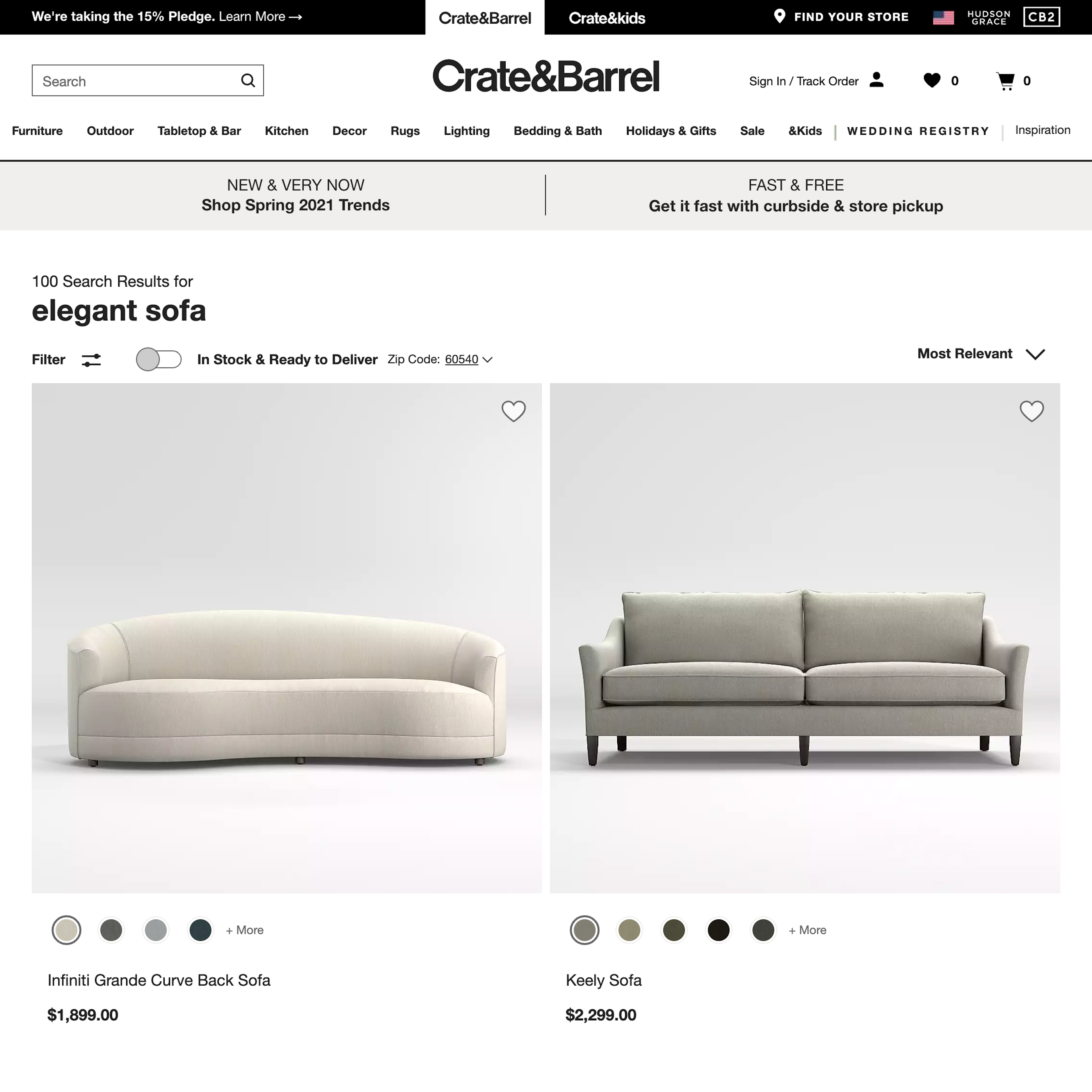
1329 ‘Search Results Page’ Design Examples
Also referred to as: Search Filters, Faceted Search
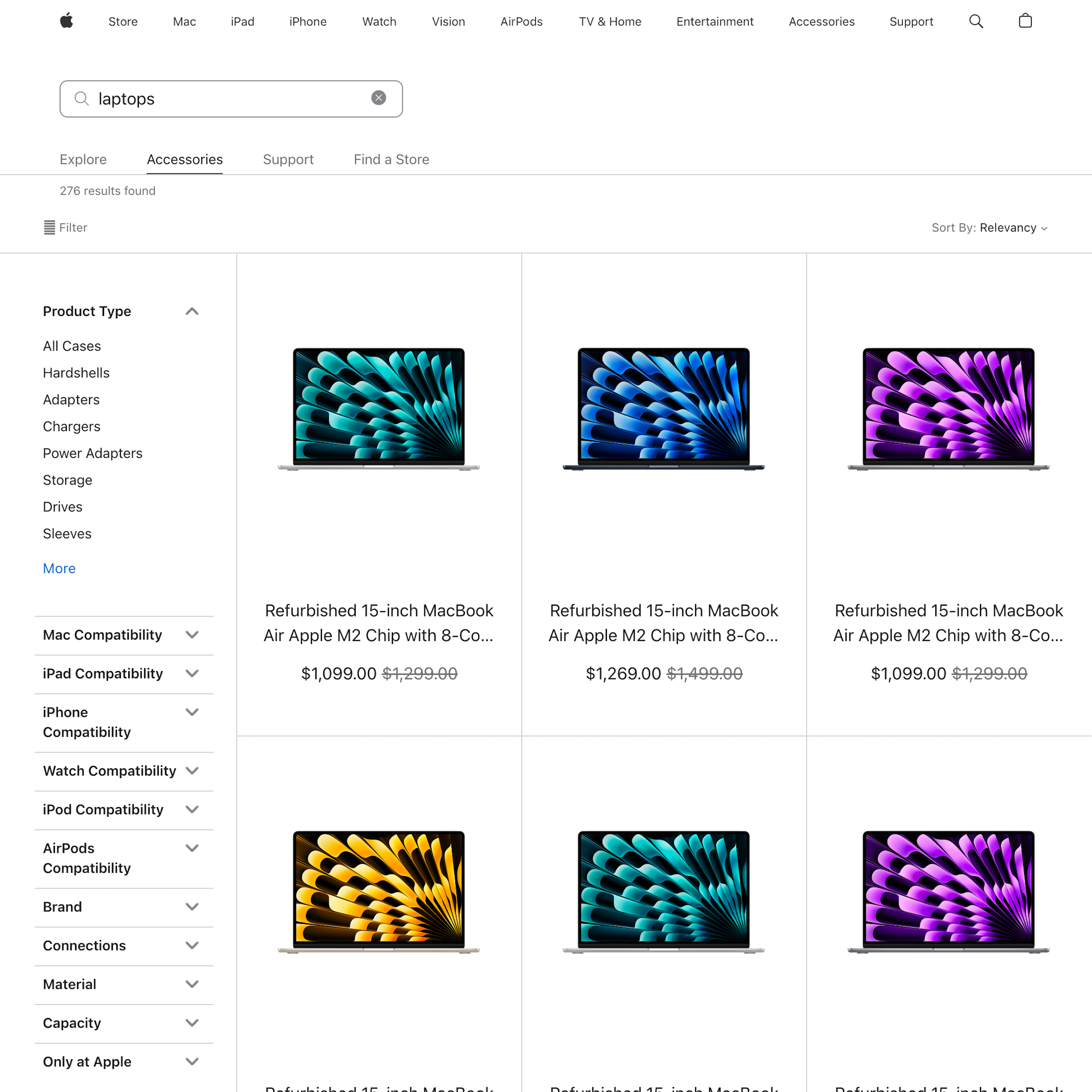
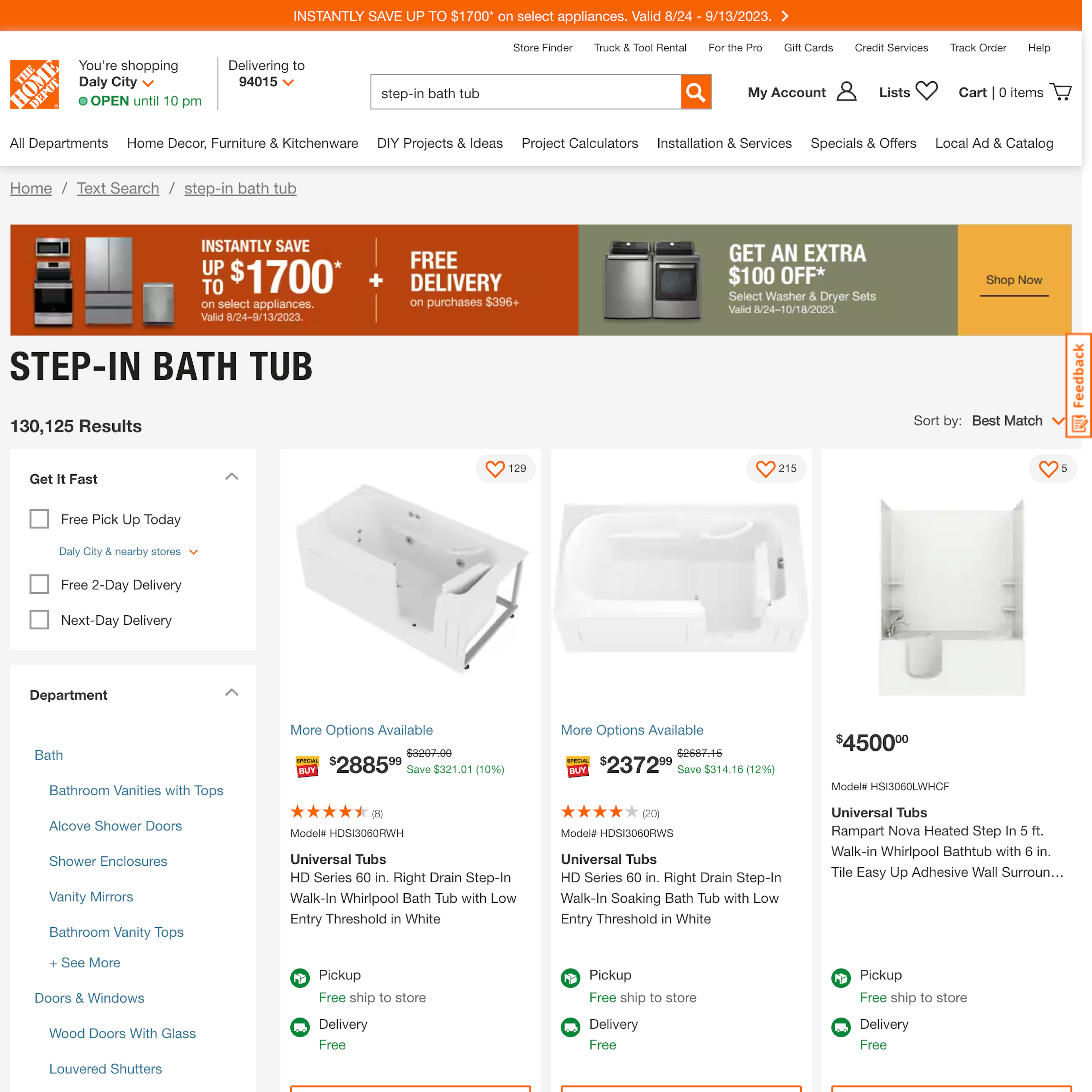
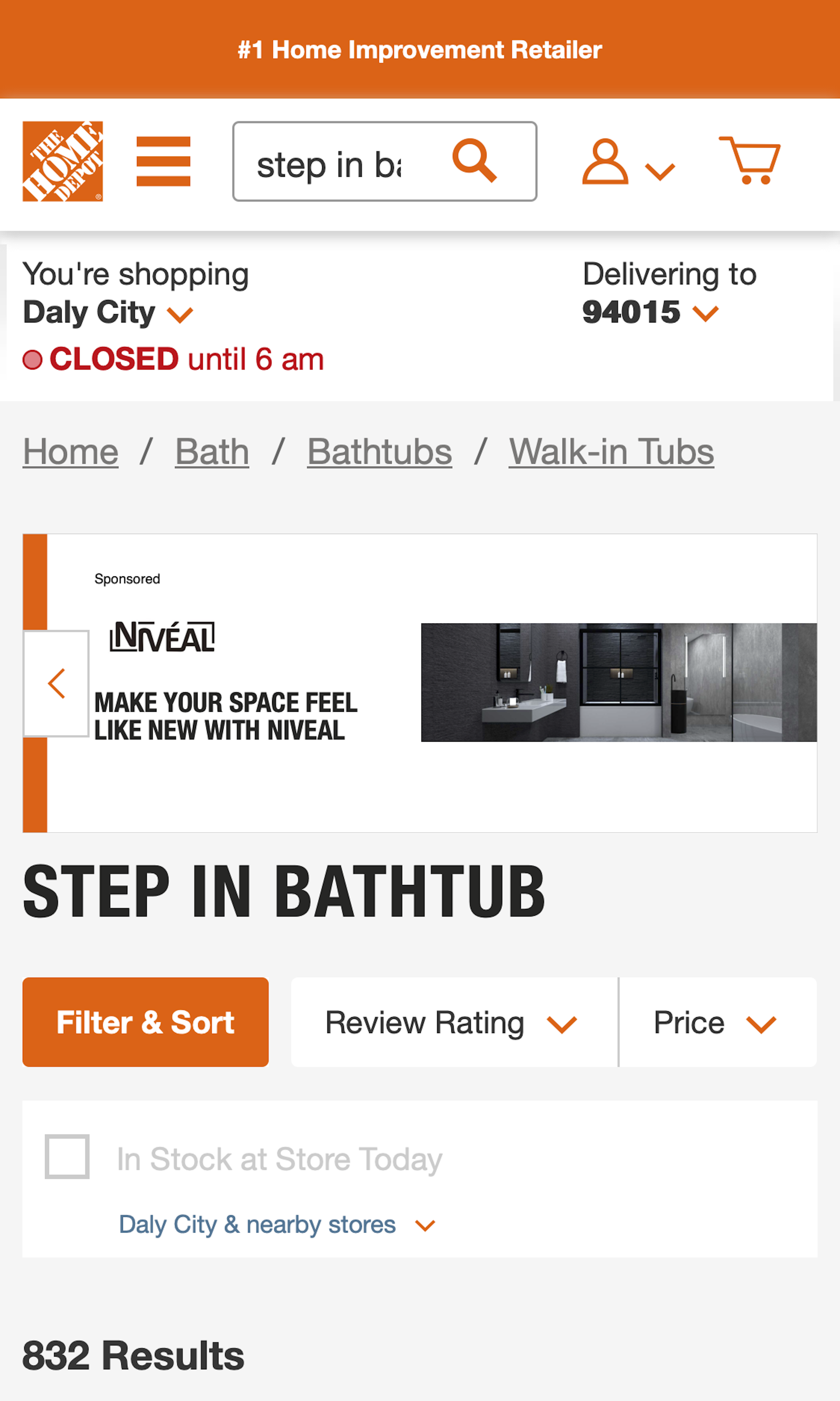
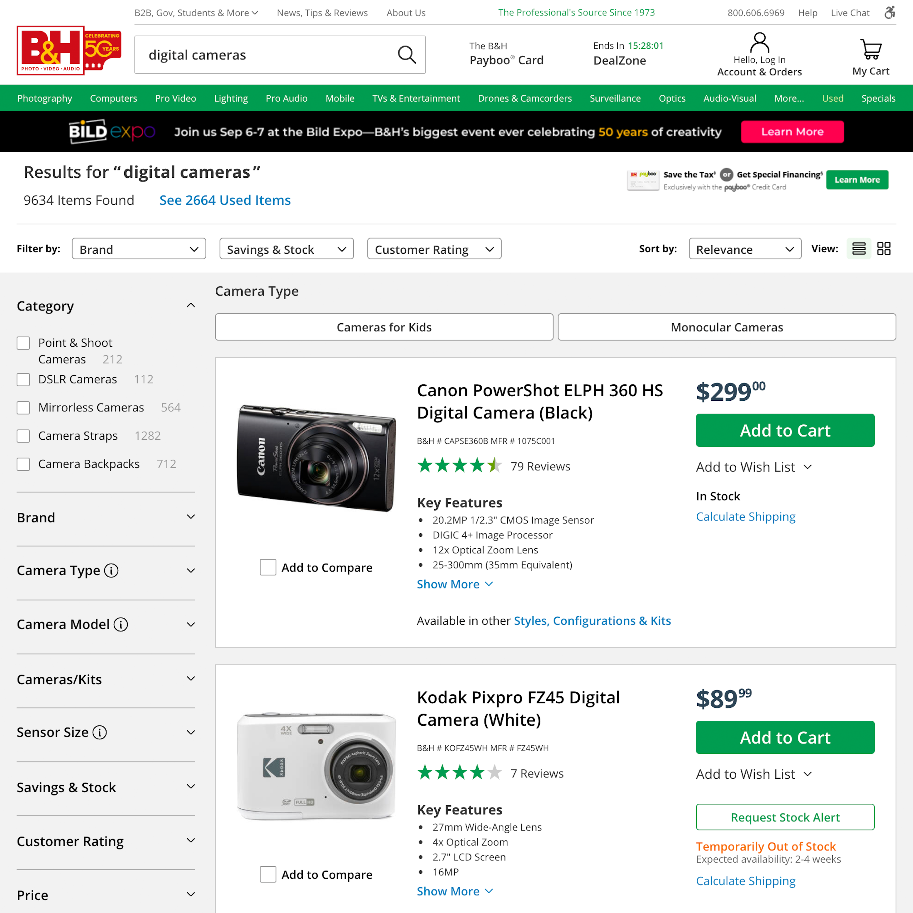
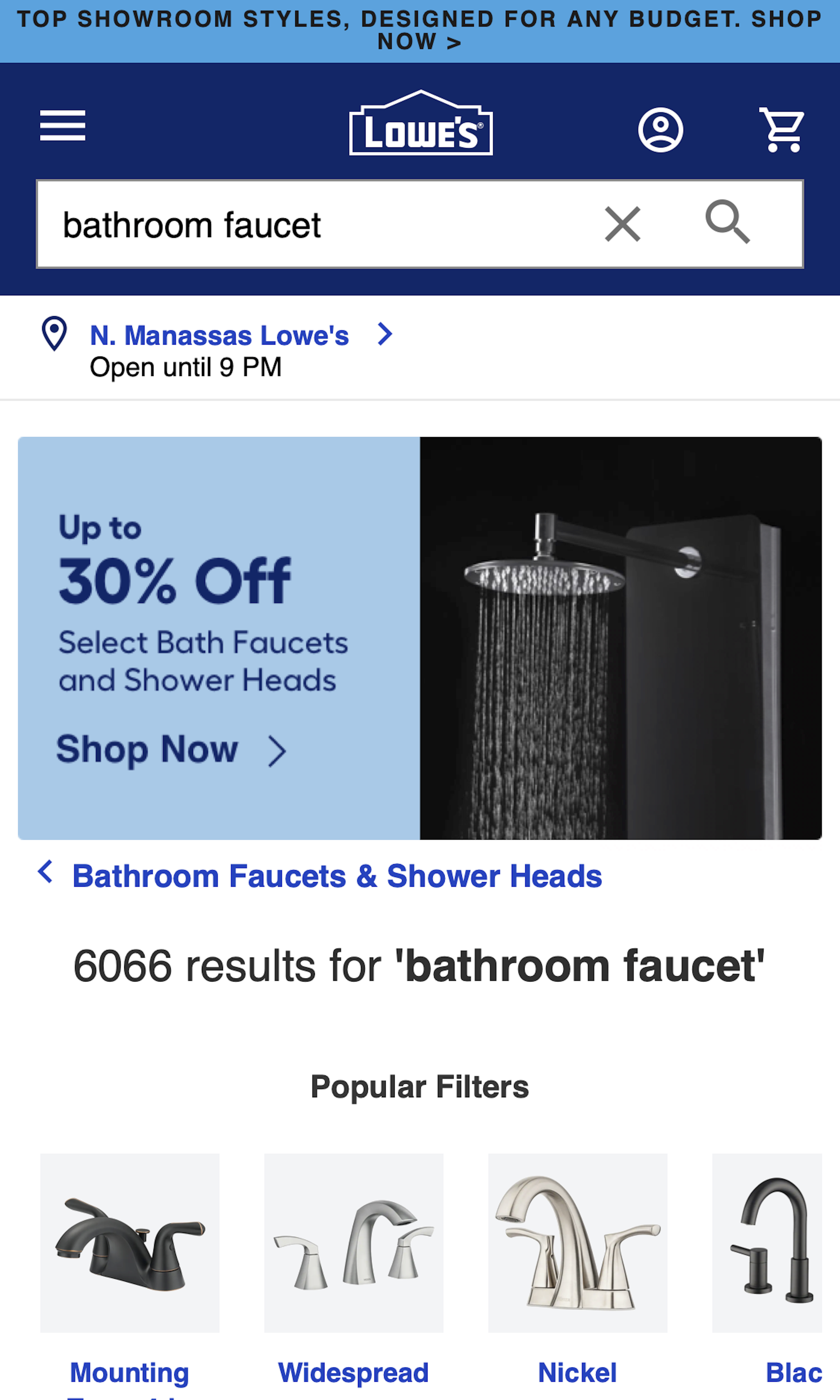
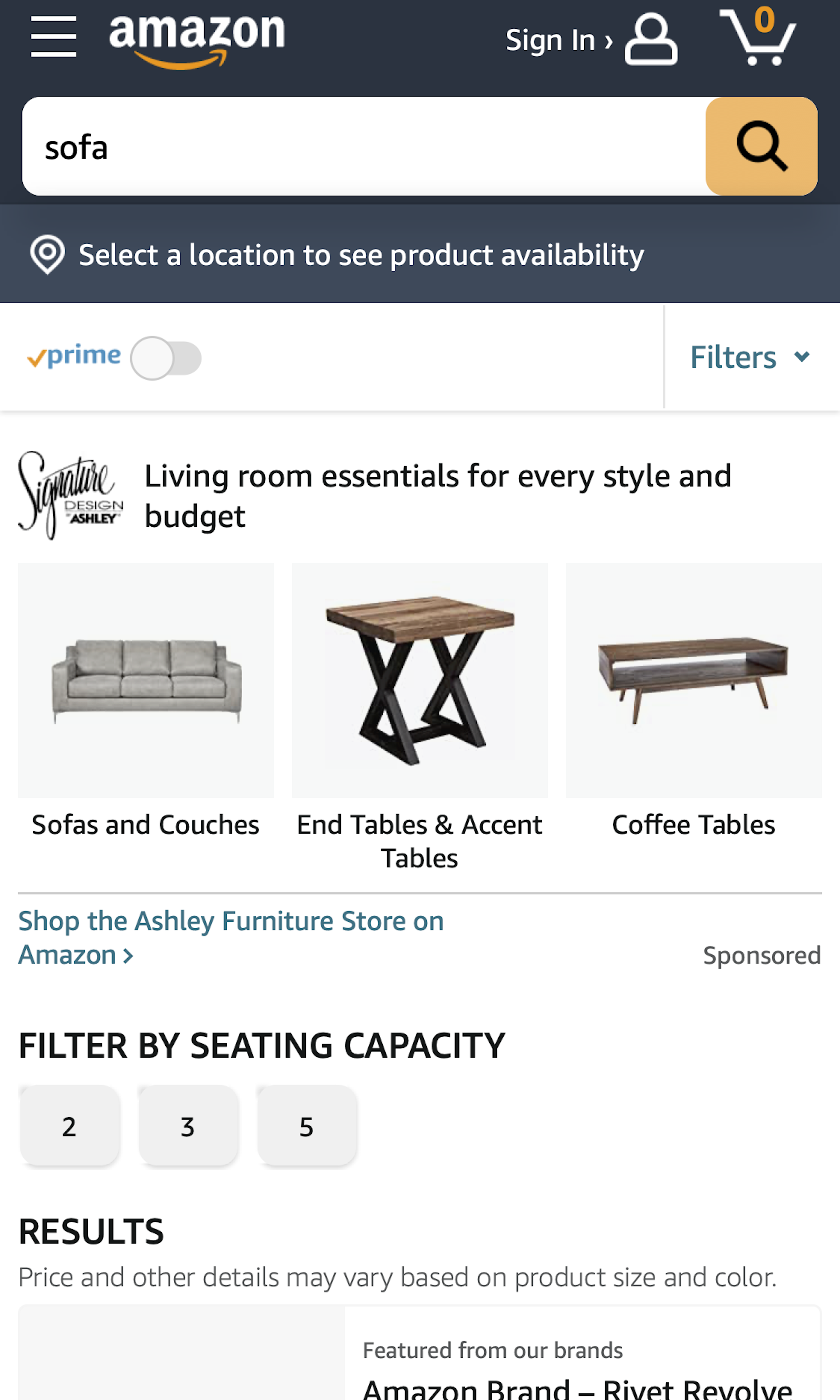
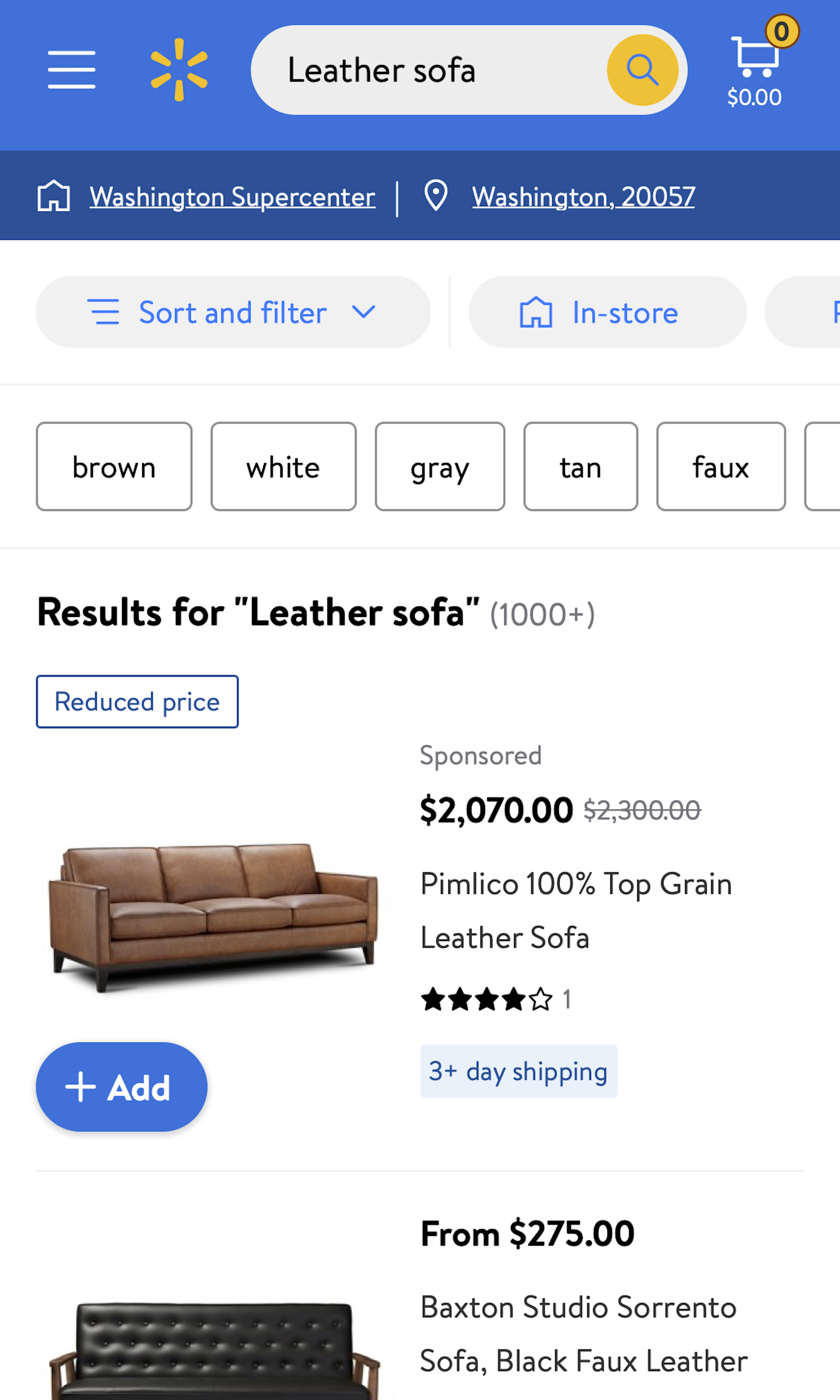
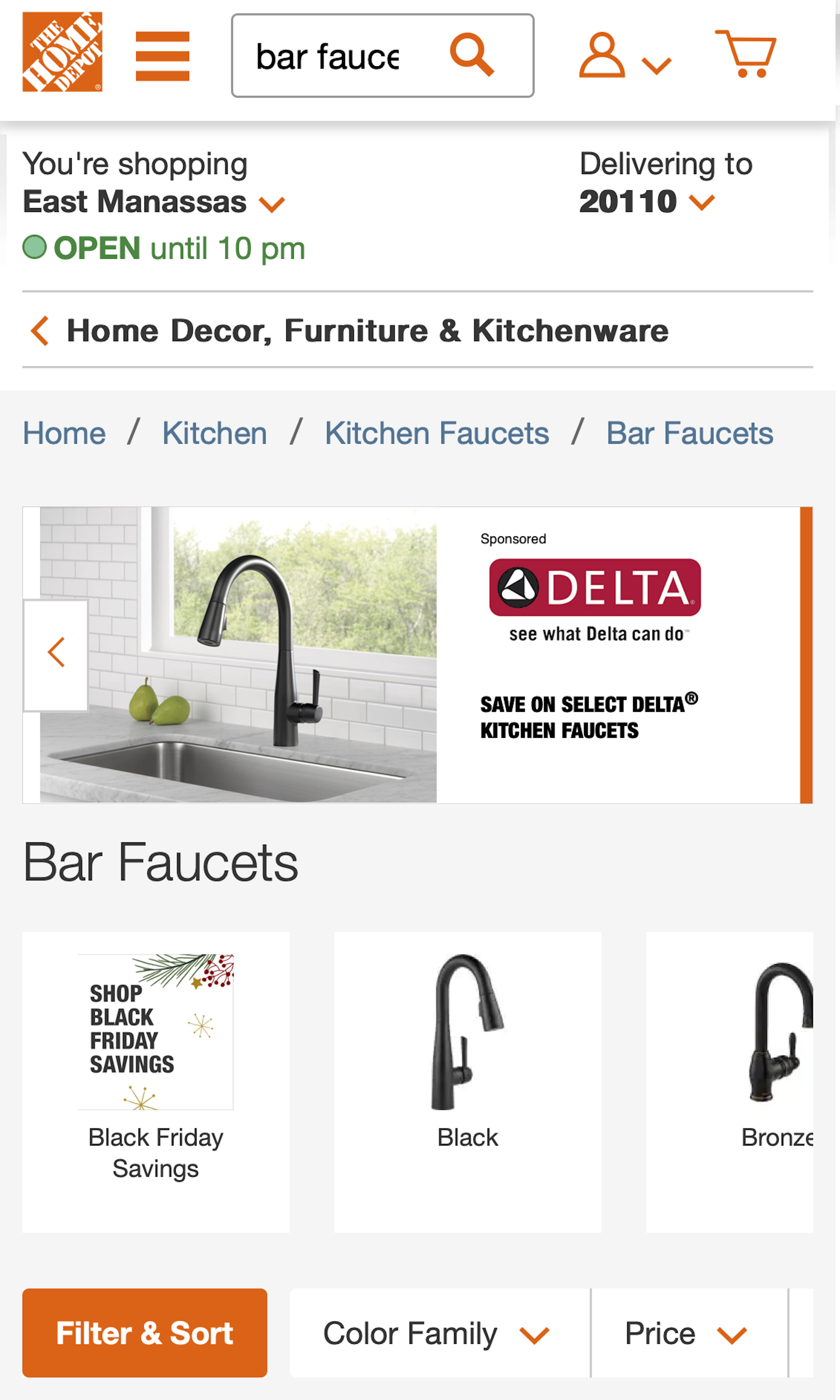
What’s this? Here you’ll find 1329 “Search Results Page” full-page screenshots annotated with research-based UX insights, sourced from Baymard’s UX benchmark of 325 e-commerce sites. (Note: this is less than 1% of the full research catalog.)
While it’s the search engine’s support for queries, autocomplete, and results logic that will determine the quality of the search results, the layout and design of the actual search results have a large say in how easy or difficult it is to actually use those results. During our search usability testing we observed sites that had spent tremendous resources on getting the search engine logic just right, but then crippled their users’ ability to actually find and select the right products among the (near-perfect) search results — all due to a subpar layout for those results.
More ‘Search Results Page’ Insights
-
The search result layout has several crucial purposes to fulfill, and can be quite a balancing act, as it should 1) enable users to make an initial assessment of the results and their quality, answering the question, Did the site return any good matches, or do I have to make a new search?, 2) provide an overview that clearly outlines the different options the user has, and give a decent look into the breadth of the product selection matching the query, answering the question, Which of these results are relevant to me? and 3) provide enough information scent about each result so users can properly evaluate and compare them in order to decide which results are worth opening for further exploration and which should be avoided, answering the question, Which product should I open/buy?
-
Not getting the balance of the search results layout just right will severely harm an otherwise good search experience, as users will either lack overview or be forced into extensive pogo-sticking — the latter being observed particularly frequently during testing. Needless and excessive pogo-sticking — where users are going back-and-forth between the search results and product pages just to learn the most basic product attributes — is frustrating to users as they have to spend a considerable amount of time exploring completely irrelevant results, all due to a substandard search results layout.
-
Learn More: Besides exploring the 1329 search results page design examples below (for general inspiration), you may also want to read our related articles on “Product Thumbnails Should Dynamically Update to Match the Variation Searched For (54% Don’t)”, “Faceted Sorting - A New Method for Sorting Search Results”, and “E-Commerce Sites Should Include Contextual Search Snippets (96% Get It Wrong)”.
-
Get Full Access: To see all of Baymard’s e-commerce search research findings you’ll need Baymard Premium access. (Premium also provides you full access to 200,000+ hours of UX research findings, 650+ e-commerce UX guidelines, and 275,000+ UX performance scores.)
User Experience Research, Delivered Weekly
Join 60,000+ UX professionals and get a new UX article every week.

User Experience Research, Delivered Weekly
Join 60,000+ UX professionals and get a new UX article every week.

Explore Other Research Content

300+ free UX articles based on large-scale research.

325 top sites ranked by UX performance.

Code samples, demos, and key stats for usability.


