126 ‘Application Form & Flow’ Design Examples
Also referred to as: Application Process
What’s this? Here you’ll find 126 “Application Form & Flow” full-page screenshots annotated with research-based UX insights, sourced from Baymard’s UX benchmark of 244 e-commerce sites. (Note: this is less than 1% of the full research catalog.)
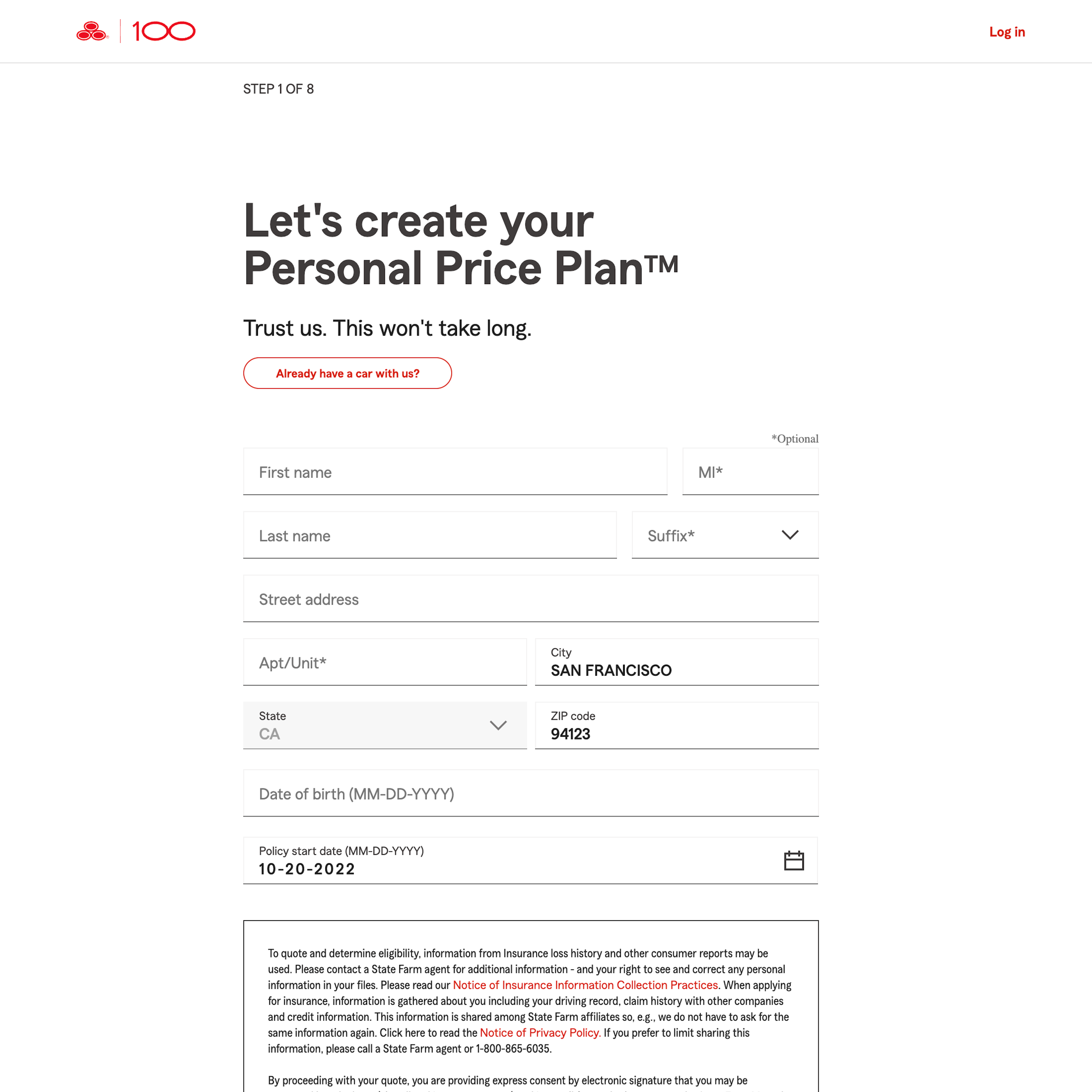
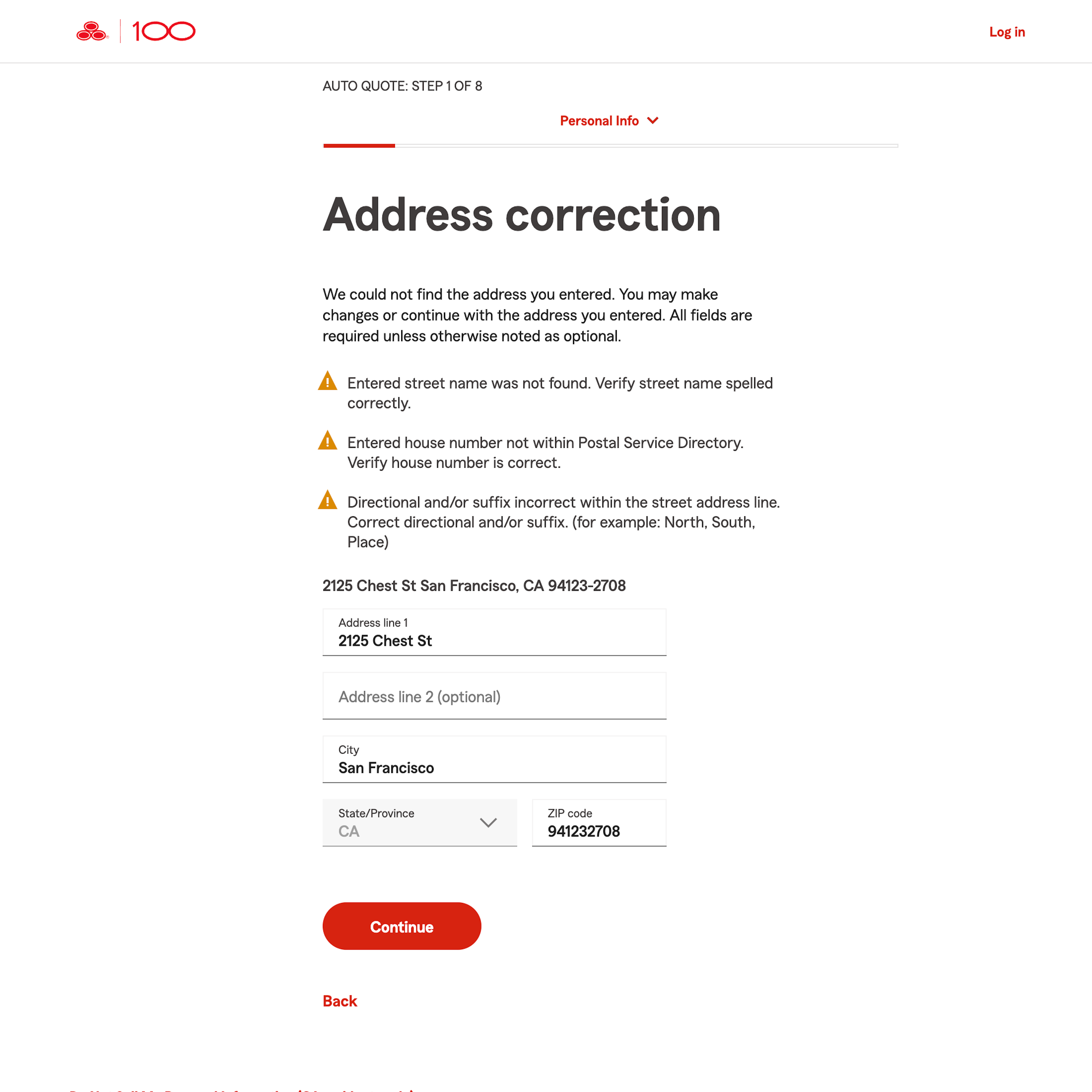
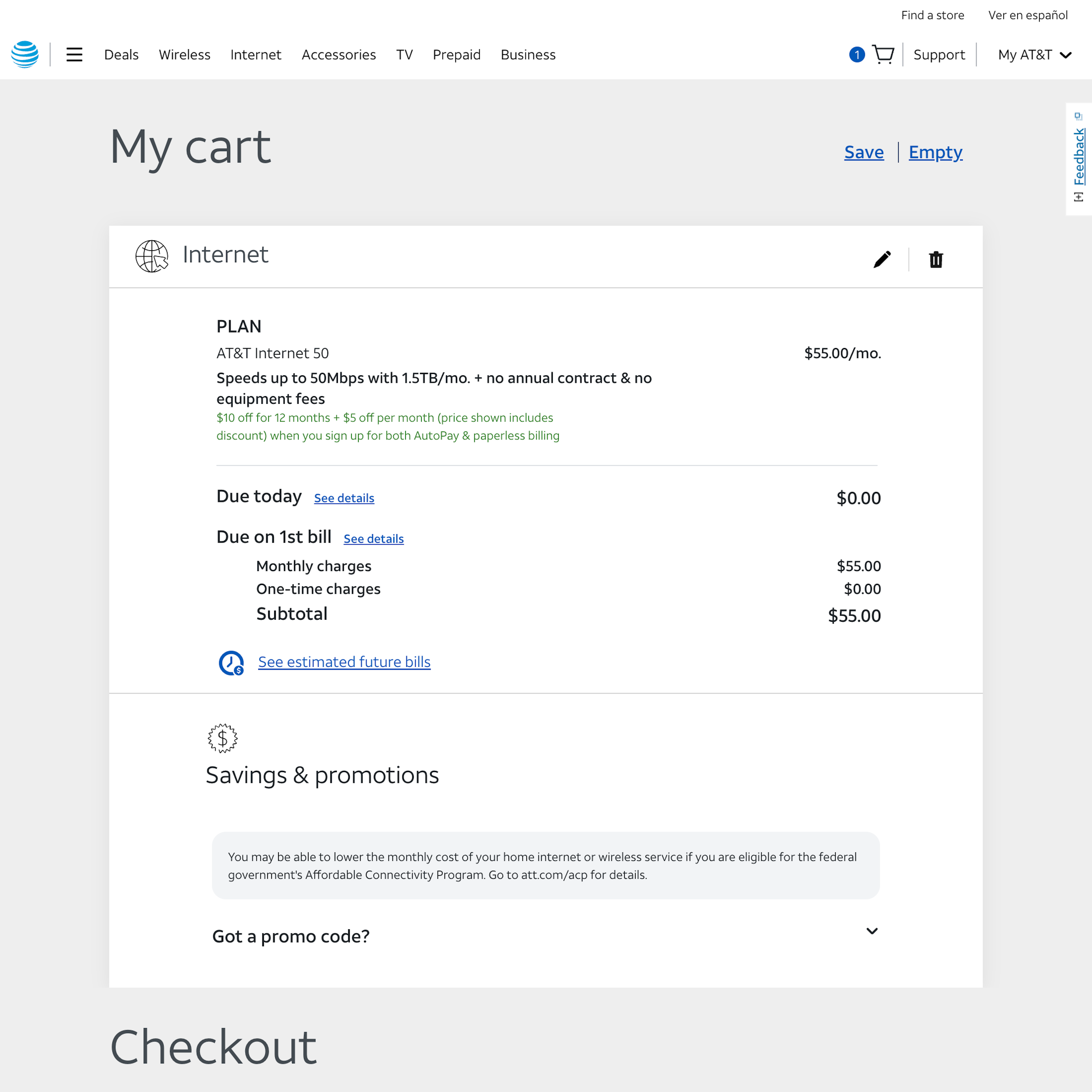
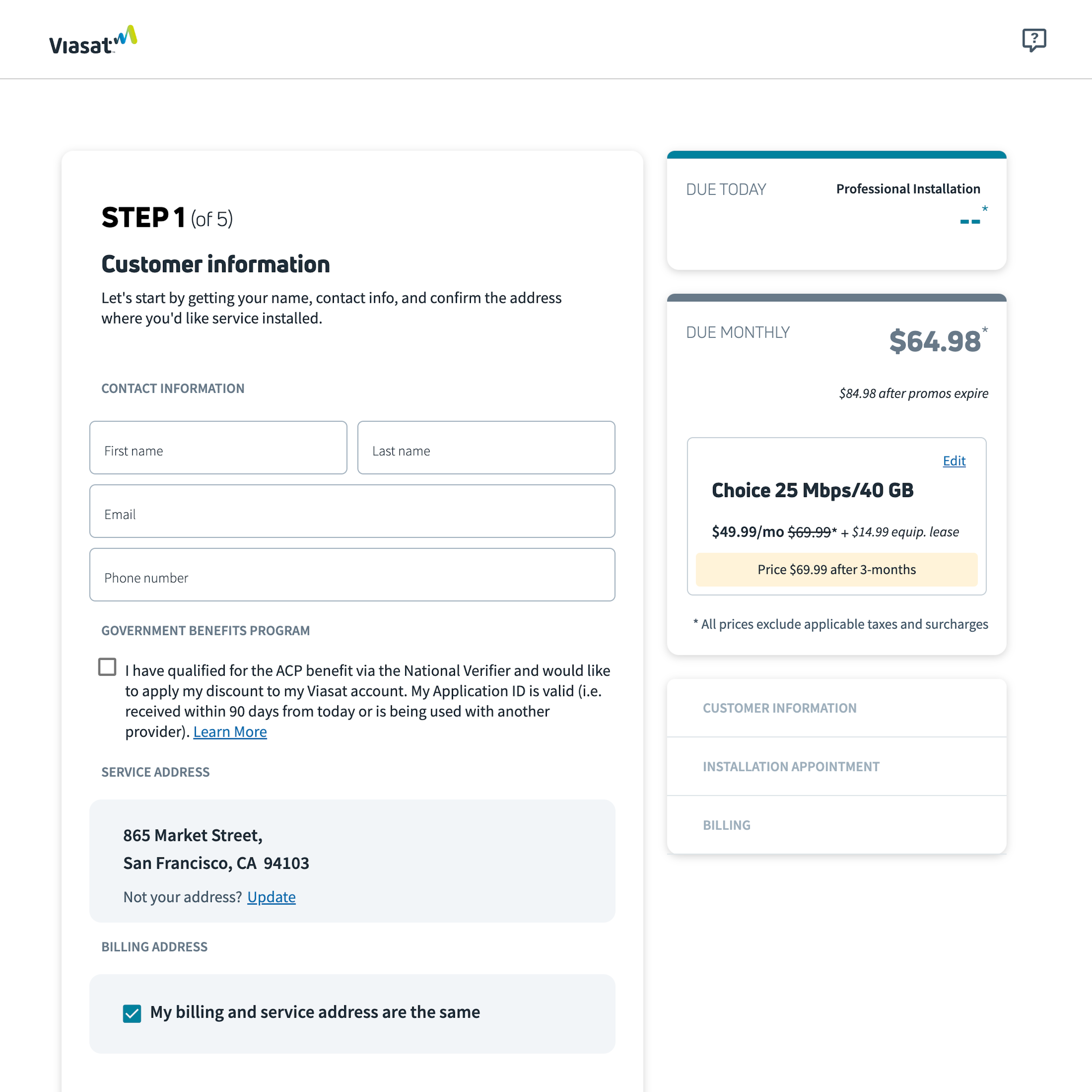
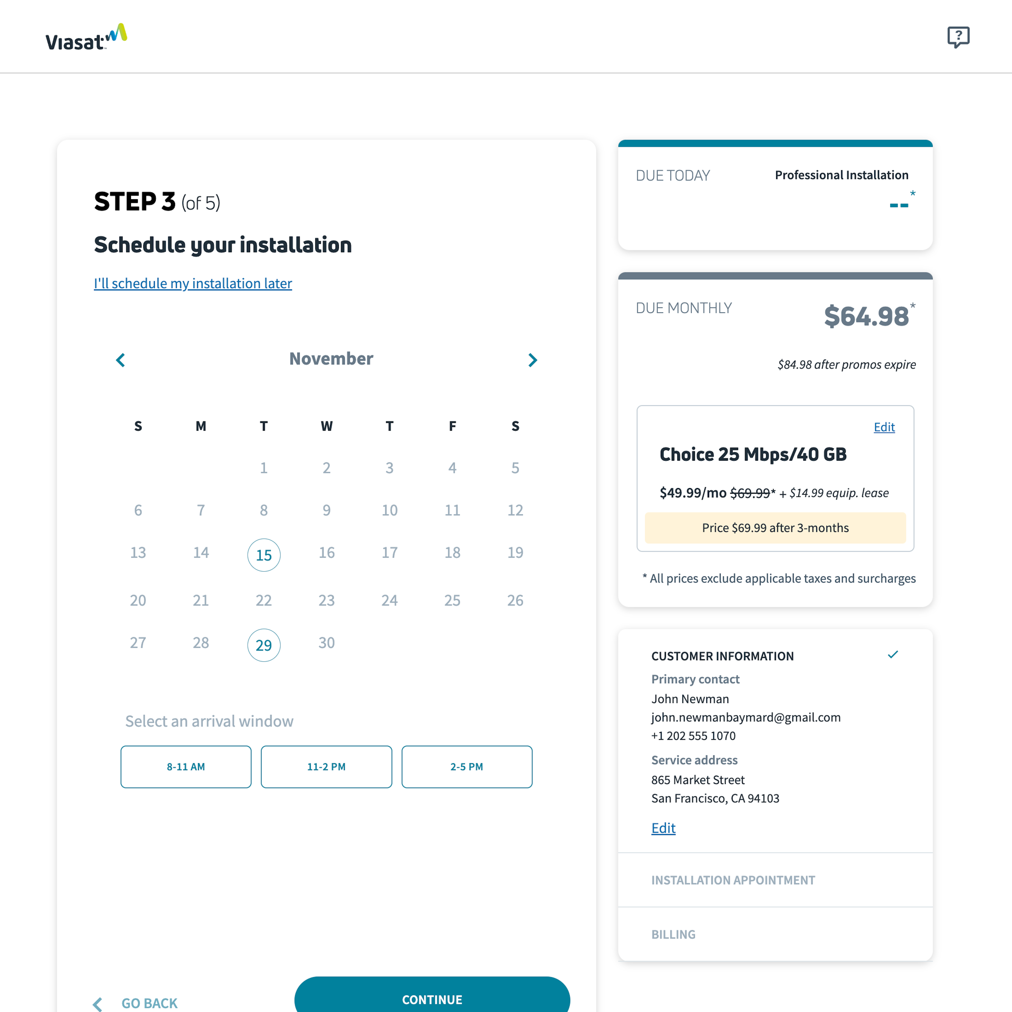
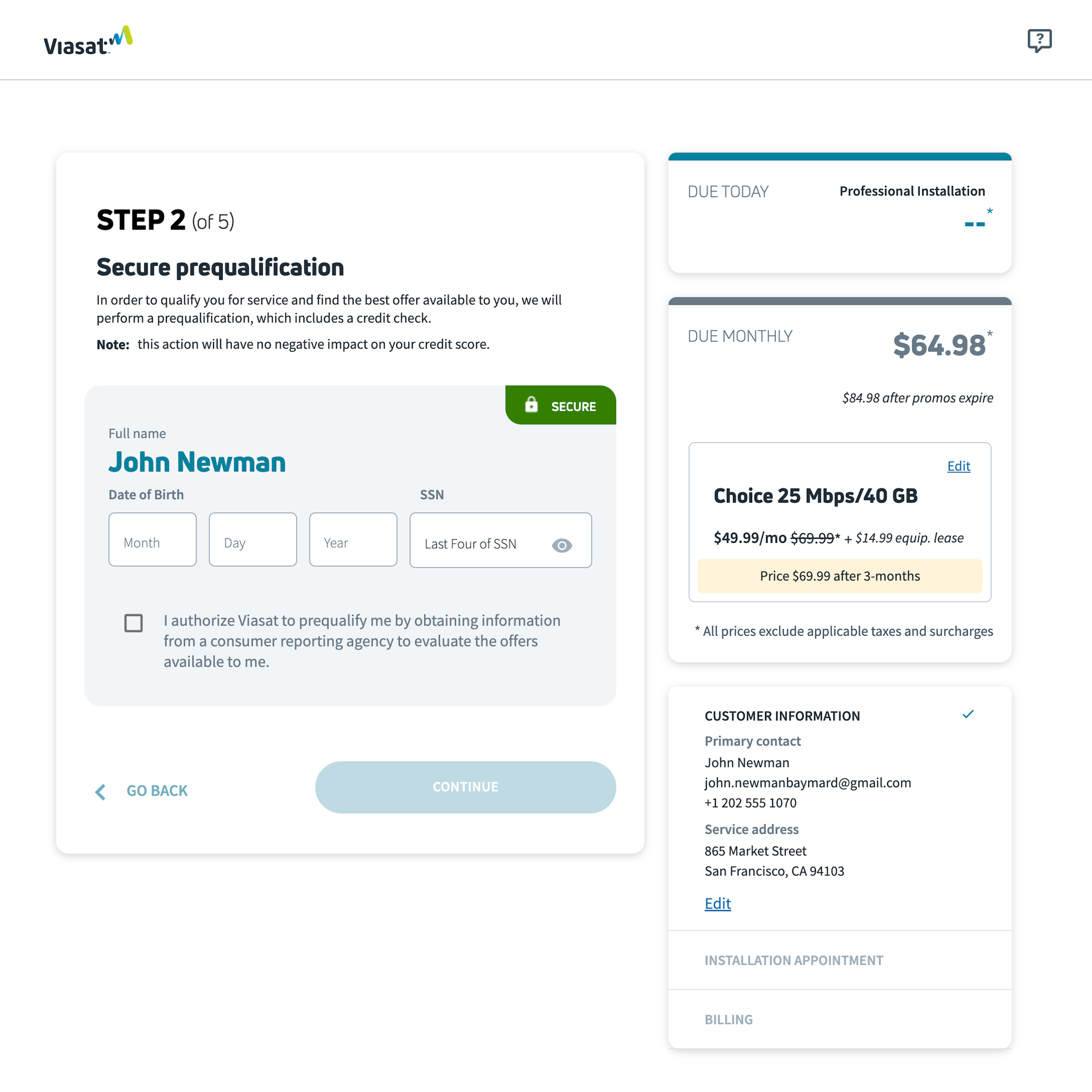
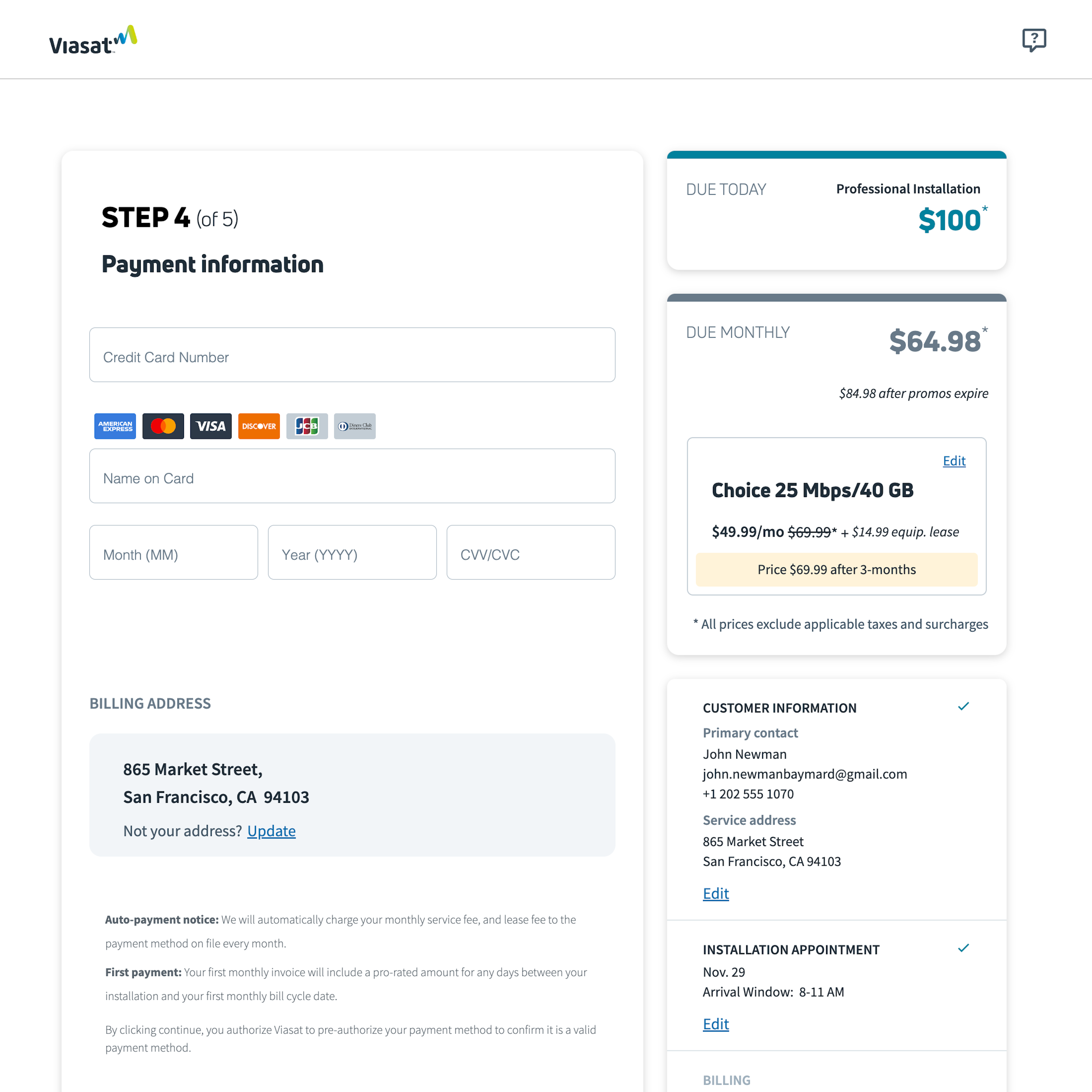
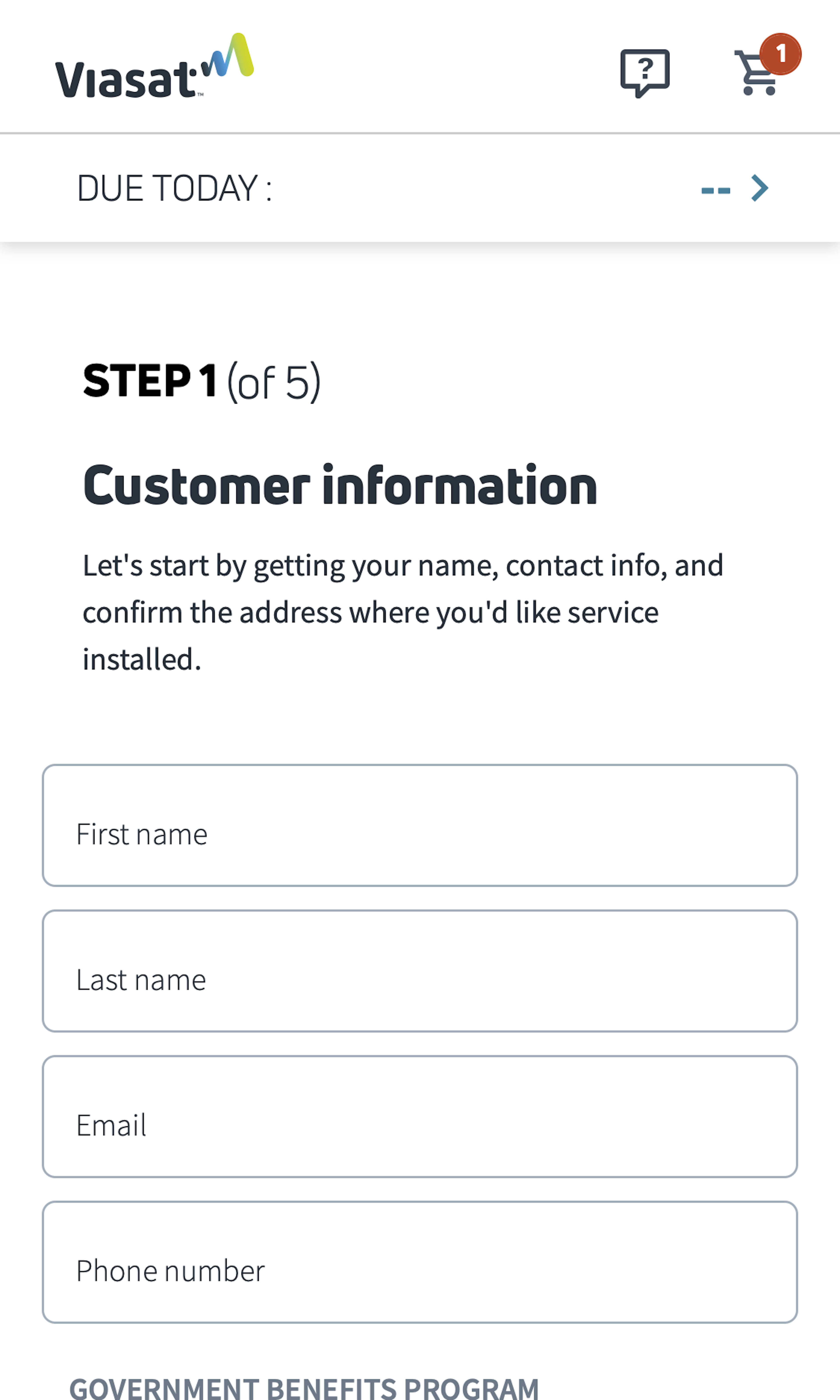
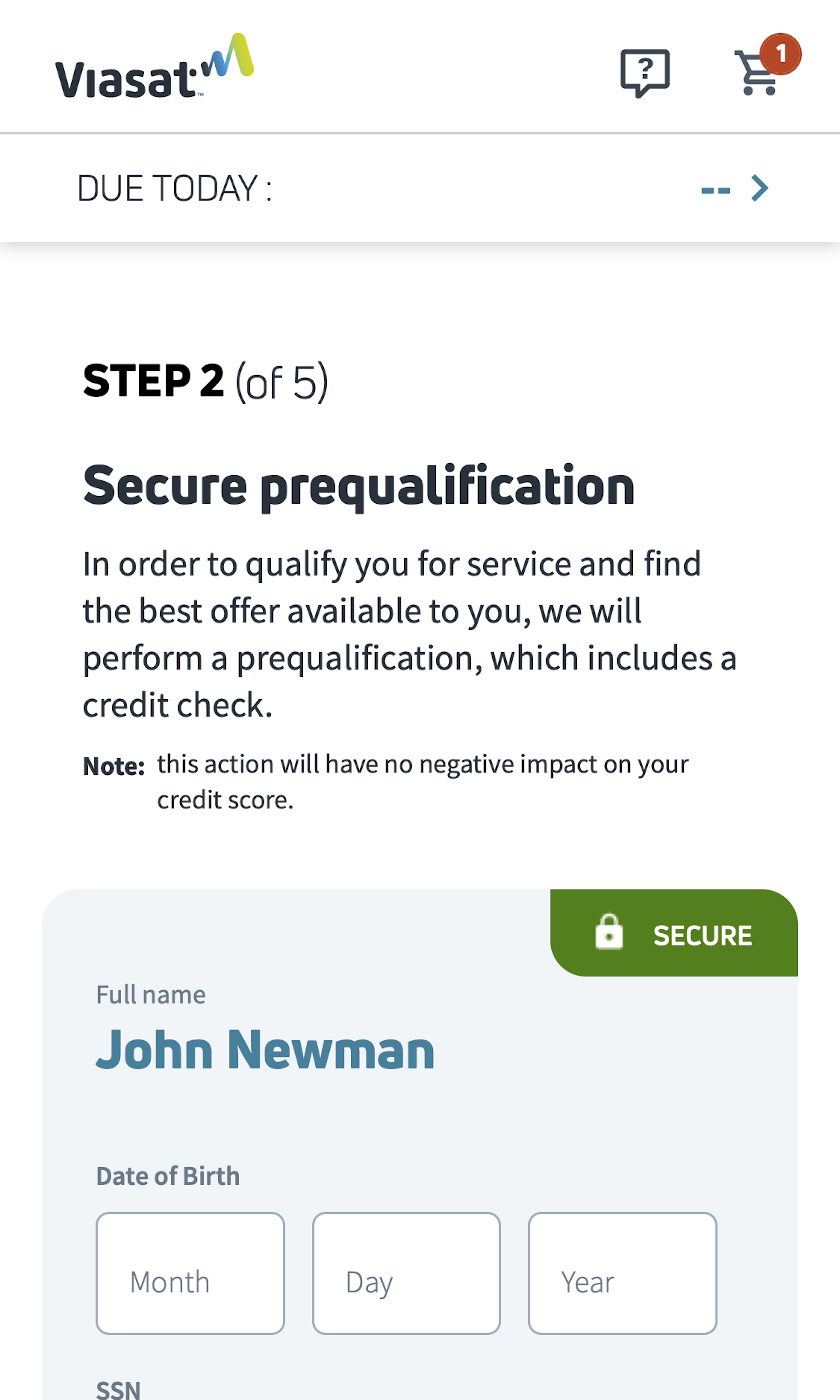
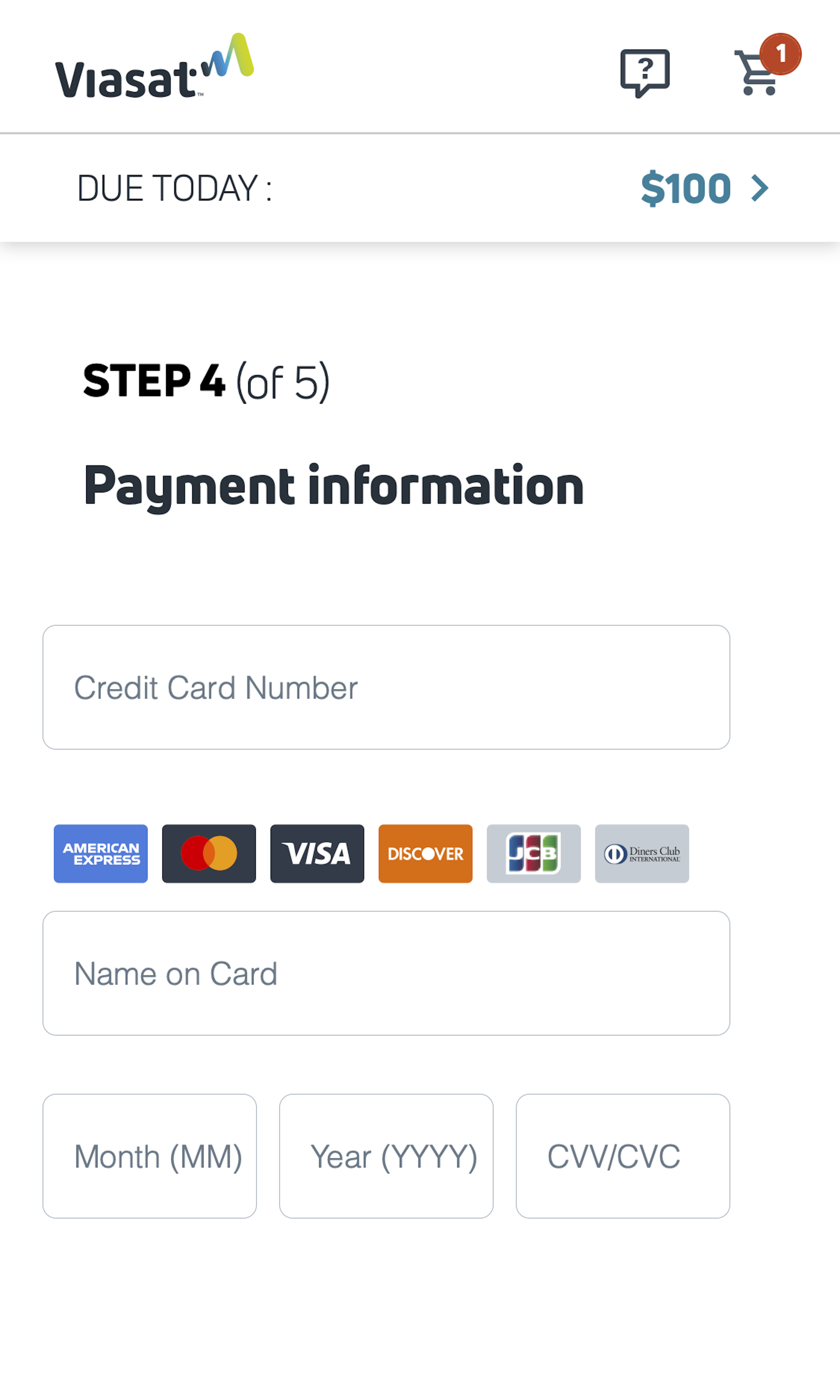
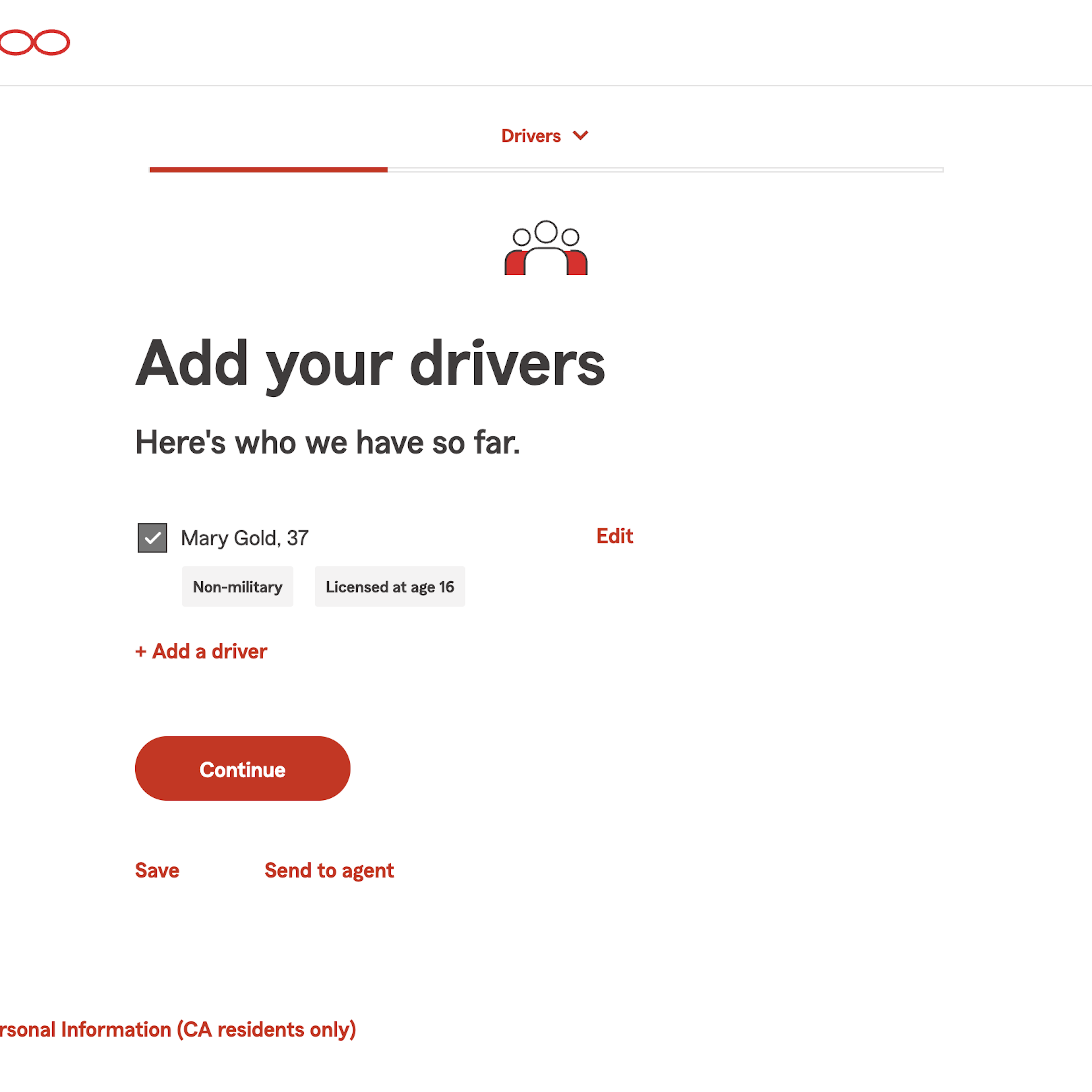
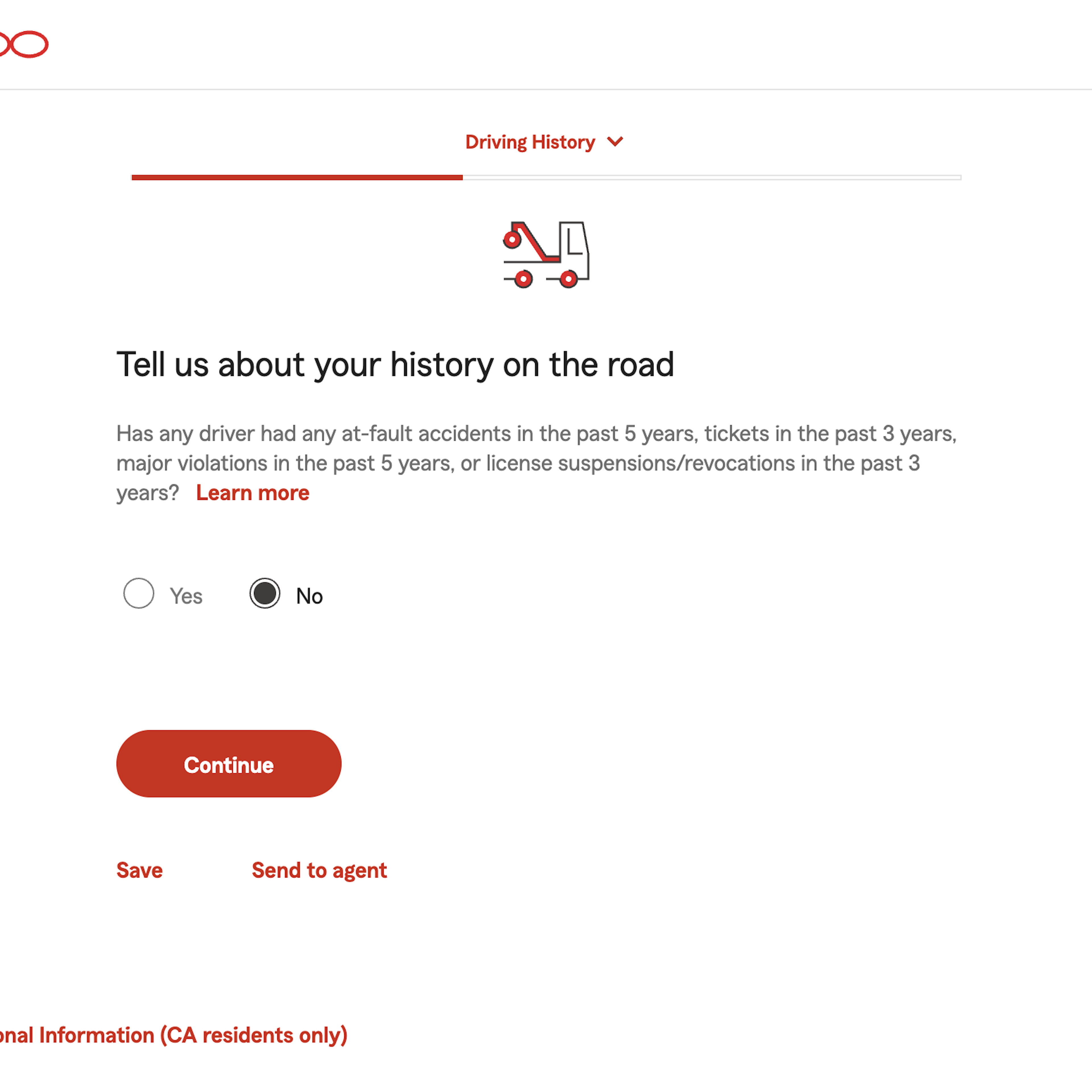
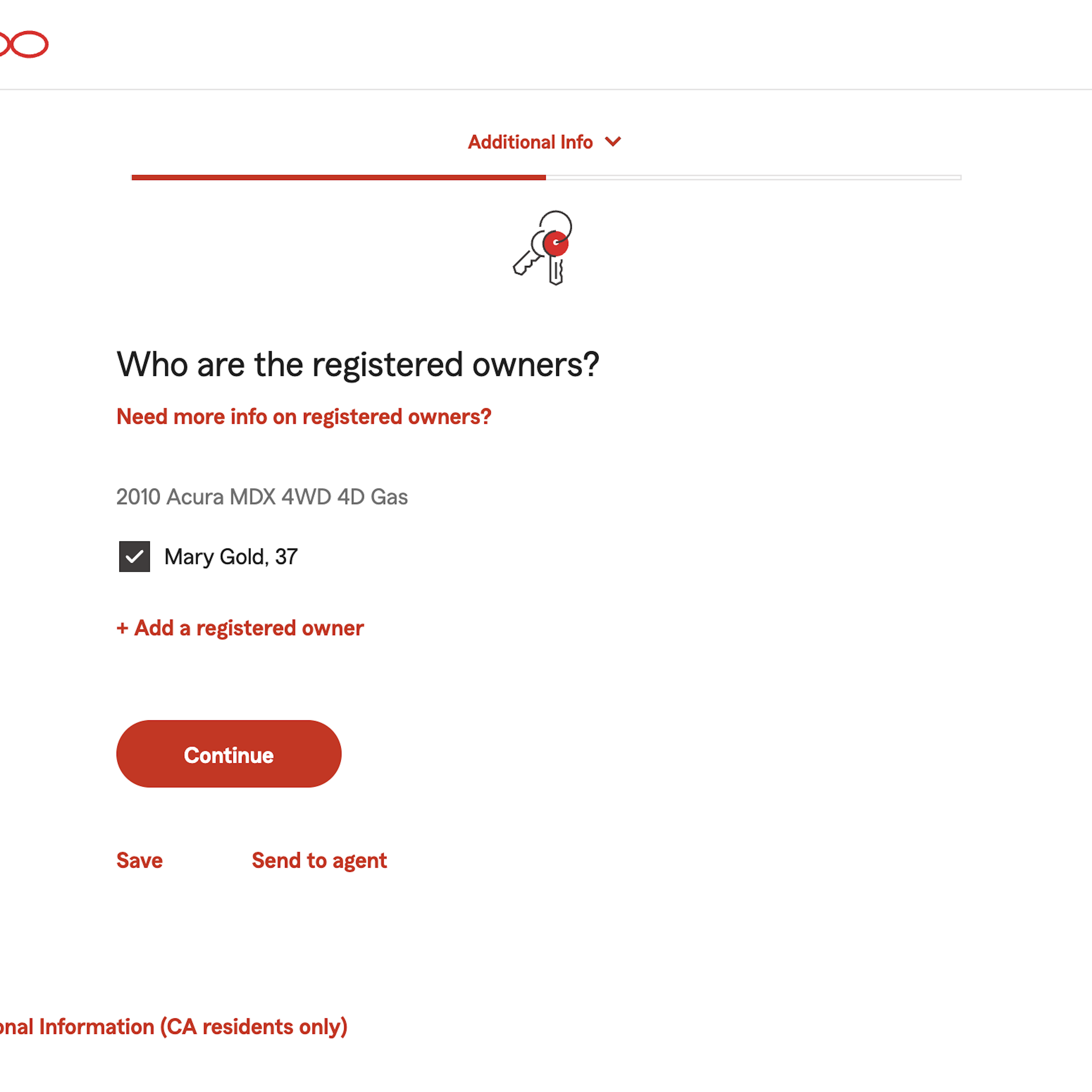
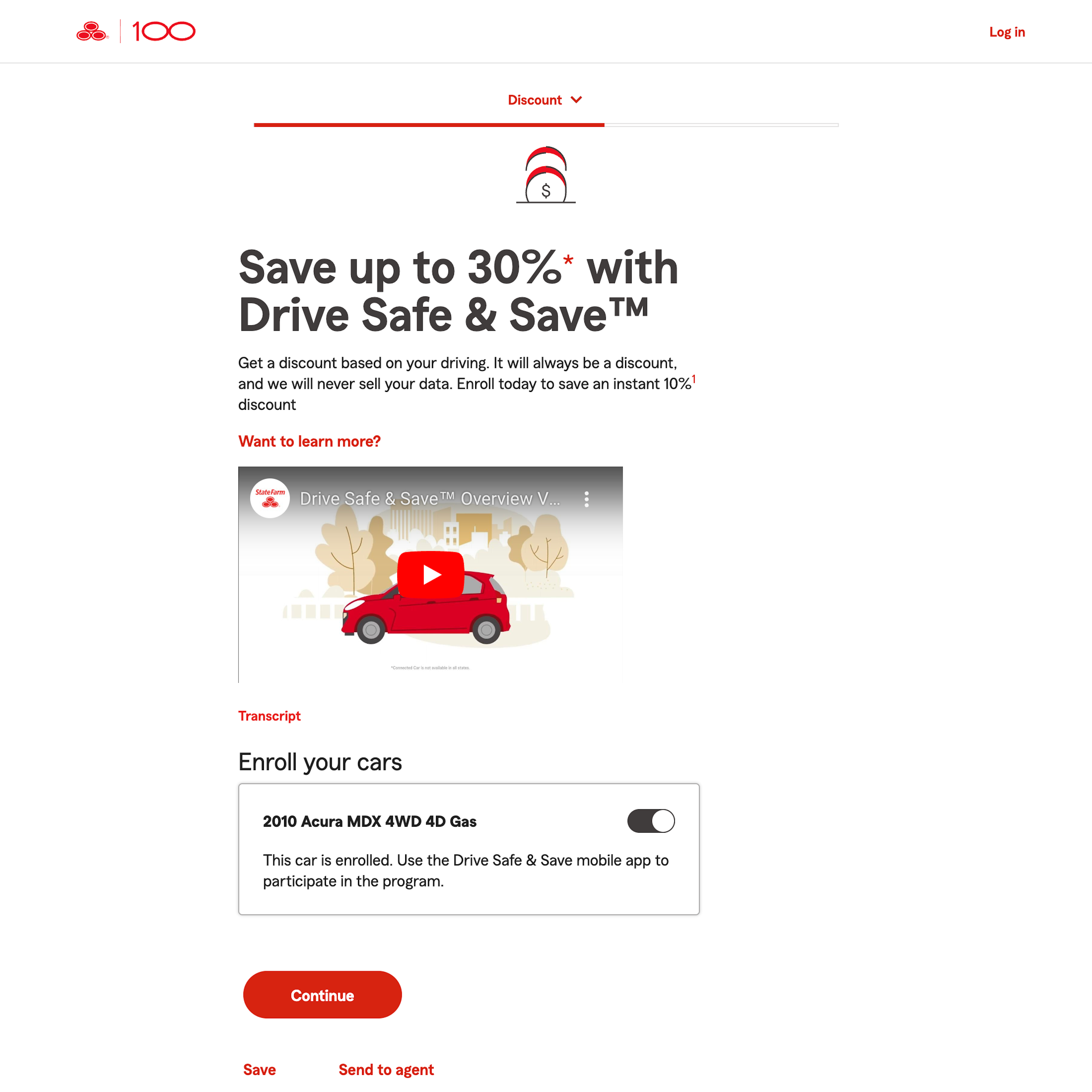
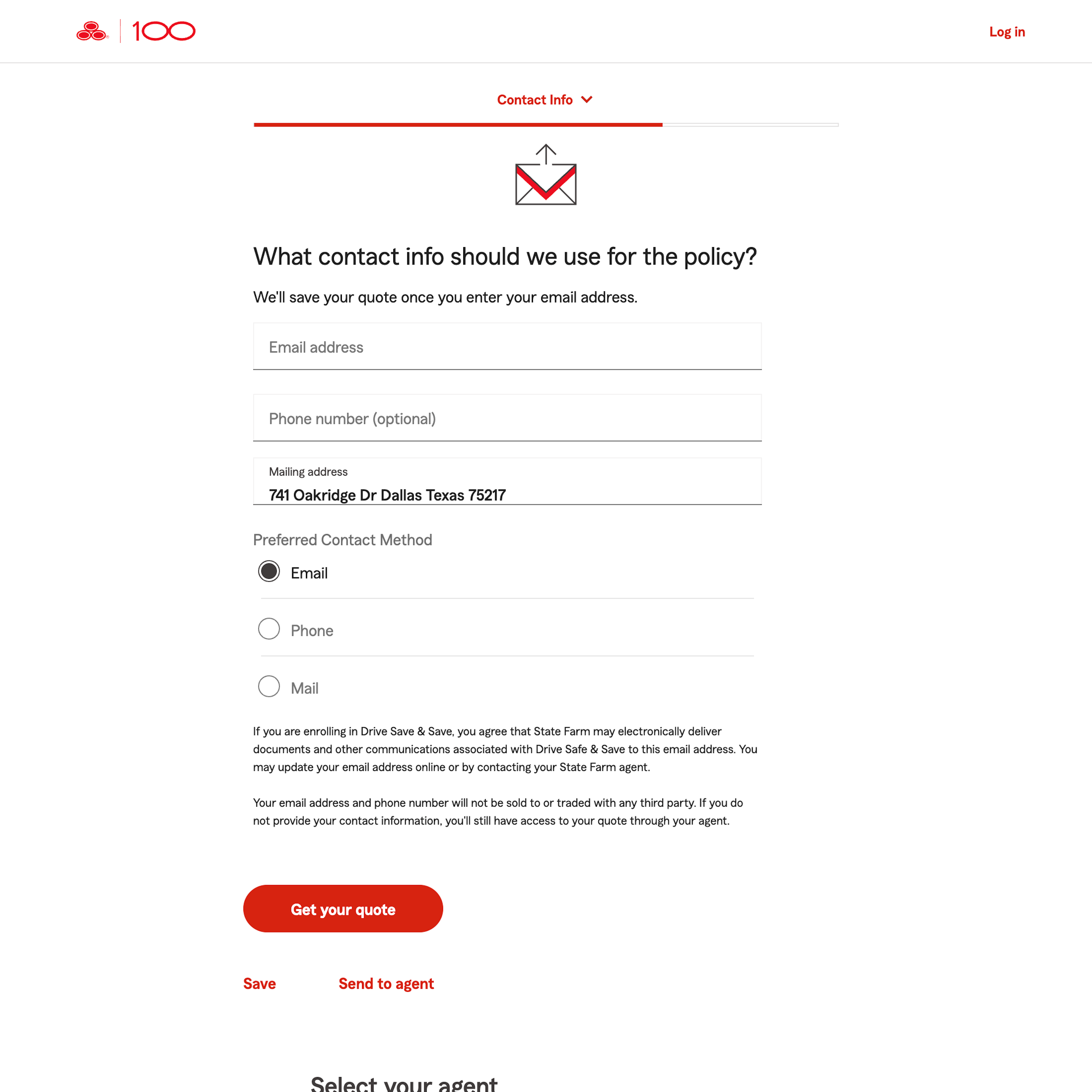
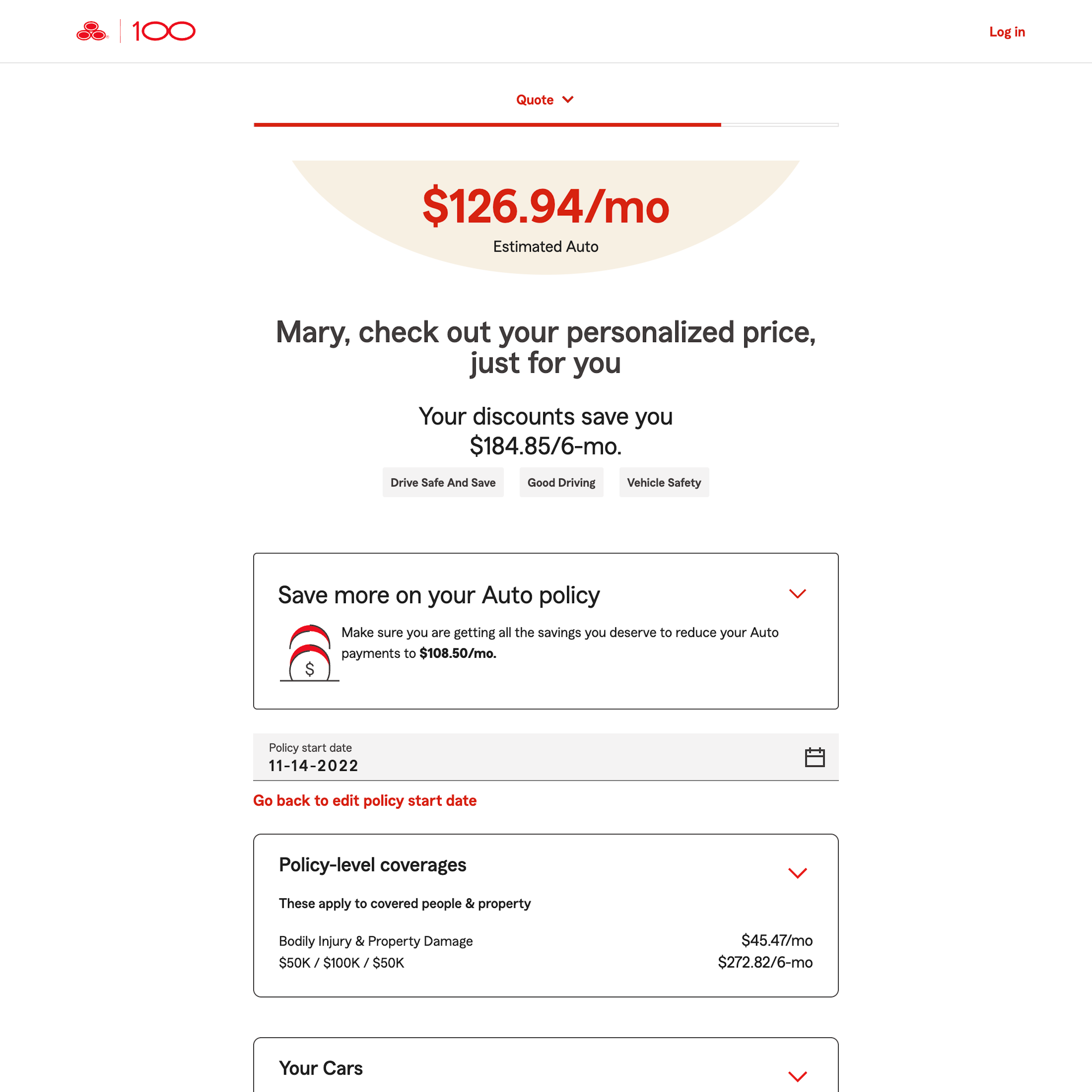
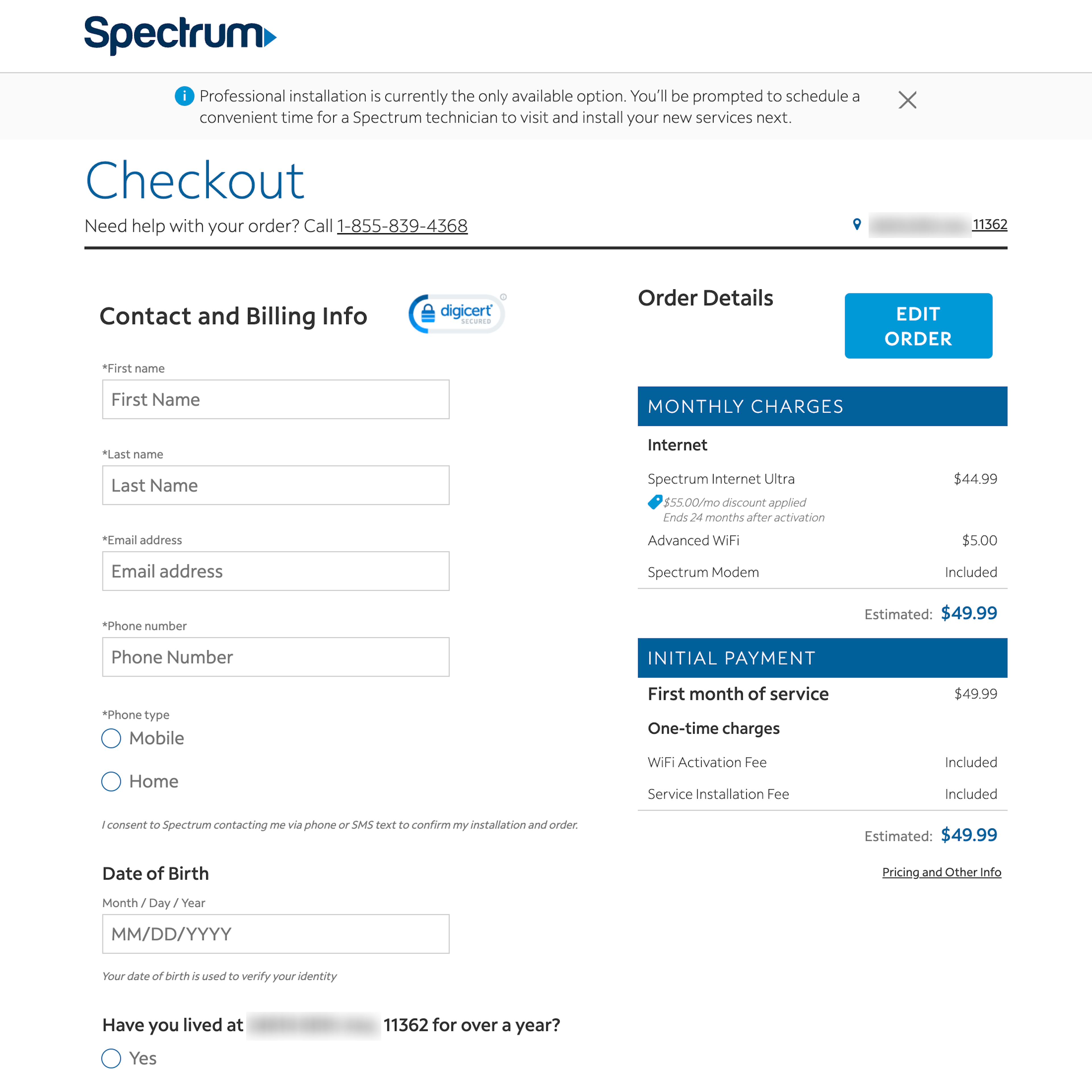
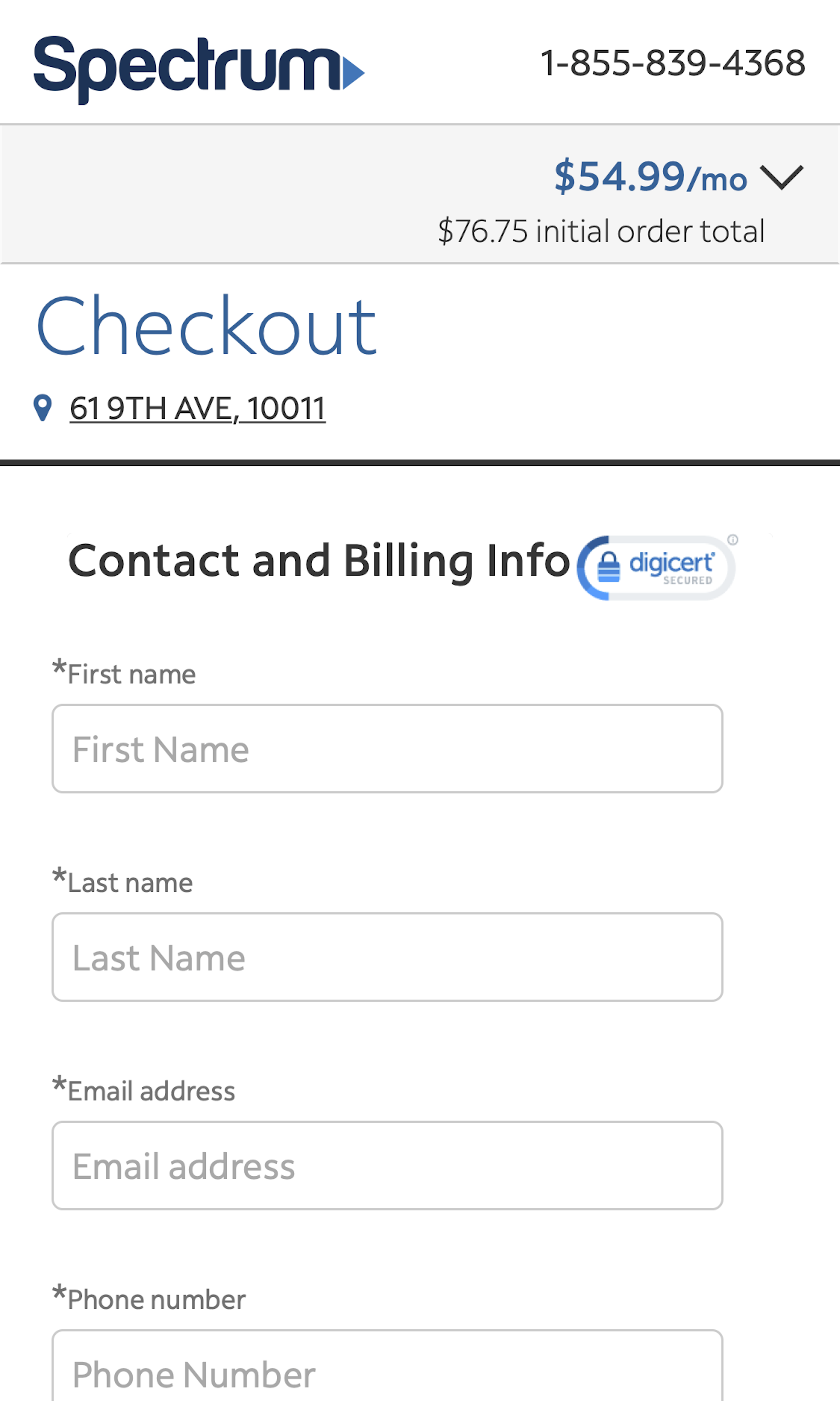
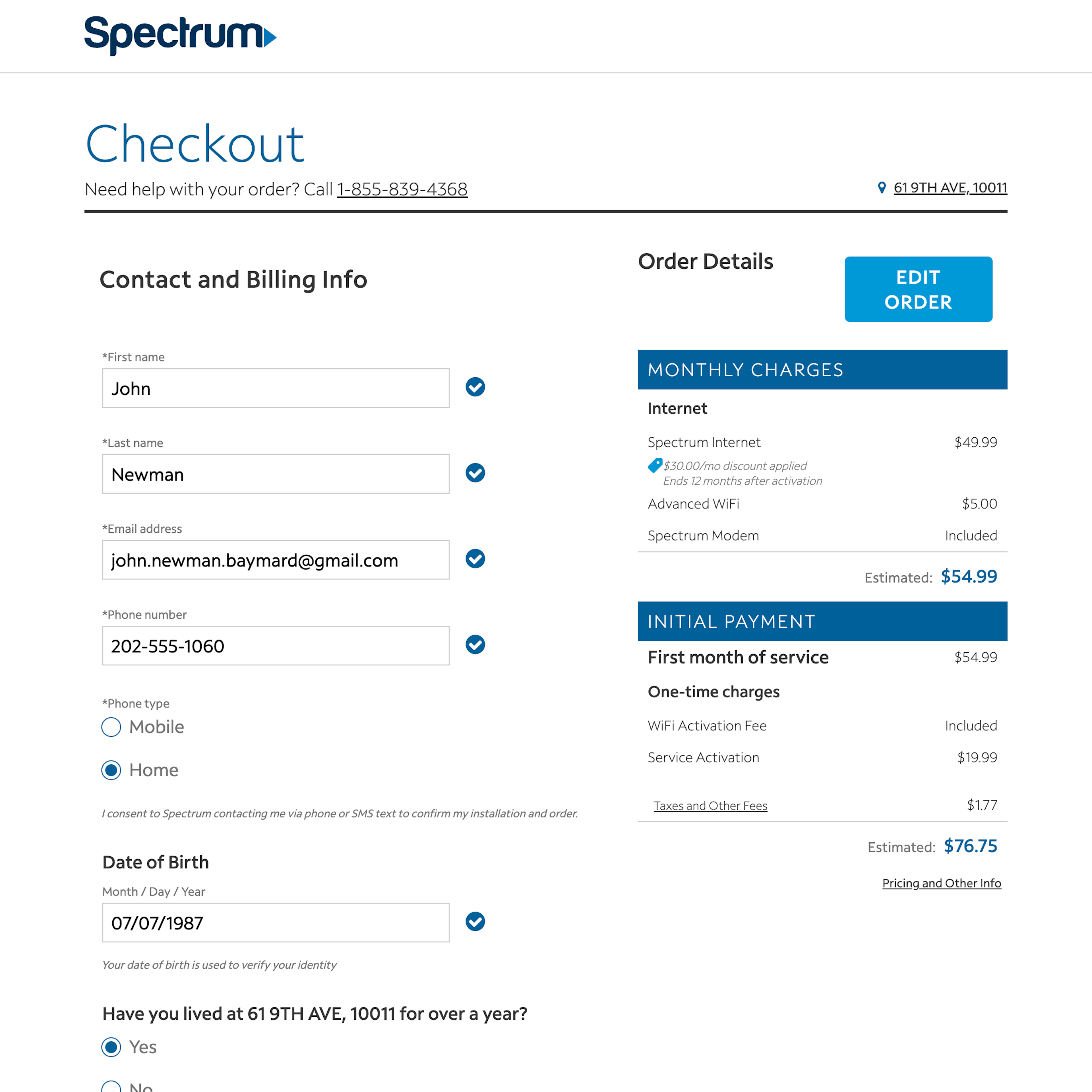
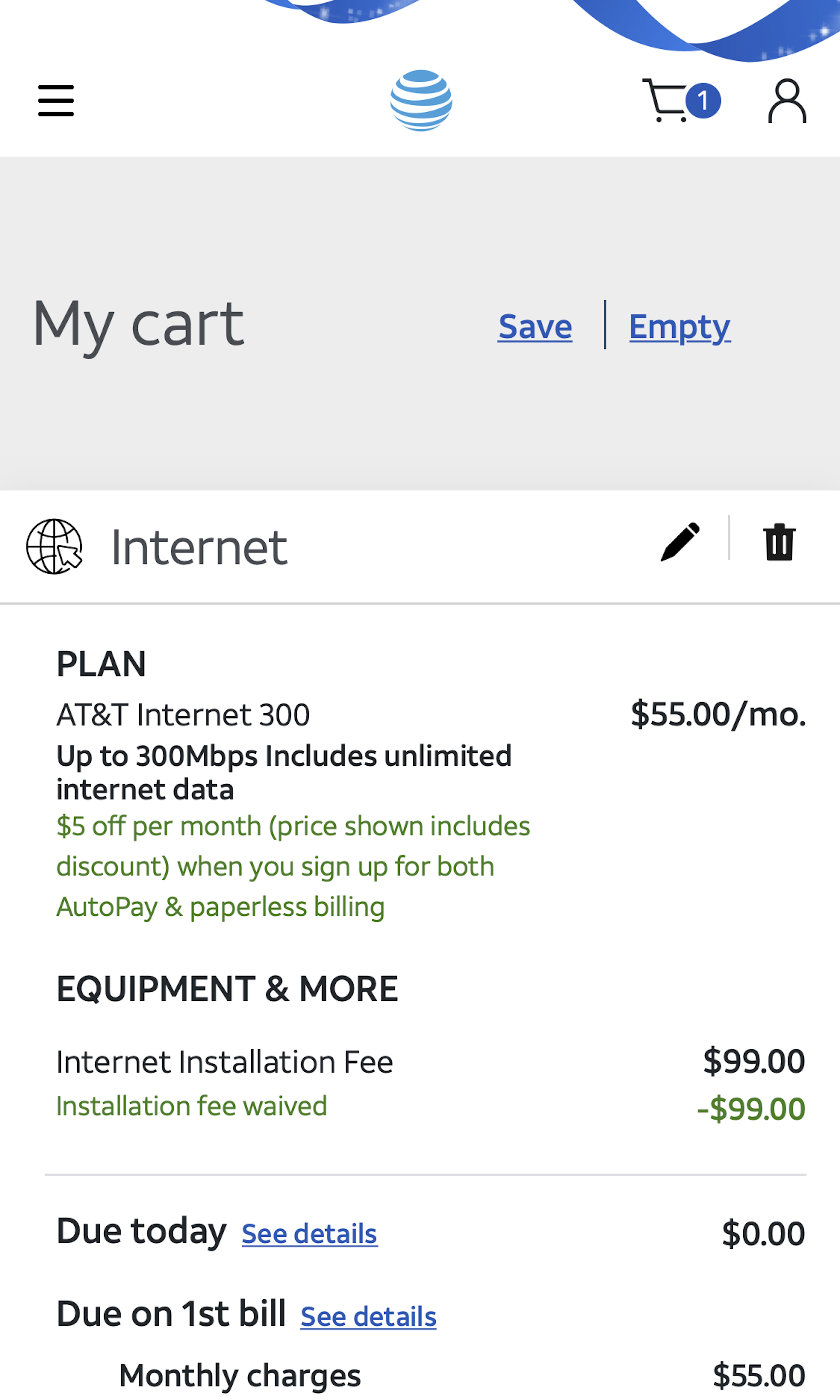
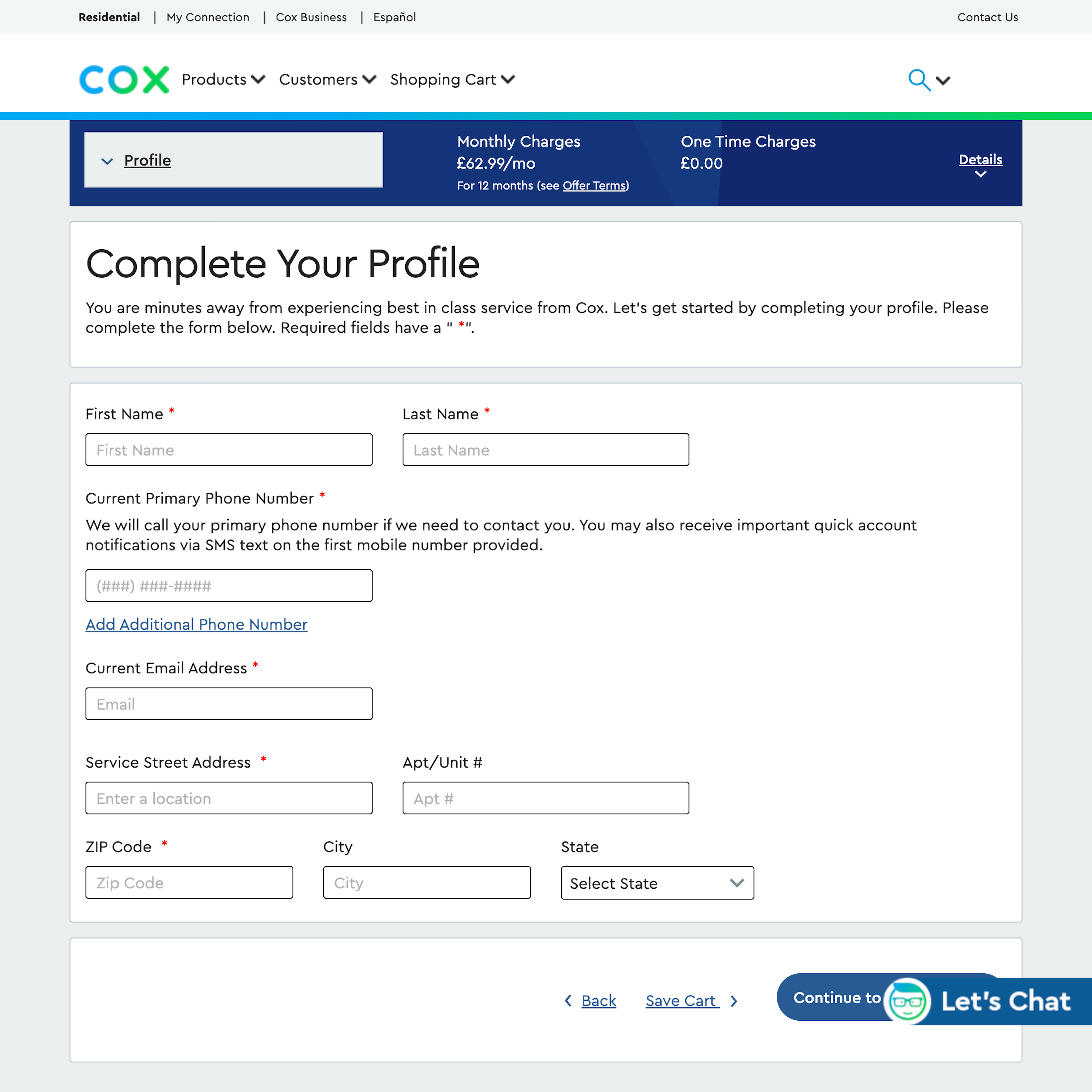
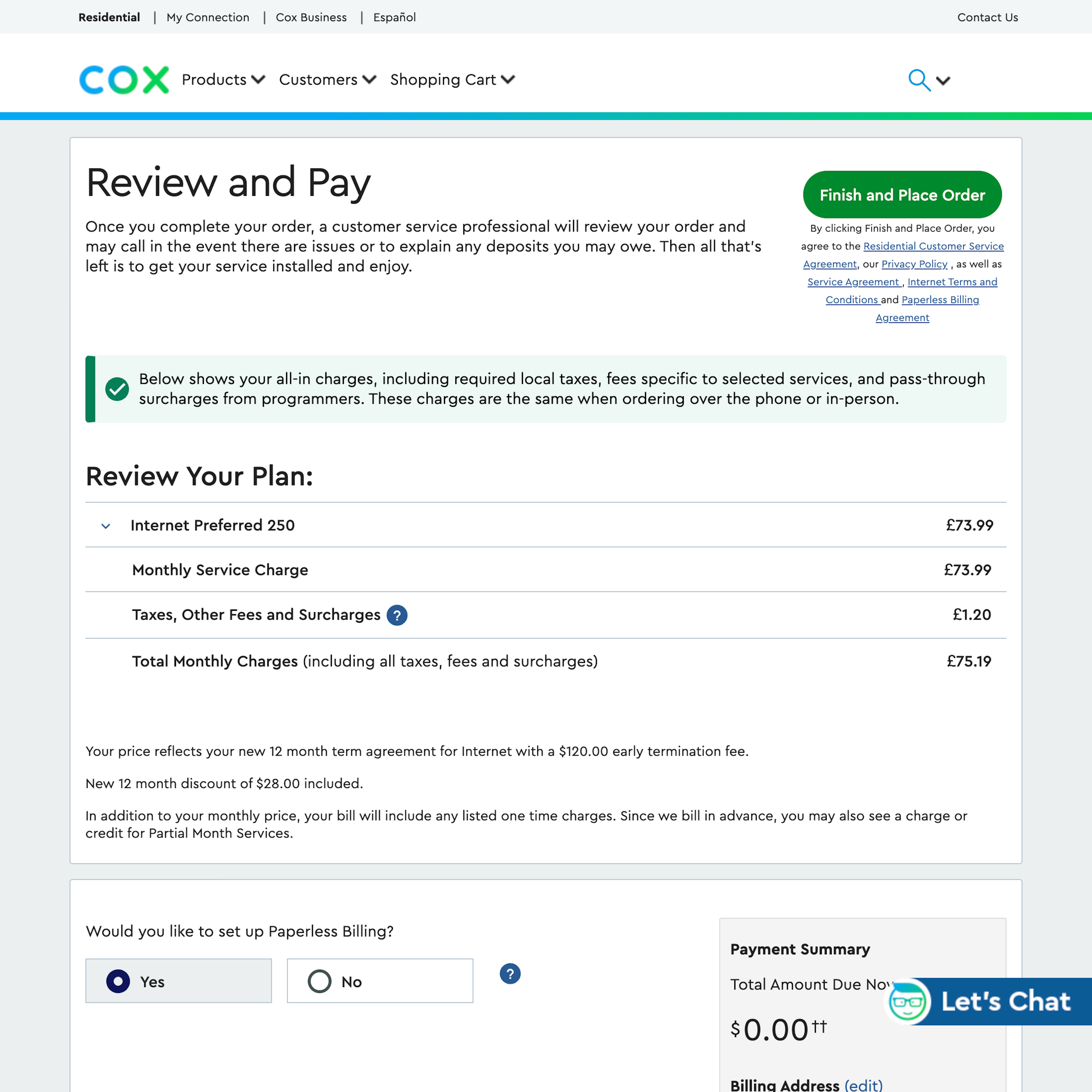
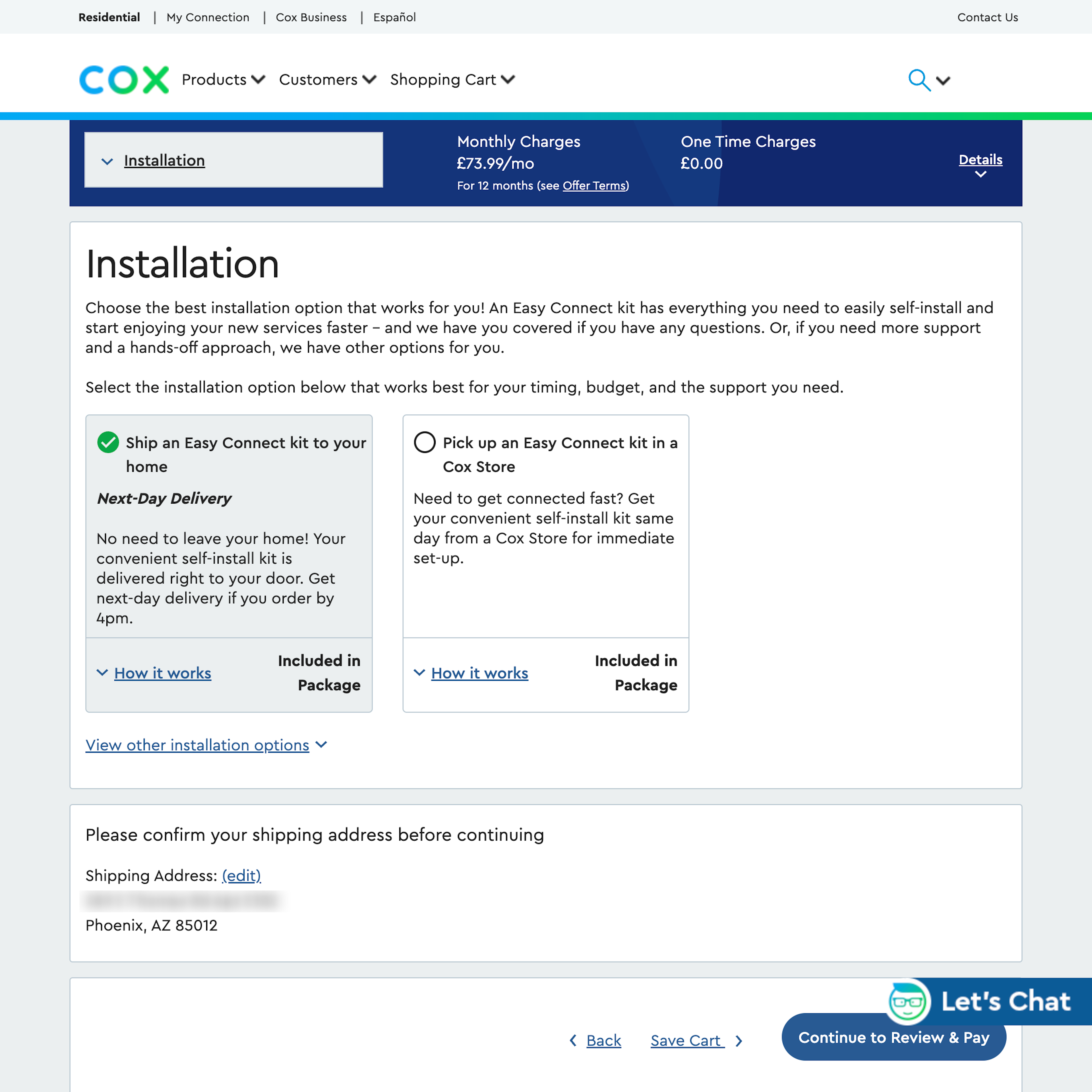
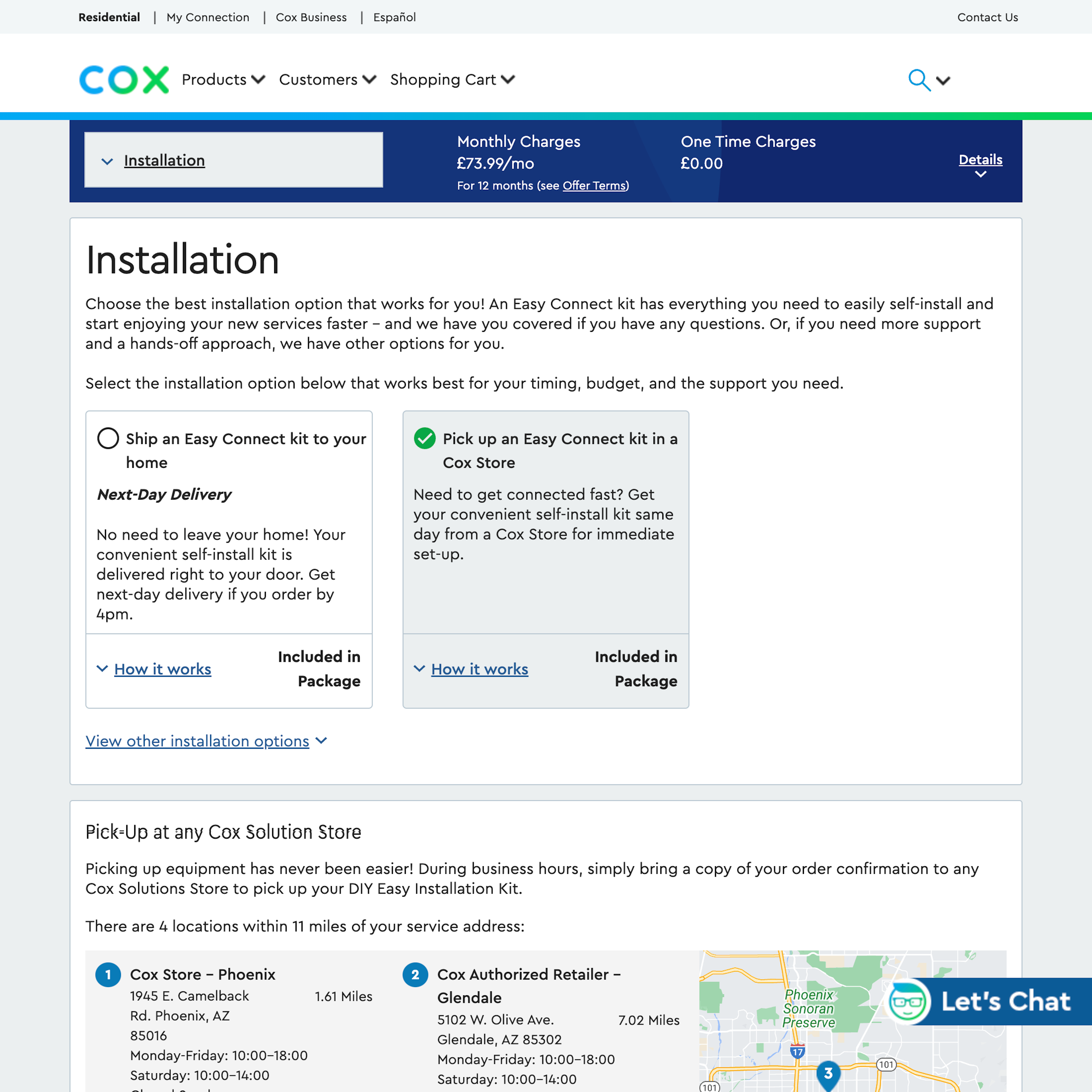
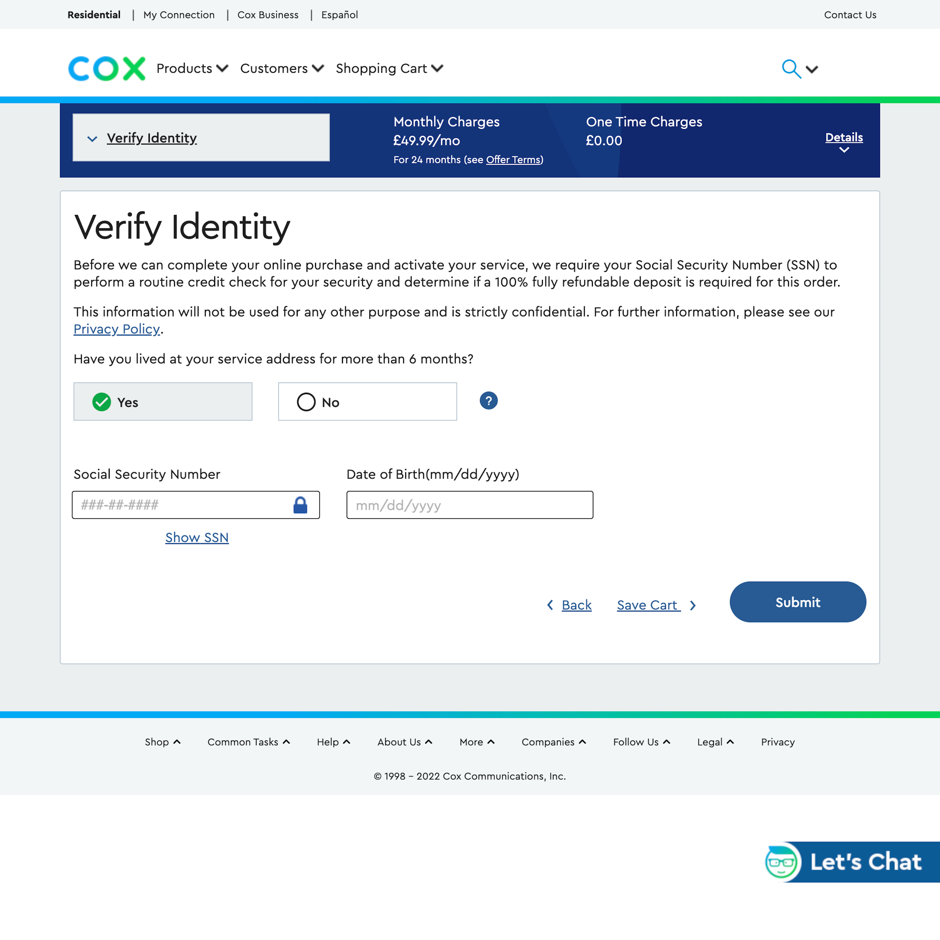
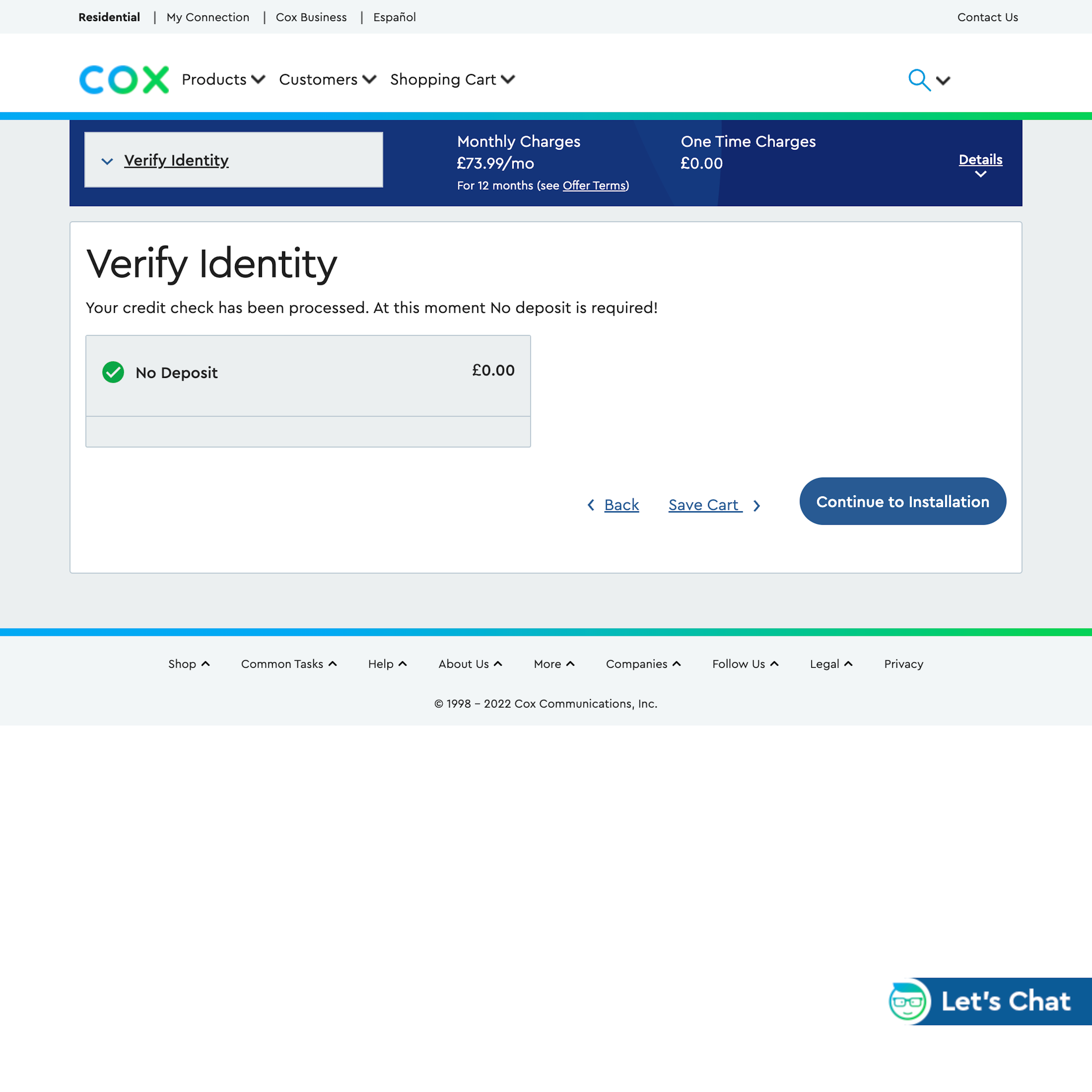
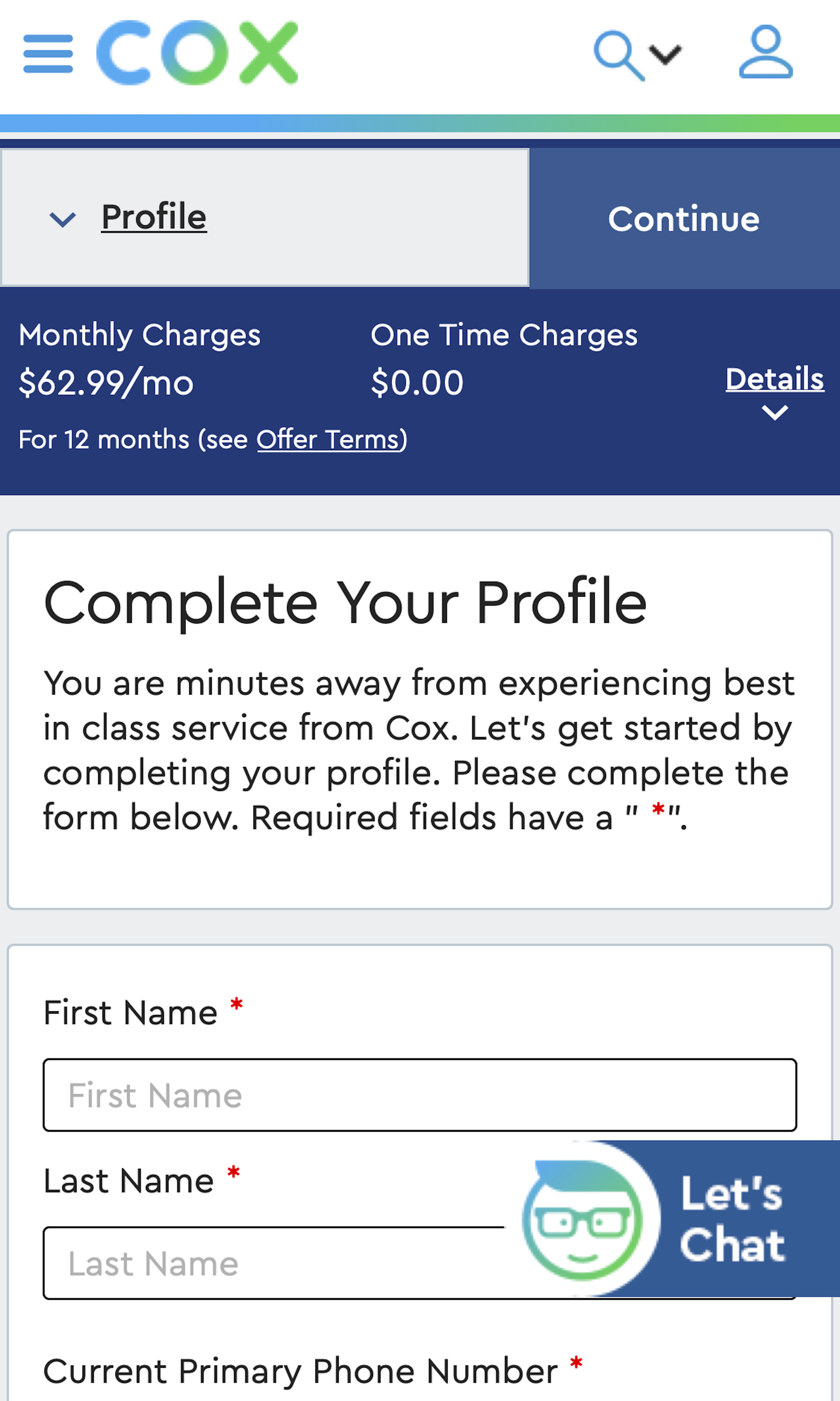
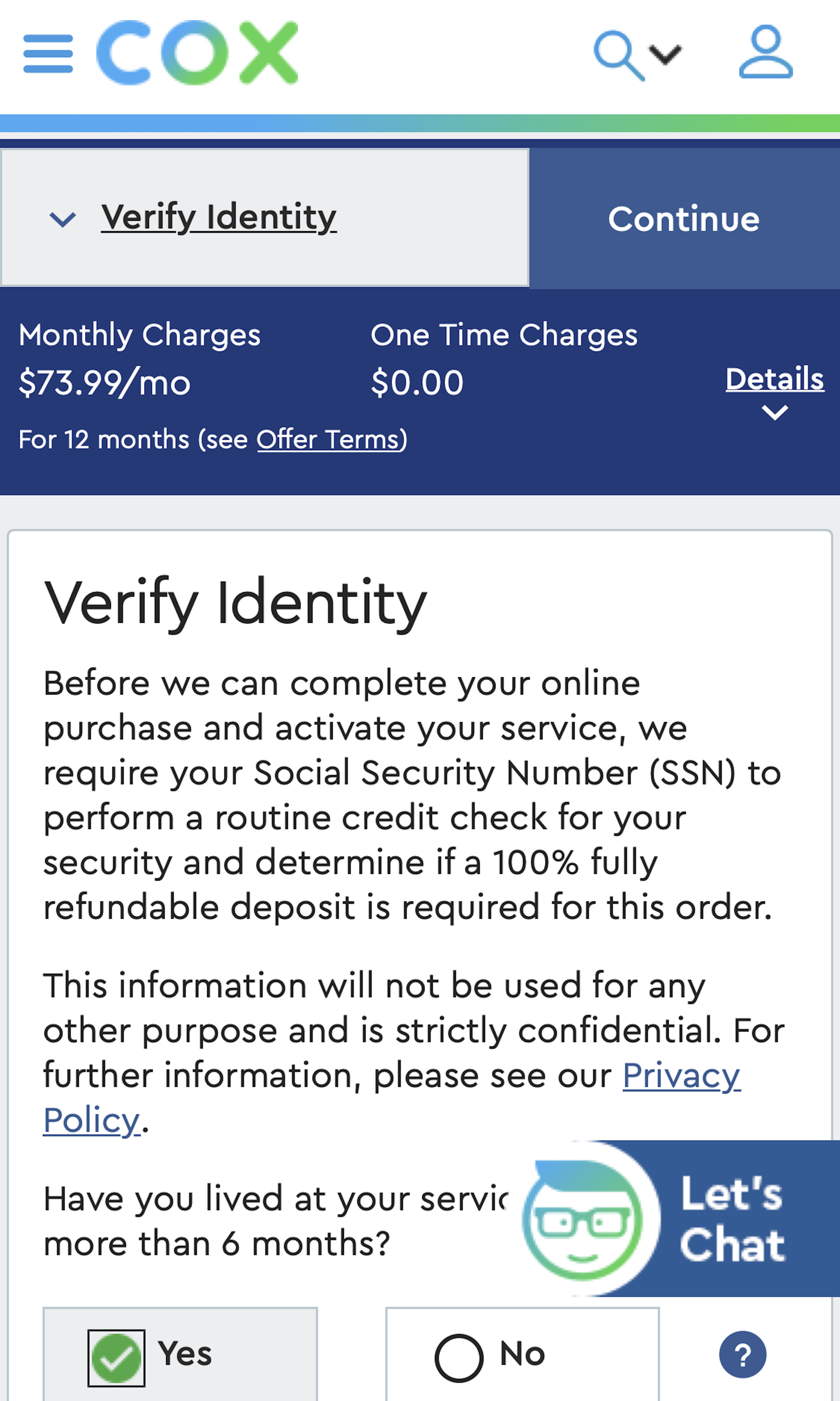
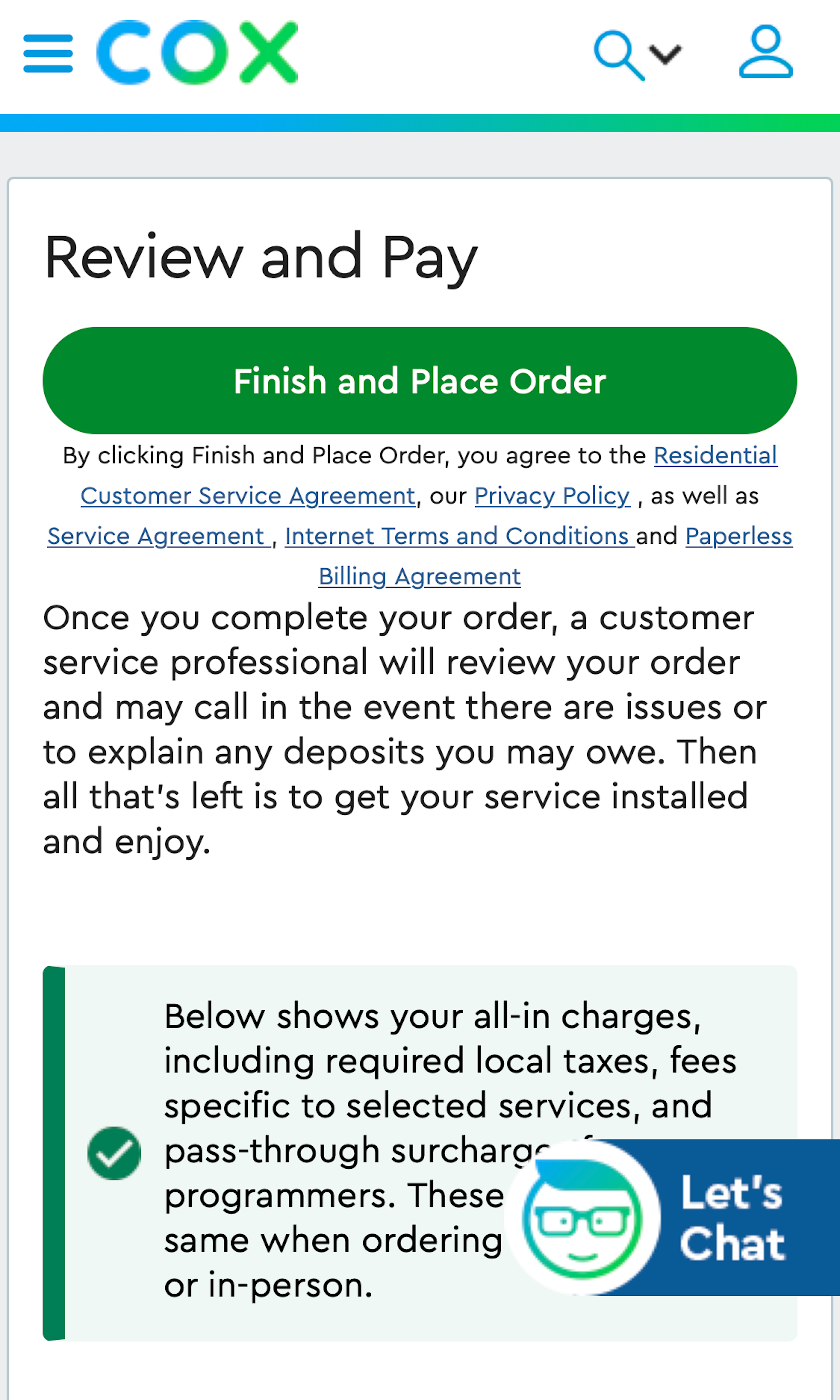
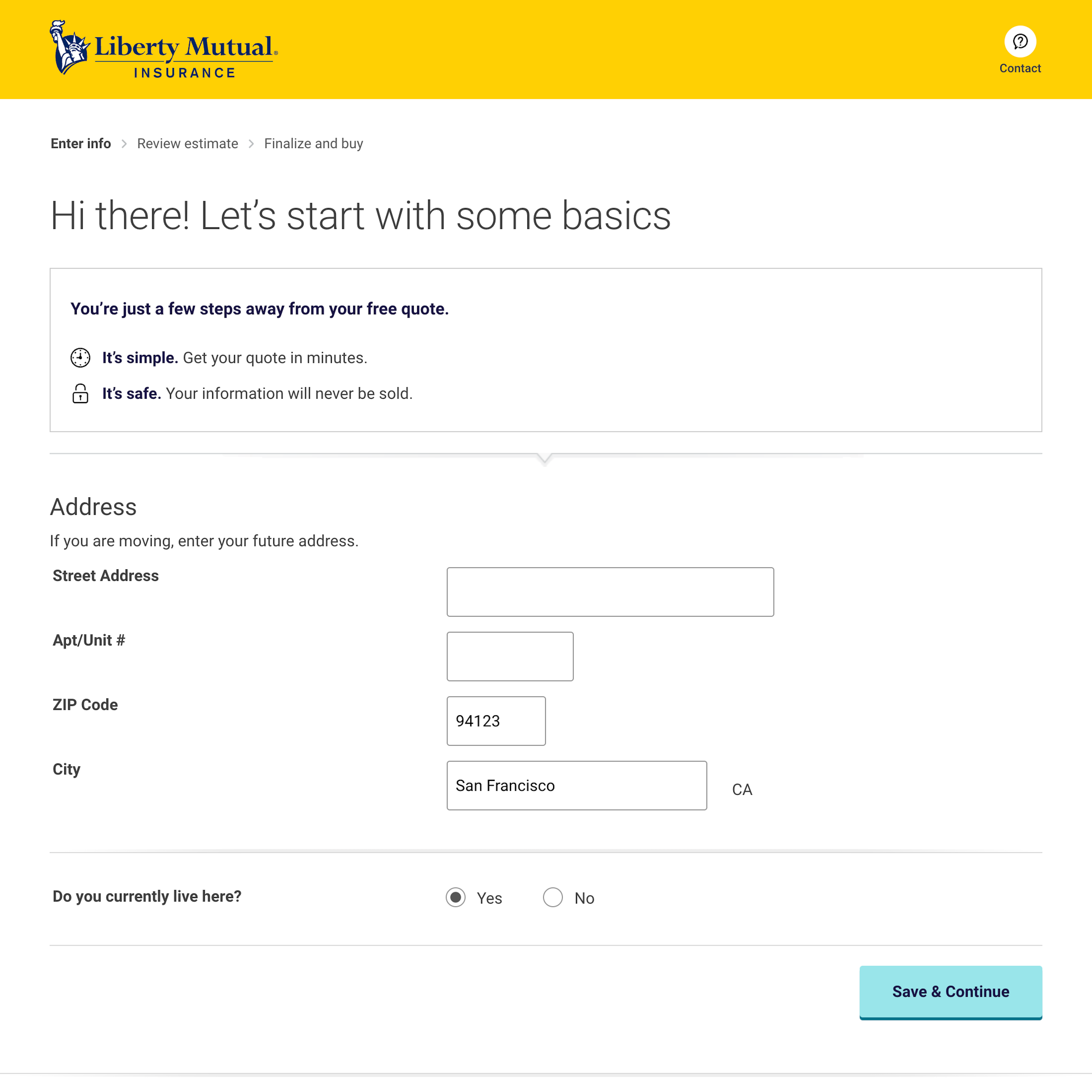
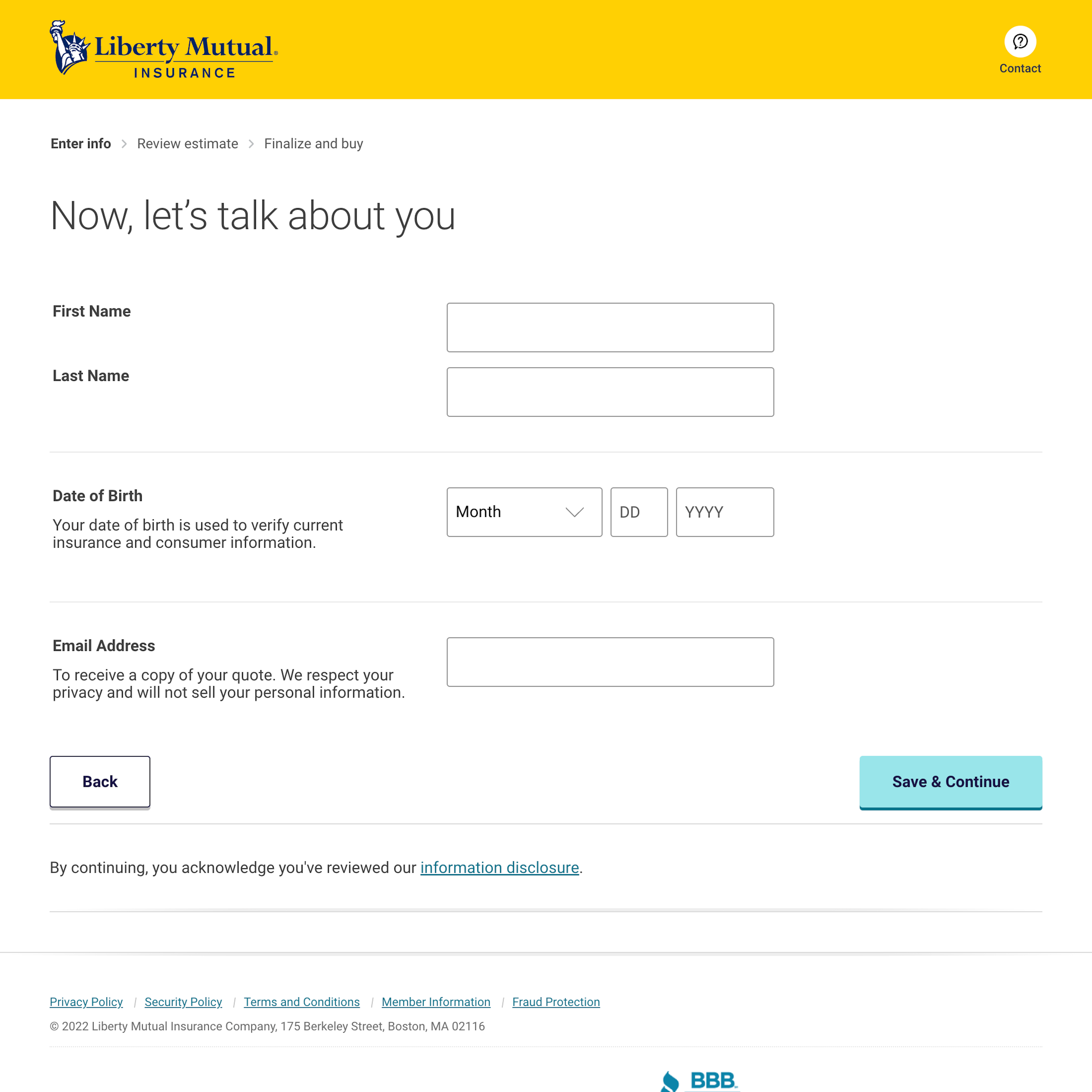
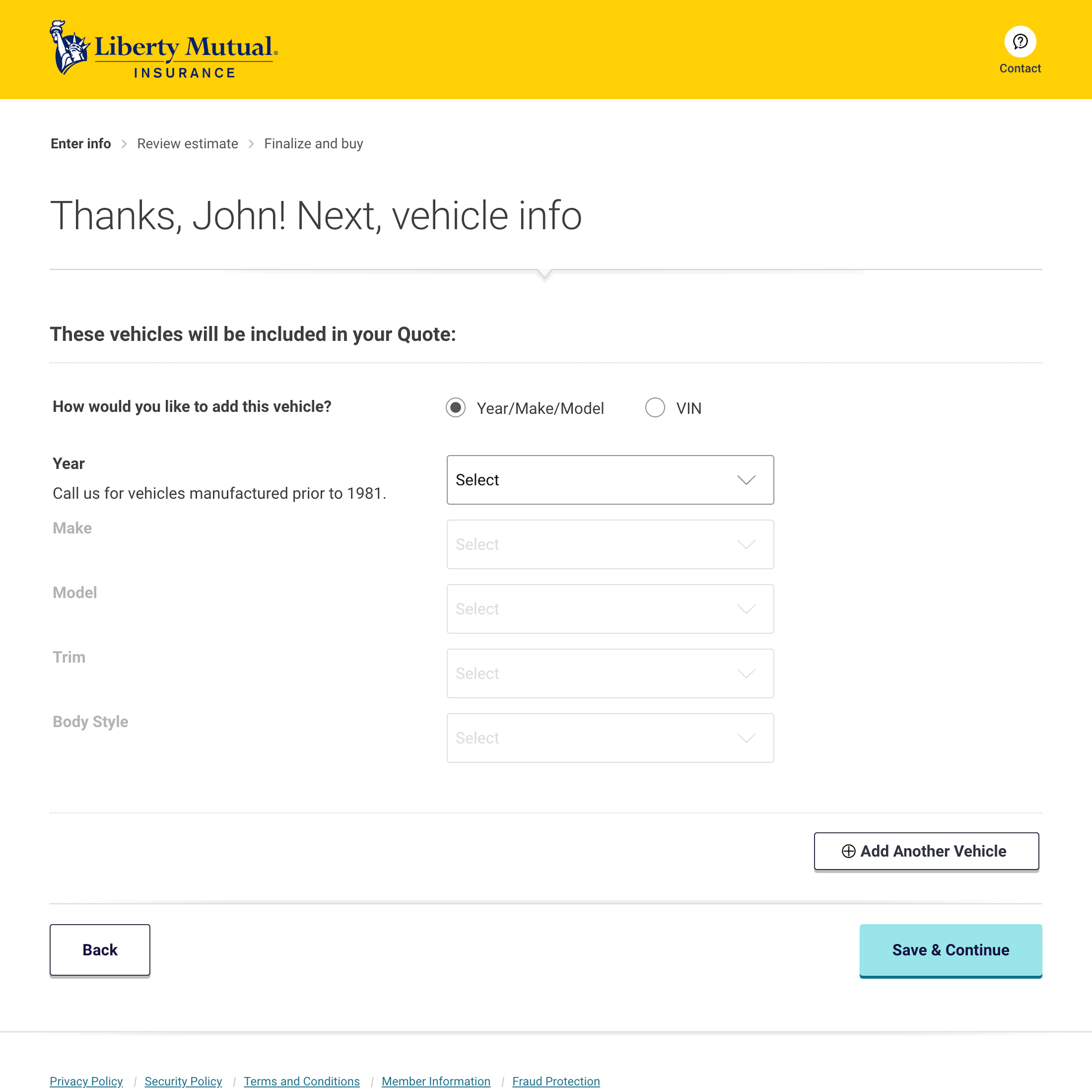
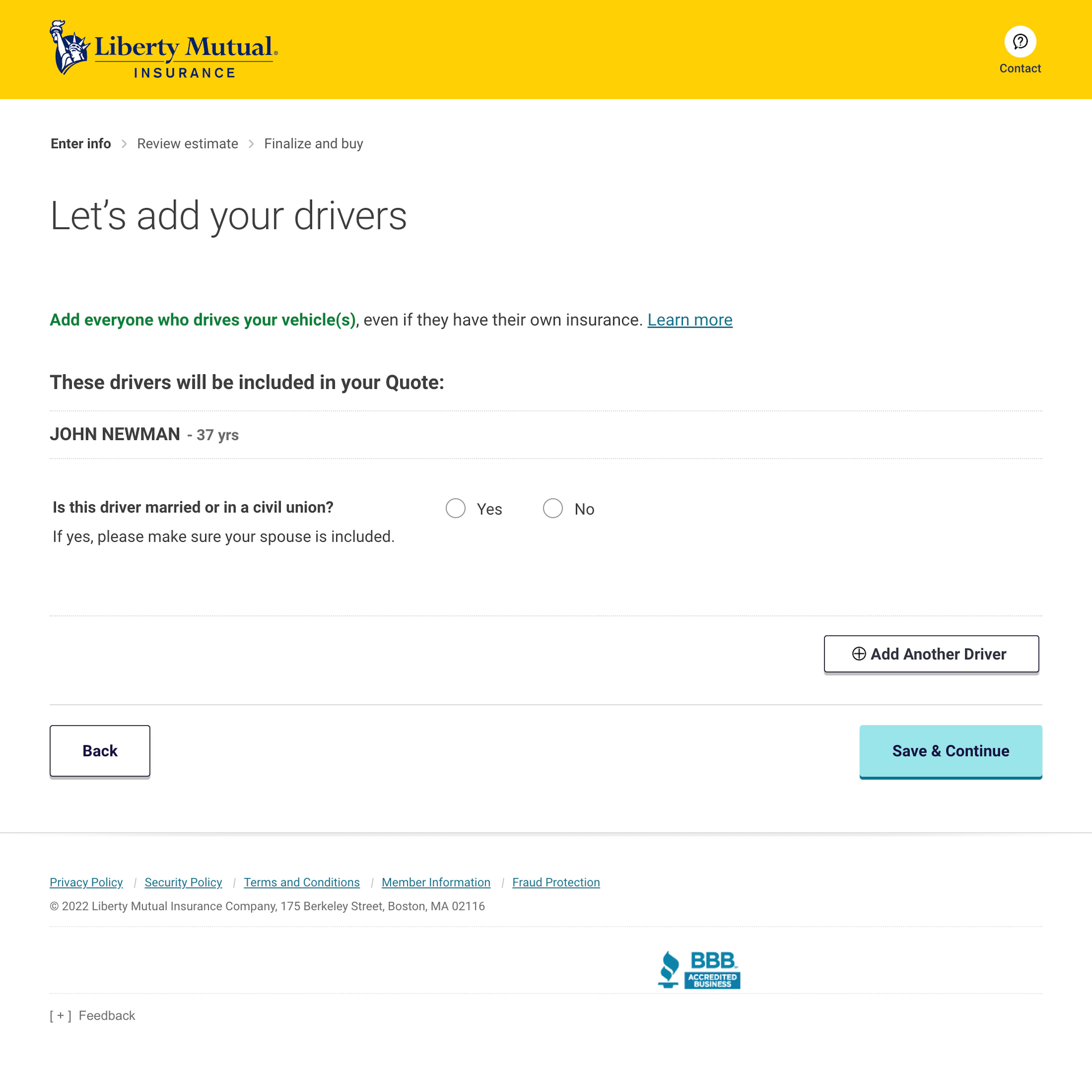
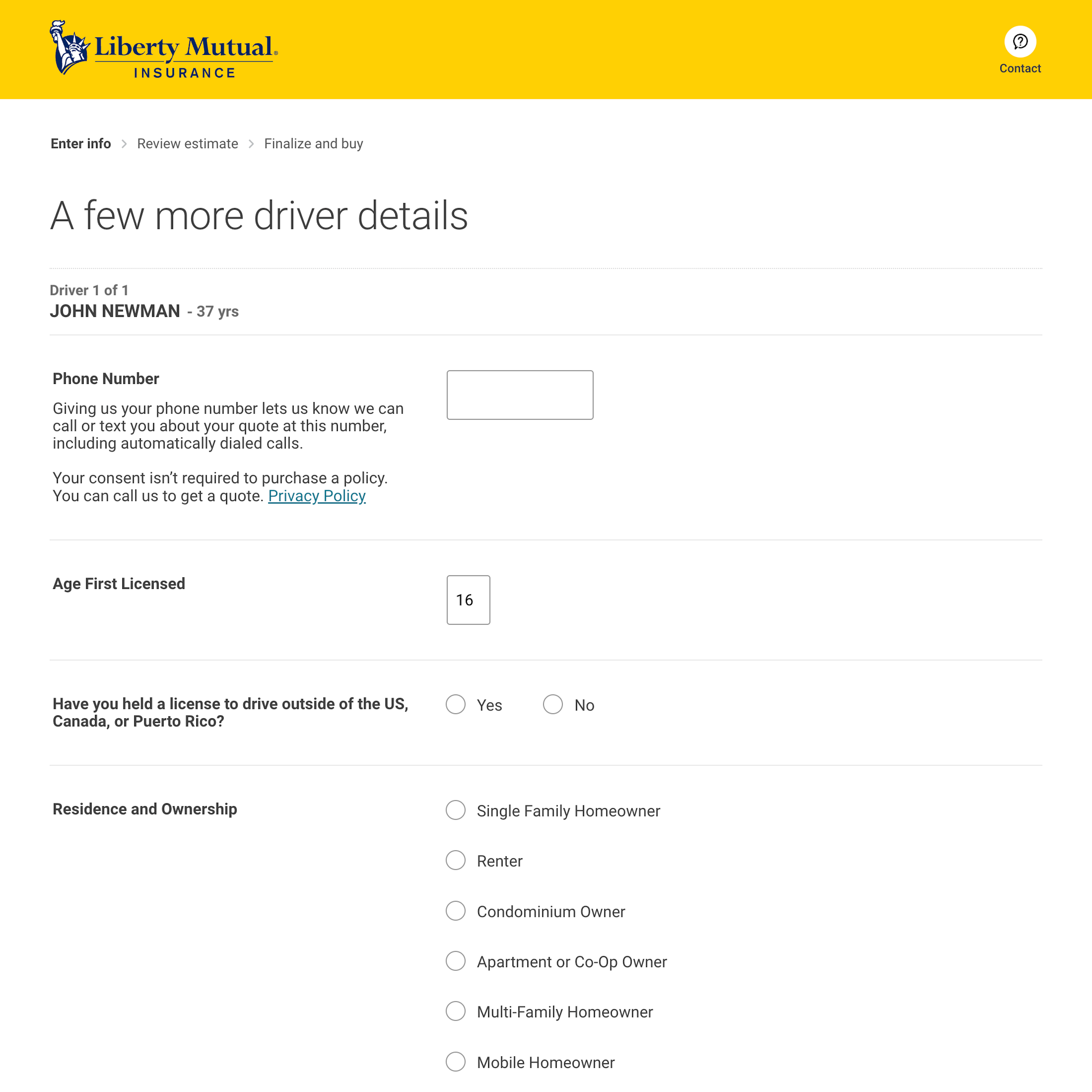
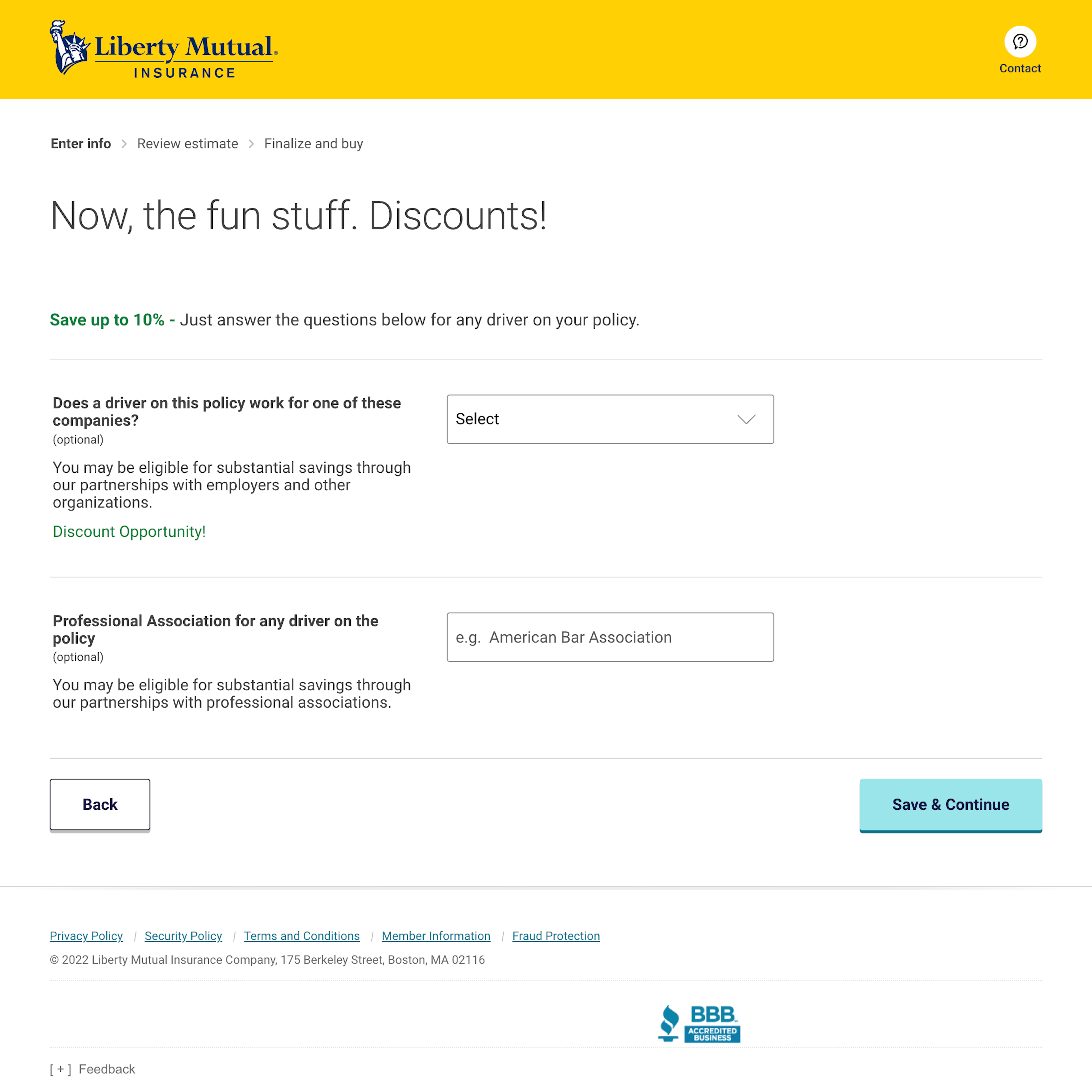
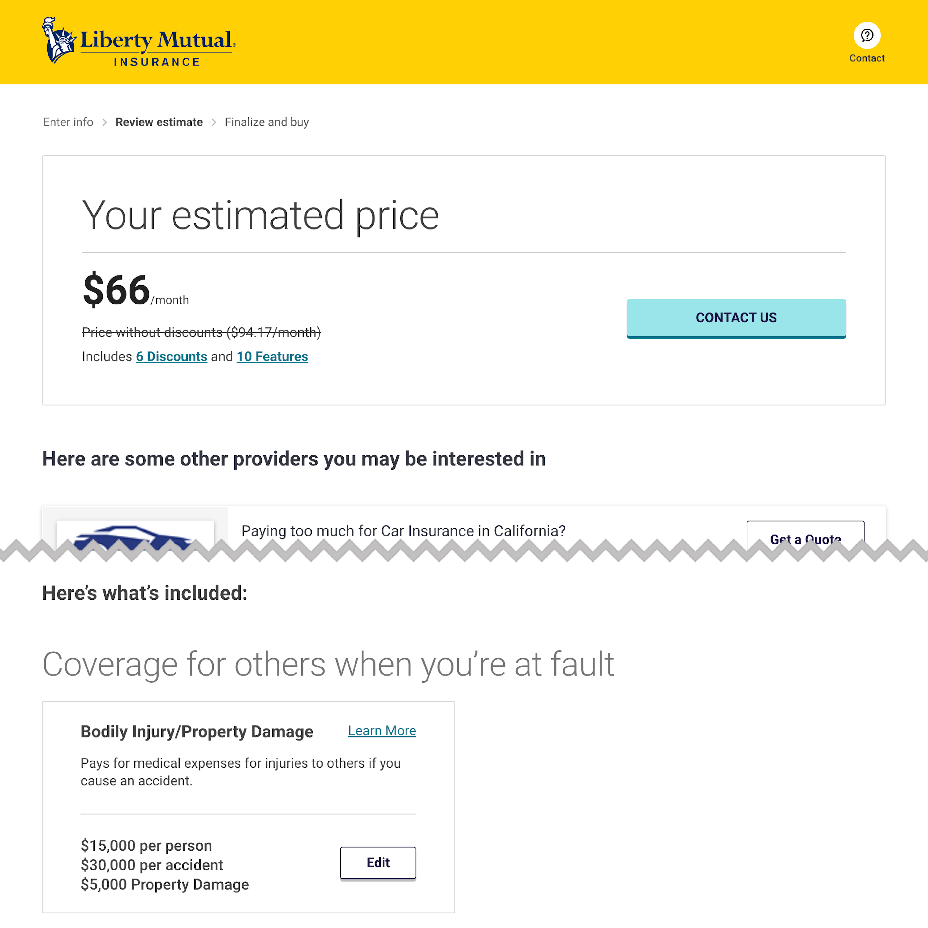
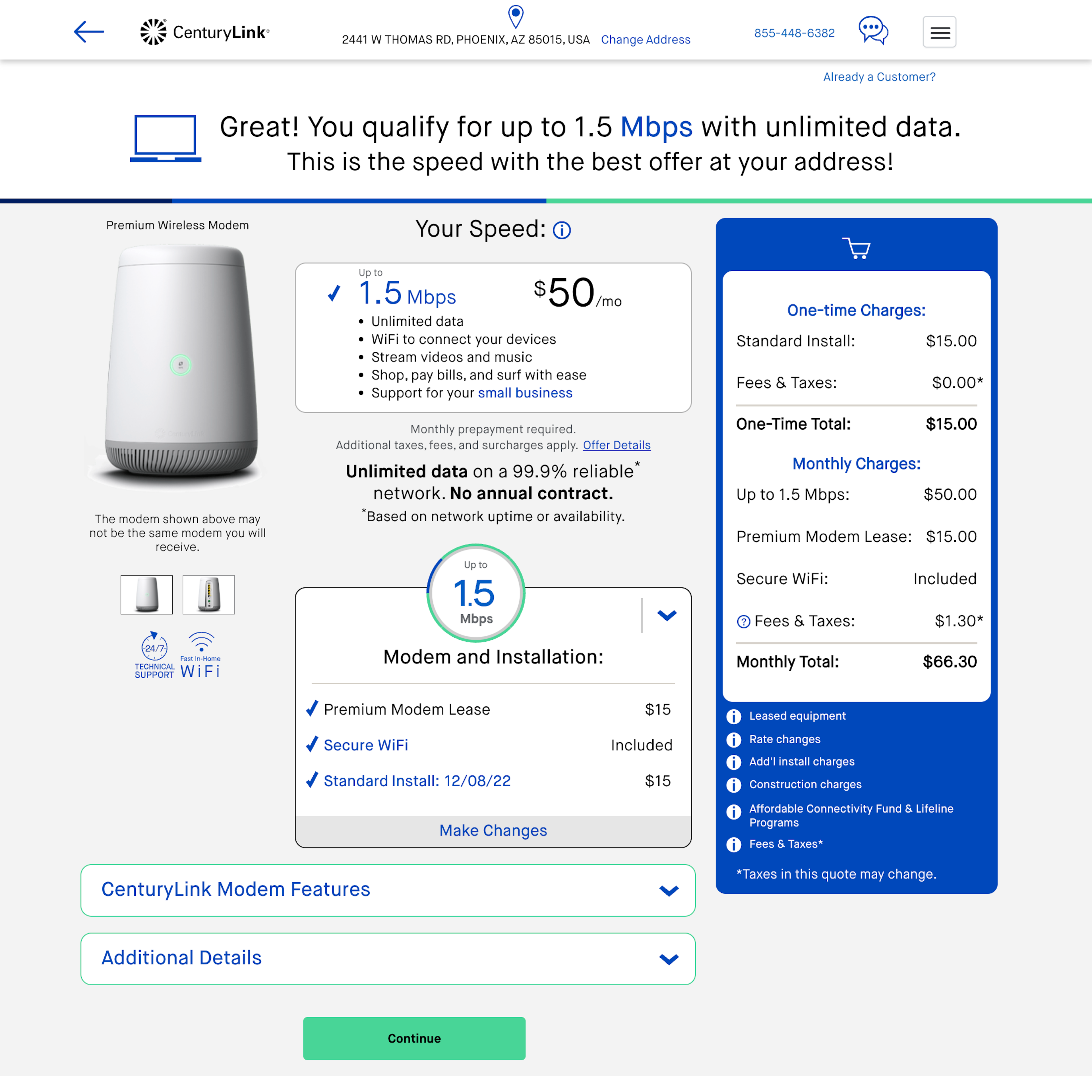
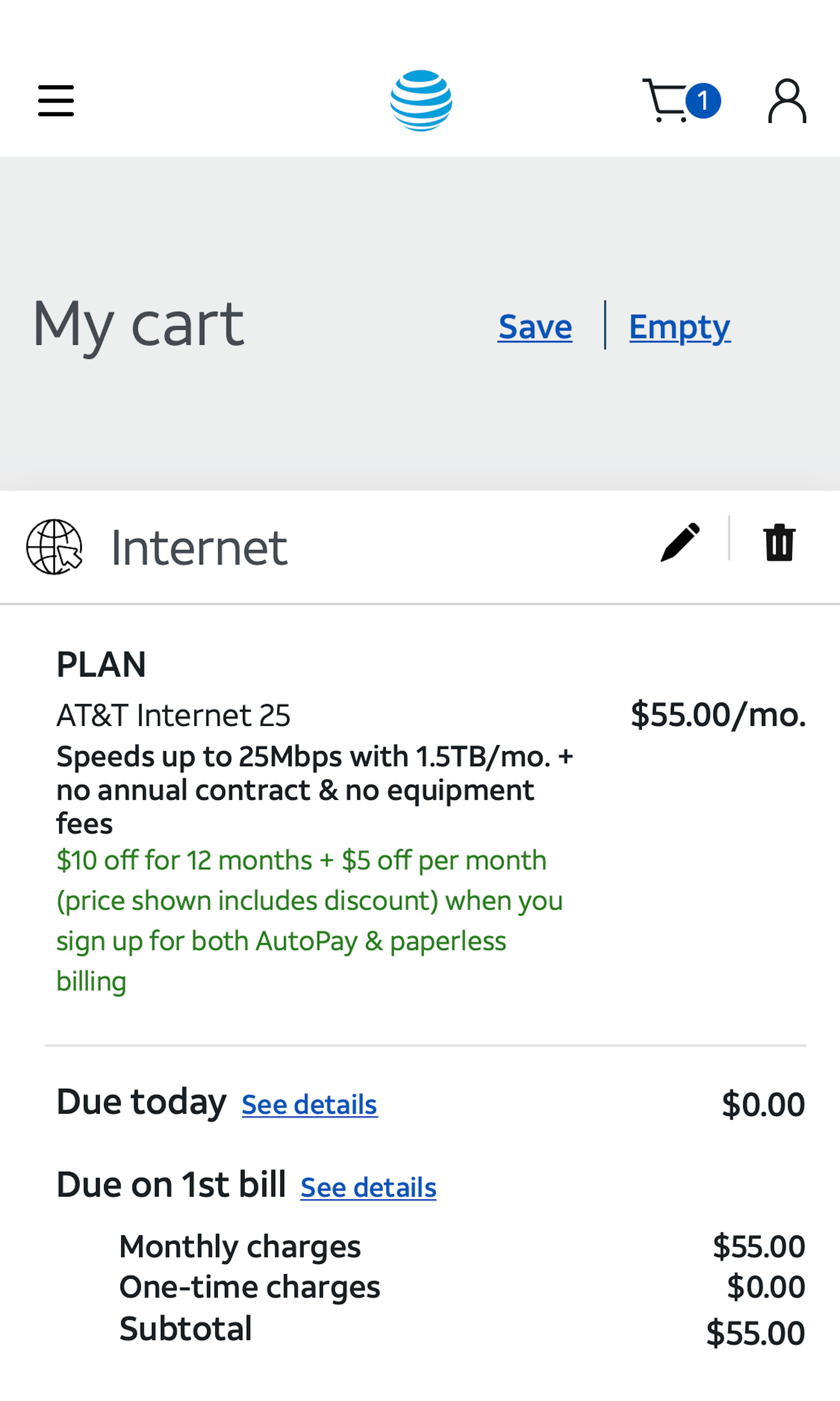
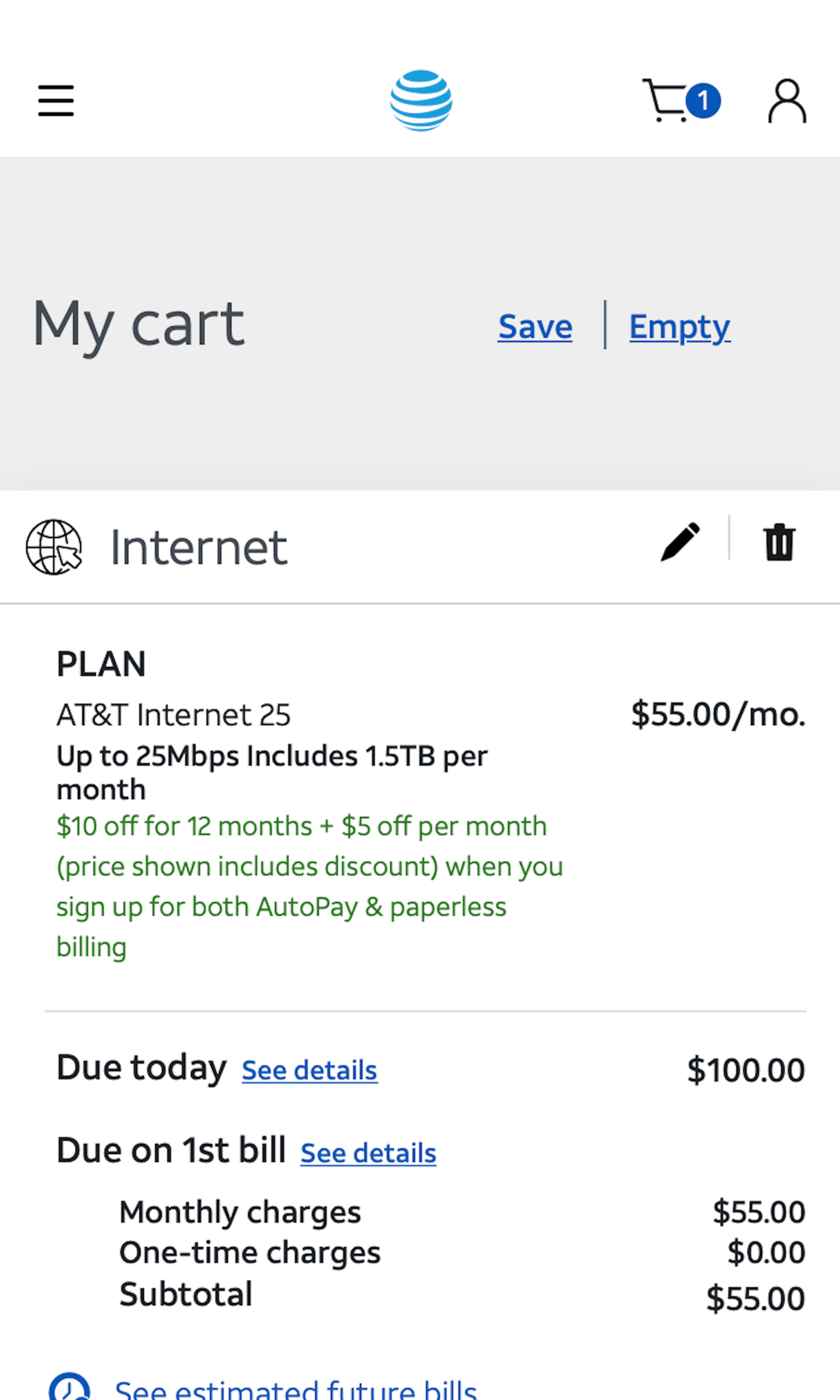
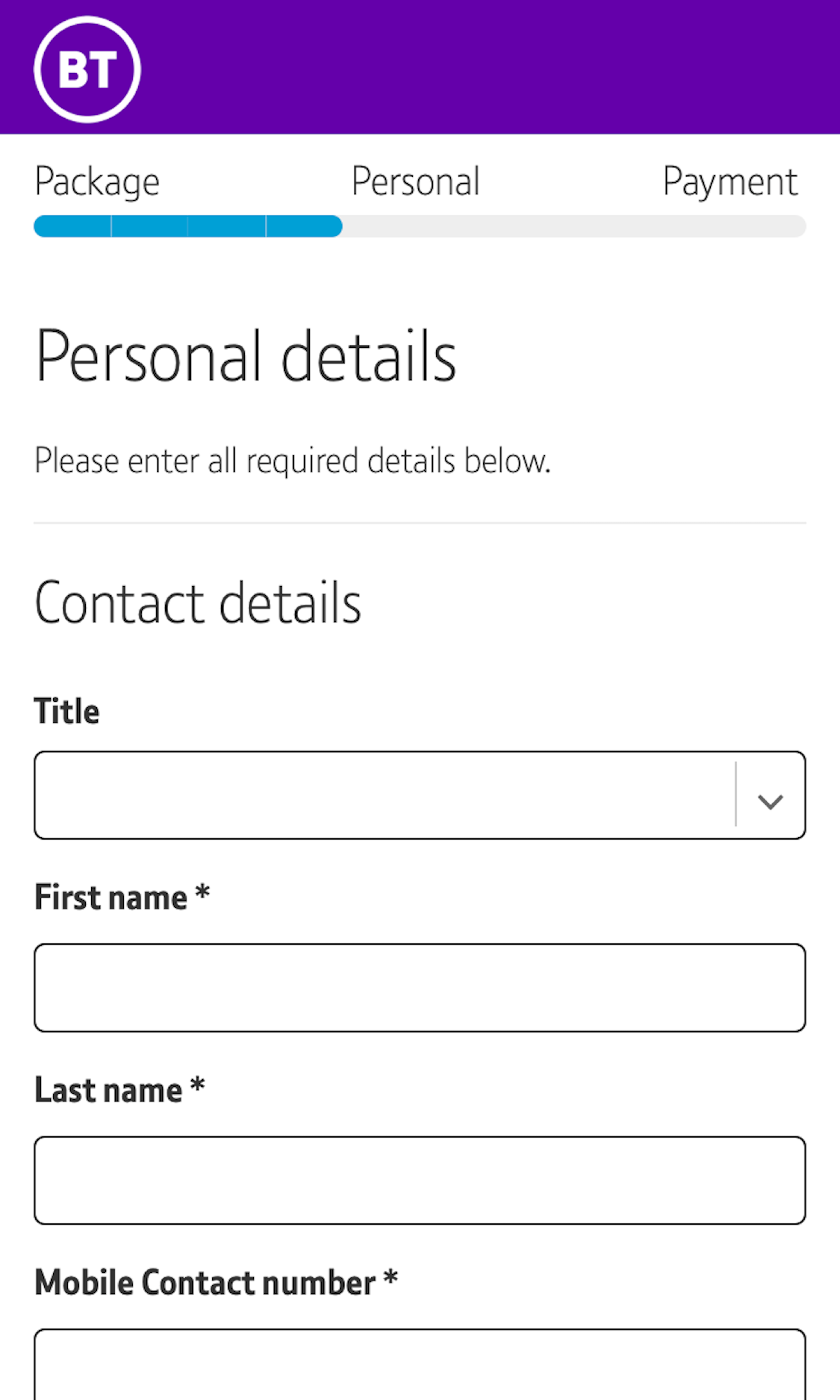
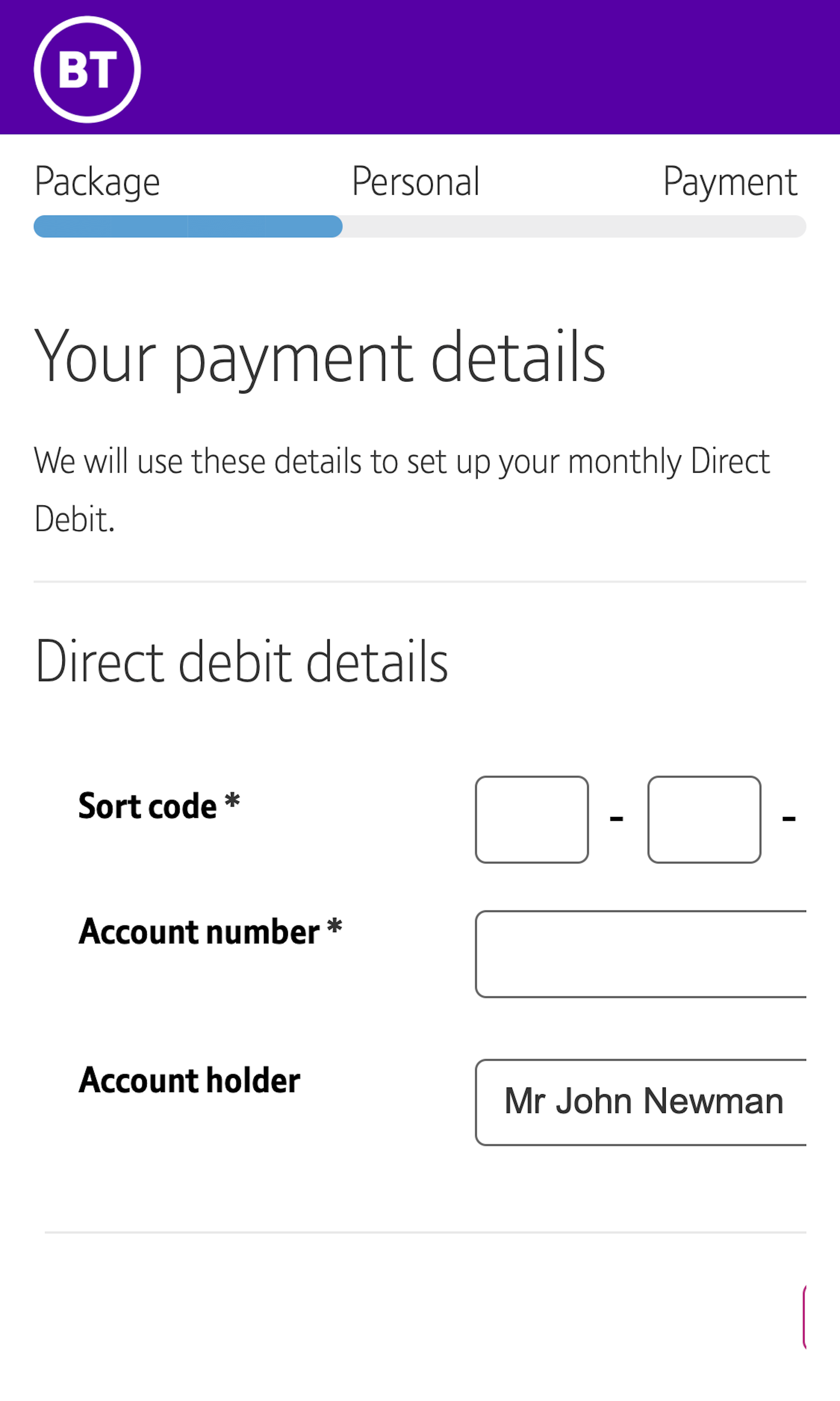
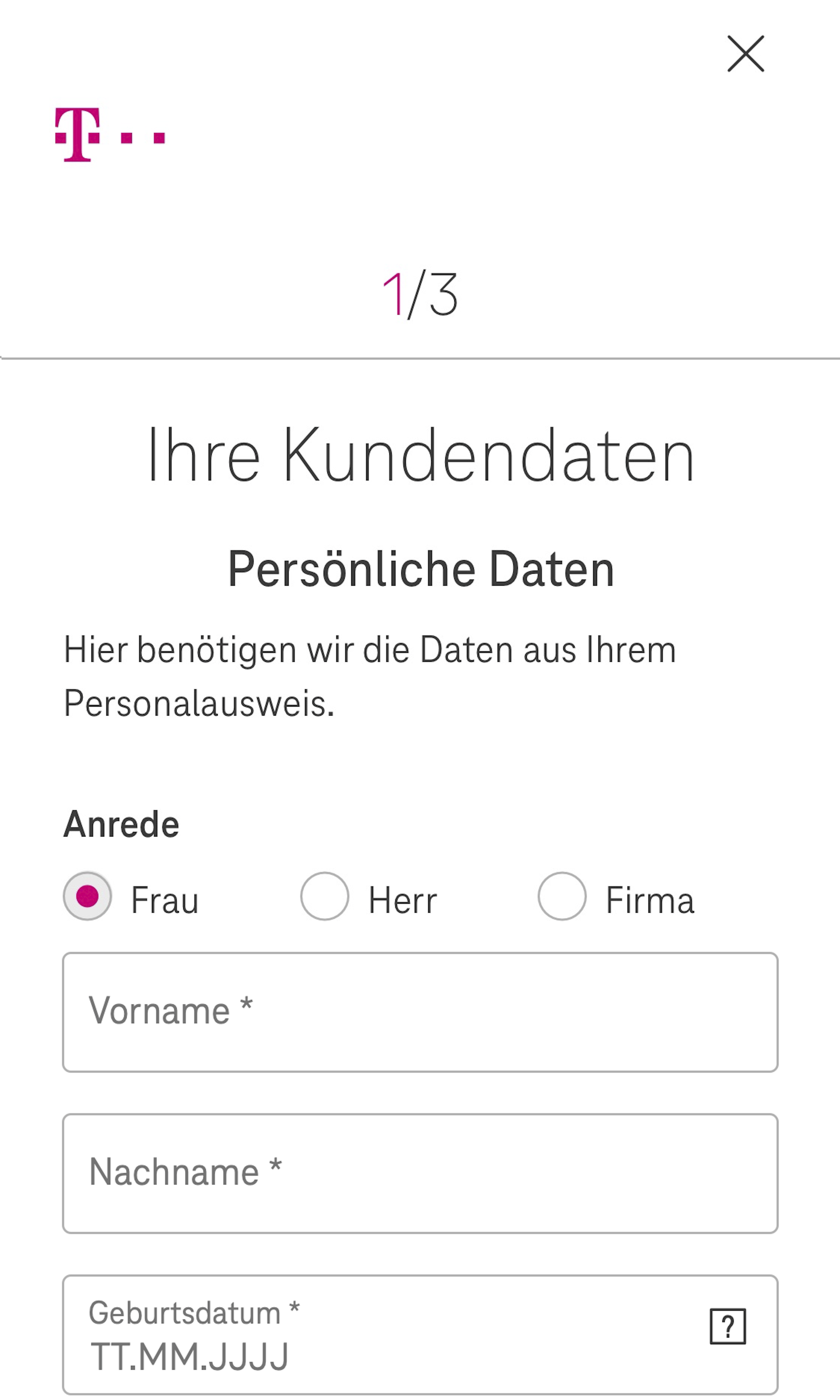
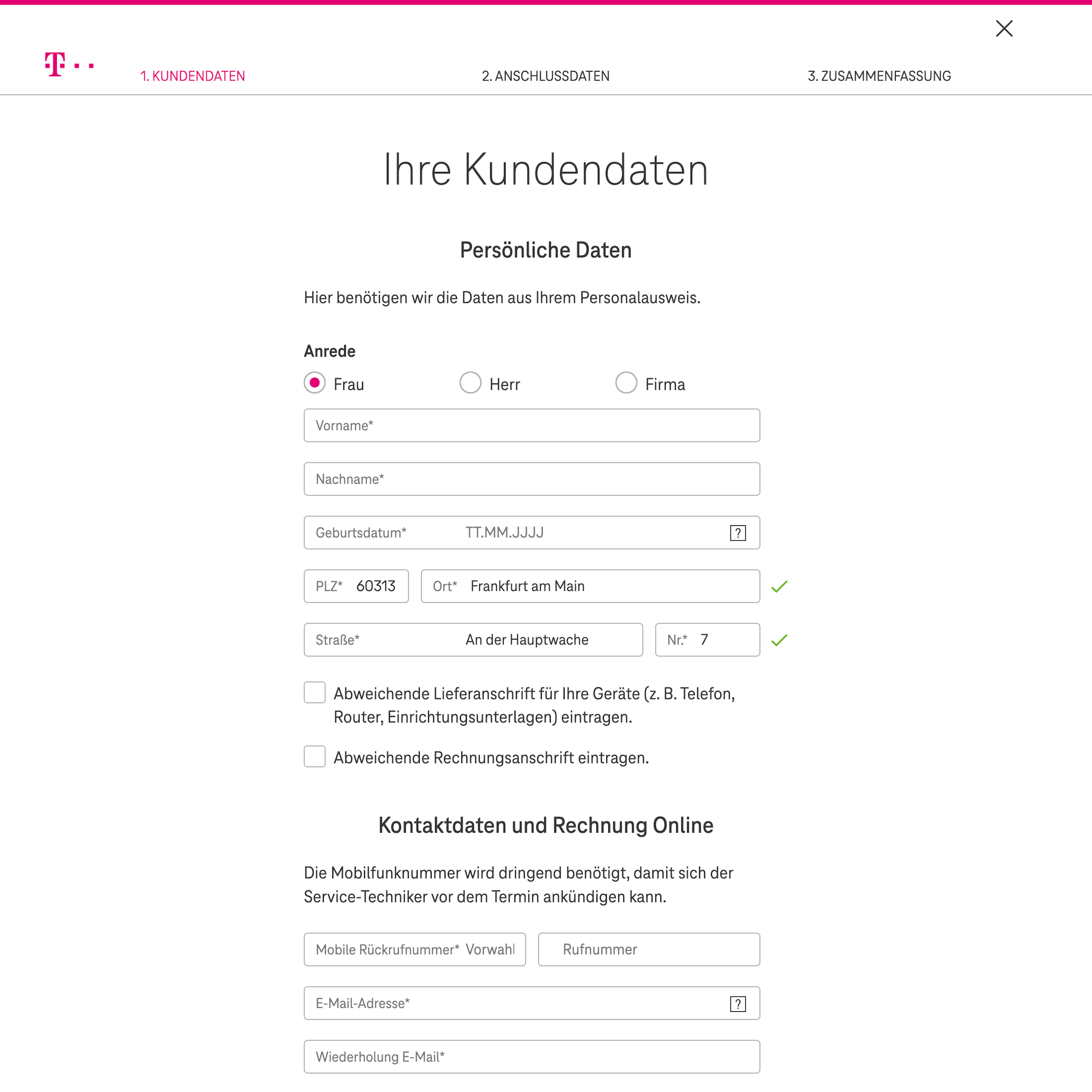
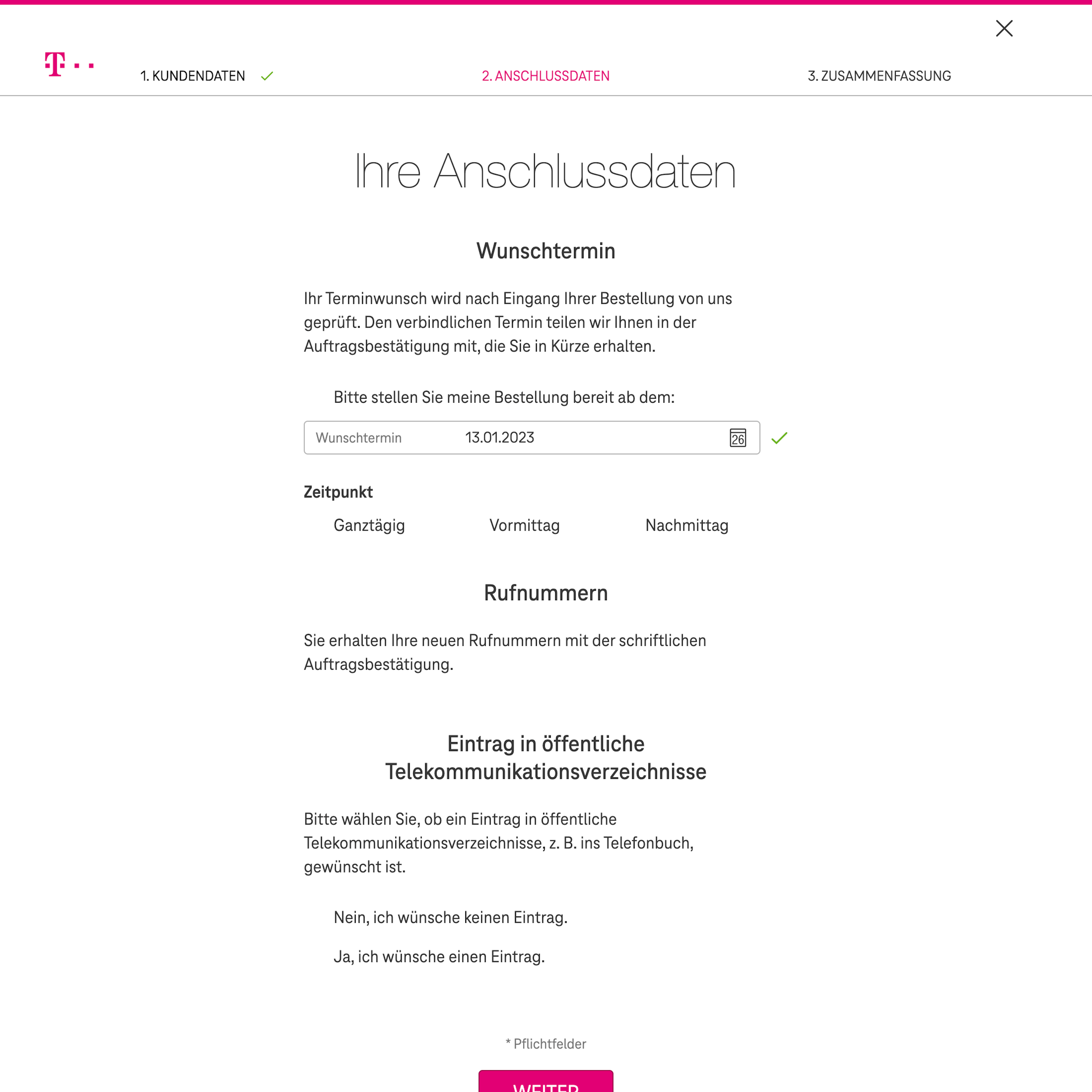
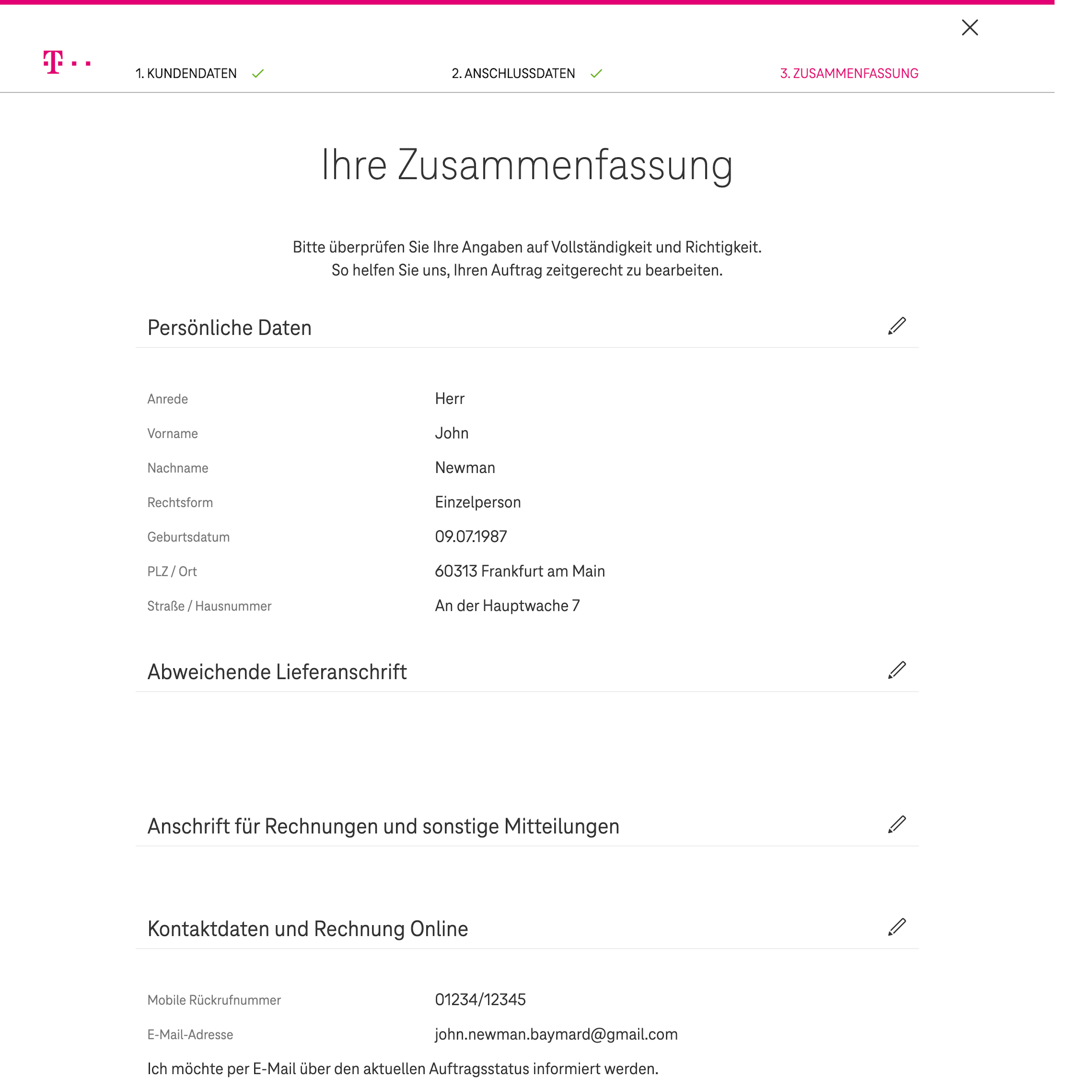
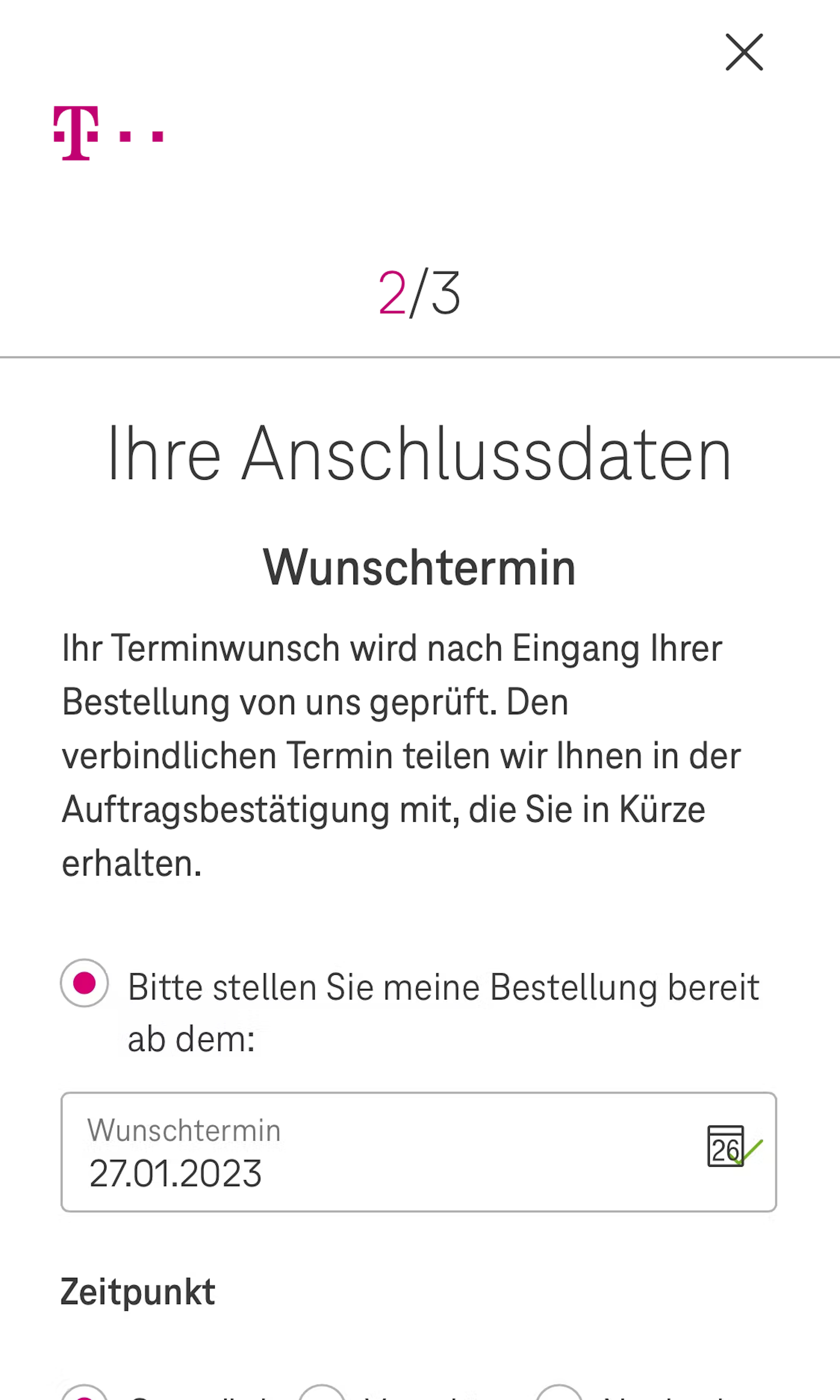
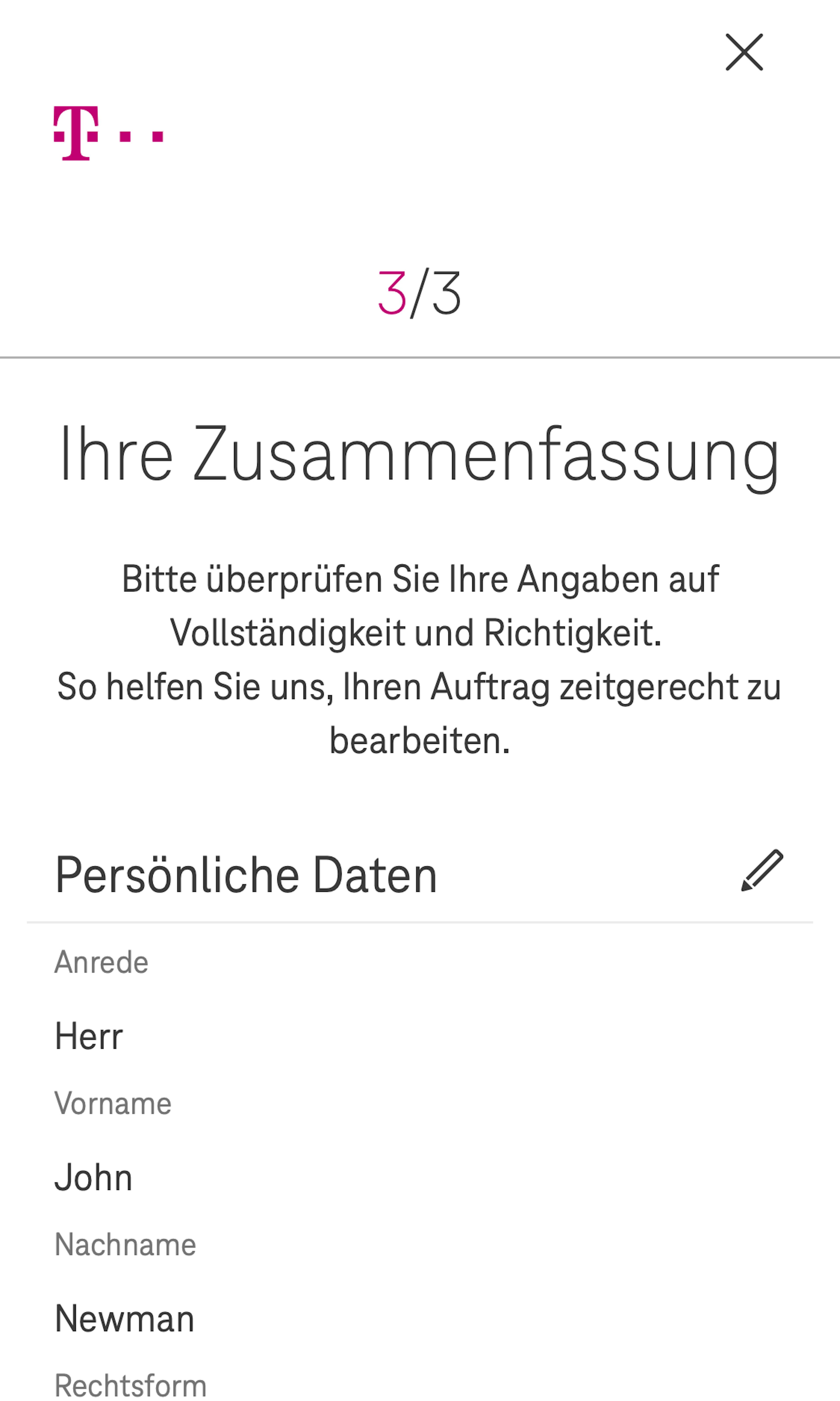
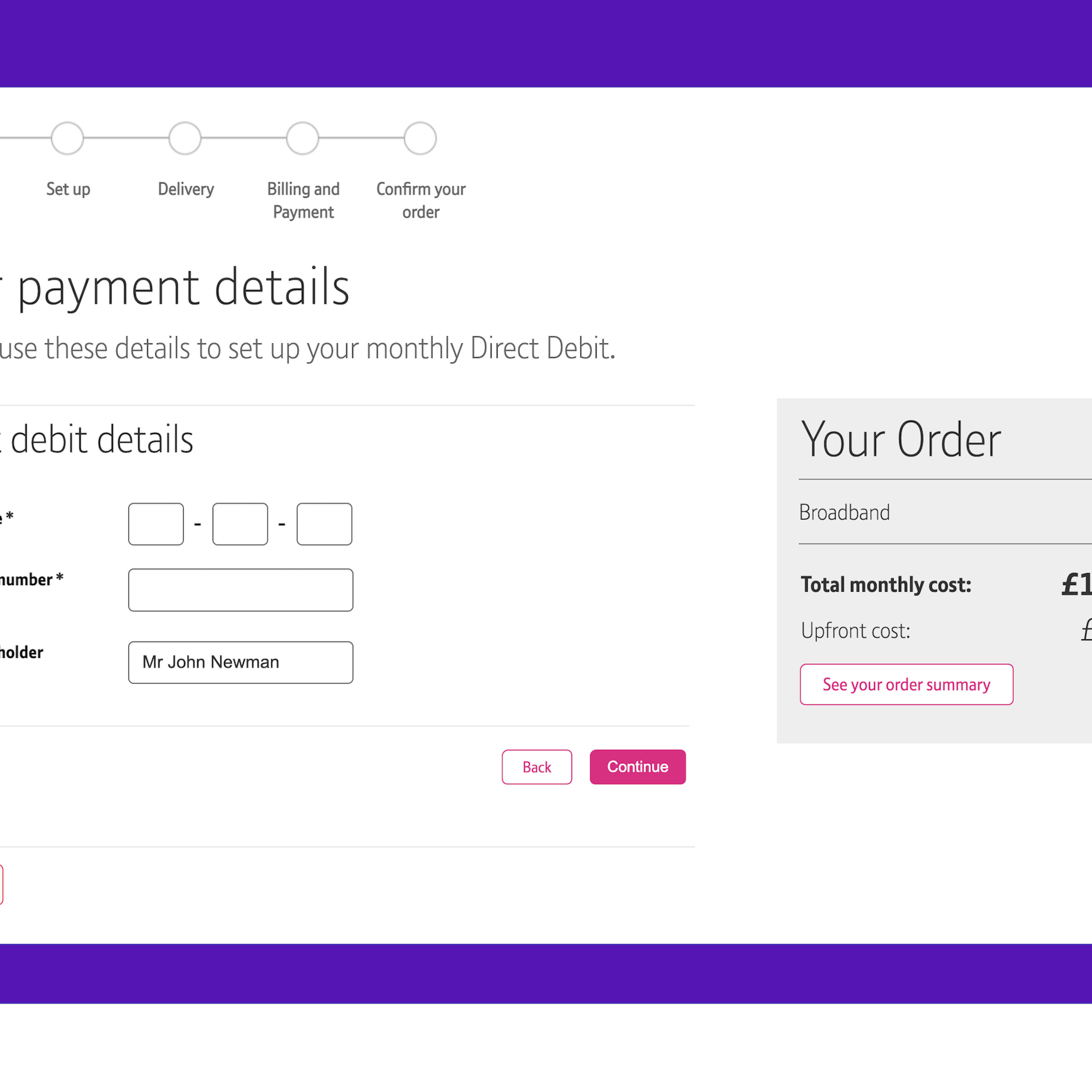
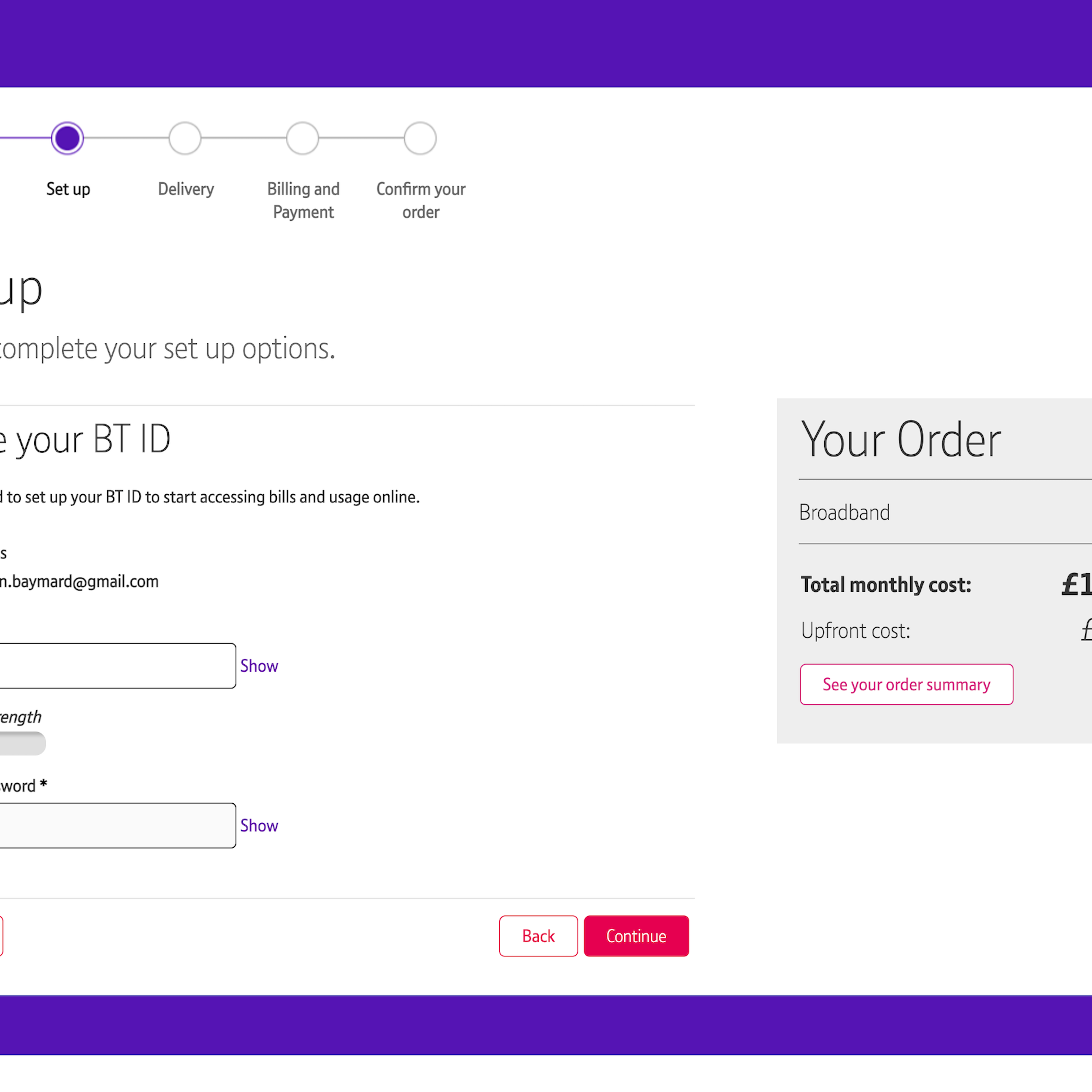
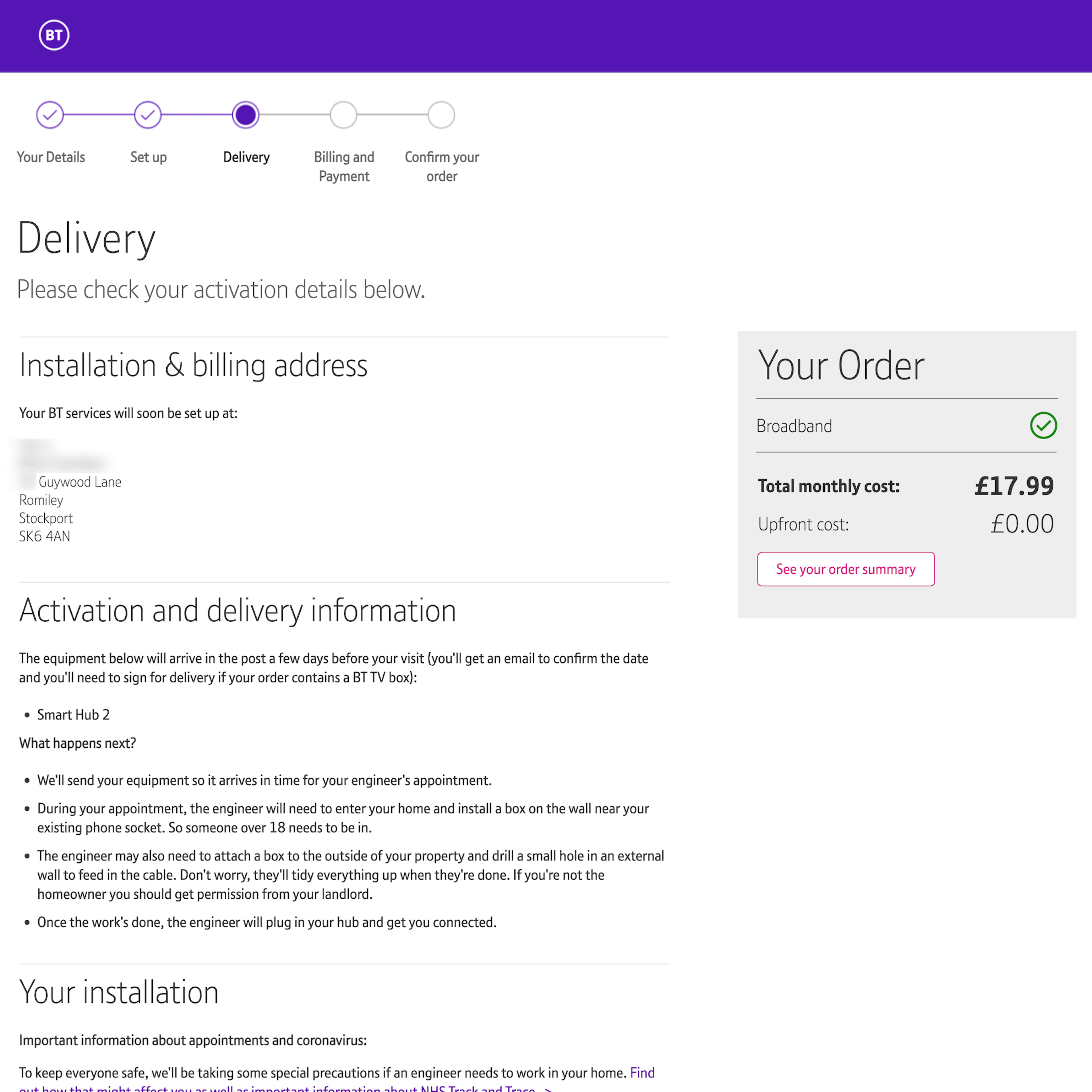
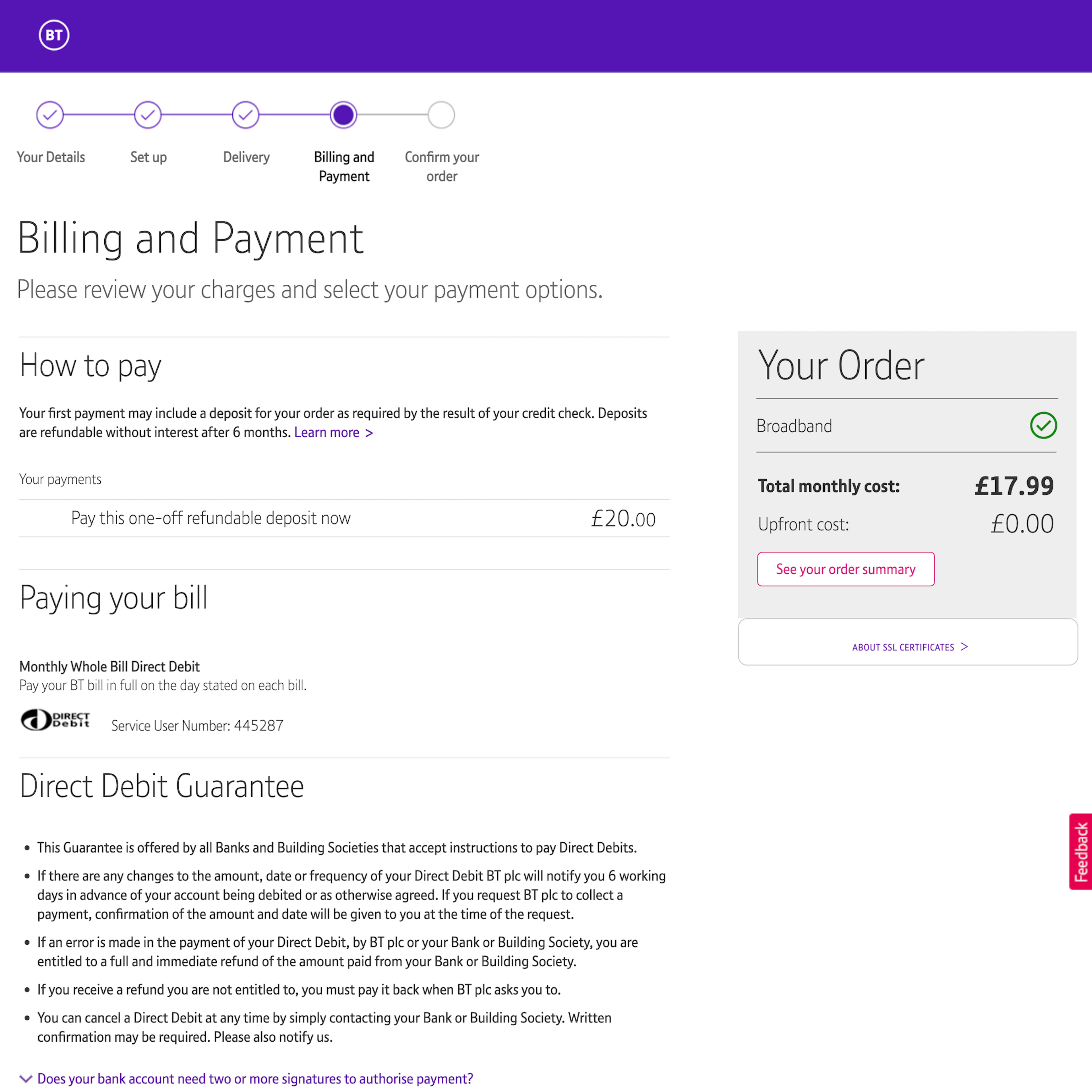
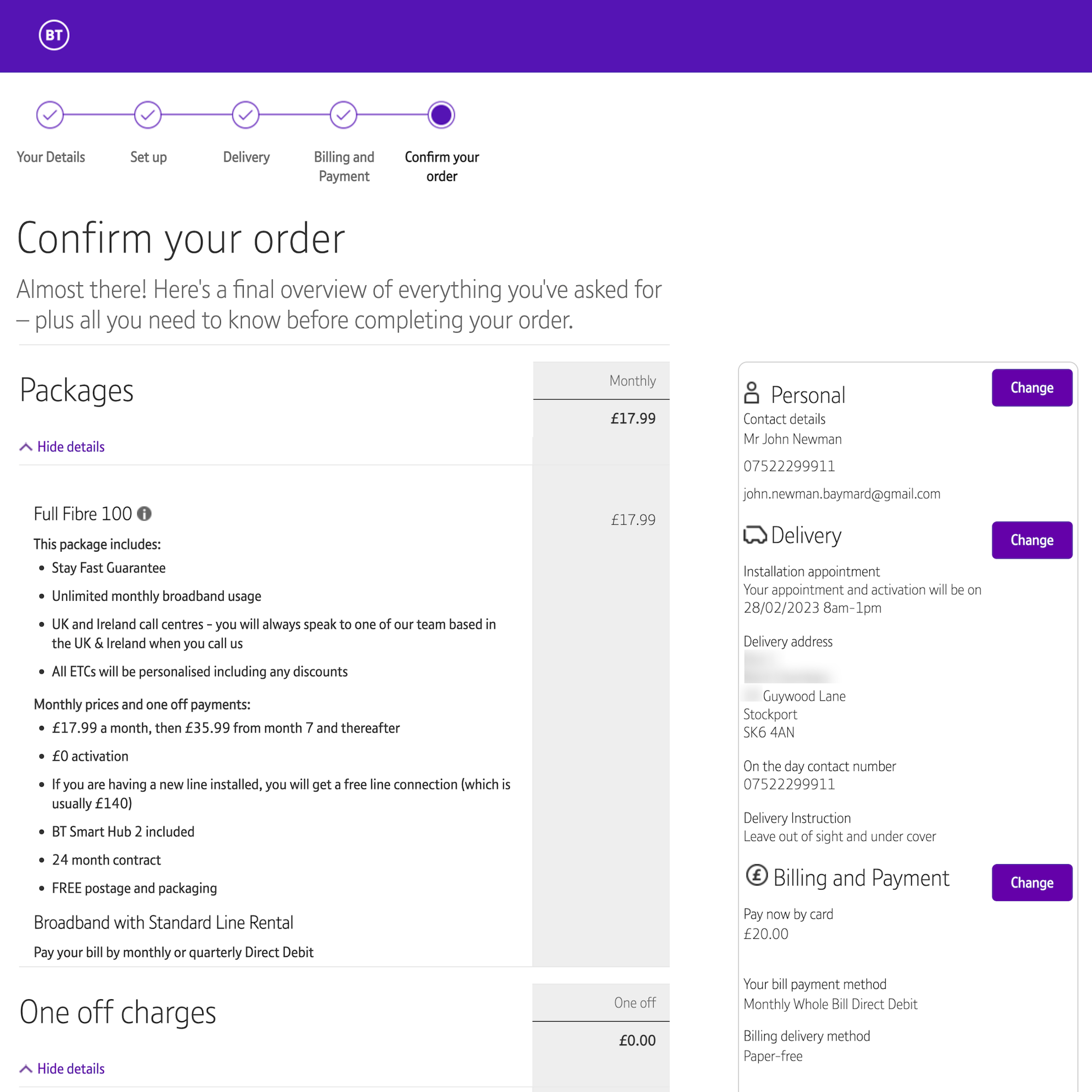
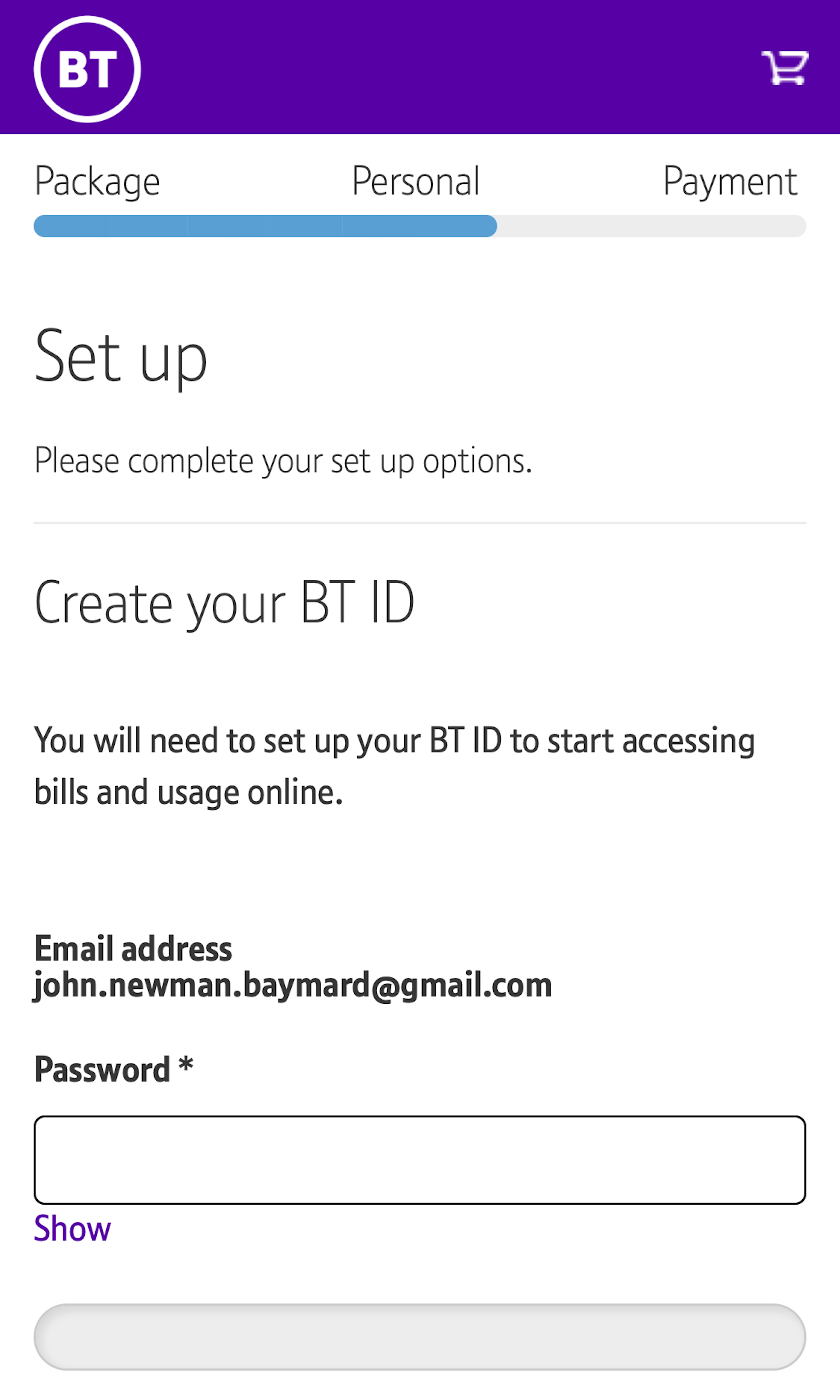
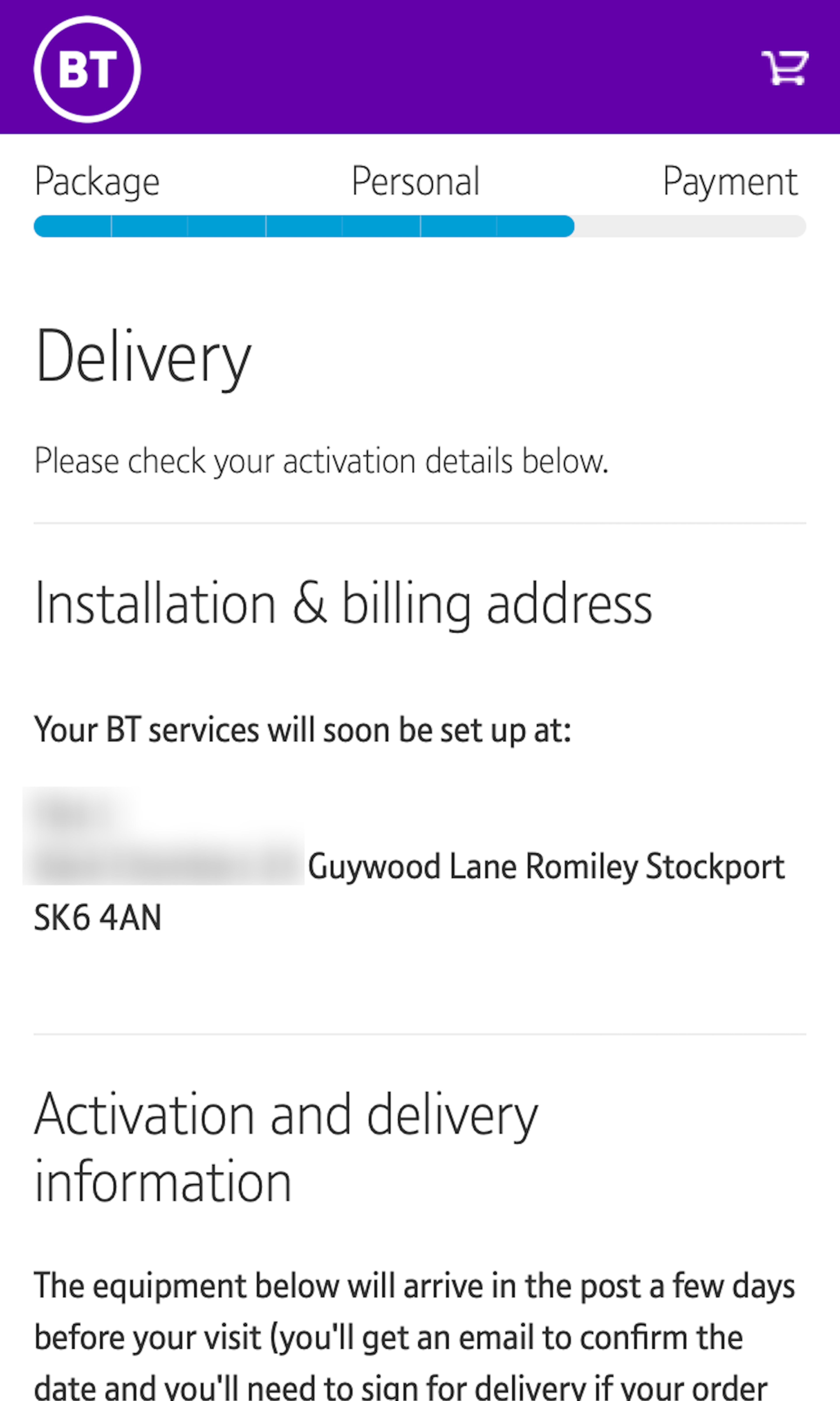
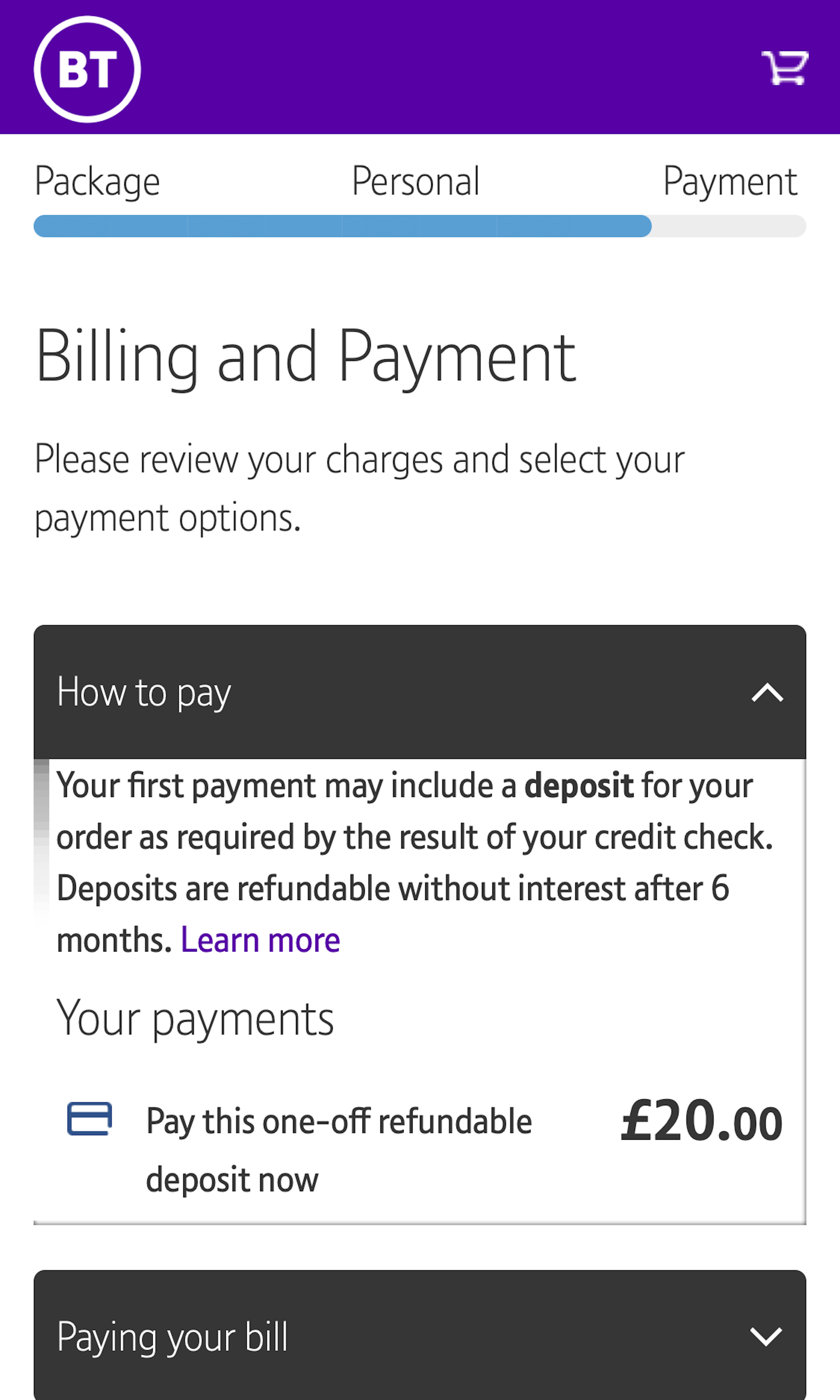
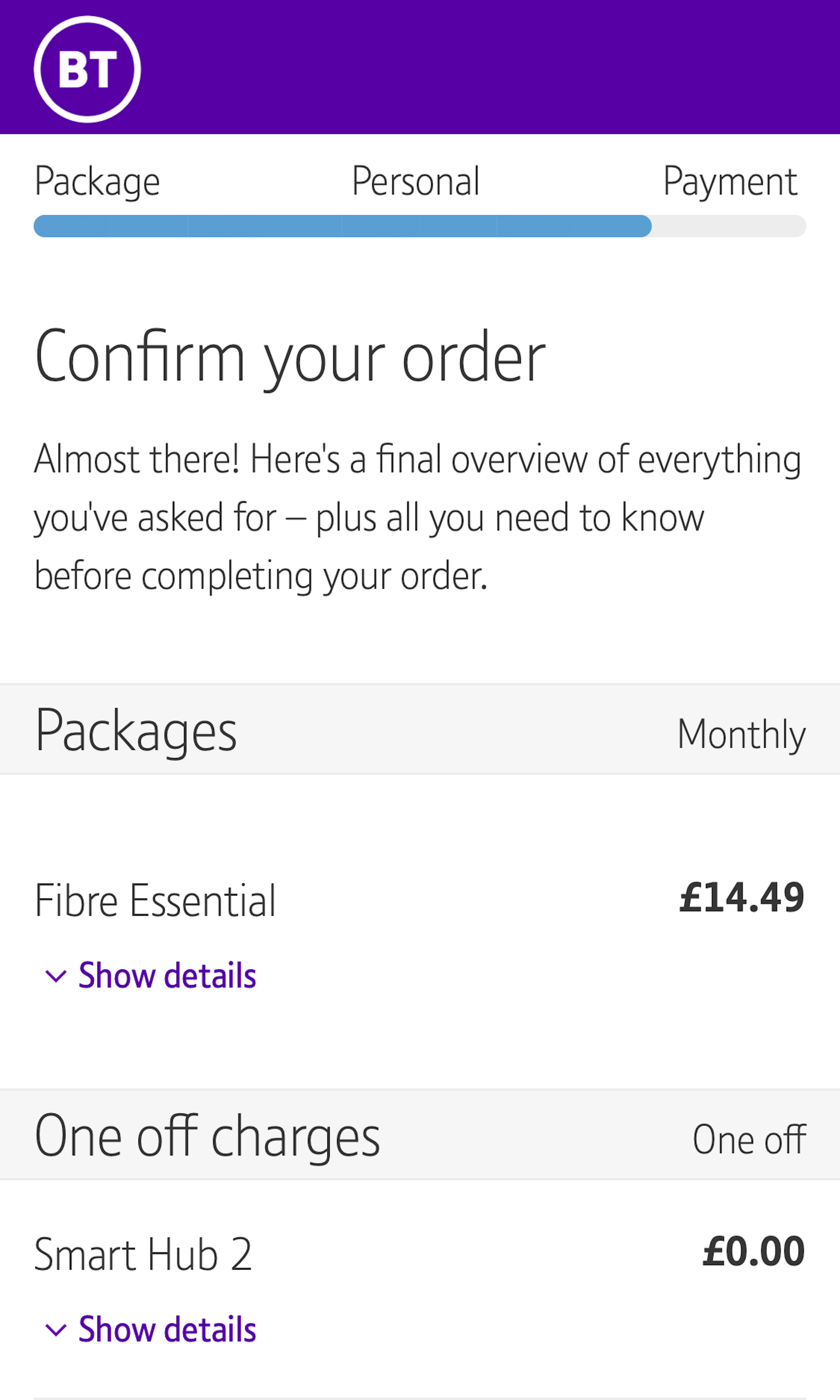
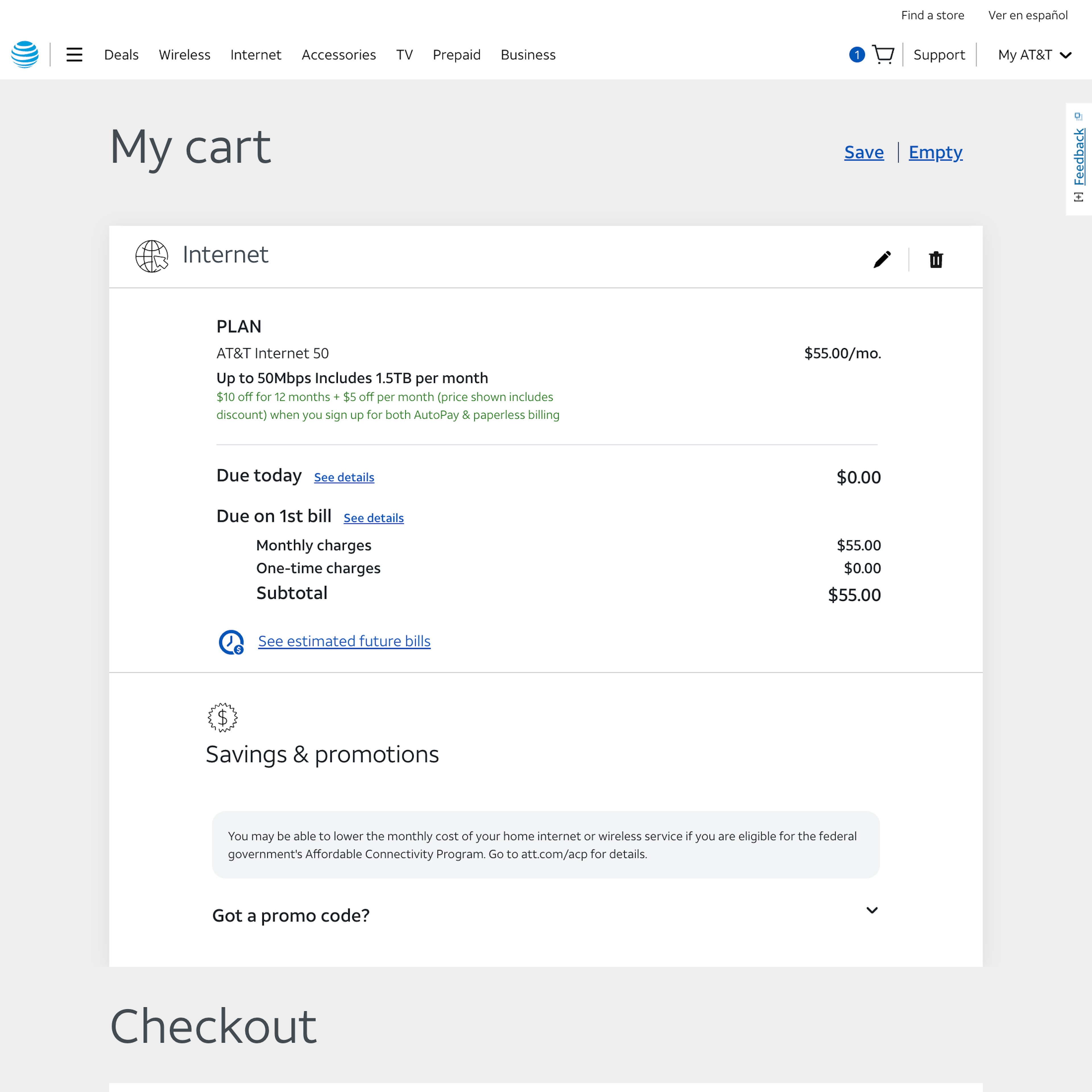
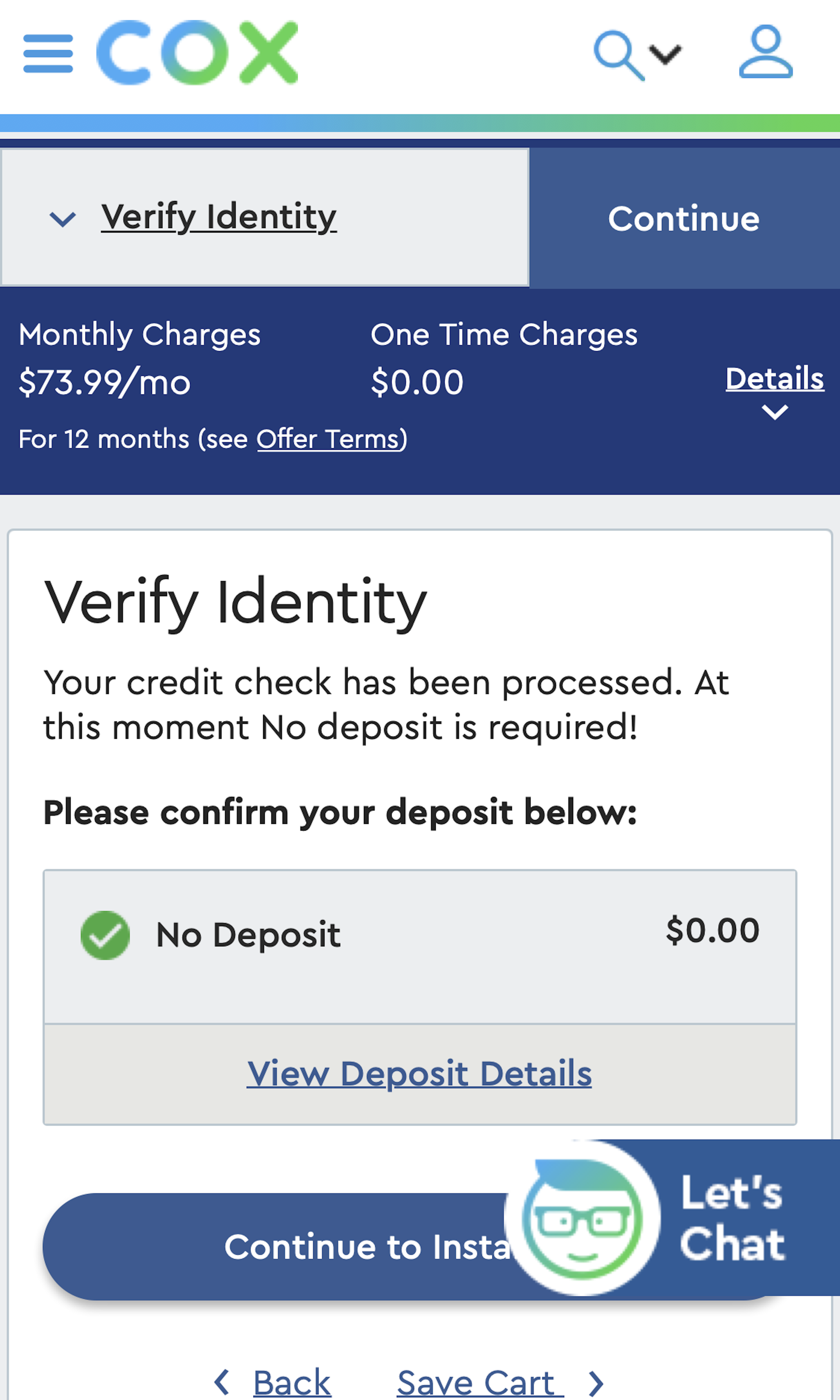
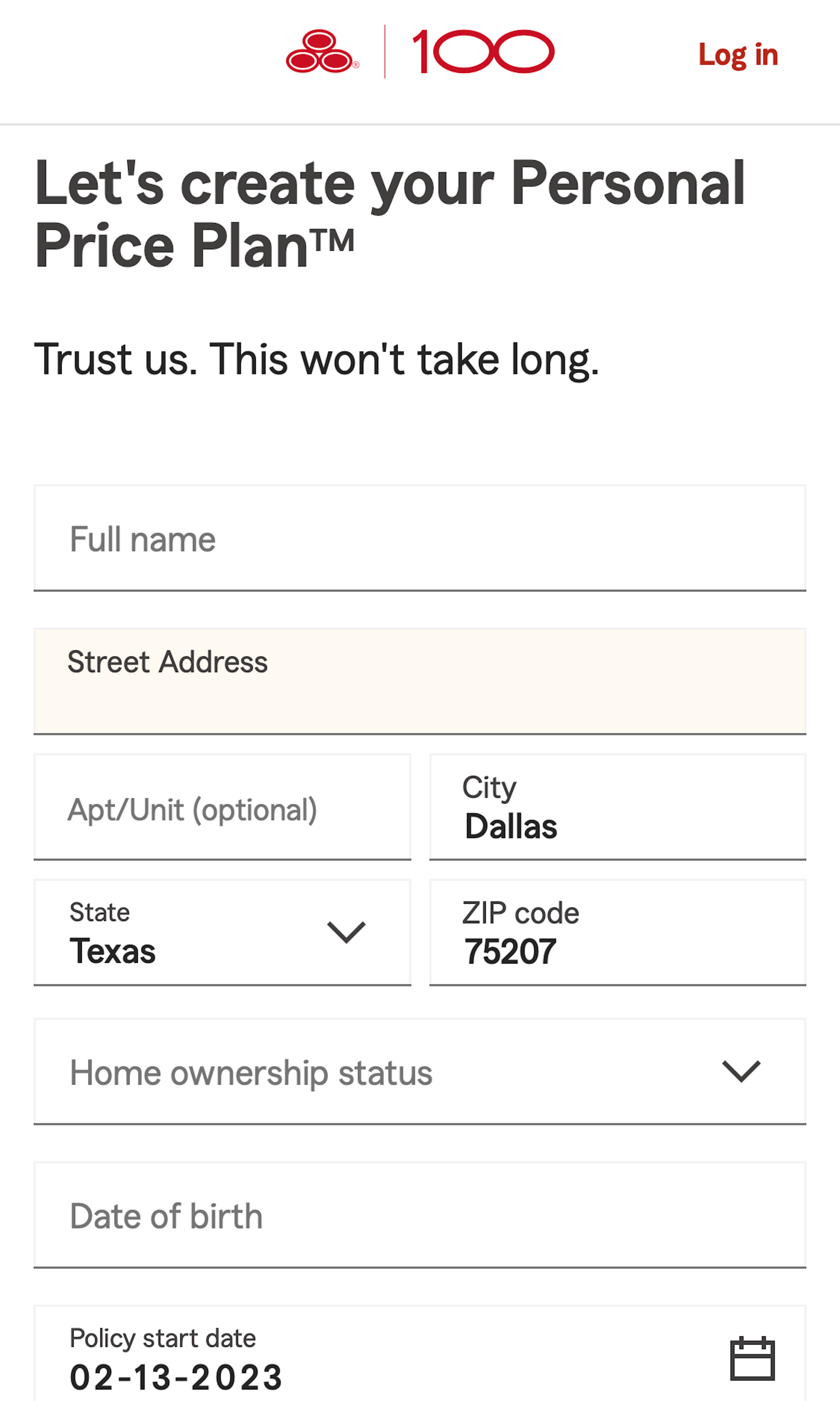
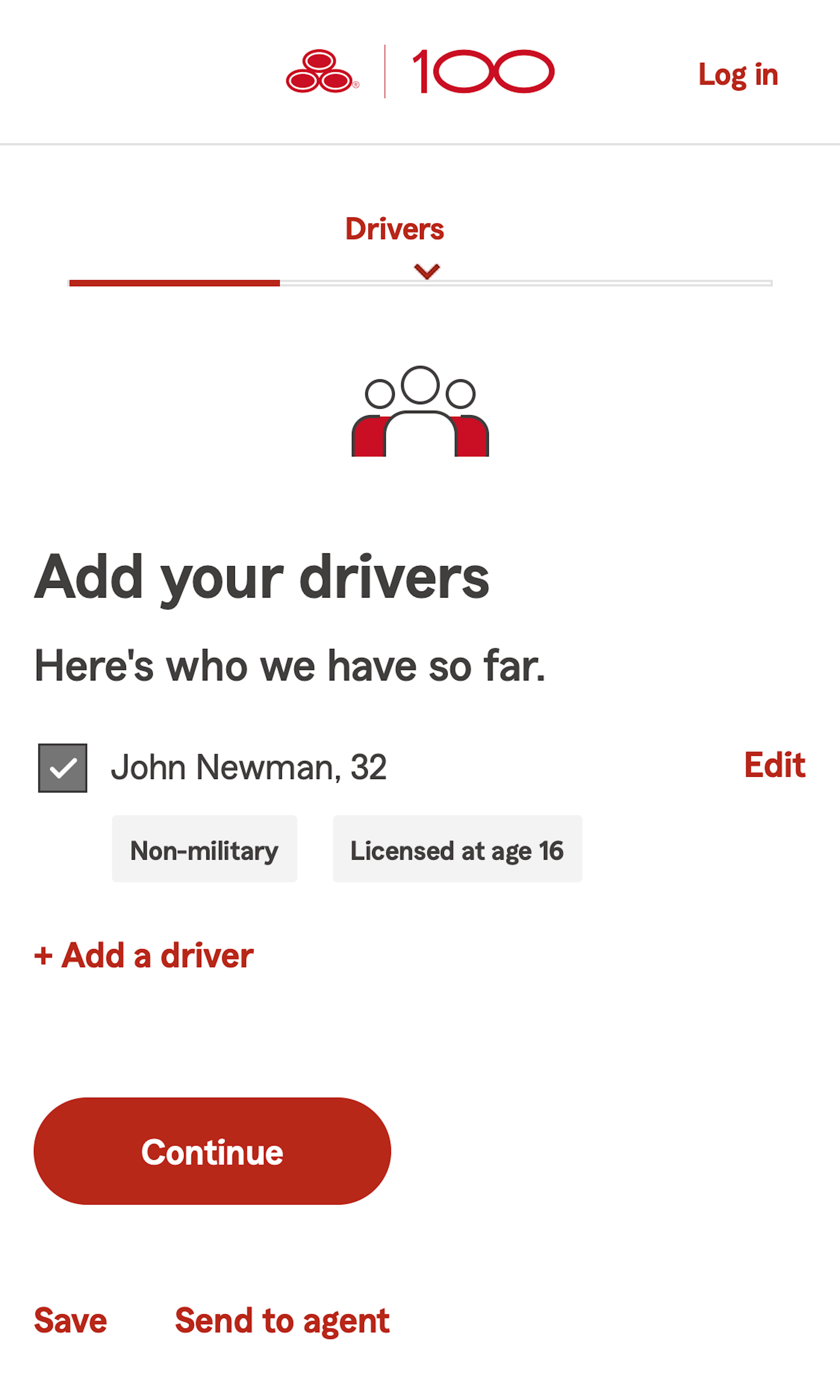
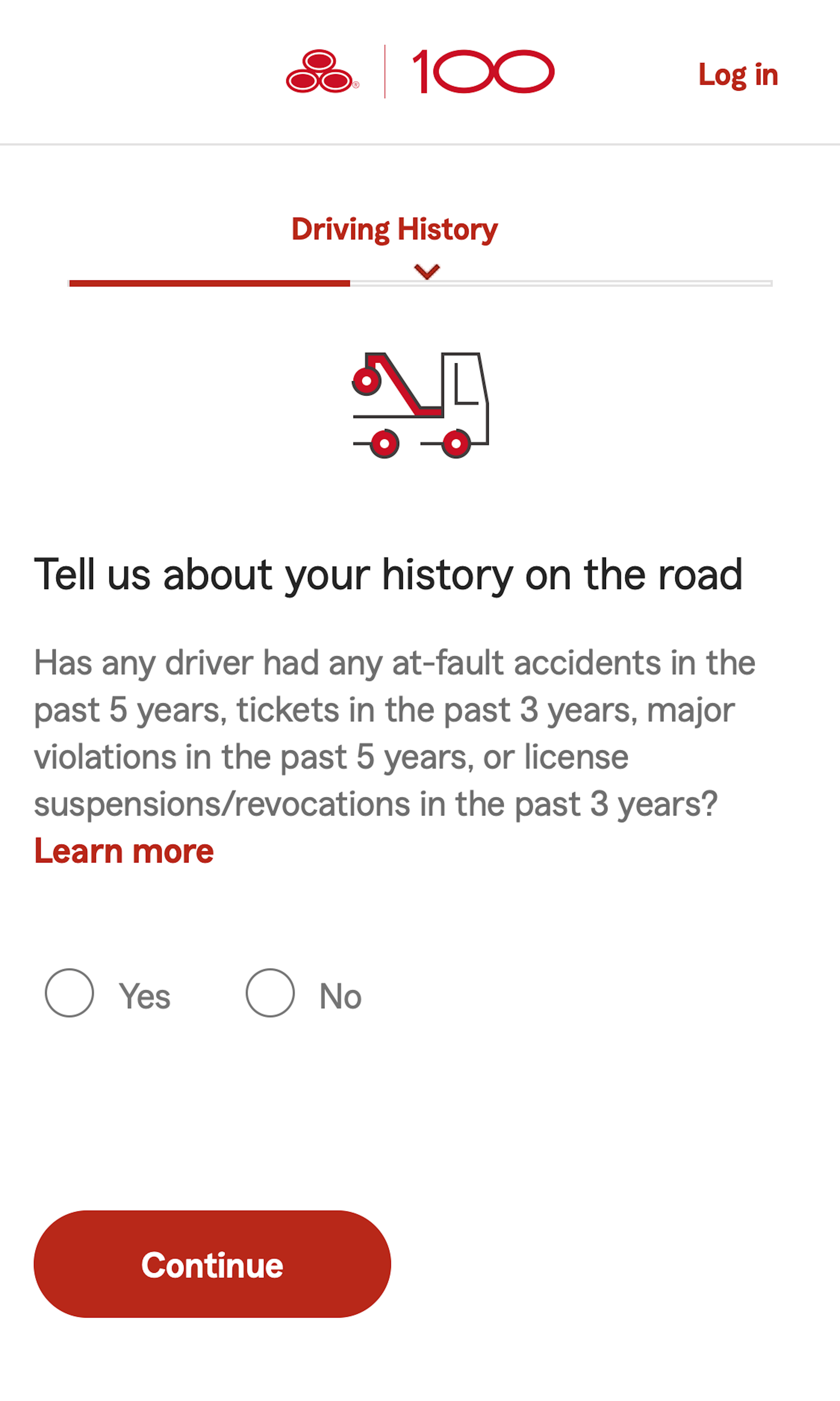
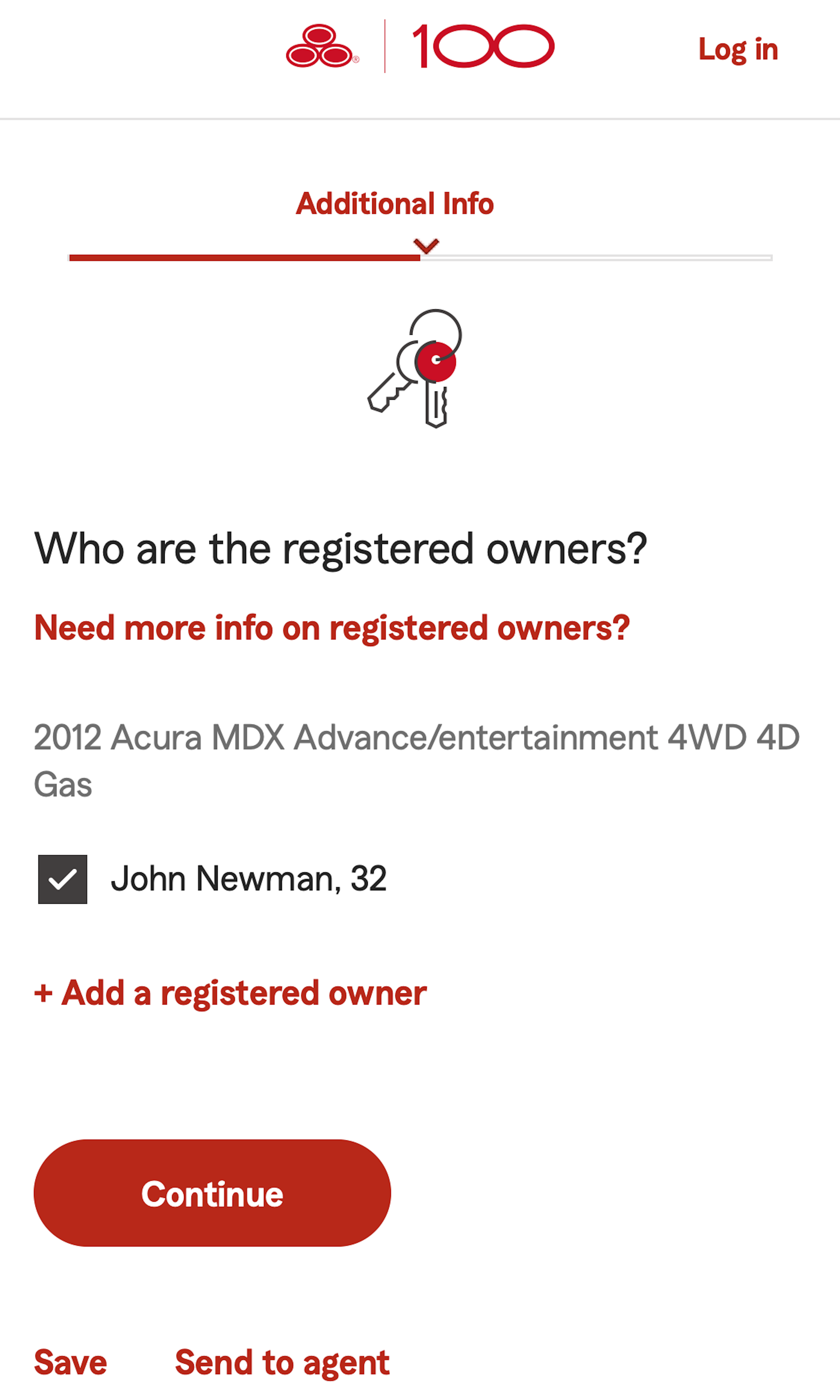
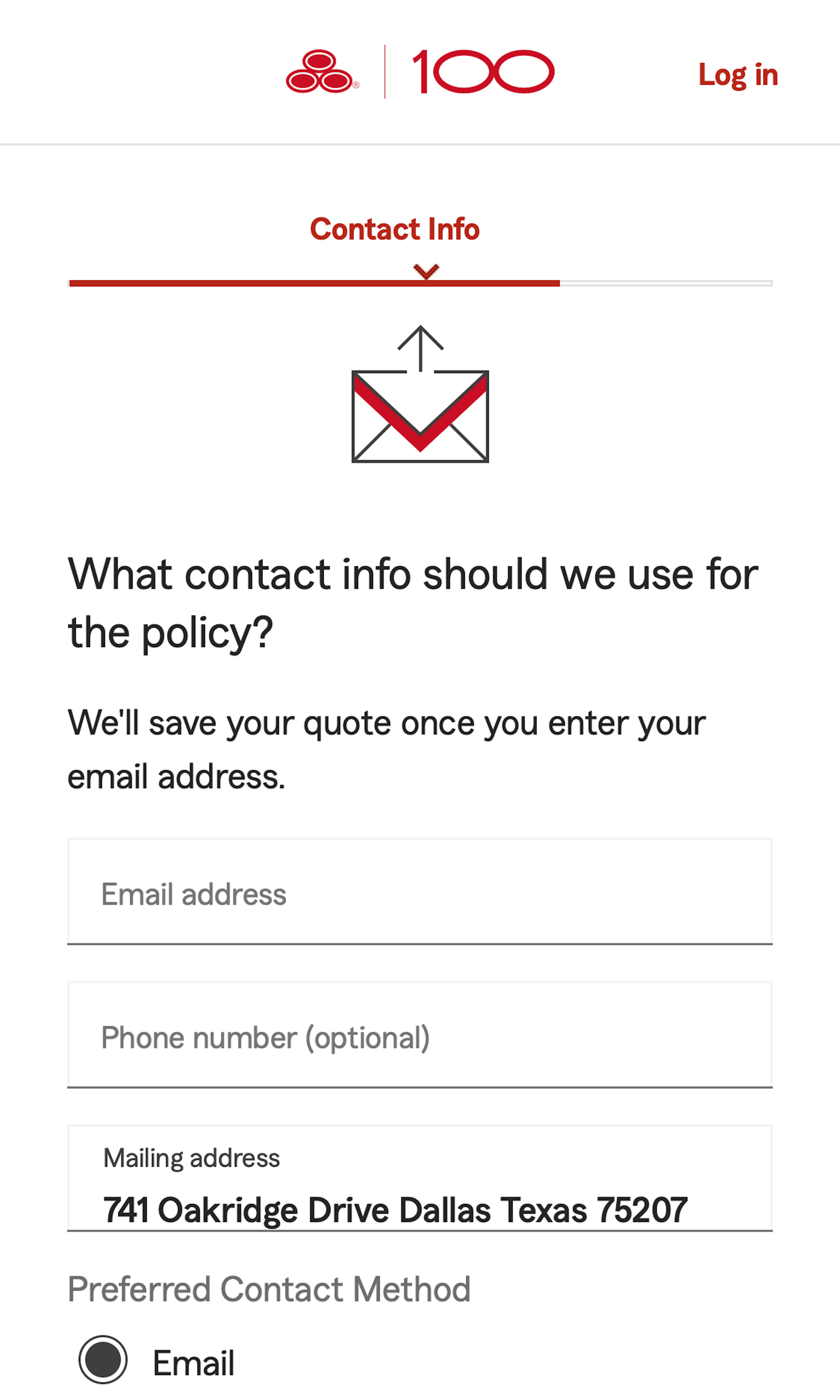
Regardless of the overall style of the application form on Insurance Company and Internet Service Providers sites, it’s key to avoid distractions and minimize opportunities for missing elements or misinterpreting the form. When errors do arise — inevitable no matter how streamlined and intuitive the form is — it’s important to help users get back on track with clear signaling and specific, descriptive messaging.
More ‘Application Form & Flow’ Insights
-
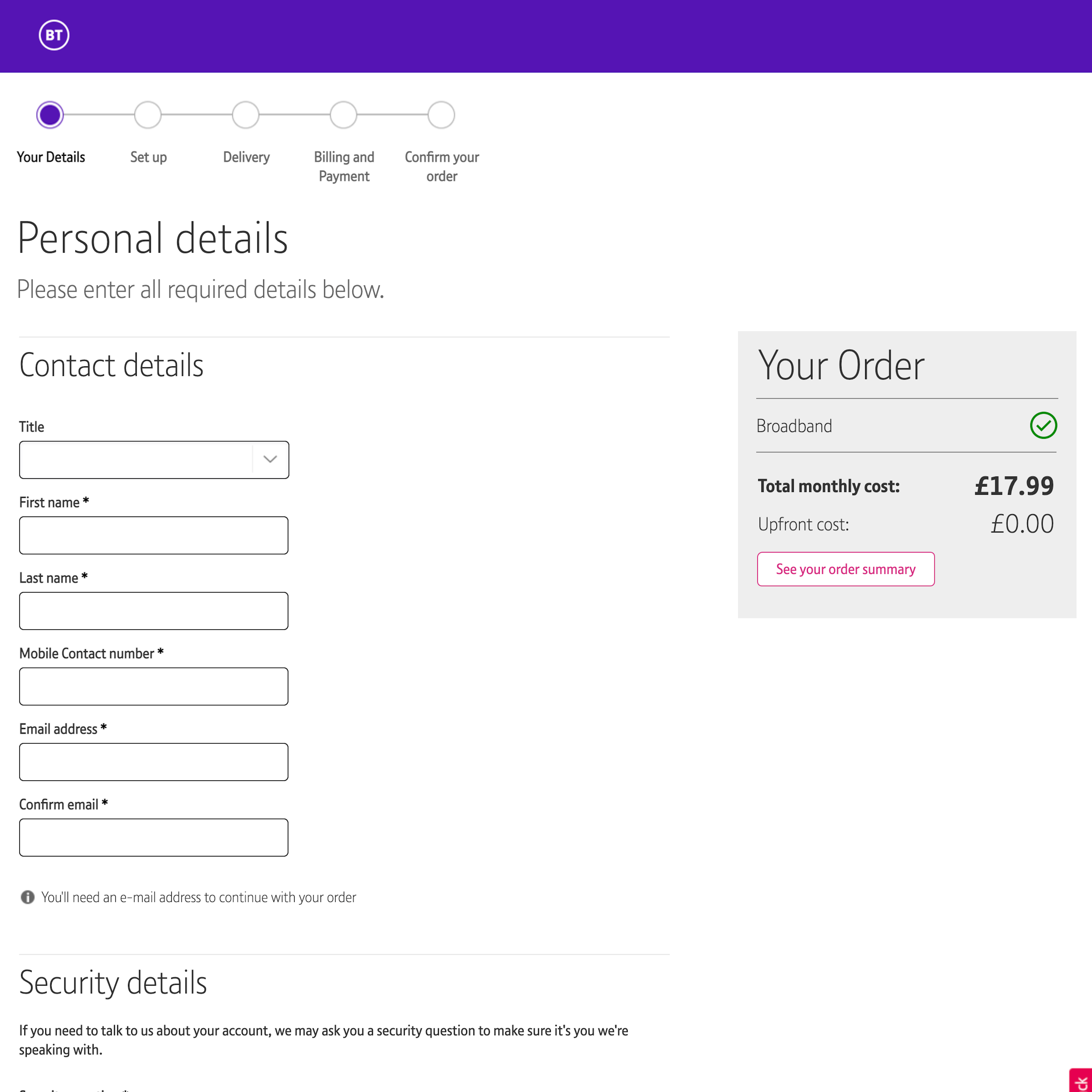
Users’ perceived level of friction can be reduced significantly through form field simplifications, autodetection, autocompletes, and smart defaults during the application process.
-
Get Full Access: To see all of Baymard’s “Application Form & Flow” research findings you’ll need Baymard Premium access. (Premium also provides you full access to 130,000 hours of UX research findings, 650+ e-commerce UX guidelines, and 150,000+ UX performance scores.)


User Experience Research, Delivered Weekly
Join 37,000+ UX professionals and get a new UX article every week.
User Experience Research, Delivered Weekly
Join 37,000+ UX professionals and get a new UX article every week.
Explore Other Research Content
380 free UX articles based on large-scale research.
244 top sites ranked by UX performance.
Code samples, demos, and key stats for usability.