
14 Accounts & Self Service UX Articles
These articles are based on observations and test findings from our usability research on ecommerce account and self-service features and design.
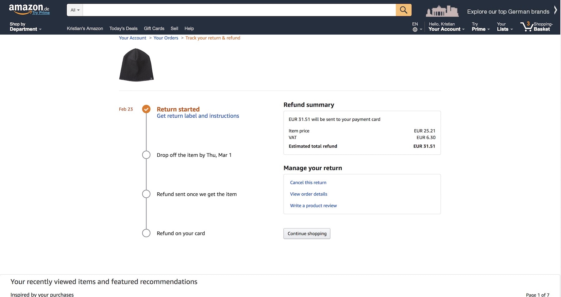
The ‘Order Returns’ Experience is Critical for Customer Retention — Yet 54% of Sites Have a Returns Interface with Substantial UX Issues
Our research show that while 'Order Returns' experiences are very important to customer retention, 54% have severe usability issues in their returns UI. Learn more about 5 commonly ‘Missed Opportunities’ for online return experiences and interfaces
Featured
Use a Fake “Editing” Flow When Updating Credit Card Details (78% Don’t)
June 2, 2026 (Updated)Popular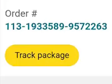
Always Provide 6 Key Order-Tracking Details on the Ecommerce Site
May 5, 2026 (Updated)Popular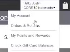
Accounts & Self-Service UX 2025: 5 Common Pitfalls & Best Practices
August 14, 2025 (Updated)Popular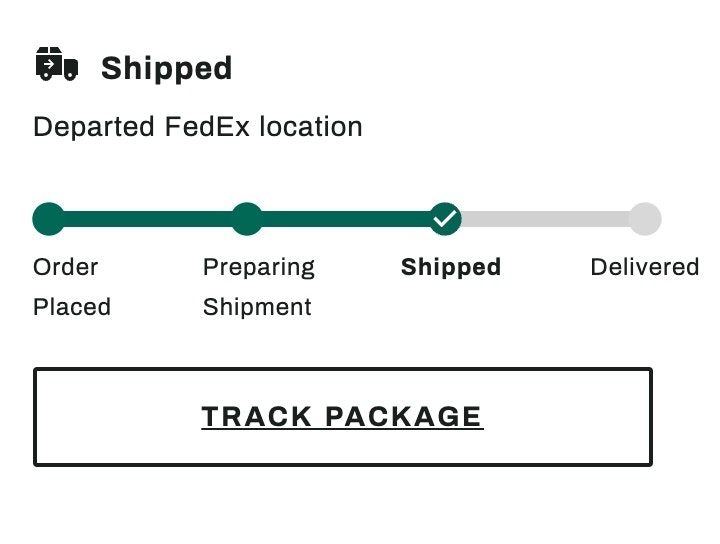
New 2024 Order Tracking & Returns UX Benchmark with 950+ Performance Scores and 850+ Best Practice Examples
March 5, 2024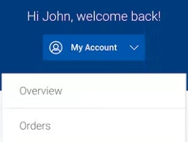
New 2023 Mobile Customer Accounts UX Benchmark with 1,600+ Performance Scores and 1,100+ Best Practice Examples
March 15, 2023

Use a Fake “Editing” Flow When Updating Credit Card Details (78% Don’t)
When users need to update their credit card details at a site, most think to “edit” their details — which is technically not allowed. Learn how to support users in managing their payment data.
Featured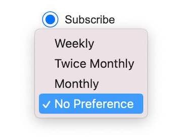
Allow Users to Choose the Frequency of Newsletter Emails (80% Don’t)
December 13, 2022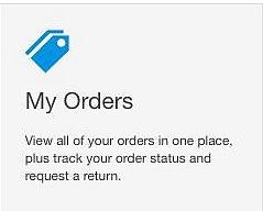
Accounts & Self-Service UX: Consider Having an “Icon-Based” Dashboard (81% Don’t)
July 21, 2022
Where to Send Users after They ‘Sign In’ or ‘Reset Password’ (34% of Sites Get It Wrong)
November 12, 2019
The ‘Order Returns’ Experience is Critical for Customer Retention — Yet 54% of Sites Have a Returns Interface with Substantial UX Issues
June 3, 2019 Popular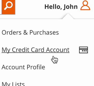
Self-Service UX: Distinguish Primary from Secondary Paths in the ‘My Account’ Drop-Down (71% Don’t)
March 20, 2019 Popular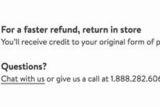
Self-Service UX: Promote In-Store Returns Alongside Mailed Return Options
August 21, 2018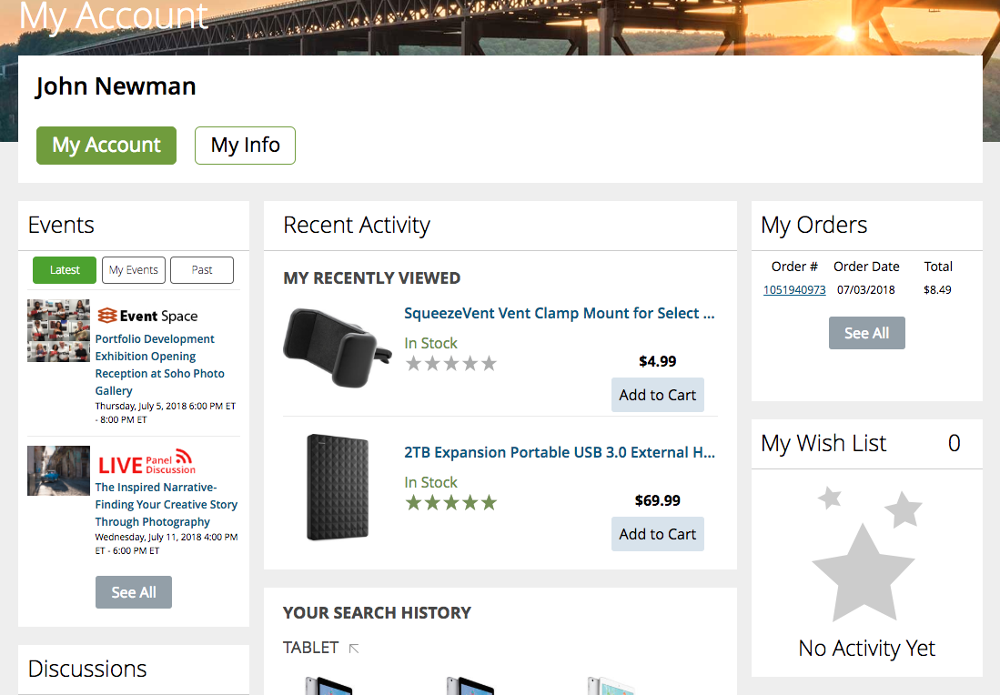
Dashboard Design: Dashboard Cards Must Be Highly Consistent and Appropriately Styled
August 8, 2018 Popular
New Research Findings on ‘Accounts & Self-Service’ UX
July 9, 2018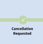
Order Cancellation Request: Have a ‘Cancellation Requested’ Order State
June 18, 2018
Want to learn more about this topic?

Explore Other Research Content

334 top sites ranked by UX performance.

18,000+ annotated designs for systematic inspiration.

Code samples, demos, and key stats for usability.