Go directly from sketch to HTML.
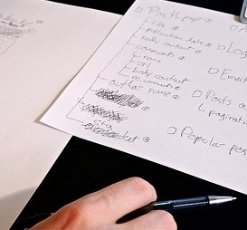
The purpose of sketching is to quickly try out many different solutions to the same problem. In web design, this means that the purpose of your sketch is to figure out what the page should communicate and how the different elements should play together.
But how do you then take your sketches and turn them into a page on your website? We suggest going straight to HTML as soon as you have a few sketches with solutions you like.
Most people typically take the sketch and turn it into a high-fidelity design in some graphics software such as Photoshop. However, this is a time-consuming process and you end up with an inaccurate result, because any design will behave differently once it’s actual HTML, loaded in a browser.
Designing your page in a tool like Photoshop is problematic because it’s a different environment, causing the feedback to be inaccurate too – the page will look and feel different in a browser. Going straight to HTML allows you to design specifically for the browser, the final destination of your design. (Spend a few days learning HTML and CSS if you don’t already know it.)
Here’s 3 benefits of going straight from low-resolution sketch to HTML in the browser:
- More interactivity - when you design your site in a tool like Photoshop, it’s easy to forget hover-states and other interactive features, because you’re essentially drawing a picture, not building a website. This means interactive features become last-minute additions - an afterthought. But when you design directly in the browser, interactive features become an integrated part of the design process. You naturally start implementing them along the way, discovering new and better ways to implement these interactive features.
- Instant and more accurate feedback – when testing your design in HTML, you’re designing for the browser - the actual environment the finished design will live in. This gives you the most accurate experience of your design while you’re working on it. It’s not a representation of how your site will look and feel – it’s the real thing.
- Many iterations – by side-stepping Photoshop you get more time to try out different designs and iterate over the best ones. You get instant feedback on what parts of your design that works well in a browser and what needs to be changed.
Don’t waste your time on representations, when it’s so easy to work with the “real deal” (HTML). By working with and evolving your web designs directly in their true environment (the browser), important things like interactivity don’t end up as an afterthought.
The instant and more accurate feedback during development allows you to constantly focus (and refocus) your design and information architecture UX, and you end up designing the full experience of your website – not just the way it looks. Browse our list of reputable UX courses for more ways to upgrade your UX design skills.
Agree? Disagree? Let us know what you think in a comment.
Update: you might also want to take a look at Meagan Fisher’s article that visualize an example of the designers workflow when going “straight to HTML”.


