
What Is UX Writing, and What Do UX Writers Do?
Have you heard the term “UX writing” and wondered how it’s different from the other types of writing on your website?
User experience (UX) writing, sometimes called “microcopy”, is the words, phrases, and sentences in a website or app used to communicate with users and provide the best possible experience of the user interface (UI). It’s one of the UX basics websites need to perform well.
If you’ve ever seen a clever, creative, helpful 404 message that helps you solve your problem when you land on a page that doesn’t exist, you’ve witnessed UX writing at work.
Let’s talk about what a UX writer is, the important differences between UX writing and copywriting, and the different types of content that UX writers create.
Then, we’ll dig into some essential tips for improving the UX writing on your e-commerce site, based on extensive UX research that leading sites use to create high-performing UX design.
What Is UX Writing?
UX writing is the craft of creating the text that appears in digital products like websites, apps, and software. The goal of UX writers is to provide users with an intuitive experience, guiding them through their interactions with the UI.
Well-designed and well-tested UX writing helps users take action and contributes to conversion rates. Poor UX writing can negatively impact conversions and drag down sales.
Ideally, the UX writing throughout your website guides users through the interface in an intuitive, frictionless manner.
What Is a UX Writer, and What Does a UX Writer Do?
A UX writer creates any text you see or hear in an e-commerce site or app. This could include error messages, push notifications, UI buttons, menus, the text above form fields, and much more.
If we take a larger view of the UX writer’s job, we see that these writers are responsible for delivering the messaging of the product from the inside out. That’s why a UX writer is a critical part of the UX team, and UX writers must have a deep and thorough understanding of the user.
Writers should be part of the UX design process right from the beginning, and the writing within the website shouldn’t be an afterthought. UX content isn’t something that belongs in a late “product documentation” phase that happens after the product is already designed.
As creative problem-solvers, UX writers are part of the team that decides what features to add to your site or app. They must always advocate for users because their ultimate goal is to make digital interfaces as easy to use as possible.
Clear communication is the UX writer’s specialty. Whenever a product manager, designer, or developer suggests something that might be unclear to the user, the UX writer needs to ask questions about how that feature or process can be communicated to the user in a better way.
UX writers also help create the brand voice and make sure content creators understand and use that voice in all content and copy. This can involve the creation of content style guides that include company-wide writing principles and guidelines.
UX Writing vs. Copywriting
Many UX writers are current or former copywriters, but UX writing is not the same as copywriting. A copywriter’s job is to help sell a product. A UX writer does that, but their work also helps craft an experience that makes users’ lives easier and more pleasant.
Your e-commerce website doesn’t come with a physical manual that walks the user through making a purchase. The manual is written right into the app, and that writing is all crafted by UX writers who focus on building the bridge between the company’s goals and the user’s needs and wants.
Types of UX Content
The specific types of content that a UX writer creates will depend on your company’s needs, your UX team, and the user. In this article, we are limiting our discussion to e-commerce applications of UX writing because that is the focus of our extensive UX research.
Different organizations and teams might have other names for UX writing, so you might hear the terms UI content, UX content, microcopy, and product copy used interchangeably.
User interface content (UI content) is delivered by voice or screen when someone is using the site. It forms part of a user interface and represents a response to a user’s action, including the labeling of tabs, buttons, and error messages.
Four groups of UI content correspond to different touchpoints with the user. There are elements that:
- Guide users
- Inform users
- Simplify navigation
- Enable the users to make choices
User experience (UX) content is the text for any part of the user experience, including content like product descriptions and support copy. UX content can help users find what they’re looking for and avoid experiencing problems on your website.
→ Sign up free to free research-backed UX guidelines and start improving your site today.
UX Writing for High-Performance E-Commerce Sites
The writing you include on your e-commerce site has a significant impact on the user experience. Carefully thought-out copy establishes trust and leads the user the entire way through a purchasing experience.
On the flip side, bad writing on your site can scare off users and cause confusion, leading to higher cart abandonment rates and lost revenue.
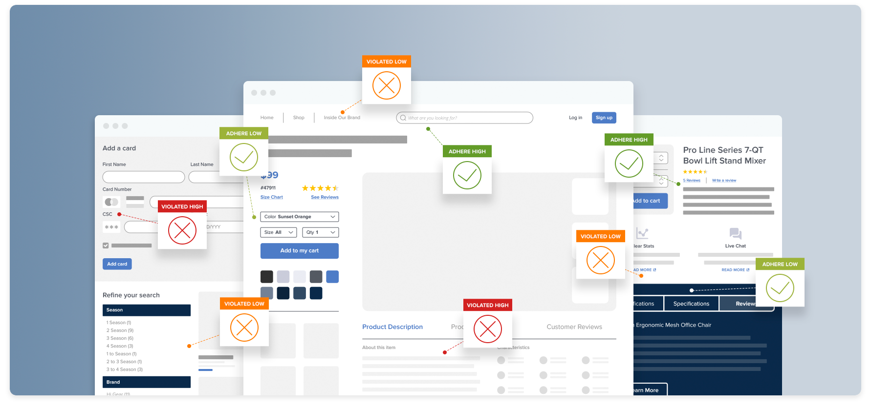
Here are a few best practices and some of our 580+ guidelines based on in-depth UX research for more effective UX writing:
Ensure a Consistently High Level of Detail in Product Descriptions (Guideline #841)
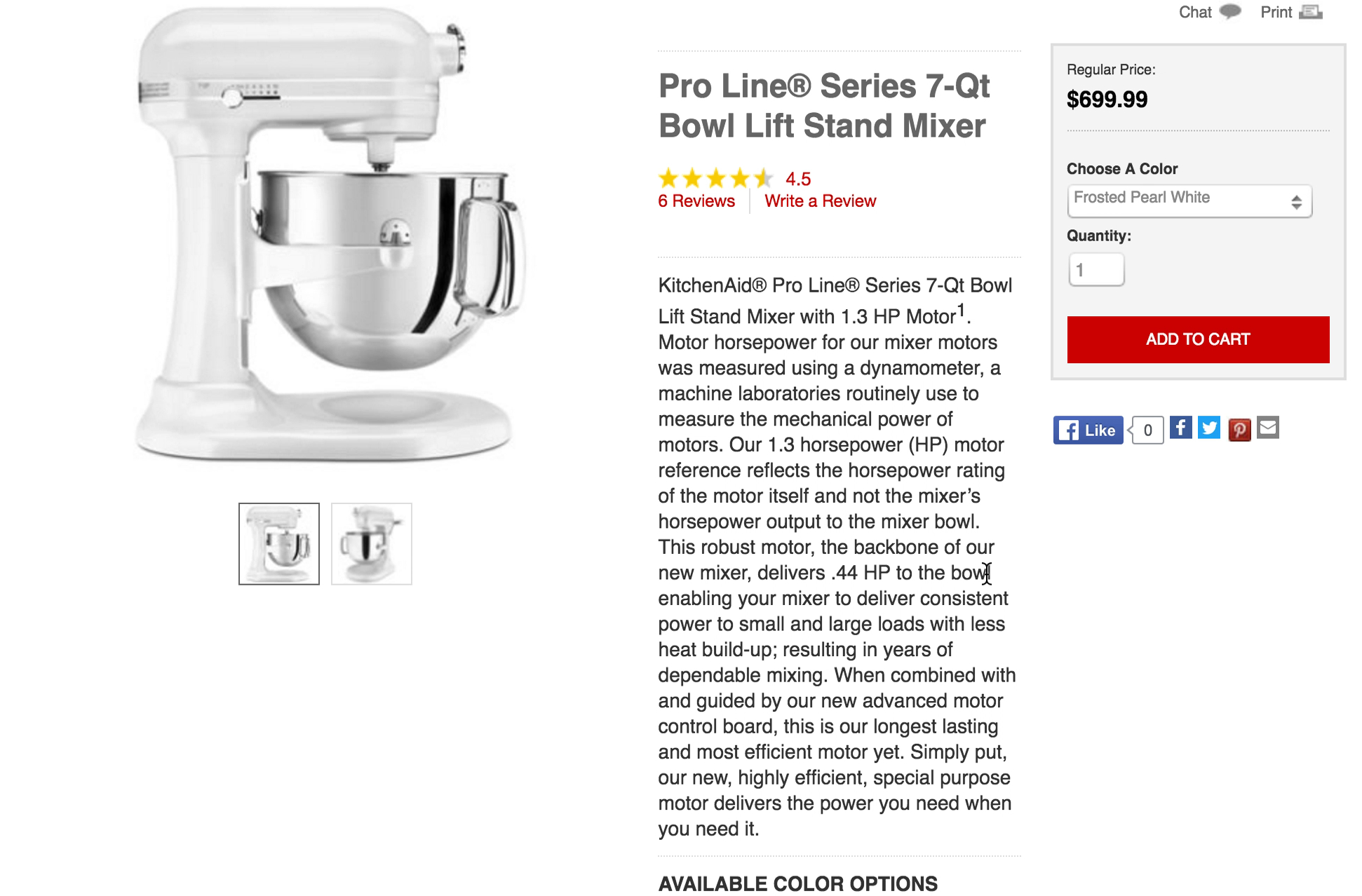
*“(The description) says a lot about the motor. I don’t care about the horsepower of a mixer, but it doesn’t say anything about different bowls, and stuff like that…” Most test participants found the description of the professional-grade blender at KitchenAid insufficient. This was compounded by a lack of product images. Another participant mentioned, “I don’t really understand what the available features are.” *
When users land on a product page, they need a detailed product description so they can make a decision about whether or not to buy the item.
During our UX research, we found that 10% of the largest e-commerce sites don’t include consistently high levels of detail in their product descriptions. That lack of information could cause users to abandon the page, or the entire site, leading to lost revenue.
Furthermore, incomplete product descriptions can lead users to make incorrect assumptions about a product. That can result in frustration, customer support calls, or unnecessary returns.
Ensure your product descriptions include the details users need to make a decision. This should include things like:
- Covering basic functionality
- Explaining feature highlights
- Listing product details
Make sure to support product images by clarifying ambiguous details. Maintain consistent levels of detail and description structure across products of the same type, and remember that technical information is not a substitute for basic information about a product.
Always Explain Industry-Specific Filters (Guideline #433)
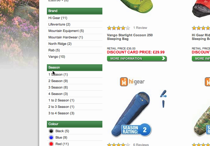
At Go Outdoors, the sleeping bag “Season” filter caused issues for every single test participant. It simply wasn’t obvious to them what each season translated into exactly. As one participant explained, “Oh, here I see season 1, 2, and 3…but I don’t really know what season 3 is? If I just knew season 1 was for winter, or for spring. Or it might just be that it works for just one season? But what season is it then? I really don’t know this.” Other participants noticed the season filter but didn’t think it was related to sleeping bag temperature ratings.
Filters help users turn larger, unmanageable product lists into ones full of relevant products, increasing the likelihood that they’ll find what they want and make a purchase.
This is particularly true on mobile websites, where small screens limit the users’ view. It’s critical that users can filter effectively and receive a manageable list.
However, when terms used to describe filter types are unclear, users can miss out on potentially suitable filters and might be unable to tailor the product list to contain only relevant items.
Our benchmark of filtering interfaces reveals that 91% of sites display jargon-heavy, industry-specific filters and don’t explain the terms to users. This means users often fail to apply filters correctly, leading directly and indirectly to abandonments.
It can be difficult for industry experts to realize that the terms they use every day to describe product specs could be confusing to users. But these misunderstandings can have big consequences.
Avoid industry-specific or confusing filters whenever possible. If the terms are unavoidable, explain the terms with visual examples or tooltips.
Avoid Jargon and Brand Names in the Checkout Microcopy (Guideline #694)
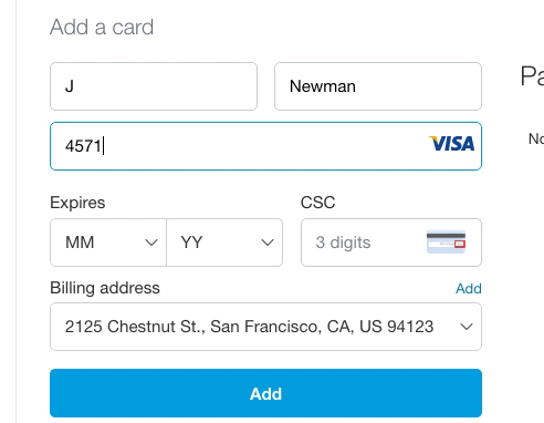
PayPal uses “CSC” for the security code field label. Users will be unfamiliar with the many different abbreviations for the “Card Security Code” as there are more than 5 official abbreviations, depending on card type.
Every step in the checkout process is potentially confusing to users, particularly people who aren’t frequent online shoppers. Users may be unfamiliar with terms associated with account selection, payment, shipping, and other e-commerce conventions.
Our usability testing showed that many sites relied too heavily on jargon or unfamiliar brand terms during the checkout process. This leads to slow, unsatisfying checkout experiences for many test participants.
To avoid confusing users, minimize jargon in your checkout process, and write microcopy that the average user can easily understand.
If using industry or site-specific terms is unavoidable, use descriptions or tooltips to explain terms to users who need more information.
Subdivide Long Product Descriptions with Sections and Headings (Guideline #845)
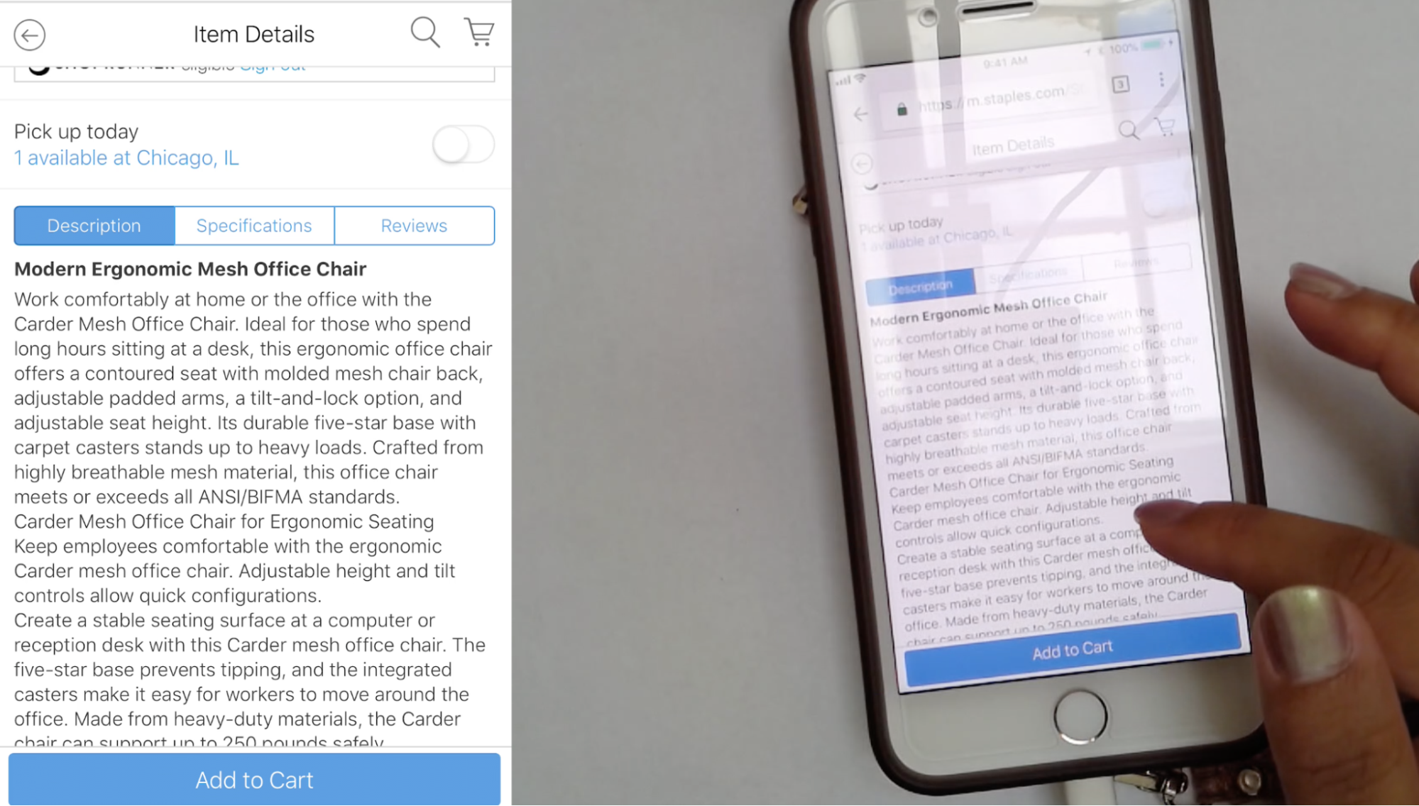
This participant only glanced at the product description on Staples — which took up most of the mobile viewport — for a few seconds before she moved on to the specifications. Users, particularly those on mobile devices, will be less likely to read product descriptions when they appear as a large block of text.
Product descriptions need to be easy for users to scan for specific information — but they also need to be detailed enough to cover the aspects of the product that might be of interest to the user.
For some products, descriptions might need to be lengthy, but there are plenty of ways to make them less intimidating while making it easier for your users to locate the information they need.
Long, unbroken, or unstructured product descriptions make navigation harder, and some participants overlook relevant information or even avoid reading the text altogether. Even worse, when product descriptions are split up and scattered across a product page, users have trouble finding the right product information.
Make your product pages easily scannable by subdividing descriptions into themed subsections and using clear, specific headings for each subsection.
Highlight Key Product Features in the Product Headline (Guideline #860)
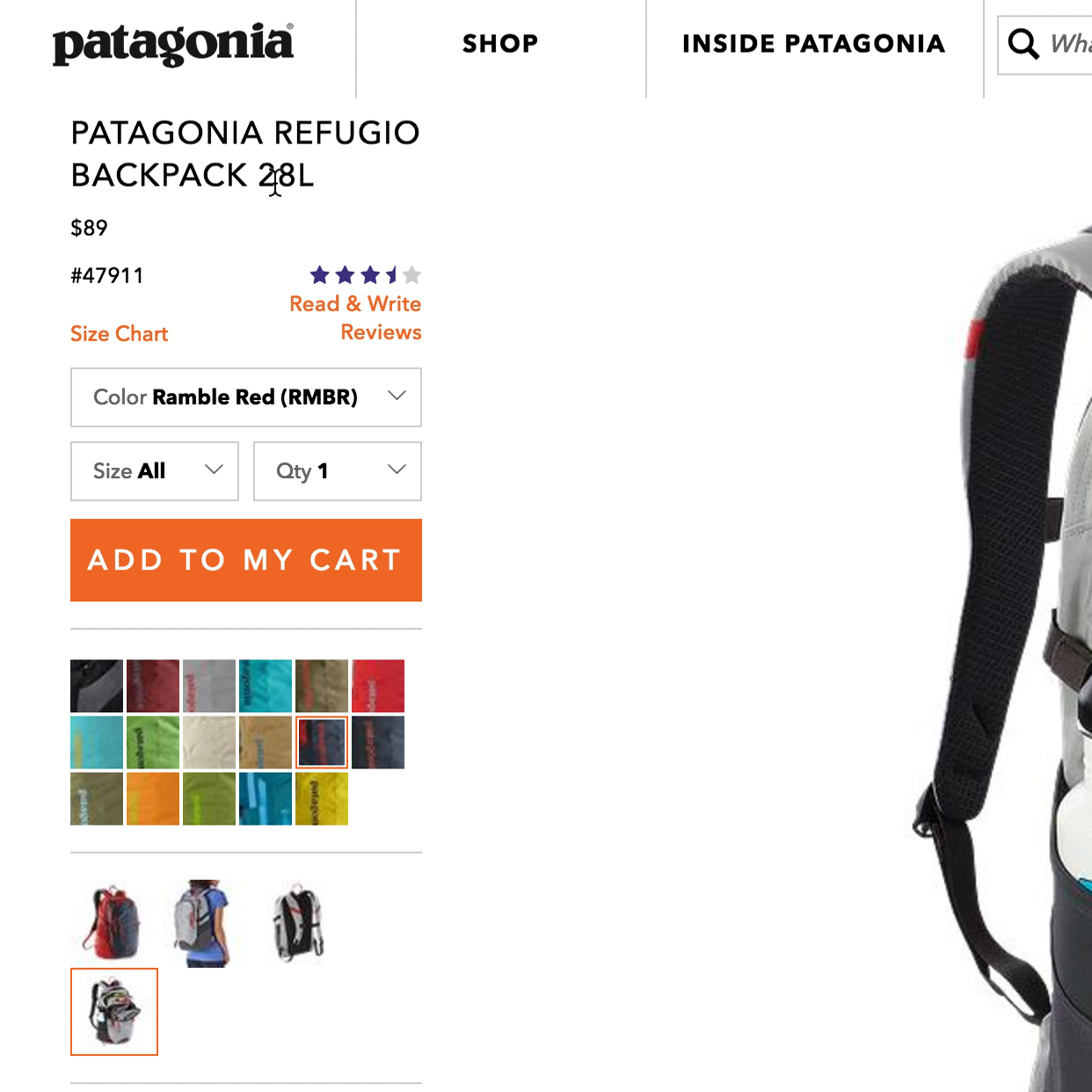
“Yeah, this is a 28L bag.” A test participant was easily able to identify the capacity of a backpack at Patagonia from the product headline, without having to explore further down the product page.
Product pages often contain large amounts of information that make it difficult for users to scan. Key product features might be buried in dense blocks of text.
Our testing revealed that participants often missed important product information when scanning, especially if product headlines were overly simplistic and didn’t include key features.
Make sure to maximize the critical first few seconds after your user arrives on a product page. The headline will often be the first thing they read, so provide one or more key product features in the product page headline. Then include the most important features directly following the product title.
Avoid vague, misleading, or overly technical product headlines and use clear, straightforward language.
Avoid Excessive Use of “Marketing Copy” in the Product Description (Guideline #1238)
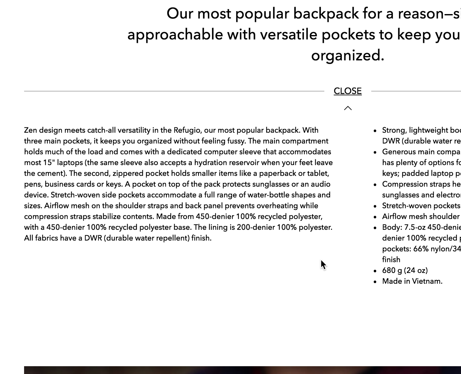
A test participant at Patagonia appreciated the specific language of “three main pockets" provided in the product description for a bag. Product descriptions should provide specific information whenever possible, rather than relying on enticing but overly vague language.
Product descriptions are designed to inform users about your product and its features and ultimately lead to the sale. However, excessive or exaggerated marketing copy can damage the credibility of the claims on your product pages and distract users from learning about key features.
During our usability testing, our test participants appreciated some marketing copy in small doses, because it helped to give them an idea of the product and informed their purchasing decisions. However, excessive marketing copy tends to make more concrete claims — such as those backed by research or experts — seem **less **credible.
Limit marketing copy, or overwrought or flowery language, in your product descriptions, and make sure users don’t feel like they are being “sold to”. Consider separating out marketing copy from the product description (e.g., by placing it within a separate section of the product description).
Dynamically Merge Potentially Contradictory Microcopy (Guideline #690)
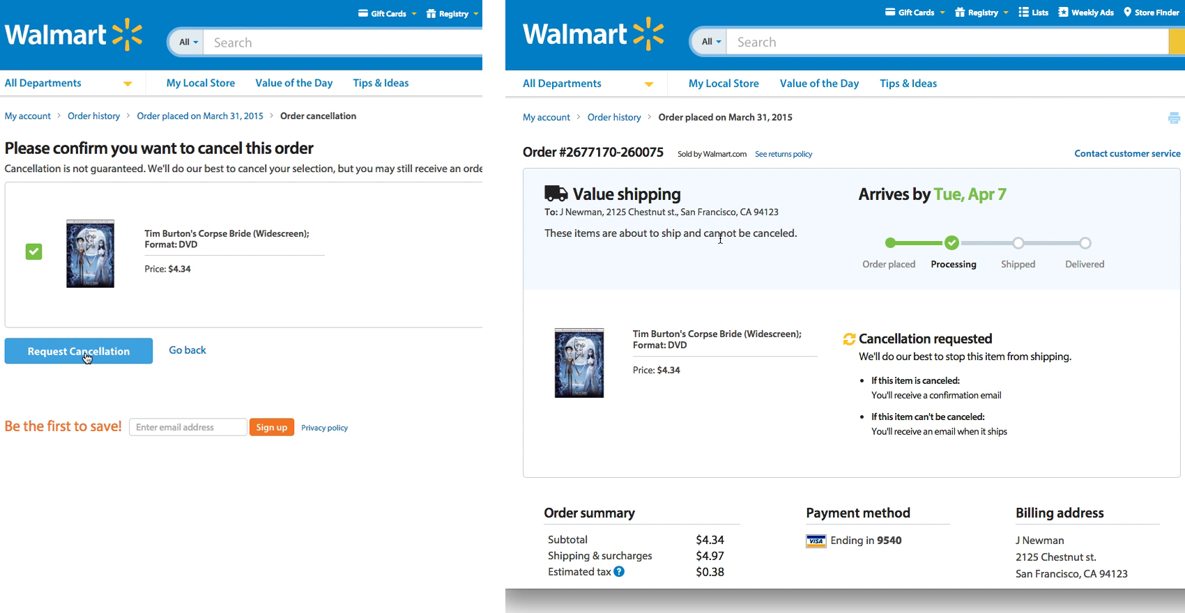
*During testing, some participants encountered problems with contradictory microcopy when they tried to cancel an order at Walmart. The order cancellation confirmation page included a prominently displayed order arrival date and shipping method. Underneath this microcopy is information about the cancellation request: “Cancellation requested. We’ll do our best to stop this item from shipping.” *
Presenting two separate interfaces with contradictory messages is a confusing way to alert users to important information about a transaction. A much clearer solution is to merge the two separate entities of information.
For example, instead of displaying the order arrival date separately on the cancellation page, Walmart could update the order status progress bar to include the cancellation request, e.g., “Pending cancellation (may arrive April 7th)”.
Be cautious of microcopy combinations that may be contradictory. Map out any combinations to identify where microcopy needs to be merged or removed.
Ensure Field Labels Are Understandable When Read Out of Context (Guideline #1104)
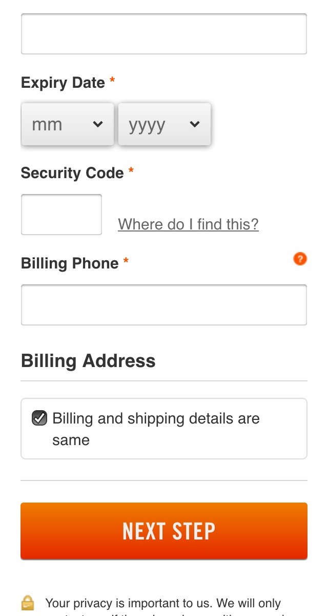
Nike uses “Billing Phone” and “Billing Address”, rather than “Phone” and “Address” for the billing fields during the checkout process. This ensures users will always be able to understand the fields solely from their labels.
During testing, many participants viewed each form field as a separate task without considering the larger context of the form or the checkout process. This can lead to problems on sites where the meaning of the form field label needs to be understood somewhere else on the page.
For example, users might become confused when faced with potentially cryptic fields such as “pin #” or “Enter your code”. Some users will scroll up on the page to reestablish context by looking at the header or subheading, but others may enter the wrong data, leading to validation errors or problems with the order.
Make sure your field labels are understandable, even when your users read them entirely out of context.
Interested in More Best Practices for UX Writing?
We’ve covered some of the most important sitewide UX writing best practices in this article, distilled down from 70,000+ hours of research.
Improve your e-commerce conversion rate by implementing our extensive usability testing insights.
To find out how your UX writing stacks up against the world’s leading e-commerce sites, check out Baymard Premium.
Research Director and Co-Founder
Christian is the research director and co-founder of Baymard. Christian oversees all UX research activities at Baymard. His areas of specialization within ecommerce UX are: Checkout, Form Field, Search, Mobile web, and Product Listings. Christian is also an avid speaker at UX and CRO conferences.