Key Takeaways
- During our large-scale SaaS UX testing, plan matrices contained on average 40 distinct features
- Identifying specific features and comparing plans is needlessly difficult in a lengthy, disorganized plan matrix
- Matrices can be made easier to scan with 5 key implementations
During large-scale testing of SaaS sites, the plan matrix was a primary destination for users considering a digital services subscription or SaaS.
Indeed, many users spent most of their time on the site considering the plan matrix — and ultimately decided on whether or not to subscribe to a service from the details provided in the matrix.
Yet the layout and design of the plan matrix on a SaaS site greatly impacts users’ ability to identify the most suitable plan for their specific business needs and, therefore, their purchase decision.
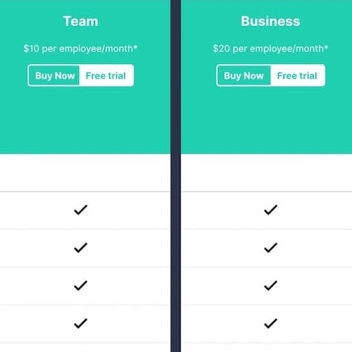
Plan matrices can be text-heavy and information-dense tables that, during our SaaS usability research study, contained on average 40 distinct features.
As such, locating specific features within a lengthy and unorganized plan matrix can be an overwhelming task, forcing users to expend undue time and energy carefully scanning through the plan matrix to pinpoint the exact information they need.
What’s more, users are at risk of mistakenly overlooking important features, which can lead to unanswered questions — and eventual plan or site abandonment.
In this article we’ll discuss the test findings from our large-scale SaaS usability research study including:
- Plan matrices on SaaS sites can be needlessly difficult to navigate
- 5 ways to maximize the scannability of the plan matrix
Plan Matrices on SaaS Sites Can Be Needlessly Difficult to Navigate
When users are presented with a long, unorganized list of features in the plan matrix, getting an overview of each plan’s offerings becomes very difficult, as does locating specific features within the matrix.
During testing, plan matrices presented as one long, unorganized list sorted by plan availability were observed to be overwhelming, and far more difficult for users to scan.
In practice, this disorganized presentation of plan information causes users to spend an undue amount of time locating their desired features — rather than interpreting those features and using them to further their plan comparison.
For example, on test sites that only ordered features by plan availability, users were observed to scroll up and down the plan matrix page to locate the precise features they were interested in, and a few users even resorted to using the browser’s “Search on Page” function to locate specific features.
As one user (a senior email coordinator for a large corporation) remarked while reviewing the long, unorganized list of features on a plan matrix page, “I think this list is sort of all over the place, in terms of how it’s organized”.
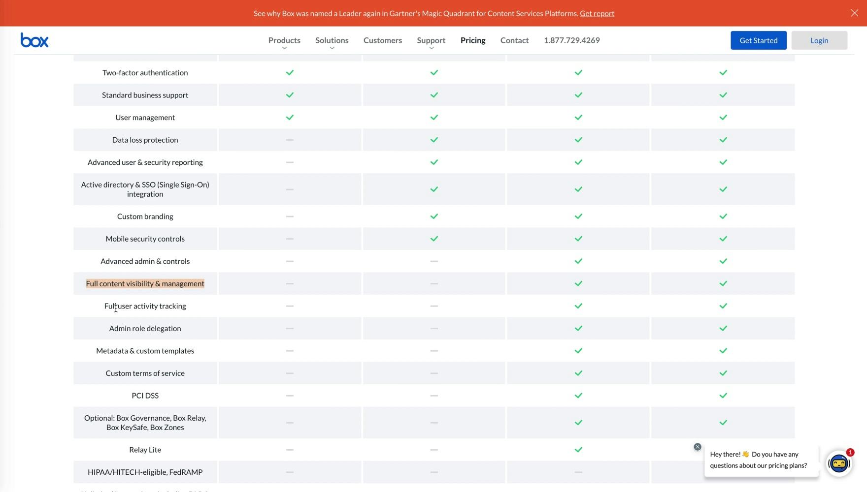
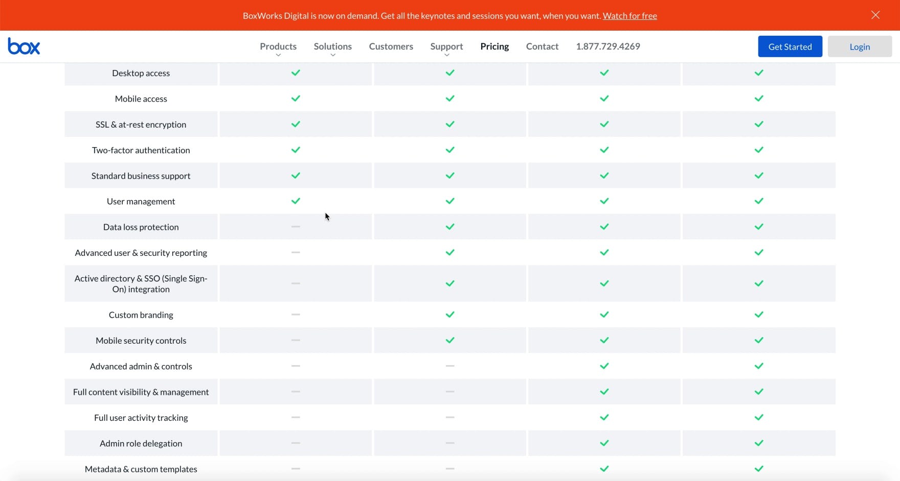
“‘Full content visibility & management’ I don’t know what this is. I don’t know if I need it.” A user (a cloud infrastructure manager for an e-commerce company) struggled to understand the context of some of the plan features at Box, which were simply listed in order of plan availability (and which also didn’t include tooltips).
Furthermore, when plan matrix features are presented in one long, unorganized list ordered by plan availability, it increases users’ efforts to infer the meaning of individual features that are unfamiliar to them, because they cannot draw on related features and a general subheading for additional context.
For example, during testing multiple users struggled to understand an unfamiliar feature in a plan matrix due to lack of context. Consequently, they had to leave the plan matrix to search for information to reach a basic understanding of the feature to continue comparing plans.
Given the risk of users overlooking features critical to their core business needs, which can lead to unanswered questions — and plan or site abandonment — it’s essential to maximize the scannability of the plan matrix.
5 Ways to Maximize the Scannability of the Plan Matrix
Testing revealed 5 ways to ensure plan matrices are easy to scan:
- Group related features under clearly labeled subheadings
- Order groups of features by importance
- Persist plan headings and feature subheadings during scrolling
- Scale the matrix for optimal display
- Use horizontal styling to define rows
1) Group Related Features under Clearly Labeled Subheadings
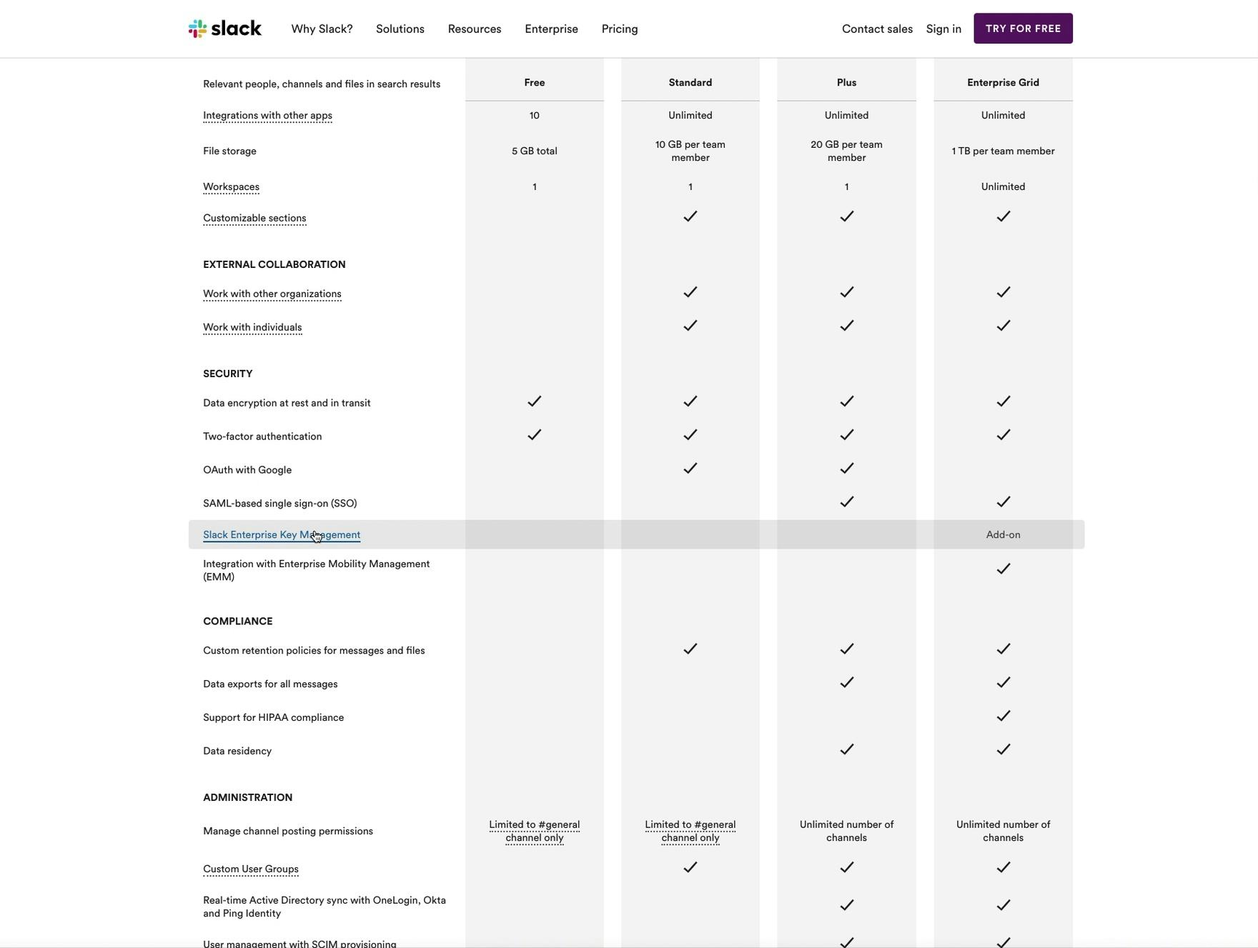
“I don’t know what this is”, remarked a user (a senior VP for an information technology and services company) while hovering the mouse cursor over the “Slack Enterprise Key Management” feature in the plan matrix at Slack. However, she was able to glean from the subheading that it was a security feature. She continued, “I’m not going to click into it though because that’s one of those security things so it wouldn’t be me deciding it”.
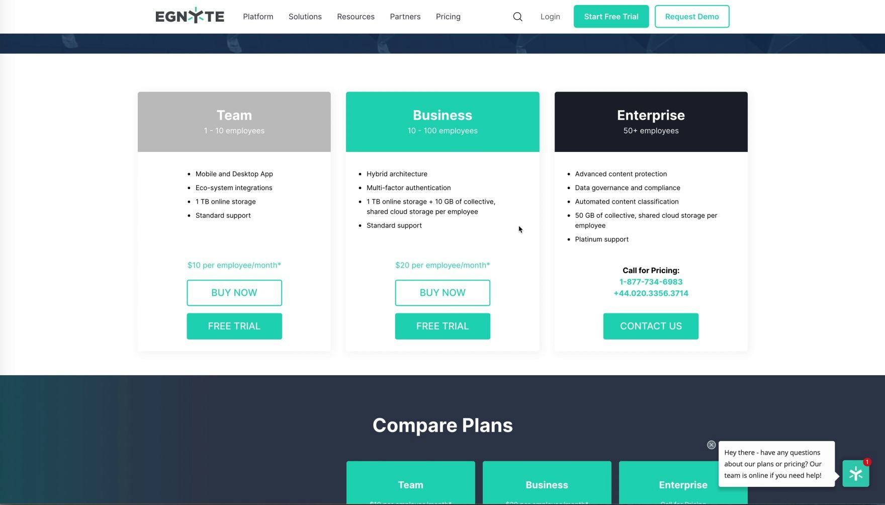
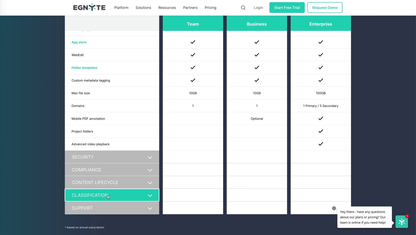
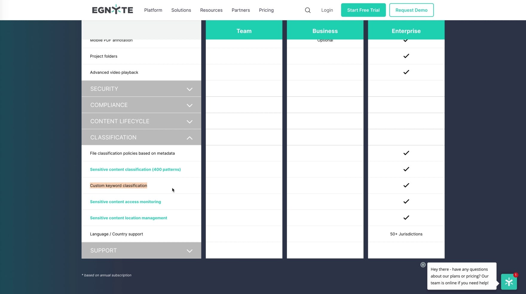
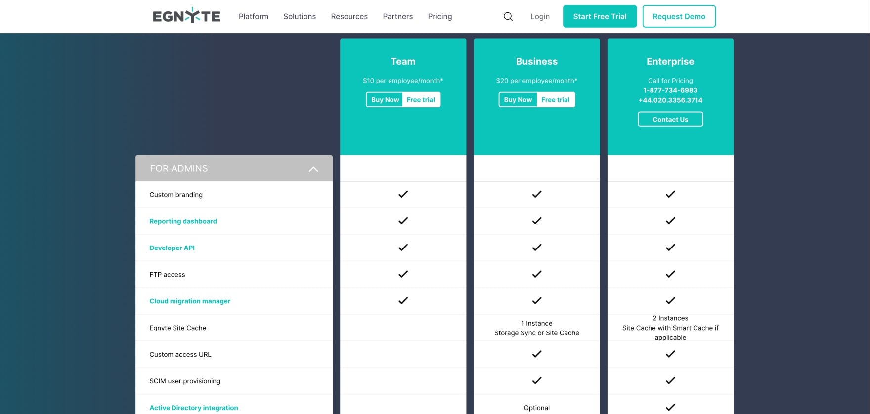
“Yeah, I’ve [now] got a good idea of what this ‘Automated Content Classification’ is.” A user (a cloud infrastructure manager for an e-commerce company) was curious about “Automated Content Classification”, featured in the plan summary for Egnyte’s “Enterprise” plan (first image). He later spotted the collapsed feature section labeled “Classification” (second image), and assumed correctly that it would contain relevant features to satisfy his curiosity (third image).
To aid scannability, and to help users infer the meaning of individual features, plan matrices should group related features into subsections (either collapsed or expanded by default), each with its own subheading. Features within each subsection can then be sorted by plan availability.
The groupings and subheadings allow for much faster scanning but also have the added benefits of making the overall plan matrix less intimidating by breaking up the long list of features and ensuring related features are always presented together.
2) Order Groups of Features by Importance
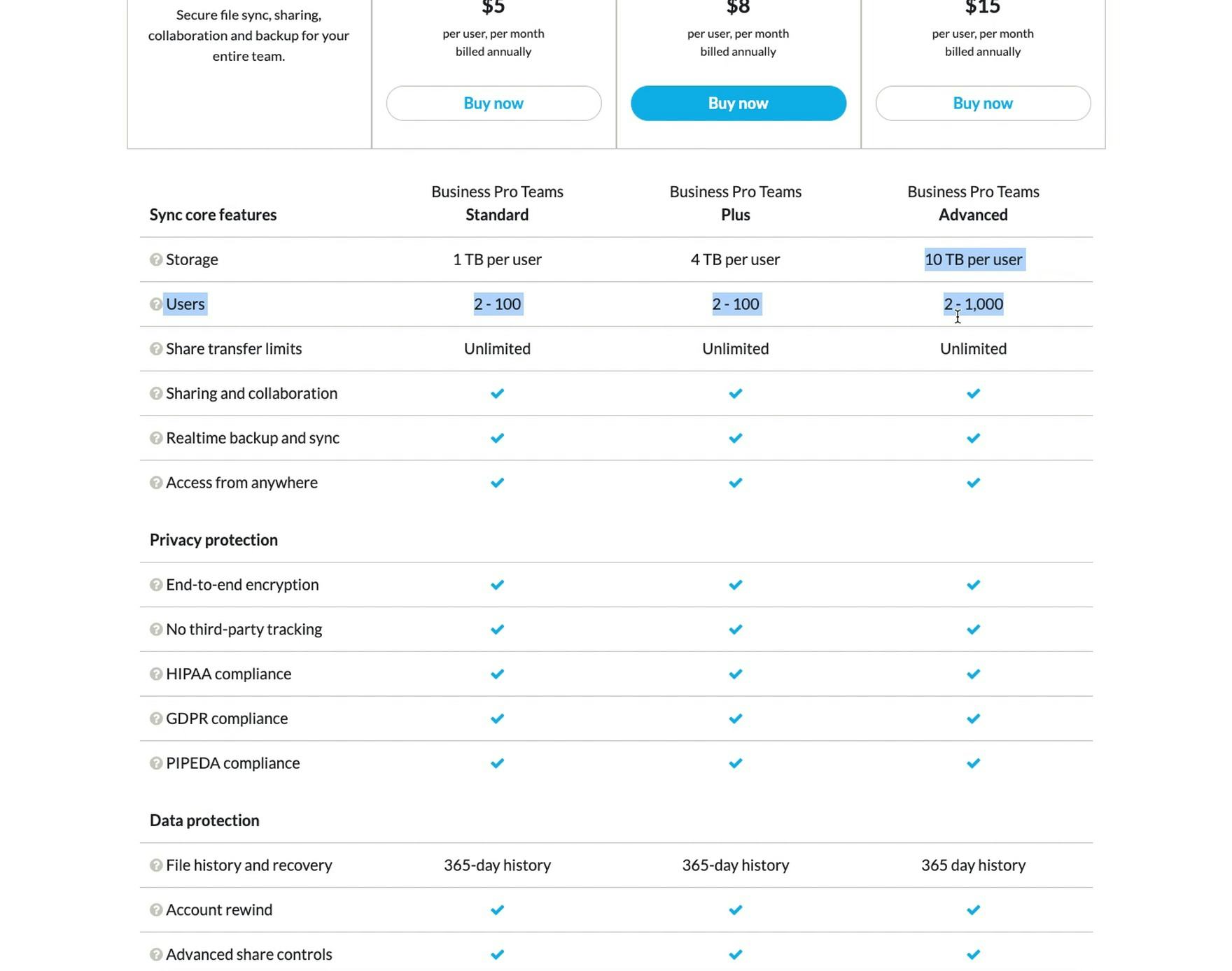
“I definitely like the way the key data is presented here. A little easier to read and the way this is presented is just a lot clearer too, you know, the number of users and the storage.” The first group of features in Sync’s plan matrix, aptly labeled “Sync core features”, contains what is likely to be the top-priority features for most users, including storage capacity, number of users, and file sharing transfer limits.
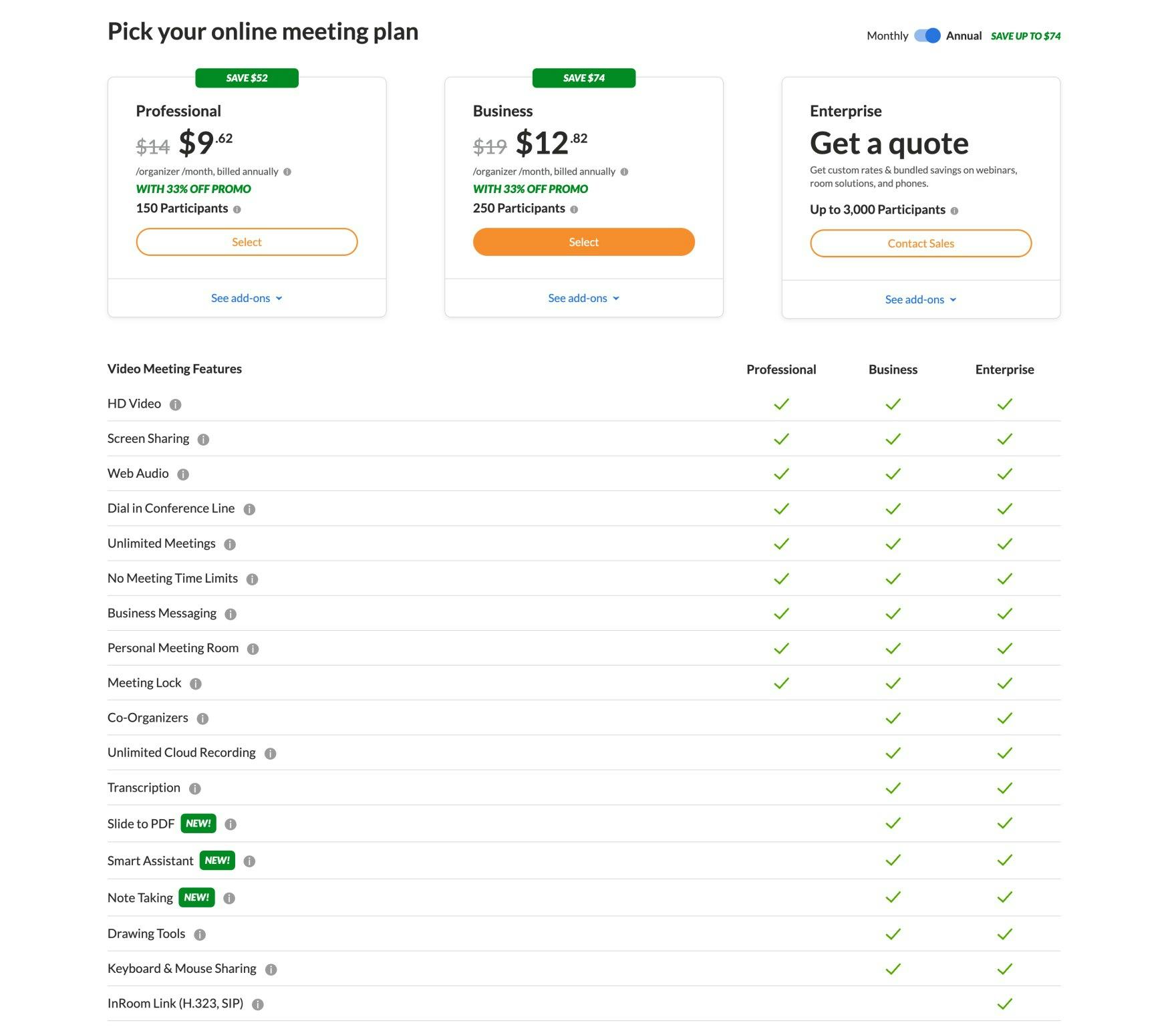
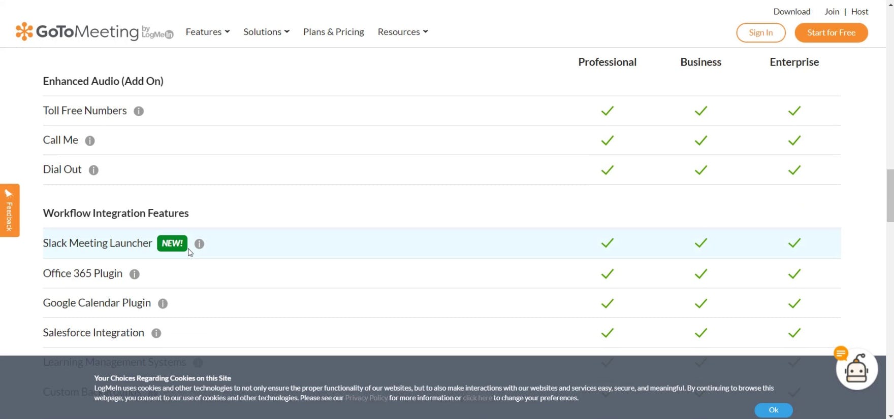
“Video Meeting Features”, core to GoToMeeting’s online meetings digital service, is the first group of features in the plan matrix. Anticipating what is likely to be the most sought-after group of plan matrix features and ordering the groups accordingly will streamline the process of scanning the matrix for the majority of users.
Ordering the groups of related features by importance will be highly valuable to users as they begin to review the complete list of plan matrix features.
During testing, the vast majority of sites ordered sections by importance — presenting the most sought-after or “core” features in the first section — and were observed to outperform the handful of sites that didn’t lead with “core” features first in the plan matrix.
Therefore, the first group of features should be those that the majority of users are most likely to be seeking.
3) Persist Plan Headings and Feature Subheadings during Scrolling
Any long-scrolling plan matrix page will make maintaining visibility to plan headings — mainly the plan names and prices — impossible if the headings aren’t always visible.
Losing visibility to the plan names and prices places an unnecessary cognitive burden on users to remember these details as they review the list of features and attempt to compare plans.
At the same time, this lack of visibility of plan names and prices increases the overall scrolling efforts for users who don’t remember these plan details, as they are required to return to the top of the plan matrix each time they identify a significant difference among the plans.
Testing showed that “sticky plan headings” that attach the plan names and prices to the top of the grid as the plan matrix page is scrolled resolves this issue entirely. Having sticky plan headings provides much-needed access to plan details that are essential to the comparison process.
Likewise, on sites that group the full list of plan matrix features into sections, it’s logical to, for sections that contain many features, temporarily anchor the current section’s subheading to the top — in addition to the plan names and prices — as users scroll.
This ensures visibility to the current section’s subheading if the list of features contained within any of the sections is longer than a single viewport. Otherwise, users can easily become disoriented and lose the context necessary to understand all of the individual features.
4) Scale the Matrix for Optimal Display
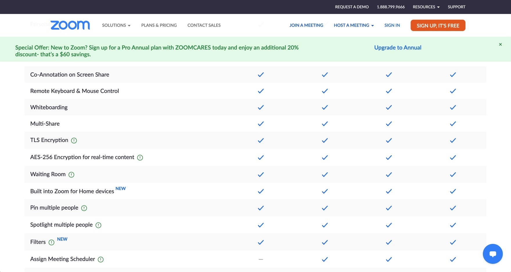
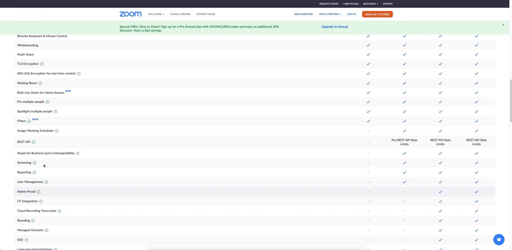
Zoom’s plan matrix does not scale for optimal display when viewed on a larger screen. Shown here, scanning the distance between the features and associated checkmarks in plan columns is manageable for most users (first image). However, on a larger screen the distance increases tremendously while the text size decreases (second image), making horizontal scanning far more difficult.
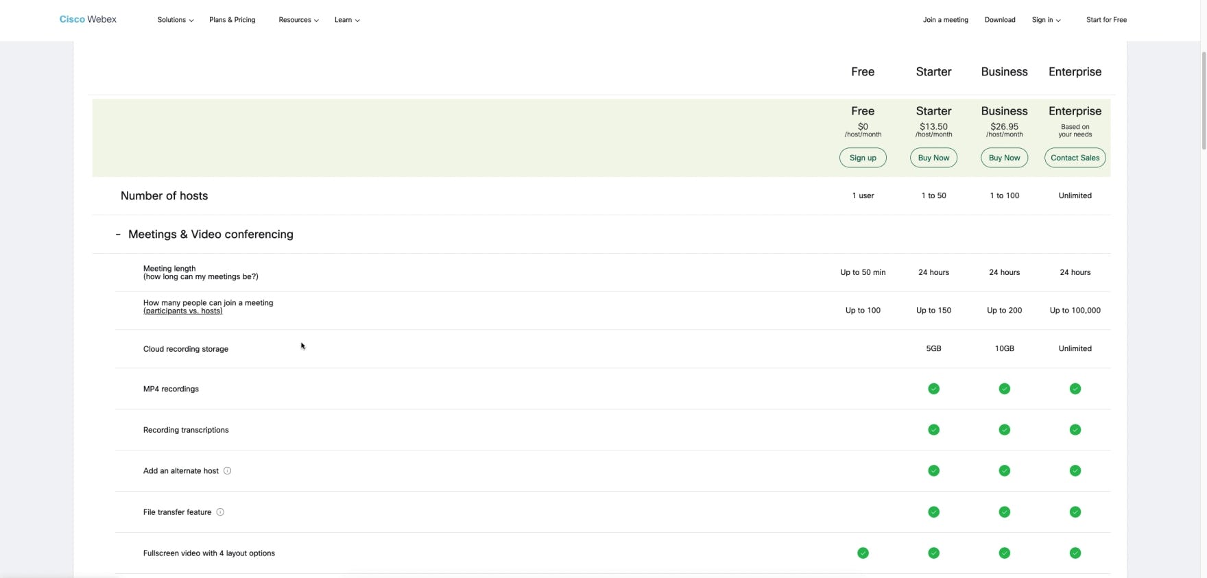
Horizontal scanning of the plan matrix on a few of the test sites was far more difficult at higher screen resolutions. For example the space between the list of features and the plan columns at Webex increased significantly for a user (a senior product manager for an online media company) viewing on a larger screen.
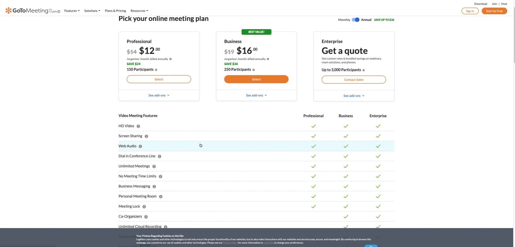
“This looks cleaner. You can almost see what Webex was trying to do with that layout”, remarked that same user (a senior product manager for an online media company) later in his session, comparing the plan matrix at GoToMeeting, which increased the space to the left and right of the matrix data, to Webex.
Plan matrices that don’t scale appropriately for larger screens make it difficult for a subgroup of users to visually trace the feature label to its associated plan values.
In practice, the increased distance between these related elements and reduced text size can result in errors when users are unable to easily track horizontally across the row.
During testing, a few of the test sites did not scale appropriately to accommodate users with larger screens. Consequently, targeting desired features and comparing plans was observed to be more difficult.
Serving the best possible experience at any screen size is imperative not only for improving the scannability of the plan matrix but also for reassuring users about the experience of using the digital service’s interface.
Therefore, it’s important to be mindful about upscaling plan matrix page content so that it fits the space proportionately on larger screens.
5) Use Horizontal Styling to Define Rows
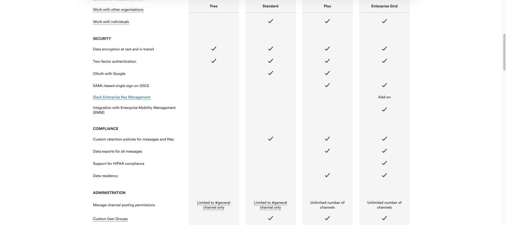
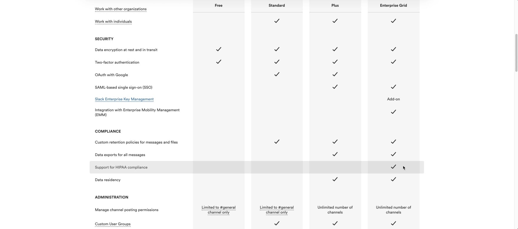
The rows in Slack’s plan matrix lack adequate default horizontal styling (first image), increasing users’ scanning efforts. Although users can hover to trigger the current row to be highlighted (second image), requiring user interaction for assistance with horizontal tracking places an unnecessary burden on users.
Egnyte employs separating lines to define the rows in its plan matrix to assist users in scanning across the plan columns. Providing default horizontal styling, such as including lines to define rows, helps users differentiate between features as they scroll and scan the matrix.
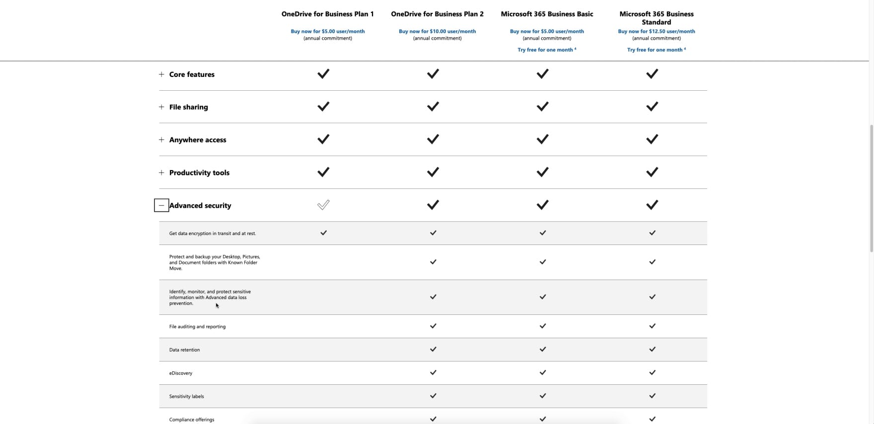
The Microsoft OneDrive plan matrix features alternating row colors to help users visually track the availability of features in each of the 4 plans. Alternating the background colors of rows is another effective default horizontal styling technique that helps users differentiate between features as they scroll and scan the matrix.
Plan matrices without any default horizontal styling can make it needlessly difficult for users to scan and interpret the plan matrix data correctly.
For example, without horizontal lines or alternate colors to visually separate the rows in the matrix, users are more likely to lose their place as they scroll and try to trace feature labels on the left to associated values in plan columns on the right.
Consequently, users are required to scan the matrix more slowly or employ the cursor to assist with tracing horizontally across the matrix.
These subtle styling details not only enhance users’ ability to scan the plan matrix but also help by visually breaking up an otherwise text-heavy list.
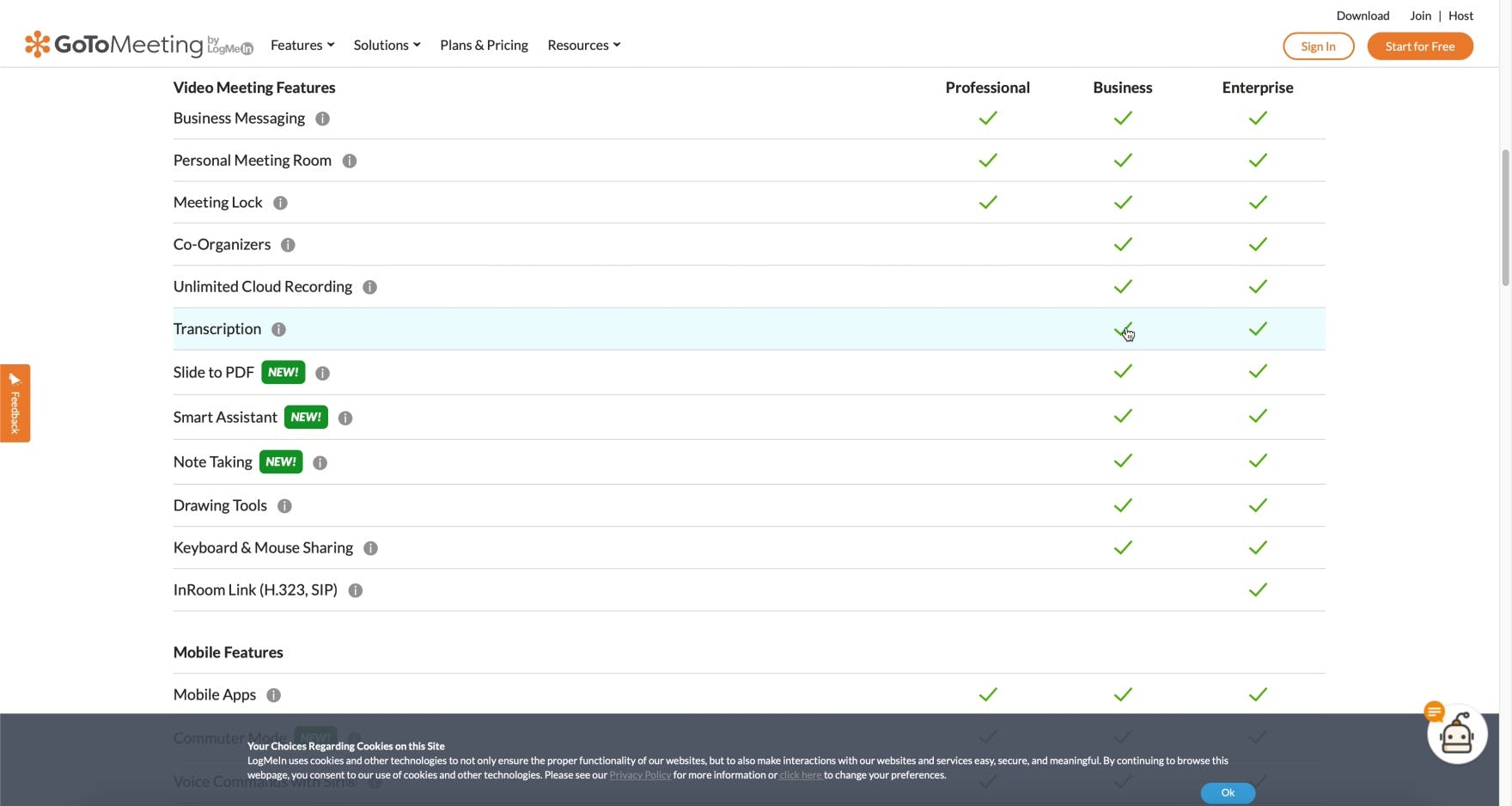
In addition to using lines to visually separate feature rows, GoToMeeting’s plan matrix provides on-hover row highlighting to further support desktop users in visually connecting feature labels on the left to checkmarks for each of the 3 plans on the right.
On desktop, horizontal styling can be taken a step further by providing on-hover row highlighting.
Regardless of whether groups of related features are displayed directly on the page or contained within vertically collapsed sections, providing on-hover highlighting in addition to visually defining the rows can reduce users’ scanning efforts, thereby allowing users to focus on interpreting the data instead.
Maximize the Scannability of the Plan Matrix
GoToMeeting has a highly scannable plan matrix that groups related features under clearly labeled subheadings, orders the groups of features by importance, persists the plan headings and feature subheadings during scrolling, scales the plan matrix for optimal display, and uses horizontal styling to define rows.
Our SaaS usability research study confirms users often arrive on the plan matrix page with specific plan feature requirements. For example, some users need a plan that will accommodate a minimum number of users or support particular app integrations.
However, users who cannot quickly and easily locate specific features that are critical to their business needs will be more likely to conclude those features are not offered with any of the plans and drop the site’s service from consideration altogether.
On the other hand, users who are able to quickly target the specific features they’re interested in can efficiently glean or confirm key details and confidently move forward with their plan comparison.
Therefore, it’s important to avoid long, unorganized plan matrices by
- grouping related features under clearly labeled subheadings,
- ordering groups of features by importance,
- persisting plan headings and feature subheadings during scrolling,
- scaling the matrix for optimal display, and
- using horizontal styling to define rows.
Having a highly scannable plan matrix allows users to focus on what’s most important — evaluating and comparing plans — instead of spending time searching for the specific features critical to their business needs.
Getting access: all 196 digital subscription UX guidelines are available today via Baymard Premium access. (If you already have an account open the Digital Subscription Services study).