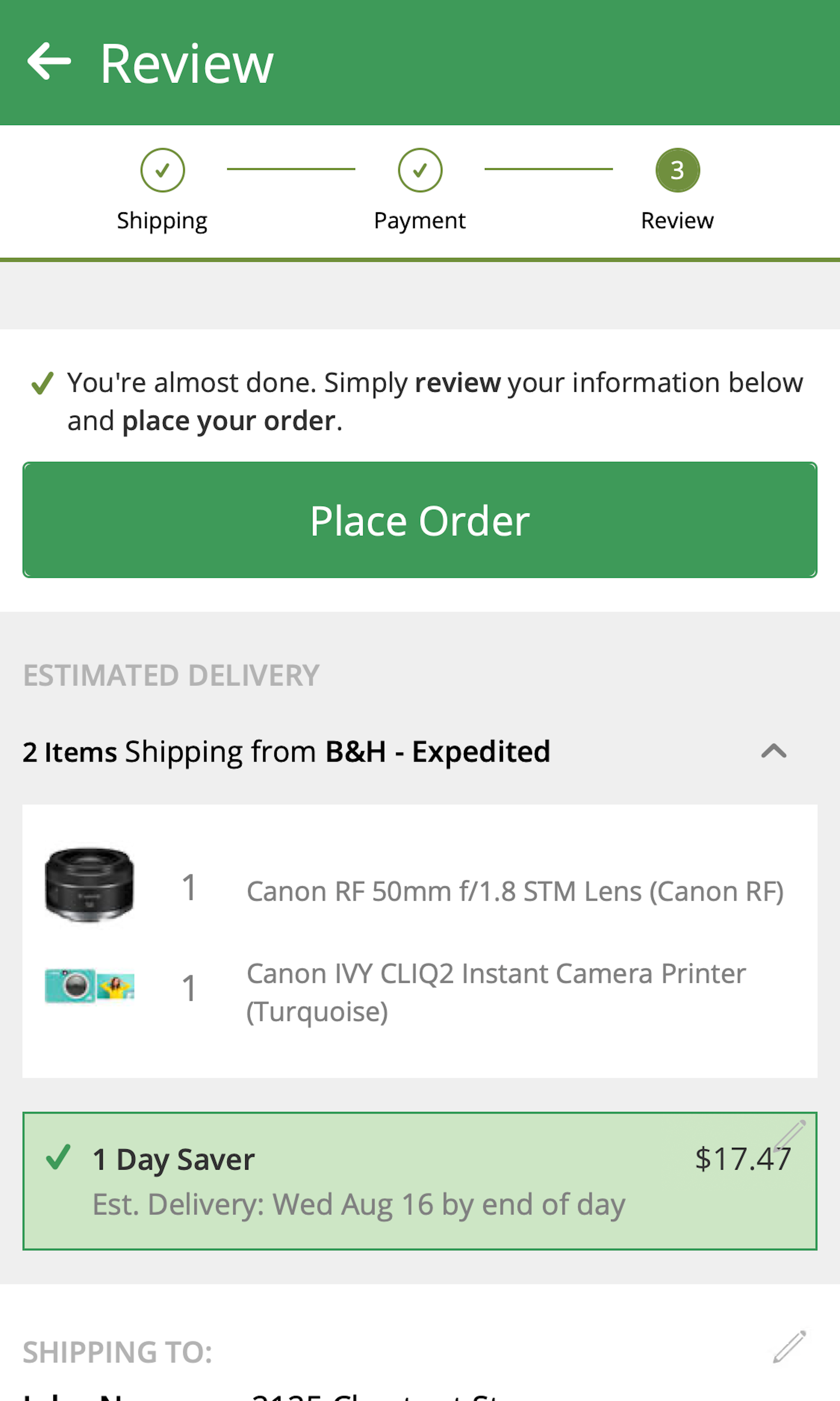
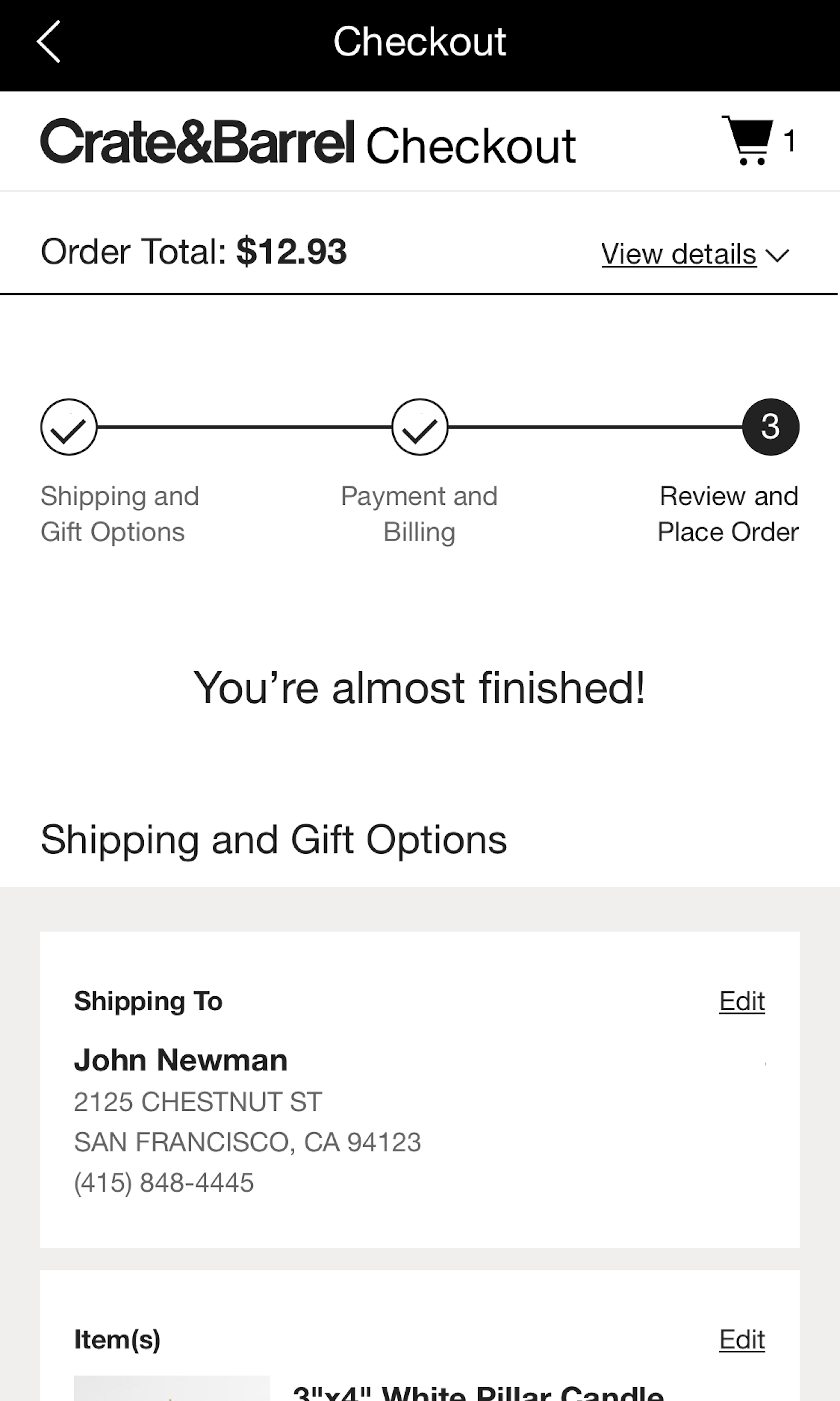
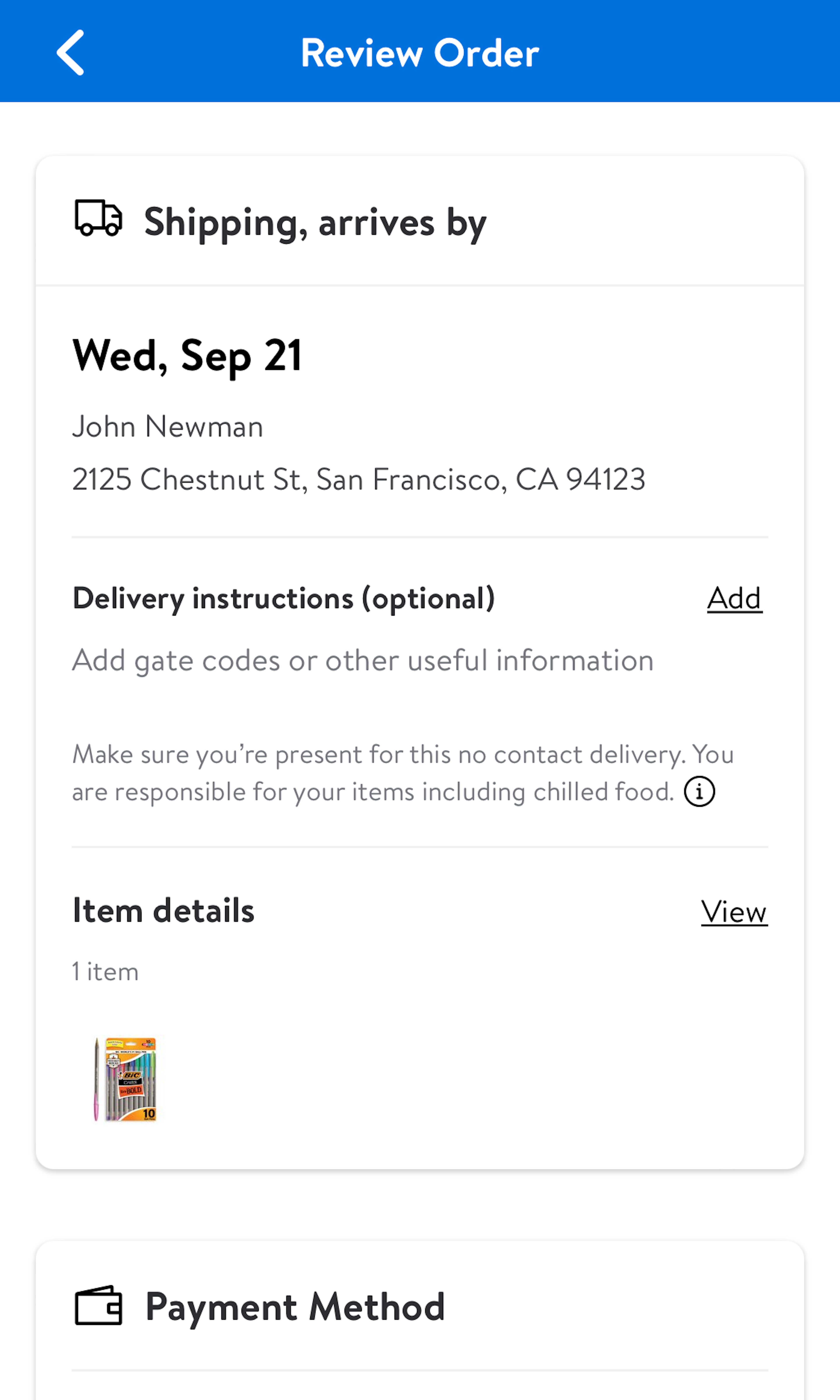
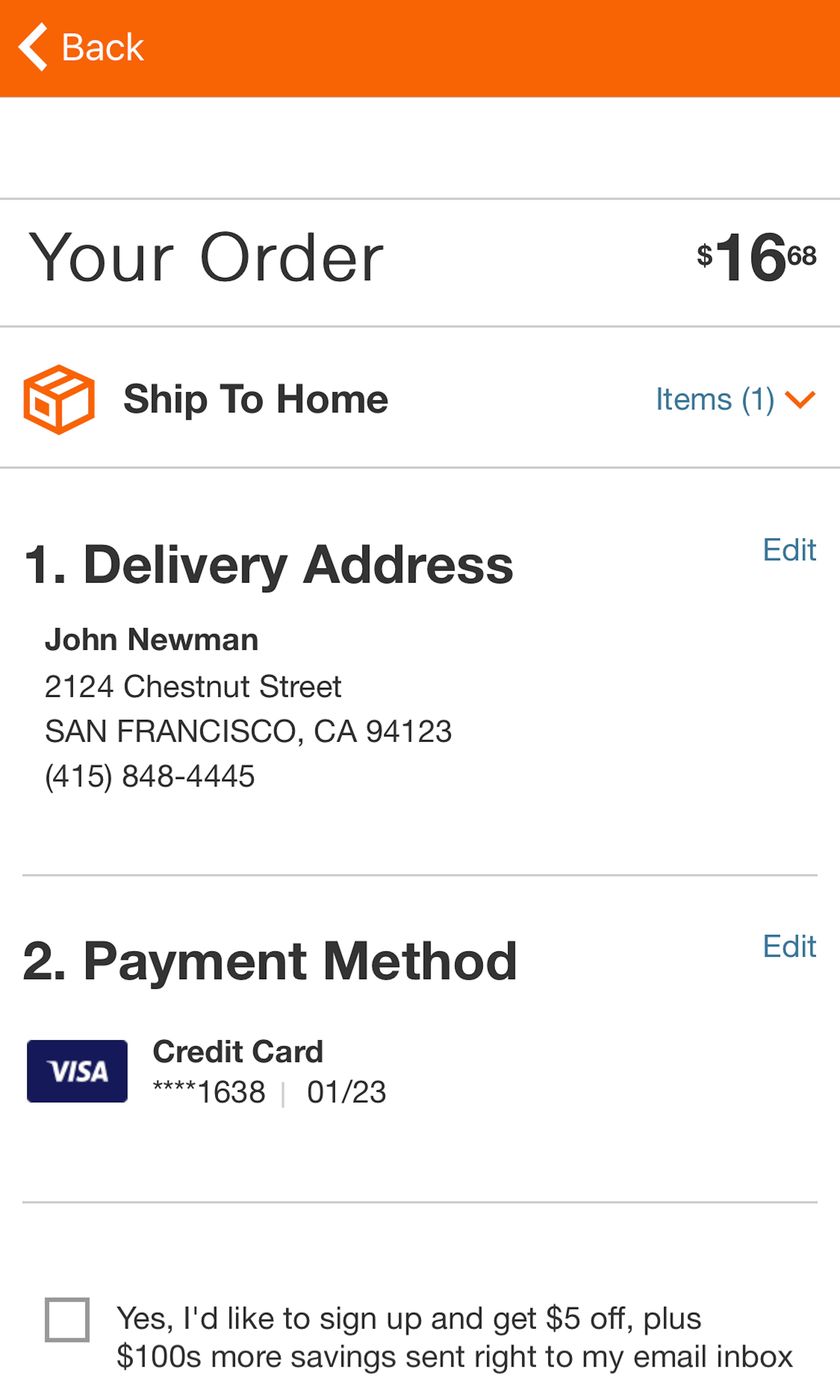
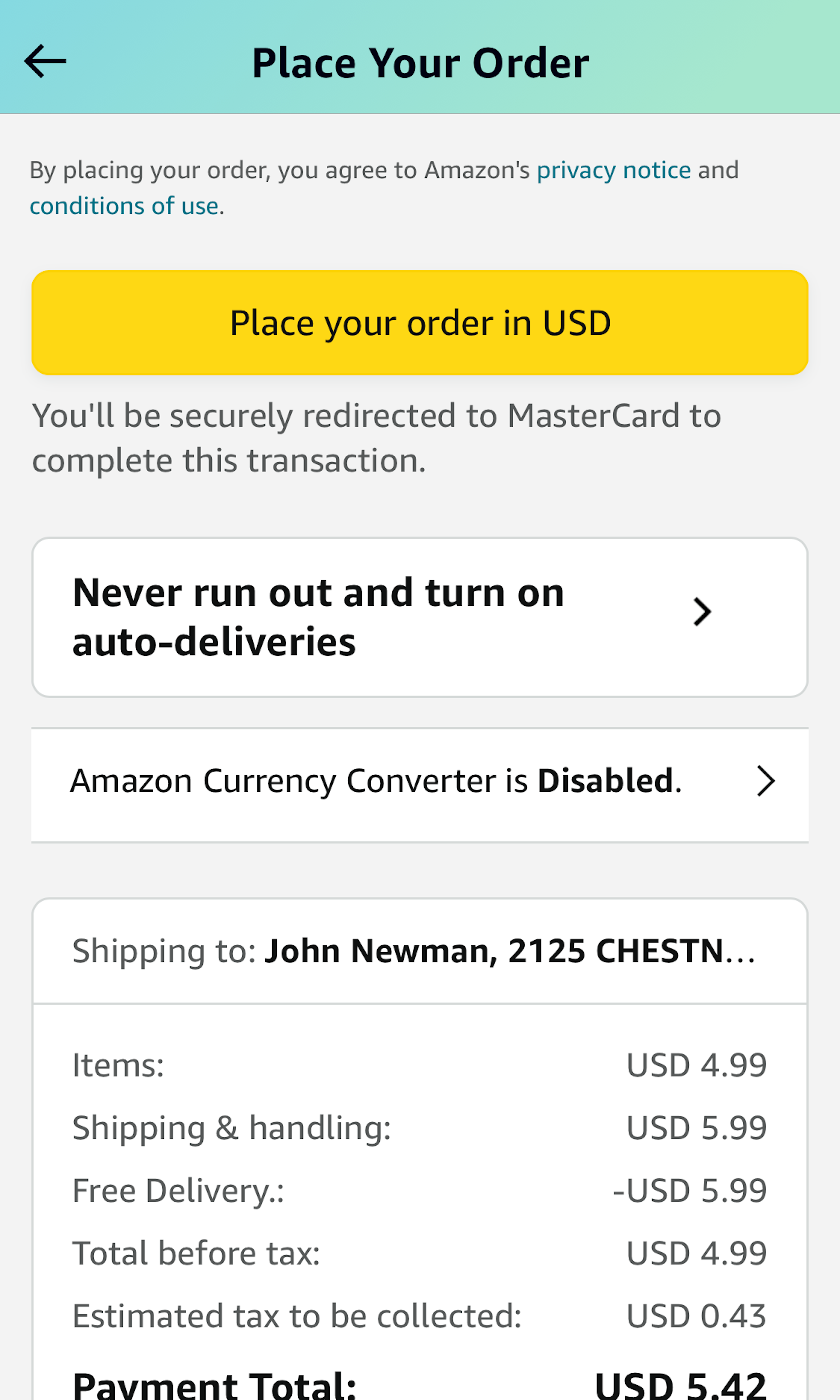
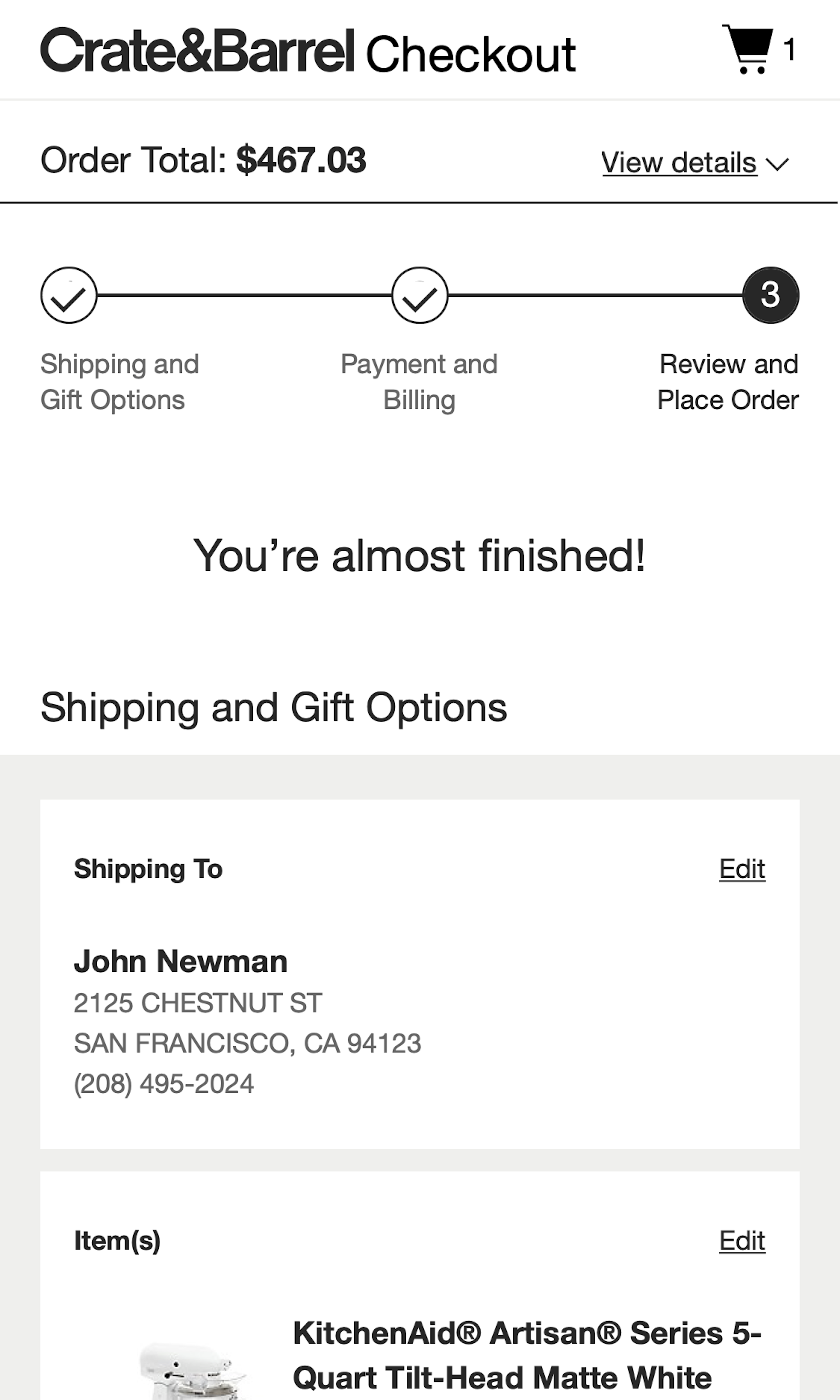
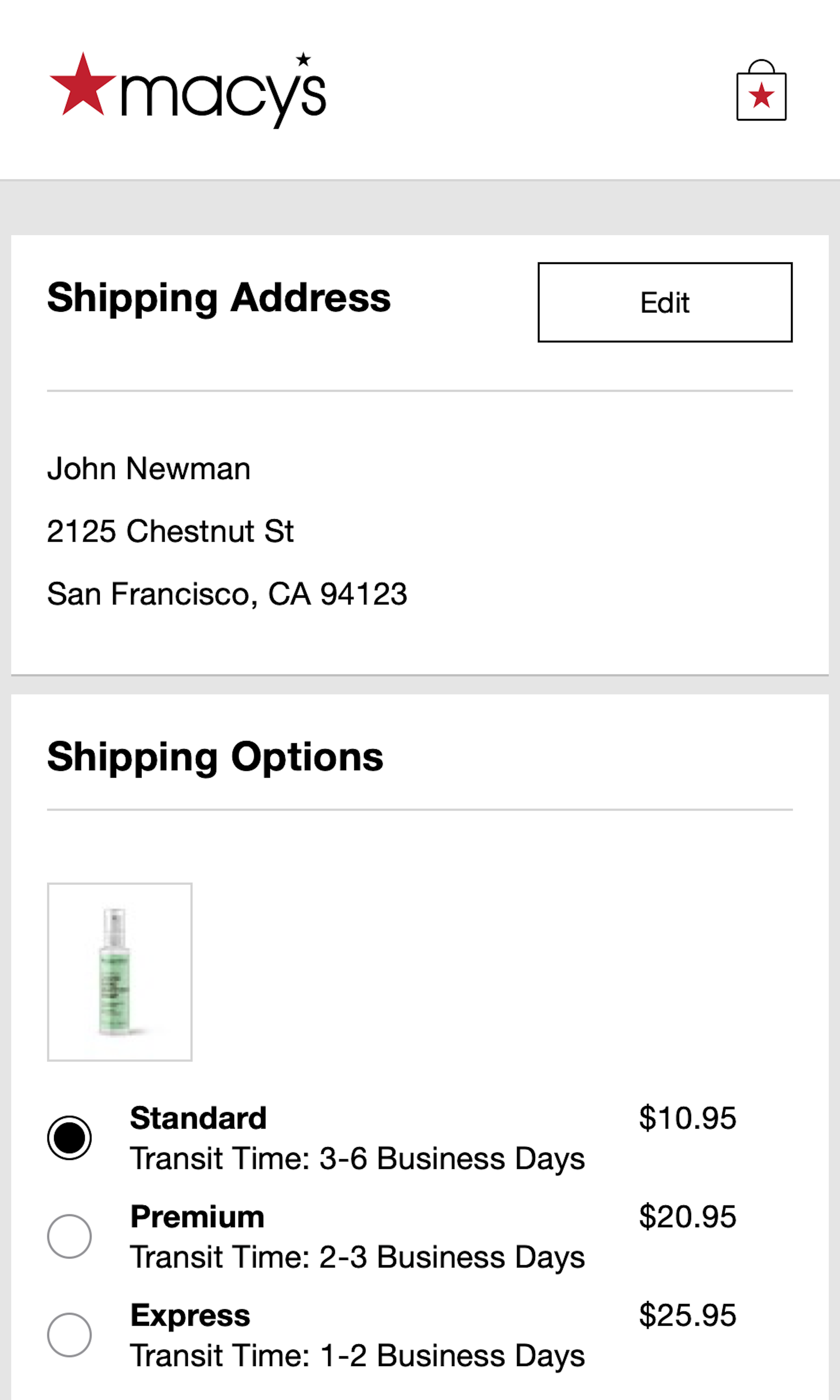
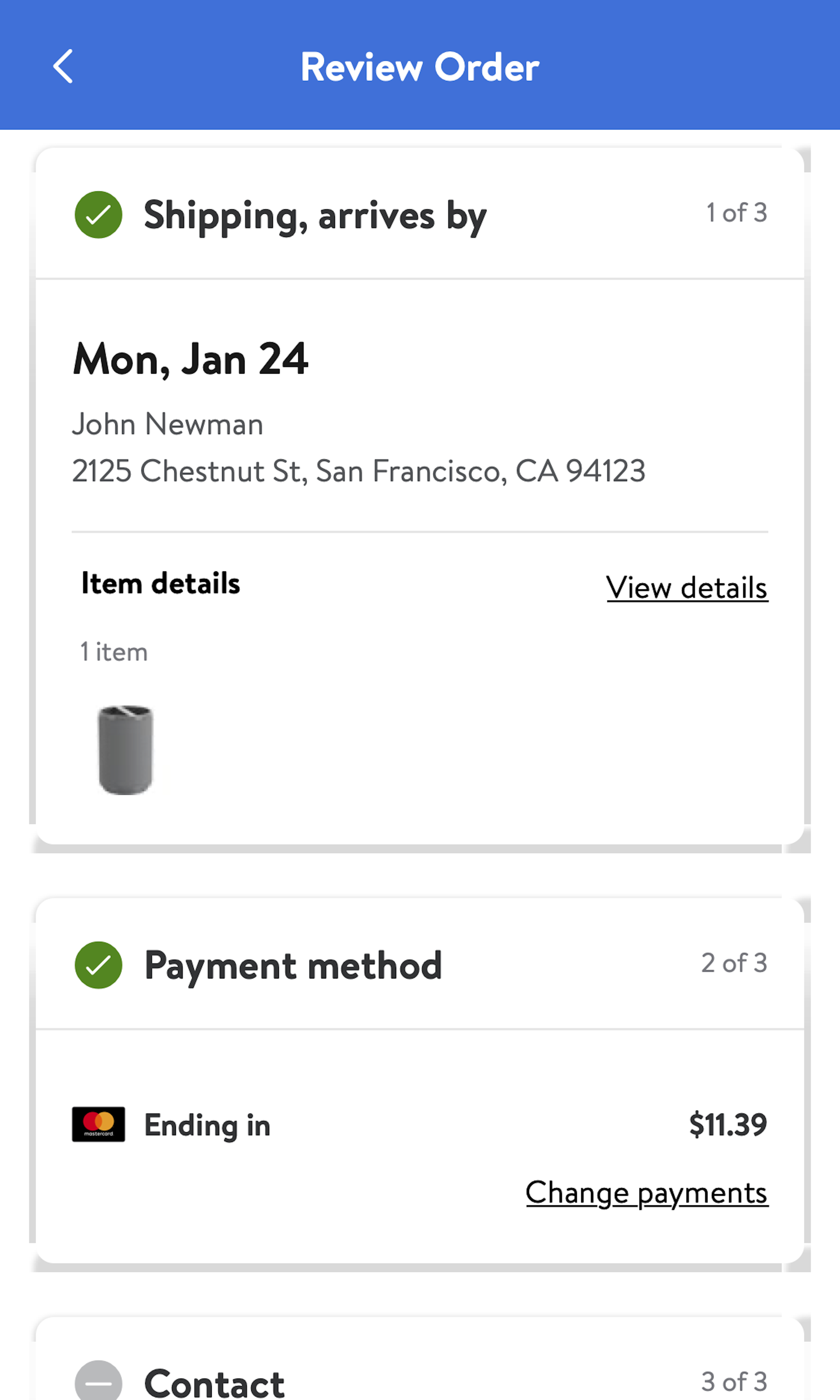
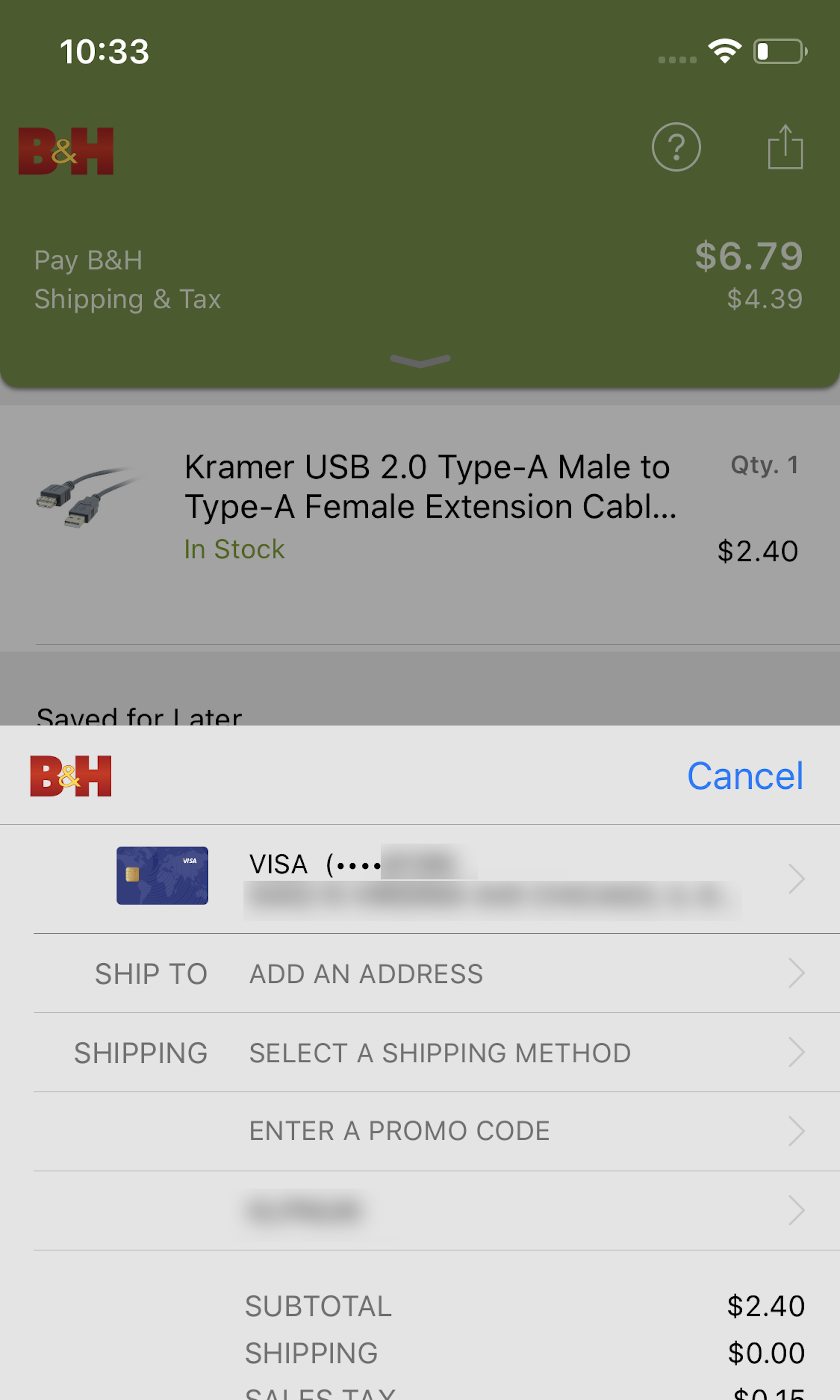
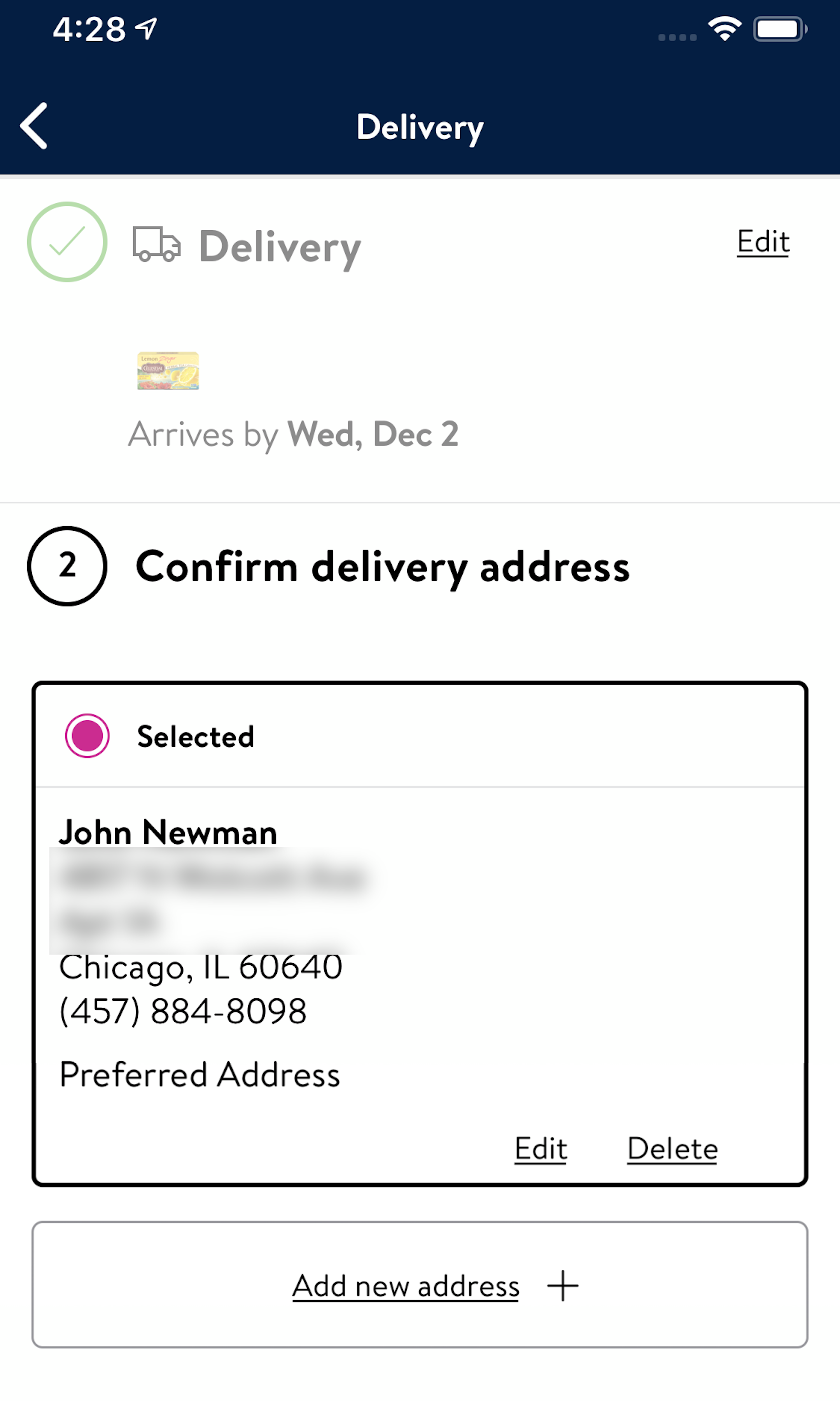
682 ‘Review Order’ Design Examples
Also referred to as: Order Review, Order Preview
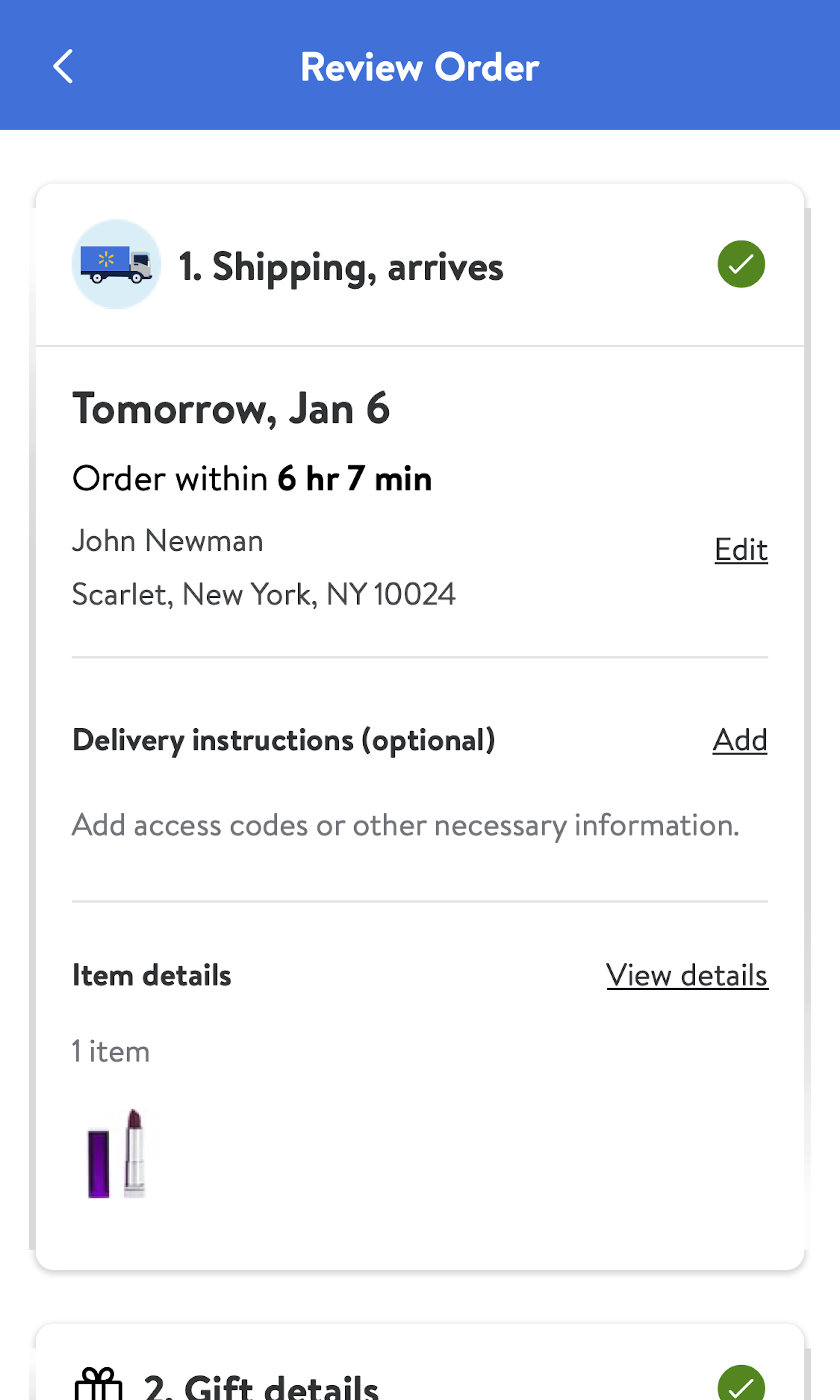
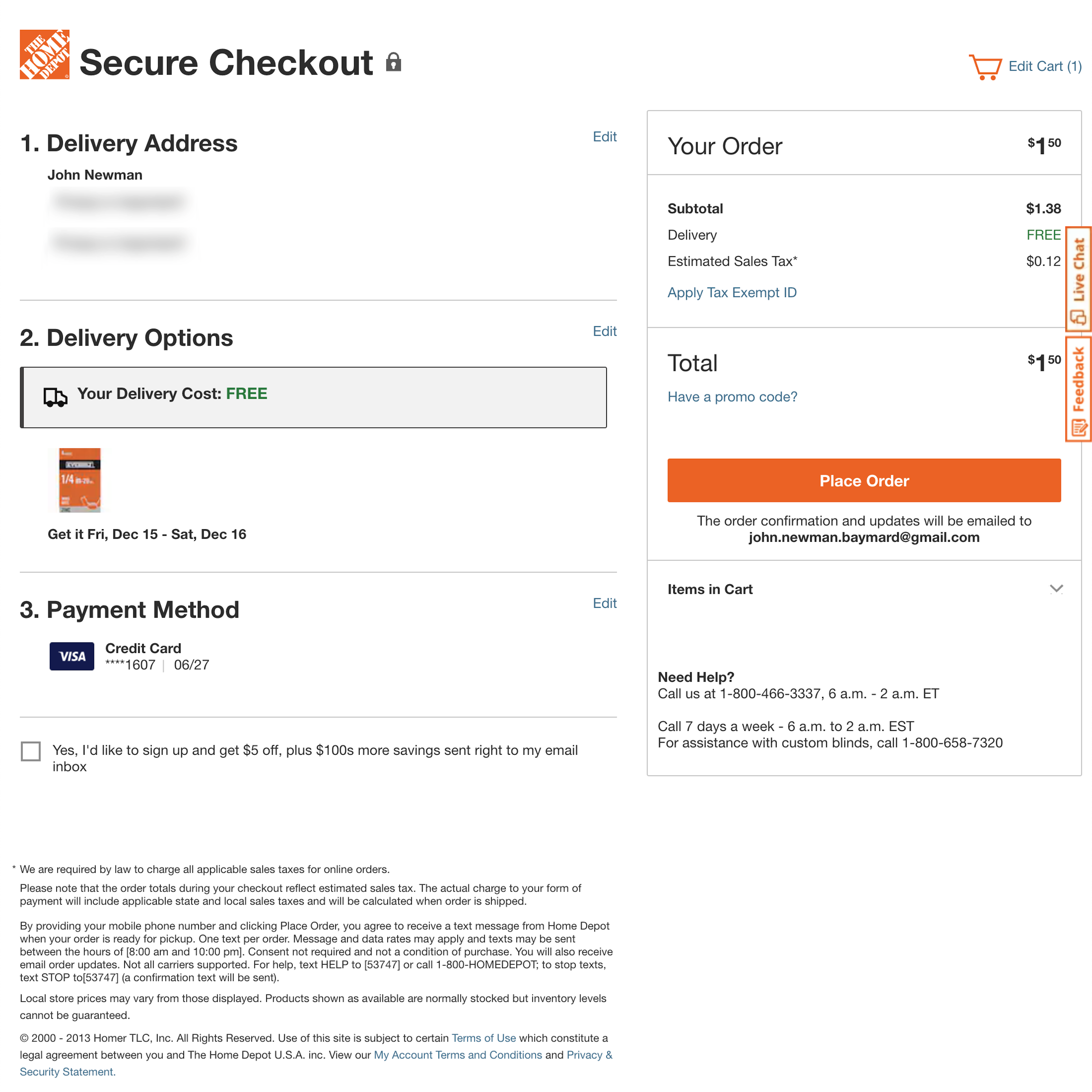
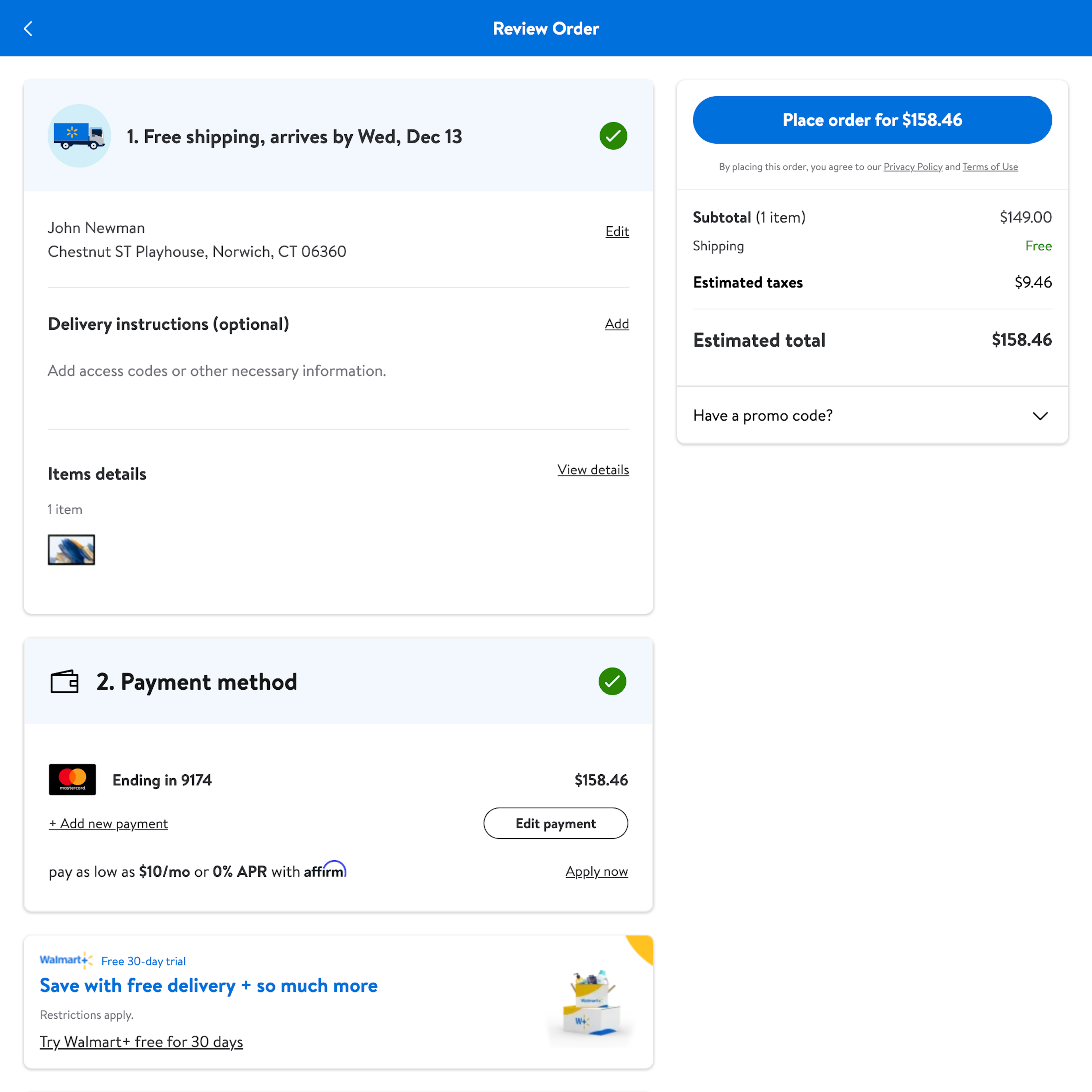
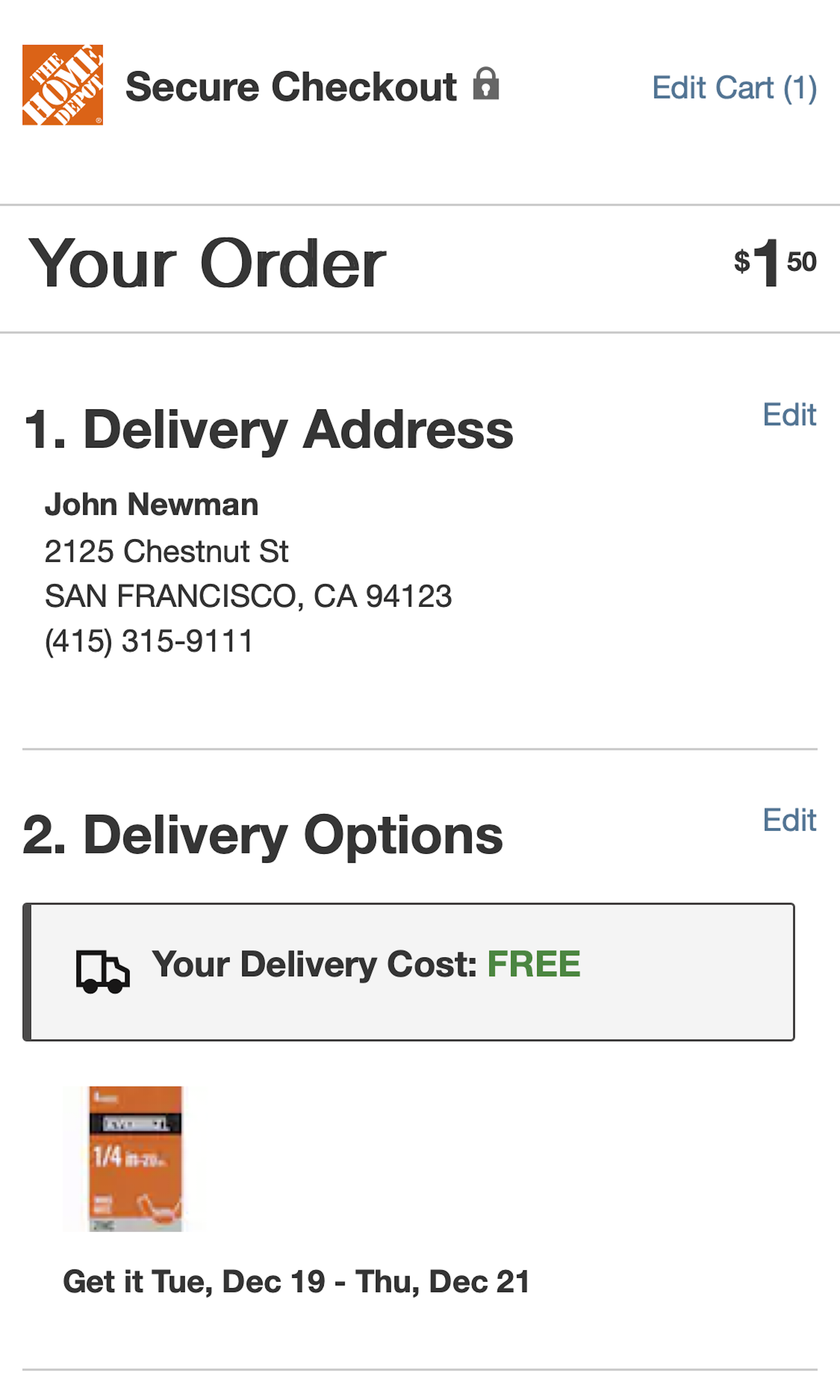
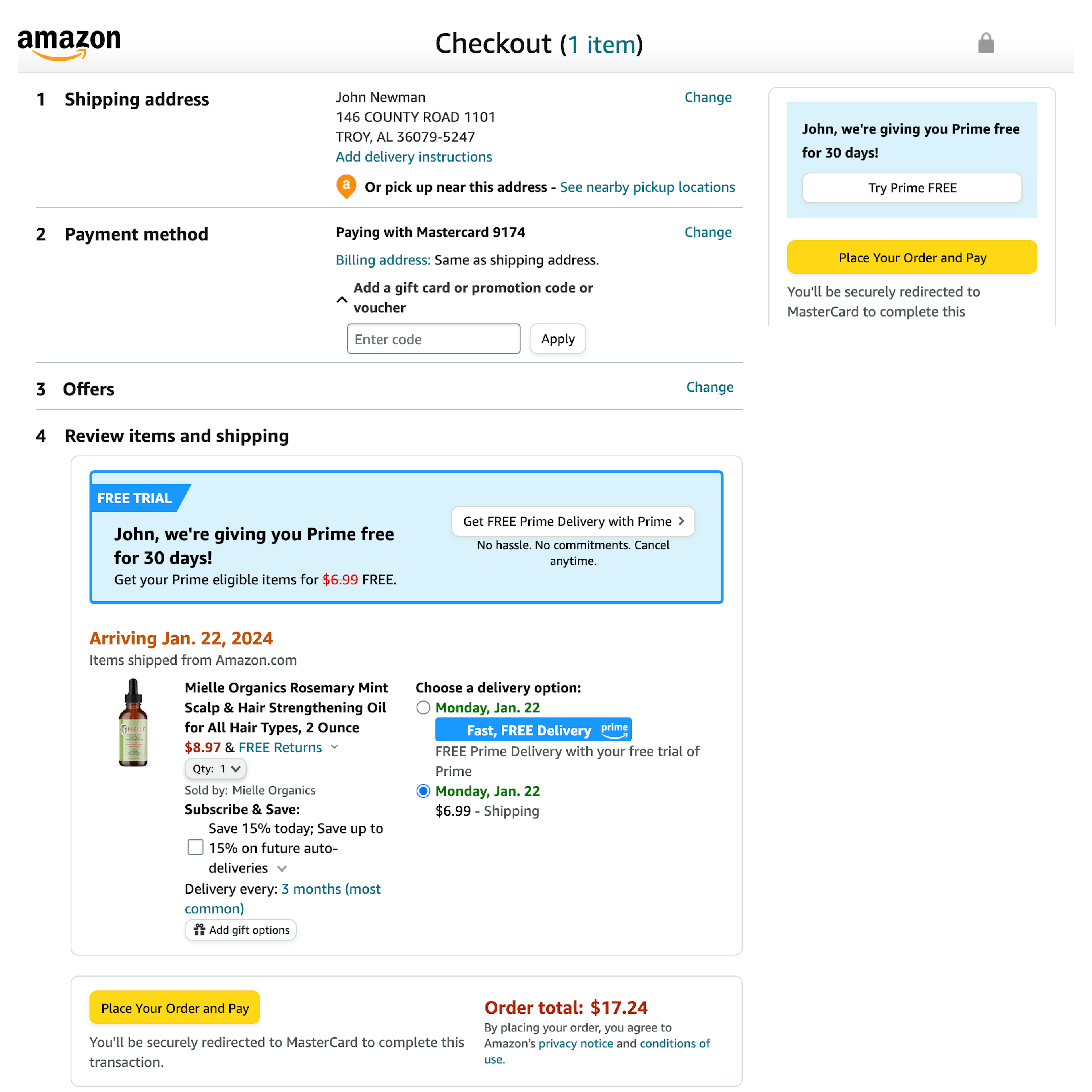
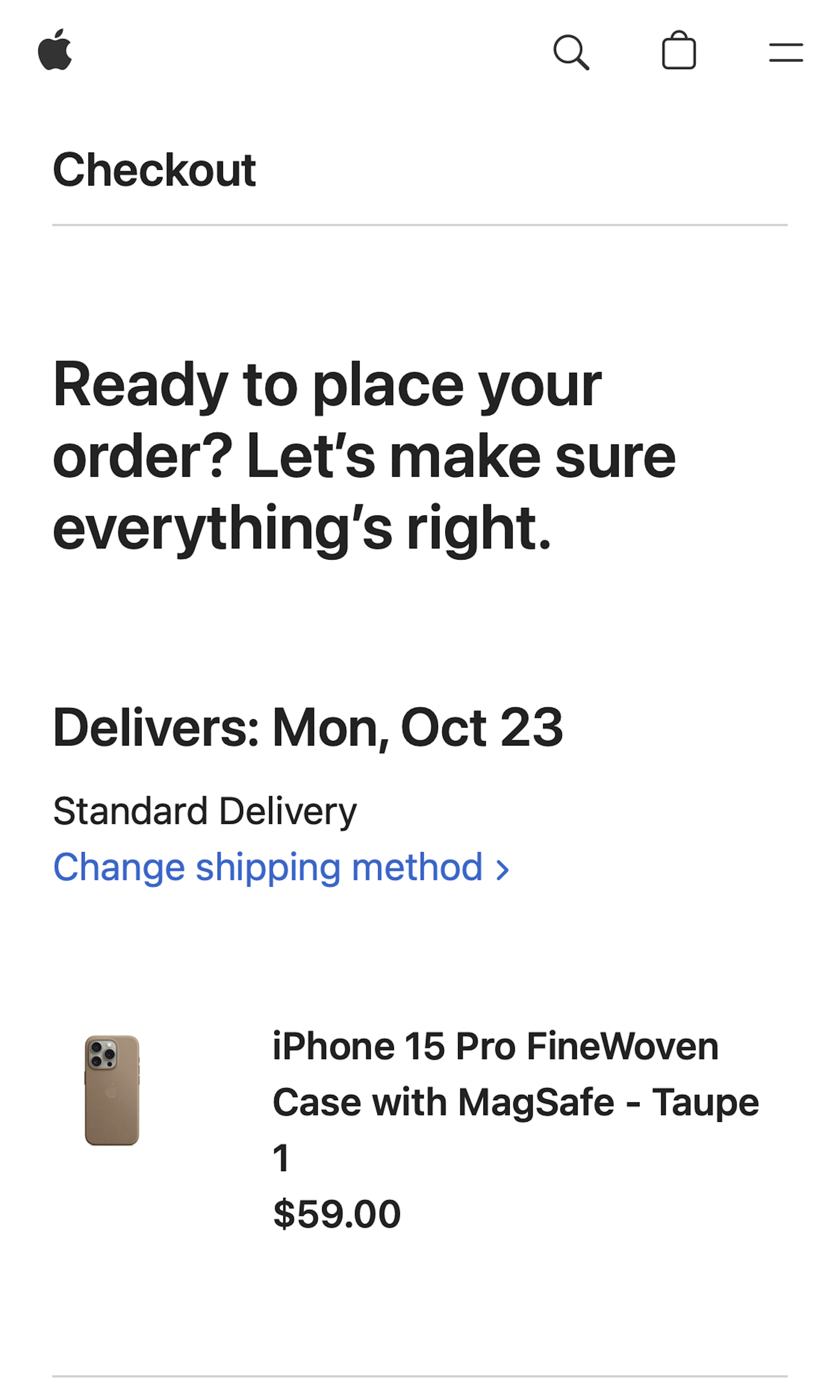
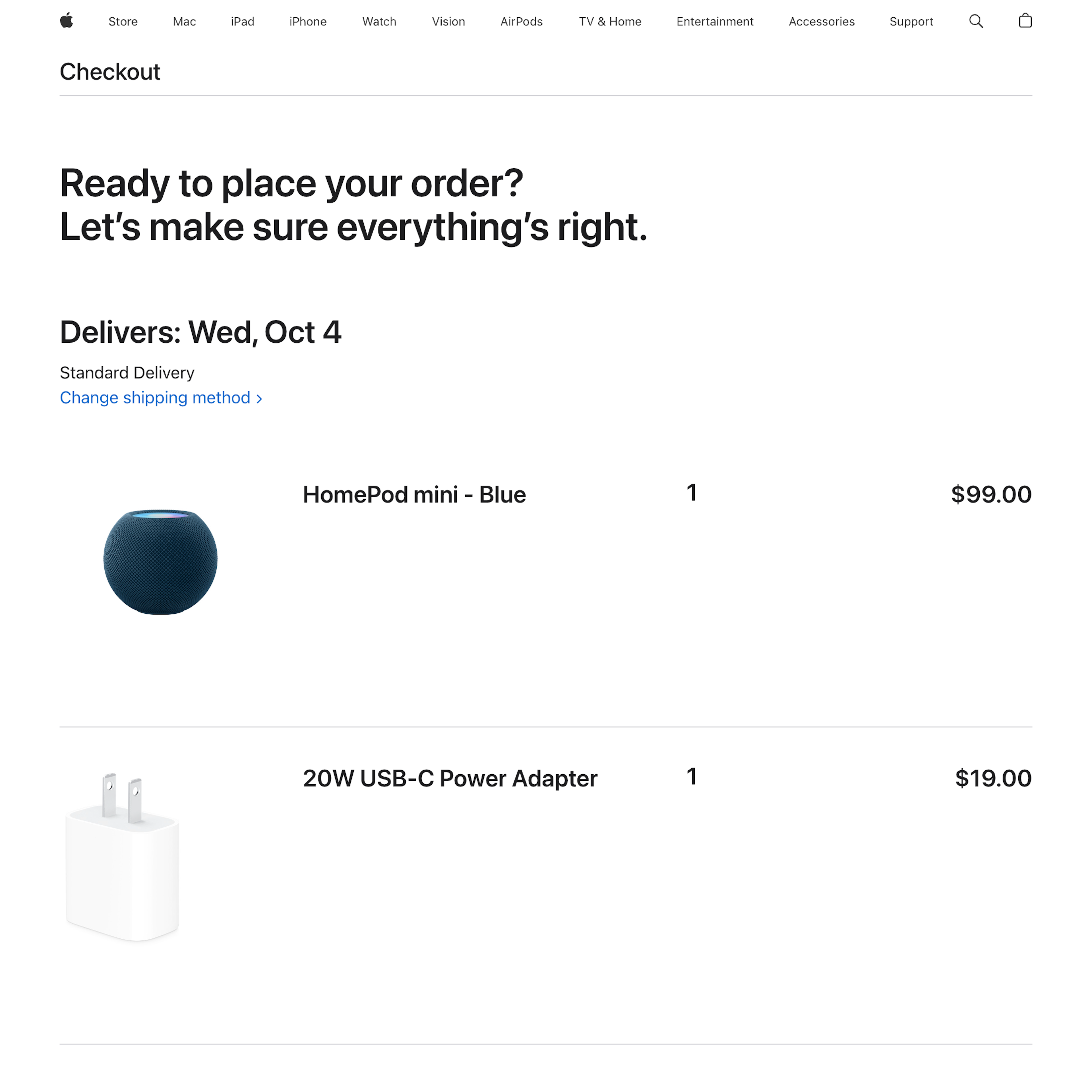
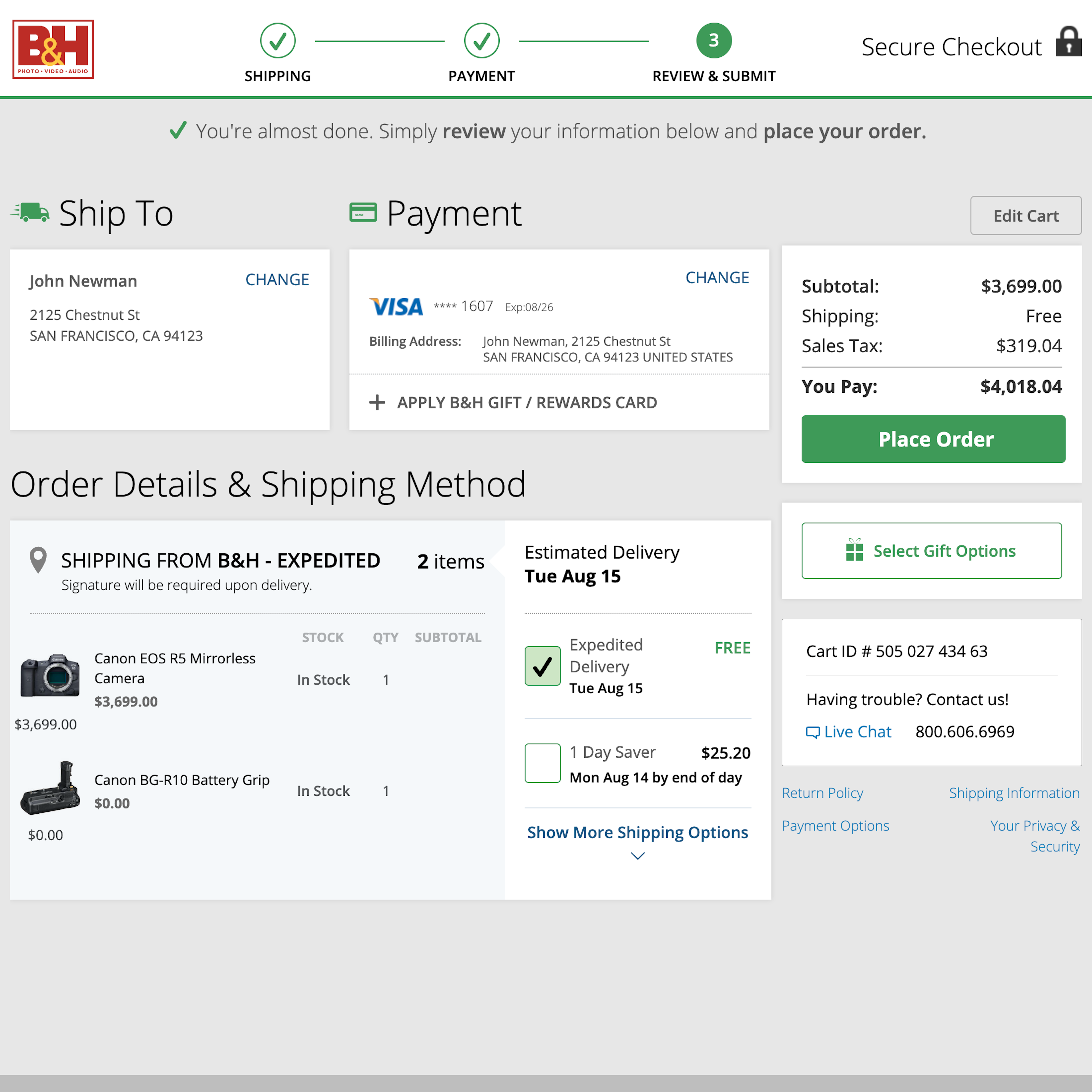
What’s this? Here you’ll find 682 “Review Order” full-page screenshots annotated with research-based UX insights, sourced from Baymard’s UX benchmark of 327 e-commerce sites. (Note: this is less than 1% of the full research catalog.)
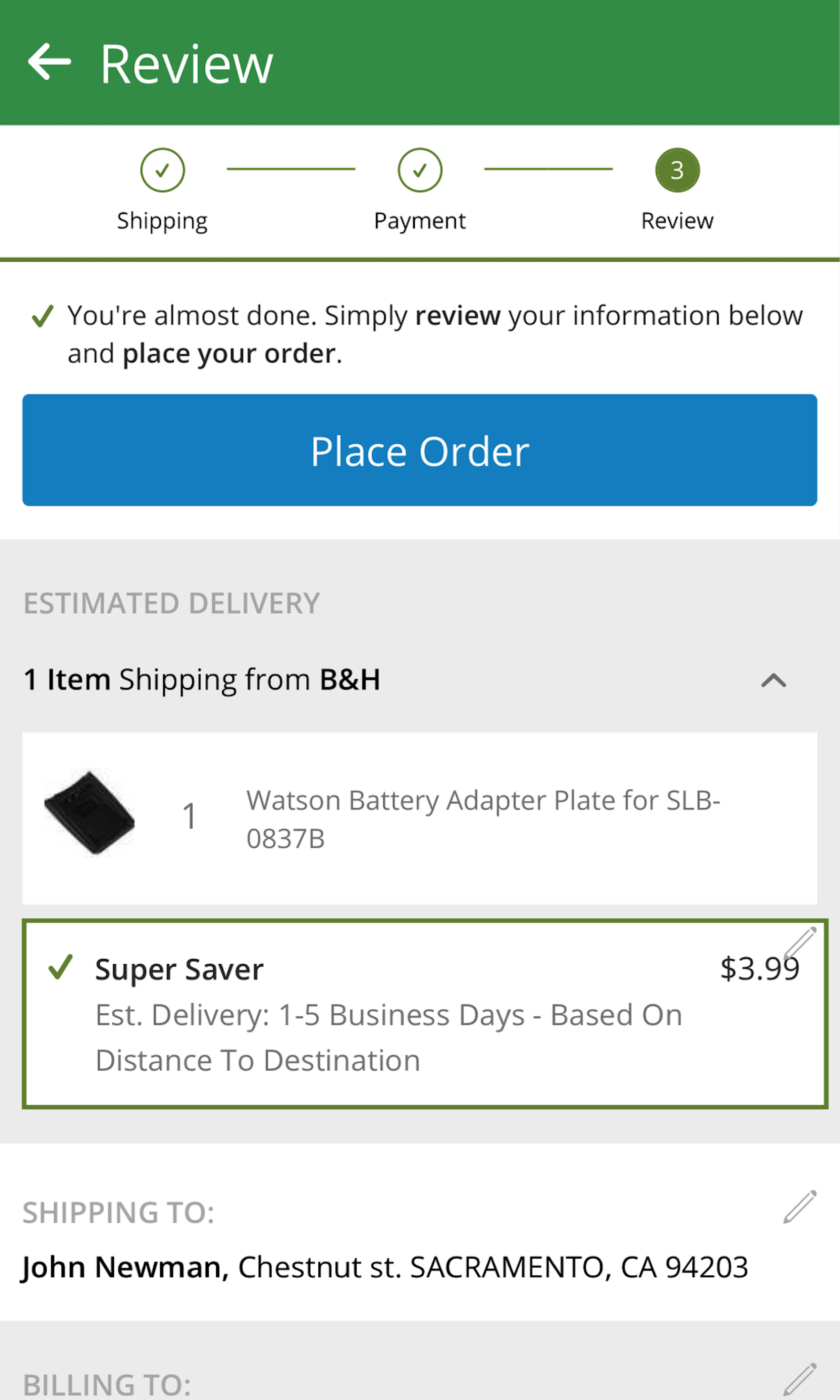
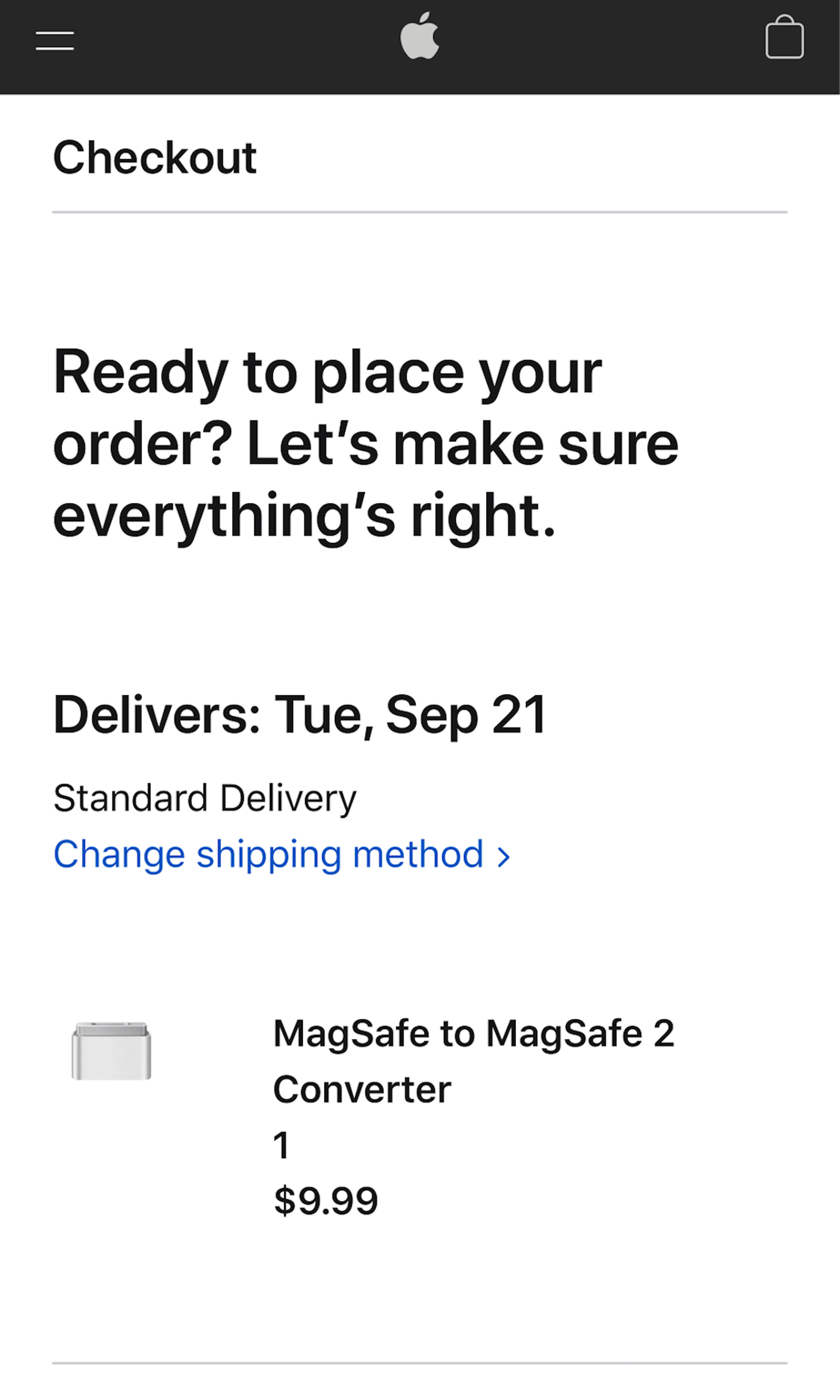
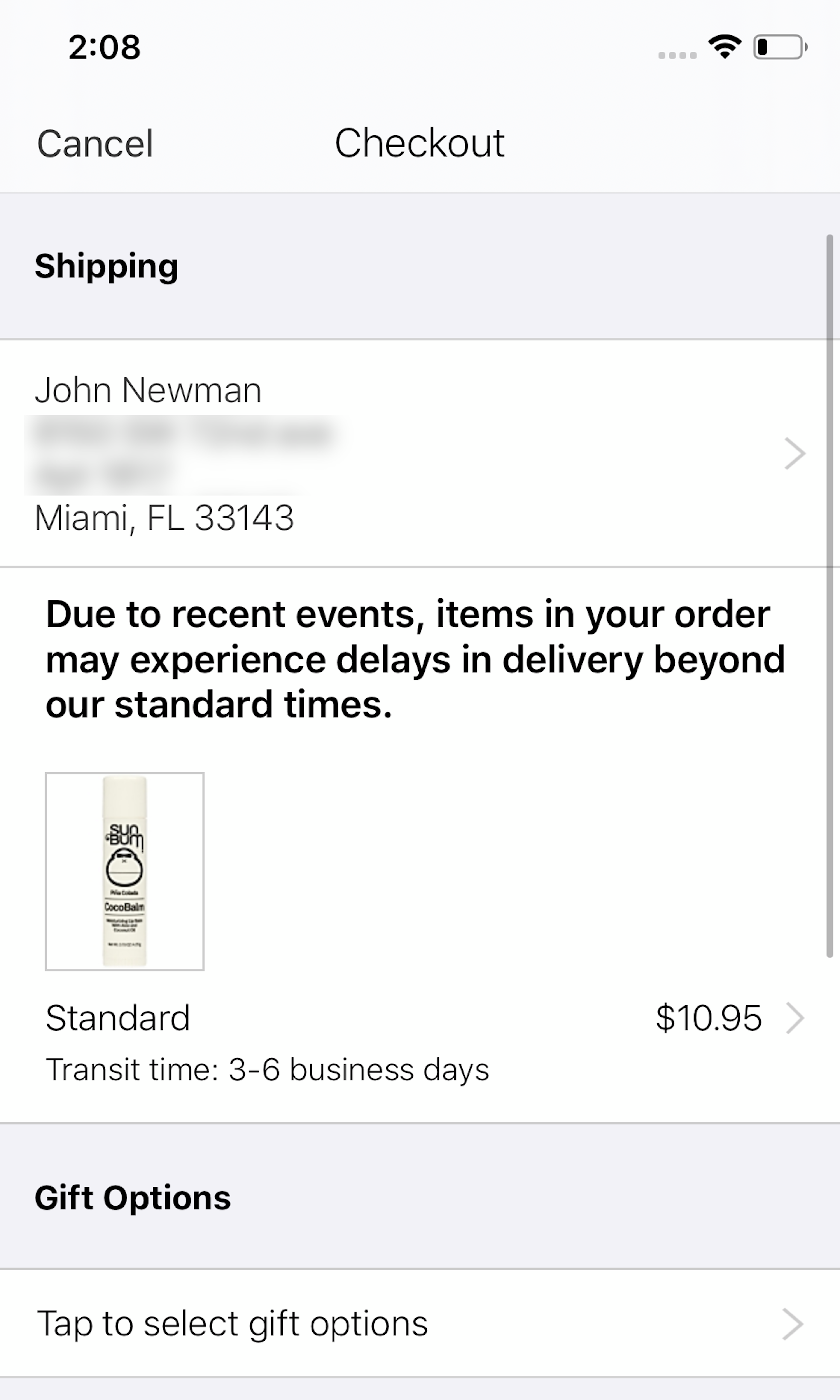
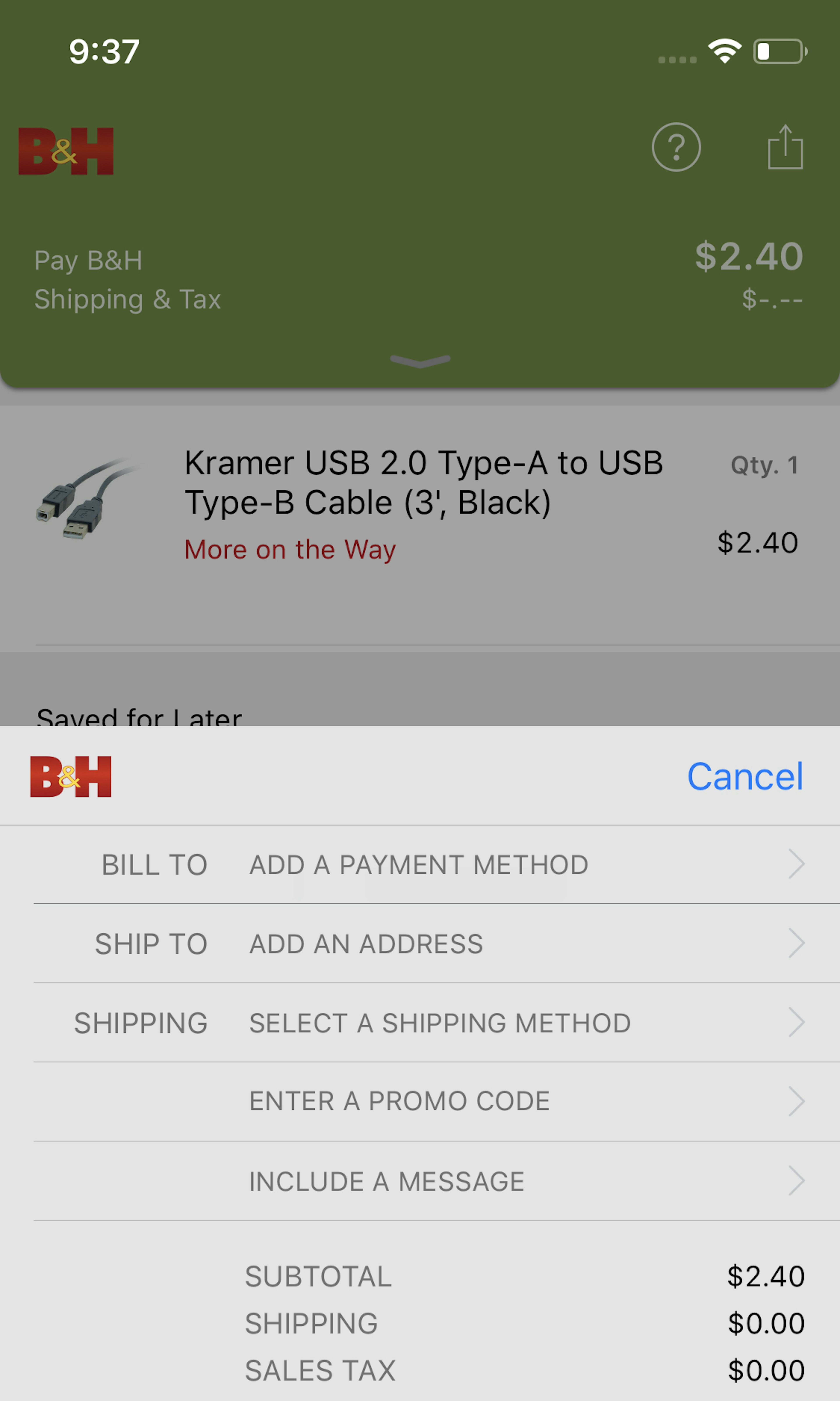
Nothing is final before users confirm the order — all prior attempts to create user-friendly checkout steps have been in vain if users do not correctly understand and use the review step. Indeed during our testing we consistently observe that some users abandon here — and very often solely caused by the design and flow of the review step.
More ‘Order Review’ Insights
-
One Order Review aspect that causes issues for many sites is the user’s “editing experience”. For example, 68% of sites send users backward in the checkout flow if they want to edit information at the review step — something that we during usability testing observed to be highly problematic.
-
Another grave issue observed in testing is that some Order Review page designs are prone to be mistaken for an “Order Confirmation” page; thinking their order is placed users then close the page (unwillingly abandoning the order).
-
Learn More: Besides exploring the 682 “Order Review” design examples below, you may also want to read our related article “5 ‘Order Review’ Implementations That Make Office Depot Best-in-Class”.
-
Get Full Access: To see all of Baymard’s cart and checkout research findings you’ll need Baymard Premium access. (Premium also provides you full access to 200,000+ hours of UX research findings, 650+ e-commerce UX guidelines, and 275,000+ UX performance scores.)
User Experience Research, Delivered Weekly
Join 60,000+ UX professionals and get a new UX article every week.

User Experience Research, Delivered Weekly
Join 60,000+ UX professionals and get a new UX article every week.

Explore Other Research Content

300+ free UX articles based on large-scale research.

327 top sites ranked by UX performance.

Code samples, demos, and key stats for usability.


