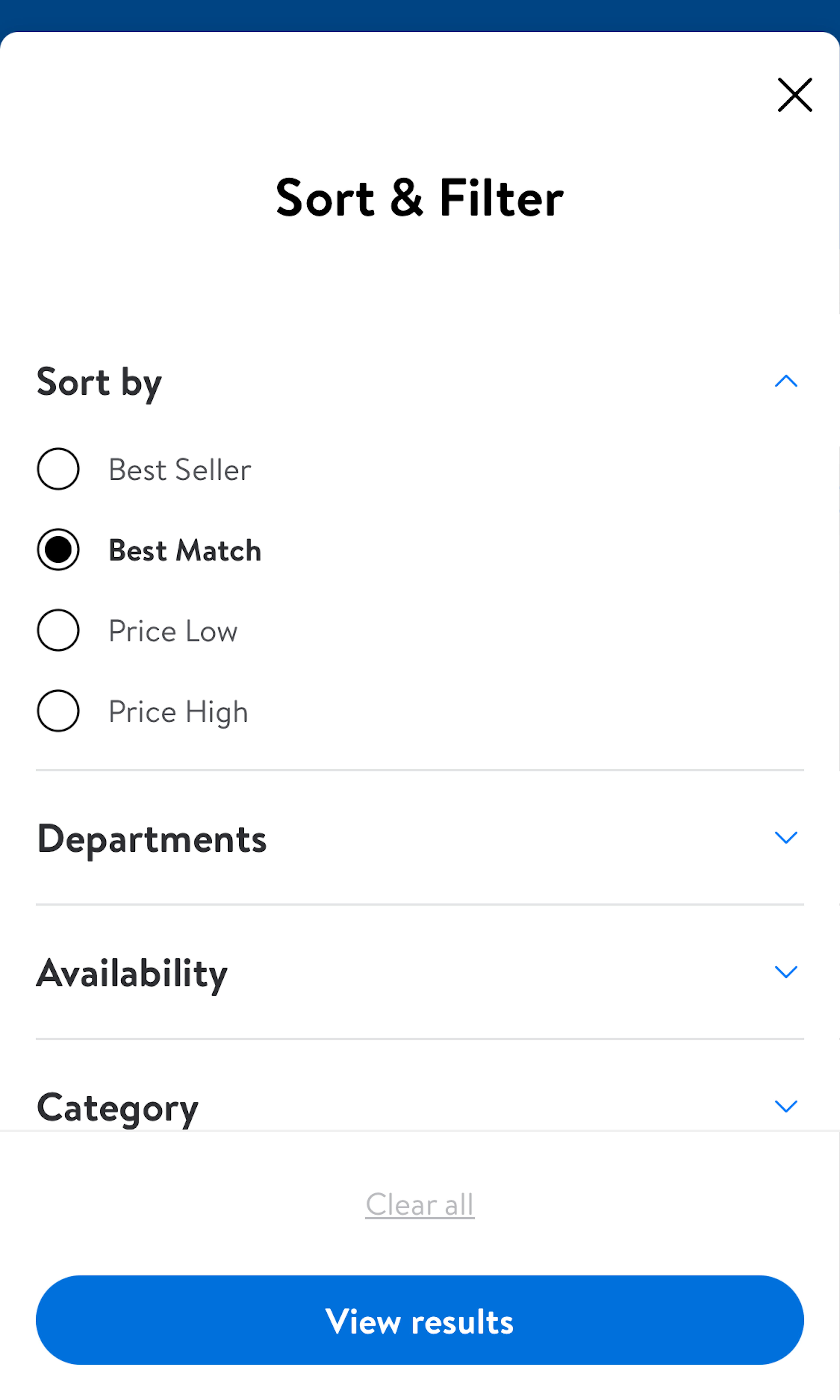
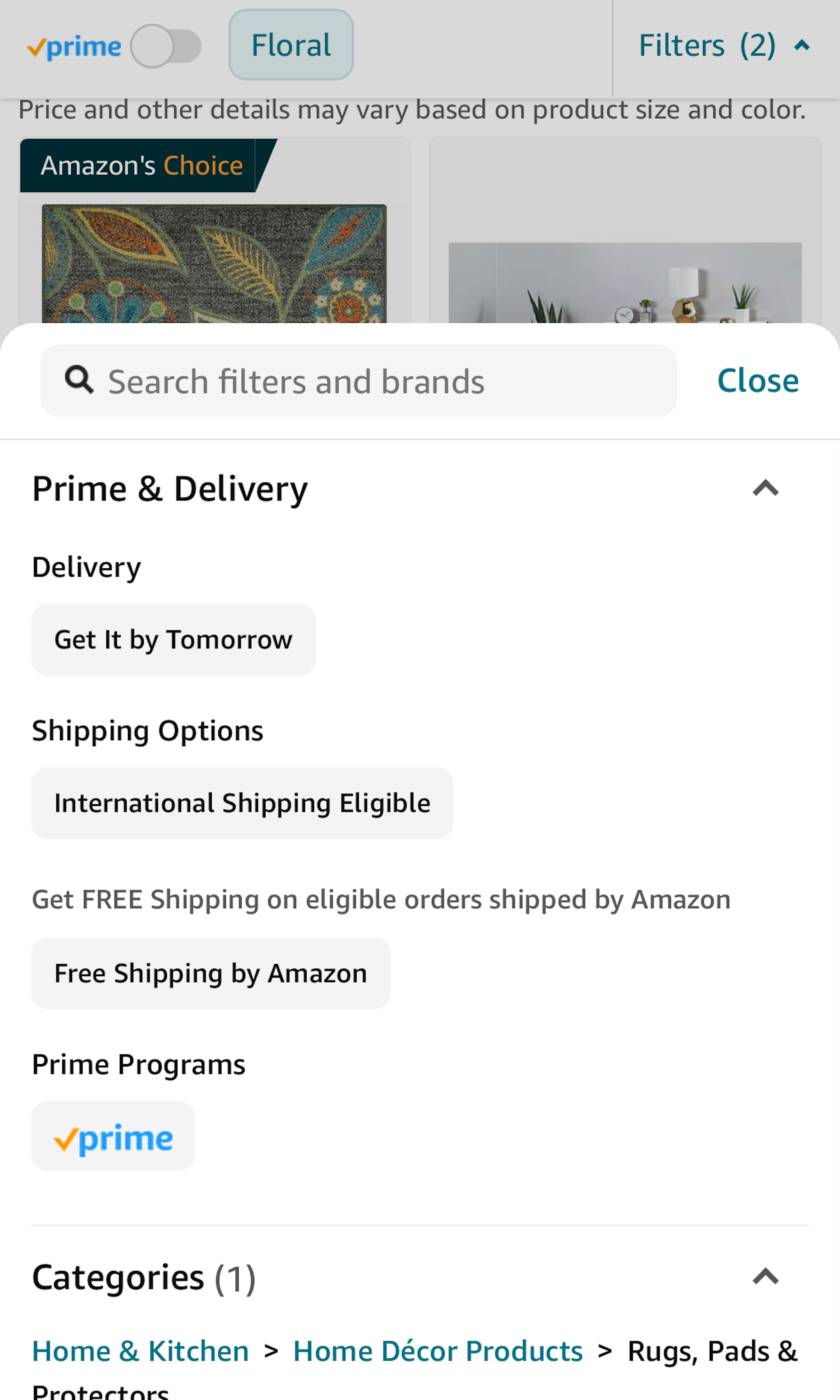
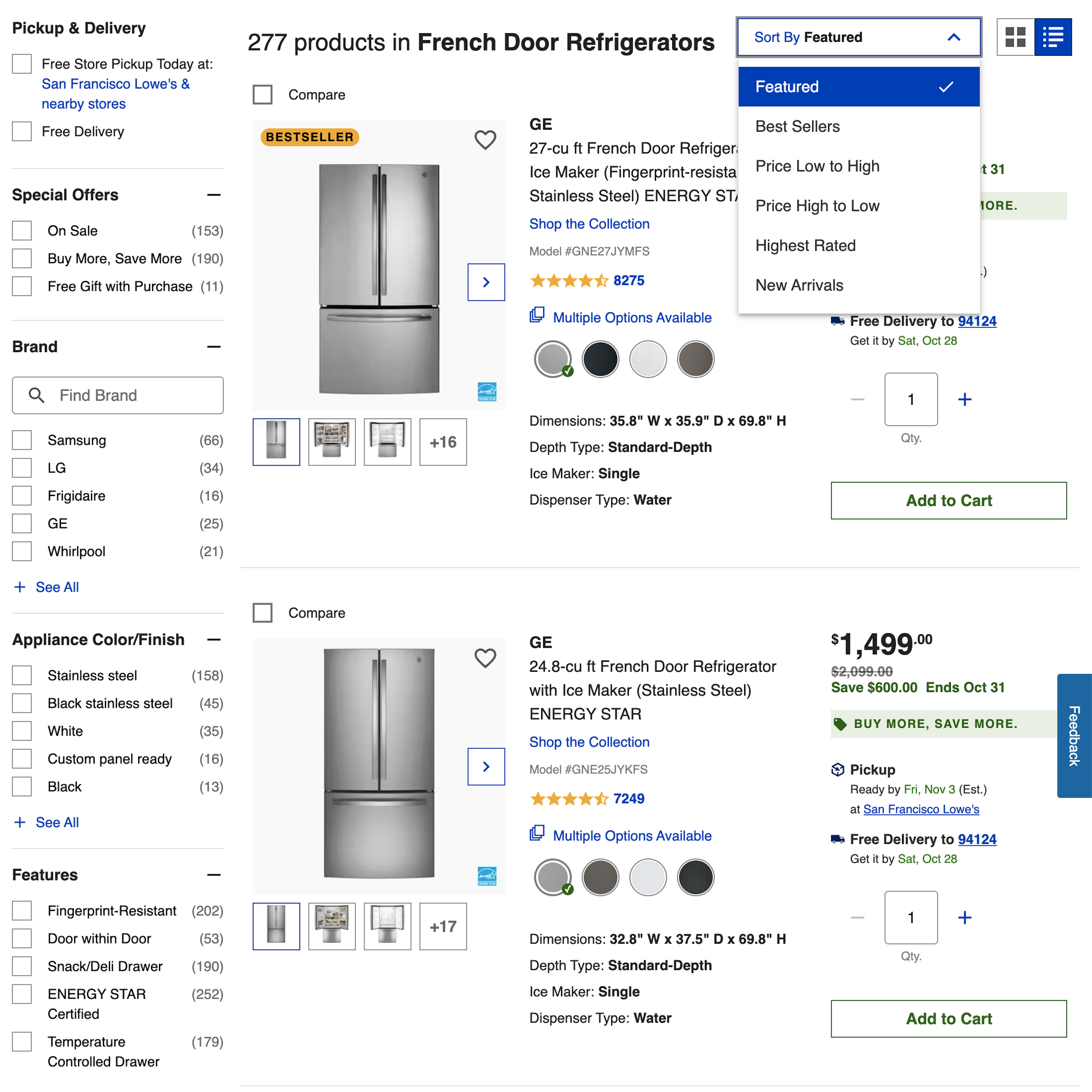
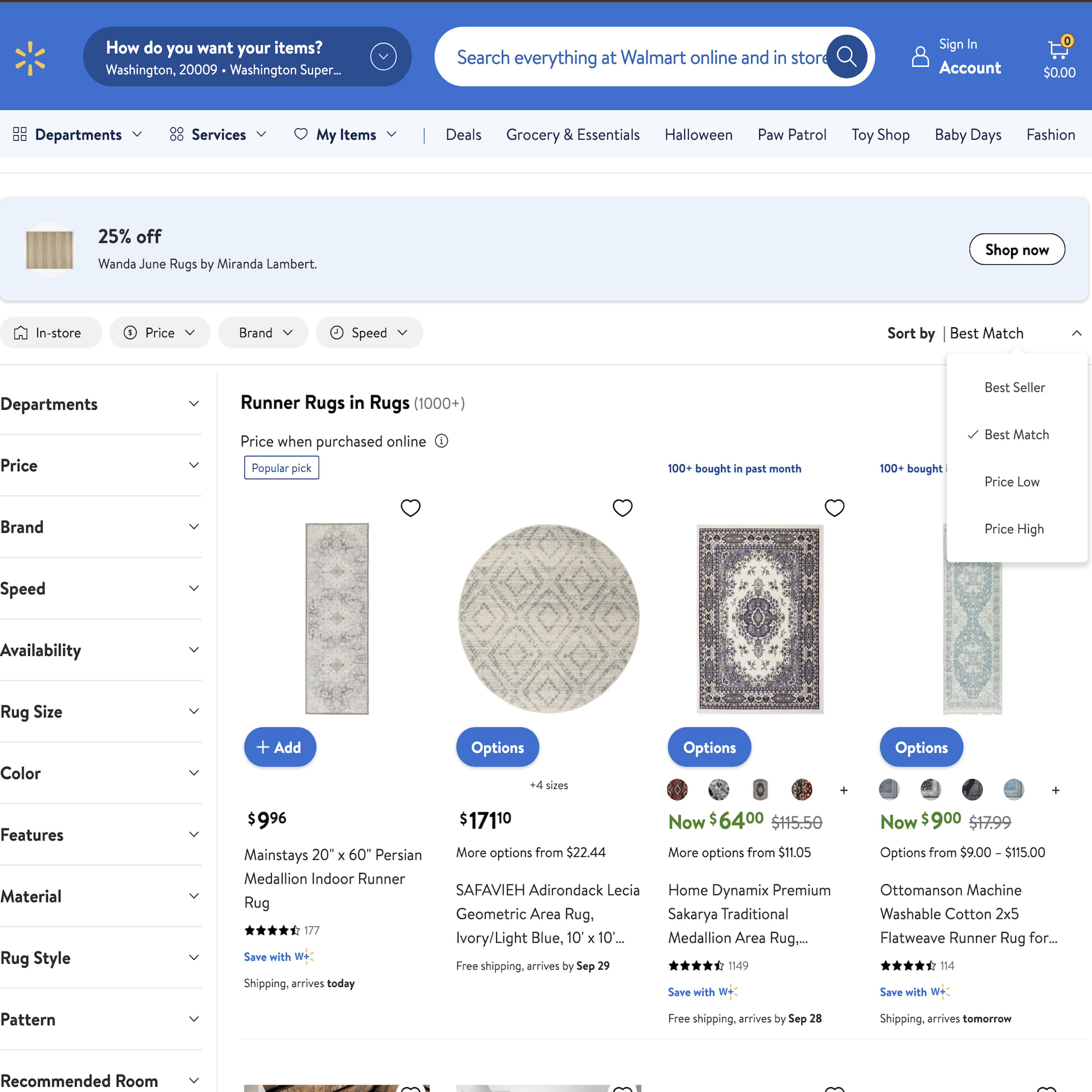
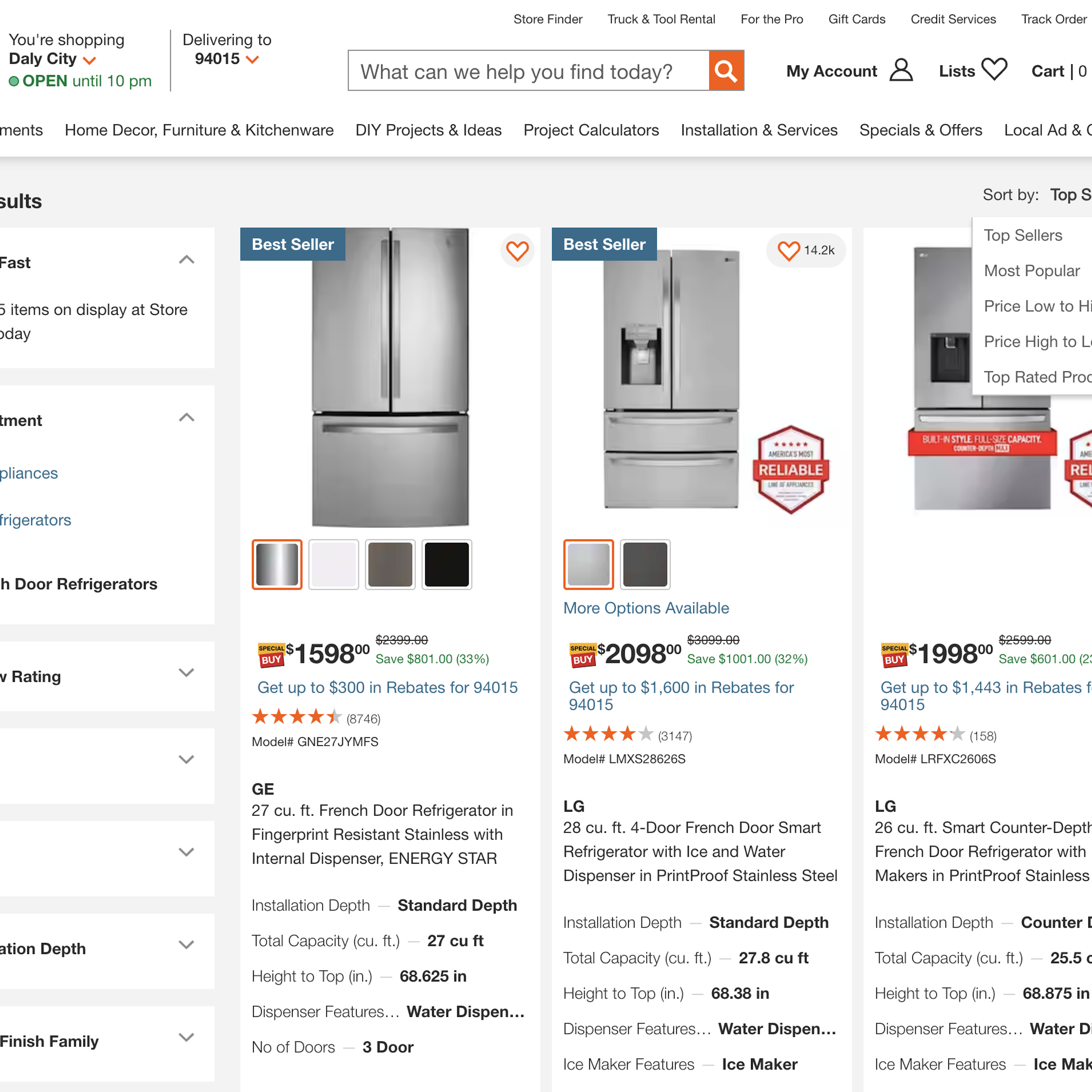
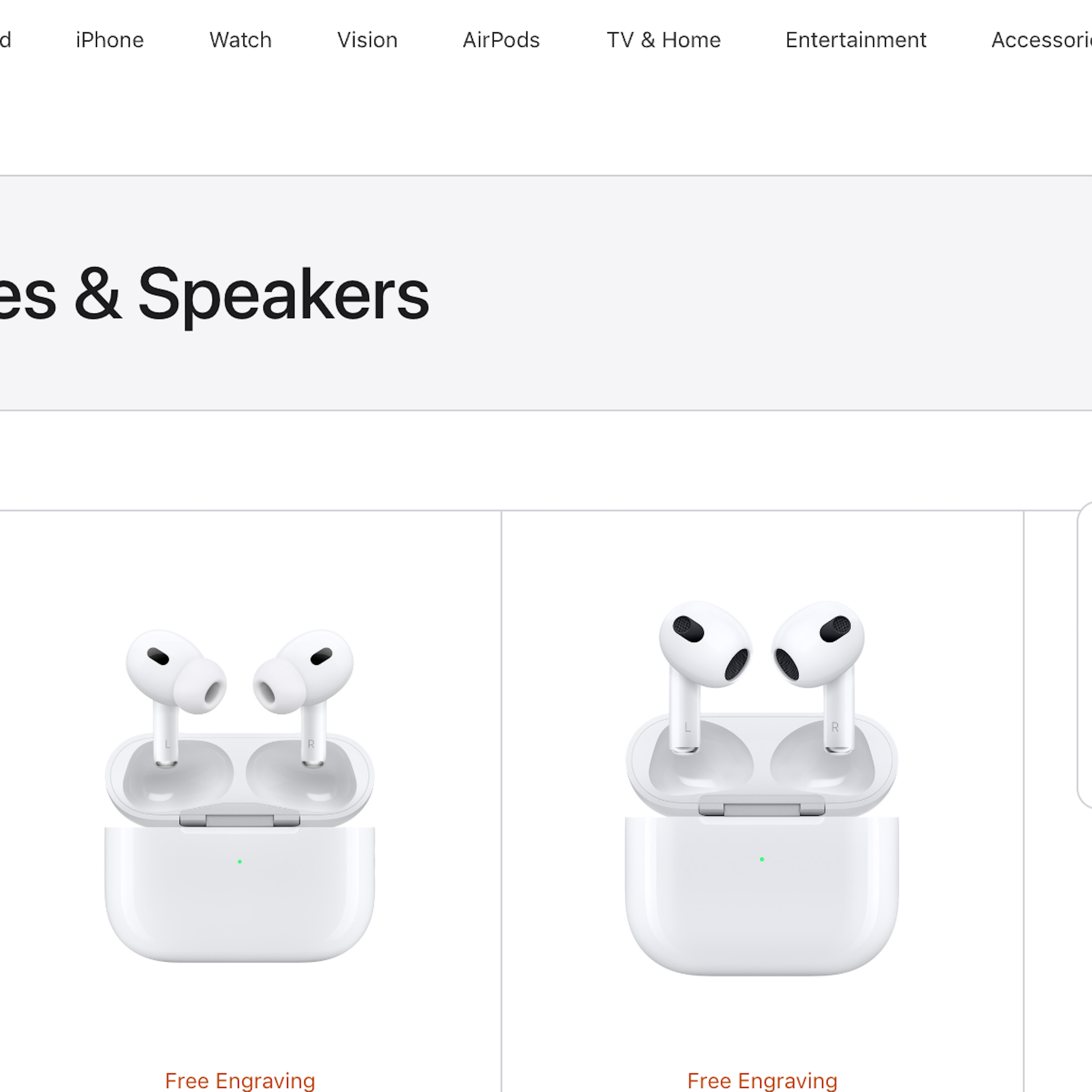
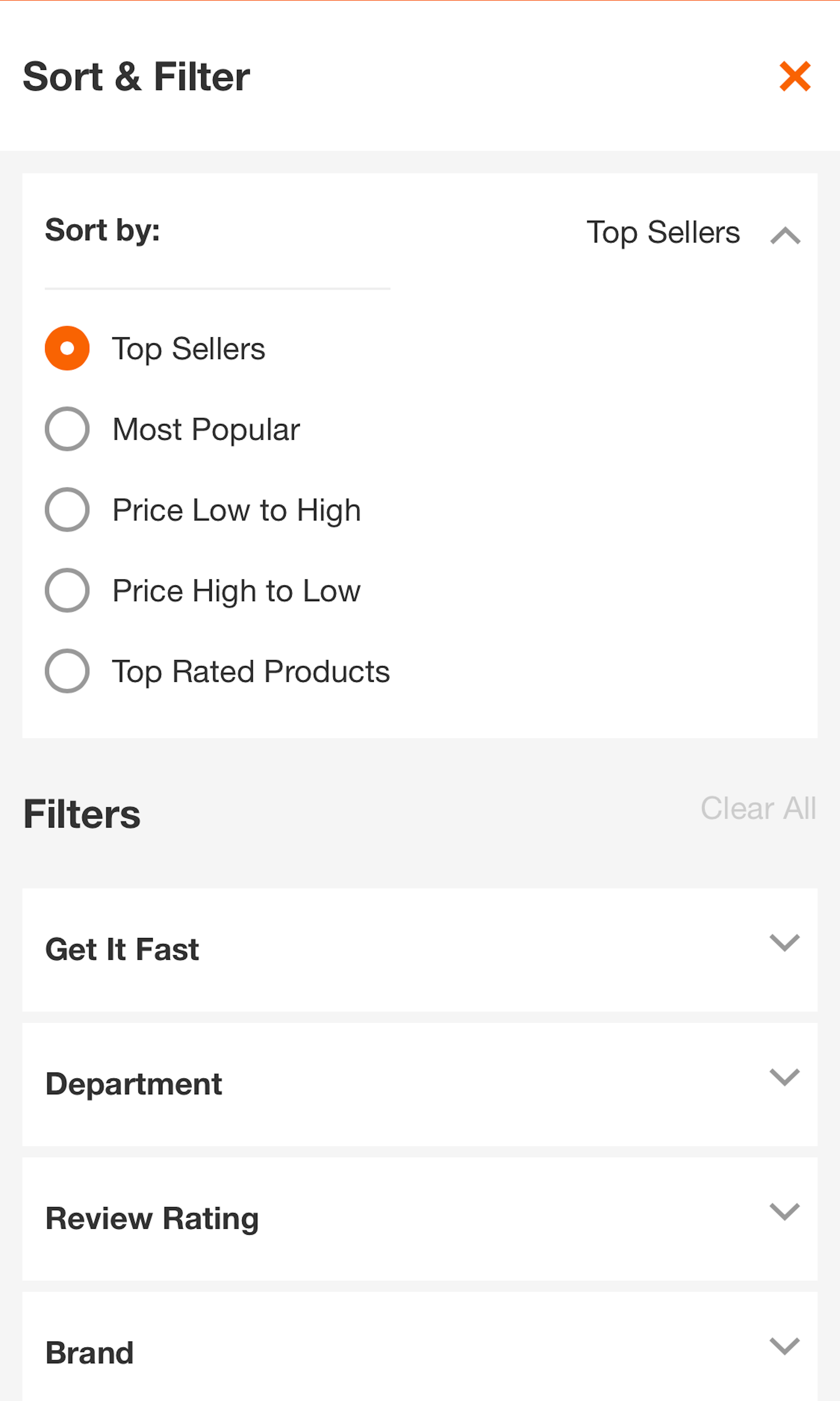
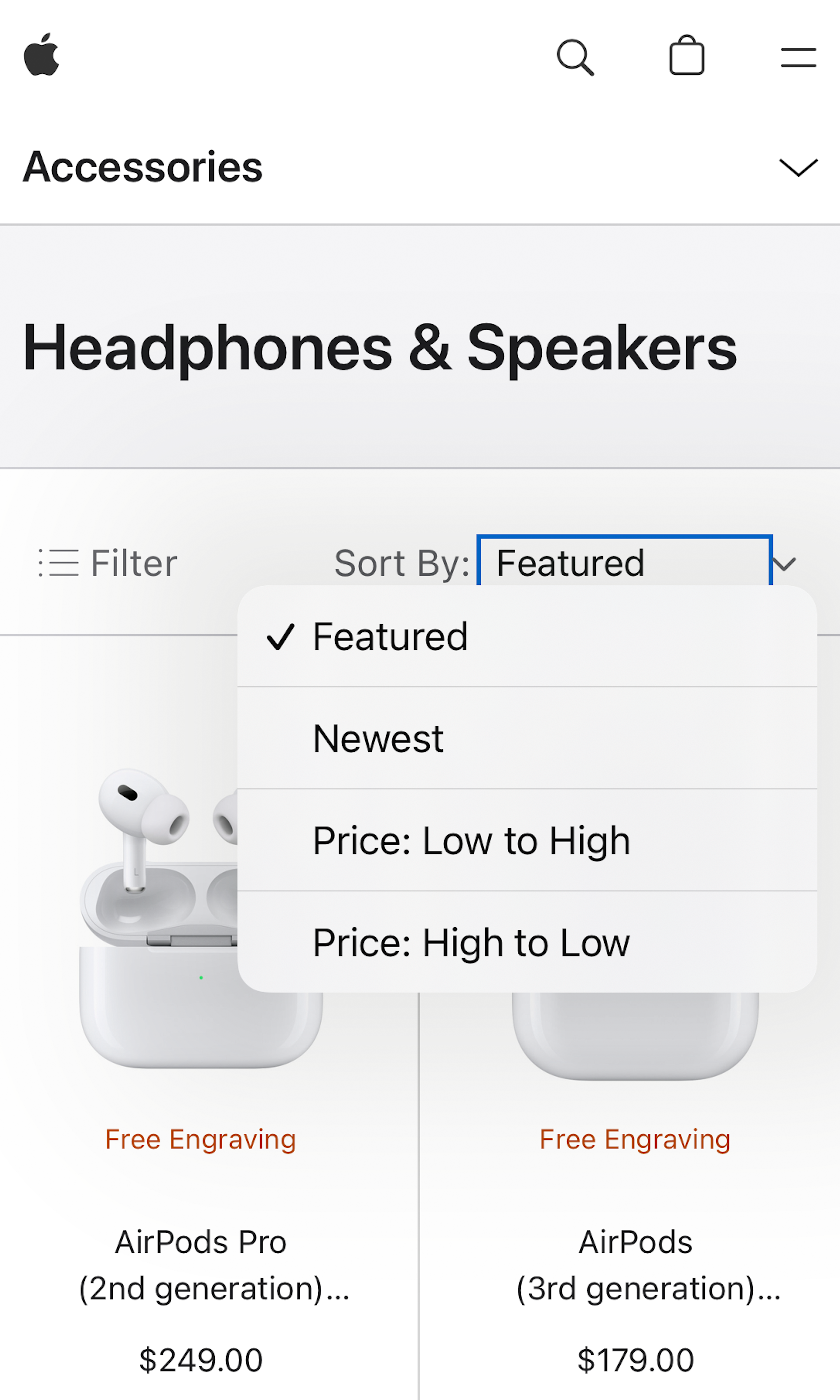
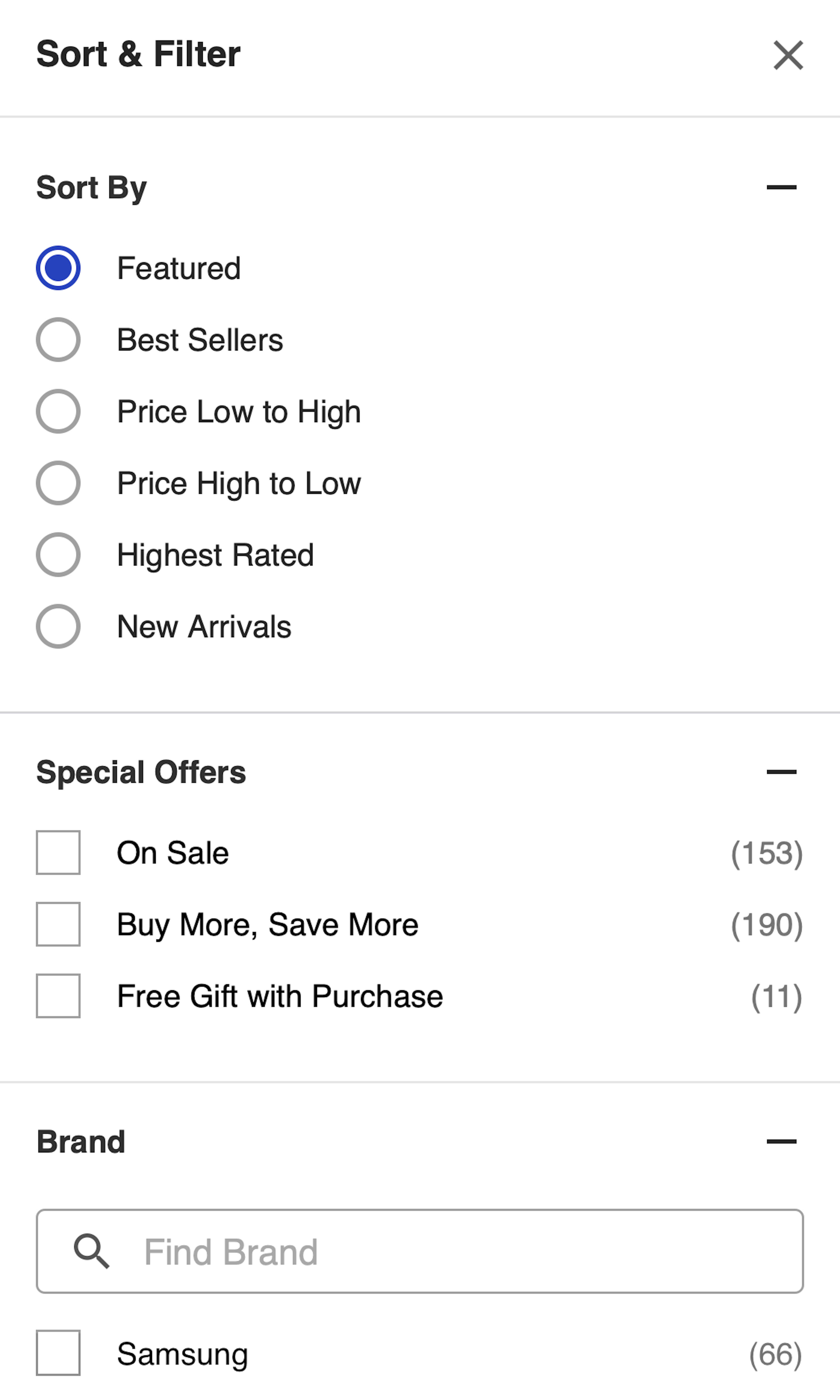
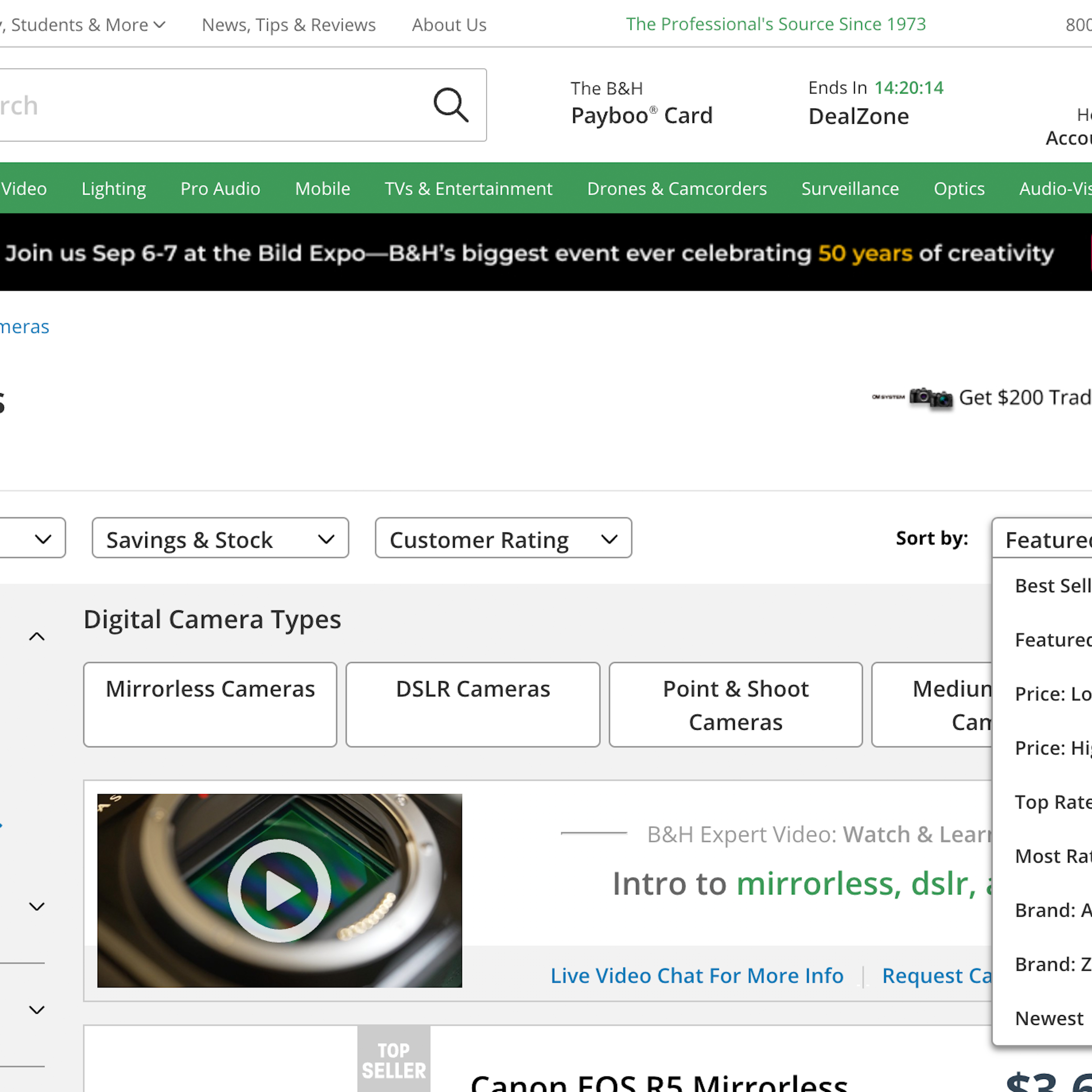
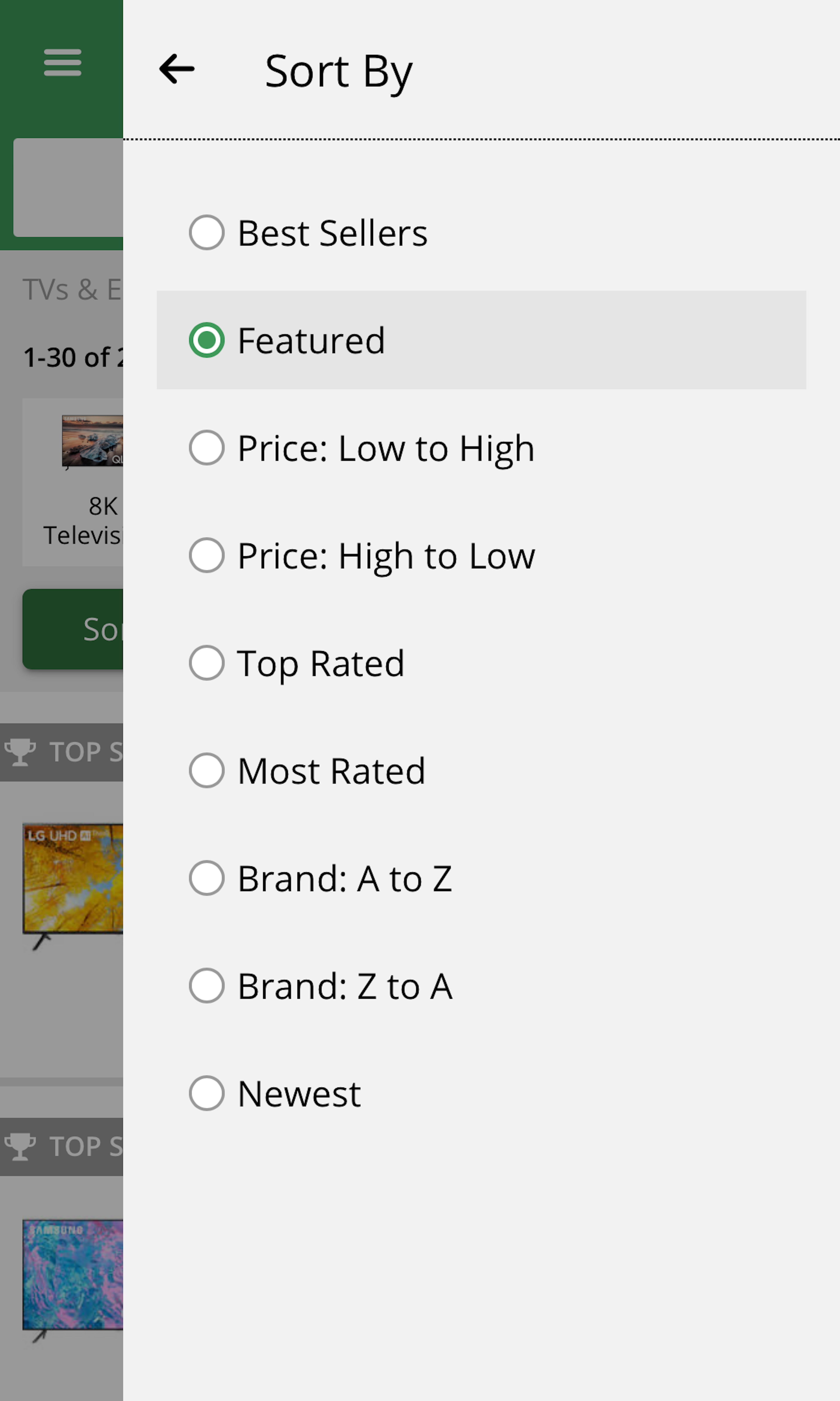
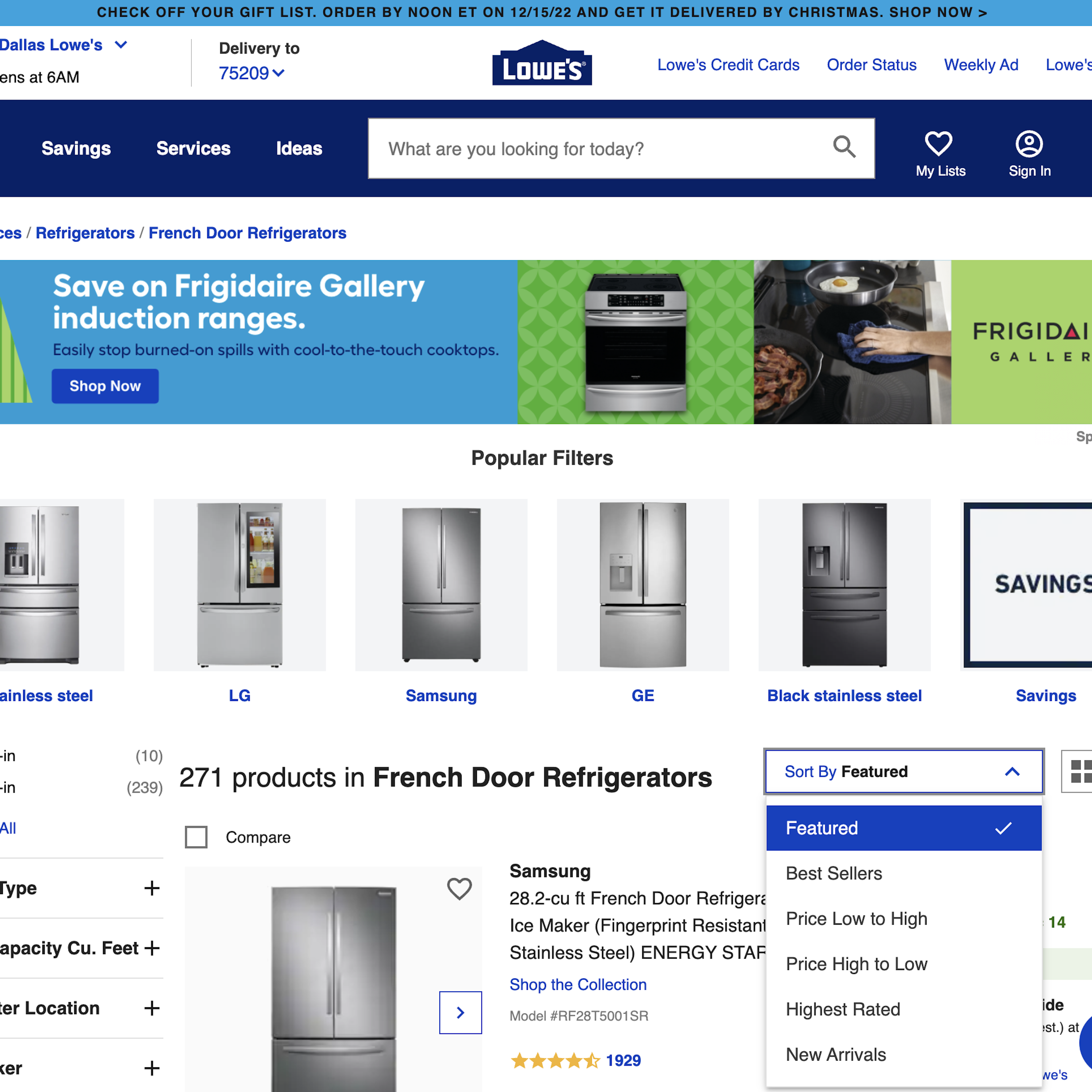
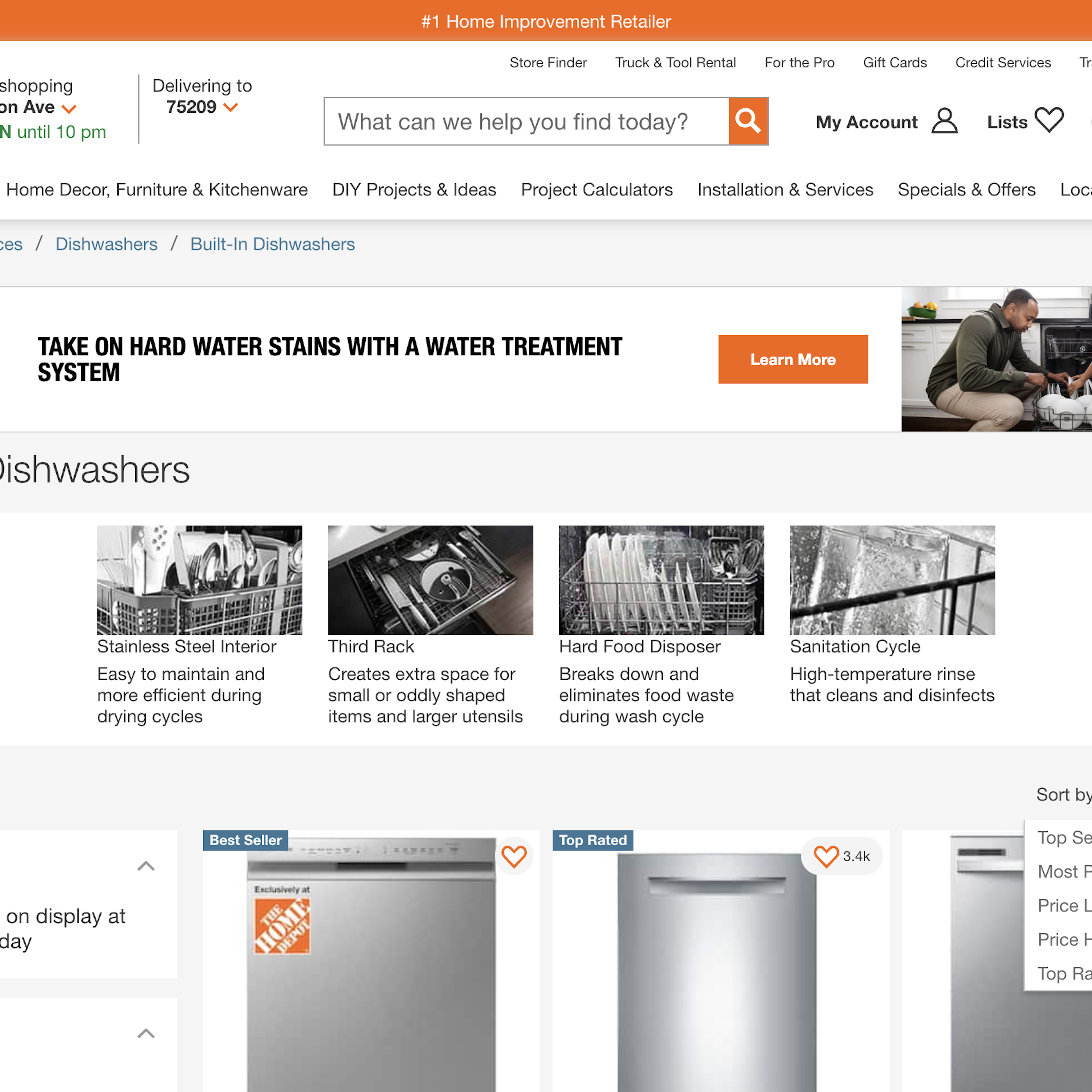
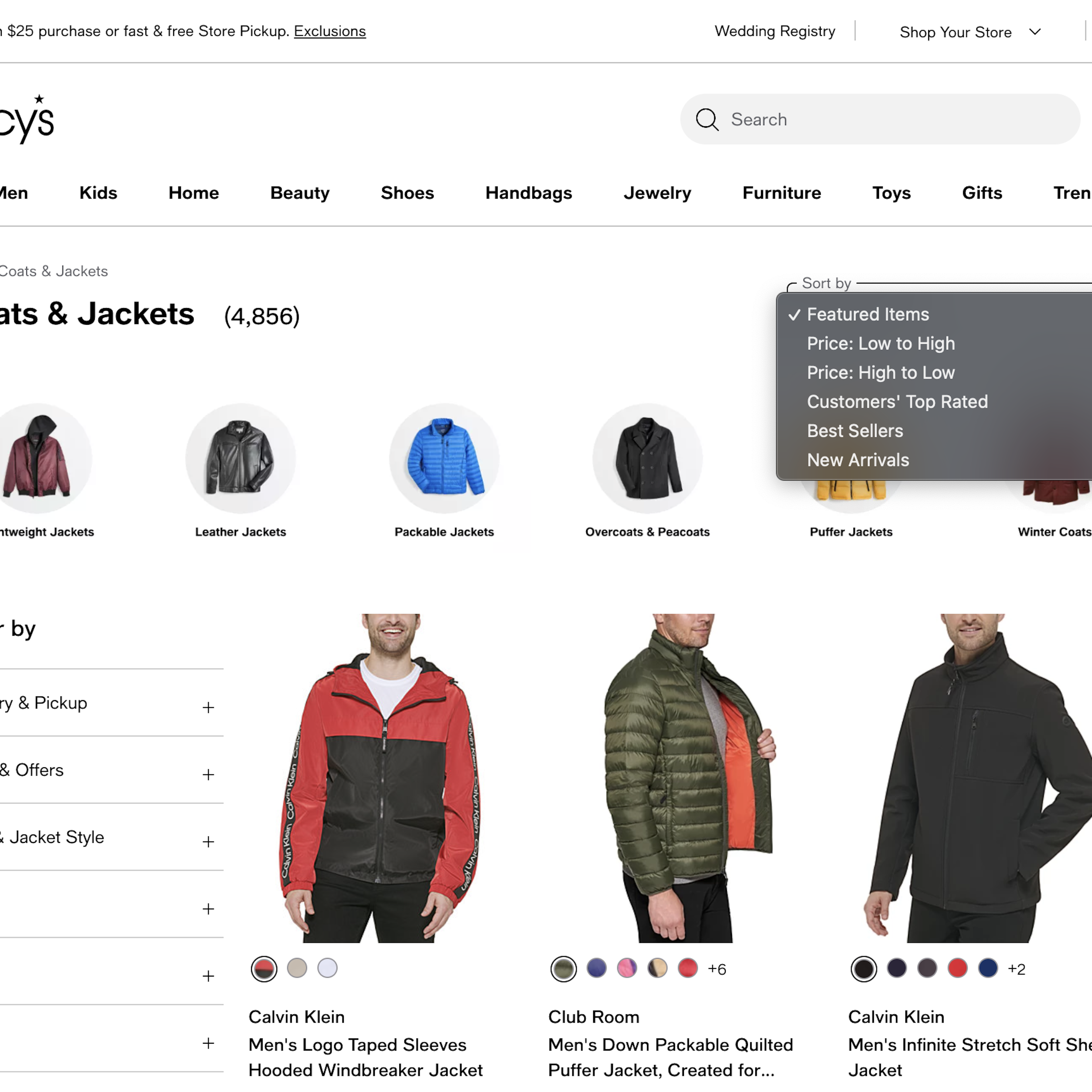
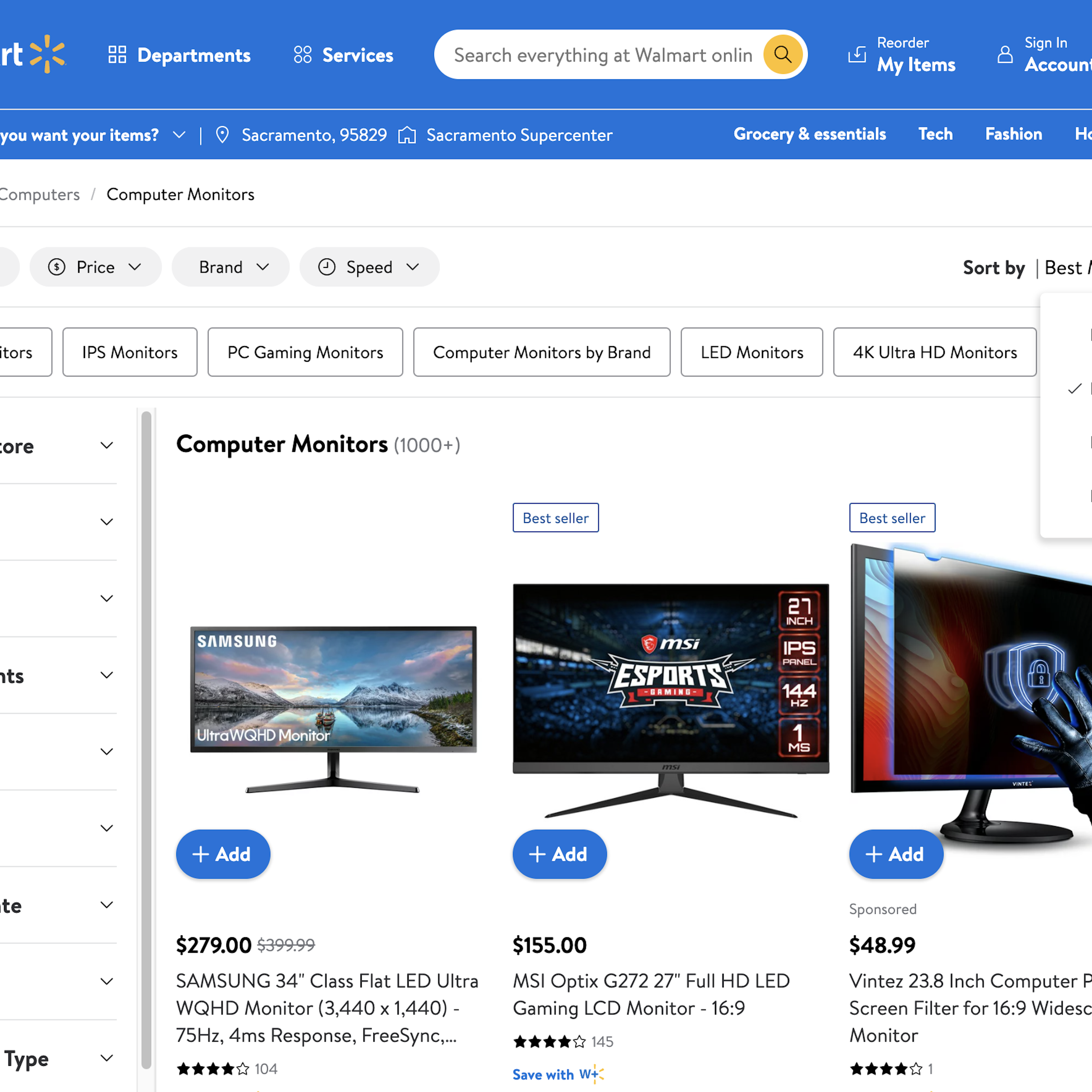
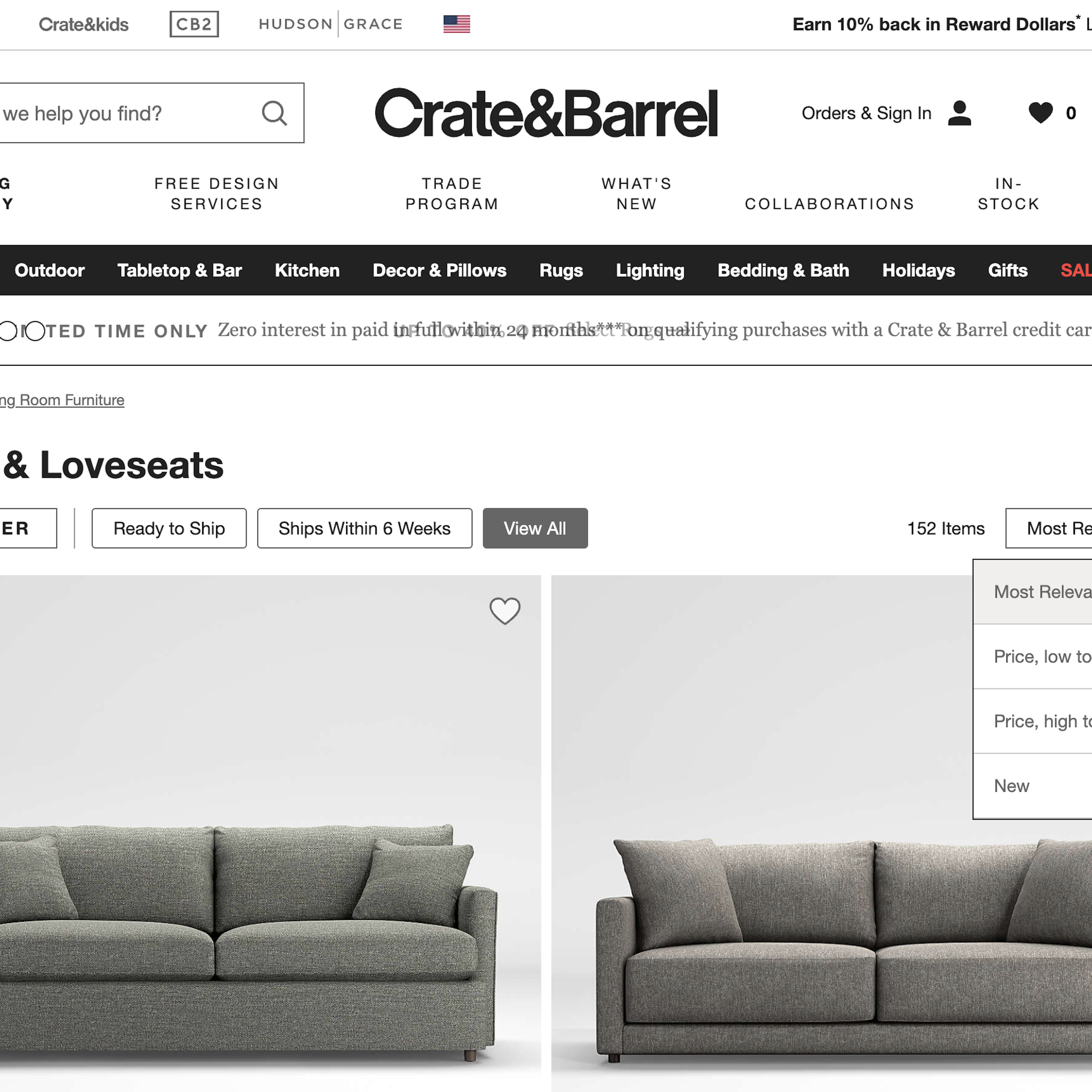
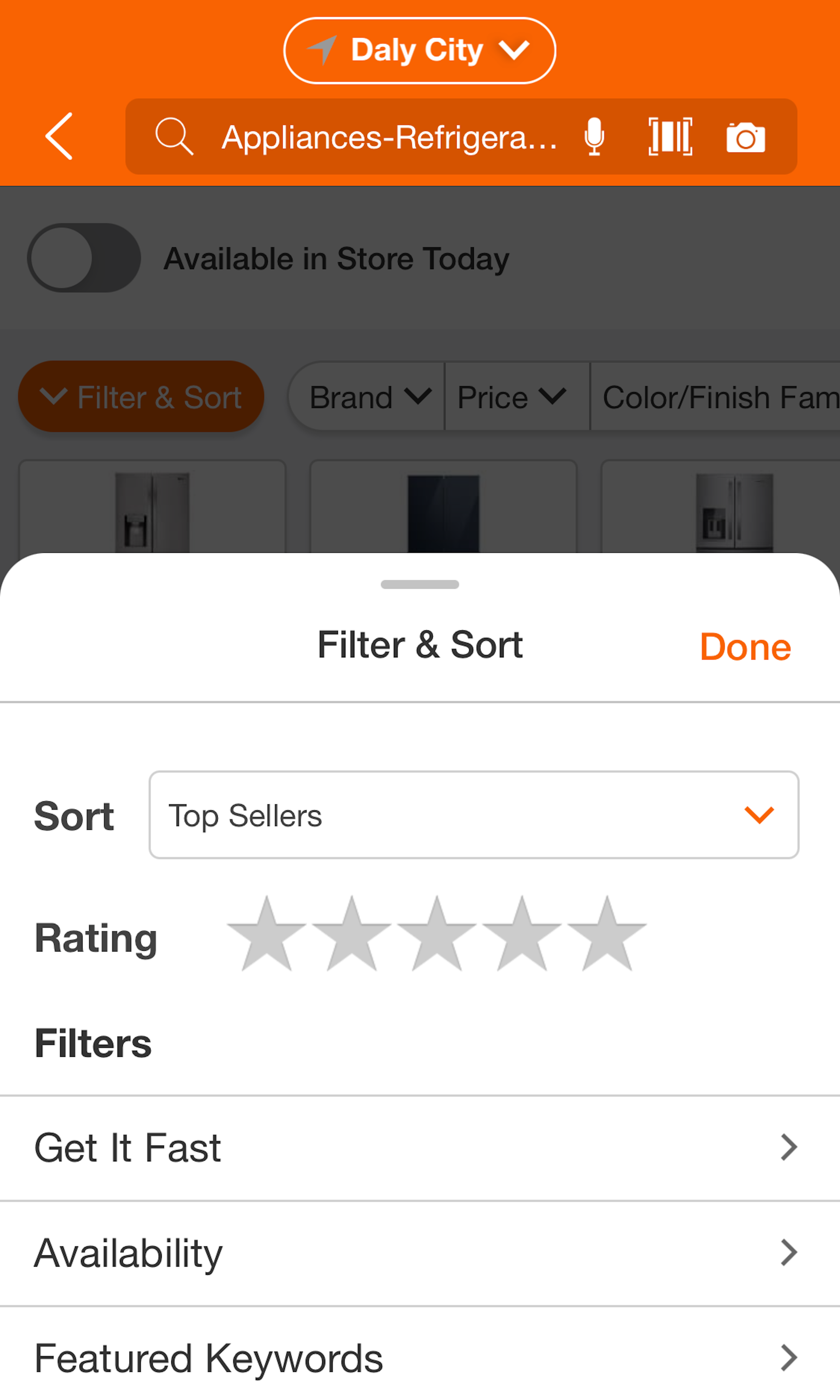
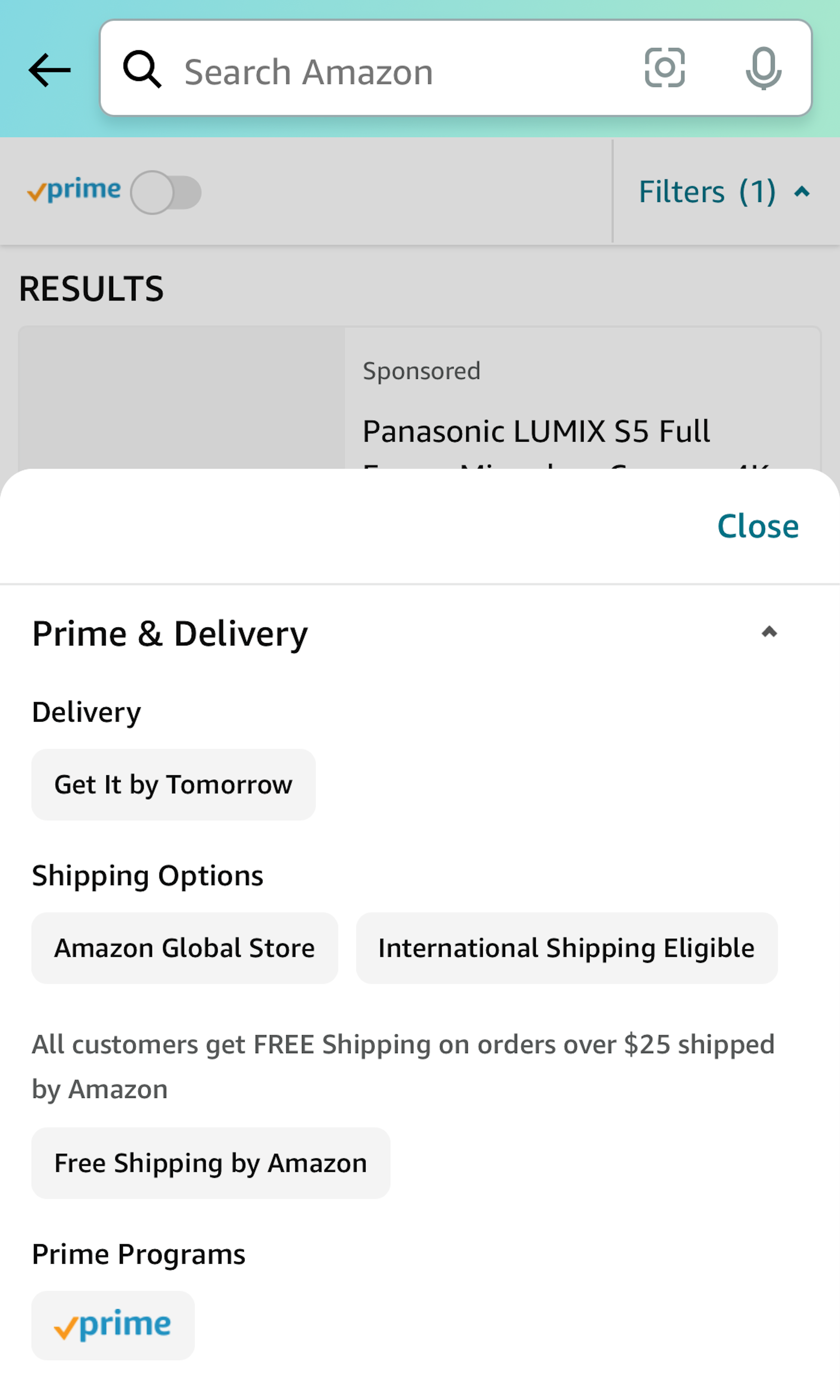
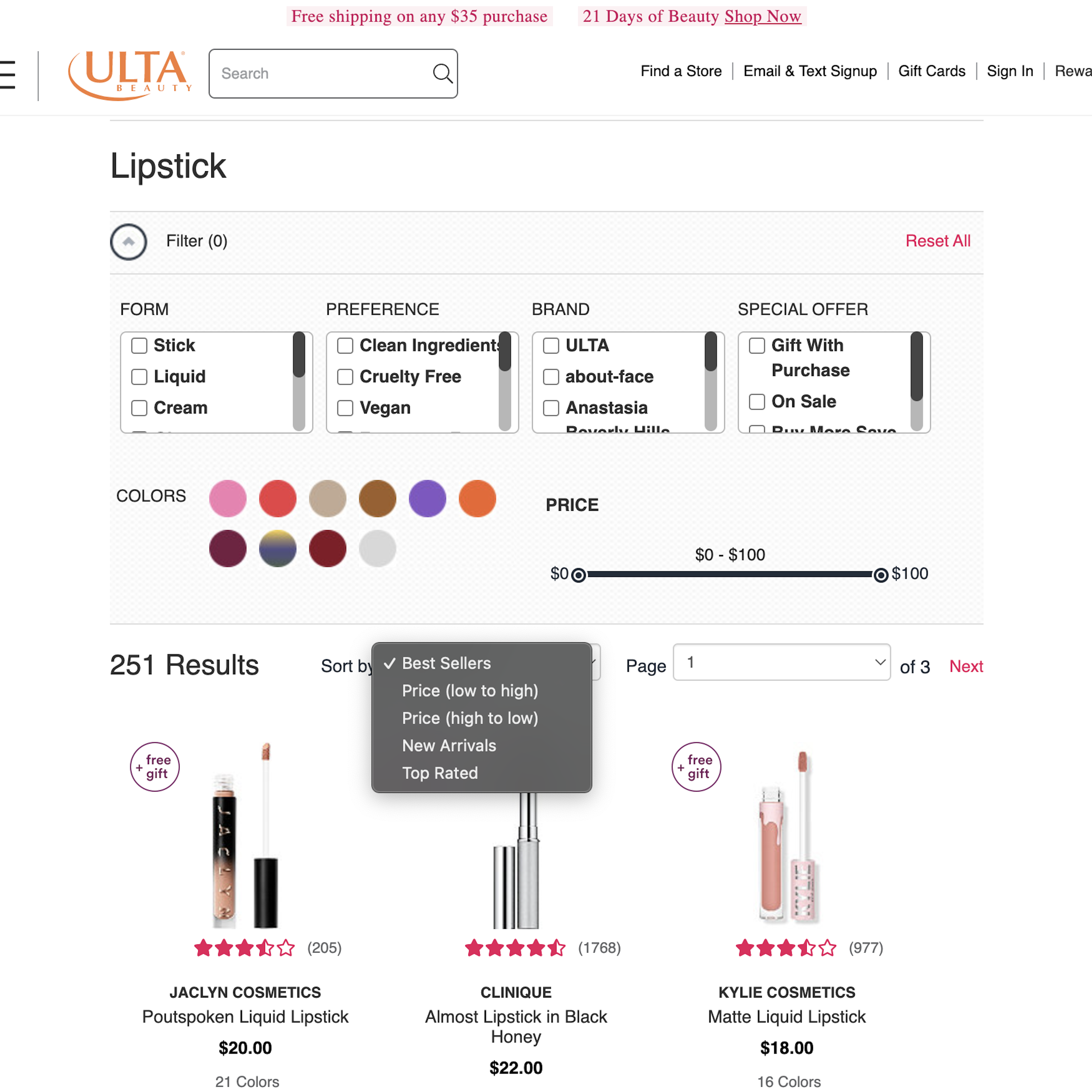
695 ‘Sorting Tool’ Design Examples
Also referred to as: Sort Feature, Product Sorting
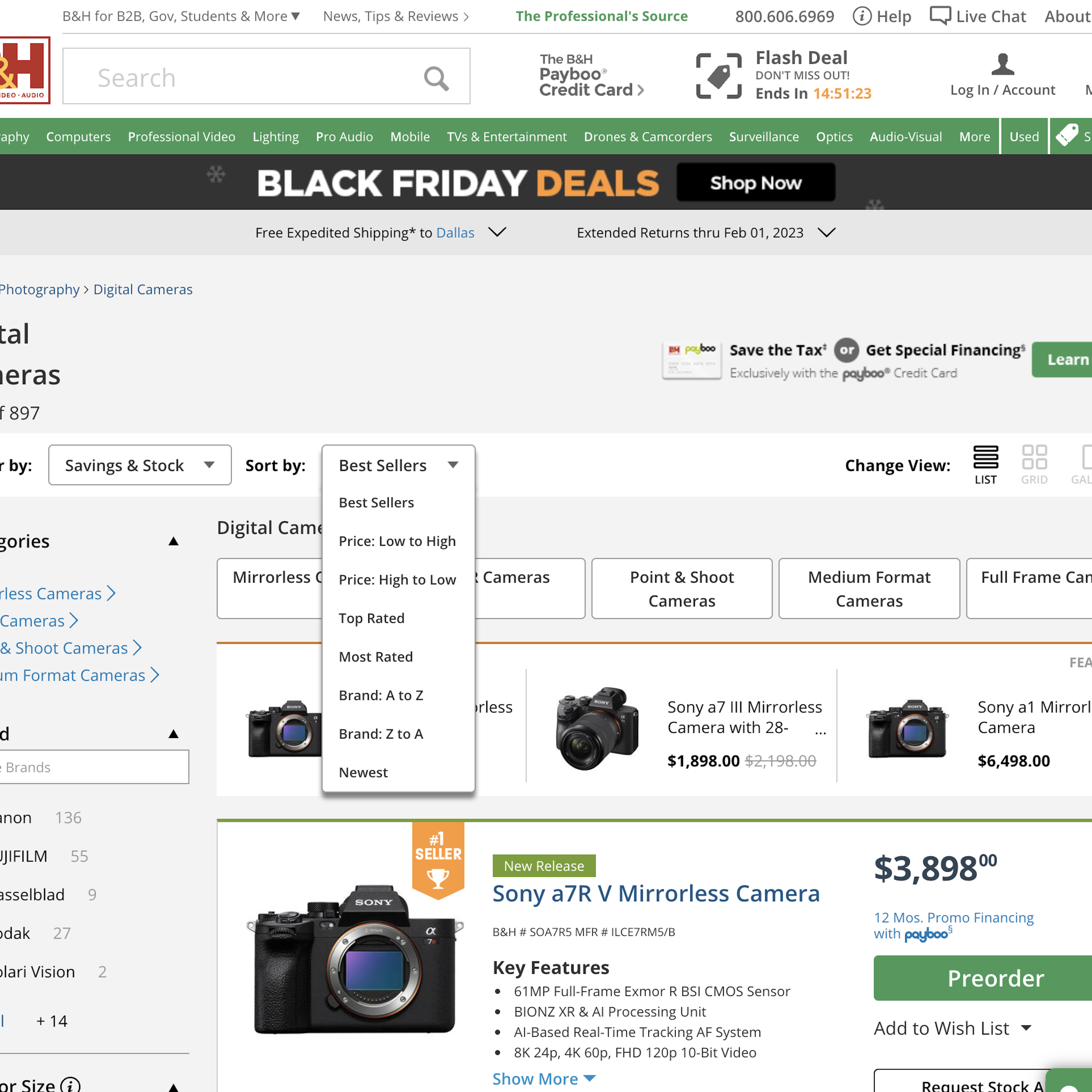
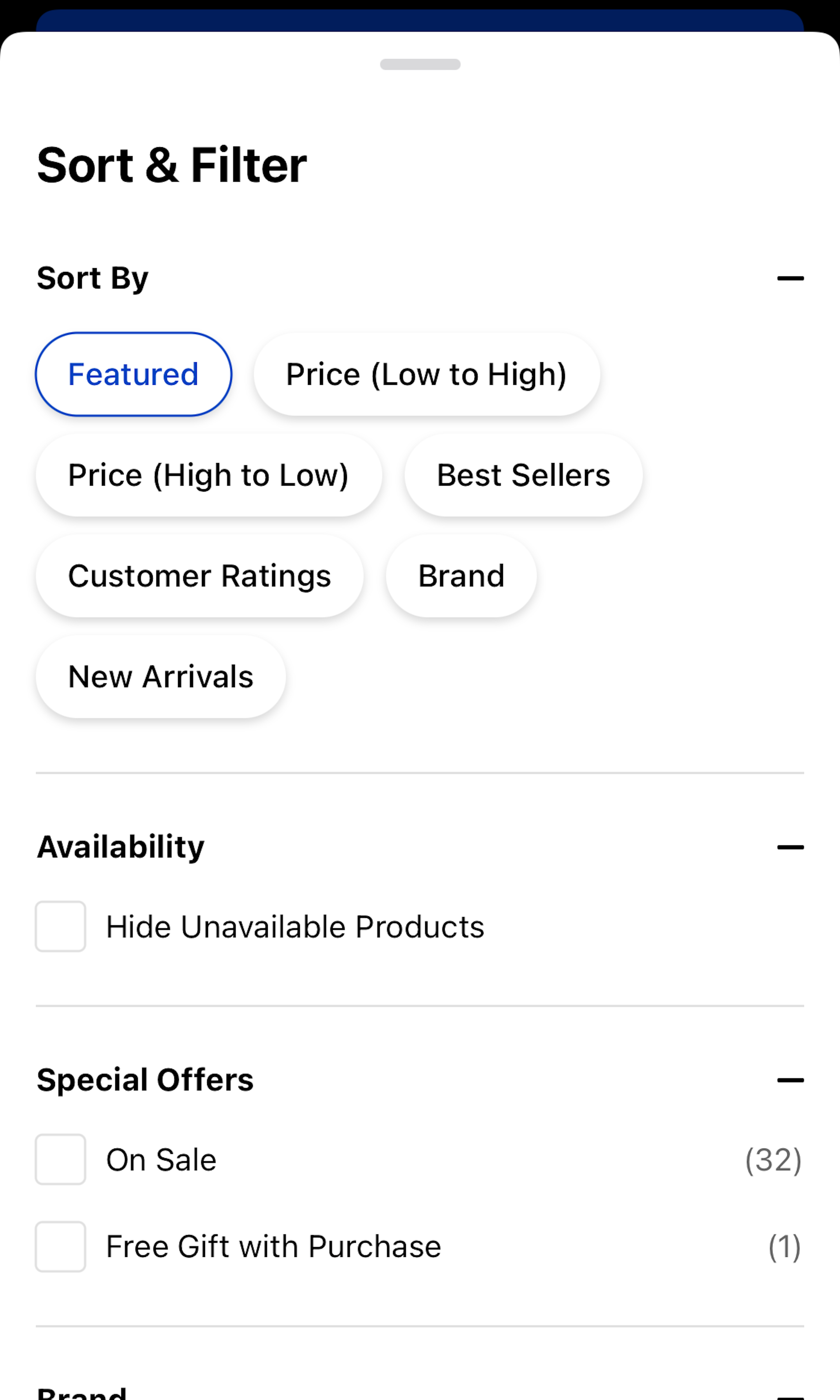
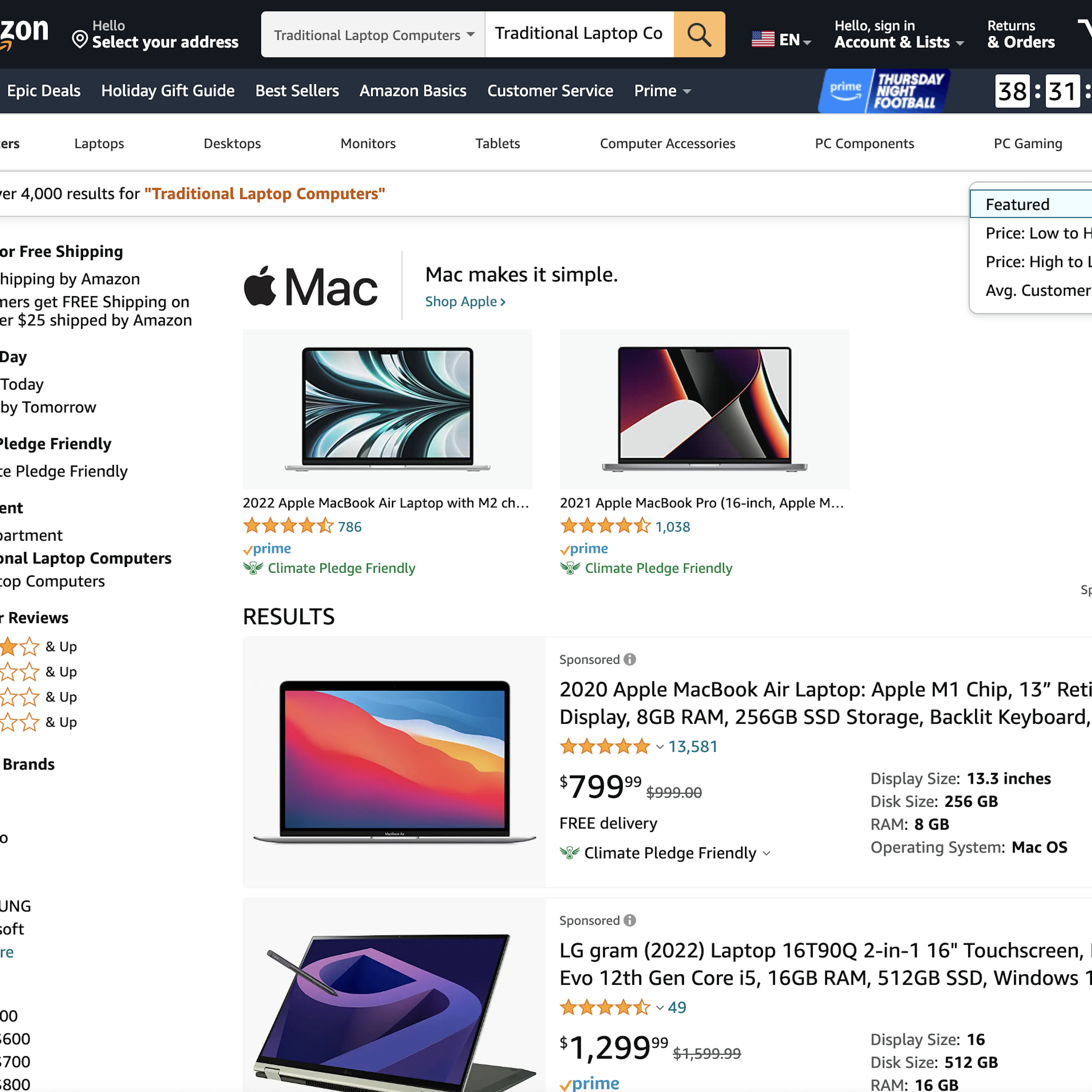
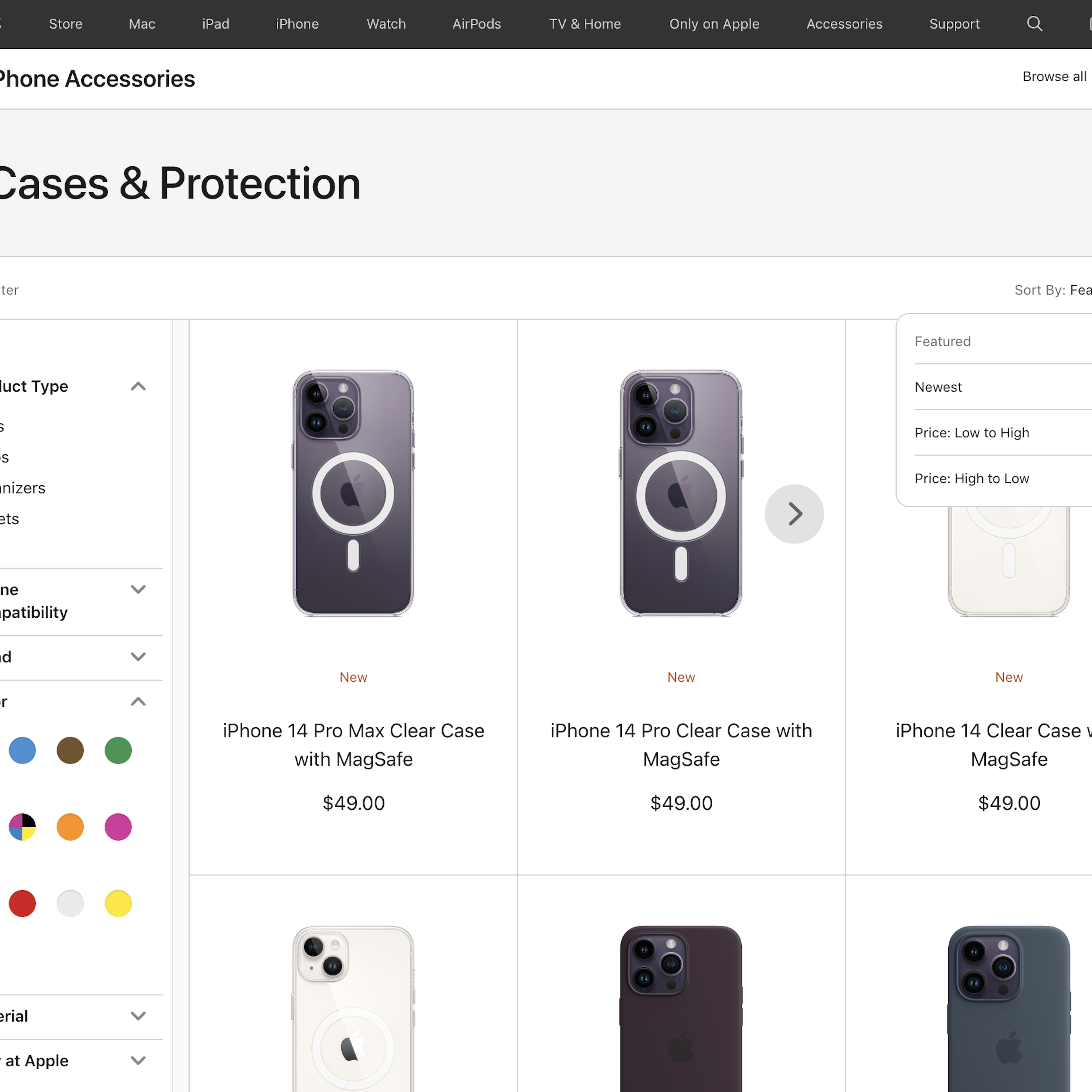
What’s this? Here you’ll find 695 “Sorting Tool” full-page screenshots annotated with research-based UX insights, sourced from Baymard’s UX benchmark of 325 e-commerce sites. (Note: this is less than 1% of the full research catalog.)
Solid sorting features enable users to order products by the attributes they care about — something that can dramatically speed up the user’s product-exploration and -selection process.
During Baymard’s large-scale usability testing sorting proved to be a crucial part of the users’ product-finding process. Sorting is particularly popular as a soft-boundary alternative to filtering, with many users frequently opting to sort rather than filter because they don’t have a strict range in mind (”I care about cost, but I haven’t decided on a specific budget”), or for parameters where the user lacks the necessary domain knowledge to specify the hard cut-off points required by a filter.
More ‘Sorting Tool’ Insights
-
Our testing shows that sorting is a generally under-prioritized area of e-commerce that has remained largely unchanged for the past 10–15 years (the entire history of modern e-commerce), with little-to-no innovation. In fact, some sites have started removing sorting features from their product lists altogether in a misguided attempt at simplification. This trend and general stagnation stands in sharp contrast to how important sorting features are to users.
-
Even for users with extensive domain knowledge or just general web shrewdness, in testing sorting proved to be a powerful feature and was often combined with filtering (“I filter the cameras for ‘water resistant’ models and $300–$500, and then sort that list by customer ratings to see the ‘best ones’ first”).
-
Learn More: Besides exploring the 695 “Sorting Tool” page design examples below, you may also want to read our related article on “Don’t Base ‘Customer Ratings’ Sorting on Averages Only” and “Category-Specific Sorting: A New Way to Sort Products”.
-
Get Full Access: To see all of Baymard’s product list and filtering research findings you’ll need Baymard Premium access. (Premium also provides you full access to 150,000+ hours of UX research findings, 650+ e-commerce UX guidelines, and 275,000+ UX performance scores.)
User Experience Research, Delivered Weekly
Join 60,000+ UX professionals and get a new UX article every week.

User Experience Research, Delivered Weekly
Join 60,000+ UX professionals and get a new UX article every week.

Explore Other Research Content

300+ free UX articles based on large-scale research.

325 top sites ranked by UX performance.

Code samples, demos, and key stats for usability.


