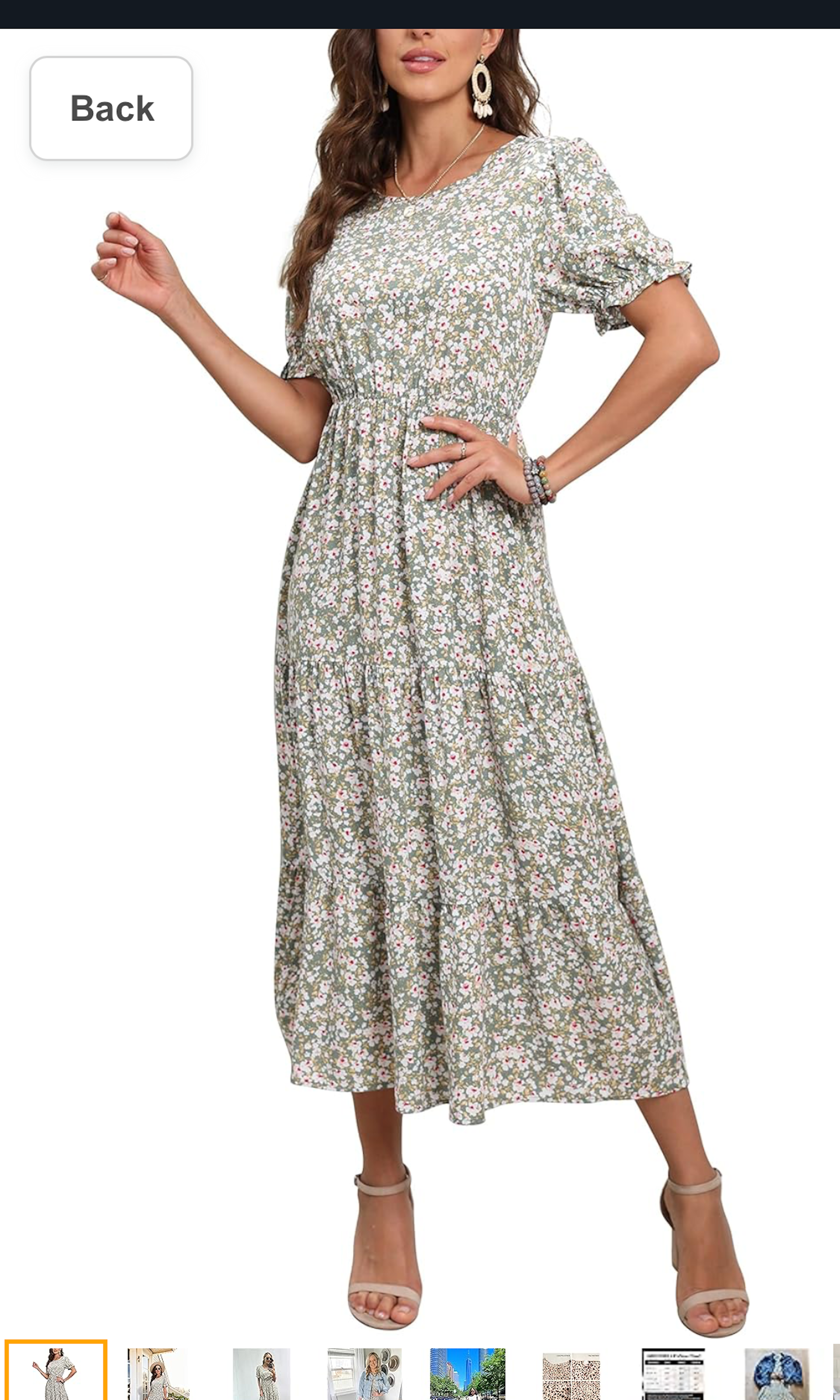
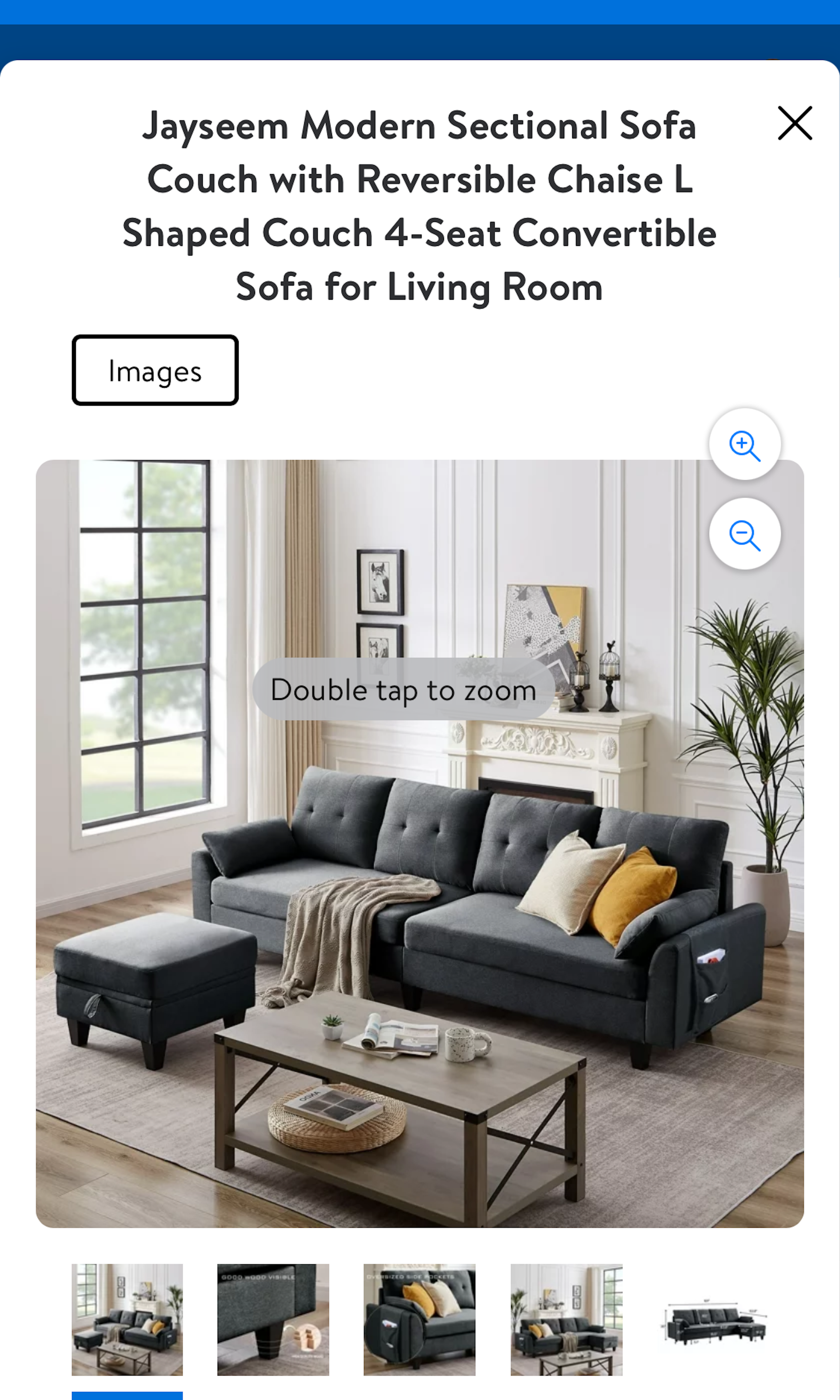
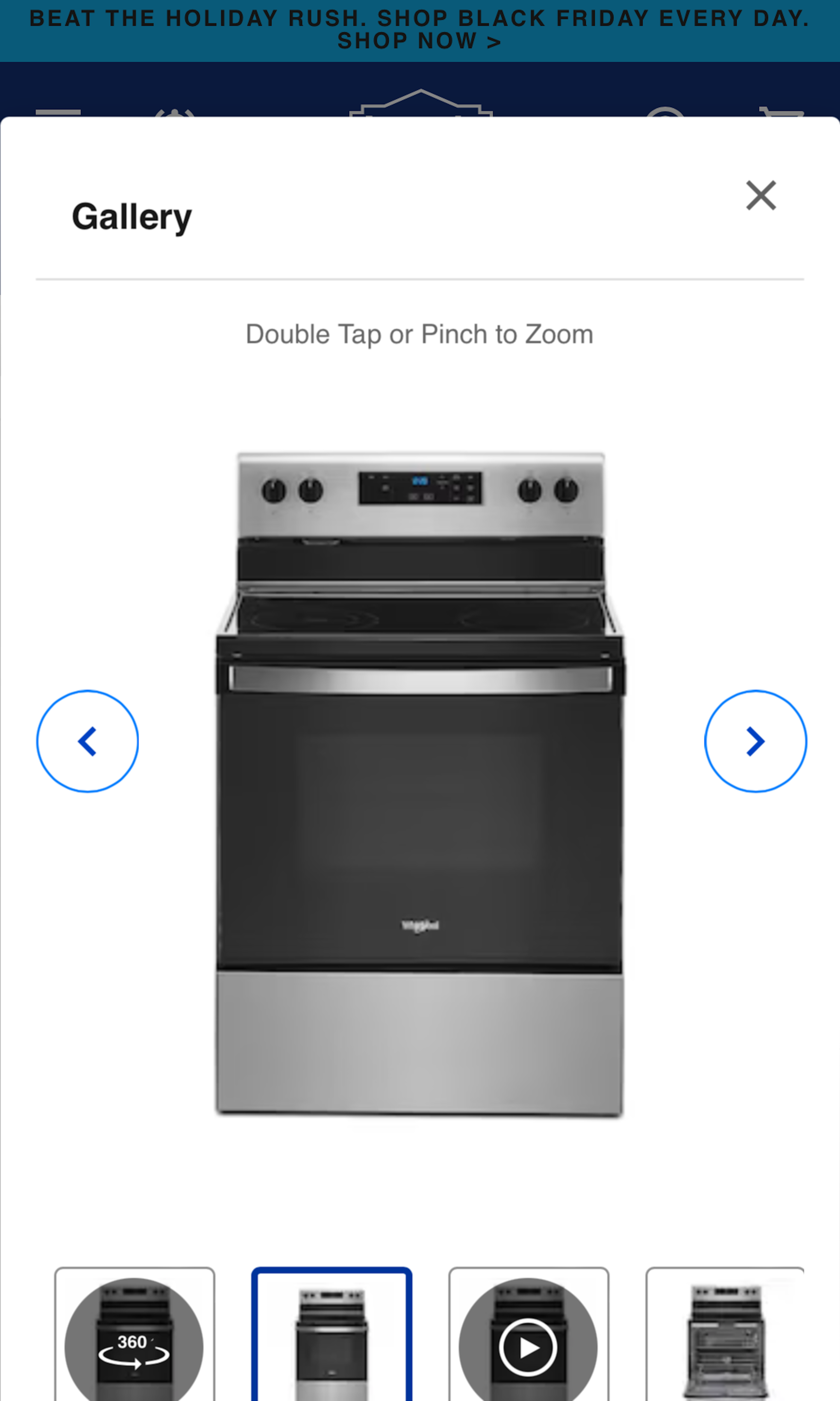
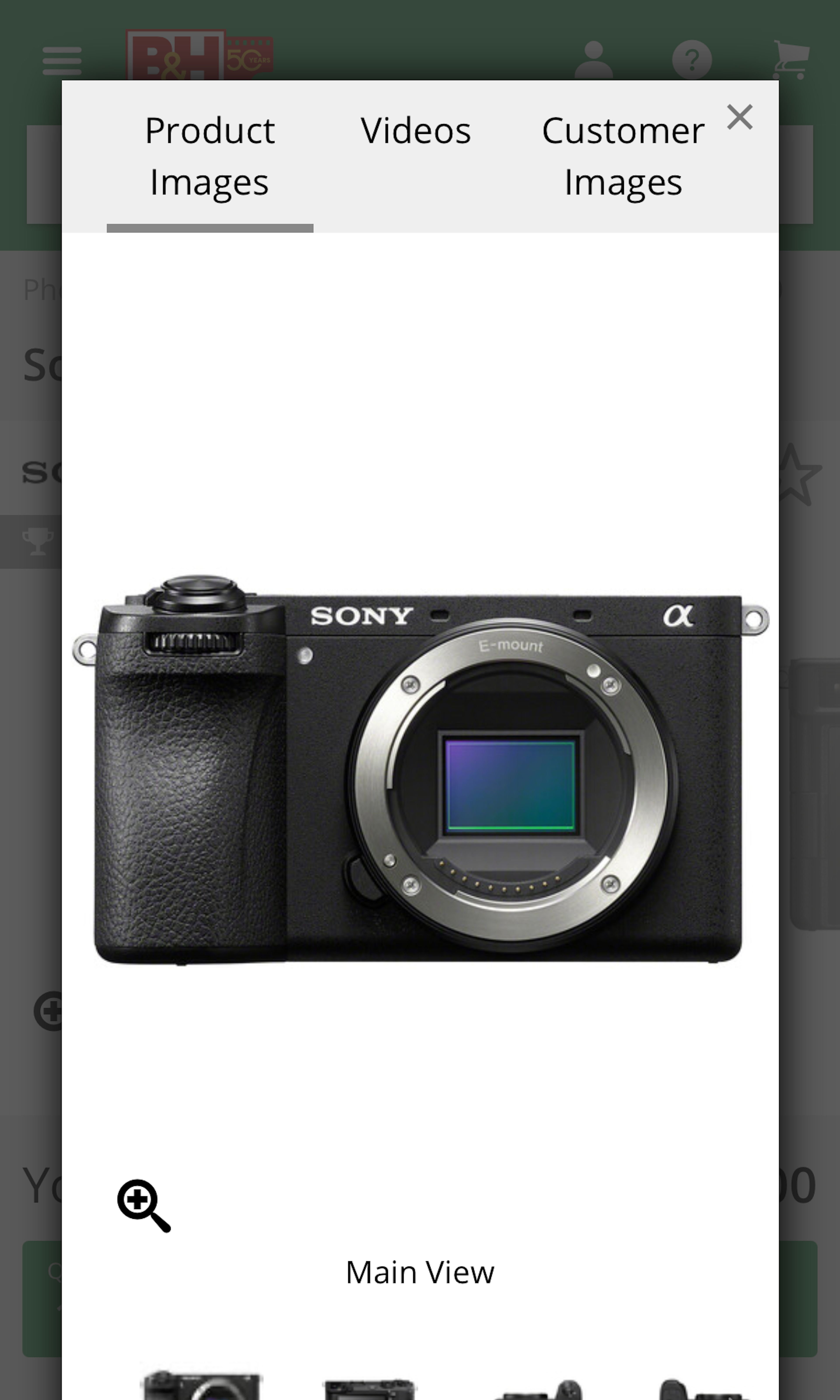
516 ‘Image Gallery Overlay’ Design Examples
Also referred to as: Product Image Overlay
What’s this? Here you’ll find 516 “Image Gallery Overlay” full-page screenshots annotated with research-based UX insights, sourced from Baymard’s UX benchmark of 327 e-commerce sites. (Note: this is less than 1% of the full research catalog.)
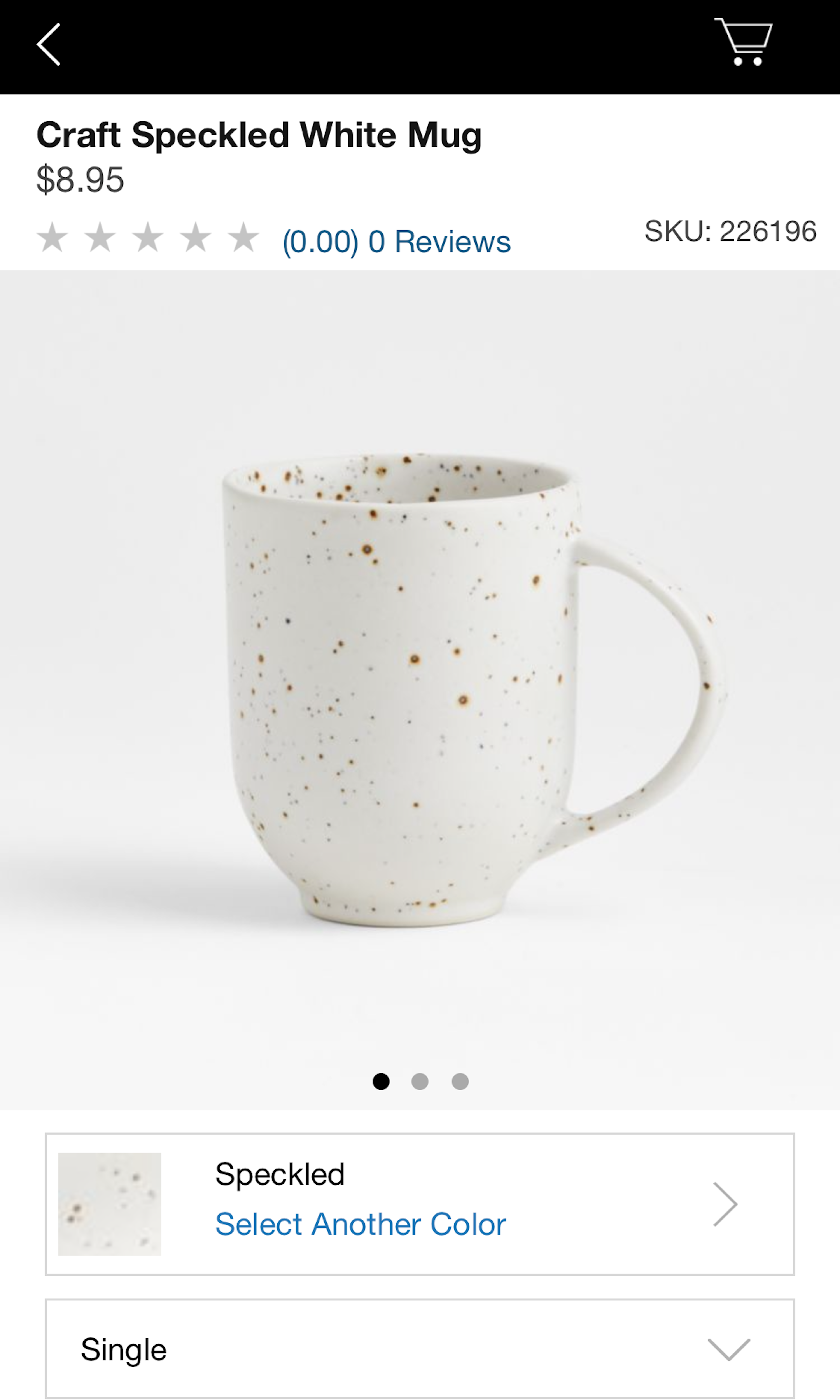
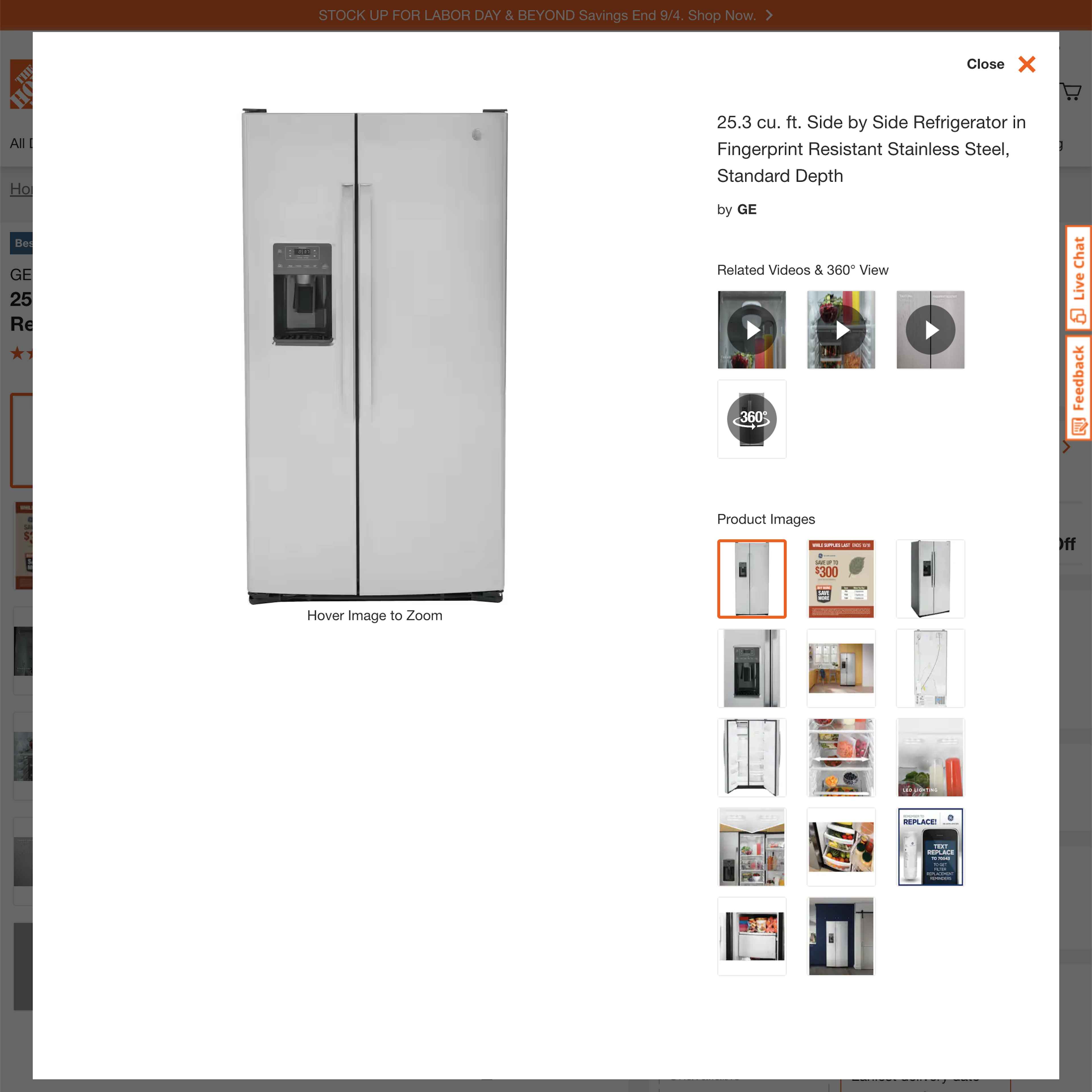
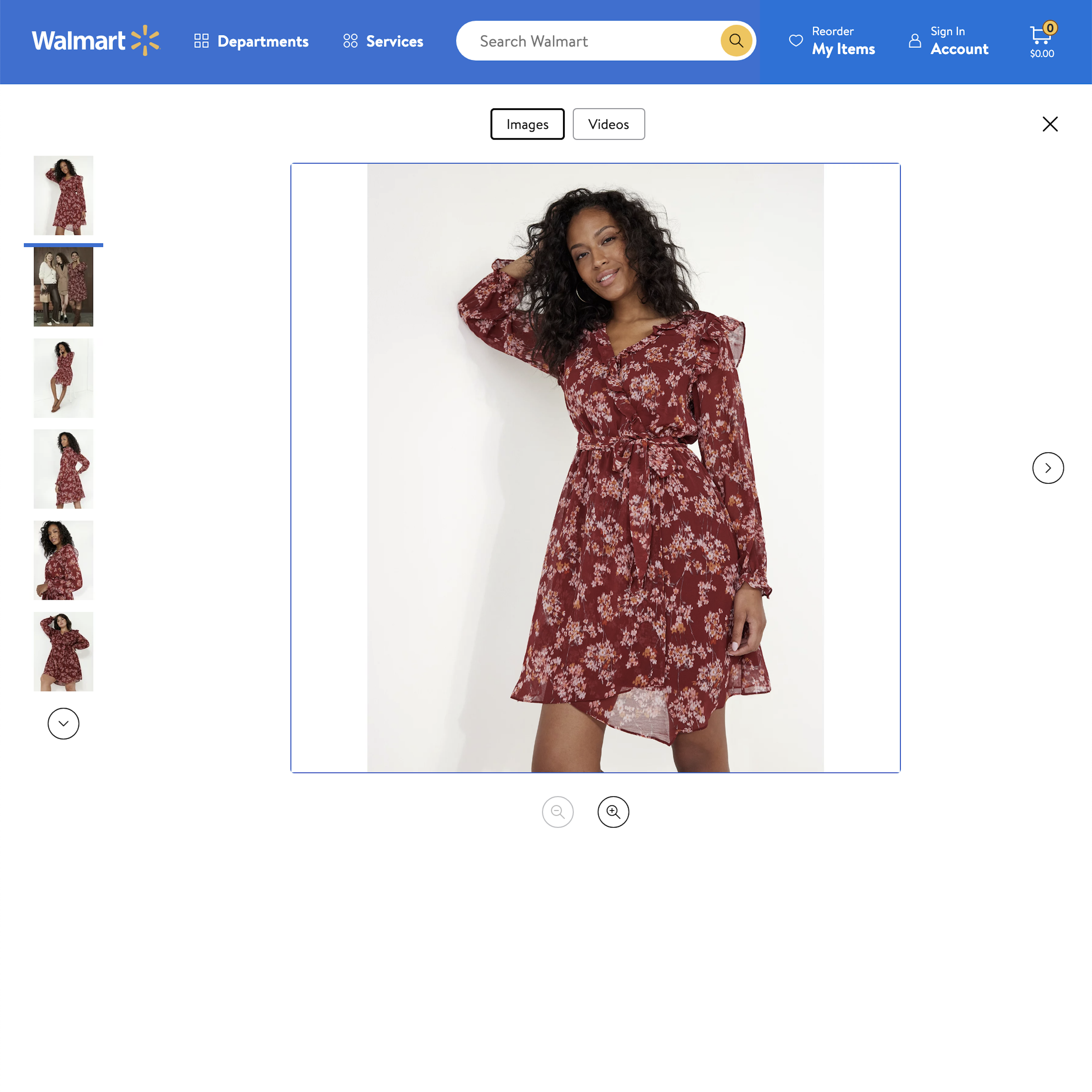
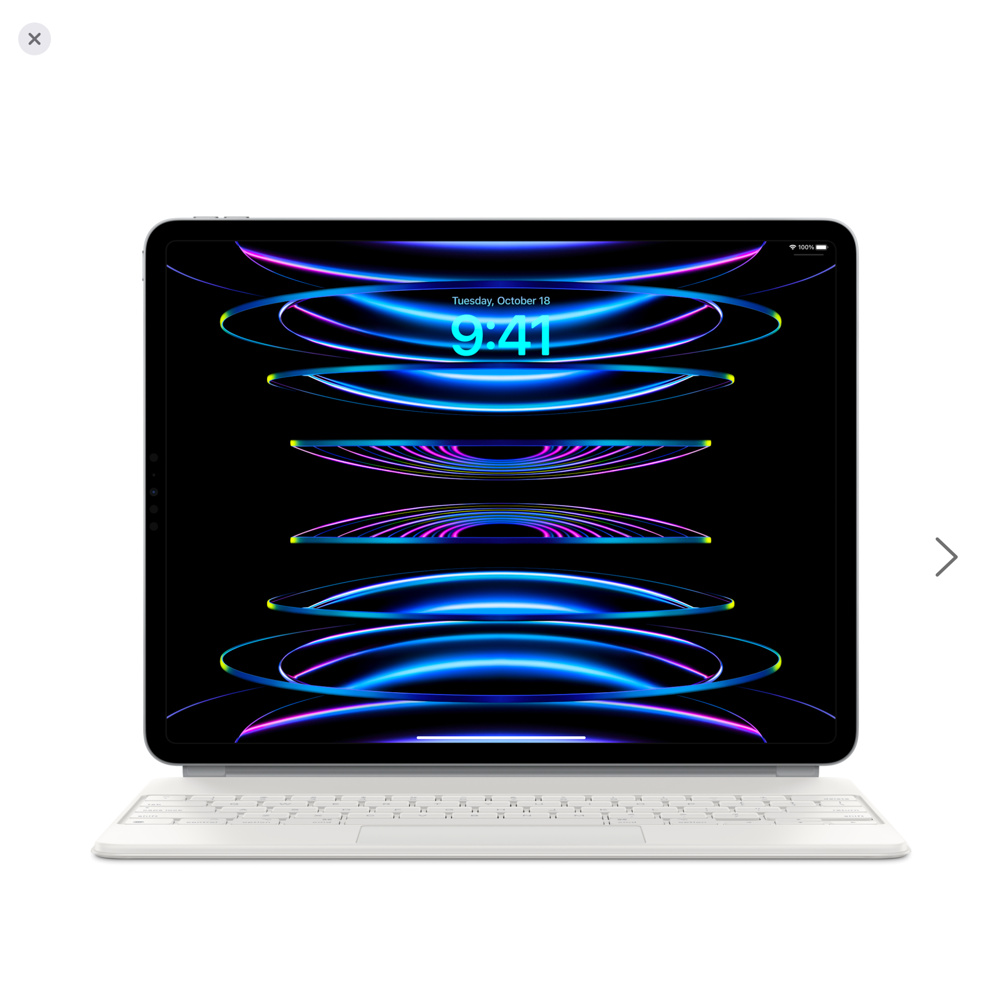
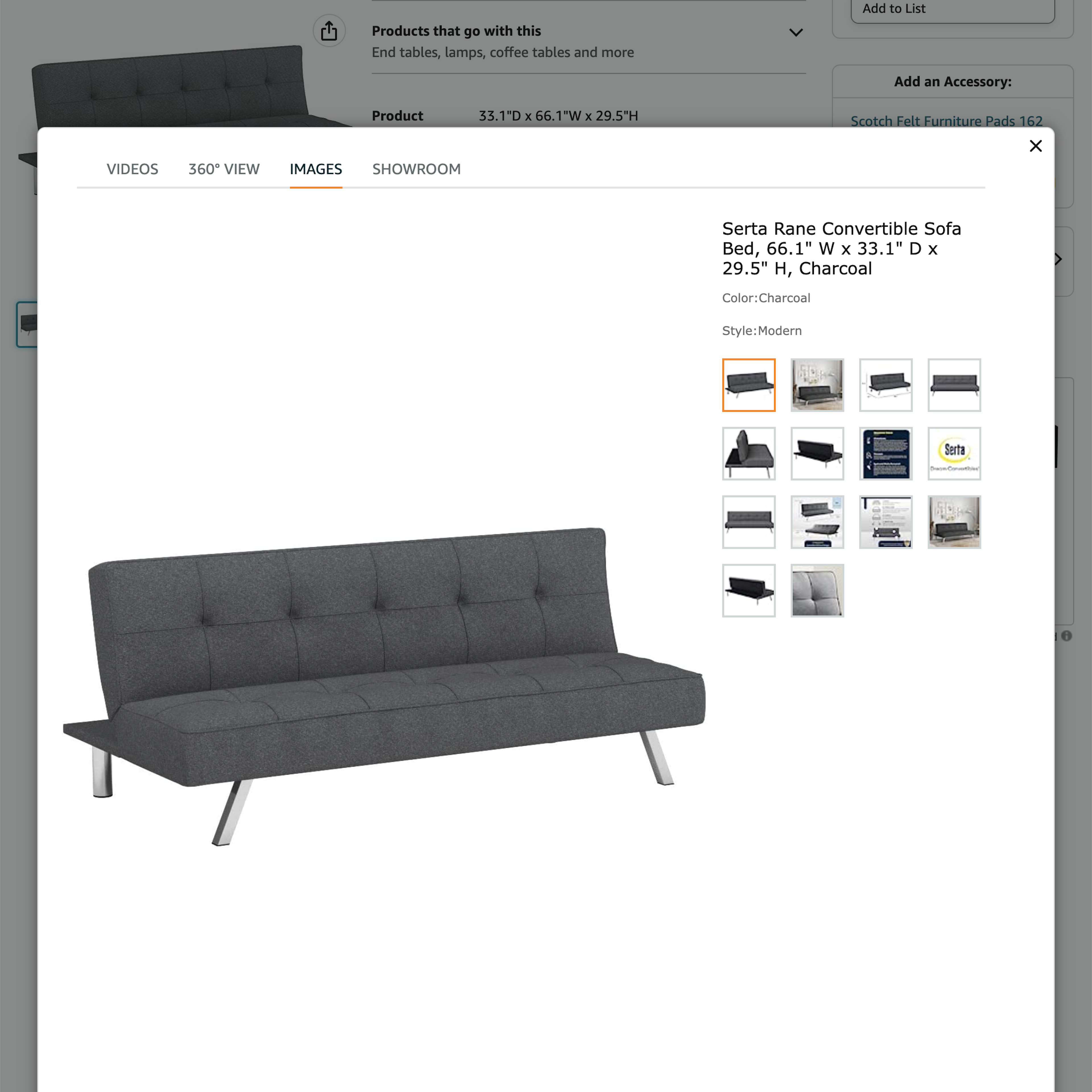
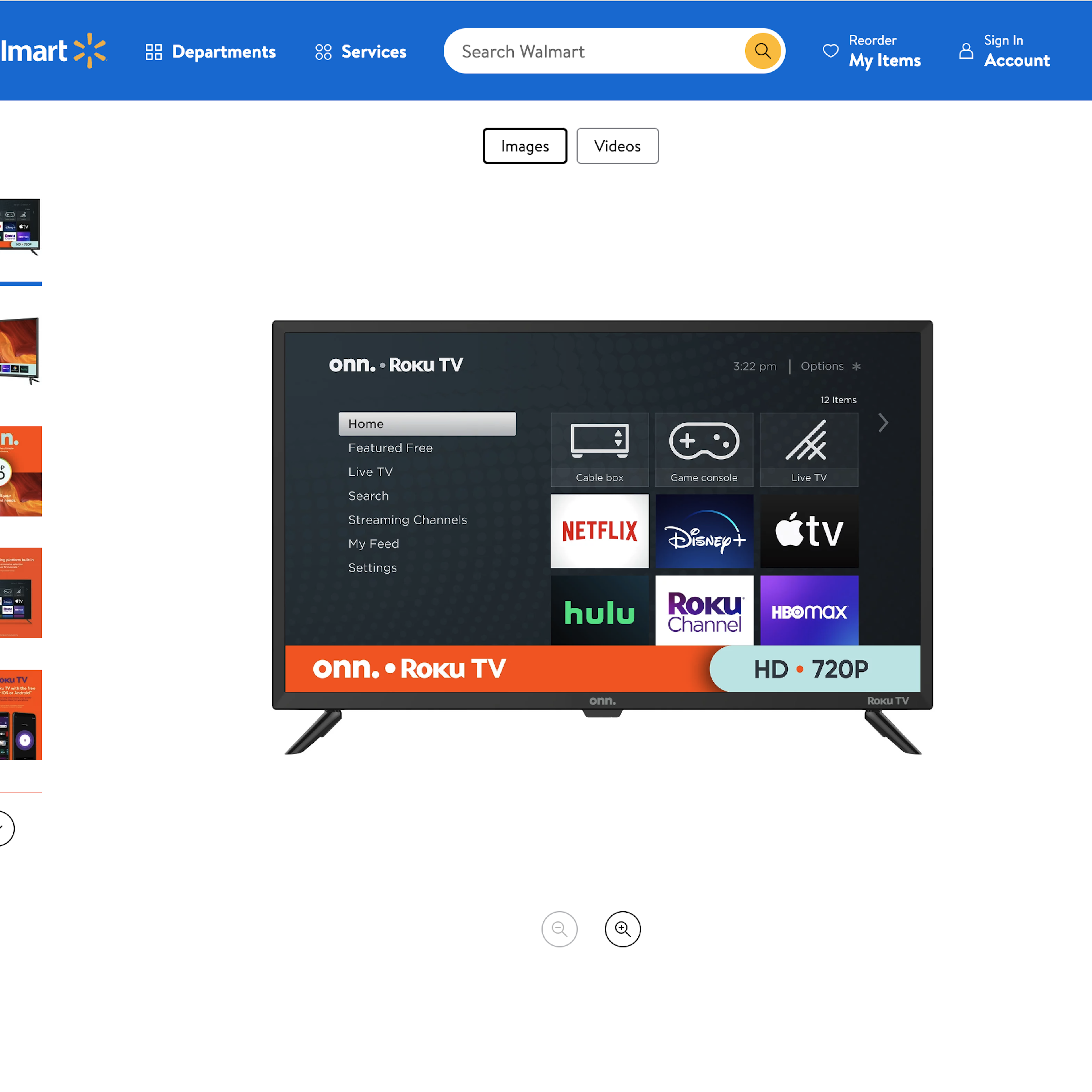
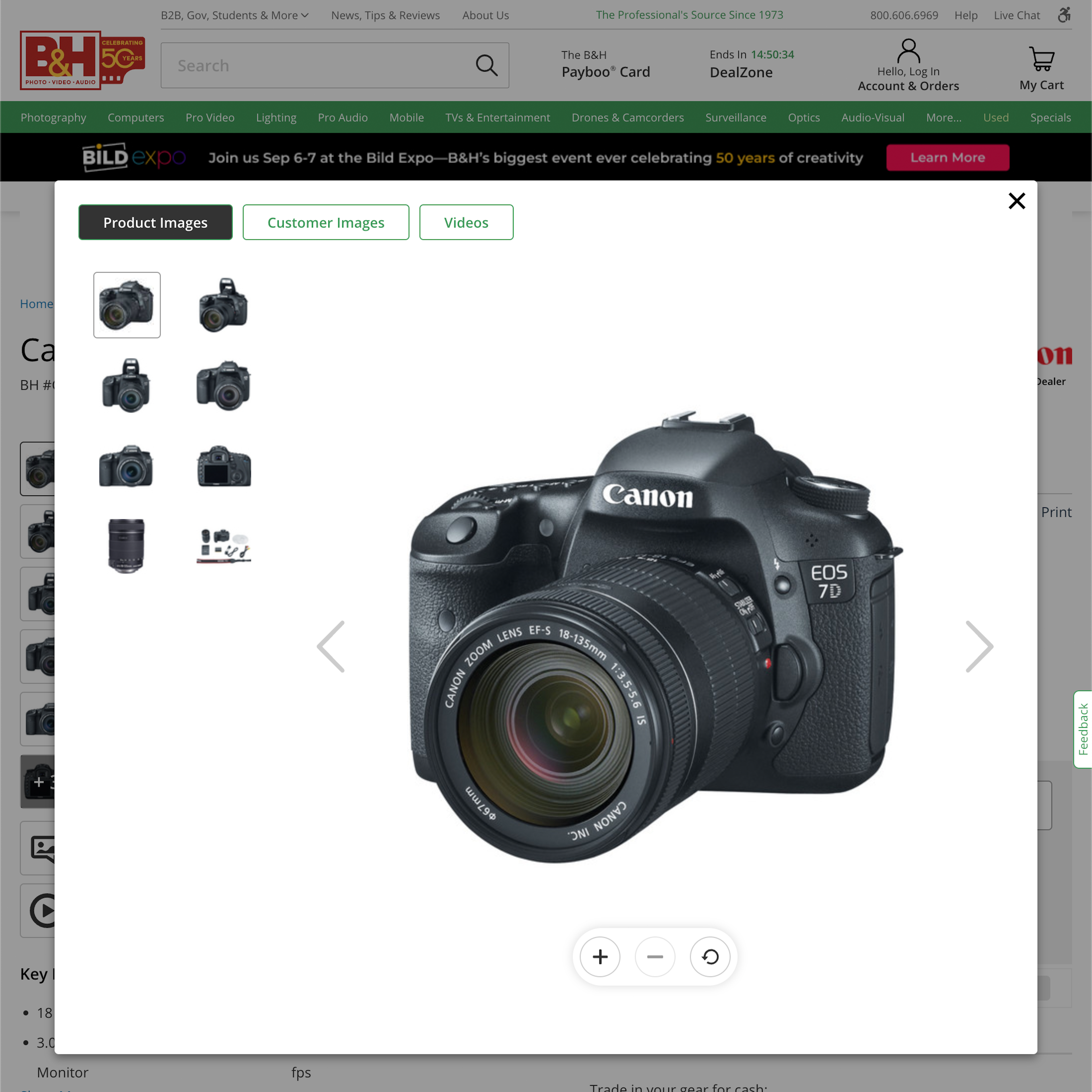
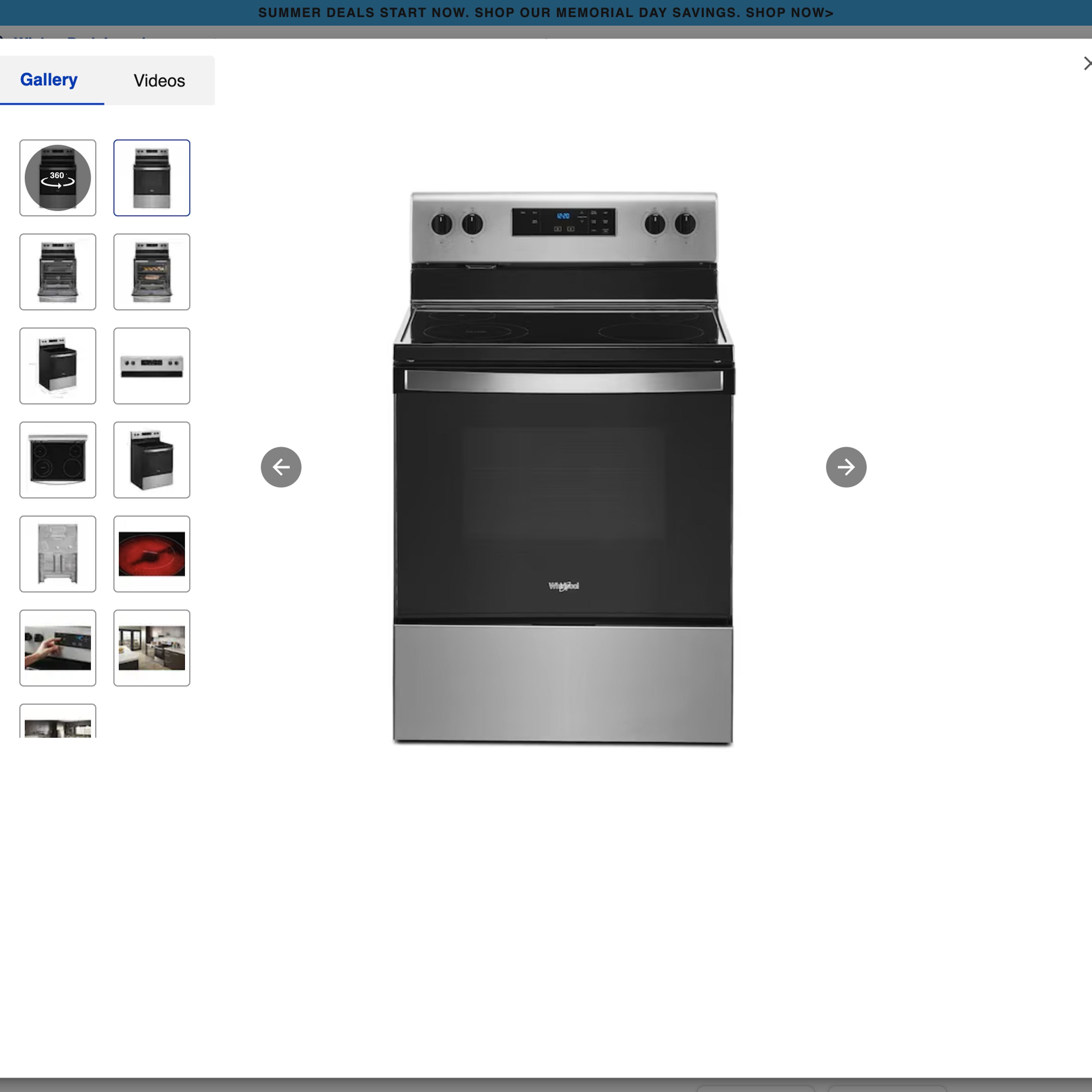
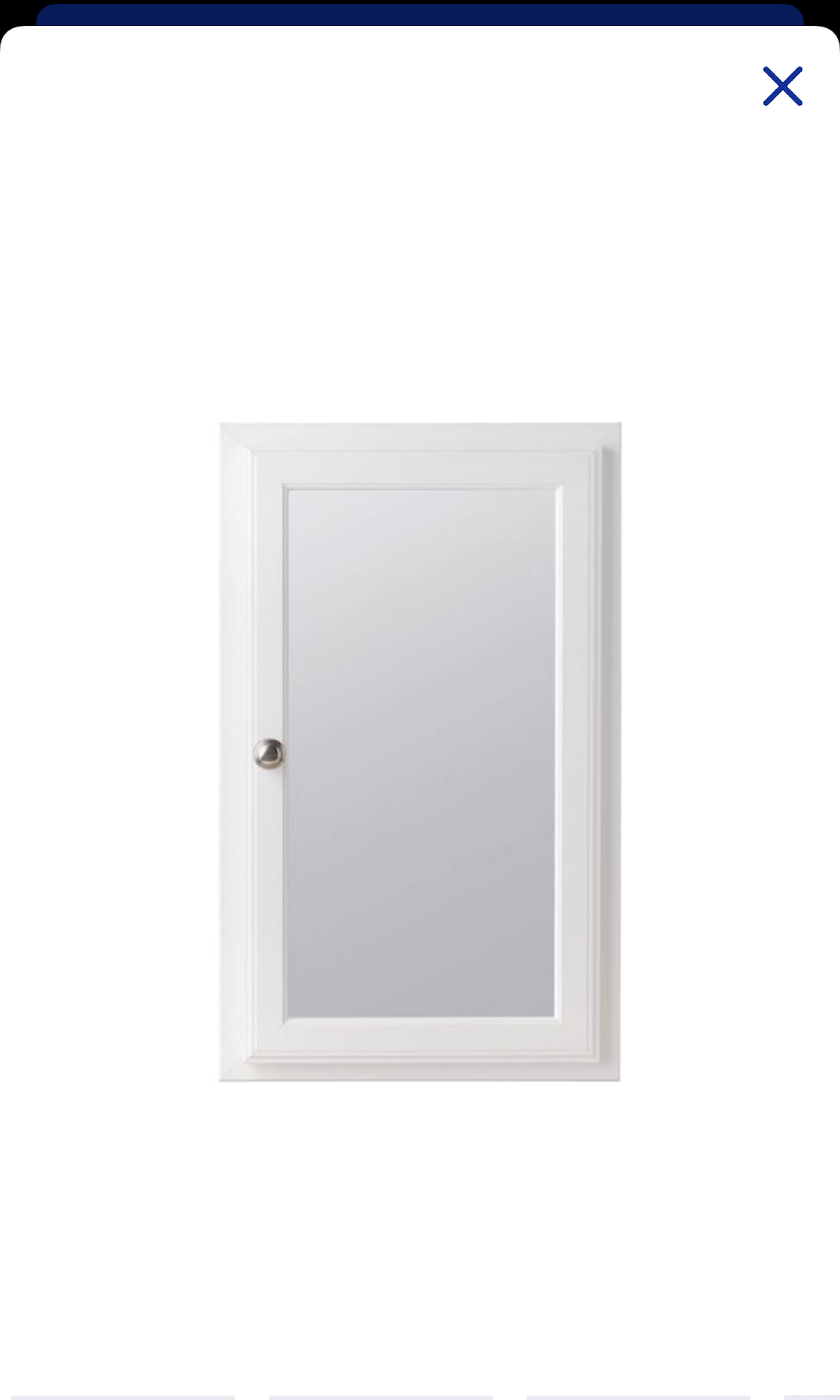
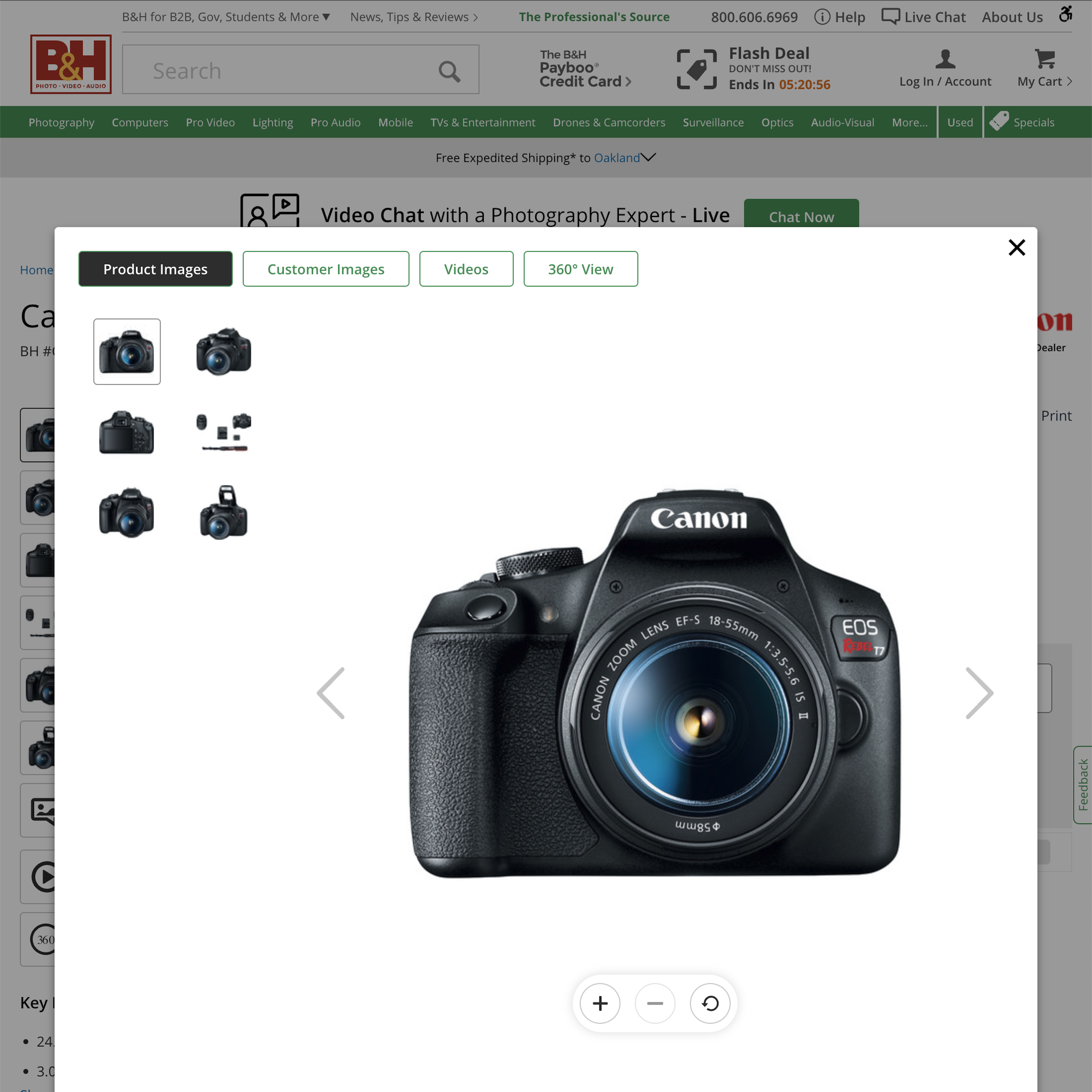
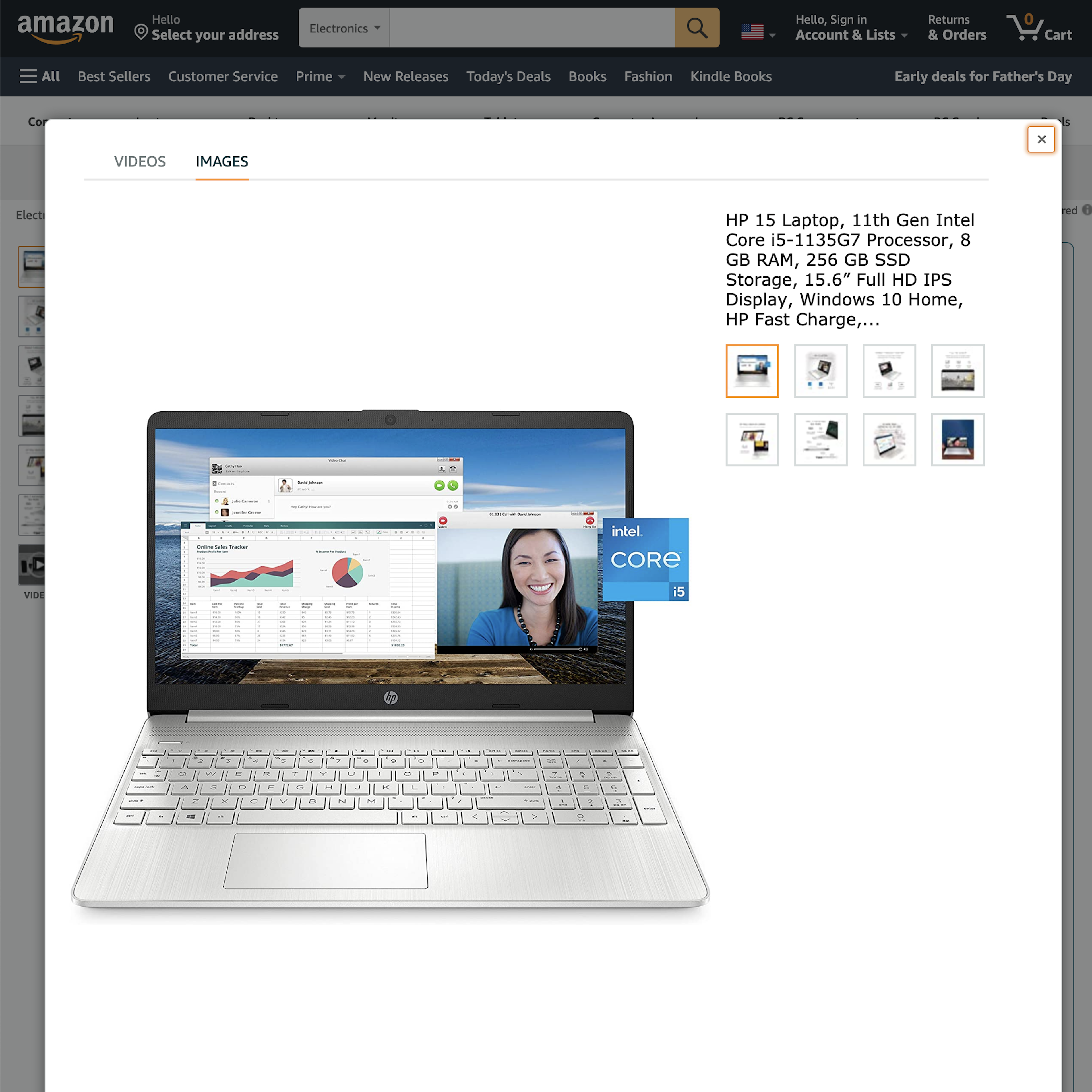
On the product page, a commonly observed UI pattern to display detailed product images is though an ‘Image Gallery Overlay’ — an overlay/modal window that often contains a complete and more detailed view of all the product images and videos.
However, during Baymard’s large-scale usability testing, time and again the UI and design of the image gallery User Interface caused users to overlook the very images they were trying to seek out, as well as causing users to not be able to properly enlarge the images (to perform a detailed visual inspection).
More ‘Image Gallery Overlay’ Insights
-
A particularly common pitfall that 40% of sites suffer from is truncating thumbnails in the image gallery without a sufficiently clear truncation indication — something that was the cause for multiple direct site abandonments during testing, as users overlooked all of the truncated images and didn’t feel like they had enough visual information about a product.
-
Learn More: Besides exploring the 516 “Image Gallery Overlay” page design examples below, you may also want to read our related articles “Always Use Thumbnails to Represent Additional Product Images (76% of Mobile Sites Don’t)”, “Ensure All Product Images Have Sufficient Resolution and Level of Zoom”, and “Provide Images of Accessory, Apparel, and Cosmetic Products on a Human Model”.
-
Get Full Access: To see all of Baymard’s product page research findings you’ll need Baymard Premium access. (Premium also provides you full access to 200,000+ hours of UX research findings, 650+ e-commerce UX guidelines, and 275,000+ UX performance scores.)
User Experience Research, Delivered Weekly
Join 60,000+ UX professionals and get a new UX article every week.

User Experience Research, Delivered Weekly
Join 60,000+ UX professionals and get a new UX article every week.

Explore Other Research Content

300+ free UX articles based on large-scale research.

327 top sites ranked by UX performance.

Code samples, demos, and key stats for usability.


