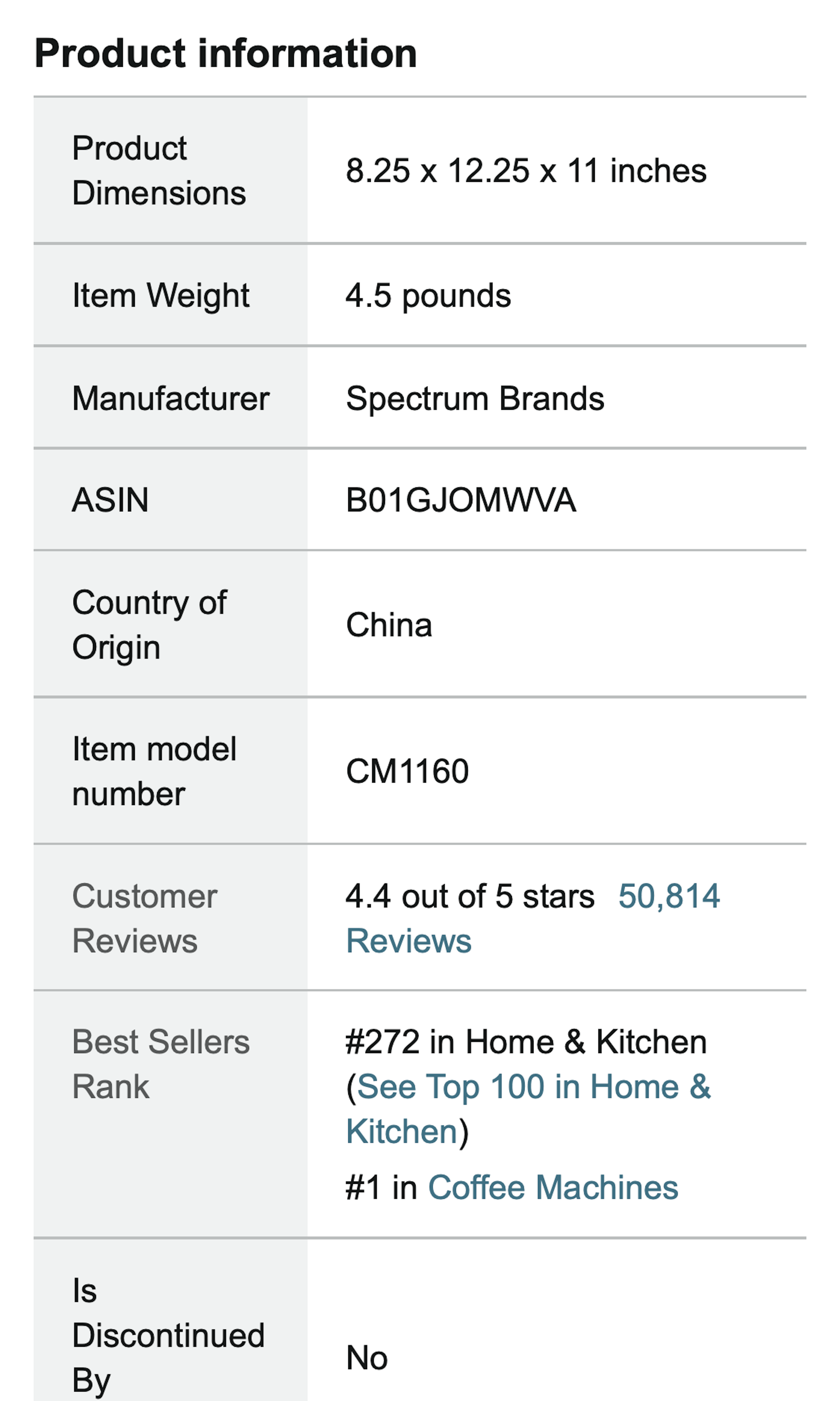
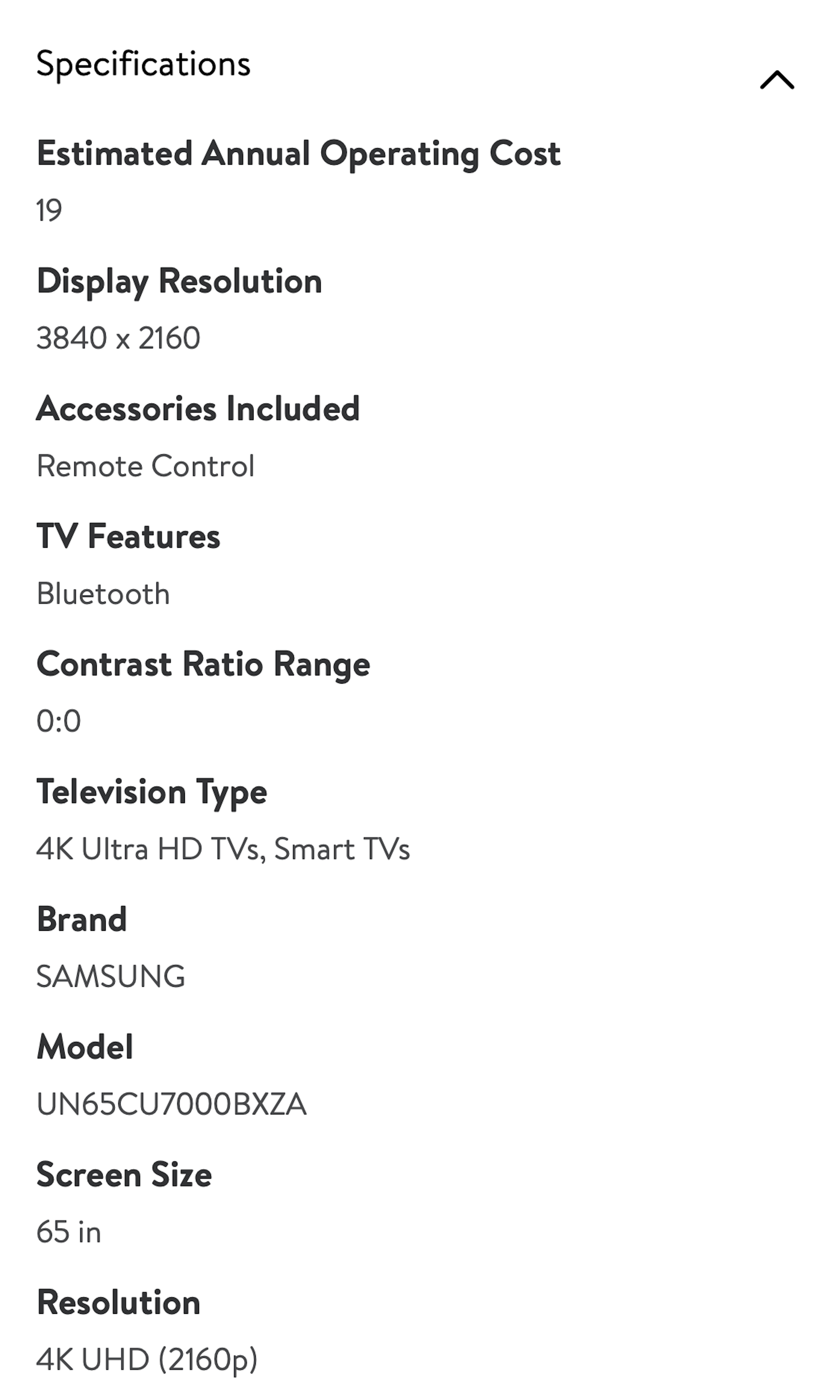
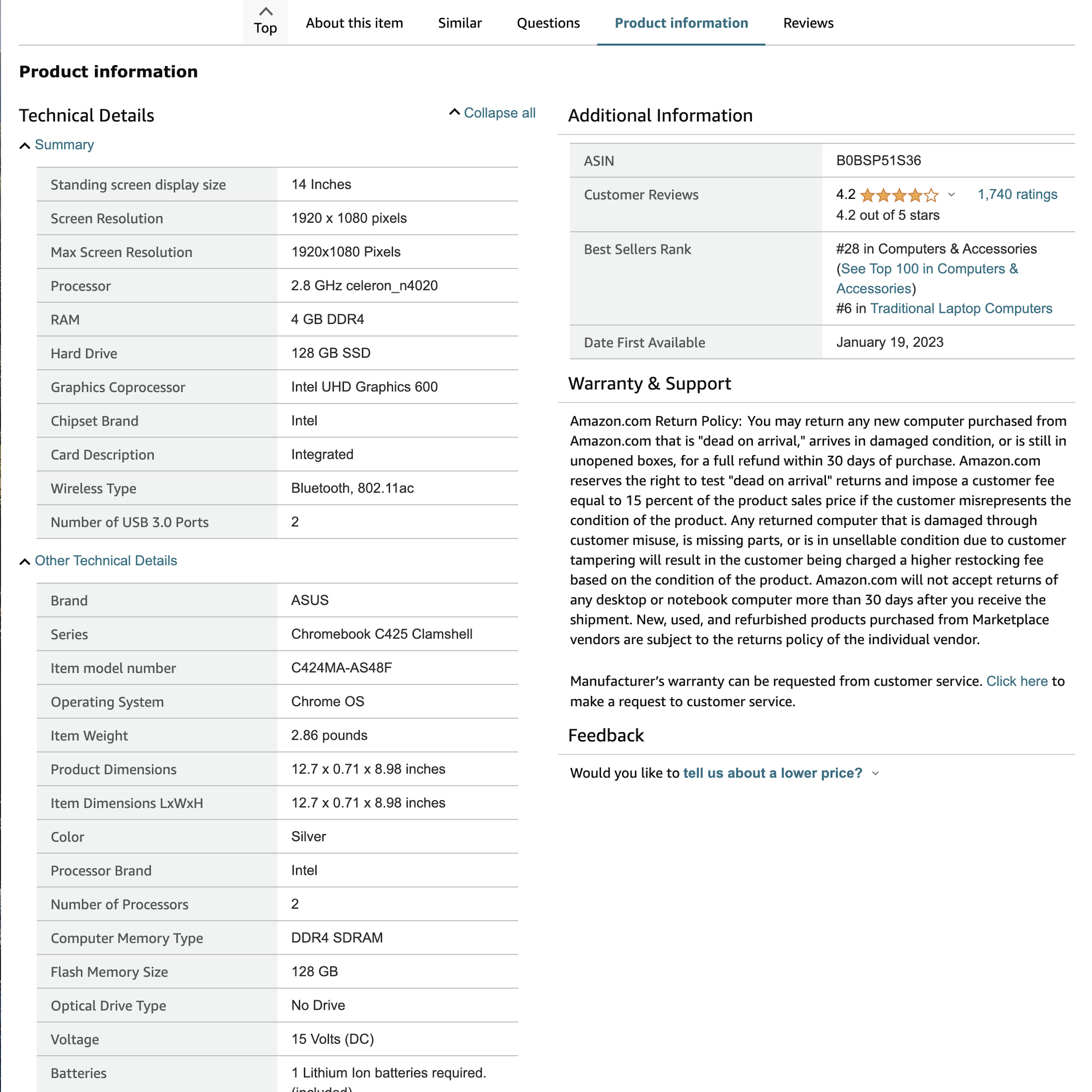
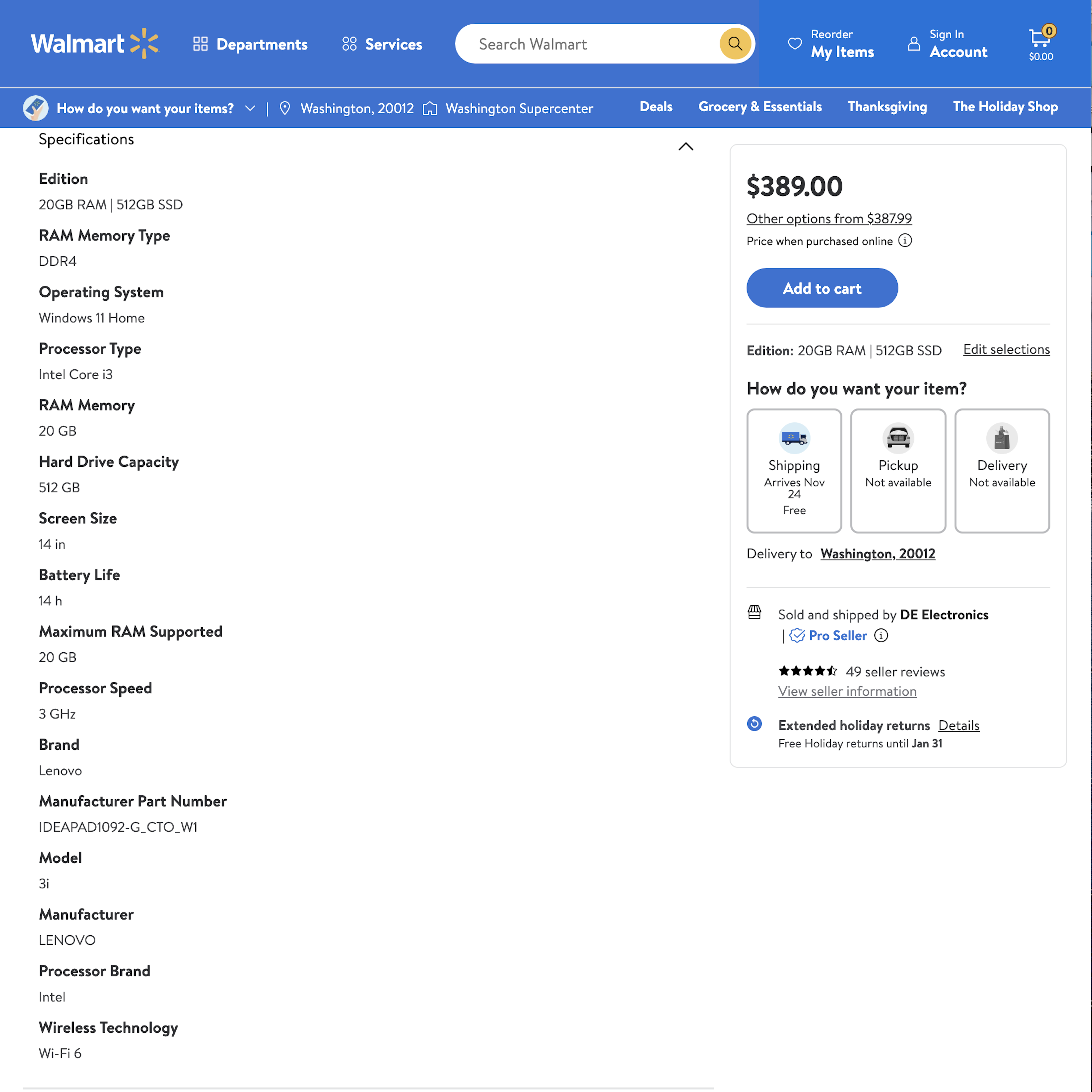
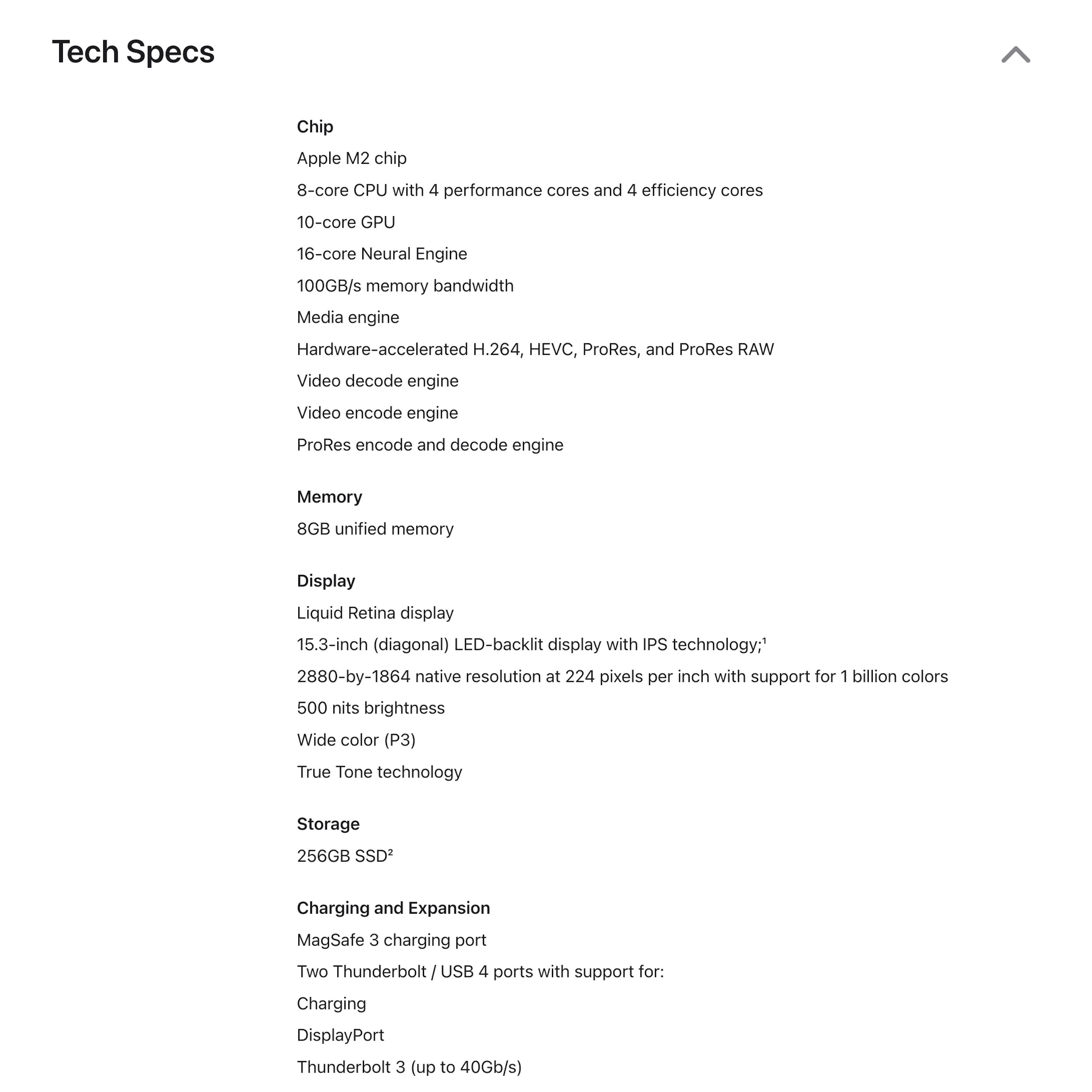
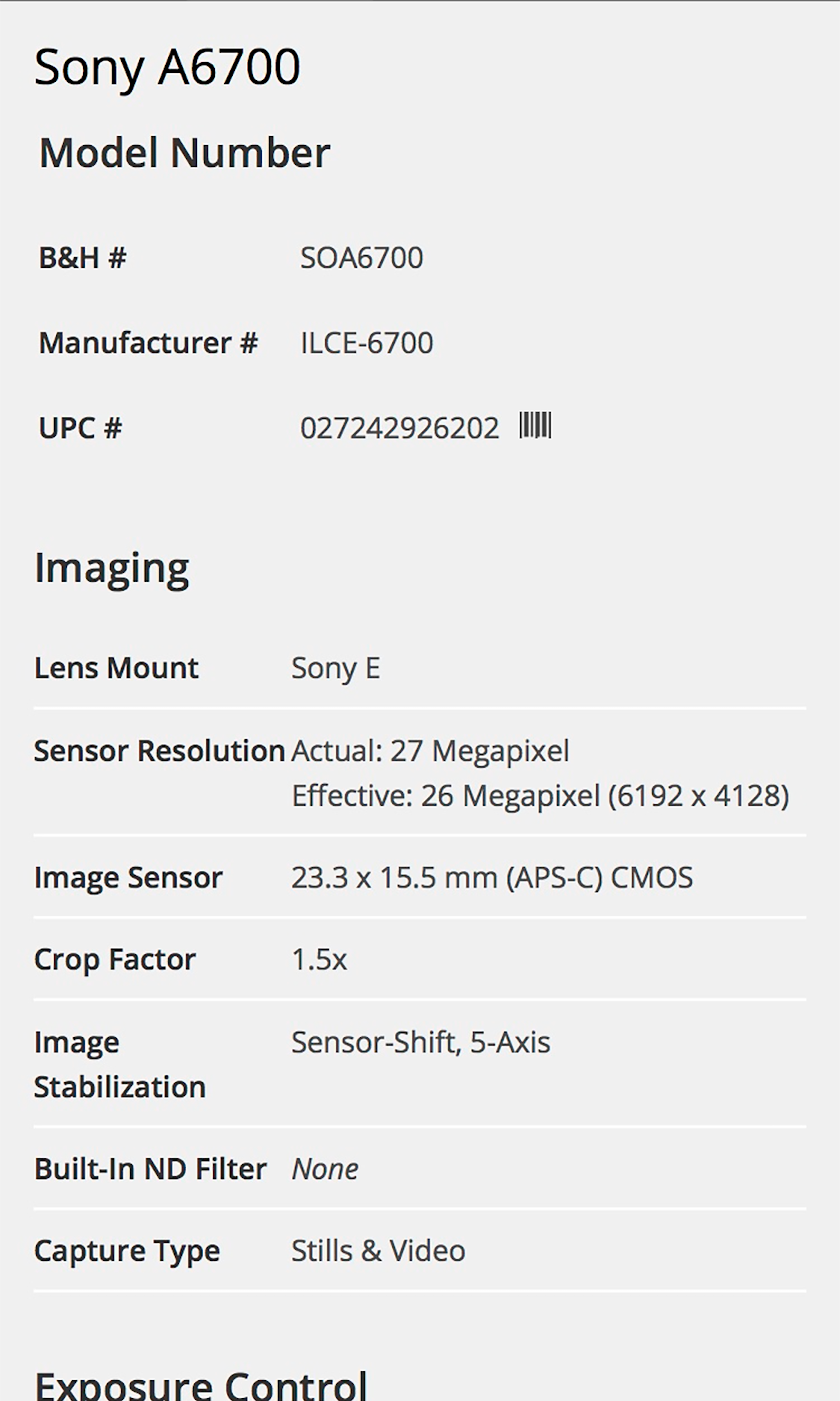
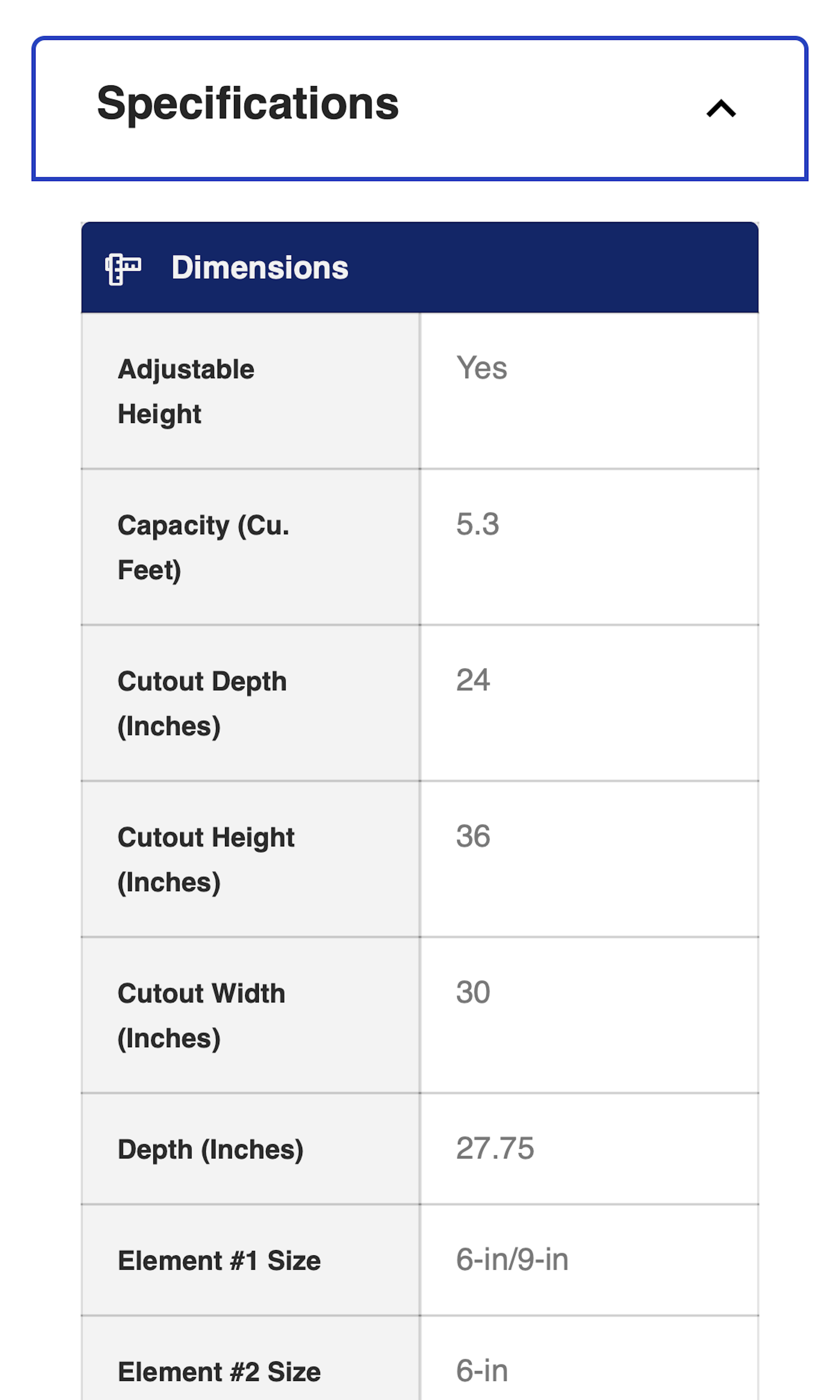
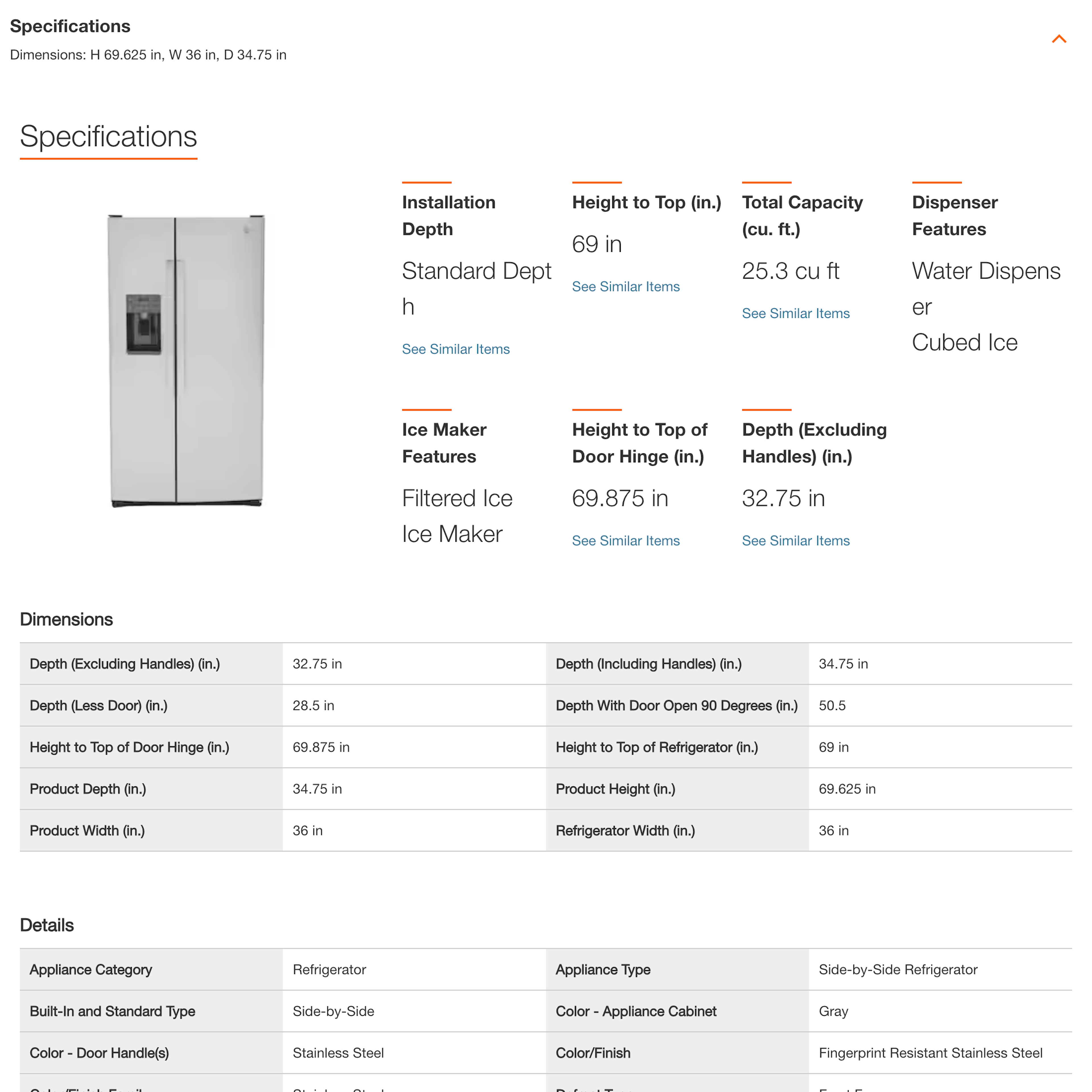
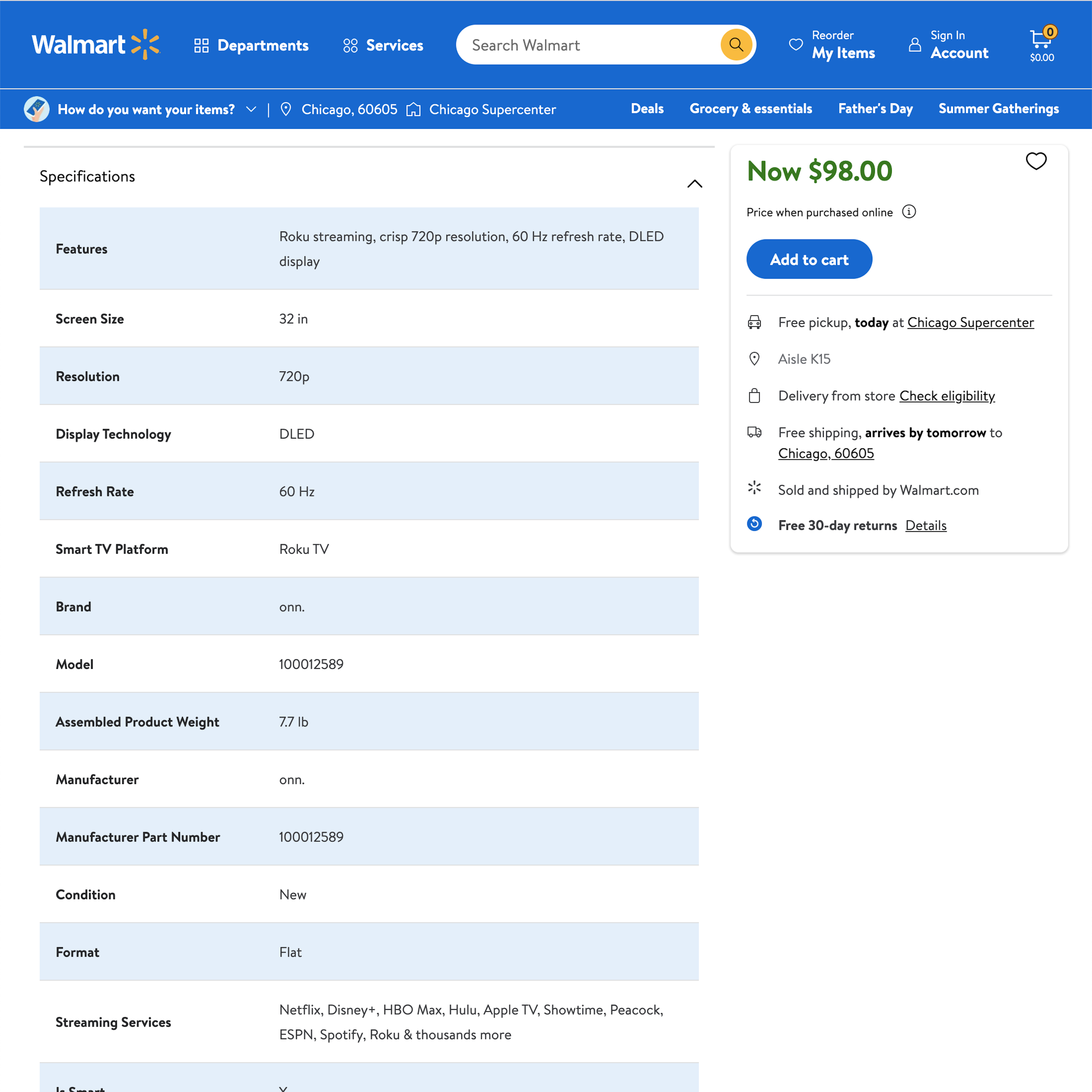
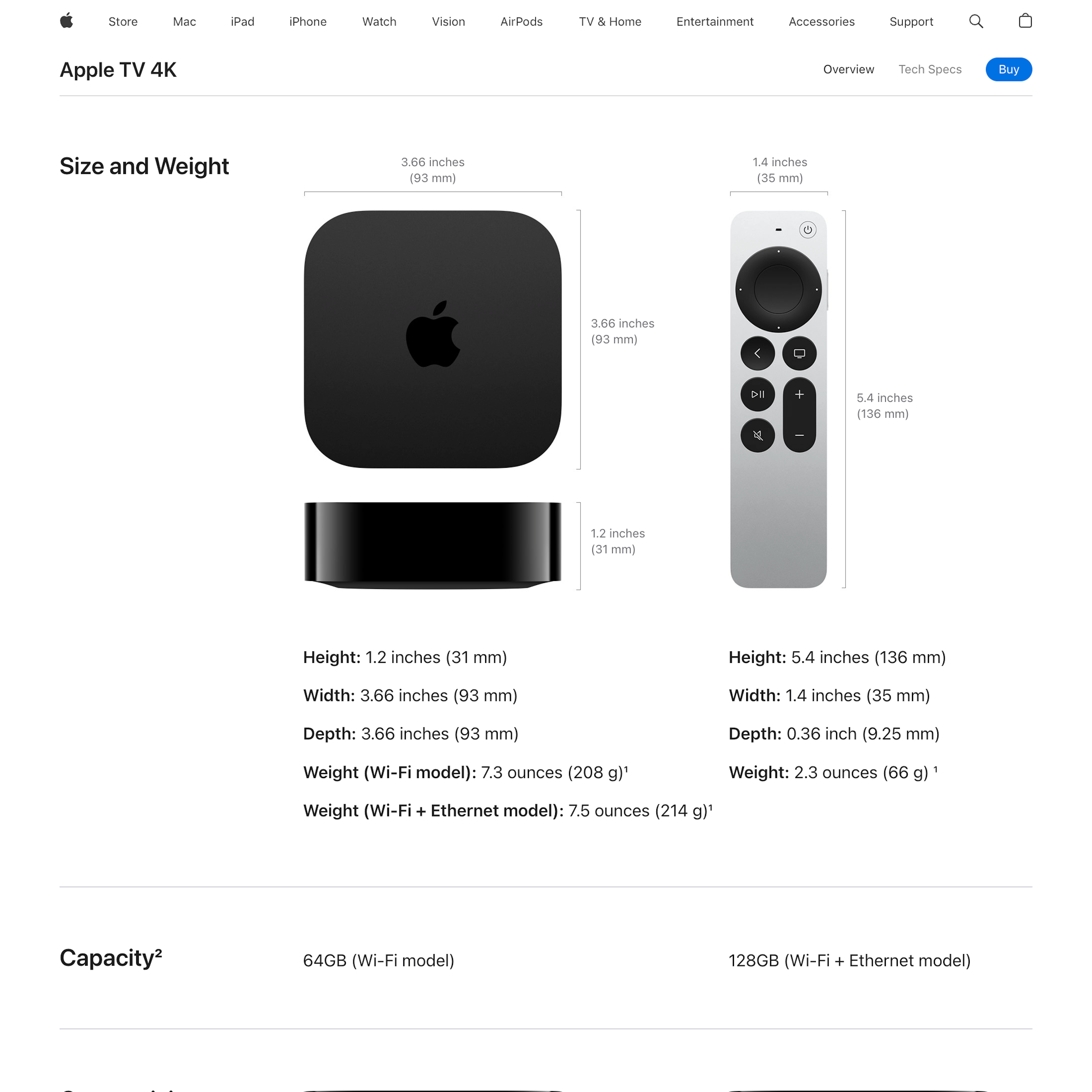
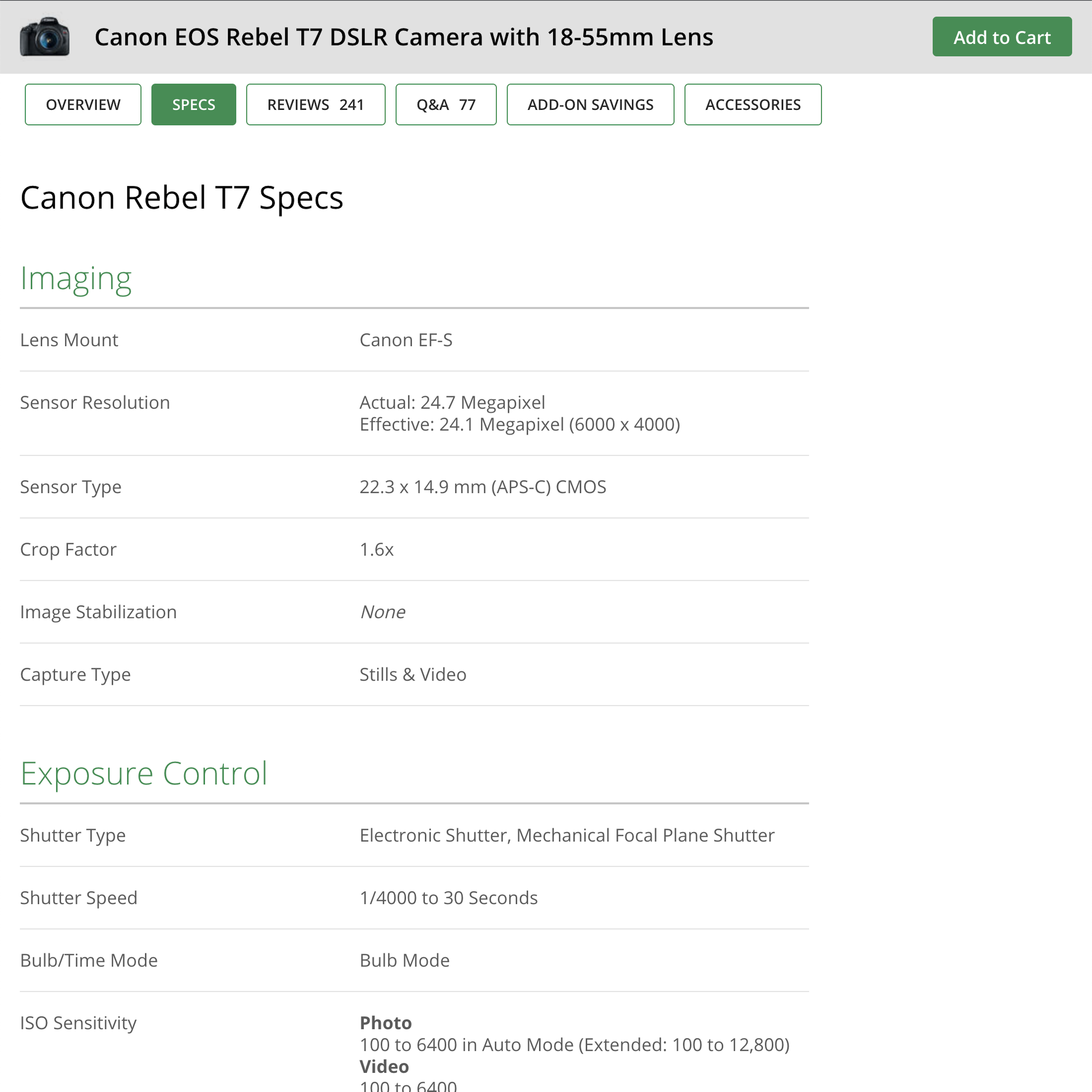
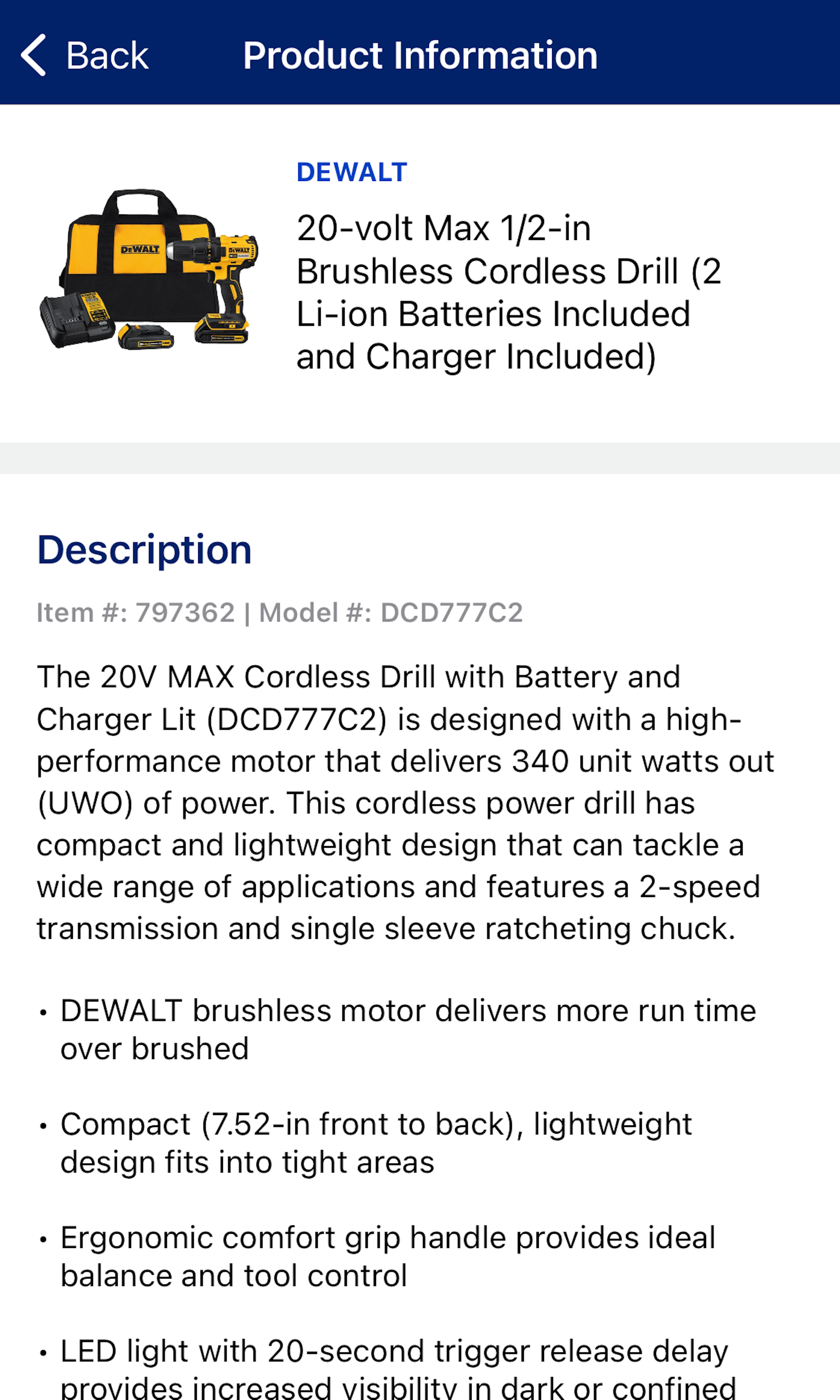
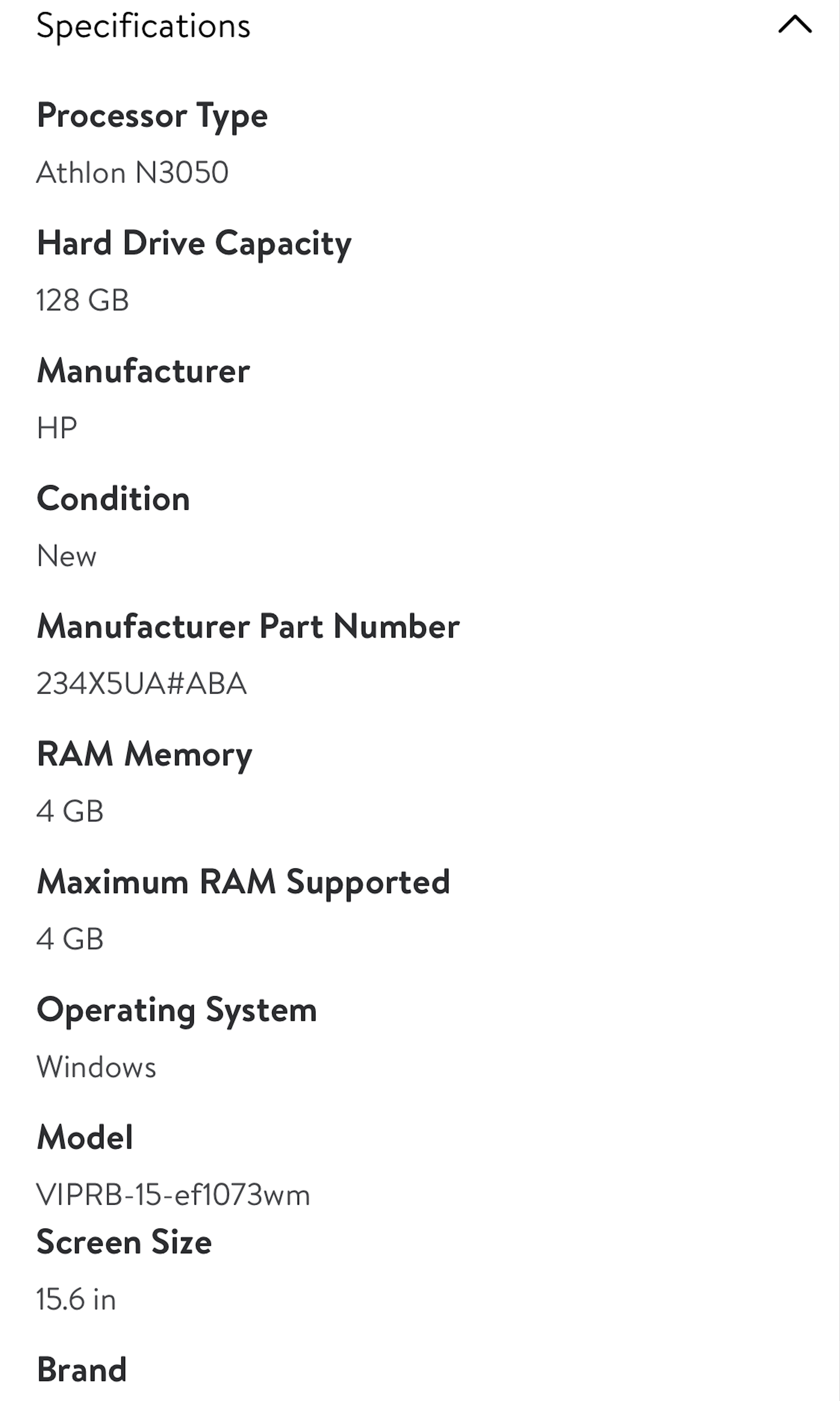
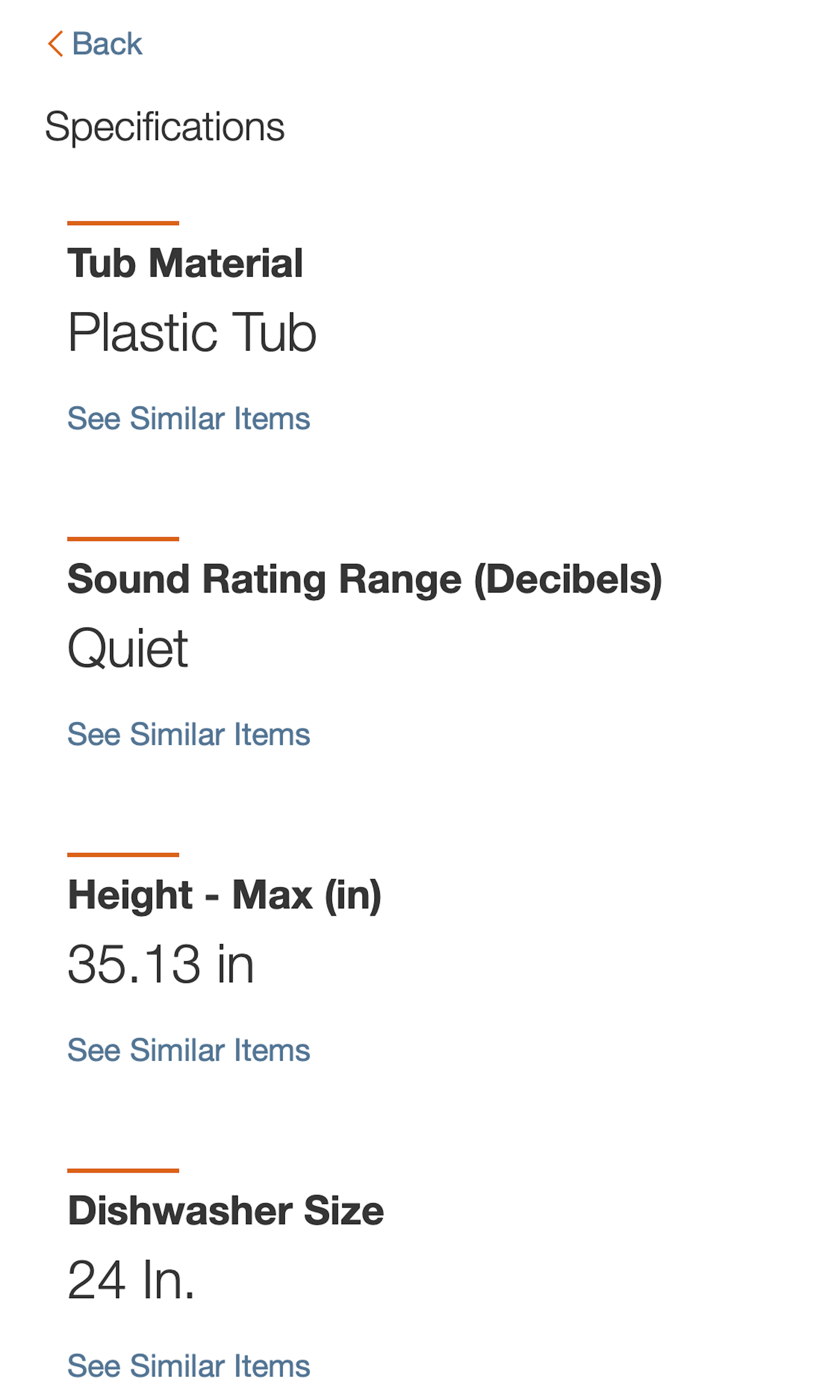
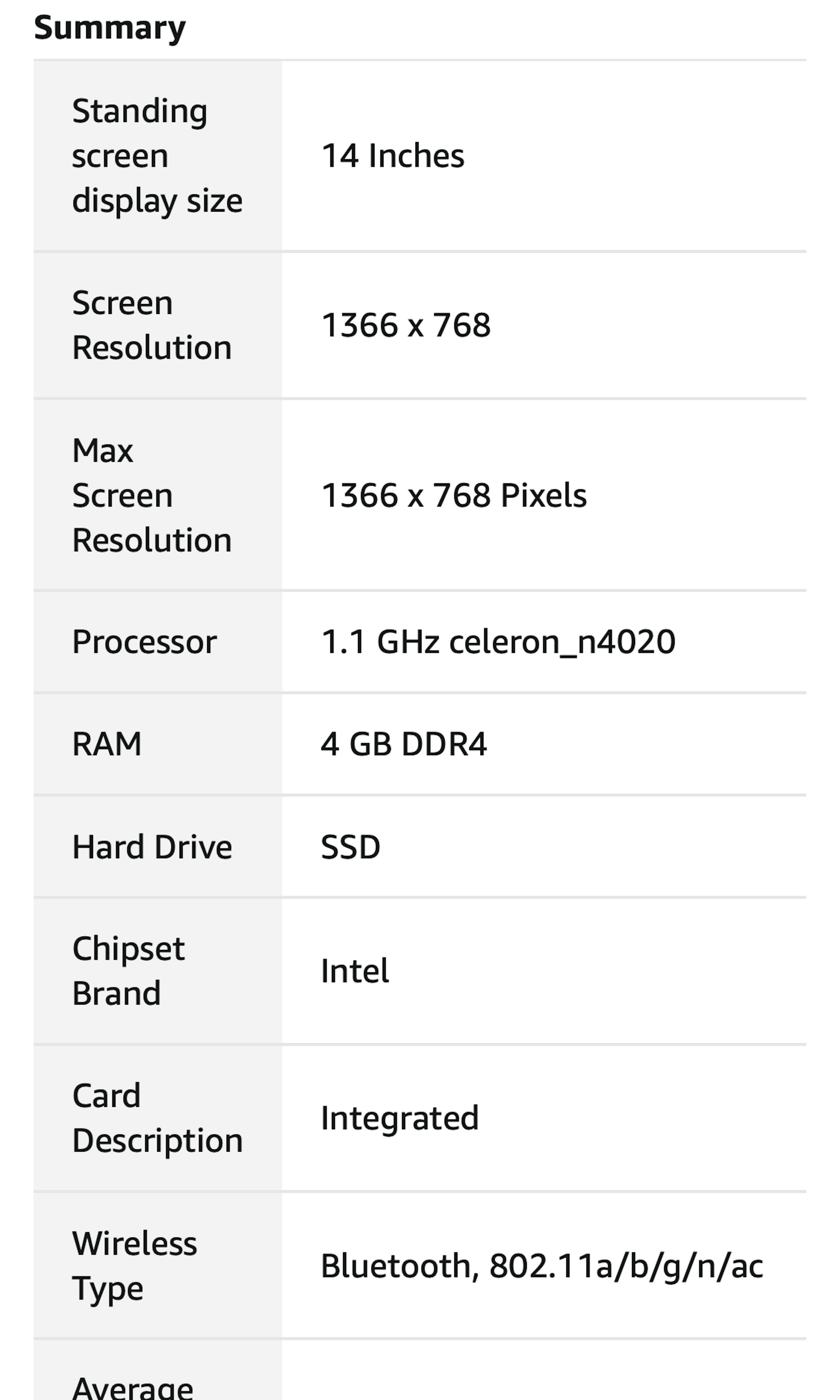
334 ‘Spec Sheet’ Design Examples
Also referred to as: Specifications Sheet, Product Specs
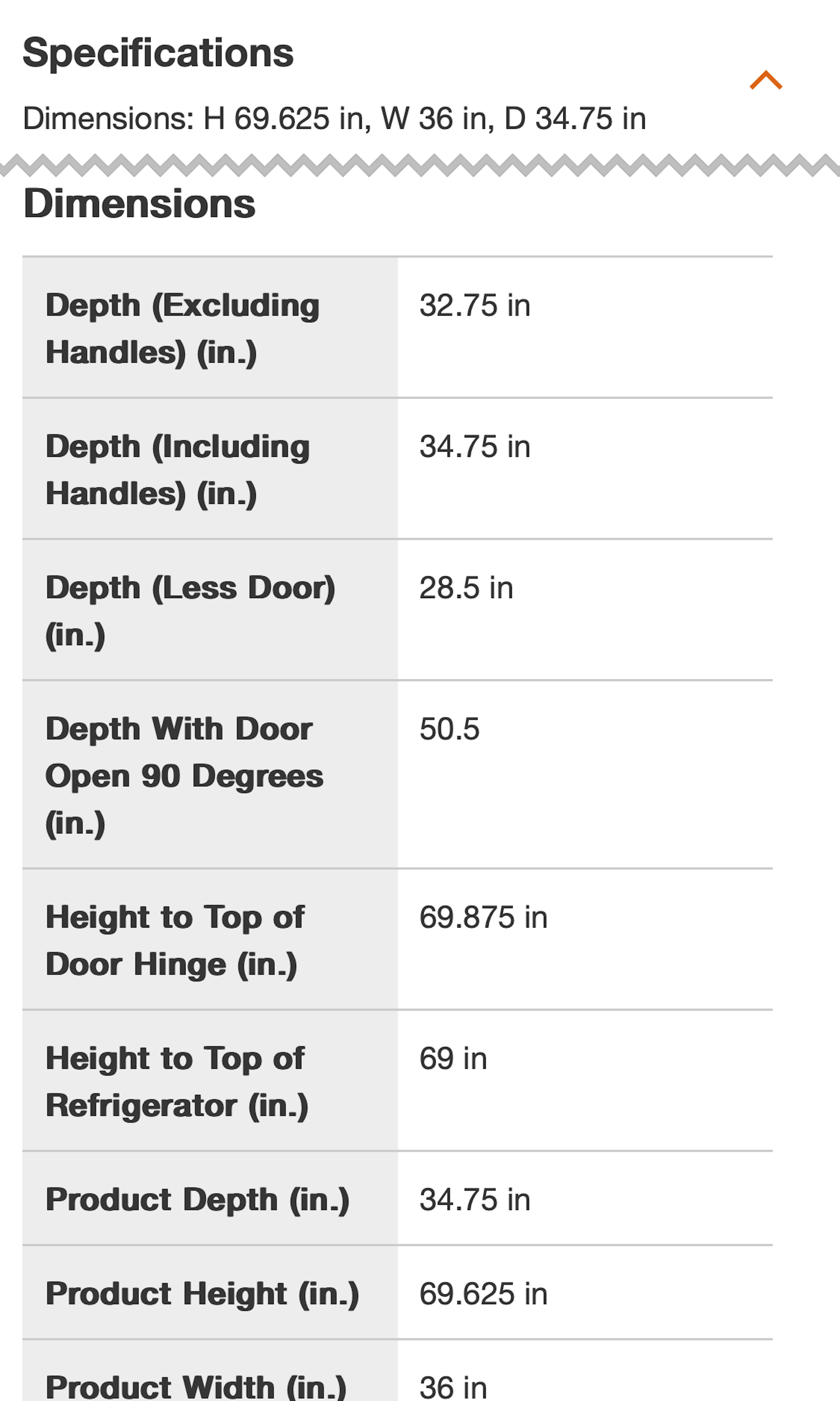
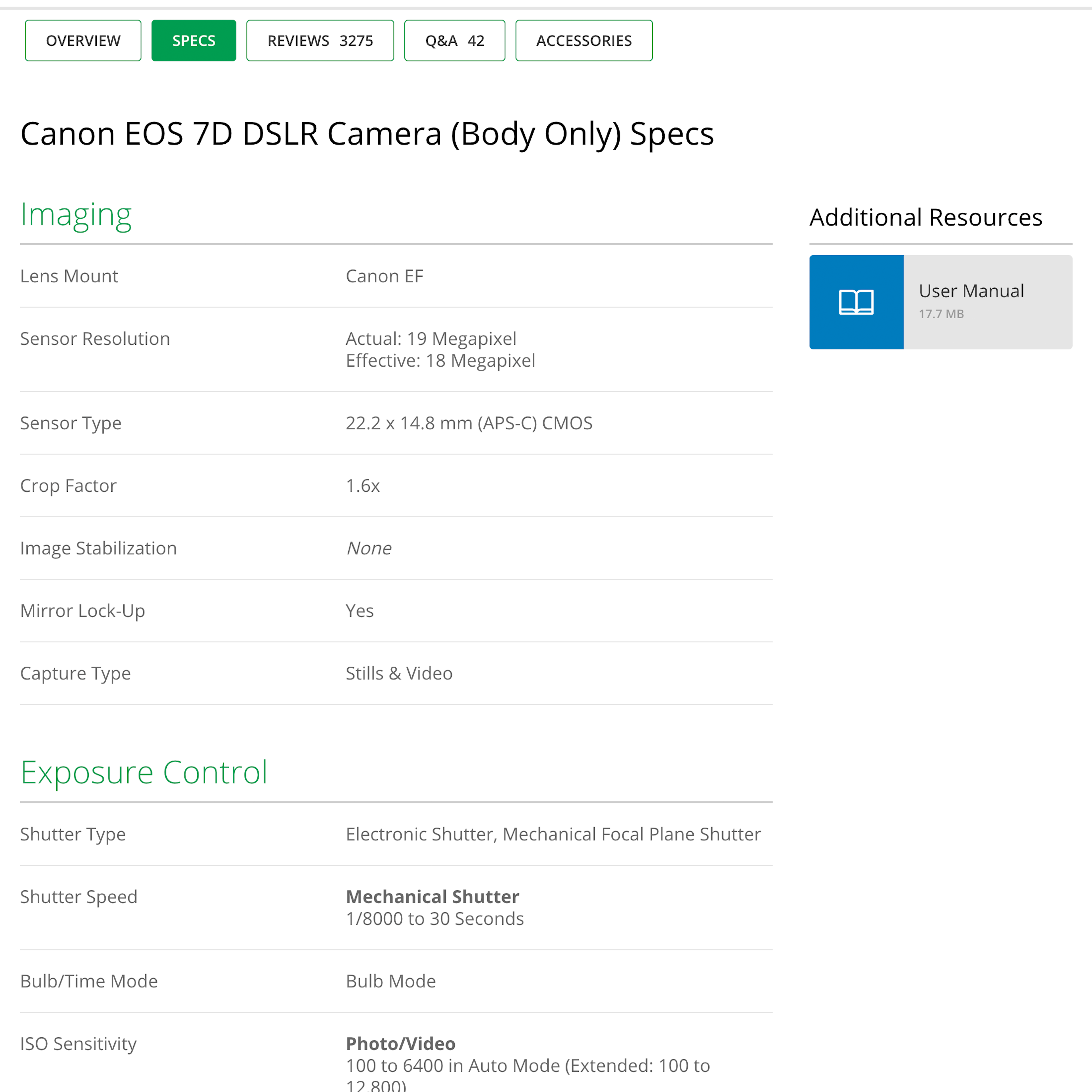
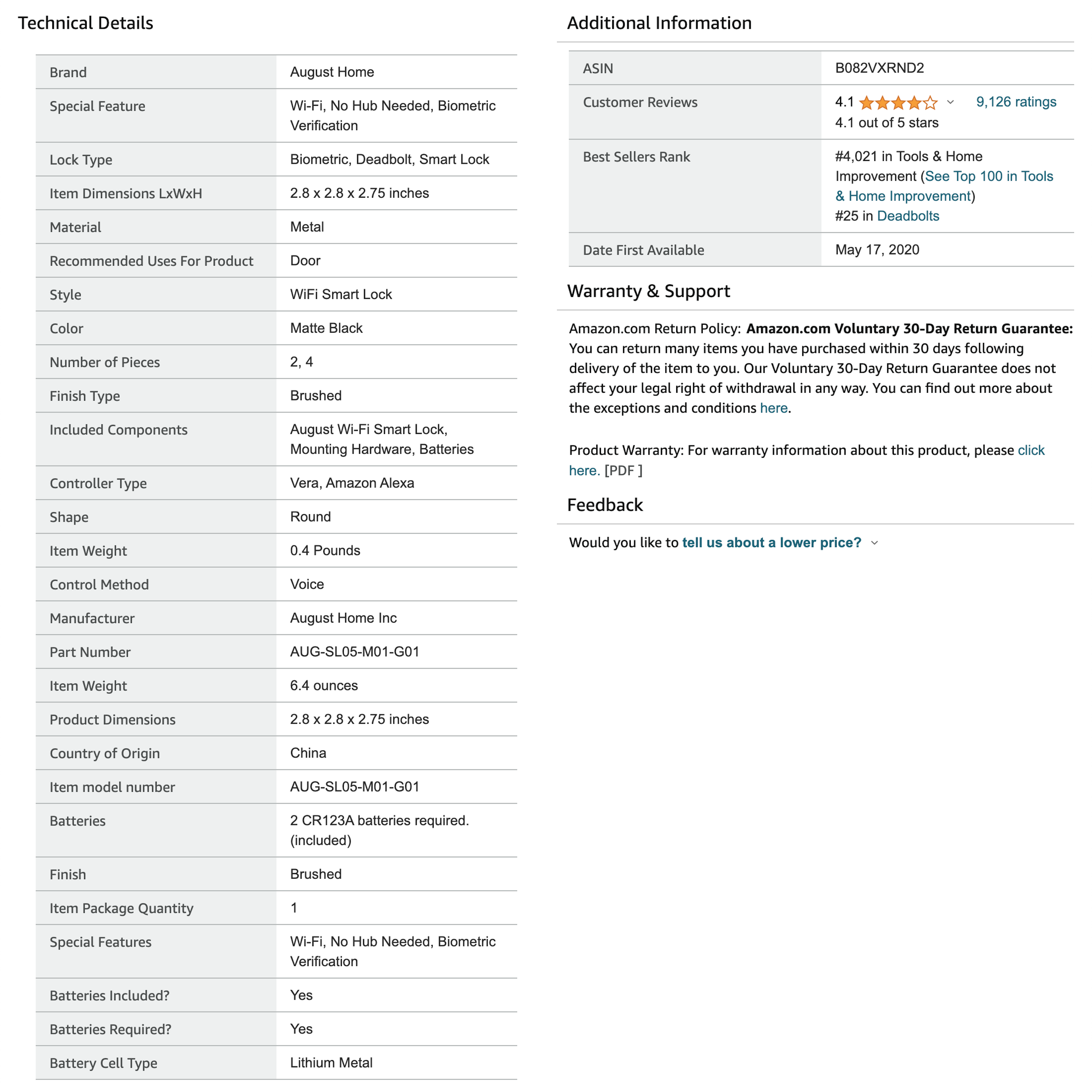
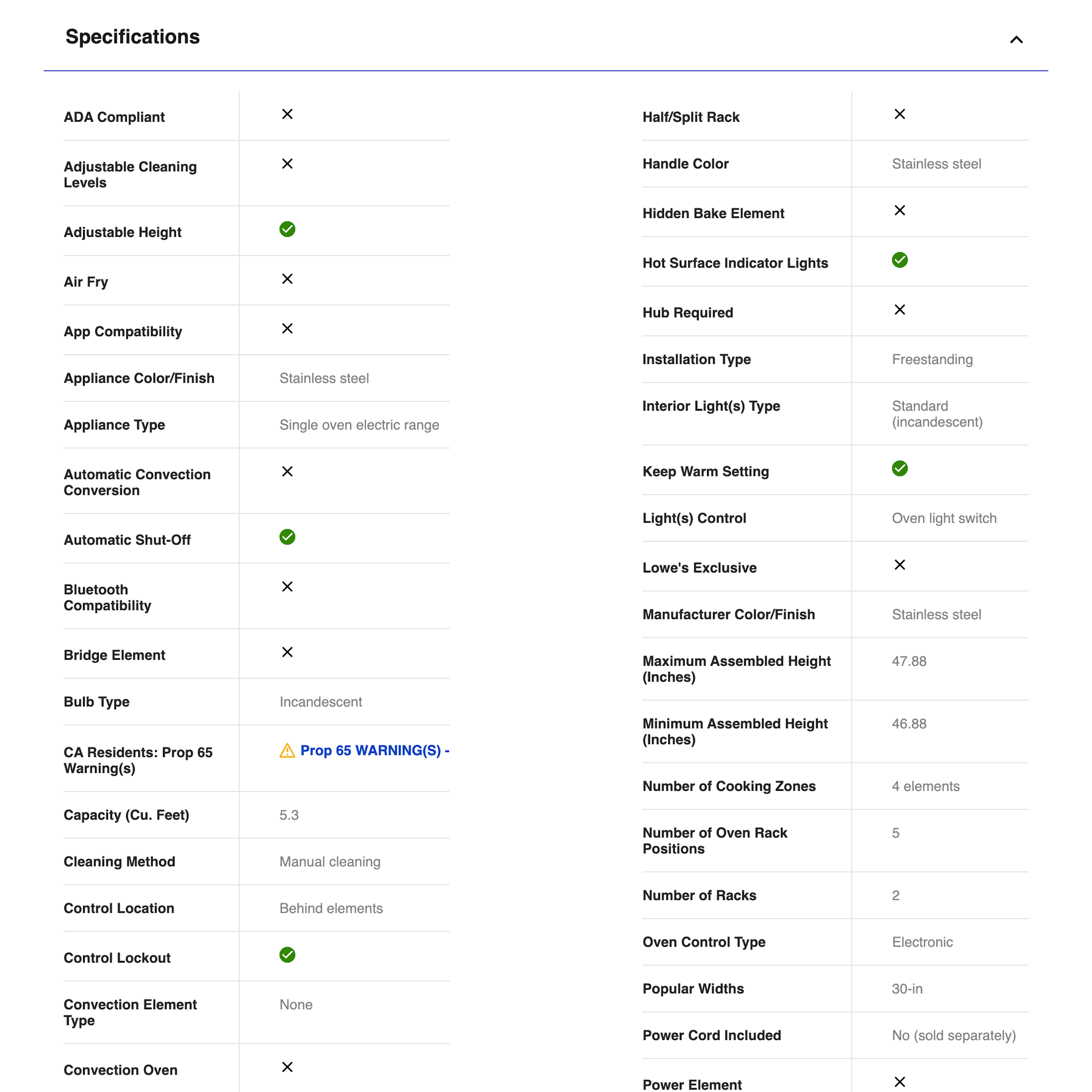
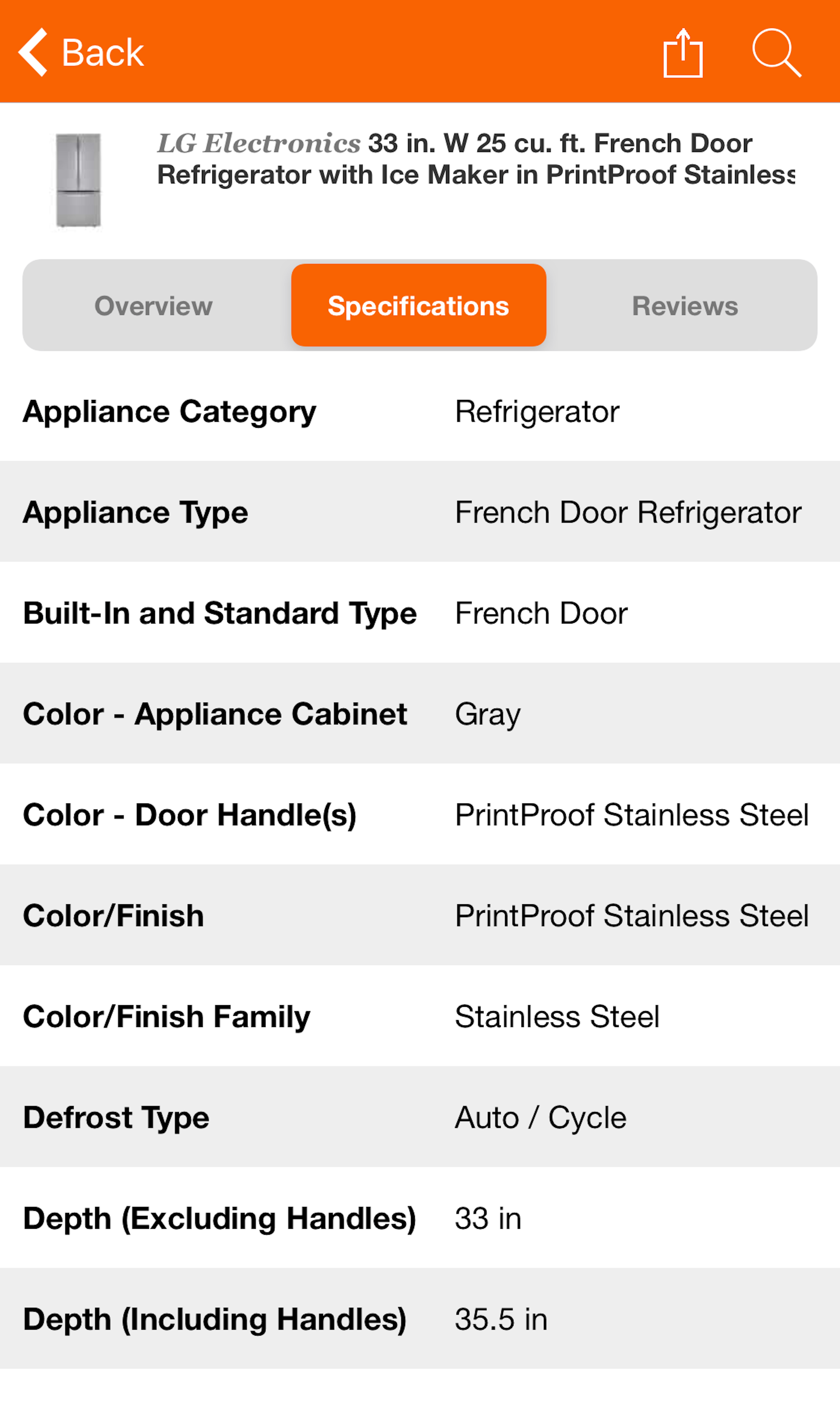
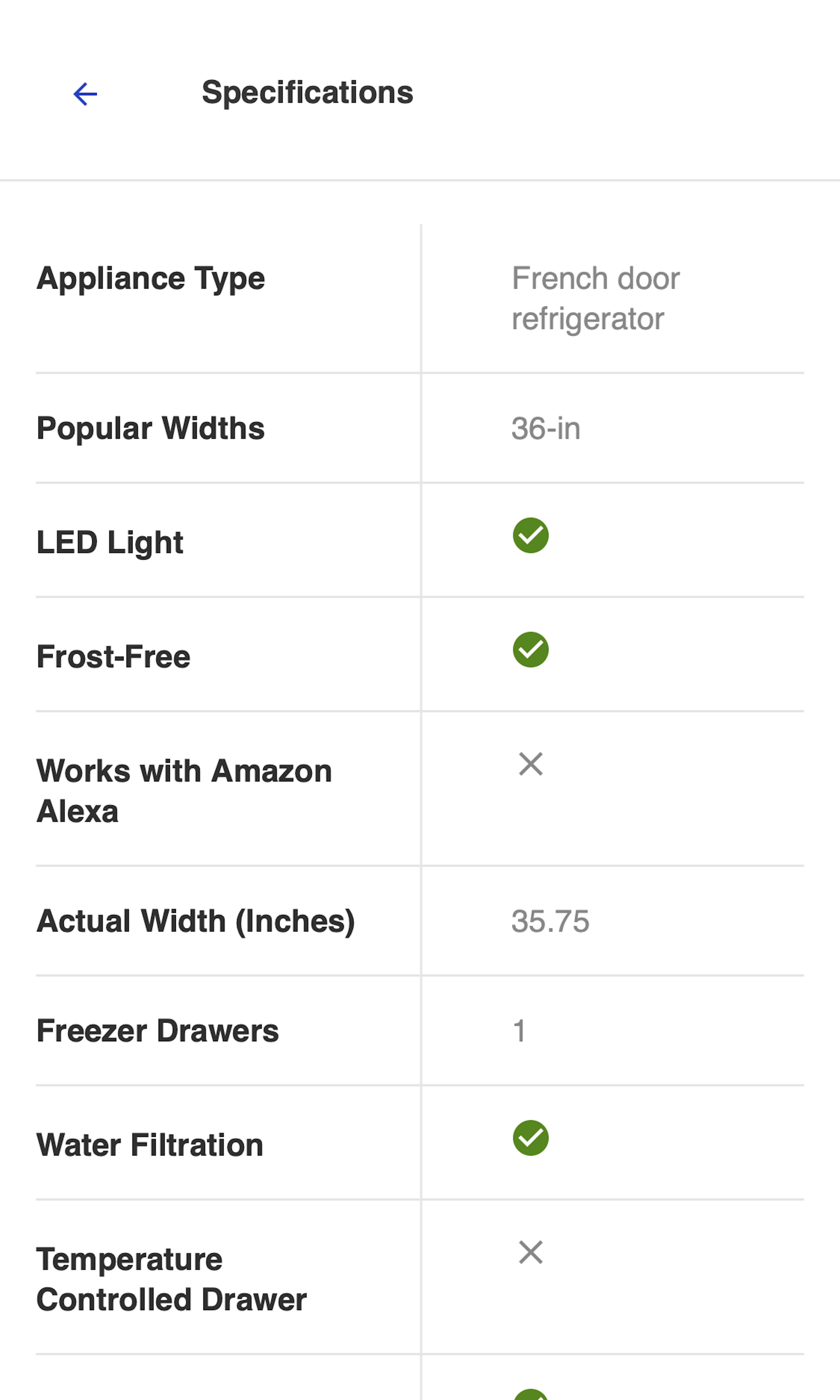
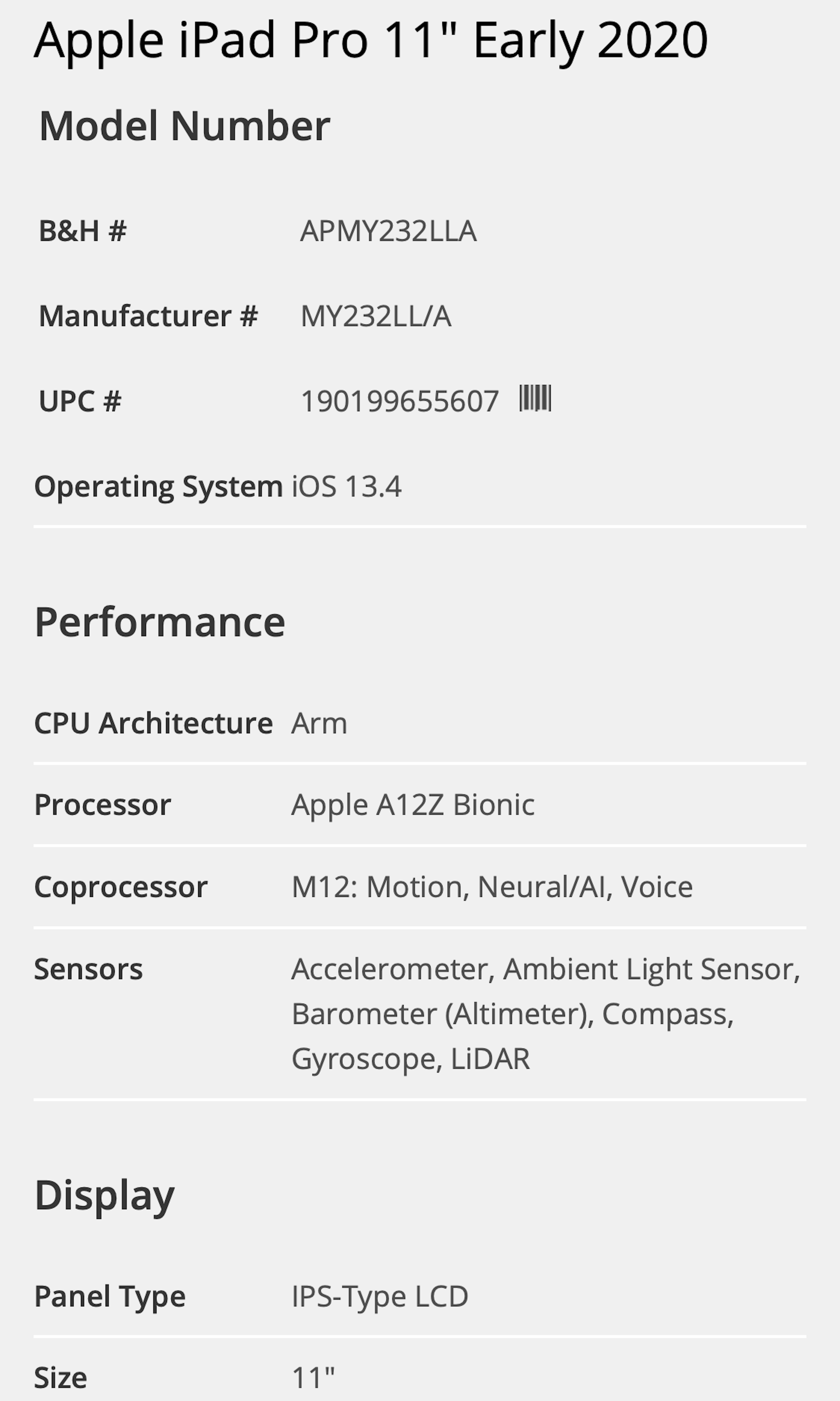
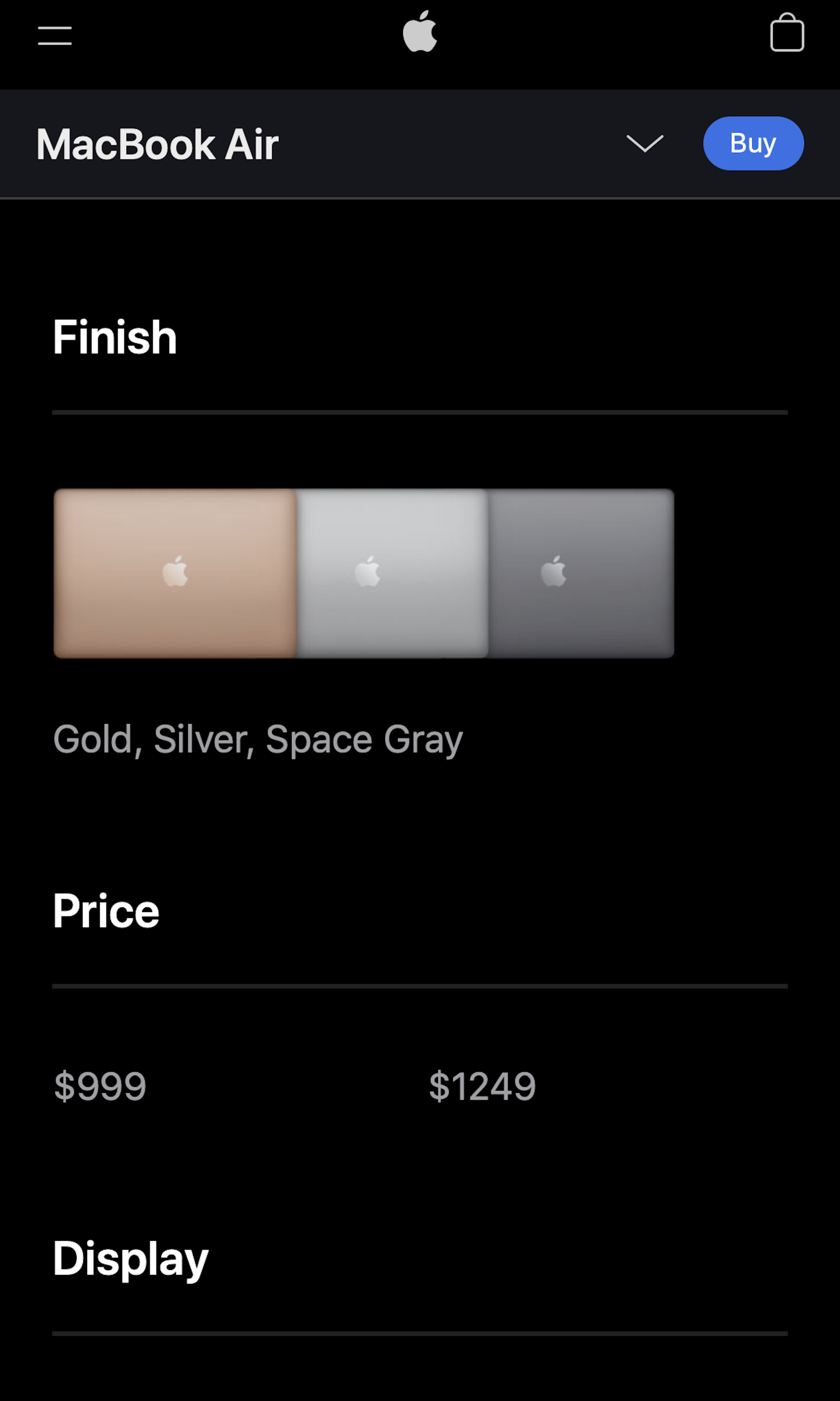
What’s this? Here you’ll find 334 “Spec Sheet” full-page screenshots annotated with research-based UX insights, sourced from Baymard’s UX benchmark of 325 e-commerce sites. (Note: this is less than 1% of the full research catalog.)
Our large-scale usability testing reveals that users rely on spec sheets to provide important product information. Unfortunately, nearly all e-commerce sites (92%) perform poorly or mediocrely when it comes to the product spec sheet UX performance, particularly with regards to scannability, consistency, and descriptiveness.
More ‘Spec Sheet’ Insights
-
For instance, our UX benchmark reveals that 38% of sites have spec sheets that hamper scannability by not grouping related specs into subsections, 32% of sites struggle with consistency across the spec sheets for products of the same product type, and 50% of sites use spec terminology that the general user will have issues fully understanding.
-
Learn More: Besides exploring the 334 “Specification Sheet” design examples below, you may also want to read our related article “The Current State of E-Commerce Product Page UX Performance - 19 Common Pitfalls”.
-
Get Full Access: To see all of Baymard’s product page research findings you’ll need Baymard Premium access. (Premium also provides you full access to 200,000+ hours of UX research findings, 650+ e-commerce UX guidelines, and 275,000+ UX performance scores.)
User Experience Research, Delivered Weekly
Join 60,000+ UX professionals and get a new UX article every week.

User Experience Research, Delivered Weekly
Join 60,000+ UX professionals and get a new UX article every week.

Explore Other Research Content

300+ free UX articles based on large-scale research.

325 top sites ranked by UX performance.

Code samples, demos, and key stats for usability.

