Key Takeaways
- Our latest ecommerce UX benchmark of Product Page performance reveals that up to 62% of sites have a “mediocre” or worse Product Page UX
- As a result, participants during testing often abandoned suitable products — solely due to resolvable UX issues
- In this article we’ll detail 10 best practices for improving your Product Page UX
Key Stats
- Our Product Page benchmark includes 30,000+ manually rated performance scores
- 115+ Product Page UX guidelines available to subscribers
- 24,000+ best and worst practice examples available in our database
The product page is the centerpiece of users’ product-purchasing decisions, as nearly all users go through product pages before deciding whether or not they’ll purchase an item.
It’s therefore crucial that product pages perform well for the end user.
However, Baymard’s latest ecommerce UX Product Page benchmark reveals that only 48% of the leading US and European desktop ecommerce sites have a “decent” or “good” Product Page UX performance — and still no sites have a “perfect” performance.
Mobile sites fare even worse, with only 38% having a “decent” or better performance, while apps fare the worst, with 36% having a “decent” or better performance.
Clearly, there’s much room for improvement in ecommerce Product Page UX.
Our Product Page UX benchmark contains 30,000+ product page usability scores that have been manually reviewed and scored by Baymard’s team of UX researchers.
Additionally, our database now contains 24,000+ new best and worst practice examples from the leading ecommerce sites in the US and Europe (performance verified).
In this article, we’ll analyze this dataset to provide you with the current state of ecommerce Product Page UX by describing the results from our Baymard research findings and provide 10 best practices applicable to most ecommerce sites.
The Current State of Product Page UX
For this analysis, we’ve summarized 30,000+ usability scores across the 12 Product Page topics in this theme that collectively constitute users’ product page experience.
Additionally, we’ve plotted the 155+ benchmarked sites’ Product Page UX performance in the scatterplot above.
Each dot above, therefore, represents the summarized weighted UX performance of one site, across the 4–21 guidelines within that respective topic.
Only 48% of desktop and 38% of mobile ecommerce sites have a “decent” or “good” Product Page UX performance
The high-level benchmark results show that 52% of desktop, 62% of mobile, and 64% of app ecommerce sites have an overall “mediocre or worse” UX performance for their product pages.
In fact, only a few desktop and one mobile site are rated as having a “good” product page UX performance (no apps did) — while “perfect” or “state of the art” implementations remain well out of reach.
The implications of this are sobering: whether on a desktop site, mobile site, or app, most users will have, at best, a “mediocre” experience while navigating the product page.
While a single severe UX issue may cause a site abandonment on its own, it’s more likely that the accumulation of experiencing medium-level UX issues on the product page will be the reason a user leaves the site.
To address this issue, below we’re providing 10 ways sites can start to improve their Product Page UX performance.
10 Product Page UX Best Practices
1) Always Use “Buttons” for Size Selection (57% of Sites Don’t)
Size is one of the most common variations for users to select before purchasing a wide variety of different product types, from apparel to beauty to hardware.
Yet on many sites this seemingly simple task is unnecessarily difficult.
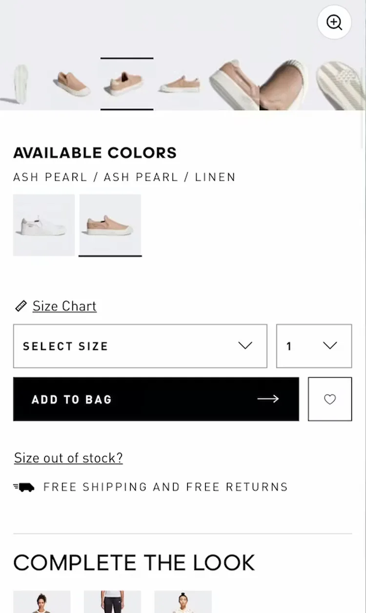
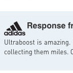
“These are cute!” This user shopping on Adidas found a pair of shoes she liked (first image) but couldn’t see that her size was out of stock until she interacted with the size drop-down menu: “Oh, they don’t have my size” (second image). Hiding sizes within a menu makes it harder to tell what sizes are in stock, which can set users up for disappointment.
In particular, using drop-down menus for size selection proved problematic during testing, as sizes were hidden by default, leading to wasted effort if a participant’s size wasn’t available (see guideline #850).
Other users will struggle to spot the drop-down menu among a variety of other, attention-grabbing visuals.
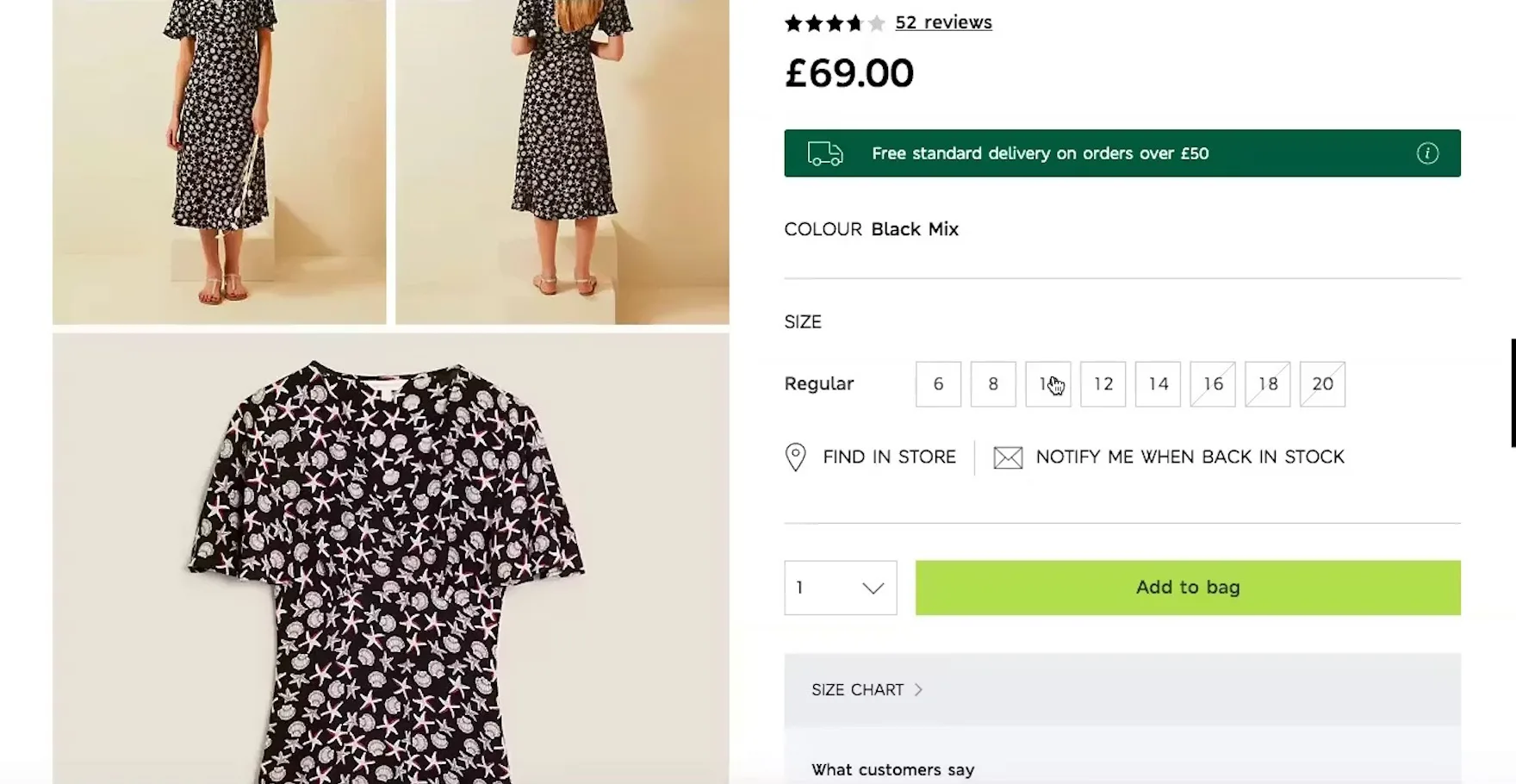
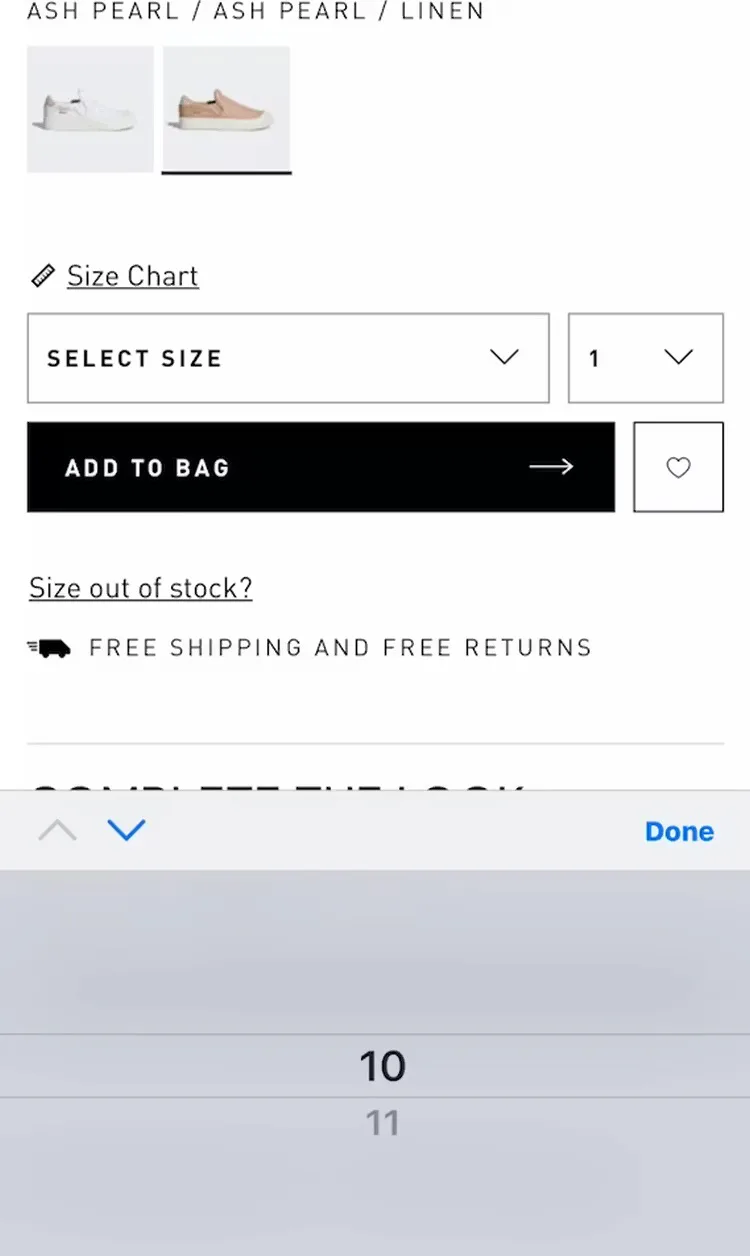
“This is clear as to what sizes there are.” On Marks & Spencer (UK), a test participant was able to quickly work out what the available sizes were, and then pick her own size easily.
Instead of using a drop-down with the size options hidden by default, expose the size options by using button-like selectors.
Exposing button selectors helps to ensure that these crucial product variations are easily seen by users.
Yet 57% of sites don’t use buttons for size selection.
2) Provide “In Scale” Images (37% Don’t)

“The dimensions. My parents measure stuff out. I’m not as much like that…I’m more visual, I feel like I want to see what it looks like in the room, and then I can gauge how tall or short it looks.” This participant at Burke Decor was unable to determine the height of the lamp from the pictures, and abandoned the product rather than using the written dimensions instead.
Our testing shows that 42% of users try to ascertain the size of a product from the product page images, but without an “In Scale” image this becomes needlessly difficult (see guideline #741).
Determining the size of a product is crucial to the online shopping experience, as users can’t physically evaluate the size of a product (like they can in a brick and mortar store).
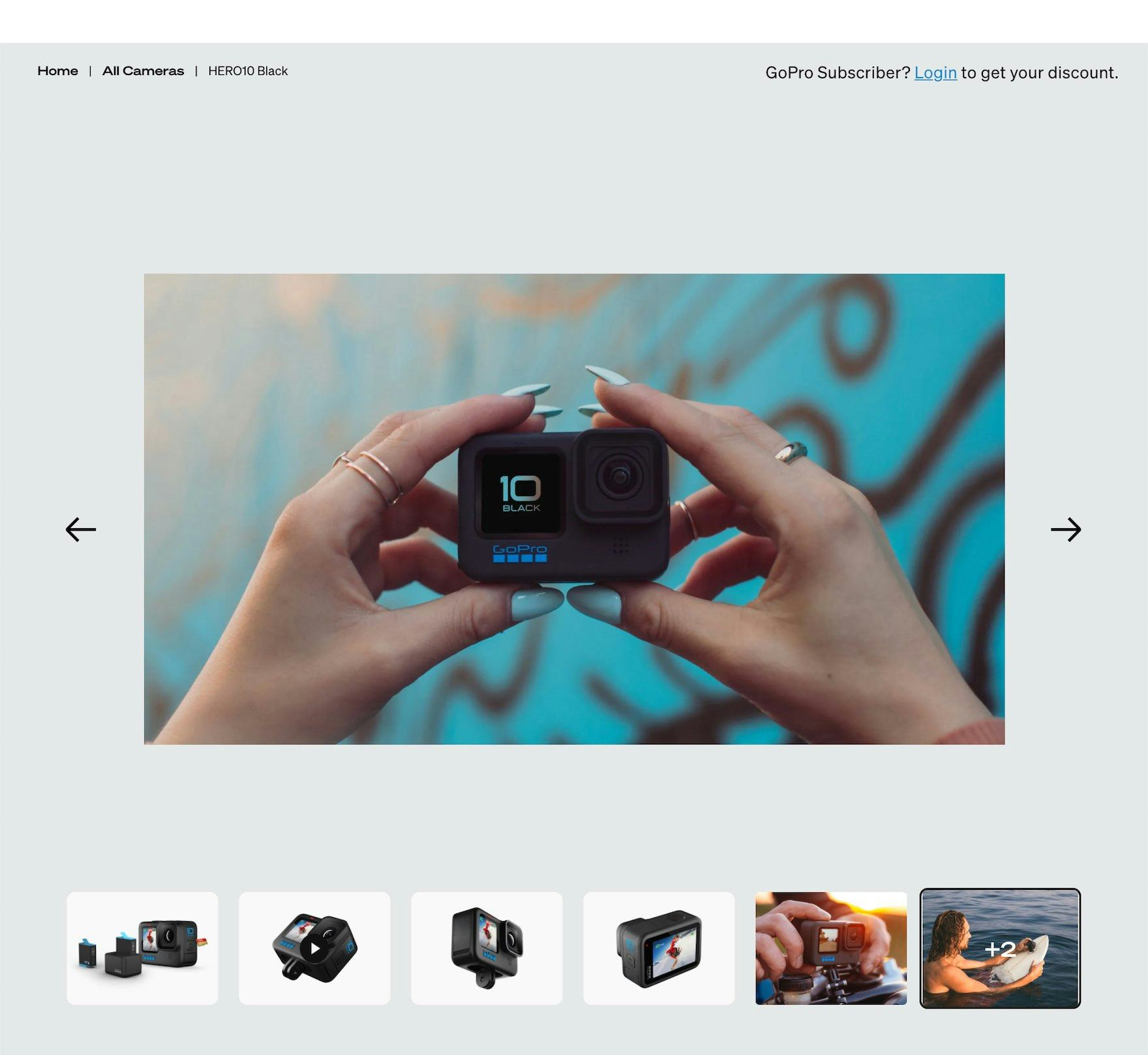
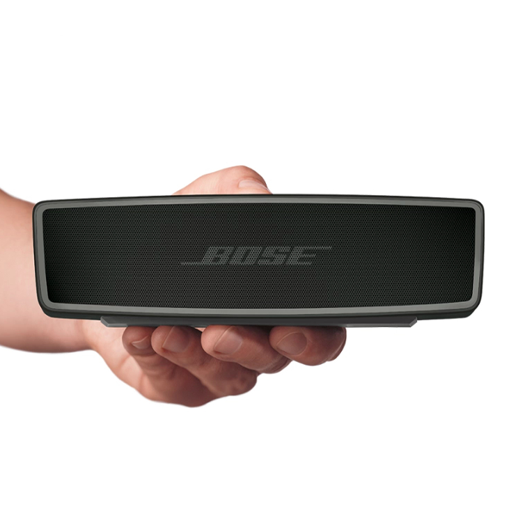
GoPro provides an “In Scale” image of a camera and illustrates its size in relation to a model’s hands. “In Scale” images are critical for users to get a sense of the relative size of products.
Therefore, it’s important to always provide “In Scale” product images.
An “In Scale” image can be created by simply placing a human or computer-generated model, or an object of known size, next to the product as a reference point.
3) Provide a “Human Model” Image (23% Don’t)

“I kind of like the ones with models, because I think it gives me kind of an idea of how tight are the jeans, where does it land on the leg?” A participant wasn’t pleased with the “Cut Out” default thumbnails for some of the jeans in a listing at Madewell, because she couldn’t grasp how the jeans would fit on a human body.
“In Scale” images are vital for helping users determine the overall size and scale of products they are viewing online.
However, for certain products, simply displaying them in context or in comparison to items of a known size is not enough for users to get a sense of their physical qualities.
Specifically, products designed to be worn — apparel; accessories such as bags, jewelry, or watches; and cosmetics — require the context of a human model in order to get the truest sense of the product (see guidelines #1193, #3174, and #3171).
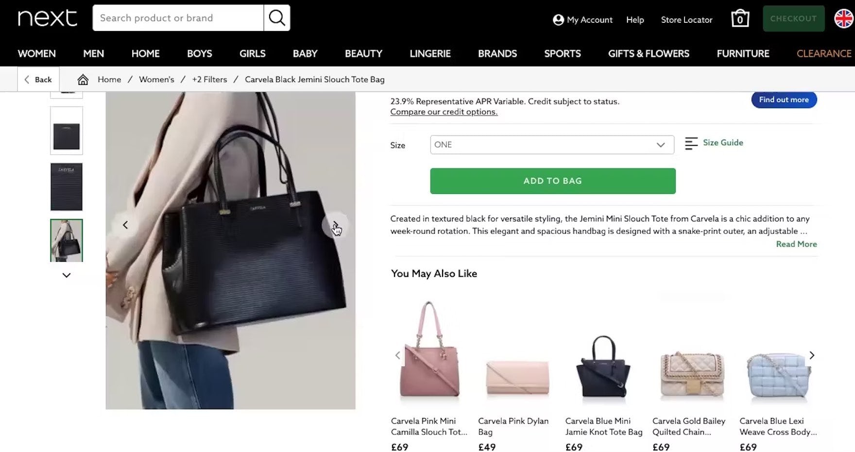
“I can also see the model so I can see that it’s quite large”. Showing a handbag being worn by a model answers any questions users may have about its size, as demonstrated here at Next (UK) during our large-scale European testing.
“Human Model” images can furnish a more comprehensive picture of the product and inform users about its visual qualities, helping them decide whether the product is suitable for them.
4) Make It Easy to Access and Use “Save” Features (89% Don’t)


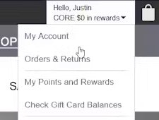
“Oh this is really cute! I like when they have hearts when you’re looking and you can actually heart something and go and look at it later and compare what you have.” A participant who admired a track jacket at Adidas was glad that it had a “Save” feature on the product list and explained how she would integrate it into her general shopping process (first image). However, she was unable to save the item because when she tapped the heart icon the site required her to sign up first (second image) — which she was not interested in doing: “See, this is crap, I hate that! I go to click on the heart and in order to do that, I have to sign up. So yeah, it’s kind of intrusive in a way!
A significant subset of users want to use “Save” or “List” features to save products they find interesting (while the majority uses the cart as a temporary storage tool).
In fact, according to our recent quantitative study, 21% of the 1,193 respondents said they rely on “Save” features.
Additionally, many users are loath to part with personal information (e.g., as evidenced in their hesitation when it comes to the phone number field).
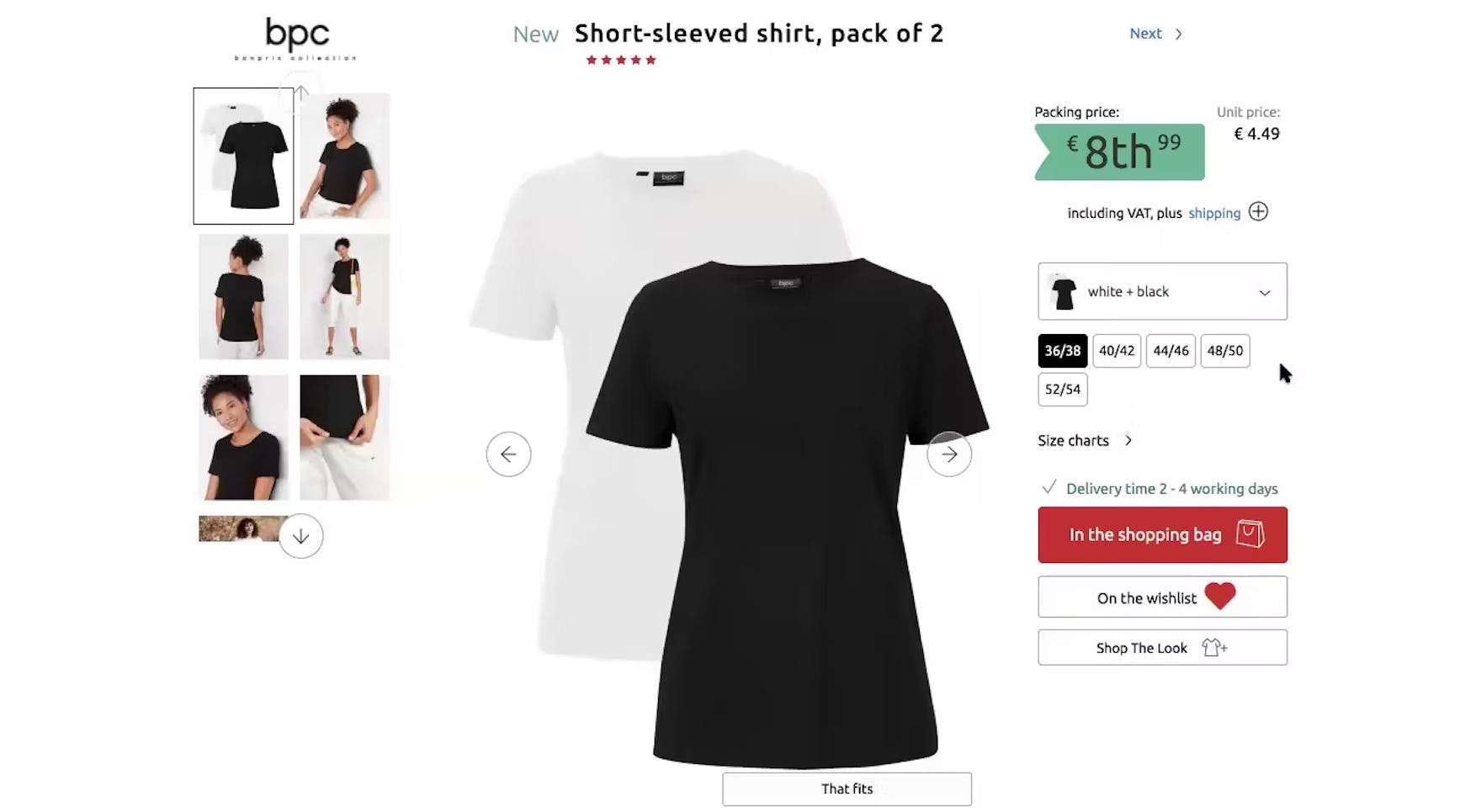
“But see what happens if I put it on the wish list. Maybe I would have to make an account. No, that’s cool, okay…I think that it’s great in this case, no account is needed to use the wishlist function.” A German participant at BonPrix appreciated being able to avoid registering in order to save items. As well as making comparing items easier, not forcing users to register makes a good impression.
It’s therefore important that sites allow any “Save”, “Favorite”, or “Wishlist” to be used by guest users (see guideline #798).
It is understandable why sites want to have users sign up for accounts: they will have the ability to reach out more often to users to offer promotions and sales, users may be inclined to shop more frequently at a site at which they’ve already registered, and having an account can allow for more robust list management and features.
However, such legitimate interests come at the expense of scaring away a significant amount of new users, and potentially forfeiting an important number of sales, here and now.
5) Display “Price Per Unit” for Products Sold in Varying Quantities or Amounts (81% Don’t)


At Ulta Beauty, users must decide whether it’s a better deal to buy 13.5 oz. of shampoo for $17 (first image) or 33.8 oz. for $25 (second image). Providing the price per ounce — that is, $1.26 per oz. for the small one and $0.74 per oz. for the large — would clarify how much better the deal is when buying in bulk.
Not providing a “price per unit” on the product page, which we also found to be an issue in our Product Lists & Filtering and Mobile ecommerce studies, makes it difficult to compare products of varying amounts or quantities (e.g., a 3.5 oz. bottle of hand lotion for $4.95 vs. a 1.2 oz. bottle of hand lotion for $2.35).
Indeed, without a price per unit, not only is it more difficult for users to judge prices, but it is also hinders sites’ ability to sell users bulk orders (which increase the average order value).
These issues often occur at a critical time in the purchase-decision process, when users are just deciding whether to add a product to the cart — disruptions here will cause unnecessary abandonments for some users (see guideline #817).
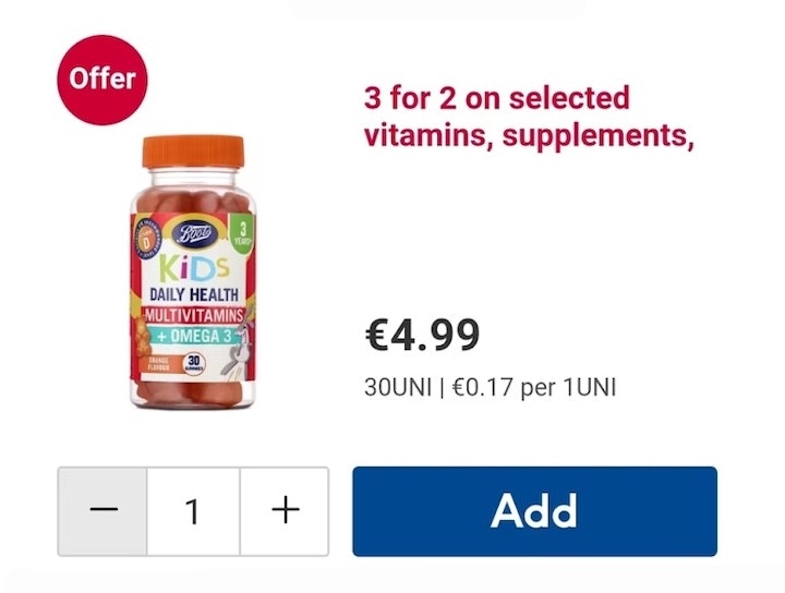
![“So you look at the price. Like this one says it’s $0.21 [per-serving].” This participant found price-per-serving information in the “Buy” section at The Vitamin Shoppe, which was helpful with comparing the supplement against other products of a similar type.](https://baymard-assets-cdn.imgix.net/research/media_files/attachments/134495/original/research-media-file-755579f1d361f1ee6b4cdb29241fc437.jpg?auto=format&dpr=2&fit=max&q=50&w=880)
“So you look at the price. Like this one says it’s $0.21 [per-serving].” This participant found price-per-serving information in the “Buy” section at The Vitamin Shoppe, which was helpful with comparing the supplement against other products of a similar type.
Therefore, to avoid users cutting their comparison process short, product pages should calculate and display price per unit for any product available in multiple quantities or sizes.
6) Provide a “Total Order Cost” Estimate Near the “Buy” Section (67% Don’t)
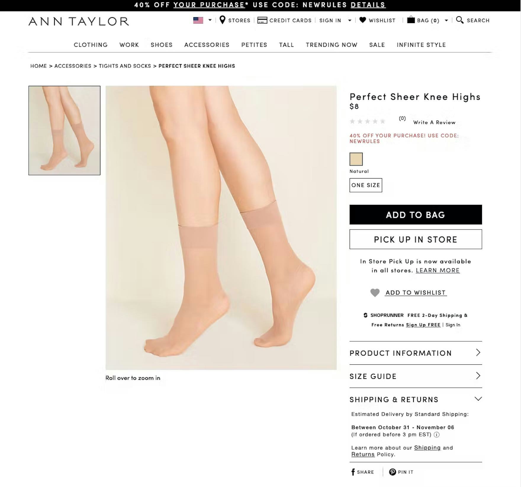
At Ann Taylor, users are given no estimate of the shipping price on the product page. When users on the product page don’t have any idea how much shipping will cost, those costs may come as a surprise at checkout and will cause some to abandon their order.
When users make purchases online, there can be a number of “hidden costs” that can quickly add up — for example, taxes, shipping costs, oversize item fees — and these costs can vary significantly from site to site.
If the total order cost is missing from the product page, users will have to take the extra step of adding the product to their cart to see this information (assuming it is provided at the “Add to Cart” step).
This quickly becomes tedious, especially as users compare products across sites and must take the extra steps of adding a product to the cart just to get an idea of how much their total purchase will cost them in the end (see guideline #825).
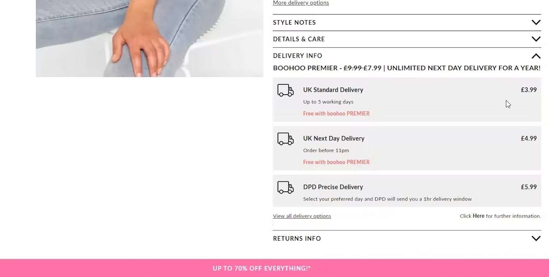
At Boohoo (UK), delivery options and costs were clearly shown. This allows users to calculate the total cost and assess the value of a faster delivery before adding items to the cart.
Instead, the lowest full order cost should be displayed on the product page by default; in particular, by showing the lowest shipping cost (or at the least an estimate and its conditions).
Additionally, if selling items where shipping and tax costs may be significant, consider making the section expandable and including a shipping and tax calculator to allow users to more accurately determine the total order cost.
7) Display or Link to the Return Policy from the Main Product Page Content (44% Don’t)

“So if I ordered this, I’m just wondering if it’s returnable.” Many participants shopping for expensive furniture products like sofas actively sought out the return policy on the product page, wanting to ensure they could get their money back if the item didn’t meet their expectations. This participant at Raymour & Flanigan wasn’t sure if the sofa she was considering was returnable or not, and the product page provided no information to answer her question. High-cost items represent a significant financial commitment and most consumers lack the financial flexibility to absorb the cost of a mistake, a concern that a clear and flexible return policy can mitigate.
When shopping for products online, users understand that even seemingly perfect products may not work in reality.
Indeed, a strict return policy can even be a reason for site abandonment, as our quantitative study of 1,026 online shoppers in the US revealed: 15% of ecommerce customers have abandoned orders in the last quarter because they found the return policy unsatisfactory (see our cart abandonment rate page).
Consequently, lacking access to the return policy early on in users’ product search — especially for products such as apparel items, which can have dramatically different sizes depending on where you shop — is a source of anxiety for many users (see guideline #803).
What’s more, according to our Consideration & Purchase Behavior quantitative study with 1,032 respondents, most users look for return policy information on the product page (60%).
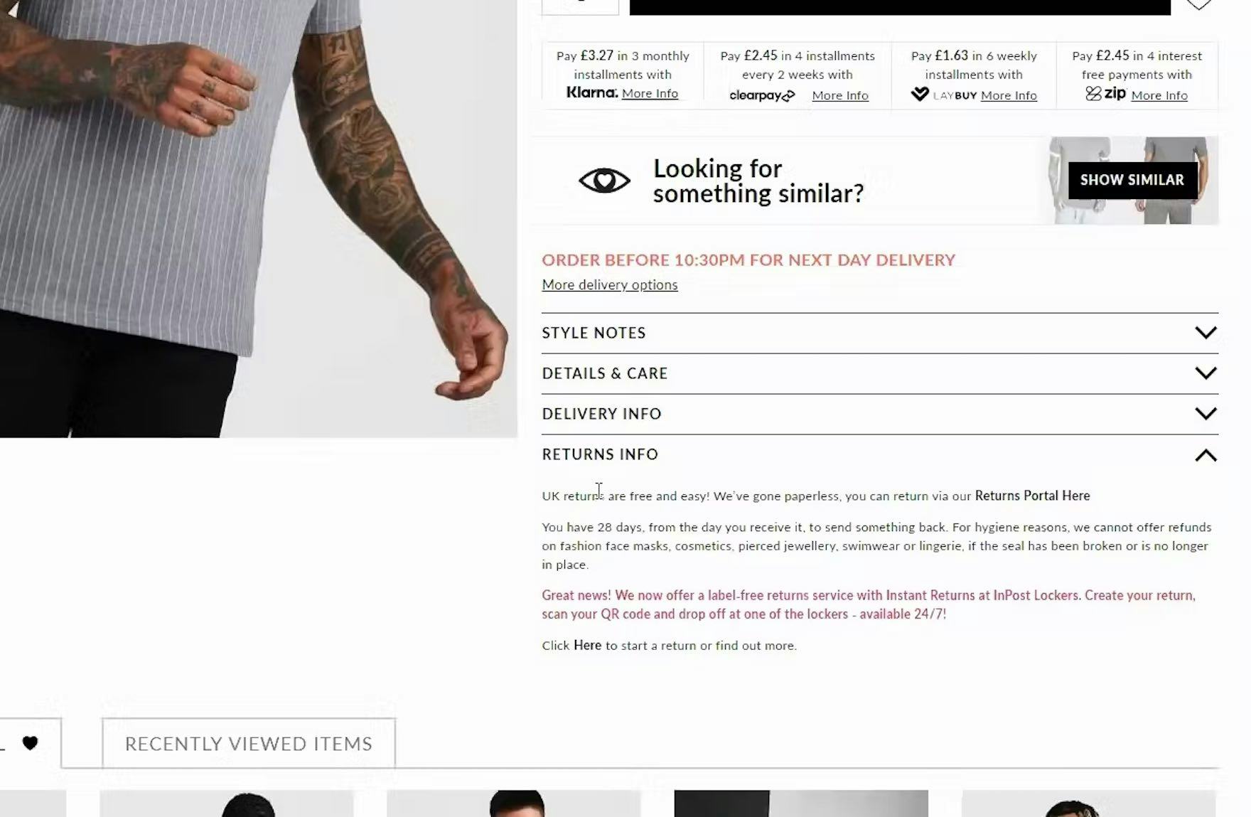
“‘Returns info’, that would be something important for me.” This test participant at Boohoo (UK) was happy to quickly find the “Returns Info” section on the product page. Returns policies on apparel sites are especially important, given the importance of trying on clothing to judge their suitability.
Therefore, a link to the return policy, or a brief summary of the general return policy, should be prominently displayed on the product page (as well as in the footer), and the return policy text must be written to be understandable by the average user.
8) Consider Showing Gifting Options on the Product Page (78% Don’t)

Here Gamestop’s product page gives users options for shipping and coupons, but not gifting. Users have to wait until the product is in their cart before they learn how they can give it as a gift.
During testing, we’ve observed some users begin considering gifting options as early as the product page (or even before they land on the site, if they know they’ll need to send the order as a gift).
If users are unclear about the gifting options being offered for a particular product, they may not be willing to add the product to the cart or to investigate the site’s non-product content in order to learn whether orders can be placed as gifts and what gifting features are available (see guideline #805).

At Etsy, the option to mark a jewelry item as a gift clarifies that “Prices will not be shown on packing slip”.
For sites that ship most of their orders as gifts, providing more detailed gifting information as early as the product page offers a competitive advantage for those users who want to put extra care into their gift giving.
For example, offering detailed shipping information, pictures of gift boxes, and descriptions of how the gift will arrive are details that will help considerate users get a full picture of the gifting process — as compared to first adding a product to the cart in order to see the gift options.
9) Respond to Negative User Reviews (89% Don’t)

“Now when I see these, I look at a bad review, this is one I’d read cause I want to know what’s so bad about it. I read bad reviews more than I read good reviews.” Many participants during app testing, like this one in the Amazon app, checked negative reviews frequently. Not responding to negative reviews leaves users with a doubly bad impression.
Not responding to negative reviews leaves users doubtful about the quality of both the specific product they’re viewing and, for single-brand sites, the customer service they’ll receive if they purchase any product on the site (see guideline #785).
Negative reviews, if not responded to, can have deleterious effects, since reviews may negatively describe not just an experience with a particular product but also external circumstances surrounding the purchase (e.g., shipping or an in-store experience).
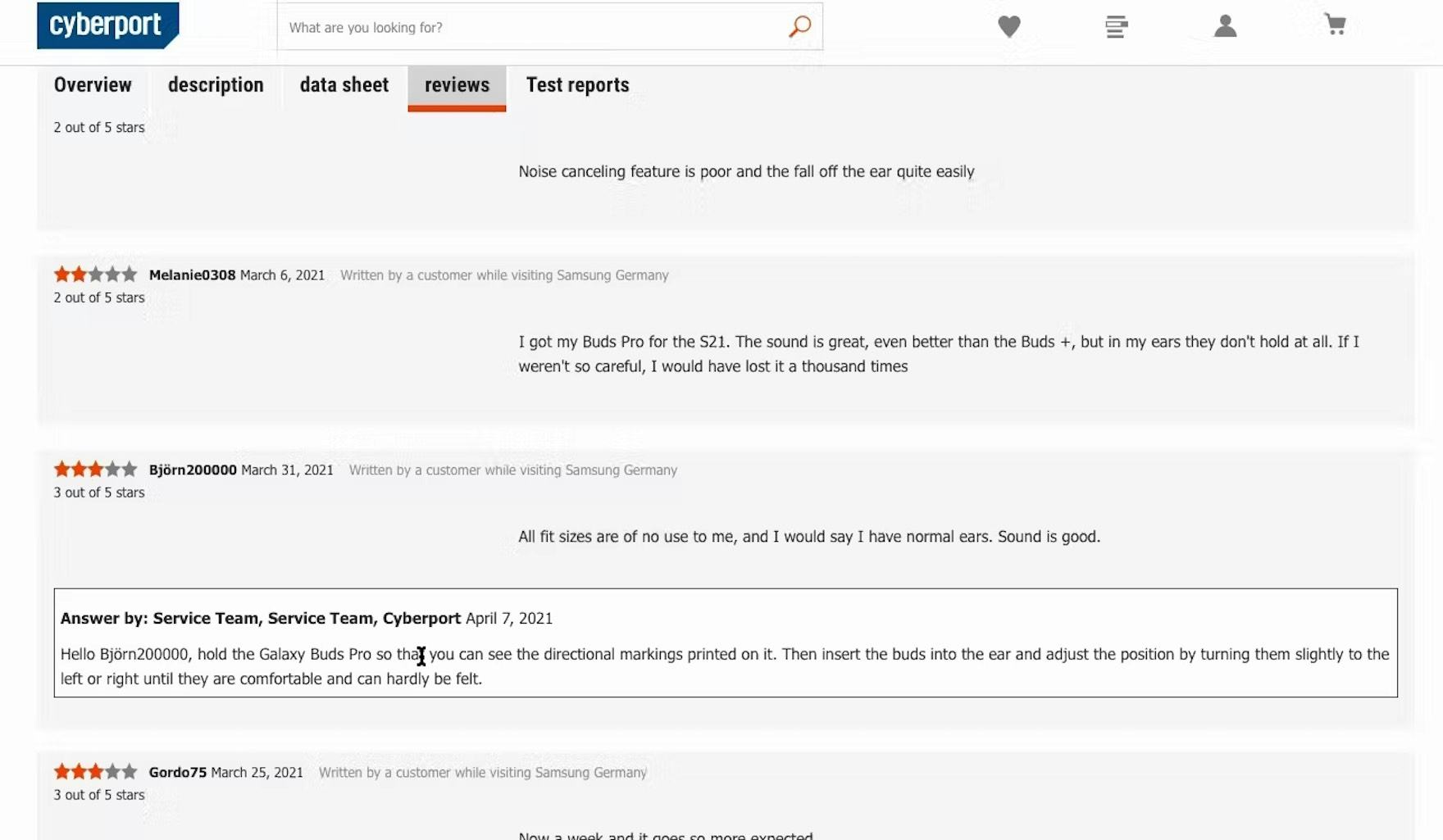
“I get a good feeling always when people reply to reviews…it just shows that they care. They even offer some support. So that’s good.” Replying to negative reviews can give users the impression that the company cares, as confirmed by this participant at the German site Cyberport during large-scale European testing.
Therefore, it’s important to respond to negative reviews.
Even though a response to a negative review may not change a dissatisfied customer into a satisfied one, testing demonstrated that doing so was positively perceived by participants to reflect customer care and proactive, easily reachable customer support.
An important implementation detail when responding to negative reviews is to style the staff responses differently from the reviews, to make them easily discernible for users.
10) Always Allow Users to Navigate across User Reviews via Reviewer-Submitted Images (63% Don’t)
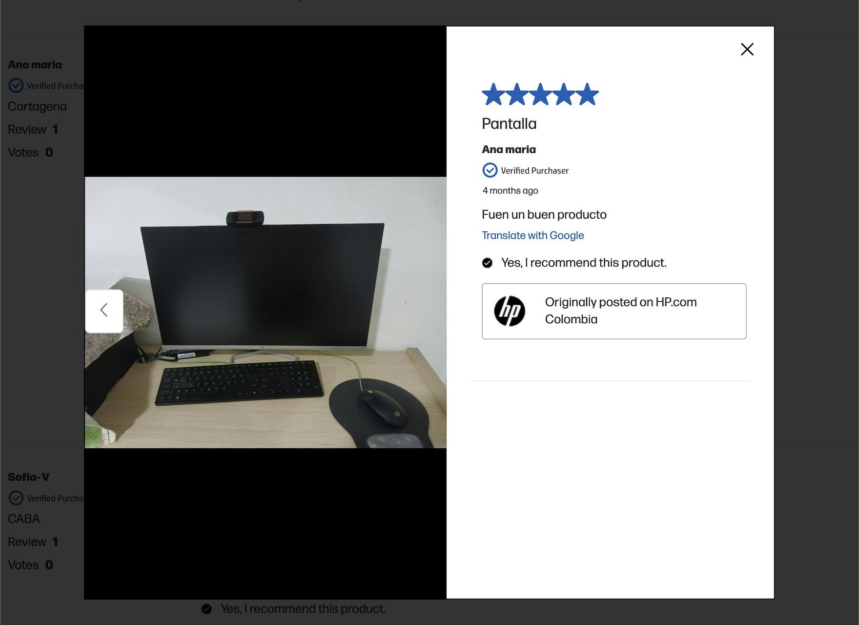
At HP, when viewing photos opened from the review, users can only see photos from that review and cannot traverse images from one review to another. This makes the task far more arduous than it needs to be.
In testing, participants appreciated when sites allowed them to easily traverse the reviewer-submitted images across reviews.
Users rely on customer images to validate that site photos are truly representative of the product, and often judge these submissions (even if lower quality) as more objective, reliable, and trustworthy.
However, many sites do not offer a way to easily view and navigate across all images uploaded to reviews, instead requiring the user to hunt for those that contain image thumbnails and then click in and out of each review individually.
When sites don’t offer an easy way for users to navigate across reviewer-submitted images, users can grow tired of this time-consuming task and possibly abandon a product that is suited to their needs (see guideline #2554).


“I like when they do this, how you can slide in the pictures, and go from one review to the next, and just see all the reviews that include pictures. I do like when they do that.” This participant at Lamps Plus gasped in delight when she swiped on the image of a flower-print chair (first image) and was taken to an image from a different reviewer (second image).
Therefore, sites should always allow users to seamlessly navigate through images and their associated reviews without impacting the main reviews feature.
In particular, participants appreciated when the act of clicking on an image within a review launched an overlay with an image carousel, allowing them to move directly through all the images submitted with customer reviews.
Thus, users should be able to progress through the image carousel using manual controls like arrow navigation or touch gestures on mobile.
Product Page UX: Get Started with Improving the Ecommerce UX
Our benchmark has revealed that there’s a long way to go when it comes to Product Page UX, as 52% of desktop, 62% of mobile, and 64% of app ecommerce sites have an overall “mediocre or worse” UX performance for their product pages.
By implementing the best practices described above and in our research catalog, you’ll make a start at ensuring users are successful when it comes to exploring products on the product page — and getting the info they need to make a purchase decision.
The best practices provided here focus on only 10 of the 100+ Product Page guidelines included in our ecommerce UX benchmark analysis.
The 90+ other guidelines should equally be reviewed to gain a comprehensive understanding of the current state of Product Page UX, and to identify additional site-specific issues not covered here.
For additional inspiration consider clicking through the Product Page Designs, as these showcase product page implementations from 155+ leading US and European ecommerce sites and can be a good resource when considering redesigning product pages — not only of what to emulate, but also of what to avoid.
This article presents the research findings from just a few of the 700+ UX guidelines in Baymard – get full access to learn how to create a “State of the Art” ecommerce user experience.
If you want to know how your desktop site, mobile site, or app performs and compares, then learn more about getting Baymard to conduct a UX Audit of your site or app.