
1482 ‘Payment’ Design Examples
Also referred to as: Payment Methods, Credit Card
What’s this? Here you’ll find 1482 “Payment” full-page screenshots annotated with research-based UX insights, sourced from Baymard’s UX benchmark of 327 e-commerce sites. (Note: this is less than 1% of the full research catalog.)
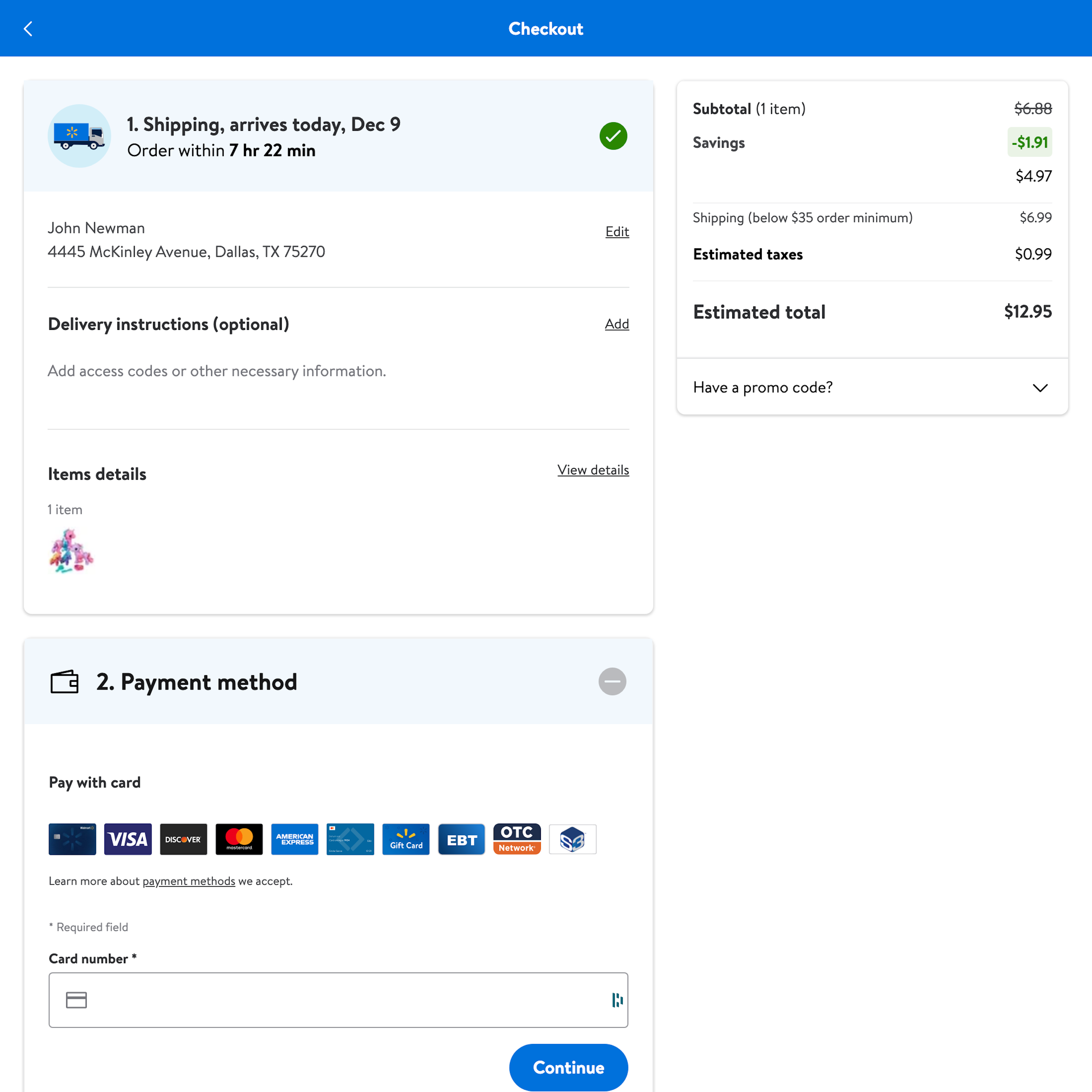
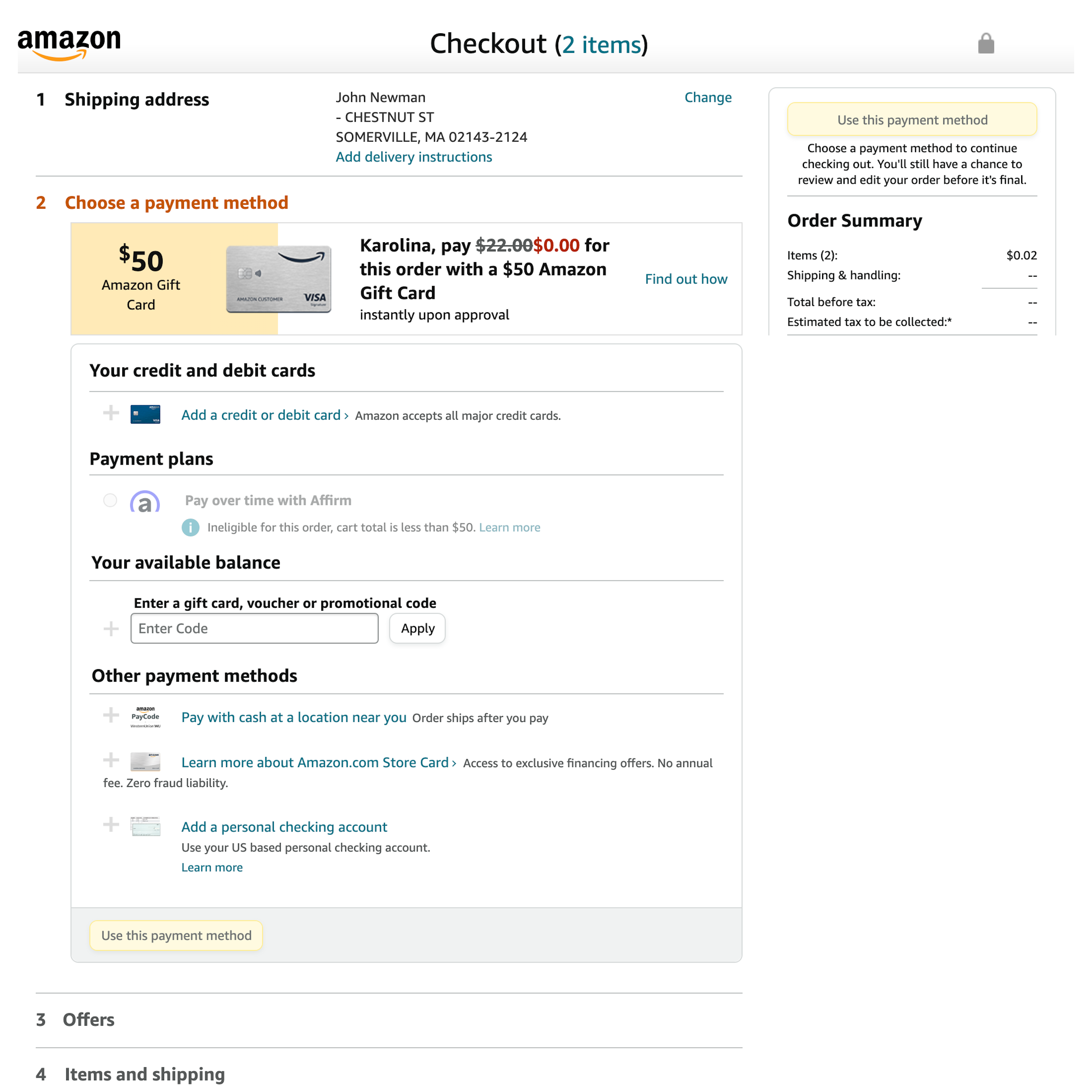
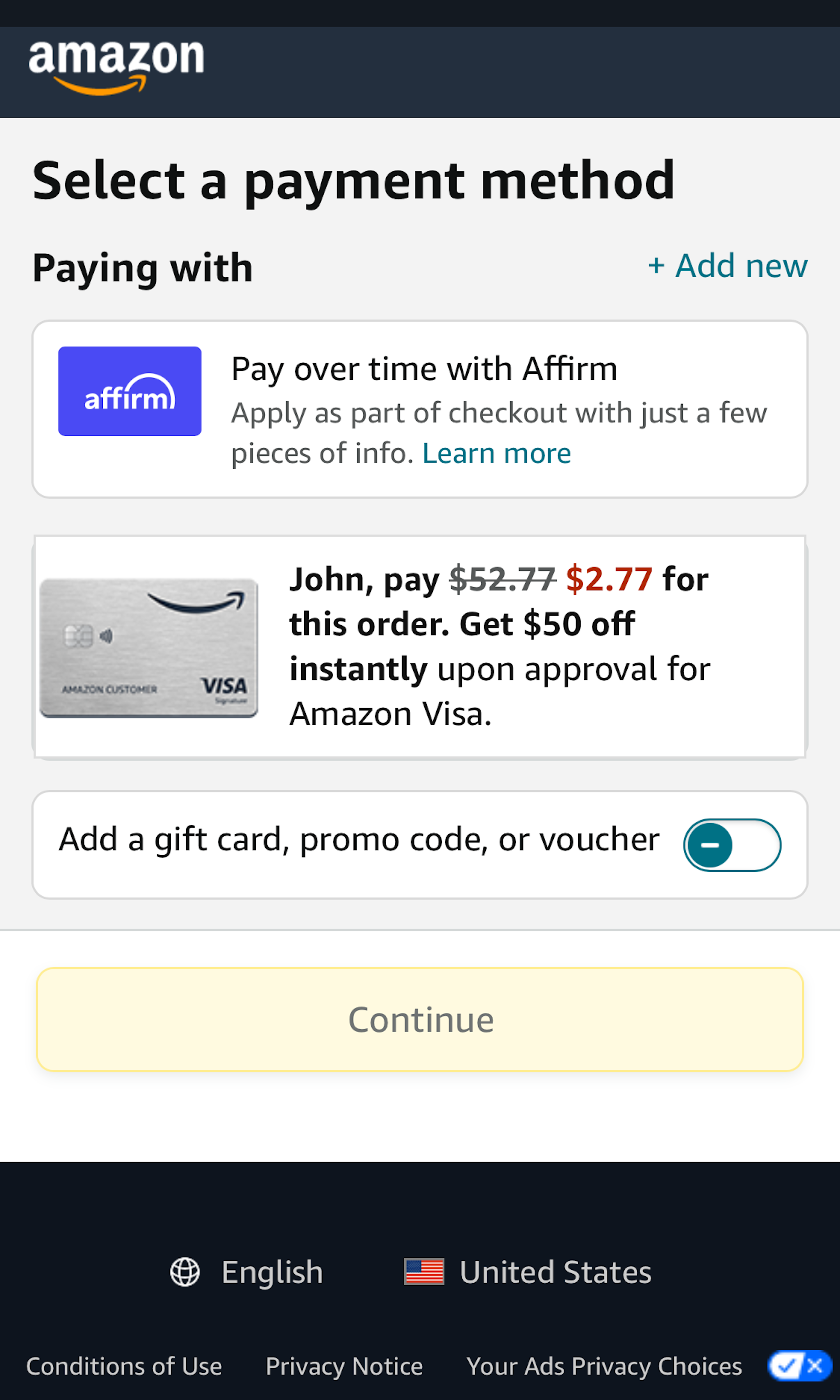
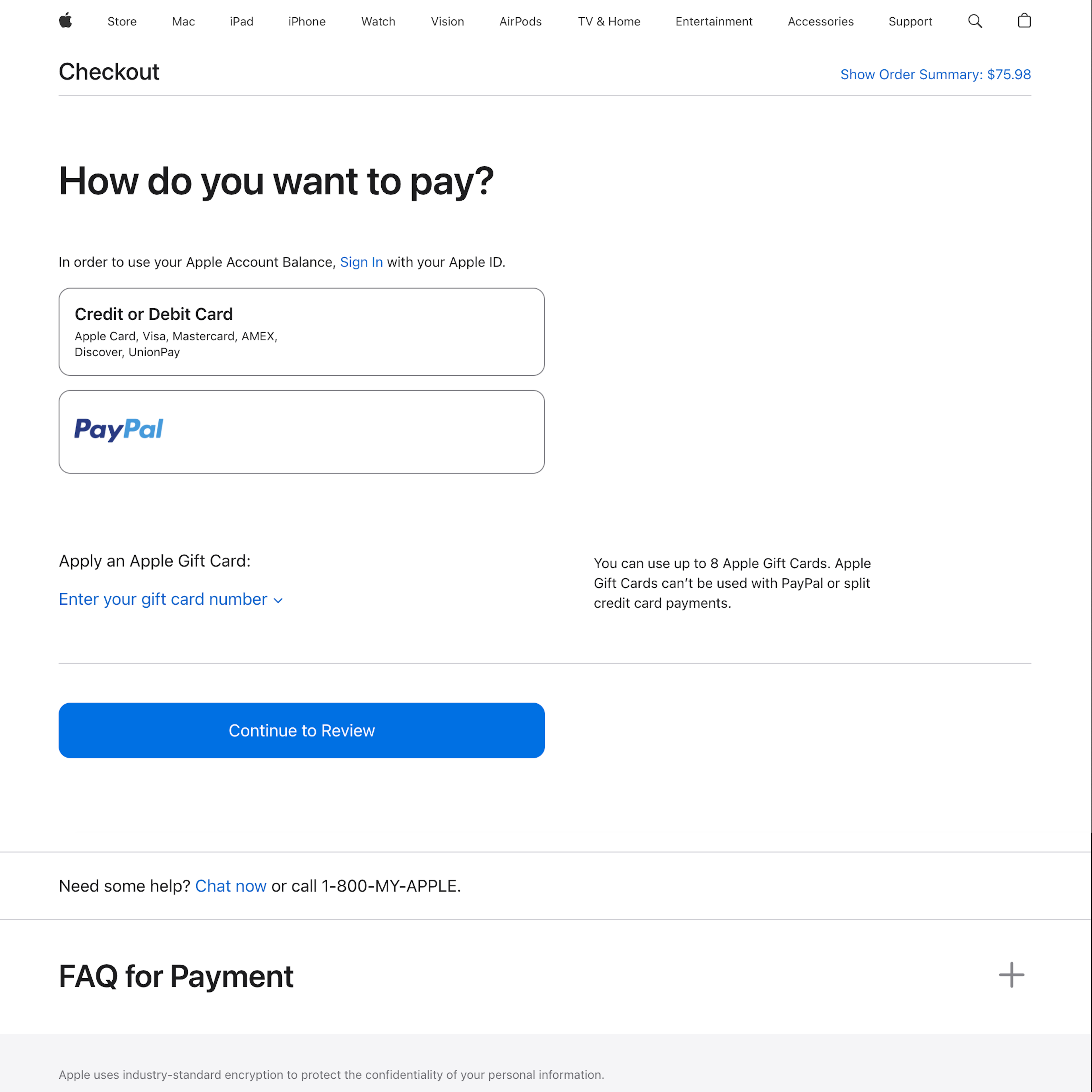
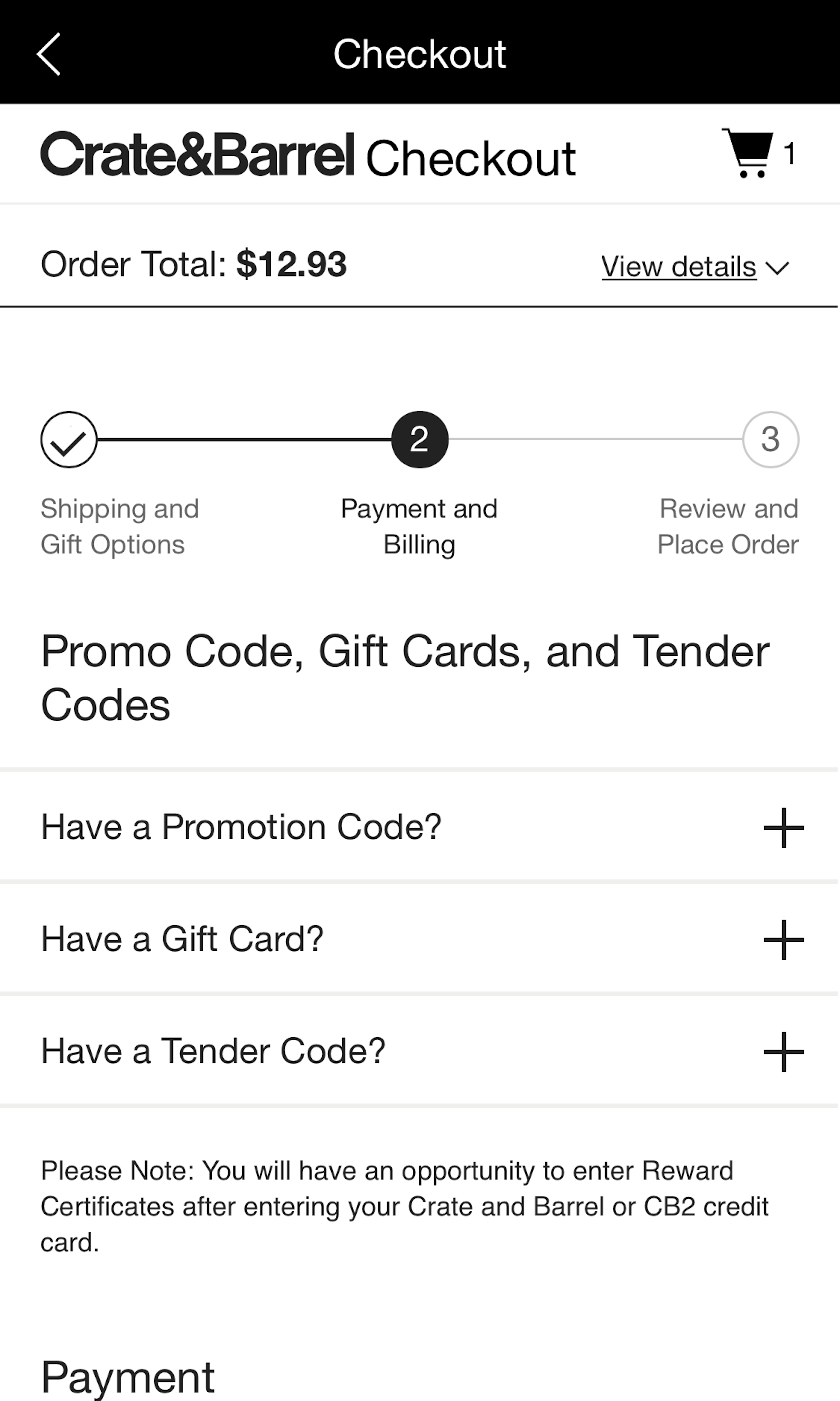
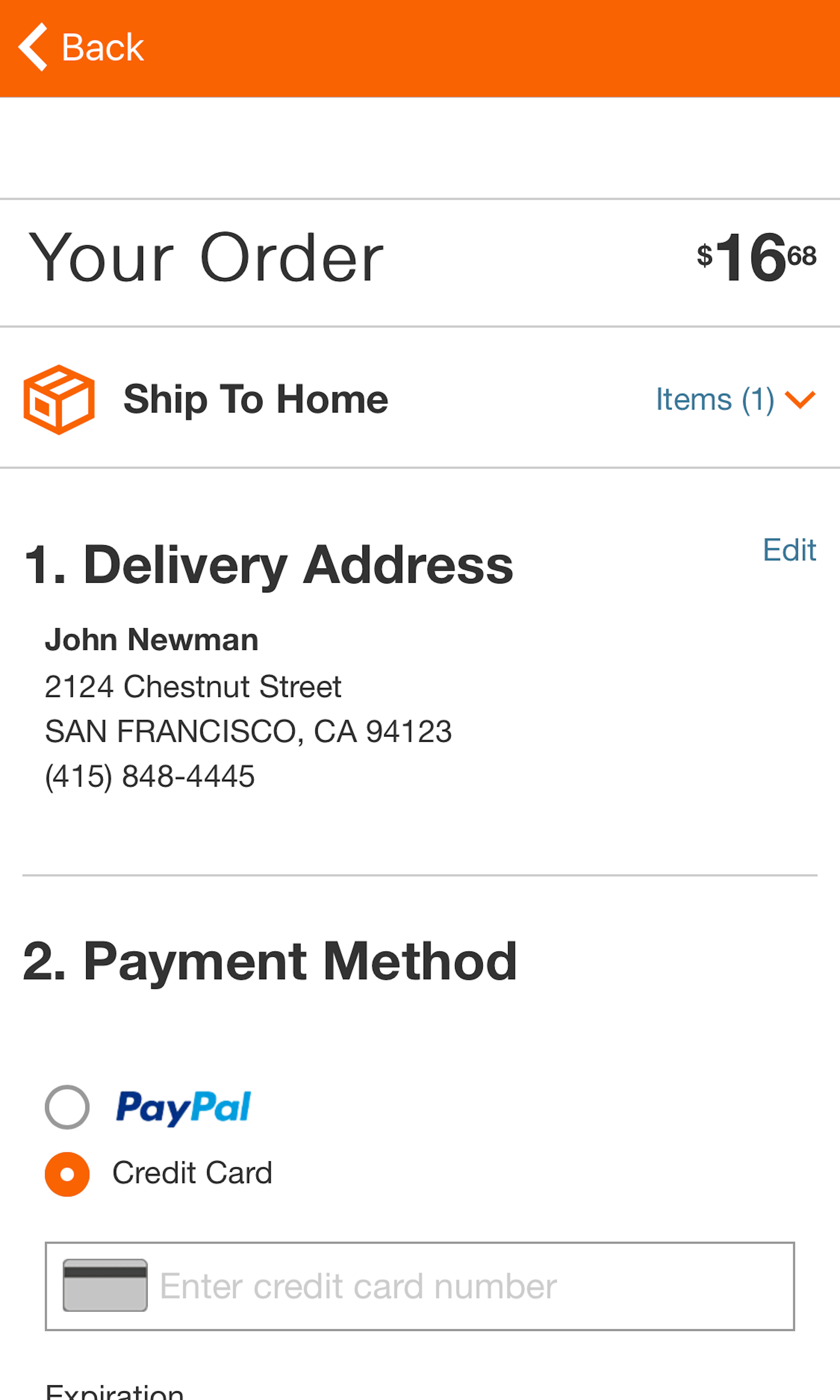
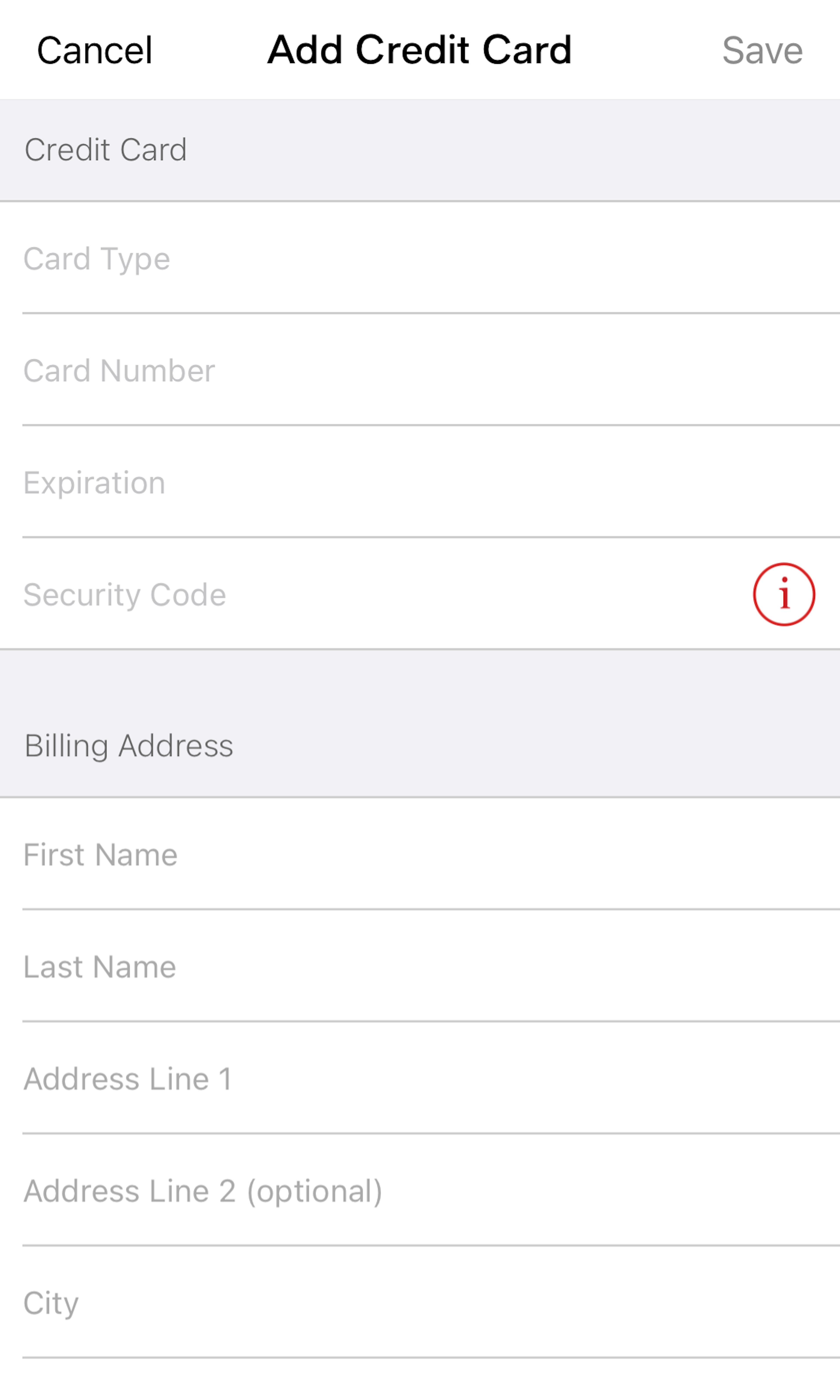
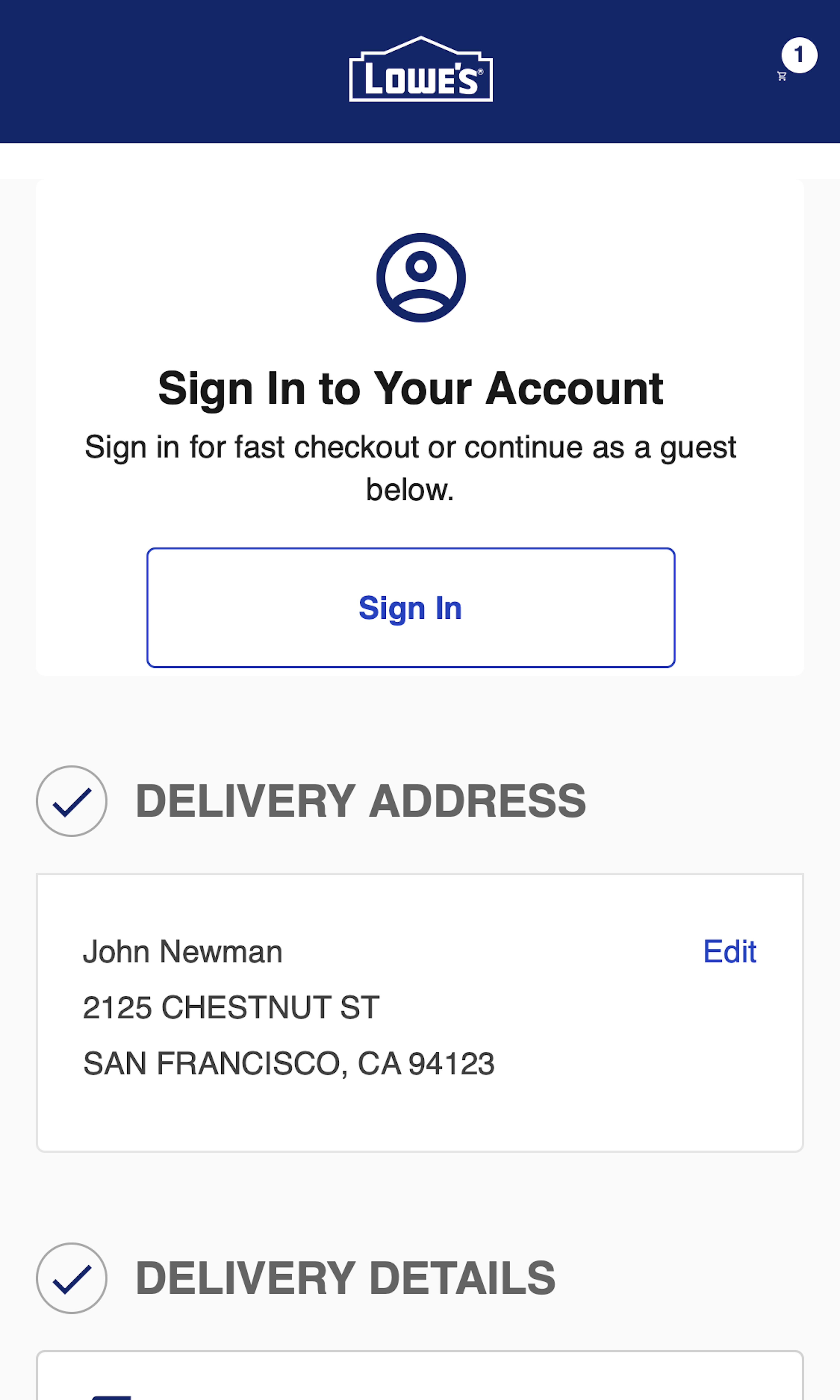
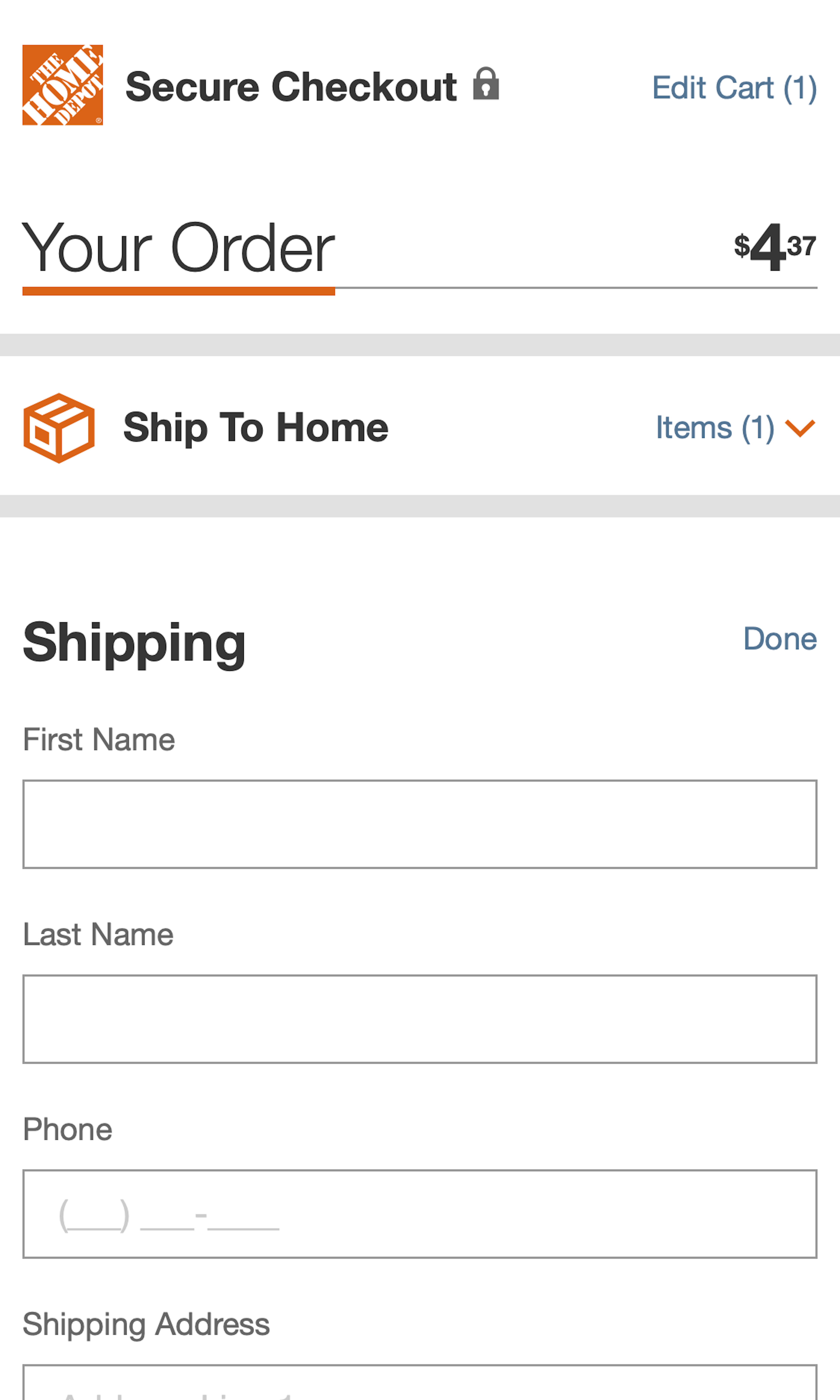
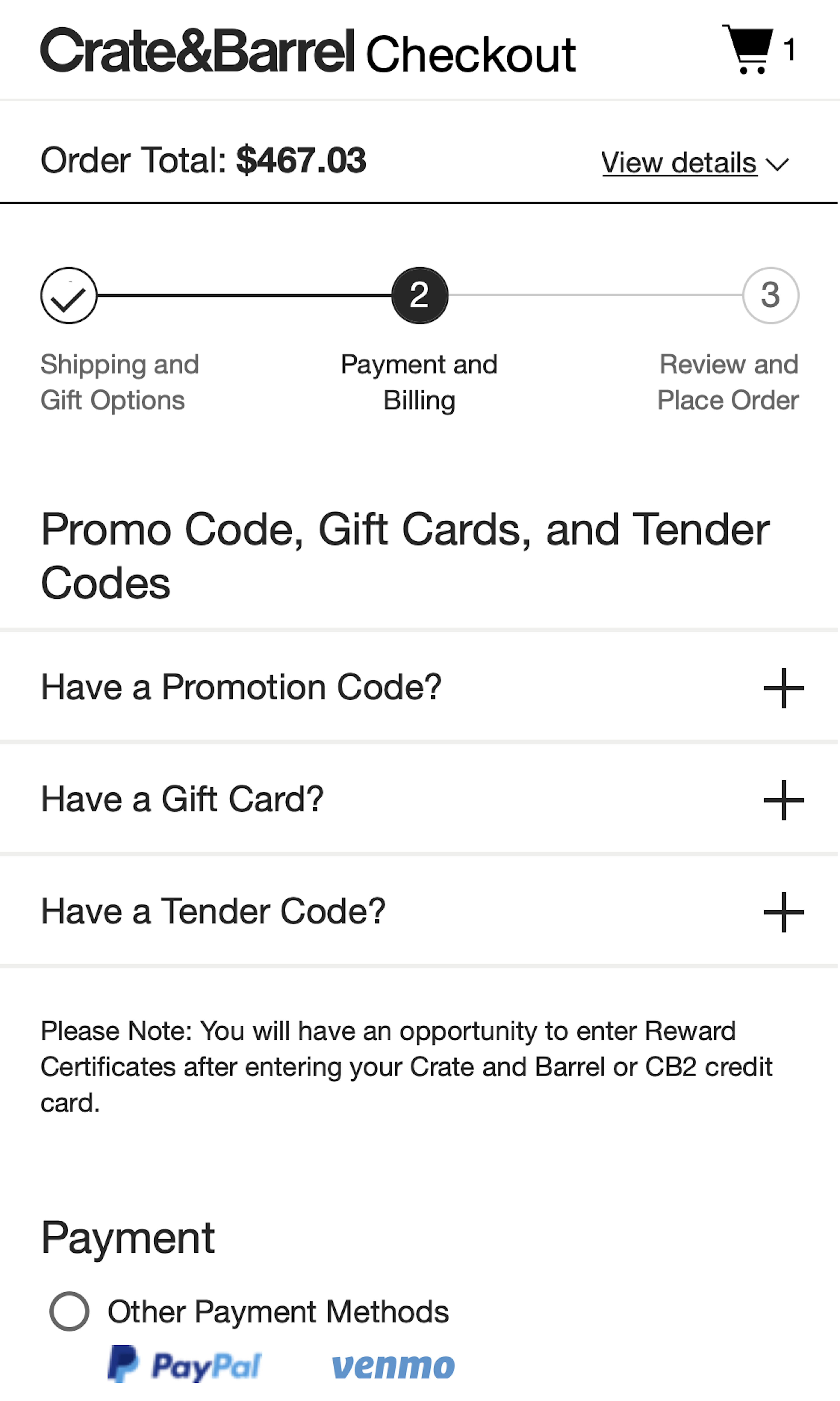
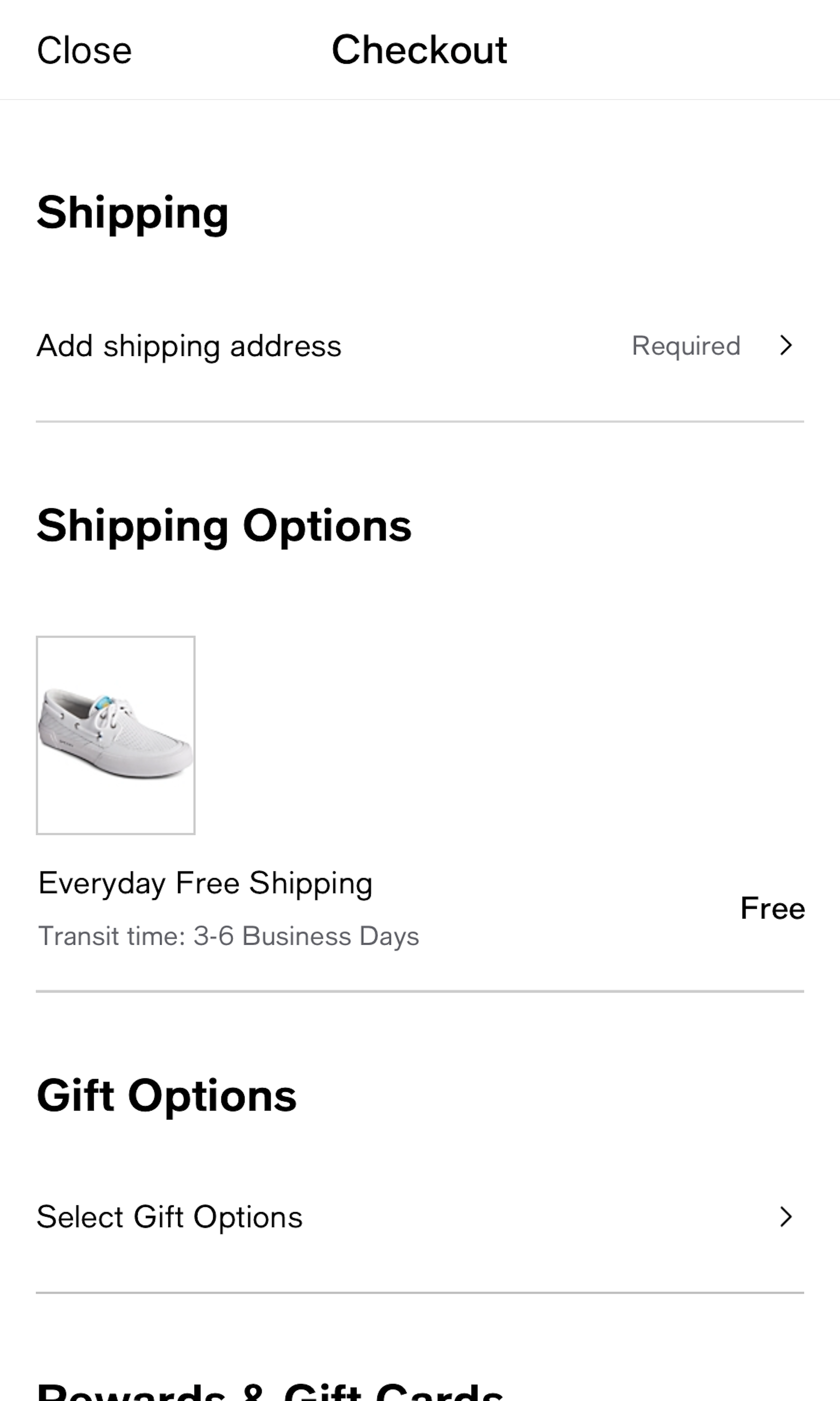
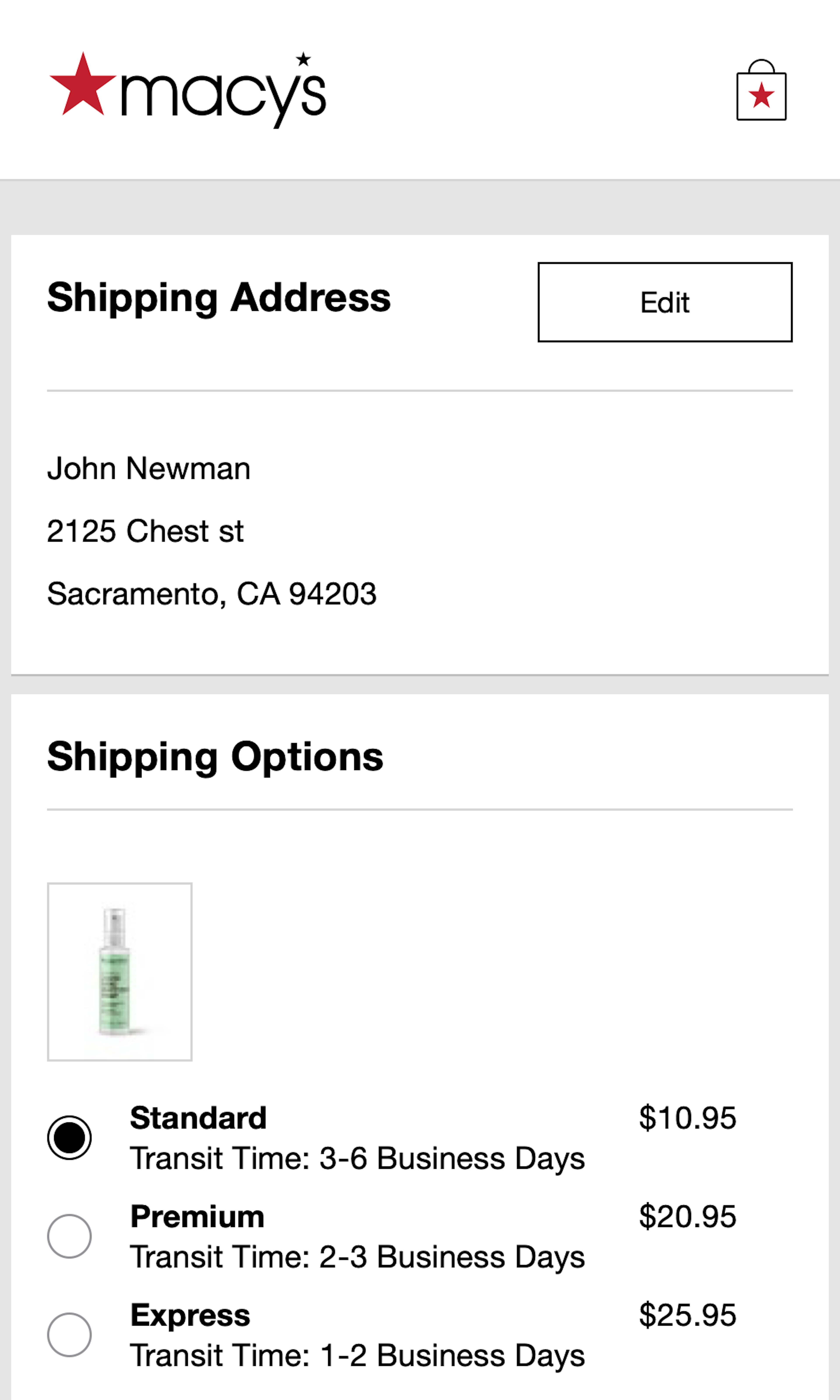
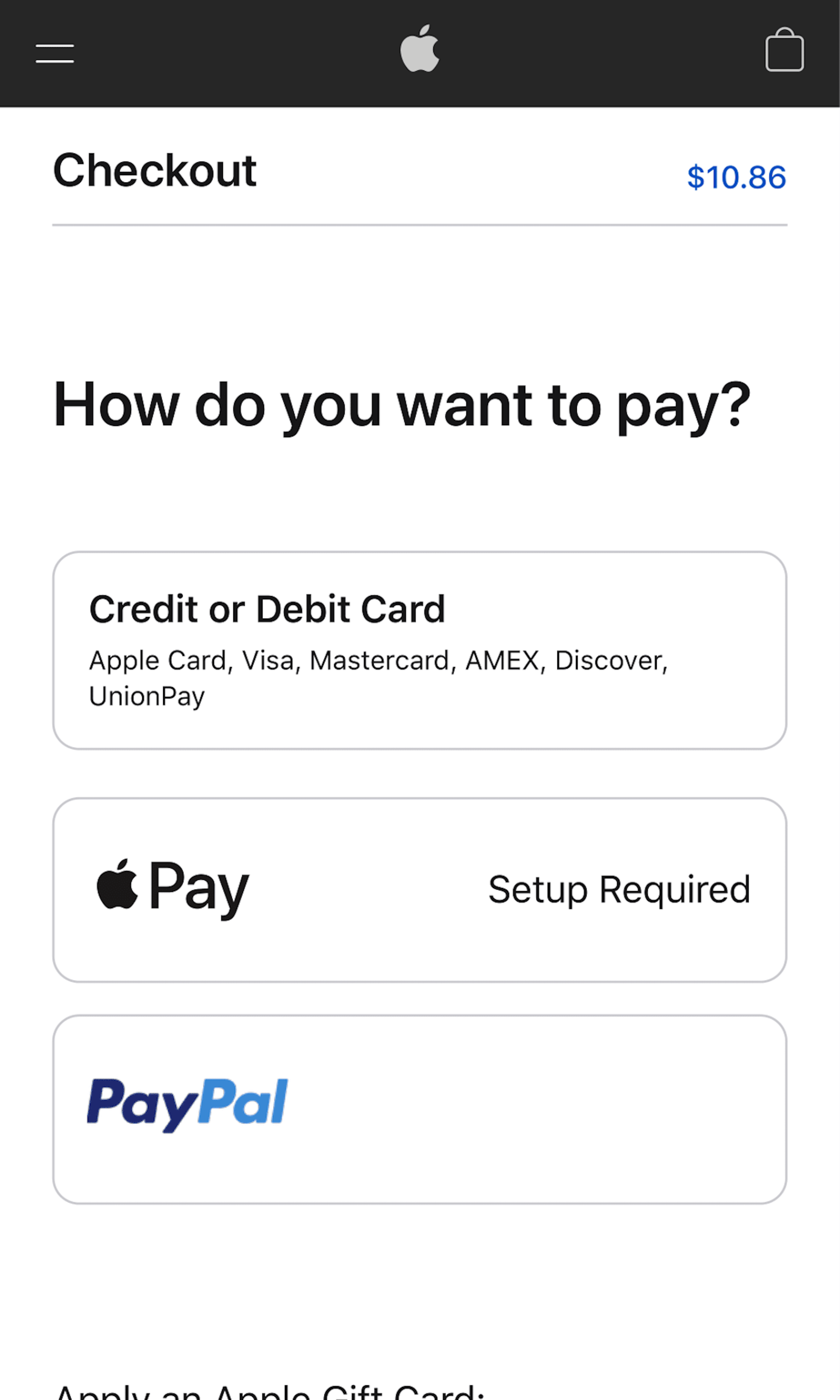
The Payment step during checkout is often dominated by credit card form fields. Yet, 3rd-party payment methods are becoming more widespread, and we’ve found that 8% of users have abandoned a checkout solely because the site didn’t offer the desired 3rd-party option. Besides exploring the 1482 “Payment Method” design examples below, you may also want to read our related UX research articles “The ‘Credit Card Number’ Field Must Allow and Auto-Format Spaces”, “Visually Reinforce Your Credit Card Fields“, and “5 ‘Credit Card Form’ Implementations That Make L.L. Bean Best-in-Class“.
More ‘Payment’ Insights
-
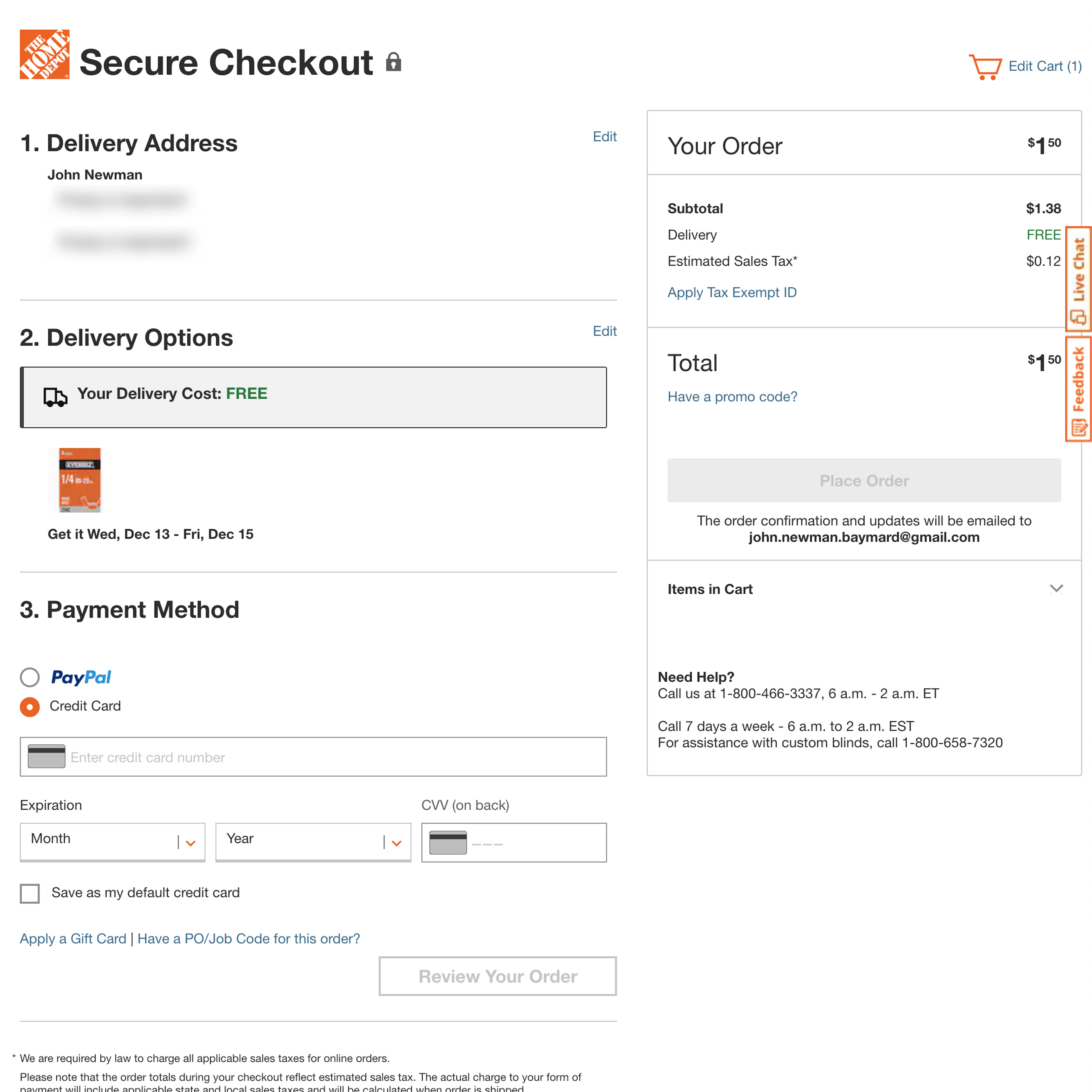
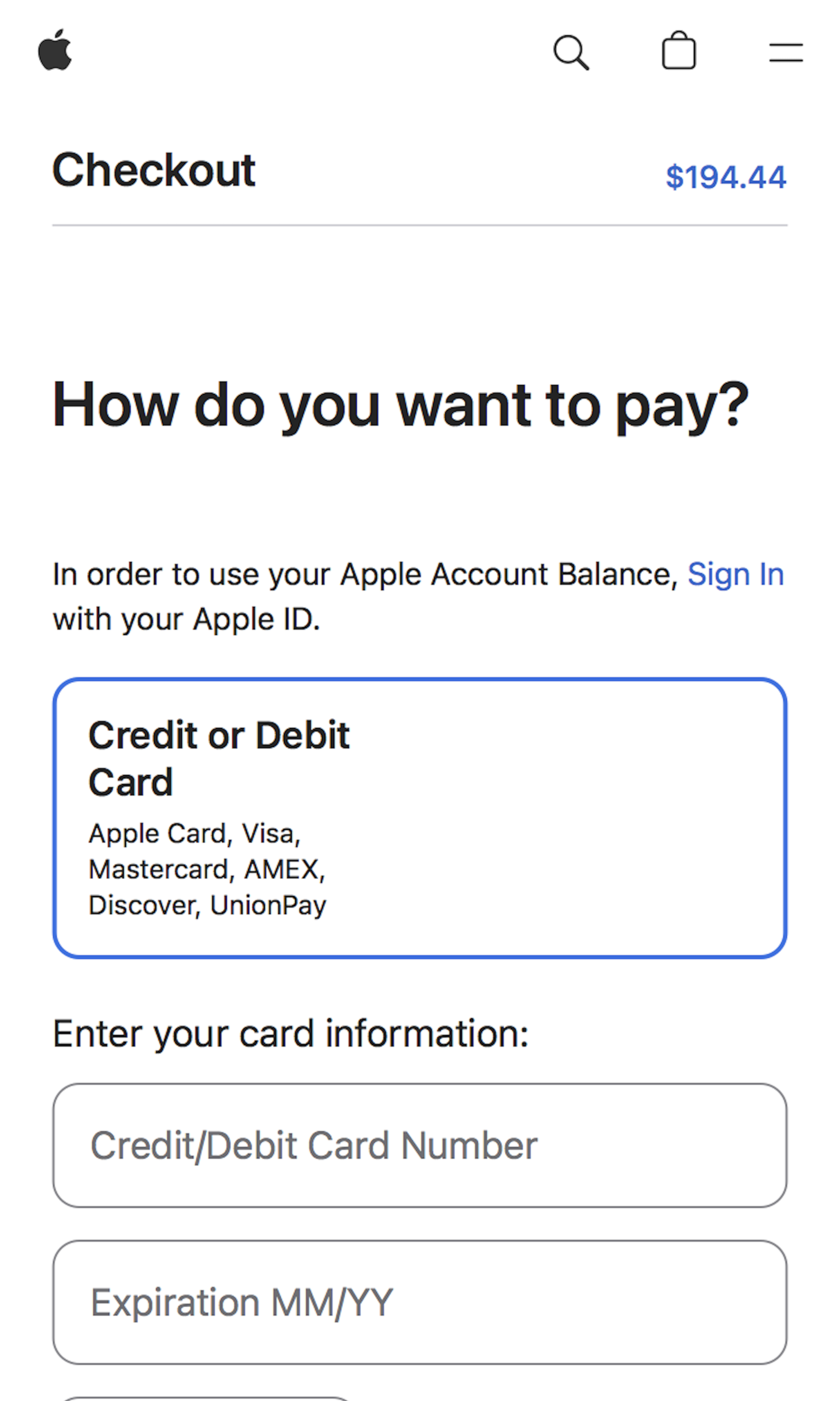
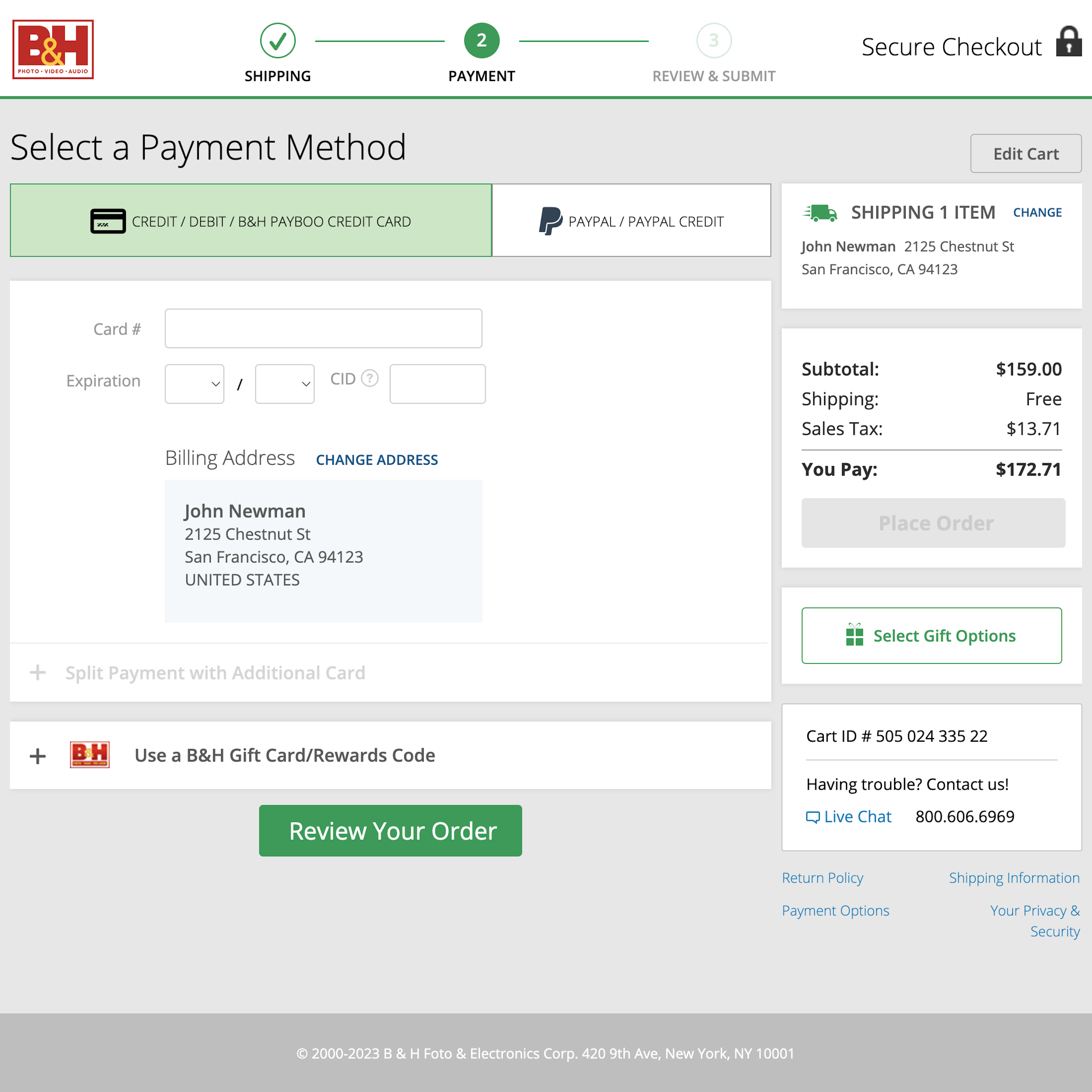
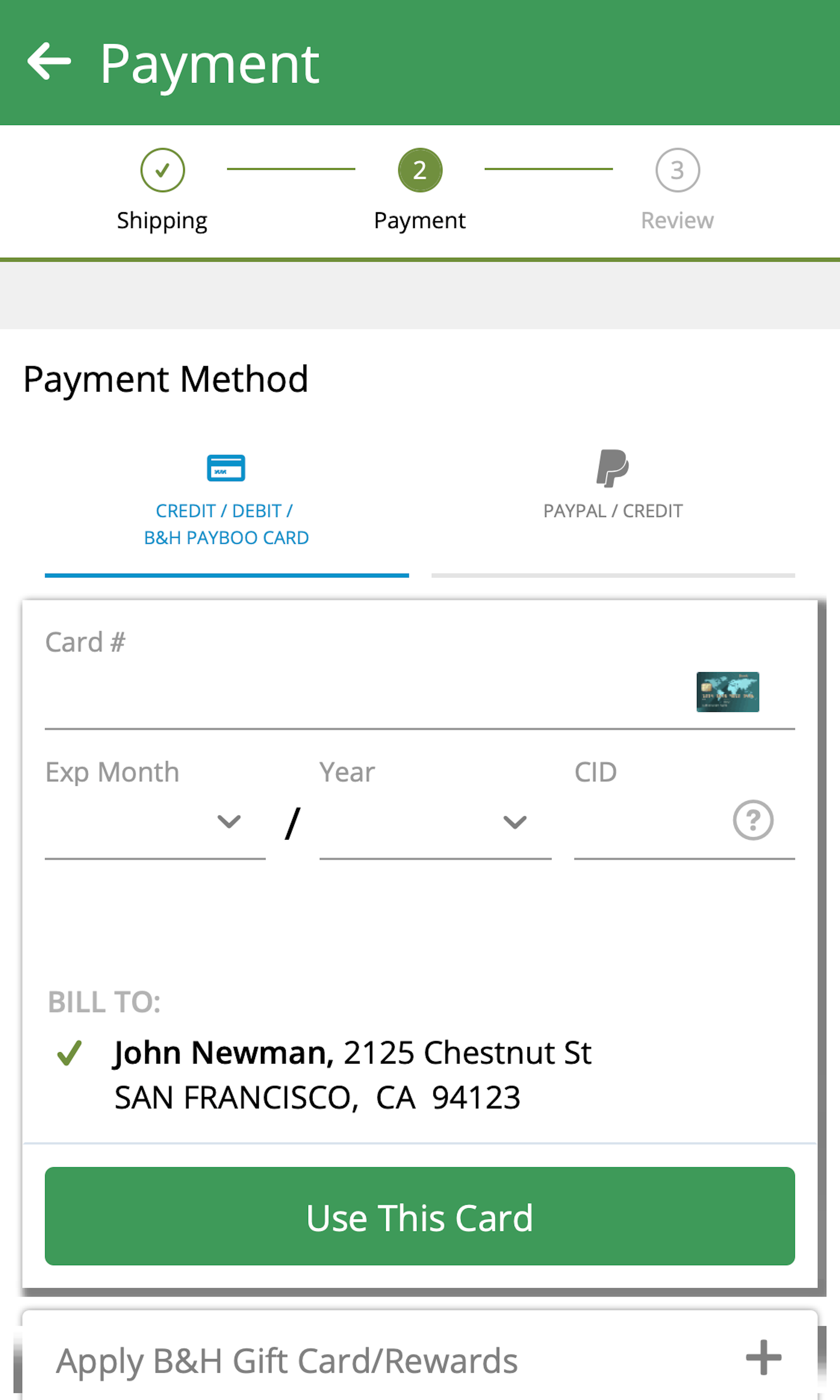
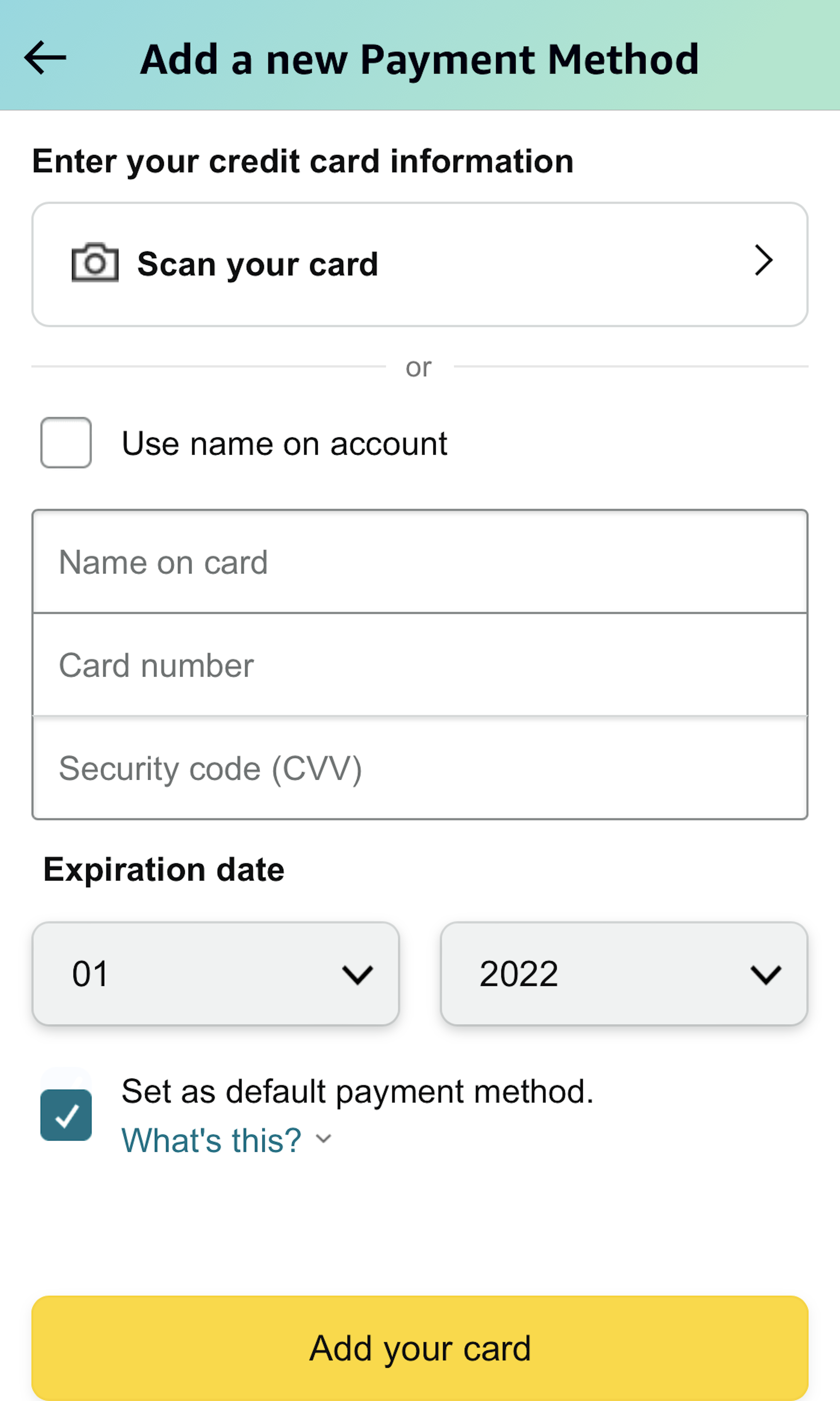
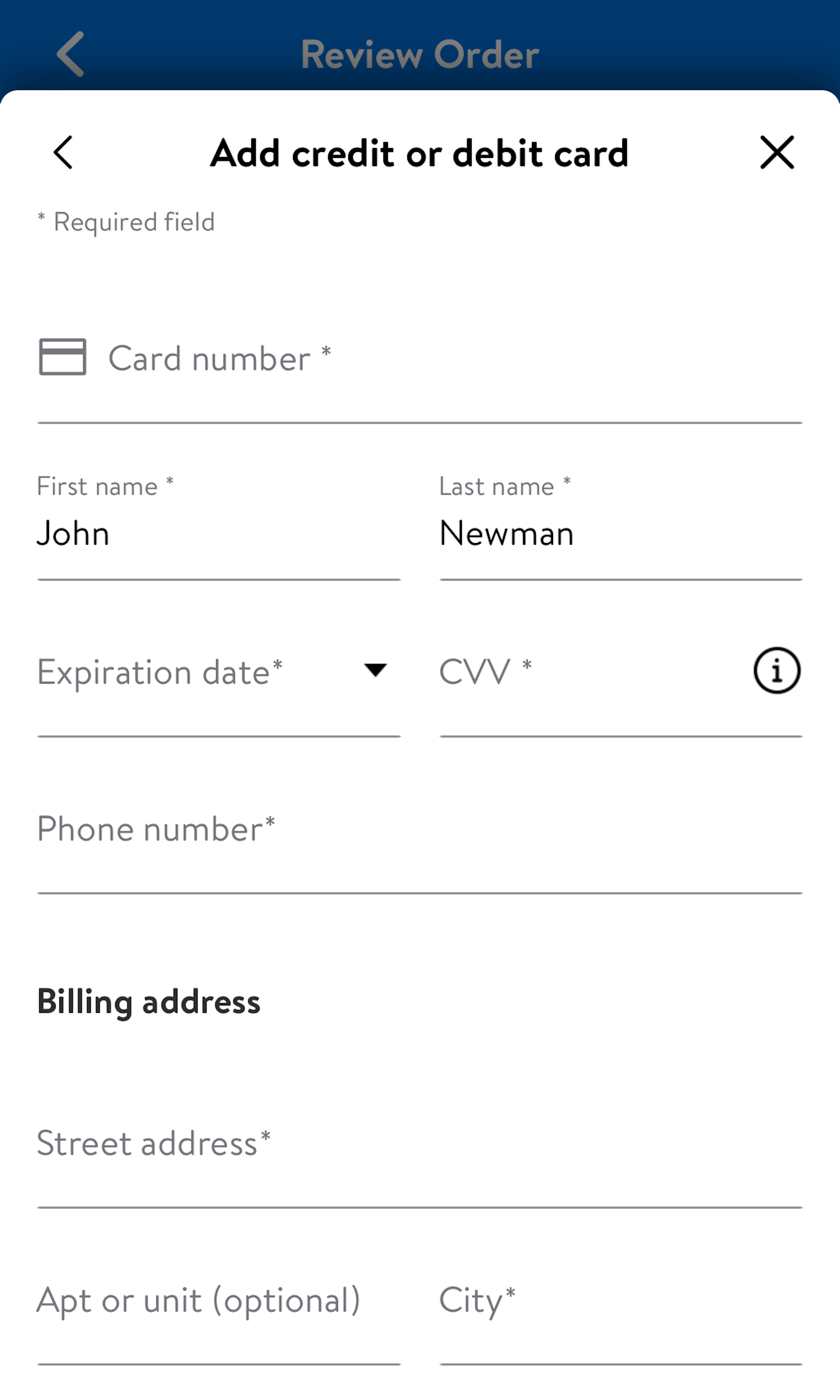
While the credit card input is only a small part of the overall amount of typing during the checkout flow, it’s by far the most complex and error-prone input during checkout. From insights gleaned during testing we’ve published more than 10 design guidelines, for the just 4 credit card inputs, that need to be implemented perfectly to avoid the most common usability issues. The impact of field descriptions and field design should not be underestimated, as any doubt, slight input inconsistencies, or validation errors in the credit card form are far more likely to result in abandonments than most other fields during checkout.
-
Get Full Access: To see all of Baymard’s cart and checkout research findings you’ll need Baymard Premium access. (Premium also provides you full access to 200,000+ hours of UX research findings, 650+ e-commerce UX guidelines, and 275,000+ UX performance scores.)


User Experience Research, Delivered Weekly
Join 60,000+ UX professionals and get a new UX article every week.

User Experience Research, Delivered Weekly
Join 60,000+ UX professionals and get a new UX article every week.
Explore Other Research Content
300+ free UX articles based on large-scale research.

327 top sites ranked by UX performance.

Code samples, demos, and key stats for usability.