
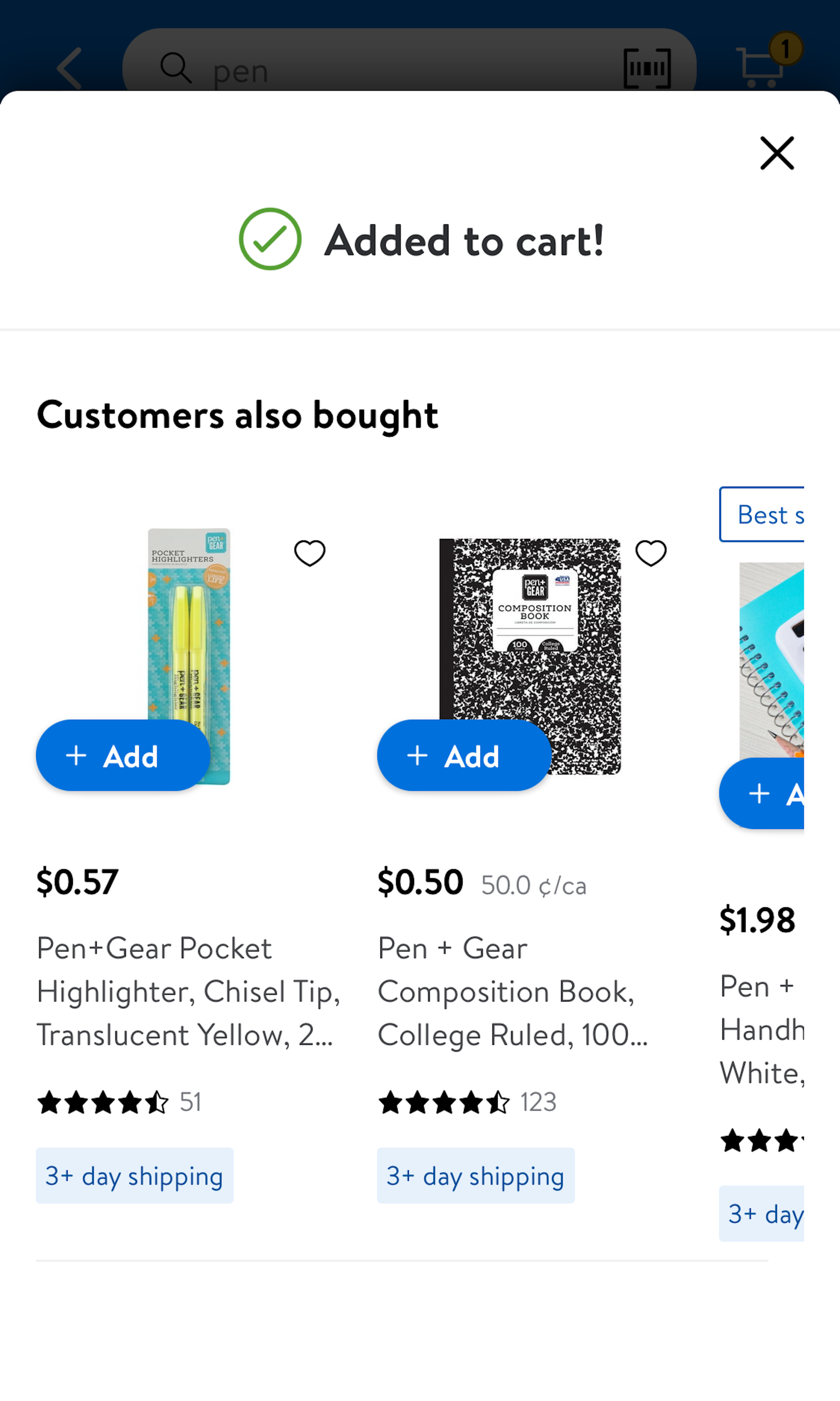
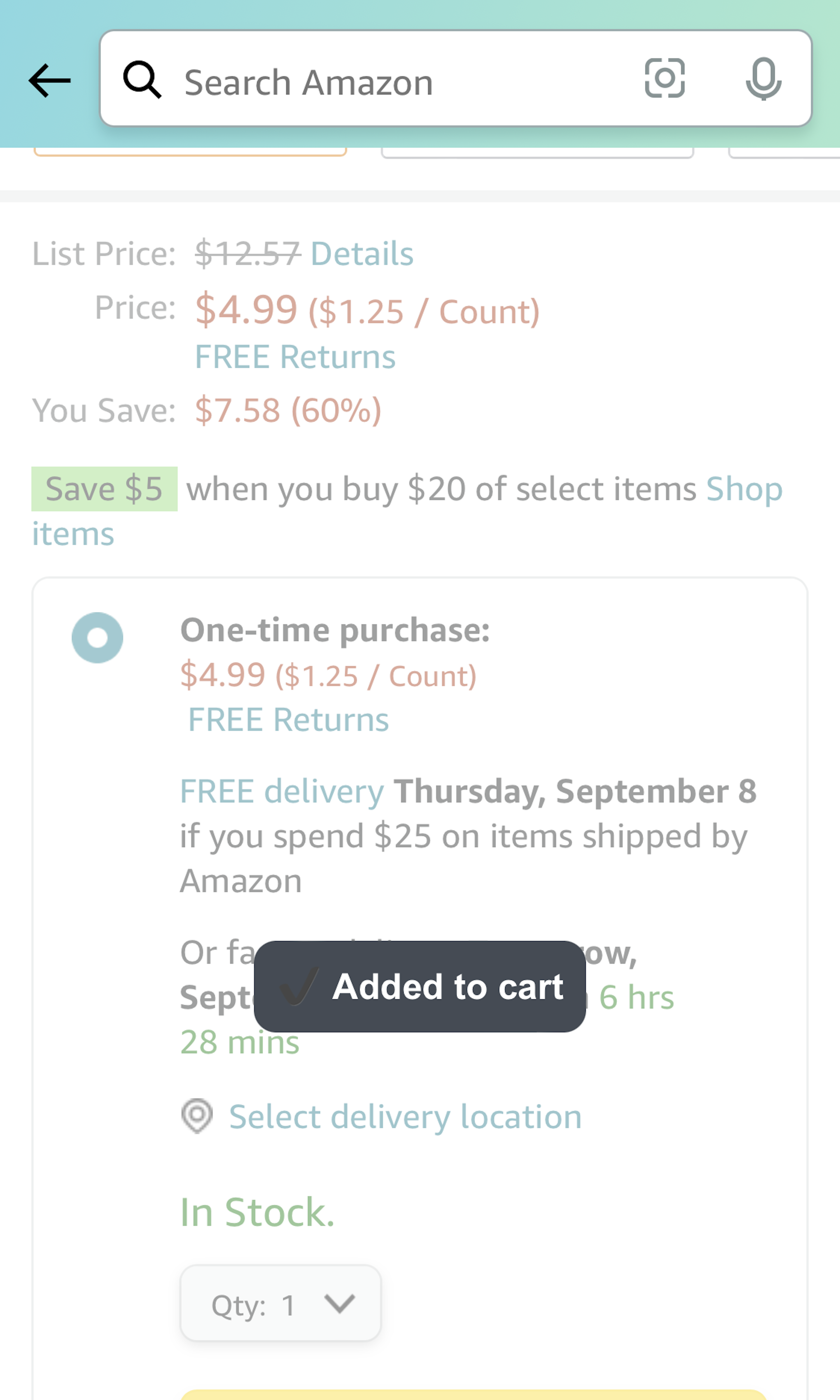
194 ‘Added To Cart Confirmation’ Design Examples
Also referred to as: Added To Basket, Added to Bag
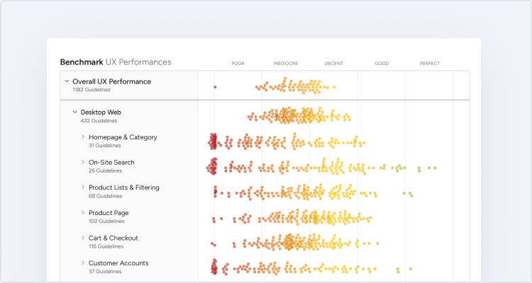
What’s this? Here you’ll find 194 “Added To Cart Confirmation” full-page screenshots annotated with research-based UX insights, sourced from Baymard’s UX benchmark of 280 e-commerce sites. (Note: this is less than 1% of the full research catalog.)
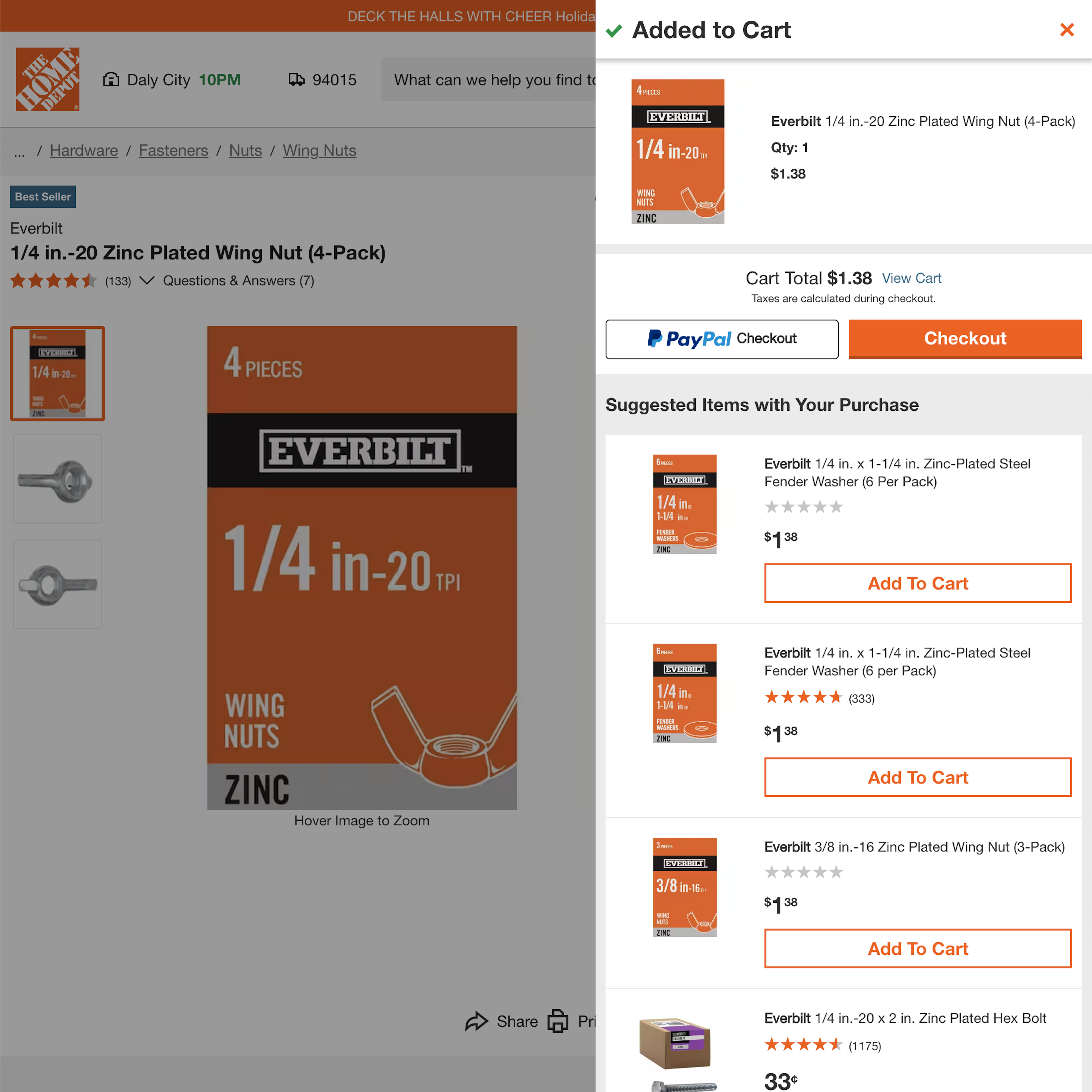
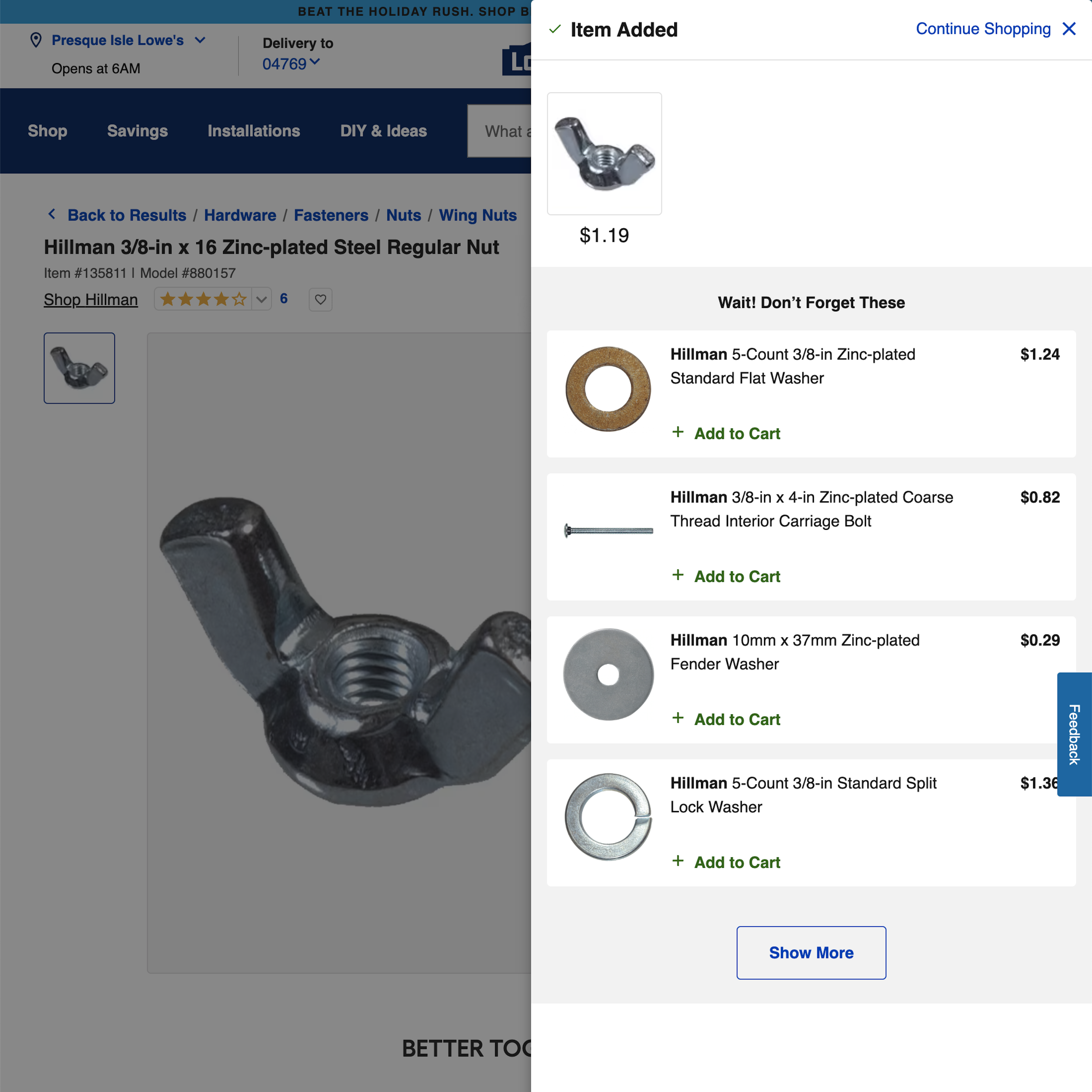
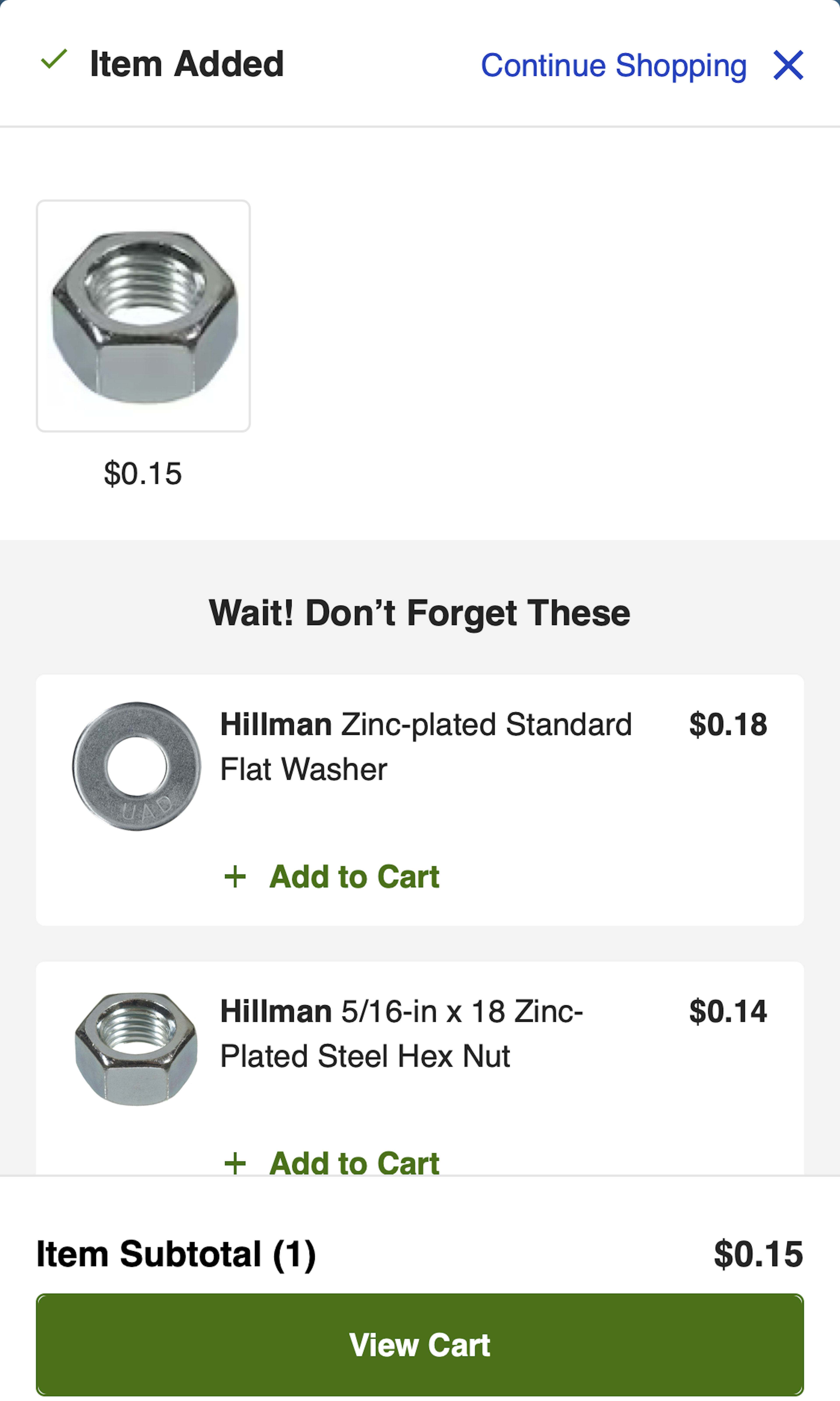
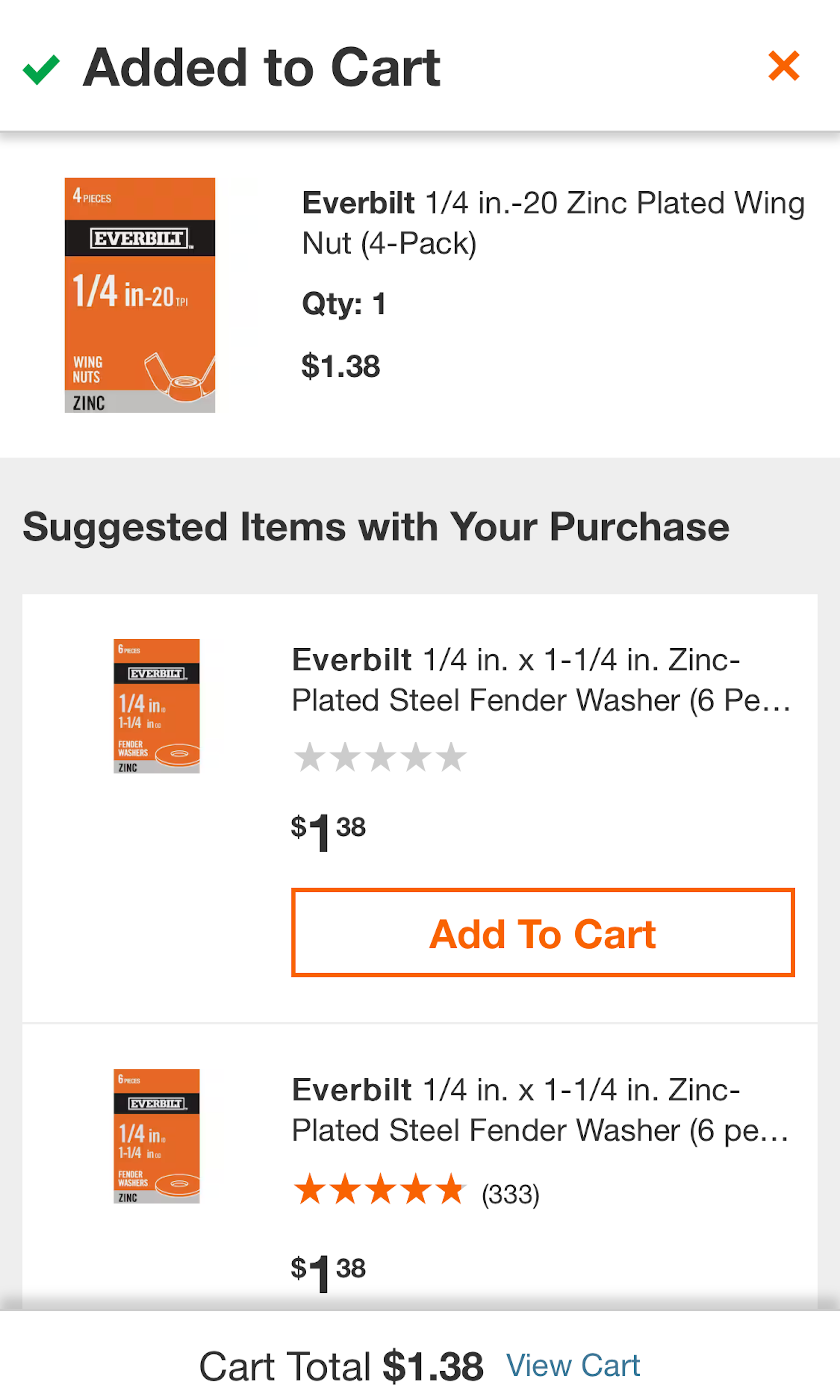
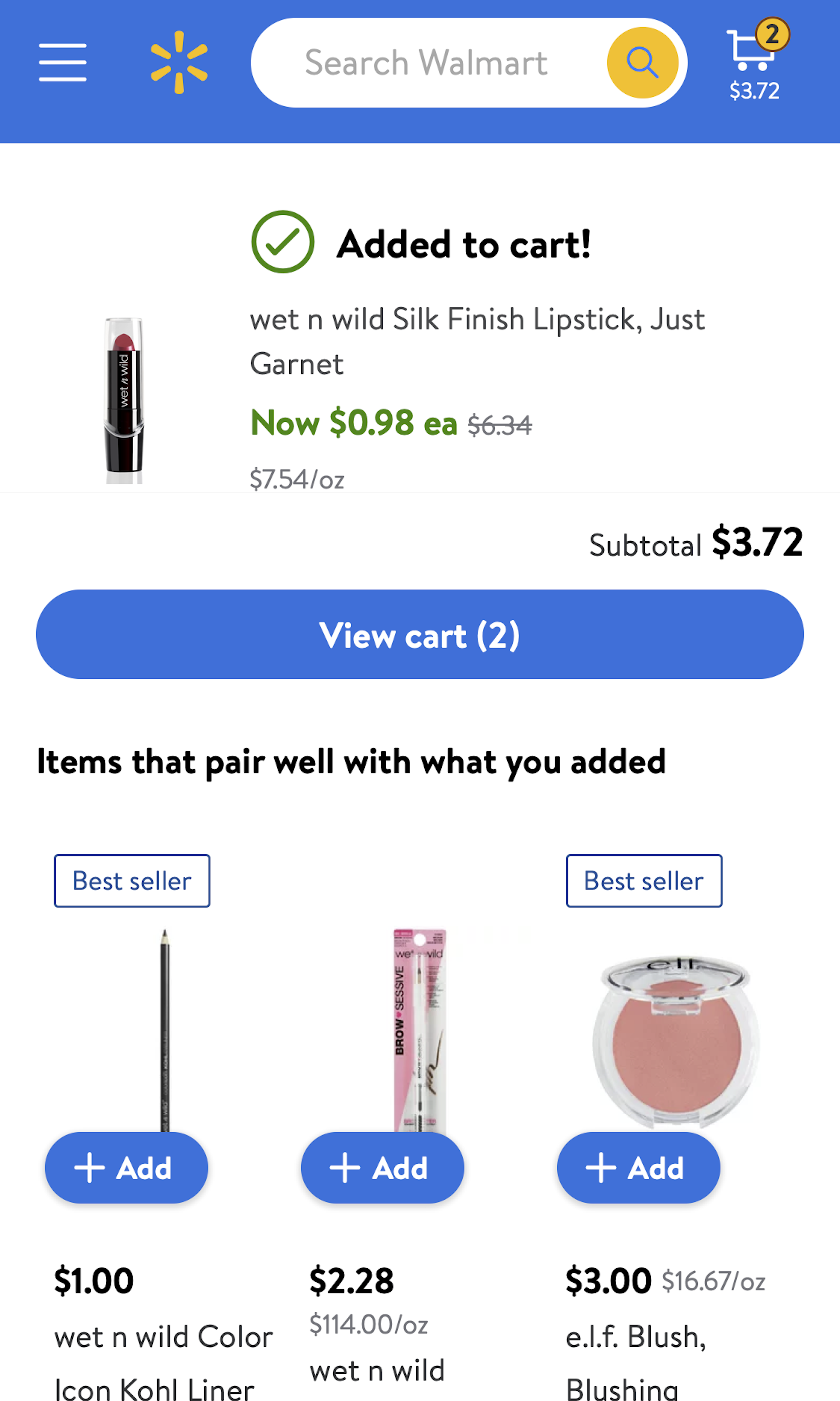
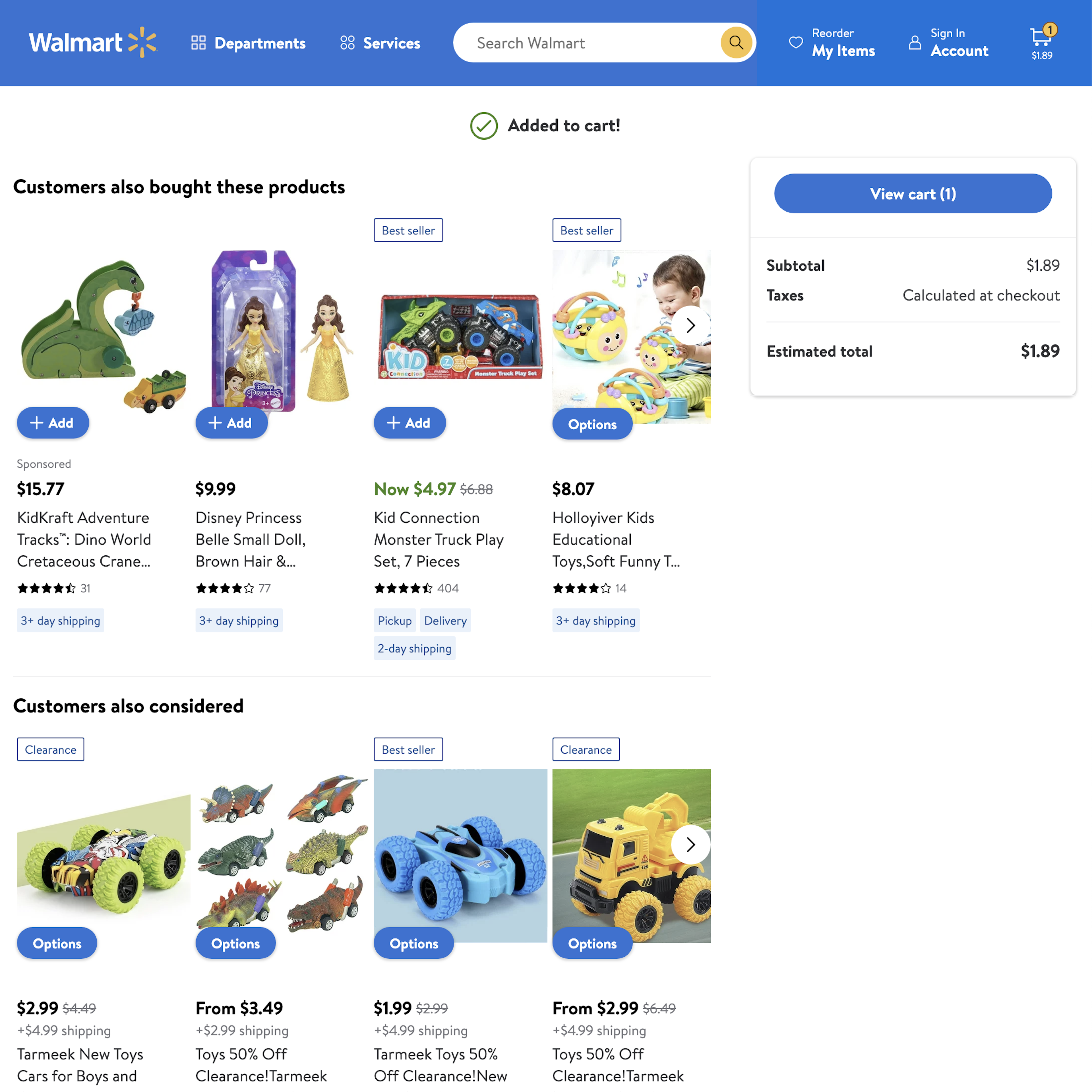
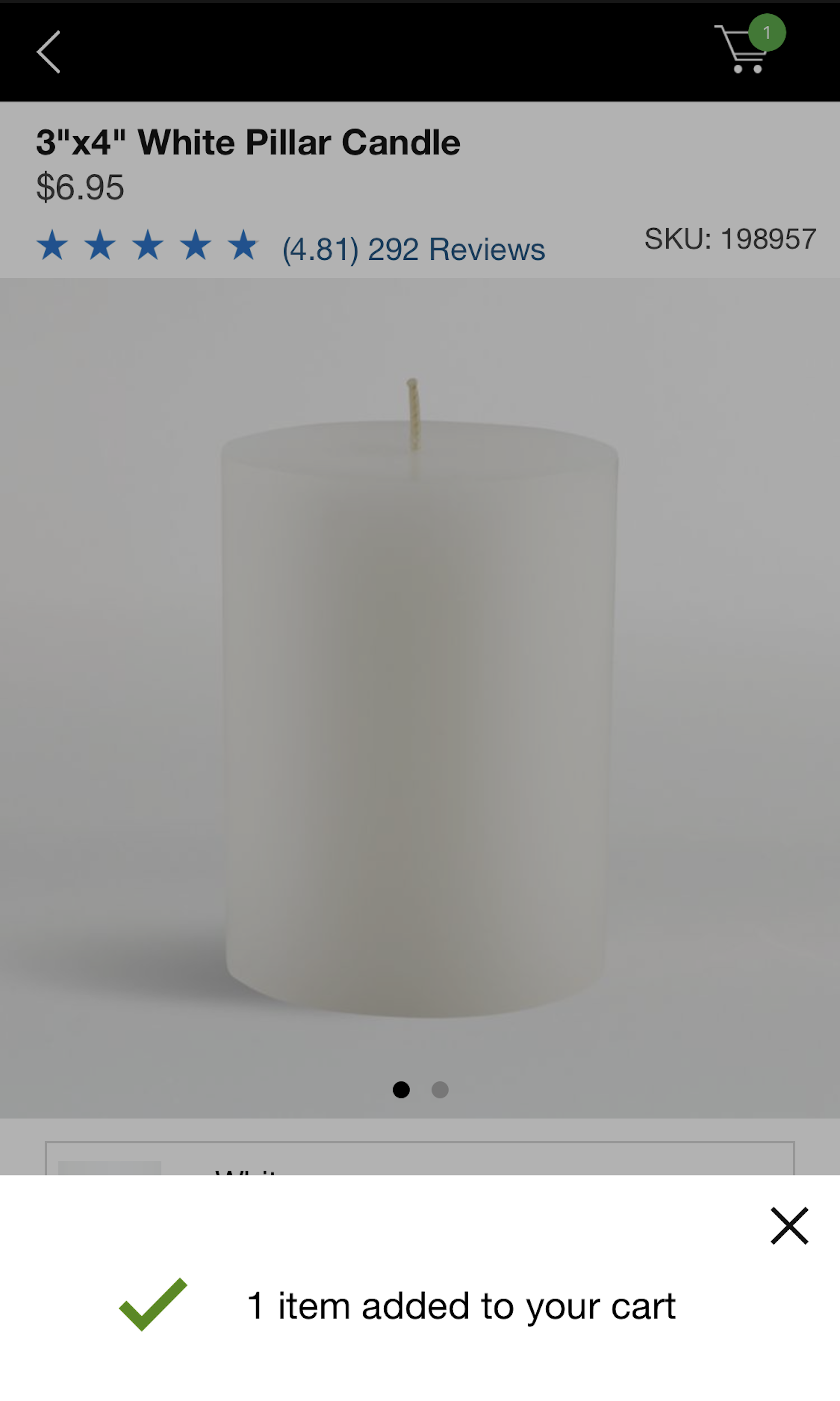
After adding an item to the cart, users may wish to continue shopping, review order details in the cart, or immediately start the checkout process — and whether using an overlay, a drop-down cart, or an “in-between” page, they expect the “Added to Cart” confirmation to facilitate navigation towards their goal. However, we’ve observed across multiple rounds of UX testing that unclear or ambiguously labeled paths within the “Added to Cart” confirmation caused participants to struggle to identify the appropriate path, leading to wasted time and effort as they tried to determine the best way to navigate.
More ‘Added to Cart’ Insights


User Experience Research, Delivered Weekly
Join 60,000+ UX professionals and get a new UX article every week.

User Experience Research, Delivered Weekly
Join 60,000+ UX professionals and get a new UX article every week.
Explore Other Research Content
300+ free UX articles based on large-scale research.

280 top sites ranked by UX performance.

Code samples, demos, and key stats for usability.