Page Designs
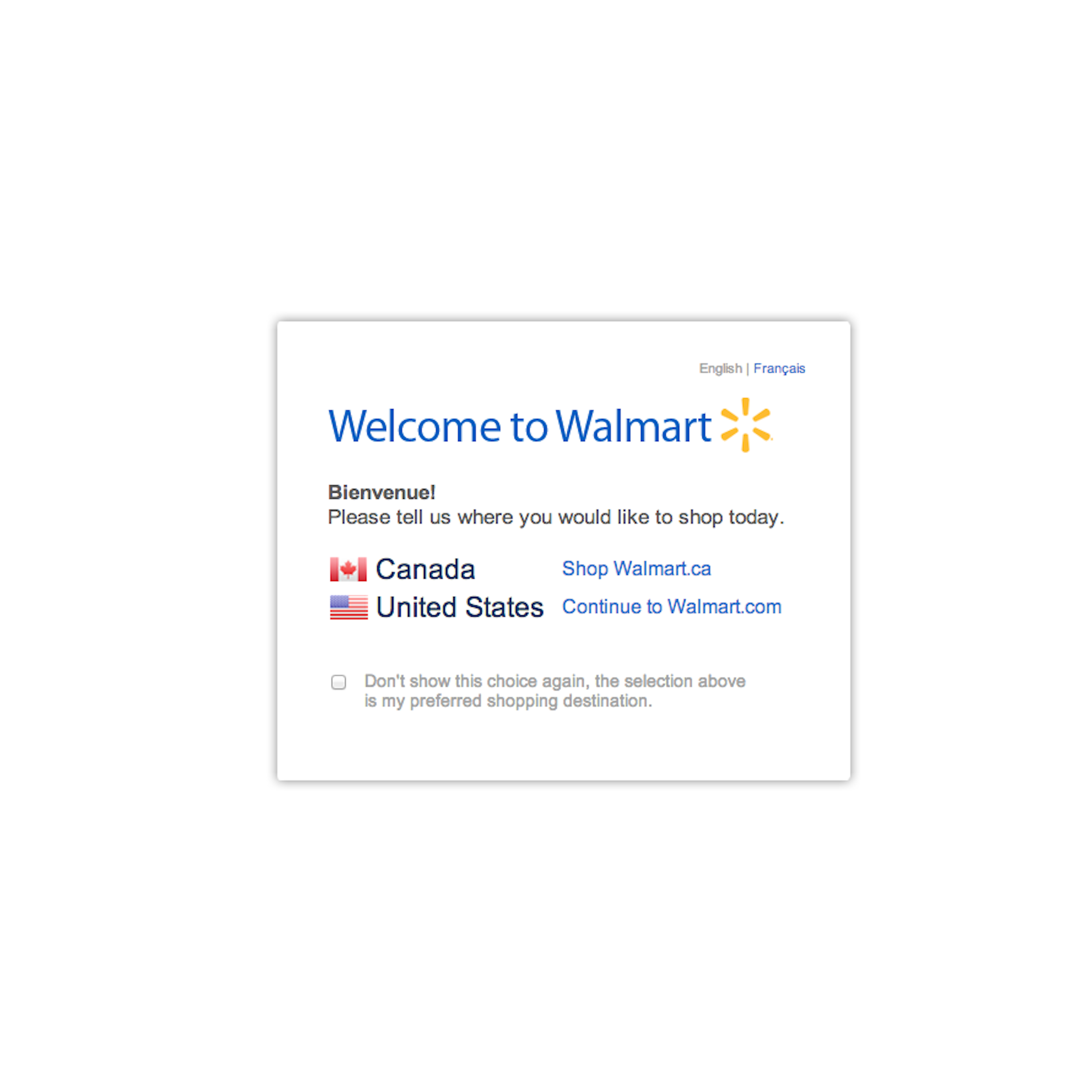
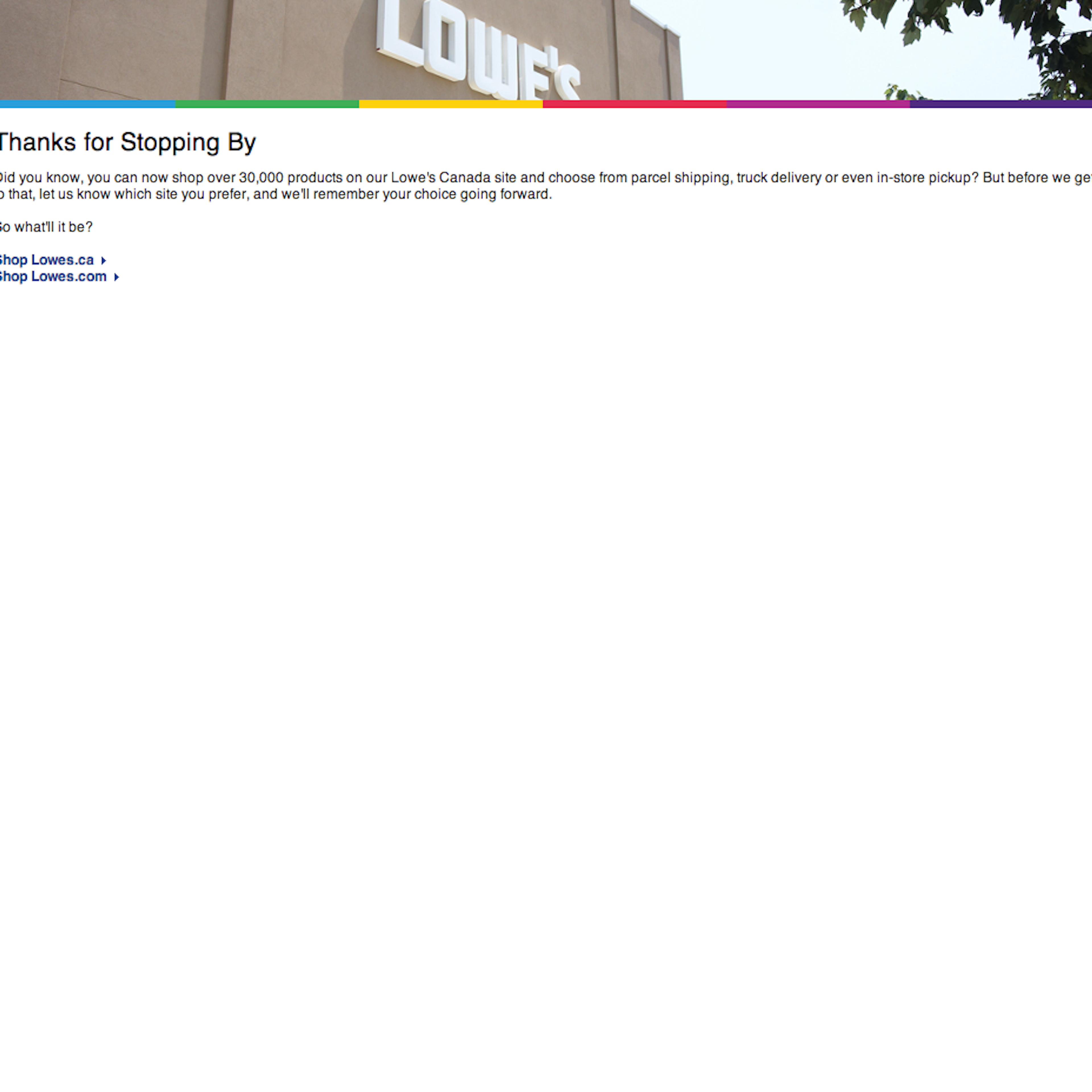
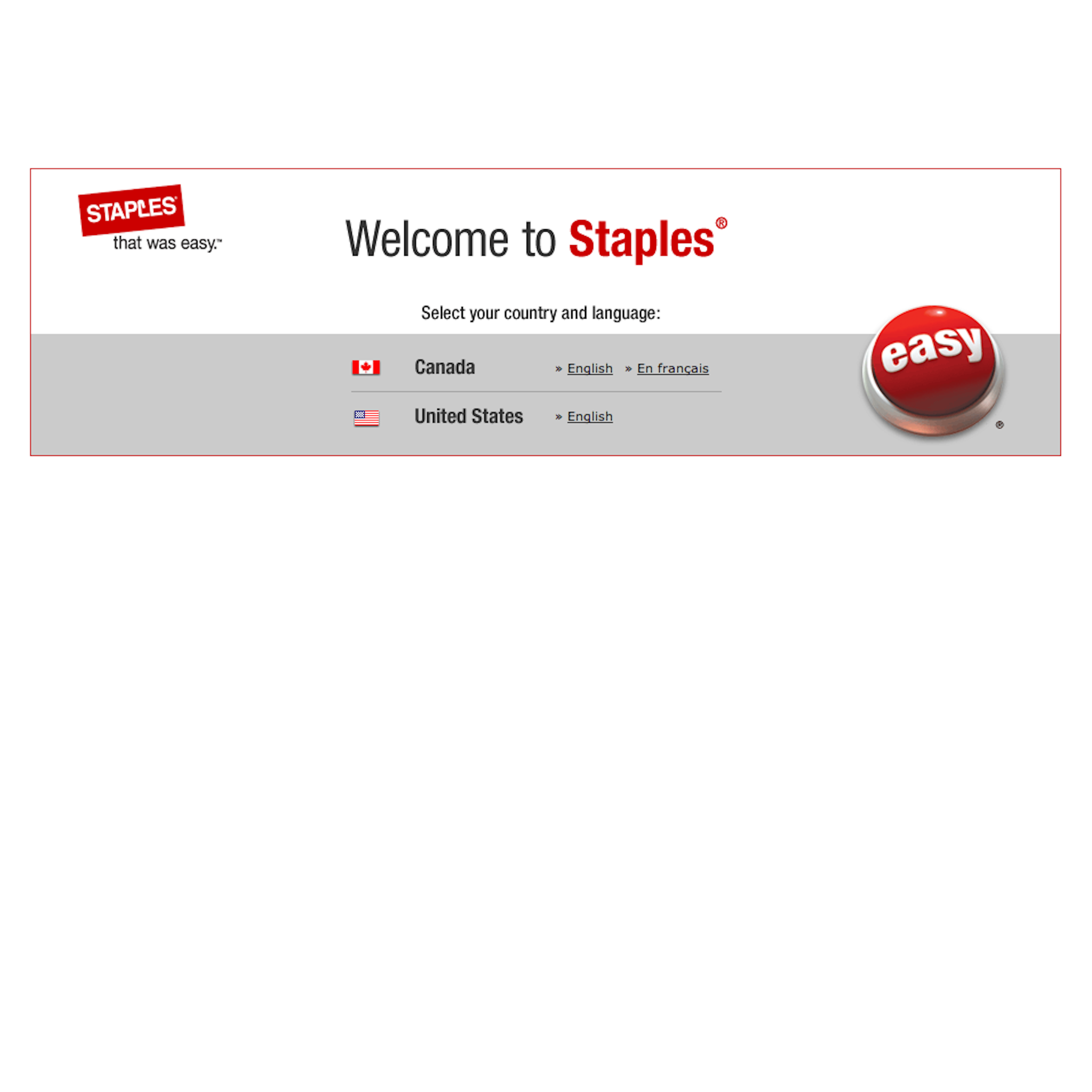
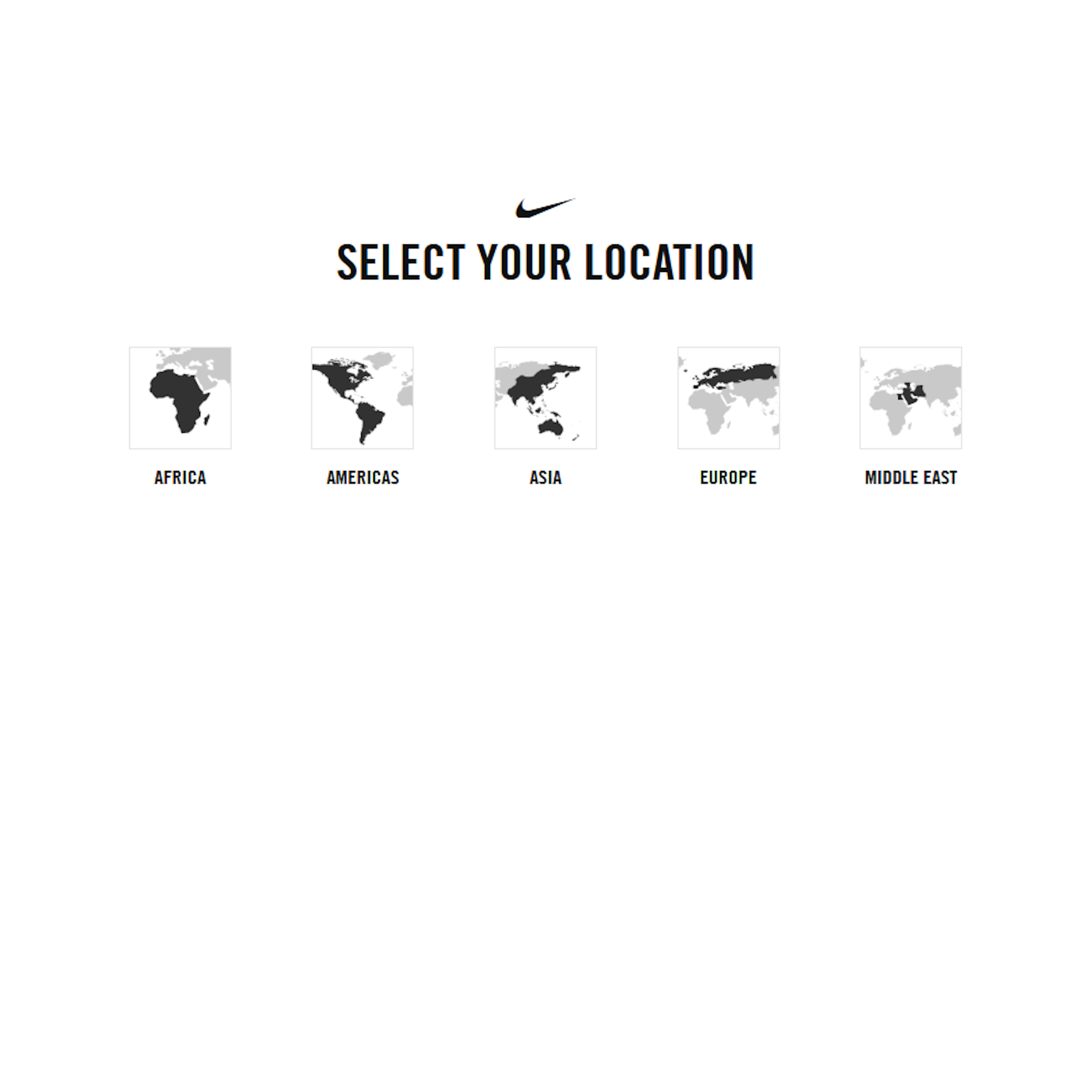
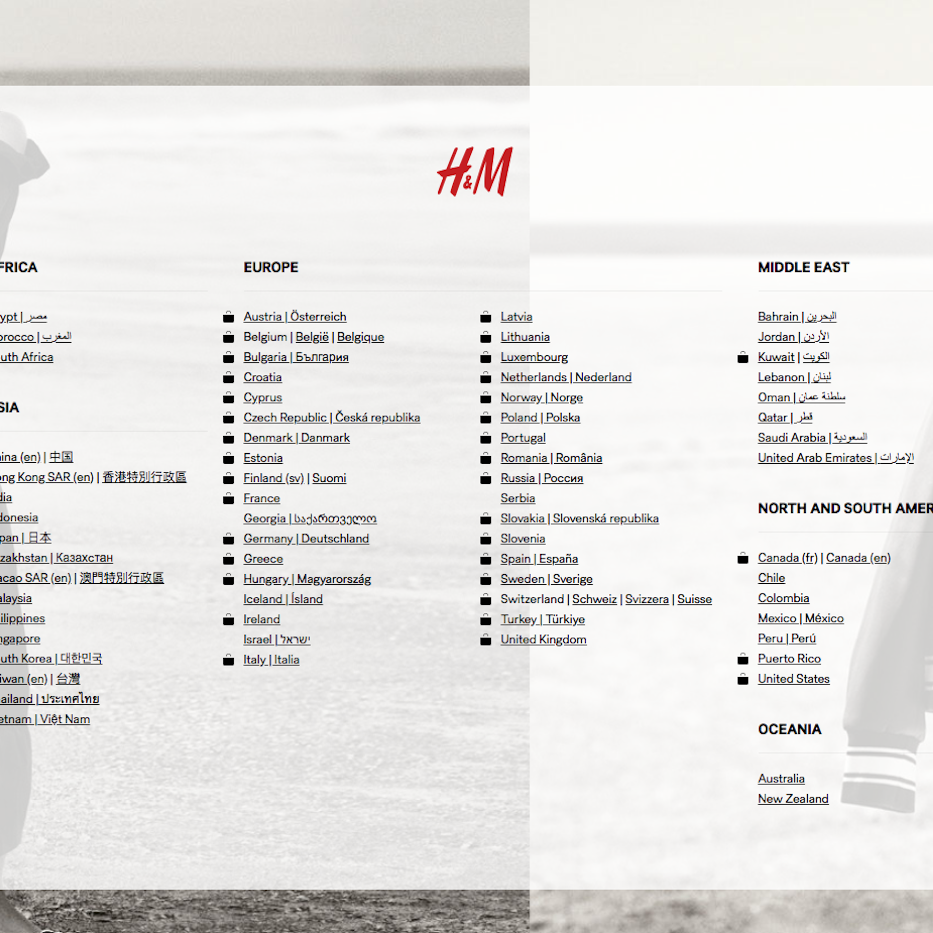
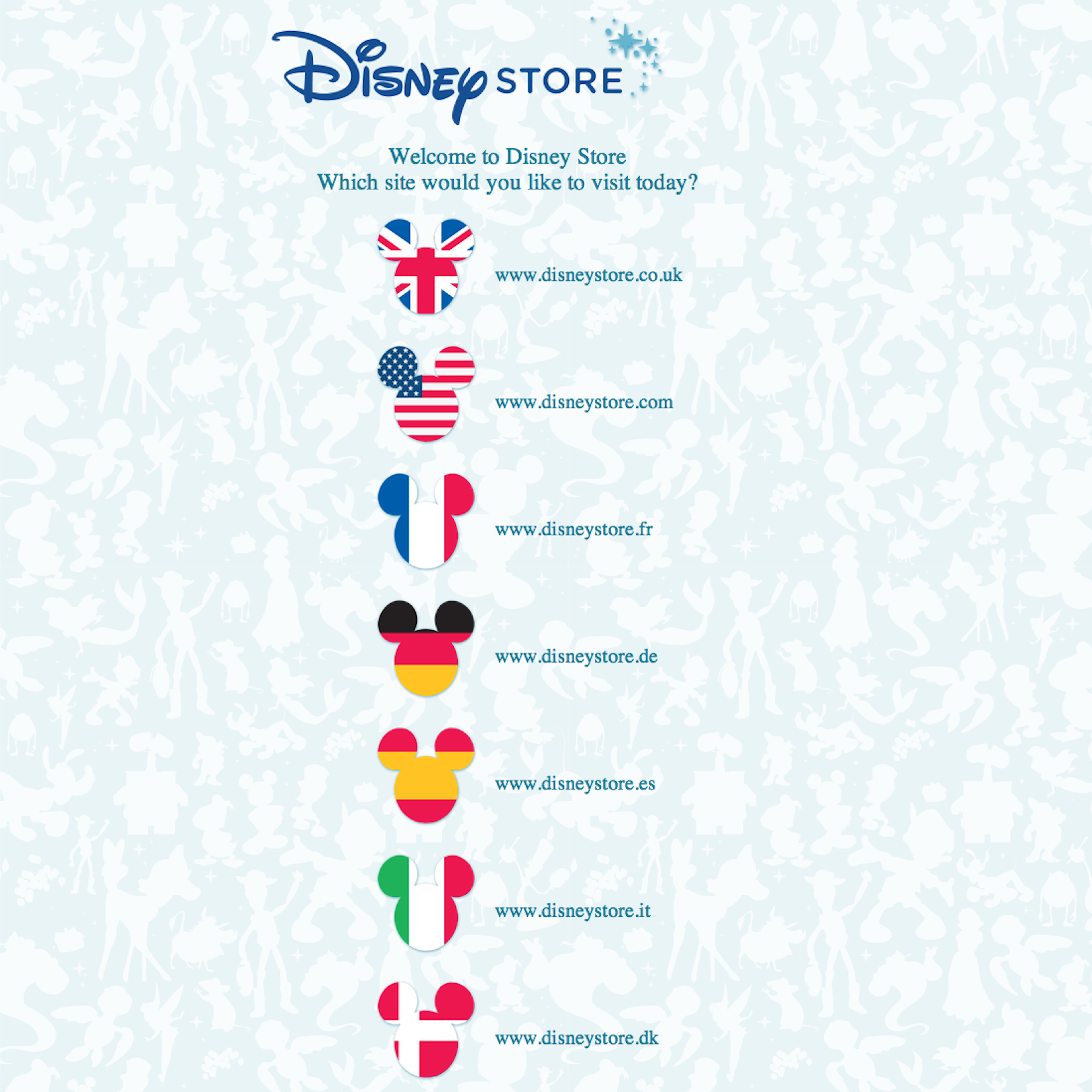
10 ‘Splash Page’ Design Examples
10 ‘Splash Page’ Page Designs
Filter by:
Mobile (0)
App (0)
User Experience Research, Delivered Weekly
Join 60,000+ UX professionals and get a new UX article every week.

Explore Other Research Content

300+ free UX articles based on large-scale research.

325 top sites ranked by UX performance.

Code samples, demos, and key stats for usability.

