Page Designs
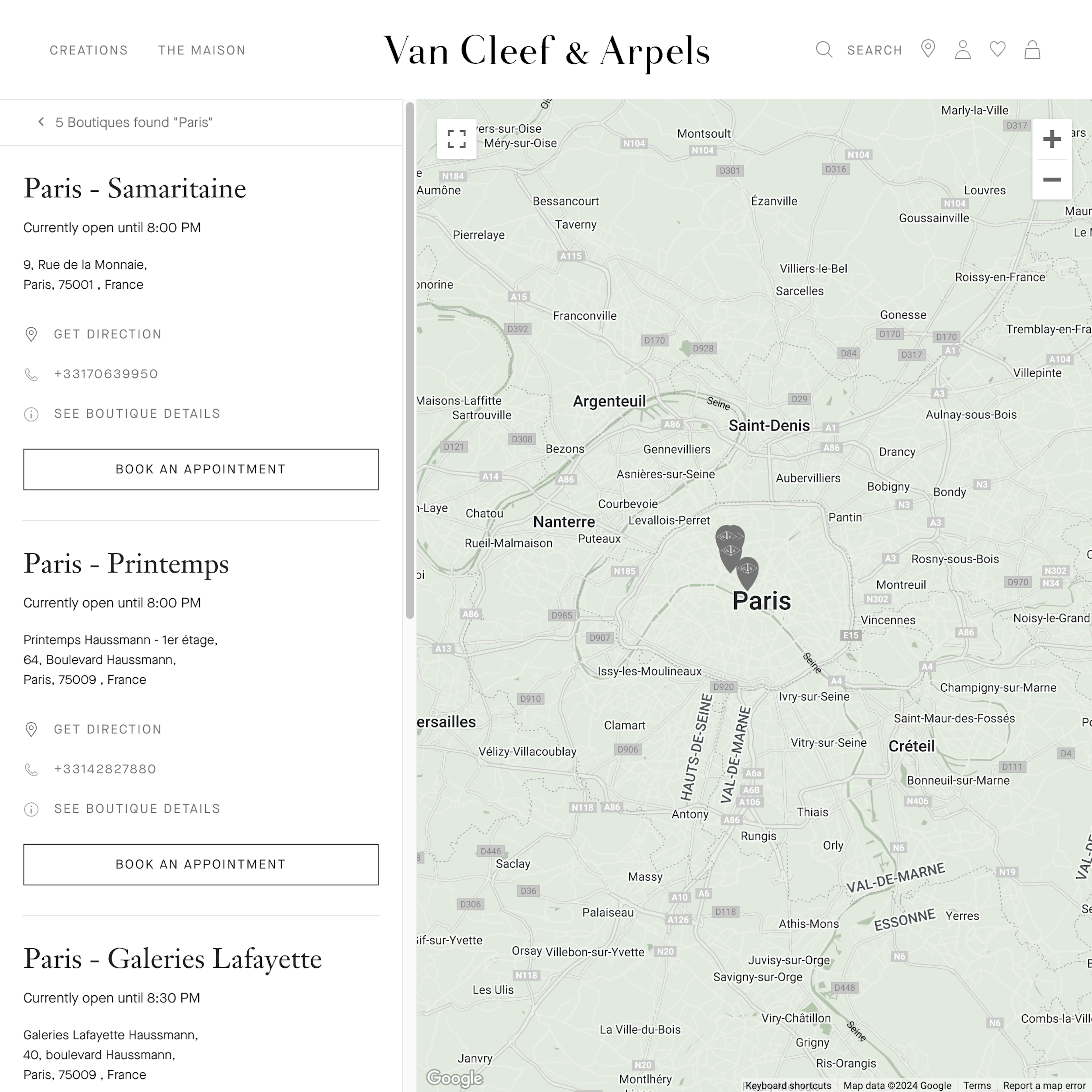
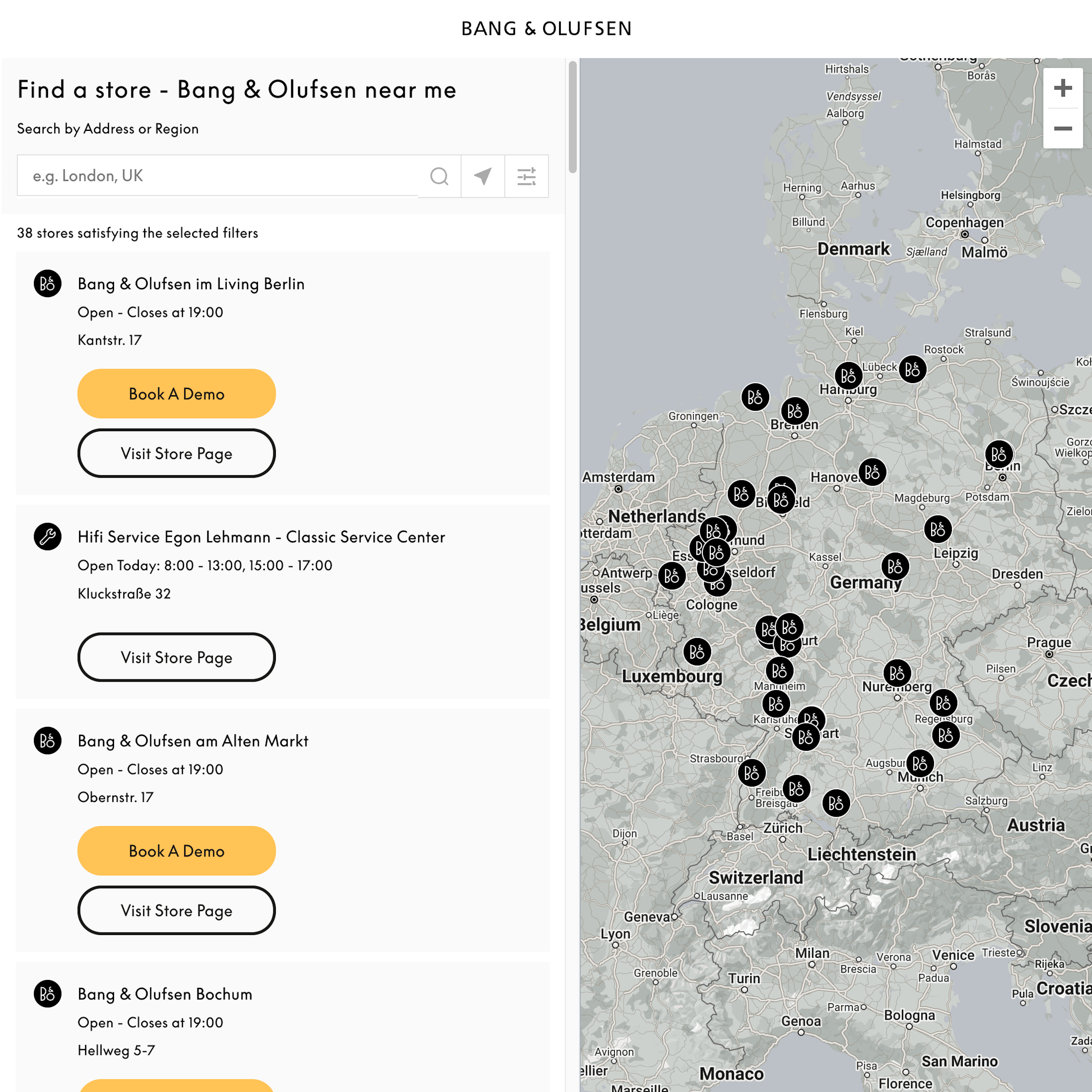
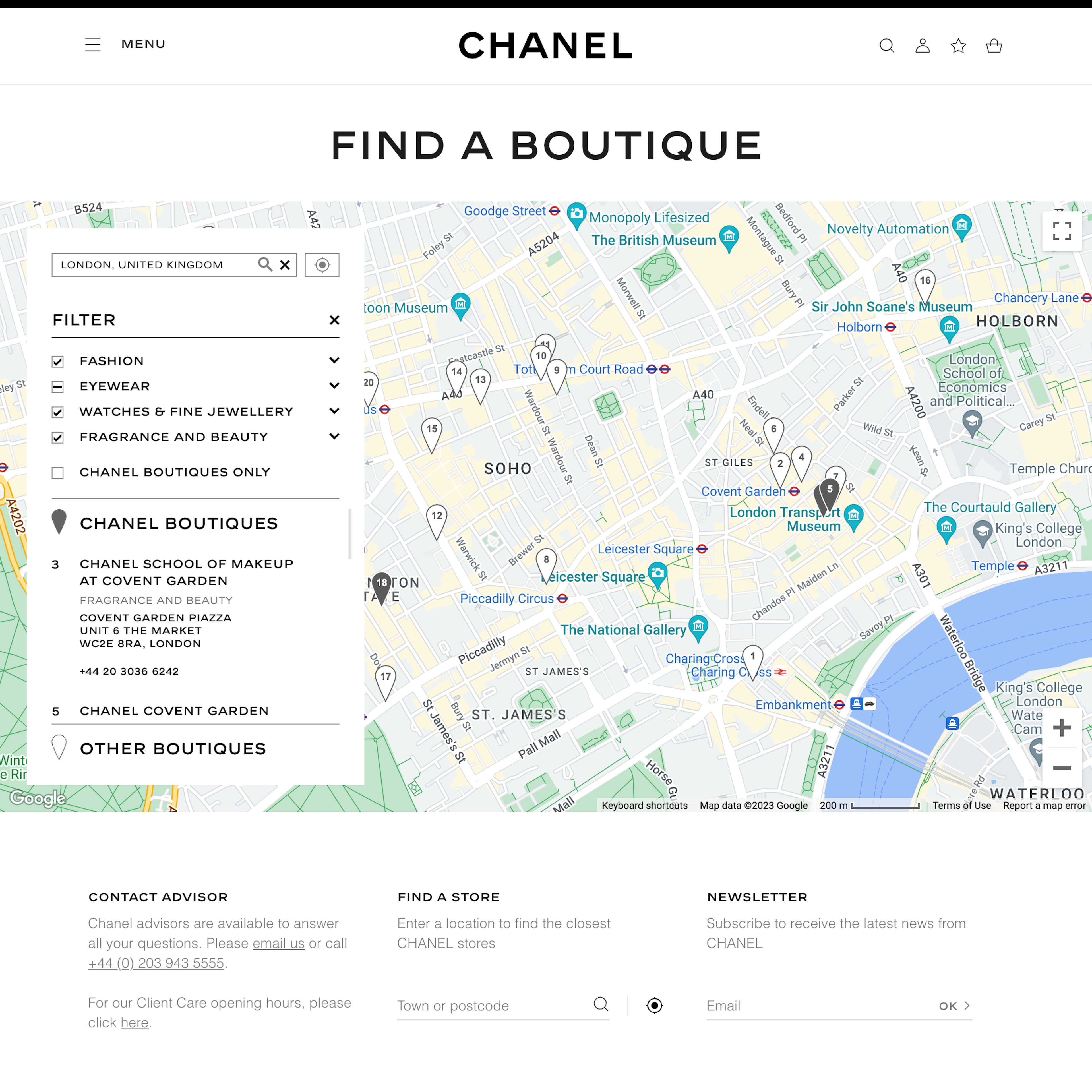
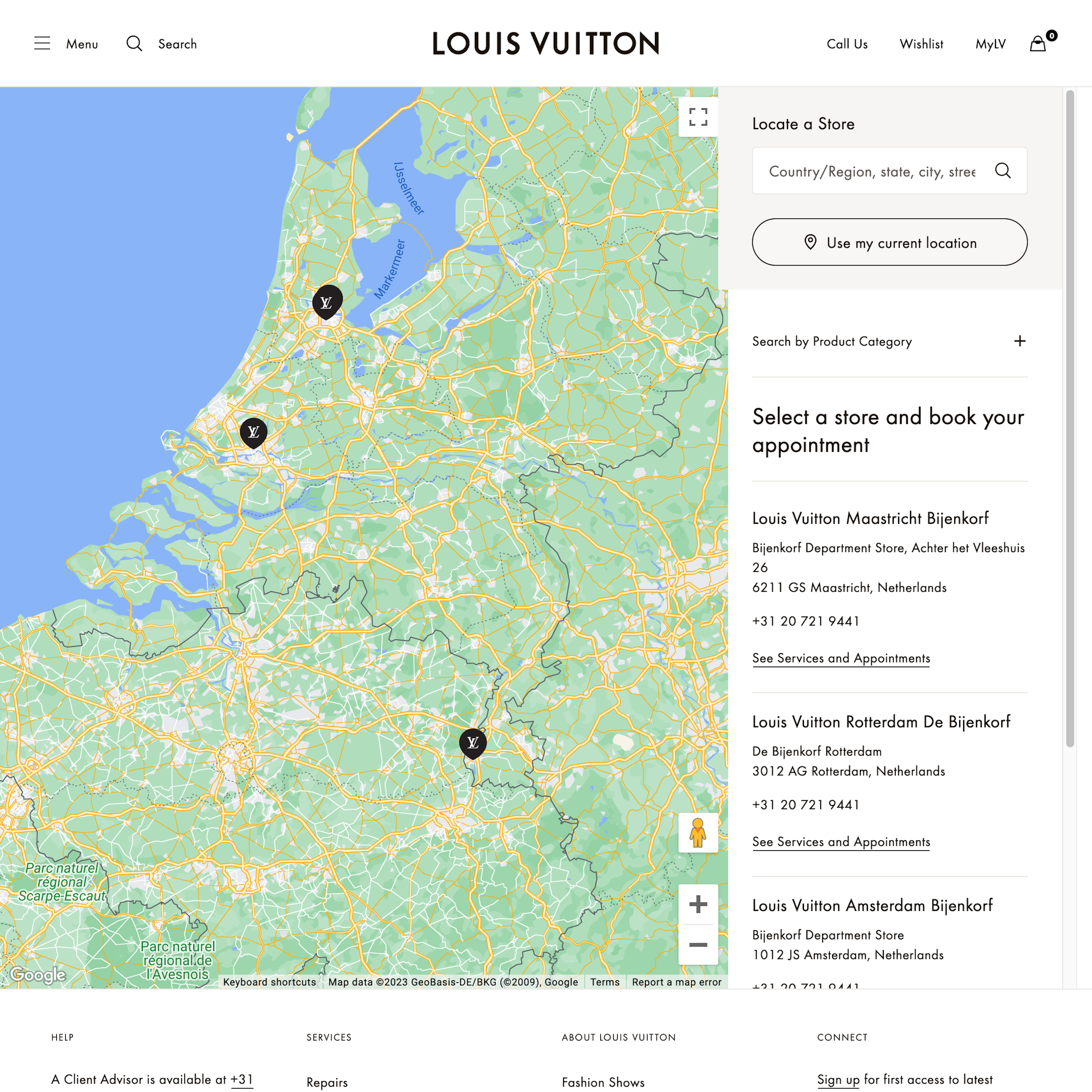
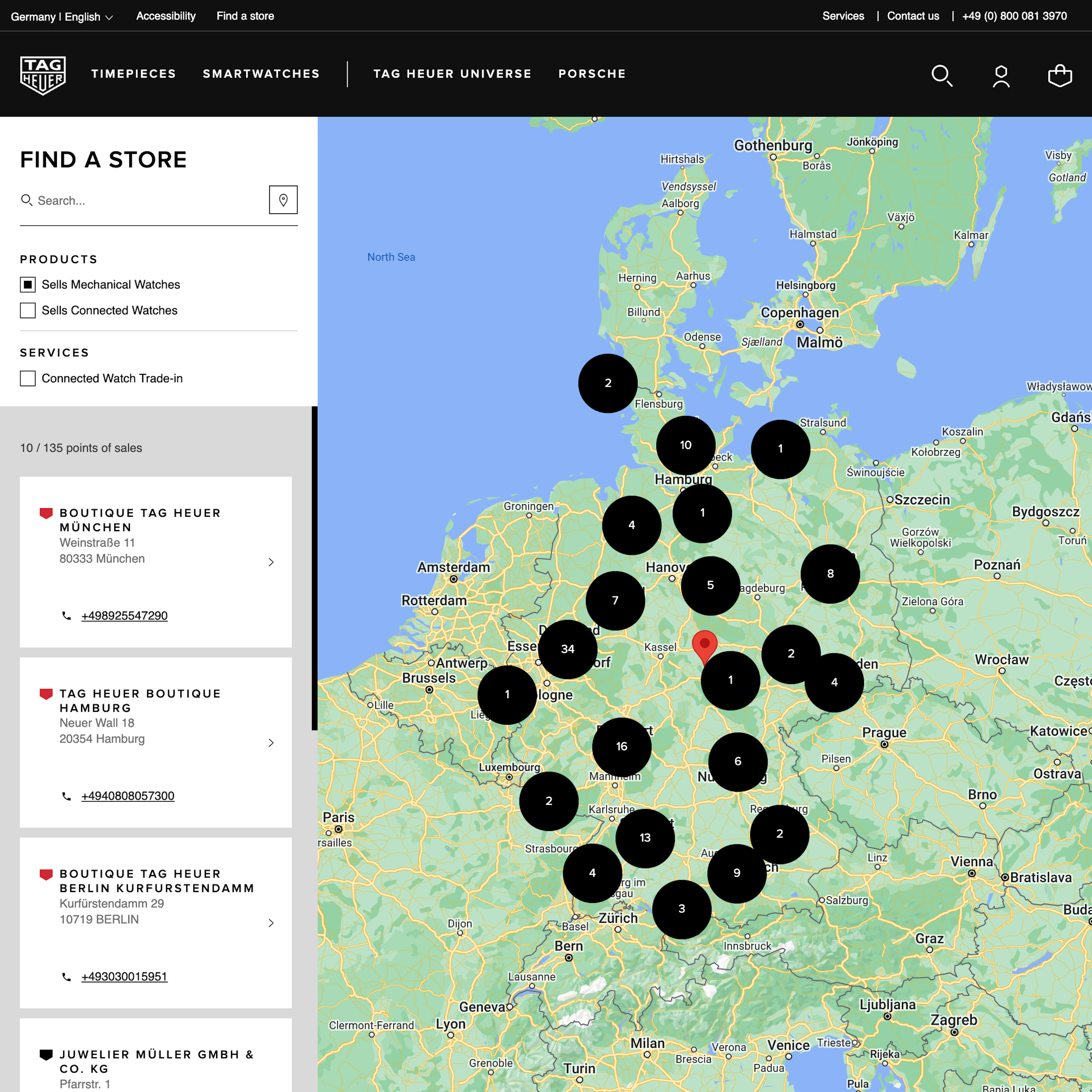
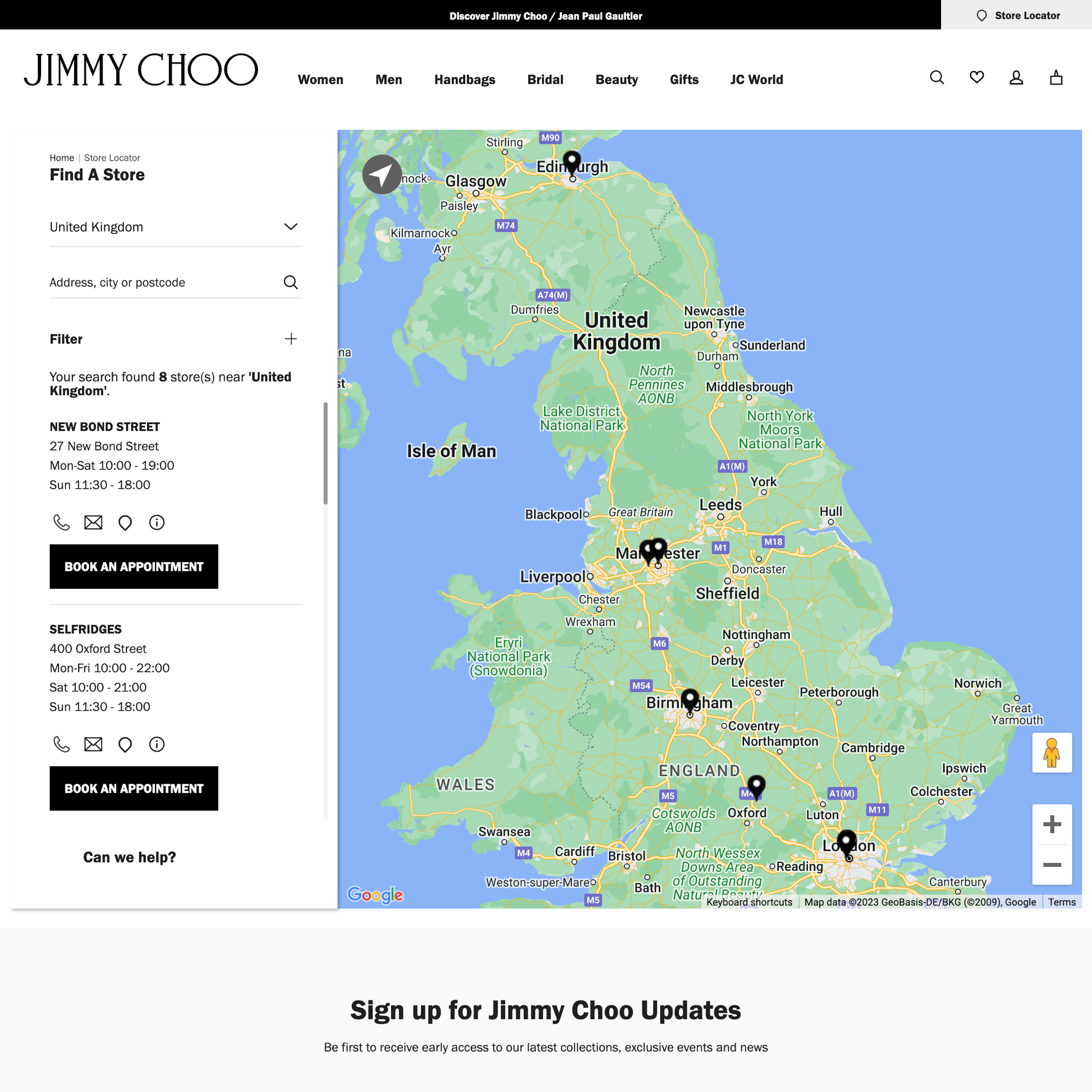
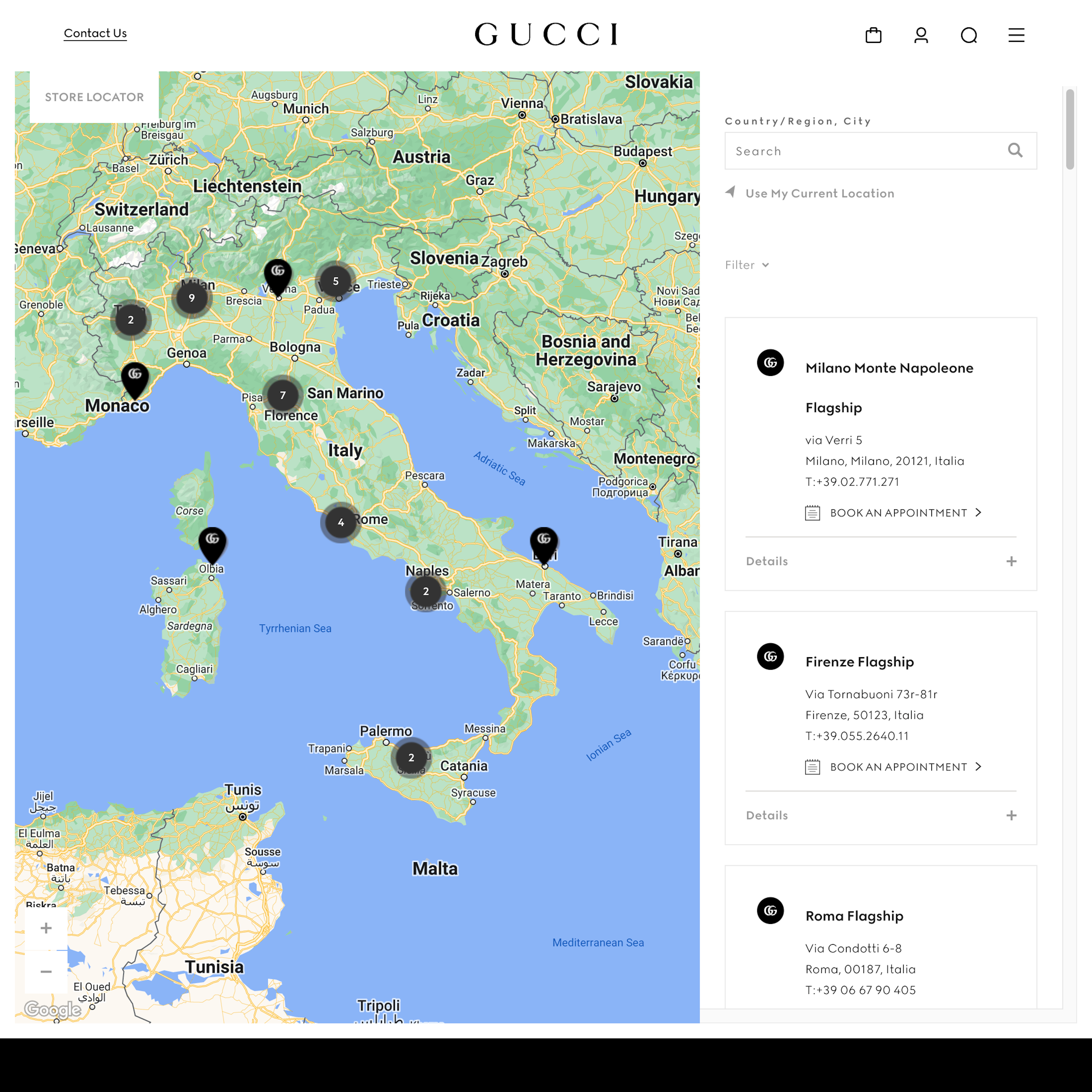
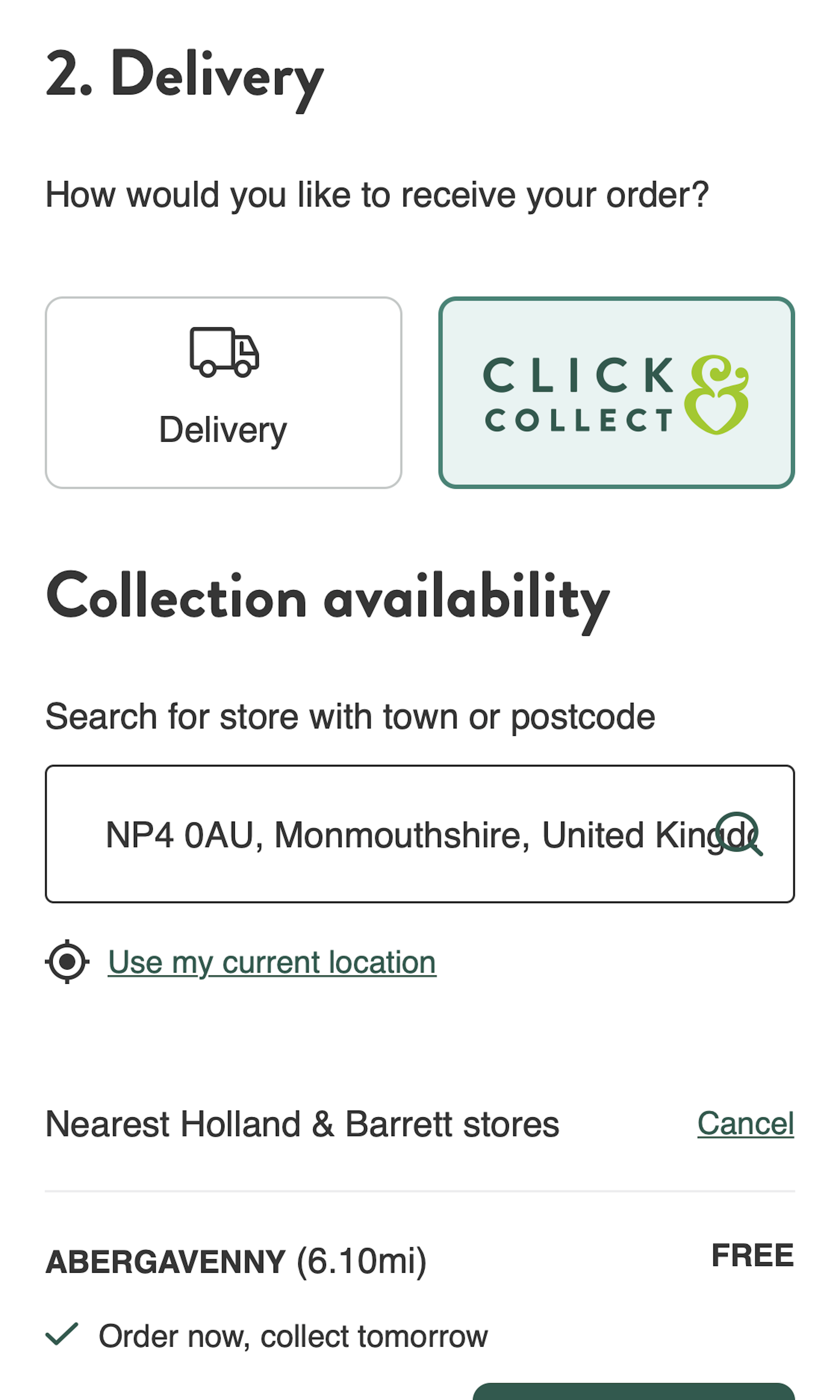
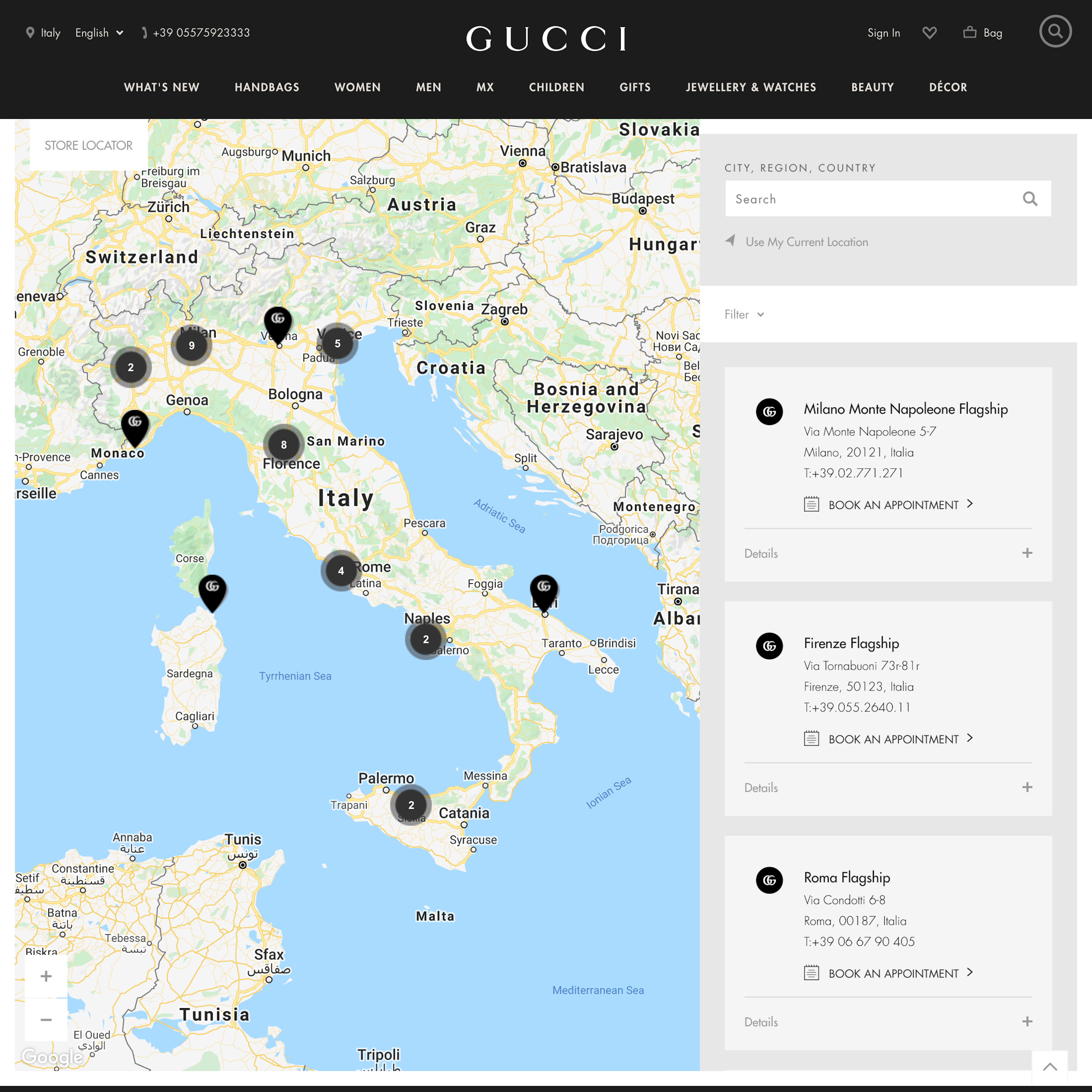
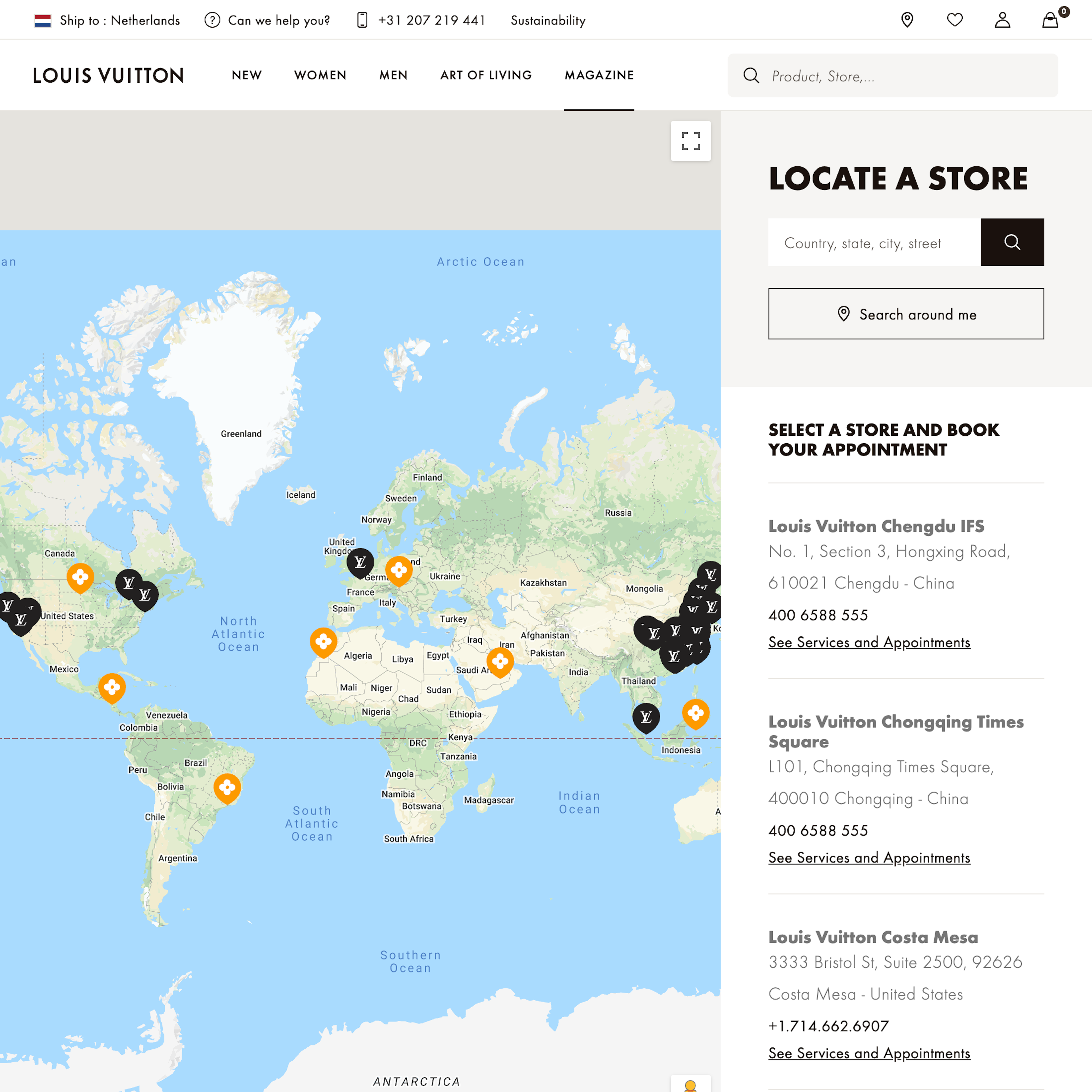
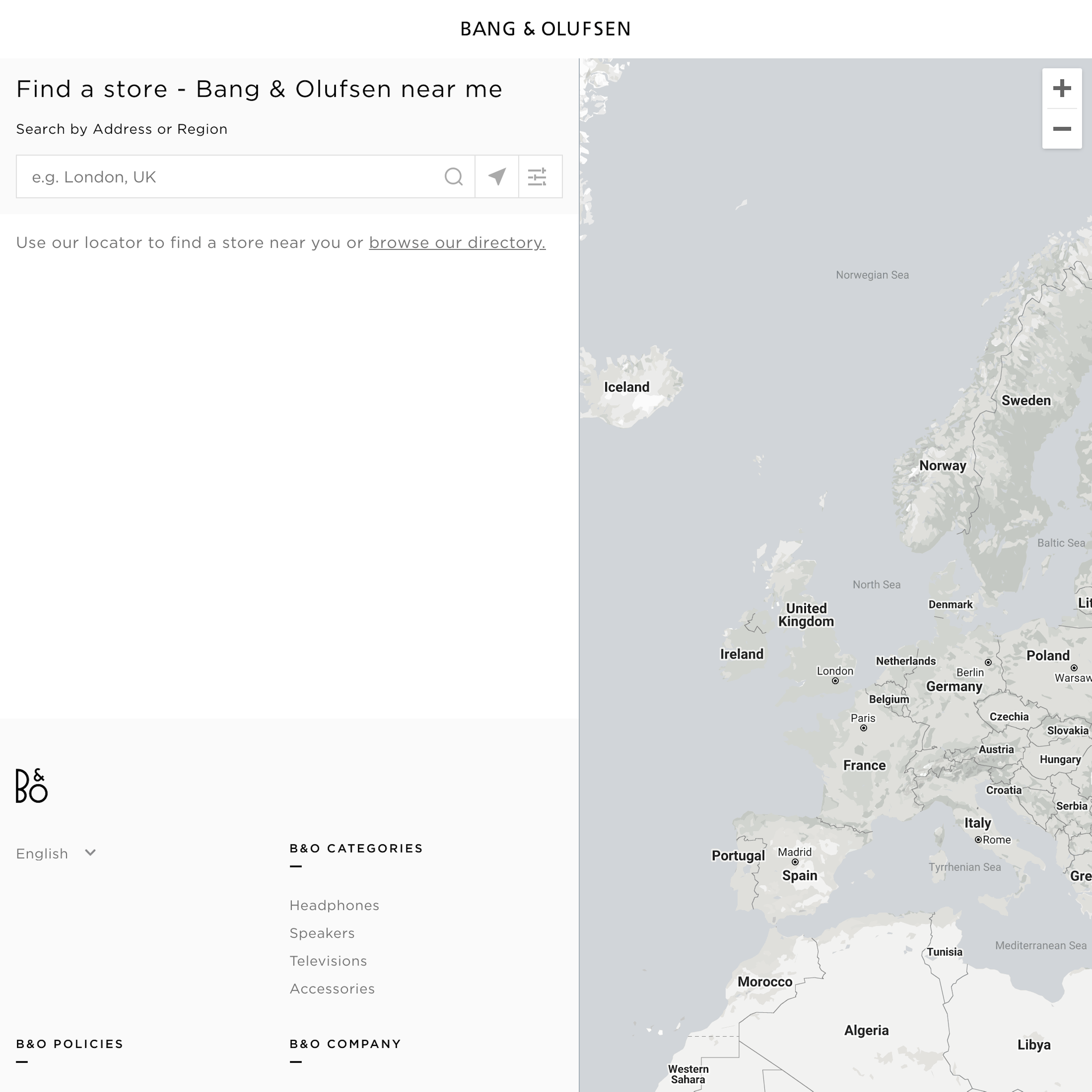
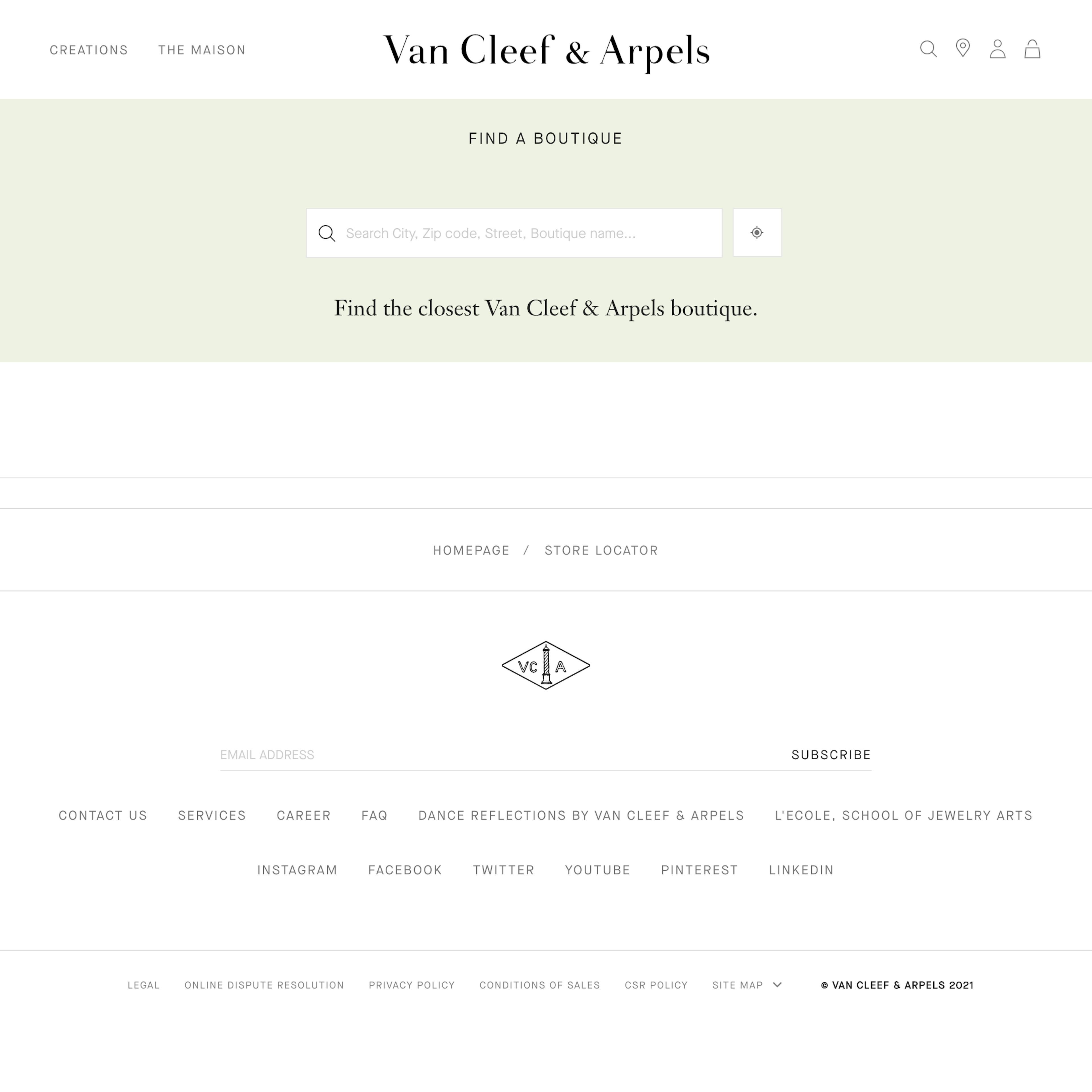
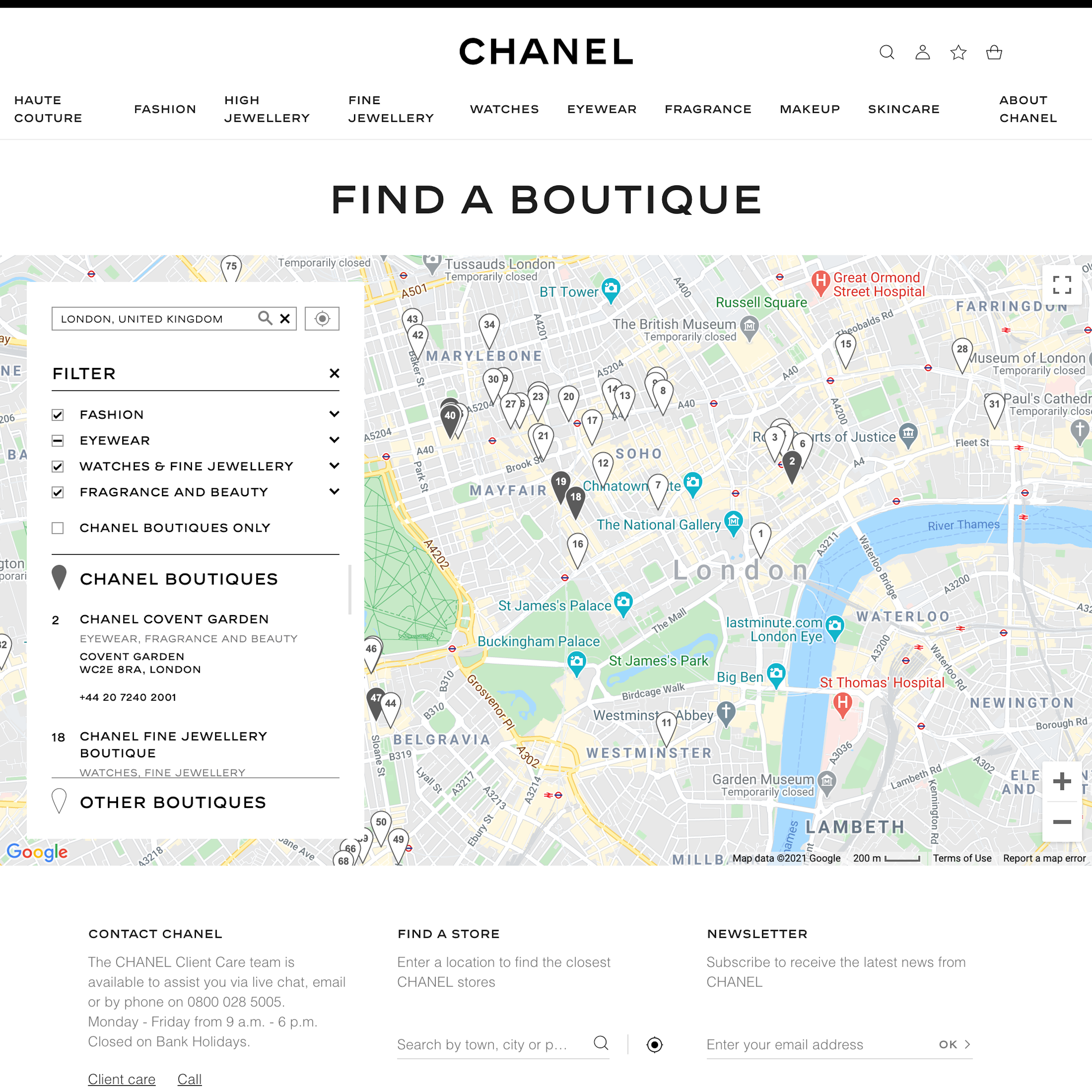
71 ‘Store Locator’ Design Examples
Also referred to as: Store Finder
71 ‘Store Locator’ Page Designs
Filter by:
Mobile (26)
App (11)
User Experience Research, Delivered Weekly
Join 60,000+ UX professionals and get a new UX article every week.

User Experience Research, Delivered Weekly
Join 60,000+ UX professionals and get a new UX article every week.

Explore Other Research Content

300+ free UX articles based on large-scale research.

326 top sites ranked by UX performance.

Code samples, demos, and key stats for usability.


