
How to Reduce Cart Abandonment (Data-Backed UX Strategies)
As a UX professional or ecommerce leader, reducing cart abandonment rate is always high on your agenda. The key to knowing where to focus is first understanding the reasons that are actually related to the user experience.
Baymard's extensive checkout UX research indicates that a significant share of abandonment is caused by friction that could be removed (or eased) with design changes. Those are the abandonments worth focusing on.
In this guide, we’ll show you where the key friction points are in your order journey (based on thousands of hours of large-scale usability testing), and how you can fix them to optimize your checkout flow.
Separate UX abandonment from everything else
Cart abandonment data gets cited constantly, but most of the conversation skips the most important question: how much of it is actually within your control? Price comparison, window shopping, and delivery costs are real factors.
While you may be aware of the overall abandonment rate of your cart, you also need to understand what proportion of that abandonment is UX-fixable.

The above chart shows the leading reasons why shoppers abandon before they order. We can broadly bucket these reasons into two categories:
-
Non-UX causes (pricing, shopper intent, delivery cost)
-
UX causes (checkout friction, forced account creation, form failures, trust gaps) If you're a UX designer making the case for checkout investment, it’s not enough to say “70% of users abandon the cart”. You need to be able to say something like: "Around 20% of our abandonment is caused by issues we can fix. Here's what they are."
5 common UX causes of cart abandonment (and what to do about them)
Baymard’s research reveals that most checkout abandonment is preventable. By addressing these five common friction points, you can build a more trustworthy experience that respects your users' time and effort.
1. Unexpected costs appear too late
Extra charges like shipping, taxes, and fees are the leading cause of abandonment; our survey found 39% of users abandoned a checkout for this reason.
Users often hesitate to move forward when they cannot see the total cost upfront, leading some to abandon the cart.
The fix:
-
Show the full order cost in the cart, including all fees and per-item costs. If you cannot provide an exact total, offer a clear estimate and explain how it was calculated.
-
Integrate free shipping information directly into the cart summary so users immediately know if they qualify.
2. Forced account creation
Mandatory account creation remains a major barrier, causing 19% of users to drop out. Users are particularly hostile to this practice, and even when a guest option exists, they may overlook it if the design is visually weak or buried.
The fix:
-
Provide a guest checkout path for every user.
-
Delay account creation until the confirmation step to keep users focused on completing checkout.
-
Make the guest option the most prominent choice on the login screen. Use a clear button labeled "Guest Checkout" or "Continue as Guest" and place it above or next to the sign-in fields.
See this video for more details:
3. Overly complex checkout flows
A checkout that looks long or complicated can be just as damaging as one that actually is. Research shows 18% of users abandoned because the process felt too difficult.
Excessive fields are particularly intimidating for mobile users, as typing, editing, and selecting text is generally more difficult than using a physical keyboard.
“Our ecommerce UX benchmark shows that many sites are still including too many form fields in their checkouts — degrading the overall user experience.”
– Edward Scott, Research Lead, Baymard Institute
The fix:
-
Minimize the number of form elements visible by default to reduce the cognitive load on your users.
-
Hide irrelevant fields based on the user's specific context.
-
Optimize all steps for browser autofill to help users complete forms with less typing.
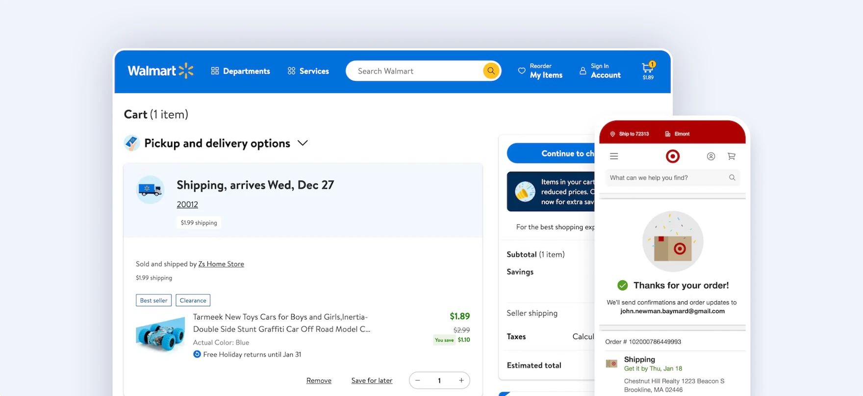
4. Slow or unclear delivery expectations
Speed matters, but so does transparency. In our research, 21% of users abandoned because delivery was too slow. Problems also arise when important shipping details are hidden until the final review step, leading to late-stage surprises.
The fix:
-
Present delivery dates and shipping speeds earlier in the flow, rather than waiting until the end.
-
Keep shipping information visible throughout the cart and initial checkout steps.
-
Provide an estimated “Delivery Date” rather than shipping speed for each delivery option directly within the shipping-selection interface.
5. Distractions and interruptions
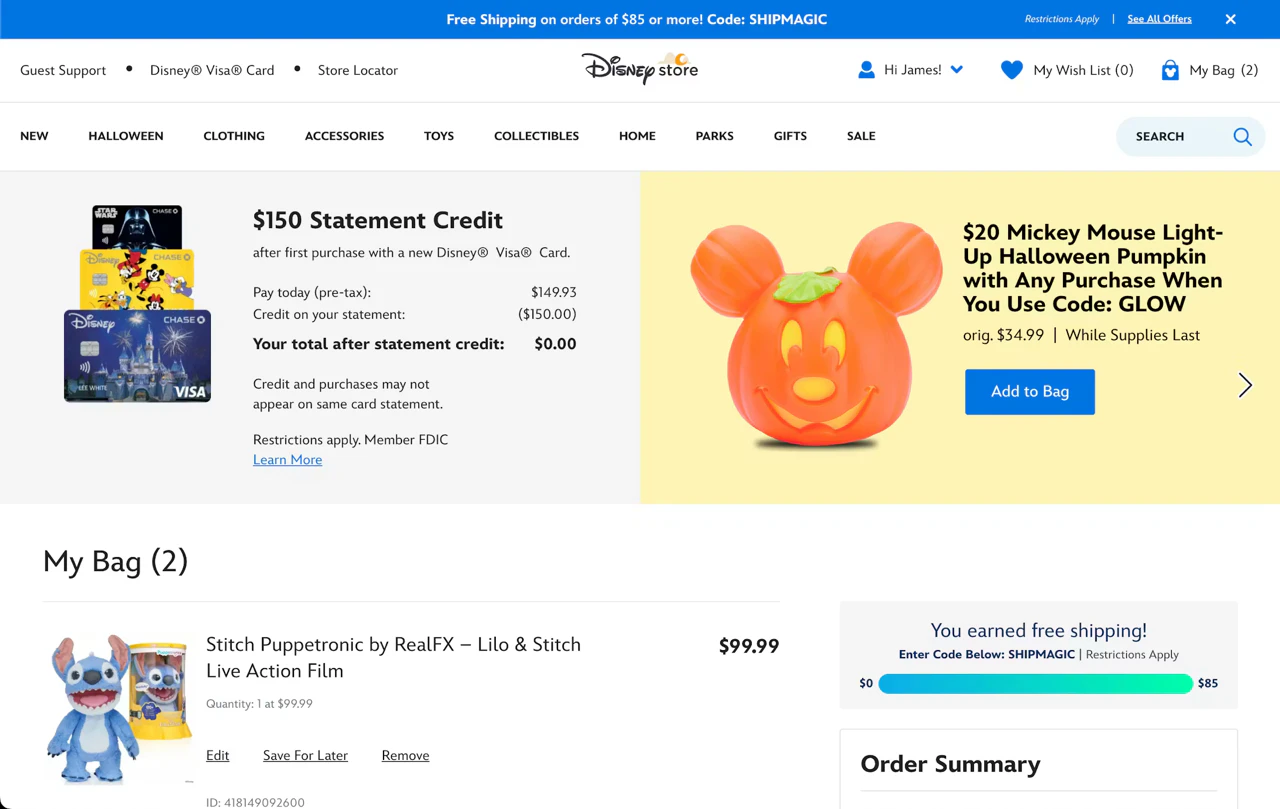
Prominent ads, financing offers, and aggressive cross-sells (like those seen in the above Disney screenshot) can pull users away from their primary goal: completing the purchase.
In the cart, these distractions increase the risk of abandonment. During checkout, interruptions can frustrate users and damage brand trust.
The fix:
-
Ensure ads and promotions remain visually secondary to the checkout actions.
-
Avoid interrupting the flow with forced offer decisions. Instead, keep special offers passive or move them to the confirmation page.
-
Use an enclosed checkout design that removes main site navigation while providing a clear way to return to the shop if needed.
What won’t fix cart abandonment
Not all abandonment is fixable with UX, and it is easy to waste effort on interventions that fail to address the actual causes. Before you invest time and resources into checkout flow “fixes”, be clear about what they can and cannot do.
You can’t fix checkout abandonment by layering persuasion tactics over a flawed user experience.
Exit-intent popups and discount offers may recover some price-sensitive users, but they do not resolve underlying UX friction. If your checkout is broken, a discount pop-up won’t fix it; it just makes the broken experience cheaper.
Similarly, retargeting emails are effective for recovering "distracted" abandonment where users intended to buy but got sidetracked. They are not effective for UX-caused abandonment. Bringing users back to a frustrating checkout simply re-exposes them to the same friction that drove them away initially.
You should also avoid treating a reduction in checkout steps as a headline goal. Step count is merely a proxy metric. In practice, a one-page checkout with 30 form fields is often worse than a three-step checkout with well-designed forms. Rather than focusing on the number of pages, you should prioritize reducing perceived complexity and ensuring every field is necessary.
How to make the case internally
For many UX practitioners, the challenge isn’t identifying checkout friction, it’s securing the buy-in to fix it. To move these improvements from a wishlist to the roadmap, you must frame UX debt as a quantifiable business cost.
Spot and fix UX issues directly in Figma
Making UX design changes to your checkout flow? Secure faster design approvals and ship designs confidently by analyzing design frames against Baymard's 200K+ hours of research.
Start by refining how you report abandonment. A headline figure like “70% abandonment” is often too broad to be actionable and can lead to stakeholder apathy. Instead, isolate the proportion of abandonment specifically attributable to UX issues. By focusing on the percentage of users leaving due to forced account creation or hidden costs, you present a problem that the design and product teams can actually solve.
You can then connect these fixes directly to conversion math. Use a simple formula to demonstrate the cost of inaction: If the checkout converts at X% and the average order value is $Y, recovering even 10% of UX-caused abandonment is worth $Z in annual revenue. Providing this structure shifts the conversation from subjective design preferences to objective financial impact.
To make this calculation concrete for your stakeholders, use real numbers from your checkout. Here’s an example that might apply to a midsize ecommerce store:
- Monthly checkout starts: 50,000 users
- Current completion rate: 30% (15,000 orders)
- Average order value (AOV): $120
- Annual revenue: $21.6 million
In this scenario, 35,000 users (70%) abandon the checkout every month. If your analytics and Baymard’s research suggest that 20% of those drop-offs are due to addressable UX friction (such as hidden shipping costs or forced account creation), you are losing 7,000 potential orders monthly to poor design.
By recovering just 10% of those UX-driven abandonments (700 additional orders per month), the impact is significant:
- Monthly revenue increase: $84,000
- Annual revenue increase: $1,008,000
Framing the project this way changes the internal conversation. You are no longer asking for a budget to "clean up the UI"; you are proposing a targeted intervention to capture over $1 million in lost annual revenue.
To add further weight to your proposal, benchmark your current experience against industry standards.
Baymard’s research provides the data needed to show exactly where your checkout falls behind leaders in pricing transparency, guest checkout prominence, or error handling. Highlighting a concrete gap between your site and the industry benchmark makes the need for investment undeniable.
Finally, present your recommendations as a sequenced roadmap rather than a collection of features. Prioritize by impact and effort, like this:
- High impact, lower effort: Implementing guest checkout and surfacing total costs in the cart.
- High impact, medium effort: Refining payment error handling and optimizing for browser autofill.
- High impact, high effort: Simplifying the flow and minimizing the number of forms
- Medium impact, medium effort: Minimizing interruptions in the checkout process
This approach demonstrates that you are not just asking for resources, but strategically identifying the most effective improvements to increase revenue.
See how your checkout compares to 300+ leading ecommerce sites with a Baymard subscription. Sign up now for free.
Make research-backed, evidence-based improvements to reduce cart abandonment
We all hate to see it, but users abandoning your checkout flow is just a natural part of running an ecommerce store. That said, it’s not something you should sleep on.
Reducing cart abandonment starts with identifying the right causes. Most of the UX interventions in this piece are well within reach of any ecommerce team, but knowing which ones apply to your checkout, and in what order to address them, requires more than a checklist. Run a checkout flow audit to find out what the main friction points are for your customers, and work backwards from there.
Baymard’s research platform includes 700+ research-backed UX guidelines, benchmark data showing how 300+ leading ecommerce sites handle each of these issues, and UX-Ray — which scans your site and surfaces specific UX problems in minutes.
Sign up to Baymard for free — no credit card required.
Research Director and Co-Founder
Christian is the research director and co-founder of Baymard. Christian oversees all UX research activities at Baymard. His areas of specialization within ecommerce UX are: Checkout, Form Field, Search, Mobile web, and Product Listings. Christian is also an avid speaker at UX and CRO conferences.