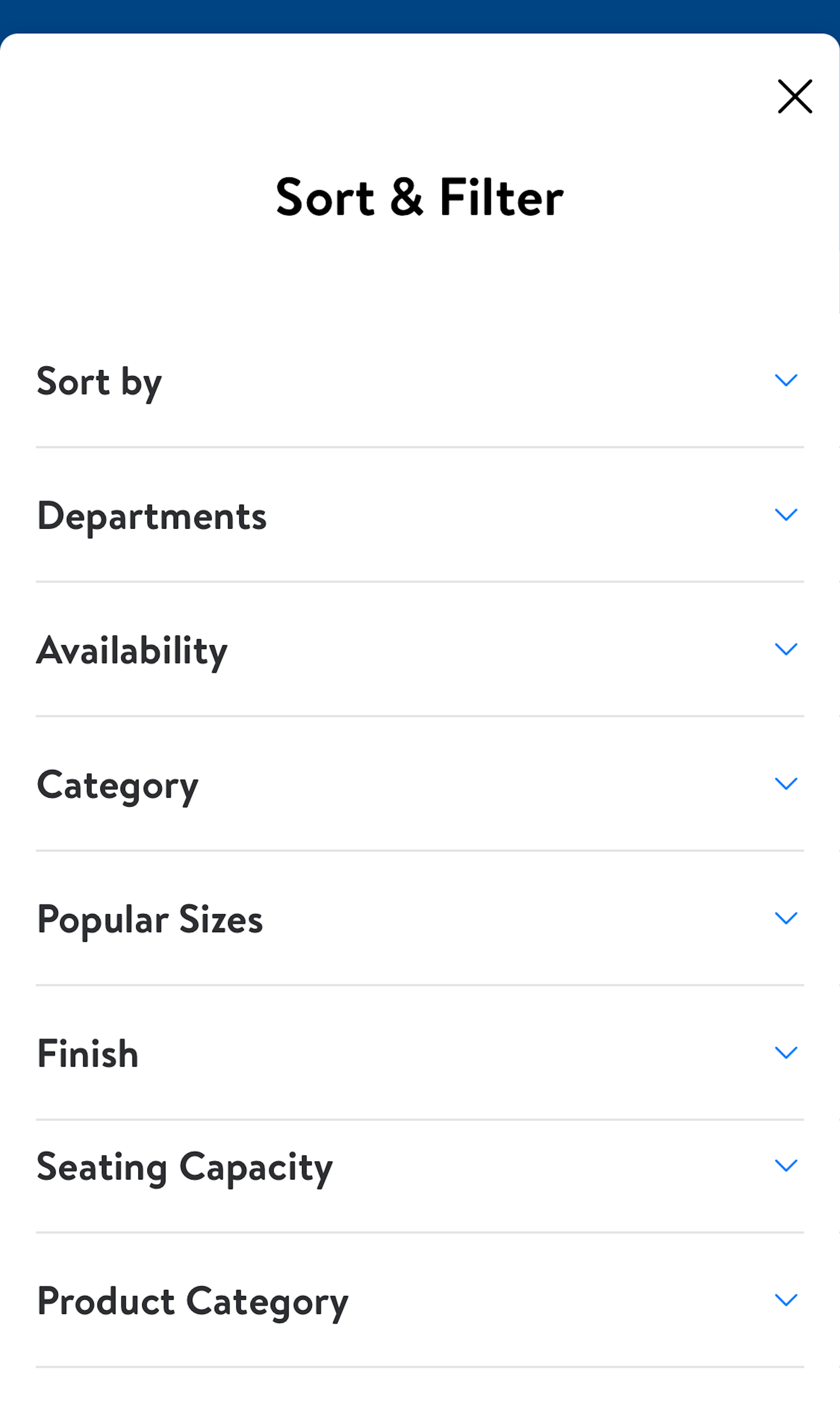
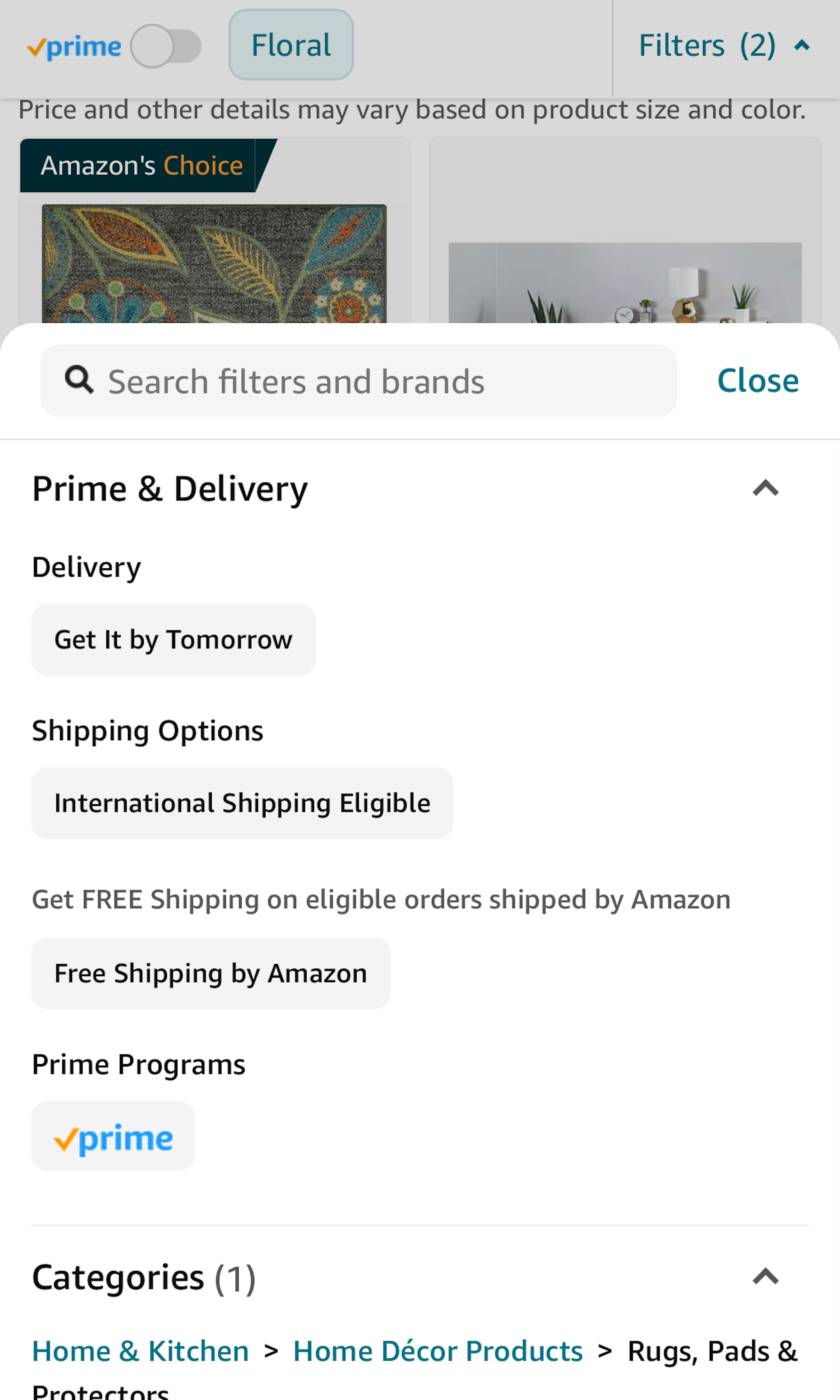
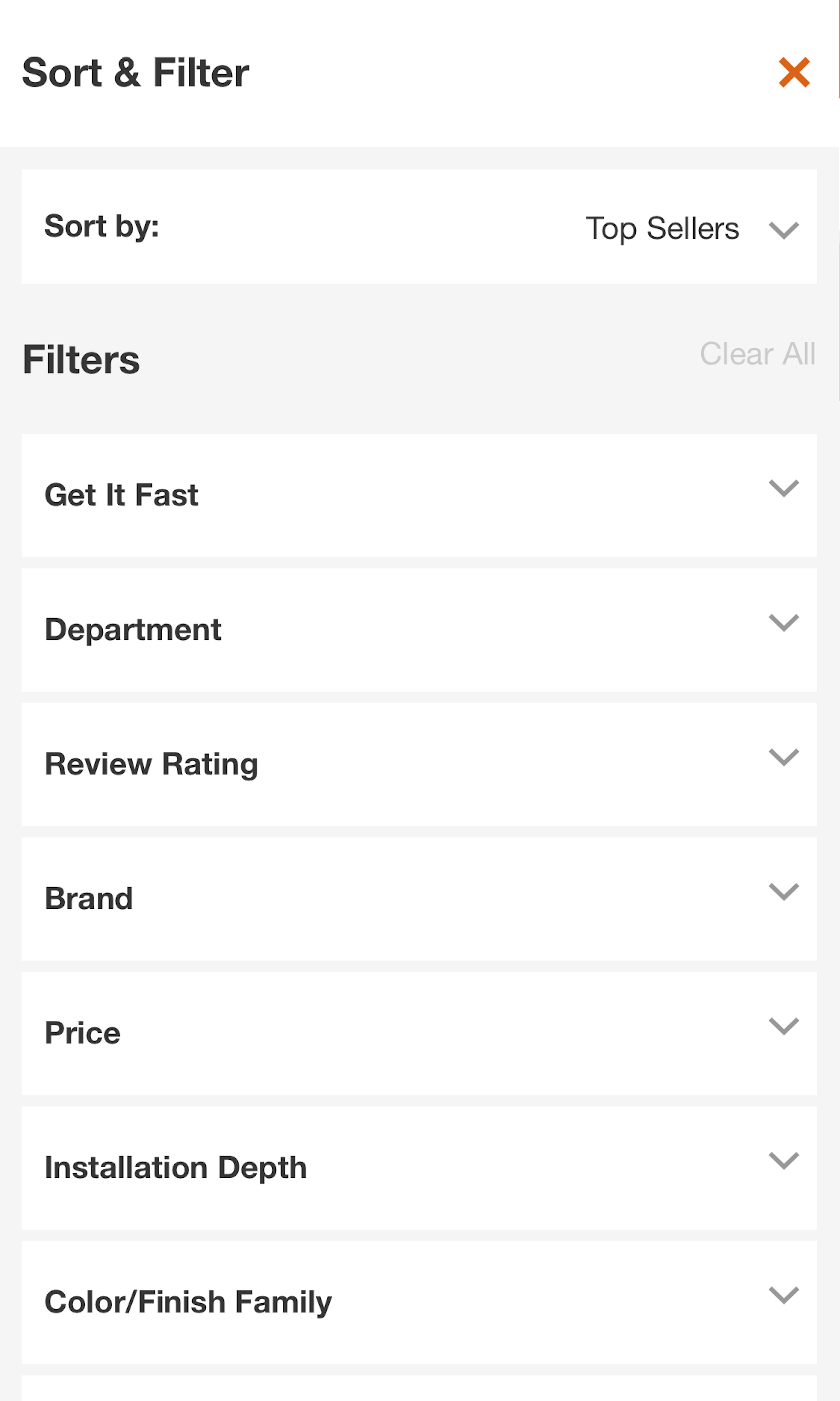
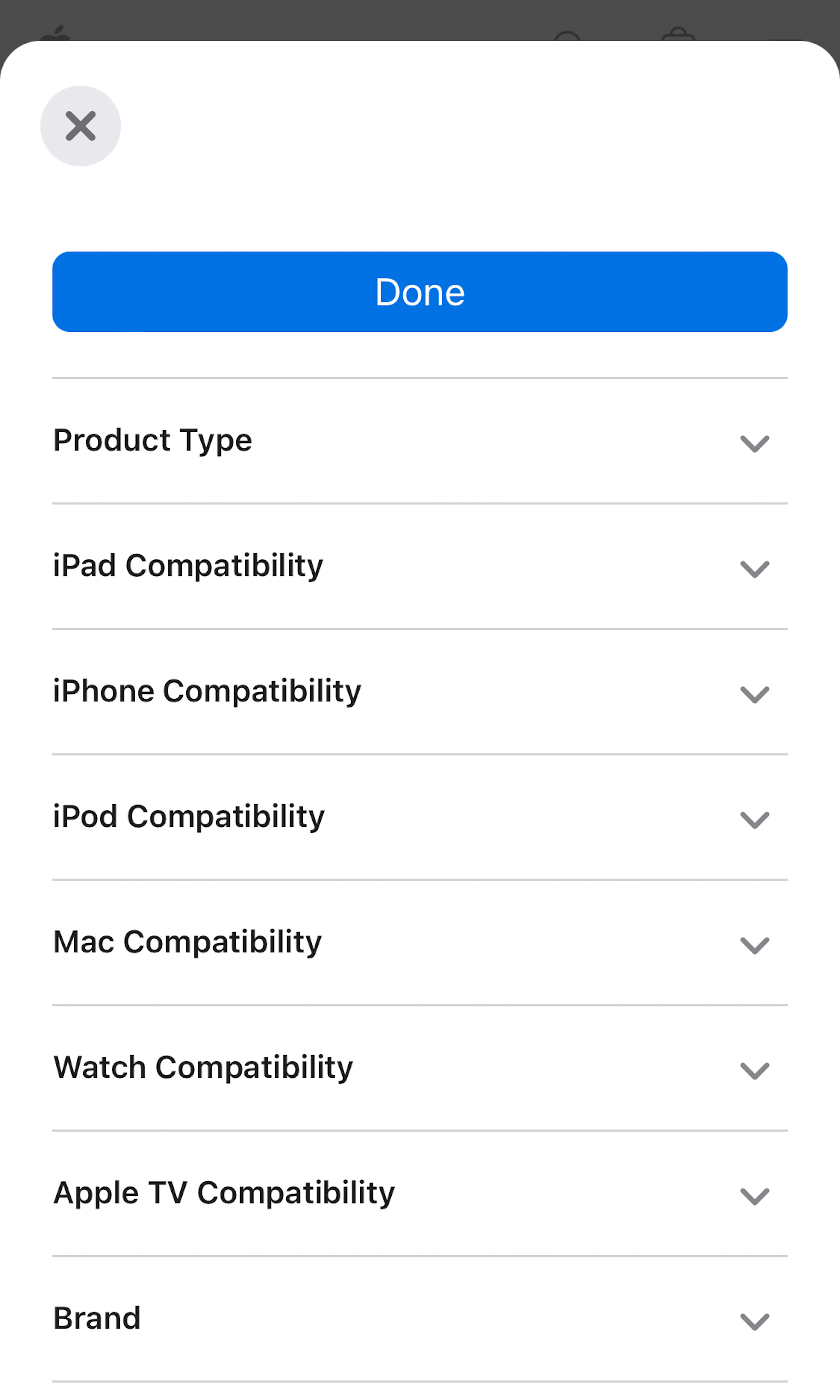
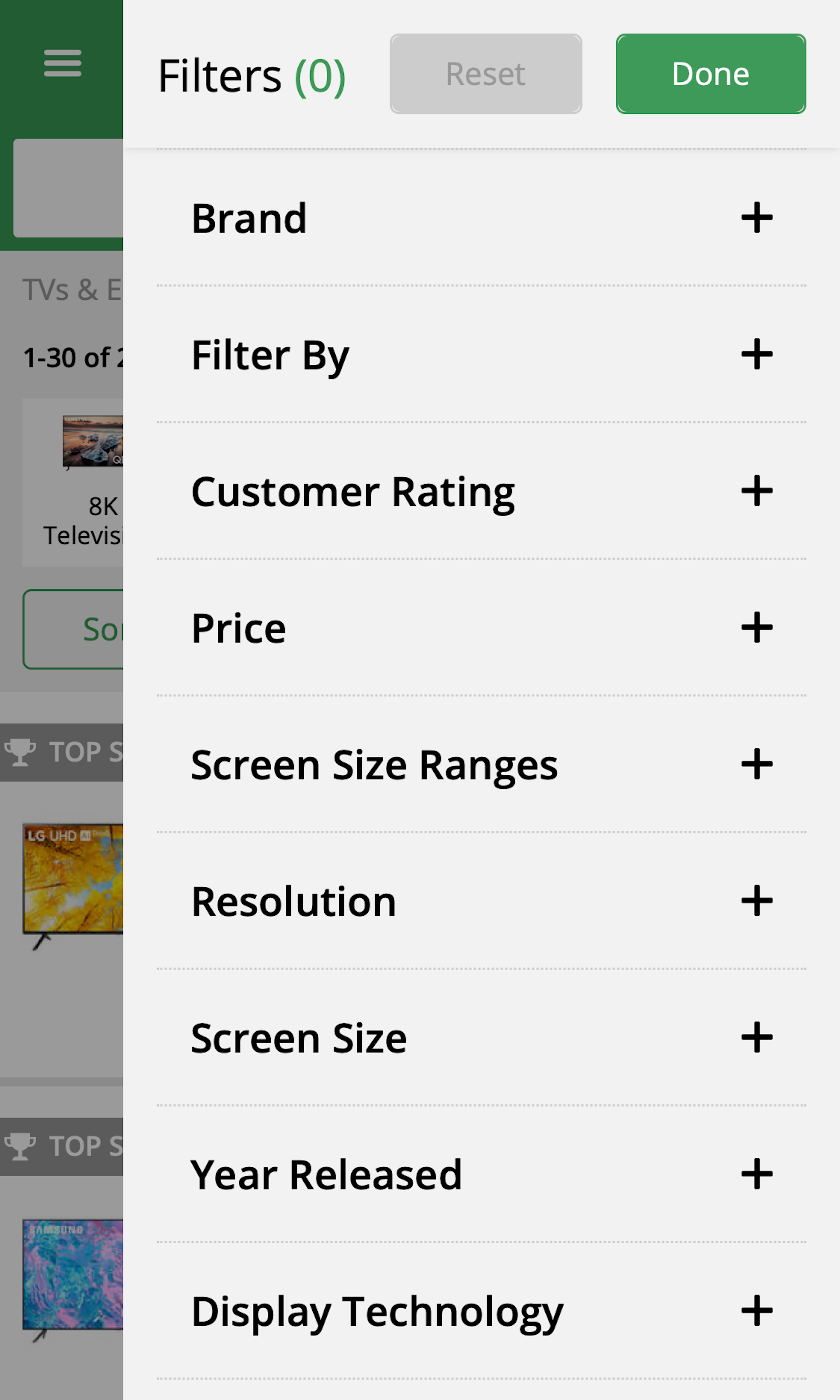
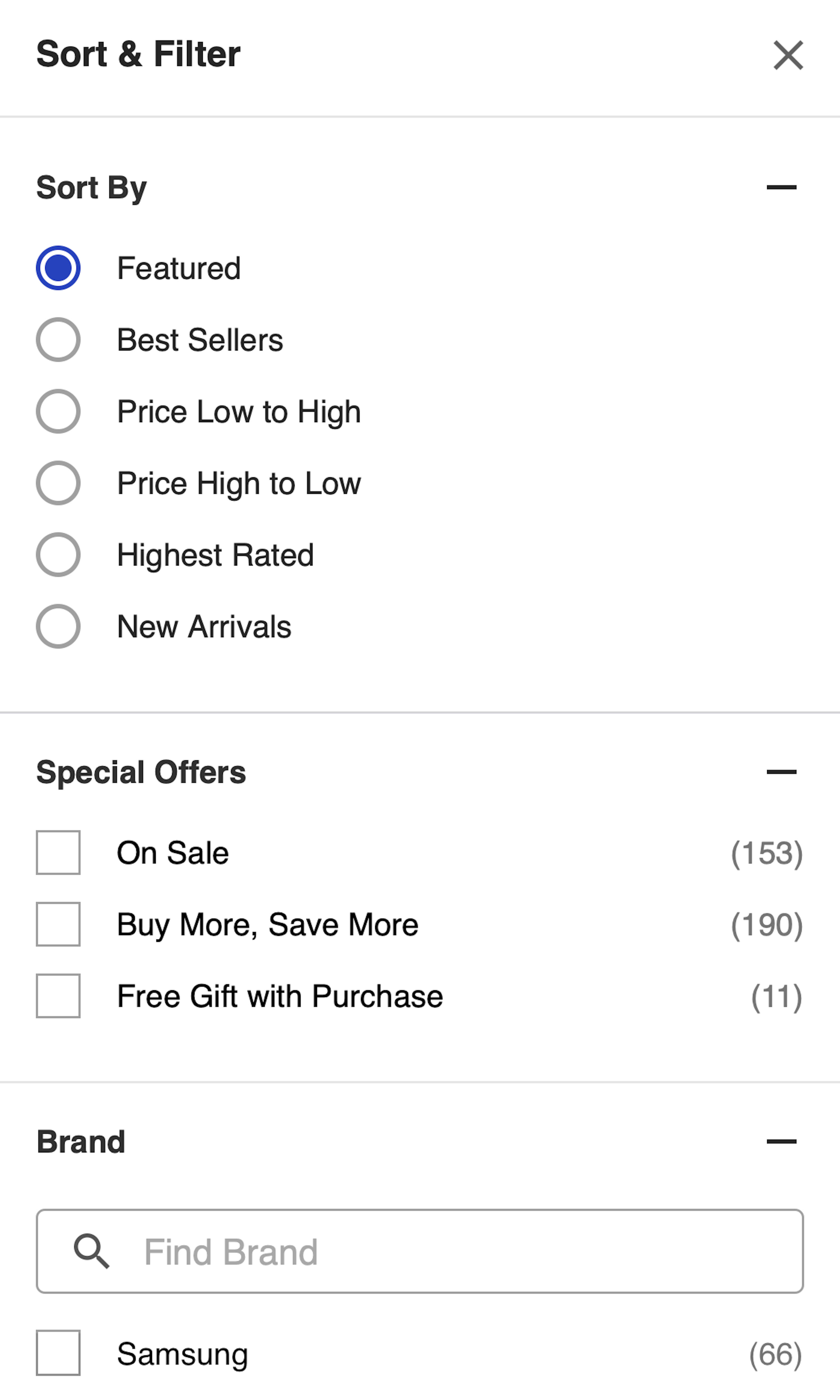
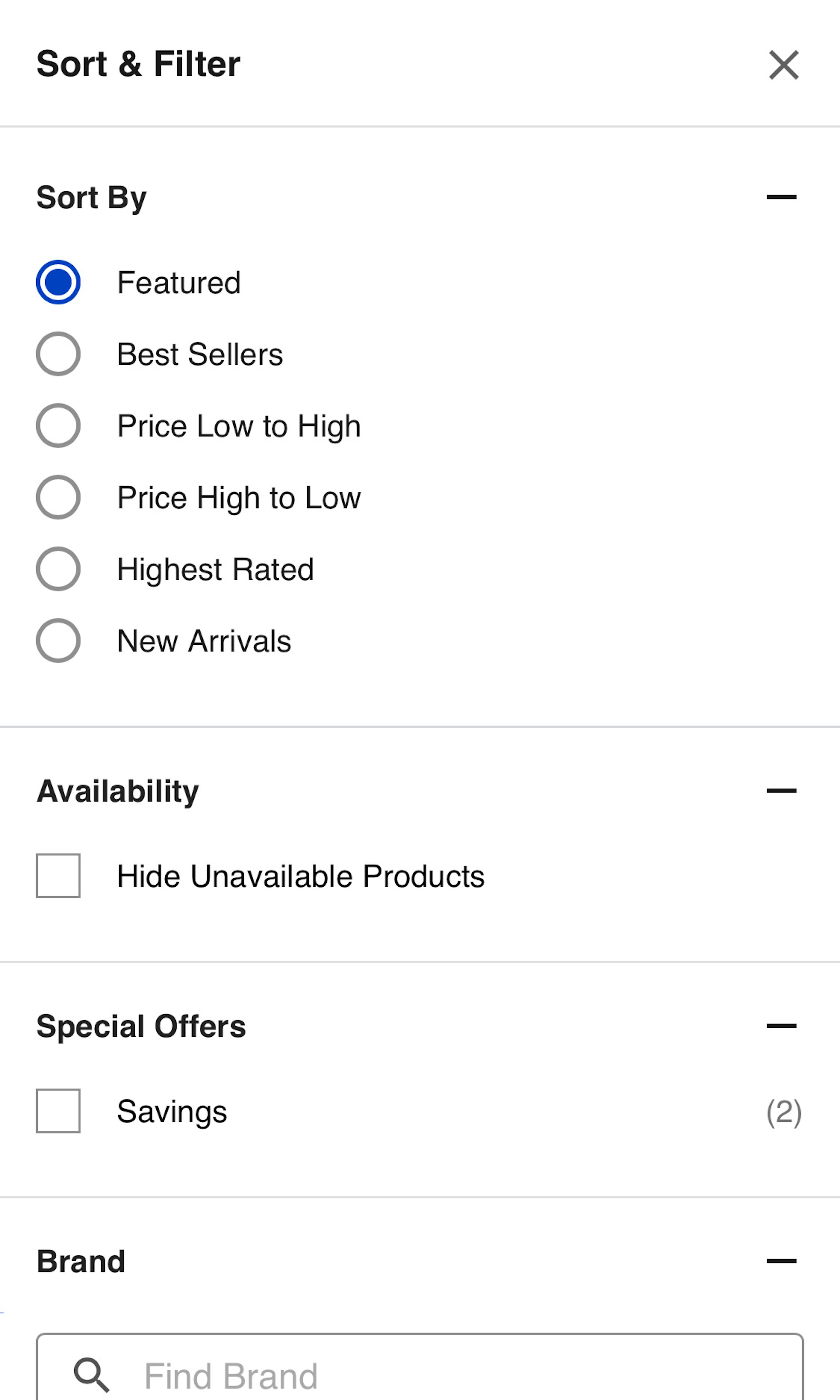
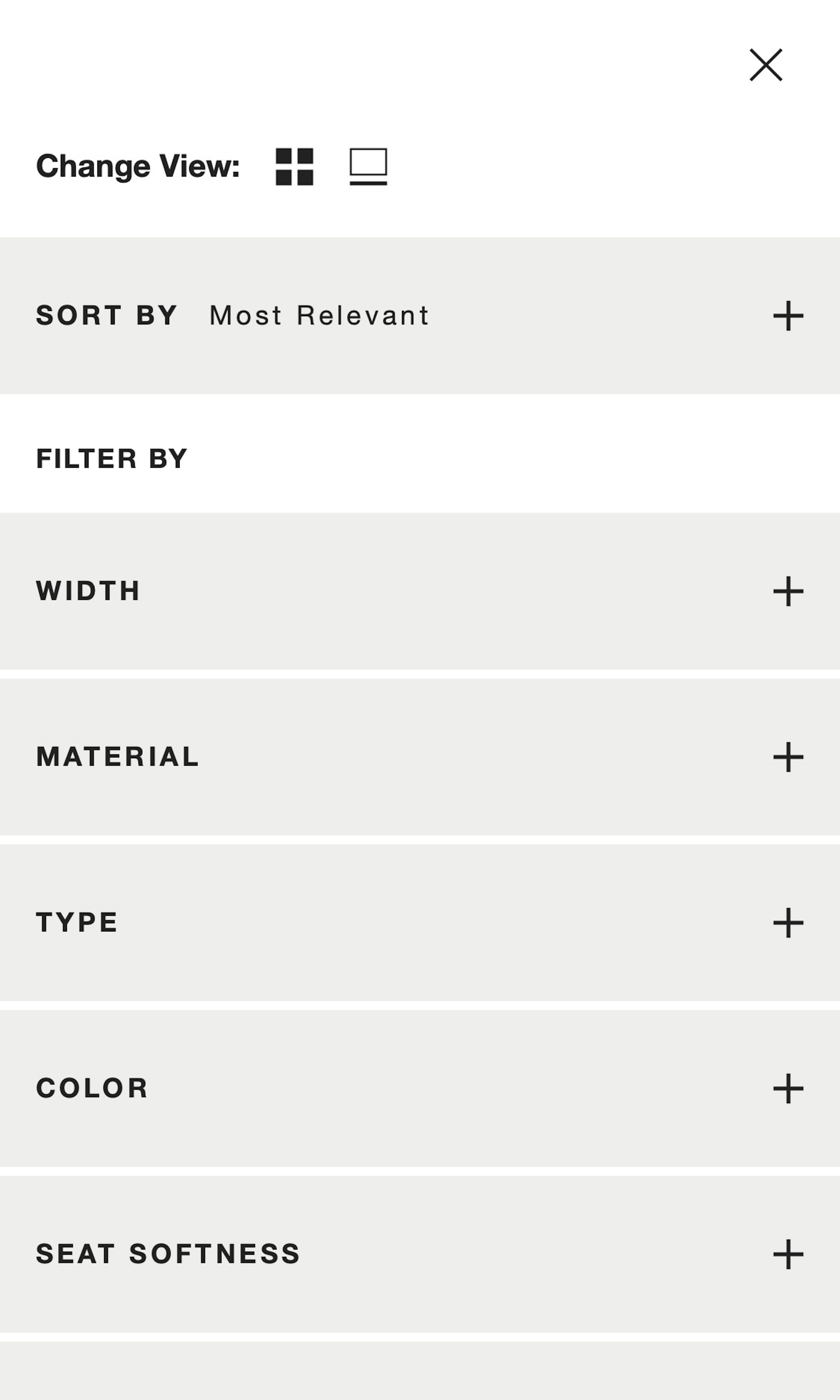
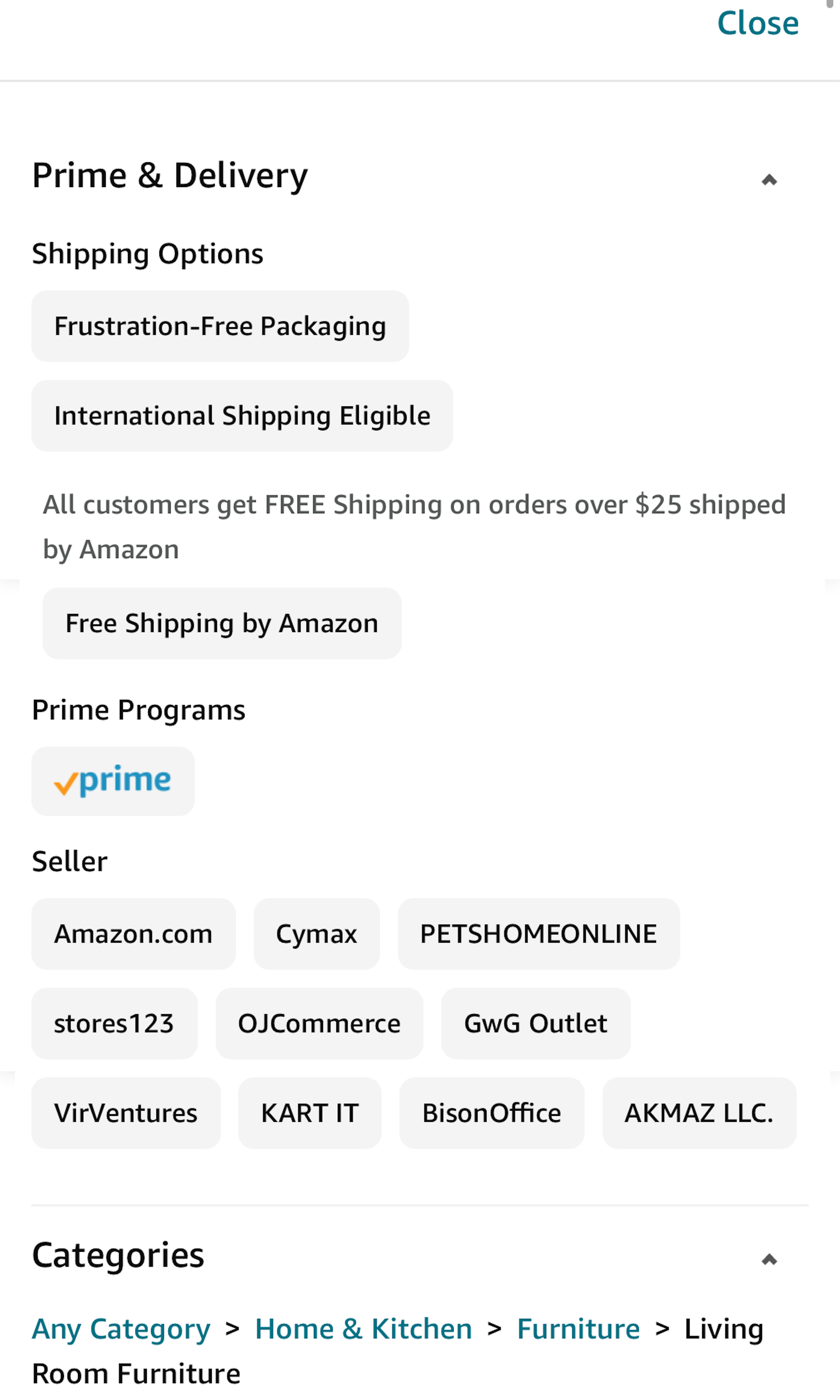
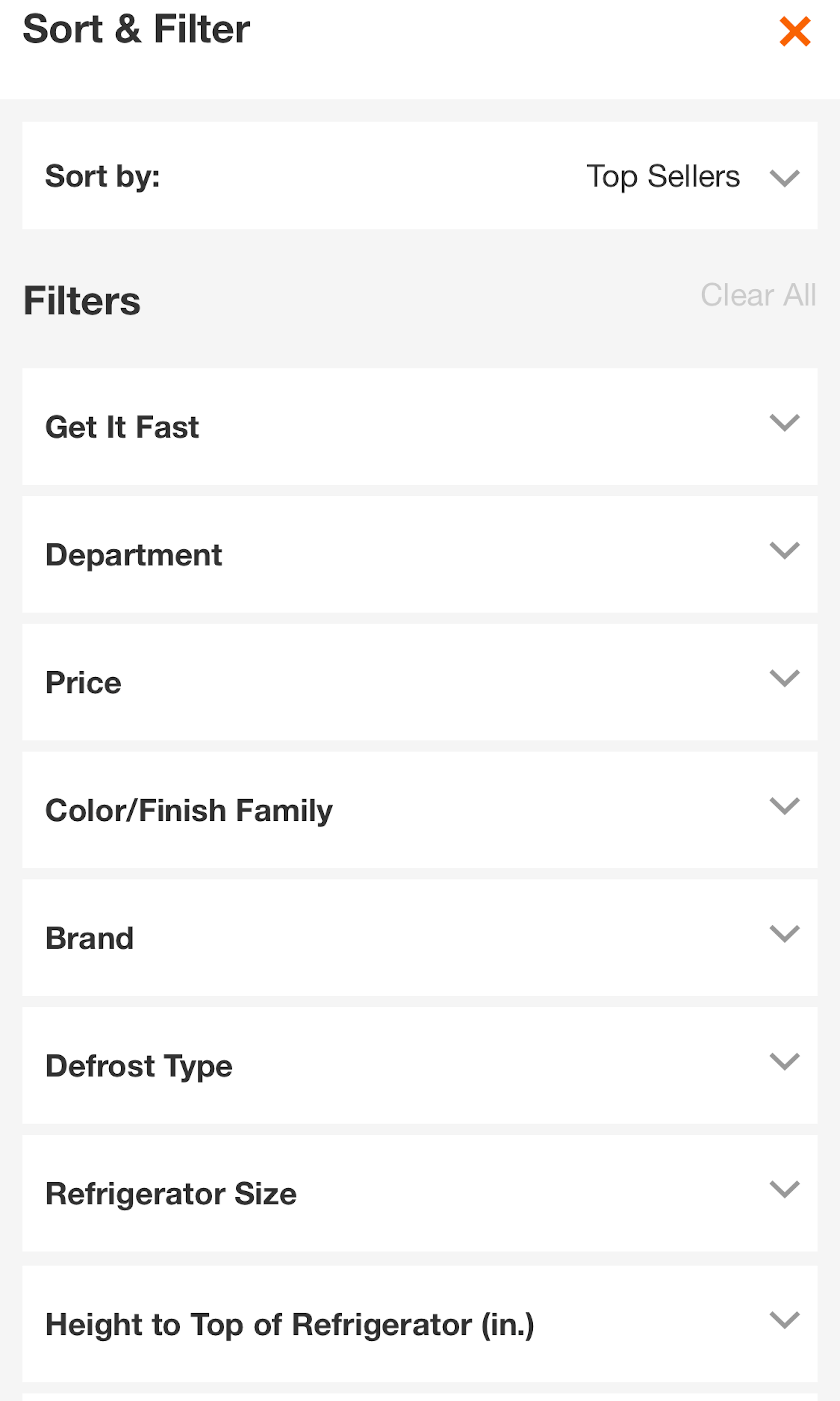
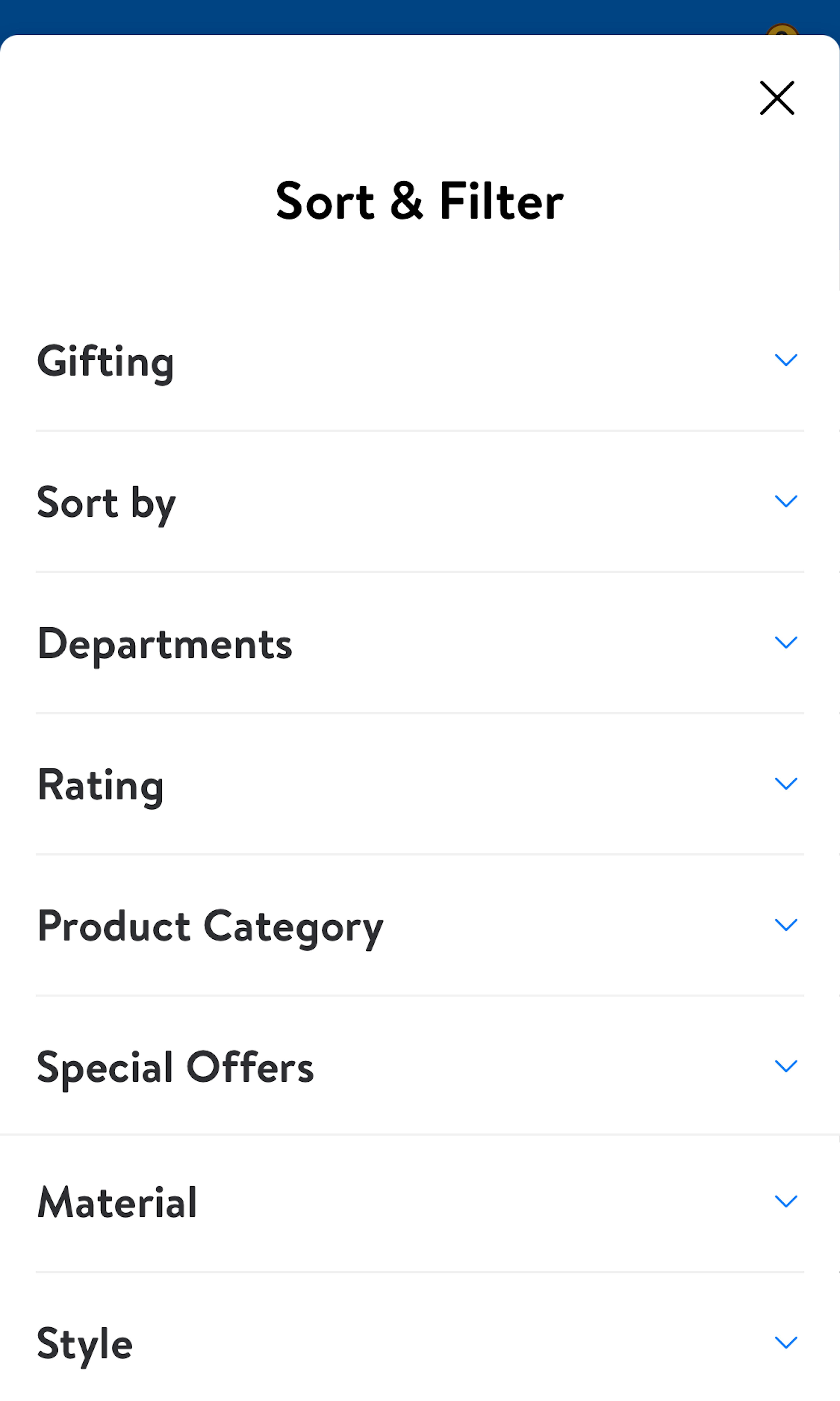
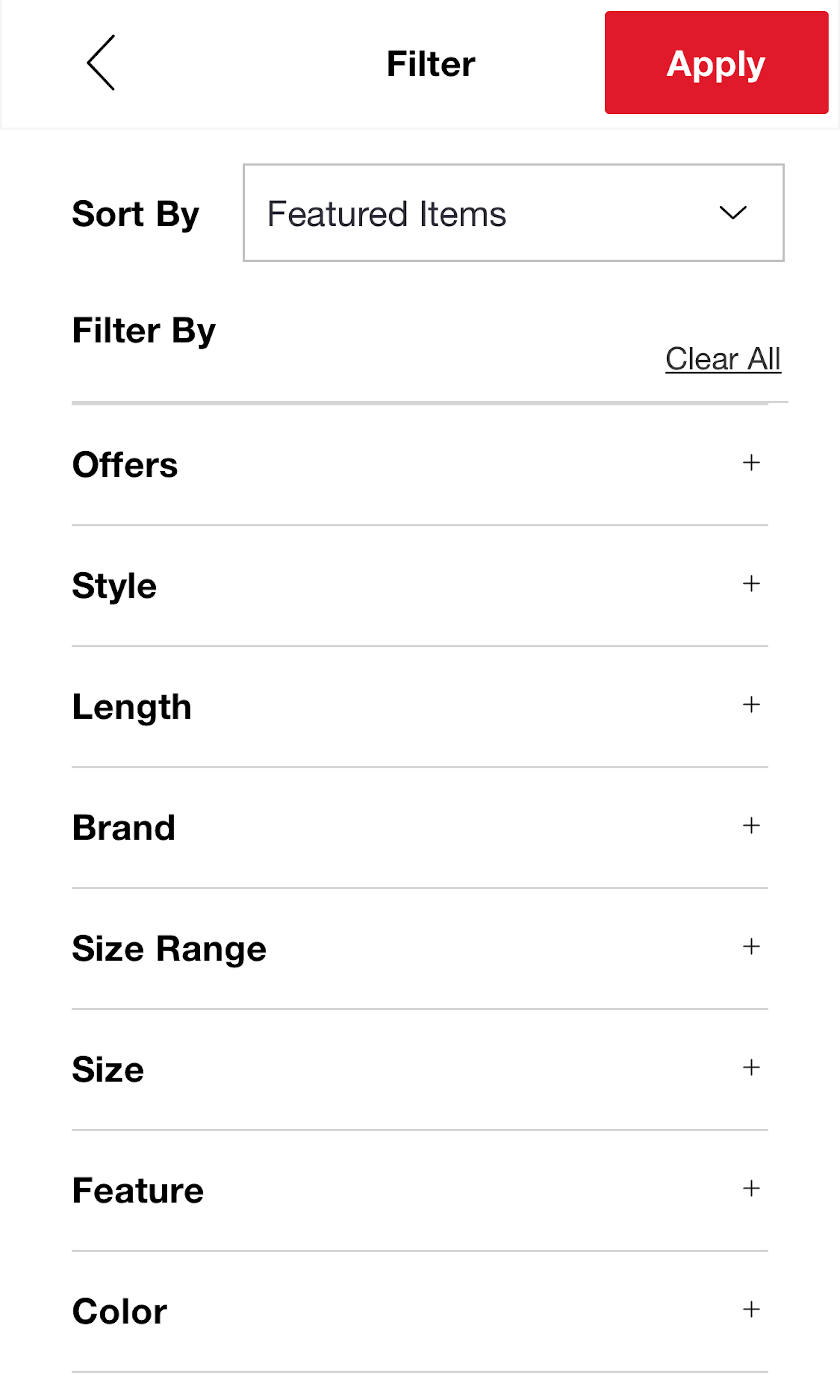
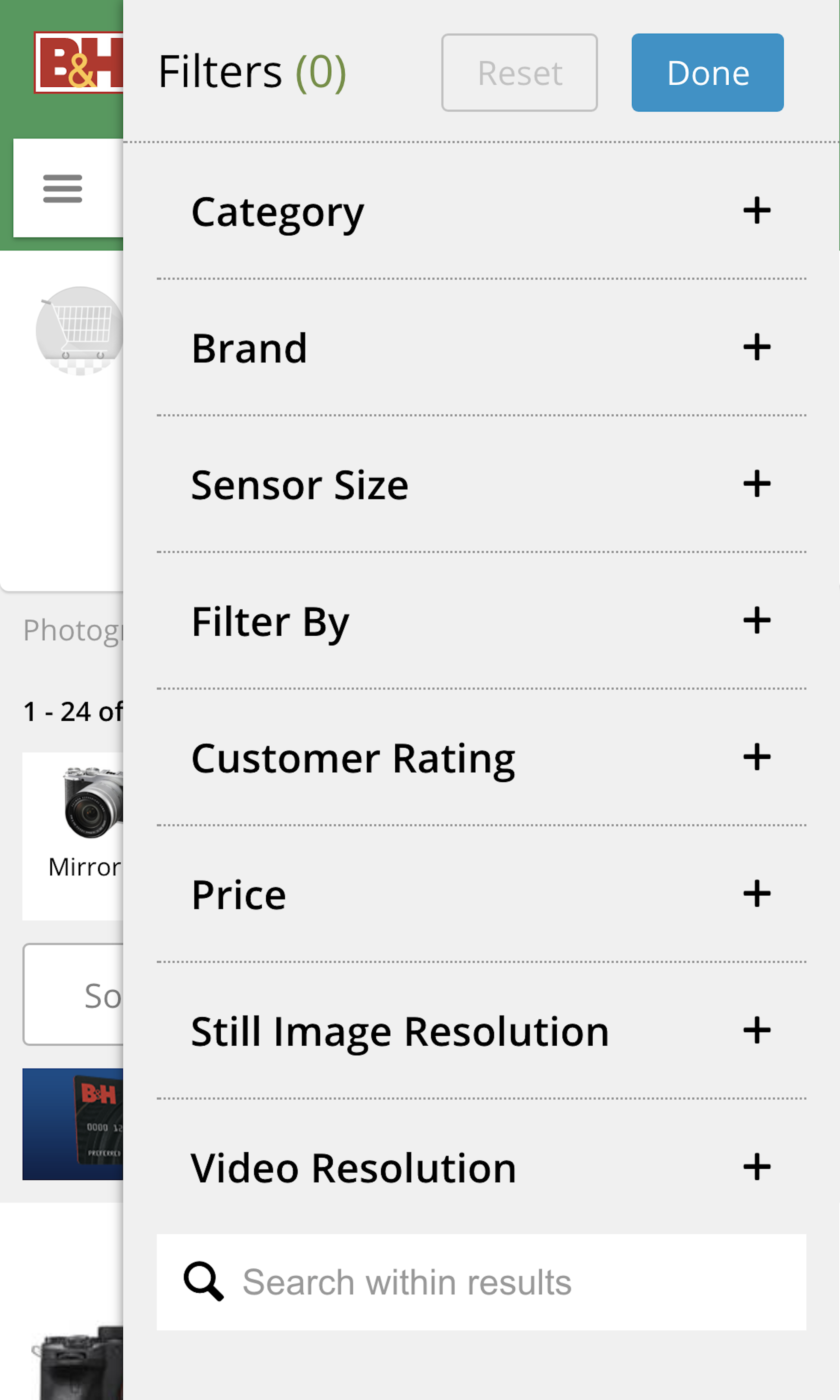
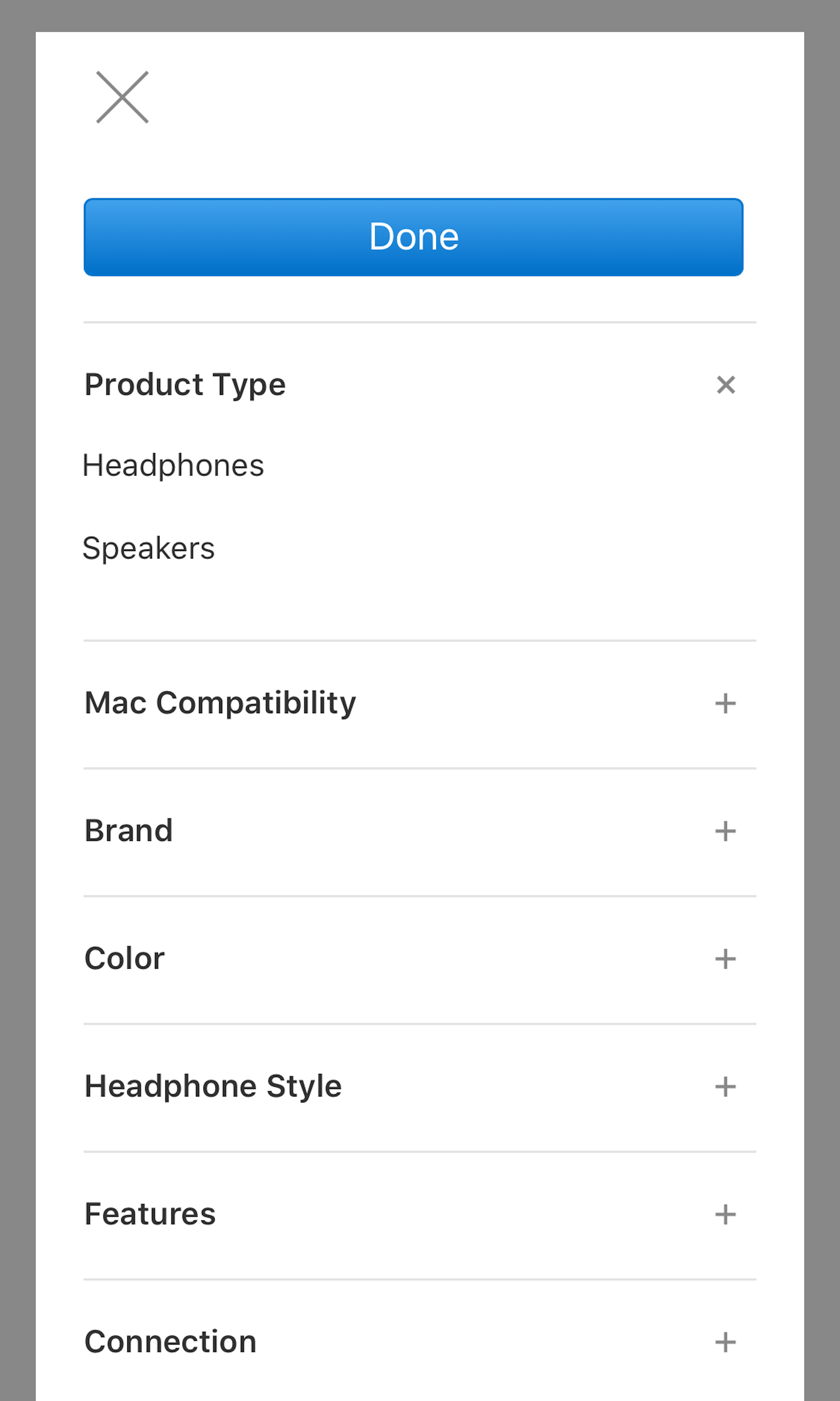
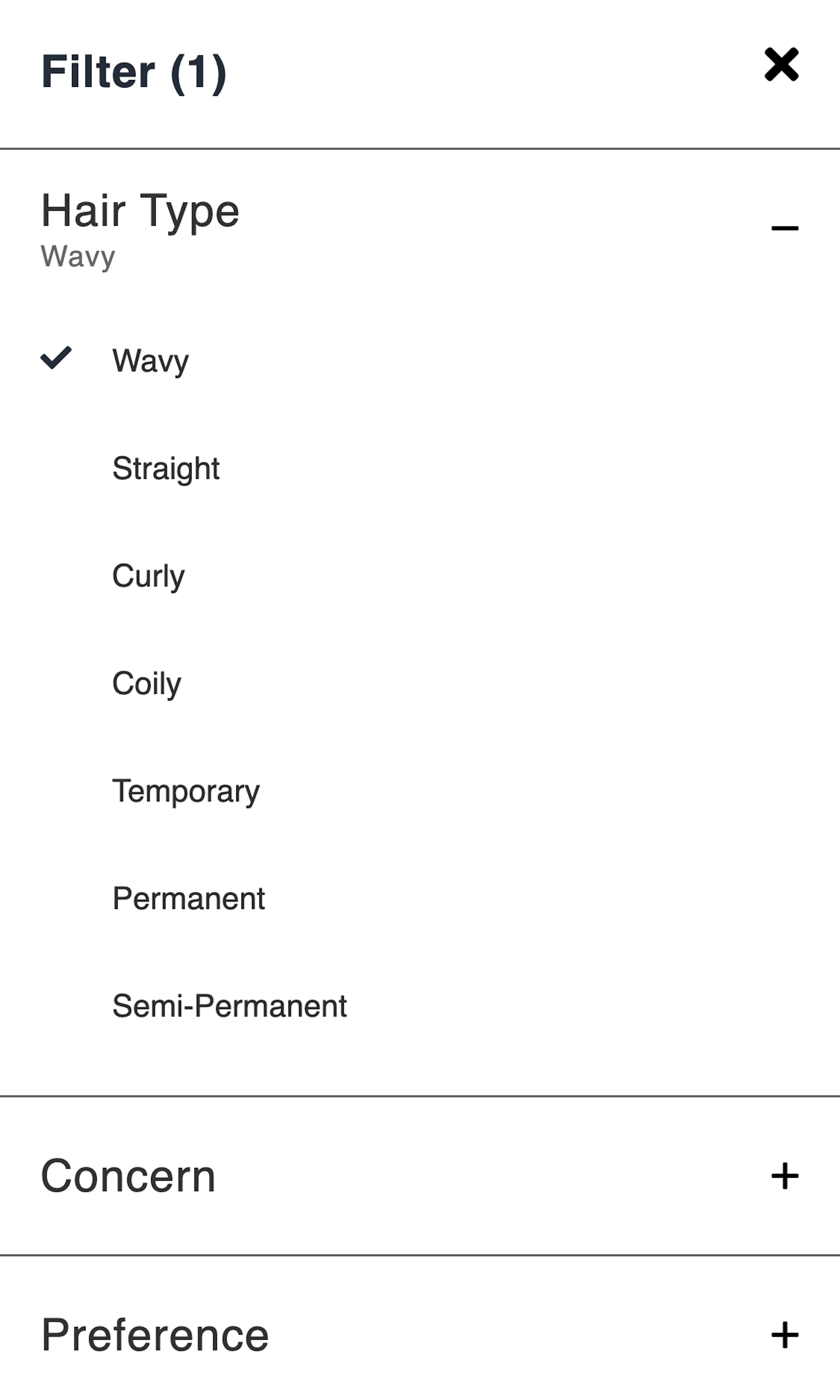
What’s this? Here you’ll find 463 “Mobile: Filtering Options” full-page screenshots annotated with research-based UX insights, sourced from Baymard’s UX benchmark of 93 ecommerce sites. (Note: this is less than 1% of the full research catalog.)
The filtering experience on mobile presents specific challenges, since mobile filters often are contained in a separate interface, meaning that filters are not permanently visible as they are on many desktop sites. During Baymard’s testing and benchmarking, the most common mobile issues encompassed: the necessity for multiple trips back-and-forth between product lists and separate filtering interfaces, difficulties with overlong lists of filter options, and poorly designed interfaces that obscured or skewed the user’s perception of the filters.
More ‘Filtering Options’ Insights
-
Desktop Examples: Besides the mobile examples below, we also have 105+ desktop examples of Product List implementations.
-
Learn More: Besides exploring the 62 mobile “Filtering Options” design examples below, you may also want to read our related article “5 Essential Filter Types Users Need on Product Listing Pages (57% Don’t Offer All 5)” and “Display “Applied Filters” in an Overview (32% Don’t)”.
-
Get Full Access: To see all of Baymard’s 351 mobile research findings you’ll need Baymard Premium access. (Premium also provides you full access to 200,000+ hours of UX research findings, 650+ ecommerce UX guidelines, and 275,000+ UX performance scores.))
User Experience Research, Delivered Weekly
Join 60,000+ UX professionals and get a new UX article every week.

User Experience Research, Delivered Weekly
Join 60,000+ UX professionals and get a new UX article every week.

Explore Other Research Content

300+ free UX articles based on large-scale research.

327 top sites ranked by UX performance.

Code samples, demos, and key stats for usability.


