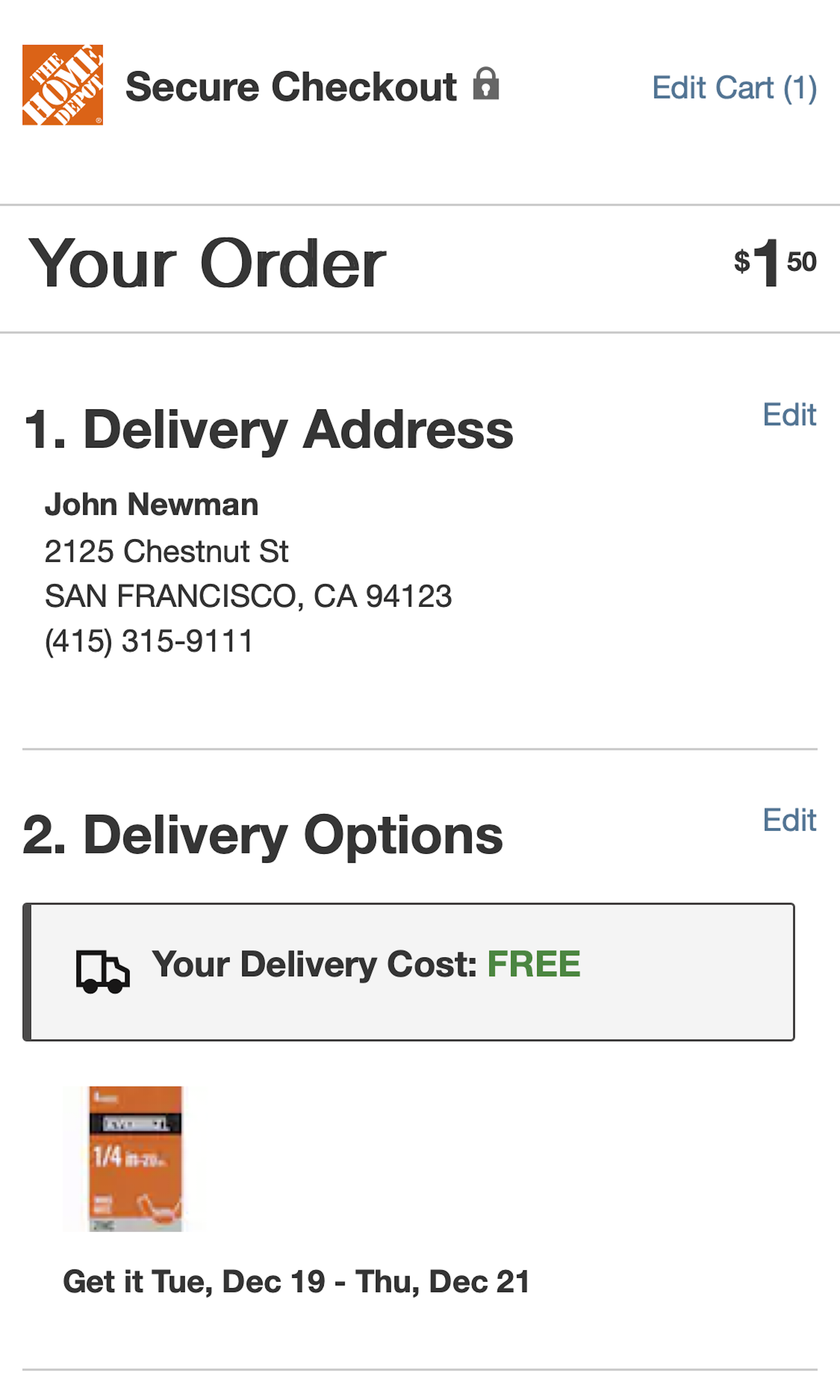
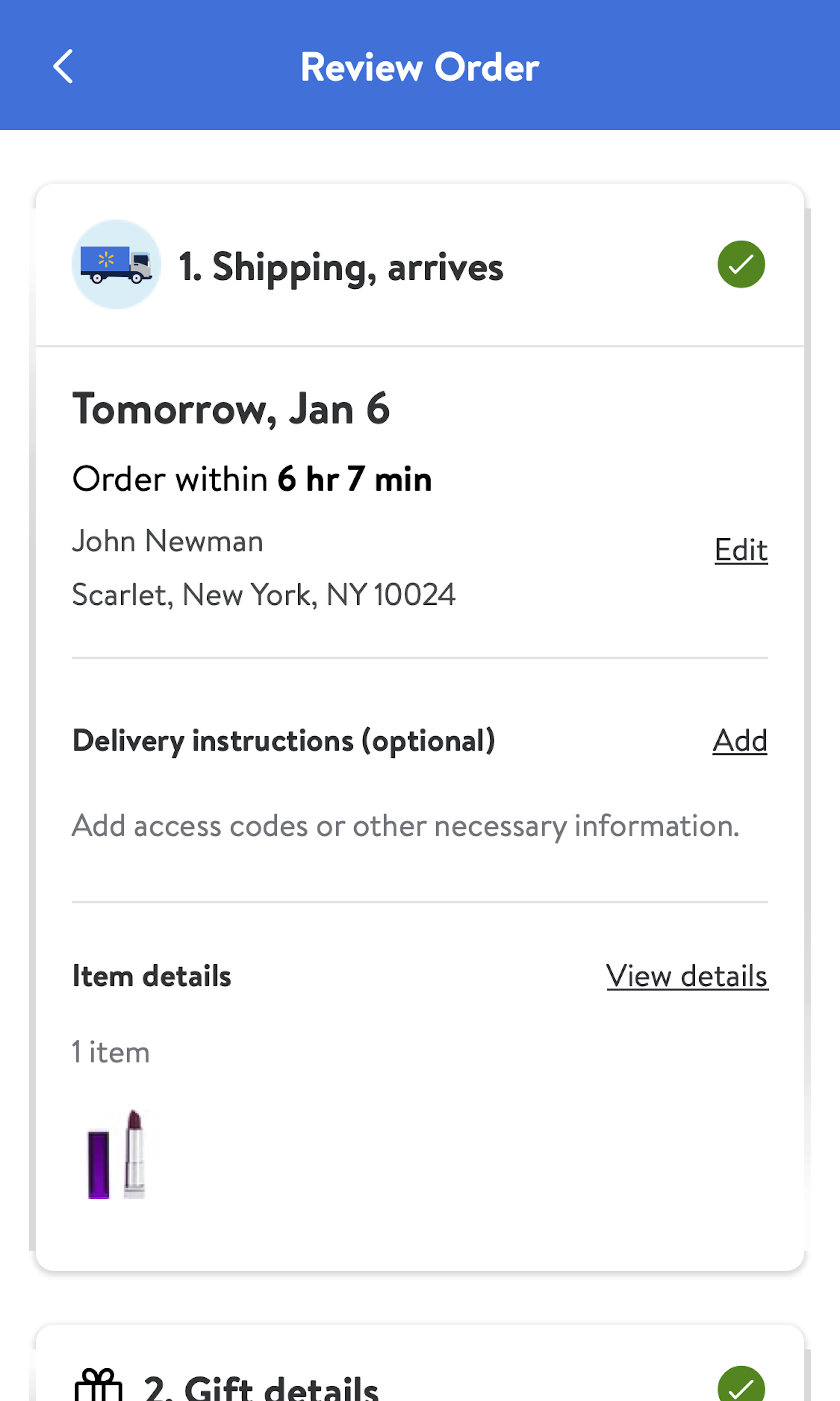
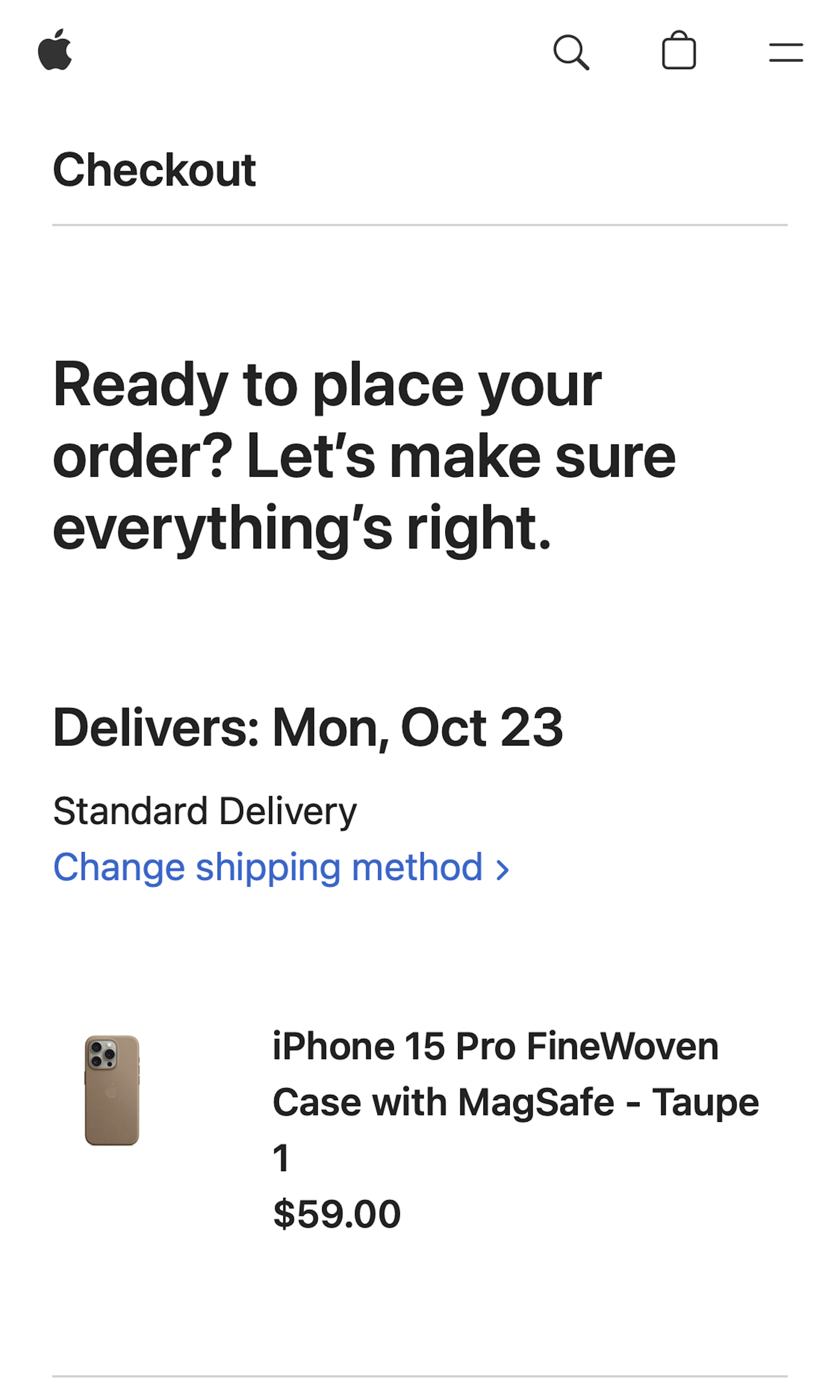
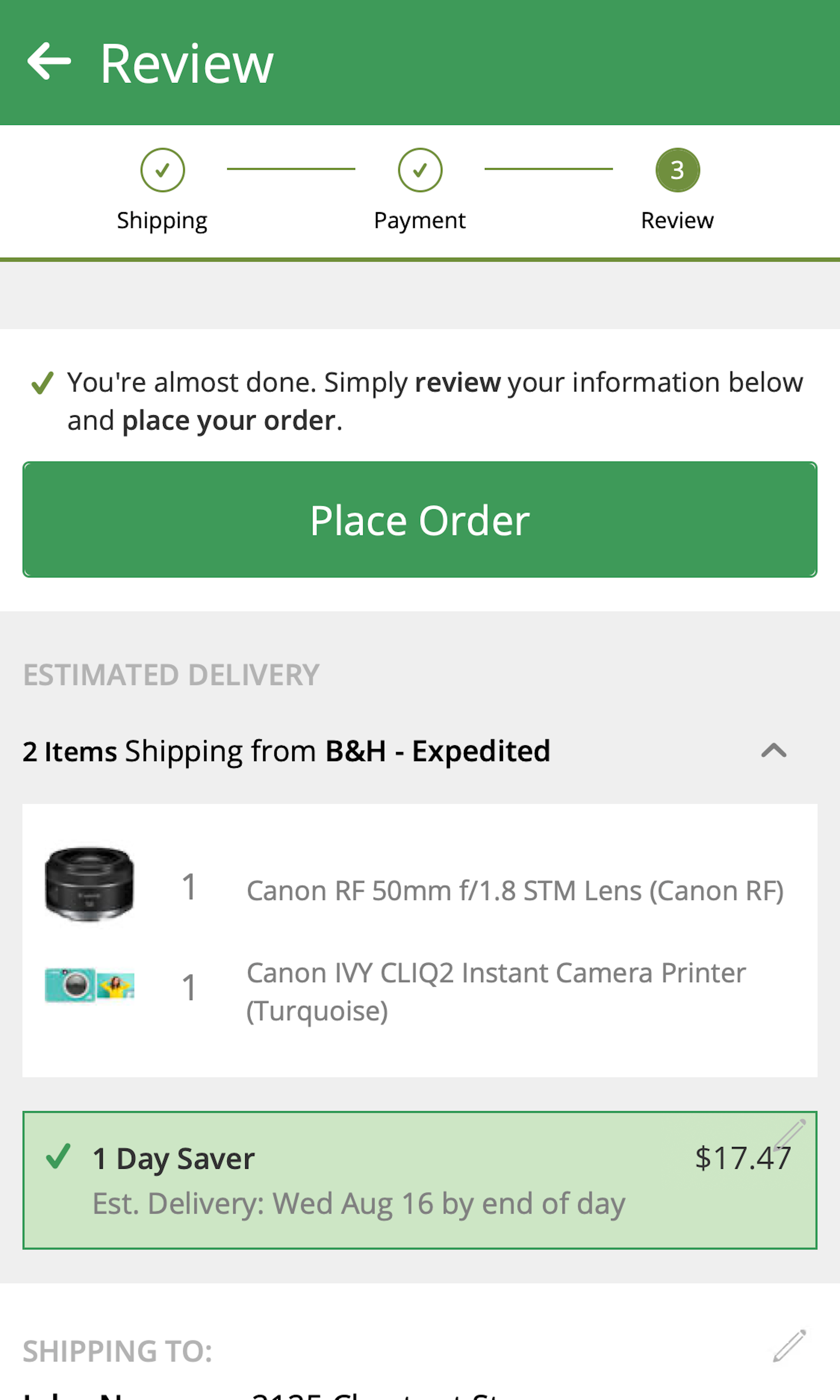
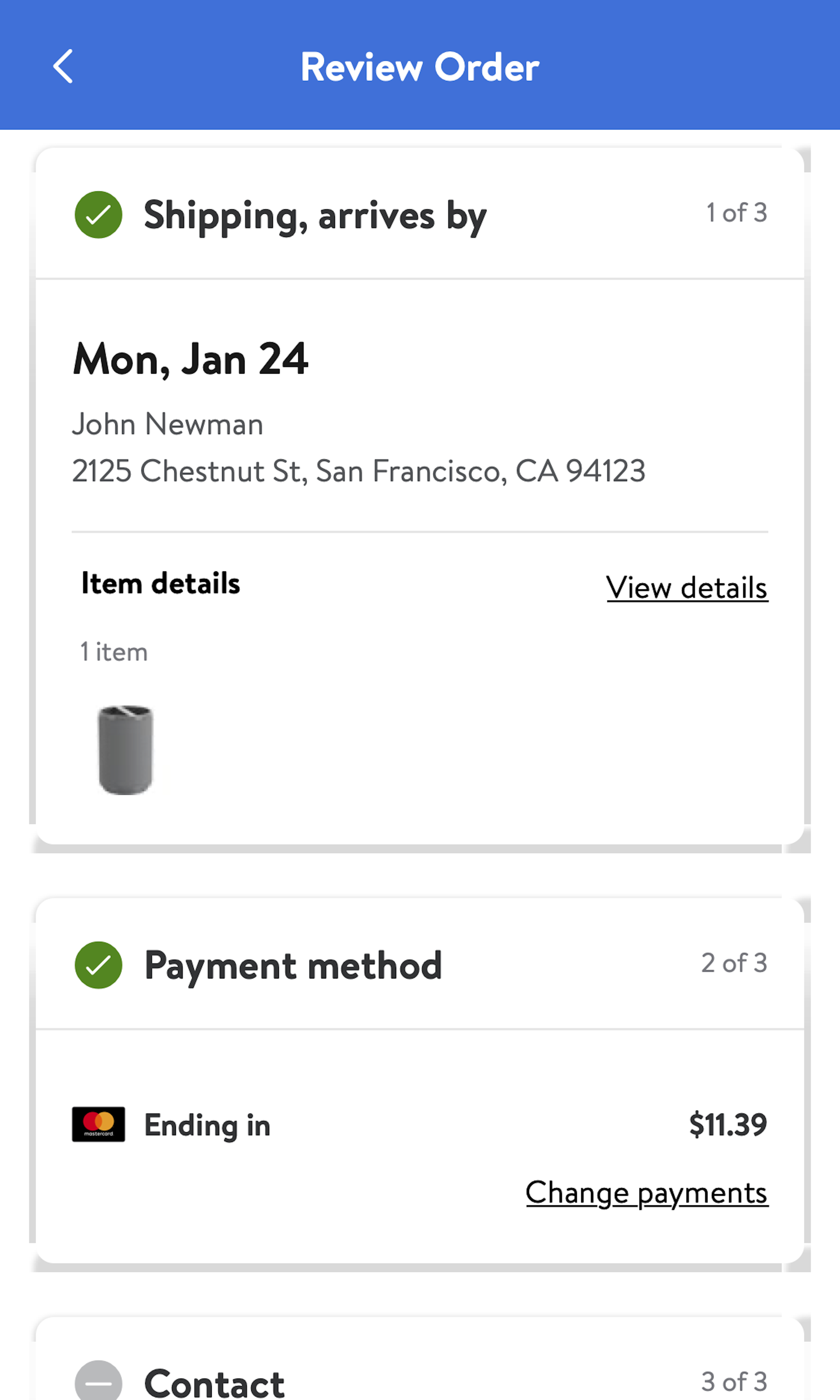
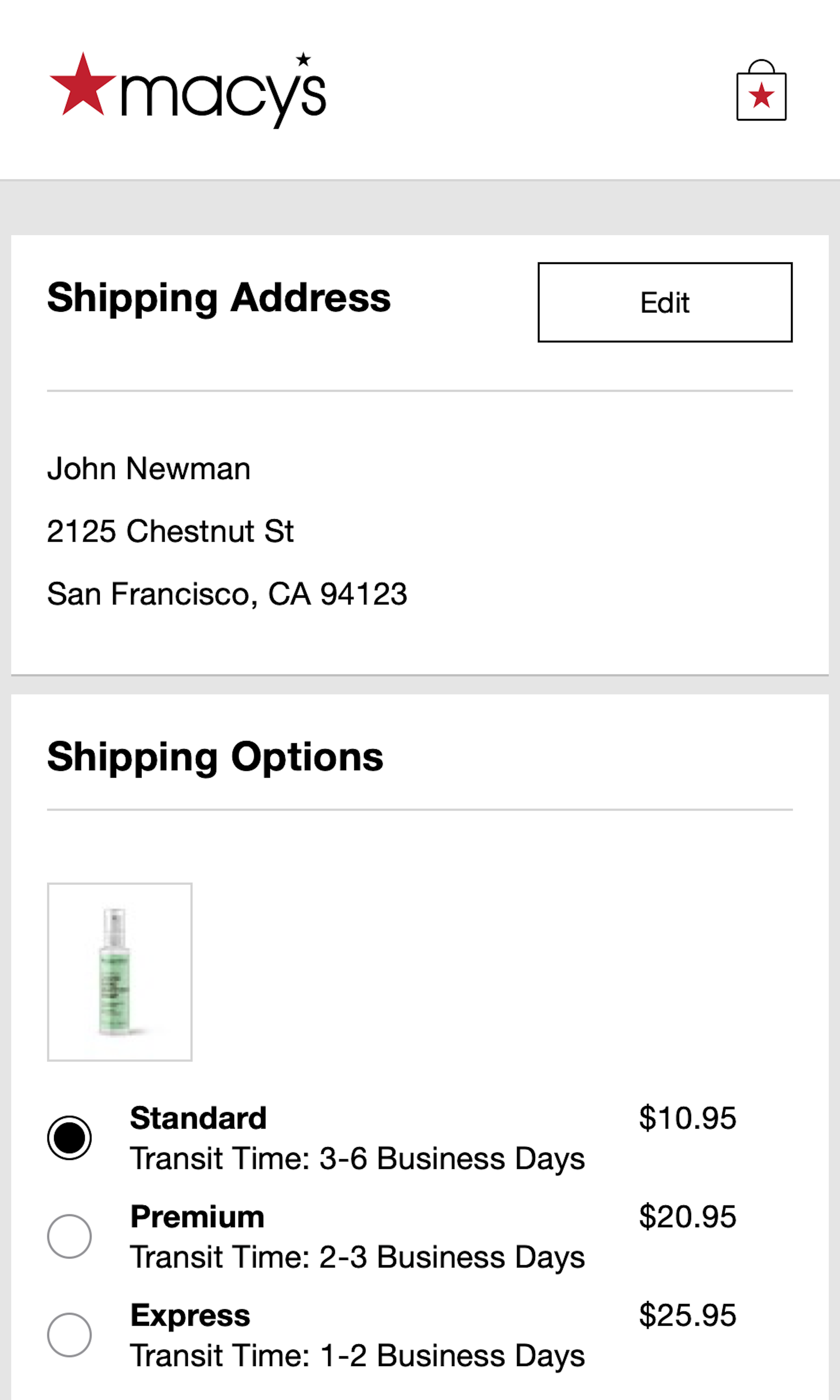
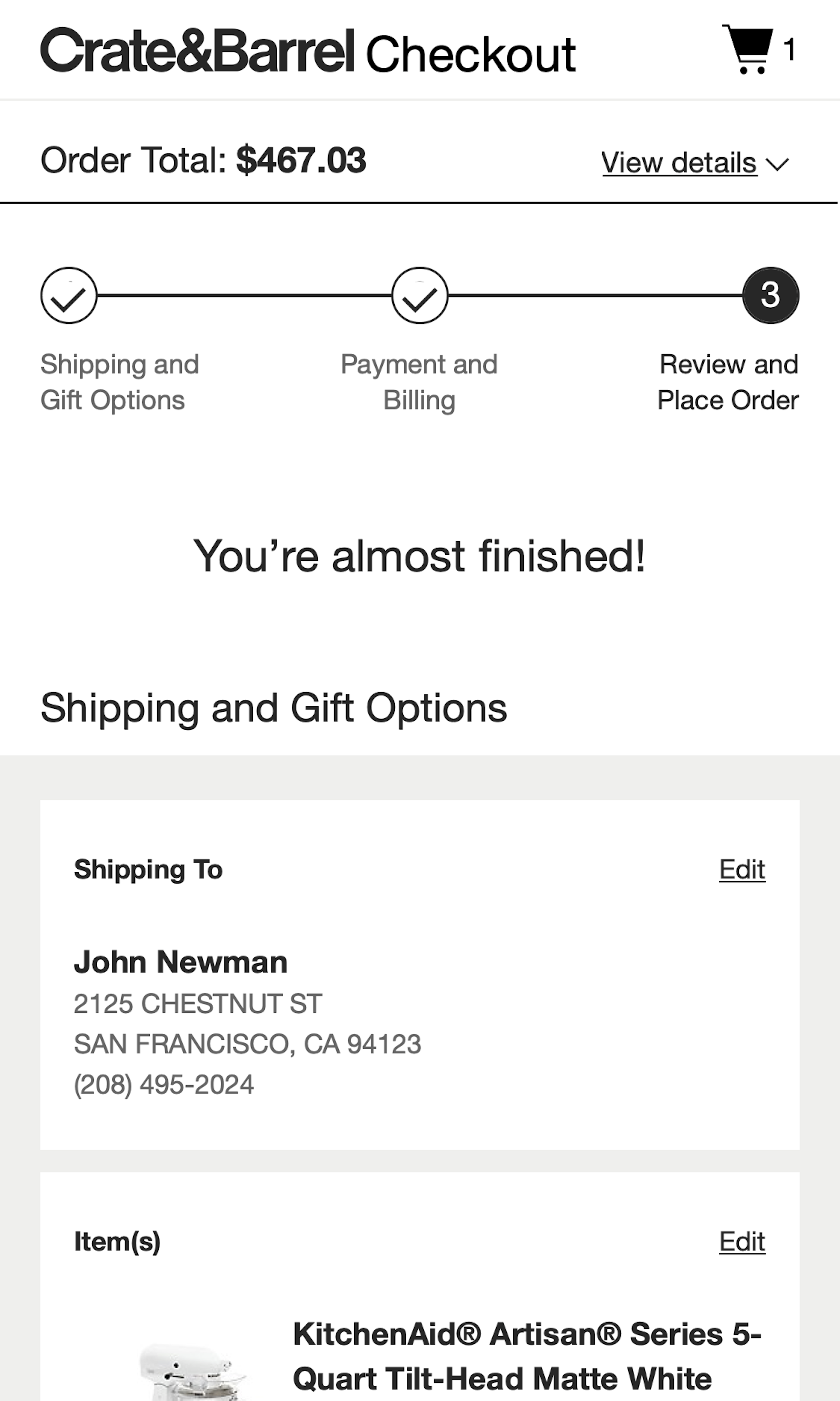
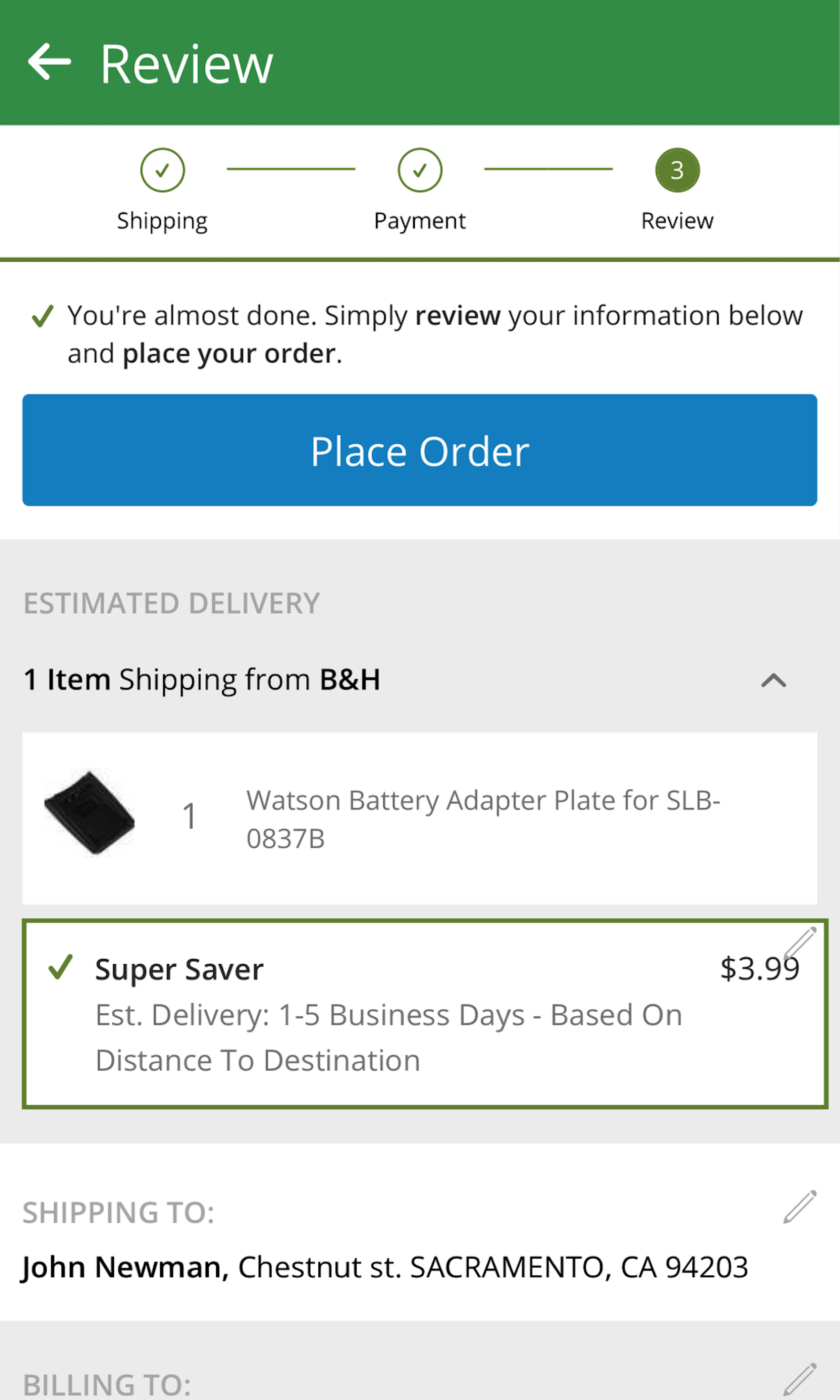
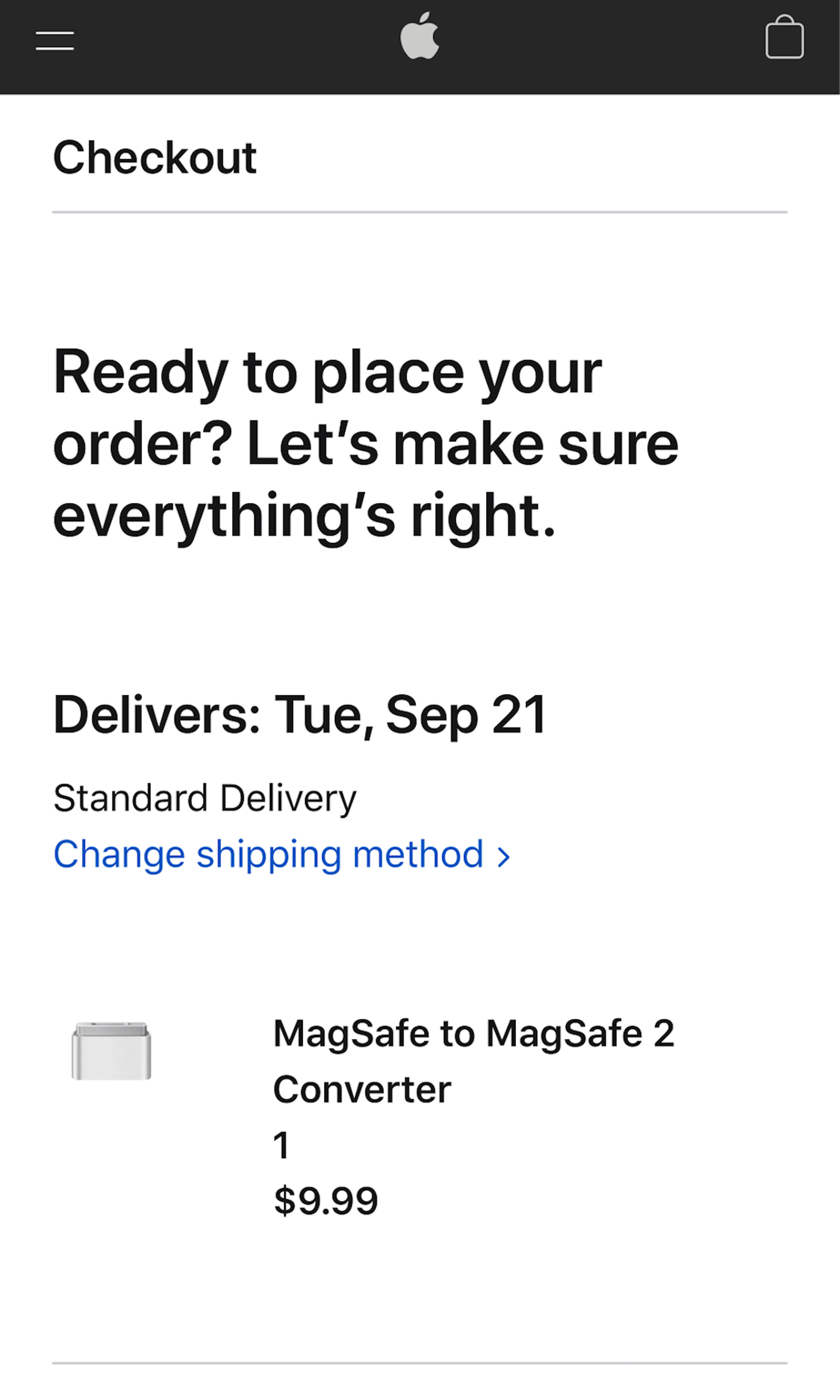
What’s this? Here you’ll find 287 “Mobile: Review Order” full-page screenshots annotated with research-based UX insights, sourced from Baymard’s UX benchmark of 93 ecommerce sites. (Note: this is less than 1% of the full research catalog.)
During checkout the ‘Confirm Order’ step and ‘Order Confirmation’ step often look visually similar. During testing we observe that, especially in mobile checkouts, this makes some users prone to misinterpreting the mobile review step as an order confirmation page — and consequently leave the page, thinking the order is placed. We observe that in the most severe instances this can cause as much as 10% mobile checkout abandonments.
More ‘Review Order’ Insights
-
Desktop Examples: Besides the mobile examples below, we also have 100+ desktop examples of Review Order implementations.
-
Learn More: Besides exploring the 62 mobile “Order Review” design examples below, you may also want to read our related article “6 Mobile Checkout Usability Considerations”.
-
Get Full Access: To see all of Baymard’s 351 mobile research findings you’ll need Baymard Premium access. (Premium also provides you full access to 200,000+ hours of UX research findings, 650+ ecommerce UX guidelines, and 275,000+ UX performance scores.))
User Experience Research, Delivered Weekly
Join 60,000+ UX professionals and get a new UX article every week.

User Experience Research, Delivered Weekly
Join 60,000+ UX professionals and get a new UX article every week.

Explore Other Research Content

300+ free UX articles based on large-scale research.

327 top sites ranked by UX performance.

Code samples, demos, and key stats for usability.


