
Today we’re launching a checkout usability benchmark of the top 100 grossing e-commerce sites, all audited across 63 checkout usability guidelines. It’s currently the most comprehensive e-commerce checkout database in the world, with 3,000+ examples of best (and worst) practice from the top 100 grossing e-commerce sites in the US.
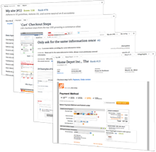
With 975 annotated and categorized screenshots there’s plenty of insights on how other top grossing e-commerce sites have solved their checkout design challenges, and which sites are still lingering behind. We’ve already touched upon three such insights in our most recent article series: don’t require unnecessary information, reinforce credit card fields, and don’t use apply buttons (five more articles will follow in this series). And of course this integration of benchmark database and checkout usability research has yielded similar insights across all of the 63 usability guidelines.
If you’d like to walk through the checkout processes of the top 100 grossing e-commerce sites yourself without filling out -1,300 form fields (as we did), then you can browse the public part of the Checkout Usability Benchmark, as we’ve decided to make a large part of this dataset freely available.
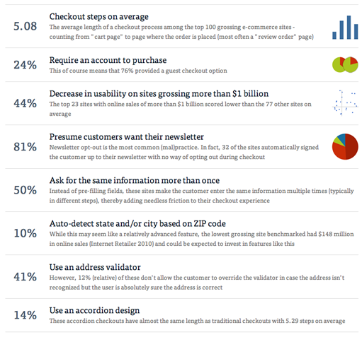
We’ve also written an article at Smashing Magazine (published yesterday) that dives into the statistics from this benchmark and showcase various do’s and don’ts. Be sure to check it out. It’s based on audits of more than 500 checkout steps and 3,000 annotations.
And here’s a breakdown of these stats (there’s an interactive version of it on our site):
Enjoy!
