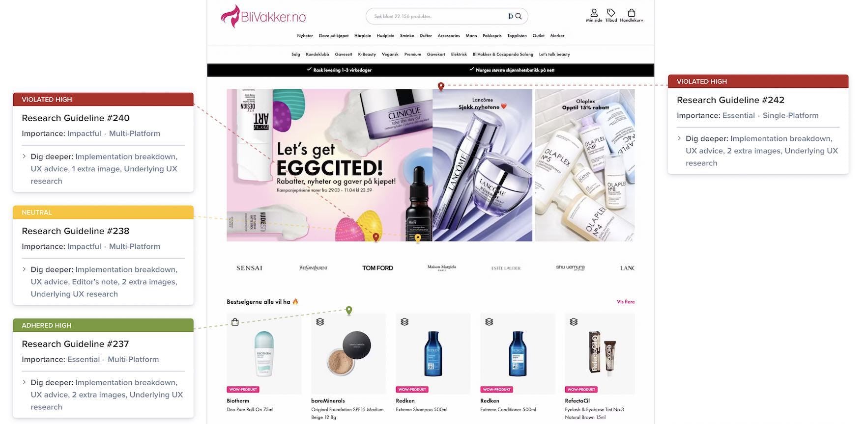
At Baymard we’ve just released a new UX benchmark of Health & Beauty sites, thereby expanding our existing Health & Beauty benchmark with 3 new UX case studies.
This follows from our large-scale user testing research on Health & Beauty sites and adds to our existing e-commerce UX benchmark.
3 New Health & Beauty UX Case Studies
The 3 sites added to our Health & Beauty benchmark have been manually assessed across 500+ research-based UX parameters relevant to Health & Beauty sites, resulting in 1,500+ weighted UX performance scores and 1,200+ worst and best practice examples.
For the benchmark, we rated 3 new Health & Beauty sites (bringing our total for the Health & Beauty benchmark to 15 sites):
Lyko, Kicks, and Blivakker.
You can explore the 3 new Health & Beauty UX case studies using the below links:
Health & Beauty UX Performance
Each of the new 3 Health & Beauty sites’ 1,500+ UX performance scores, along with the scores for the 12 other Health & Beauty sites in the benchmark, are summarized in the interactive scatterplot below — showing you how they perform collectively and individually:
A publicly available overview of the research and benchmark can be found on our Health & Beauty research overview page.
Getting access: all 1,500+ UX performance scores, 1,200+ best-practice examples, and the UX insights from researching the Health & Beauty industry are available immediately and in full within Baymard Premium. (If you already have an account open the Health & Beauty study.) If you want to know how your Health & Beauty desktop site, mobile site, or app performs and compares, then learn more about getting Baymard to conduct a Health & Beauty UX Audit of your site.


