Key Takeaways
- Our new research has uncovered 1,000+ usability issues specific to consumables subscription services sites
- The research has resulted in 350+ guidelines that describe the issues, as well as design patterns verified to perform well for users
- In particular, the research provides insights on the content and features consumables subscription services sites need to provide users to ensure they’re able to make a purchase decision
At Baymard our research team has just spent 1,200+ hours usability testing and researching consumables subscription services website features, layouts, content, and designs — leading to our new study on Consumables Subscription Services UX.
The research is based on more than 100 qualitative user/site usability test sessions following the “Think Aloud” protocol (1:1 remote moderated testing).
This study of “Consumables Subscription Service” websites cover sites that sell subscriptions for physical products that users consume or deplete on a regular basis — such as grocery box subscriptions, office supplies subscriptions, razor subscriptions, fashion subscriptions, etc.
Test sites were selected by choosing 3 product category subsets of Consumables Subscription Services — general grocery (Imperfect Foods and Hungryroot), meat (Butcher Box and Crowd Cow), and fish (Oceanbox and Sea to Table).
During testing, users at these sites frequently ran into issues that severely disrupted their ability to efficiently subscribe to a consumables service.
Indeed, during testing the users encountered 1,000+ medium-to-severe usability issues. These issues have subsequently been analyzed and distilled into the 350+ UX guidelines found within our Consumables Subscription Service UX research study (all of which are available as part of our Premium UX research).
The 350+ guidelines cover most aspects of the online subscription process for consumables services, at both a high level of general user behavior as well as at a more granular level of specific issues users are likely to encounter.
In this article we’ll introduce 3 UX best practices for consumables subscription services:
- The “How It Works” page must provide users with the ability to get an overview of the service
- User-preference quizzes need to provide users with a clear overview and straightforward navigation
- Pricing information should be widely available and easy to understand
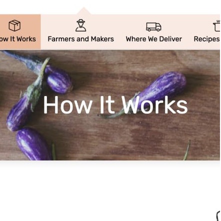
1) The “How It Works” Page Is Key to Users’ Ability to Get an Overview of the Service
During testing, almost all test sites included a “How It Works” page (or its equivalent — e.g., “Our Process”).
It’s likely therefore that such pages have become a standard for subscription-service sites.
However, testing revealed that the page, which is intended to provide potential customers with an overview of the service, as well as key service details, can vary widely in terms of meeting this crucial user need.
A poor-performing “How It Works” page can be a direct cause of abandonment, as users rely on this one page to conclude that the service won’t be a good match for them.
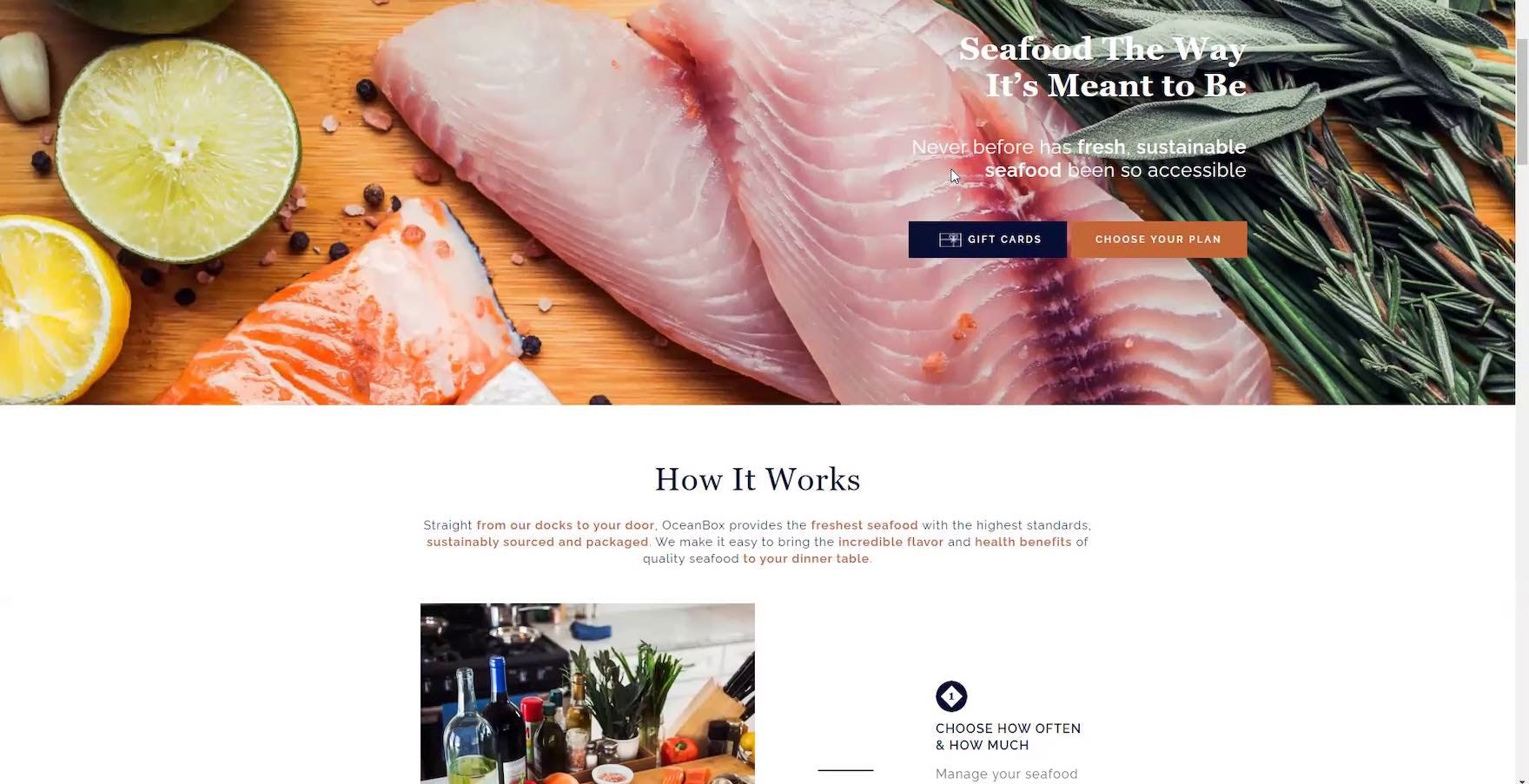
“It just says it’s ‘sustainable’ and ‘from docks to door’. They don’t say that it’s wild-caught. The other one says it was wild-caught. So this one, I guess the language here makes me feel like they could be leaving it open to farmed fish that they just immediately grabbed and flash froze. They’re leaving it pretty vague.” A user on Oceanbox thought that the lack of detail on how the fish were sourced was detrimental to his ability to understand the service.
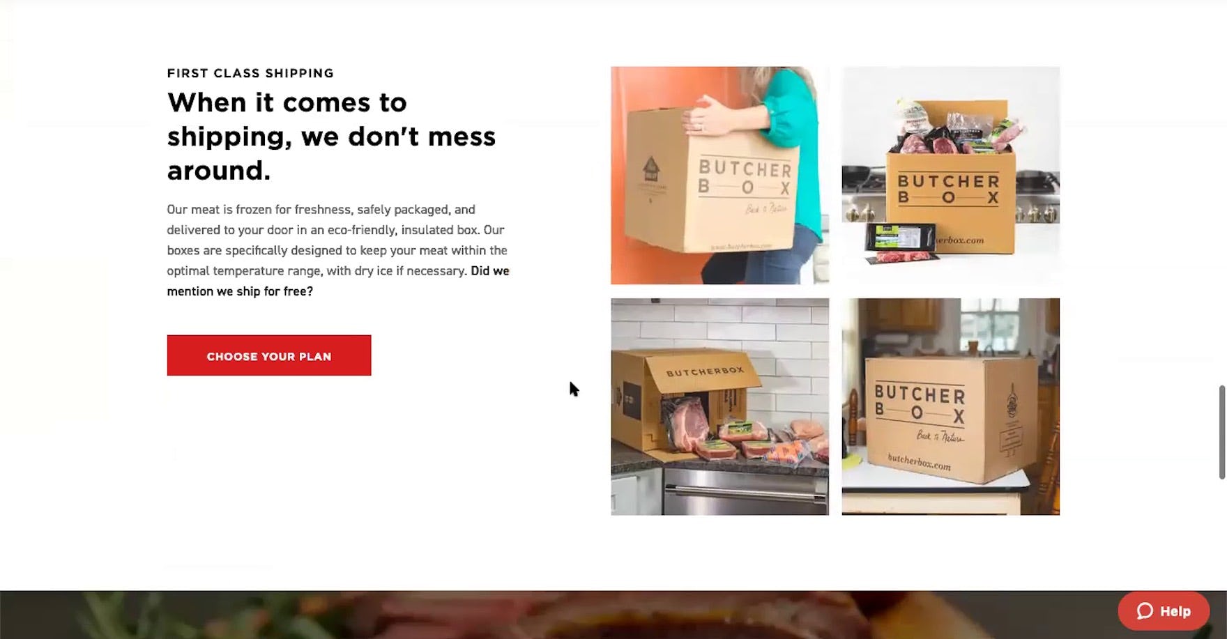
“And then it looks like we’ve got our shipping and I liked that they bolded that they ship for free, because that’s super important.” A user on Butcher Box focused on the free shipping called out on the “How It Works” page that also mentioned how the meat would be packaged.
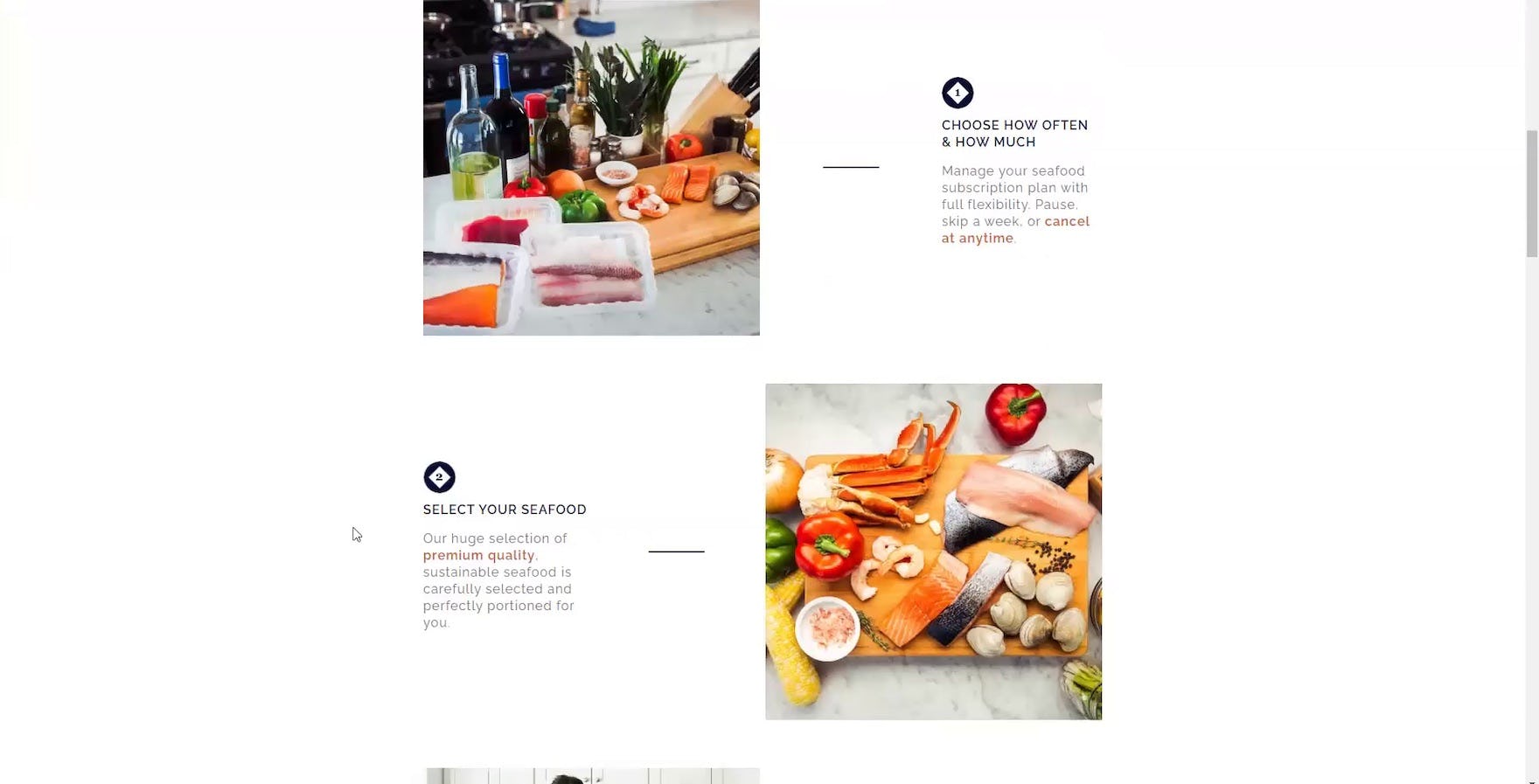
In particular, testing revealed that “How It Works” pages need to provide 3 general types of information:
- Core service features (the key aspects that define a service and set it apart from its competitors)
- Pricing (including justifying a price point that may be higher than the industry average)
- Shipping and deliveries (in particular, pausing, skipping, and canceling deliveries; packaging information; and free shipping information)
Additionally, structuring the page appropriately will help to ensure that this key information is easy to scan and understand.
While it’s important to avoid overwhelming users on “How It Works” pages — which are for many users their first stop on the website — it’s just as important to provide enough in-depth information to truly “sell” users on the service.
2) User-Preference Quizzes Need to Provide Users with a Clear Overview and Straightforward Navigation
While many subscription-service sites allow users to directly choose the products they will receive in their order, some subscription sites encourage or require users to input their product- or service-preference information prior to signing up via a series of questions, often presented in a “quiz” format.
However, as these quizzes typically vary widely from site to site, it is often difficult for users to rely on any “standard” conventions when considering a quiz at a particular site.
During testing, some users were observed to struggle with understanding and navigating quizzes; as a result, users spent extra time trying to understand instructions, correcting errors in the selection interface, and going backwards in the quiz flow.
If users have to spend too-much time or mental energy struggling to use a site’s quiz, some will simply exit the quiz flow and investigate other areas of the site’s content, while others will take this as a worthwhile excuse to abandon the site in favor of exploring a competitor’s subscription service.
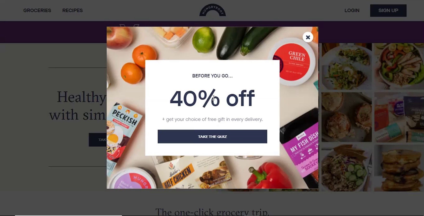
“I don’t know how long this quiz is, but hopefully 5 questions or so.” At Hungryroot, users who saw the numerous “Take the Quiz” CTAs — such as on this promotional overlay — had no idea what to expect in terms of the time commitment required before they entered the quiz flow. Many users will hesitate to commit to taking quizzes if they don’t have a general idea of the time required to complete them.
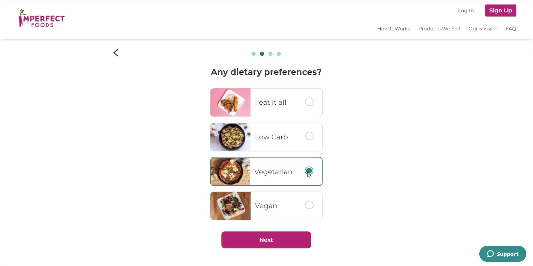
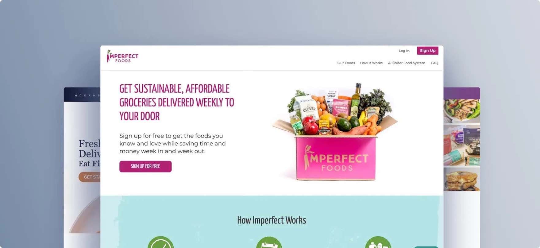
“Okay. Again, I clicked ‘Vegetarian’, and they just forgot about my husband.” Users during testing sometimes tried to accommodate multiple dietary restrictions within one household but found that the “dietary preferences” selector at Imperfect Foods only allowed for a single selection. Despite this quiz question being a radio button selection, many users at Imperfect Foods failed to intuitively understand that only a single response was allowed. Testing revealed that even well-known selection options, such as radio buttons, may be experienced by users as custom implementations if, for example, the radio buttons are accompanied by images.
In particular, during testing we observed 4 moderate-to-severe issues when users were considering subscription-service quizzes:
- The time required to complete the quiz is unclear
- Multistep quizzes lack clear navigational anchors
- Quizzes fail to indicate if users’ progress will be saved
- It’s unclear if quiz questions accept multiple responses or if responses are mutually exclusive
Addressing these issues will ensure that quizzes help to inform users of the service and determine their preferences, rather than having quizzes serve as a roadblock to proceeding with a subscription.
3) Pricing Information Should Be Widely Available and Easy to Spot
“Why can’t a website just tell me what the price is gonna be? Even if it’s more expensive, it’s about saving time. If you’re gonna make me spend 20 minutes trying to figure out what it’s even gonna cost me, I don’t have time for that. Just be transparent with me instead of making me jump through hoops.”
During testing on consumable subscription-service sites, pricing was a key factor for users.
This is understandable as, unlike on many general e-commerce sites focused on selling products, signing up for a subscription service entails agreeing to a recurring charge.
Thus, users are keen to ensure that the price of the service is within their budget.
However, it’s not always clear where to look for pricing information on subscription-service sites.
Again, a comparison to general e-commerce may be useful here: users on most general e-commerce sites know they can find pricing information on product pages or in product lists.
Yet that’s not the case on subscription-service sites, where pricing may be presented anywhere on the site.
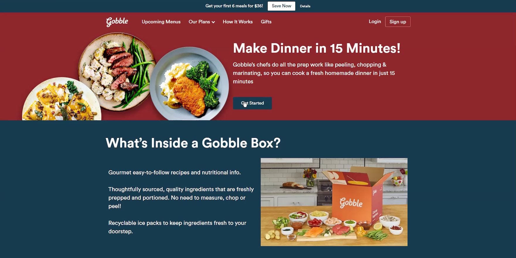
“I’d like the pricing to be something I see almost instantly.” At Gobble, subscription-service pricing information (or a link to pricing) was not included on the “Plan Selection” page (i.e., “Our Plans”) — where many users expect it. During testing, users who couldn’t find subscription-service pricing information within a few minutes of searching often chose to abandon the site.
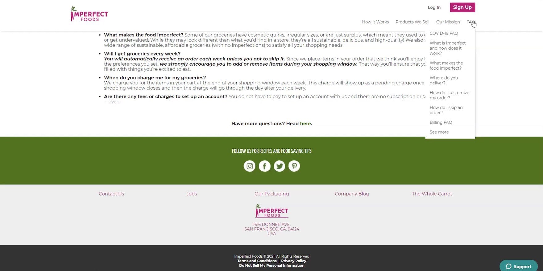
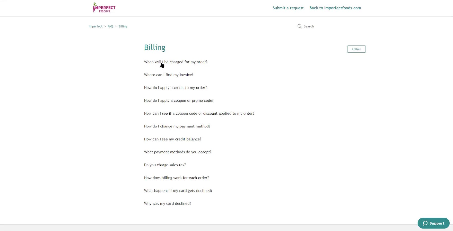
“So, I would have probably [abandoned] this website by now because I’d be like, ‘Where the hell is the pricing?’ If you’re hiding it from me [or] it’s not super easy to find, then why would I sign up? And that also suggests [the price is] high. In general, I wanna at least have an idea of what I’m paying. I don’t even care if it’s [an estimate].” At Imperfect Foods, users struggled to find pricing information — as it wasn’t included on any on major pages until the checkout flow — and thus had to resort to searching the embedded FAQs at the bottom of the “How It Works” page (first image), as well as the full FAQ section (second image). As a direct result of being unable to find subscription-service pricing information, this user abandoned the site.
If pricing information is difficult to find, users who are unable to find pricing information in a reasonable amount of time will likely abandon the site in favor of the competition.
Indeed, during testing many users equated difficult-to-find pricing information with an attempt by the site to conceal the price and “trick” them — indicating that brand damage from difficult-to-find subscription-service pricing information is both harmful (potentially resulting in site abandonment) and long-lasting for many users.
In addition to the “How It Works” page (discussed above), testing revealed that pricing information should be provided on an additional 2 key pages — the homepage and the subscription-plan page.
That said, making pricing information widely available sitewide would help ensure it’s accessible wherever users are on the site.
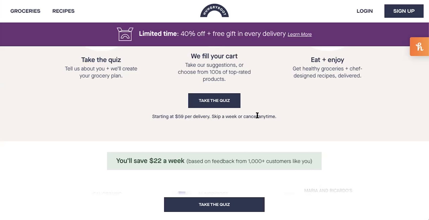
“But the one thing I still haven’t really gotten an understanding of is how much it actually costs.” At Hungryroot, multiple users missed the pricing information displayed on the homepage (“Starting at $59 per delivery”) on their initial scan of the page due to the text being inconspicuous.
Finally, in addition to making pricing information available on multiple pages, pricing information should also be easy to spot by scanning users.
Otherwise, if the information can’t be found it’s as bad as not having it at all.
Help Your Consumables Subscription-Service Site Stand Out
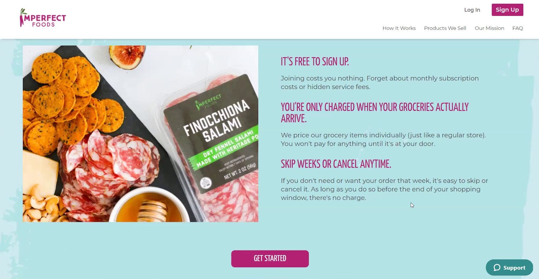
“It’s one of the things that I like about this [site], when you keep going through [the homepage] they kind of give you a breakdown of what’s happening with the box. They make this big statement, ‘Skip weeks or cancel any time’.” At Imperfect Foods, the ability to “Skip Weeks or Cancel Anytime”, along with other key service info, was specifically highlighted on the homepage for users who may have reservations about signing up for a subscription service. The homepage for subscription-service sites, much like for direct-to-consumer sites, was observed during testing to be a key point of departure for users considering signing up for a service.
Testing revealed that users considering subscription-service sites will be quick to jump to a competitor if they feel the site isn’t meeting their information needs.
For many users, subscription-service sites have a limited window of only a few minutes to sell them on their service — otherwise, users are likely to consider it’s not worth the bother trying to hunt down necessary information.
Therefore, it’s important to make finding core service information as easy as possible for users.
In particular, 3 high-level aspects of consumables subscription-service site UX were identified during testing as especially important to focus on:
- The “How It Works” page
- User-preference quizzes
- Sitewide pricing information
Ensuring your consumables subscription-service site performs well across these 3 high-level aspects of consumables subscription-service UX will help your site stand out from the crowd — and will likely result in a better-performing e-commerce conversion rate.
Getting access: all 350+ consumables subscription-service UX guidelines are available today via Baymard Premium access. (If you already have an account open the Consumables Subscription Service Study.) You may also want to visit our audit page page for information on booking an audit of a consumables subscription-service site with a Baymard auditor.