
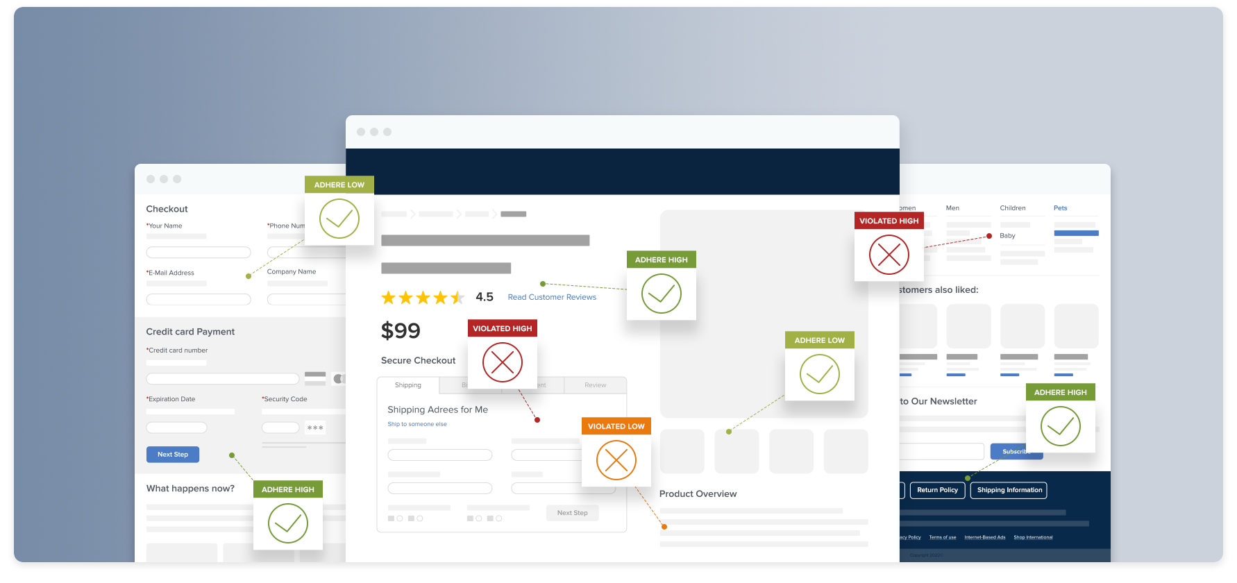
16 Actionable Ecommerce Conversion Rate Optimization Tips
A successful website that brings in plenty of subscribers, leads, and sales doesn’t just happen — it happens because you’re optimizing your ecommerce conversion rate.
Your conversion rate is a critical metric to monitor as you build your business and increase your revenue. It’s one of the most reliable ways to see if you’re meeting your business goals.
In this article, you’ll find a list of helpful ecommerce conversion rate optimization (CRO) tips based on ecommerce best practices. They’ll help improve your customer’s experience on your site, motivate them to buy, and make the purchasing experience as smooth as possible.
Before we get started, here are some frequently asked questions and important things to know about conversion rate.
Access research-backed UX guidelines
Make best-in-class design decisions and improve conversions with 200,000+ hours of validated, industry-specific UX research and benchmarks.
What Is Ecommerce CRO?
Have you seen the term “ecommerce CRO” before, but you’re not quite sure what it means?
The simple definition of an online conversion rate is the percentage of visitors to your website who convert.
That means the visitor completes the action you want them to fulfill, whether that’s upgrading a subscription, signing up for an email list, or making a purchase.
** Ecommerce Conversion Rate Optimization ** (CRO) is the process of improving your ecommerce conversion rate by making small, incremental improvements. A better user experience (UX) on your site naturally leads to more conversions, so UX and CRO are closely linked.
Understanding how your customers think, feel, and behave leads to better user experiences, which helps you maximize the number of conversions you bring in.

To start with, data from one of our quantitative studies also underscores the reasons people have for shopping online, instead of offline. Two of the reasons — better selection and living too far away — are beyond the scope of our conversion rate optimization tips, but the others offer clear insights into where you should focus your optimization efforts.
What Is a Good Ecommerce Conversion Rate?
There is not one conversion rate that can be deemed as “good” across all industries. Good conversion rates are the result of hundreds of small design decisions — and that can feel really overwhelming.
If there are other things on your to-do list than “Improve UX for the website,” it can be easy to put off the fixes that will make a big difference in your site’s profitability and brand loyalty.
But one thing we can tell you with certainty, having worked with many of the biggest names in ecommerce, including Nike, Amazon, Etsy, and many more: No site gets everything perfect – our UX research confirms this.
Improving conversion rates is an ongoing part process for any company — from the smallest niche purveyor to global mega brands.
The goal of each incremental change should be to make it easier for your buyers to find the items they want, add them to their carts, complete a seamless transaction, and return to buy from you again.
When you systematically work through the problems that make it harder to complete a transaction, you’ll see fewer cart abandonments and more sales.
How Do You Calculate Conversion Rate?
To calculate your conversion rate, divide the number of conversions you get in a given period by the total number of people who visited your site or landing page during that time. Then multiply the result by 100% to get a percentage.
Conversion Rate Formula
Conversion rate = (conversions / total visitors) x 100%
Tracking your conversion rate is critical, because you can’t improve your conversions if you don’t measure them on an ongoing basis! Remember: What gets measured gets managed!
You can compare the conversion rates on your site over time, to track improvement and see the impact of the optimization strategies you’re implementing.
→ Sign up free to free research-backed UX guidelines and start improving your site today.
Ecommerce Conversion Rate Optimization Strategies: How to Design Pages that Convert
If you’re going to have high-performing ecommerce product pages that bring in as many leads and sales as possible, your visitors need to have a positive user experience on your site.
The process of ecommerce conversion rate optimization creates seamless experiences for visitors, so it’s easy and enjoyable for them to buy something on your website or sign up for your mailing list.
Here are 16 ways to improve your conversion rate.
1. Optimize Your Ecommerce Checkout Process
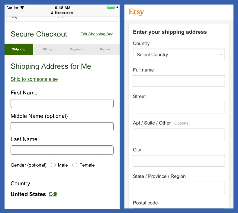
On a mobile device, every unnecessary form field makes the form’s length seem even more unwieldy than on desktop. The checkout form at Etsy allows the user to input much more information within a single screen, compared to L.L Bean’s.
Baymard’s research shows that 18% of users have abandoned orders due to checkout UX issues — the experience is either too long or too complicated.
Your checkout process should be seamless and easy, so your customer doesn’t hit any snags when they’re trying to buy. This is a great way to boost conversions from visitors who are closest to the buying stage.
2. Add Trust Signals
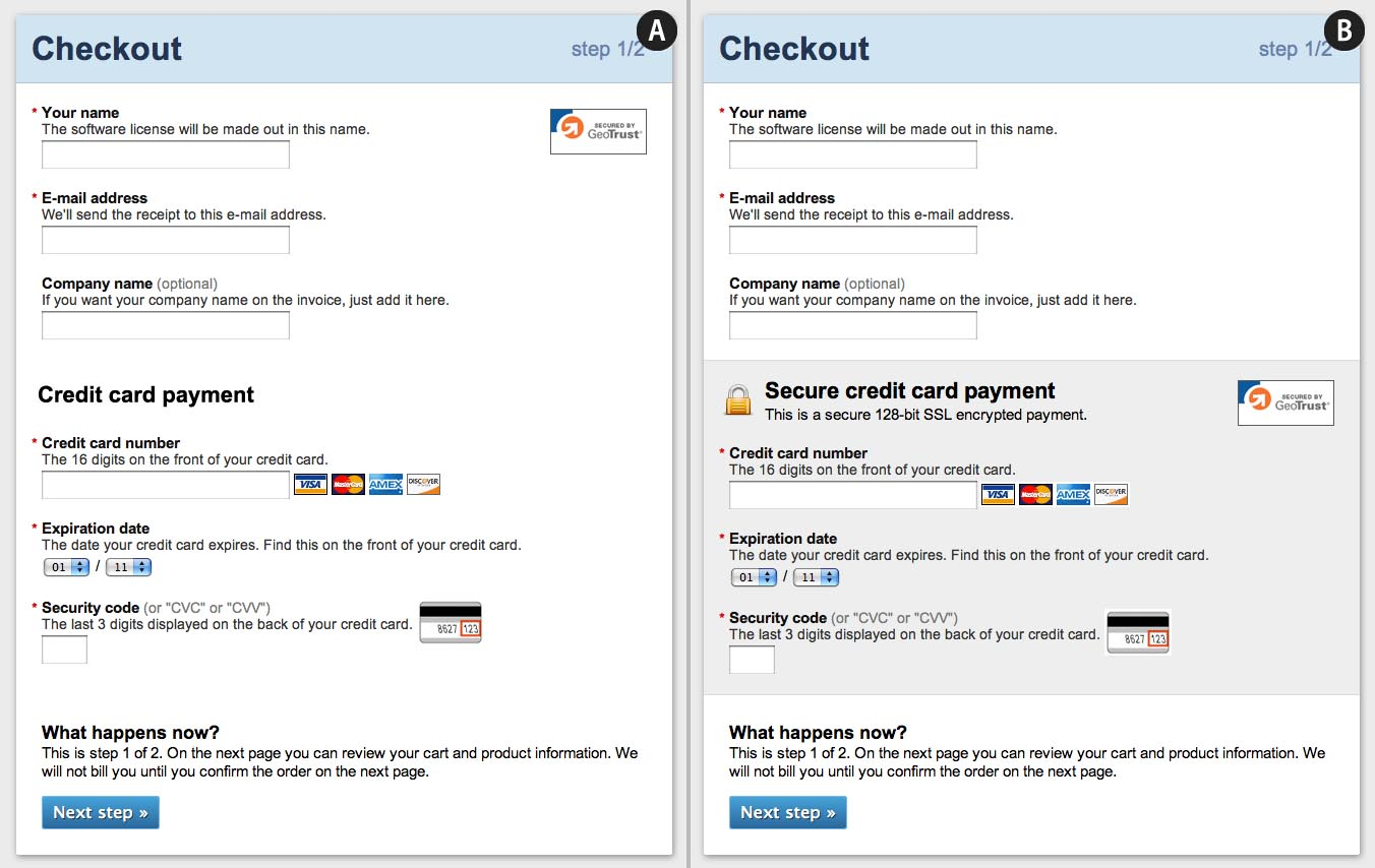
This mockup illustrates how to emphasize the security of a payment form through visual cues. Notice the microcopy, site seals, and padlock icon, along with the visual encapsulation of the sensitive credit card fields.
Trust signals like SSL certificates and site seals help customers feel more secure about their decision to buy from an ecommerce website.
Throughout all our testing of checkout processes, we’ve consistently observed two important user behaviors relating to trust signals:
-
Depending on the design, users perceive some parts of a page to be more secure (and therefore trustworthy) than other parts of the same page.
-
The average user’s perception of a site’s security is largely determined by their “gut feeling,” which — beyond how much they trust the brand — is to a large extent observed to be directed by how visually secure the page looks.
Baymard tested numerous site seals to determine which images users trust most when they’re getting ready to pull out their credit card details. Get the results of our in-depth research on ecommerce trust signals.
3. Clearly Display Product Reviews
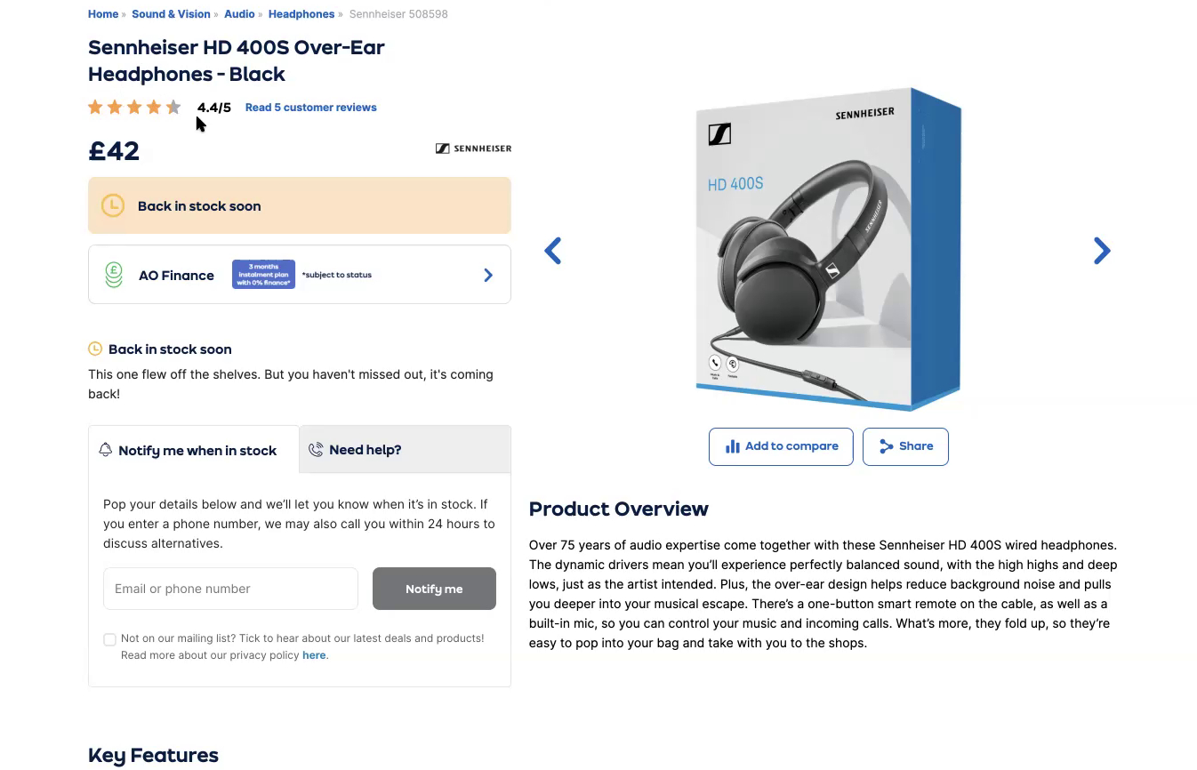
“It’s good to see customer reviews as well up here because it gives me confidence in the product, but also in the seller as well.” During large-scale European testing, this participant on Appliances Online (UK) valued the clickable ratings average just below the product heading.
User reviews aren’t simply important — they are critical to users’ confidence in the suitability of a product and their ability to arrive at an informed purchase decision.
In Baymard’s product rating research studies, across multiple rounds of desktop and mobile testing, up to 95% of subjects relied on reviews to evaluate or learn more about the product. They typically look for two critical pieces of information about reviews: the average rating score and the number of ratings the average is based upon. For each product, make sure you display both.
4. Optimize Websites for Mobile Users

This user on Staples searched for “office chair blue casual”, which returned only a single irrelevant result - a painting. At this point, the user was ready to leave the site entirely.
While most websites are already optimized for mobile, many ecommerce sites still don’t provide a great mobile experience.
Now that it’s extremely common for people to visit websites on their phones, paying attention to mobile UX is critical. One of the best ways to increase your conversions is to make it easier for people to use your site on their mobile devices and work their way through your ecommerce funnel.
Check out our common ecommerce mobile pitfalls list, compiled from 289 user test sessions we conducted for our 2-year Mobile UX study.
5. Improve Product Photography
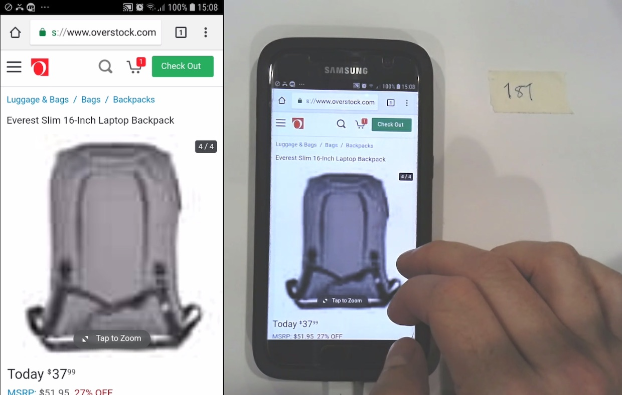
This blurry image of a laptop backpack is “not helpful at all”, commented a user. Product image quality is a critical user concern. Low quality photography is a big red flag and will deter many shoppers from purchasing.
Users can tell a lot about a brand from the images on a site. High-quality product images reassure visitors that they’re purchasing the correct item. As a result, they can have a significant impact on your ecommerce conversion rates.
During Baymard’s large-scale usability testing, 56% of users immediately began exploring product images after arriving on an ecommerce page. But low-quality photos or images that users couldn’t zoom in on adequately led to a high cart abandonment rate.
Despite the importance of product images, Baymard’s benchmark showed that only 25% of ecommerce sites provide sufficient images for users to evaluate a product properly.
6. The Checkout Form Needs to Be Easy to Understand
Checkout forms on desktop and mobile need to be easy to use and understand, and they need to include as few fields as possible. Fewer form fields create a smoother, more seamless checkout experience, which will lower your cart abandonment rates and lead to more conversions.
In our latest usability study on checkout optimization, we’ve found that the average checkout displays 11.8 form fields, which is more than the eight needed for most checkouts.
Try experimenting with your checkout form to see if simplifying it can help you bring in more sales.
7. Always Label Both Optional and Required Checkout Fields
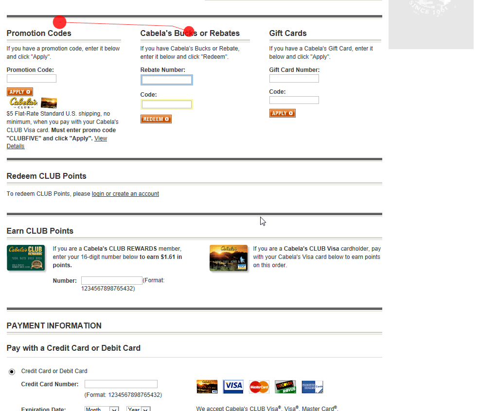
*A massive 66% of Cabela’s users abandoned the payment form after being overwhelmed by a number of promotional fields, which are entirely optional. *
Our next CRO tip might seem counterintuitive at first. (And only 24% of sites do it.)
But our large-scale cart and checkout testing has shown that failing to implement this fix causes unnecessary validation errors, user confusion, a slower checkout process, and even order abandonments.
We first observed this in 2010, and we’ve confirmed it repeatedly in our testing.
That’s why, for ecommerce checkout forms — we strongly recommend you mark both the required and the optional fields.
When users feel uncertain about which fields are required and which are optional, they tend to skip information and create unnecessary validation errors, which leads to drops in conversion rates.
8. Be Careful How You Implement a Live Chat Feature

A user at Macy’s dismisses the live chat for the third time while browsing products on the site. Constantly interrupting users should be avoided. Instead of helping, this chat irritates and deters users.
These days, live chat pop-up boxes seem to be everywhere — but you should think carefully about how to implement chat features on your site.
Baymard’s large-scale usability testing of ecommerce sites has shown that non-user-initiated live chat is perceived as annoying and distracting — but useful when users have specific questions they need answered.
9. Websites Should Be Easy to Navigate
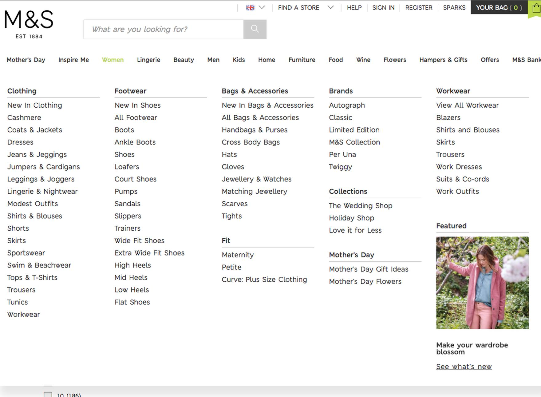
At Marks & Spencer, many product types are incorrectly implemented as separate subcategories rather than filters. This can be overwhelming for users who need to choose the correct category. Also, any choice will shoehorn the user into a narrow selection of products.
Users expect logical website navigation to find what they need with the least amount of clicking around the site.
For example, make sure you have an explicit “View All” option that allows users to see all of the available items on the site (within a limited scope).
Additionally, make product categories visible in the top level of the main navigation, so the user doesn’t have to hover on desktop. They should also be visible immediately after opening the main navigation on mobile.
Get more best practices for ecommerce navigation here.
10. Have the Shipping Info and Return Policy in the Footer of Your Site
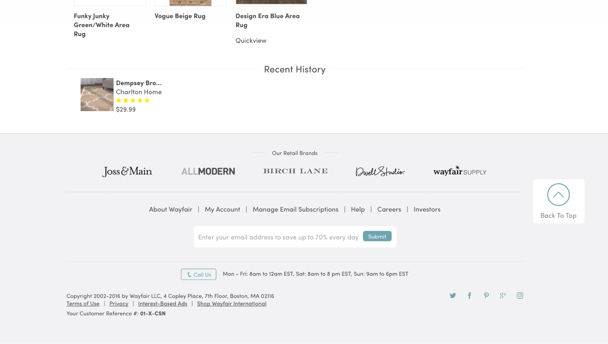
Wayfair doesn’t include a direct link to the return policy in the footer. Users must first click the “Help” link, then locate the return policy link. This is an unnecessary step and will deter some users who can’t find the right information while scanning.
Buyers care a lot about return policies. But you might be surprised to learn where they’re looking for this information.
A full 11% of buyers have told us they’ve abandoned orders within the last quarter because they weren’t happy with the return policy of the site.
Most buyers will look for your return policy when they’ve found a product, but they’re not completely convinced it will work for them. But some users want to know about your return policy before they even begin browsing, to decide if shopping on your site is “worth it” for them.
Your site may have a dedicated area in navigation for your return policy, or you might include it on the product page. But different buyers will look for this crucial information in different places.
For example, a subgroup of users will always look for this information on the footer of your site — even scrolling right past a clear, relevant section of the product page.
As one user told us, “I go to the bottom because that’s where it usually has all those things.”
This is an essential ecommerce optimization practice that many websites miss. Giving users easy access to shipping and return information can make or break a sale. Feature shipping links in the footer of every page.
11. Encourage Account Creation at the Right Time
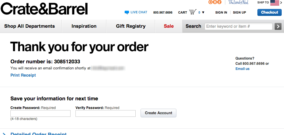
Crate & Barrel allows you to easily create an account after completing the checkout form. This ensures the primary goal is completed without distracting the user. It also allows users to save their information and helps Crate & Barrel follow up with additional marketing.
First off, it’s important to make sure that a user has the option to check out as a guest. (Being forced to create an account is a significant driver of order abandonment.)
That said, your site gains a lot of benefits when a buyer creates an account with you, rather than checking out as a guest – including increasing your conversion rate.
But not enough sites help the buyer understand that it also benefits them.
It can be a tough sell to get users to create an account, especially when this is the customer’s first purchase.The key is to spell out how it will make this purchase better for them.
Our tests have shown that when the benefits of creating an account are included on a site, users are more likely to create one — even if they’re not already regular customers.
12. Allow Users to Search Within Categories
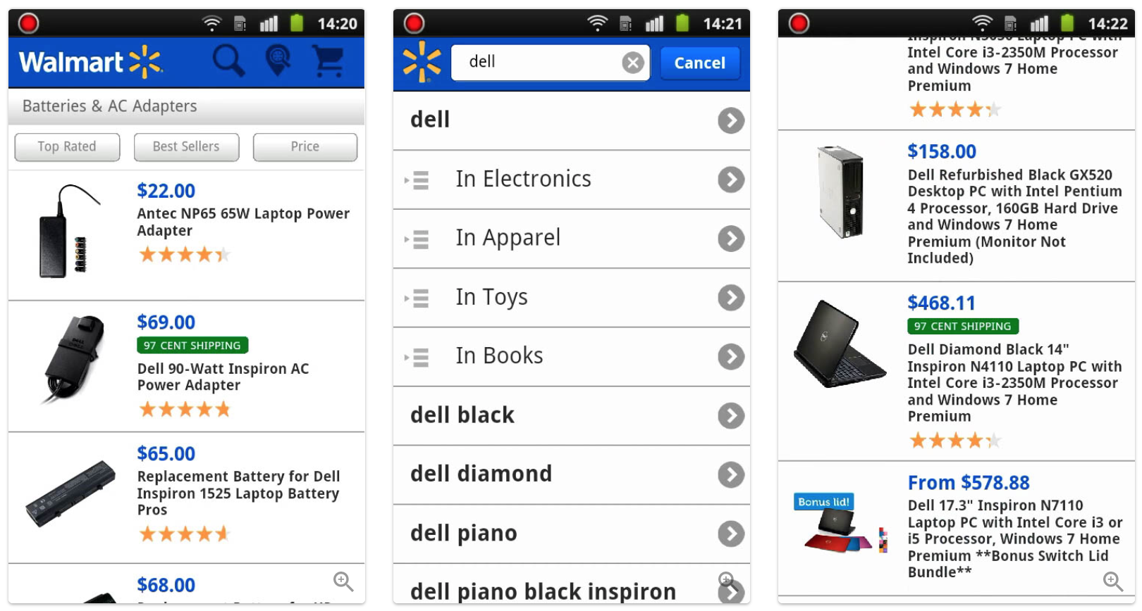
At Walmart, a test participant was looking for a spare adapter for a Dell laptop and navigated to the highly relevant category ‘AC Adapters’ (first image). Since they only wanted to see adapters for Dell laptops, they proceeded to the search field and typed “Dell” (middle image). Unfortunately, they were given site-wide search results, showing mainly Dell computers (last image).
When first seeing a list of categorized products, and then seeing a search field above it, it’s only natural that users assume the two are related. In fact, it seems a perfectly reasonable assumption once we adopt the user’s point of view.
While performing a usability test, one of the test subjects explained after performing such a search and learning that it was not connected to his category:
“When I search — when I am in a category — then to me it seems logical to search within that category.”
Once we appreciate this user context, it’s easy to understand how users make this conclusion.
Giving users the ability to search within a category on an ecommerce website can help improve conversions, too. This is particularly important on mobile, when people are dealing with smaller screens and often want to see a smaller subset of product options.
13. Streamline Mobile Payment
Mobile users should be able to pay in a streamlined way.
During our usability testing of mobile checkouts, we’ve observed that Payment Method selection is a step where users often experience usability issues. Most sites have one predominant method (usually credit cards) but still display a handful of third-party payment options. All of those choices can be challenging to balance on a small screen, leading to users becoming overwhelmed and confused.
Explore Baymard’s annotated examples that highlight what 92 companies are doing right and wrong with their mobile payment options, and find tips on improving your mobile experience to get more conversions.
14. Hide Coupon & Promotional Fields Behind a Link
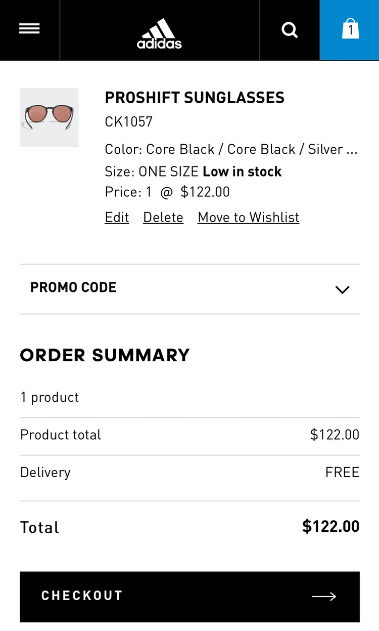
Adidas offers users the ability to input a promo code in the cart. It’s clearly visible and separated from the rest of the fields, but remains collapsed to decrease the emphasis and reduce abandonment.
Our eye-tracking test sessions confirm that empty form fields draw a disproportionate amount of user attention, and promotional fields, like “Coupon Code,” will get noticed immediately if shown by default within the normal flow of form fields.
We consistently see during checkout optimization testing that “coupon hunting” is a persistent issue. Once users notice the coupon field, they will often feel like they are overpaying.
As one subject stated:
“I find it slightly annoying that they’re flashing these coupon code fields as much as they do, because it is like, ‘You should have a coupon, you could get this cheaper if you knew this code’ … I don’t.”
To resolve this, collapse all coupon and promotional fields behind links, and place those links secondary to the step’s primary purpose (e.g., below the credit card form). See an example of good implementation below.
15. Product Descriptions Should Be as Clear as Possible

Although it looks detailed, this product description at Staples mentions two sets of dimensions which are not labelled. The user is left to guess what they apply to, which reduces their confidence in making a “right choice”.
Ecommerce product descriptions need to provide the precise information users are looking for, without being overwhelming. If a product description on a page fails to meet users’ expectations, many of them will simply click away rather than take a chance on purchasing the product.
Consider adding things like product composition (materials or ingredients), product dimensions, and compatibility information to your product descriptions.
16. Autocomplete Fields Need to Work Correctly
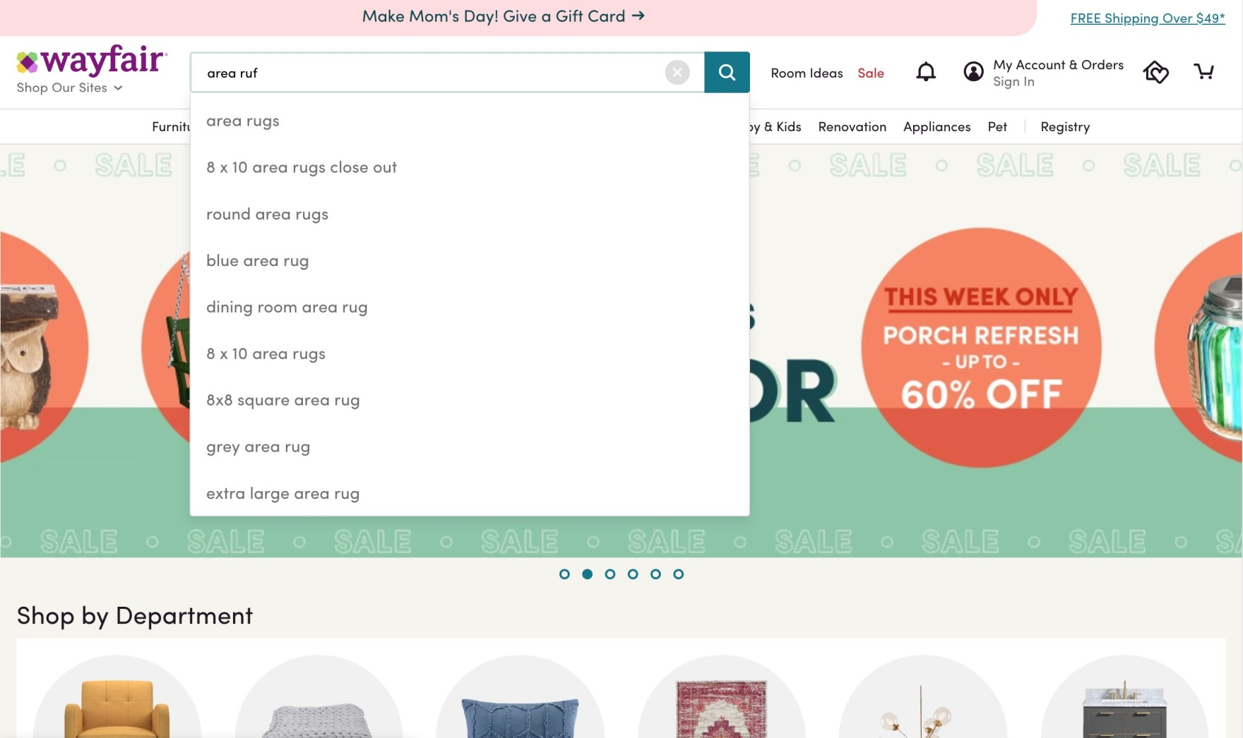
Even though the user misspelled the item they are looking for, Wayfair still offered the right product suggestions.
Poorly performing autocomplete fields on ecommerce websites confuse users and drag down your conversions. During Baymard’s desktop and mobile testing, nearly all users relied on autocomplete suggestions at some point as they searched.
Optimize your autocomplete suggestions for better conversions. For example, make sure misspelled queries don’t cause usability issues that cause users to abandon the site.
Ecommerce Conversion Rate Optimization FAQ
What Is the Purpose of Conversion Rate Optimization?
The goal of conversion rate optimization is to improve the results you’re getting from your current website traffic. With a solid ecommerce CRO strategy, you can increase the number of conversions you get, whether you’re looking for more clicks, sign-ups, or sales.
What Are the Best Ways to Optimize Conversion Rates for Ecommerce Sites?
Doing things like streamlining the checkout process, creating clear product descriptions, and making it easier for customers to find exactly what they’re looking for, you can steadily increase your conversions and continually bring in more sales.
Making incremental changes can lead to a significant revenue boost. Learn more about the UX design process.
How Should I Track Conversion Rate?
If you want to improve conversion rate, then it should be tracked! To track an ecommerce website's conversion rate, you can use a range of analytics tools.While Google Analytics is the most popular choice for website-specific data, there are numerous alternative methods for measuring this crucial metric.
To calculate conversion rate for a specific time frame (e.g. a month or a year), divide the total number of purchases made during that period by the total number of visitors to your website.
What Factors Affect Conversion Rate?
Several controllable factors can influence conversion rates, such as the design of your web pages, the quality of your website content, and the pricing and quality of your products or services. Additionally, features like compelling calls to action, customer reviews, and live chat support have been proven to enhance a website's conversion rate.
Does Traffic Increase or Decrease Conversion Rate?
If you are receiving more traffic, but your conversion rate drops, this is likely due to the quality of that traffic. Sometimes higher traffic does not always equate to more sales, meaning that where that traffic comes from, and the intent of the website visitors, matters more than the traffic number itself.
That doesn’t mean that more traffic always means the conversion rate will drop. If there is a change in the source of traffic, for example, from a social media post that is promoting a sale, it might mean that your conversion rate increase along with the traffic numbers.
How Does Site Speed Impact Conversion Rate?
Page speed plays a crucial role in conversion rates, as faster-loading pages deliver a smoother user experience. Slow-loading sites often frustrate visitors, leading to higher bounce rates and reducing the chances of completing purchases or other key actions.
Baymard Can Help You Develop High-Converting Product Pages to Improve Your Ecommerce Conversions
In addition to the strategies above, Baymard’s extensive UX research can help you improve your conversion rate and generate more sales by improving your user experience.
Get Baymard Premium to get access to 700+ design guidelines and 275,000+ UX performance scores — insights already used by many of the world’s leading sites.
Or, if you’re ready to get started with your own UX audit, we’ll help you discover the 40 most important changes you need to make to your checkout, navigation, search, product pages, and mobile experience to optimize conversions.
Research Director and Co-Founder
Christian is the research director and co-founder of Baymard. Christian oversees all UX research activities at Baymard. His areas of specialization within ecommerce UX are: Checkout, Form Field, Search, Mobile web, and Product Listings. Christian is also an avid speaker at UX and CRO conferences.