Key Takeaways
- Our new research has uncovered 1,000+ usability issues specific to travel accommodations sites
- The research has resulted in 364 guidelines that describe the issues, as well as design patterns verified to perform well for users
- In particular, the research provides insights on the content and features travel accommodations sites need to provide users to ensure they’re able to make a booking decision — and the content and features they don’t
At Baymard our research team has just spent 992 hours usability testing and researching travel accommodations website features, layouts, content, and designs — leading to our new UX research study on Travel Accommodations UX.
The research is based on more than 317 qualitative user/site usability test sessions following the “Think Aloud” protocol (1:1 remote moderated testing), and includes 4 general types of travel accommodations site:
- Online travel agency (OTA) sites (e.g., Expedia, Booking.com). OTA sites are the “Amazon” of the travel industry, providing users a “one-stop-shop” for all their travel needs.
- Large-brand hotel chains (e.g., Marriott, Hilton). Large-brand hotel chains allow users to focus their search on a “family” of properties that will provide a predictable experience along with the opportunity to earn or redeem reward points.
- Boutique hotels (e.g., The Artezen, The Nolitan). Boutique hotels offer a unique, one-of-a-kind stay — often reflected in highly stylized, sometimes unconventional, site designs.
- Whole property rental sites (e.g., Airbnb, Vrbo). Whole property rental sites serve users seeking a “live like a local” travel experience, offering a handful to hundreds of properties depending on the destination.
Yet despite testing some of the largest travel accommodations sites, users frequently ran into issues that severely disrupted their ability to book an accommodation — issues that are likely to increase the cart abandonment rate of many travel accommodations sites.
Indeed, during testing the users encountered 1,000+ medium-to-severe usability issues.
These issues have subsequently been analyzed and distilled into the 364 UX guidelines found within our travel accommodations UX research study.
In this article we’ll discuss the following high-level findings from the study:
- UX issues observed at OTA, large-brand hotel chain, and rental property sites, and boutique hotel sites
- 3 ways in which the UX of accommodations sites differs from general B2C e-commerce sites
UX Issues Observed at OTA, Large-Brand Hotel Chain, Rental Property Sites, and Boutique Hotel Sites
While users of OTA, large-brand hotel, and rental property sites share the same goal as users of boutique hotel sites — finding and booking an accommodation — the information and features sought by each group of users differed in some key ways during testing.
OTA, Large-Brand Hotel Chain, and Rental Property Sites
During testing, users shopping at OTA, large-brand hotel chain, and rental property sites had varying degrees of familiarity with their travel destination.
Some had visited the destination many times before and were familiar with the area and its attractions. Meanwhile, others had never considered visiting that particular destination.
Yet despite their different levels of familiarity, a consistent theme emerged: users need to understand where exactly the property locations are to evaluate and compare hotels or whole property rental properties effectively.
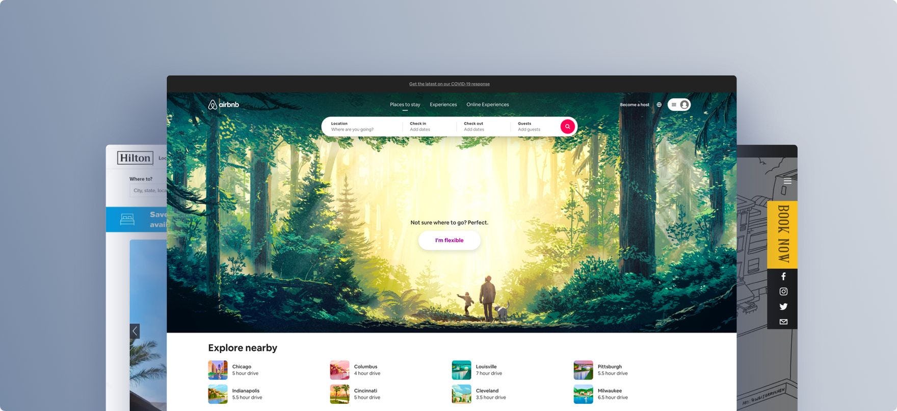
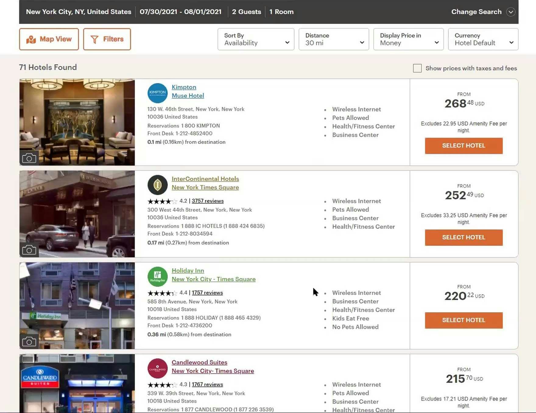
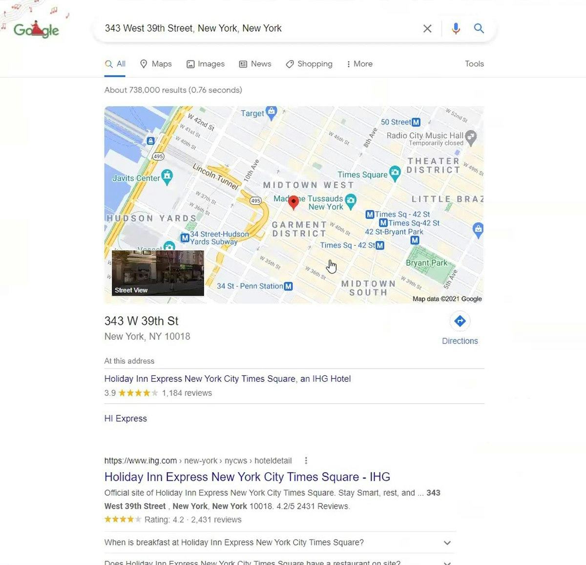
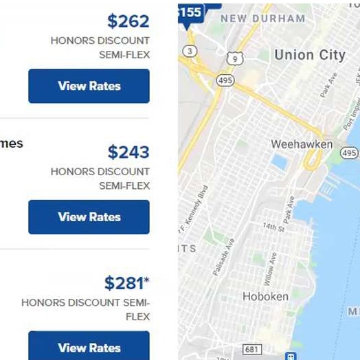
“So I would be wanting to stay in Times Square, but I’m curious where this is. I really wish they had a little map [to] give me a better idea of where that is”, complained a user at IHG. He’d scrolled past the “Map View” button at the top of the search results (first image). “I would do this. I would search for it”, he explained as he copied the address of the hotel he was considering into a new browser tab to view its exact location on a map (second image). Without an immediate view of search results on a map, some users will waste time performing external searches to discover the exact location of properties they are considering.
This is challenging when considering accommodations in large cities such as New York, where maps and lists of properties can quickly become cluttered and hard to navigate, distracting users from their goal of finding a property in a desired location.
Moreover, due to the number of potentially suitable hotel and rental properties offered within even an exact location, narrowing down the search results is directly linked to users’ success at being able to find and consider only relevant hotel and rental property listings.
This means that users shopping for OTA, large-brand hotel chain, and whole property rental sites have similar filtering requirements as users shopping at mass-merchant B2C e-commerce sites.
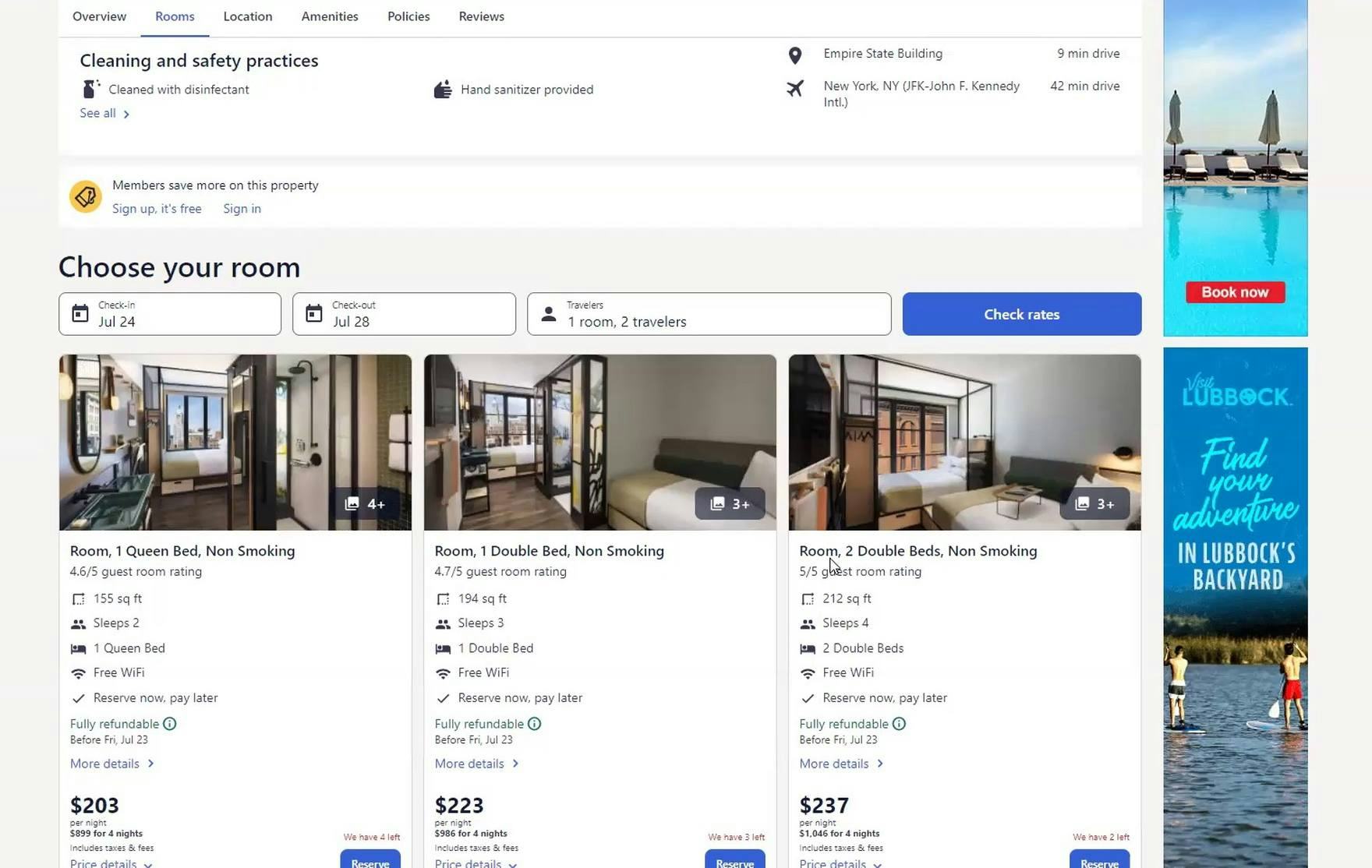
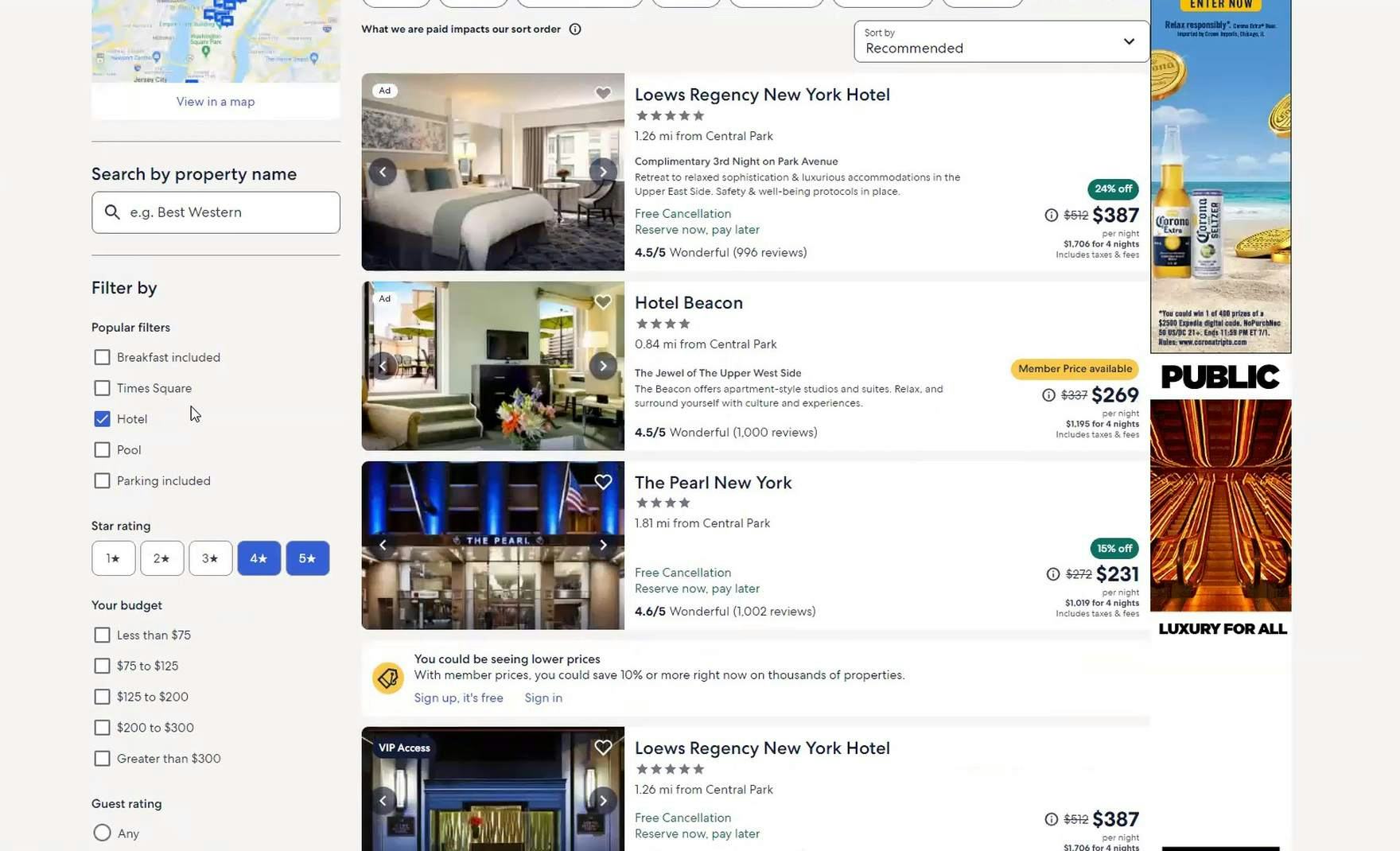
“Oh, this hotel looks like it just has queens, so I wouldn’t get more information on that one”, explained a user at Expedia viewing a hotel property details page (first image). Returning to the search results, she continued, “I wonder if there is a filter for a king bed?” After scanning the filters, she explained, “No, it doesn’t look like there is…it would be nice if there was a filter here for the type of room” (second image). During large-scale travel accommodations testing, users shopping for hotel rooms on OTA and large-brand hotel chain sites often wanted to filter by bed size to eliminate hotels that couldn’t accommodate their bed-size preference.
In addition to essential filters like price and guest rating, industry-specific filters — for example, amenities like a pool, or an on-site restaurant for hotels, or bedroom and bathroom counts for rental properties — are highly valuable for users to identify the most relevant hotel or rental properties to consider.
Therefore, OTA, large-brand hotel chain, and whole property rental sites need to be mindful about providing relevant filters, and that filters are displayed in a way that makes scanning and applying them manageable.
Boutique Hotels
In contrast to users on OTA, large-brand hotel chain, and whole property rental sites, users shopping for a room at small boutique hotels have by and large already determined their destination and therefore are more focused on learning about the property, before checking the availability of rooms or comparing room rates.
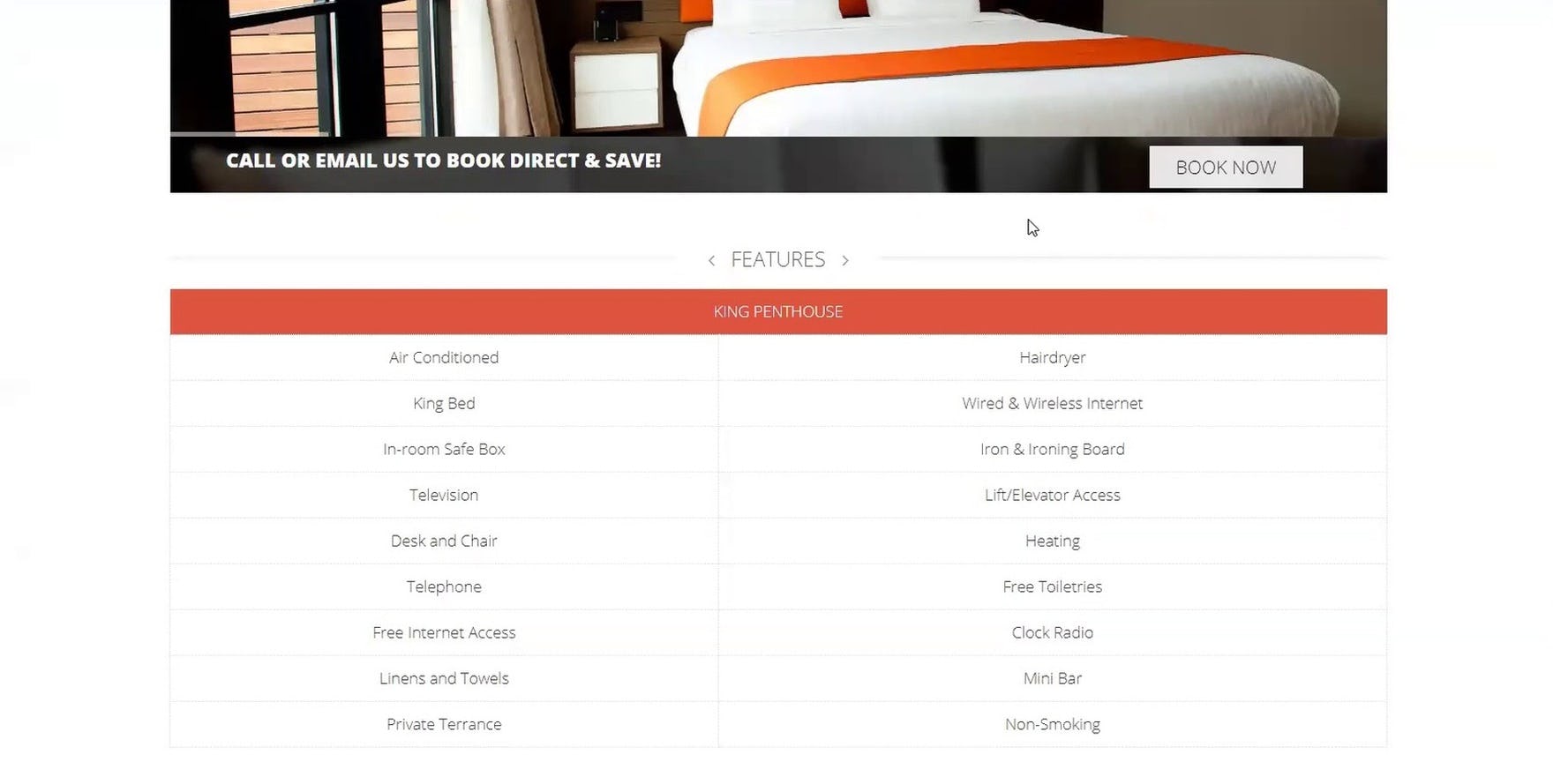
“Well does it have a shower? A bathtub? Okay, I’m a little nervous. Okay I’m done looking. I give up. I would call”, complained a user shopping for a room at a boutique hotel, The NobleDEN, during large-scale travel accommodations testing. Similar to users shopping for products on traditional e-commerce sites, users shopping for travel accommodations on boutique hotel sites need a high level of detail in the property and room descriptions. In this example, the absence of information about whether rooms included a bathroom was further compounded for users by the lack of room photos.
During testing, users were unfamiliar with the boutique hotels under consideration and therefore partial to first scrolling through the homepage to get a feel for a property or seeking out a photo gallery and amenities list.
In addition to seeking out a photo gallery and amenities, many users will dig deeper to learn about what makes a boutique hotel unique — special features and services, events, and the surrounding neighborhood.
Thus, providing comprehensive property information, and ensuring it is easily accessible via the main navigation, is paramount for boutique hotels.
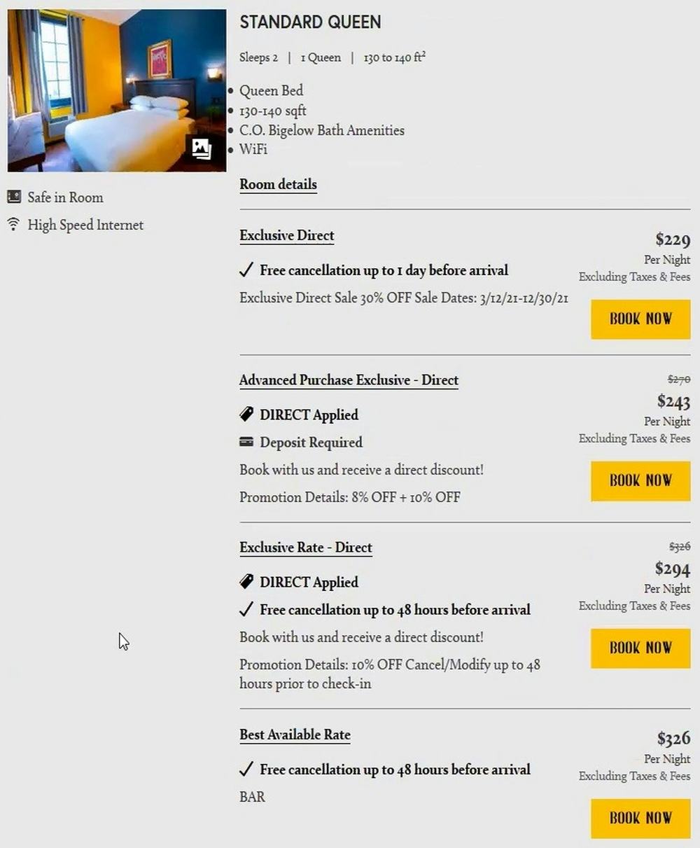
Furthermore, because rooms at boutique hotels are typically priced higher than at large-brand chain hotels, users had a keen interest in any available special offers and discounts.
Yet, they often became confused, frustrated, and mistrustful of a site when offer messaging and discounts were unclear or inconsistent.
Thus, boutique hotel sites need to be especially mindful about the presentation of and messaging around special offers and discounts.
3 Ways in which the UX of Accommodations Sites Differs from General B2C E-Commerce Sites
Testing revealed that accommodations sites share with general B2C e-commerce sites many of the same UX issues.
For example, whether a user is on Amazon or Airbnb, if it’s not easy to get a good visual sense of the product or property through high-quality images, many users will be reluctant to proceed with the purchase or booking.
Yet testing also revealed 3 general ways in which the accommodations UX is likely to differ from general e-commerce.
1) The Importance of the “Booking” Search Feature
The “Booking” search feature at Airbnb.
First, travel accommodations sites tend to funnel users toward the “Booking” search feature — where users enter their destination, select check-in and check-out dates in the calendar date picker, and specify the number of rooms and guests.
Indeed, on many sites entering information into the “Booking” search feature is a prerequisite to users being able to begin browsing for appropriate accommodations.
Therefore, the design, layout, and function of the “Booking” search feature are critically important for users to be able to quickly narrow the sometimes vast selection of accommodation options.
However, some of the travel accommodations sites tested failed to give the “Booking” search feature the attention it deserves, considering its importance in locating a room or property to book.
2) The Complexity of Pricing Information
Next, when it comes to shopping for travel accommodations, certain types of information are especially important to users.
For example, as on traditional B2C e-commerce sites, price is a huge factor, both in terms of evaluating each property or room on its own and for comparing them to one another.
Yet, unlike on traditional e-commerce sites, where the price of a product is typically a straightforward consideration, on travel accommodations sites unclear room rate information on hotel sites and nebulous price breakdowns on whole property rental sites make room and property evaluation and comparison more challenging for users.
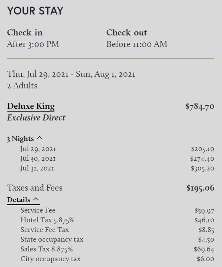
Then, once users identify a hotel room or property to book and enter the “Booking” Checkout process, reviewing their reservation details for accuracy is top of mind, similar to B2C e-commerce users.
However, users shopping for travel accommodations generally tend to be more suspicious about the addition of last-minute fees than general e-commerce shoppers.
Consequently, users will take extra time scrutinizing the final cost summary, and a subgroup of users will drop a property or room from consideration if the final cost summary suddenly contains new or unexplained fees.
3) Special Checkout Considerations
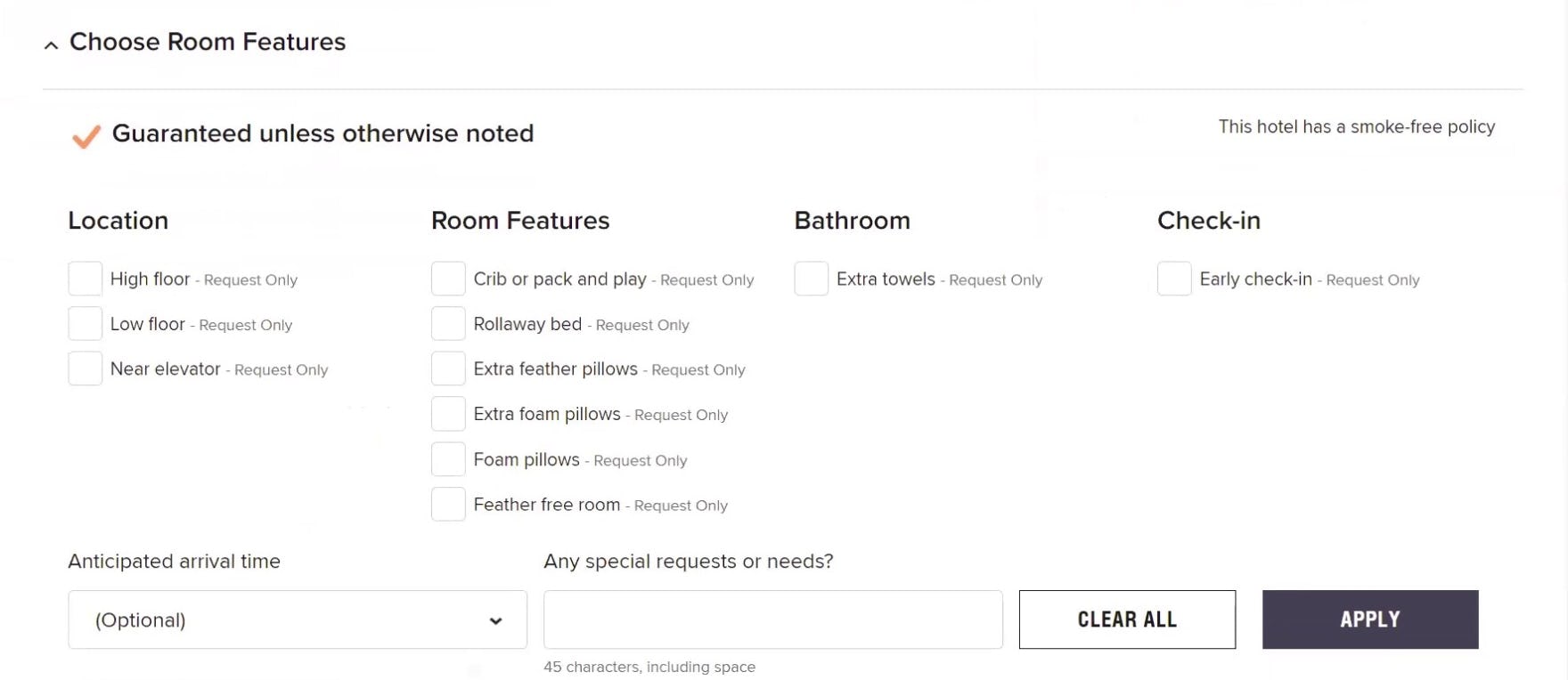
At Marriot, users have many optional checkout options to select from to customize their hotel stay.
Lastly, users shopping for travel accommodations will often look for the opportunity during the “Booking” Checkout process to make special requests.
These can include a high- or low-floor room location, in-room features like extra pillows, or services such as early check-in or late check-out.
Likewise, users booking whole property rentals typically have an opportunity during the “Booking” Checkout process to reach out to the host directly to ask questions or make special requests.
These additional checkout options can add to the complexity of the checkout process, and sometimes risk distracting users from finalizing the booking.
Ensure Users Seeking Travel Accommodations Are Able to Easily Find and Book Their Ideal Stay
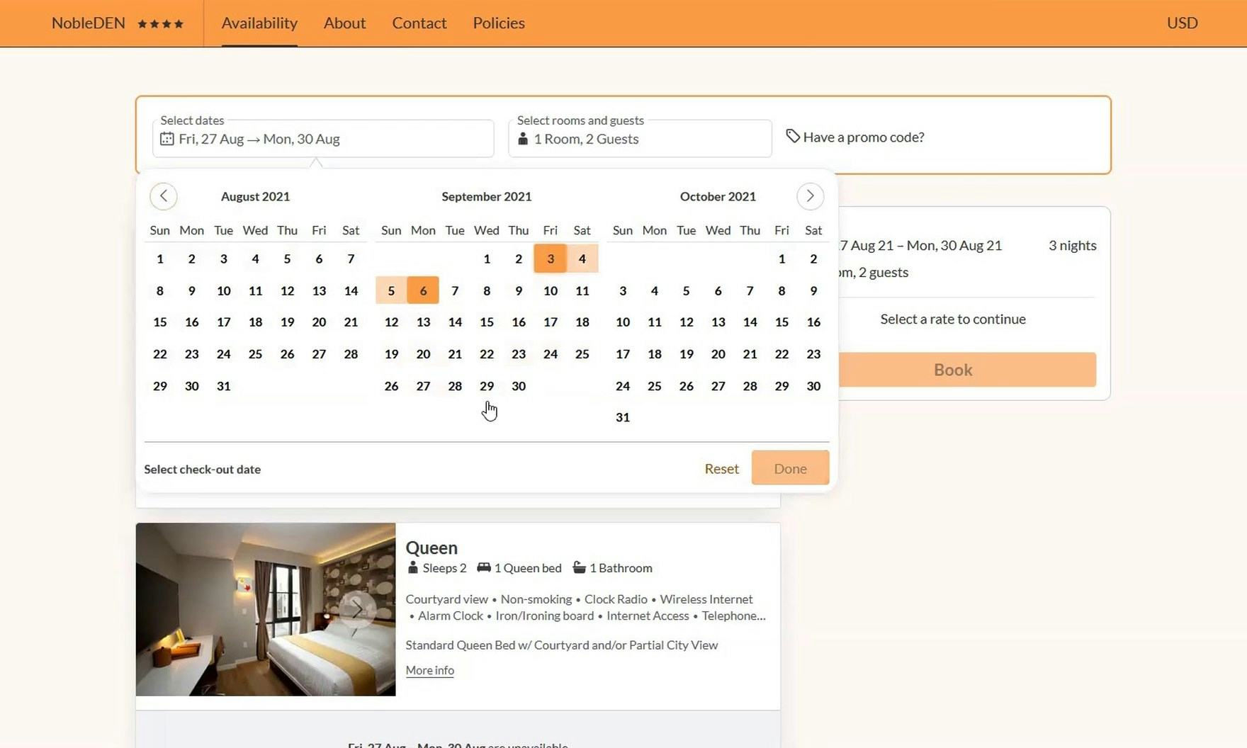
“Some places, it might be that a Monday night is cheaper than a Friday night and so you’re like, ‘Oh, I’m going to just adjust a little bit’…but this doesn’t tell me that”, complained a user viewing the calendar date picker in the “Booking” search feature on the “Select a Room” page at NobleDEN. Without minimum nightly rates, users cannot quickly determine if adjusting their travel dates is worthwhile.
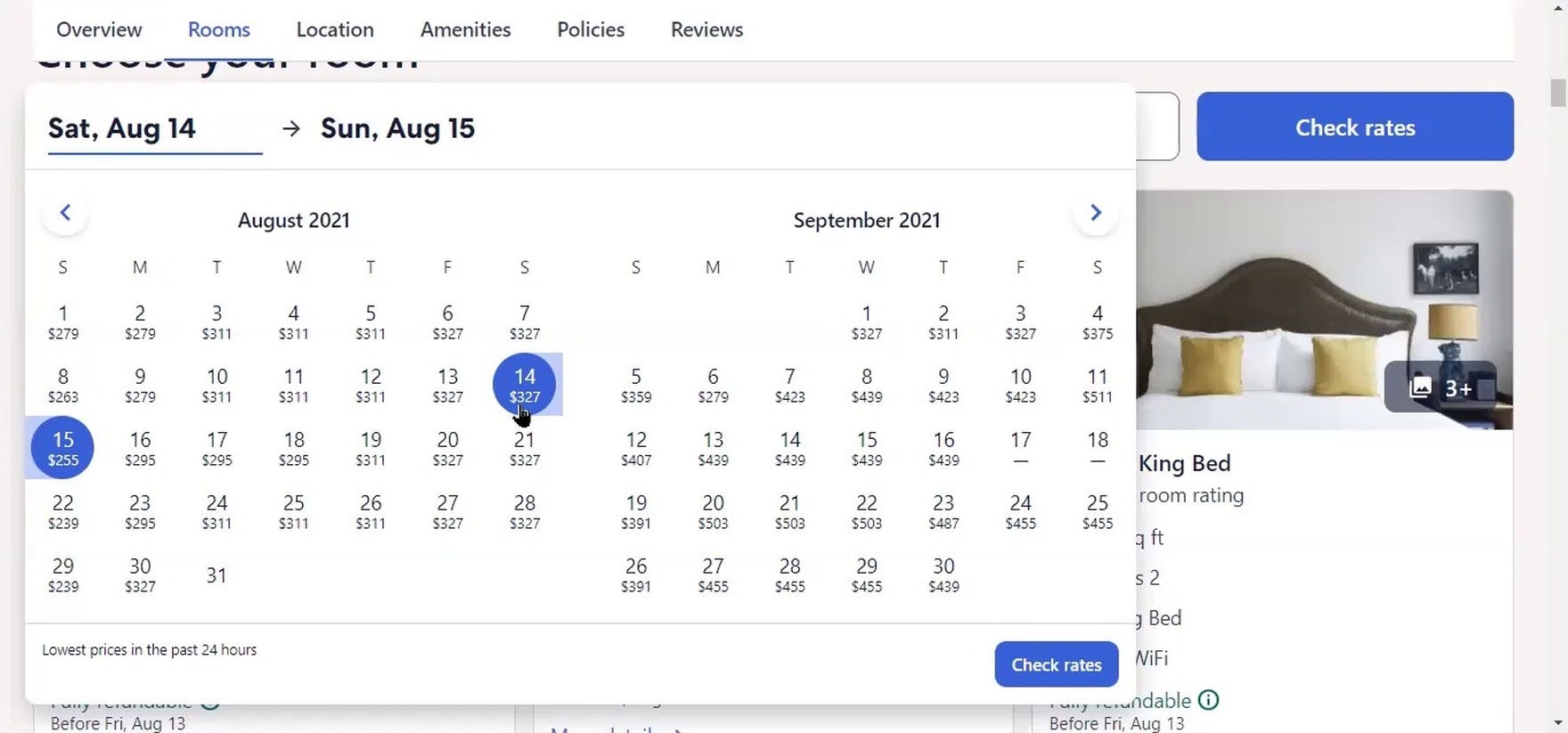
“I do like that it’s telling me the different price points based on the weekend or the day”, remarked a user as she viewed the calendar date picker in the “Booking” search feature on an individual hotel property details page at Expedia. Notably, unavailable dates — September 17–18 — are also clearly identified.
Large-scale testing of travel accommodations sites revealed that finding and booking a place to stay can be a complex endeavor.
Users must synthesize a great deal of information to determine where they’d like to book their accommodation, with many users during testing at some point becoming overwhelmed.
With that in mind, the 364 guidelines presented here offer guidance on resolving the UX issues that travel accommodation users face.
The guidelines cover the tools needed to identify a suitable hotel room or property to book, as well as what information is important to users shopping for travel accommodations.
Implementing the recommendations will help to ensure users have what they need to search, evaluate, and compare travel accommodations, increasing their confidence when it comes time to make a booking decision.
In particular, testing revealed that it’s important to pay special attention to the following when it comes to accommodation site UX:
- The “Booking” search feature
- How pricing information is presented and explained
- How complex the booking process is
Yet this large-scale study of travel accommodations UX has revealed that many accommodations sites make it unnecessarily difficult for users to proceed efficiently with booking their stay — leaving themselves at risk of abandonment in favor of a competitor, and negatively impacting their e-commerce conversion rate.
Getting access: all 364 accommodation UX guidelines are available today via Baymard Premium access (if you already have an account open the Travel Accommodations Study).

