
Key Takeaways
- Homepage & Category Navigation UX is key to users’ ability to find products
- Yet our 2025 benchmark shows most sites fail to provide even a “decent” UX
- Implementing the 11 best practices discussed in this article can get you started on improving your site’s Homepage & Category Navigation UX
Key Stats
- 58% of desktop sites’ Homepage & Category Navigation performance is “mediocre” to “poor”
- 67% of mobile sites’ Homepage & Category Navigation performance is “mediocre” to “poor”
- 16,000+ Homepage and Category UX performance scores included for the top US and European ecommerce sites
Baymard’s 2025 Homepage & Category Navigation ecommerce UX benchmark contains 16,000+ Homepage and Category Navigation UX elements manually reviewed and scored by Baymard’s team of UX researchers (benchmark embedded below).
In addition, you’ll find 13,000+ best and worst practice examples (categorized and performance verified) from 180+ leading US and European ecommerce sites.
This article analyzes a portion of our large-scale Baymard research findings to provide you with the current state of Homepage and Category Navigation ecommerce UX, and outline 11 common pitfalls and corresponding best practices to implement.
The Current State of Ecommerce Homepage and Category Navigation UX
For this analysis, we’ve summarized the 16,000+ UX performance scores for 2025 across the topics in this theme and plotted the benchmarked sites’ related navigational user experience across these topics in the scatterplot above.
Each dot, therefore, represents the summarized UX score of one site across the guidelines within that respective topic of the homepage and category navigational experience.
Our 2025 UX benchmark shows that most leading US and European sites’ Homepage & Category Navigation performance is at a “mediocre” to “poor” level (58% of desktop and 67% of mobile sites).
Thus, the average site fails to deliver a “decent” Homepage and Category Navigation UX performance.
Moreover, there are no sites that overall perform exceptionally well for end users (i.e., have a “perfect” Homepage and Category UX), highlighting an opportunity for sites to outshine their competitors by resolving the many UX issues rampant throughout this theme.
Below we’ll discuss in more detail the results from our research by outlining 11 common Homepage and Category Navigation pitfalls and best practices based on our large-scale testing and benchmarking.
Implementing these best practices will get you started on improving your Homepage and Category UX.
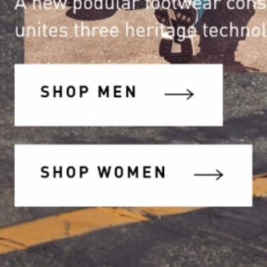
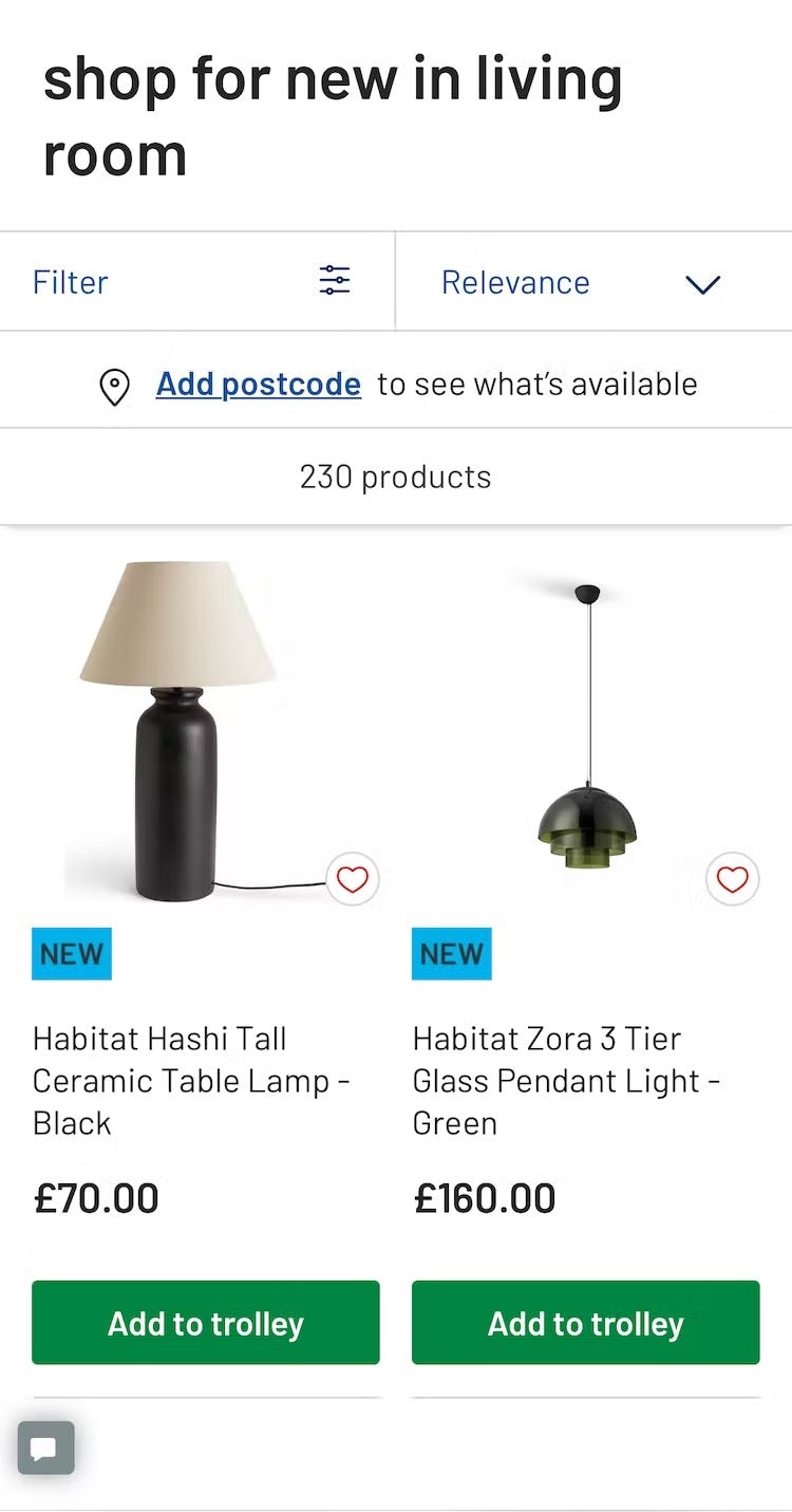
1) 59% Don’t Provide the Full Scope for Links on Mobile Homepages
On mobile sites and apps users are at risk of developing tunnel vision, as the small viewport limits their ability to gain an overview of their current location.


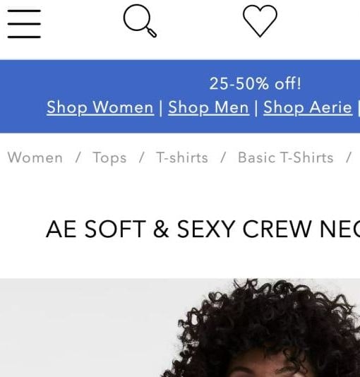
“Okay. So none of these dresses are really anything that I would like. I think I’m gonna go back to the homepage.” A participant at Banana Republic tapped on a “50% off” ad on the homepage (first image). She then misunderstood the resulting product list, assuming that the products shown (with coats mixed in with other women’s items) were the full product list of women’s clothing (second image). Scoped paths on mobile homepages can easily mislead fast-moving users.
Testing revealed that users on mobile homepages and apps can have overview issues when selecting a featured scope — for example, “Women’s > New Arrivals” — if the link to the featured scope fails to make it very clear that tapping on the link will result in a specific product list.
The consequences of this misunderstanding can be severe.
Multiple users during testing abandoned sites because they found the product selection unsatisfactory after tapping on a featured scope link on the homepage — yet they simply misunderstood where they were in the site hierarchy, and didn’t realize they were viewing a narrow product list.


“‘48 hour outdoor sale’. I would immediately be inclined to click and see what’s in their sale.” A participant at Columbia tapped on a “Shop Sale” button on the homepage (first image). She then was delighted to see the resulting drop-down list, which allowed her to specify exactly what product list she wanted to see: ”Oh, I like the drop-down. I like that it’s all right there.” (second image). Properly labeled scoped paths on mobile homepages help users retain an overview of where they are on the site.
Therefore, if deciding to provide access from mobile homepages to subcategories or product lists with filters applied, then include the full scope in the link text.
This means that for many links both the category and subcategory/filter names will need to be included — for example, have “Women’s New Arrivals” as the button microcopy, rather than “New Arrivals” as a header and only “Women’s” as the button microcopy.
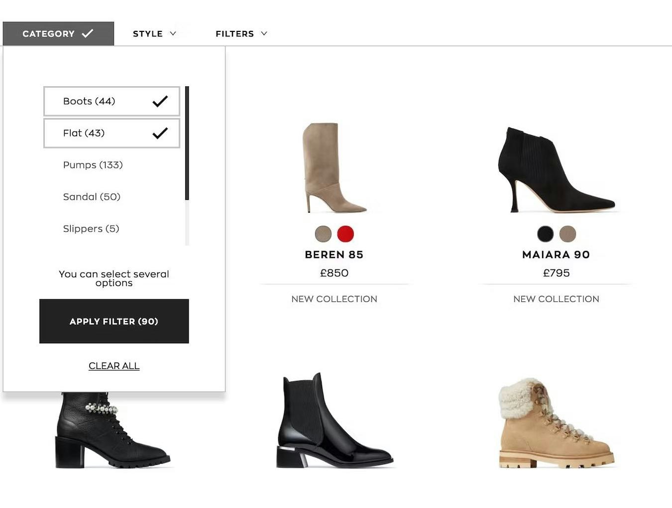
2) 60% Don’t Divide Categories and Subcategories into Manageable Chunks

“First I would probably start with — whoa, there’s a lot of options here!” This participant at Ashley Furniture was overwhelmed by the number of subcategories in the ”Furniture” menu.
During testing, the hierarchies of many sites were perceived by users to be “overwhelming”, “cluttered”, or “confusing”, reflecting the paradox that the benefits of drop-down menus — that they can hold an almost unlimited number of options — are also their Achilles’ heel.
Indeed, most participants began to feel overwhelmed when they were presented with more than ~10 subcategory options to choose from.
While navigating or scanning long lists of categories on desktop is difficult, on mobile the task is even harder, as users will have to scroll through the options — a time-consuming and laborious task — and will find it difficult to establish an overview of the navigation.
Furthermore, there’s minimal information scent provided on mobile, since users can’t hover menu items to potentially learn more about the category, and there’s less space to include inline text descriptions of the items.
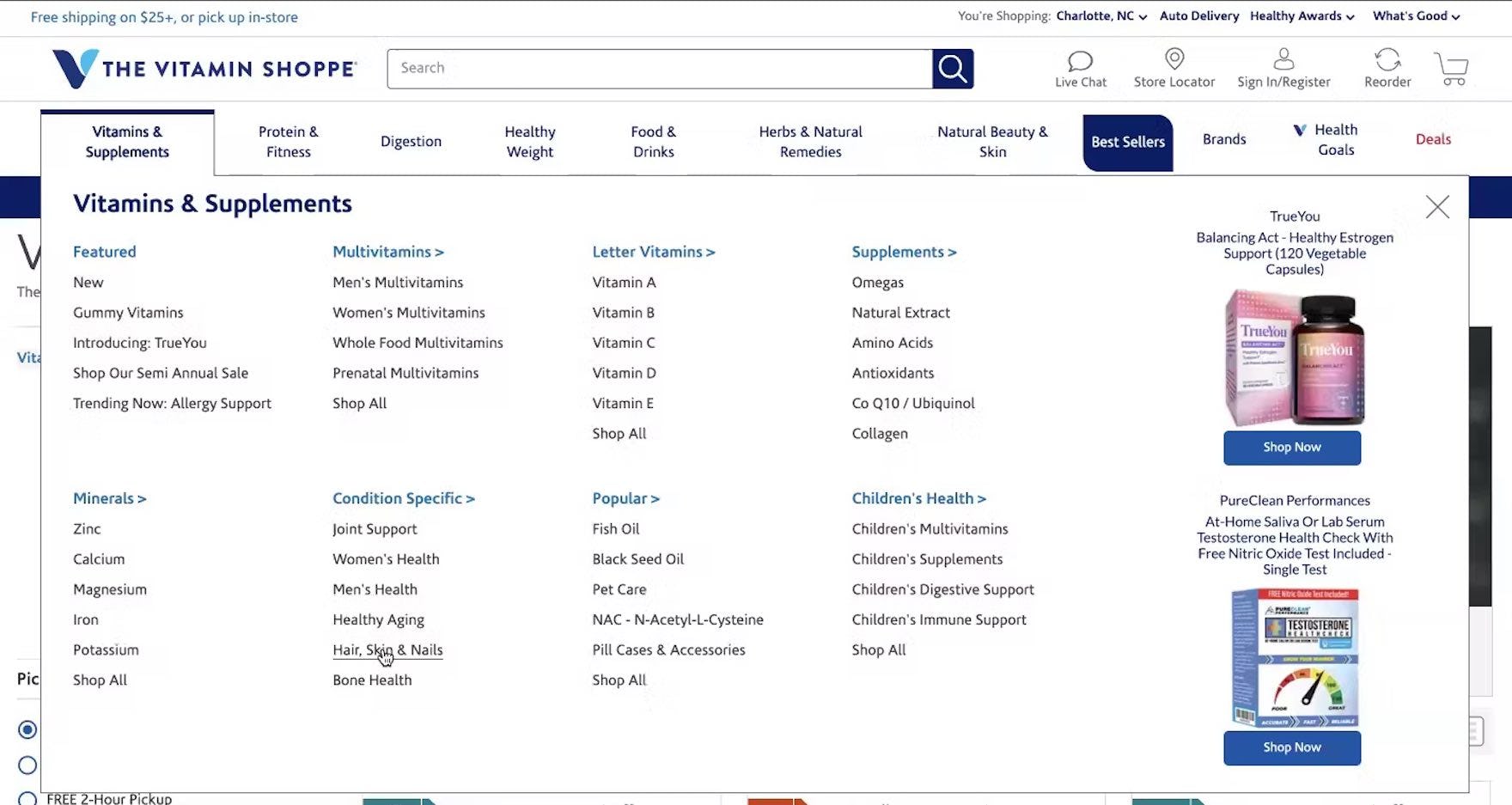
“So if we go back to ‘Hair, Skin & Nails’…they do break it down pretty nicely.” The fact that a manageable amount of subcategories were included under each category on The Vitamin Shoppe made it straightforward for this test participant to choose the most suitable one.
To address this issue, divide categories and subcategories into manageable chunks: subdivide when reaching around 10 categories, and aim for at least 10 products in the categories at the deepest level.
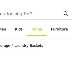
3) 95% of Sites Don’t Highlight the User’s Current Scope in the Main Navigation
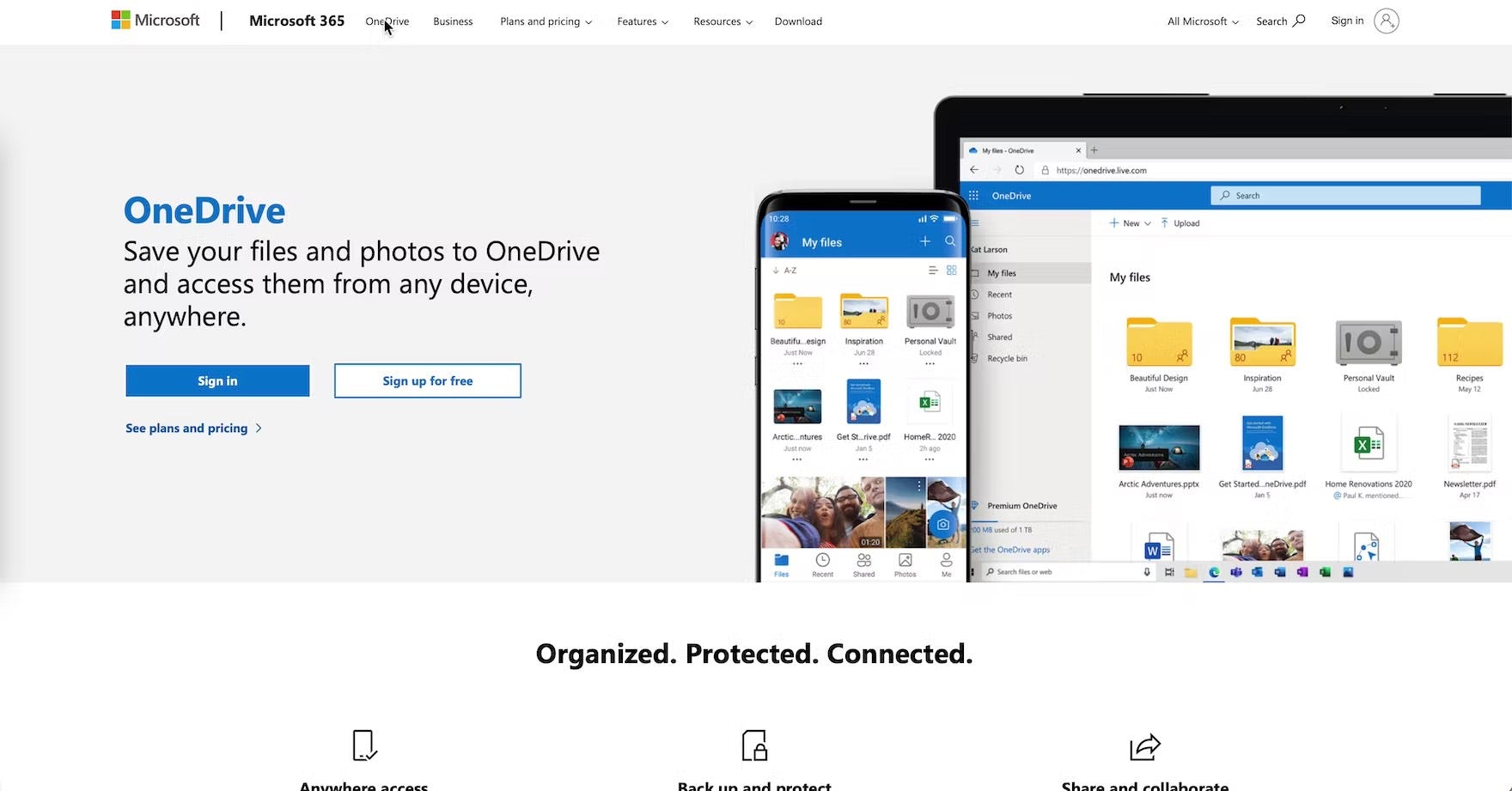
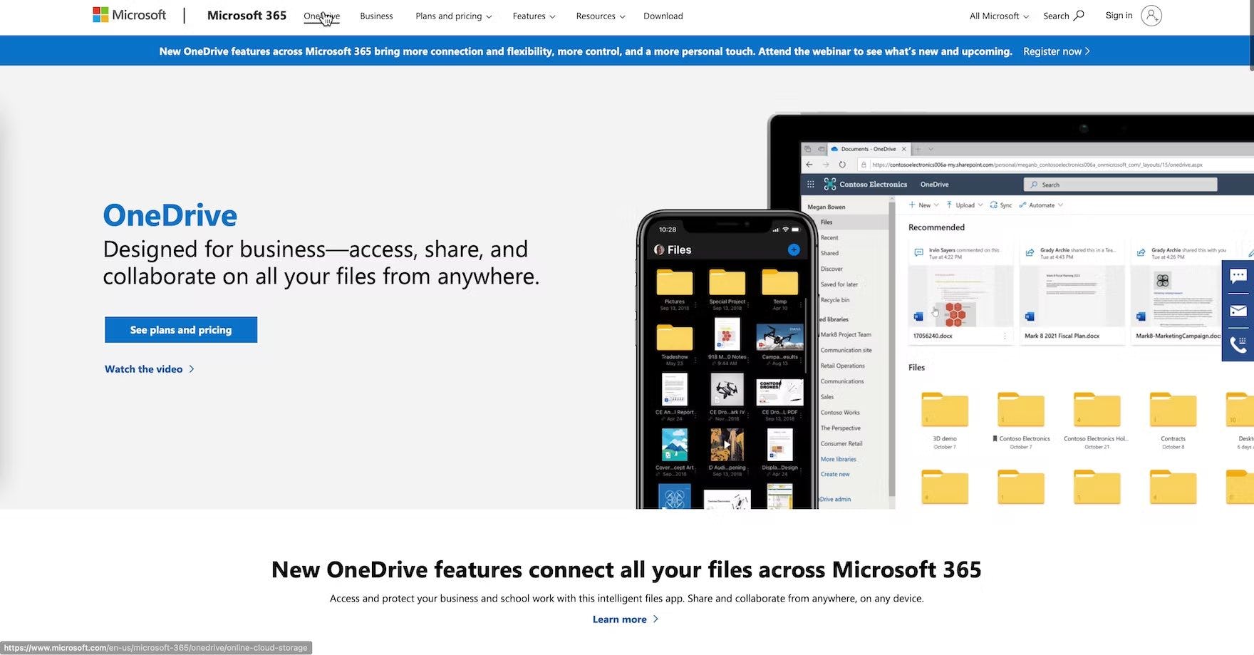
“I guess I didn’t realize that this OneDrive was the ‘Personal’ one (first image), and this is the ‘Business’ one (second image). I guess that was a little confusing. The ‘Business’ one is obviously what I’d be looking for.” This test participant at Microsoft Teams was slow to recognize that the information he was viewing wasn’t relevant to his research on “business cloud storage and sharing services” because his current location wasn’t highlighted in the main navigation.

At Anine Bing, the location of this page in the hierarchy is hard to work out because the user’s current scope isn’t clear (also note the nonstandard placement of the hierarchical breadcrumbs, “Classics Clothing”, just above the product title). As such, users arriving directly on this page hoping to see similar products will have to guess which main navigation category to click on to broaden their scope.
During testing, when the current top-level scope wasn’t highlighted in the main navigation, it made it unnecessarily difficult for participants to determine where they were in the site hierarchy.
Additionally, failing to highlight the current scope in the main navigation also makes it more difficult for users to begin to learn and internalize the site’s structure.
Even when breadcrumbs are implemented perfectly, some users still rely on the main navigation to help them quickly understand where they are, or to reassure themselves that they are where they thought they were.

At Keurig, the mobile main navigation doesn’t give users any indication of where they currently are, which will lead some users to lose their overview.
On mobile, even though it isn’t permanently displayed, users also rely on the main navigation to give them a sense of where they are on a site, especially if they arrive directly to a product details page from off-site.
Indeed, during mobile testing, when the current scope wasn’t highlighted in the main navigation, users had more difficulty figuring out where they were within the site hierarchy — putting more strain on breadcrumbs (which were often absent, inconsistently implemented, or truncated) and terminology to perform perfectly to help them learn the site hierarchy.
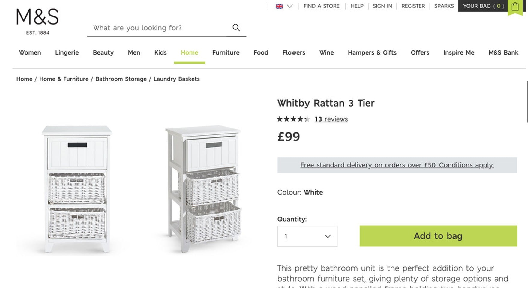
At Marks & Spencer, the top-level “Home” category is highlighted in bright green in the main navigation, clarifying to users that this product is placed within “Home” and not “Furniture”. Highlighting the current scope in the main navigation can be as simple as a change in the font color: the key is to make sure the “current scope” styling in the main navigation is sufficiently distinct from the other main navigation options.
Fortunately, providing information on where users are in the main navigation has a somewhat “low-cost” solution: simply highlight their current scope in the main navigation by styling it differently than the other top-level main navigation options in the permanently visible main navigation (on desktop), or within the main navigation viewport (on mobile).
Despite the importance of orientation cues to the ecommerce shopping experience, a staggering 95% of sites don’t highlight the user’s current scope in the main navigation (even worse than the 91% in 2024).
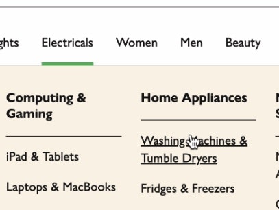
4) 33% of Sites Don’t Make Headers Clickable
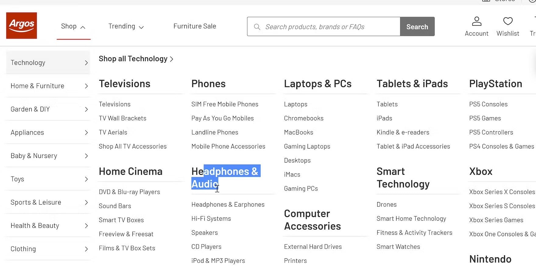
“And also these things themselves aren’t linked, so I can’t click on that to the category.” A participant at Argos UK wanted to get an overview of the “Headphones & Audio” category but found that the heading was static text. For users who want to browse broad product scopes, links that only lead to individual subcategories (such as “Hi-Fi Systems” in this example) are much less useful.
During desktop testing, at many of the tested sites the headings of the drop-down categories were only text labels, not clickable parent categories.
This conflicted with the expectations of the majority of participants, who anticipated the headers would be clickable and often tried clicking them — despite the cursor indicating the item wasn’t clickable.
Some users want to click on main navigation headers to stay in a fairly broad product scope; for example, in the hope of landing at a curated intermediary category page, which could assist them in their selection of a more defined scope.
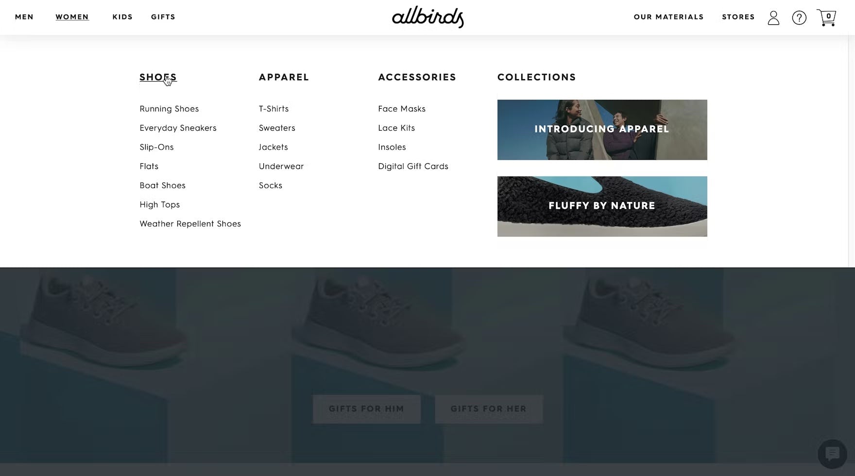
“I would first look at ‘Shoes’.” Rather than select one of the available subcategories of shoes, this participant on Allbirds opted to see all shoes by clicking the “Shoes” category within the drop-down menu.
Having parent categories be part of the actual product catalog hierarchy (and not just shallow text labels) is critical in supporting explorative product browsing.
Users who haven’t fully decided what they want, or who are looking for inspiration on what to purchase, can dip their toes in broader categories before diving into highly defined ones.
5) 61% of Sites Don’t Have a Hover Delay
Hover-based drop-down menus outperformed other main navigation menus in testing because they enabled users to easily explore categories and accurately select a well-defined scope.
However, participants ran into severe usability issues with “flickering” behavior related to menus that opened and closed immediately as participants moused over the menu.
Additionally, while they were within the menu, many participants accidentally triggered sibling categories, making it difficult for them to use the main navigation menu effectively.
To avoid the “flickering” of hover-based drop-down navigation menus, there needs to be a hover delay — a minimum amount of time the user needs to hover the trigger area before the drop-down content appears.
Typically a delay of 300–500 milliseconds will suffice in eliminating the worst of the “flickering” issues, without introducing needless friction for intentional hover interactions.
Additionally, an intelligent mouse path algorithm could be used to determine the user’s intent and prevent the accidental triggering of sibling category menus.
6) 55% of Sites Use Overly Aggressive and Distracting Ads on the Homepage

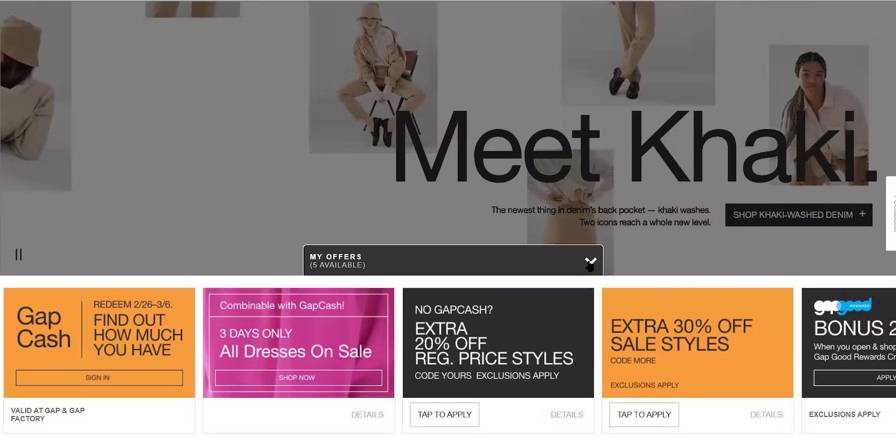
“This one is killin’ me. You know with this, there’s so much going on…and then I’m scrolling down and then this comes up. ‘My Offers’, taking up the whole screen, it’s distracting.” The ads and offers at the top and bottom of the GAP homepage overwhelmed this participant. Distractions like these impact the ability of users to assess a site’s product catalog and set a negative tone.
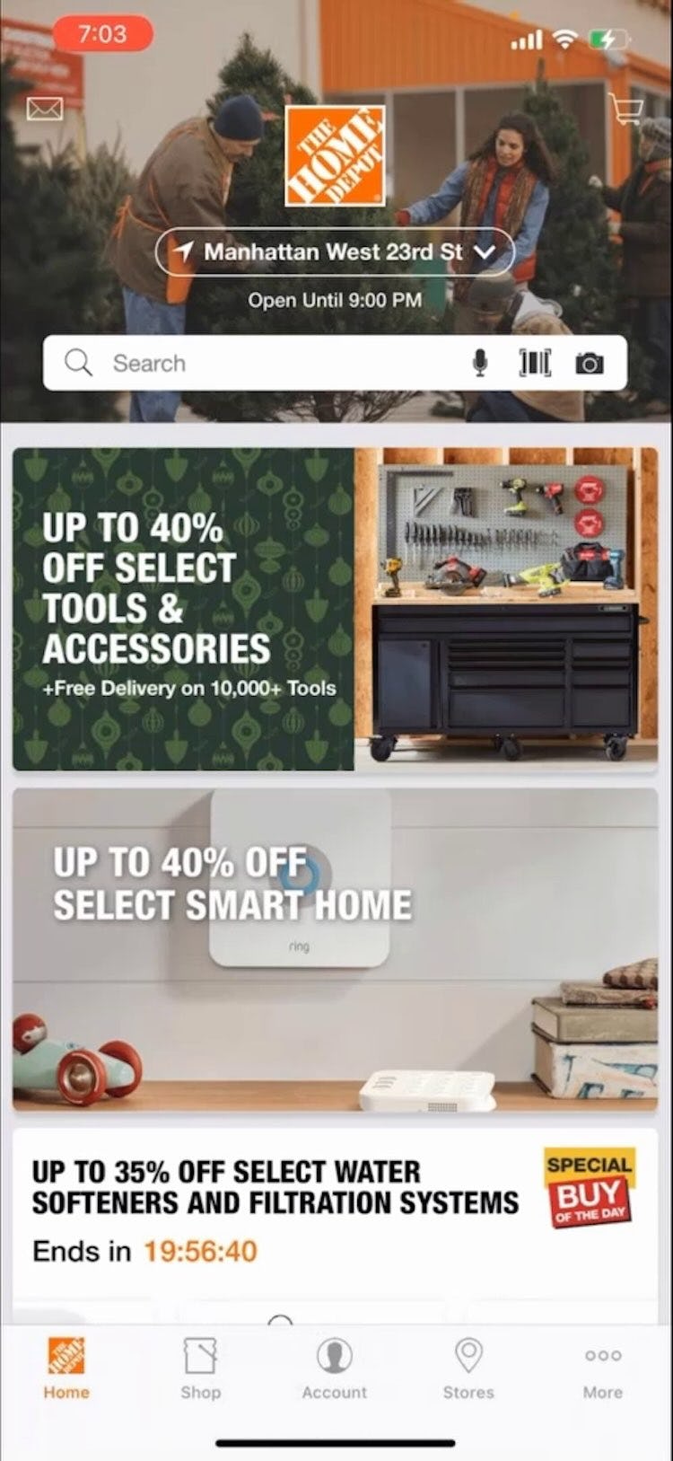
I feel my first reaction to this homepage is that it is a bit overwhelming. There are a lot of different things going on. They’re promoting various sales…so again, very confusing. Mobile homepages dominated by ads can also confuse users, such as this participant using the Home Depot app for the first time.
During testing, overly flashy ads in a prime content location on the homepage (particularly in the upper part of the page) were often met with negative reactions from users — and pop-up banners and overlays were met with even greater disdain.
Meanwhile, our mobile testing revealed that homepage ads could cause even more — and more severe issues — such as reducing the size of the viewport, making the homepage feel overwhelmingly cluttered, and causing interaction difficulties.
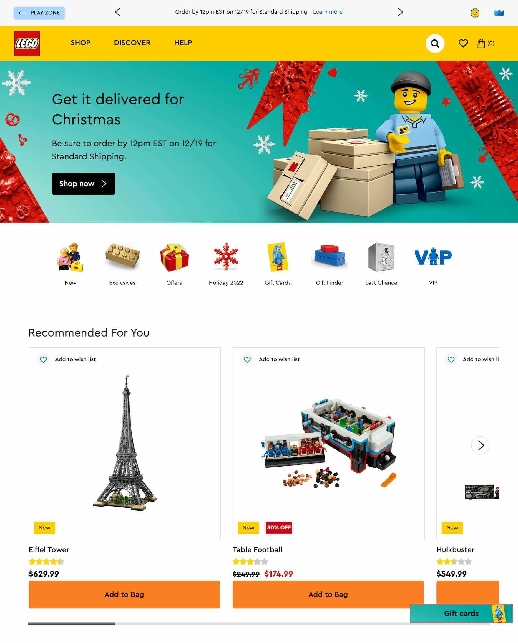
LEGO avoids ads in prime areas on the homepage, allowing users to focus on product finding.
Therefore, for both desktop and mobile, it’s critical to be particularly mindful of the size, placement, aesthetics, and integration of the ads within the overall homepage design.
In particular, avoid placing ads and any ad-looking content in prime content locations on the homepage and avoid pop-up banners or dialog overlays.
On mobile homepages, ads shouldn’t be overly prominent or visually distracting.
7) 32% of Sites That Use Carousels Implement Them Incorrectly
Carousels are appreciated by some users for their large, attractive imagery, and autorotation helps expose a variety of content without taking up too much space.
Indeed, when implemented with care, carousels are a powerful way to promote features, offers, and popular product types.
Yet, carousels can cause more harm than good if serious usability issues aren’t addressed.
In particular, carousel slides shouldn’t rotate too quickly on desktop — for instance, slides with just a header (and few tags and labels) should rotate after 5–7 seconds, while more text-heavy slides may need to be static for as much as 10 seconds.
On mobile sites, carousel slides shouldn’t autorotate at all (due to the lack of hover).
Likewise, it’s important to pause the slides on mouse hover so users don’t click just as a carousel slide is changing — causing the wrong page to load.
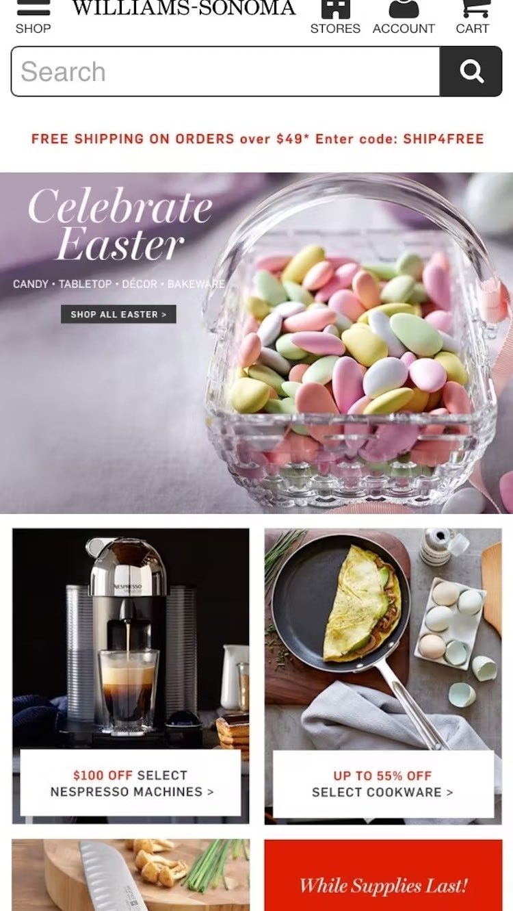
A generally better-performing alternative to carousels is simply displaying the slides as dedicated sections at the homepage, as seen here at Williams Sonoma.
Alternatively, using static content sections scattered throughout the homepage in combination with featured categories was observed to perform well during testing.
This instead relies on users scrolling the homepage, a vastly simpler and more ingrained web interaction.
8) 51% of Sites Don’t Make It Clear Where Hit Areas in Visual Elements Lead

A border appeared when users clicked an element at Hayneedle, making it appear as though the whole area were one link. In reality, the Add to Cart link added the item to the cart whereas clicking anywhere else within the border led to the item’s product page.
Participants in testing were observed to hesitate when multiple items were enclosed in a single visual element.
This was due to the fact that it was unclear if the visual element was one large hit area leading to a single page or whether it contained multiple distinct hit areas leading to different pages.
Ambiguous hit areas can cause users to miss links to desired content or take unwanted detours — on both desktop and mobile sites.

Wayfair makes it clear that both the title and thumbnail of subcategory links lead to the same place by using a unified hover area.
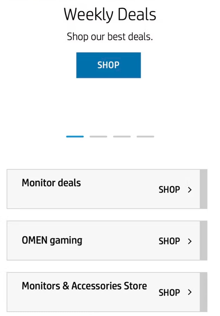
Hit areas are crystal clear on HP’s mobile homepage, where the use of borders, background colors, and arrows help users to instantly discern them.
To address the issue of ambiguous hit areas on desktop, make it clear whether a visual element leads to a single location or multiple different locations by leveraging hover effects as well as styling (for instance, by using borders, separators, arrows or other indicators, or background colors to clearly delineate hit areas).
Meanwhile, on mobile it’s crucial to always make it clear what elements are links — by making each visual element a single hit area that goes to one location — and to ensure that the hit area for links matches the size of the visual element.
9) 55% of Sites Are Missing or Have Hard-to-Interpret Subcategory Thumbnails
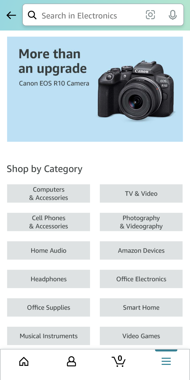
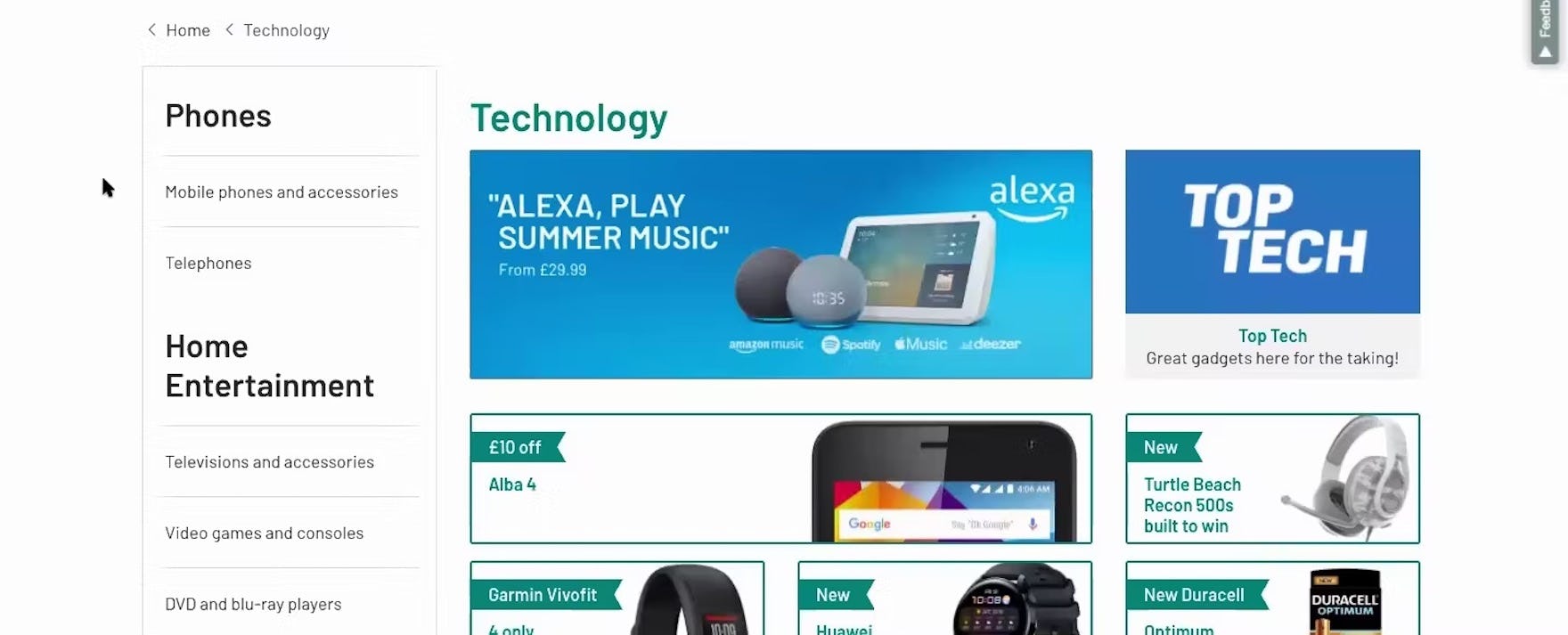
At Amazon, electronics subcategories are represented as text. This prevents users from visually scanning for their subcategory.
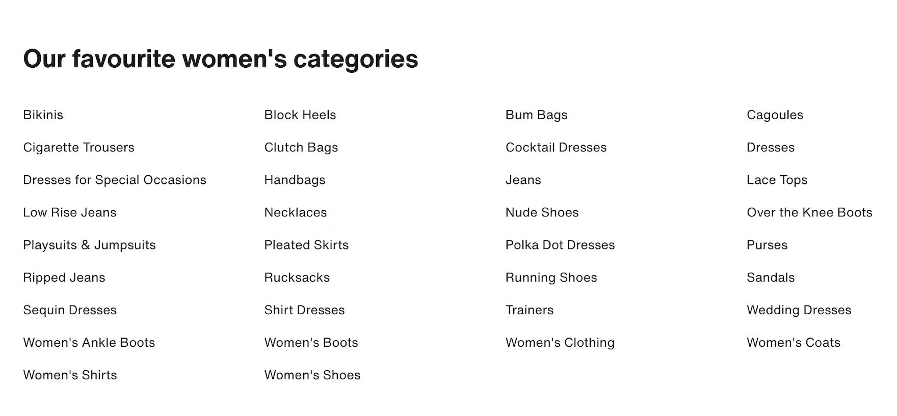
Having to scan a lot of text-only headings on this intermediary category page at Zalando will considerably slow down users looking for the most suitable navigation path.
During testing, when intermediary category and subcategory pages lacked thumbnails, or had thumbnails that were difficult to interpret, participants had more difficulty determining which subcategory to navigate to.
Indeed, users will hesitate more when evaluating and deciding among text-only subcategory links without an accompanying thumbnail.
In short, the purpose of the intermediary category page — as a jumping off point to explore subcategories or products — is hindered when users aren’t offered important visual guidance.
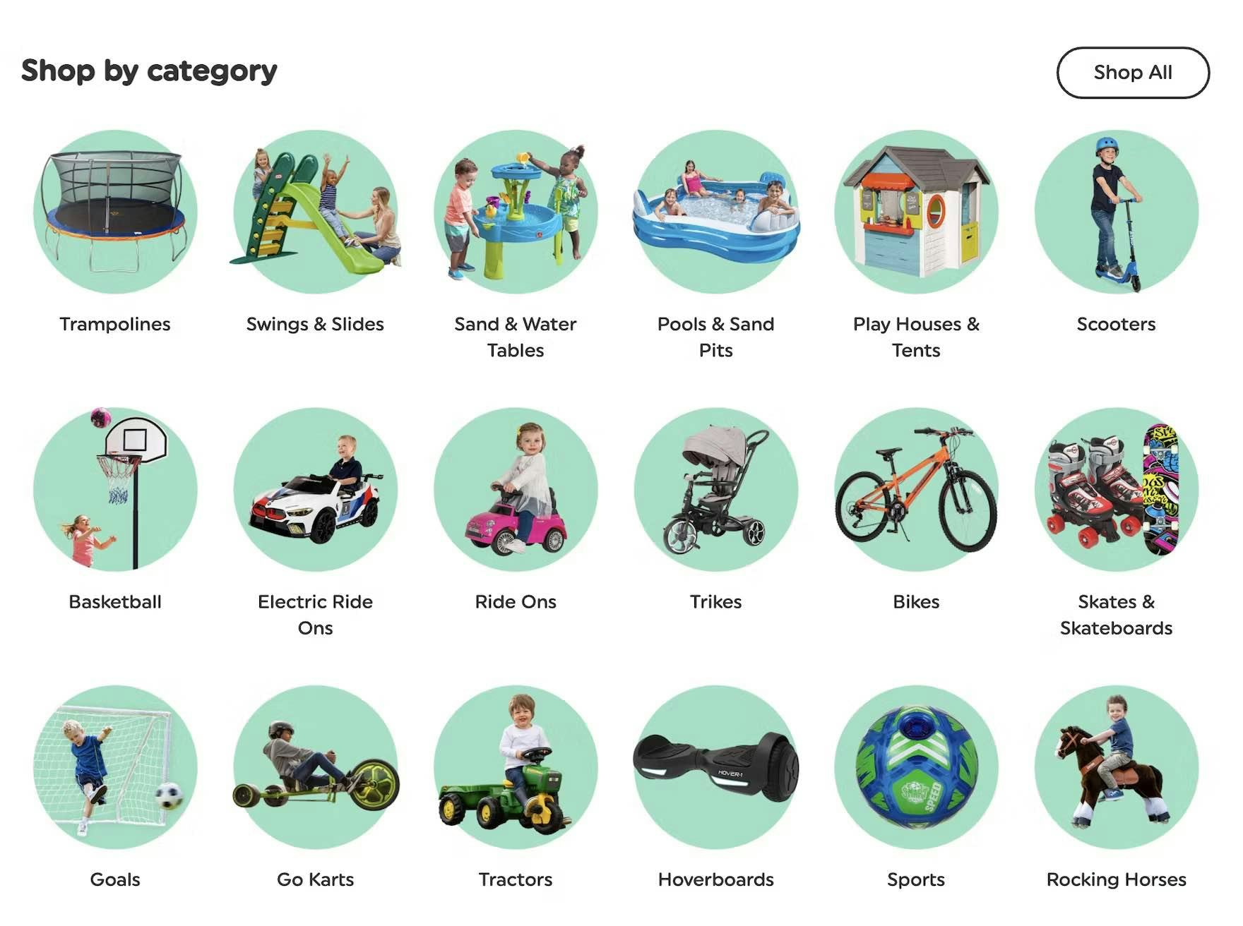
These thumbnails on Smyth’s make it perfectly clear what product types are in each subcategory.
On the contrary, our testing showed that users more easily navigate subcategory links on intermediary category and subcategory pages that are accompanied by clear, representative thumbnails.
Therefore, clear subcategory thumbnails should always be provided on intermediary category pages on both desktop and mobile sites.
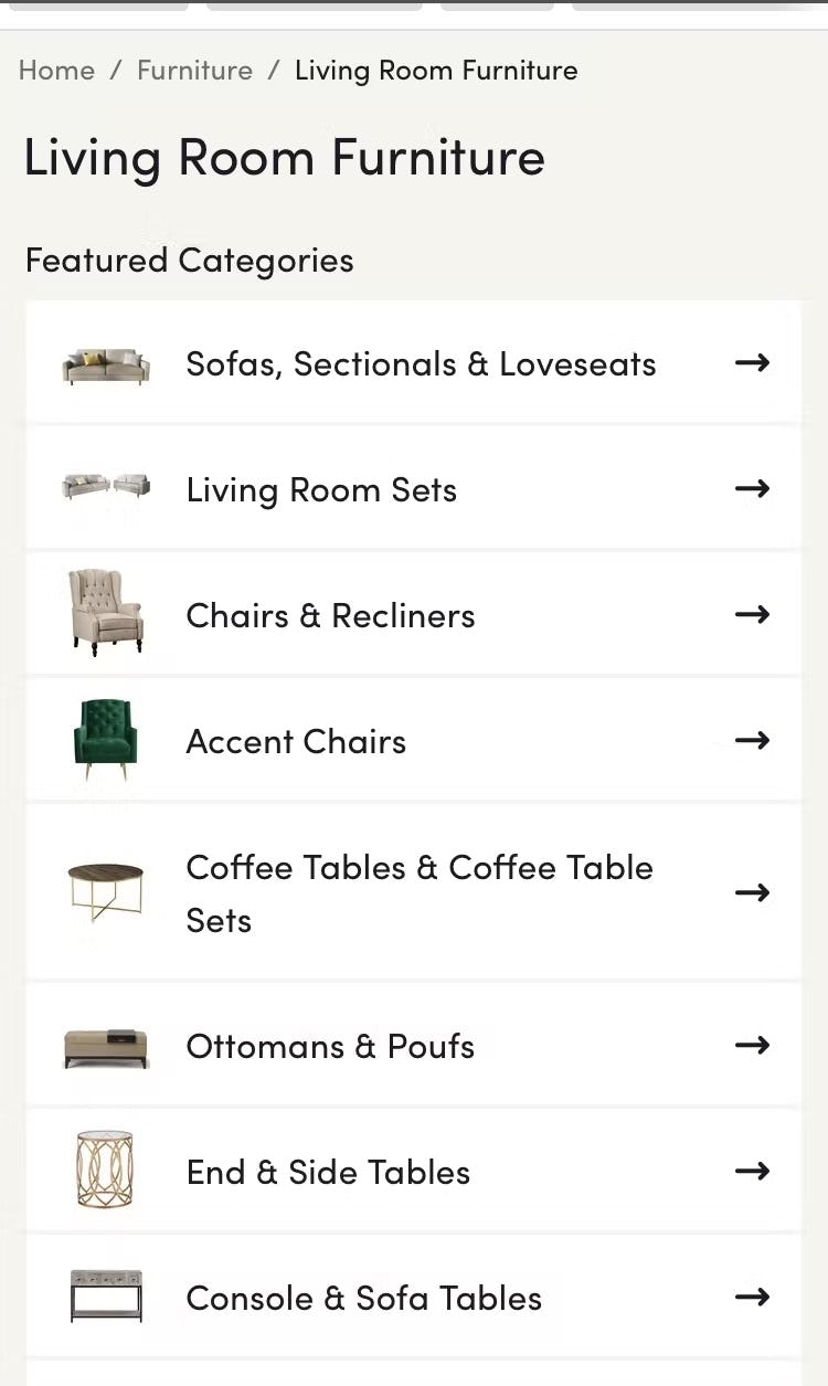
The thumbnails on Wayfair’s intermediary category page clearly represent subcategories rather than specific products. The minimized size of the subcategory thumbnails reinforces their purpose as “visual labels” that enhance information scent, as they are only large enough to recognize without needing the level of detail necessary for product listings.
Additionally, ensure the subcategory thumbnails are easy to interpret at a glance, and make it clear what product type they represent.
10) 76% of Sites Don’t Feature Subcategories as the Primary Content on Intermediary Category Pages
“I have a lot of offers, but I don’t see the categories anymore. I would expect that if I opened the page, I would see more stuff.” When subcategories aren’t easy to locate on intermediary category pages, such as on this one at Argos (UK), users have to work harder to find a way to access a relevant subcategory.

At Nike, the intermediary category page for “Men” featured a very prominent featured link that overshadowed the text-only subcategory links above it.
Some intermediary category pages performed poorly in testing because they prioritized promotional or auxiliary content above subcategory navigation.
Such implementations distract users from their original task of navigating to an appropriate subcategory and make it more difficult for users to find and choose among subsequent navigation paths.
Furthermore, without clear access to subcategories, some users will have difficulty identifying that they are on intermediary category pages at all.

“So right off the bat I want a ‘Dining Room Set’. I think that’ll save me money.” This participant at Bob’s Discount Furniture using iOS was browsing the “Dining Room” intermediate category page and was pleased to spot a link to “Dining Room Sets” right away, as he preferred to shop for a table and chairs as a set in order to save money.
Intermediary category pages perform best when they prioritize subcategory navigation, locating subcategories front and center at the top of the page.
11) 70% of Sites Don’t Provide Direct Access to Products Featured in Inspirational Imagery
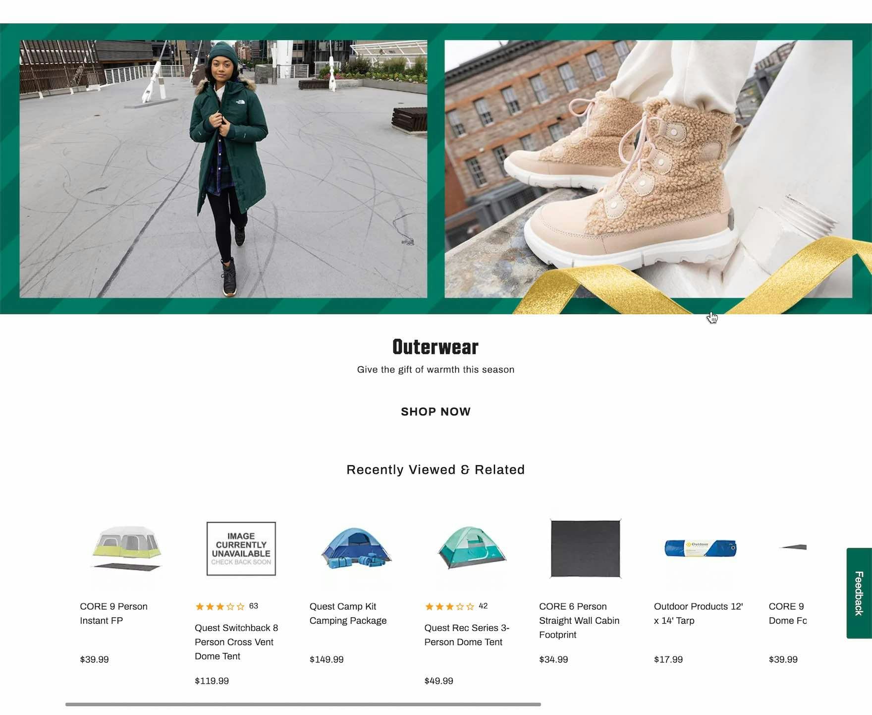
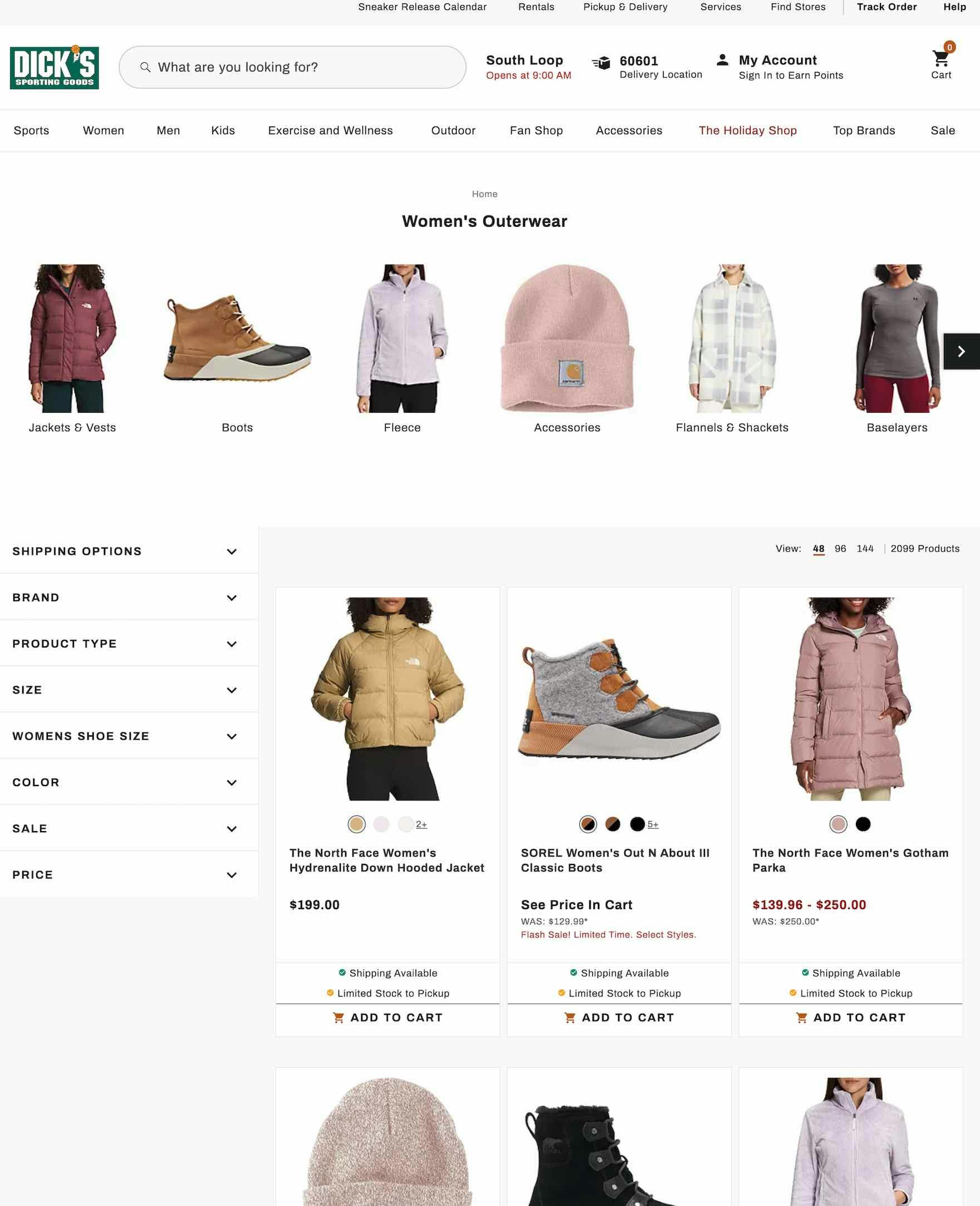
At Dick’s, the intermediary category page prominently featured products in “Lifestyle” images (first image). Yet clicking on a “Lifestyle” image sent users to a general product list — and the featured products weren’t within the first 10 items in the list (second image). Users can be inspired to explore featured products on intermediary category pages but their ability to find (and purchase) the items is hindered if they’re not immediately available.
During testing, participants on intermediary category pages often found it baffling when a site didn’t provide direct access to products featured in inspirational images.
As one participant said, “I want this — what do I do? I want this one”, — as he struggled to find a product featured on an intermediary category page.
If it’s difficult to access products featured in inspirational imagery on intermediary category pages, users can quickly lose patience and may be unwilling to put in the effort required to locate the desired items manually.
On mobile sites, the consequences of not linking to products included in inspirational imagery can be even more problematic because the effort required to hunt down the desired featured product is increased.
The fact that the featured products on the intermediary category page (first image) appear at the top of the linked product list (second image) on the Argos mobile site meant that users didn’t have to scroll far to find the relevant items.
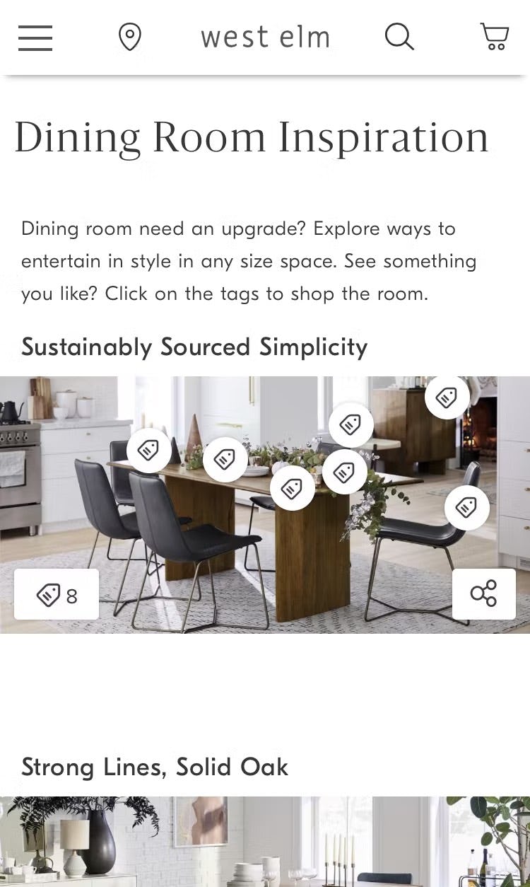
There is no hover functionality on mobile, so on West Elm’s mobile site individual product tags appeared when the image was tapped. The persistent tag icon in the lower-left corner indicated that there were 8 products linked to from the image — tapping a tag took users to the product details page for the depicted item.
Therefore, provide direct access to all the products depicted in inspirational images on intermediary category pages by linking to a page or overlay specifically listing the depicted products.
Also, to properly set expectations for what will happen upon clicking, links to inspirational images should feature explicit messaging or iconography to indicate that the resulting page will contain only those products depicted in the original image (and not lead to a broader product-listing page).
Alternatively, have links to curated pages, or directly link to individual products.
Improving Ecommerce Category Navigation & Homepage UX
Our 2025 Homepage & Category Navigation benchmark reveals that most sites have a “mediocre” to “poor” Homepage and Category performance — showing that most sites have not substantially improved when it comes to their UX performance.
Clearly, much work remains to be done to improve the performance of the average site’s homepage and category navigation UX.
Implementing the 11 best practices described in this article will go a long way toward improving the average site’s performance to “decent” (or even “good”):
- Provide the full scope for links on mobile homepages (59% don’t)
- Divide categories and subcategories into manageable chunks (60% don’t)
- Highlight a user’s current scope in the main navigation (95% don’t)
- Provide clickable headers in the main navigation (33% don’t)
- Provide a hover delay for the main navigation drop-down menu (61% don’t)
- Avoid overly prominent ads on the homepage (55% don’t)
- Correctly implement carousels (if provided) on the homepage (32% don’t)
- Style clickable interface elements clearly (51% don’t)
- Provide clear and representative subcategory thumbnails (55% don’t)
- Present subcategories as the primary content on intermediary category pages (76% don’t)
- Always provide direct access to products depicted in inspirational images (70% don’t)
This high-level analysis of the current state of ecommerce Homepage and Category Navigation UX focuses on only 11 of the 41 navigation UX best practices included in our full research catalog.
The other 30 best practices should also be reviewed to gain a complete understanding of ecommerce navigation and to identify site-specific issues not covered here.
For additional inspiration, consider exploring the 3,600+ Homepage and Category desktop and mobile Page Design Examples we’ve collected, as these showcase homepage and category navigation implementations at the leading US and European ecommerce sites and can be a good resource for navigational redesigns.
This article presents the research findings from just a few of the 700+ UX guidelines in Baymard – get full access to learn how to create a “State of the Art” ecommerce user experience.
If you want to know how your desktop site, mobile site, or app performs and compares, then learn more about getting Baymard to conduct a UX Audit of your site or app.