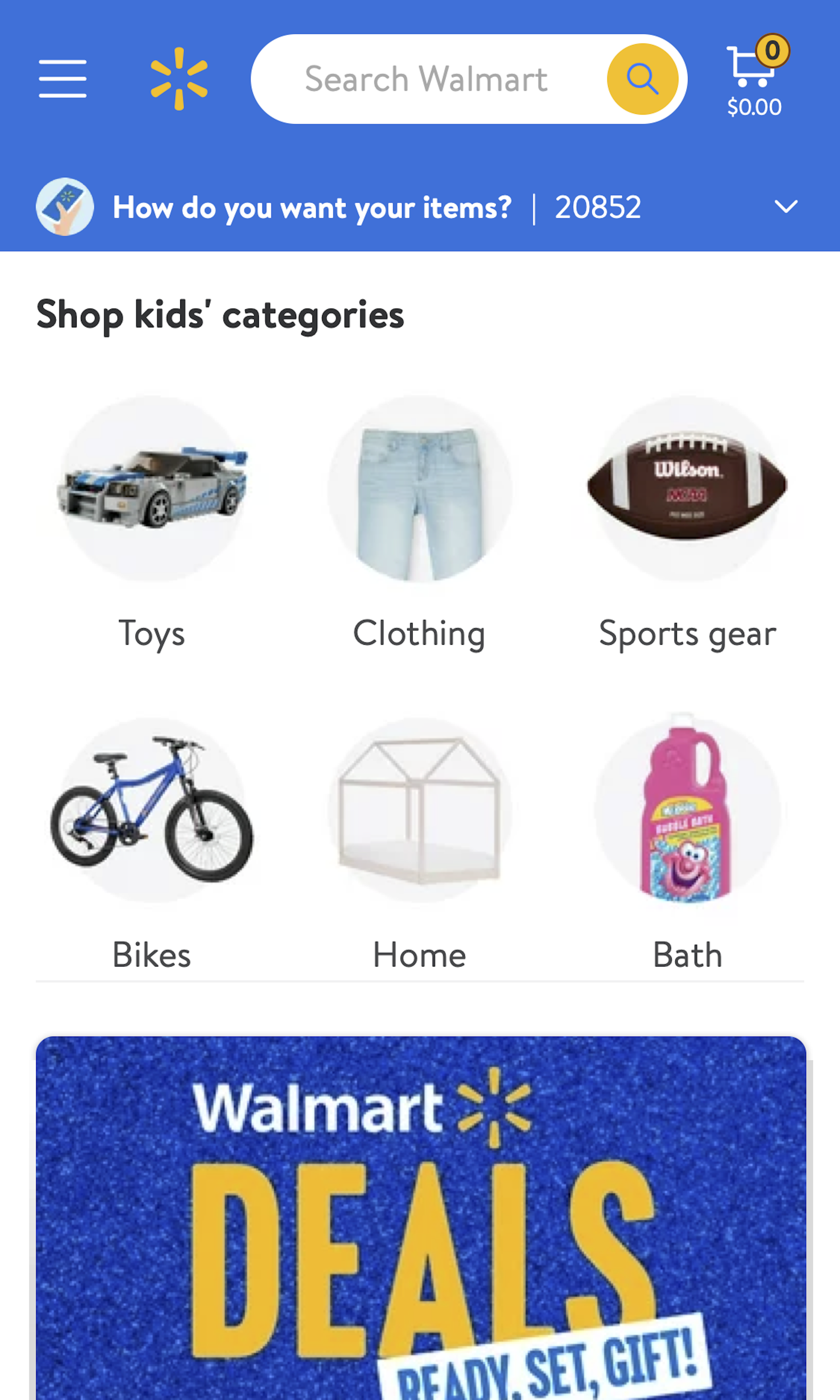
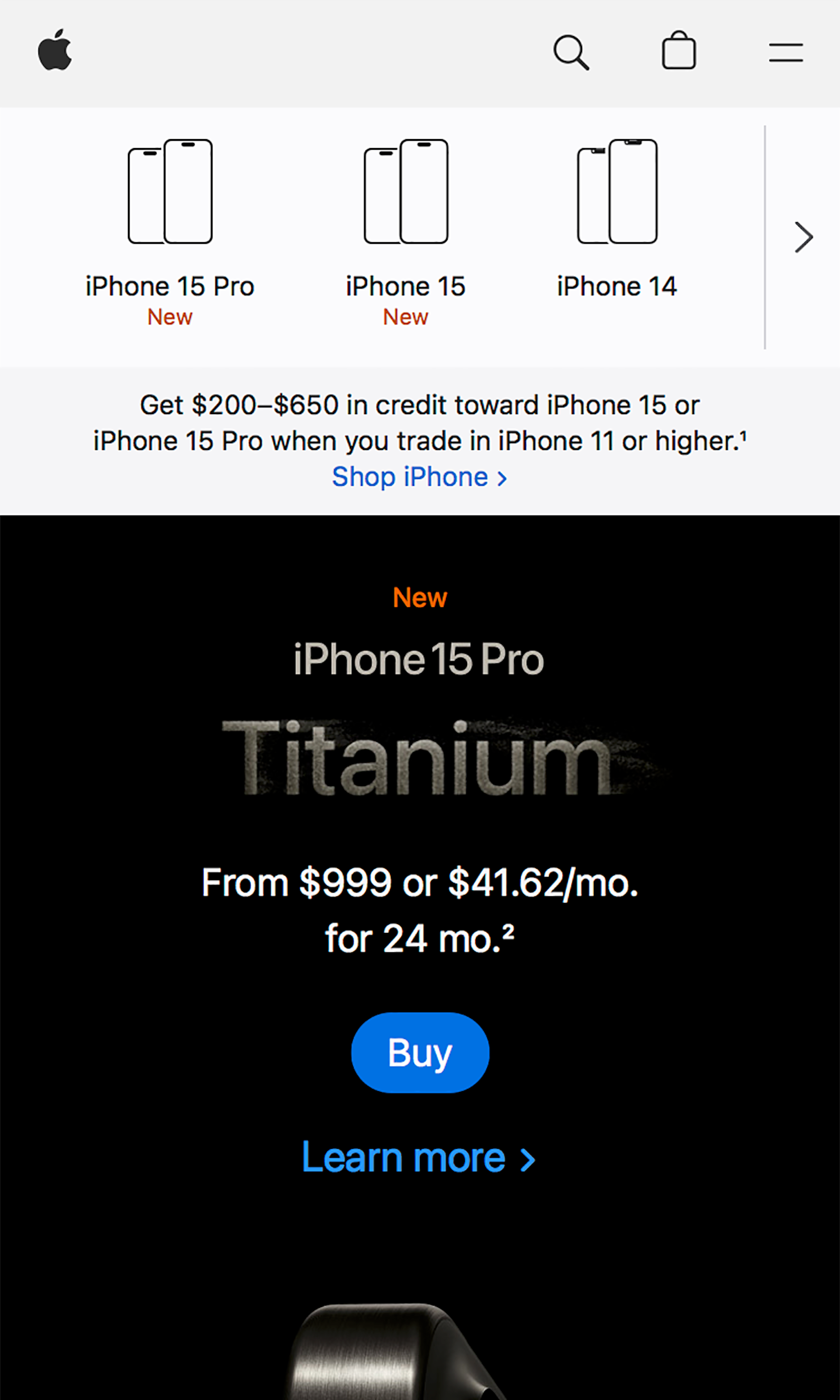
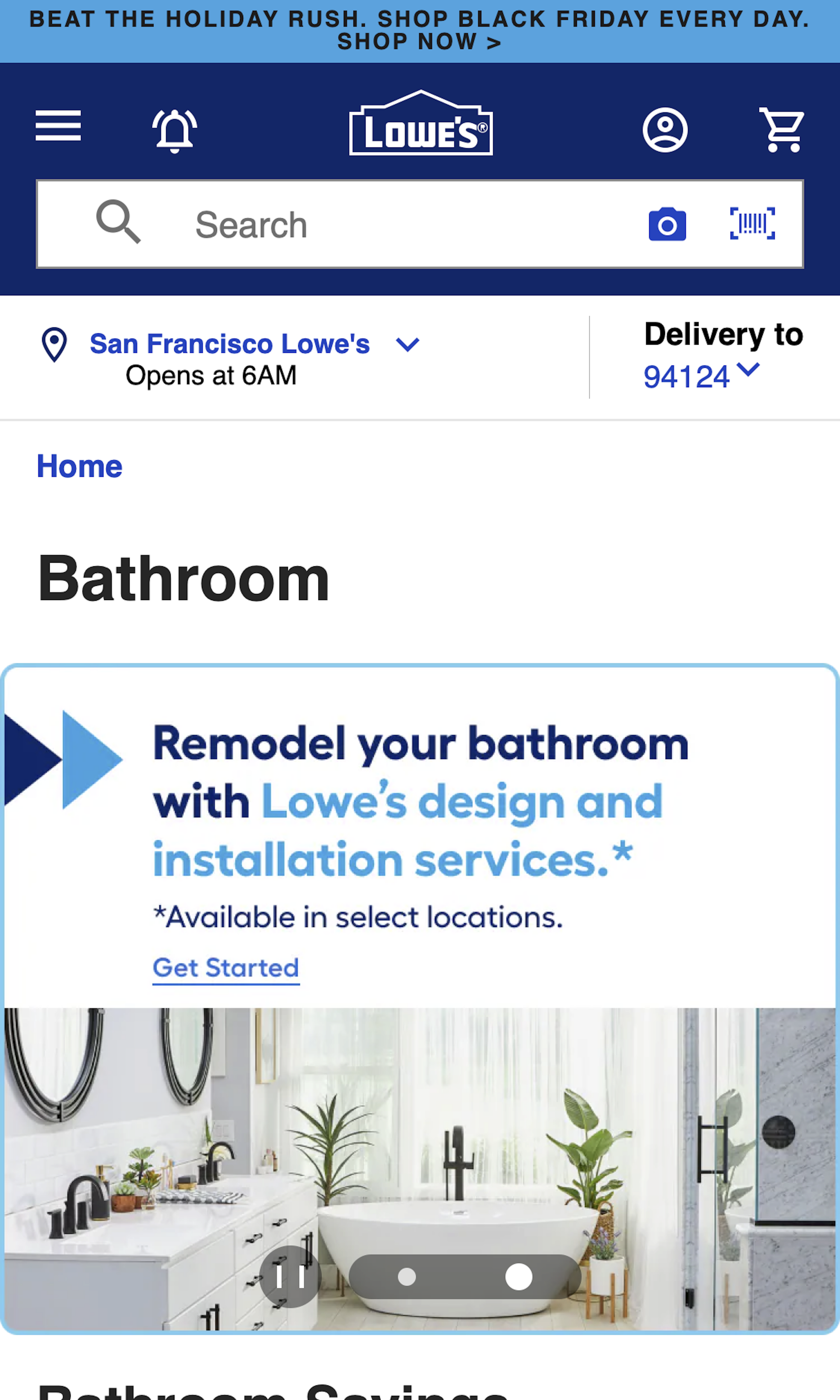
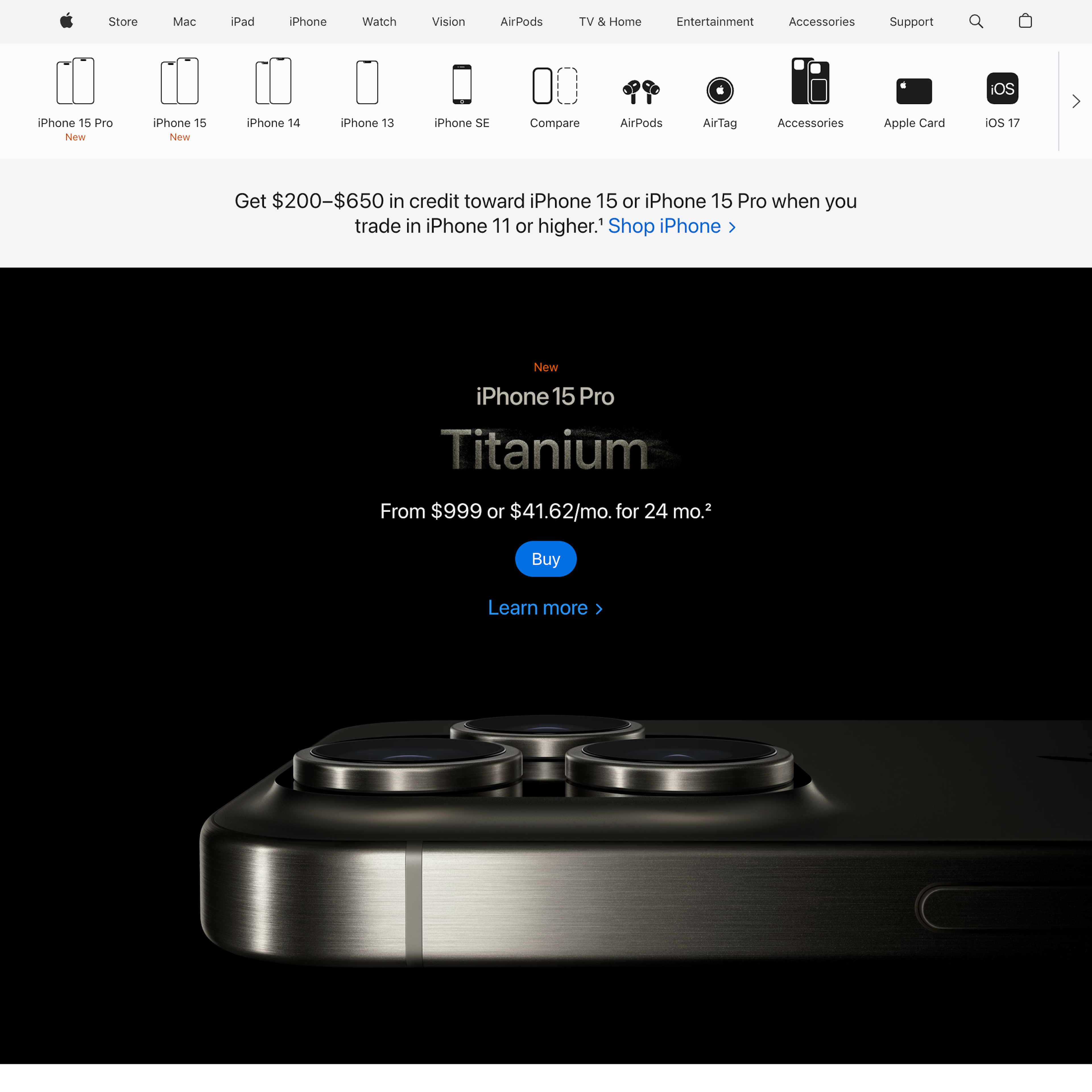
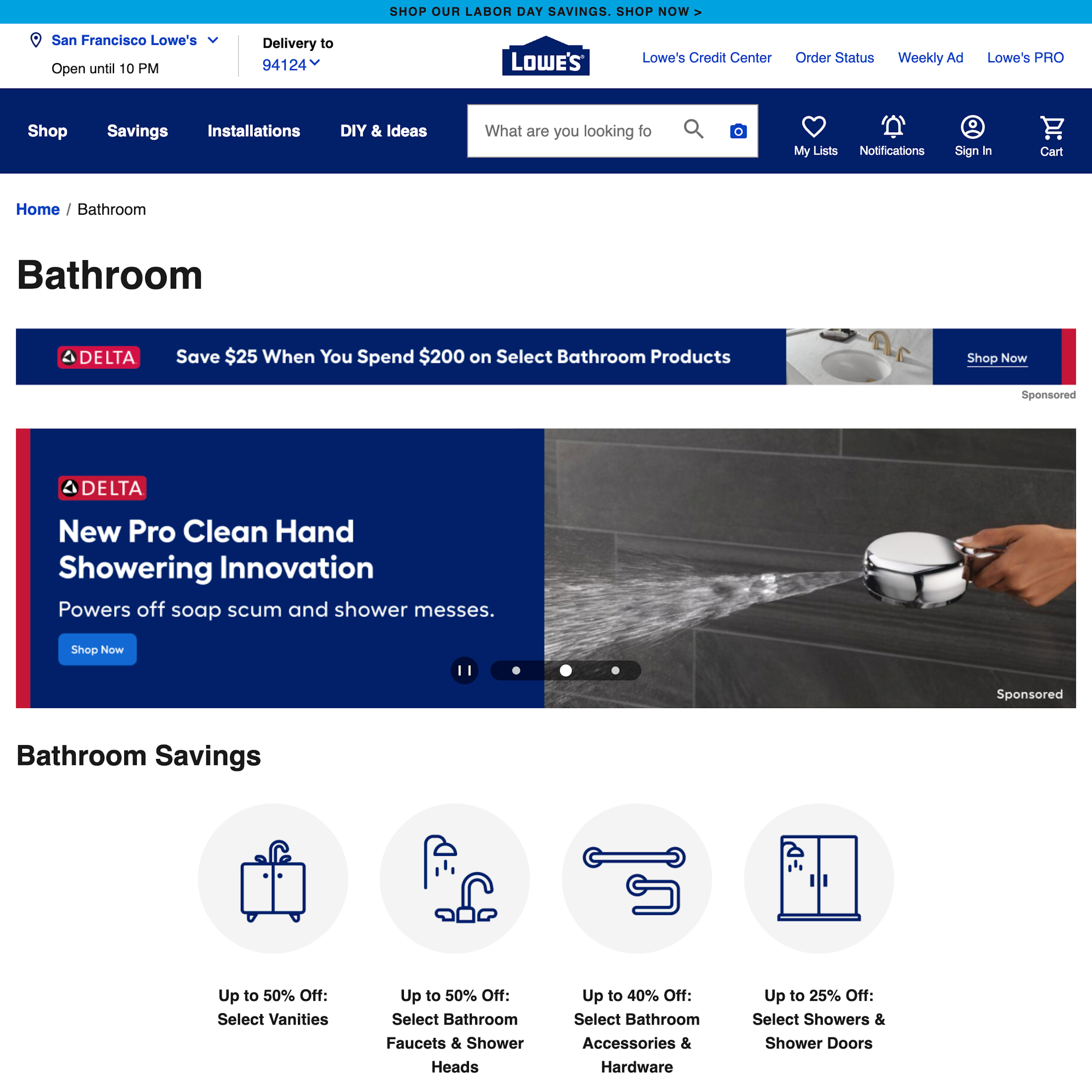
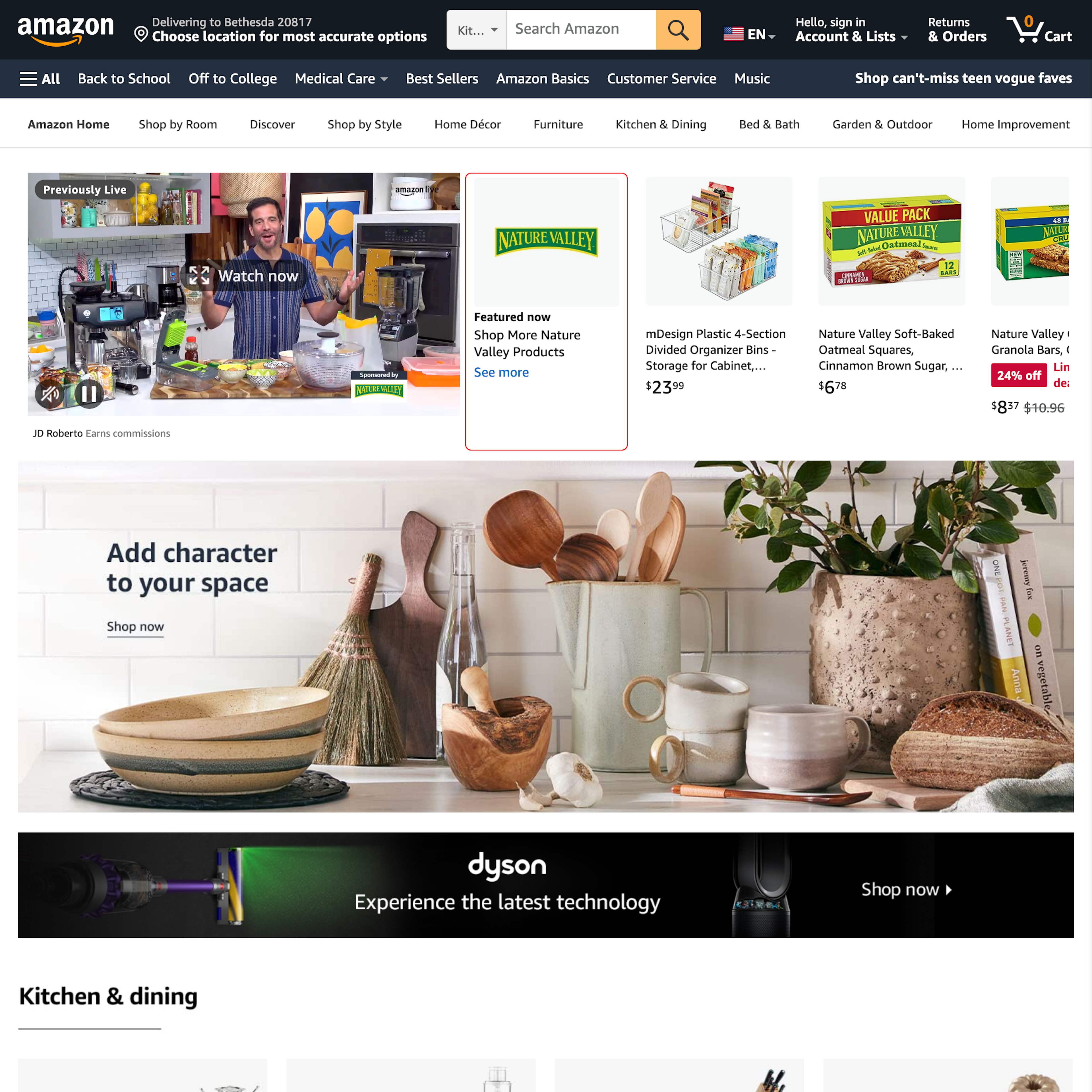
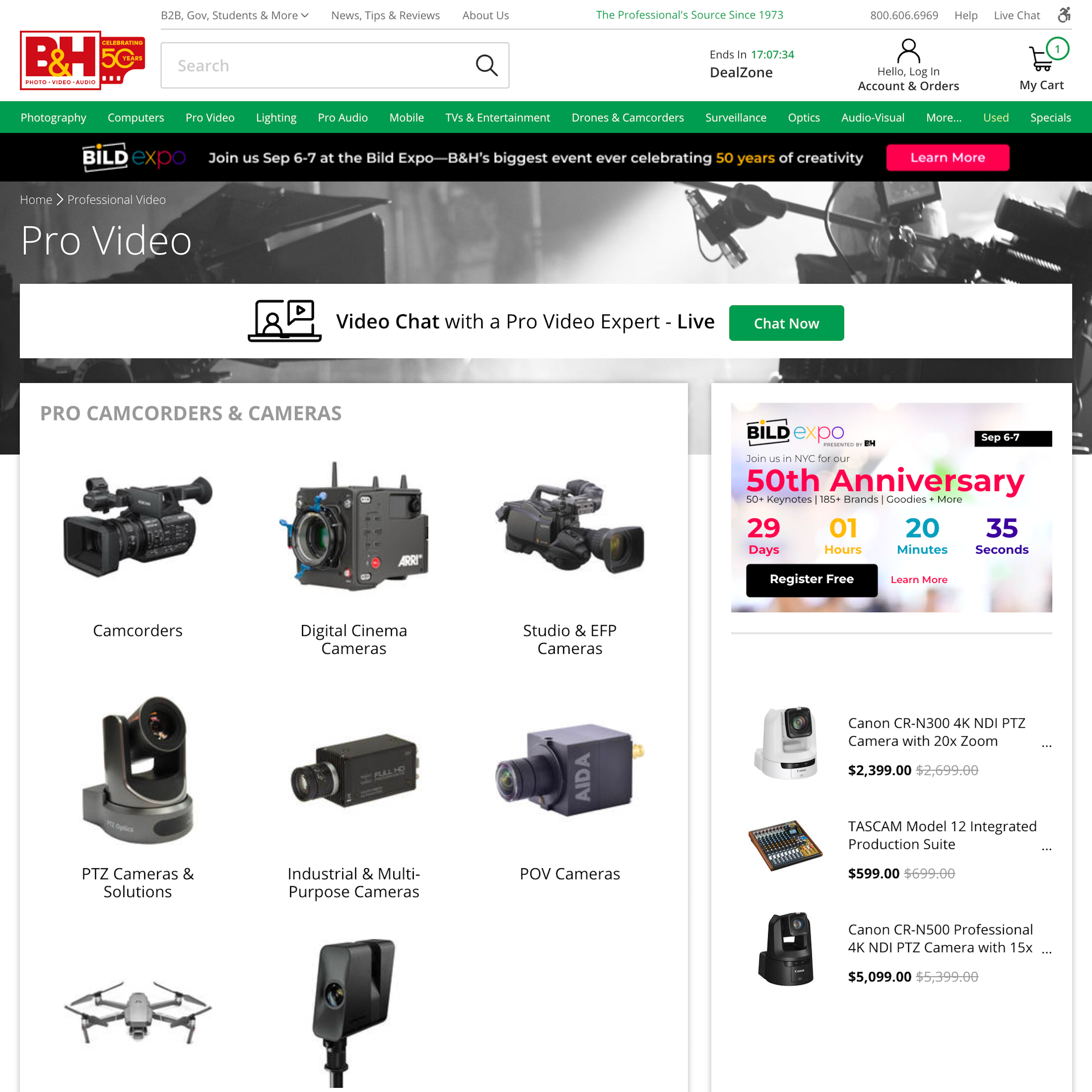
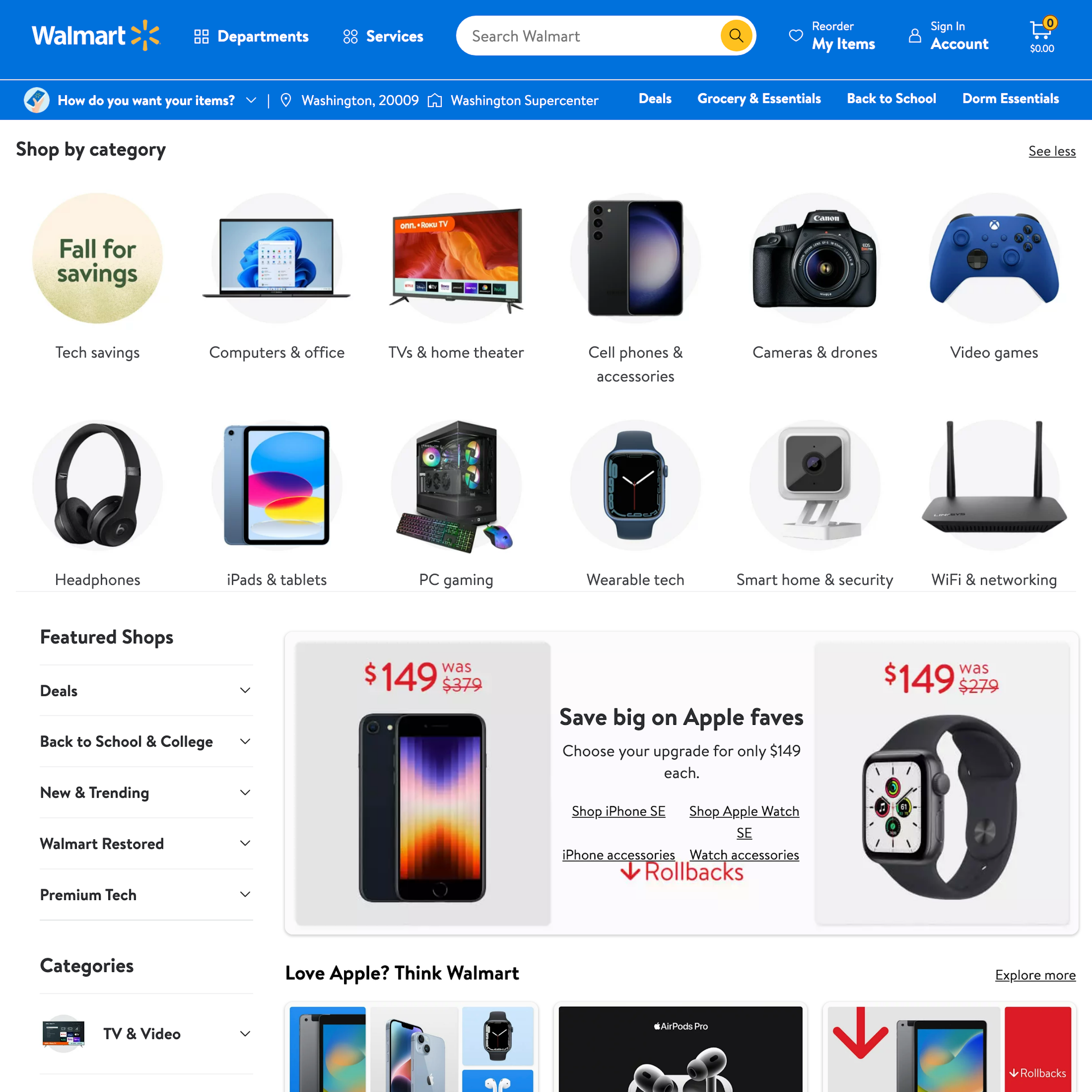
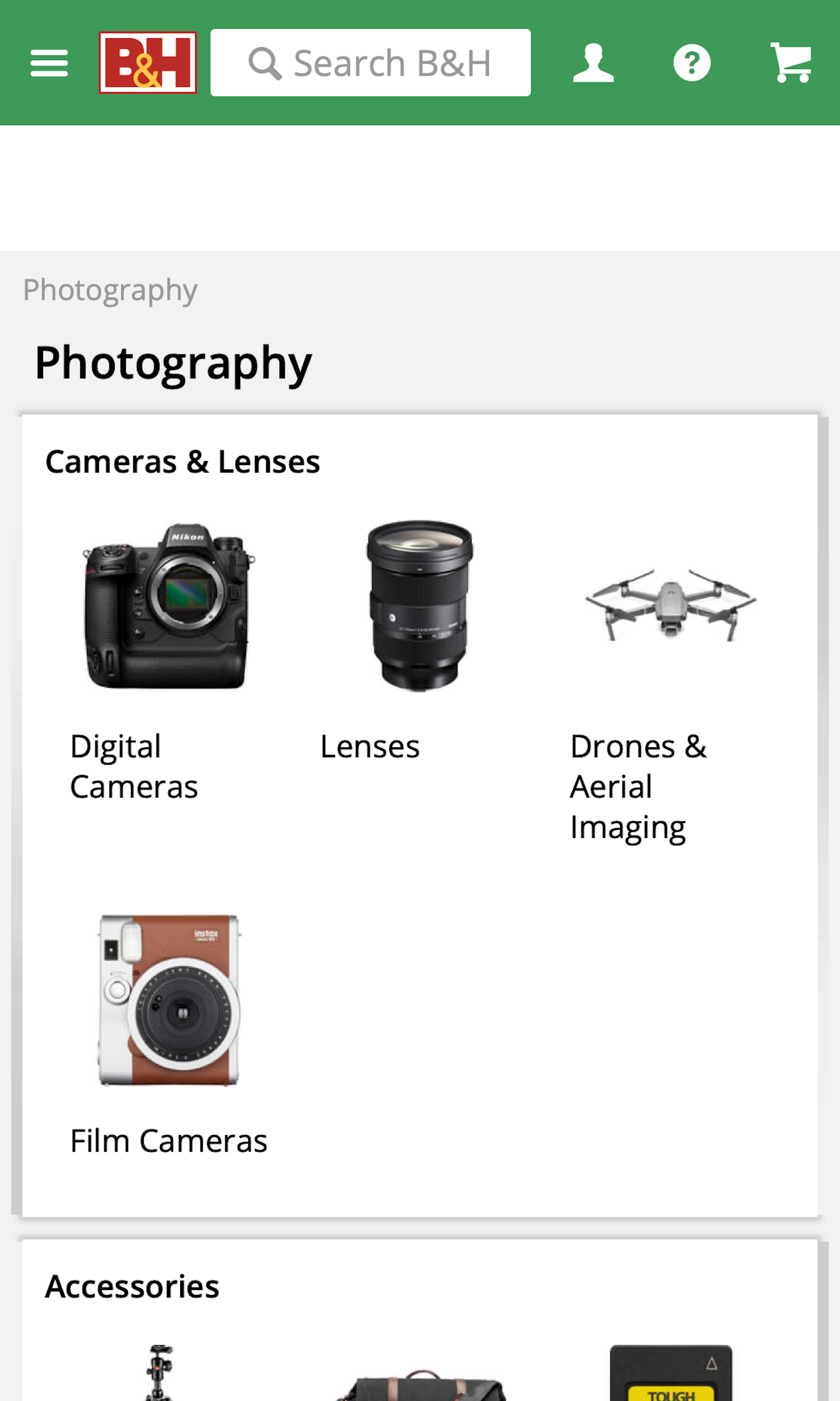
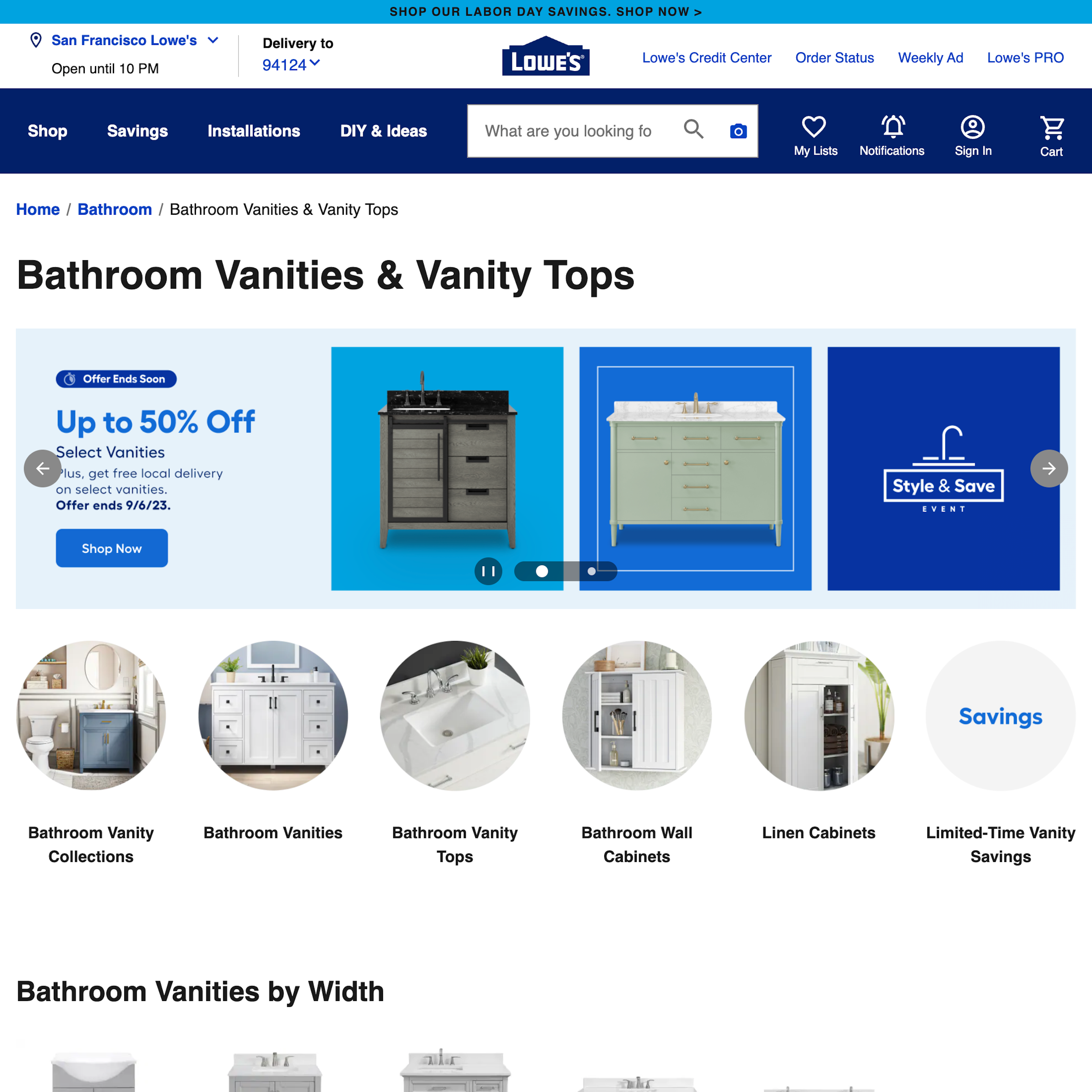
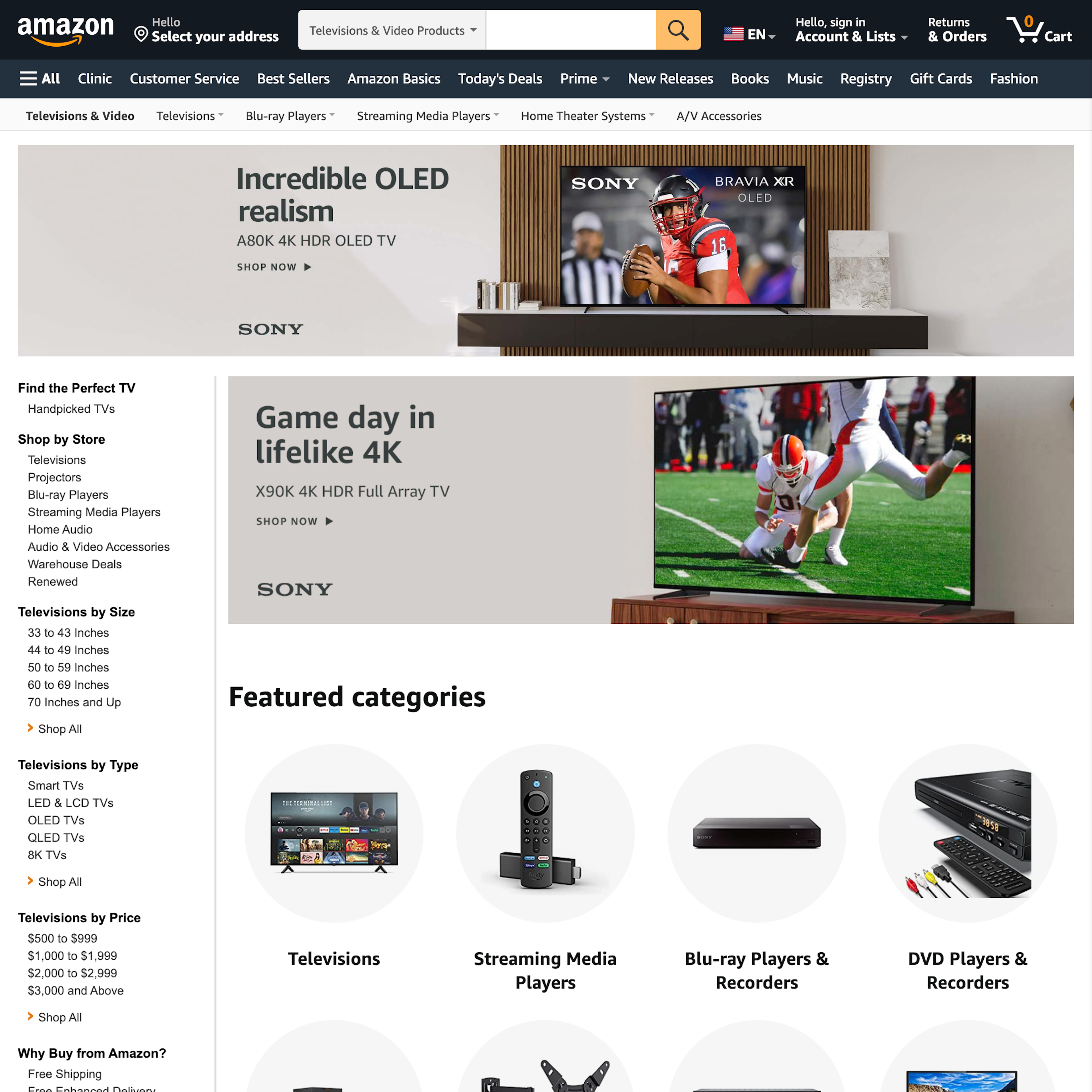
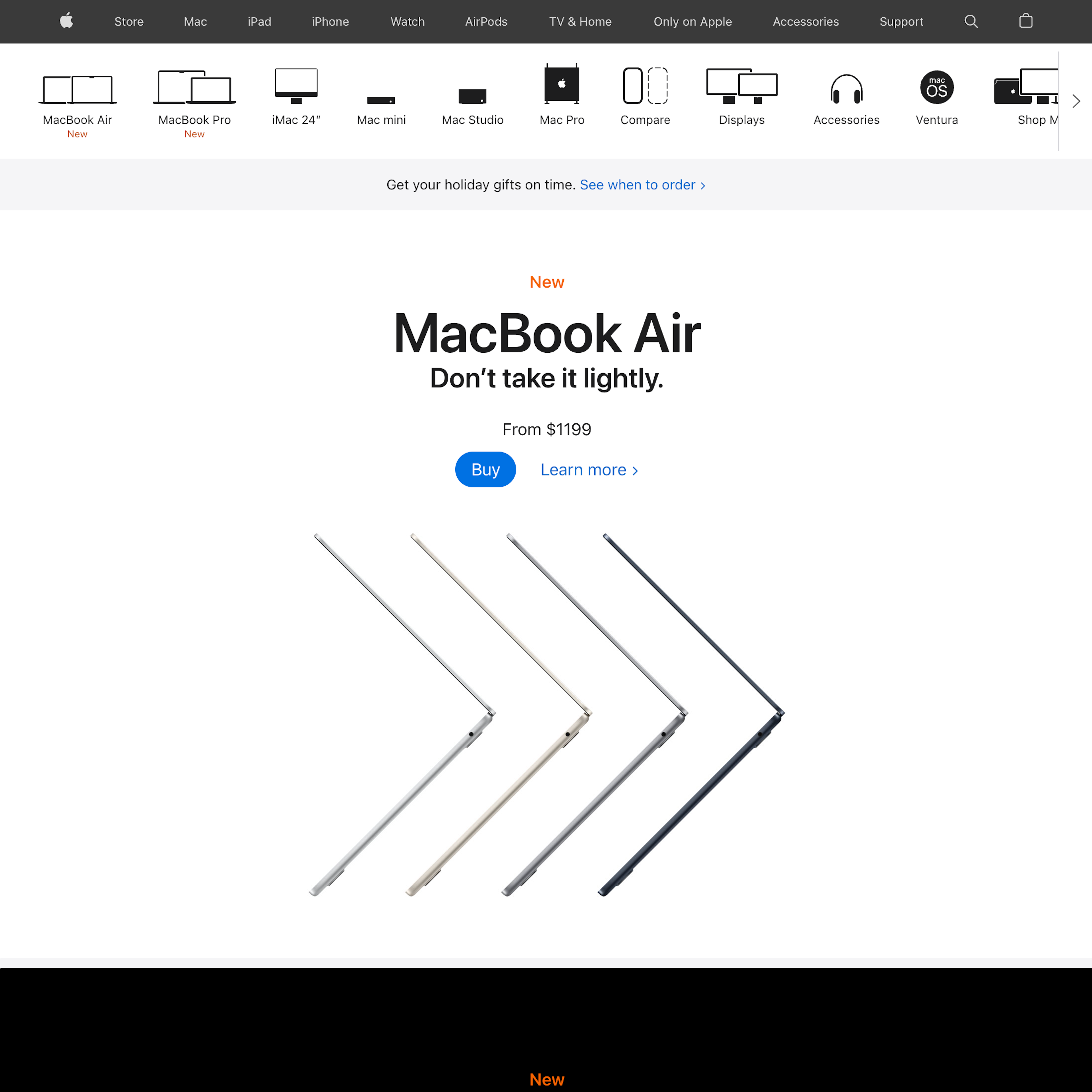
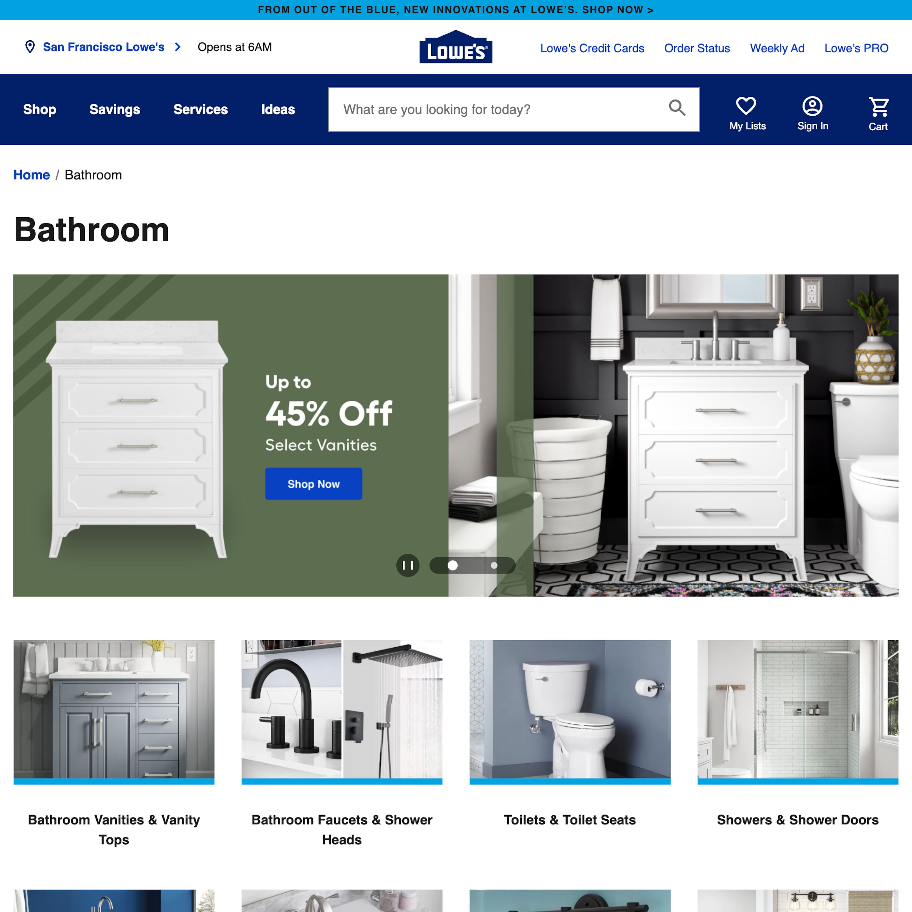
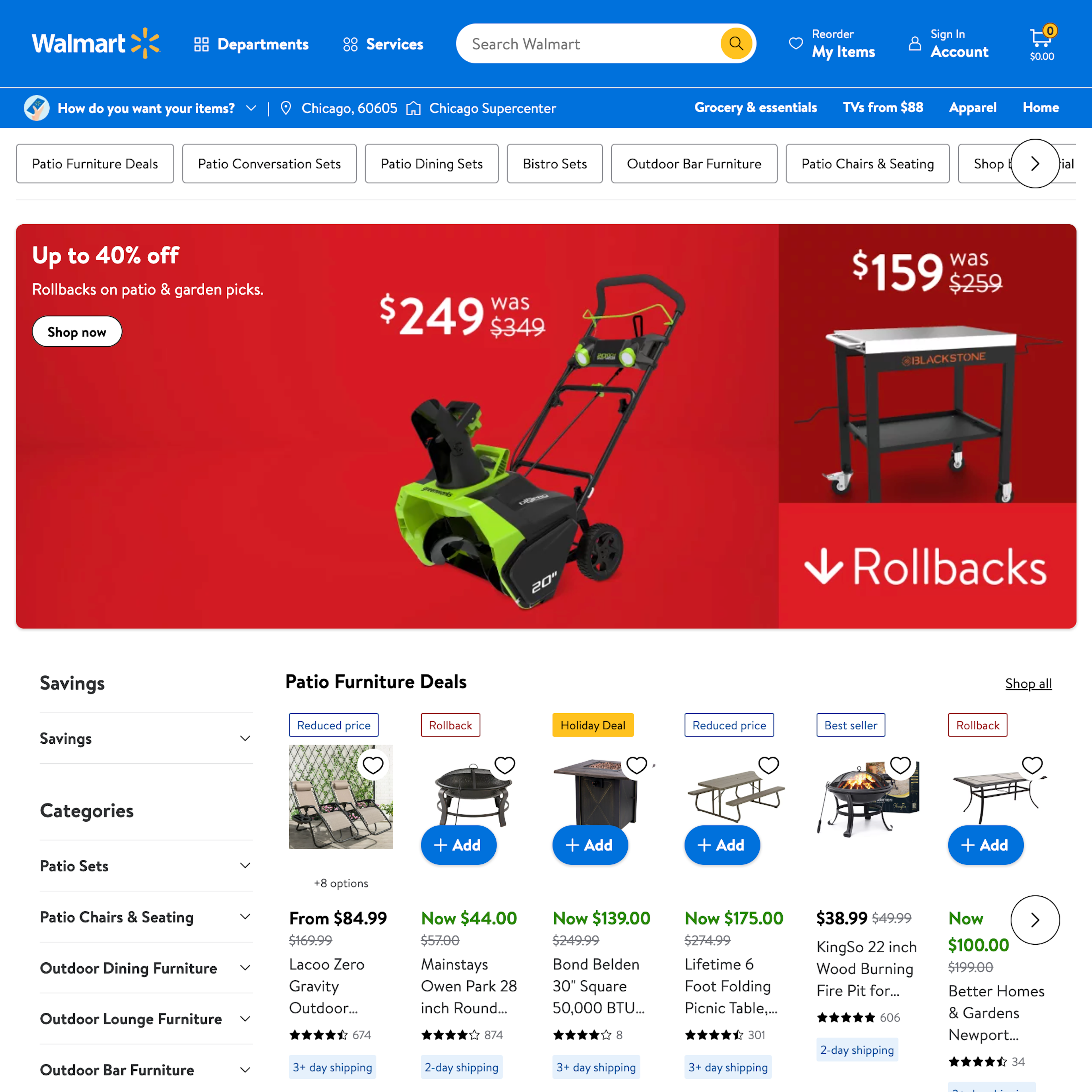
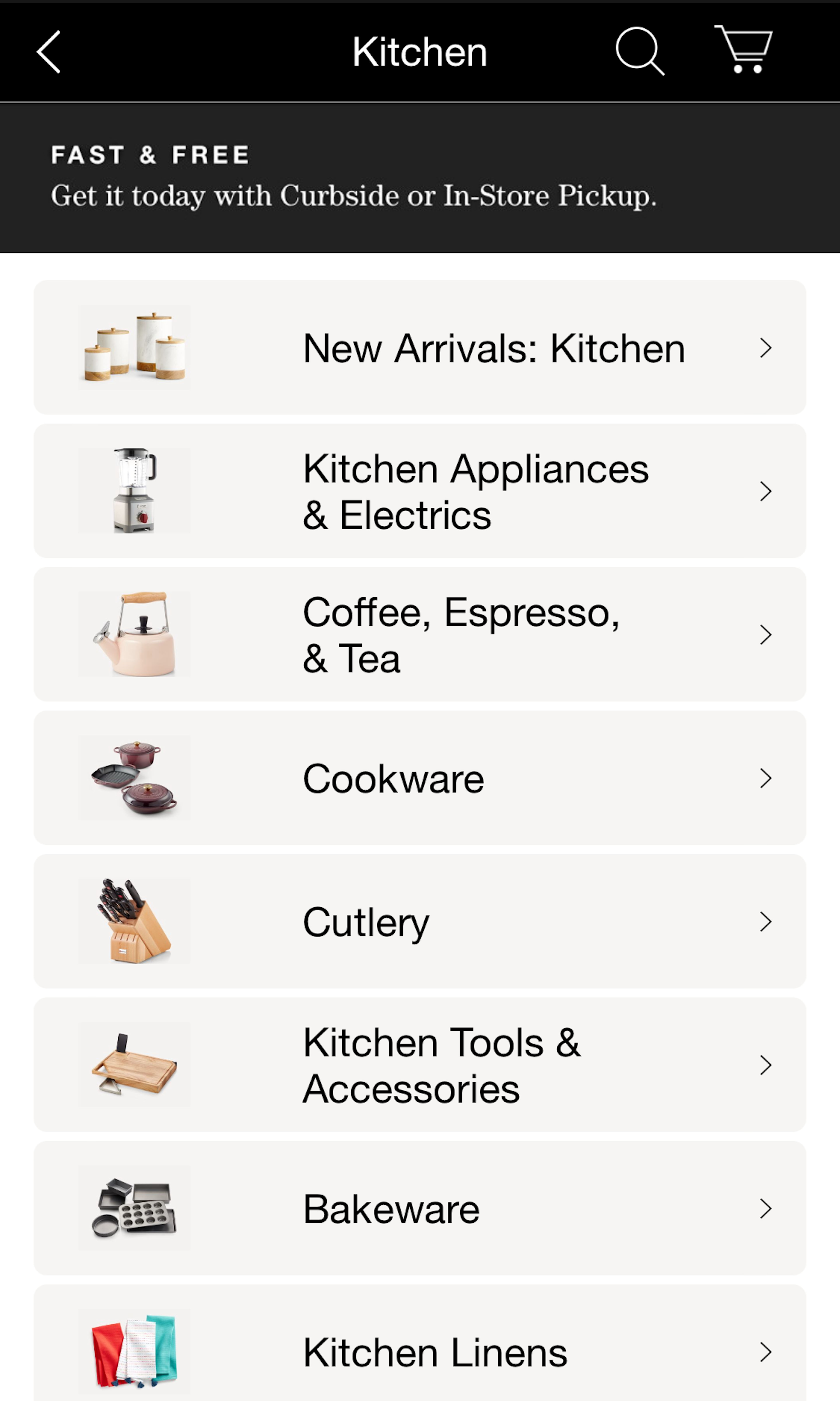
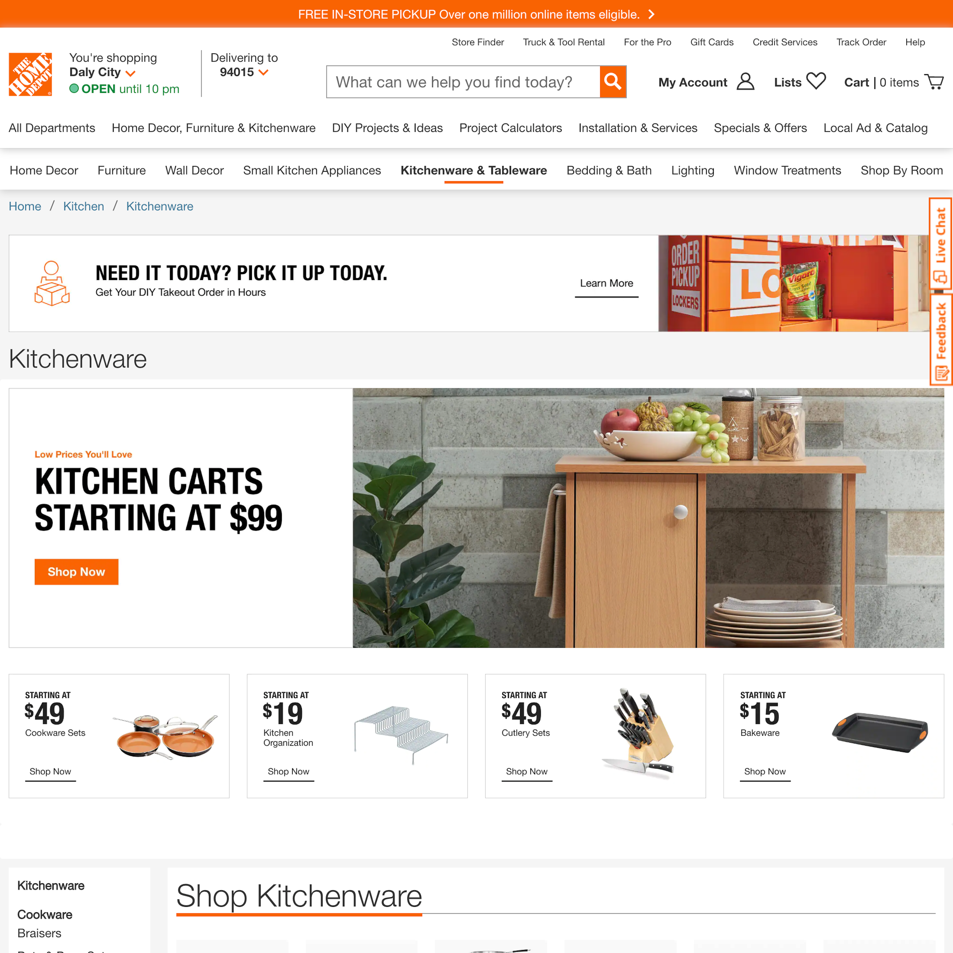
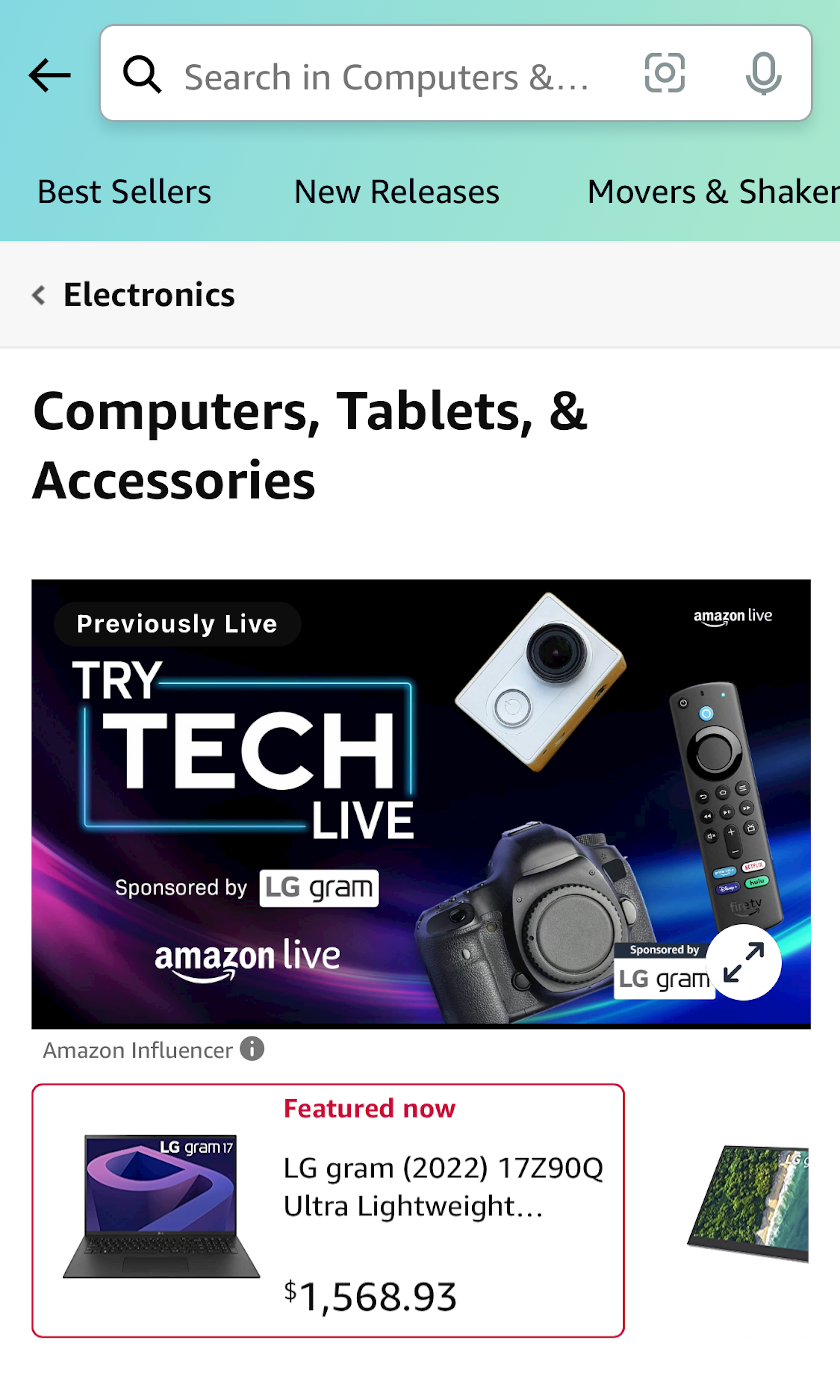
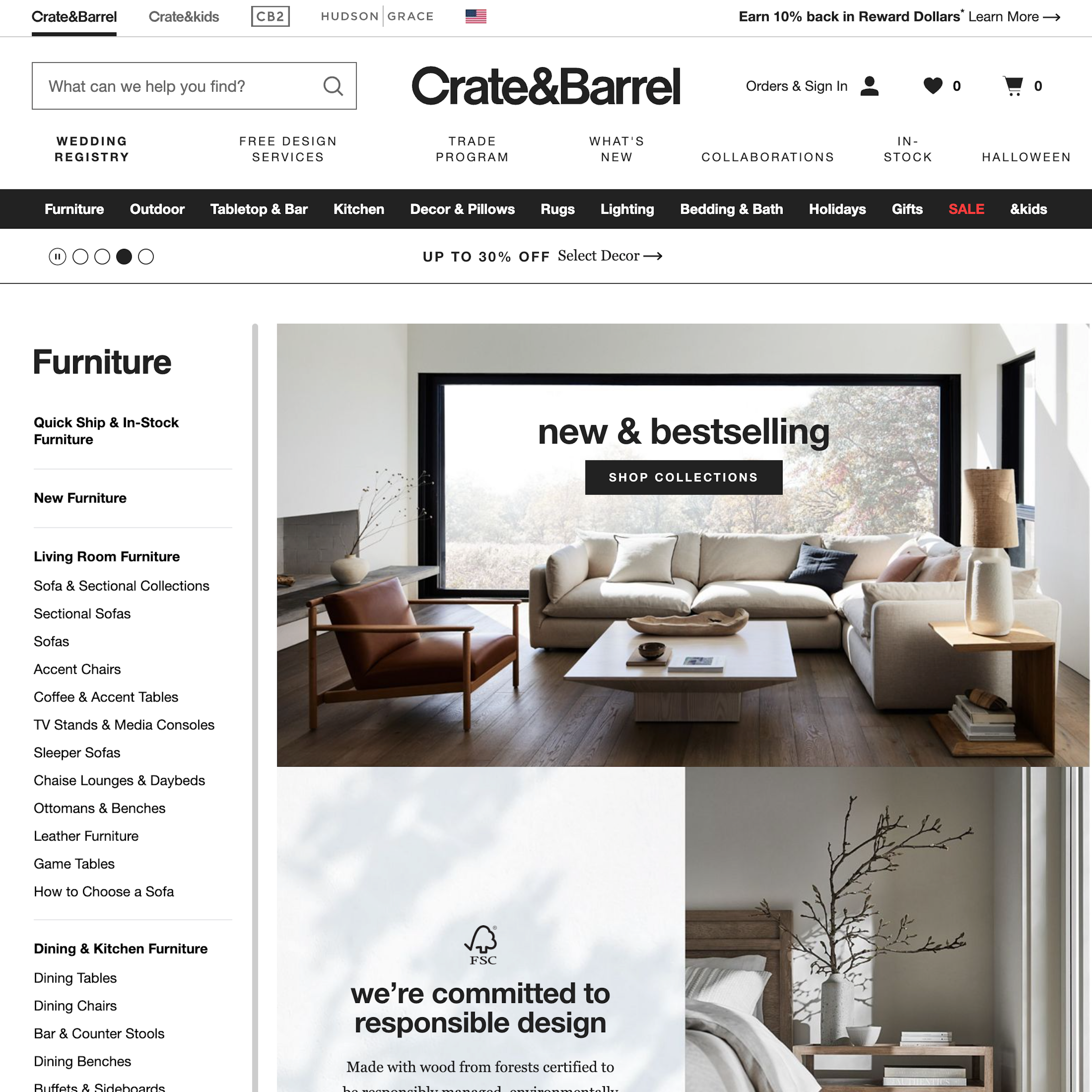
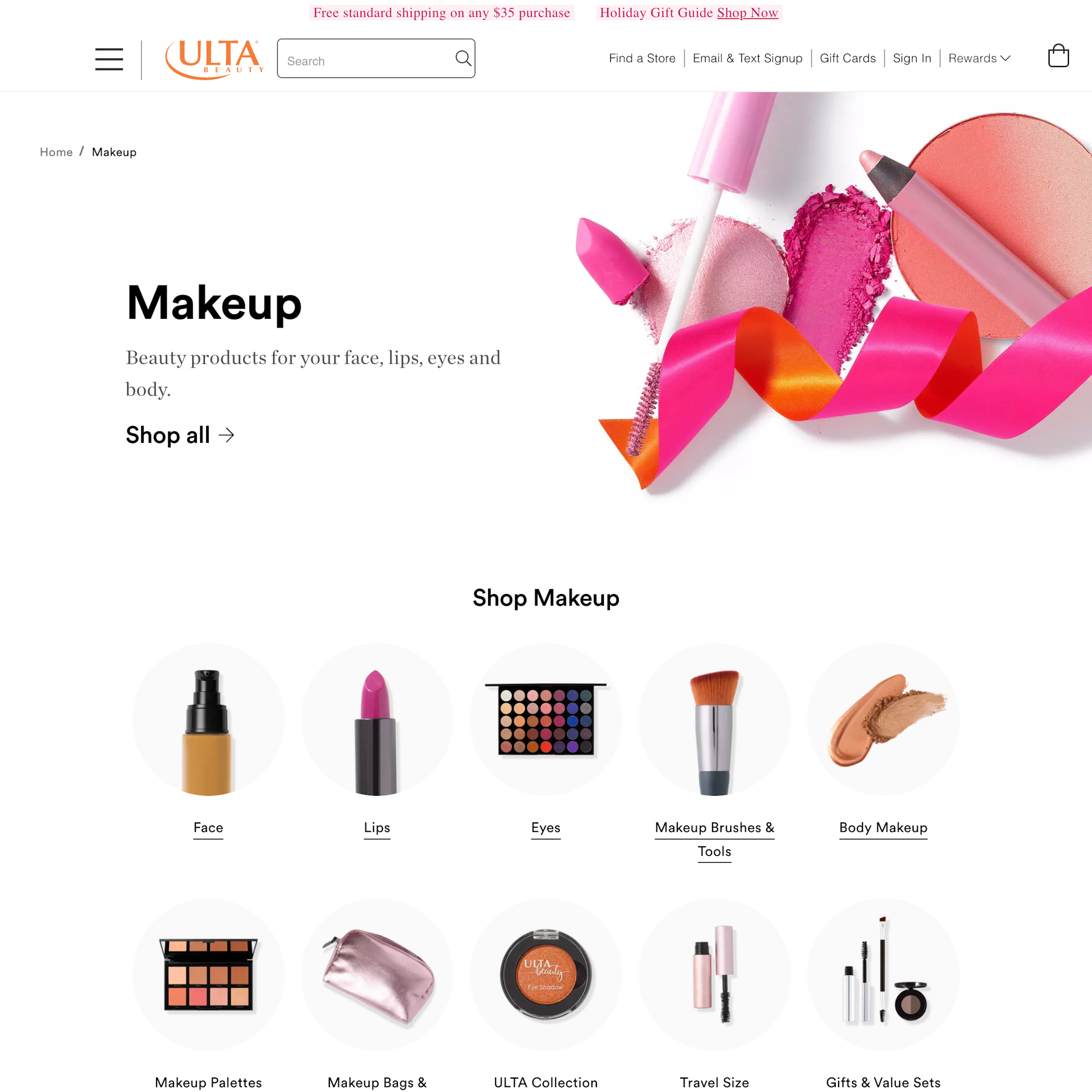
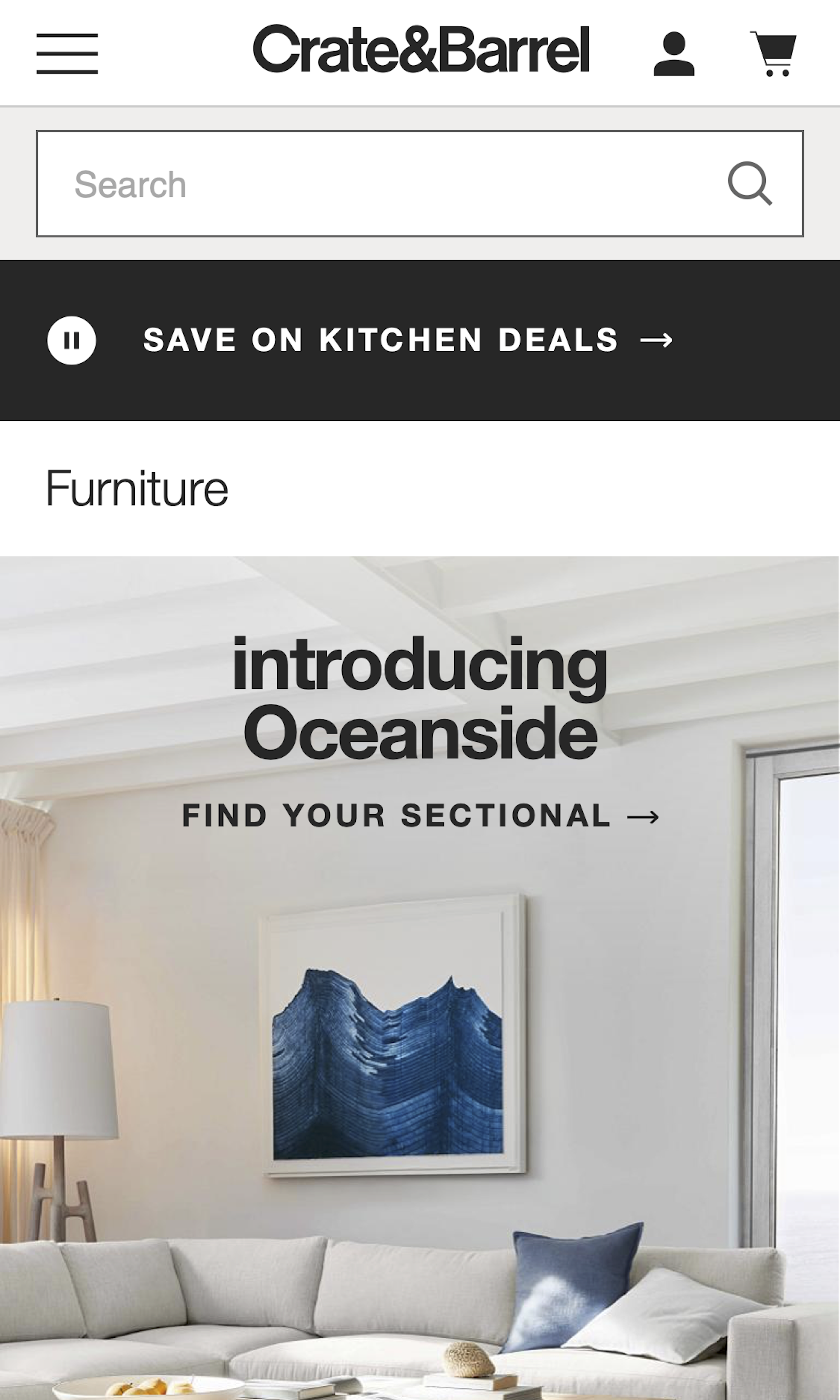
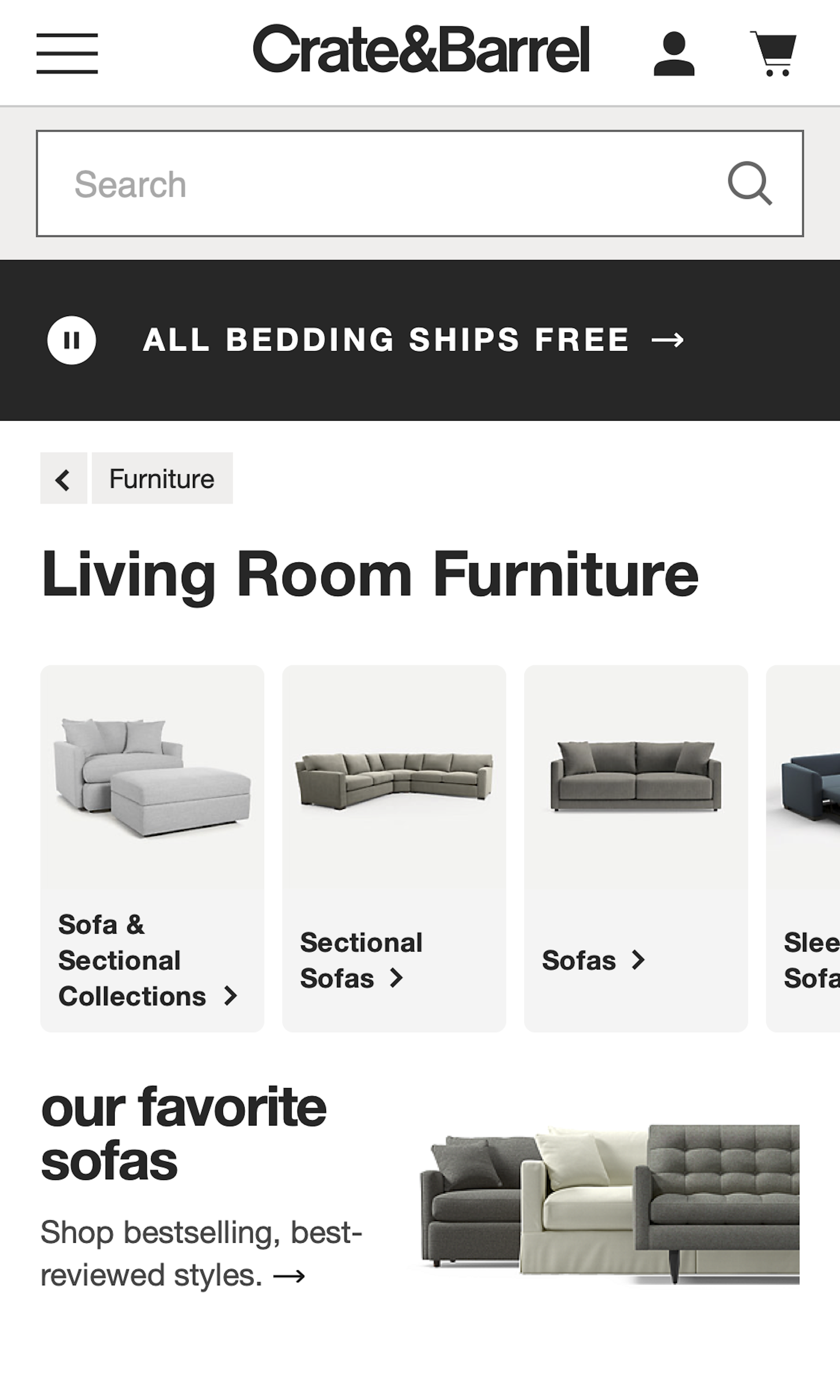
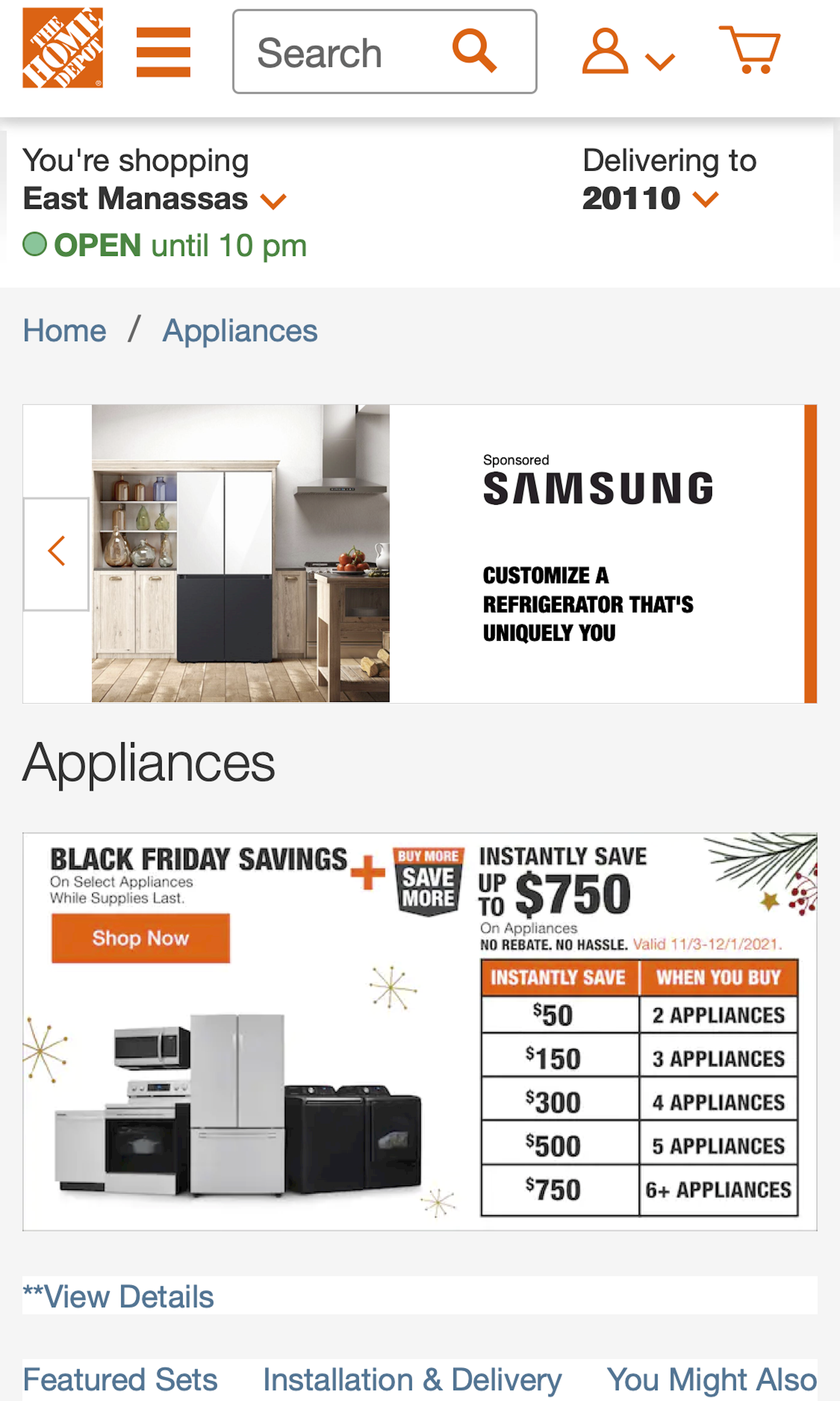
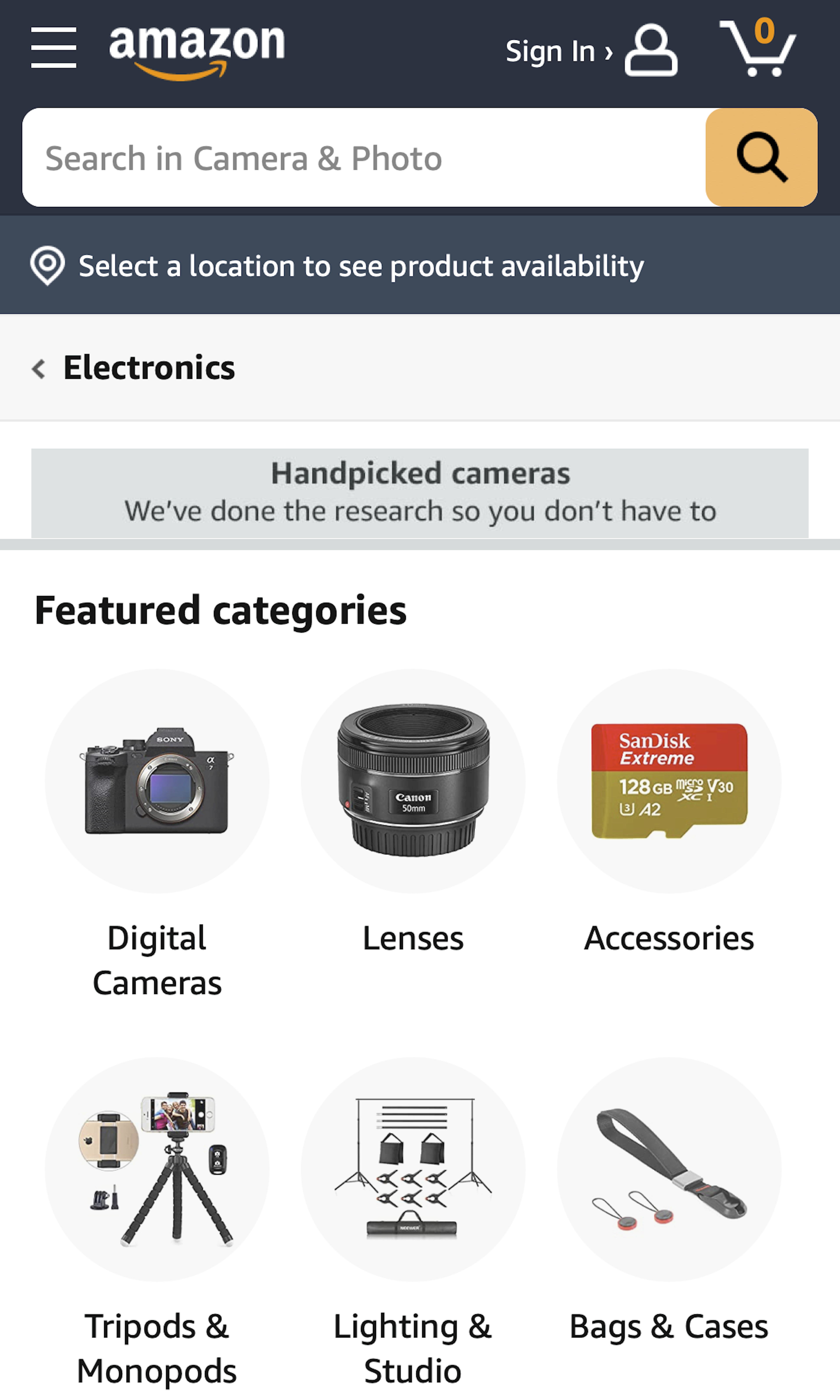
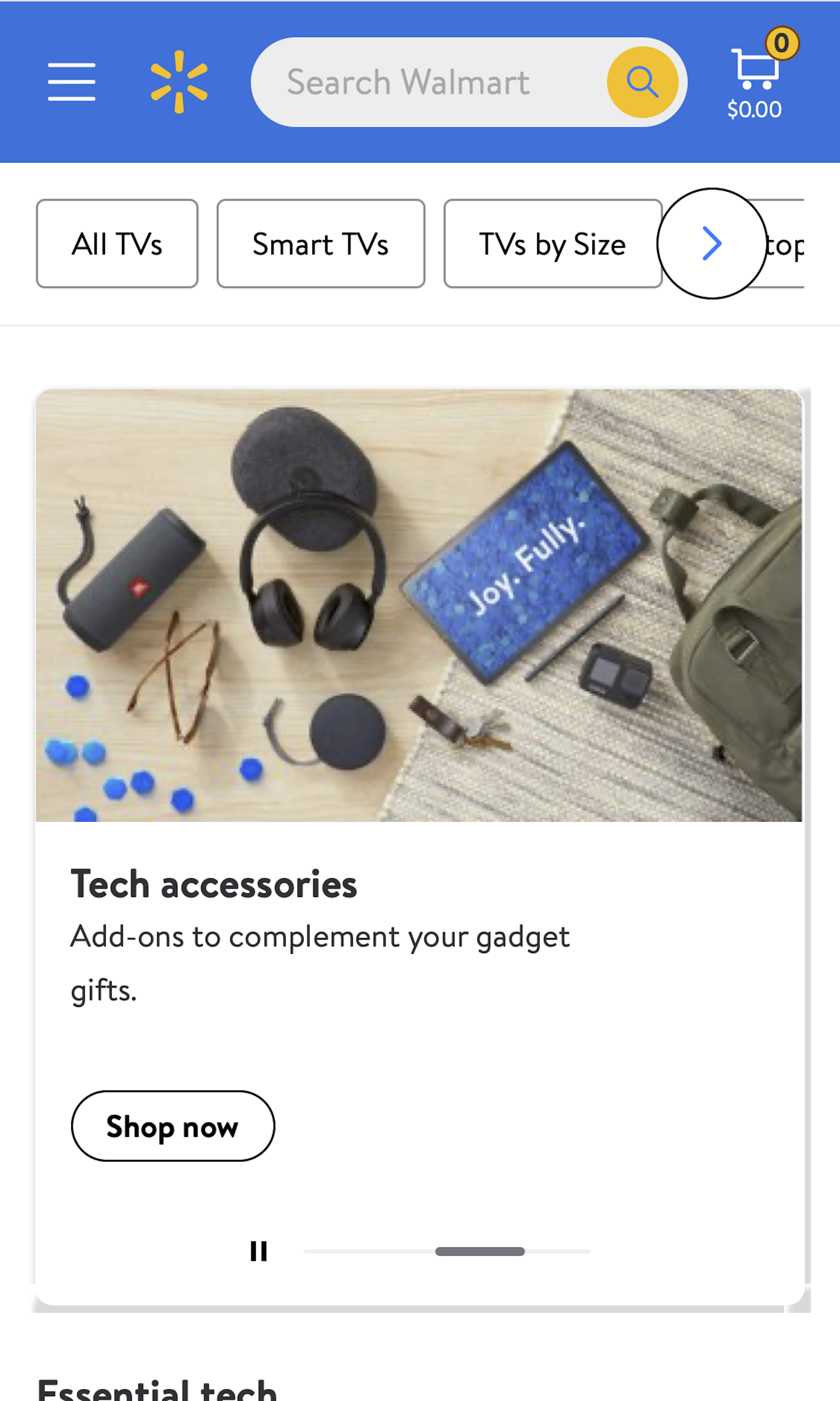
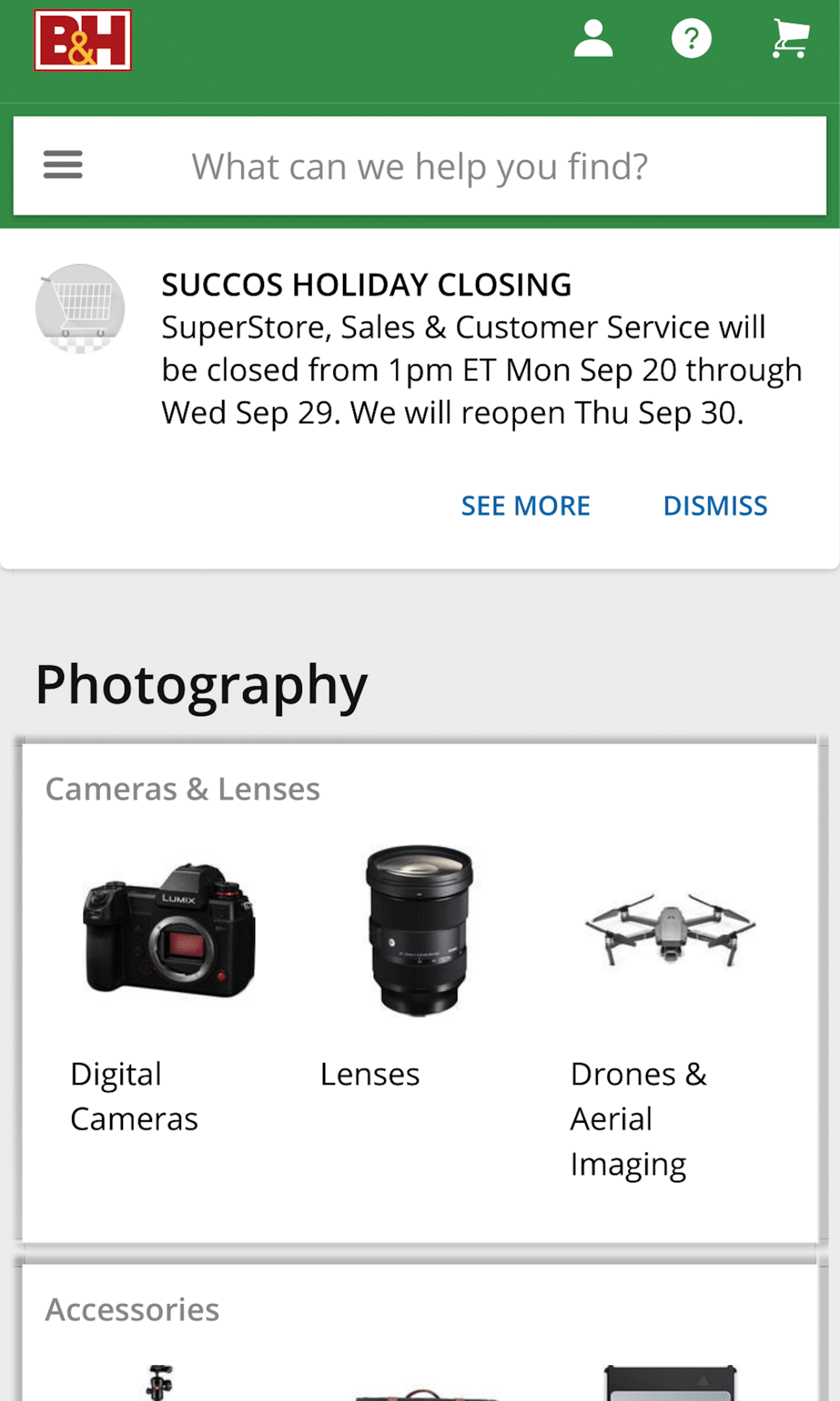
954 ‘Intermediary Category Page’ Design Examples
Also referred to as: Product Category Page
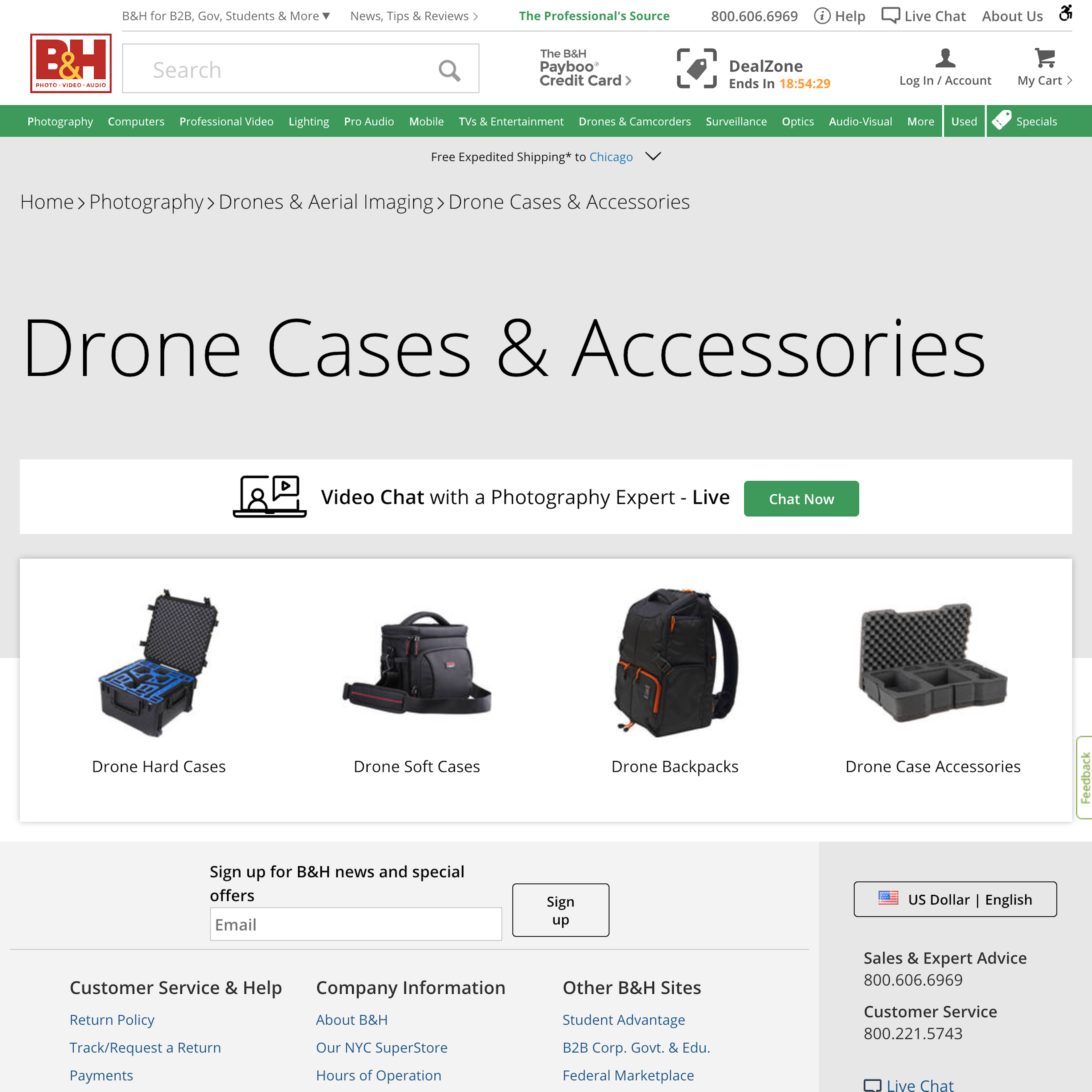
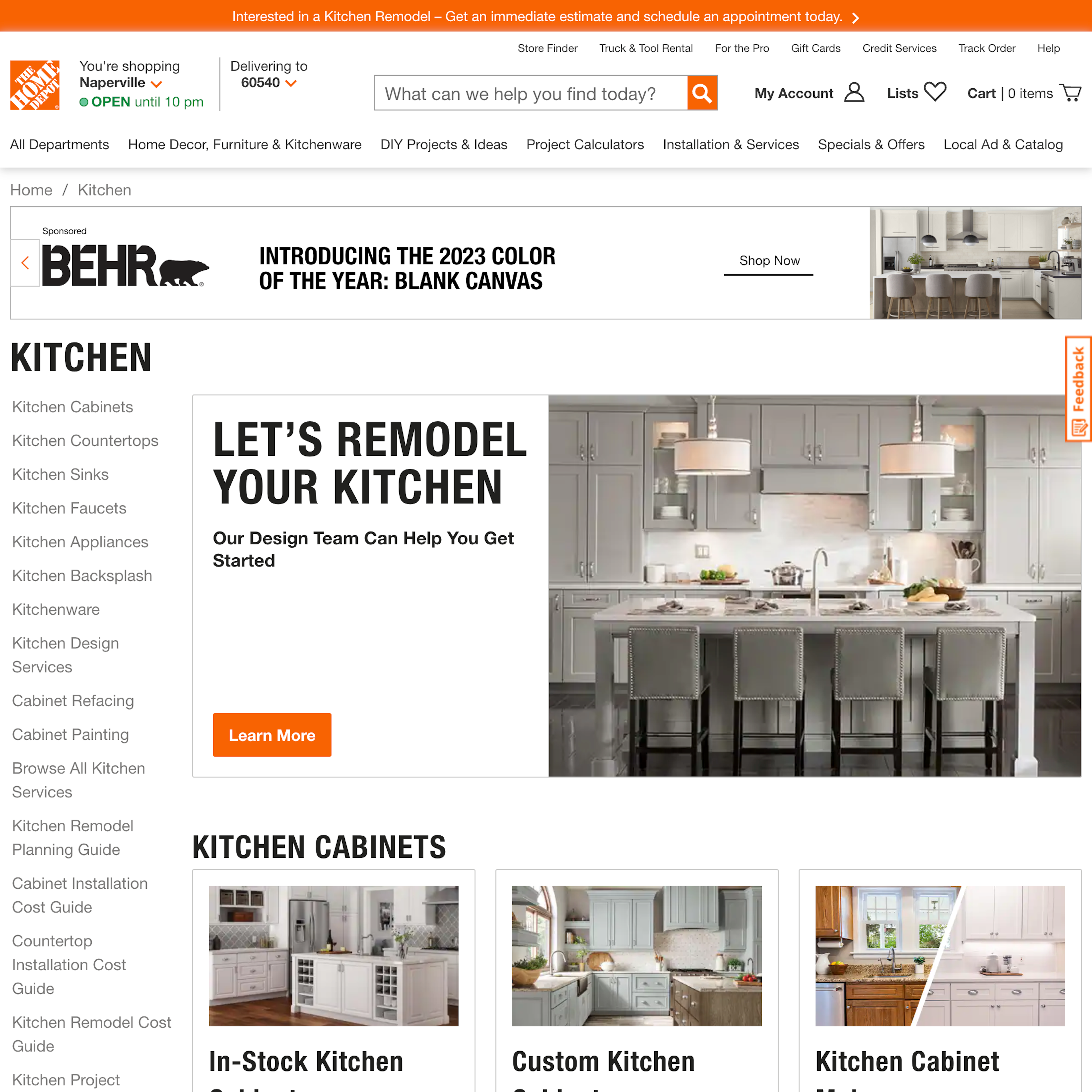
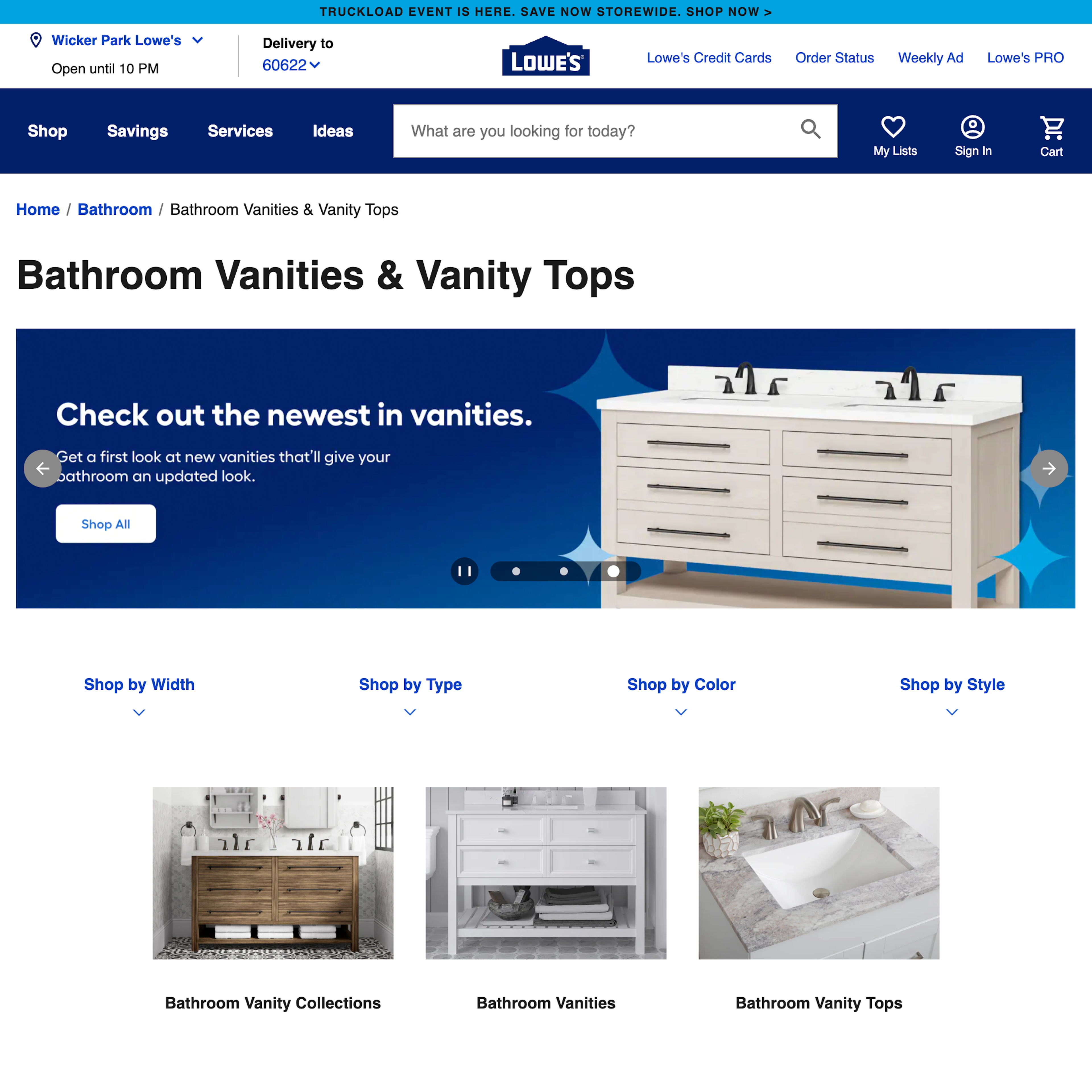
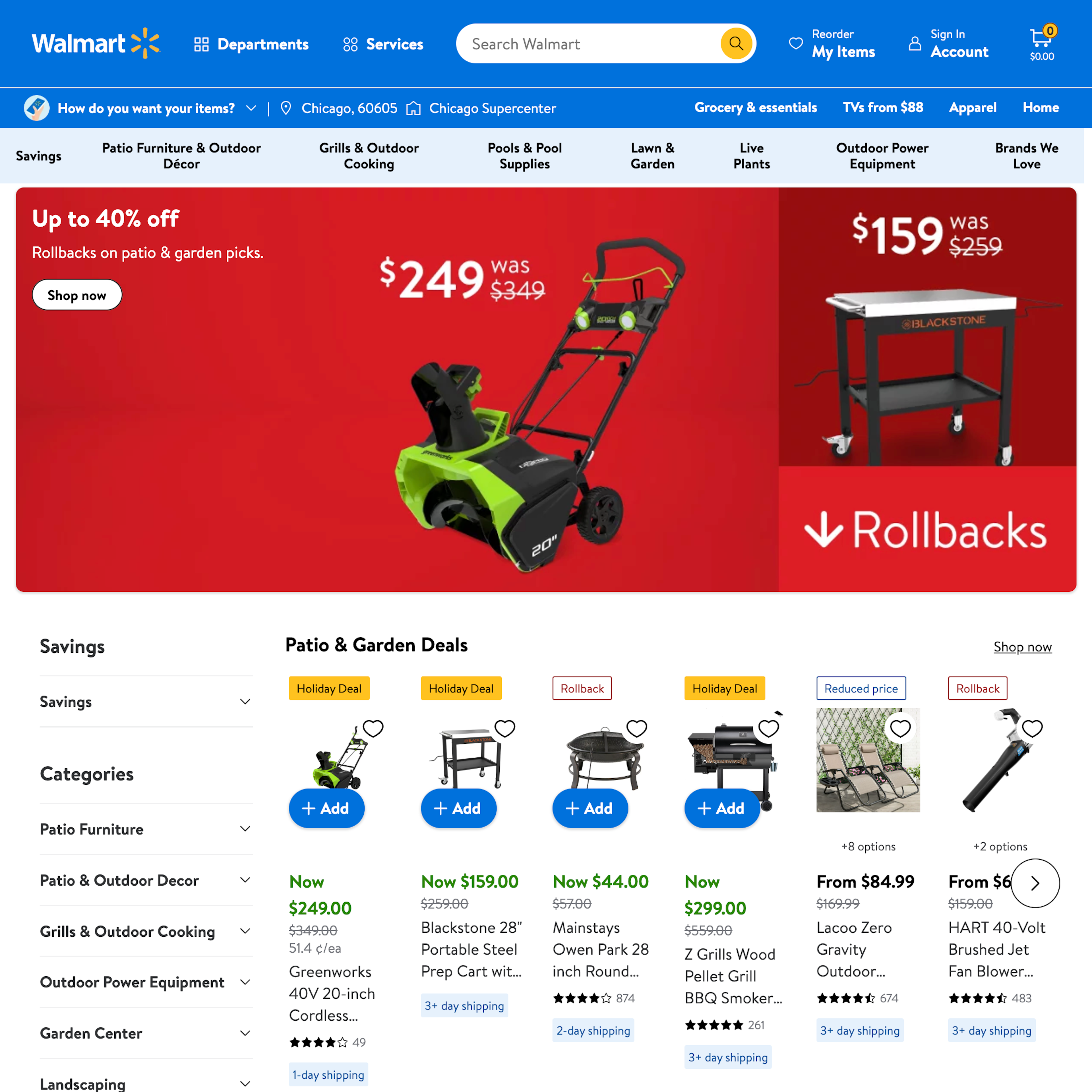
What’s this? Here you’ll find 954 “Intermediary Category Page” full-page screenshots annotated with research-based UX insights, sourced from Baymard’s UX benchmark of 327 e-commerce sites. (Note: this is less than 1% of the full research catalog.)
Intermediary Category Pages are category pages used at the first 1–3 levels of a site’s category hierarchy - depending on the size of the product catalog. Sometimes they are referred to as “Level 1 Category” or simply “L1 category”. Category Pages are unique because they don’t show a list of products, but rather show all the available subcategories they contain — each depicted with a representative thumbnail. Despite consistently performing well in usability testing, 32% of e-commerce sites still don’t have any kind of category pages.
More ‘Intermediary Category Page’ Insights
-
In testing we observe that when users land on an intermediary category page, they exhibit much of the same behavior as they do when landing on the homepage — they try to infer the category taxonomy, the breadth of the particular category, and which path will suit them best. Therefore the intermediary category page often faces the same challenges as the homepage, such as instantly conveying the category contents and making the primary paths (the subcategories) stand out among any featured promotions and products.
-
Showing the entire list of products for a top-level category often won’t make sense, as the list will simply be too long or generic (e.g., “Women’s clothing”). Instead, the scope must be further defined before a meaningful and manageable list of products can be shown (e.g., “Women’s Jackets”). Intermediary category pages solve this exact problem and should be utilized in the 1–2 top levels of the hierarchy. It’s almost like a storefront for a particular product category, guiding the user to select subcategories, filters, or even specific promoted products.
-
Learn More: Besides exploring the 954 “Intermediary Category Page” design examples below, you may also want to read our related articles on “Implement the First 1-2 Levels of the E-Commerce Hierarchy as Intermediary Category Pages” and “Inspirational Images Should Link to All Depicted Products (9% of Sites Don’t)”.
-
Get Full Access: To see all of Baymard’s homepage and category navigation research findings you’ll need Baymard Premium access. (Premium also provides you full access to 200,000+ hours of UX research findings, 650+ e-commerce UX guidelines, and 275,000+ UX performance scores.)
User Experience Research, Delivered Weekly
Join 60,000+ UX professionals and get a new UX article every week.

User Experience Research, Delivered Weekly
Join 60,000+ UX professionals and get a new UX article every week.

Explore Other Research Content

300+ free UX articles based on large-scale research.

327 top sites ranked by UX performance.

Code samples, demos, and key stats for usability.


