Key Takeaways
- “Intermediary Category Pages” are key for many users who need navigational guidance
- Yet other users don’t need the page — they want to go to a product list immediately
- Providing an “Intermediary Category Page” is important to meeting the needs of the first group of users — but ensuring the page is high-performing is key to avoid distracting the latter
“Intermediary Category Pages” — essentially a category landing page where users are provided with thumbnails and descriptions of subcategories, guides, and other category-related content — can be a helpful starting point for a subgroup of users.
Indeed, Baymard’s large-scale testing revealed that “Intermediary Category Pages” can fulfill a valuable role for users who are as yet unclear about what product to buy — however, our e-commerce UX benchmark reveals that 13% of sites don’t provide “Intermediary Category Pages”.
That said, while the benefits of “Intermediary Category Pages” are clear for some users, our testing also revealed that other users favor going quickly to product lists to filter a selection of products — and find the “Intermediary Category Page” to be unnecessary to their product-finding efforts.
Therefore, it’s key that “Intermediary Category Pages” are implemented carefully to avoid becoming an unnecessary roadblock for users who don’t find them useful.
In this article we’ll discuss our Premium research findings on “Intermediary Category Pages”:
- How “Intermediary Category Pages” are useful to some users
- How to avoid “Intermediary Category Pages” becoming a hindrance to product finding
How “Intermediary Category Pages” Are Useful to Some Users
“Okay, they’re highlighting a specific laptop…that’s interesting. Initially I thought they were just going to show all laptops, but it’s nice to see that they have some suggestions…because there’s usually hundreds of laptops to choose from. It can be a little overwhelming. So to have the website have a curated selection…that’s good to know.” The “Laptops” “Intermediary Category Page” on B&H Photo offers useful advice on how different types of laptop would meet different user needs. This added context can make a big difference to users who need guidance, and helps narrow the scope before reaching a suitable product list.
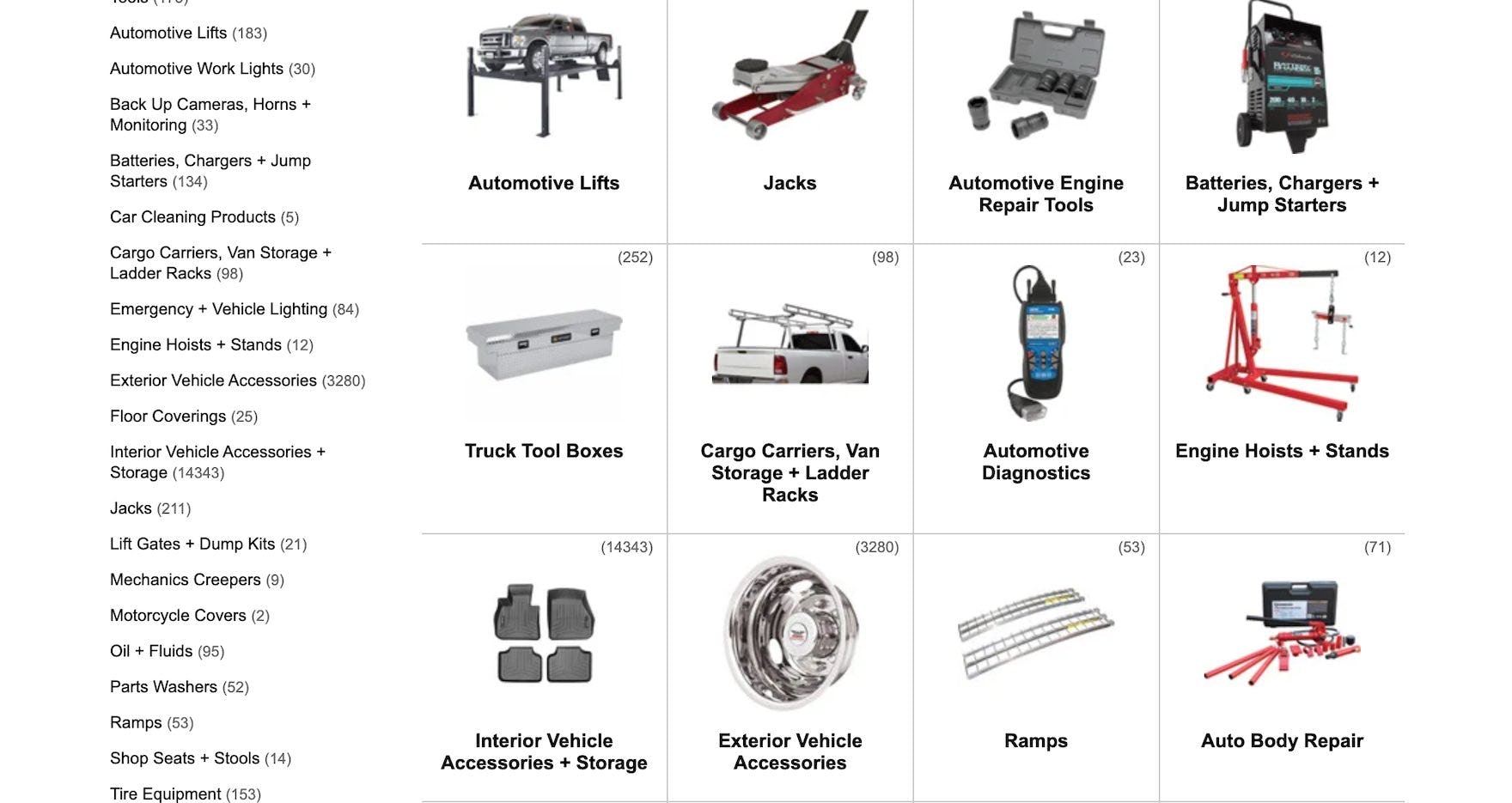
Northern Tool provides easy navigation to subcategories with its efficient “Intermediary Category Page”.
“Intermediary Category Pages” help undecided users learn what product types might be suitable by introducing subcategories alongside additional information and context, which helps inform their decisions.
Indeed, testing revealed that “Intermediary Category Pages” are an excellent opportunity to promote subcategory navigation and other paths, encouraging users to make a more deliberate path selection before displaying a potentially overwhelming number of items in product lists.
Furthermore, without the narrower product scope offered by subcategories accessed from “Intermediary Category Pages”, product lists (or search results) could contain items that don’t share common attributes, making filtering the list considerably more difficult.
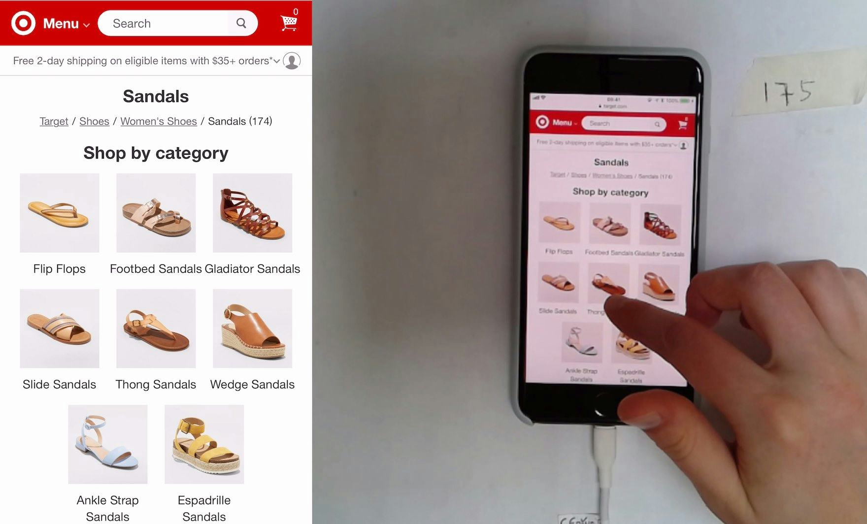
This test participant on Target used the prominent subcategory links on an “Intermediary Category Page” (first image) to quickly navigate to her desired product list (second image).
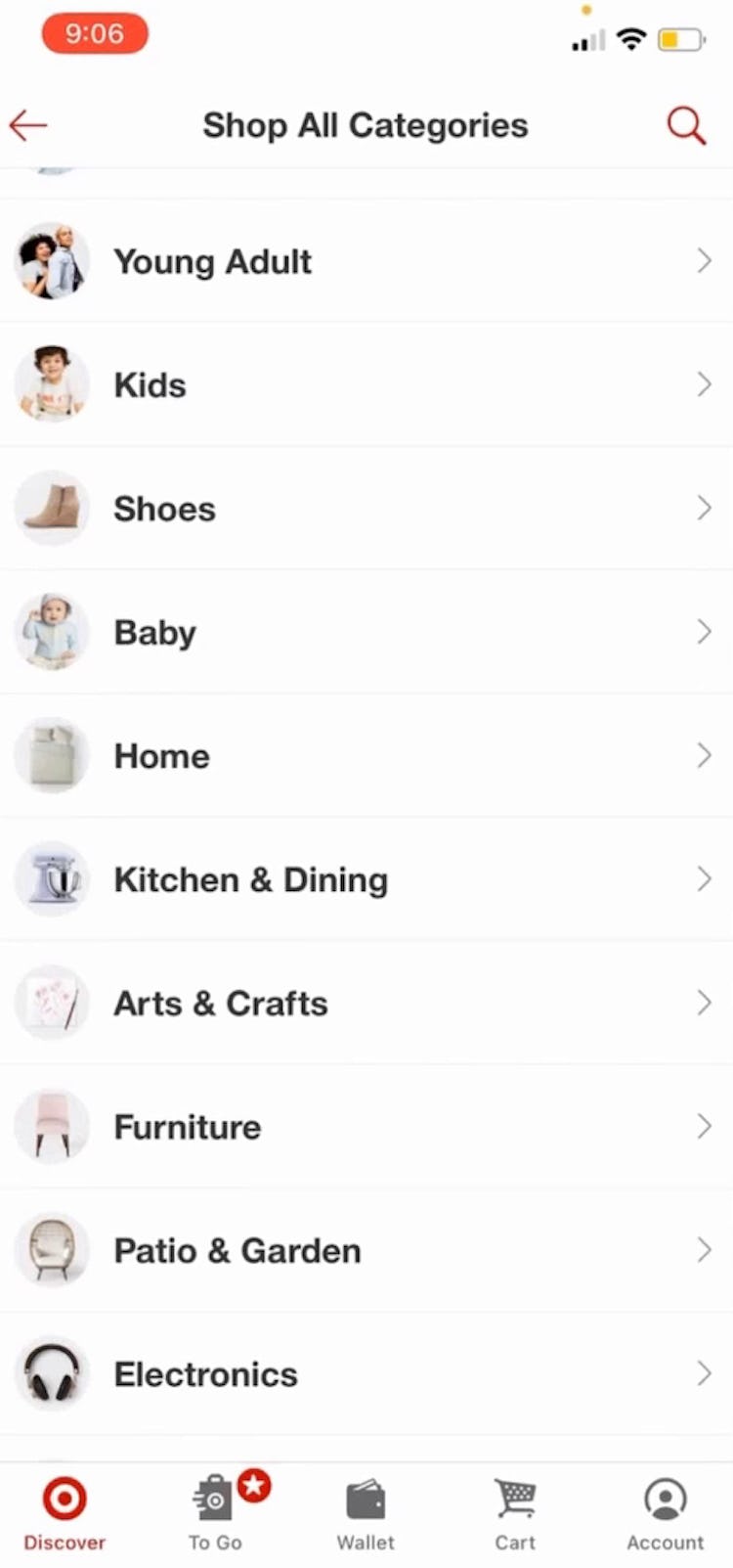
“’Shop all categories.’ I would scroll down to ‘Home’. They’ve got the nice photos up top. I’d click on ‘Bedding’ again. ‘Bedding Sets & Collections’ is what I was looking for.” These “Intermediary Category Pages” in the Target app helped this test participant to quickly navigate down the hierarchy from the top level (first image) to the “Home” category (second image), and then the “Bedding” subcategory (third image).
During mobile testing, we observed participants relying more heavily on “Intermediary Category Pages” to determine which subcategories to explore further.
On mobile sites and apps, it’s especially easy to get overwhelmed when faced with overly broad scopes, and thus “Intermediary Category Pages” were often observed to be even more useful to test participants on mobile devices, compared to desktop.
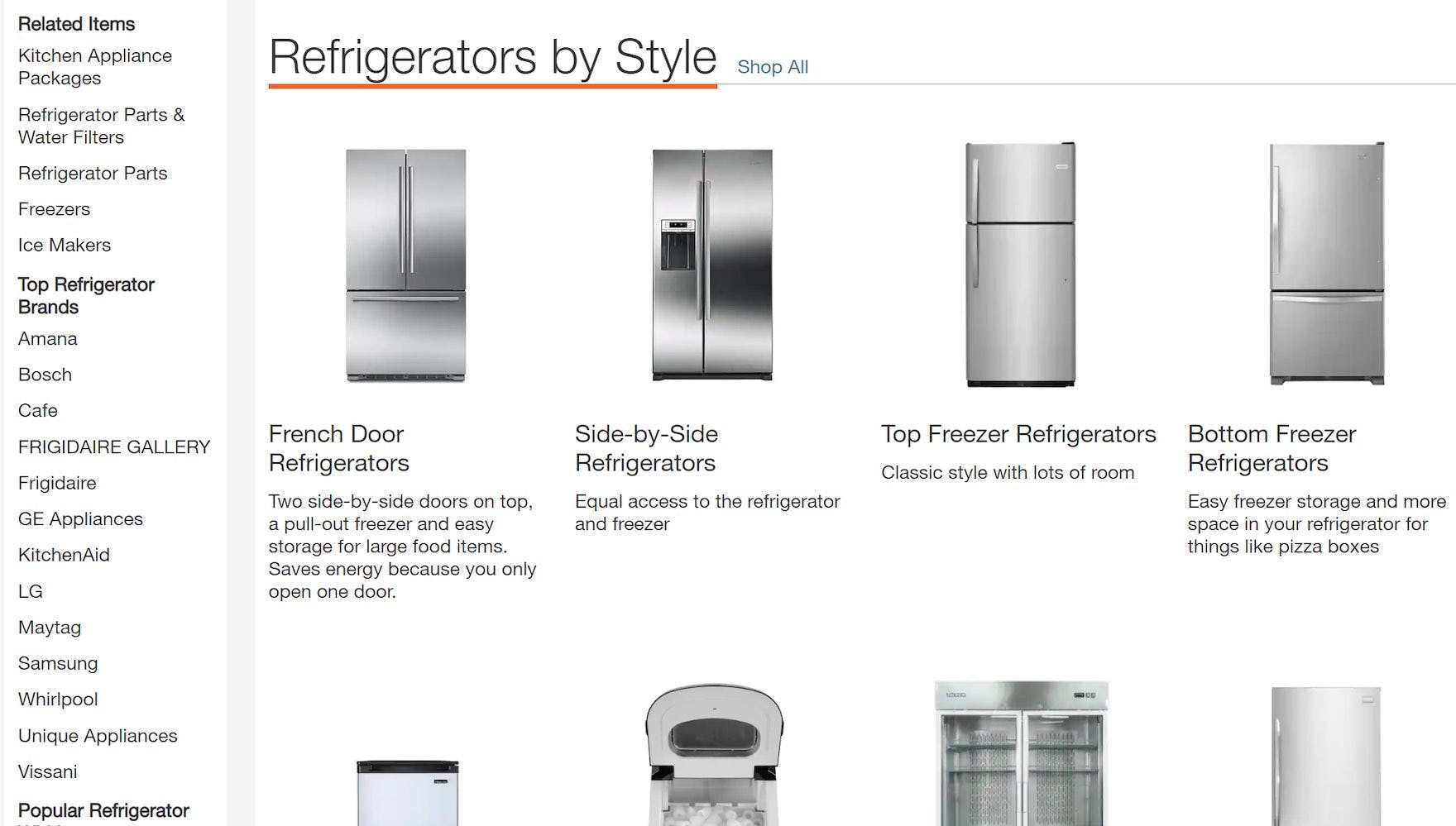
The “Intermediary Category Pages” for the first level (first image) and second level (second image) of the site taxonomy on Home Depot guide users through narrower product scopes with the help of useful subcategory thumbnails.
Therefore, at minimum, consider implementing the first layer in the navigation hierarchy as an “Intermediary Category Page”.
For example, clicking on the top-level category link “Appliances” should lead users to a page featuring subcategories, such as “Refrigerators”, “Washers & Dryers”, and “Microwaves”.
A second “Intermediary Category Page” for the next level of the taxonomy, such as “Refrigerators”, would then allow users to judge which subcategories might contain the specific product type that would suit them best before reaching a product list with relevant filters to further narrow the scope.
How to Avoid “Intermediary Category Pages” Becoming a Hindrance to Product Finding
As noted above, “Intermediary Category Pages” can be very helpful to a subset of users seeking navigation guidance.
But, importantly, testing revealed that a roughly equal number of users preferred to bypass “Intermediary Category Pages” and go directly to a product list.
Now, while it’s tempting to think that this indicates that “Intermediary Category Pages” should perhaps be avoided, it’s important to note the following:
- For the subset of users who rely on “Intermediary Category Pages”, “Intermediary Category Pages” are crucial to their ability to find a suitable product list
- For the subset of users who don’t rely on “Intermediary Category Pages”, they often have options to bypass the page (e.g., accessing a filter-based category in the main navigation), or they can quickly select their preferred subcategory on the “Intermediary Category Page” (or simply “View All” products; see below) — thus experiencing only a minor speedbump in their search for a relevant product list
Therefore, the benefits of providing “Intermediary Category Pages” generally outweigh the drawbacks — as long as the “Intermediary Category Page” is carefully implemented.
In particular, it’s important to pay attention to the following 3 implementation details.
1) Avoid Excessive Layers of “Intermediary Category Pages”
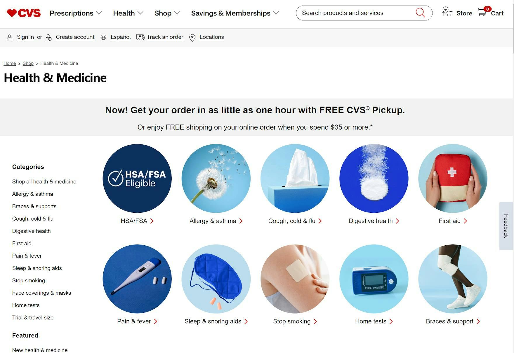
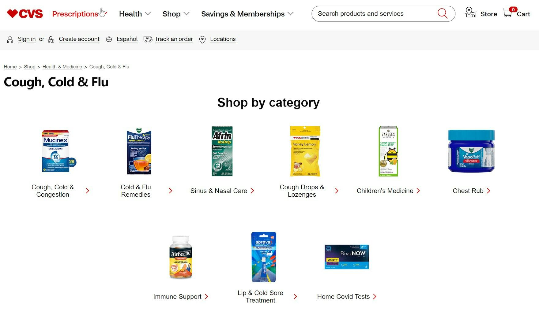
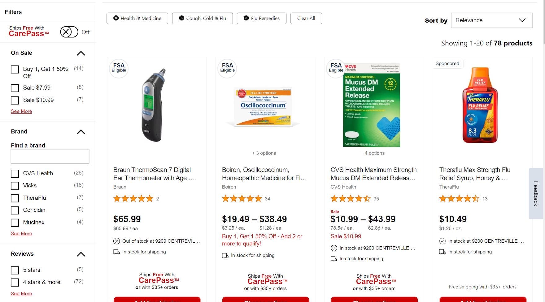
Here on CVS, there are “Intermediary Category Pages” implemented for the first 2 levels of the site taxonomy (“Health & Medicine”, first image, and “Cough, Cold & Flu”, second image). Once users click on a subcategory on this page — for example, “Cold & Flu Remedies” — they are taken to a product list (third image) with preapplied filters. As a result, users can narrow the scope before arriving on a product list with a manageable number of items and useful filters.
Testing revealed that it’s best to avoid having “Intermediary Category Pages” too low in the navigation hierarchy, as this encourages users to select narrower and narrower scopes, potentially luring them into overly constricted and sparse product lists.
For most sites, this means implementing the first 1–2 layers of the category taxonomy as “Intermediary Category Pages”.
However, the number of layers to provide as “Intermediary Category Pages” depends on the overall size of the product catalog — some sites may warrant 3+ layers if there are sufficient products at each additional layer.
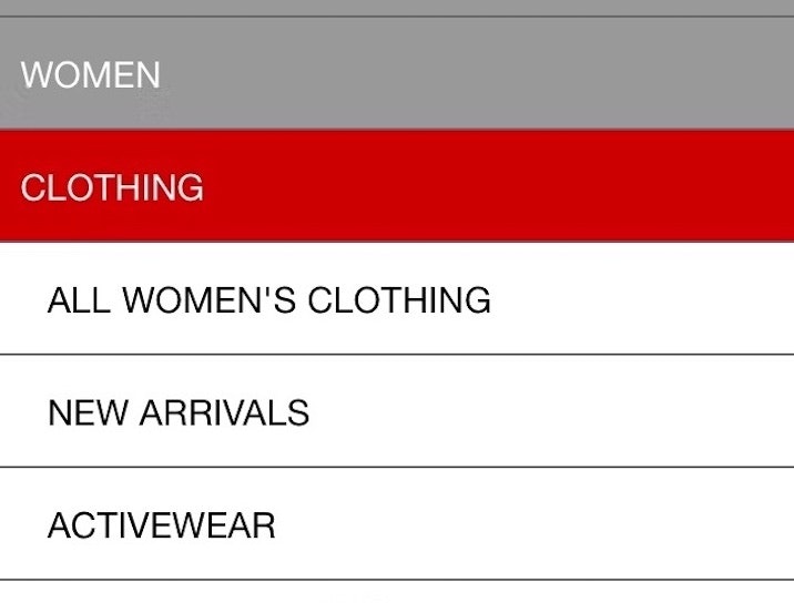
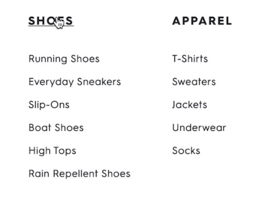
For example, a shoe site may have, for instance, “Women’s” > “Shoes” > “Sandals” > “Dress” > “Leather”, while a mass merchant site may only need “Women’s” > “Shoes” > “Sandals” or simply “Women’s” > “Shoes”.
However, note that “Intermediary Category Pages” should be avoided entirely on small catalog sites, as there’s simply not enough of a category taxonomy in the first place to warrant the additional navigational layers.
2) Keep Focus on Subcategories on the “Intermediary Category Page”
The “Women’s” “Intermediary Category Page” at Gilt showcases sales and special offers, rather than subcategories. As a result the page will perform poorly for most users seeking to meaningfully narrow their scope.
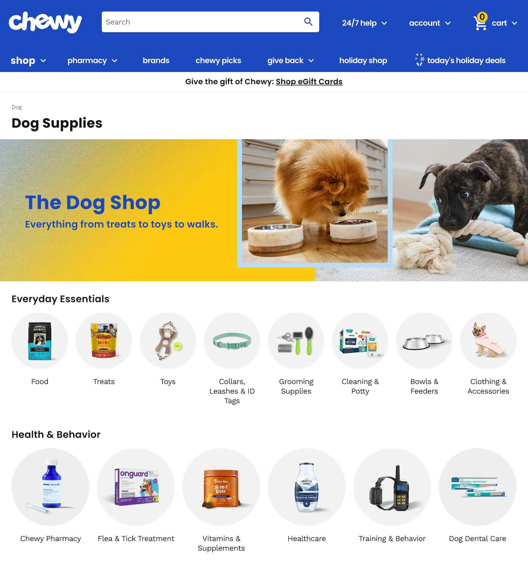
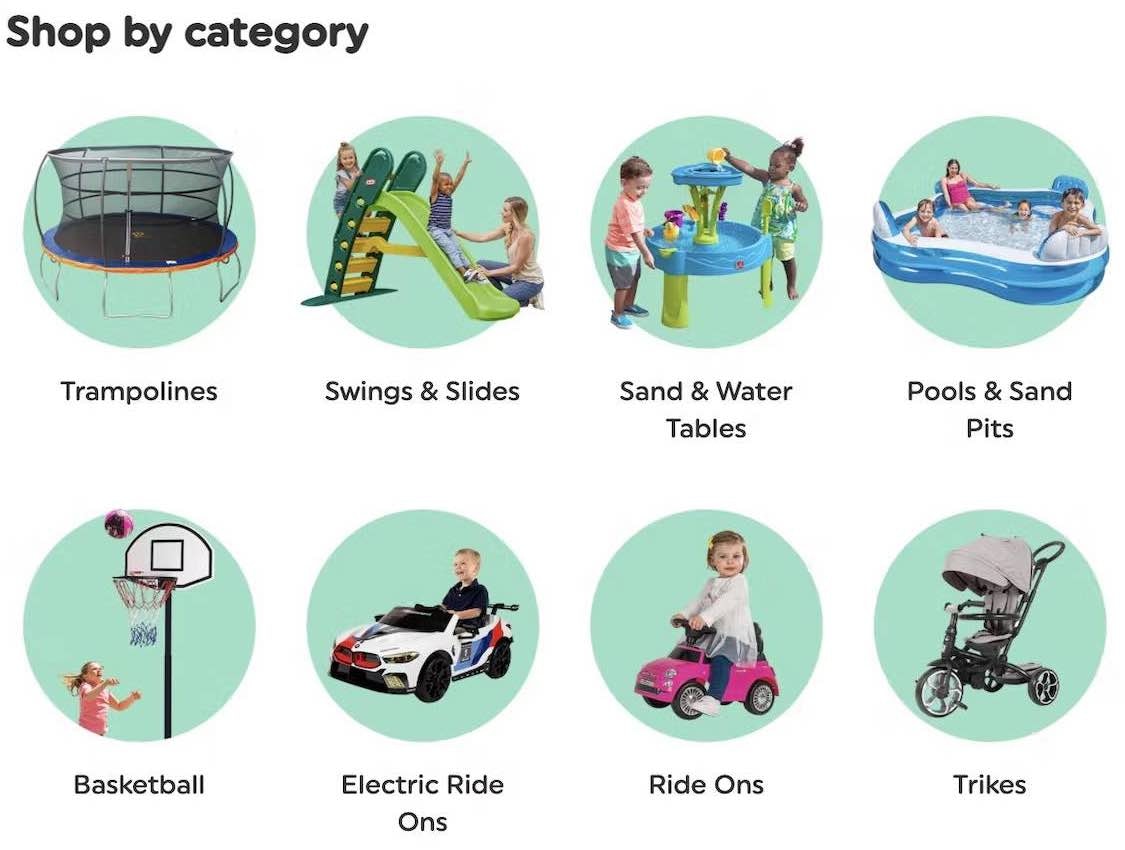
At Chewy, the “Intermediary Category Page” for “Dog” is focused on helping users navigate to an appropriate subcategory.
While “Intermediary Category Pages” are a good place to highlight specific products and include additional category content, it’s important to keep in mind the core purpose of the page — to help users navigate to a suitable subcategory.
Therefore, while including supplementary content on the “Intermediary Category Page” is fine, it’s key that this content is placed below or otherwise made more visually subdued relative to the subcategories (which should feature titles and prominent thumbnails).
3) Always Include a “View All” Link to Allow Users to Access Broad Product Lists
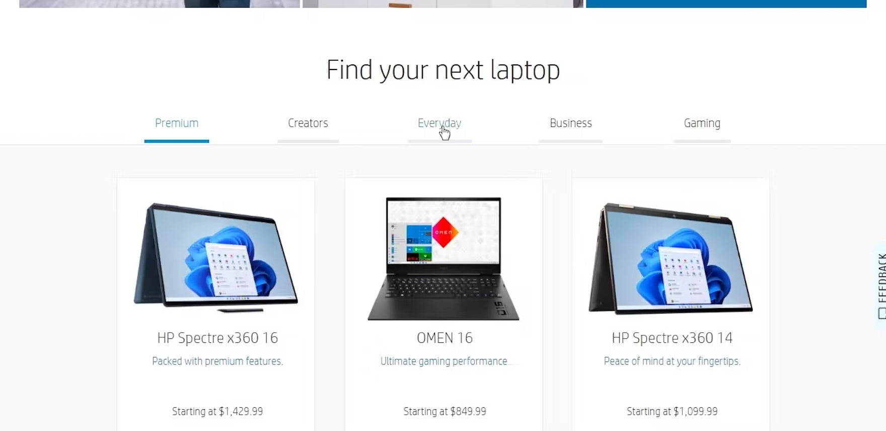
“It doesn’t seem like I can actually see everything all at once. It’s actually a little disappointing that I can’t just quickly and easily do that.” When there’s no obvious link to all products in a category — for example a list of all laptops in the 5 subcategories “Premium”, “Creators”, “Everyday”, “Business”, and “Gaming” here on HP — users can’t easily get an overview of all product options, nor can they easily compare them.
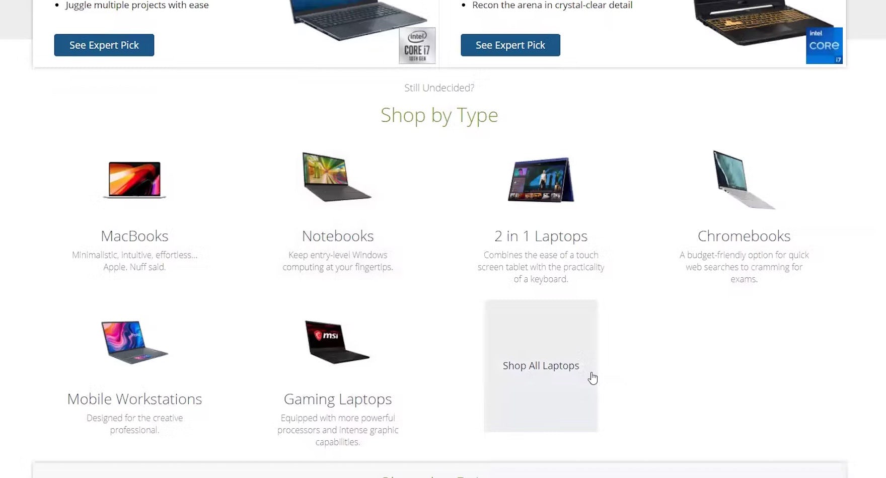
“So what I do is I go back and just open ‘All Laptops…” The “Shop All Laptops” link on B&H Photo is also useful for users, like this test participant, who want to broaden the scope having explored one or two subcategories.
Some users browsing “Intermediary Category Pages”, as mentioned above, want to immediately see a broad product list containing all the products in the category.
Other users, after browsing the “Intermediary Category Page” for awhile, may decide that none of the subcategories are quite the right fit, or that they’d prefer to use filters instead to narrow a product list.
Either way users on “Intermediary Category Pages” should be provided with a link to “View All” the products in a desired category.
Otherwise, they’re at risk of getting stuck in an overly narrow scope, or they spin their wheels on the “Intermediary Category Page” as they look for a way to access a broad product list.
Provide an “Intermediary Category Page” for Those Who Need It — But Avoid Distracting Those Who Don’t
“Intermediary Category Pages” have been observed to be very helpful for users who are new to a site or product type, or who are simply in more of a “browsing mood”.
For instance, someone considering purchasing a laptop, but relatively new to shopping for laptops, would likely appreciate, after clicking “Laptops” in the main navigation, being presented with a “Laptops” “Intermediary Category Page” that includes subcategories, featured products, and buying guides.
The “Intermediary Category Page” provides an important additional layer that helps to avoid immediately overwhelming the user with potentially 1,000s of products to consider.
Yet more experienced users may wish to avoid this interstitial layer — or at least minimize its disruption to their browsing experience.
Therefore, while it’s important to include “Intermediary Category Pages”, ensure they perform for all users by following the 3 implementation details below:
- Avoid excessive layers of “Intermediary Category Pages”
- Keep focus on the subcategories
- Always include a “View All” link
That way the “Intermediary Category Page” is a beneficial layer for those who need additional guidance, and only a slight increase in navigational friction for those who don’t.
This article presents the research findings from just 1 of the 700+ UX guidelines in Baymard – get full access to learn how to create a “State of the Art” ecommerce user experience.
If you want to know how your website performs and compares, then learn more about getting Baymard to conduct a UX Audit of your site.

