
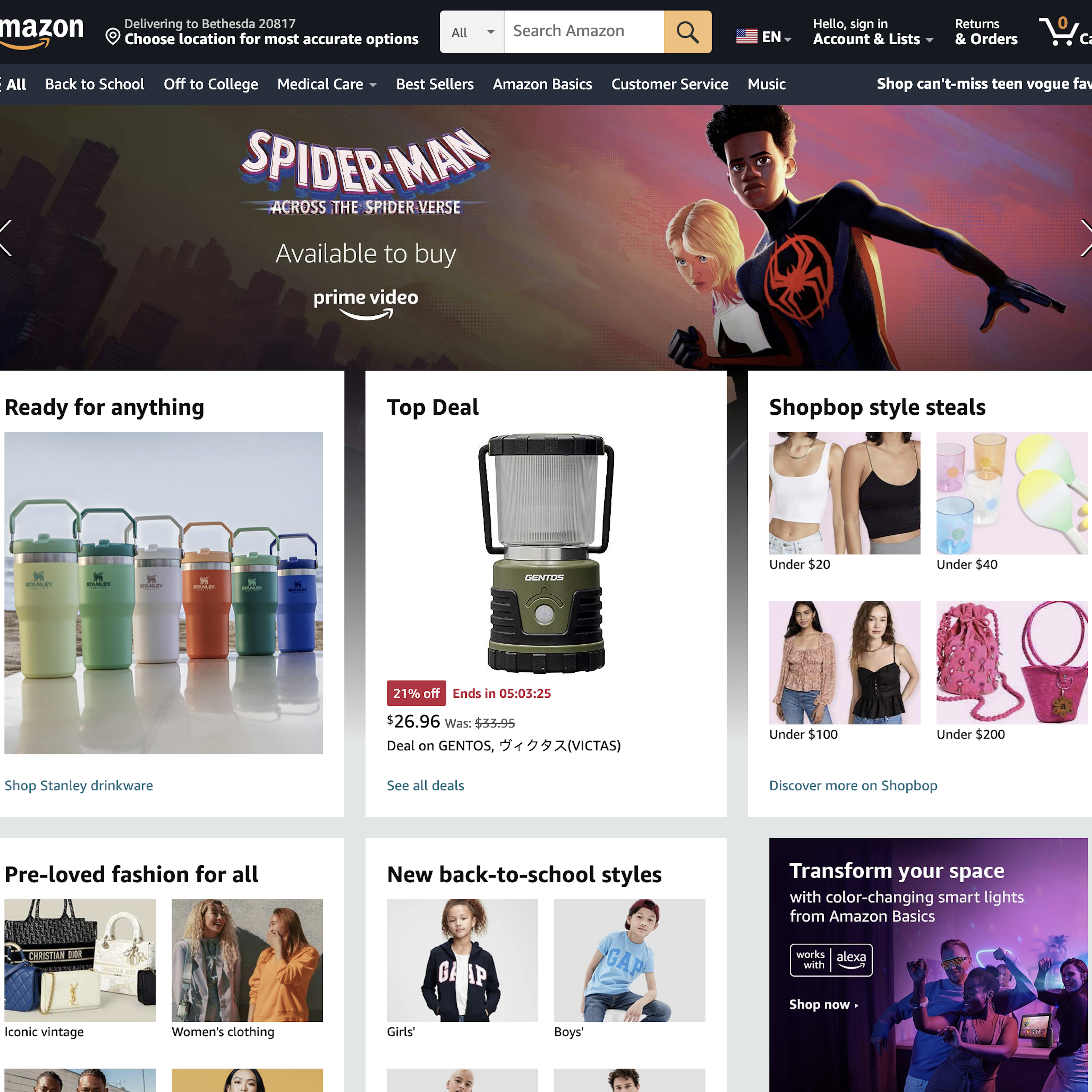
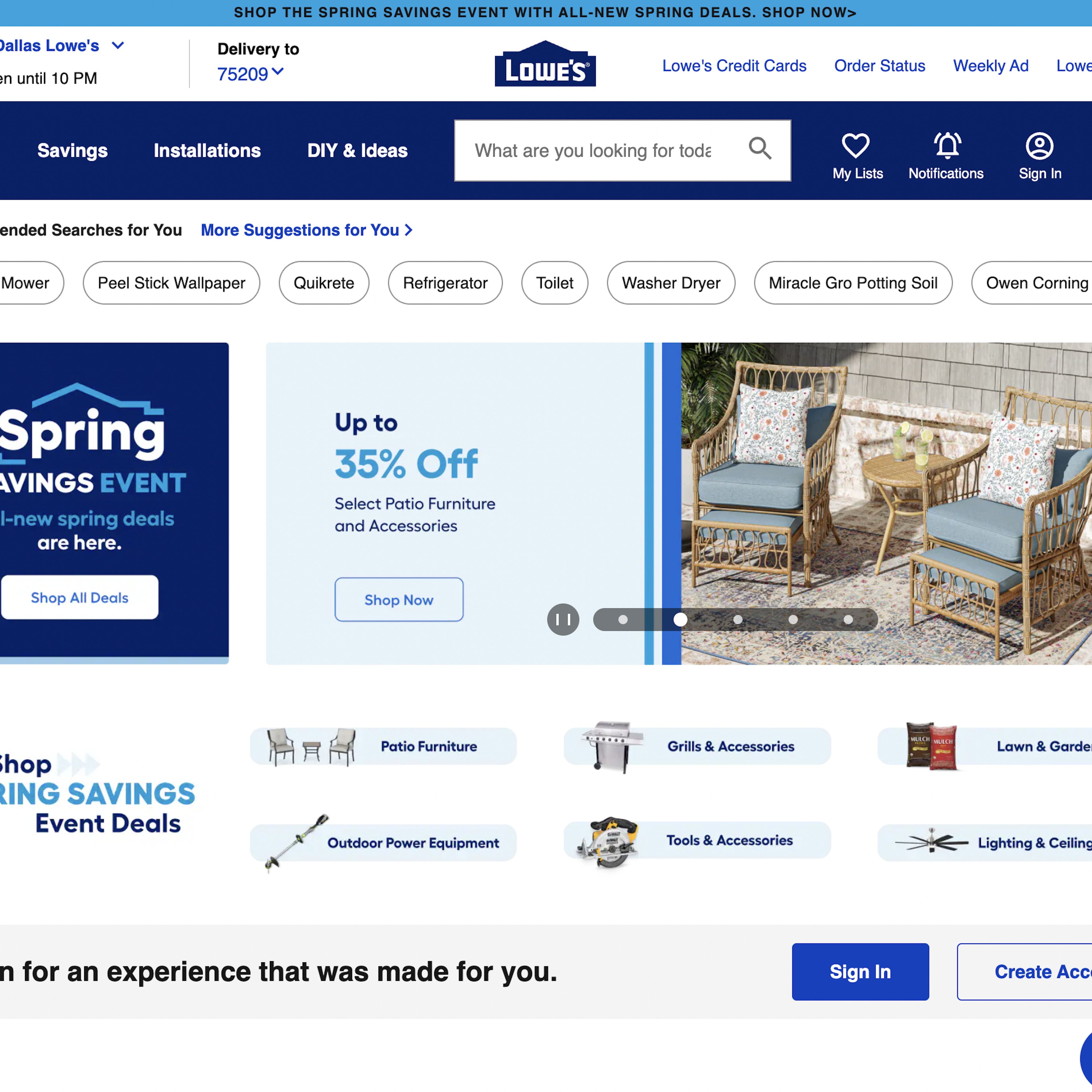
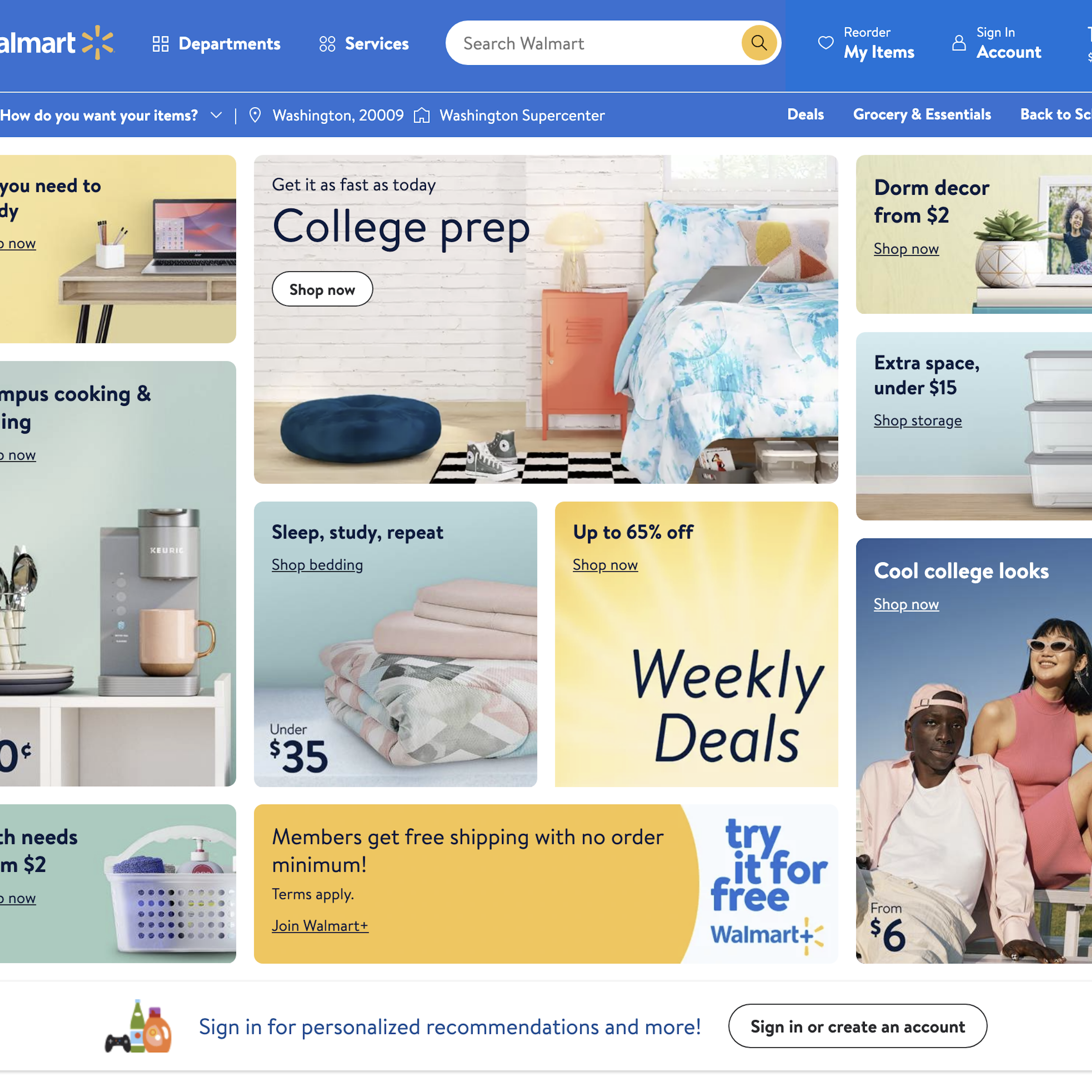
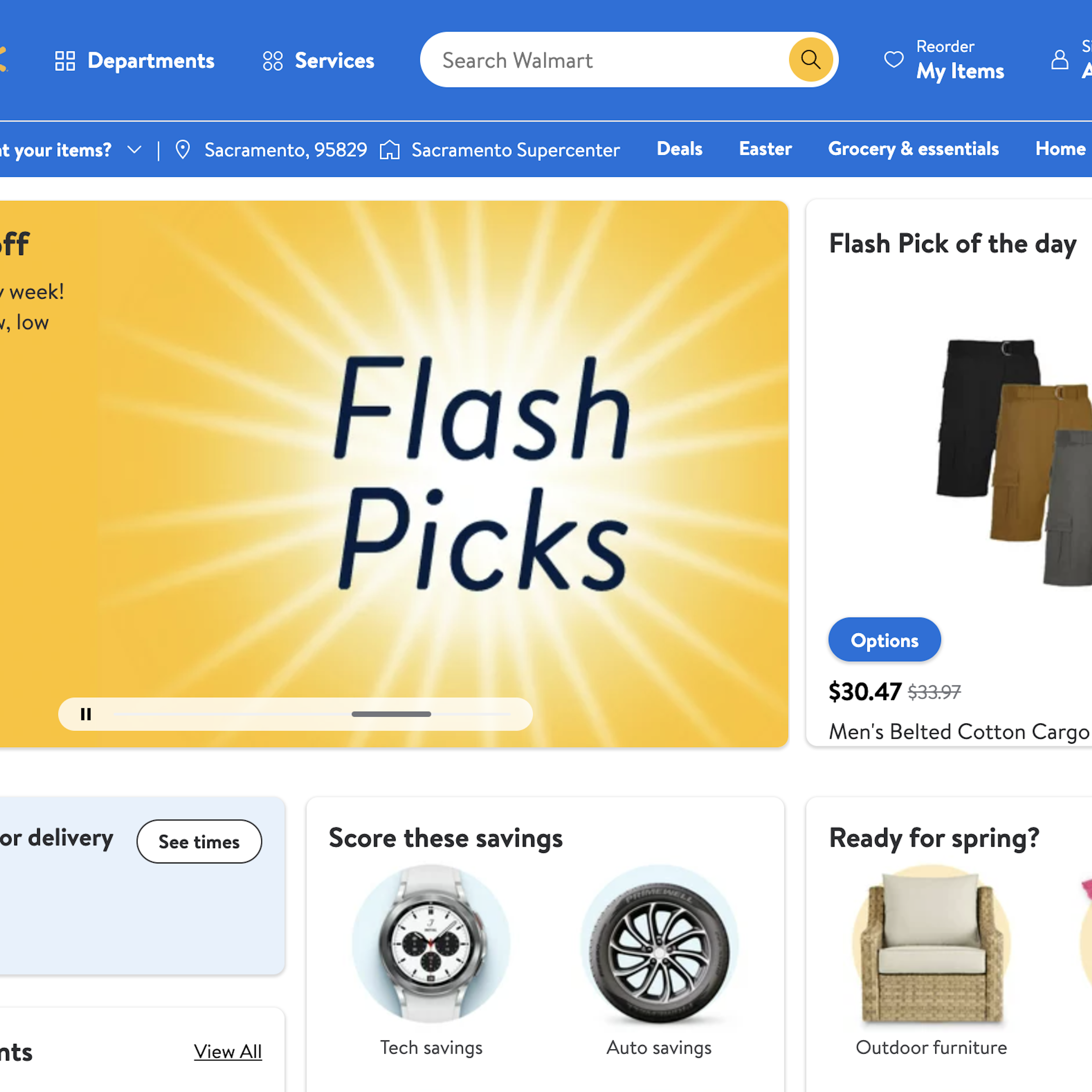
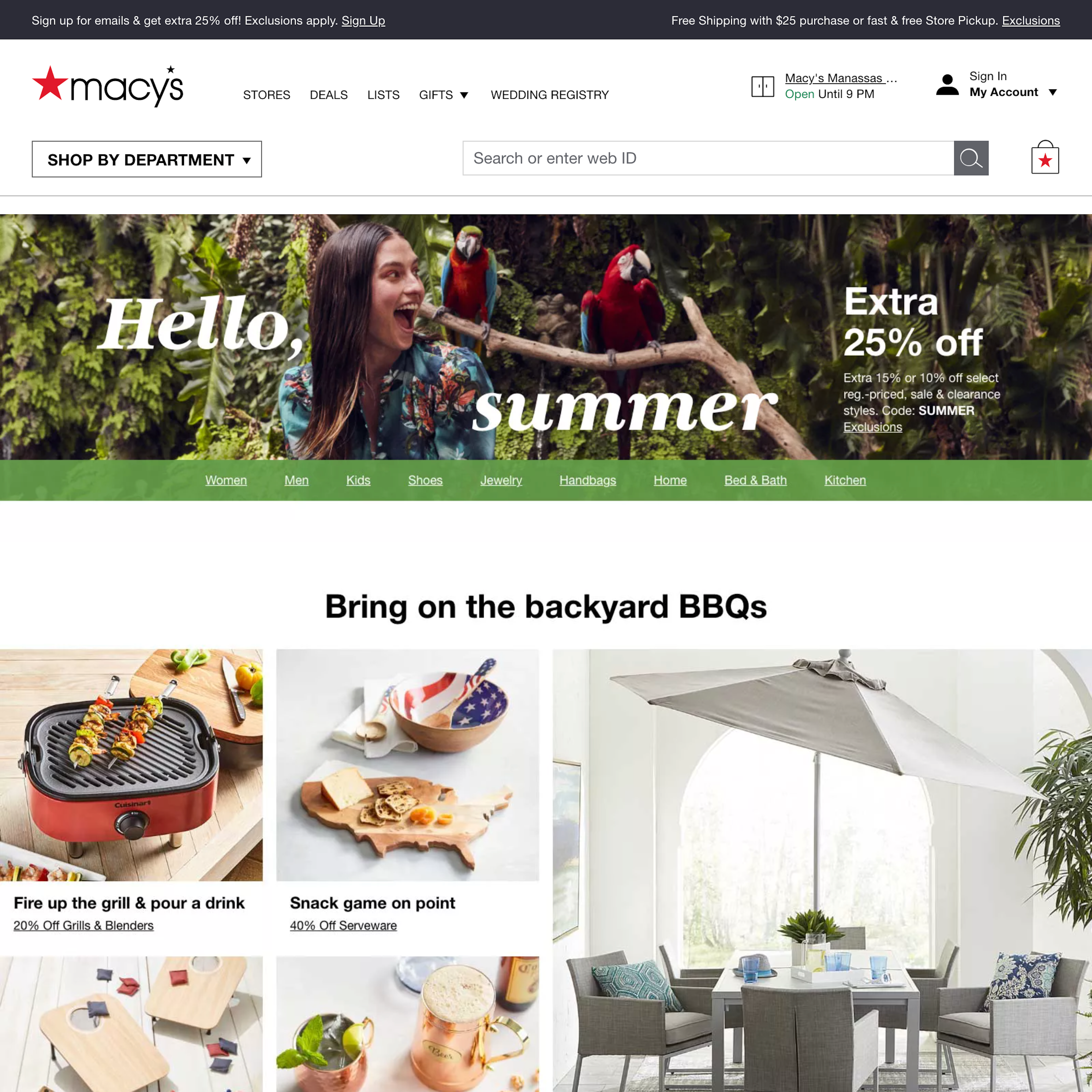
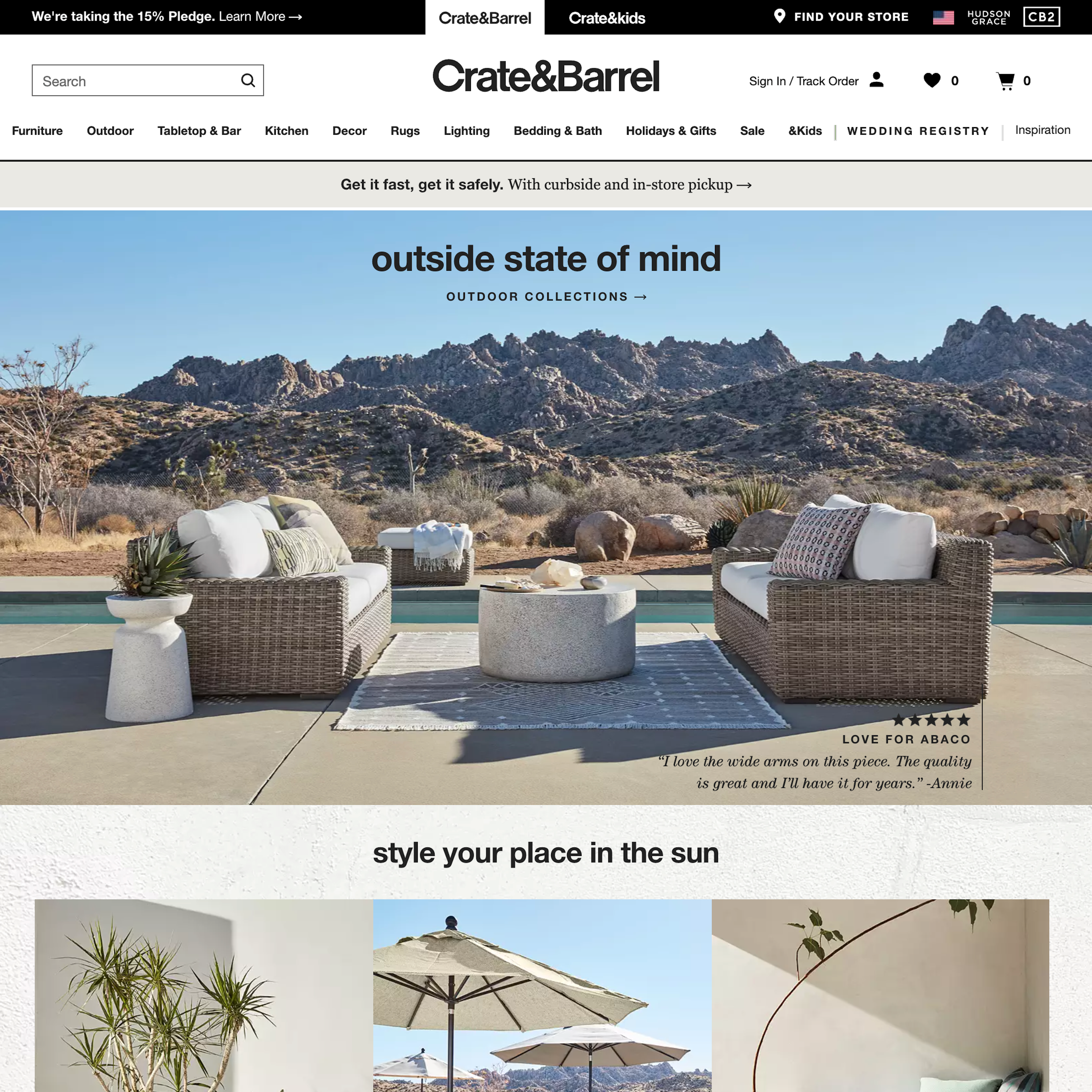
1148 ‘Search Field’ Design Examples
Also referred to as: Site Search, Search Bar
What’s this? Here you’ll find 1148 “Search Field” full-page screenshots annotated with research-based UX insights, sourced from Baymard’s UX benchmark of 327 e-commerce sites. (Note: this is less than 1% of the full research catalog.)
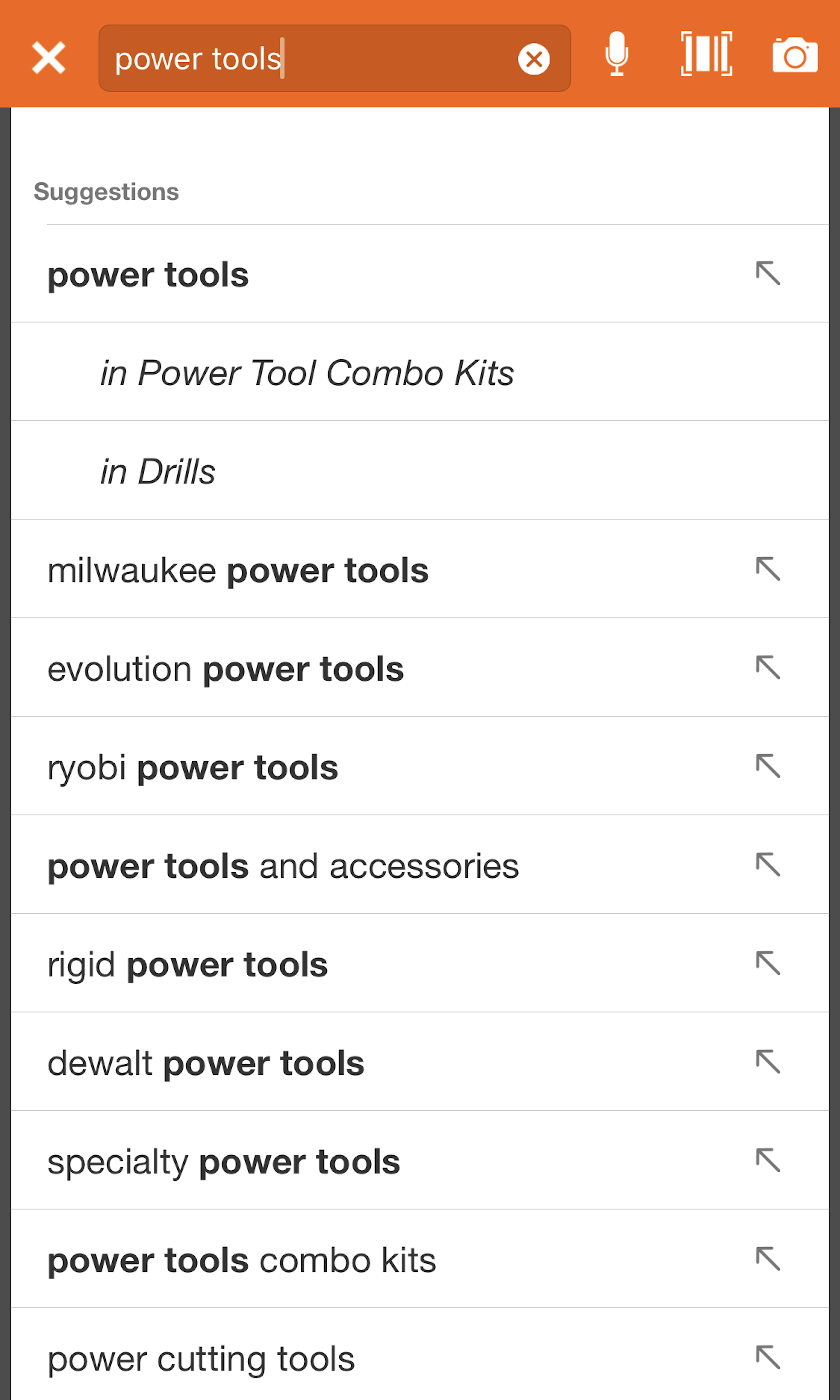
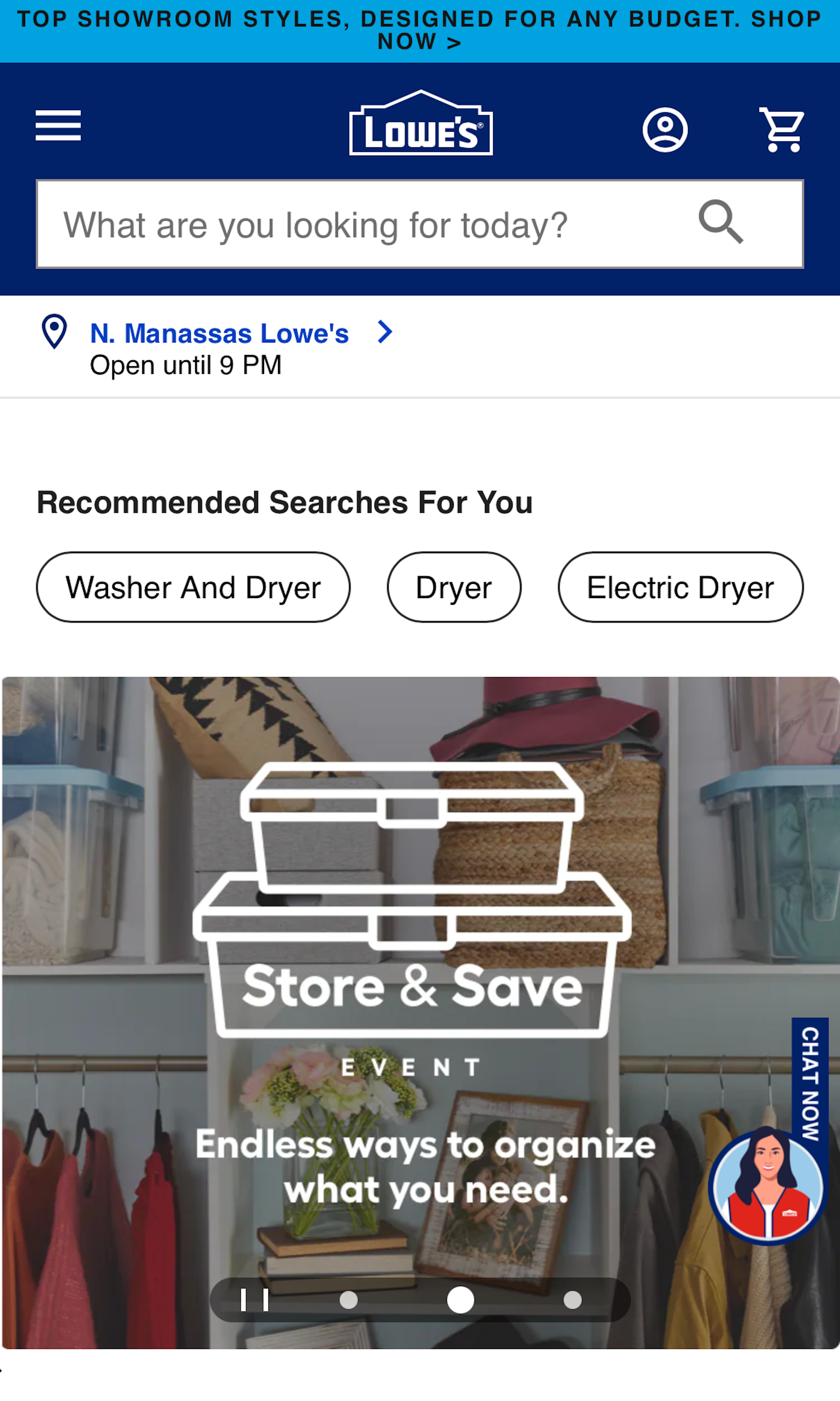
The search field itself represents the initial step of the user’s search process, and the search field design is therefore a key aspect in crafting a great search experience. However, our large-scale e-commerce search usability study shows that the design of the search field is instrumental at an even more fundamental level — the field design can influence the user’s entire approach to how they find products on the site.
More ‘Search Field’ Insights
-
While an advanced search engine logic is the backbone of delivering a great search experience, our usability testing reveals that a great search field design, placeholder text, and button design can set the right expectations and steer users toward better search queries — but it only takes a few minor design hiccups to severely mislead your users. During testing, minor design quirks for the search field led to severe usability issues such as users completely misunderstanding the search results, often abandoning the site as a direct consequence.
-
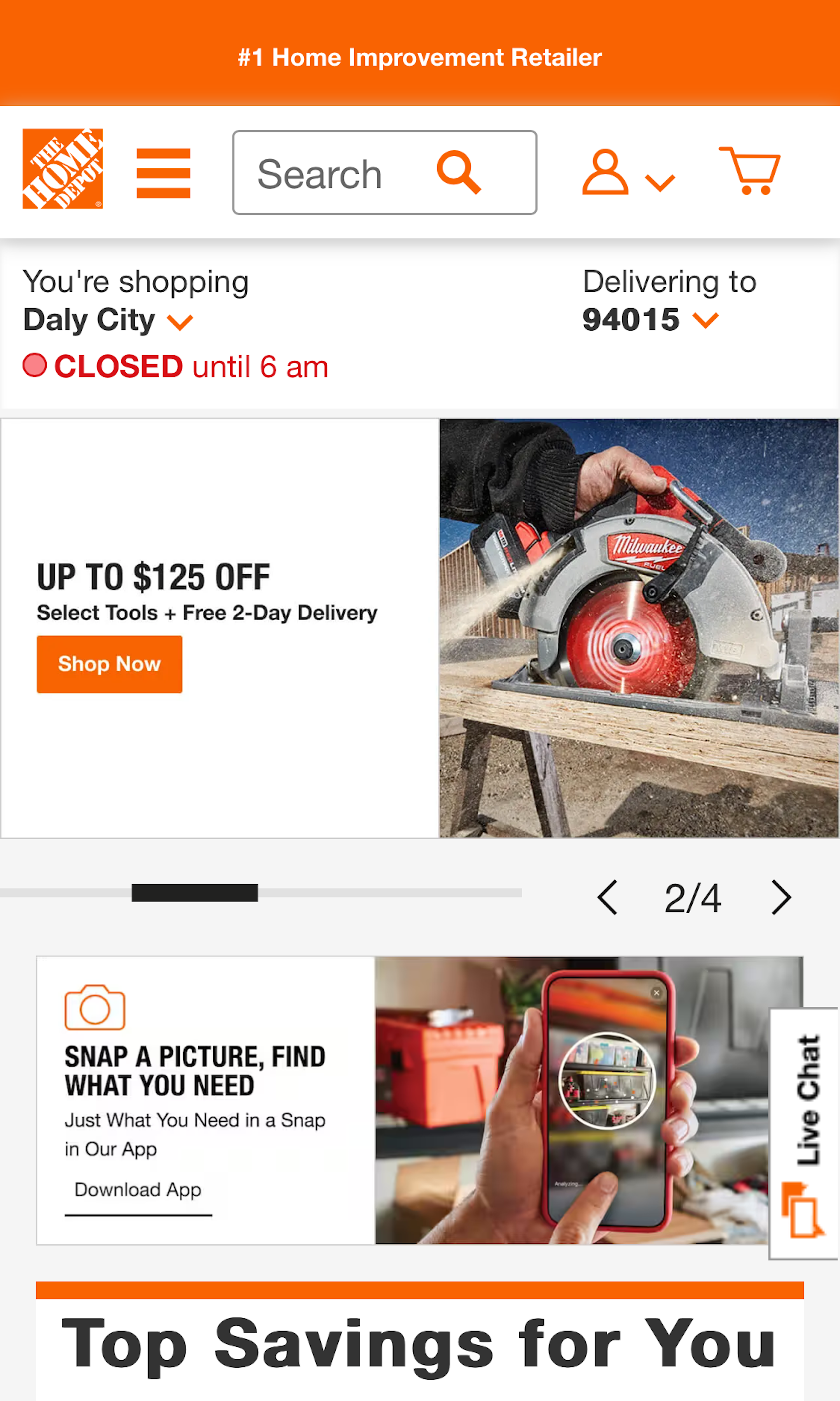
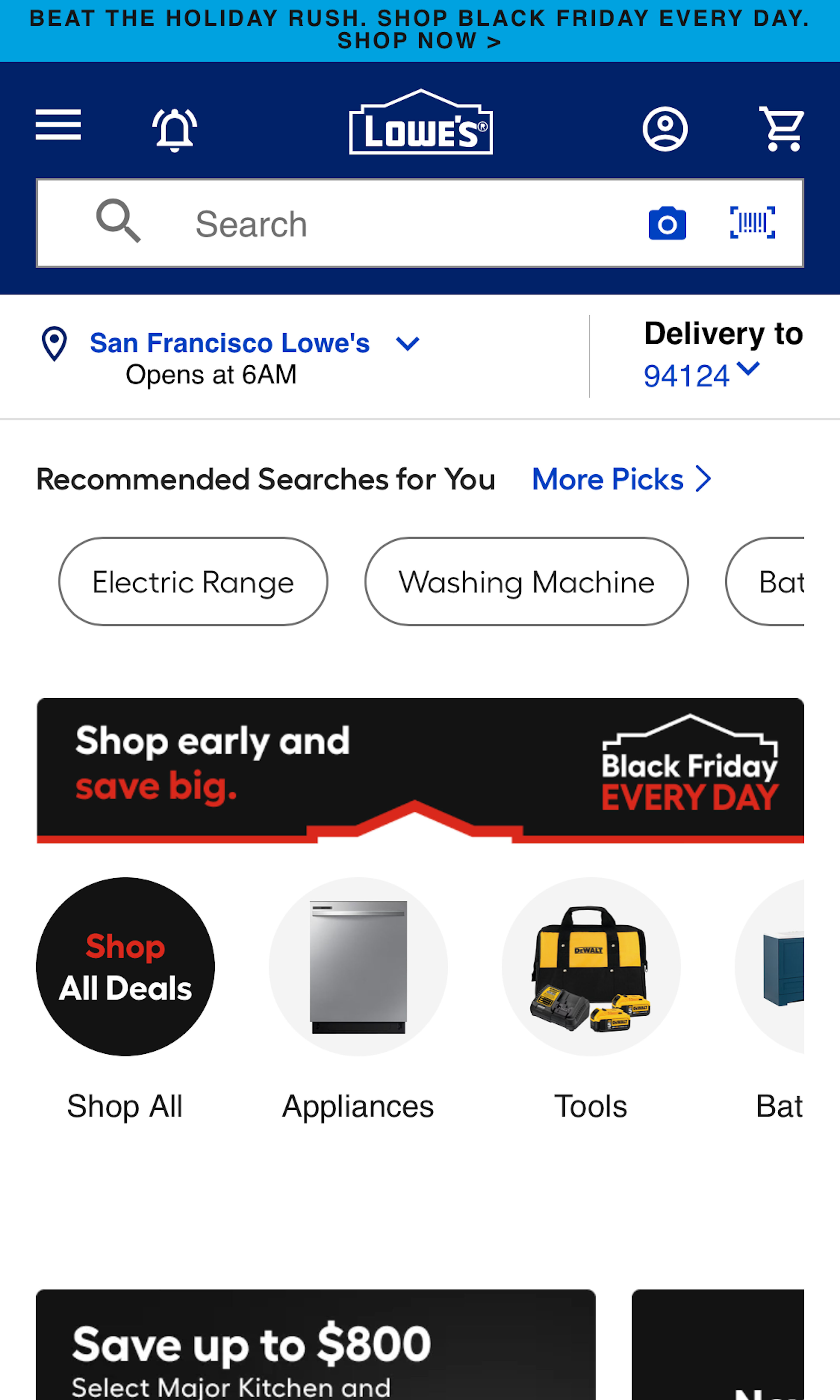
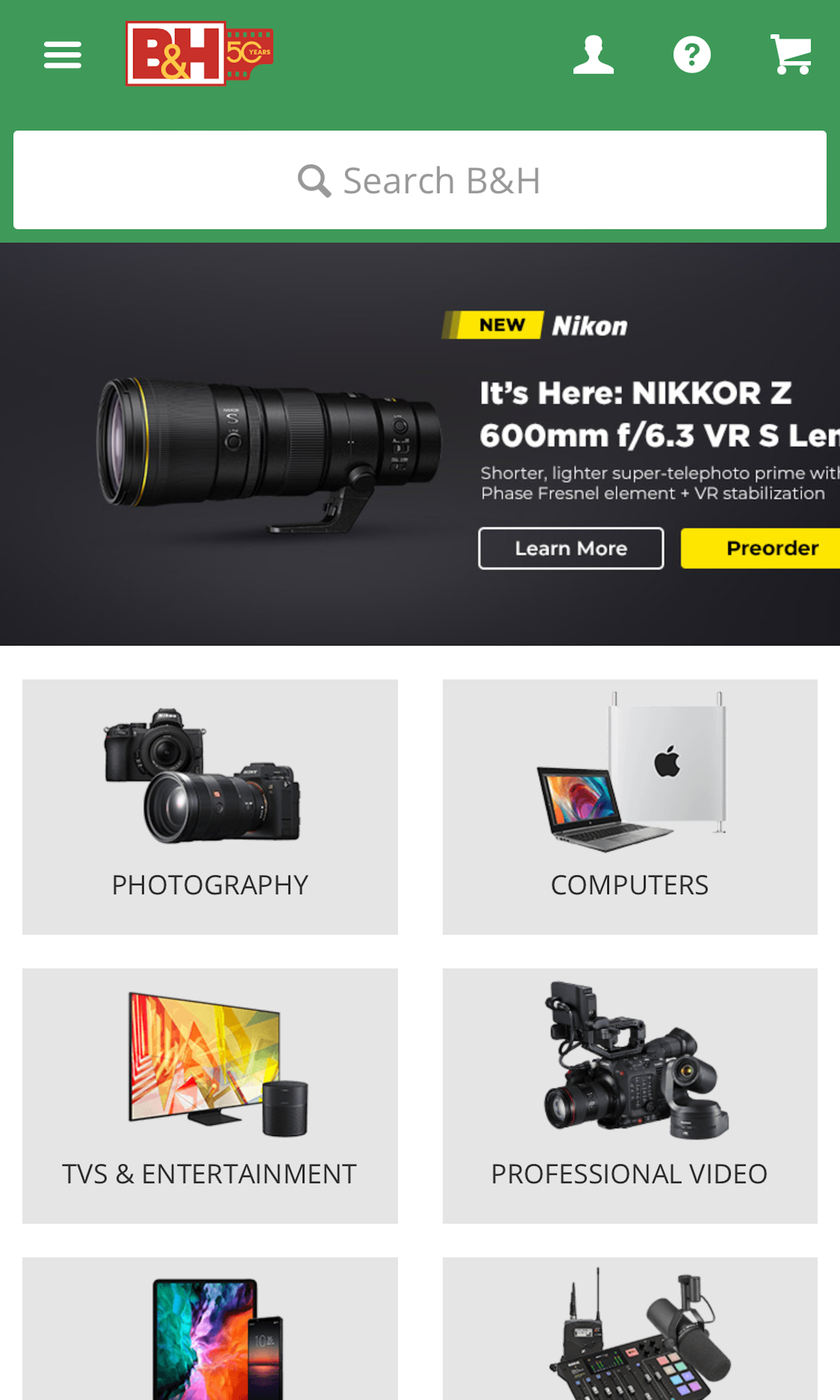
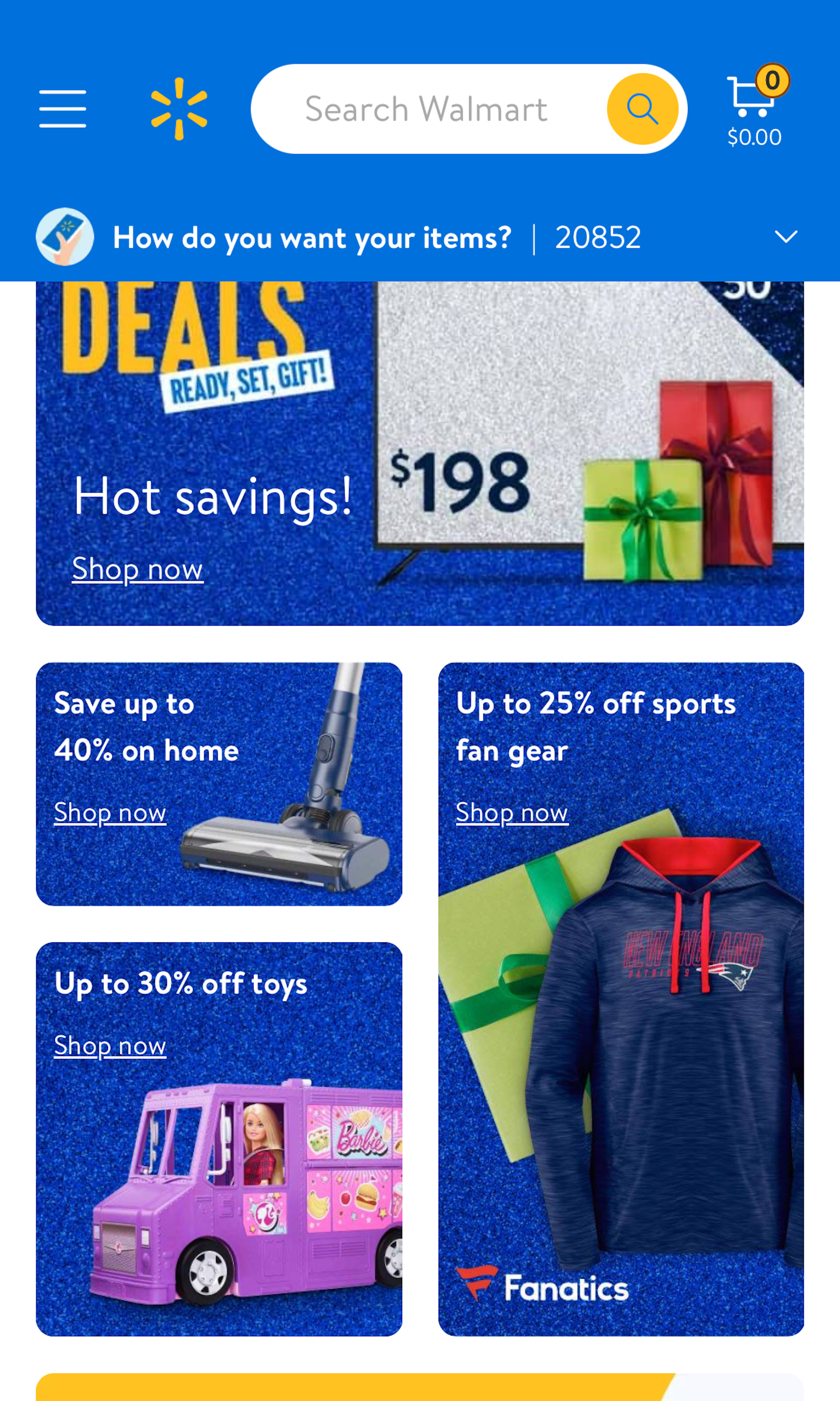
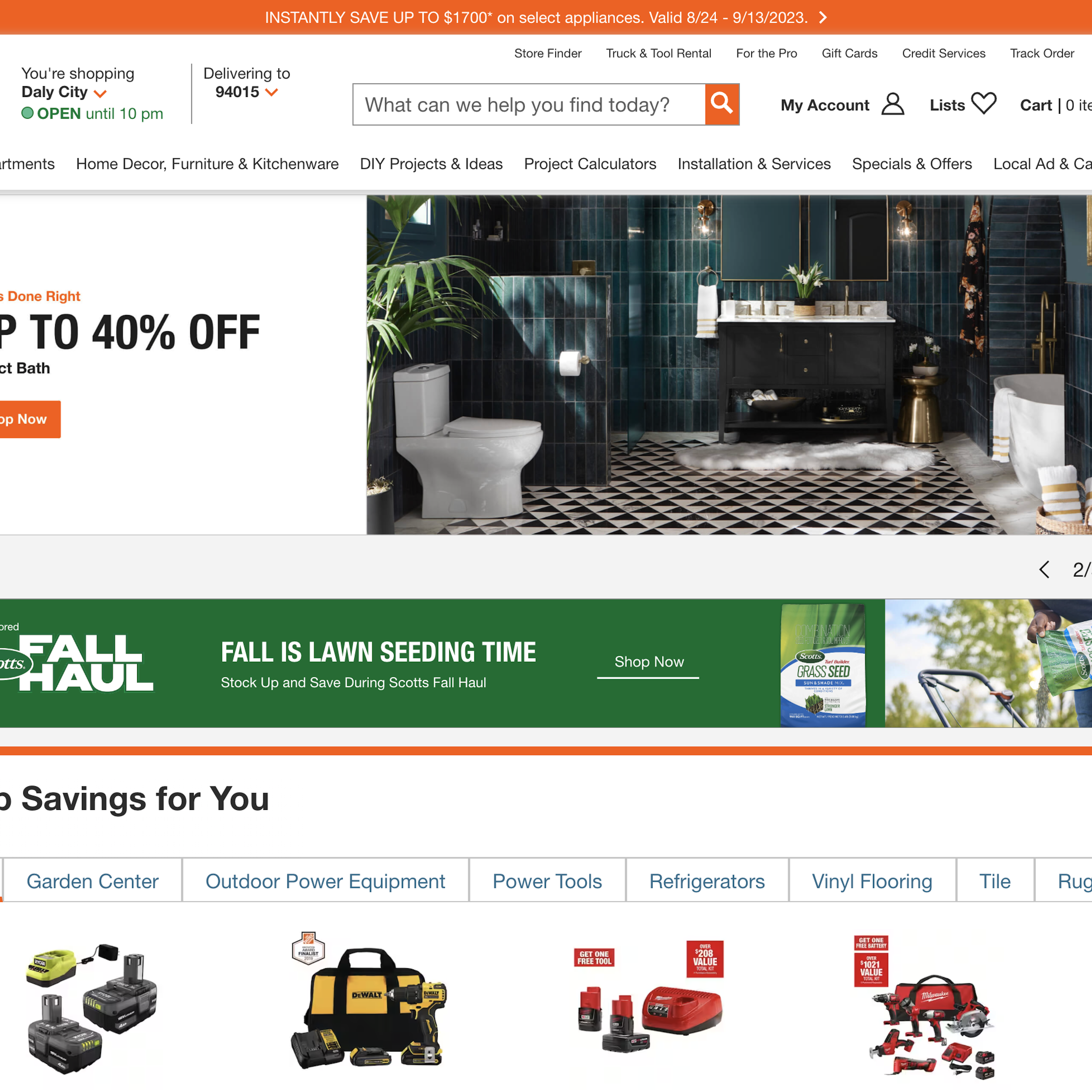
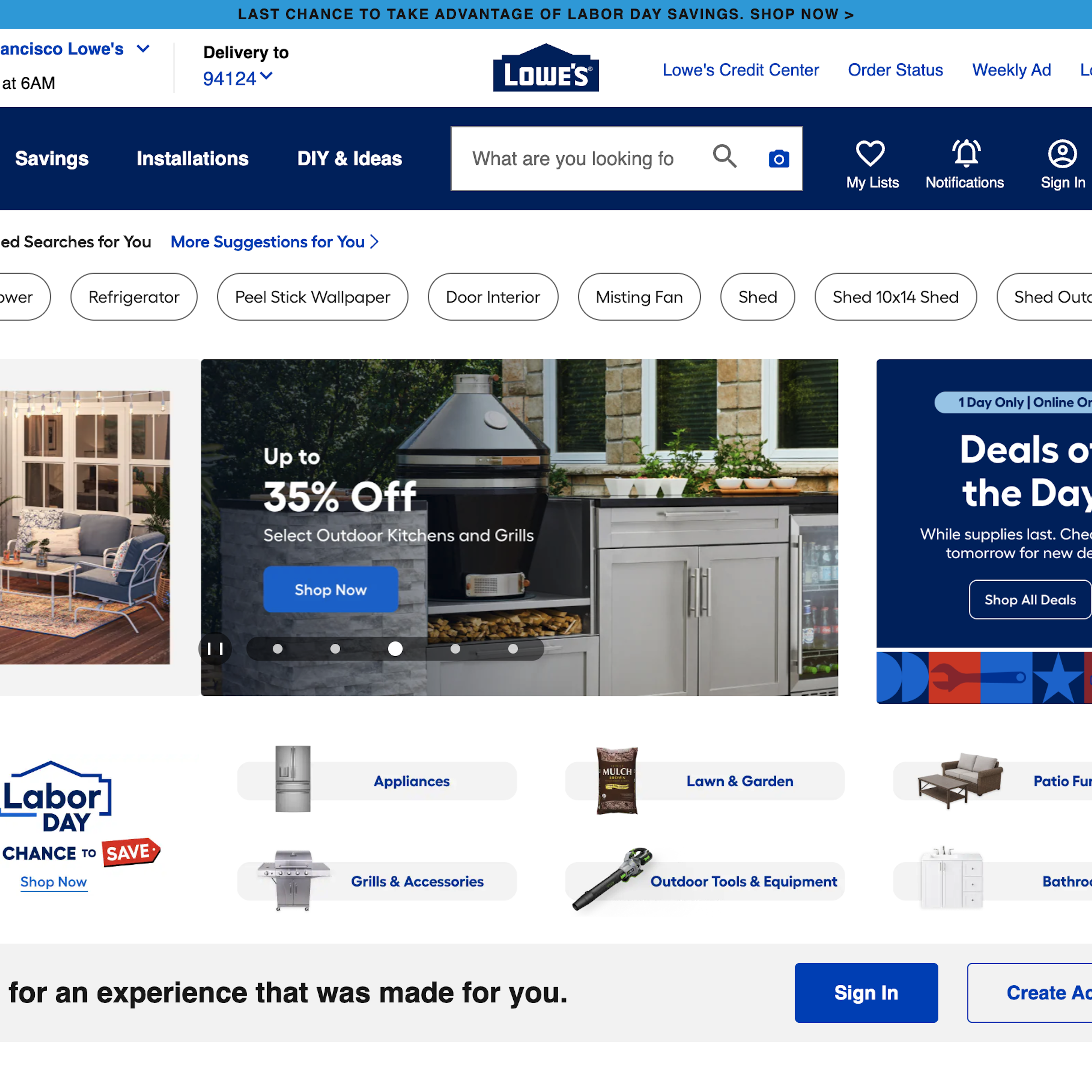
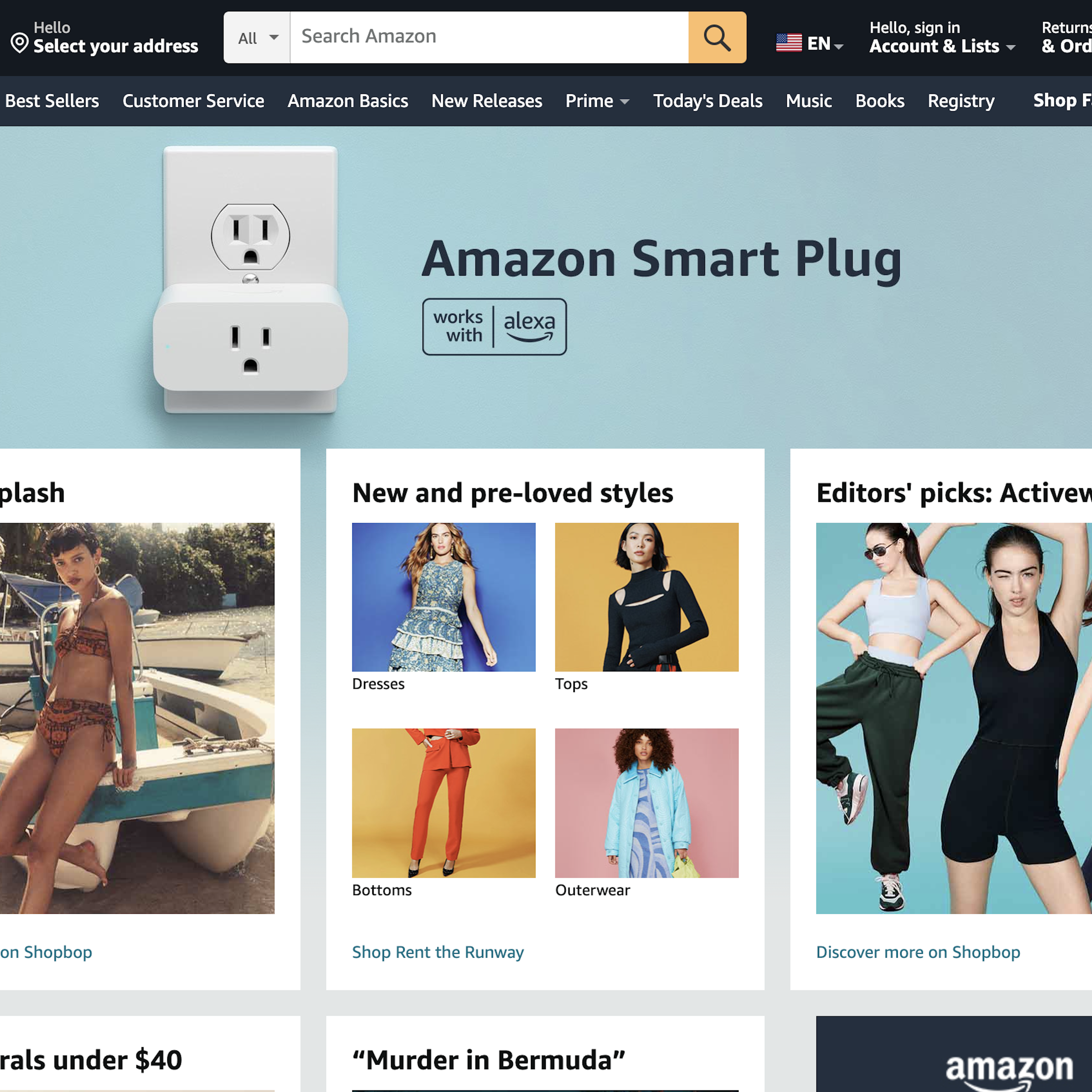
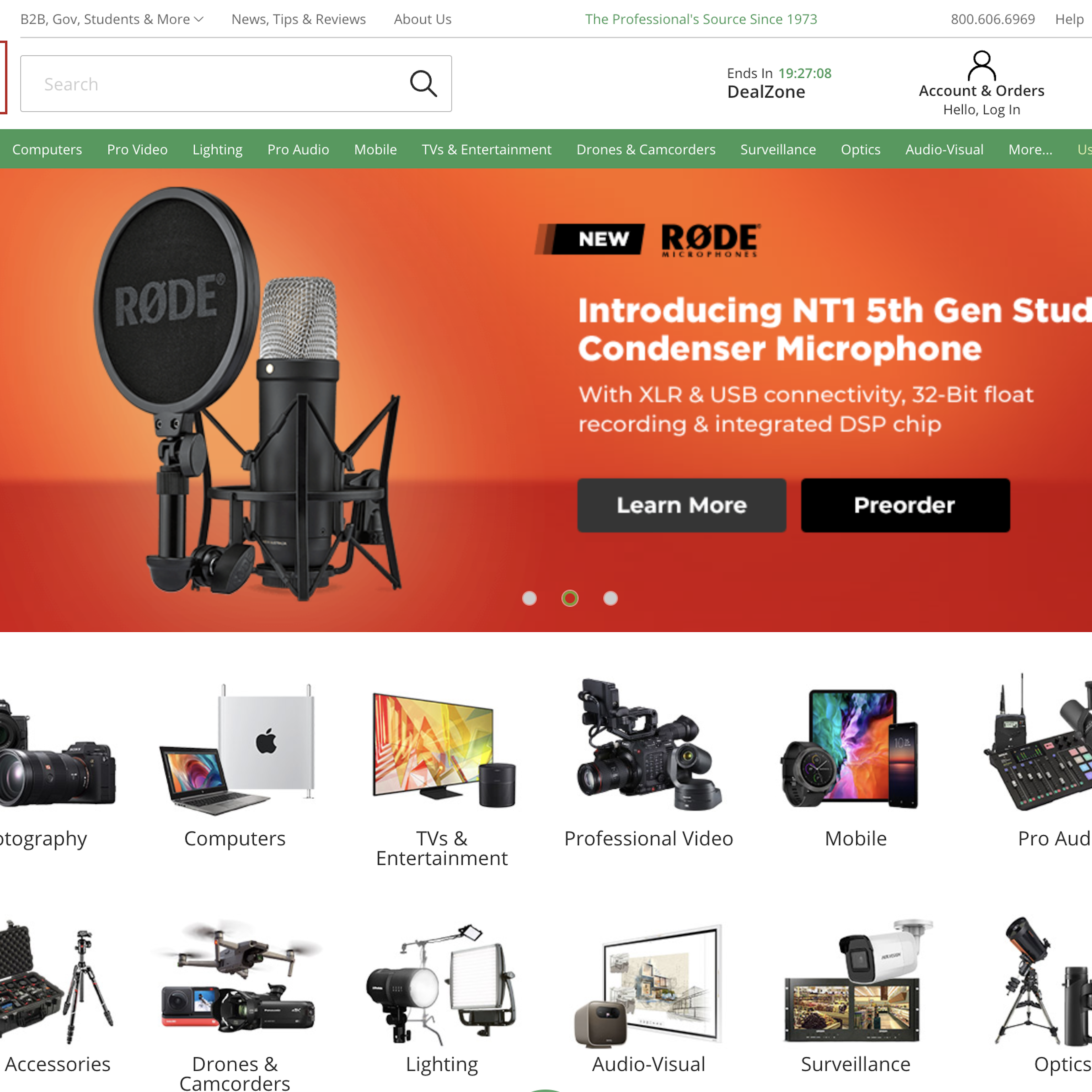
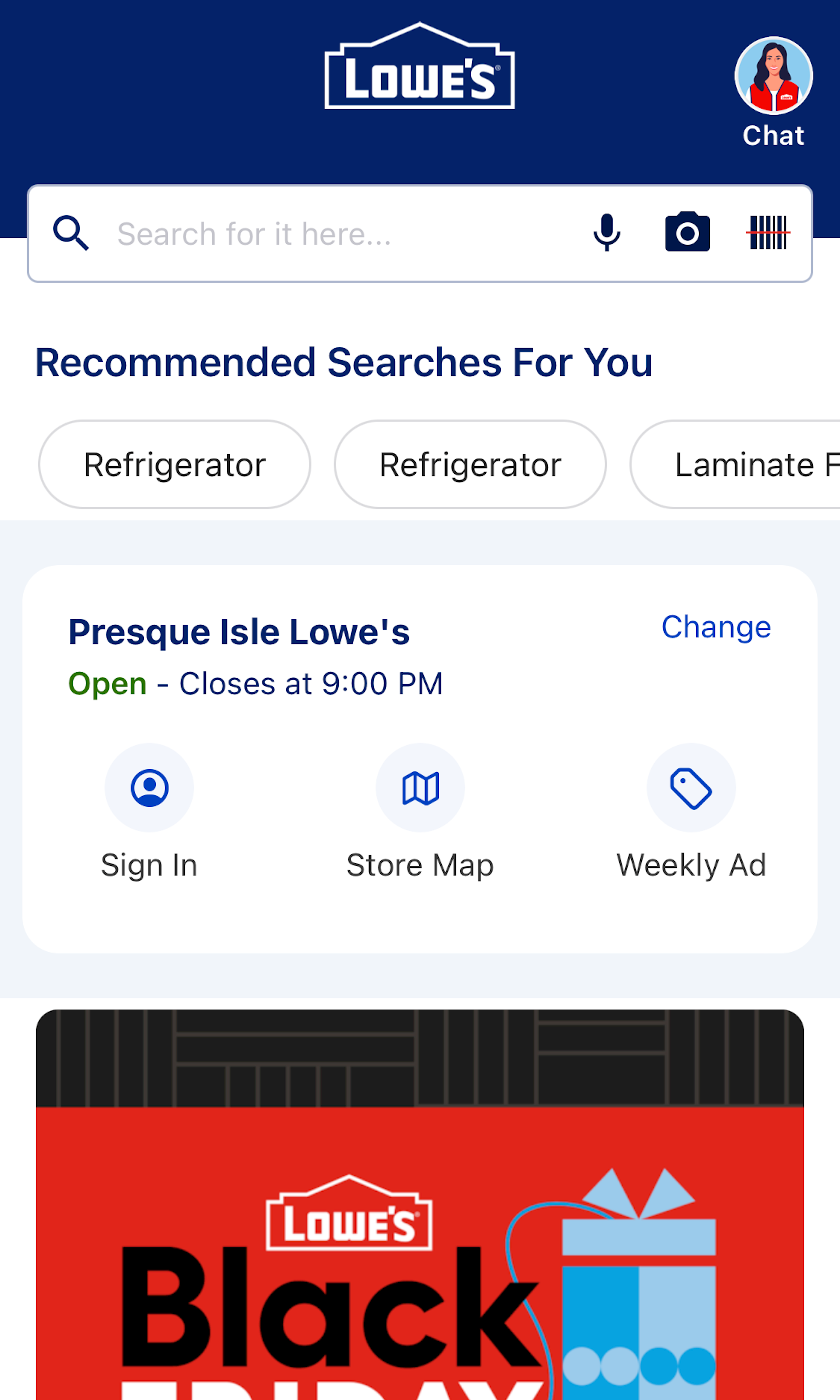
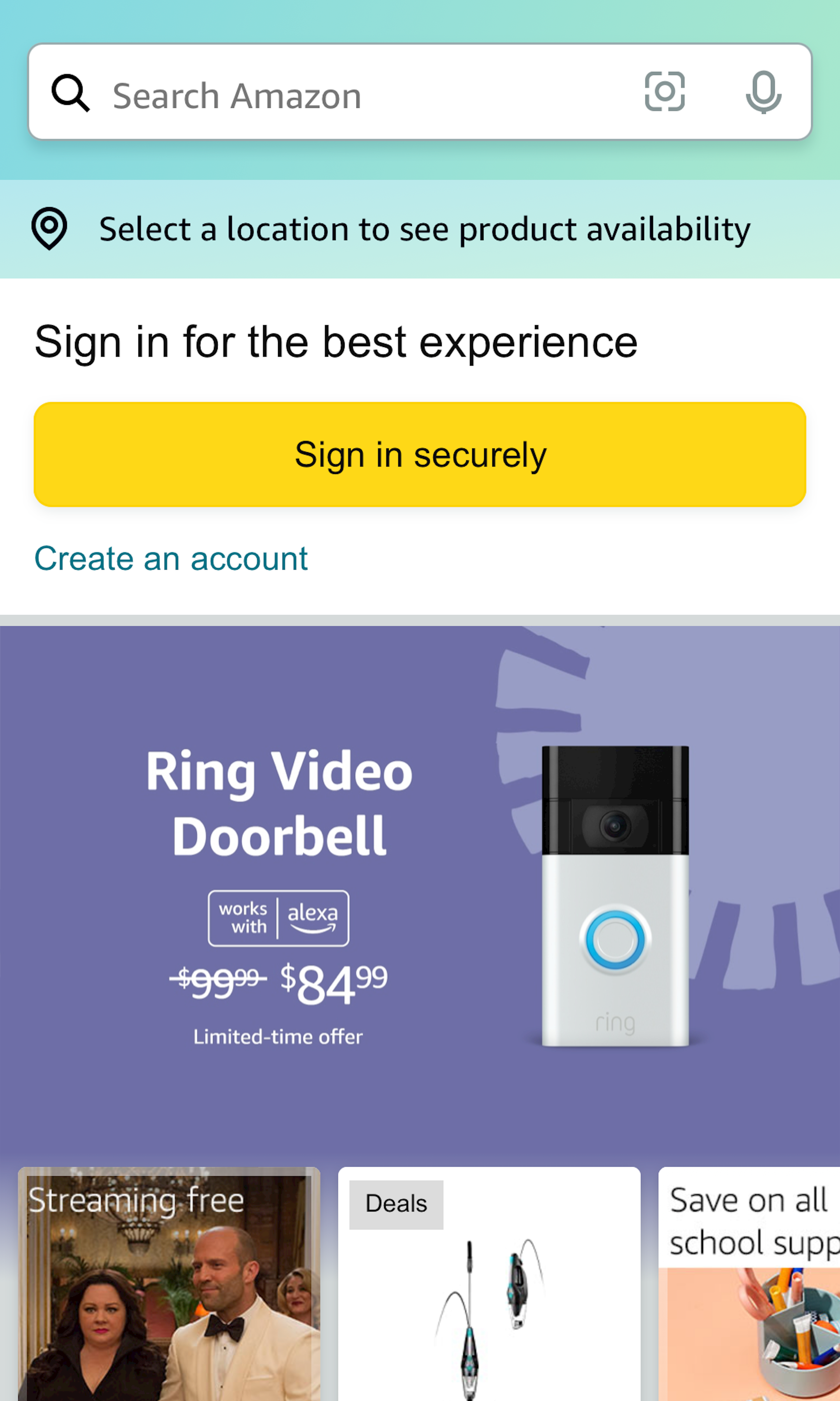
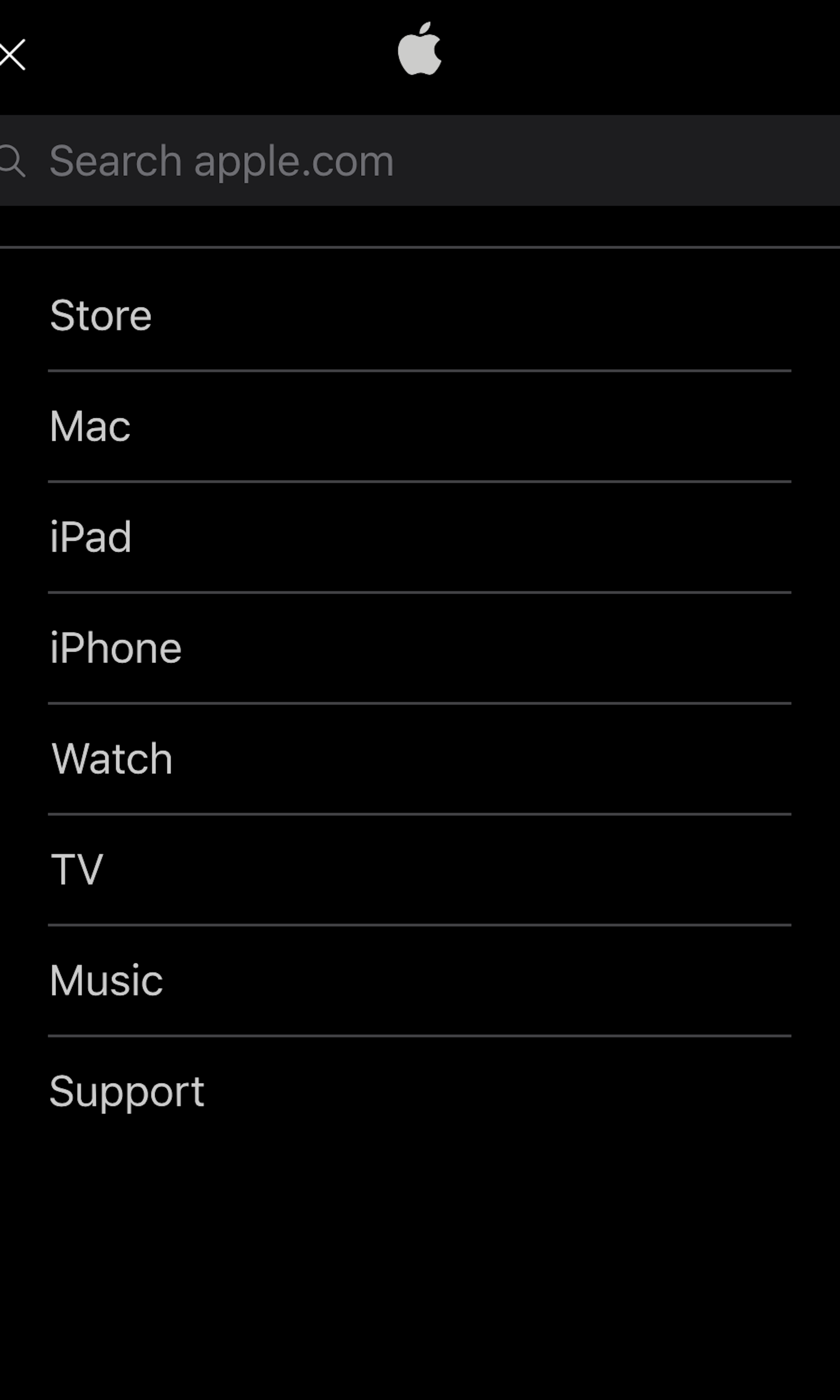
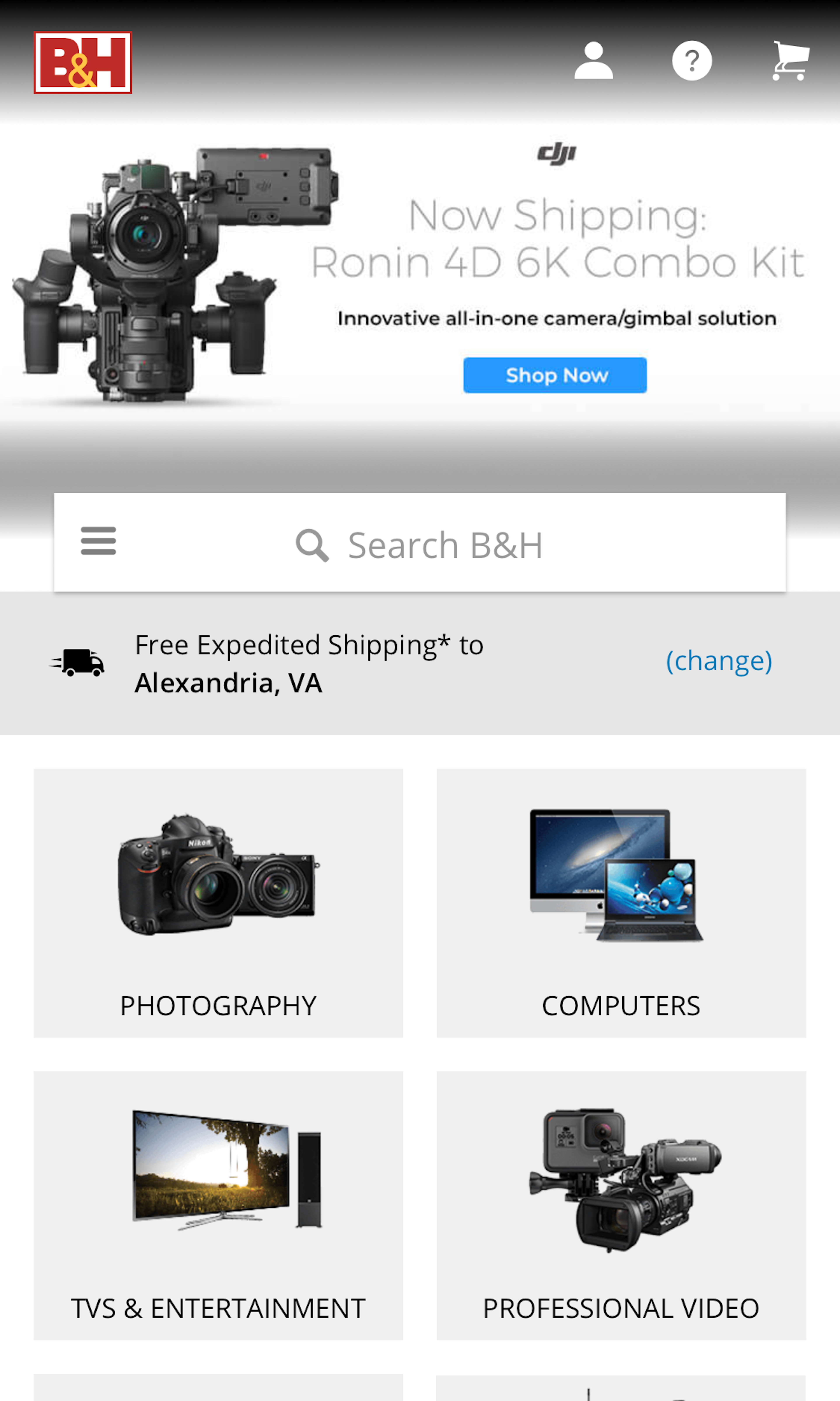
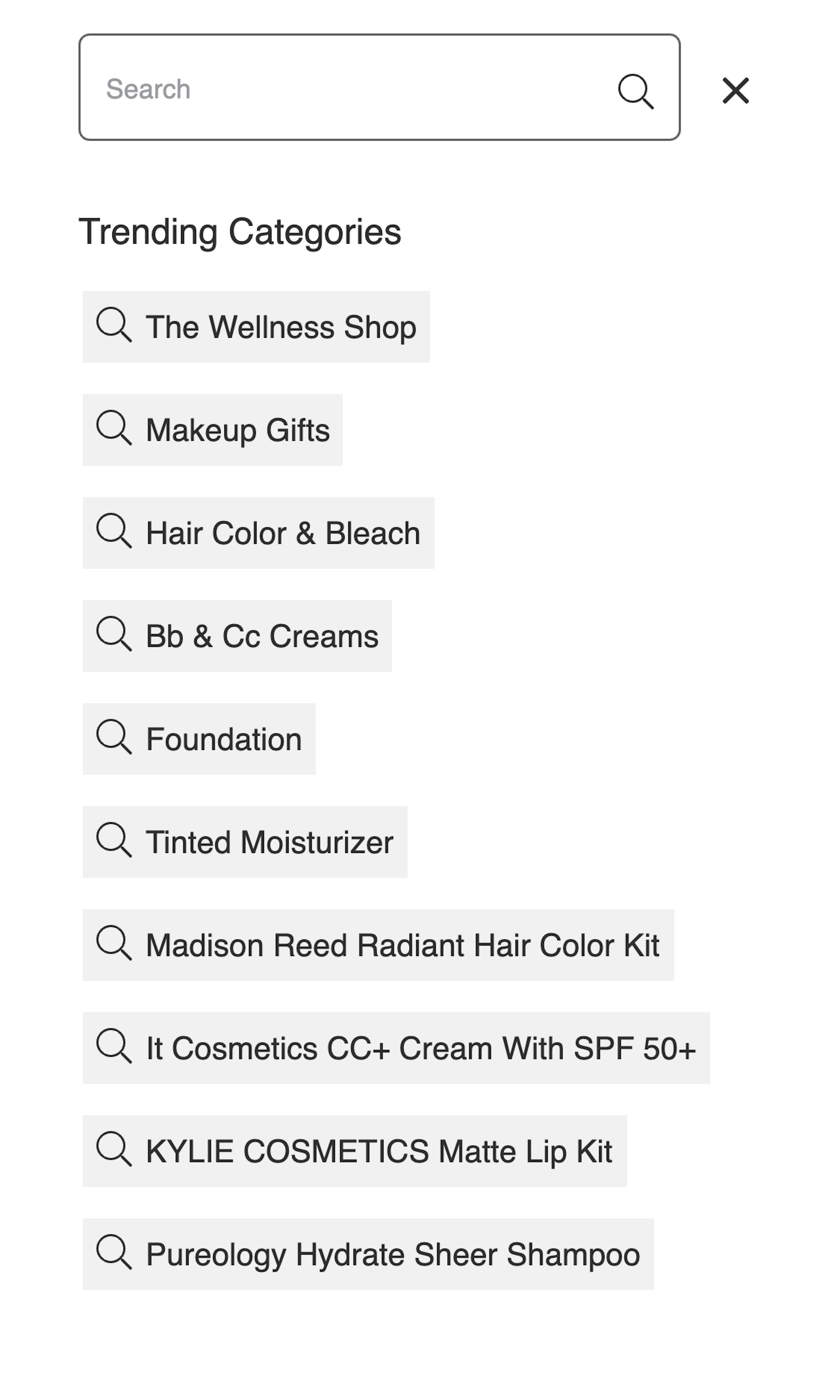
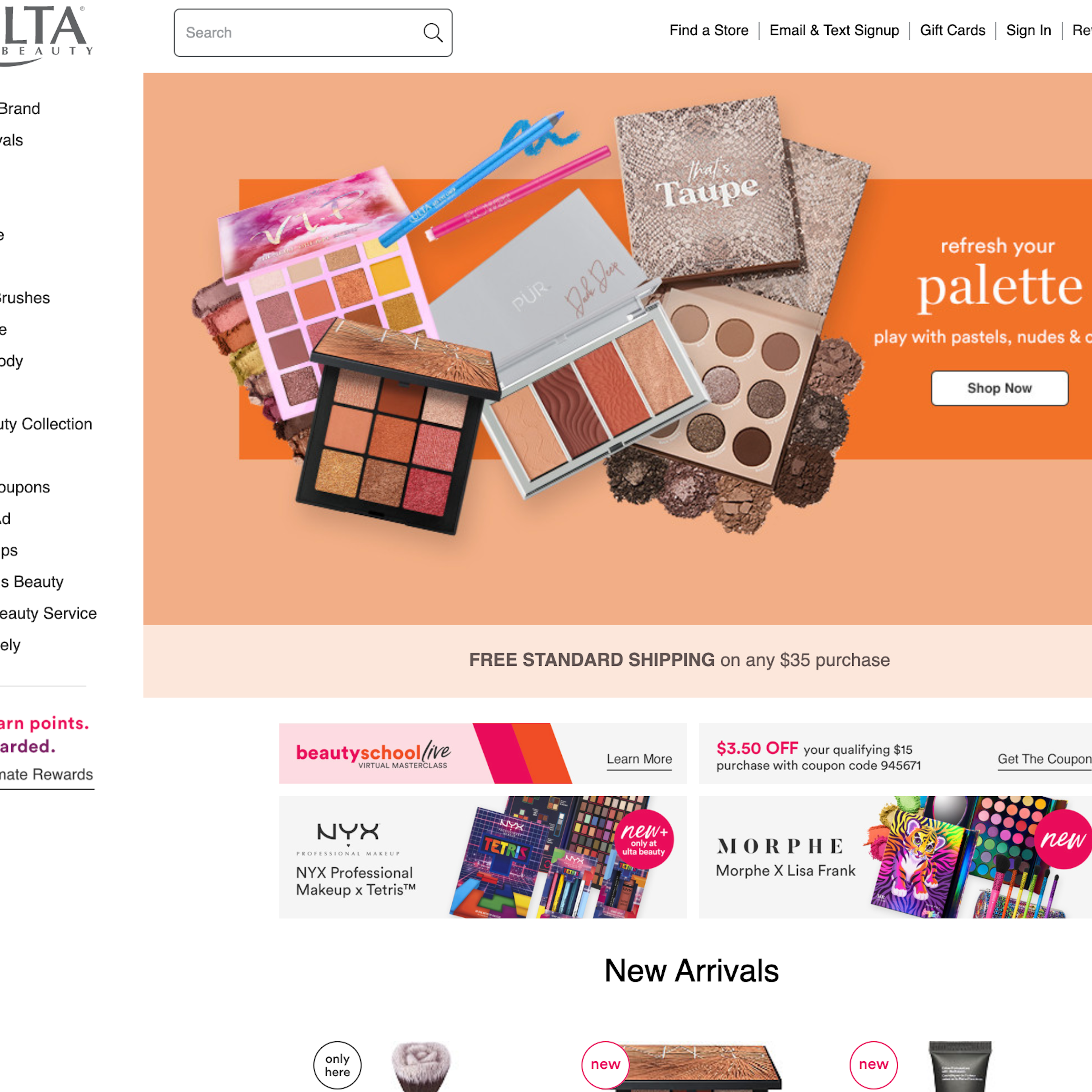
To a large extent users see the prominence of the search field as an indicator of how strongly the site “recommends” search as a way to find products, versus the alternative of navigating categories via the site menus. During our usability testing the subjects adopted search as their primary product-finding strategy much more frequently on sites that had a very prominent search field, while the test sites with a subdued search field design saw increased category navigation.
-
Learn More: Besides exploring the 1148 search field design examples below, you may also want to read our related articles with our (free) research findings on “E-Commerce Search Field Design and Its Implications” along with “E-Commerce Sites Need Multiple of These 5 ‘Search Scope’ Features”.
-
Get Full Access: To see all of Baymard’s e-commerce search research findings you’ll need Baymard Premium access. (Premium also provides you full access to 200,000+ hours of UX research findings, 650+ e-commerce UX guidelines, and 275,000+ UX performance scores.)


User Experience Research, Delivered Weekly
Join 60,000+ UX professionals and get a new UX article every week.

User Experience Research, Delivered Weekly
Join 60,000+ UX professionals and get a new UX article every week.
Explore Other Research Content
300+ free UX articles based on large-scale research.

327 top sites ranked by UX performance.

Code samples, demos, and key stats for usability.