
328 ‘Address Validator’ Design Examples
Also referred to as: Address Validation
What’s this? Here you’ll find 328 “Address Validator” full-page screenshots annotated with research-based UX insights, sourced from Baymard’s UX benchmark of 327 e-commerce sites. (Note: this is less than 1% of the full research catalog.)
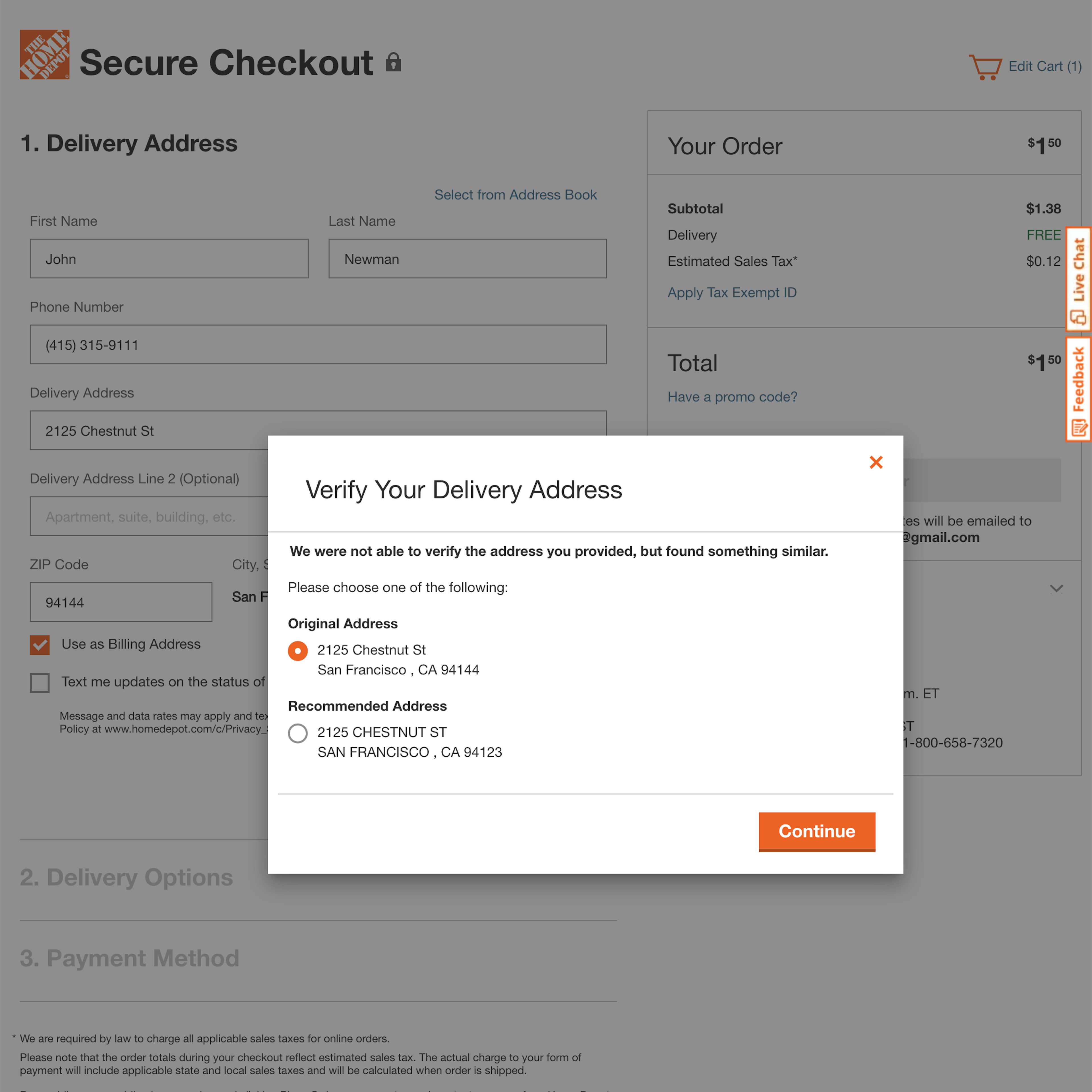
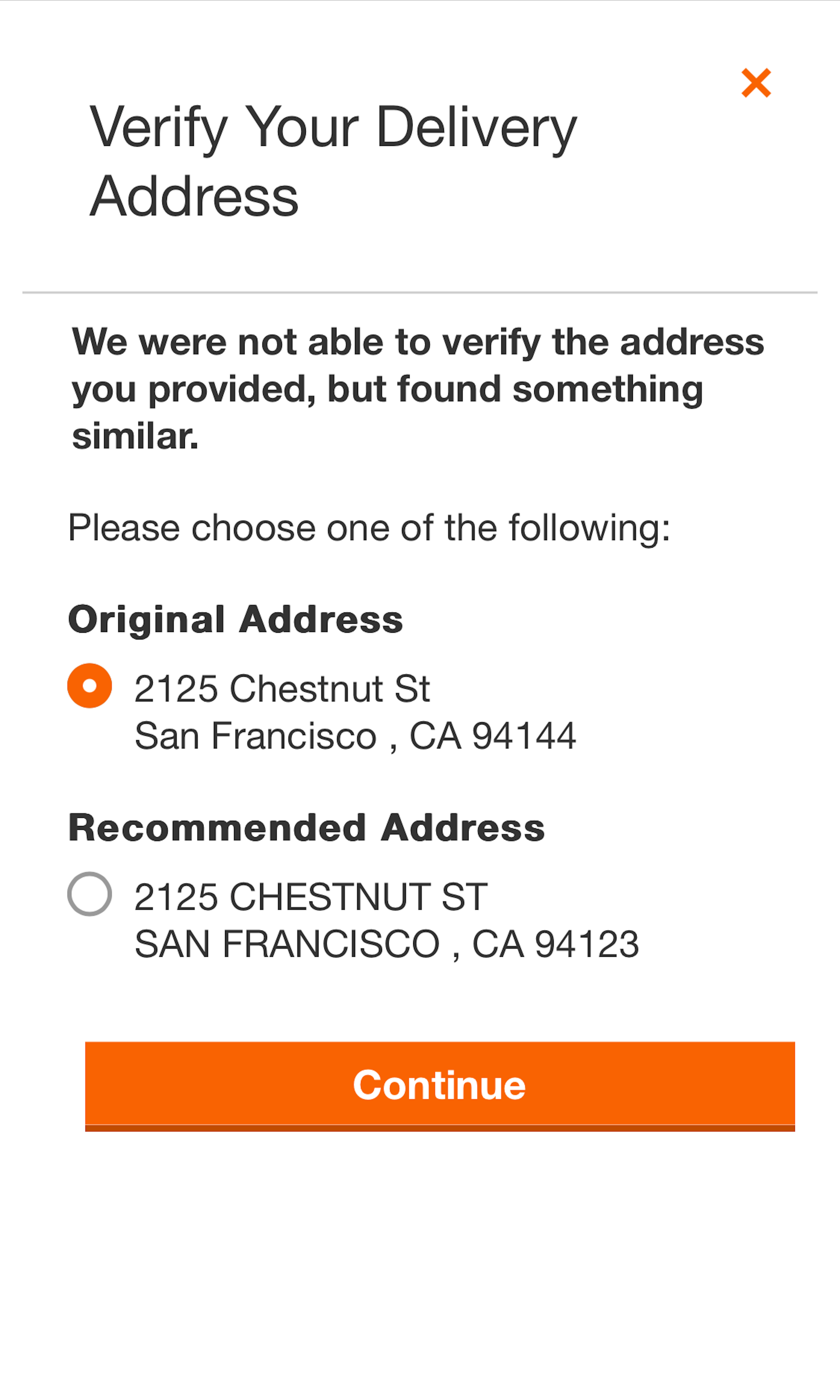
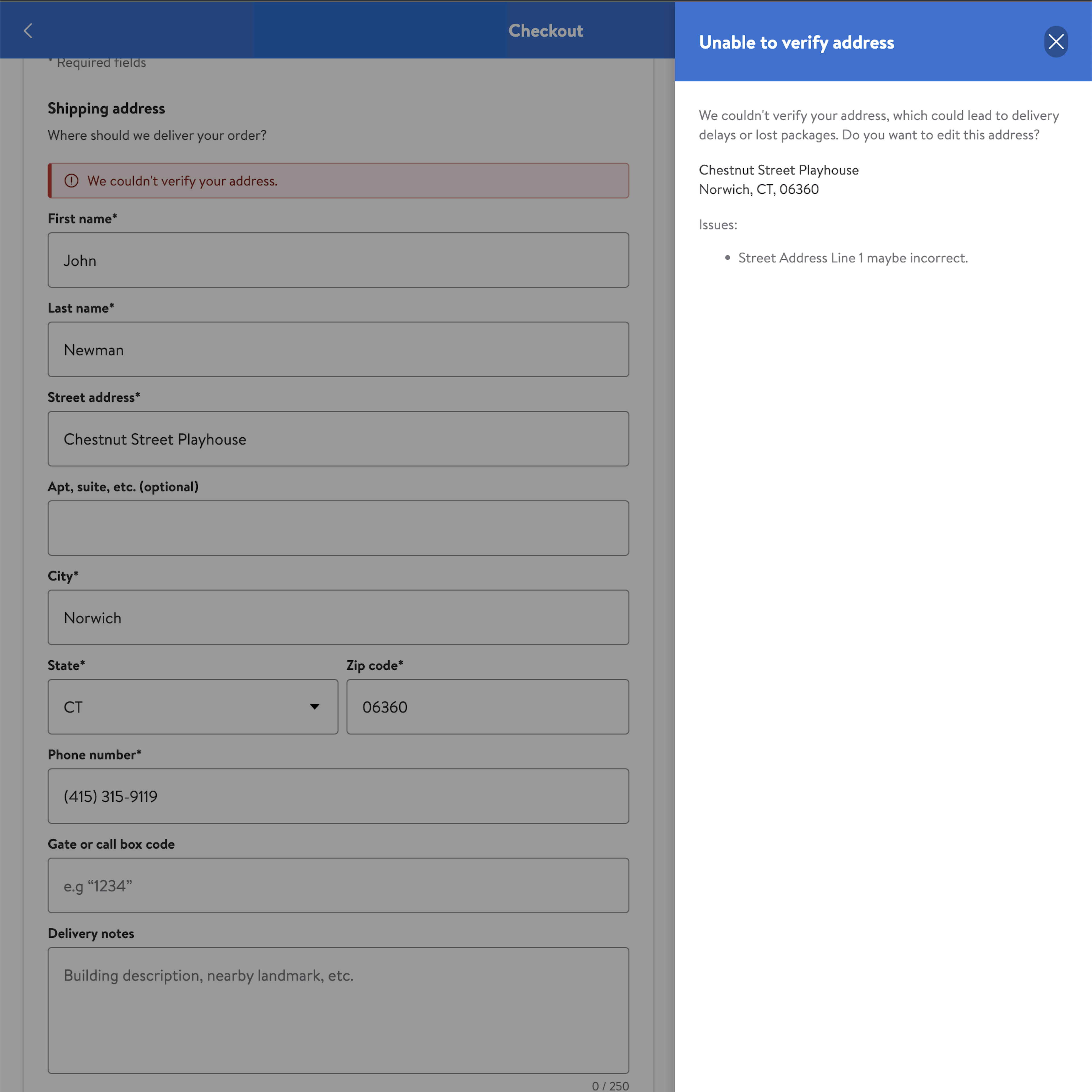
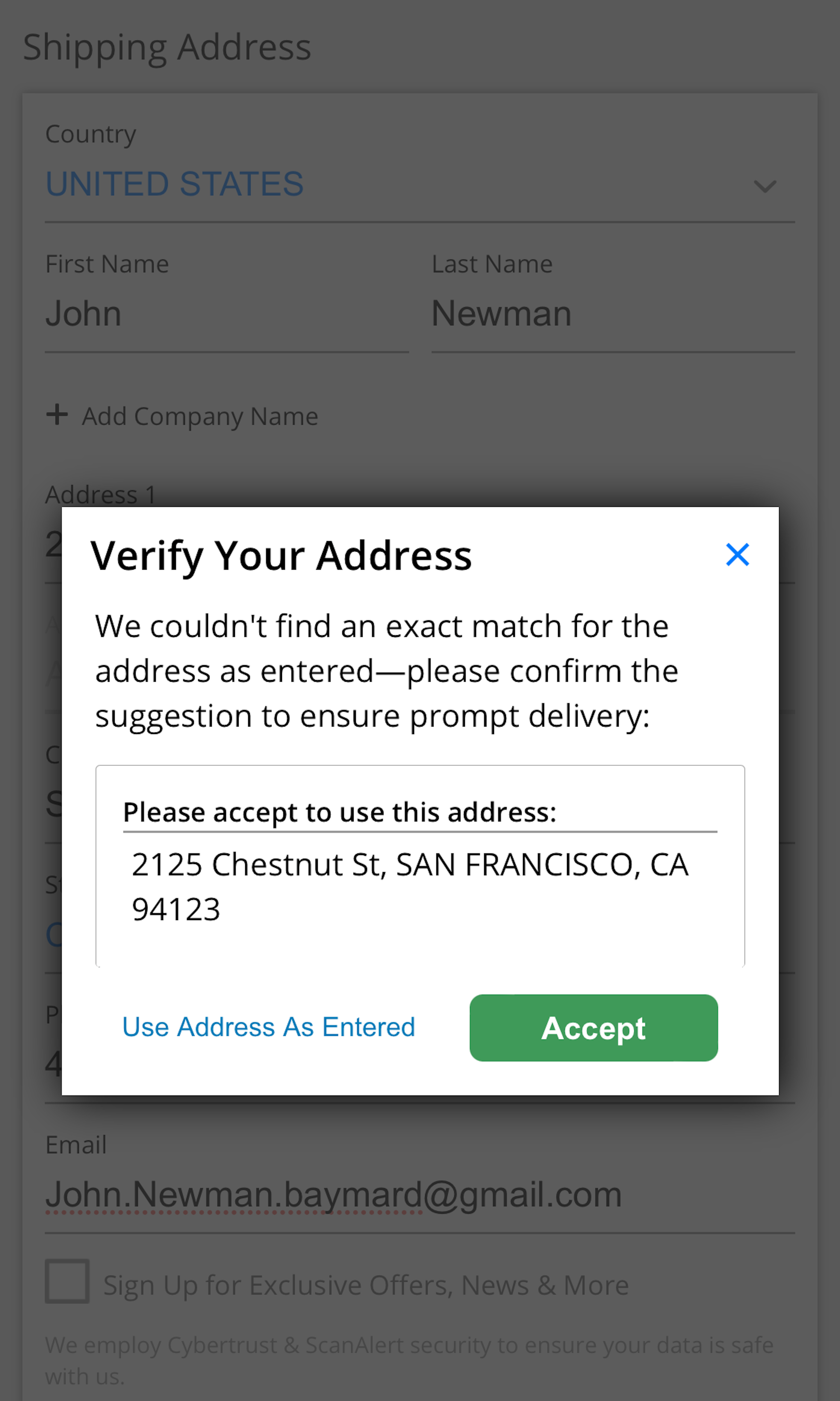
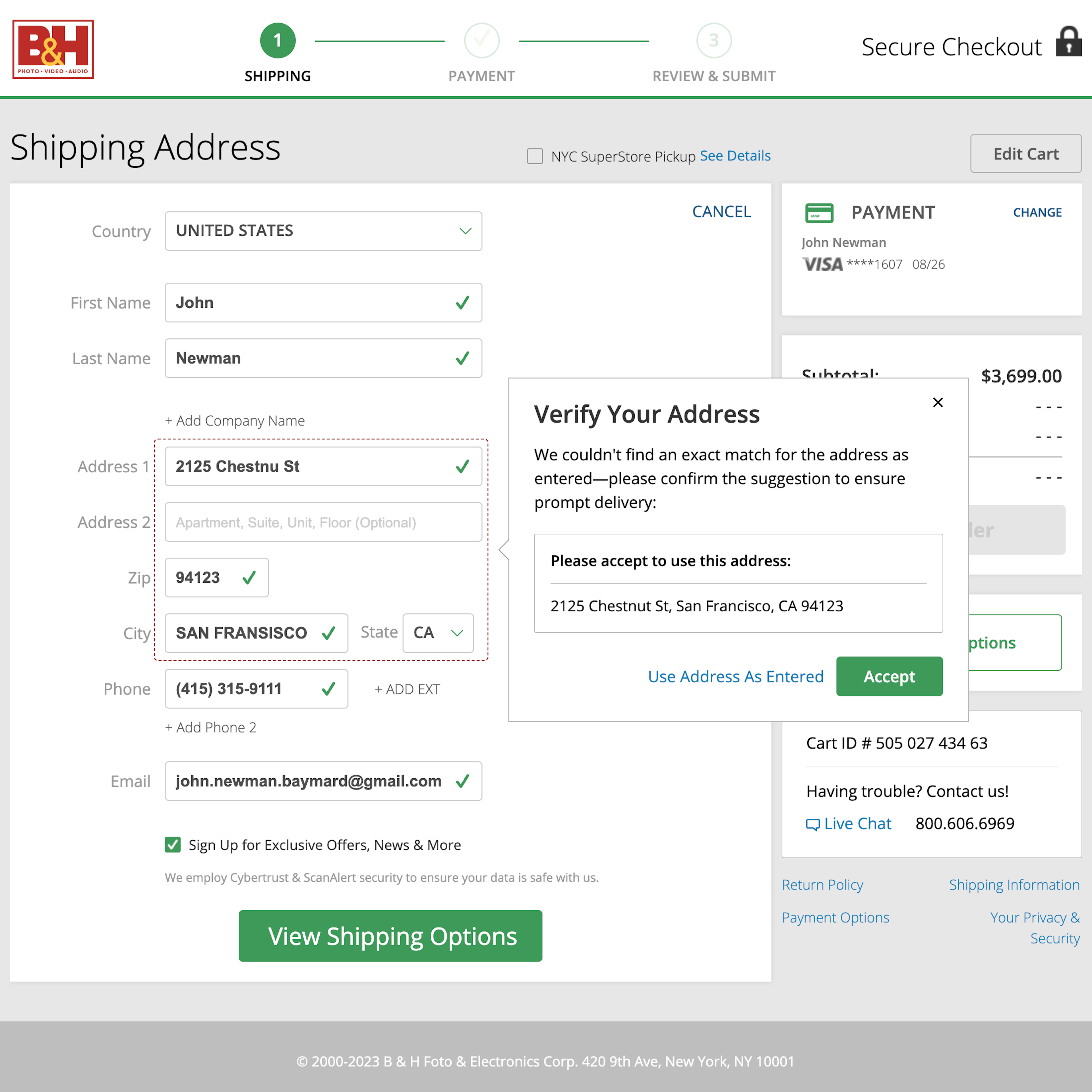
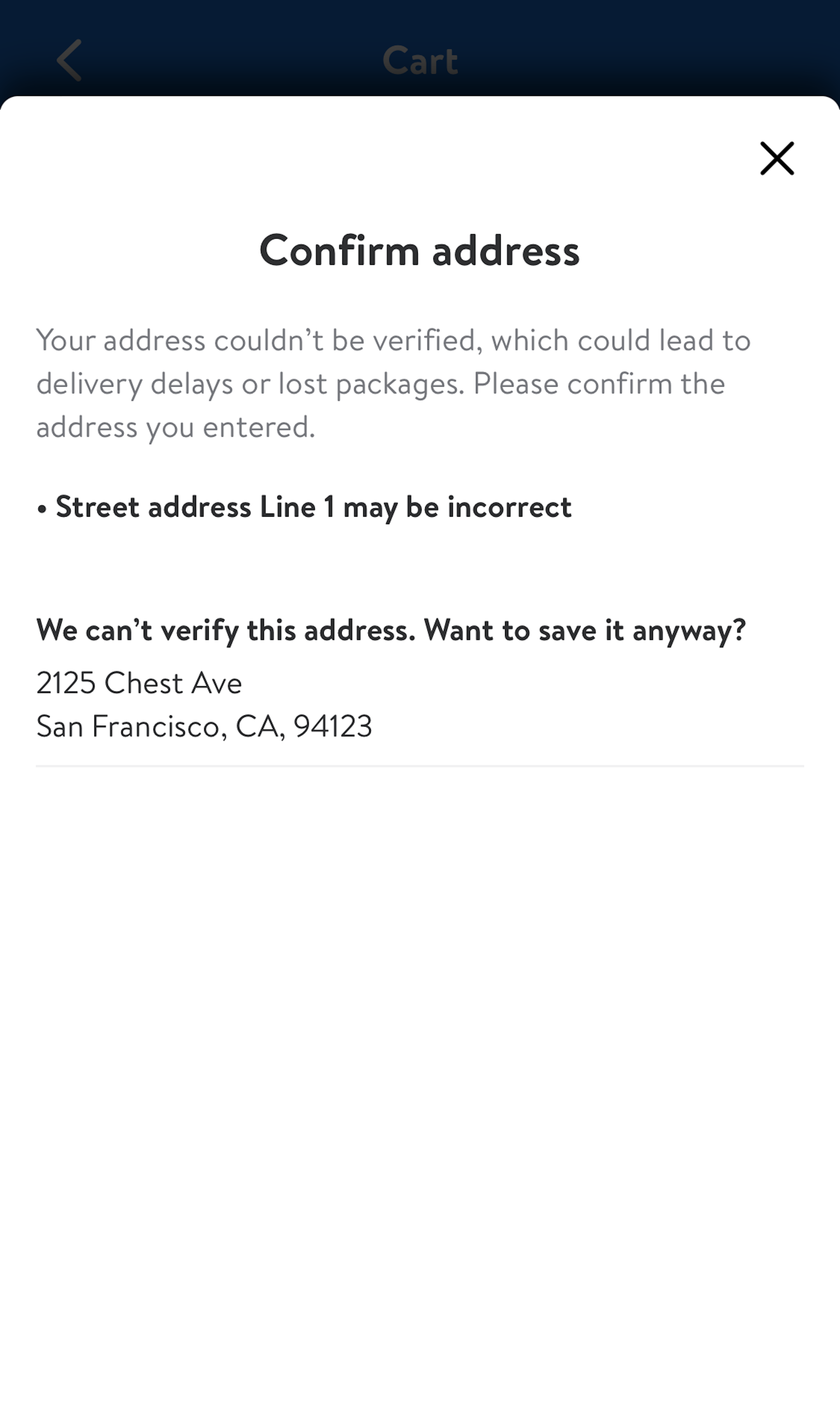
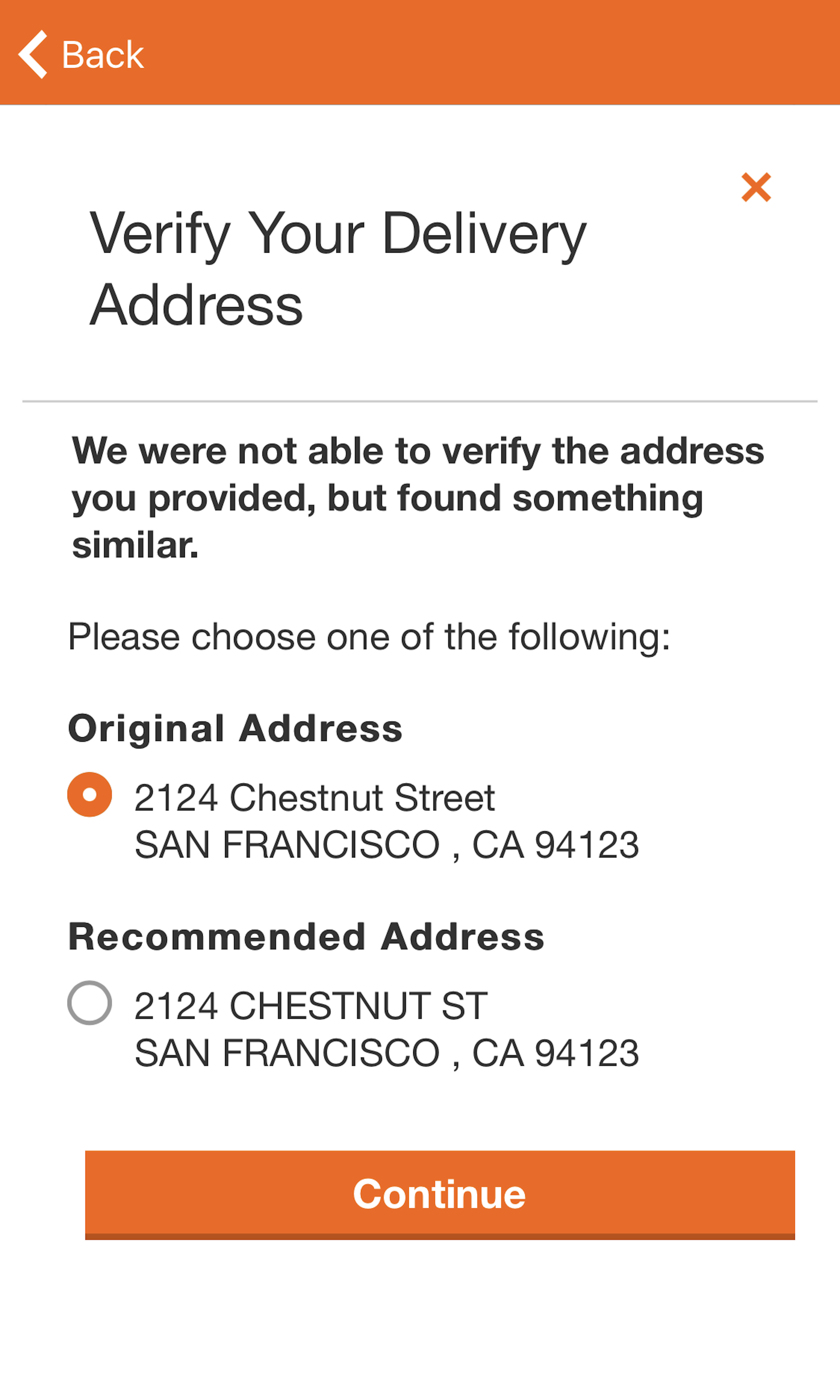
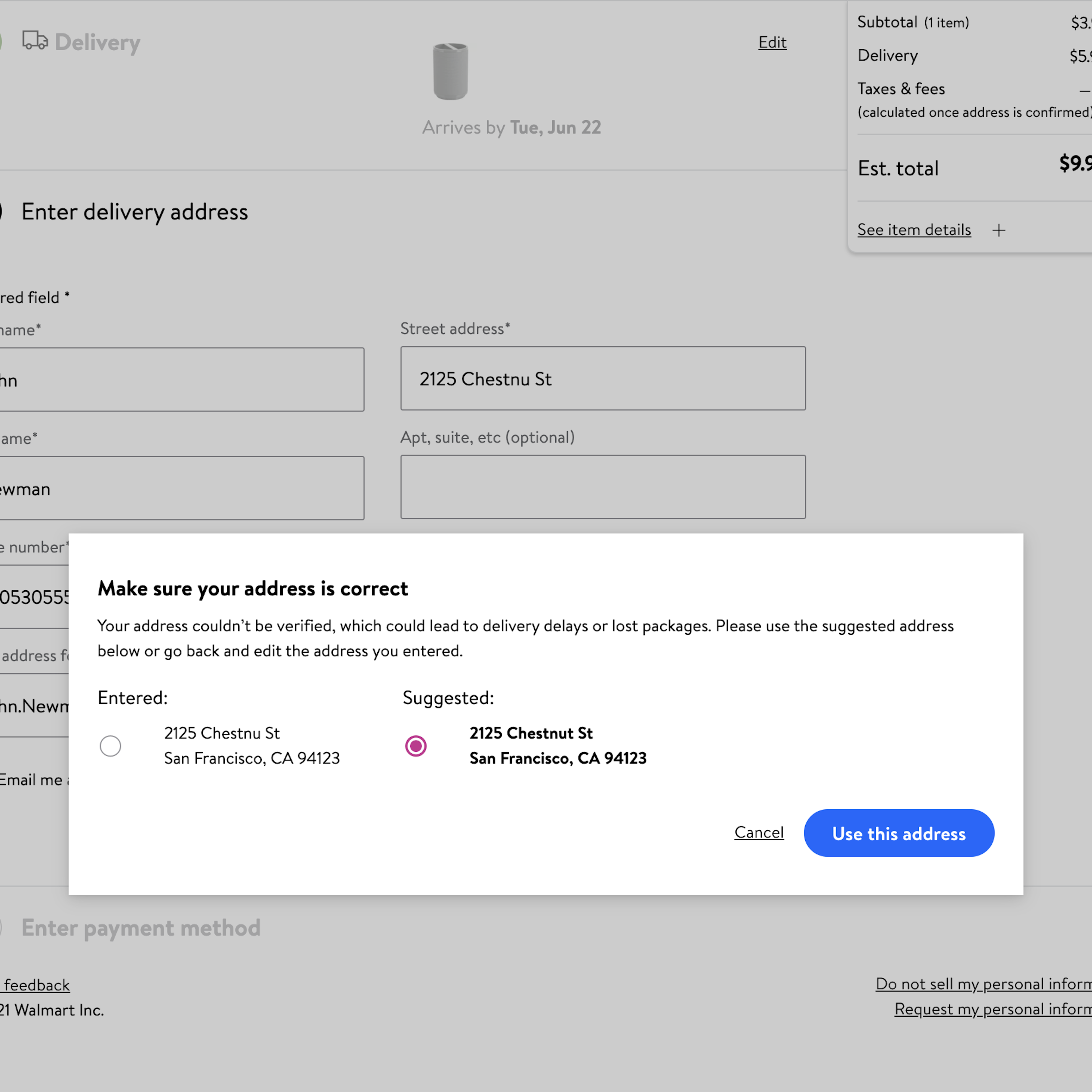
Validation of the user’s address during the checkout flow can help avoid severe issues such as delivery delays or undelivered orders. This is both in the site’s and the user’s interest. Yet, address validators also pose a roadblock in the user’s checkout flow. Given the high complexity in accurately validating an entire address, it’s little surprise that we consistently observe the flow, design, and microcopy of address validators to be the direct cause for checkout abandonments. For instance, 86% of sites provide validation error messages that are very generic (such as “Invalid [field name]”), offering little assistance or insights.
More ‘Address Validator’ Insights
-
Learn More: Besides exploring the 328 “Address Validator” design examples below, you may also want to read our related articles “Improve Validation Errors with Adaptive Messages” and “Usability Testing of Inline Form Validation: 40% Don’t Have It, 20% Get It Wrong”.
-
Get Full Access: To see all of Baymard’s cart and checkout research findings you’ll need Baymard Premium access. (Premium also provides you full access to 200,000+ hours of UX research findings, 650+ e-commerce UX guidelines, and 275,000+ UX performance scores.)


User Experience Research, Delivered Weekly
Join 60,000+ UX professionals and get a new UX article every week.

User Experience Research, Delivered Weekly
Join 60,000+ UX professionals and get a new UX article every week.
Explore Other Research Content
300+ free UX articles based on large-scale research.

327 top sites ranked by UX performance.

Code samples, demos, and key stats for usability.