Key Takeaways
- Inline validation can save users time and effort and help them avoid errors
- Yet 31% of sites don’t have any inline validation at all — increasing friction for users who have errors
- Avoiding premature validation, removing error messages when an input is corrected, and using “positive inline validation” help to ensure top performance of the inline validation feature
Video Summary
Receiving unexpected error messages can be a jarring and frustrating experience.
Across multiple rounds of Baymard’s large-scale testing, these often contributed to form or checkout abandonment.
While error message styling and content can make it easier for users to locate and remedy errors, the delay caused by completing the form and submitting it only to be stopped by an unexpected error message can be significant, introducing friction to the form-submission process.
Effectively, receiving an error message on form submission means that sites have already missed an opportunity to prevent the error from occurring.
Yet our Premium research findings indicate that validating users’ inputs inline — as they’re filling out a form field — can mostly resolve this issue.
Yet 32% of sites in our e-commerce UX benchmark fail to provide any field validation at all.
In this article we’ll discuss the following:
- Why getting errors only when submitting a page is harmful to end users
- How inline form validation alleviates the issue
- 3 critical details to get right when implementing inline validation
Why Getting Errors Only When Submitting a Page Is Harmful to End Users
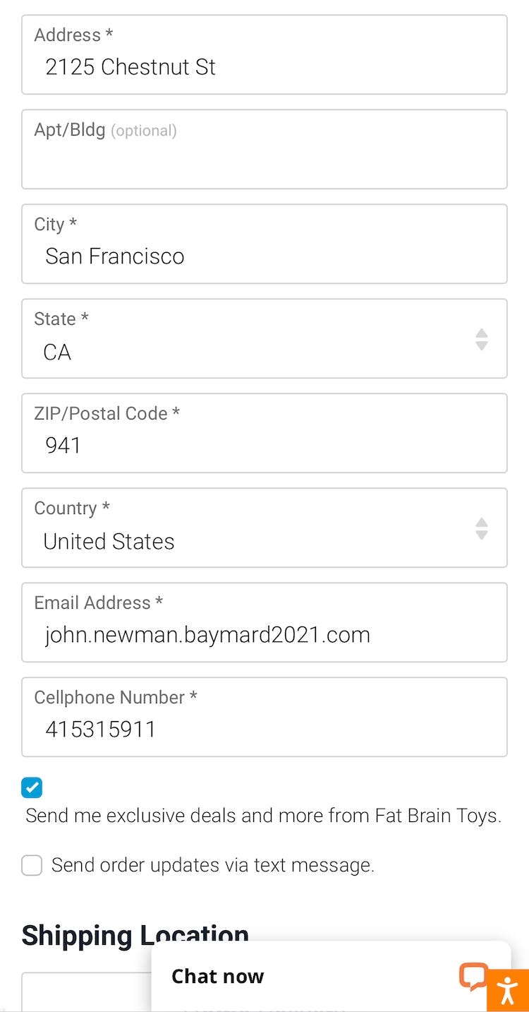
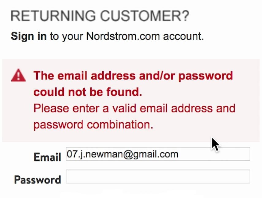
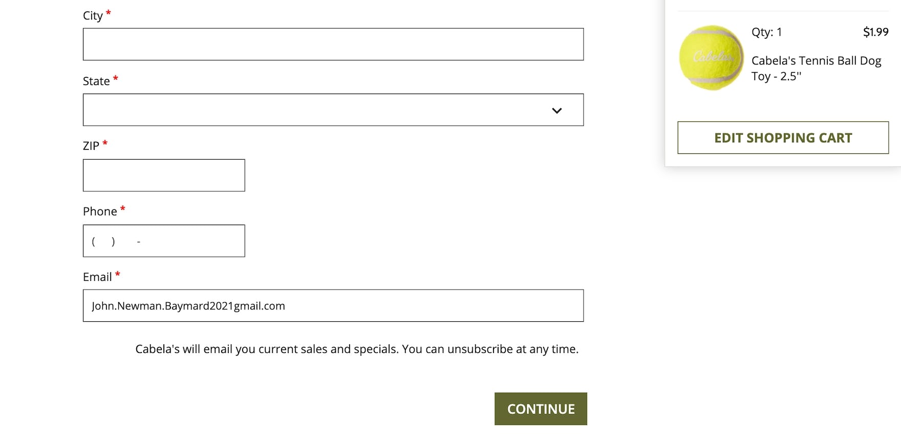
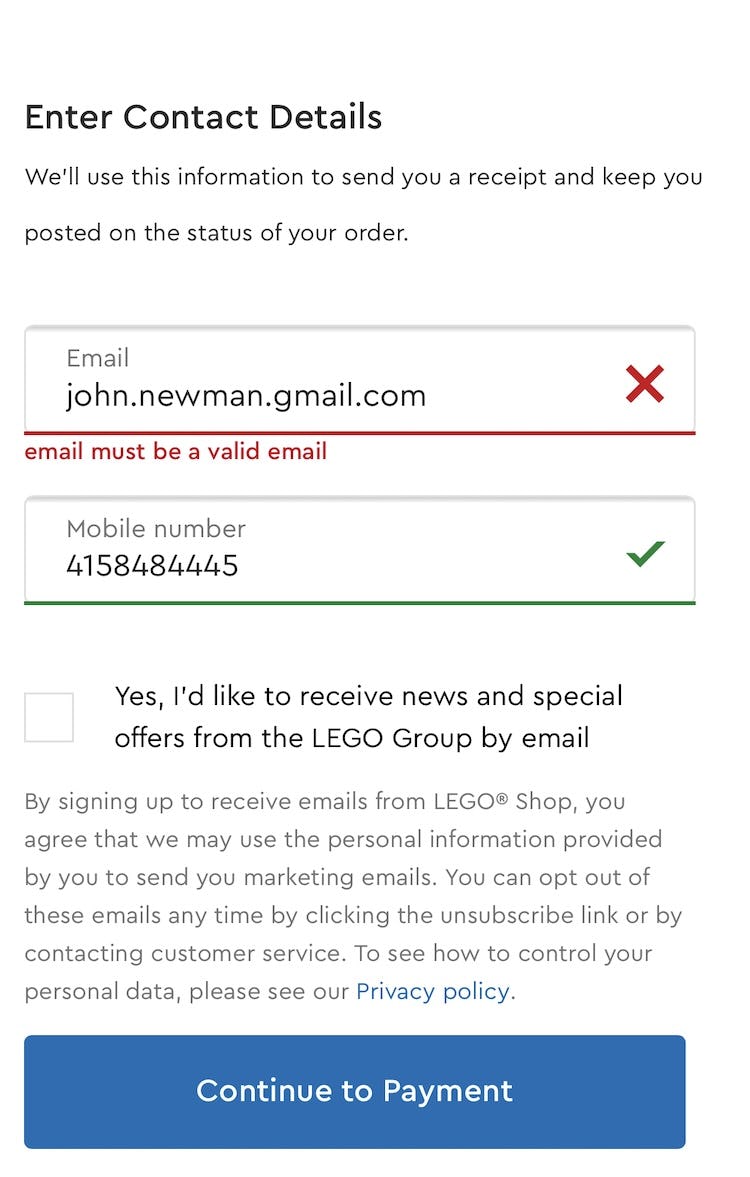
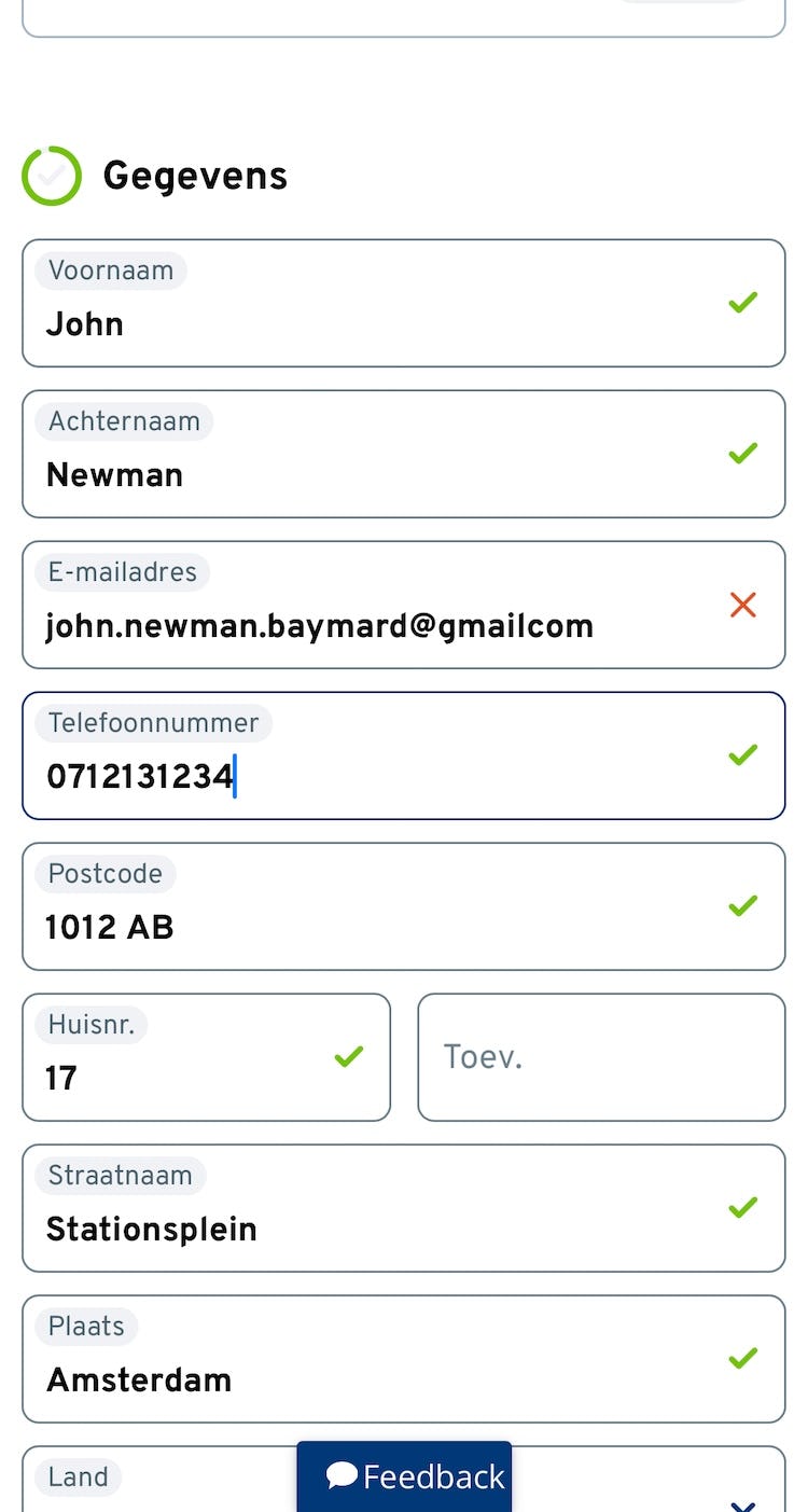
At Backcountry (first image; the “Email” field) and Fat Brain Toys (second image; the “ZIP/Postal Code” field), users moving through the form can leave a field with an invalid entry without any warning, ensuring they will receive an unexpected error message when they move to submit the form.
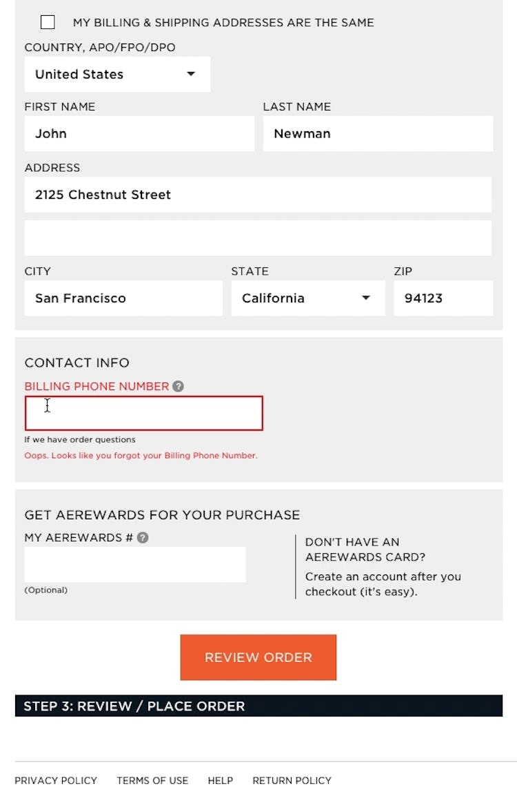
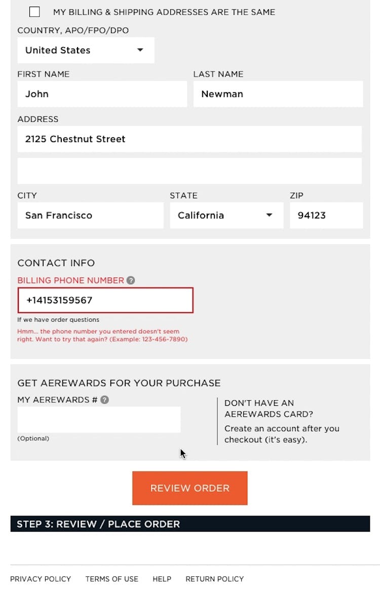
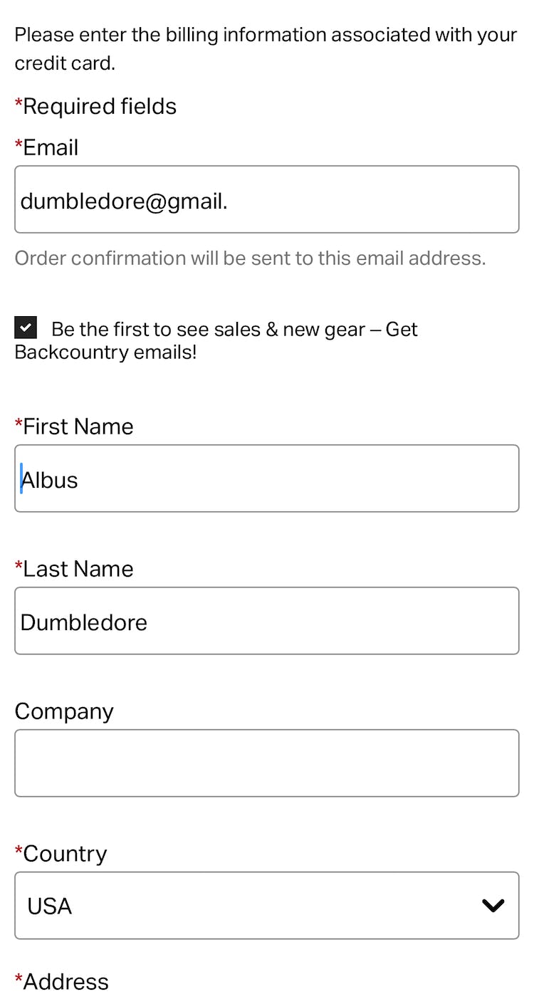
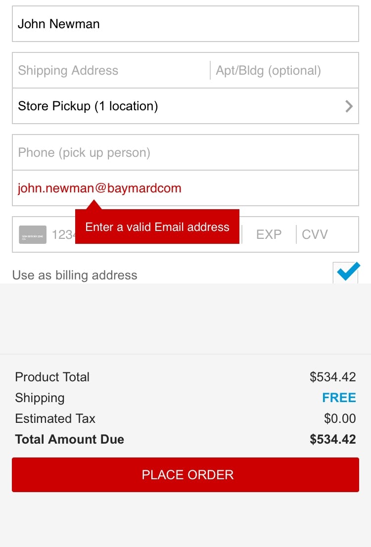
A test participant tabbed through this form at American Eagle, and after clicking “Review Order” received an error message because he had omitted his phone number (first image). After inputting a number, and clicking “Review Order” again, he received another error message because the phone number was inputted incorrectly (second image). Inline validation would have prevented both of the error page reloads.
Participants in testing who encountered an error message upon form submission were forced to come to a complete stop to find and resolve the error.
This typically leads to significant delays and occasionally causes abandonment when the error is too difficult to locate or unclear how to resolve.
Compounding the issue, many forms reset upon submission, removing user entries and selections.
Therefore, users are forced to resolve not only the error at hand but also to duplicate previous work.
In reality, error messages disrupt the natural process flow, surprising users who expect to move on to the next step after hitting the “Submit” button.
How Live Inline Form Validation Alleviates the Issue
A live front-end validation, as seen here on Staples, can speed up the recovery process significantly, as an error is displayed while the input is still fresh in mind, rather than when the whole page is submitted.
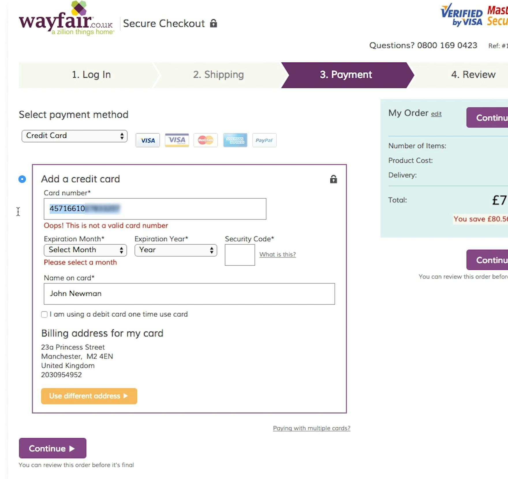
After initially transposing two numbers in his credit card number, this test participant was able to quickly recover before clicking “Continue” because Wayfair had implemented live inline Luhn validation.
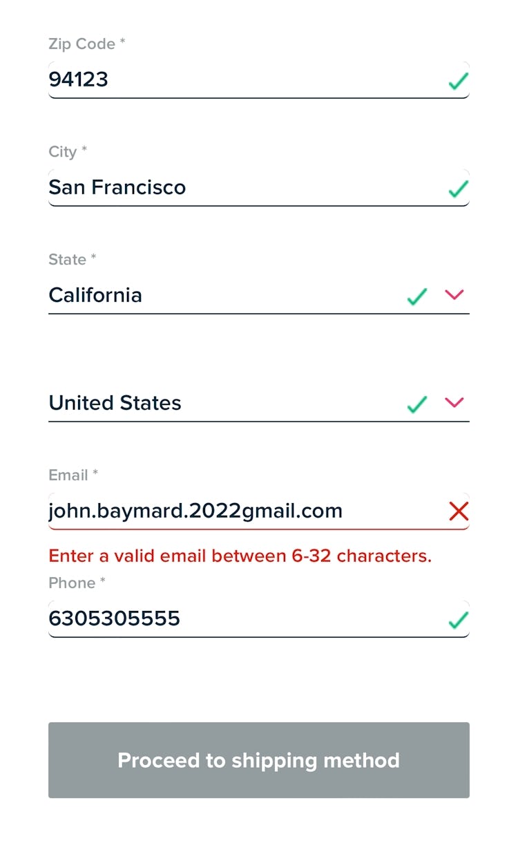
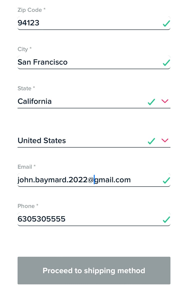
At L.L. Bean, another participant made a simple typo, typing an email without the @ character. As she proceeded to the next field, the live inline validation alerted her immediately that the input was incorrect, and she corrected the mistake within seconds. A key benefit of inline validation is that it speeds up the error-recovery process because inputs are corrected while still fresh in mind.
In testing, we’ve repeatedly observed that a better solution to error messaging that consistently improved the participants’ error-recovery experience was live inline validation.
Live inline validation is where the validity of the user’s input is checked immediately as the user types in the full value or leaves the field.
In practice, inline validation introduces several benefits over traditional error messages presented upon form submission.
First, users are informed of the error immediately and, as a result, won’t to the same degree need to come to a full stop to figure out where the error is, making the process of locating the errors significantly simplified.
Inline validation also efficiently draws attention to any required fields that users skipped while tabbing through the form, preventing any associated error messages.
Next, because users are alerted to input issues immediately after typing, the amount of time needed to correct the error decreases significantly, as the input and its context are still fresh in the user’s mind.
On a more traditional after-the-fact error page, the incorrect input will have to be relearned, as it can be several fields and minutes ago that the user read the label for the incorrect field and typed the incorrect input value.
Also of note, inline validation does not entirely replace the need for traditional error page and design, since users may still attempt to submit the form even with inline validation errors present.
3 Critical Details to Get Right When Implementing Inline Validation
To ensure inline validation performs as best as possible for users, it’s key to implement the following:
- Avoid premature validation
- Remove error messages as soon as the field is corrected
- Use “positive inline validation” for all fields
1) Avoid Premature Validation
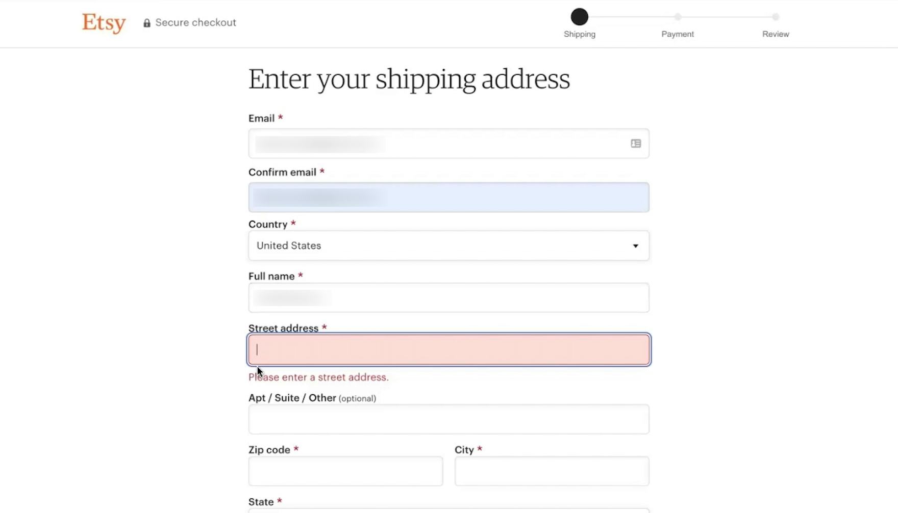
“I don’t like how this is like kind of yelling at me before…I didn’t try to submit anything, you know?” Entering his shipping address at Etsy, this participant was dismayed that the inline validation immediately triggered when his focus moved to the “Street address” field, reacting as though he had skipped over the required field when in fact he had not even begun typing.
It’s important to avoid taking validation too far and provide critical feedback before users begin entering information.
While the point of live inline validation is to alert users of incorrect inputs early on, overly aggressive premature validation negatively impacts the overall experience as users are told their input is wrong before they have had a chance to type it correctly.
In testing, participants were often frustrated by overzealous inline validation suggesting they had made a mistake before they even had a chance to type the input correctly.
As one participant from testing said, frustrated at the immediate validation error when he moved focus to an empty field for the first time, “Why are you telling me my email address is wrong, I haven’t had a chance to fill it all out yet!”
Moreover, as an error message is shown, we observed other participants’ typing was disrupted as they stopped to read and interpret the error — misleading some to incorrectly interpret the message as suggesting that their perfectly valid input was actually wrong.
To keep live inline validation from becoming a distraction and annoyance, it’s key to fine-tune the logic for when the field is checked for errors.
When users enter a new field, without any existing errors, and start typing, the validity of the input should not be checked before the user has had a chance to fully type a correct input.
Depending on the type of input, this means that the validity of each field input should be checked when the user leaves the field — for example using an onblur event.
In addition, for some field types, sites can also check the validity once the input has reached the correct character length, such as for ZIP and postal codes, phone numbers, credit card numbers, card security code inputs, etc.
2) Remove Error Messages as Soon as the Field Is Corrected
At Fitbit, users who receive an inline validation error (first image) can see the validation update as soon as they update the field to address the issue (second image).
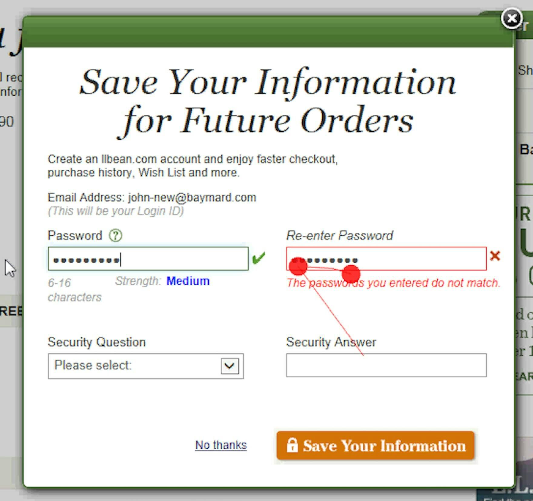
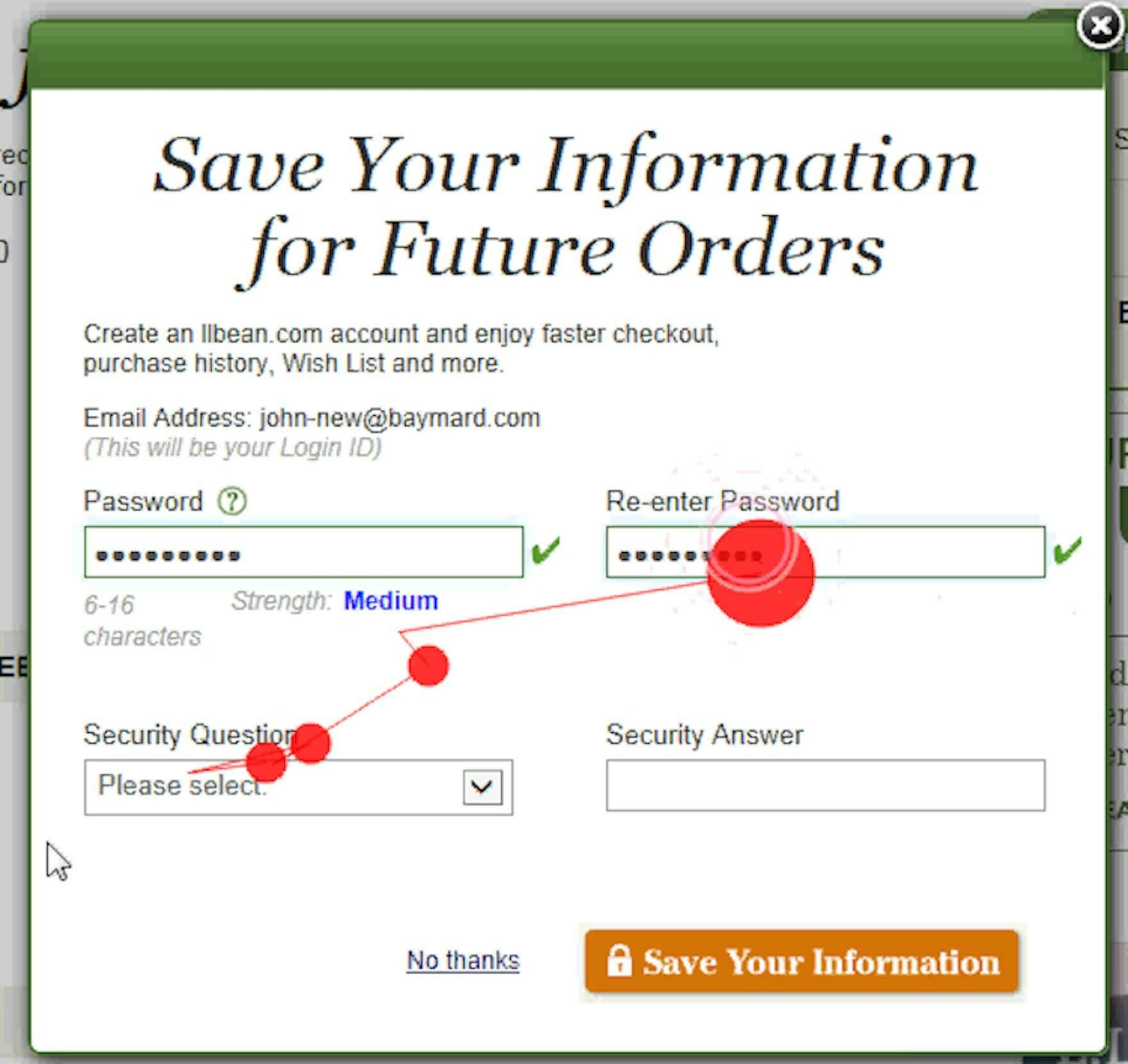
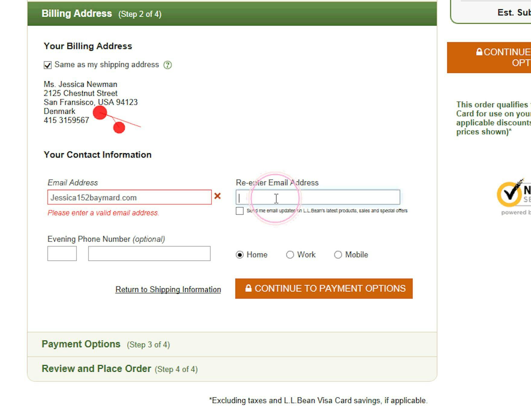
When typing a password into the “Re-enter password” field at L.L. Bean, a test participant received a “The passwords you entered do not match” error. After correcting the input in the first password field, the error message still remained under the “Re-enter Password” field (first image). When he clicked into the “Re-enter password” field again, the error message changed to a green checkmark (second image). Inline validation would have been more helpful to this test participant if it had updated immediately after the participant corrected the input in the first “Password” field.
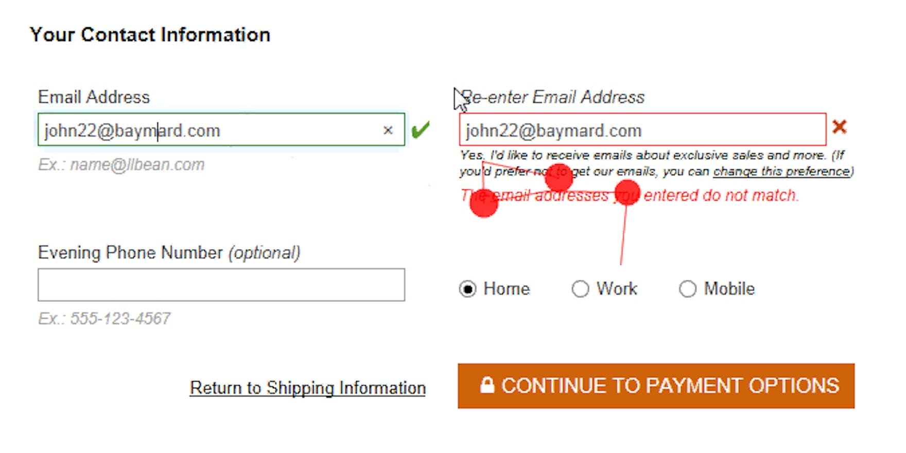
At L.L. Bean, another participant had a similar issue when he went back to correct a mistake in the first typed email address. After he corrected the mistake, the error message continued to be displayed. This was highly misleading as it incorrectly read, “The email addresses you entered do not match”. Notice how the participant focused intensely on the unresponsive error message as he corrected his input.
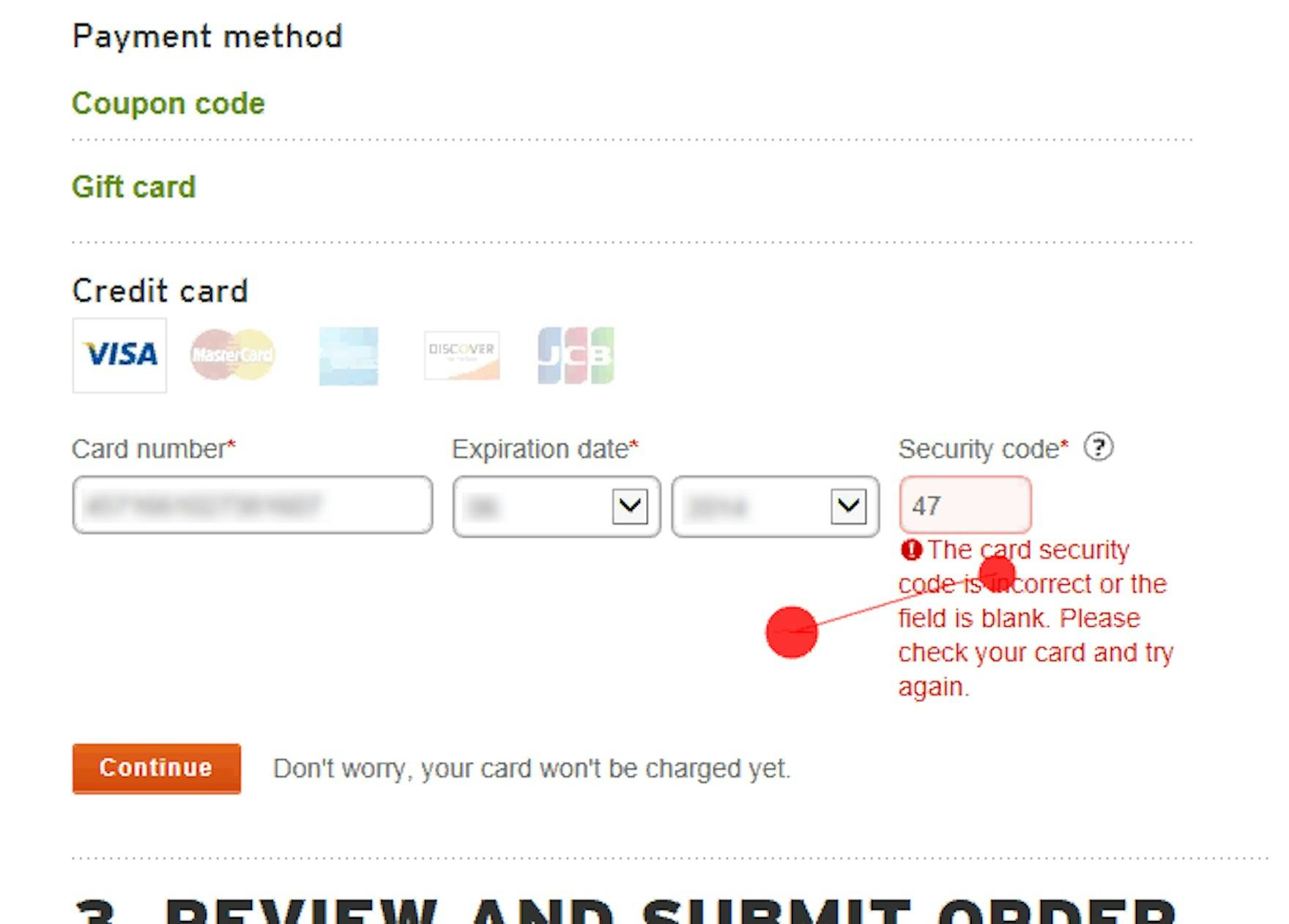
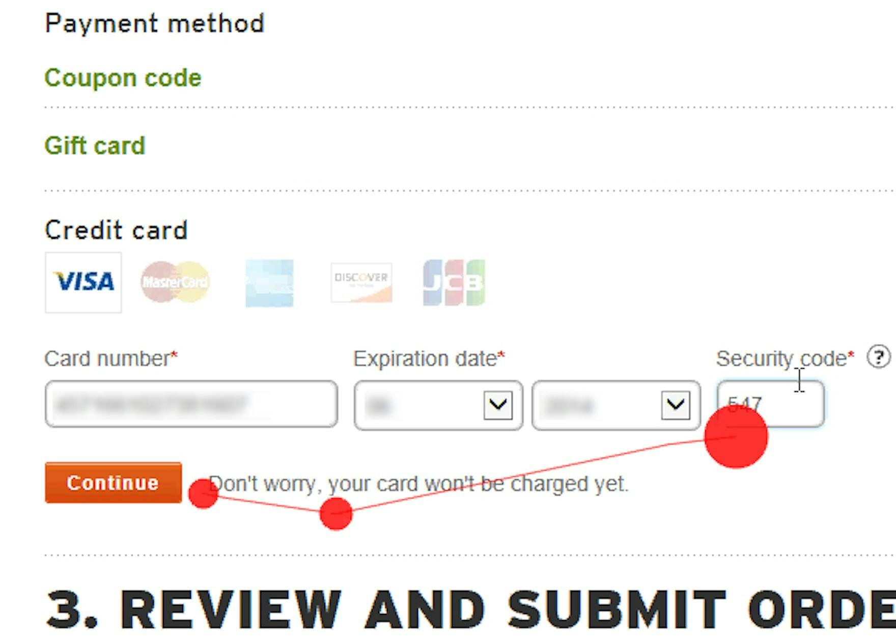
REI alerted a test participant that he had incorrectly submitted a 2-digit card security code for his VISA card (which is a 3-digit input) (first image). As he typed a third character the page immediately updated and the error message was removed (second image) — thereby confirming that his correction was registered.
When an error has occurred and a live inline error message is shown to users, they will naturally try to correct it immediately.
However, some sites with inline validation do not remove the error message live, as soon as the user has resolved the issue, which led to compounded problems during testing.
After resolving the issue suggested by the inline error message, participants often focused intensely at the error message, expecting it to be removed as soon as the field contained the correct input — rather than leaving the field, which would then often remove the inline message.
In practice, this can cause grave issues as users are likely to misinterpret their newly corrected, and now valid, input to still contain an error.
This is particularly so for fields where validity is interdependent, such as email and password confirmation fields.
It’s therefore key that when an error is invoked using live inline validation, the logic for rechecking the validity of the incorrect field does not happen only as users leave the field.
This means that rechecking the validity of the incorrect field is not based solely on an onblur or similar event.
Instead, the error message must live update on a keystroke level, disappearing the moment users enter a valid input.
3) Use “Positive Inline Validation” for All Fields
“I do like it whenever it has a little checkbox, or an icon, or something that’s green where it’s like, okay, yep, that kind of confirms that I didn’t mistype a number.” Participants at Everlane appreciated the inline validation confirming their credit card entry was free from errors.
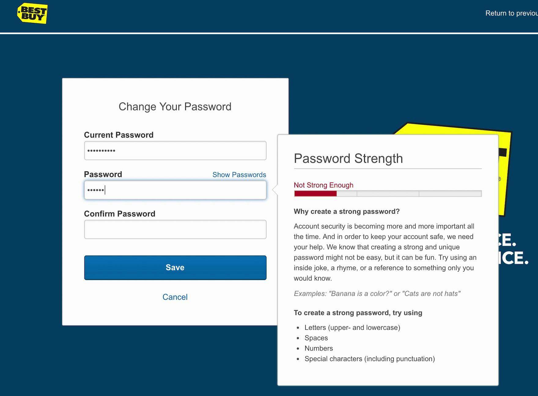
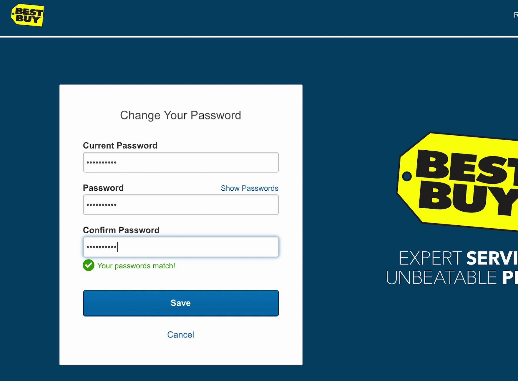
At Best Buy, when creating a new account password users are informed via live inline validation whether the password meets the site’s password requirements via a robust “Strength Indicator” (first image). Moreover, users are then informed if their passwords match before leaving the second password field (second image). Positive inline validation helps users catch errors before they attempt to save their changes.
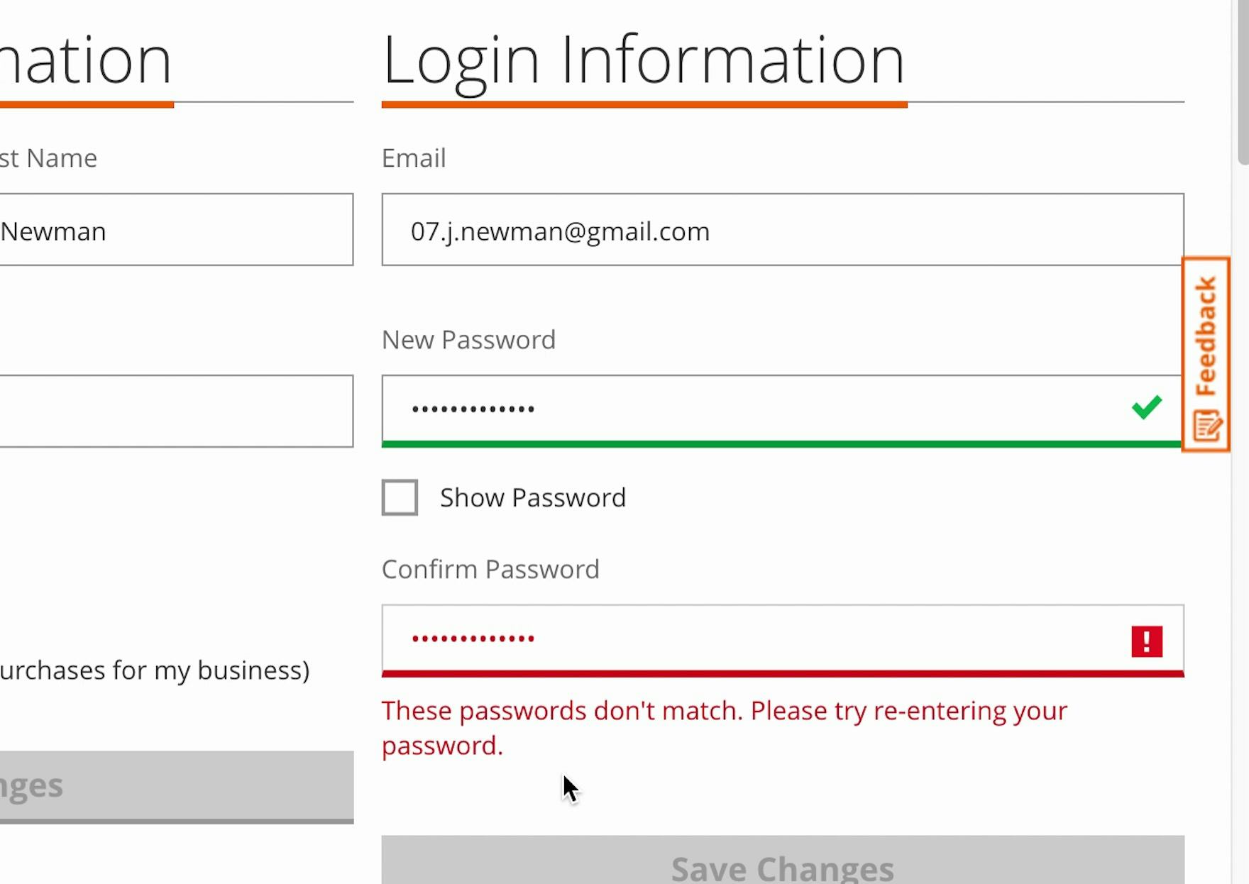
At Home Depot, a participant was informed that the new password she’s entered meets the password requirements via a green checkmark and border color. However, there’s no validation of whether the two password fields match, and the participant received an error when trying to save her changes. Validation logic for password fields could consider the character length of each field and, when the character length is the same, check to see if password field inputs match.
Finally, if positive inline validation is used, even users without any incorrect input will benefit.
Positive inline validation removes some cognitive load from users since they don’t have to review and validate the form for errors before submitting it.
With positive inline validation, a site can assure users that their input is correct, and the user is able to more quickly move to the next step of the checkout flow.
During testing, sites that used positive inline validation, by adding a checkmark next to correctly inputted values, added a sense of accomplishment and progression to the whole typing experience.
Positive inline validation also helps risk-averse users trying to preempt validation errors and those users who would otherwise meticulously review the entire completed form before submitting it.
Help Users Catch Input Errors Early
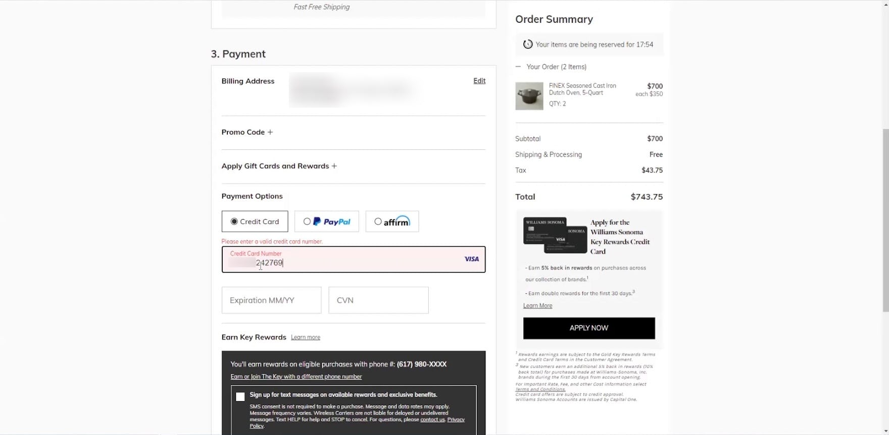
“‘Please enter a valid credit card number’…huh? Let’s see what happens when I complete it.” This participant was thrown off by the premature inline validation at Williams Sonoma, second- guessing his entry before he was even done typing the entire card number. After carefully scanning his entry several times, he finished inputting the final digits, at which point the validation error went away. Relieved, he added, “That’s a little confusing, honestly…Any time where there’s text that’s overlaying other texts, that’s always like, oh no, something’s going wrong here…I was like, well, let me just finish the number and see what happens, and sure enough, it was just sort of auto-erroring when you don’t have all the characters in there. I definitely don’t like that. That definitely made me feel like I did something wrong…it just feels like I broke the website.”
Our large-scale testing has shown that, even if forms are perfectly designed, users will invariably have errors.
Typing, especially on mobile devices, is challenging, and minor mistakes are easy to make.
Yet how the site supports — or doesn’t support — users matters more than a user receiving an error.
In particular, by alerting a user to an error immediately via inline validation the user has a much better chance of quickly correcting the input and moving forward with checkout.
On the other hand, only showing errors to users when they’ve tried to submit a form can be a recipe for abandonment.
Yet our e-commerce UX benchmark shows that 31% of sites fail to provide inline validation.
Finally, having inline validation is only the start.
To have it perform optimally it’s key that fields aren’t prematurely validated, that error messages are removed as soon as the input is corrected, and that “positive inline validation” indicates to users “everything’s okay!” as they’re moving through a form.
Implementing these 3 key details will help to ensure that users are able to swiftly move through a form, supported yet unimpeded by the inline validation feature.
This article presents the research findings from just 1 of the 700+ UX guidelines in Baymard – get full access to learn how to create a “State of the Art” ecommerce user experience.
If you want to know how your desktop site, mobile site, or app performs and compares, then learn more about getting Baymard to conduct a UX Audit of your site or app.