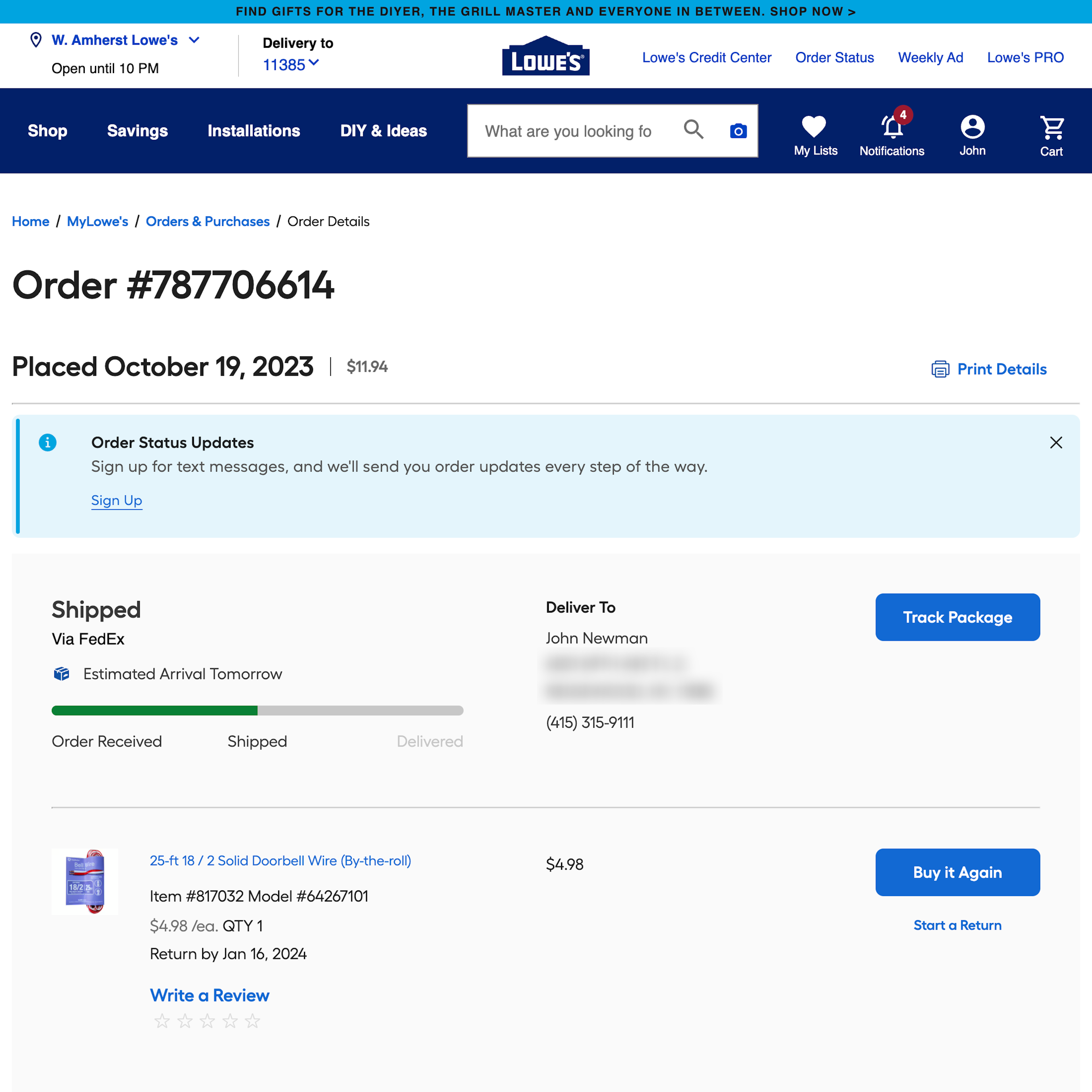
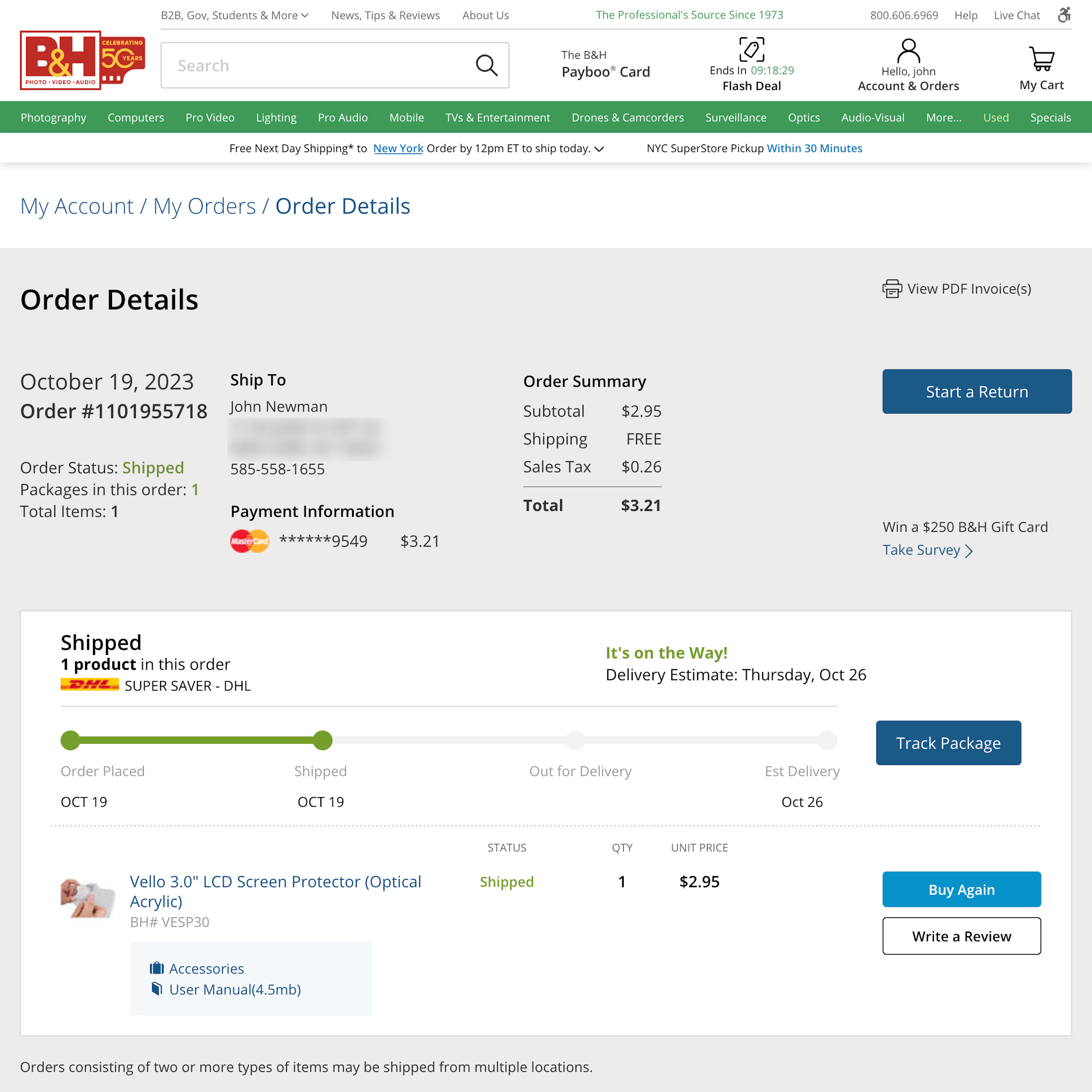
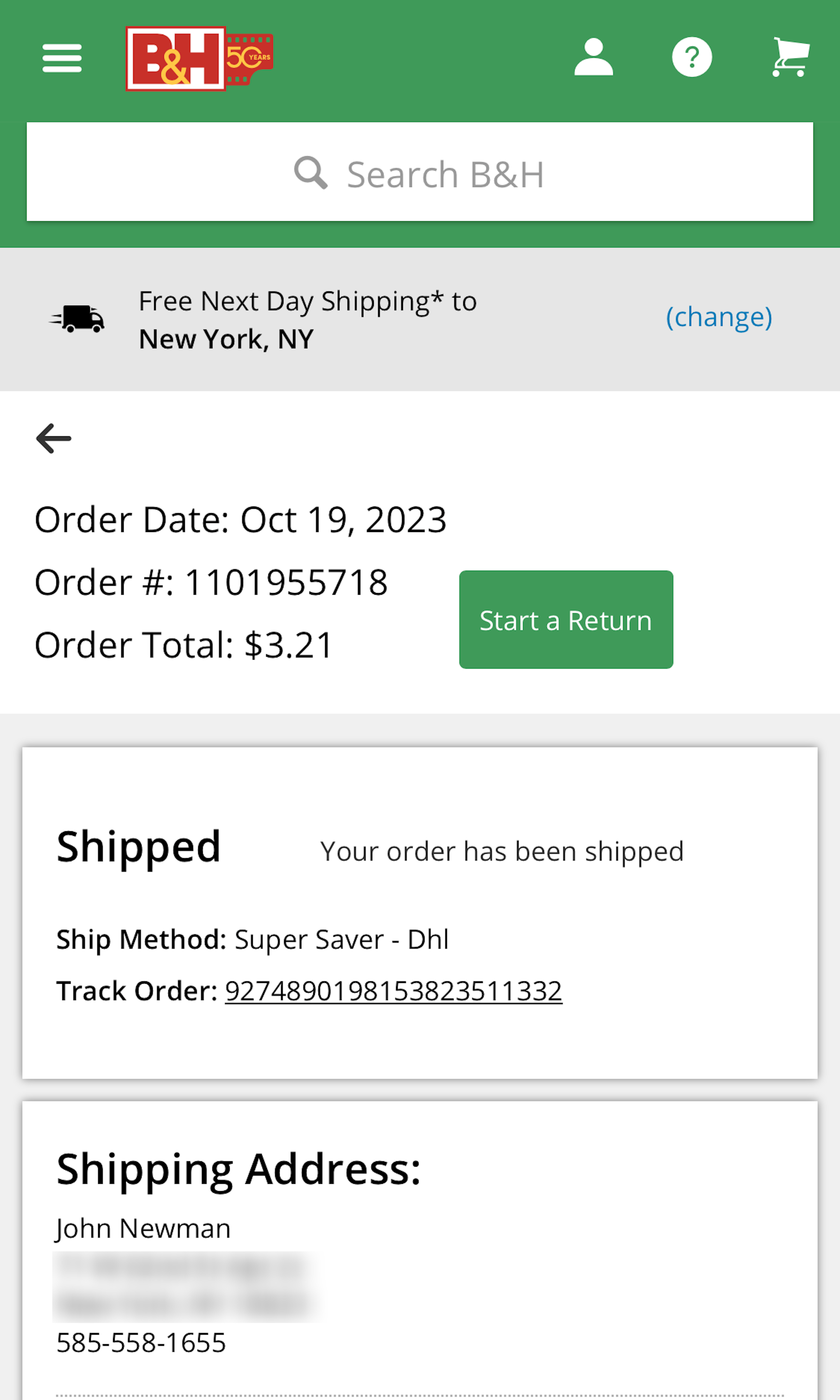
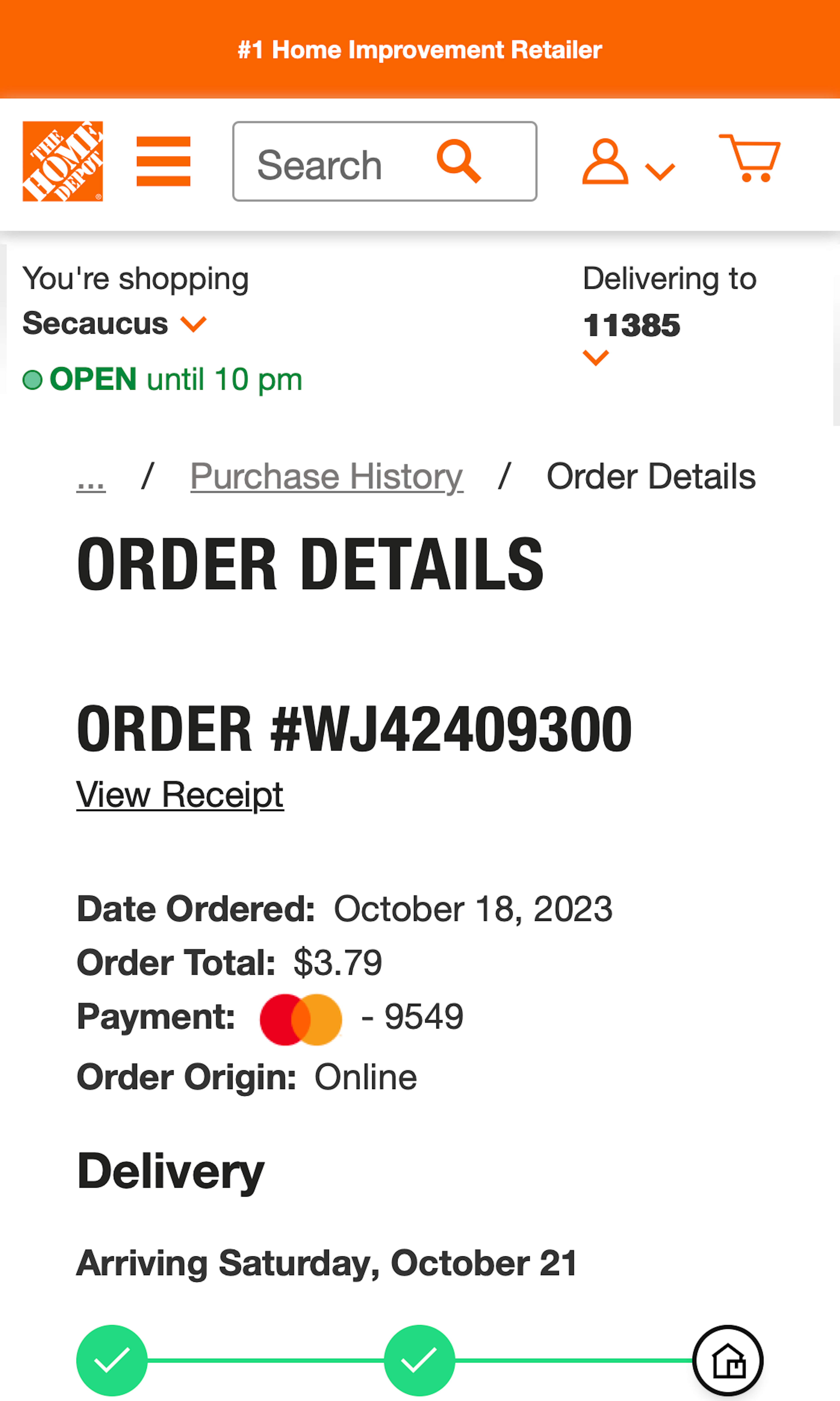
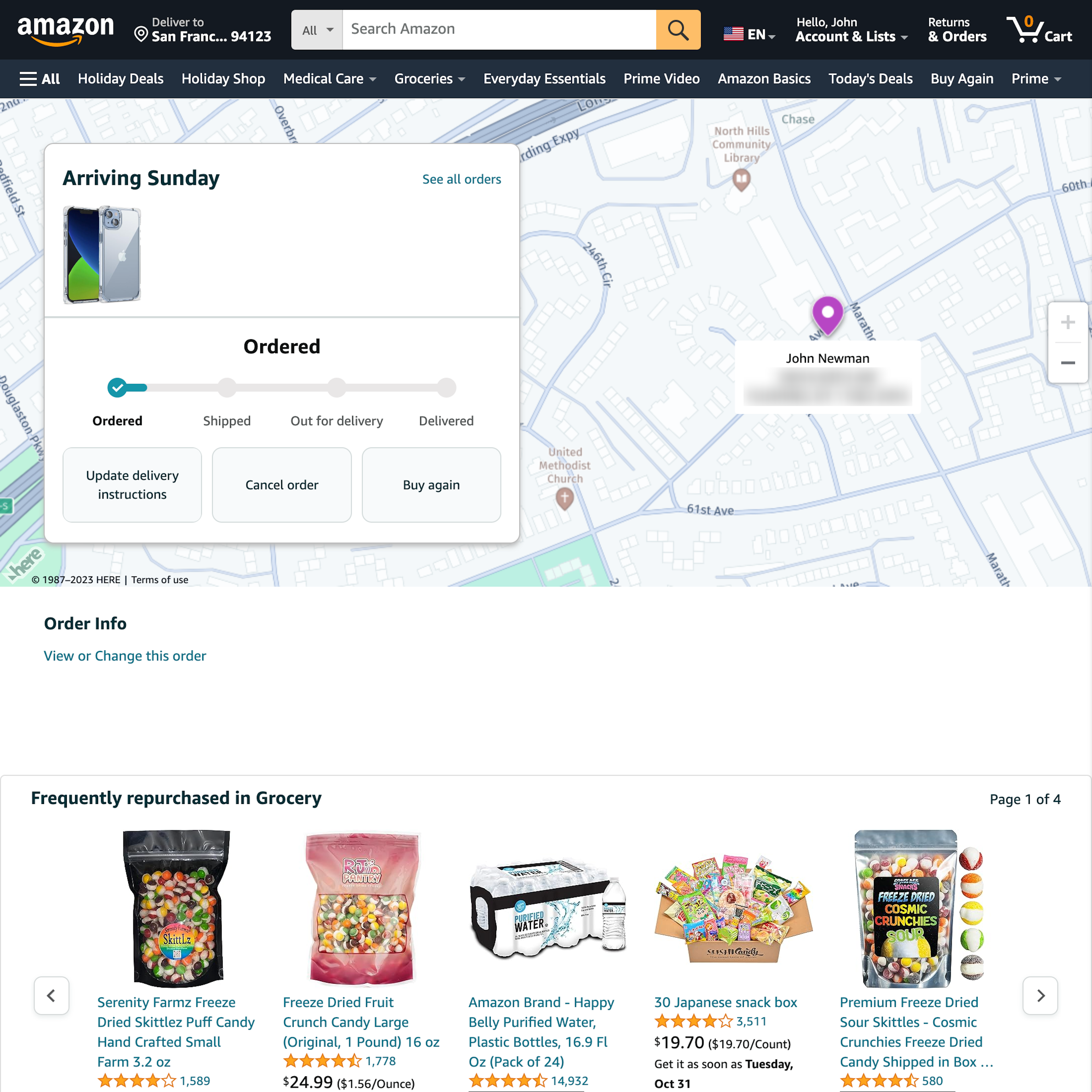
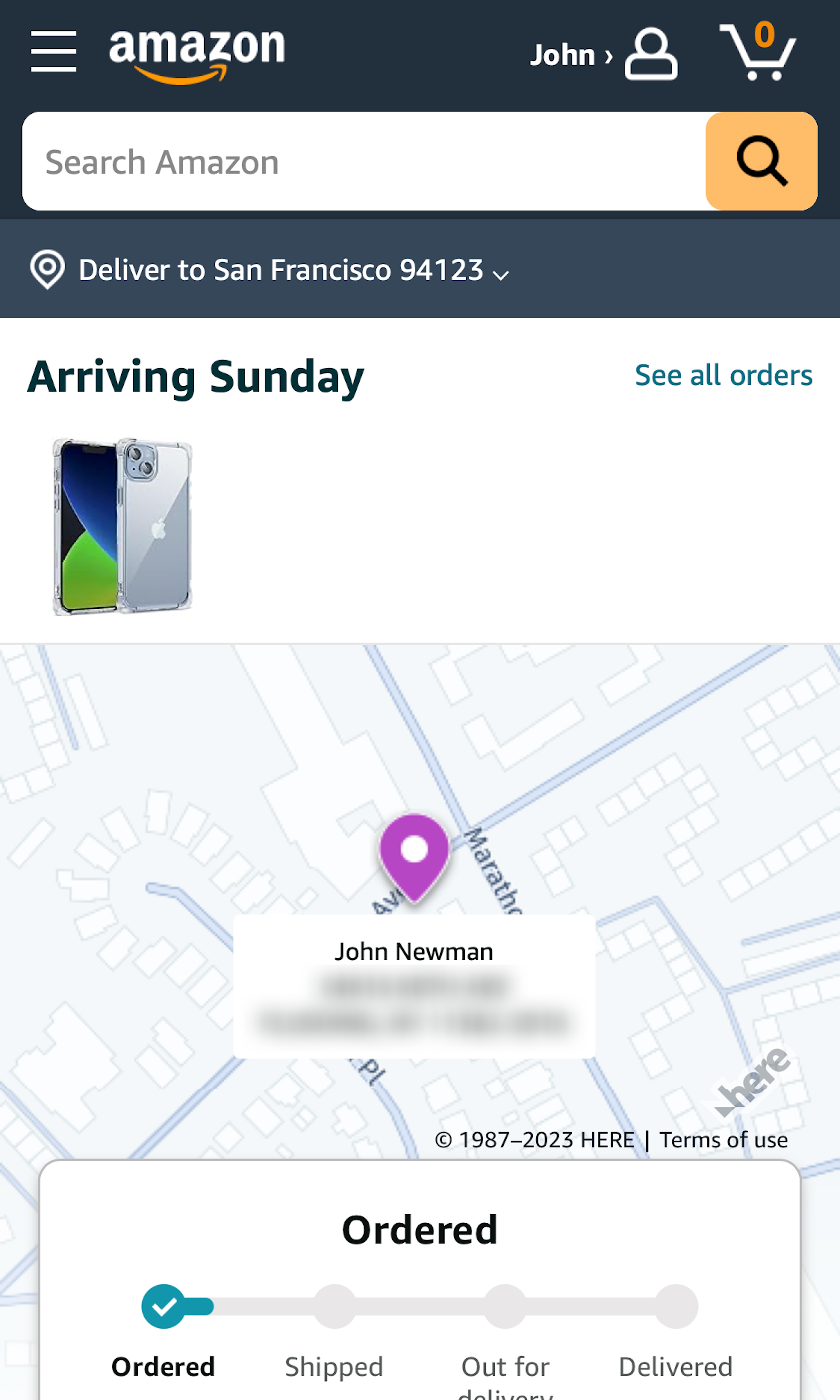
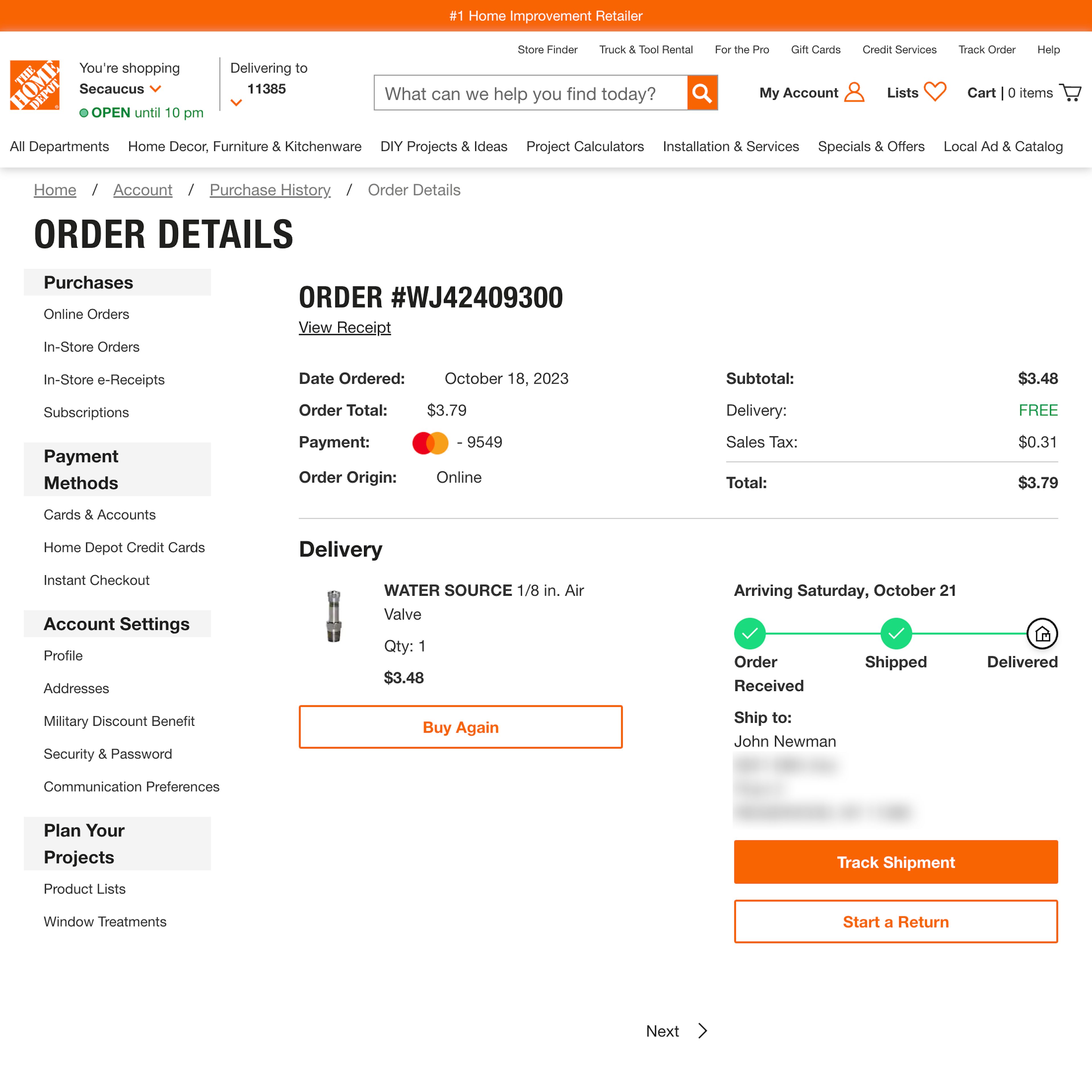
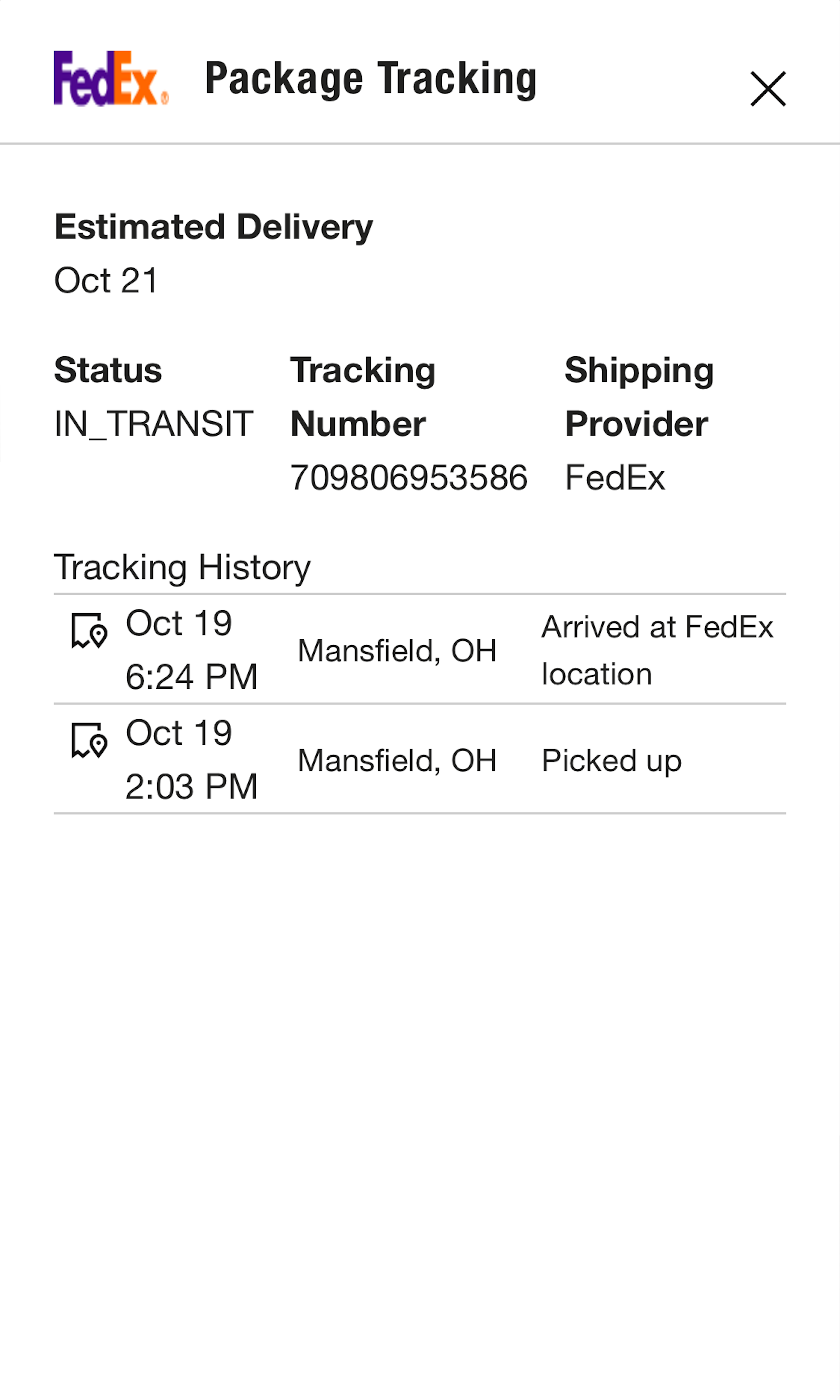
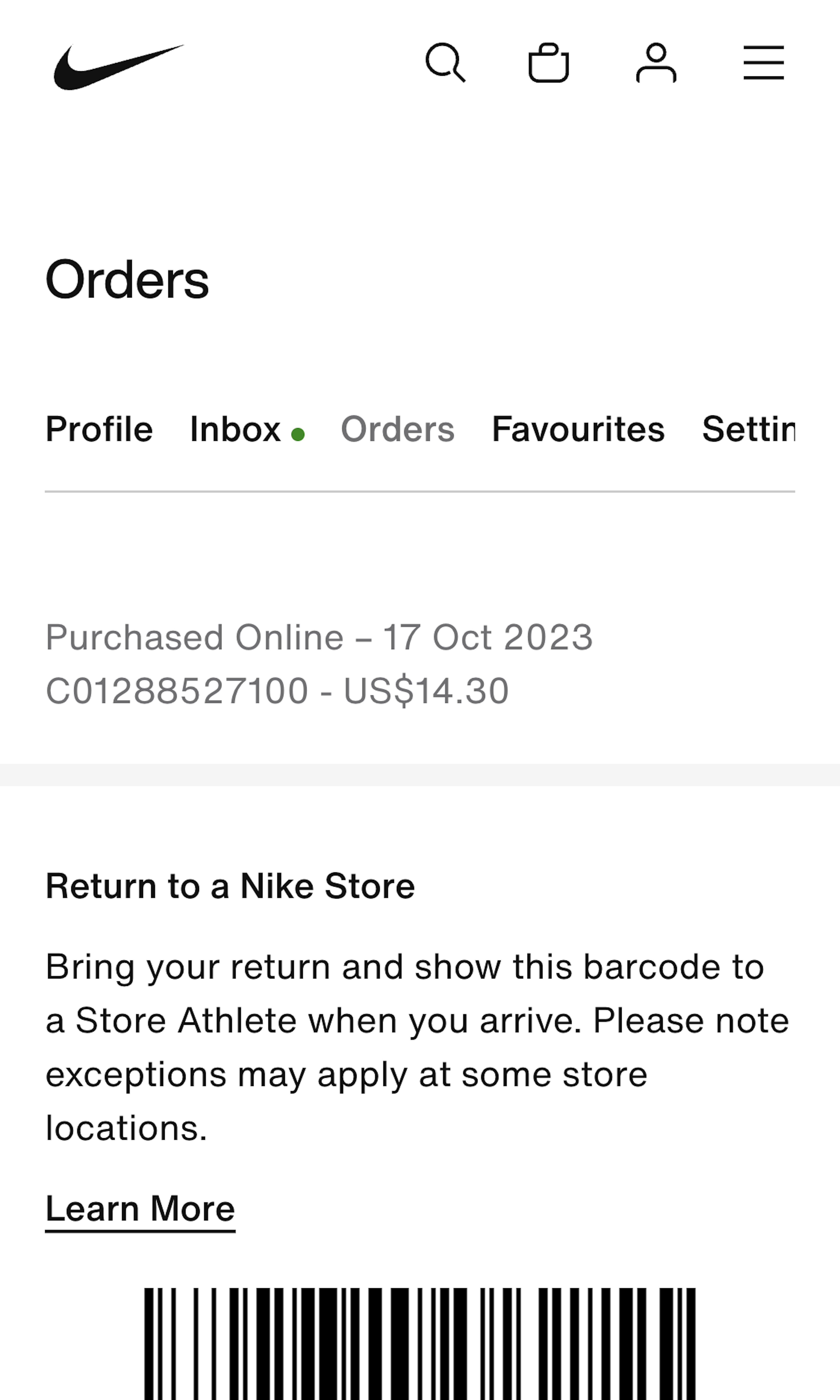
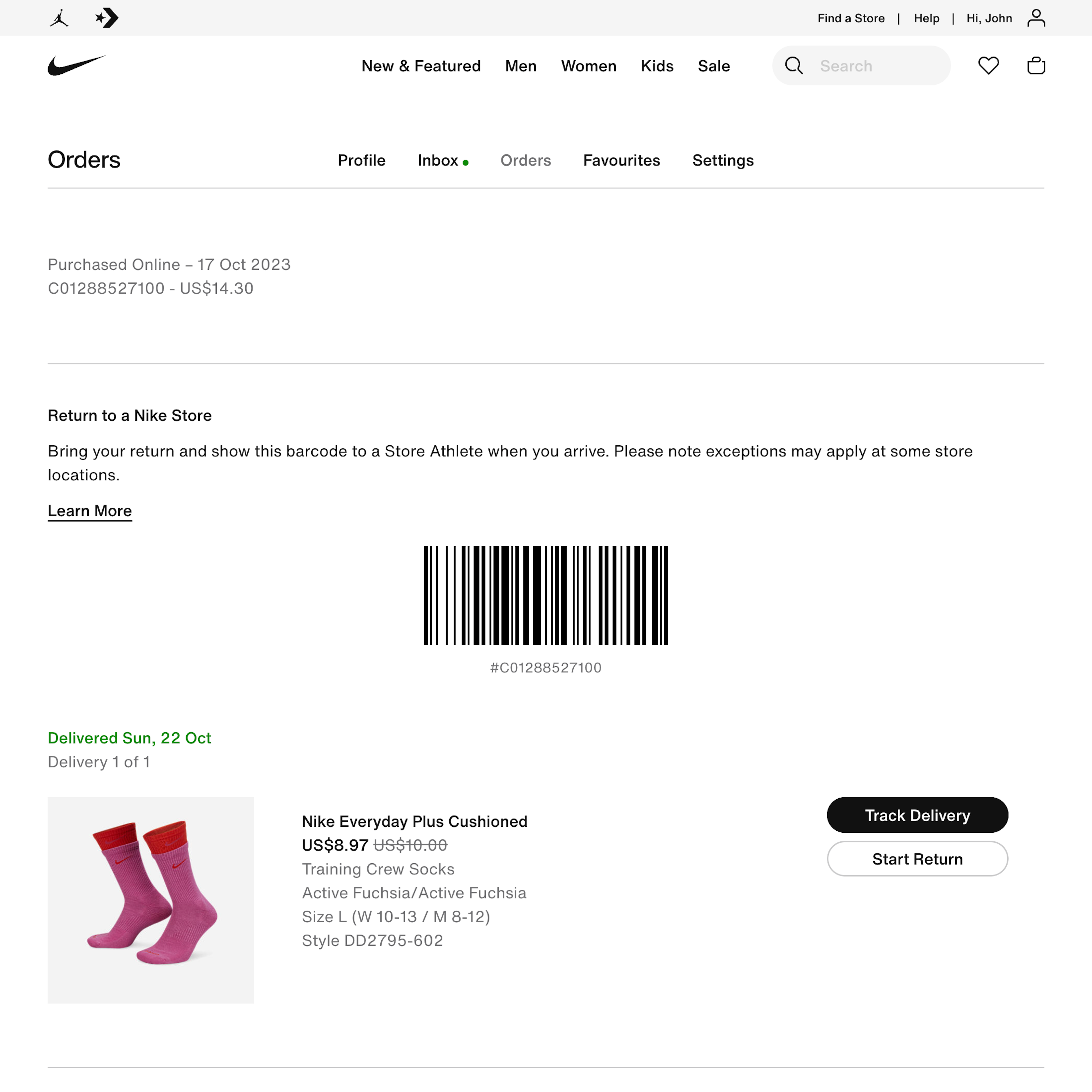
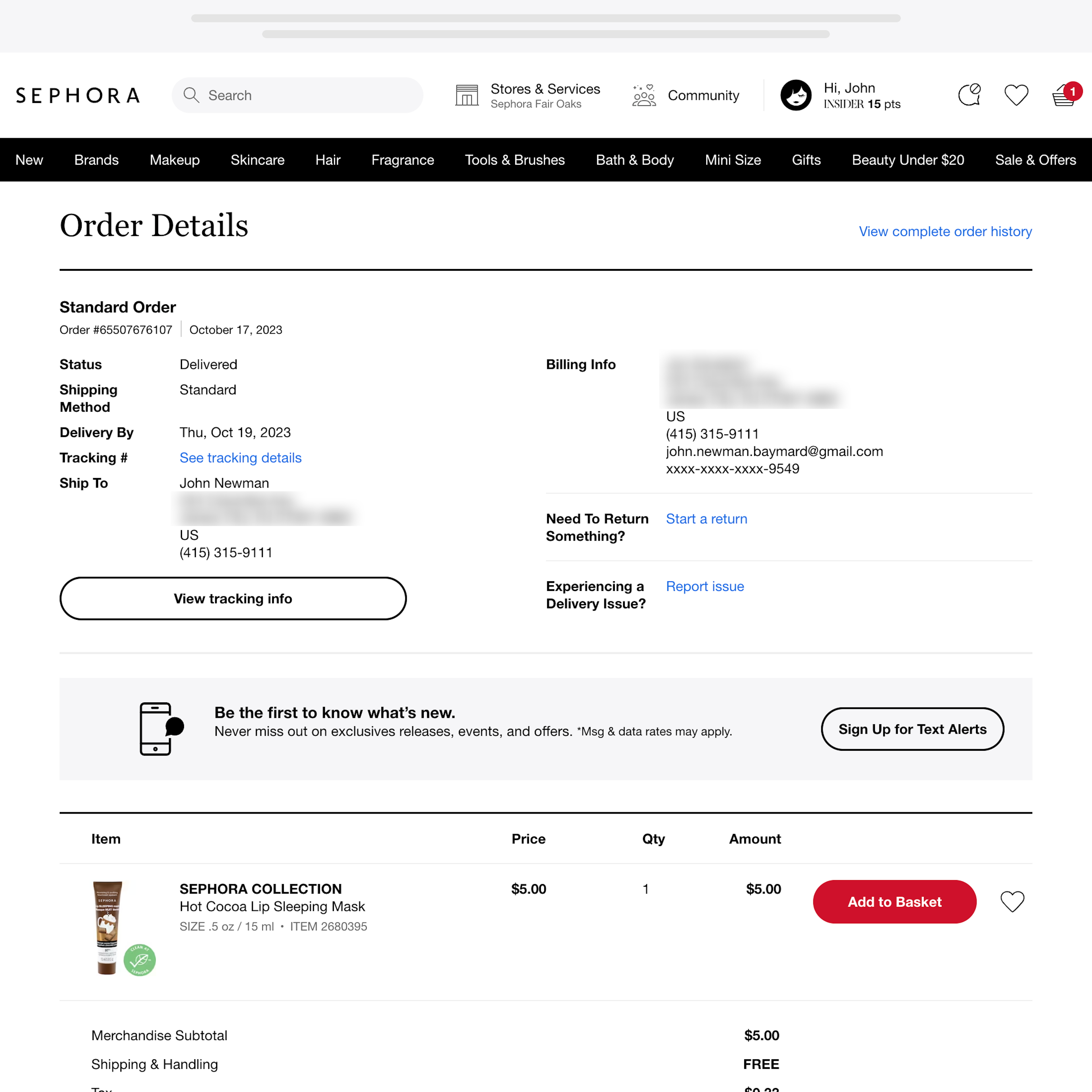
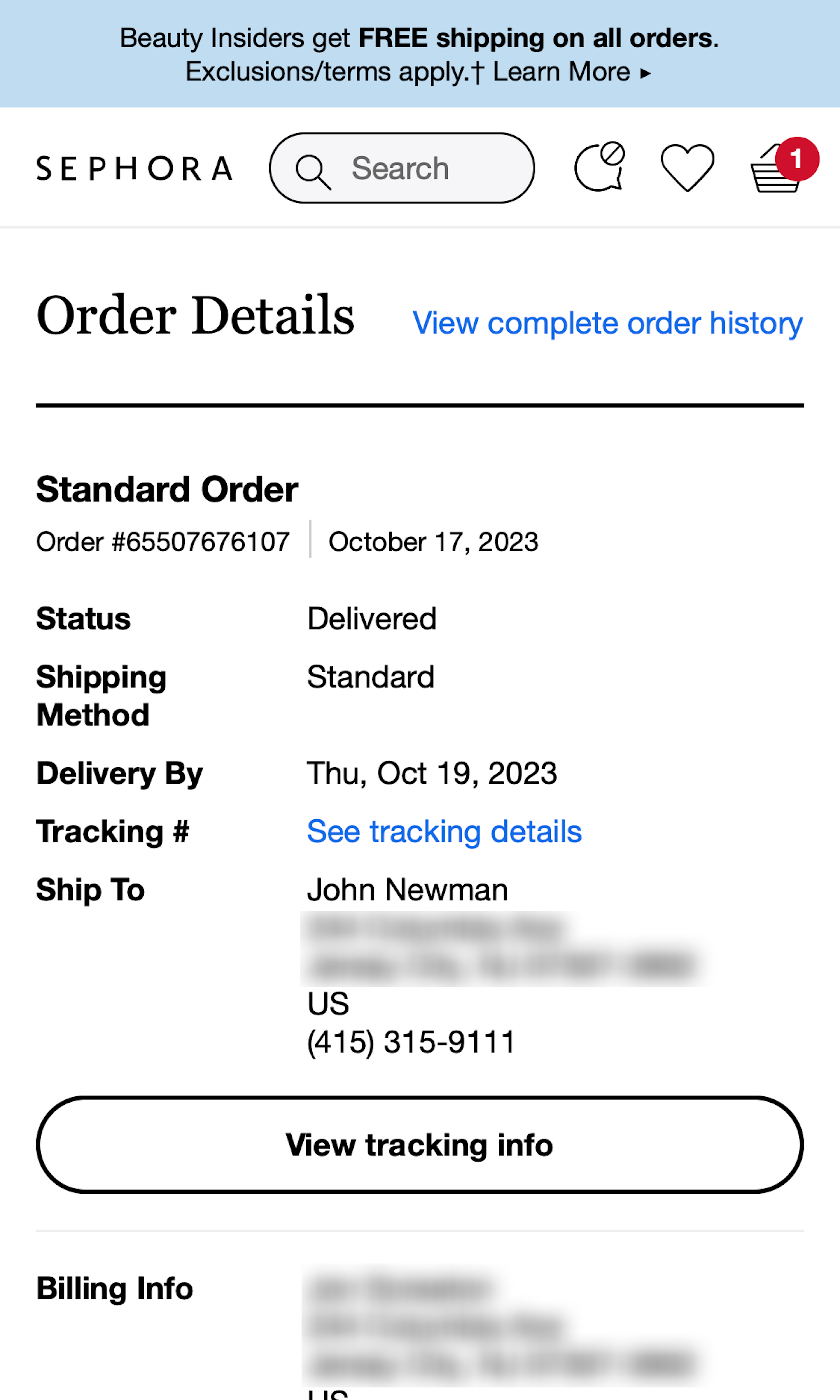
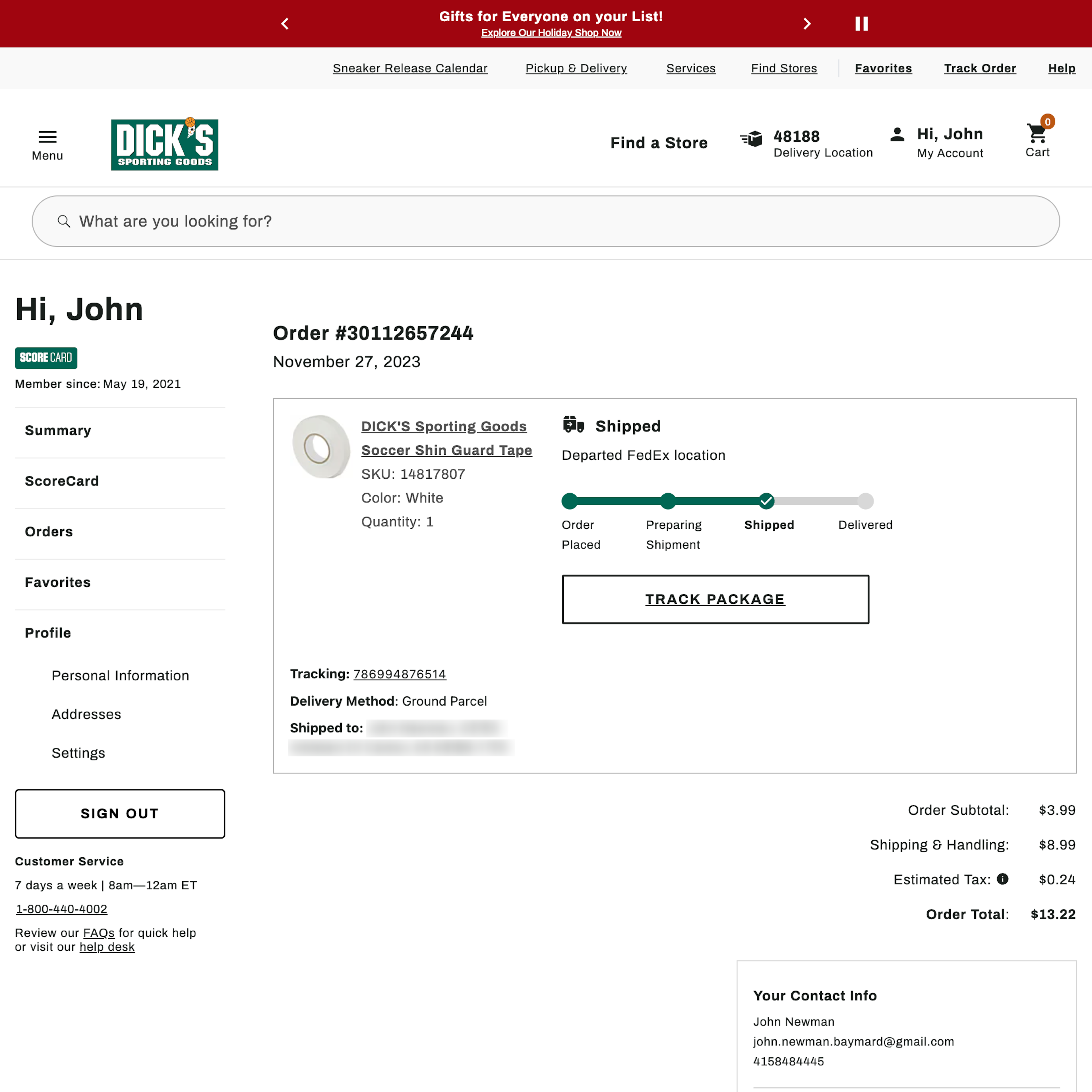
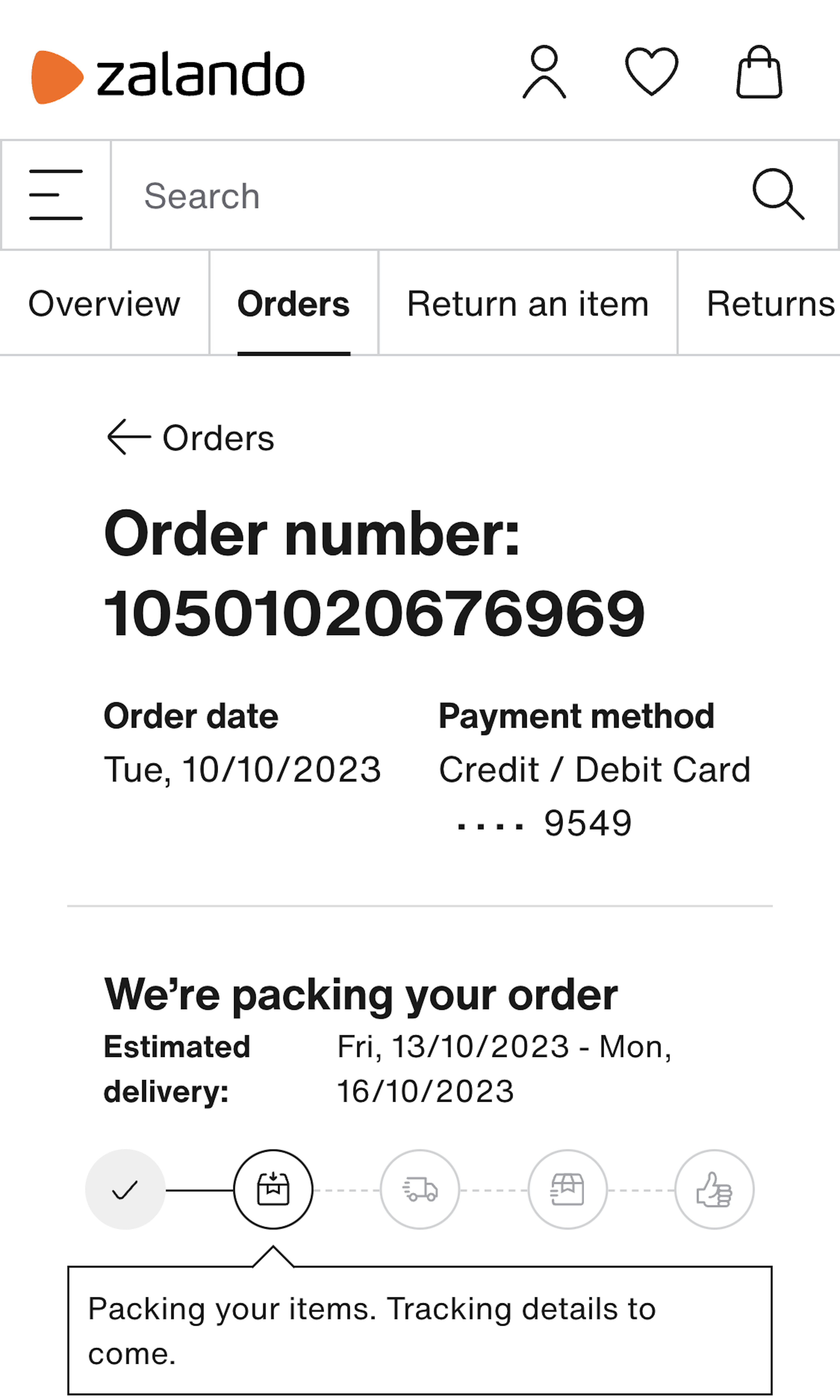
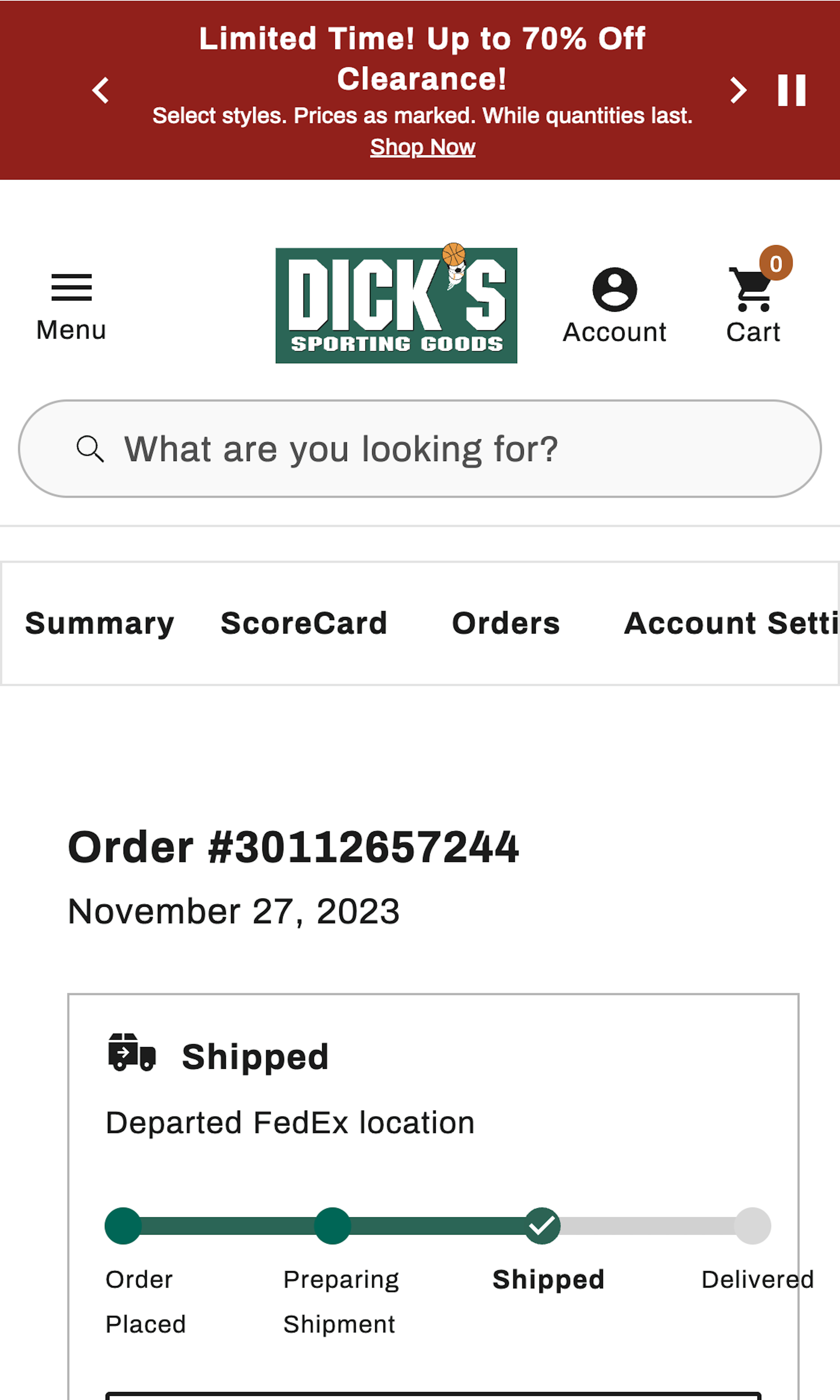
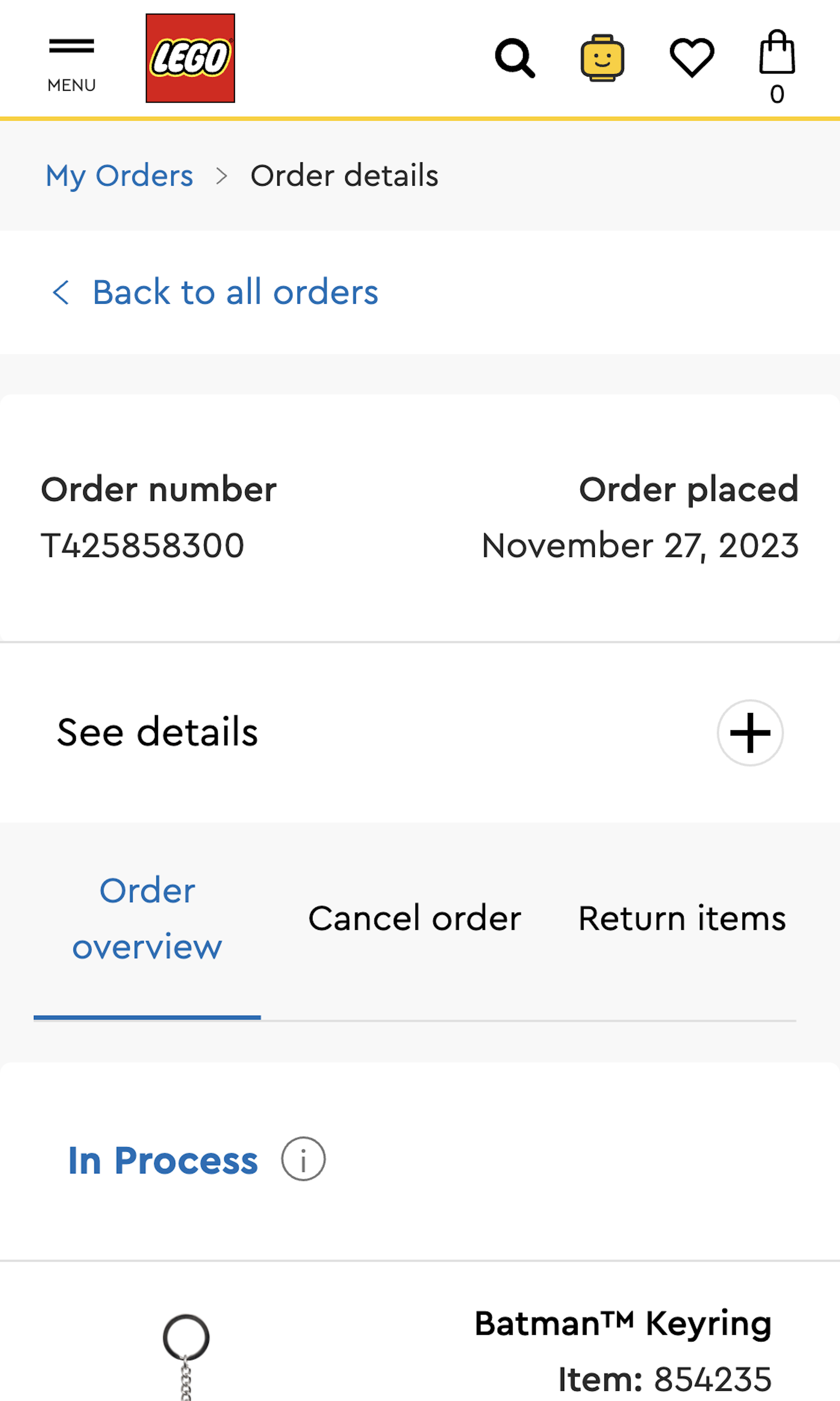
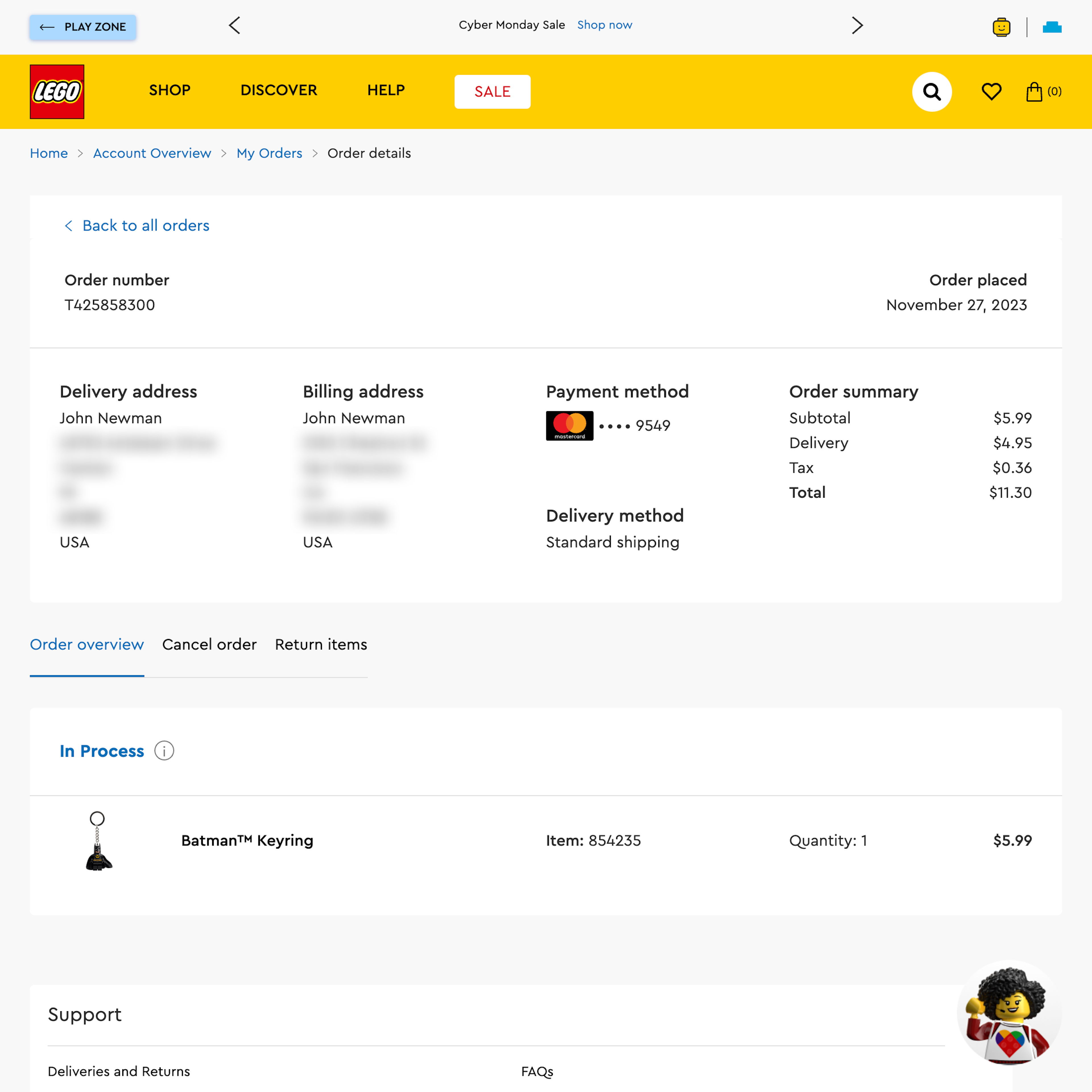
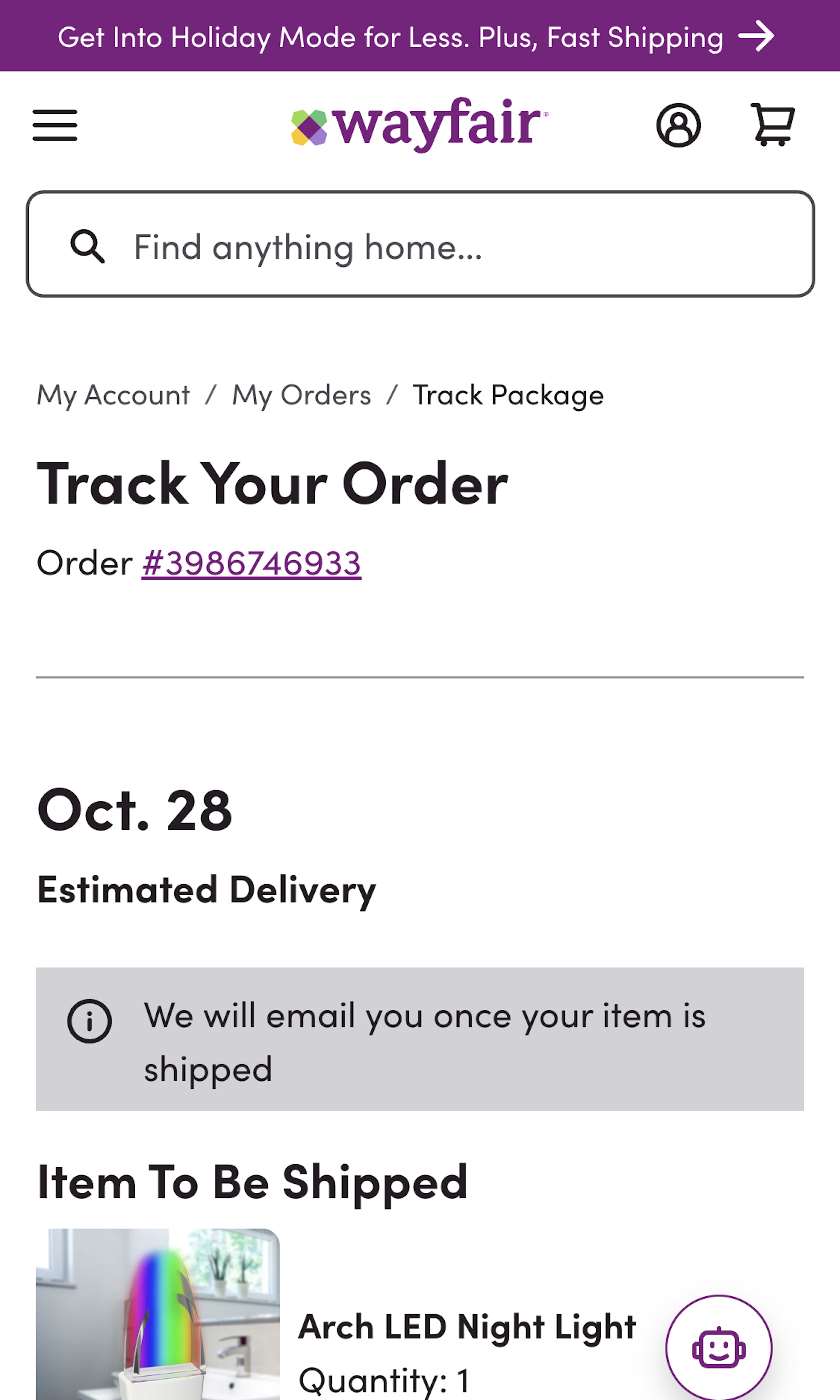
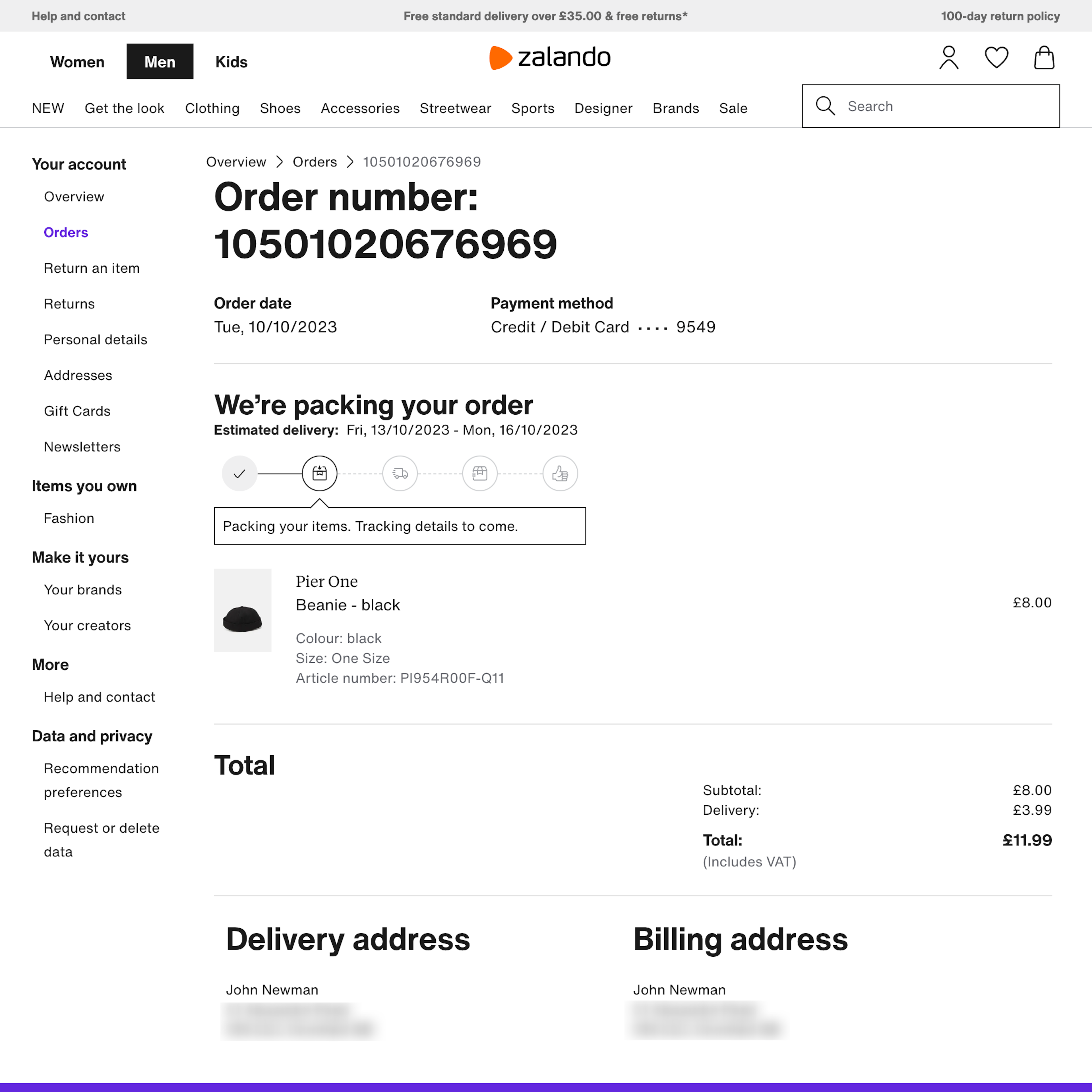
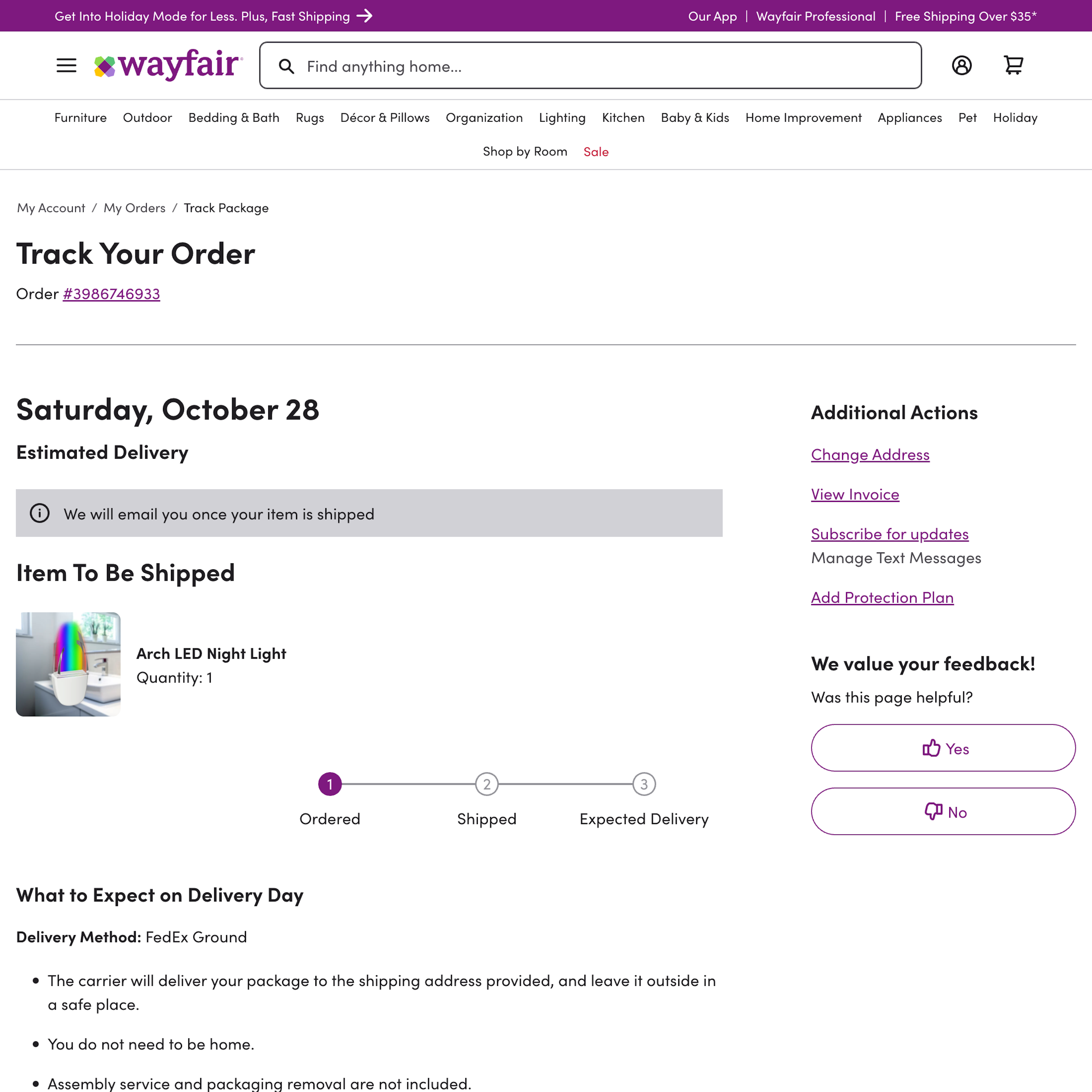
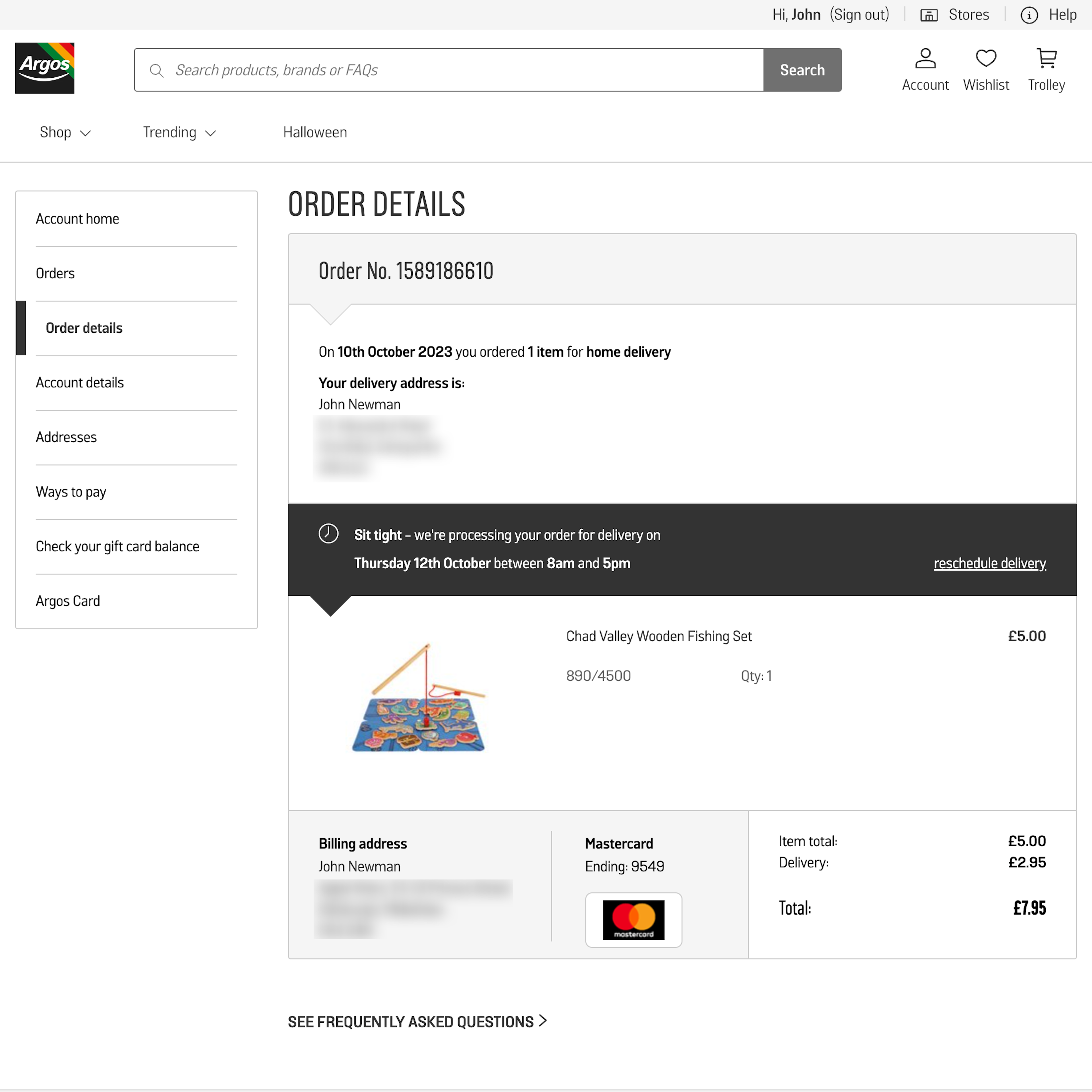
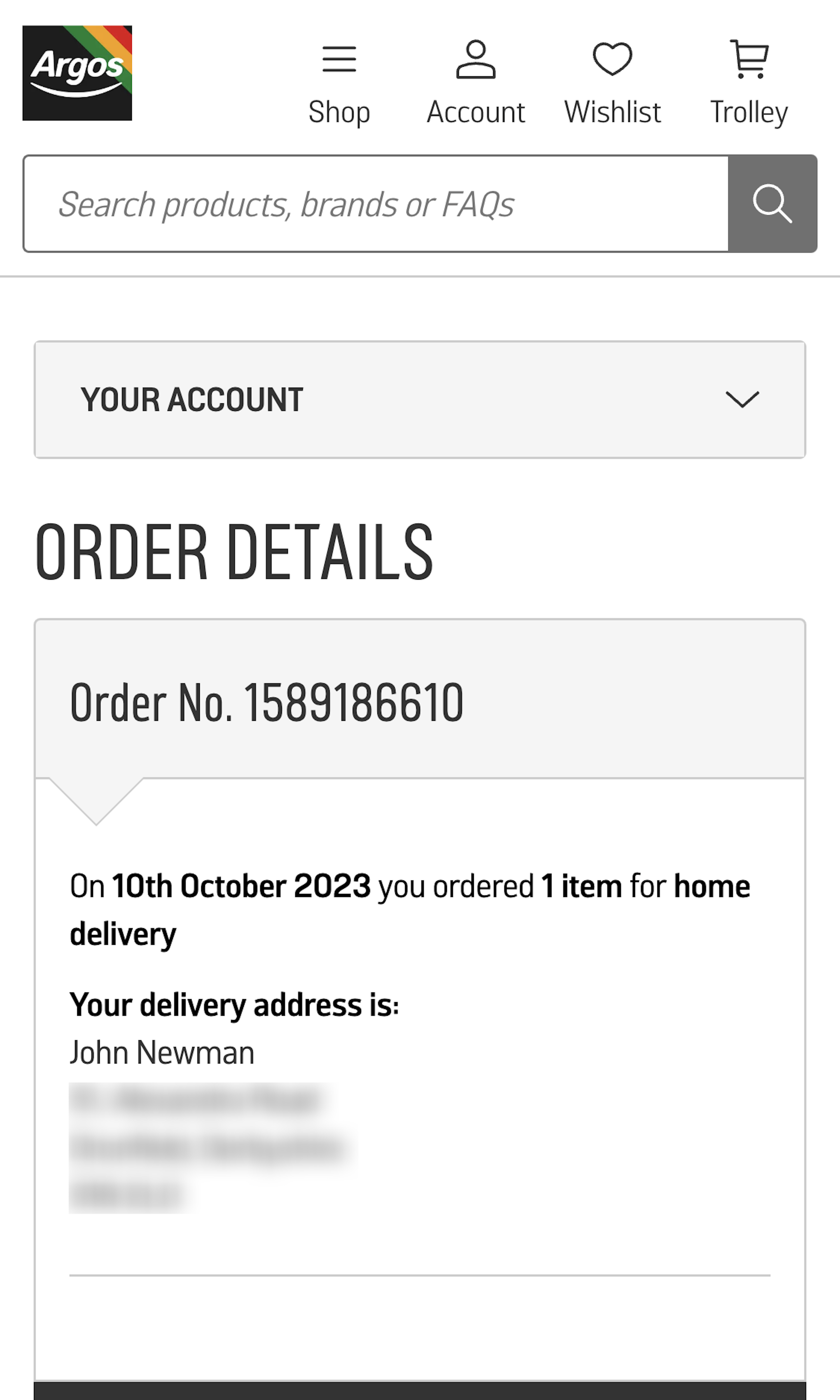
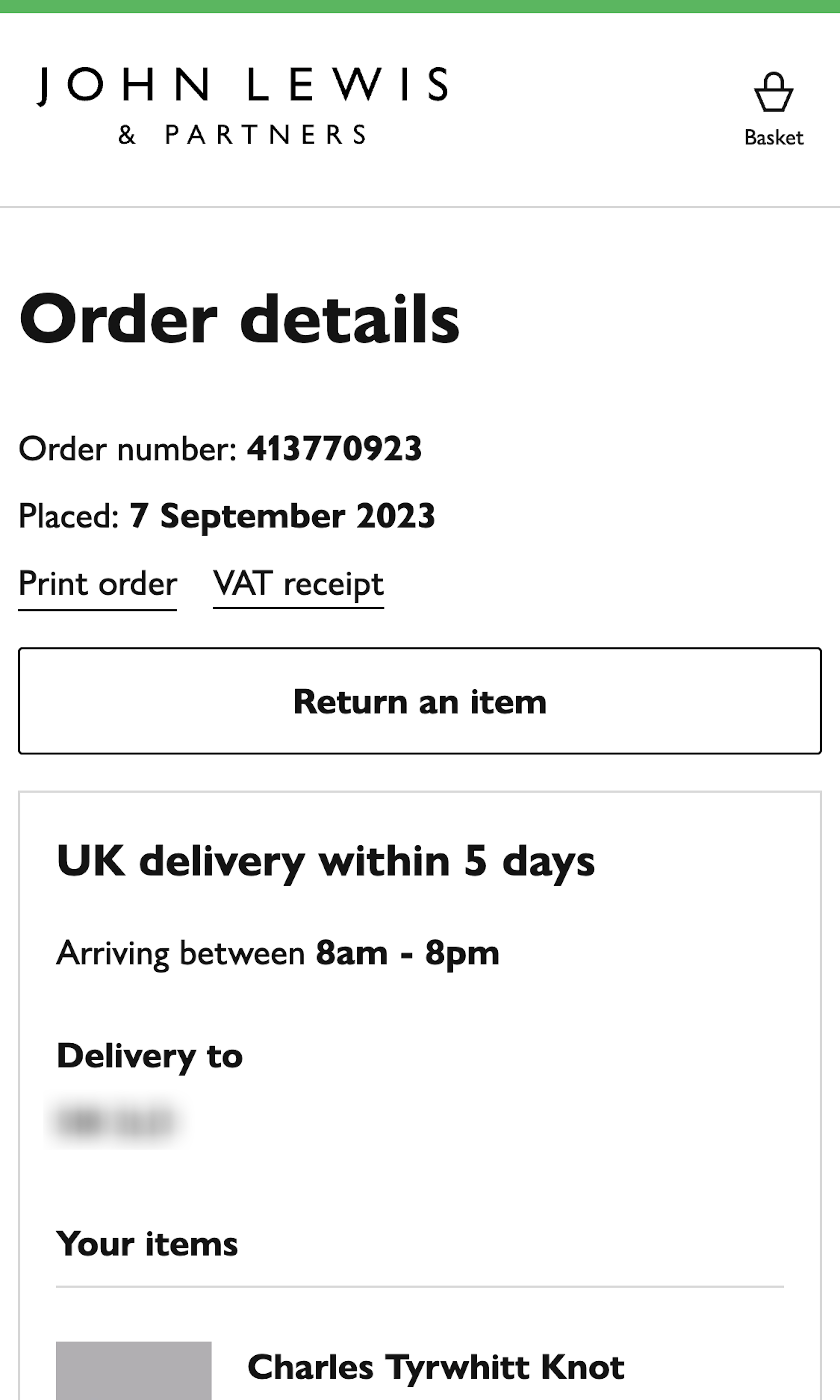
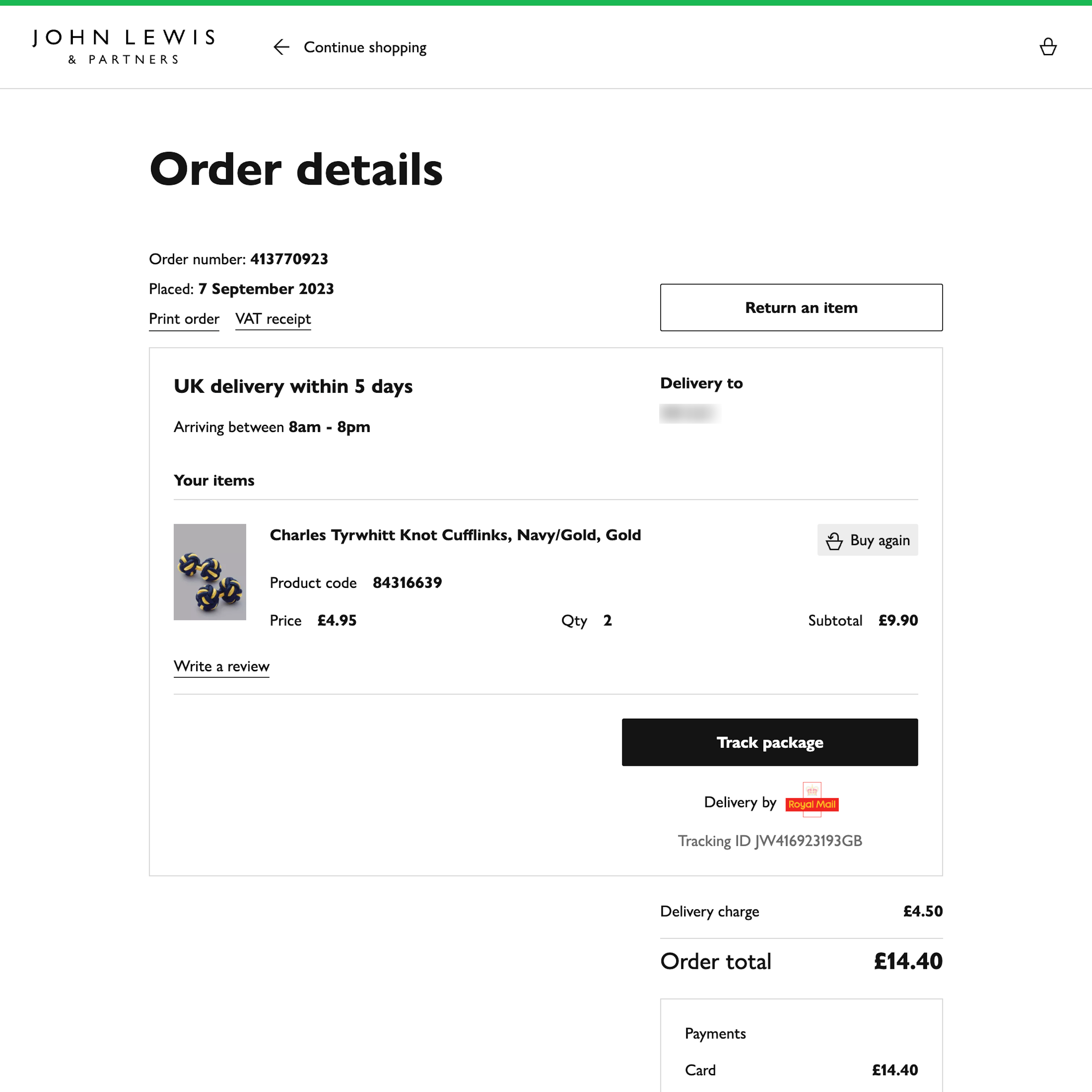
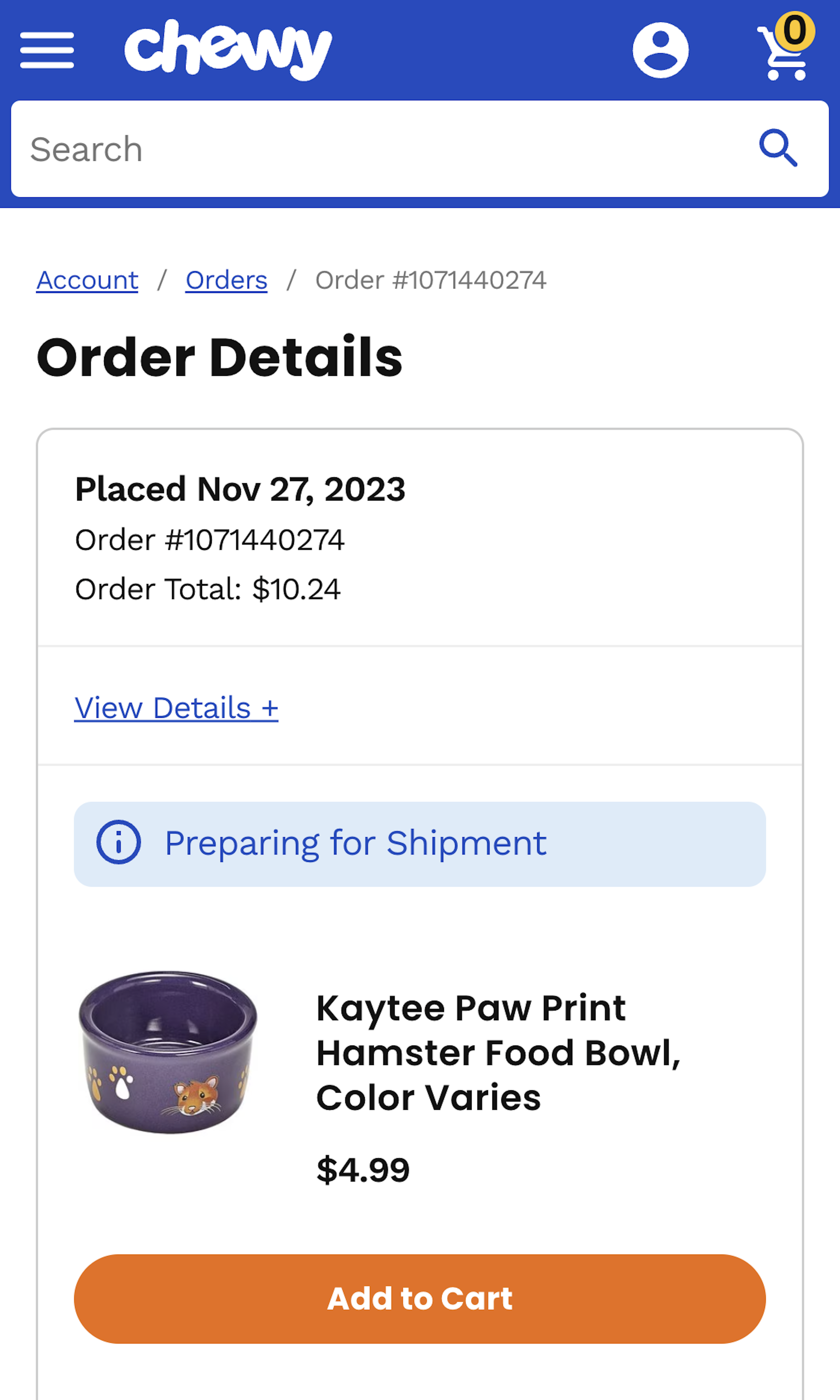
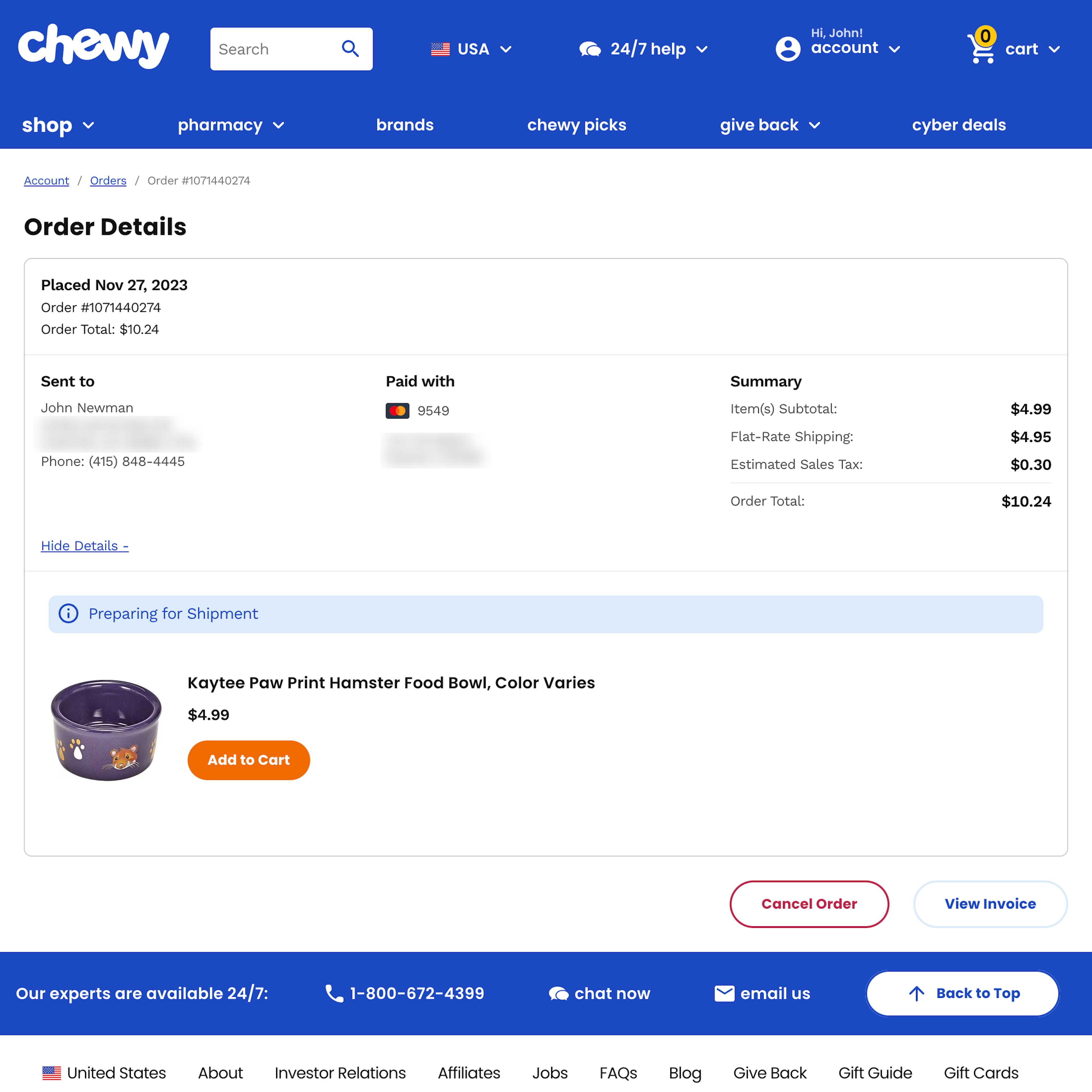
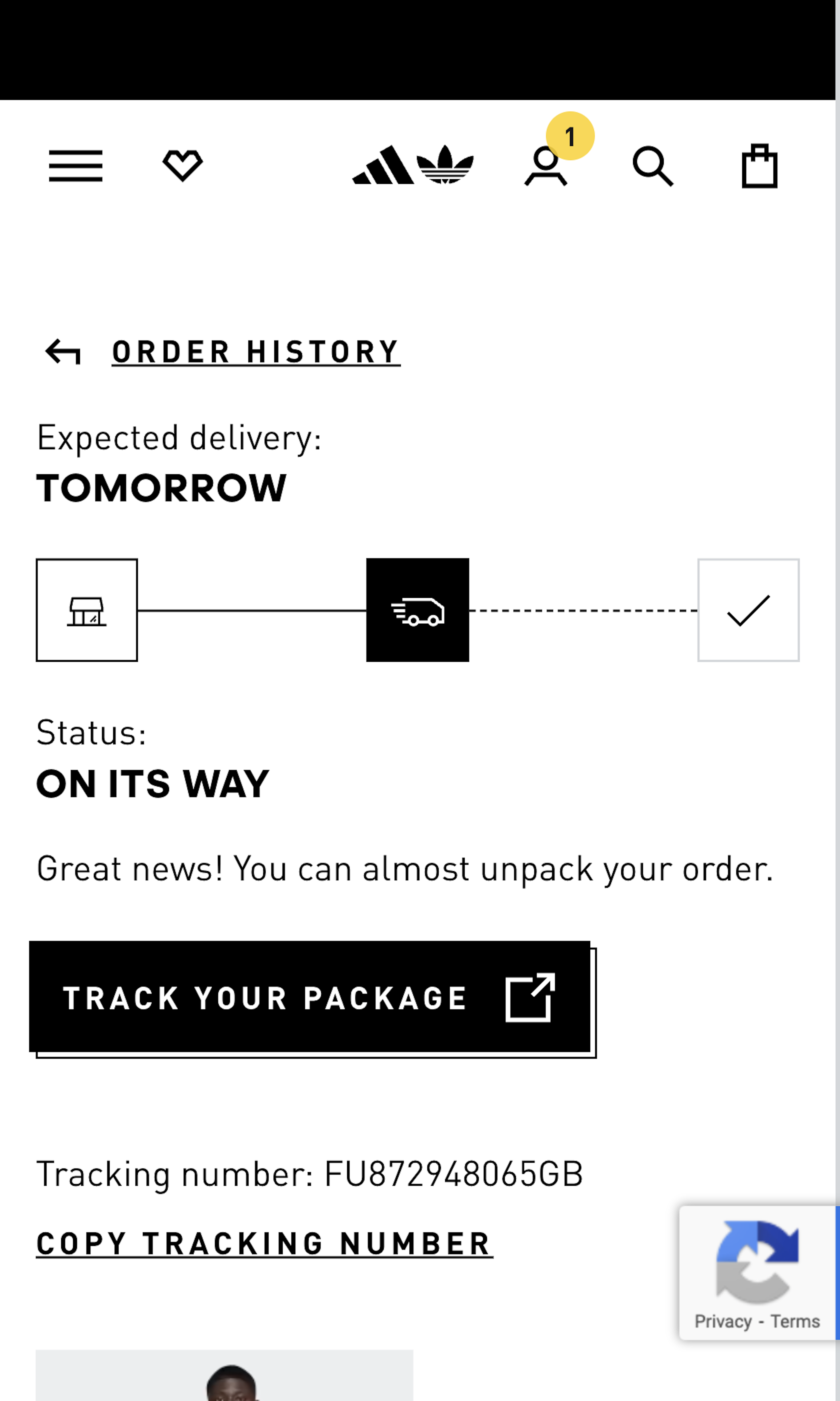
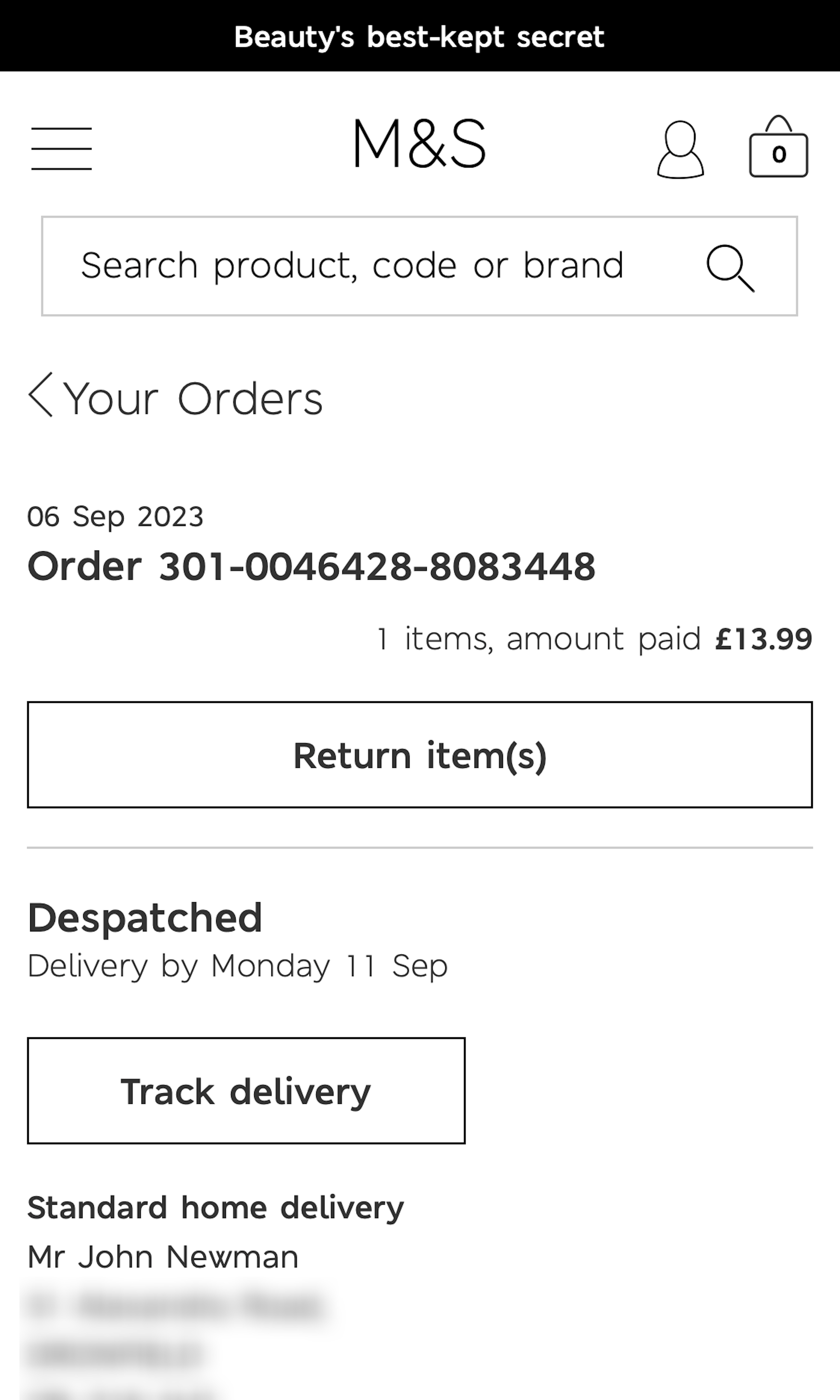
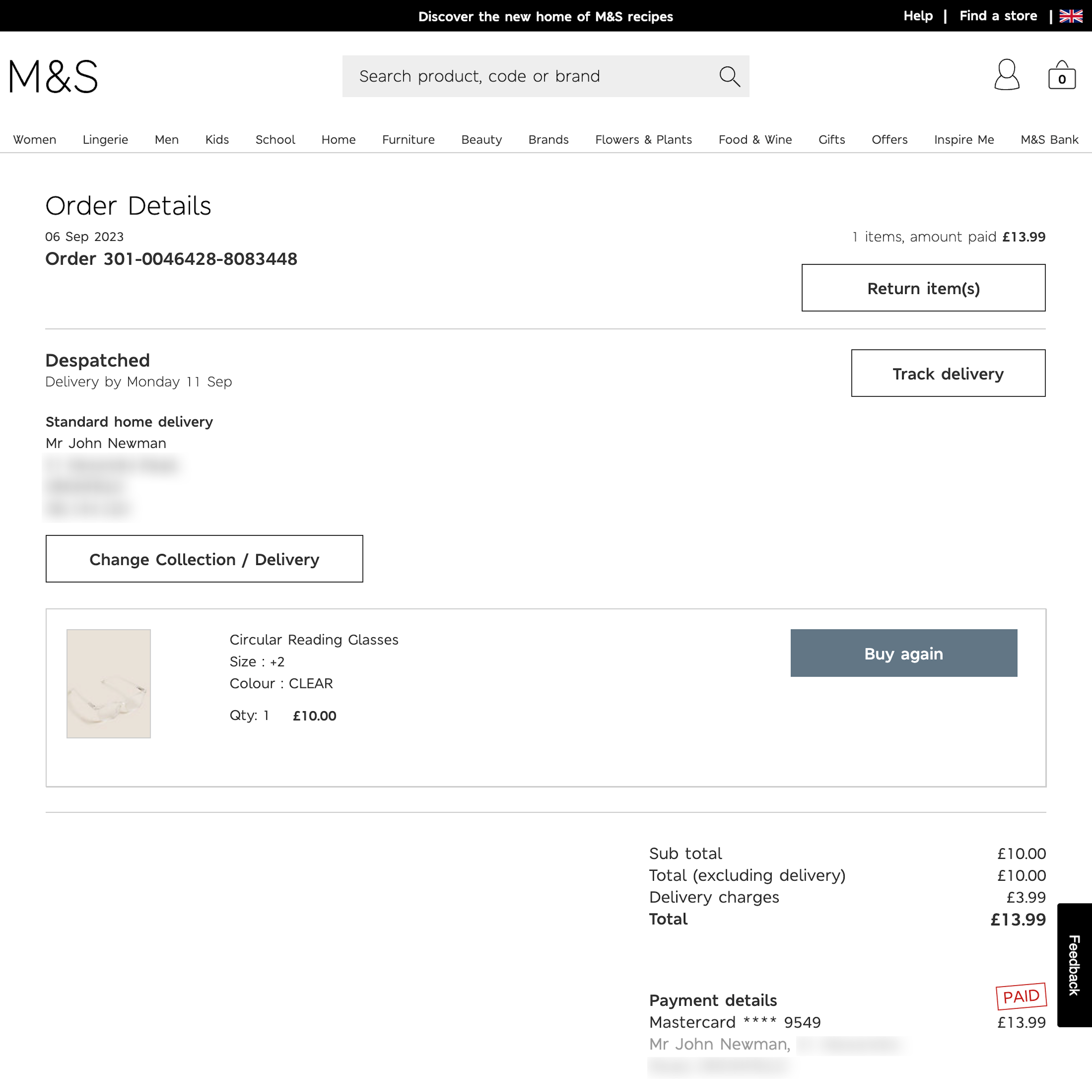
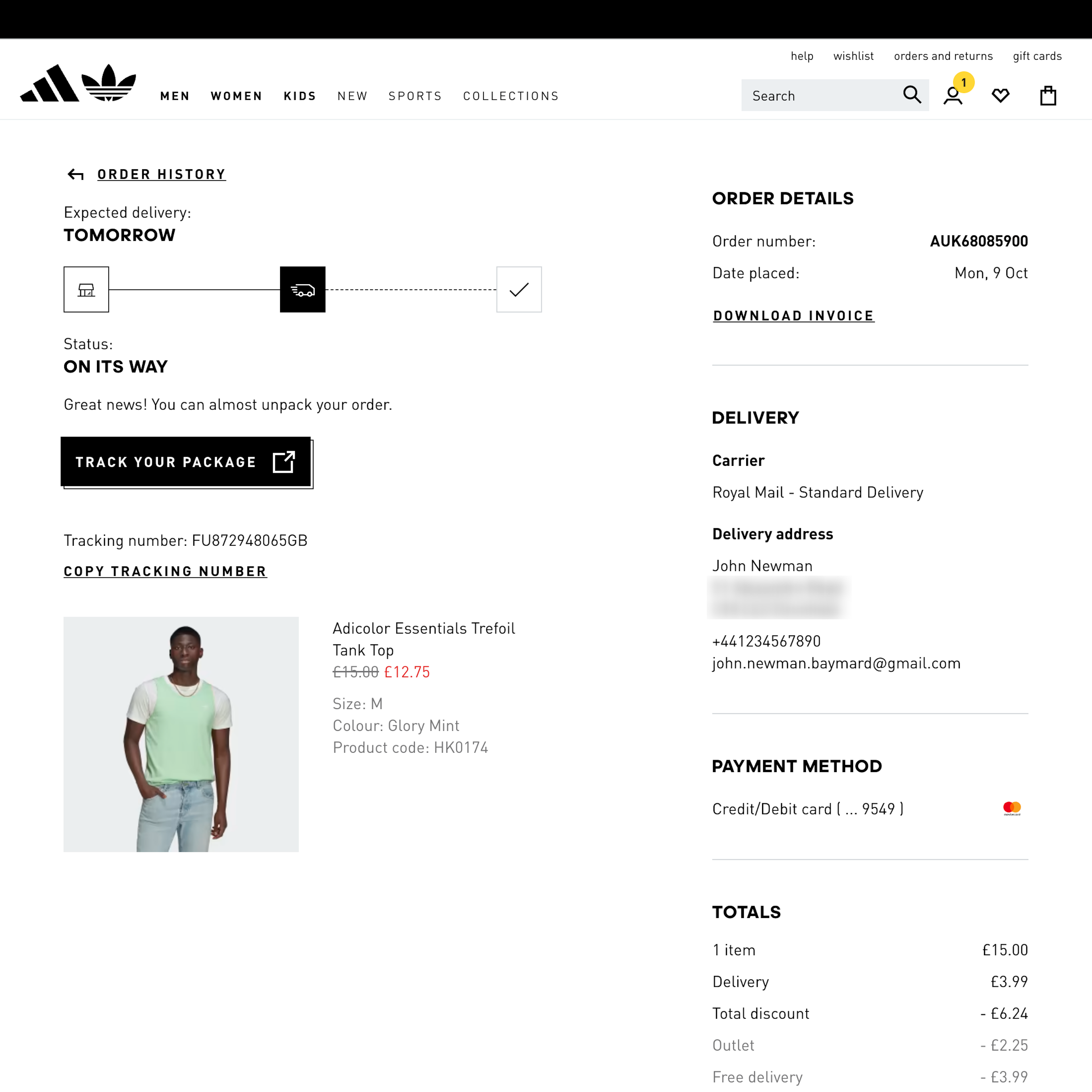
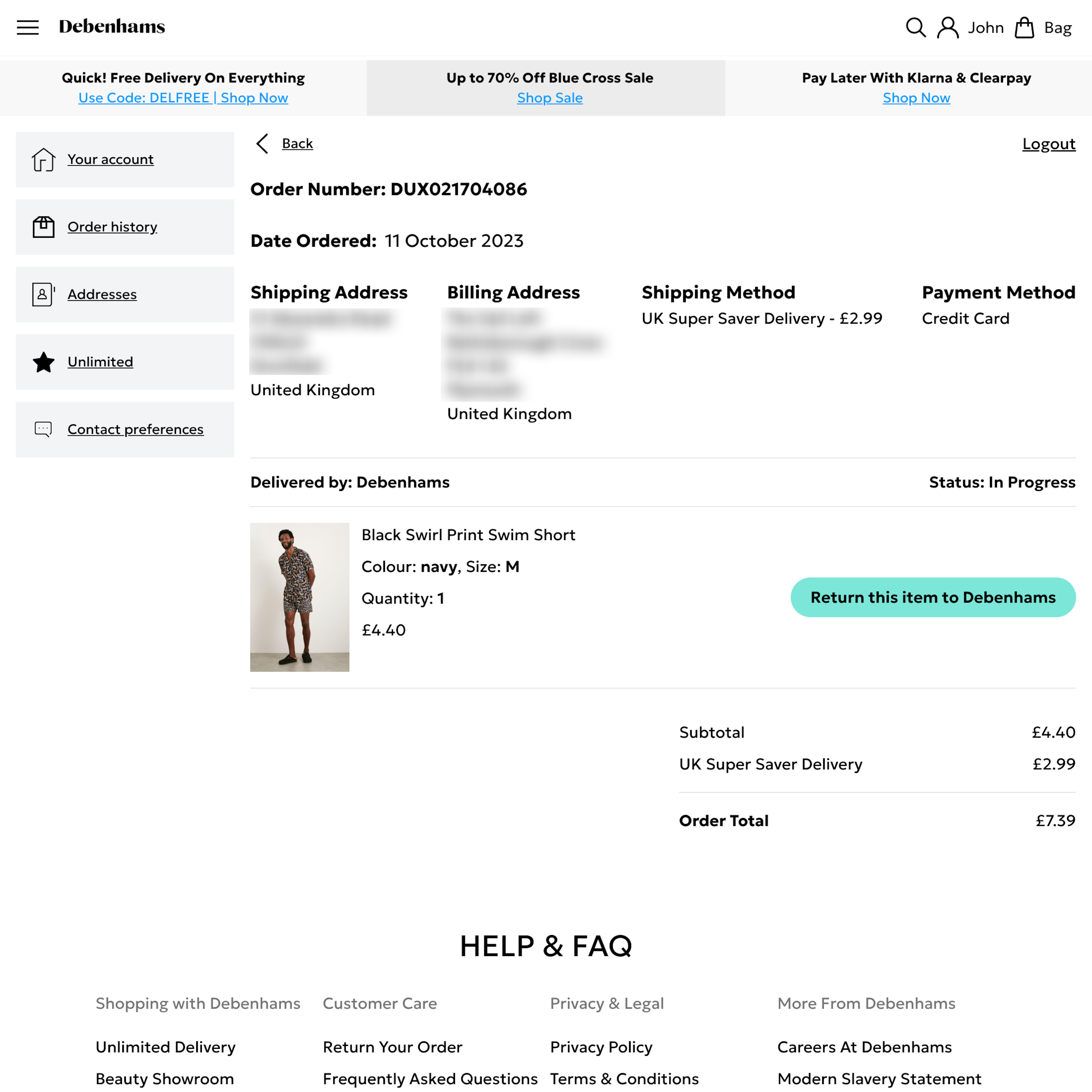
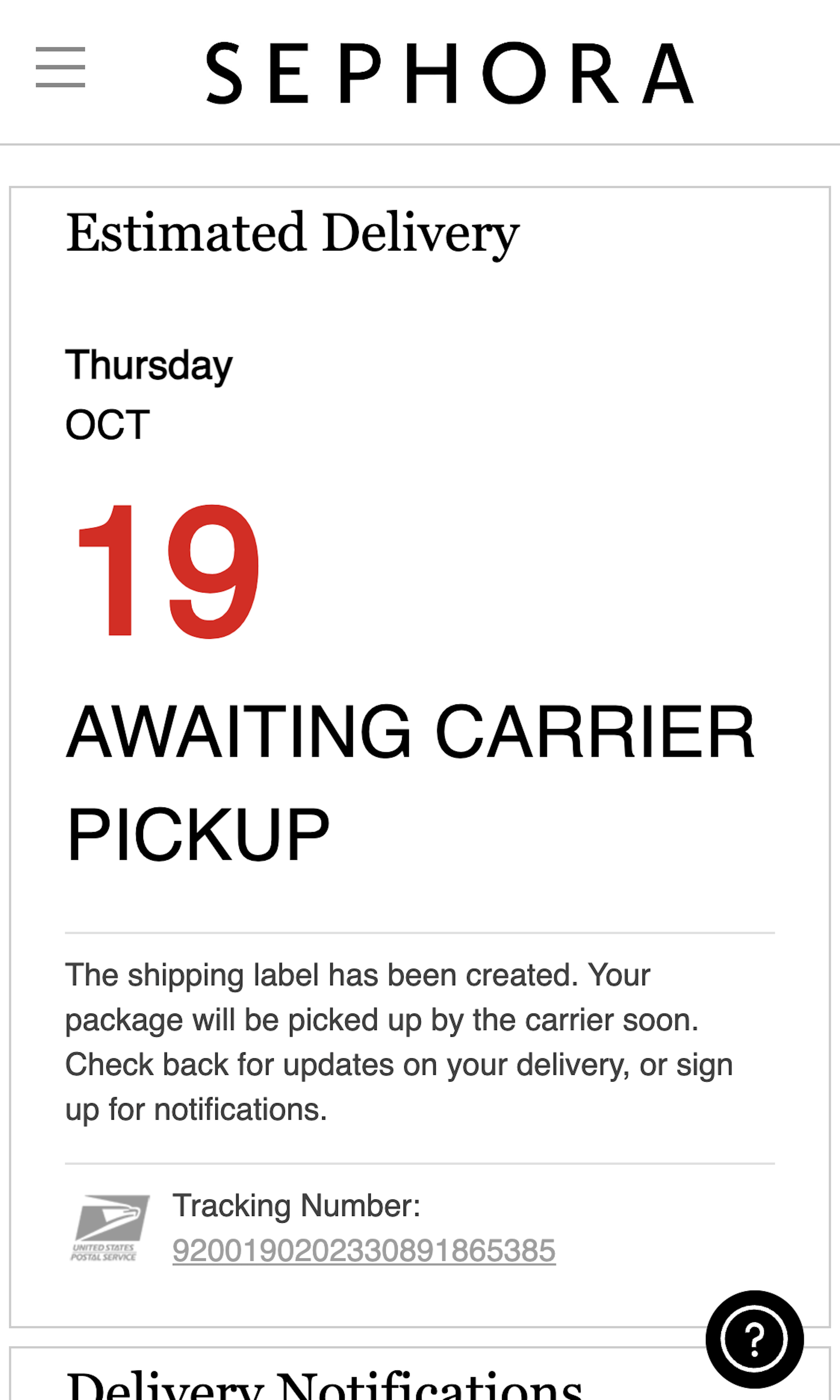
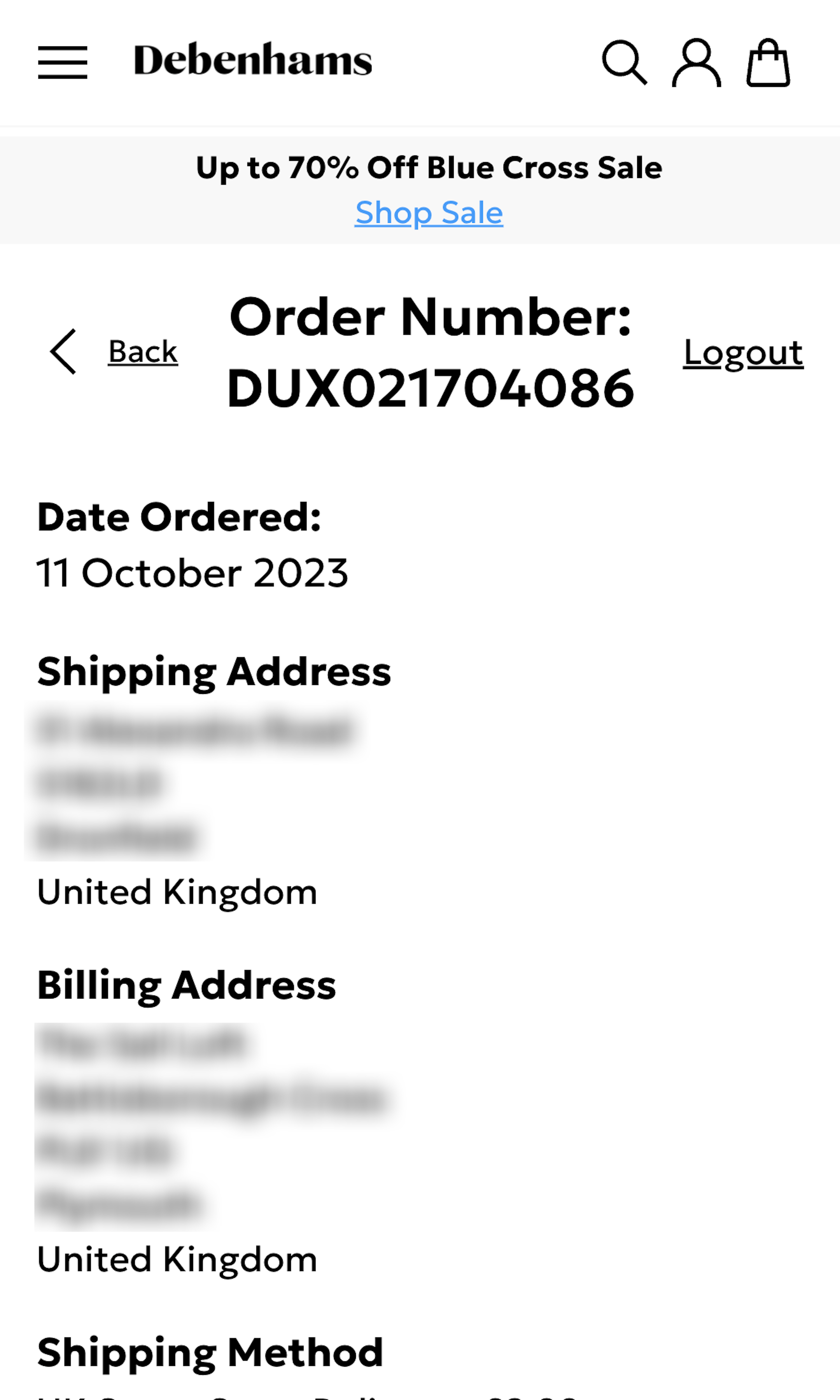
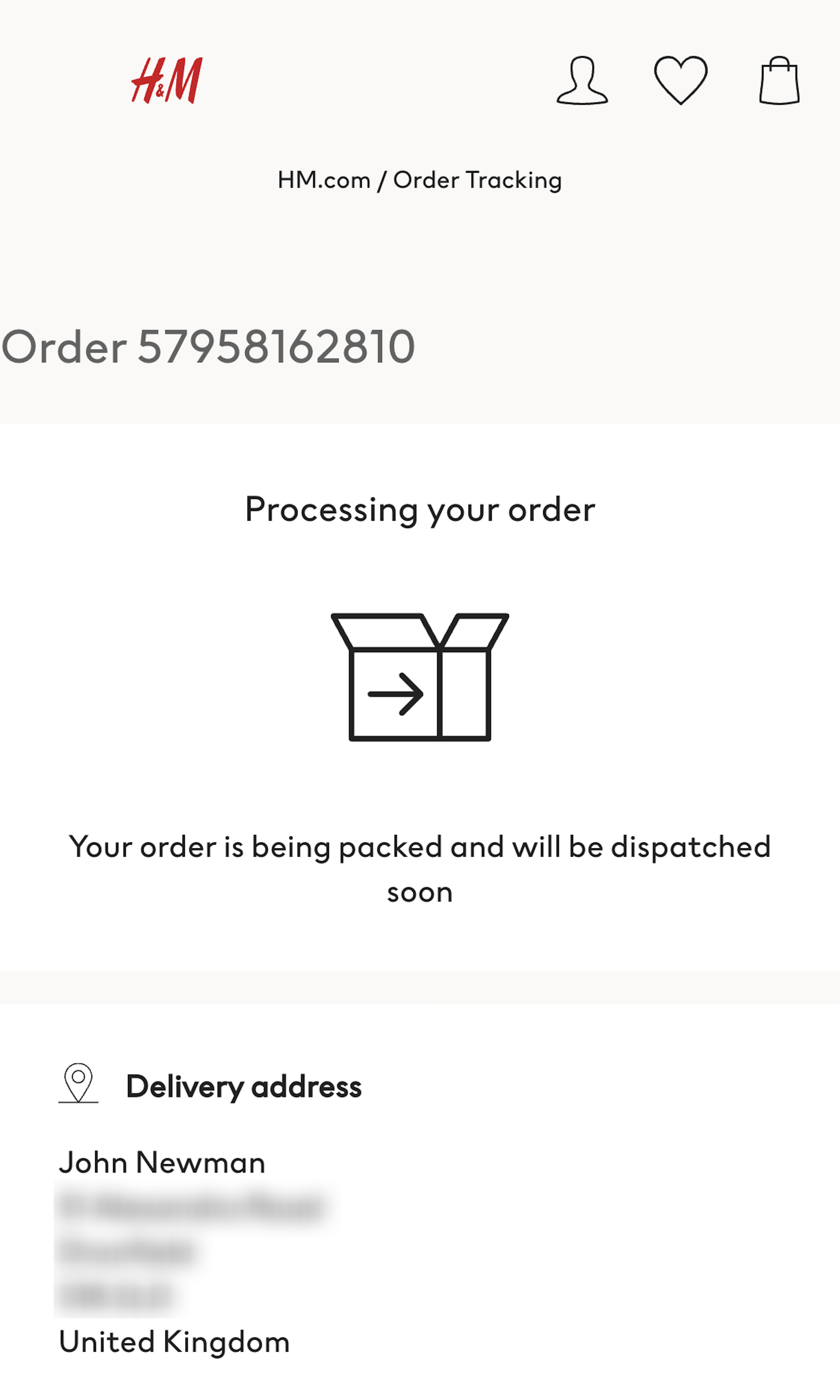
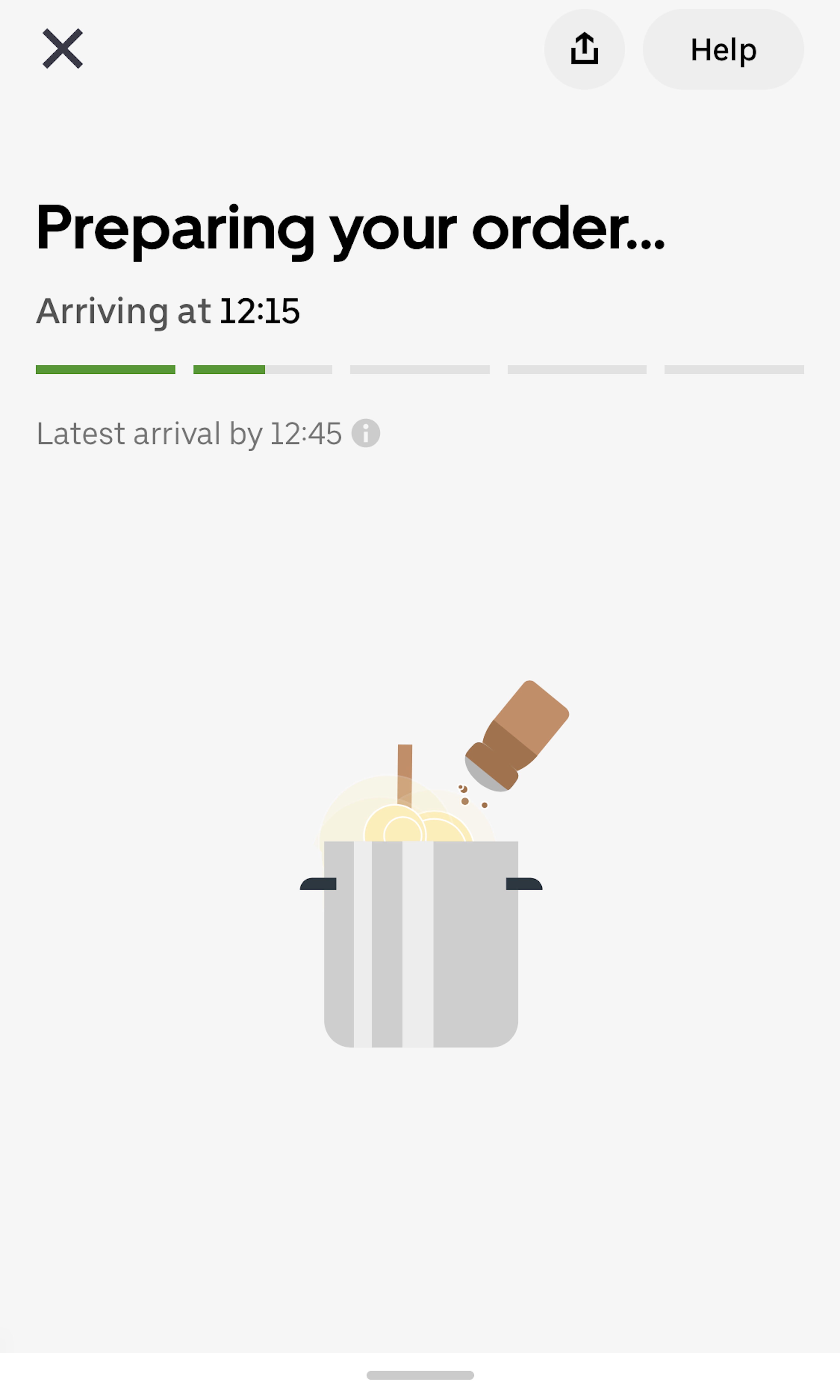
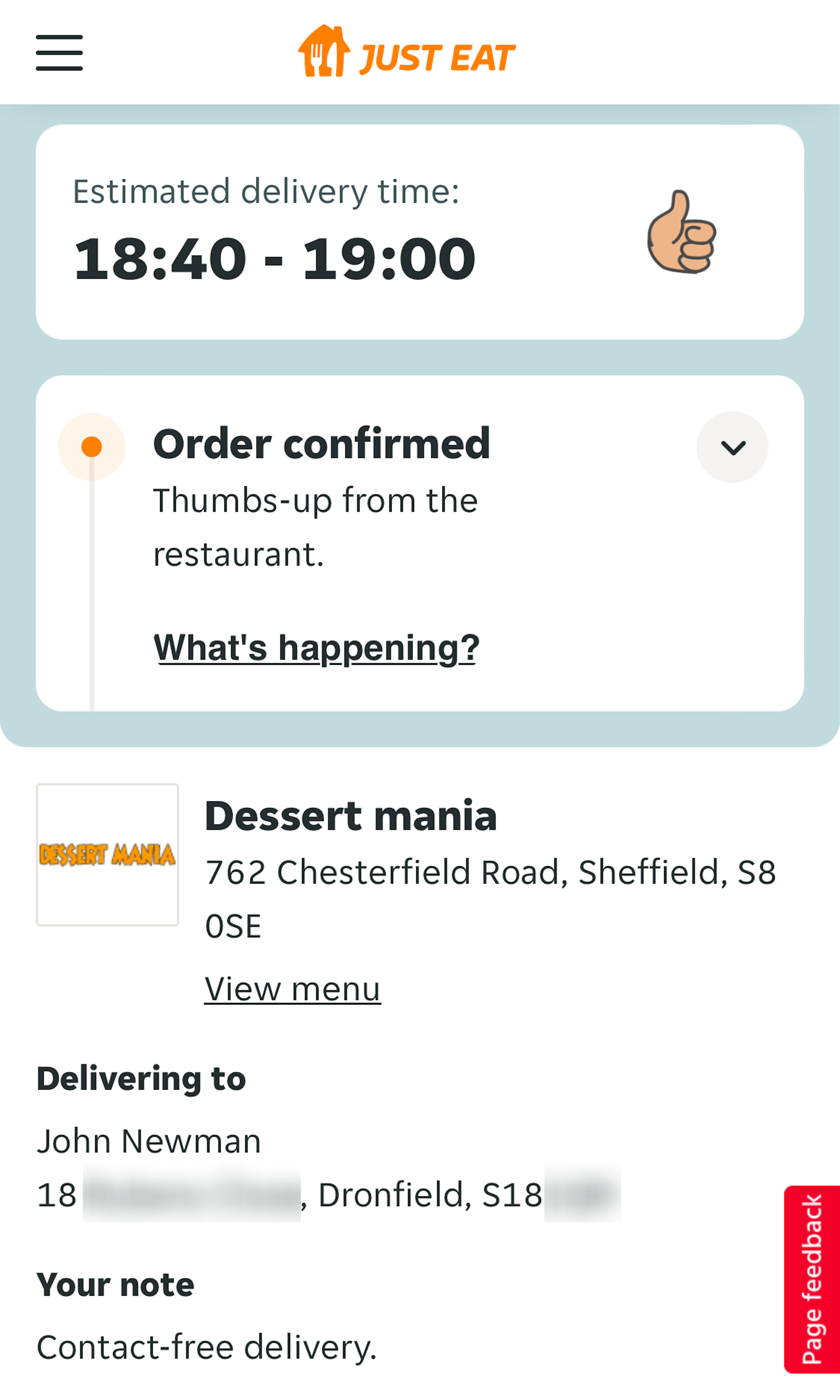
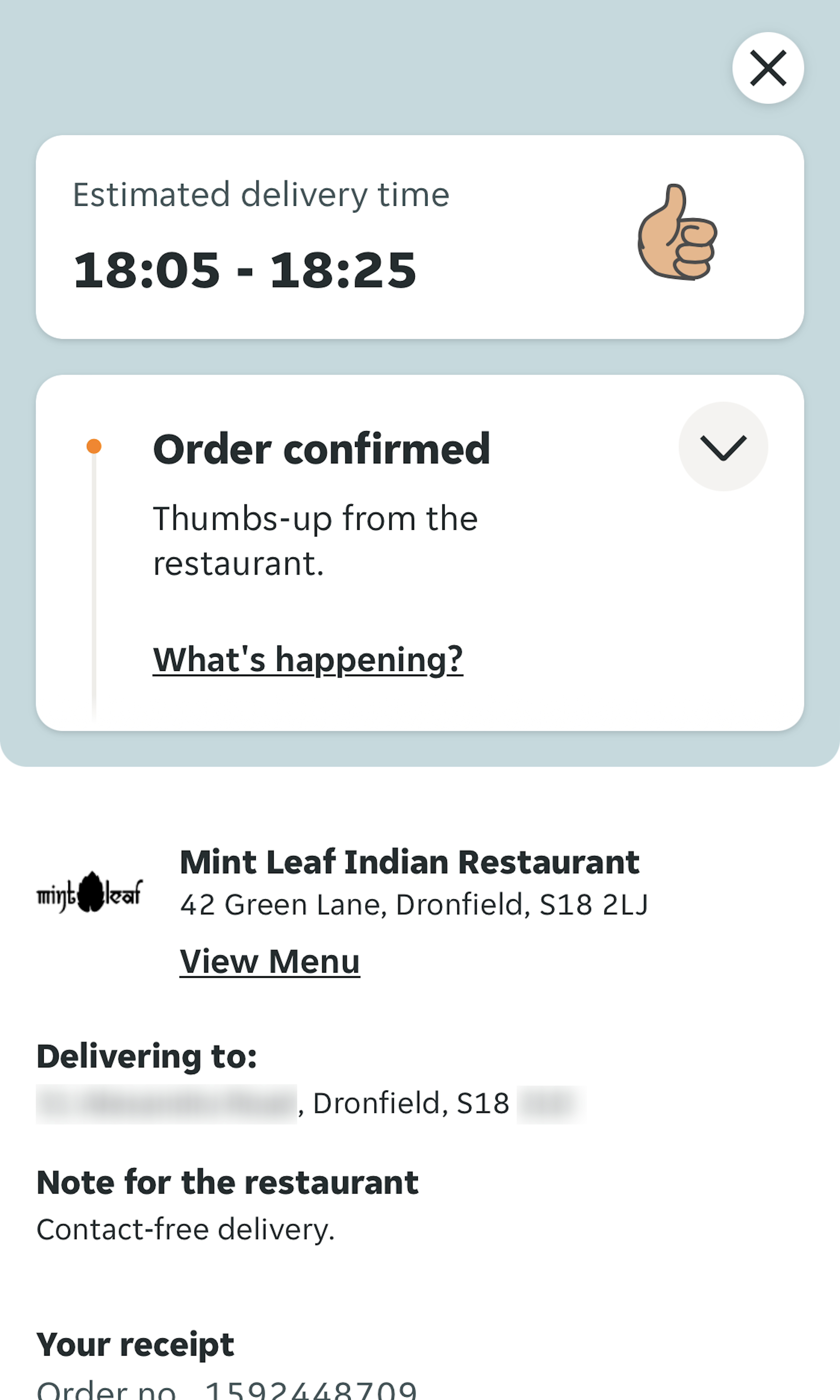
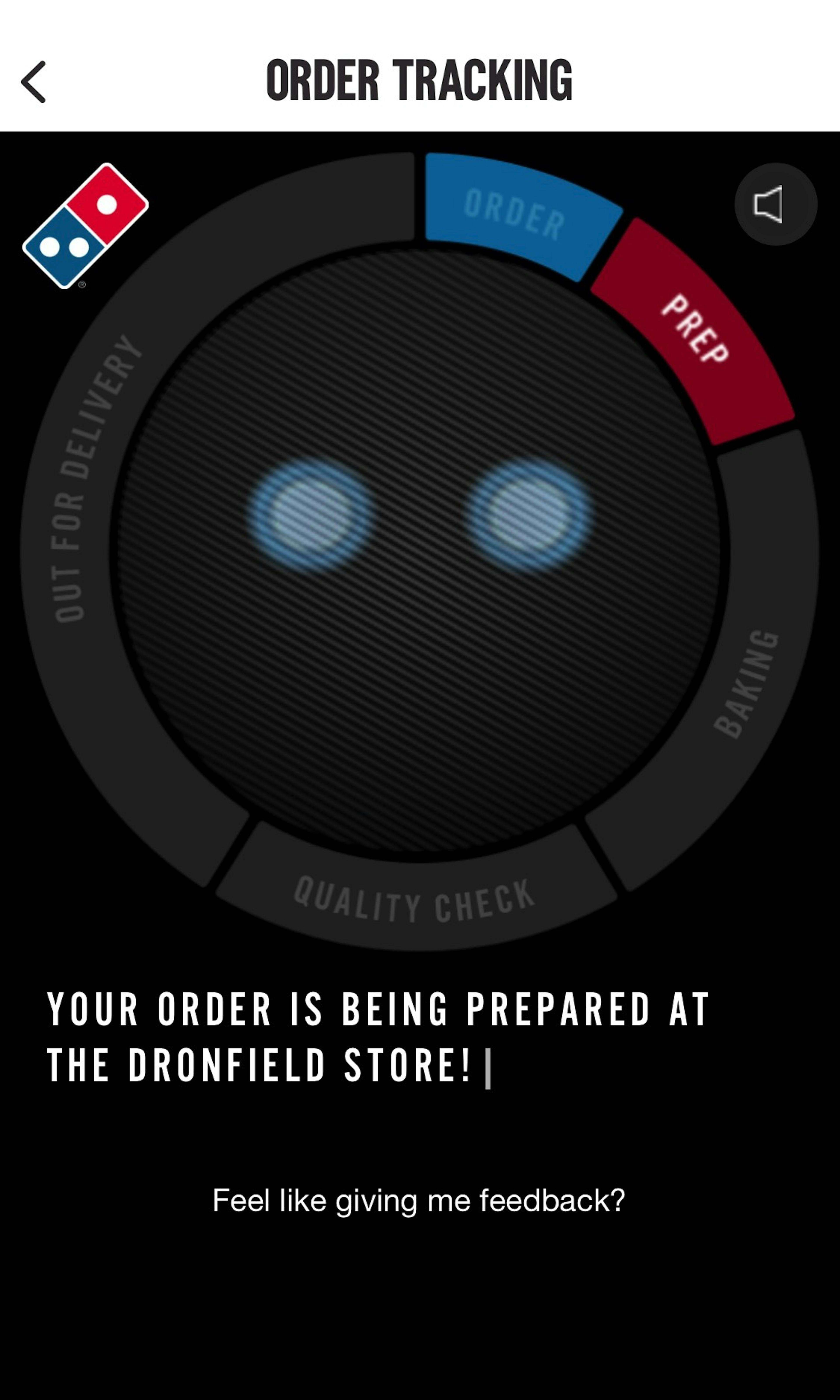
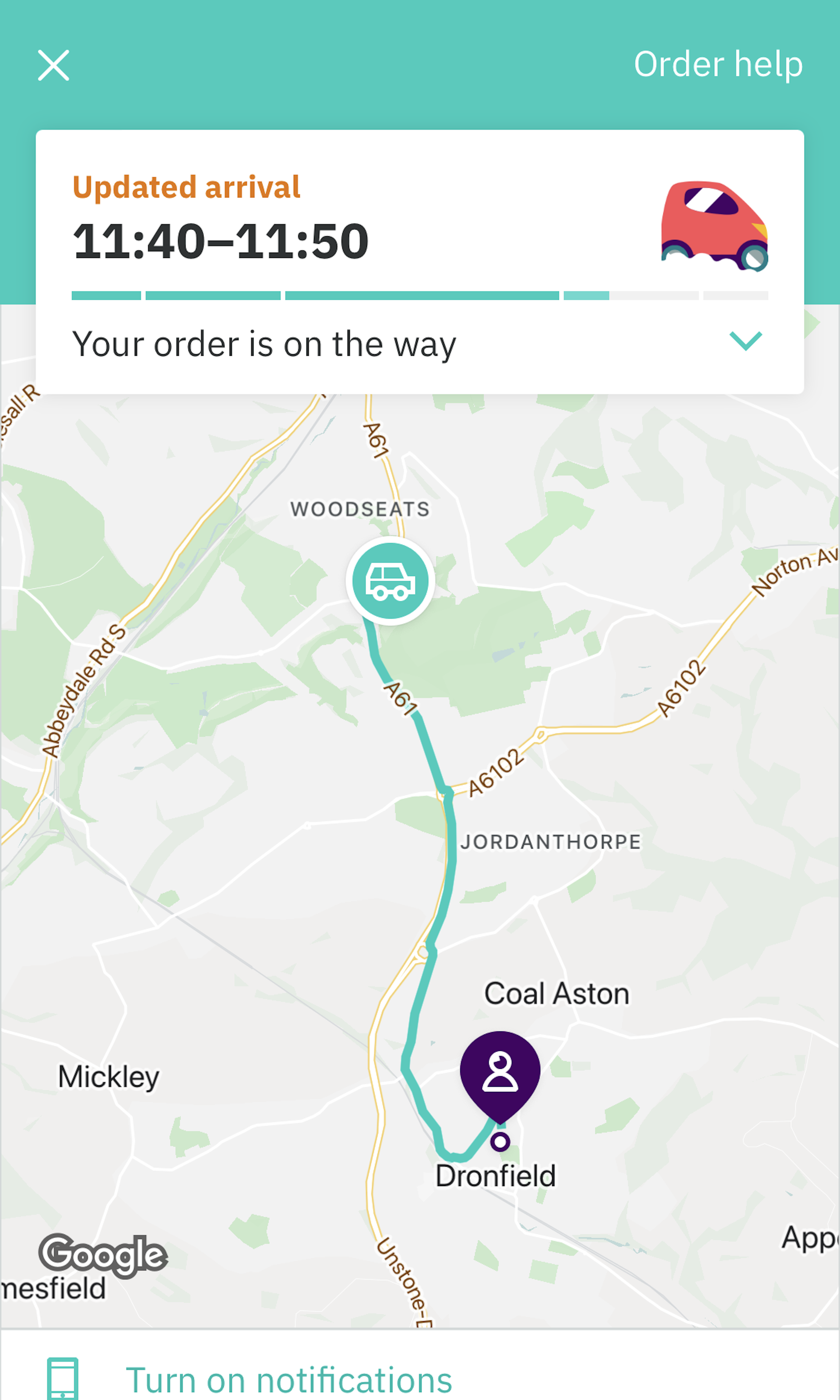
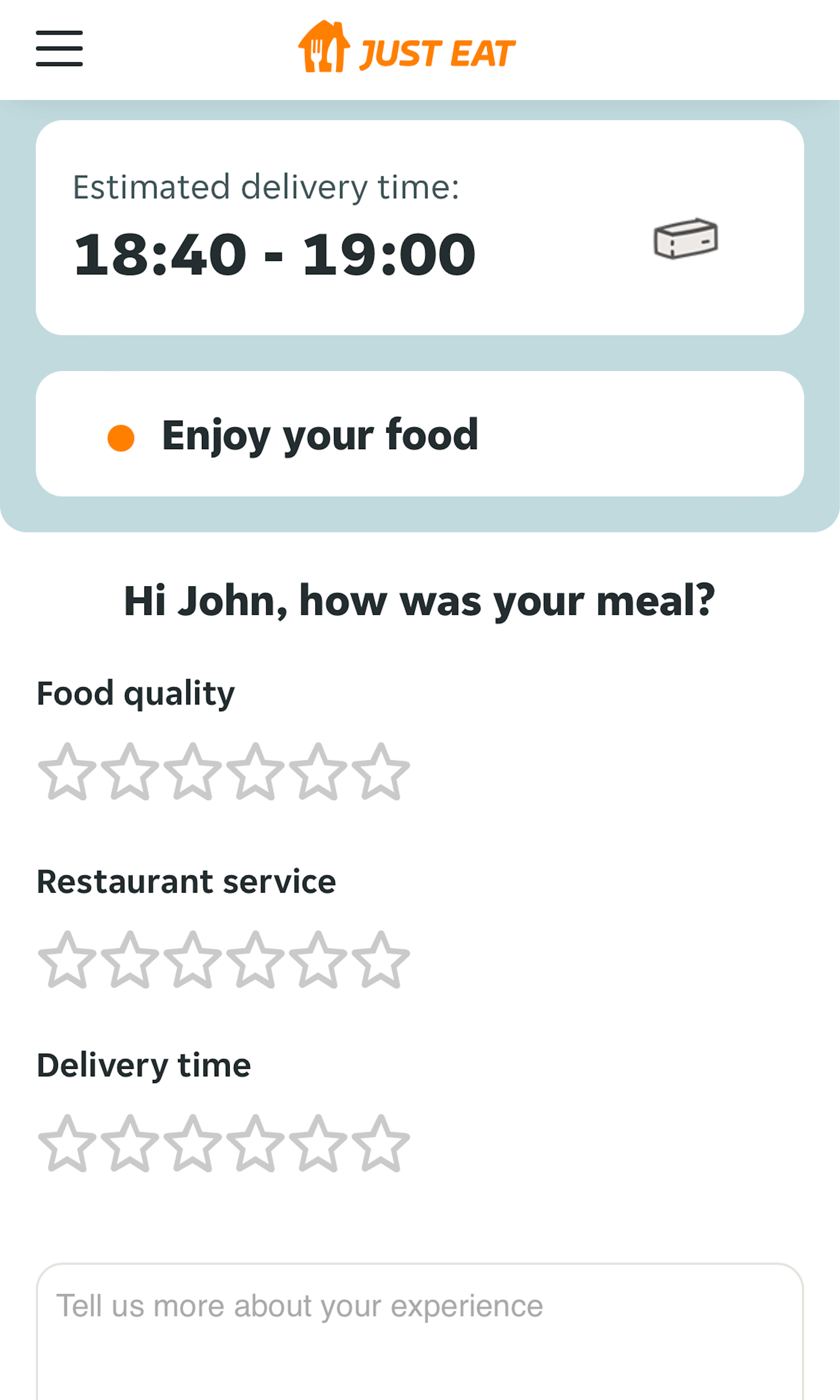
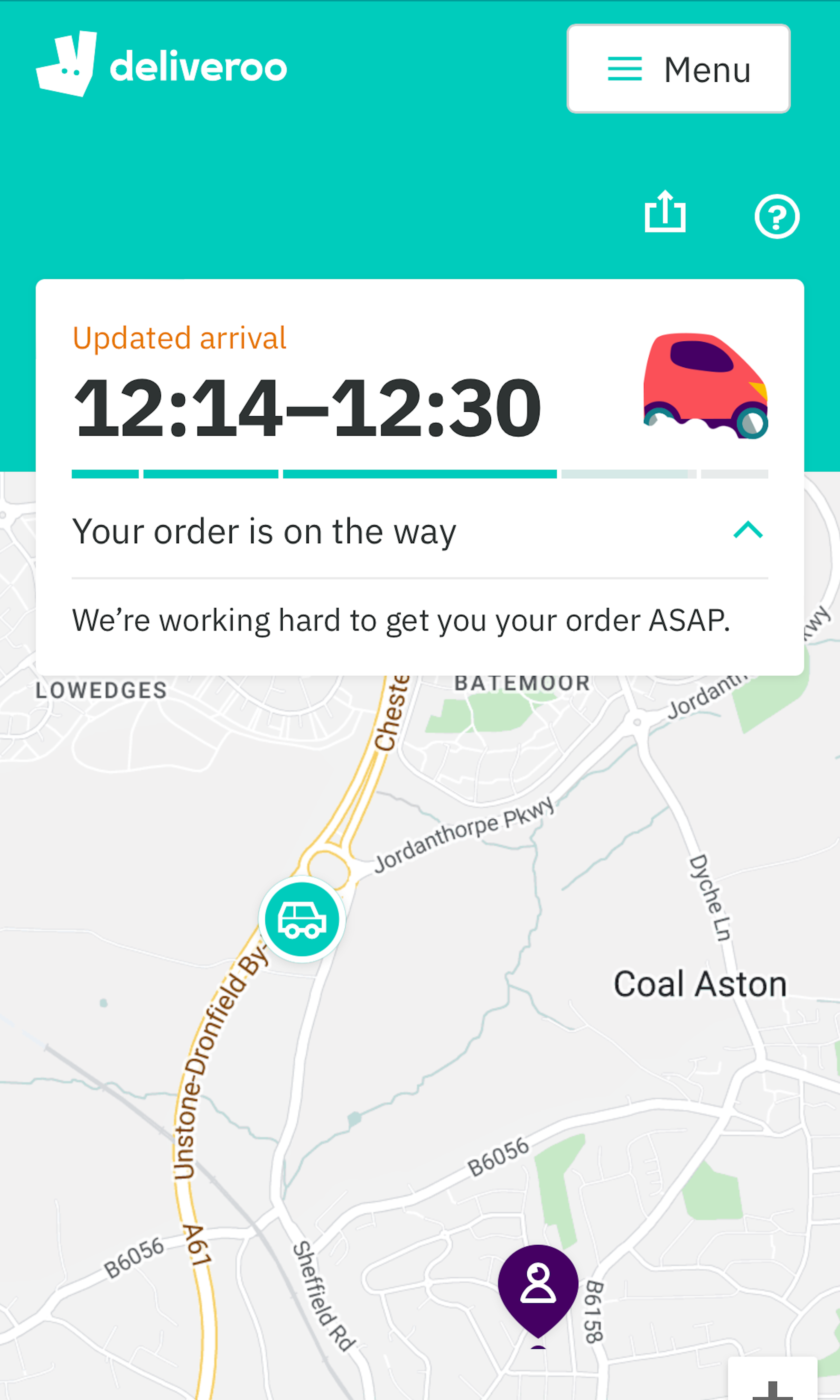
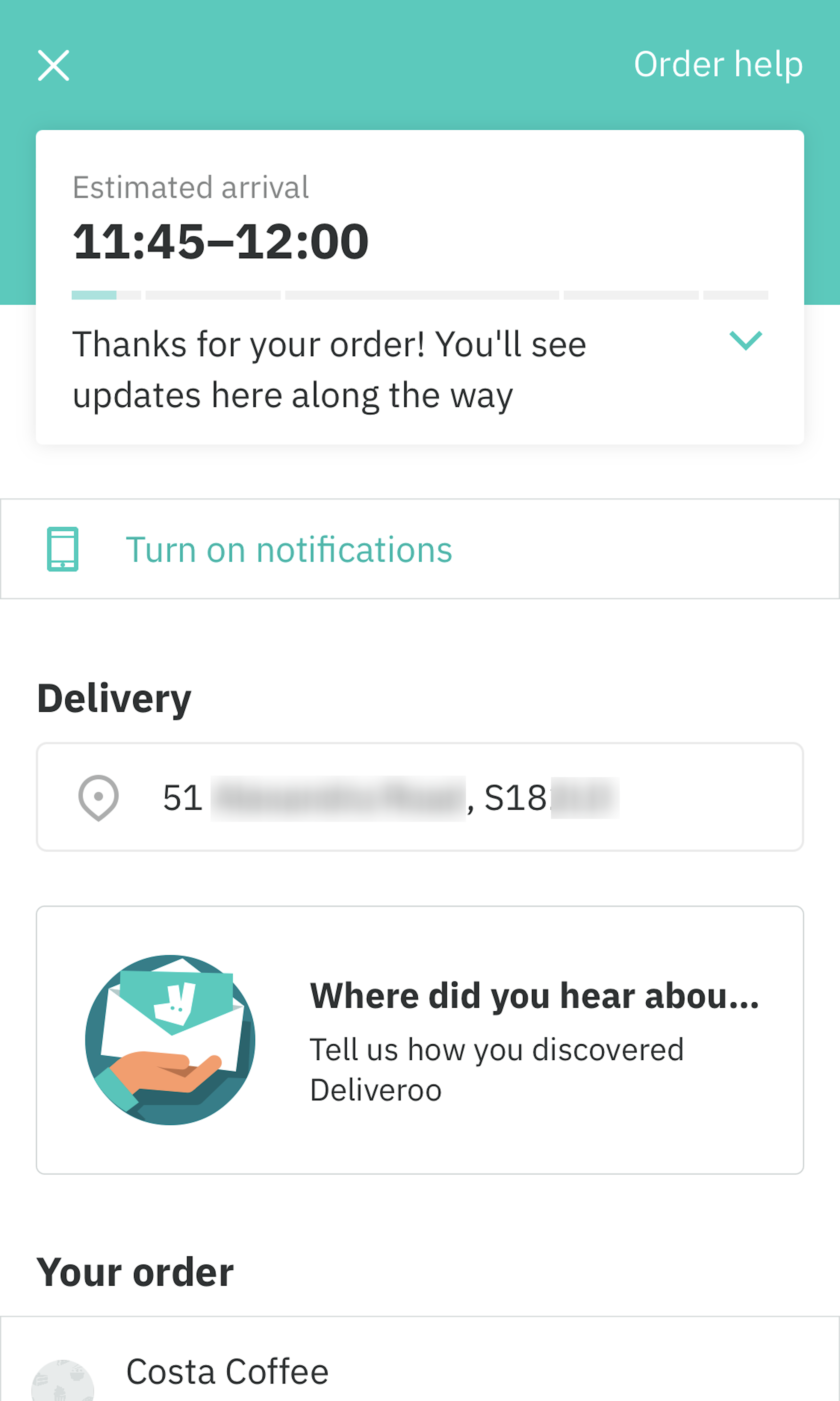
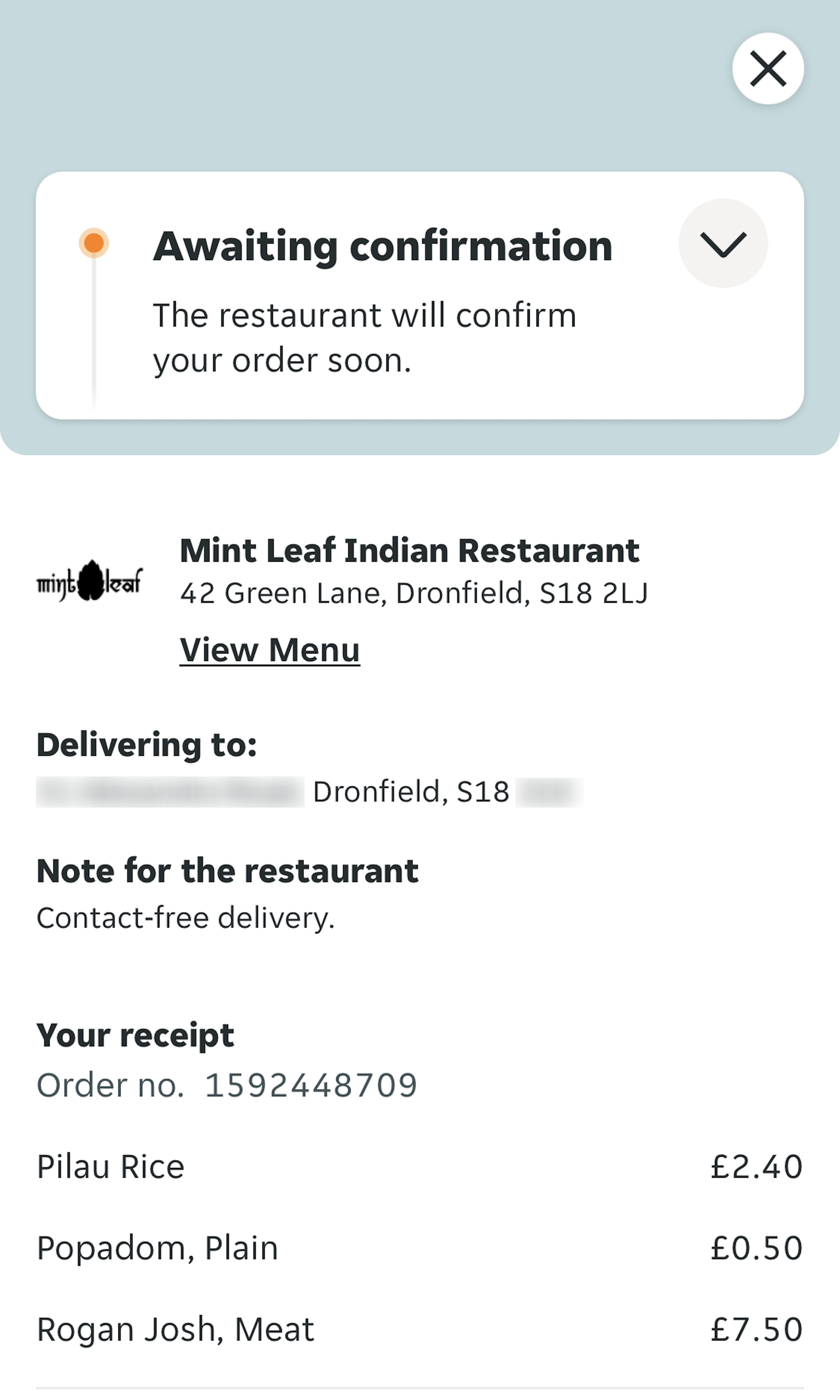
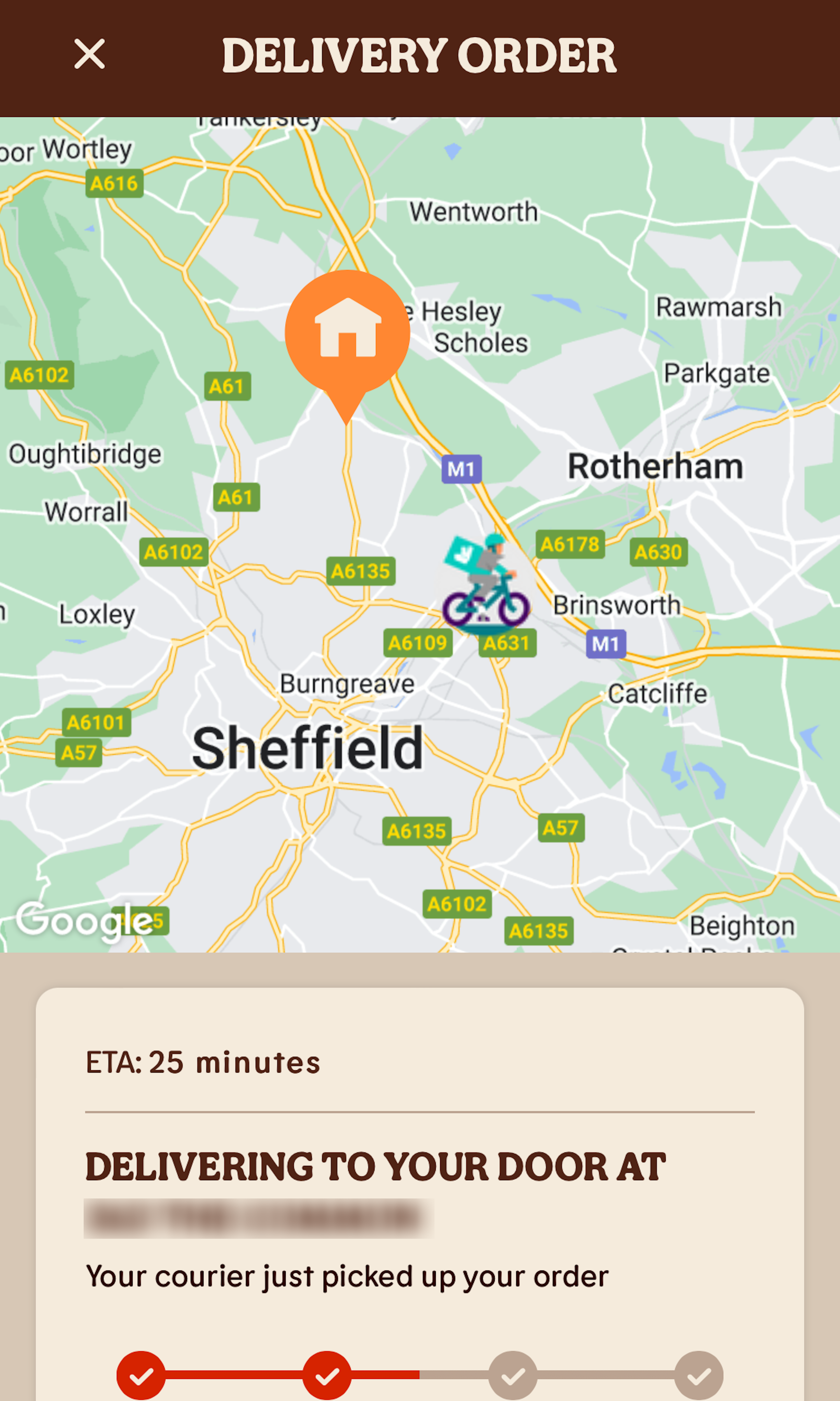
147 ‘Order Tracking Page’ Design Examples
Also referred to as: Package Tracking
What’s this? Here you’ll find 147 “Order Tracking Page” full-page screenshots annotated with research-based UX insights, sourced from Baymard’s UX benchmark of 326 e-commerce sites. (Note: this is less than 1% of the full research catalog.)
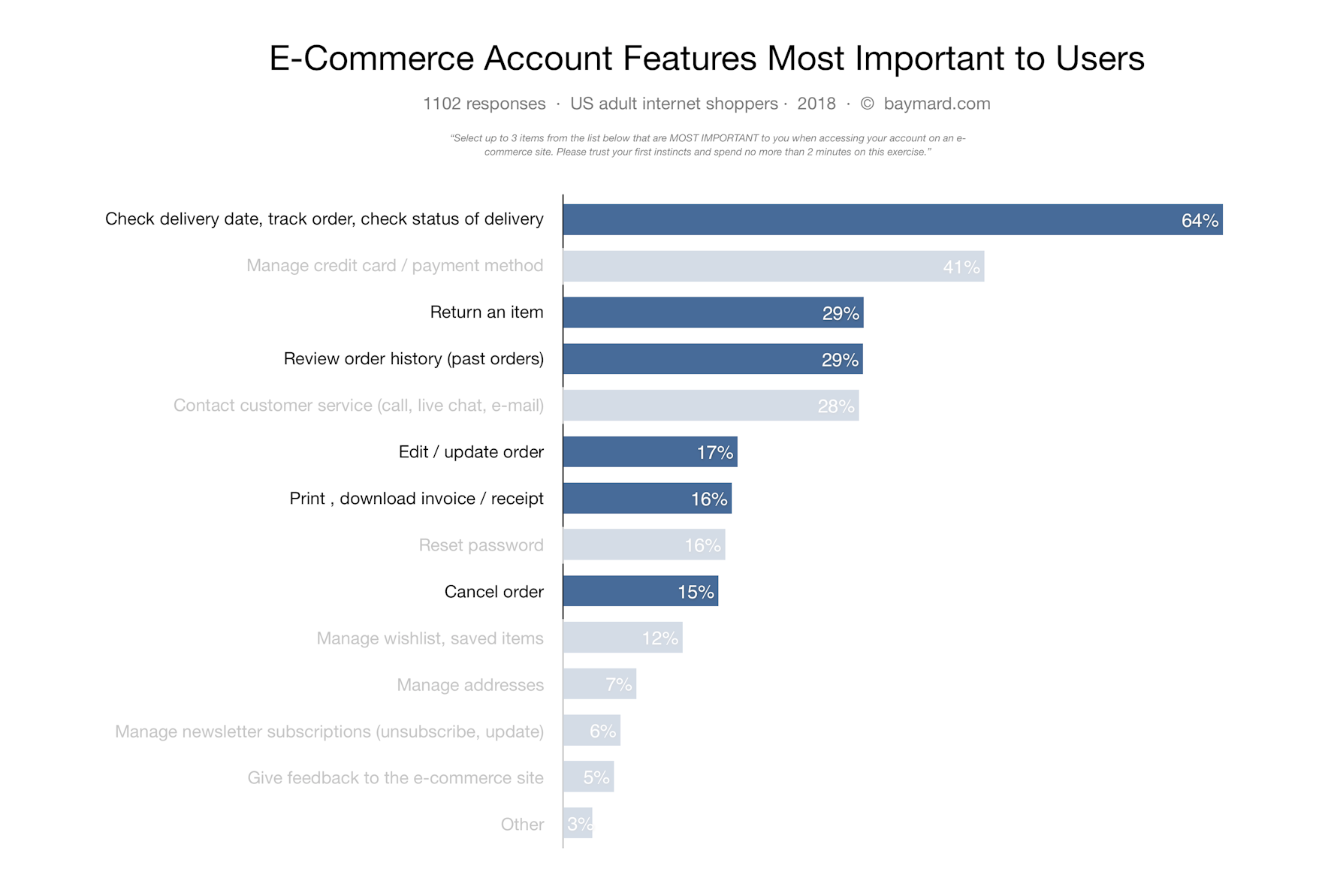
Our quantitative study of what Account & Self-Service features are most important to users shows that the order-related features generally dominate what users use their e-commerce account for; that is, order tracking, returns, order history, receipts and invoices, and editing or cancelling orders. It’s understandable that order tracking is the primary reason why users visit the accounts area of e-commerce sites: users have recently placed an order and want to ensure that everything’s on track for the delivery.
More ‘Order Tracking Page’ Insights
Our quantitative study of what Account & Self-Service features are most important to users. (The non–order-related features are dimmed out.
-
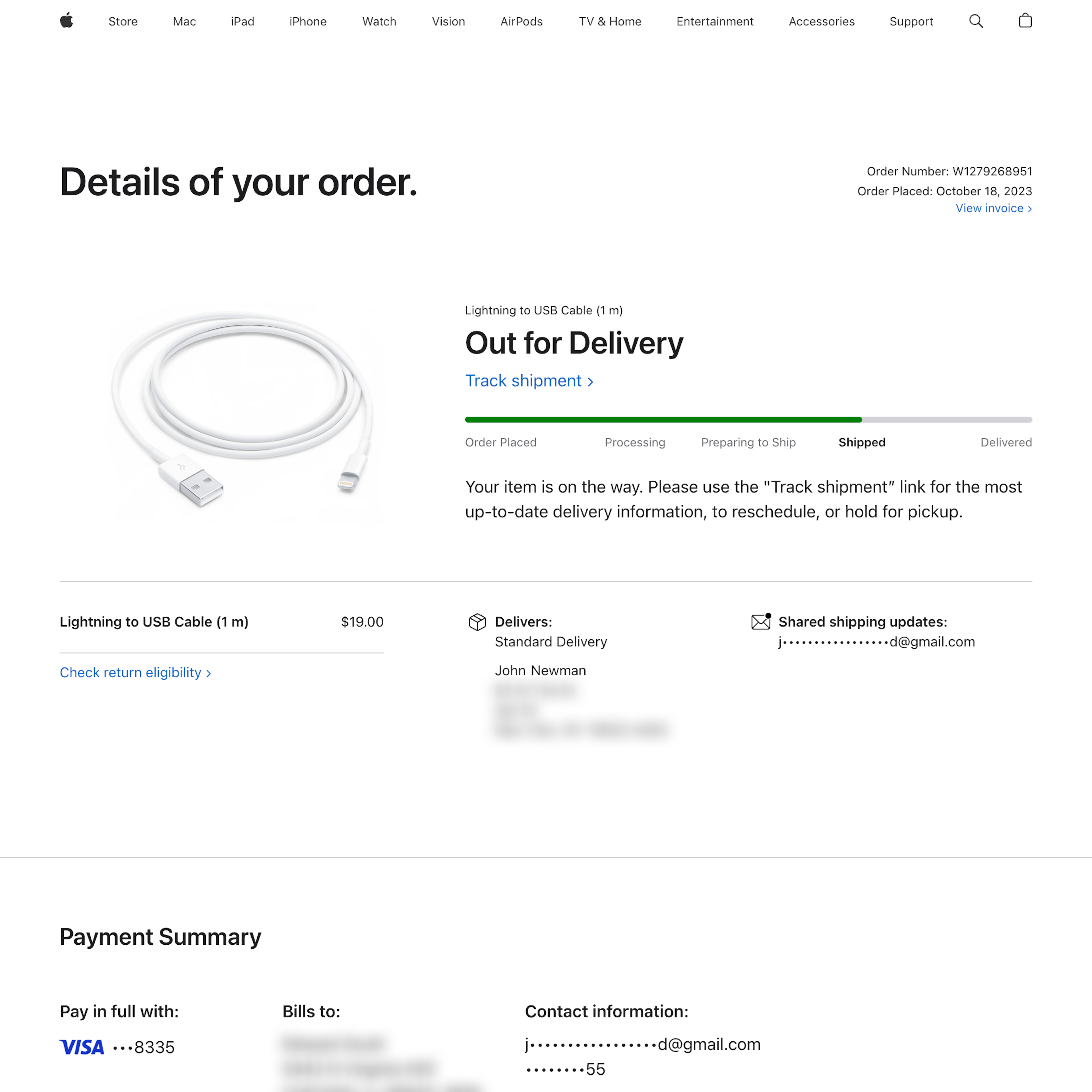
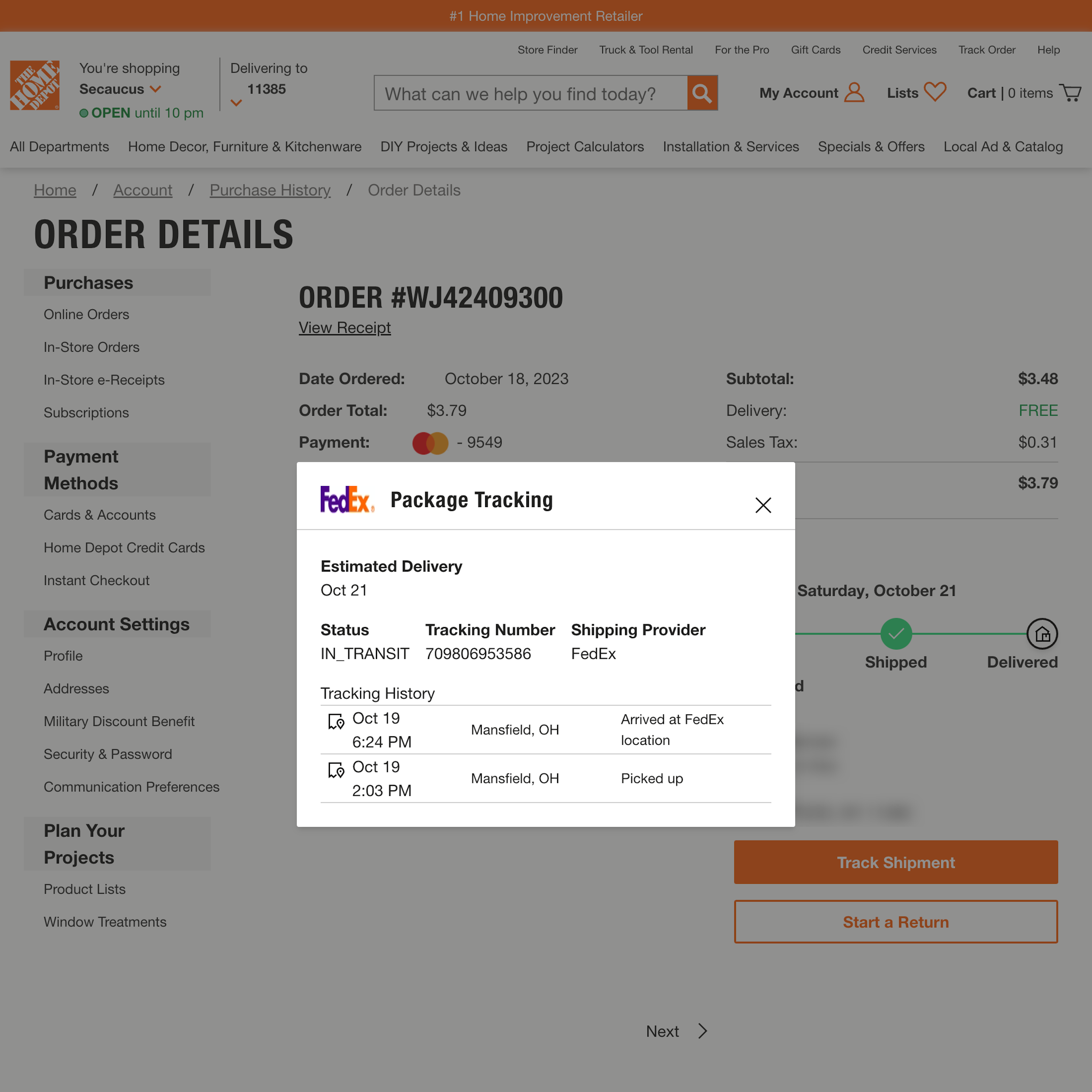
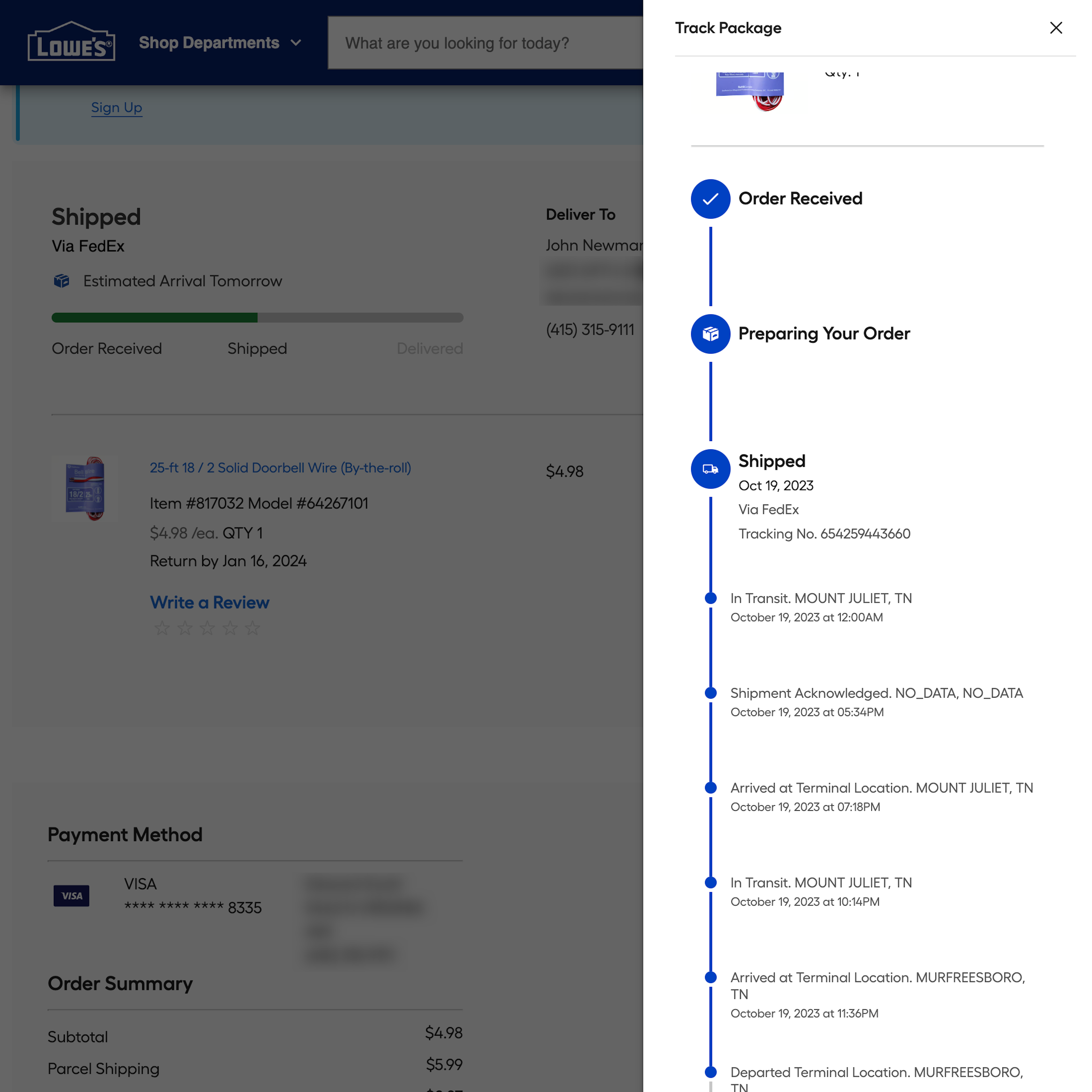
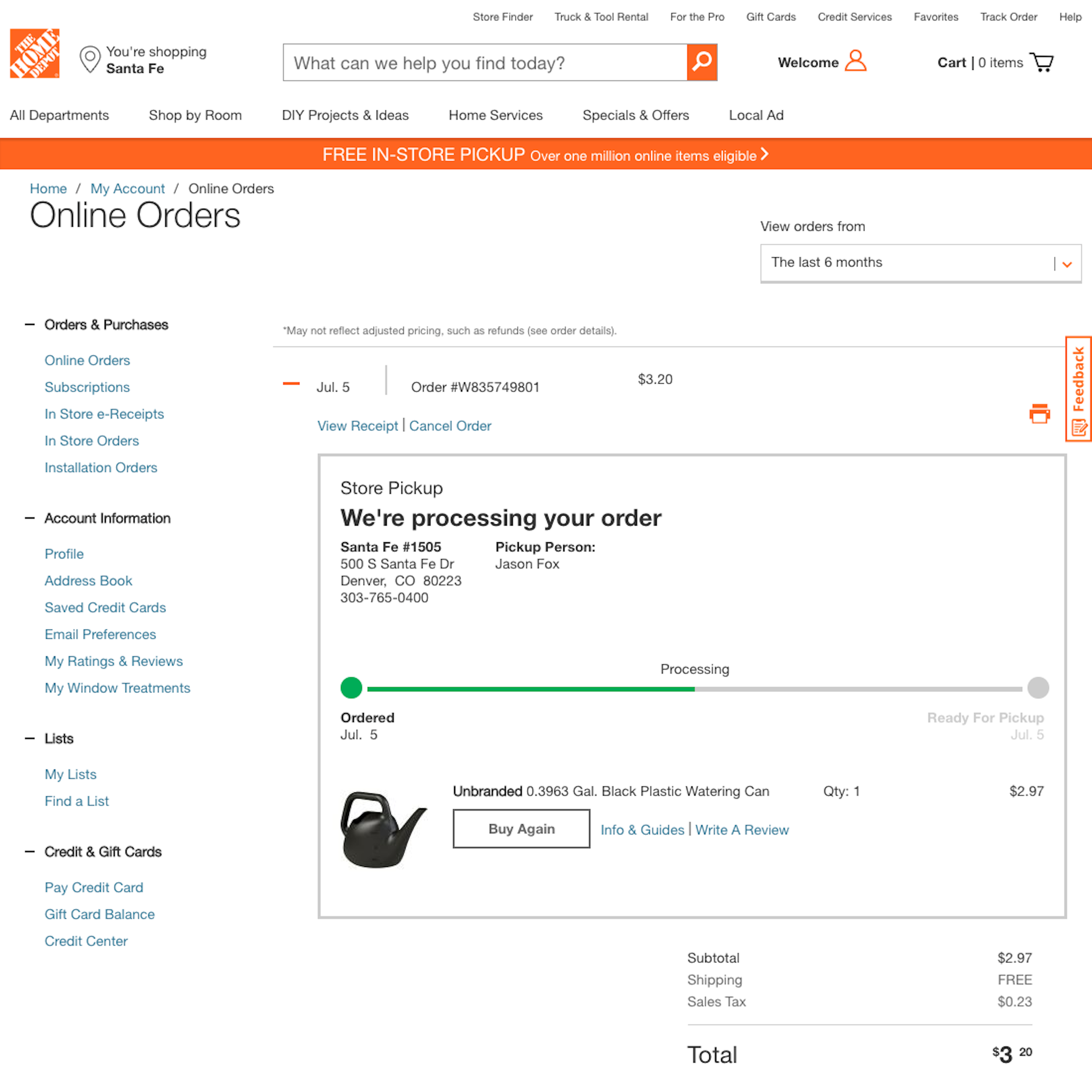
Our large-scale qualitative usability testing shows that for most users the key details needed to track an order are the delivery date, the name of the courier company, and the sub-events or stages of the order delivery process. Some tracking details will be contained in the order shipment confirmation email, but users who need more detail on order tracking than is in the shipping confirmation email will need to visit the order tracking page on the e-commerce site.
-
Furthermore, during testing we observed that there are pitfalls at all stages of the order-tracking process and that several e-commerce sites suffer from not having sufficient information on order tracking. Issues often occur with the two transition phases between sites — the first when users click a link in their shipping email to get to the e-commerce site, and the second between the e-commerce site and the third-party courier site.
-
Another factor that causes difficulties for users is the design and content of the order-tracking pages on the e-commerce site, and issues include tracking details being hard to discover, missing tracking details, and the use of unclear terminology. On third-party courier sites, users encounter issues caused by factors such as cluttered pages and terminology that is even less clear than they find on e-commerce sites.
-
Learn More: Besides exploring the 147 “Order Tracking Page” design examples below, you may also want to read our related articles on “Have a ‘Cancellation Requested’ Order State”, “Integrate All Order Tracking Info and Events Within the E-Commerce Site Itself — 56% Don’t” and “New Research Findings on ‘Accounts & Self-Service’ UX”. You may also want to see our related Page Designs for “Orders Overview” page design examples.
-
Get Full Access: To see all of Baymard’s design guidelines on Accounts & Self-Service pages and features you’ll need Baymard Premium access. (Premium also provides you full access to 200,000+ hours of UX research findings, 650+ e-commerce UX guidelines, and 275,000+ UX performance scores.)
User Experience Research, Delivered Weekly
Join 60,000+ UX professionals and get a new UX article every week.

User Experience Research, Delivered Weekly
Join 60,000+ UX professionals and get a new UX article every week.

Explore Other Research Content

300+ free UX articles based on large-scale research.

326 top sites ranked by UX performance.

Code samples, demos, and key stats for usability.

