Key Takeaways
- After purchasing, a significant subgroup of users will want to check their order status
- Ecommerce sites redirecting to third-party tracking sites often fail users’ information and navigation needs
- Providing 6 order-tracking information elements gives users the information they need
Key Stats
- 50% of respondents in our quantitative study reported that order tracking is the most important account feature
- Yet, 67% of test sites neglected to consistently provide all key order-tracking details, resulting in needless friction and frustration for participants
“I track my orders all the time. I want to know when it’s coming, the delivery date, you know, all the logistic information.”
After completing an online purchase, many users are interested in following their order as it progresses through the various stages of order processing and shipment.
Indeed, Baymard’s large-scale Accounts & Self-Service usability testing revealed that users track their order at many different times — ranging from immediately after completing the checkout (e.g., to see if it’s processing) to several days after submitting the order (e.g., to check on the status and learn when to expect it).
Furthermore, order tracking ranked as the most important self-service feature (50%) in Baymard’s quantitative study (see Quantitative Insight #GC051).
Despite its importance, many ecommerce sites fail to support users’ full order-tracking needs.
As observed across multiple large-scale studies, when important order-tracking information is missing from the ecommerce site, users have to exert far more effort to find answers to basic questions, such as “When will my order arrive?” and “How is my order being delivered?”
In this article, we’ll discuss 3 aspects related to ecommerce Order Tracking UX:
- How order-tracking pages often fail users’ information needs
- Why relying on third-party tracking sites is a subpar experience
- What 6 key order-tracking details to provide on the order-tracking page
How Order-Tracking Pages Often Fail Users’ Information Needs
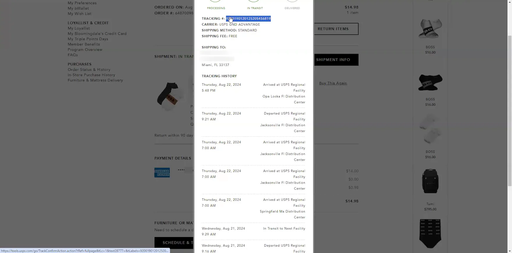
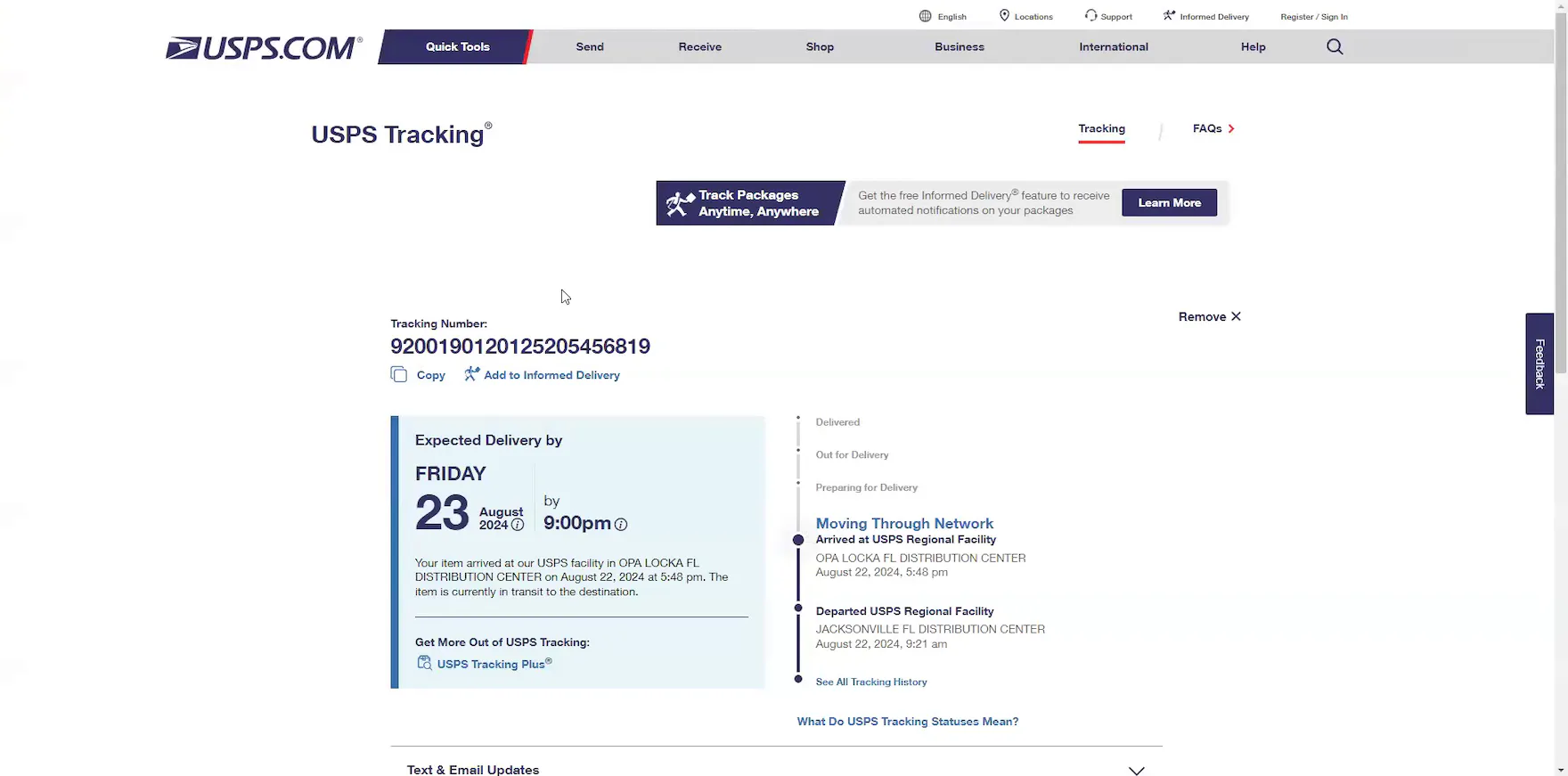
“Right now it’s in Opa Locka, which is here in Miami. So, it’s arrived there, but it doesn’t give me an estimated delivery date. So that’s a little disappointing. I would hope that that information would be there”, complained a participant at Bloomingdale’s when he discovered the “Order Tracking” overlay lacked an estimated delivery date (first image). “Okay, so here it’s saying, the expected delivery date is today, the 23rd, by 9:00 PM.” He searched the tracking number at the carrier site and confirmed the expected delivery date and time (second image). “Yeah, see, it would be helpful if the information from USPS about the expected delivery date would also be included. I’m just not seeing it anywhere. I’m not seeing it anywhere on the website”, he lamented after he returned to his tracking information at Bloomingdale’s.
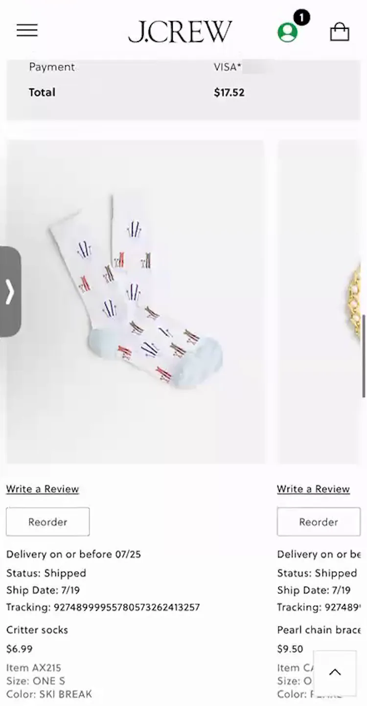
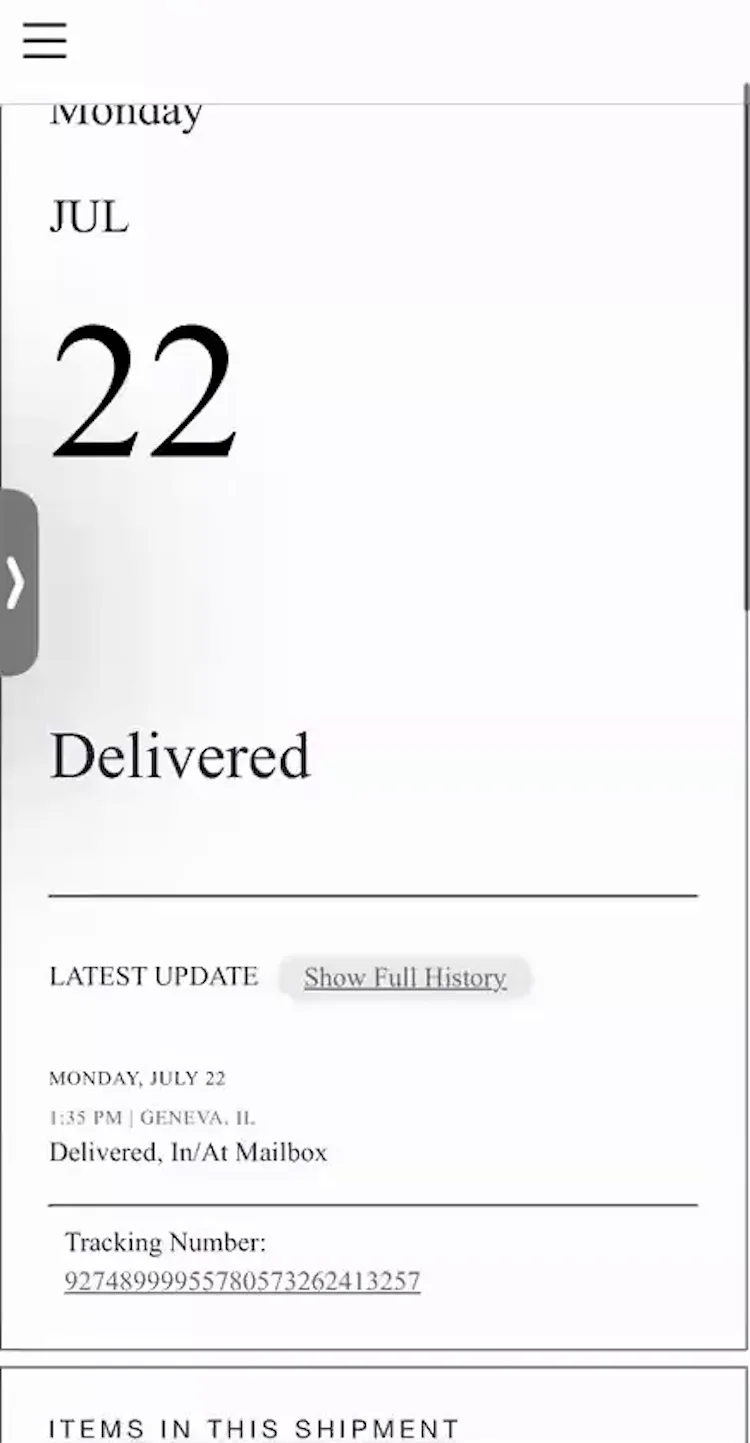
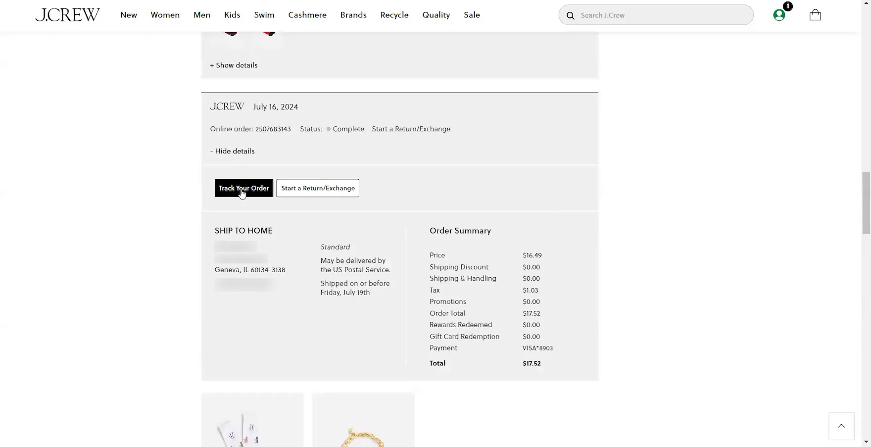
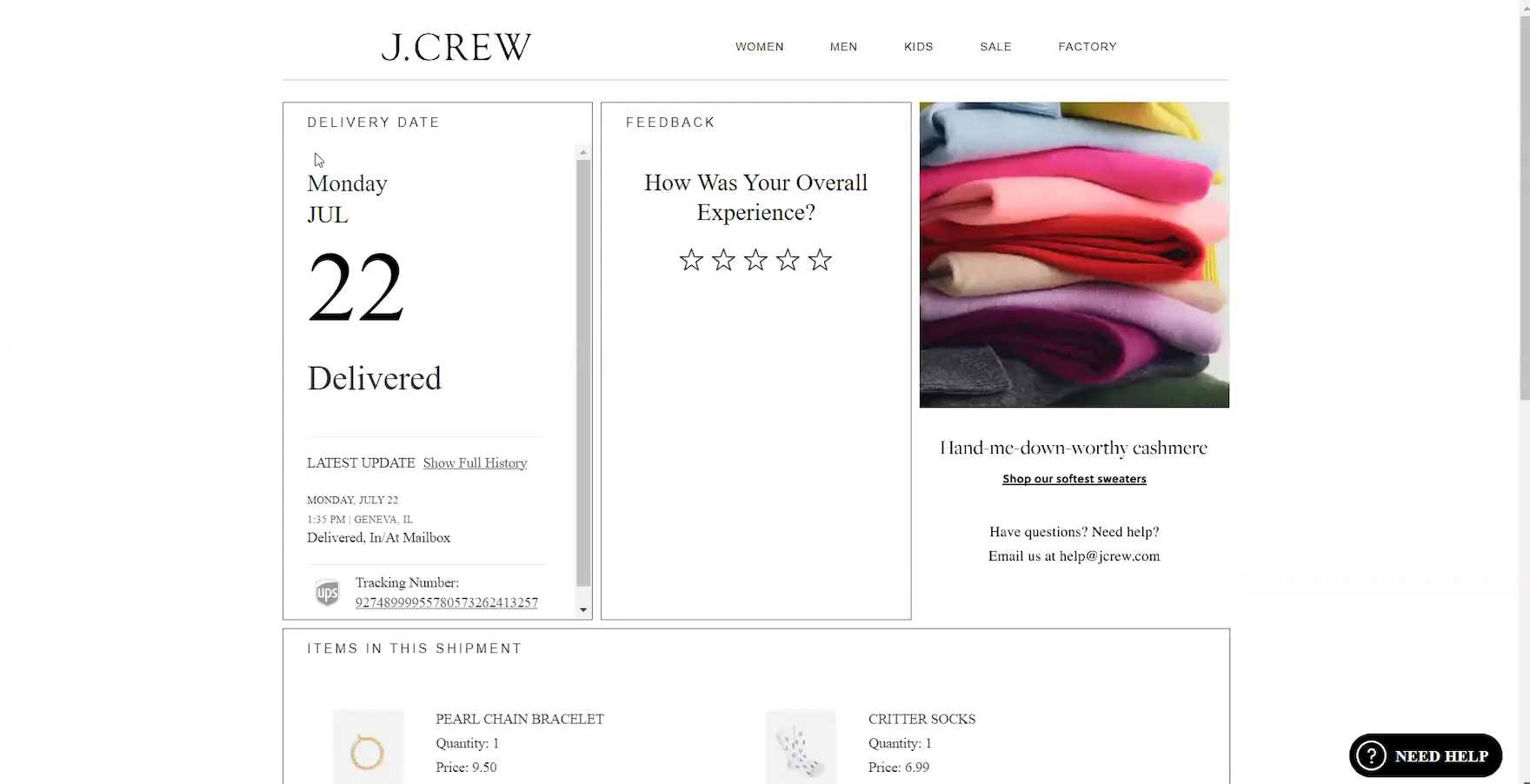
“It says ‘Delivery on or before 7/25’, so I guess we’re not yet there.” This participant (iOS) at J.Crew was misled by the information provided on the site that the order was still in transit (first image). Only after she tapped the “Track Your Order” button, which opened a third-party tracking page, did she discover the order was actually delivered the previous day (second image). “It would be helpful to see that up top — the order status, and then another line underneath that says ‘Delivered July 22 at 1:35 PM’”, she remarked, frustrated.
“Um, I don’t know when it was delivered. I’d have to open the tracking information. It looks like it was shipped on the 19th, but I can’t tell when it was delivered. I would try clicking on this tracking number. But this is not a hyperlink. It’s just a number. So — Oh, I would click this ‘Track Your Order’ button. There it is. It looks like it was delivered on the 22nd.” Another participant at J.Crew struggled to find the delivery date for a delivered order in the order details (first image), so she had to open the third-party tracking page, which is designed to look like the J. Crew site (second image).
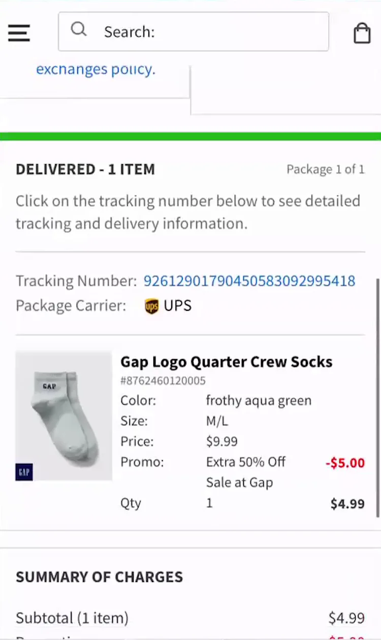
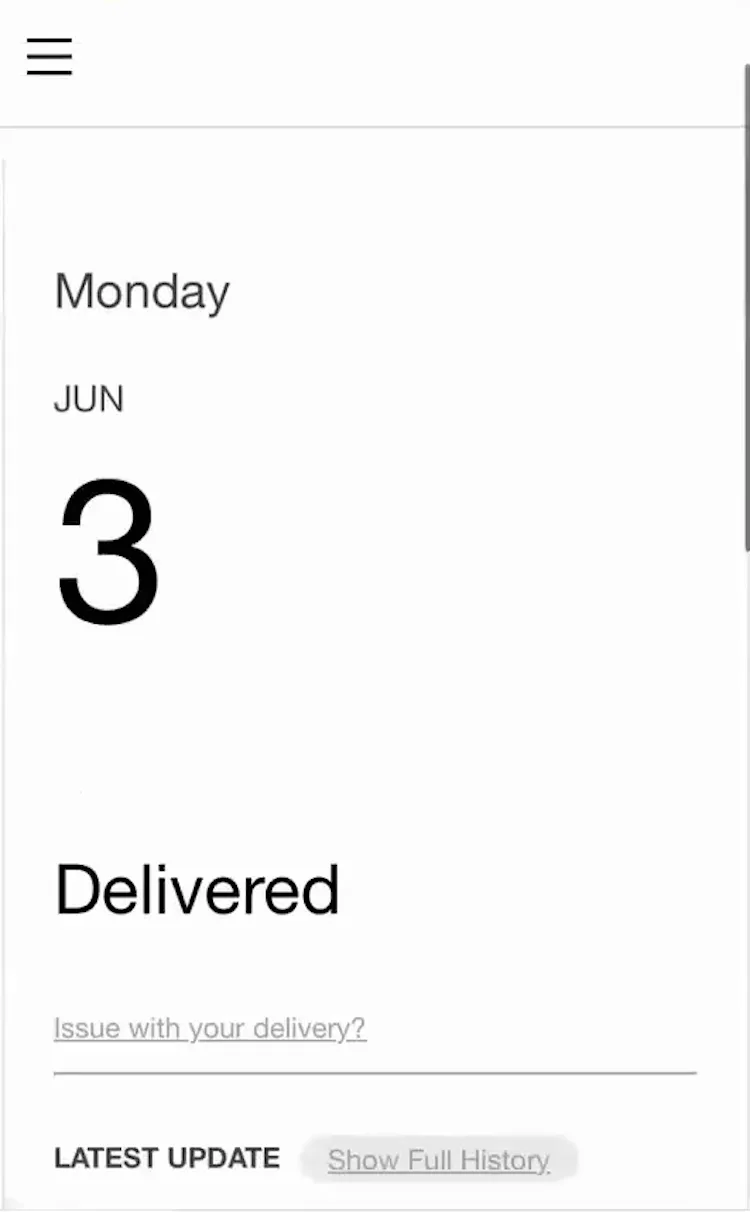
“Um, actually, I don’t know. I guess I would have to click on the tracking number to see when it was delivered.” This participant (iOS) at GAP could not confirm the order’s delivery date (first image). “So June 3. Yeah, it would’ve been nice if that were on the same page”, she complained after opening the third-party tracking page (second image).
During recent testing, participants visited third-party tracking sites and carrier sites mainly when the test sites forced them to by not providing complete tracking information.
For example, 25% of test sites failed to reliably provide an expected delivery date in the order-tracking details.
Consequently, participants resorted to navigating to third-party and carrier sites to confirm this information or guesstimating when their orders might arrive.
In practice, when the expected delivery date isn’t provided, it creates unnecessary friction for users and may negatively influence their future purchase decisions.
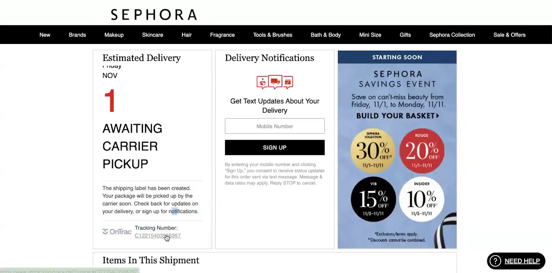

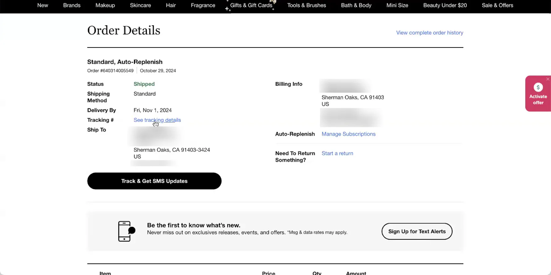
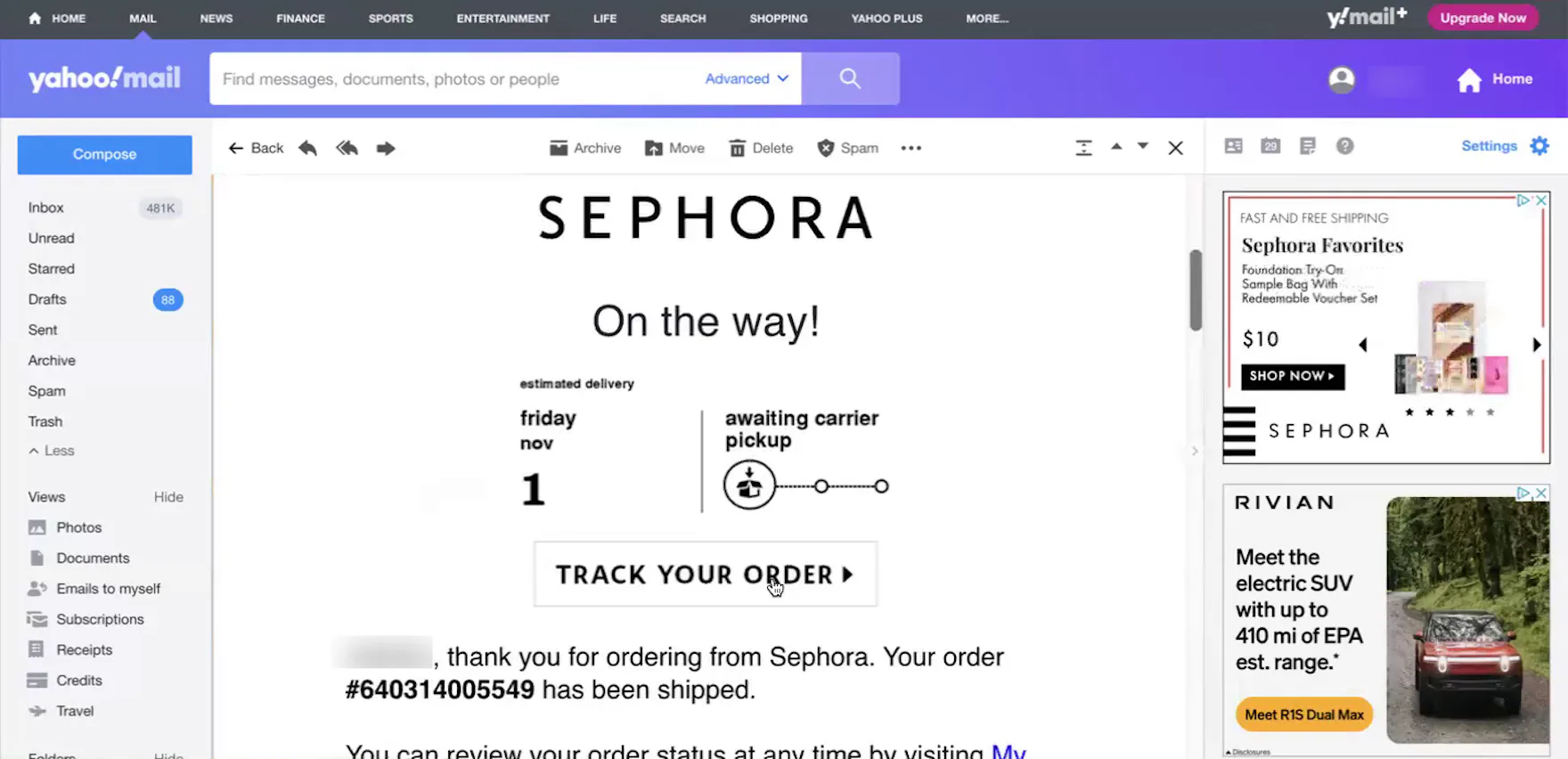
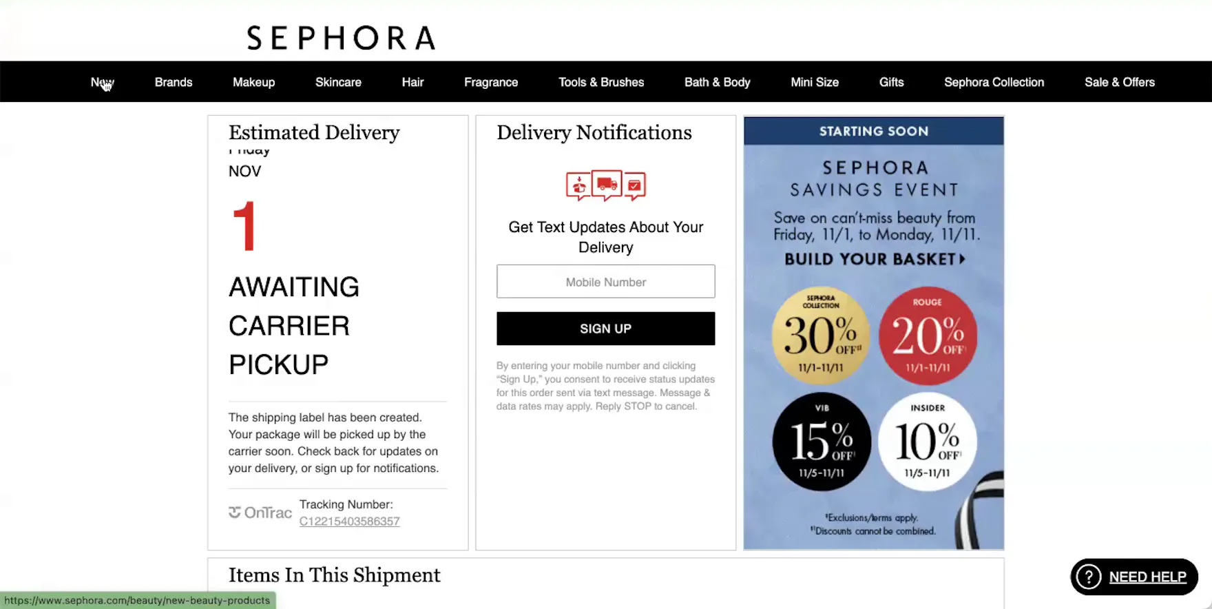
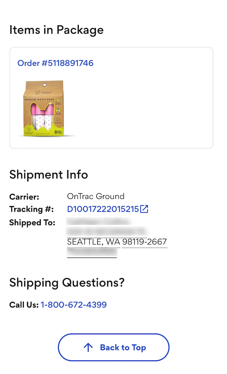
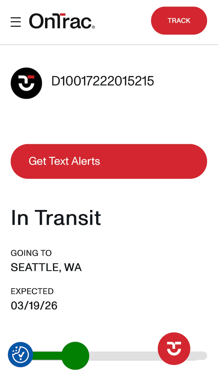
“It just has this ‘see tracking details’ link. Yeah, it doesn’t say anything about the carrier itself”, complained a participant at Sephora about the absence of the carrier name on the “Order Details” page for her shipped order (first image). She opened the third-party tracking page — designed to look like a Sephora page — to confirm the carrier (second image), then clicked the carrier tracking link to determine if there was any further shipment tracking information (third image). ”I think that OnTrac is a lower-grade shipping company. My guess is that they’re not — they’re trying not to draw attention to themselves for using OnTrac”, she remarked.
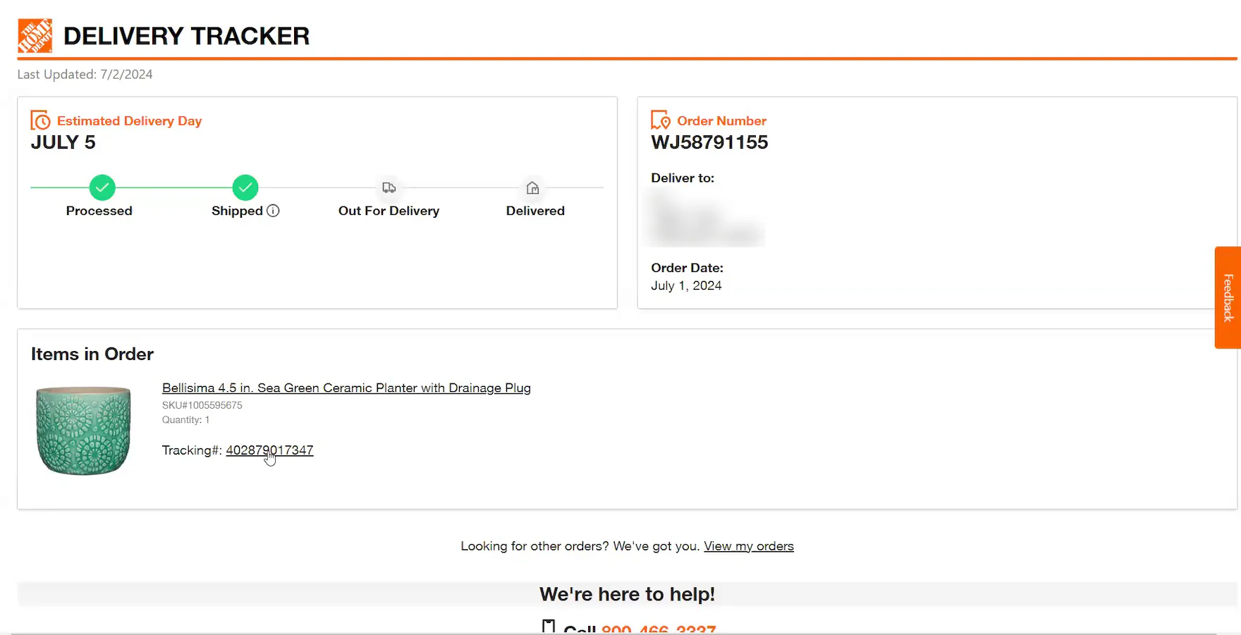
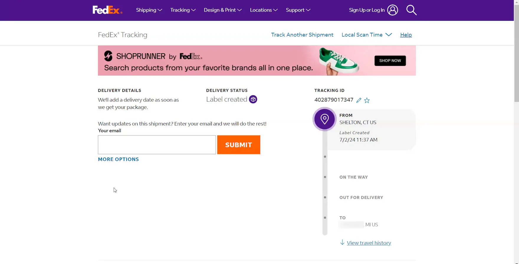
Although a linked tracking number was provided, the carrier name was missing from this Home Depot “Order Tracking” page because there was no detailed shipping history yet (first image). Consequently, this participant had to click to open the carrier site to learn that the order would be delivered via FedEx (second image).
While the expected delivery date of an order will typically be the most critical order-tracking detail for users, other elements can still be highly important, depending on a user’s particular situation.
For example, during recent testing, participants were disappointed when the carrier name was omitted from shipment notification emails or the order-tracking details on the site.
As one participant who lived on a military base explained, “If I don’t know how it [will be delivered] and there’s no way to find out, I don’t know if I would continue to order from this site. I would probably switch to another site for these things because trying to figure out how it’s coming, and then worrying that they’re not going to be able to actually get it to my door, is a little more stressful than it should be.”
In practice, forcing users to leave the site for key order-tracking information risks introducing unnecessary navigation friction and frustration.
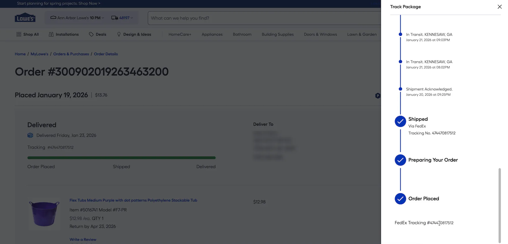
At Lowe’s, the FedEx tracking numbers displayed in the “Order Tracking” overlay are rendered as static text. Consequently, users who need or want to access information at the carrier’s site are forced to manually navigate to it and copy and paste the tracking number. Presenting tracking numbers as unlinked text creates unnecessary friction at a potentially critical moment in the order-tracking experience.
Additionally, when carrier-tracking numbers are presented as static text, it breaks with a fundamental user expectation that these unique codes function as clickable hyperlinks leading to carrier sites.
Testing showed that users rely on carrier sites primarily to “fill the gap” when key order-tracking details are missing.
However, as observed during testing, a subgroup of users will click through to carrier sites to “double-check” the accuracy and completeness of the information provided by the ecommerce site.
In practice, when the tracking number is rendered as static text, it forces users to take more complicated measures, such as copying and pasting the tracking number, and either searching for details on the carrier site (if the carrier is known) or performing a general web search, such as Google (if the carrier is unknown).
Why Relying on Third-Party Tracking Sites Is a Subpar Experience
“This doesn’t feel like it’s actually the Sephora site, so I may have to just get out of here…it’s kind of weird that they’re making it so hard to get back to the order”, complained a participant at Sephora. After opening a third-party tracking page from her shipment notification email (first image), she spent 30 seconds searching for a link to her order. There was no account menu link in the header, so she resorted to clicking the “New” category link (second image), and then, once on the actual ecommerce site, opened the account menu to navigate to her “Order List” page (third image).
As observed during testing, third-party tracking pages seldom link directly back to the specific order at the ecommerce site.
For example, tracking pages supplied by third-party post-purchase platforms (e.g., Narvar) are typically designed to look and feel like the ecommerce site, and during testing participants generally perceived these pages to be part of the site.
However, these tracking pages consistently failed to include a direct link to the “Order Details” page, or even a link to the account menu.
Consequently, participants — especially those arriving directly from delivery-update emails — often became disoriented and struggled to navigate from the third-party tracking page to their “Order Details” page.
Indeed, one participant had to click the site logo on the tracking page to reach the ecommerce site’s homepage, open the account menu to find the “Order List” page, and finally click to open the specific “Order Details” page.
In practice, when users are forced into unnecessary navigational detours, it creates a laborious and confusing navigation experience.
Furthermore, some users may interpret the absence of the sitewide header or a direct link to the “Order Details” page on the tracking page as a technical glitch, eroding their trust in the site’s order-tracking functionality.
The experience degrades further if a “Track Order” link in a delivery-update email leads directly to a shipping carrier’s tracking page, as users will hit a navigational dead end.
Indeed, users are forced to either return to the email to search for a link leading to the order or their account or manually navigate to the ecommerce site, sign in, navigate to the “Order List” page, and then open the specific order.
6 Key Order-Tracking Details to Provide on the Order-Tracking Page

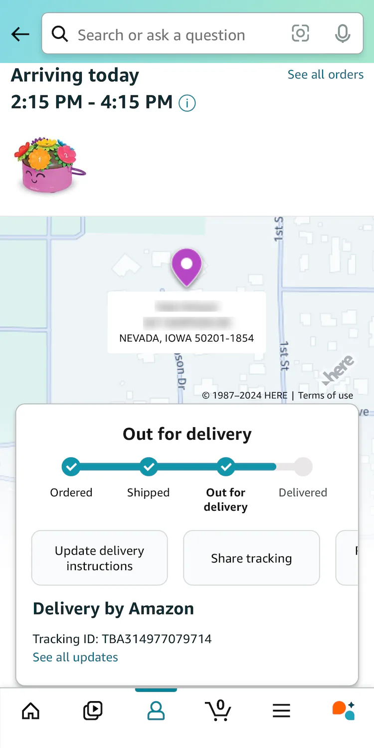
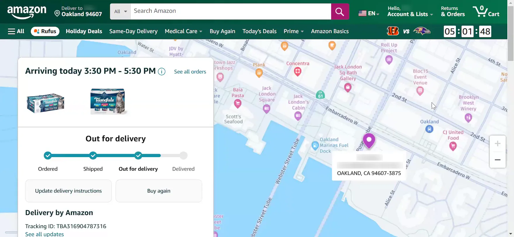
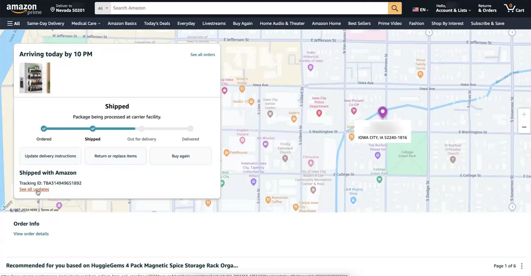
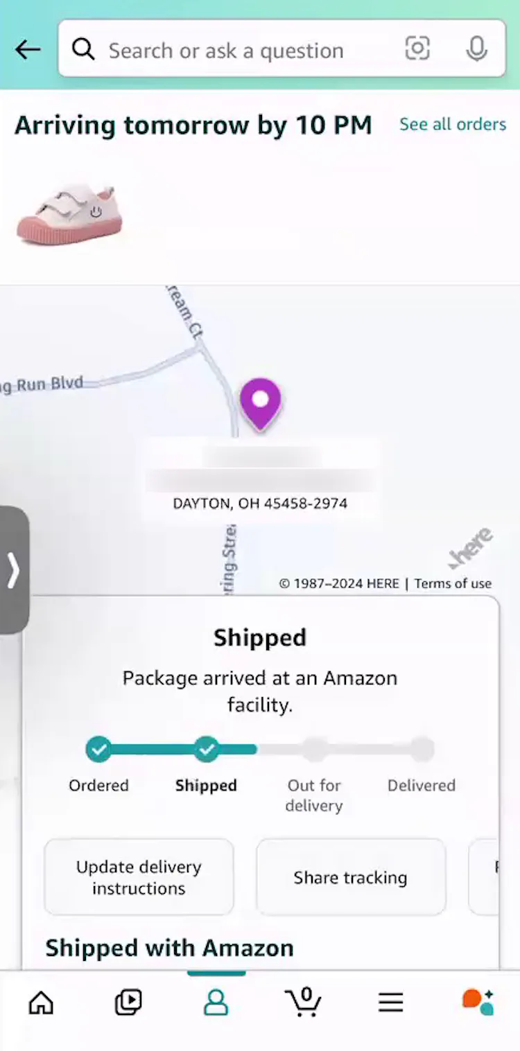
“I like that the tracking number is there, and I like that I can click on [this link] and see exactly where [my order] is right away. A lot of other sites will give you this, but then it goes to, like, that third screen for UPS or FedEx or something. I like that this is built right into Amazon; I don’t have to go to another site or copy the tracking number, or look it up on another site”, remarked a participant at Amazon after she clicked the “Track Package” button on the “Order List” page (first image). She appreciated that she could access all critical order-tracking details for her order directly on the “Order Tracking” page (second image), and in the detailed shipping history overlay (third image) (see guideline 913).
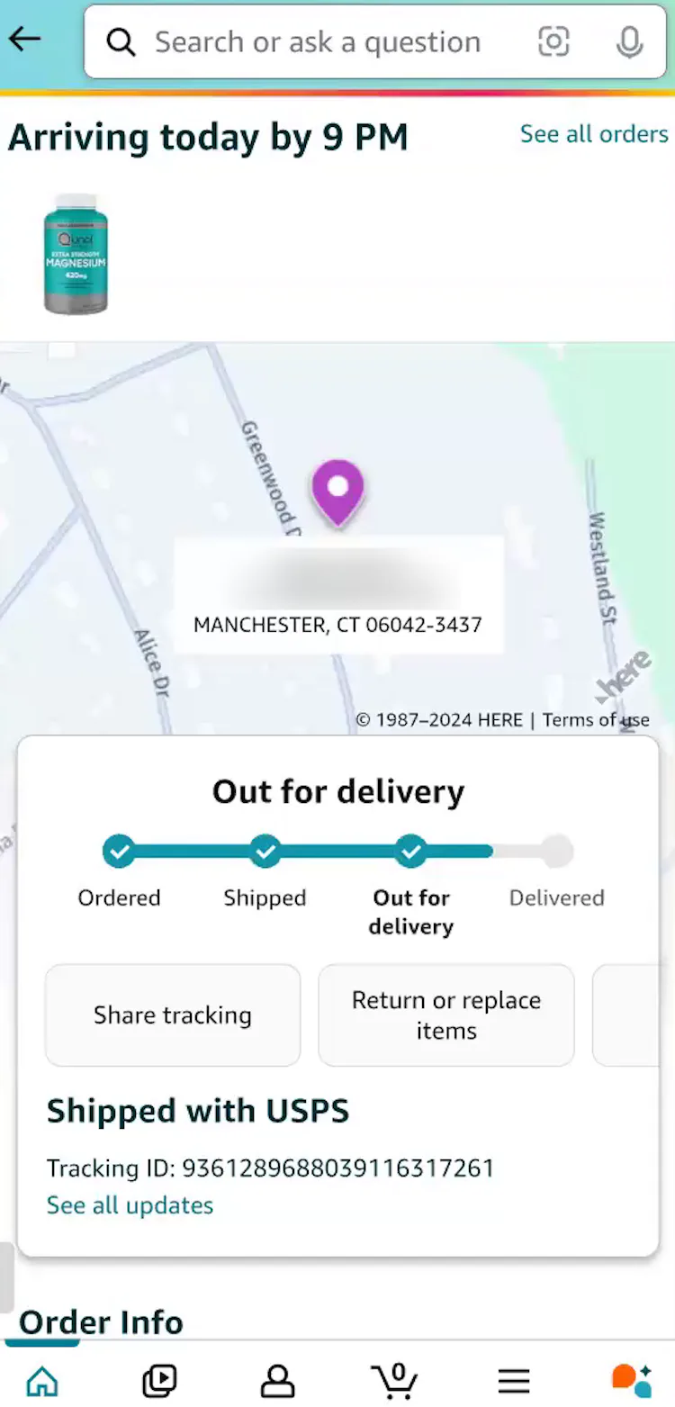
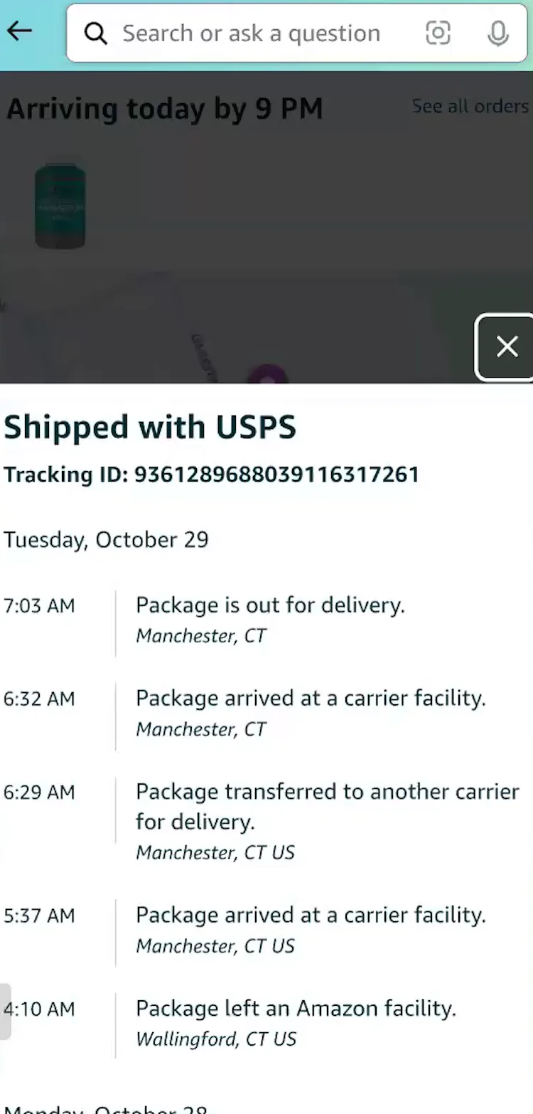
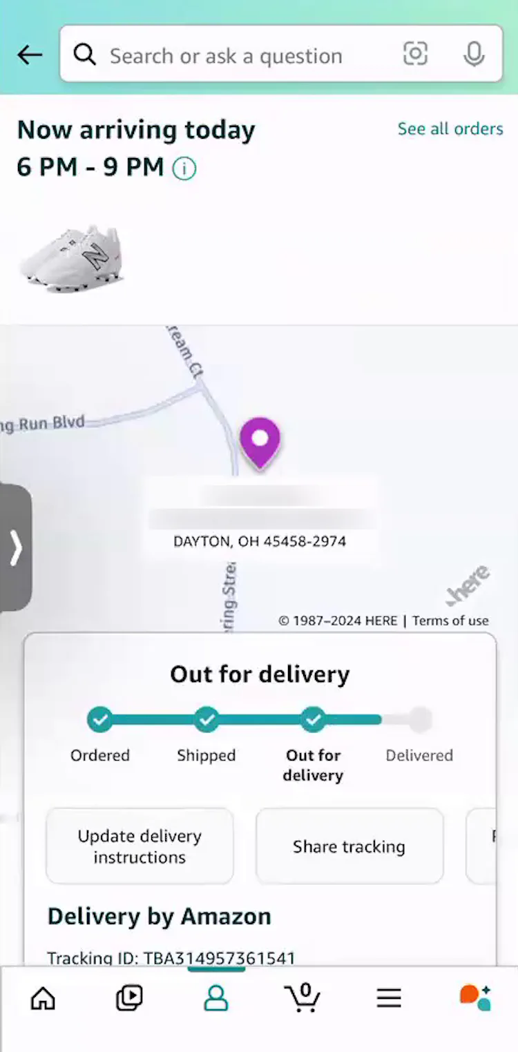
“It’s out for delivery, it’s probably in a truck somewhere, and it will be here before 9 PM tonight. I could do the ‘see all updates’, and that gives me a more in-depth view. It tells me that it’s in Manchester, which, I mean, that’s my town.” This participant (Android) tapped the “Track Package” button in her Amazon shipment notification email (first image) then confirmed on the integrated “Order Tracking” page that her order was out for delivery (second image). Based on the detailed shipping history (third image), she quickly determined her order was in her town.
To satisfy users’ extensive order-tracking needs and greatly reduce their efforts to track orders, ecommerce sites should always provide key order-tracking information and events within the site.
That is, the information below should be provided within the accounts section for signed in users — not offloaded onto a third-party tracking site.
During recent testing, only 33% of test sites provided “Order Tracking” pages containing the following 6 key order-tracking details.
Yet on these sites participants were observed to easily confirm desired order-tracking information:
- Expected delivery date
- Order status progress bar
- Carrier name
- Linked tracking number
- Detailed shipping history
- Package contents summary
1) Expected Delivery Date
“Instead of saying it’s going to arrive by 10:00 PM, when it gets close, you get ‘it’s now arriving between, you know, 2:00 PM and 5:00 PM.” A participant (iOS) at Amazon appreciated that the expected delivery date and timeframe were refreshed once her order status reached “Out for Delivery”.
“So yeah, it looks like it’s out for delivery right now — between 6 and 9 o’clock — so it gives me a good little window. I know the timeframe to look out for the order”, remarked another participant (iOS) at Amazon positively about the updated delivery estimate on the “Order Tracking” page.
“I think it’s great! I mean, it’s pretty specific on the time, which is nice. I feel like it’s generally accurate as well.” Participants at Amazon generally regarded the expected delivery timeframe for orders very positively.
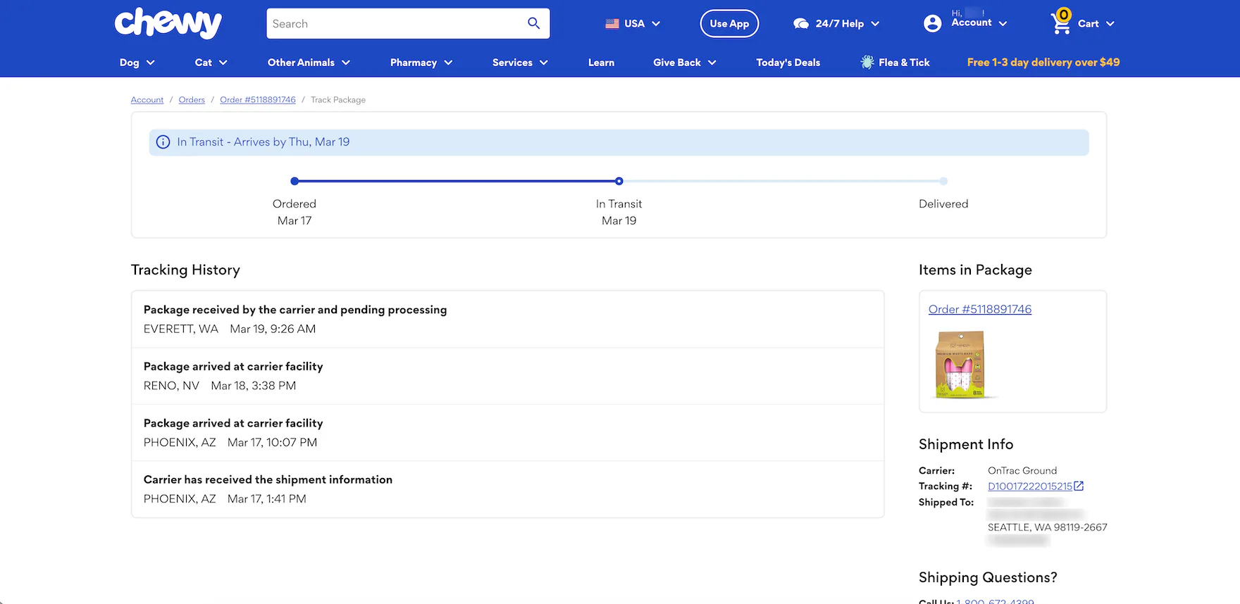
At Chewy, the expected delivery date is highlighted in a blue banner and displayed above the order status progress bar on the “Order Tracking” page.
During testing, the primary information that many users sought was, perhaps not surprisingly, the expected delivery date.
It’s information that many users are concerned with before they even place an ecommerce order and, once the order’s been placed, they’ll often immediately seek out this date so that they can plan for the delivery (e.g., plan to be at home to quickly retrieve the package or be present to sign for it if necessary) and alleviate anxiety (e.g., knowing the package will be delivered in time for a holiday or birthday).
As one participant explained, “I always want to be cognizant of when an item is delivered. The woman who brings home my dogs will sometimes bring in the packages for me, but porch pirates are always a concern here in Miami.”
Another participant remarked, “We live in Kansas, and the wind does blow, so I have to watch things that are getting put on our doorstep very carefully, or they will blow away, and we can’t find them. So, I track!”
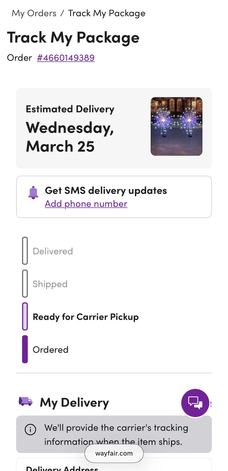
2) Order Status Progress Bar
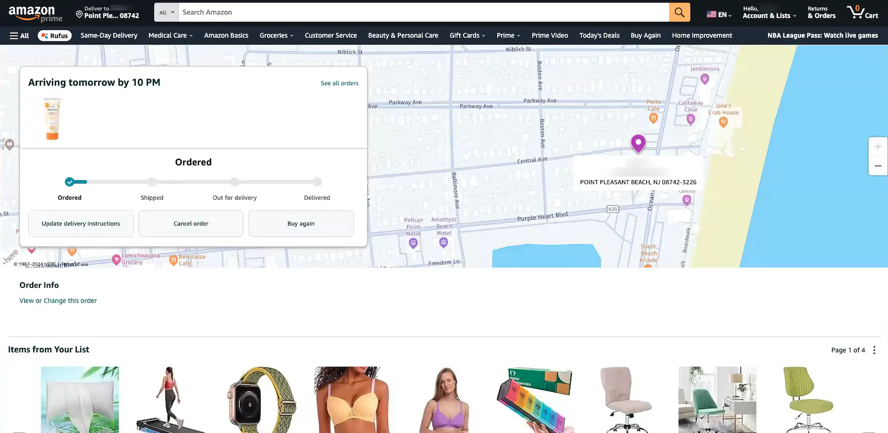
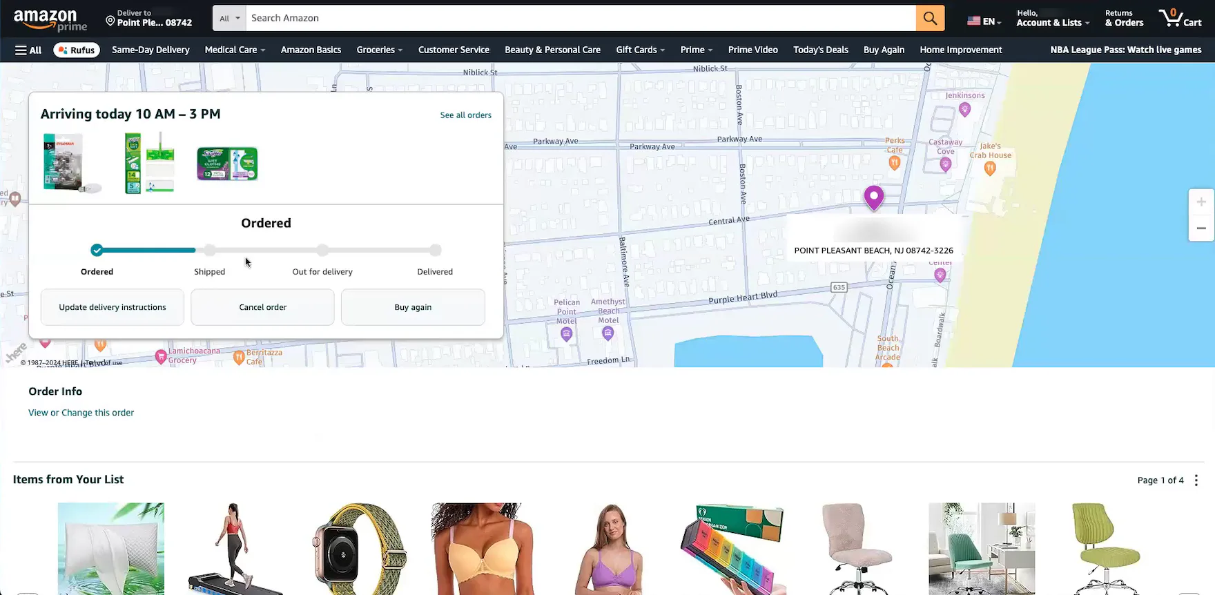
“I always go to the orders page — I can see the status of where it is in the shipping process. I like that they have a progress line showing you that it’s been ordered, but it hasn’t shipped yet. I’ve always liked this page”, remarked another participant at Amazon positively about the order status progress bar on the “Order Tracking” page for an order she’d just placed (first image). She then tracked another order and noted it was further along in the process (second image): “This one looks like it’s closer to being shipped, which makes sense since it’s arriving today. I do like that it shows you that progress, that it’s close to being shipped, but not quite yet.” During testing, participants relied heavily on these visual progress bars to quickly confirm order status — even before an order was shipped.
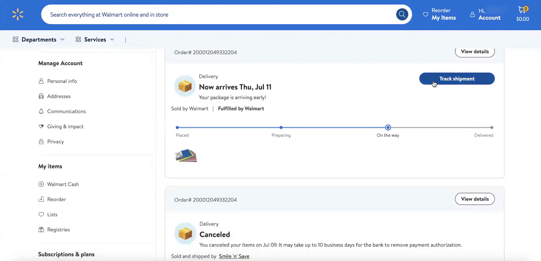
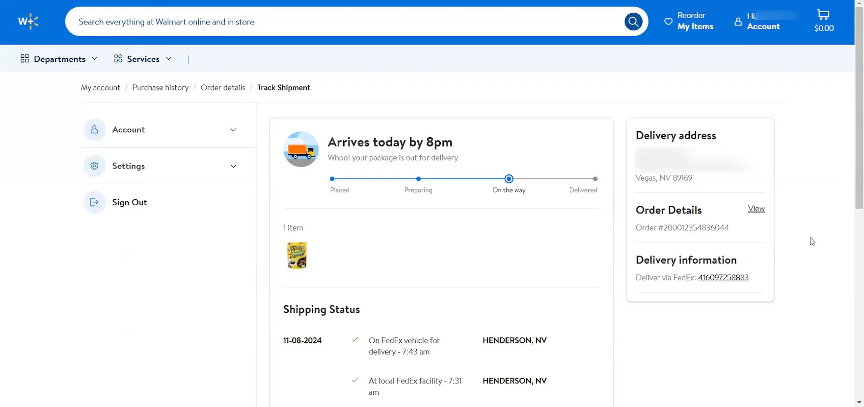
“It’s showing me it’s on the way. It says ‘Fulfilled by Walmart’, and I can track my shipment.” At Walmart, an order status progress bar is featured at the top of both the “Order Details” page (first image) and the “Order Tracking” page (second image), providing this participant with a quick visual snapshot of the order’s progress in multiple locations.
“I do like the little progress bar just to kind of have a metric for how close to delivery we’re getting.”
“I would say I check it, if not every day, every other day. I want to see the changes to the order — like if it’s going to be delayed at all, if I’m expecting it on a certain day — that’s why I check it that often.”
In practice, a visual representation of the different subevents or stages that an order will go through — even before it ships — is a highly important element to provide, as it allows users to quickly see how far their order or package has progressed overall.
Indeed, some of the test sites in our most recent round of testing displayed the order status progress bar on both the “Order Details” and the “Order Tracking” pages.
3) Carrier Name
“I will [often take a look at the tracking information once an order has shipped] because it can give you an estimated time of delivery. Also, especially with USPS — our neighborhood has like the community mailbox kind of thing — so, they’ll put it in the parcel box”, explained a participant (iOS) at Nordstrom as he viewed his order tracking details. As observed during testing, users’ delivery expectations are heavily influenced by the specific carrier.
At Wayfair, when an order is “Ready for Carrier Pickup”, a note about the availability of carrier tracking information is displayed on the “Order Tracking” page (first image). When the order has been picked up, the order status progress bar updates to ”Shipped”, and detailed shipping information, including the carrier name and a linked tracking number, is displayed (second image).
The carrier name can be highly important for users, as it helps them to work out the time of day a delivery will arrive.
Additionally, there may be differences based on the carrier in where exactly the package is left.
As one participant explained, “It’s useful to know who’s delivering it because that will give me an idea of what time it will arrive. If it’s USPS, then I know it’s going to be in the mailbox, which is at the end of the road, and I know that it’s going to be there by 3 o’clock in the afternoon. If it’s FedEx, then they drop it at the door, and they’ll knock, and it can be up to 5:30 PM.”
Therefore, the carrier name should always be included on the “Order Tracking” page.
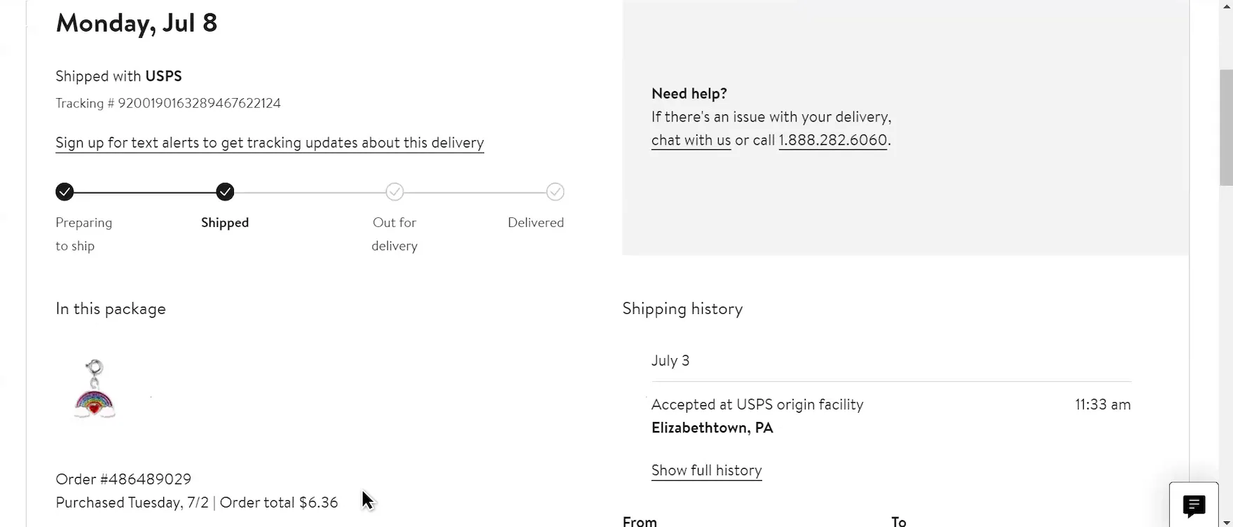
4) Linked Tracking Number
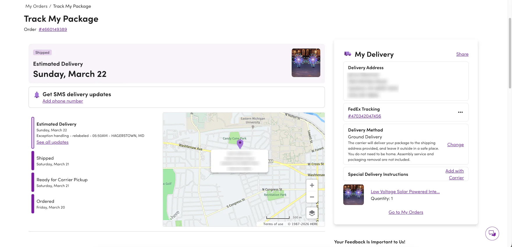
The “Order Tracking” page at Wayfair contains a link to FedEx Tracking. It is styled like all other links, in bright purple underlined text. This treatment helps users to quickly spot it in the interface and recognize it as a link.
At Chewy, the linked tracking number on the “Order Tracking” page is styled in bright blue text, similar to other linked text, and is accompanied by conventional iconography for off-site links (first image). Tapping the link opens the carrier’s tracking page in a new browser tab (second image).
As mentioned above, all the tracking information users need should be on the ecommerce site.
However, there should always be one-click access to the tracking page on the carrier site as well, as some users will want to double-check the ecommerce site’s information, or simply prefer the carrier site (e.g., if they are used to receiving many packages from FedEx).
Each unnecessary step users take potentially increases the likelihood of running into difficulties, especially if it involves going off-site to look for answers.
Providing a simple method for starting the transition to the carrier’s site by making the tracking numbers links to the associated carrier’s tracking page will make it more likely that the missing tracking details will be easily found.
It’s important to note that conventional styling techniques are critical for helping users quickly spot the linked tracking number and easily recognize it as the path to the carrier’s tracking page.
For example, during testing, some test sites neglected to render the linked tracking number with the same prominent styling used for other linked text (e.g., using a prominent color or underlining), which risks unnecessary delays for users who need to access the carrier site.
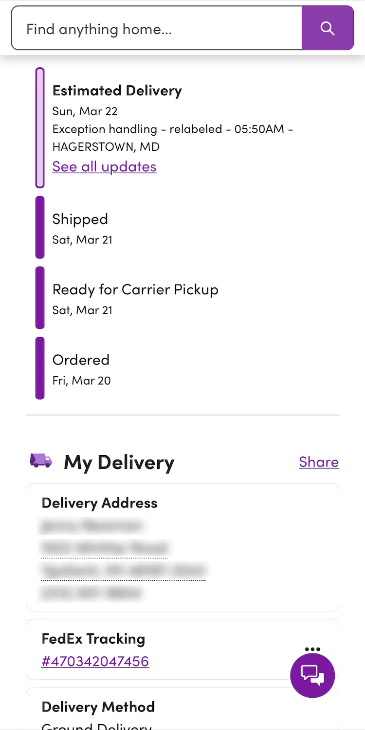
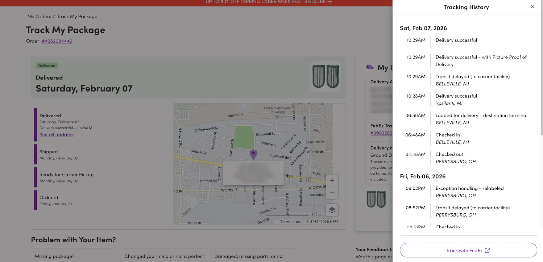
5) Detailed Shipping History

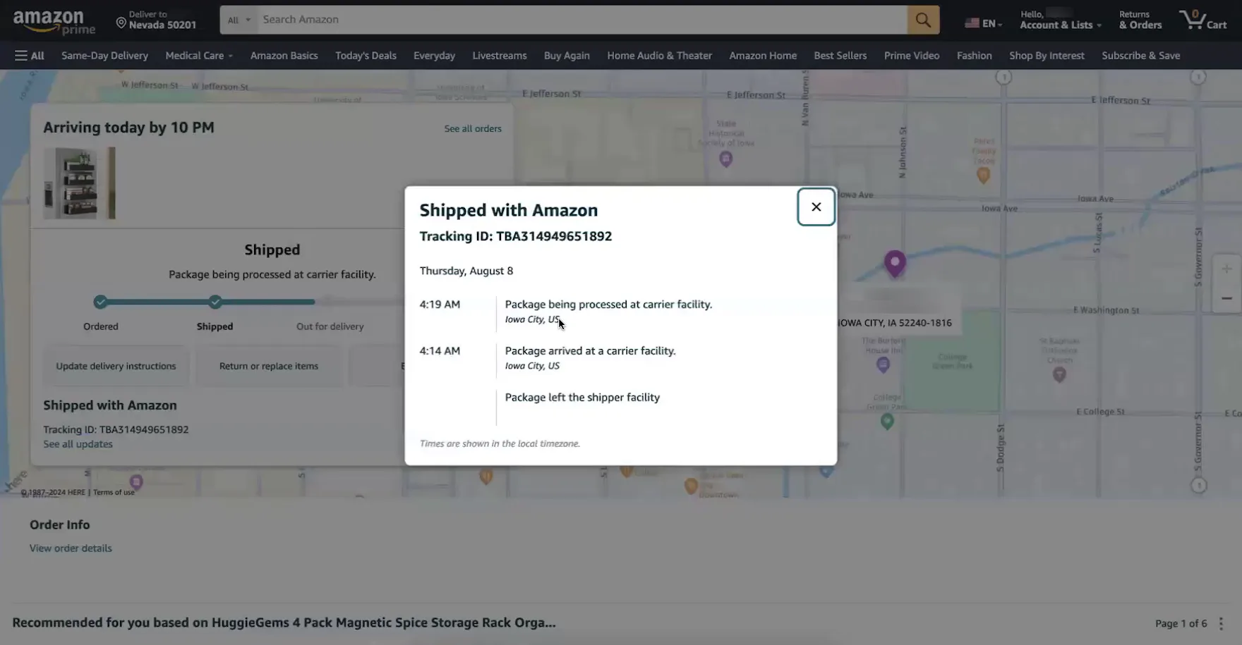
“It’s going to arrive today. Okay, for us here in central Iowa, it’s 8:00 AM. I look to see — Oh! It’s not even on the delivery truck yet — or out for delivery. I’m kind of curious about that since it’s going to come today”, remarked a participant at Amazon, viewing the progress bar on the “Order Tracking” page. She was concerned that her package wouldn’t actually arrive that day because it hadn’t left the carrier’s facility (first image). “It’s being processed. Oh! That was at 4:00 AM this morning! It’s in Iowa City. Okay, perfect. I have confidence that it will get there today, without being delayed. So if this were in another city, then I would probably be checking back this afternoon to see if it ever got on the truck, if it got delivered today.” After she viewed the detailed shipping history (second image), she was reassured that the order would arrive that day.
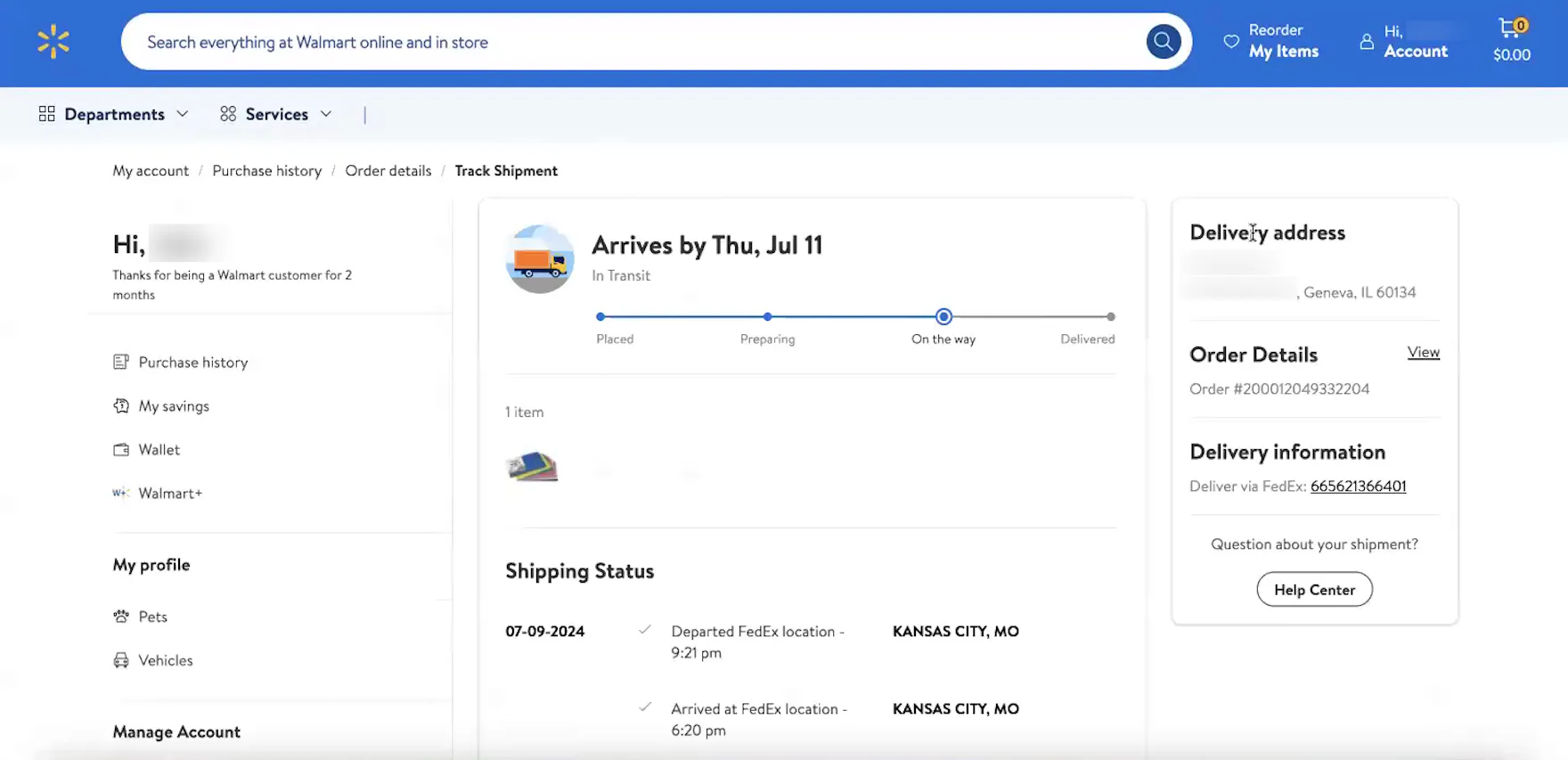
“So, it’s on the truck, out for delivery, and it’s about like, I don’t know, maybe 15 miles away physically from where I’m at.” This participant at Walmart clicked the “Track package” button in his shipment notification email (first image), opening an “Order Tracking” page that allowed him to immediately discern the location of his shipped order (second image).
At Wayfair, a detailed shipping history from the carrier is integrated into the site’s “Order Tracking” page, allowing users to see where their package is coming from and where it is throughout the delivery process.
Once an order ships, users appreciate and rely on having a detailed history that includes all shipping subevents.
Indeed, as observed during testing, having a detailed shipping history directly on the site’s “Order Tracking” page can be highly important for users, as it reassures them that their order is moving smoothly through the process and will arrive on schedule.
Additionally, a detailed shipping history helps users understand their expected delivery date.
As one participant remarked, “It’s useful to know where exactly it’s shipping from. I’m located in Nashville, so if something’s coming from Atlanta, I know it’ll be fairly quick. Or if it’s coming from Seattle, I know it’s going to take a little while.”
In practice, providing a detailed shipping history on the integrated “Order Tracking” page streamlines order tracking, saving users valuable time and effort.
As another participant explained, “I like that I can click on it and see exactly where it is right away. A lot of other sites will give you [a link], but then it goes to UPS or FedEx or something. I like that this is built right in; I don’t have to copy the tracking number and look it up on another site.”
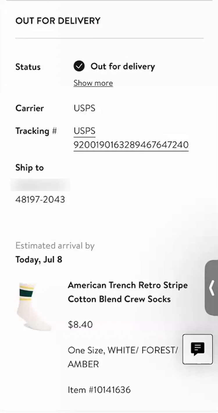
6) Package Contents Summary
Nordstrom’s “Order Tracking” page helps to orient users to which tracking page relates to which ordered items by providing a brief package summary, including a thumbnail image of the shipped item and the order total.
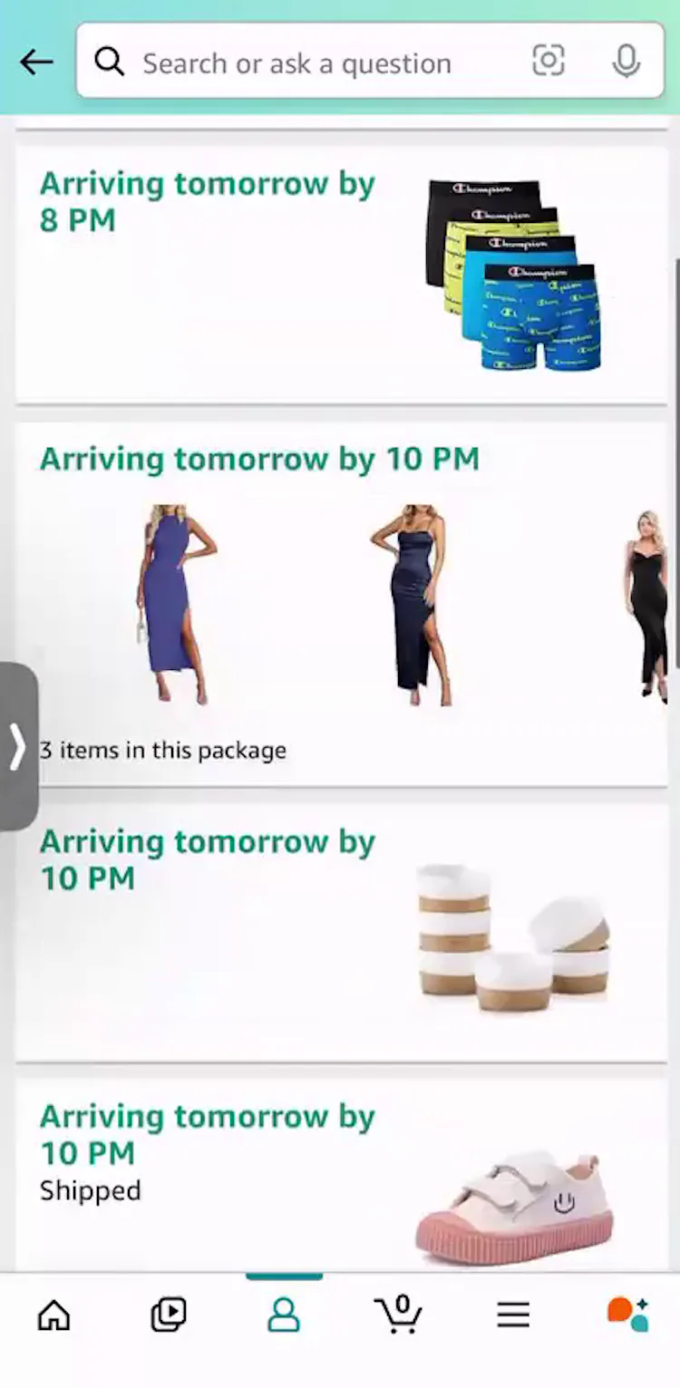
“We order so much from Amazon, I also get a lot of food items, you know, paper towels, stuff like that. So, I don’t typically use my email [to track]. I always go to the app. This is how I typically keep track of what I’ve ordered and when it’s coming”, explained a participant (iOS) at Amazon. She had multiple items scheduled to arrive the following day (first image), so having item thumbnails included on the “Order Tracking” page was essential to effectively tracking individual orders (second image).
Lastly, if a user has multiple orders, or multiple items shipping separately, there will be more than one “Order Tracking” page, and users will need to be able to intuitively know which tracking page relates to which items.
Therefore, “Order Tracking” pages should always show a summary of the package contents.
During recent testing, most test sites displayed thumbnails of the shipped items on the “Order Tracking” page or overlay to help users keep track of what was included in each shipment.
Give Users the Tracking Information They Need
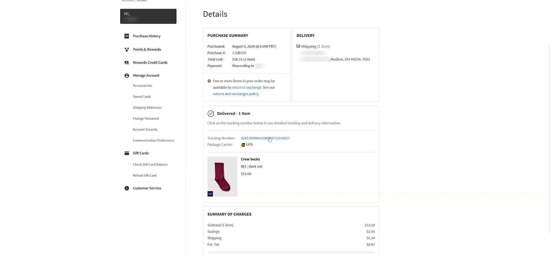

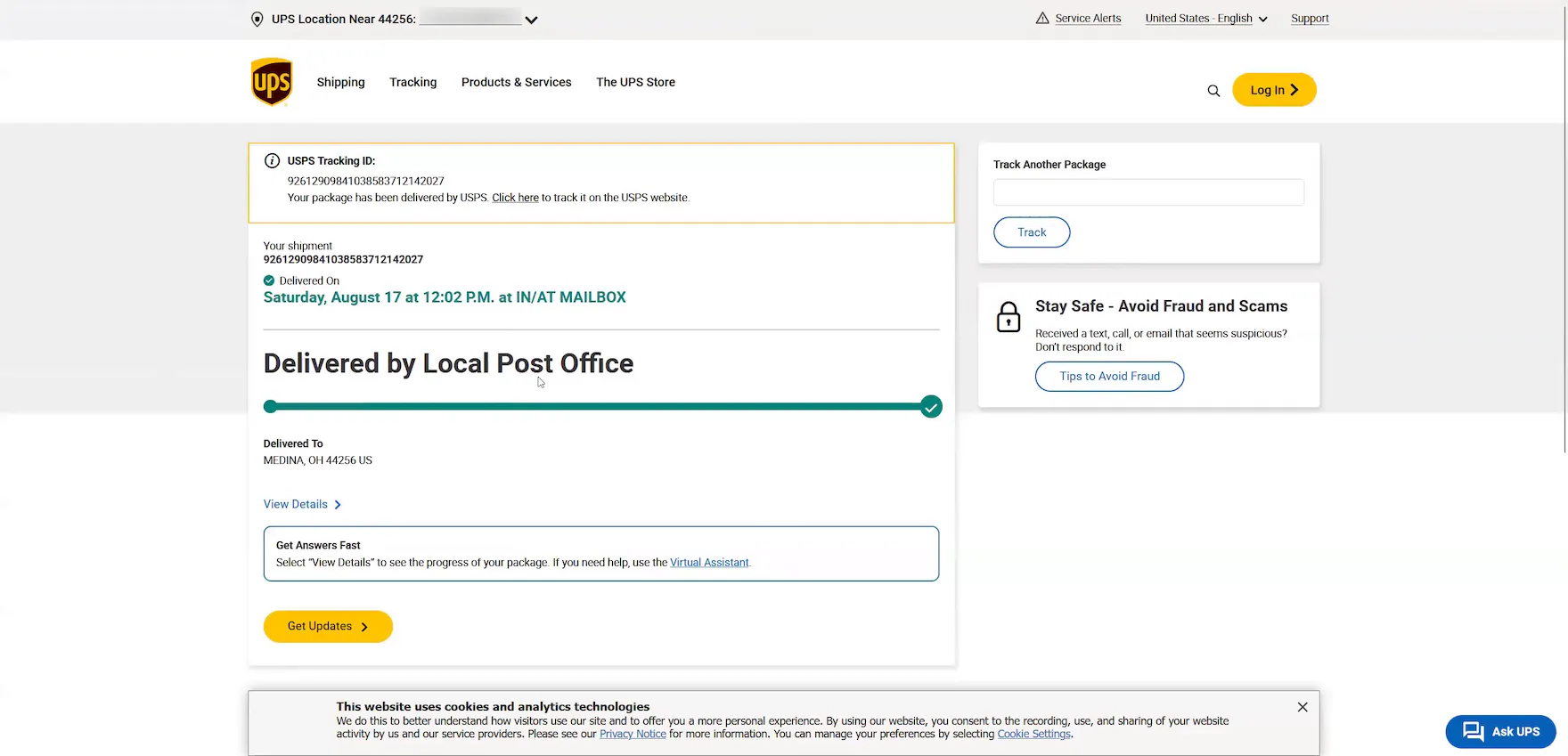
“I’d probably go back to the website and check on my order here. Then I’d look at the tracking number they supply here. Oh, it looks like it’s not available. It’s prompting me to look at the UPS website. It looks like it was actually delivered by USPS. Yeah, it looks like UPS had it originally. And then it looks like they transferred it over to USPS.” According to his “Order Details” page at GAP, this participant’s order was also delivered via UPS (first image). However, he verified on the carrier site (after encountering a technical issue that prevented him from accessing the third-party tracking page, second image) that the order had actually been transferred from UPS to USPS (third image). Incomplete shipping information can cause unnecessary anxiety and delivery issues for users.
Testing revealed that “Order Tracking” pages, for most sites, are clearly an afterthought when it comes to the user experience.
Indeed, most “Order Tracking” pages simply fail to provide users with the information they need to track their order successfully.
Moreover, sending all users to a third-party tracking interface, just to perform basic order tracking on such things as the arrival date or shipment subevents, causes an ecommerce site to lose control of the end users’ order experience.
Instead, it’s important to consider the needs of the post-purchase user by providing the 6 key order-tracking details described above.
Doing so will allow users to effectively track their orders — and will improve users’ overall perception of the site.
This article presents the research findings from just 1 of the 700+ UX guidelines in Baymard – get full access to learn how to create a “State of the Art” ecommerce user experience.
If you want to know how your desktop site, mobile site, or app performs and compares, then learn more about getting Baymard to conduct a UX Audit of your site or app.