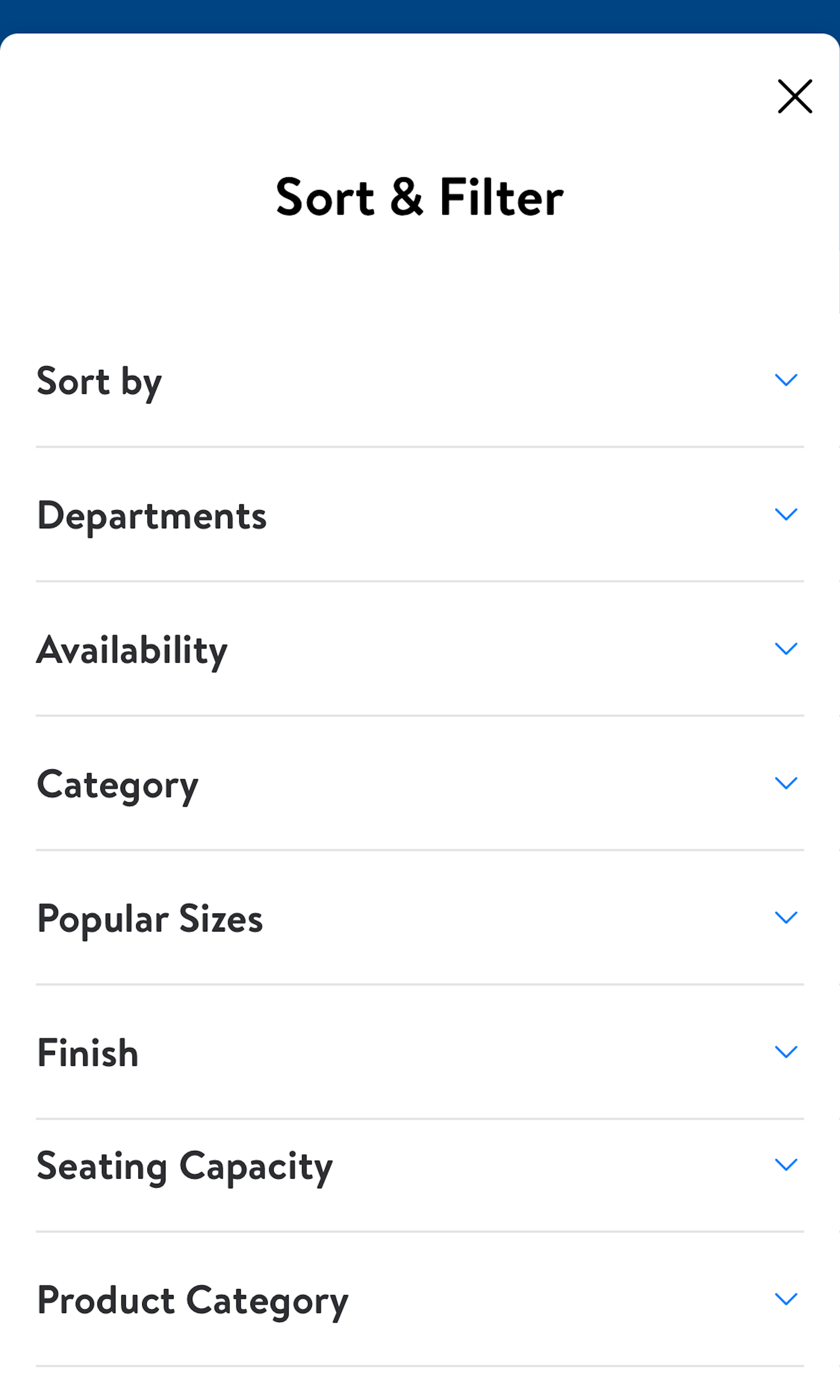
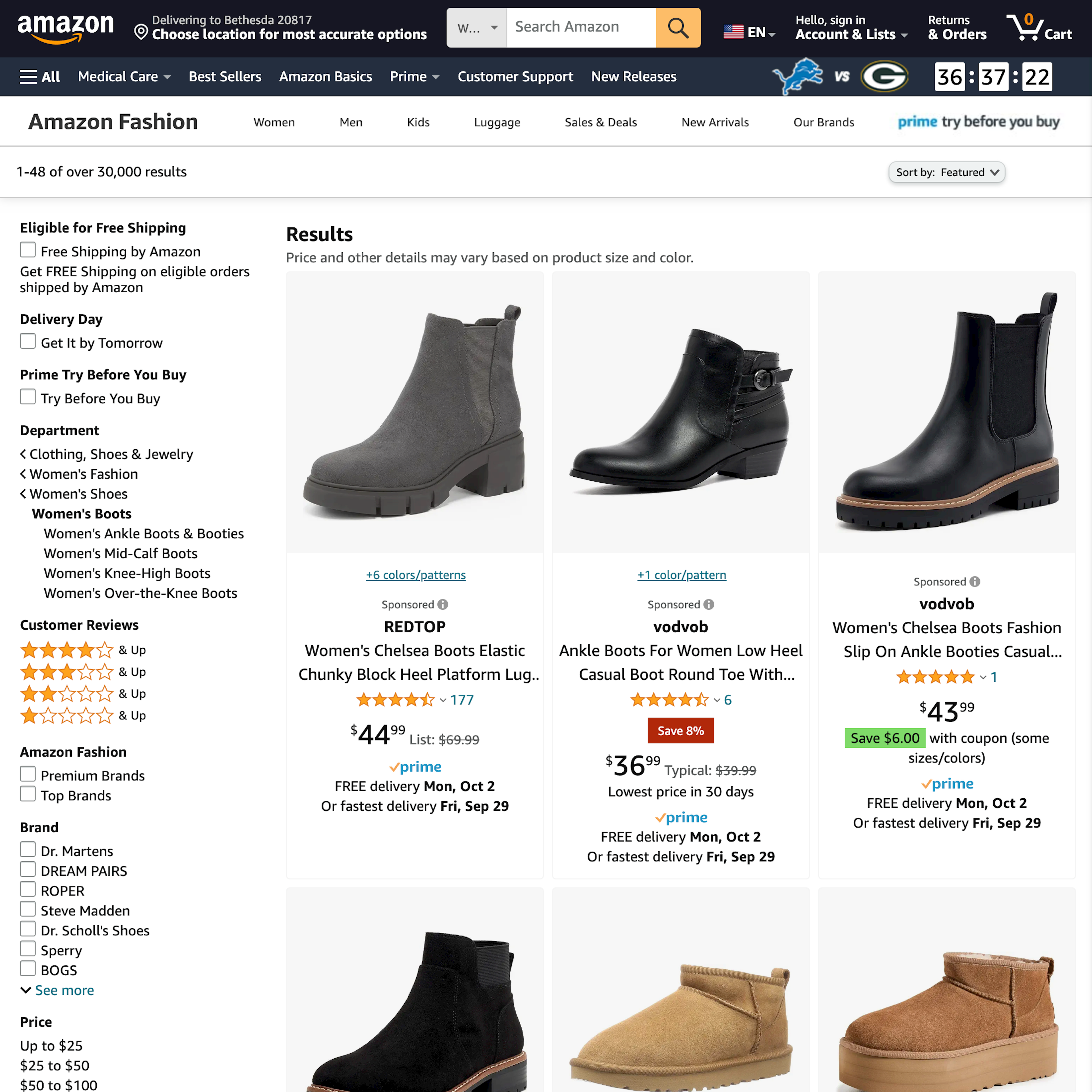
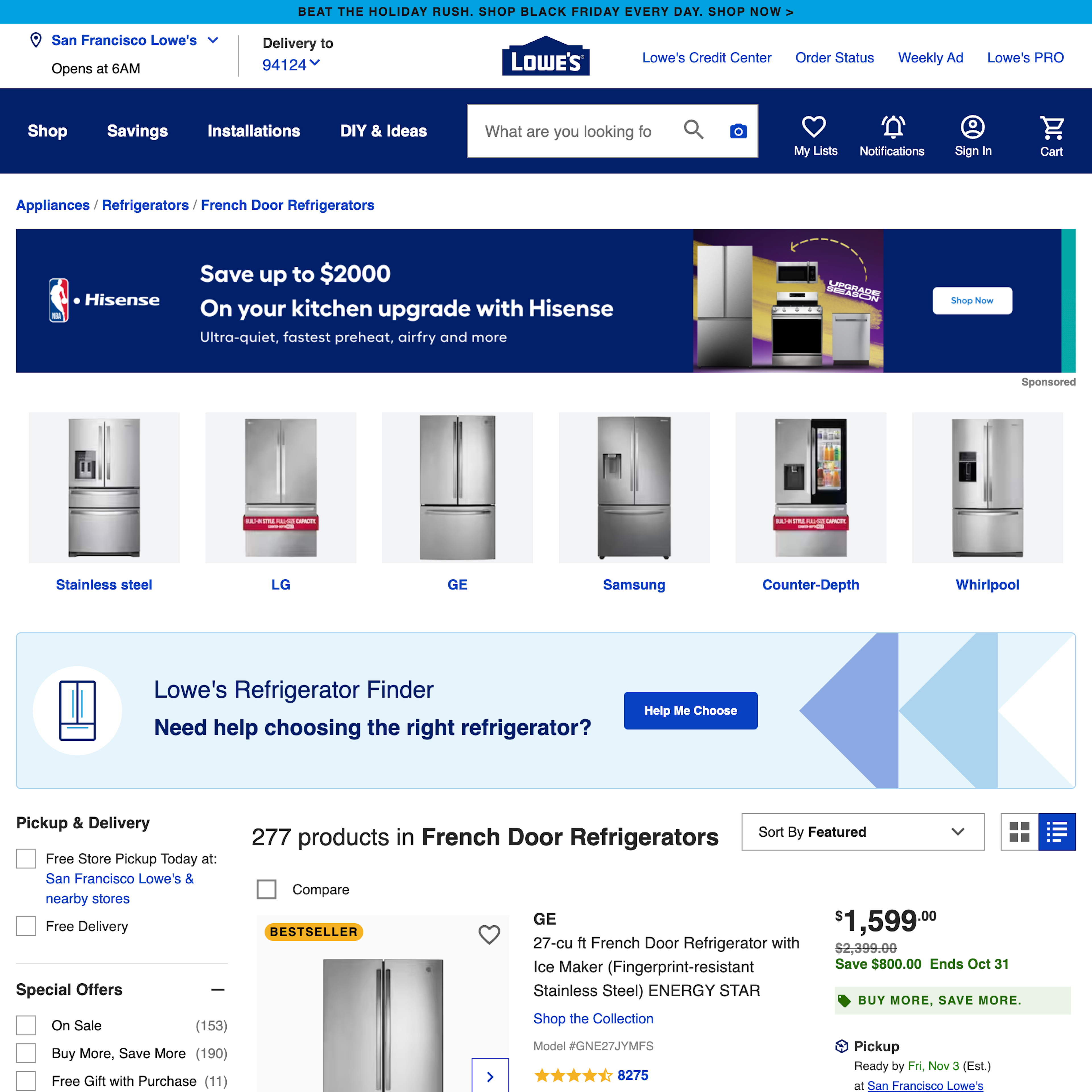
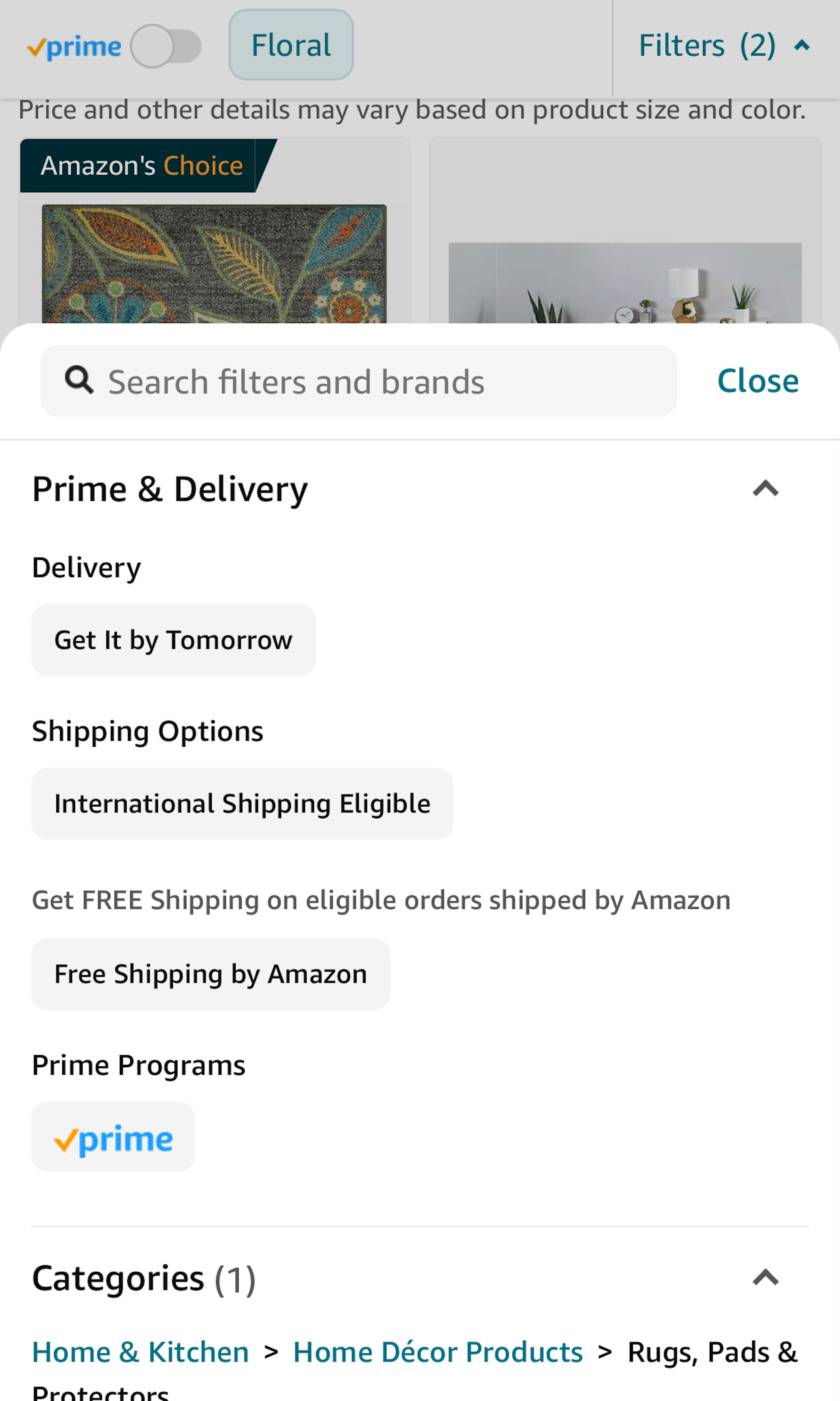
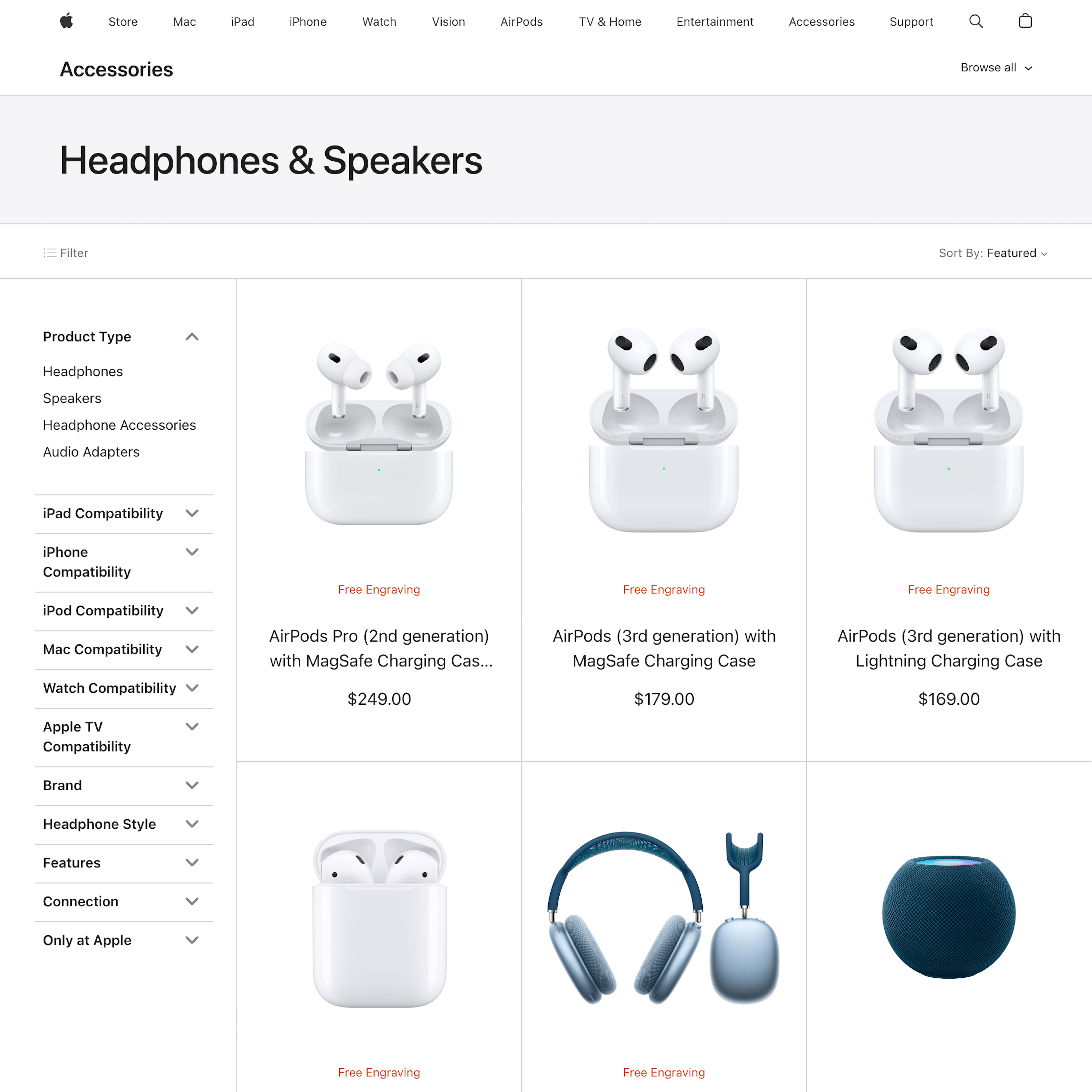
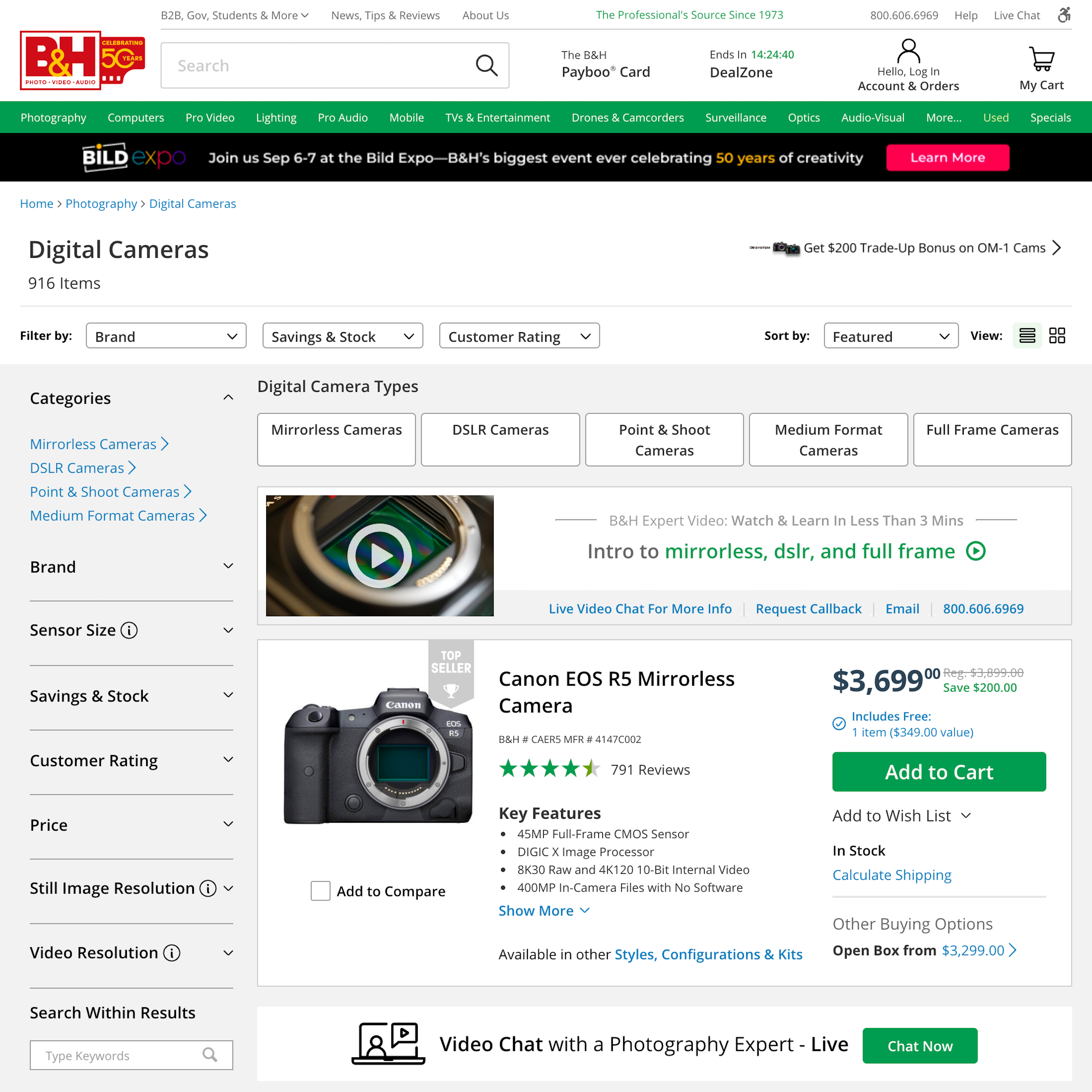
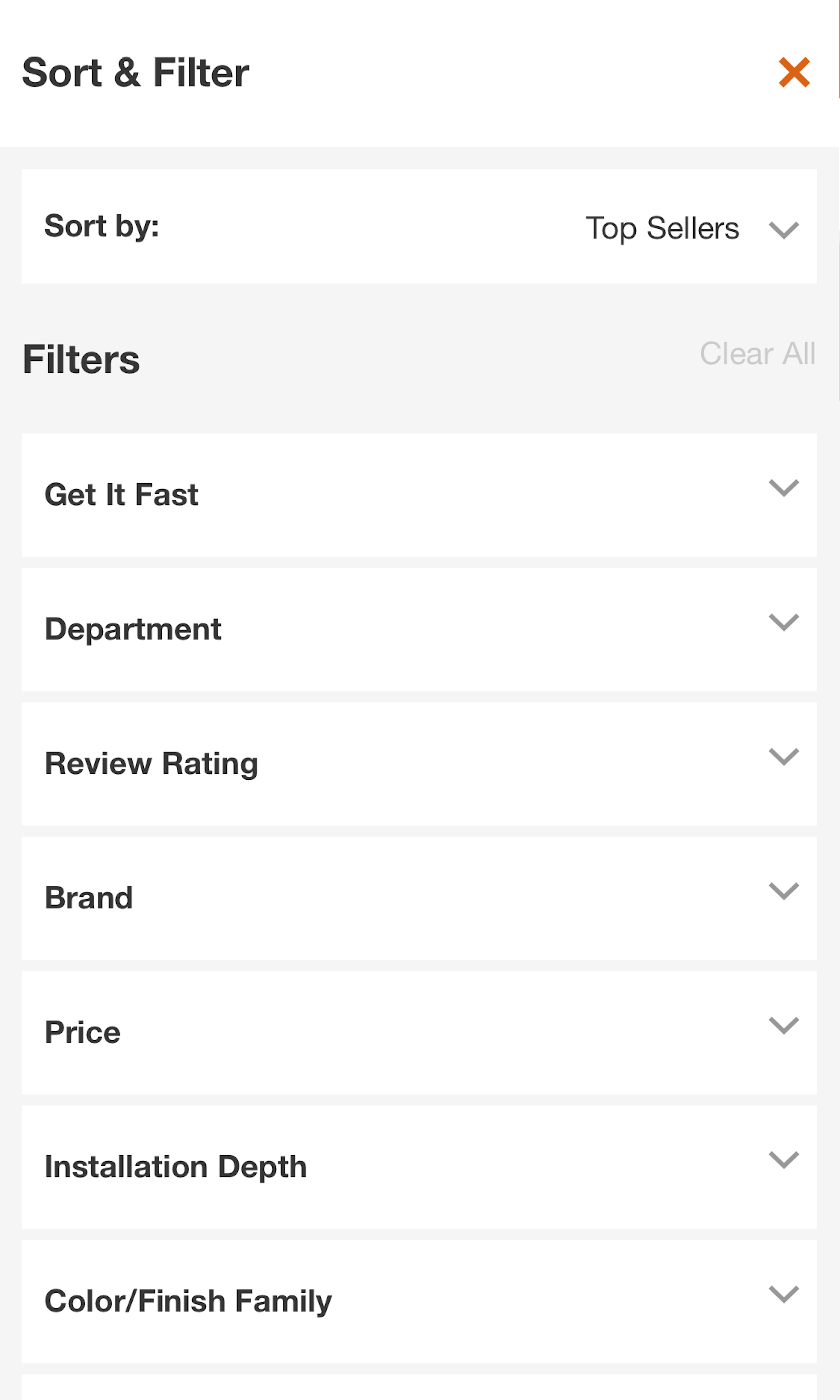
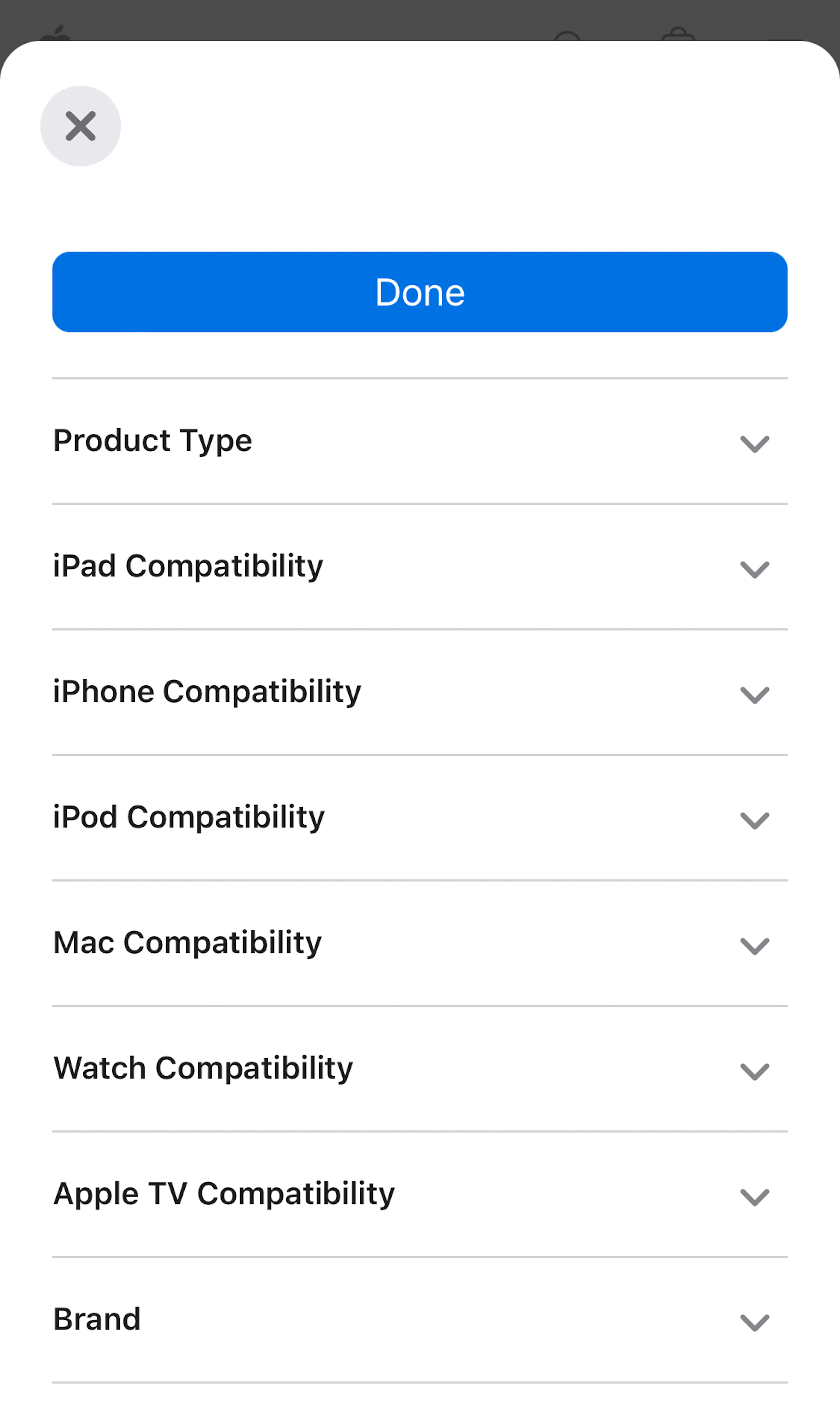
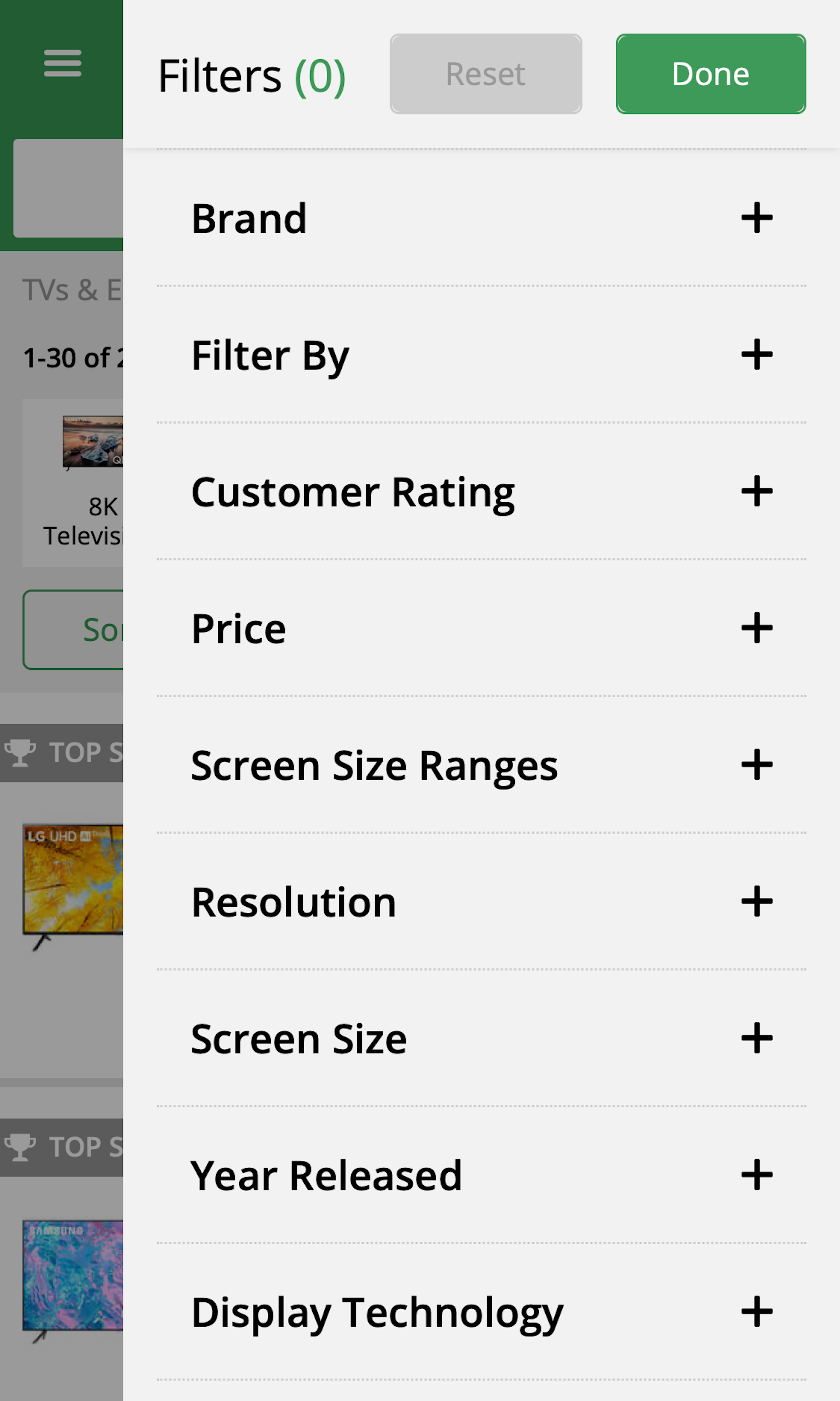
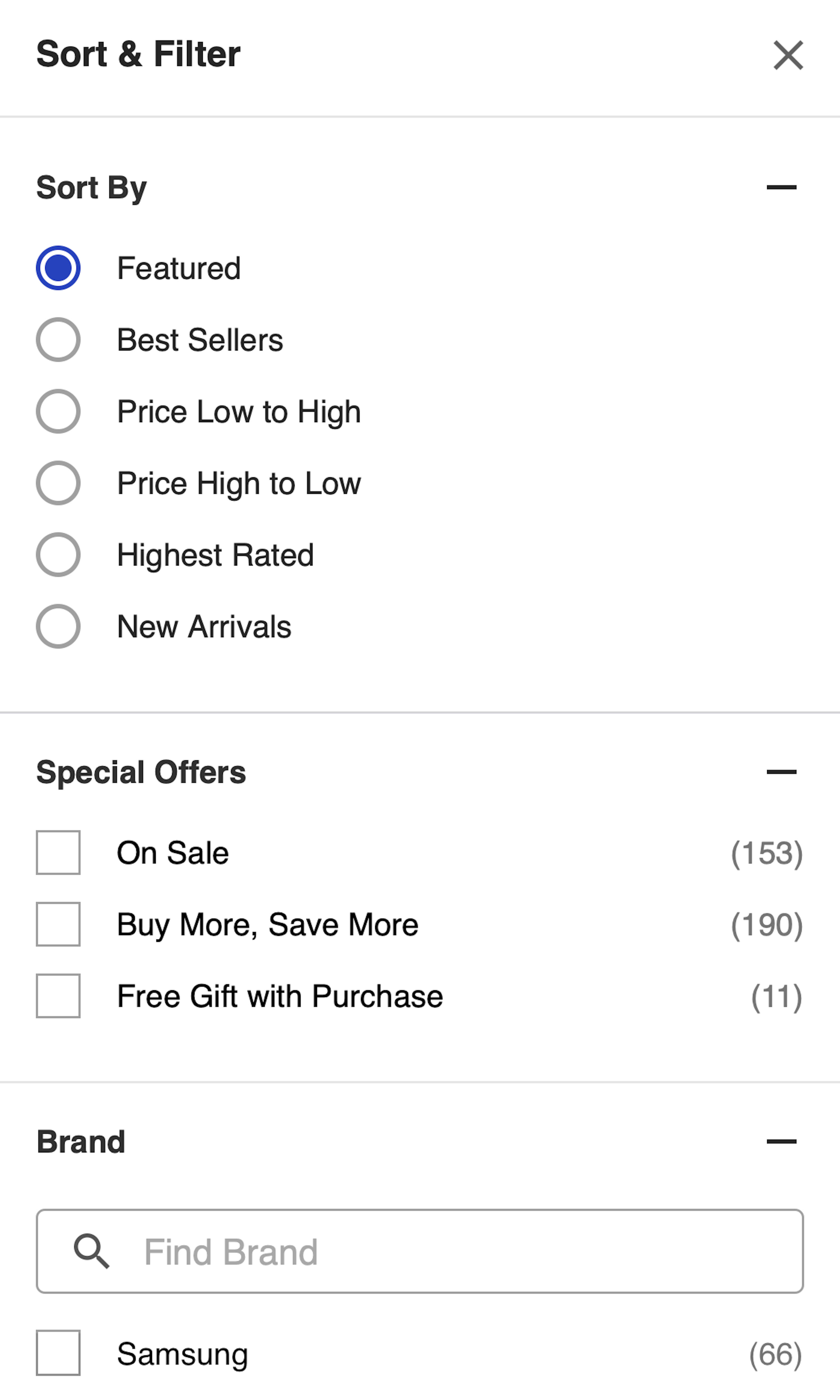
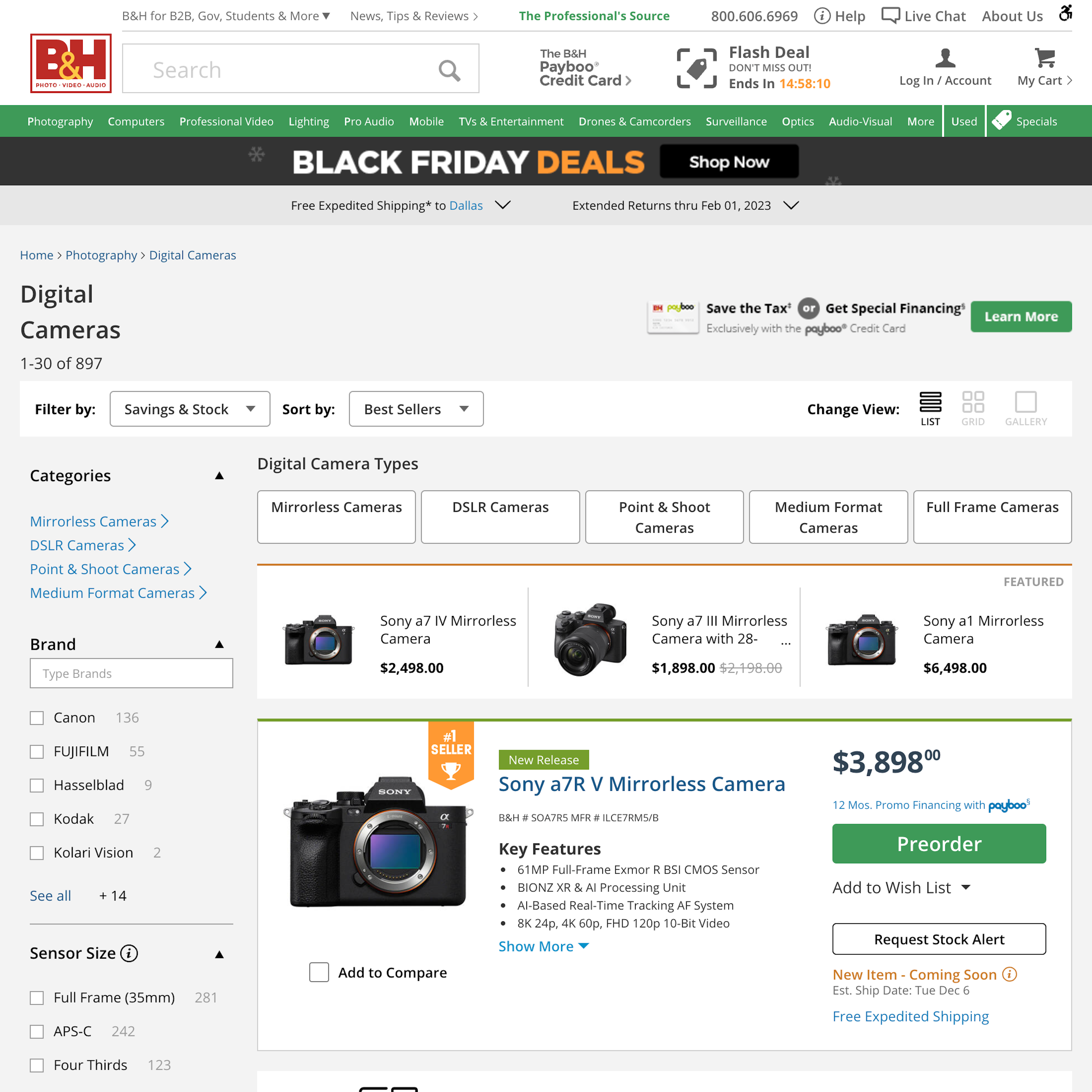
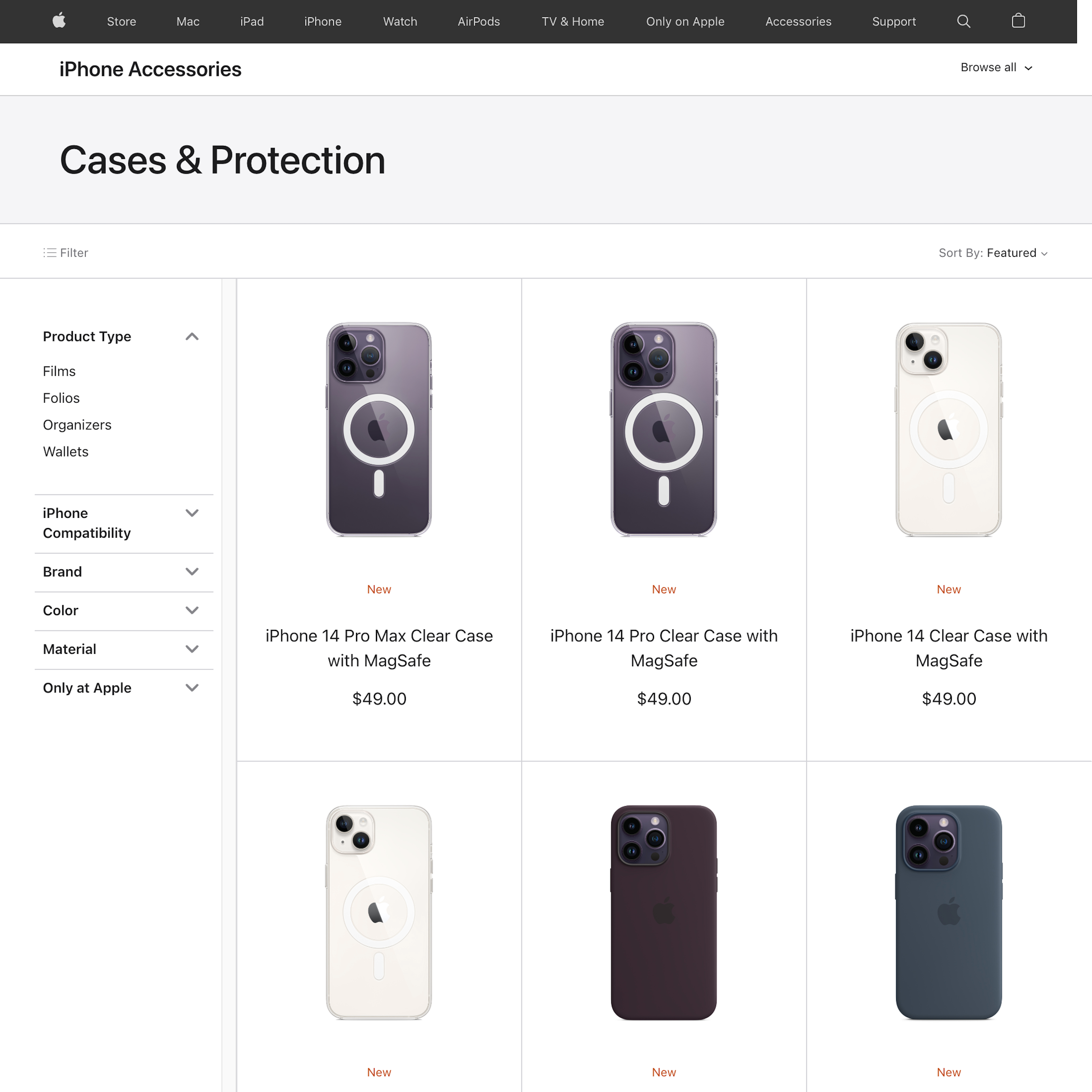
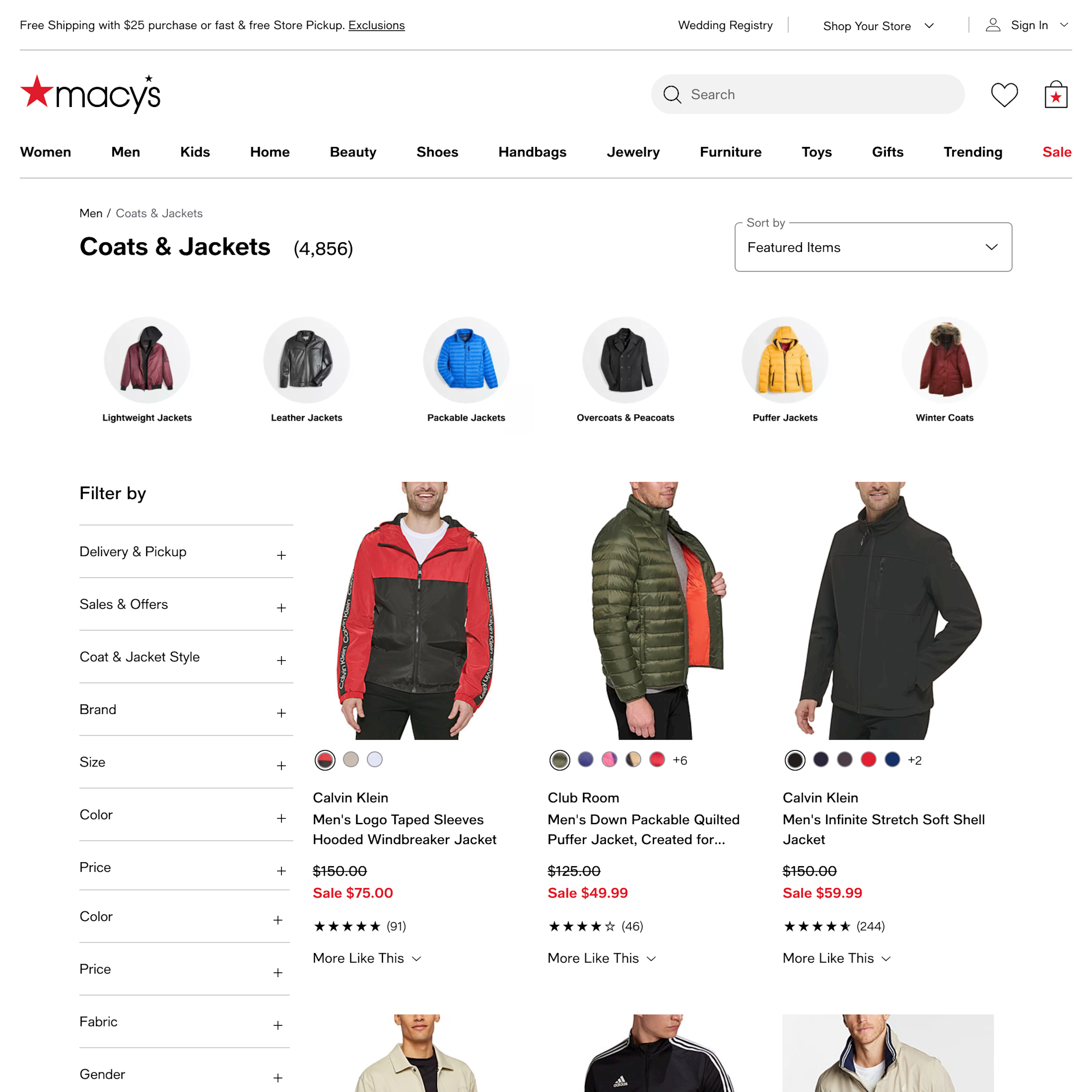
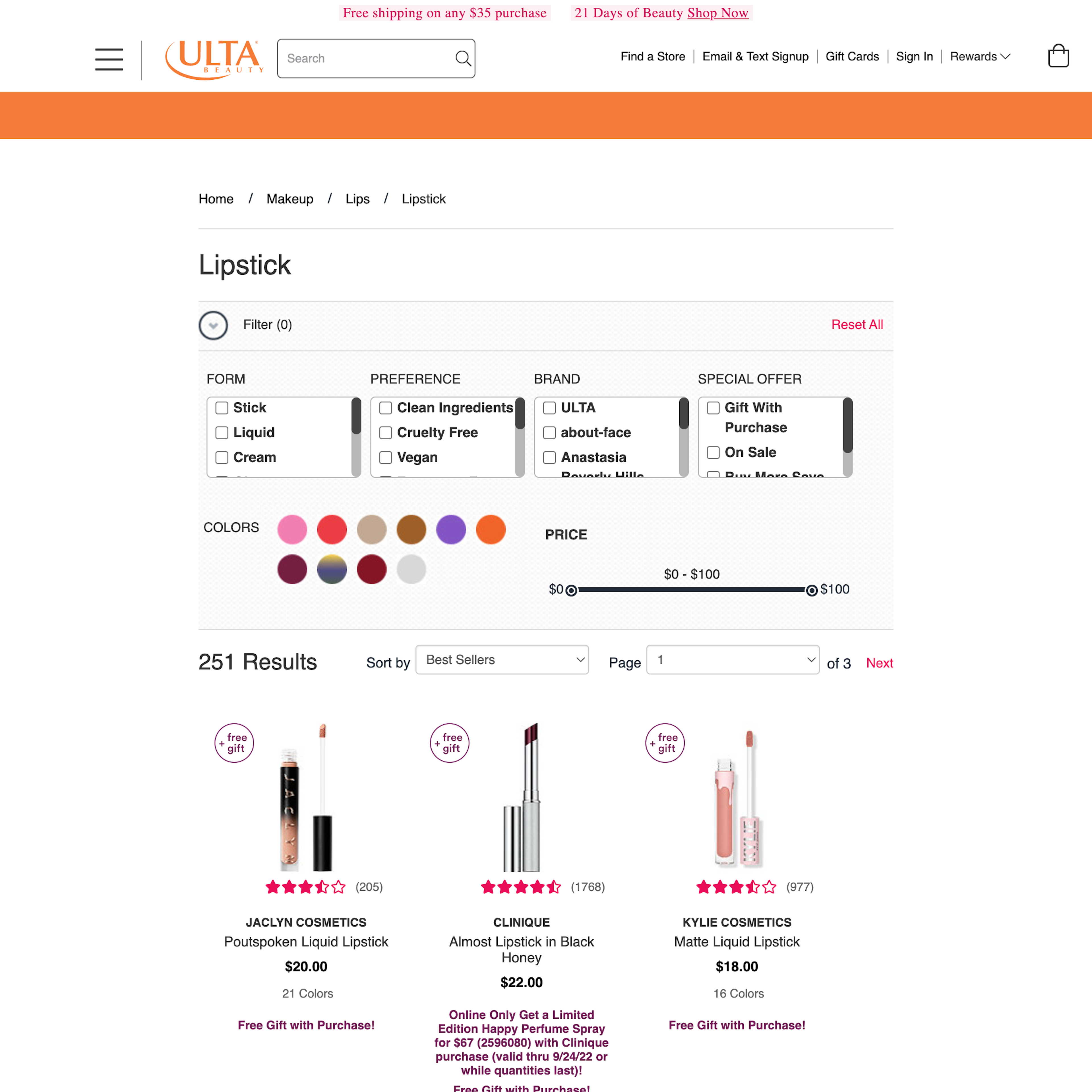
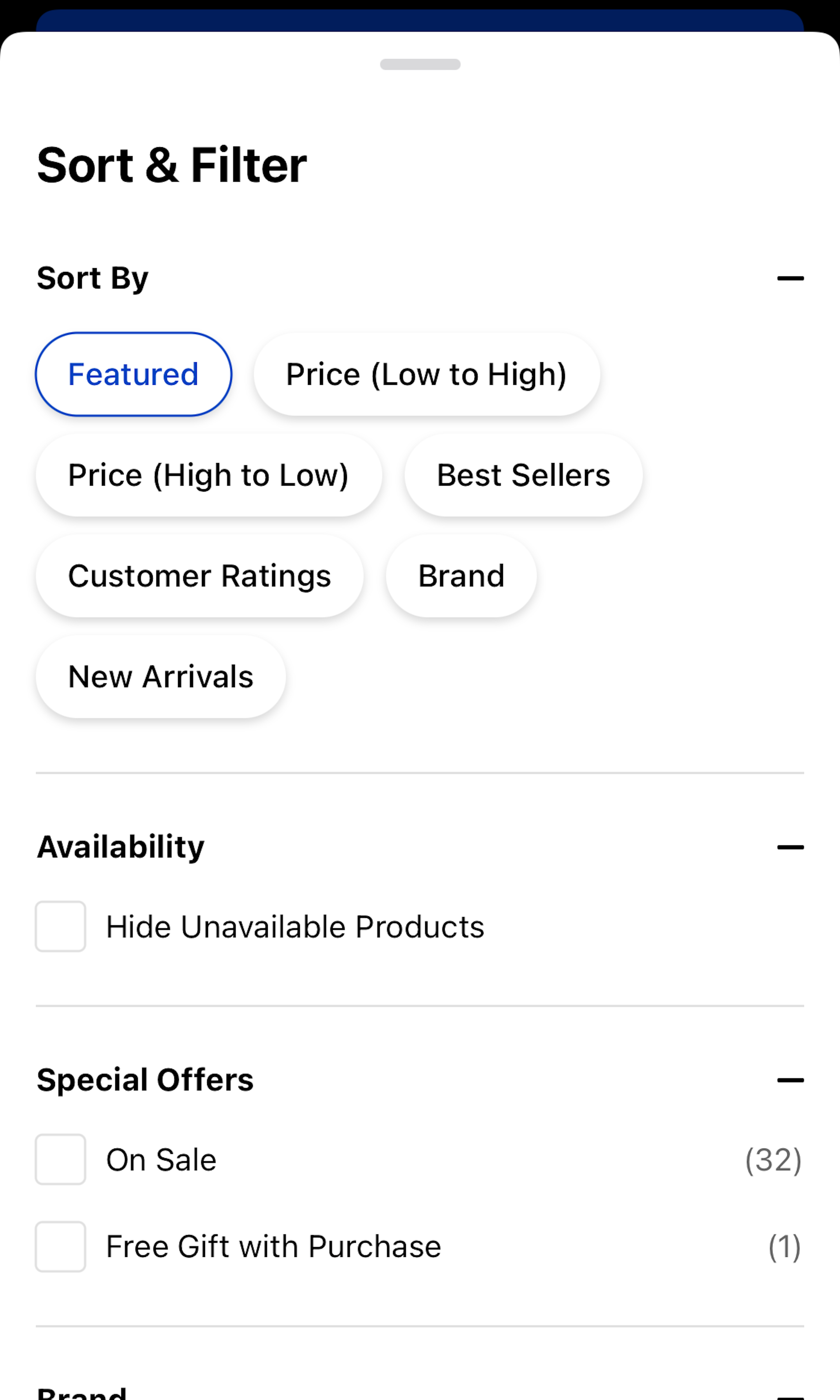
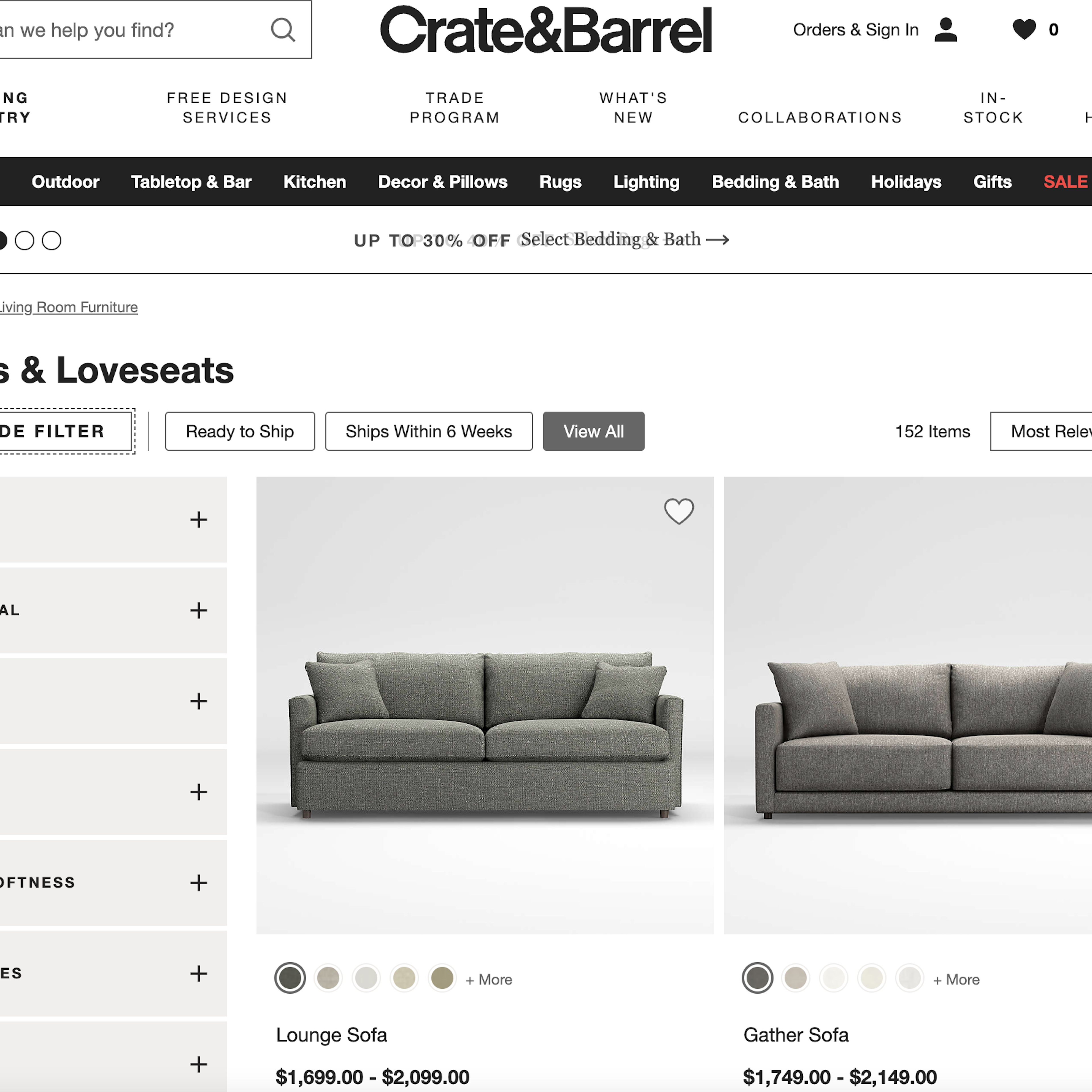
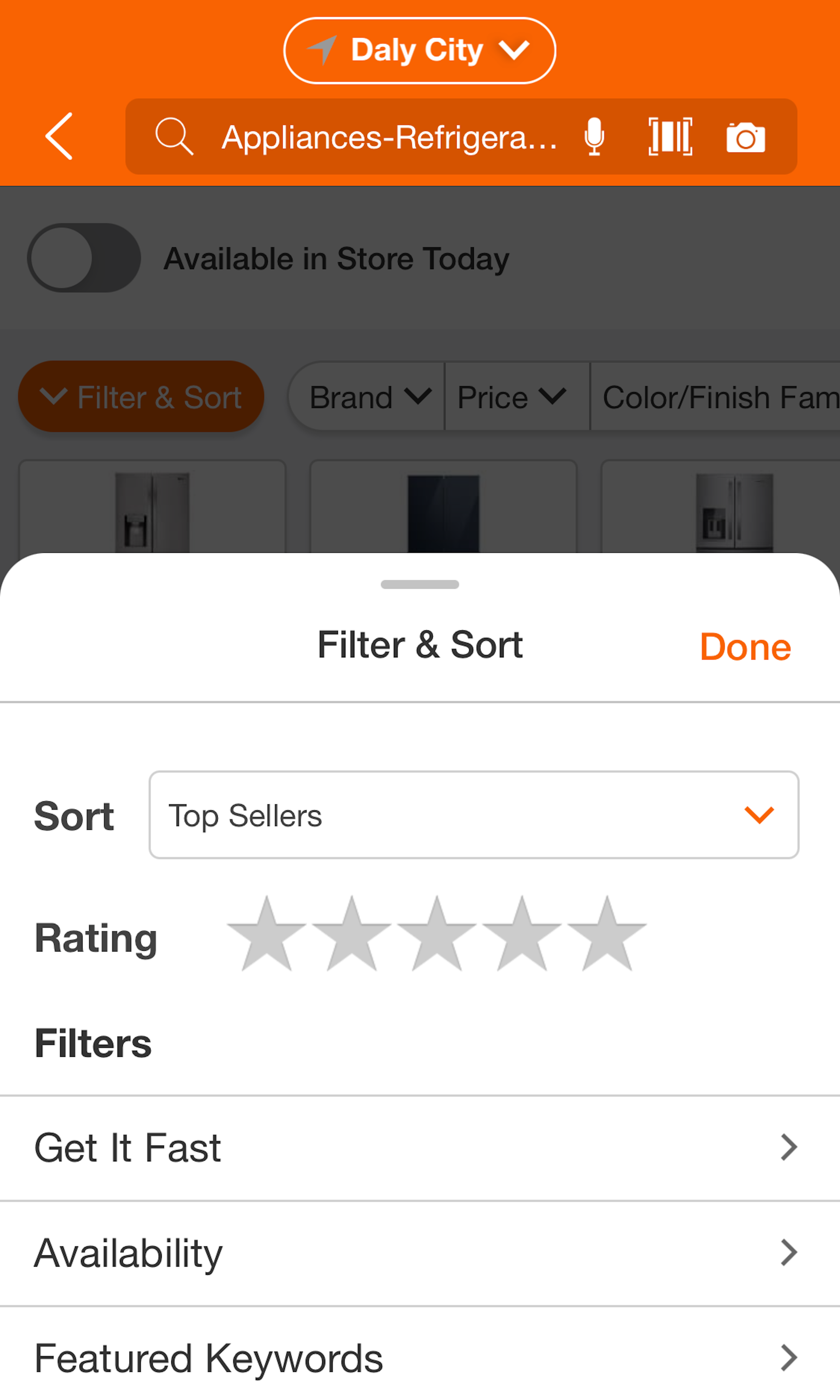
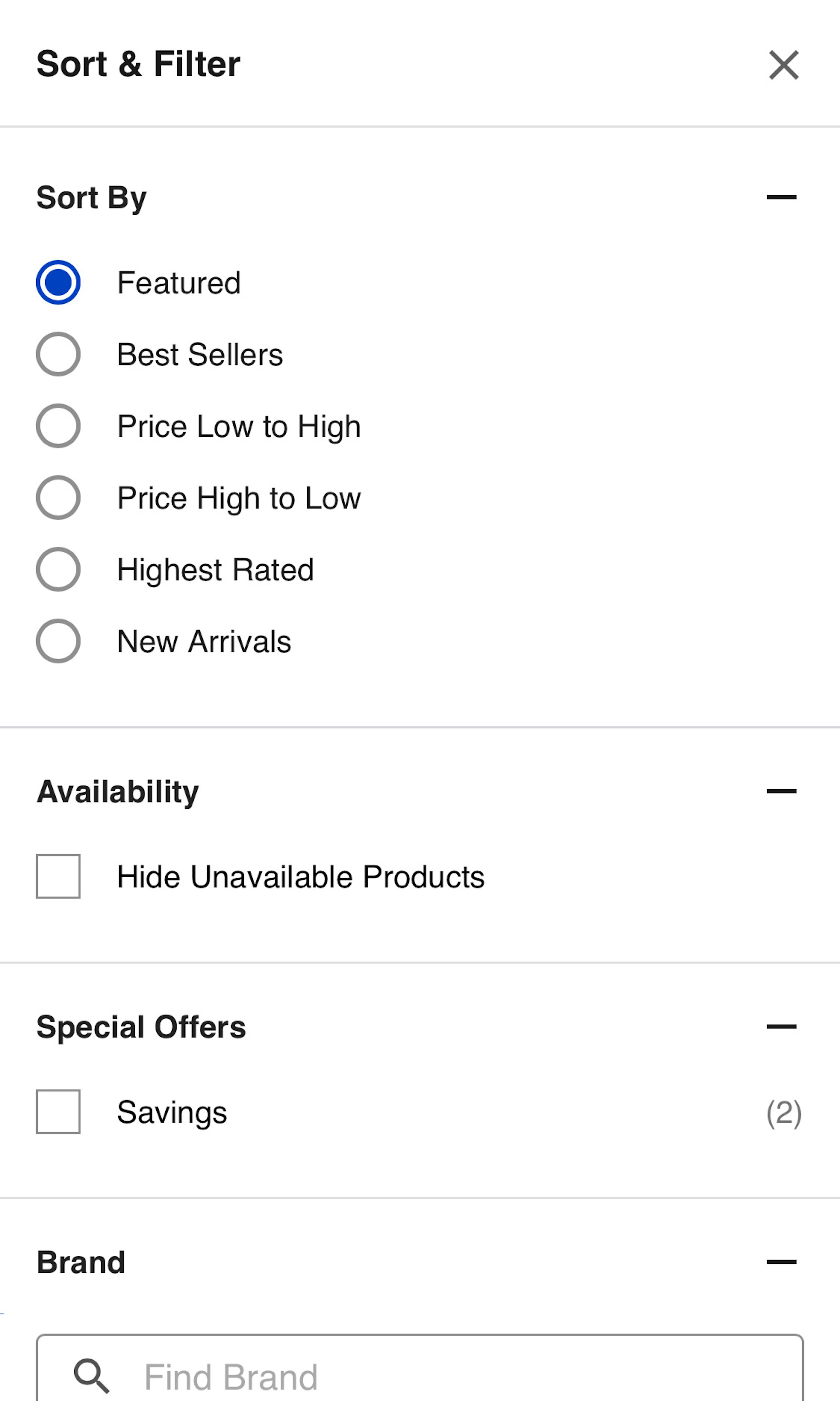
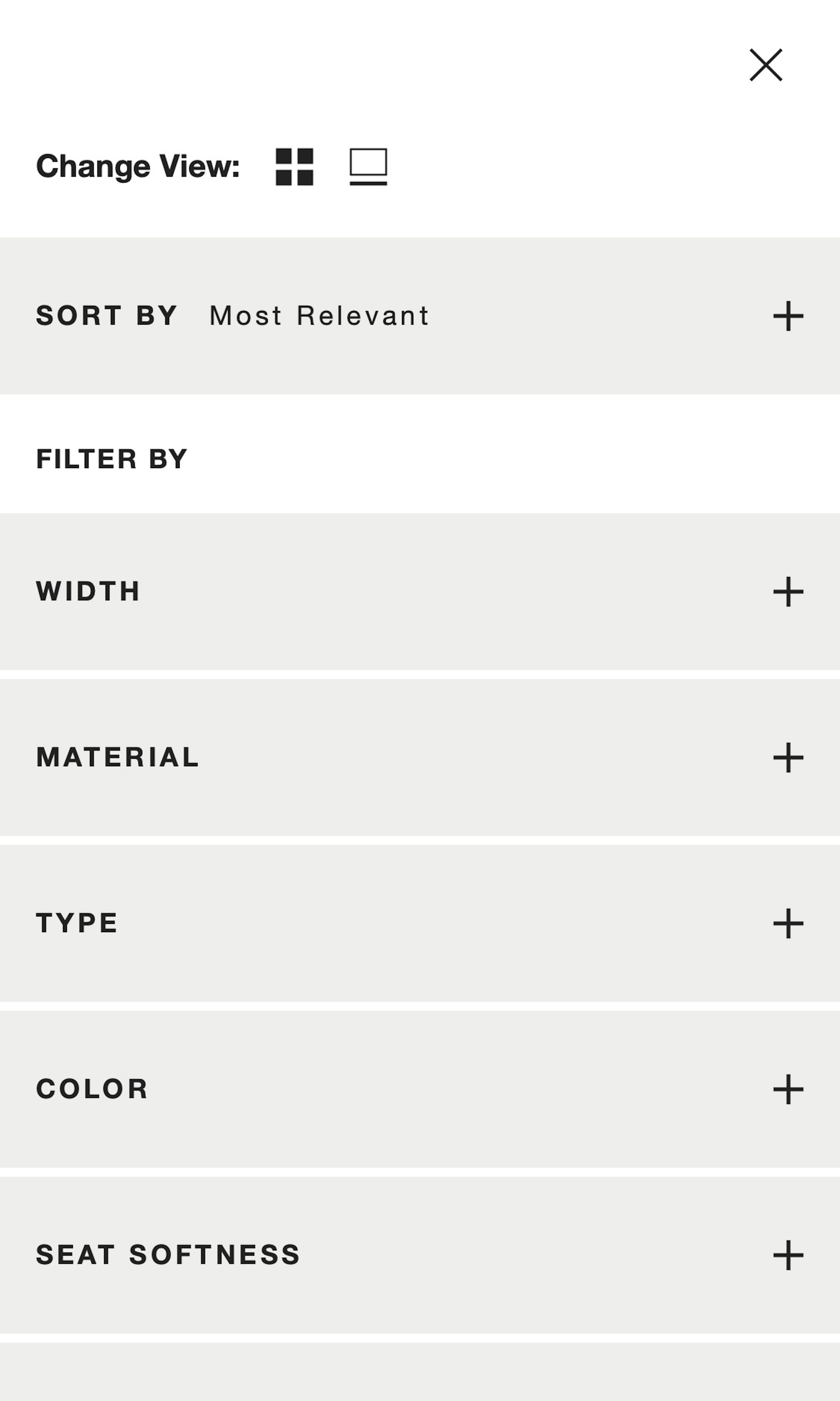
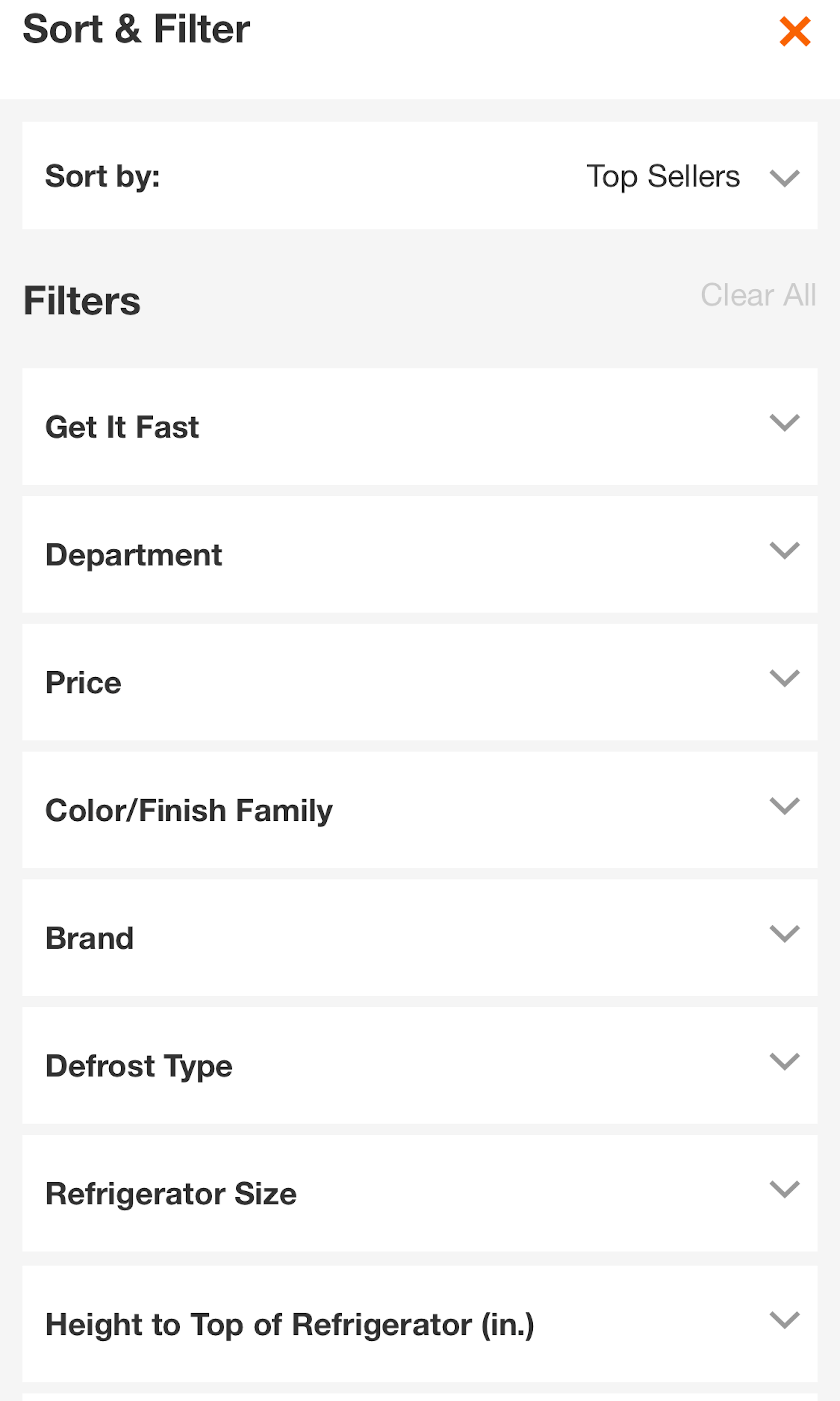
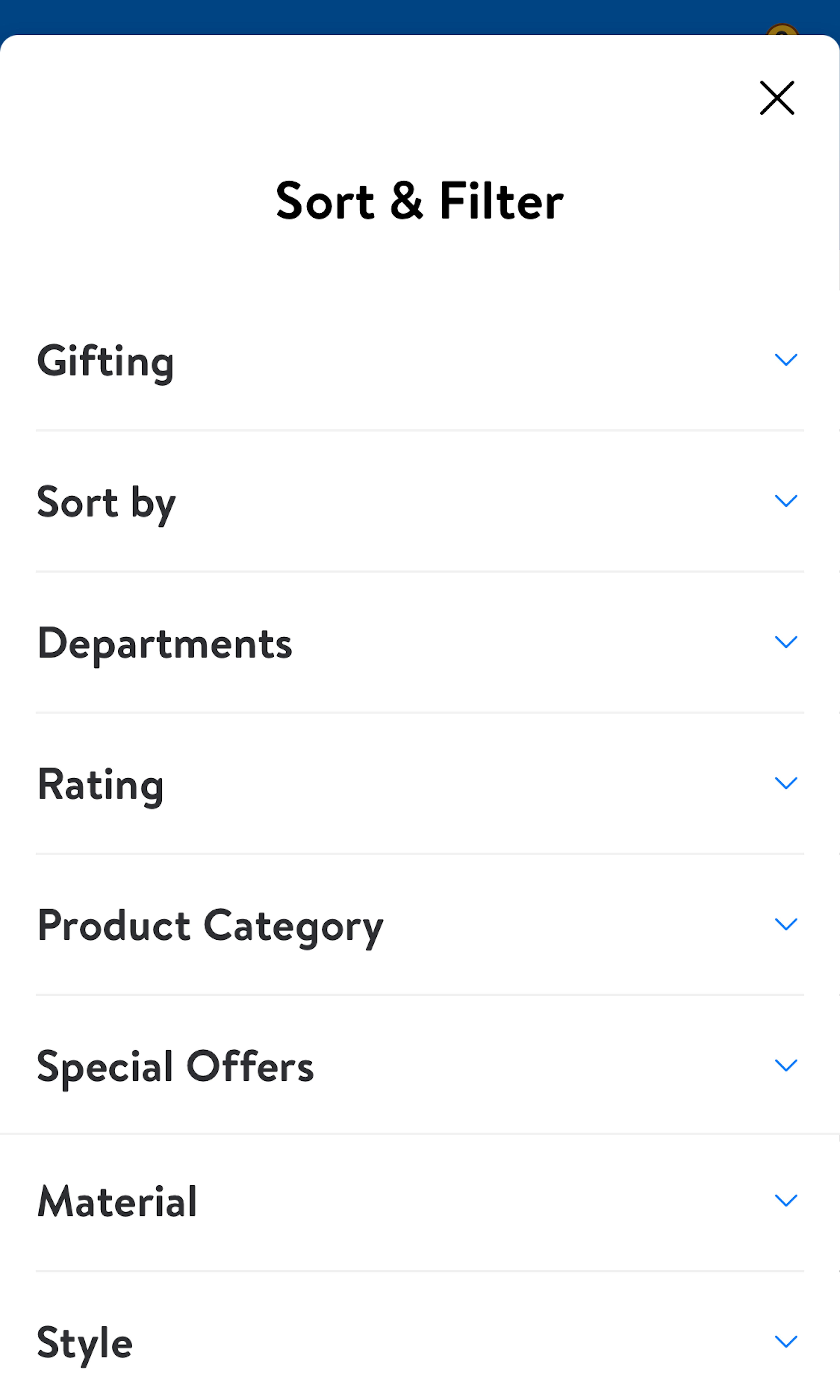
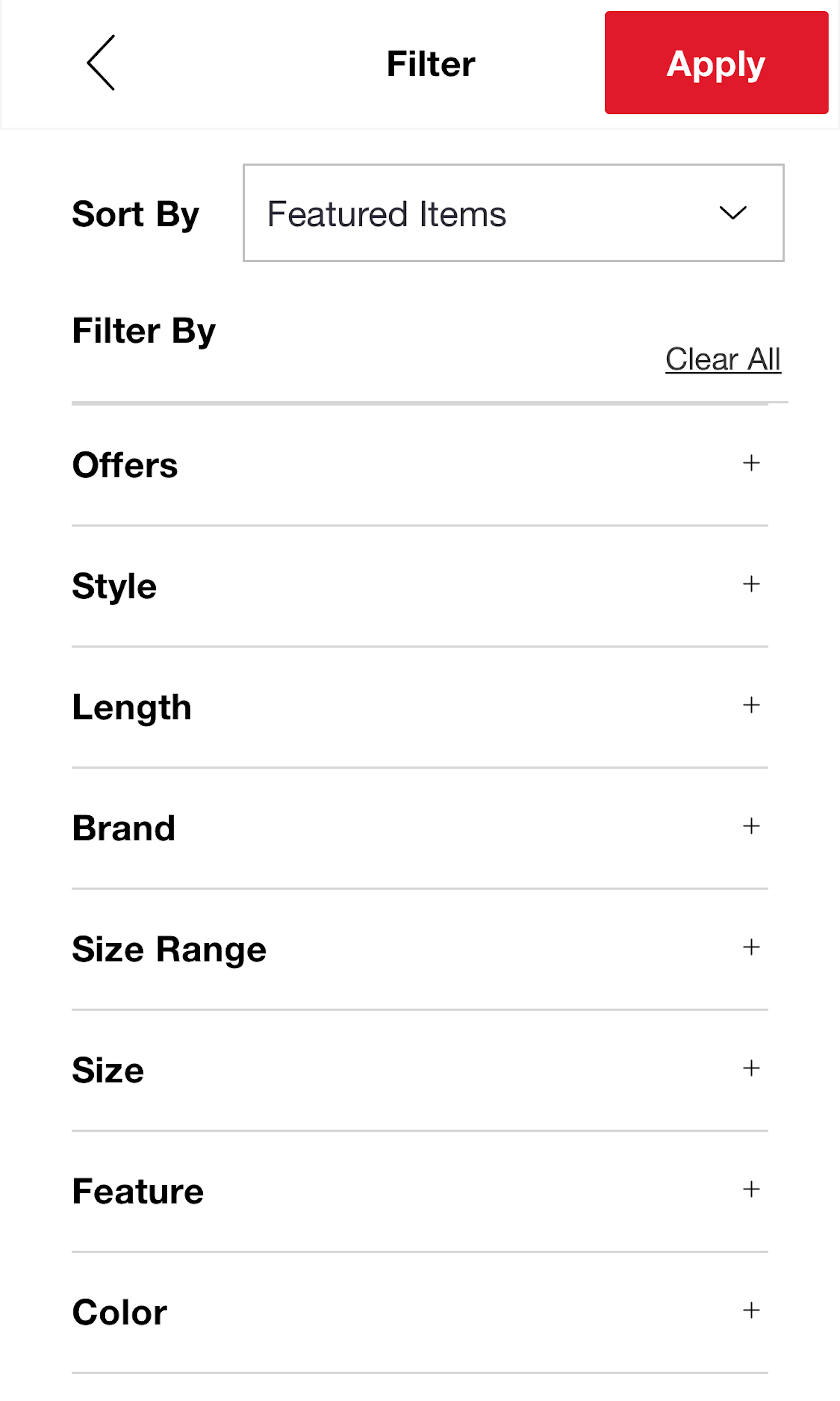
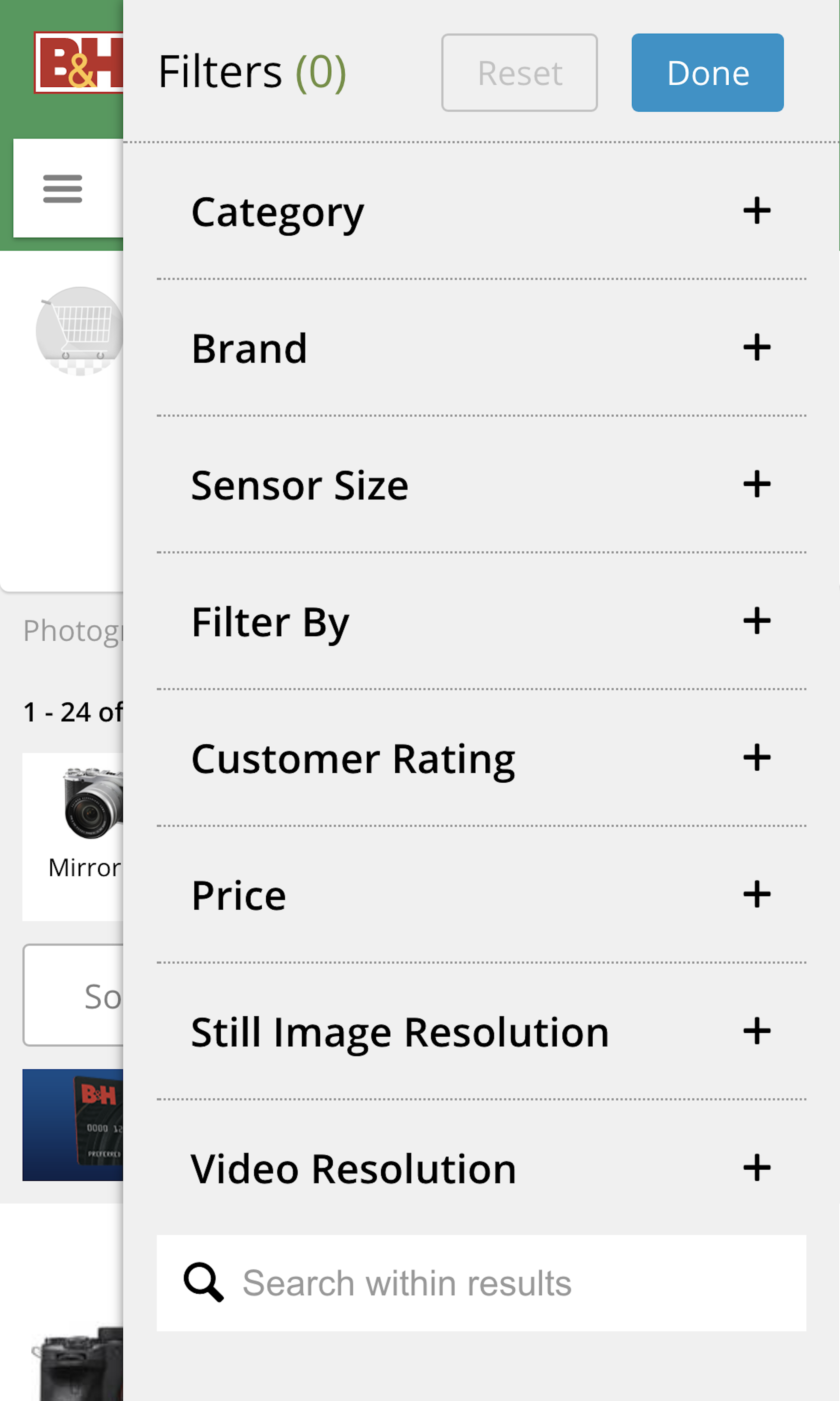
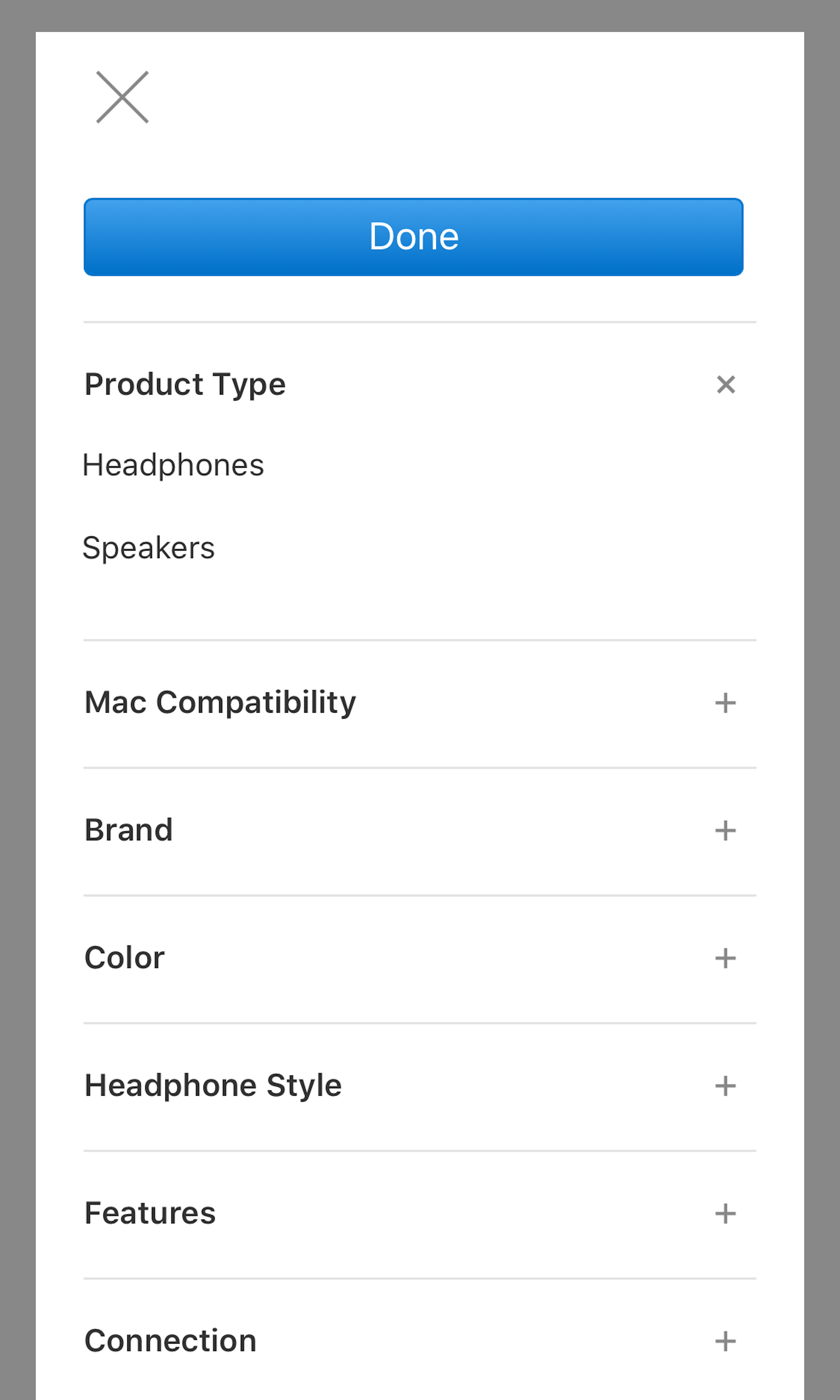
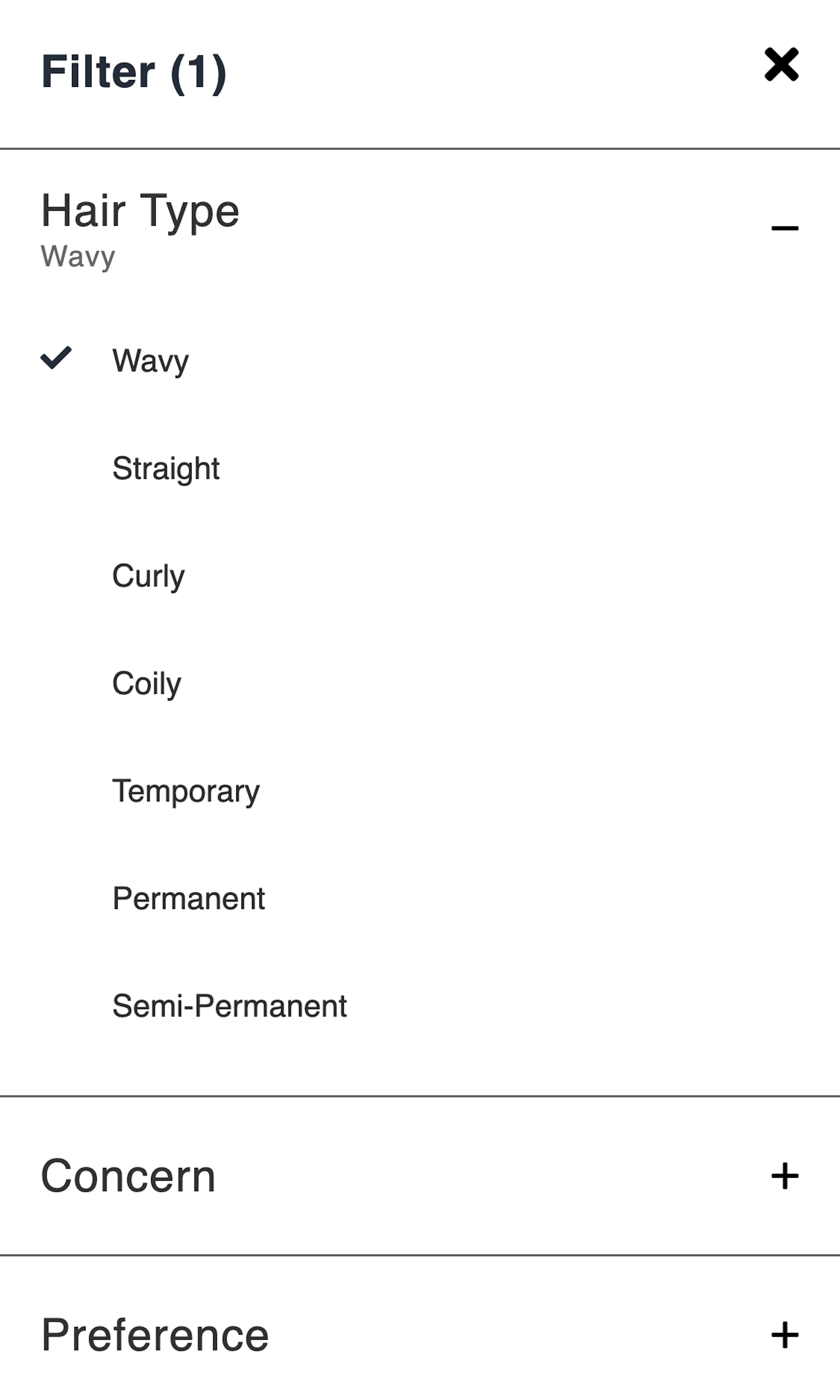
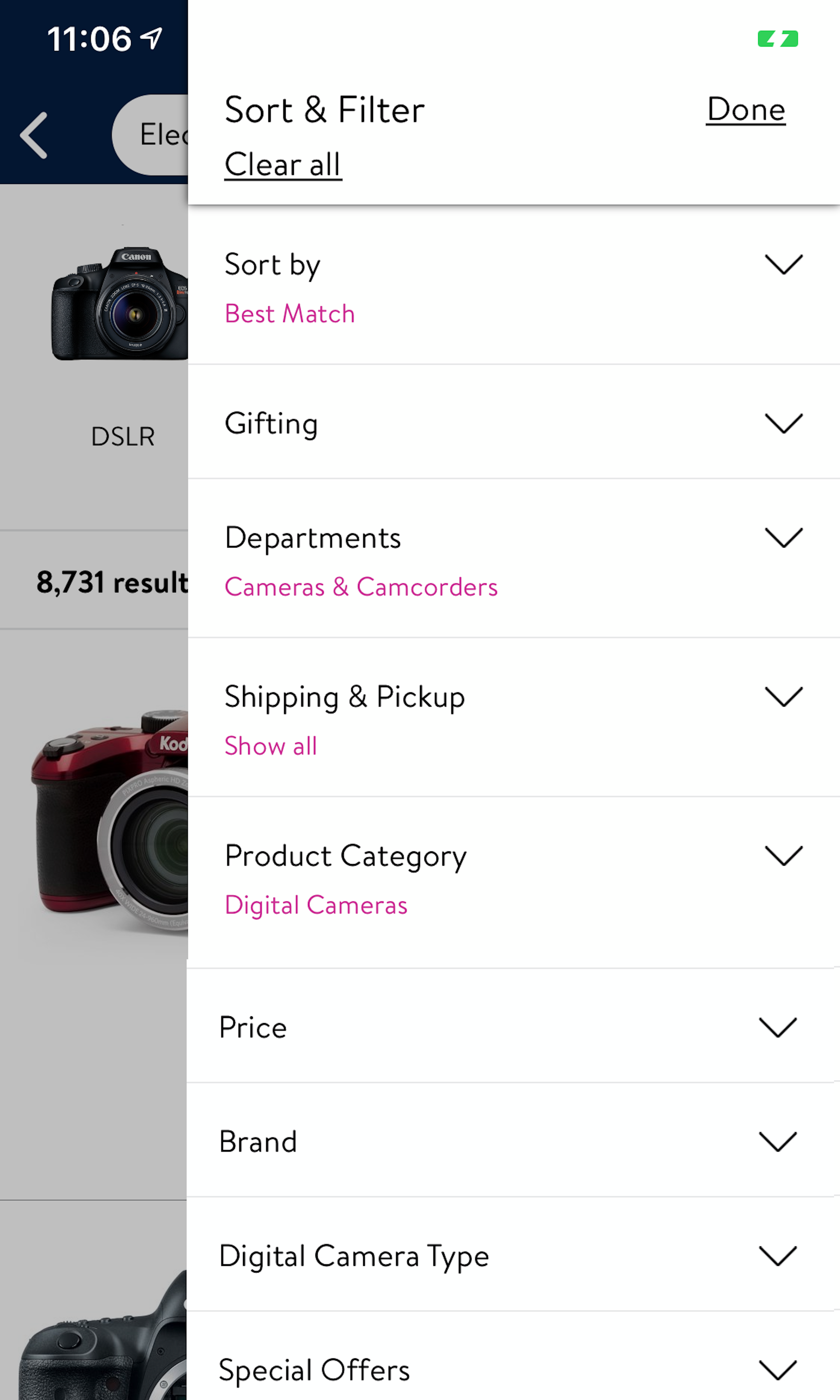
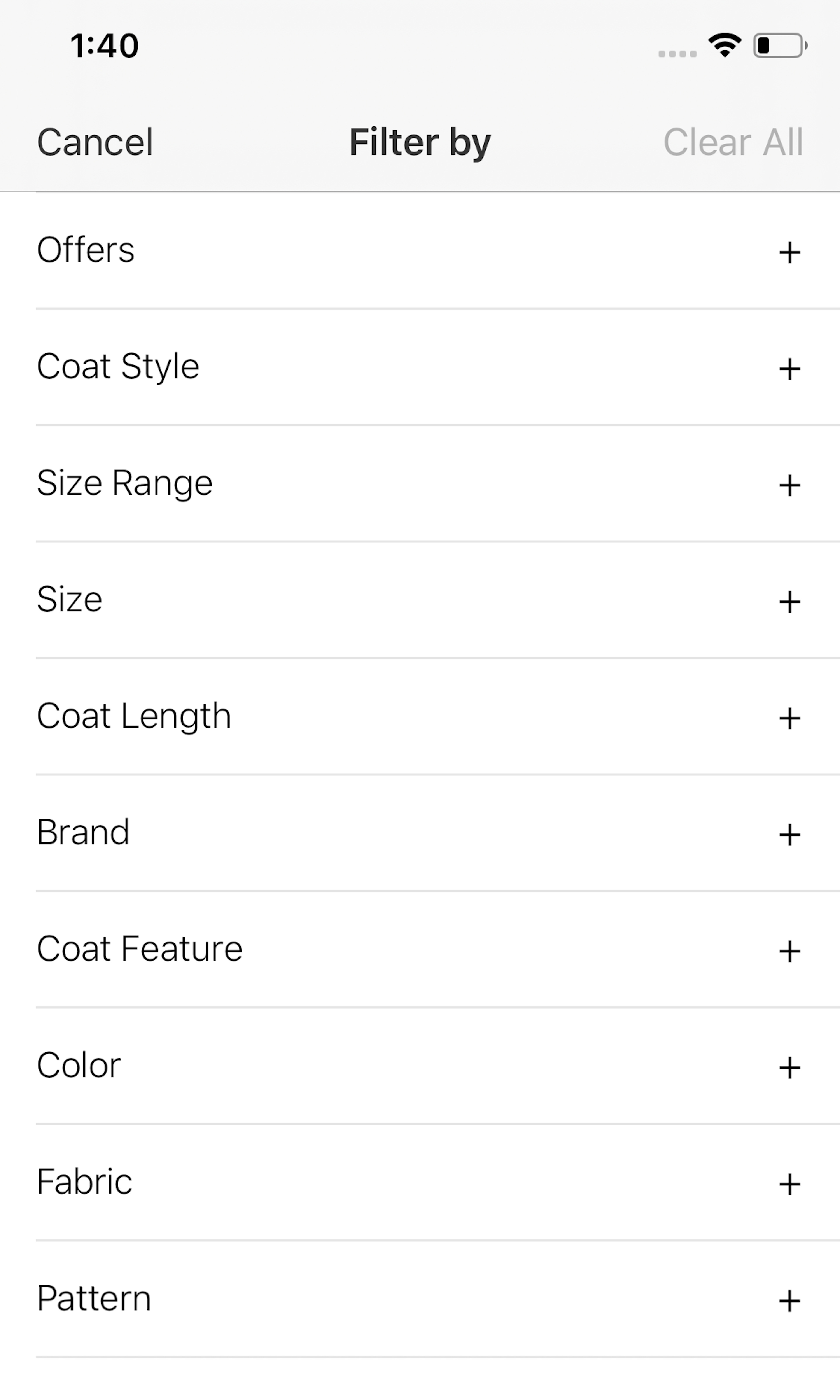
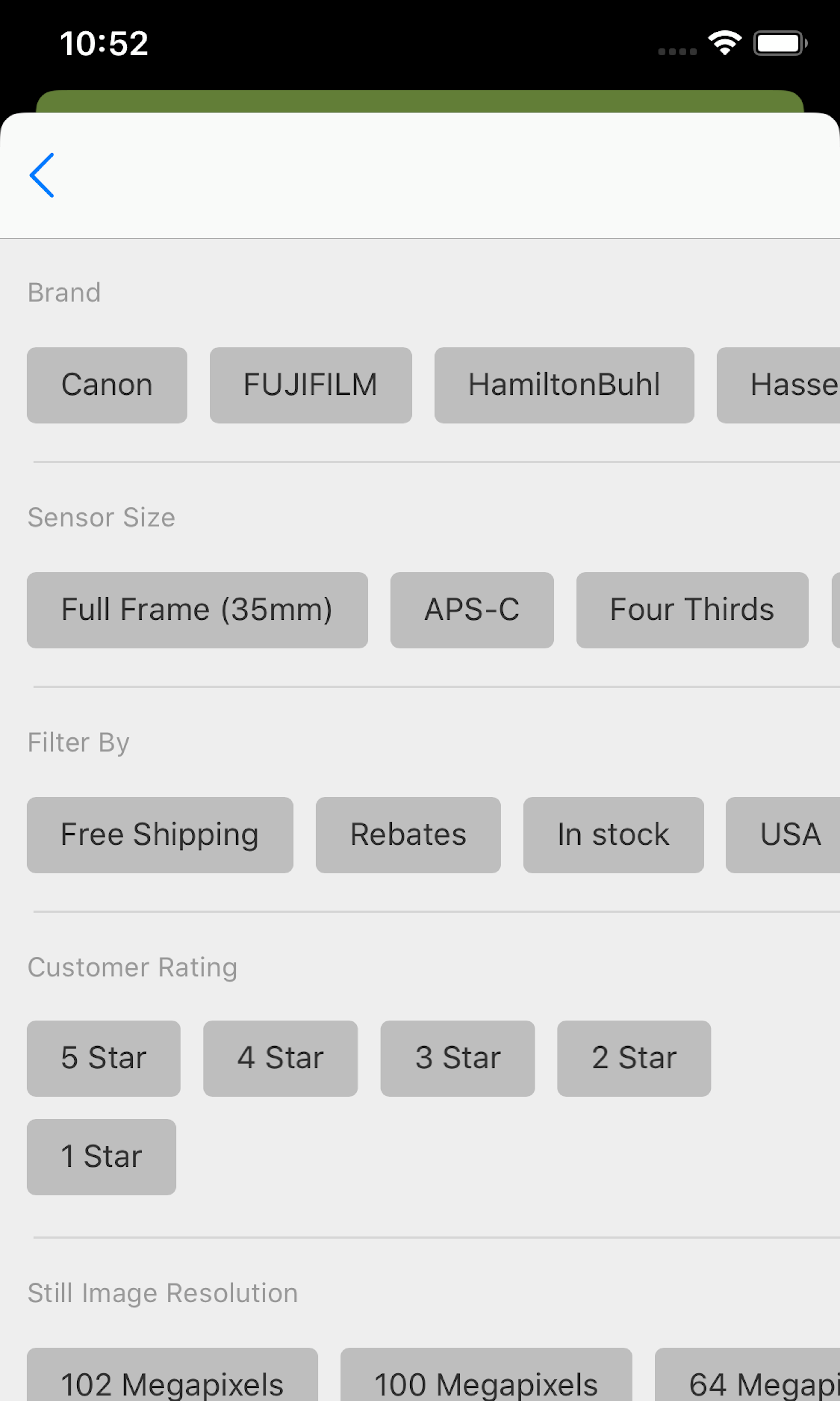
809 ‘Filtering Options’ Design Examples
Also referred to as: Filter Facets, Product Filtering
What’s this? Here you’ll find 809 “Filtering Options” full-page screenshots annotated with research-based UX insights, sourced from Baymard’s UX benchmark of 319 e-commerce sites. (Note: this is less than 1% of the full research catalog.)
Filtering tools on e-commerce product lists are essential in the product-finding process. When done right, filters enable users to see only the products that match their individual needs and interests. Filtering is about empowering the user to take a product list with potentially thousands of items and to be able to narrow it down into a smaller, manageable selection of products uniquely tailored to their needs and interests. Yet our extensive UX performance benchmarking shows that 34% of sites tested have poor filtering implementation, making it almost impossible for users to narrow down a generic list to include only (or mostly) suitable products.
More ‘Filtering Options’ Insights
-
Multiple aspects of the filtering tools can significantly impact the overall product-finding experience; these include layout and interface styling, availability of site-specific and category-specific filters, and filtering scopes and logic. Of course, optimal filtering works hand in hand with optimized product list implementations and a sorting tool with all its valuable attributes.
-
Throughout Baymard’s Product Lists & Filtering usability research, sites with mediocre product list usability saw abandonment rates of 67-90%, whereas sites with just a slightly optimized toolset saw only 17-33% abandonments for users trying to find the exact same types of product. This translates into as much as a 4-fold increase in leads. More often, it is a matter of simple modifications of existing site features that can significantly impact the user experience with a positive outcome.
-
Learn More: Besides exploring the 809 “Filtering Options” design examples below, you may also want to read our related articles “Always Explain Industry-Specific Filters (62% Don’t)”, “Always Allow Users to Combine Multiple Filtering Values of the Same Type — an ‘OR’ Logic (15% of Sites Don’t)”, “Consider Promoting Important Filters (61% Don’t)” and “Consider Having a “Sales” or “Deals” Filter-Based Category (32% Don’t or Have Implementation Issues)”.
-
Get Full Access: To see all of Baymard’s “Filtering Options” research findings you’ll need Baymard Premium access. (Premium also provides you full access to 150,000+ hours of UX research findings, 650+ e-commerce UX guidelines, and 275,000+ UX performance scores.)
User Experience Research, Delivered Weekly
Join 60,000+ UX professionals and get a new UX article every week.

User Experience Research, Delivered Weekly
Join 60,000+ UX professionals and get a new UX article every week.

Explore Other Research Content

300+ free UX articles based on large-scale research.

319 top sites ranked by UX performance.

Code samples, demos, and key stats for usability.


