Key Takeaways
- Almost two-thirds of sites tested use unclear filtering terminology, hindering users trying to find suitable products
- Filter types and options using industry jargon can go unused or be misunderstood, leading to site abandonments
- Avoiding or explaining jargon can help users identify the right set of products quickly
Video Summary
Users don’t always understand the terminology chosen for filter types and options.
In Baymard’s large-scale testing of product lists, participants struggled with a significant number of unclear or jargon-heavy filter types and options (e.g., “RFID” in filters for wallets), which often required domain or technical knowledge to use correctly.
Labeling filters with terms users don’t understand can hinder product finding just as much as not having the right filters in the first place.
Yet our e-commerce UX benchmark shows that 62% of sites use unclear labels, which users may skip when trying to filter for desired items.
Thus, particularly with large product lists, it’s important to help users filter accurately to reduce the noise.
In fact, our testing shows that not fully understanding — or misunderstanding — filter types and options was both a direct and an indirect cause of site abandonments.
In this article, we’ll discuss Baymard’s Premium research findings related to jargon language for filter types and options:
- What can happen when users encounter ambiguous or technical filter terms
- 3 ways to avoid or explain the jargon in filtering labels
- How to use image thumbnails to show attributes visually
Ambiguous Filter Terms Can Cause Abandonments
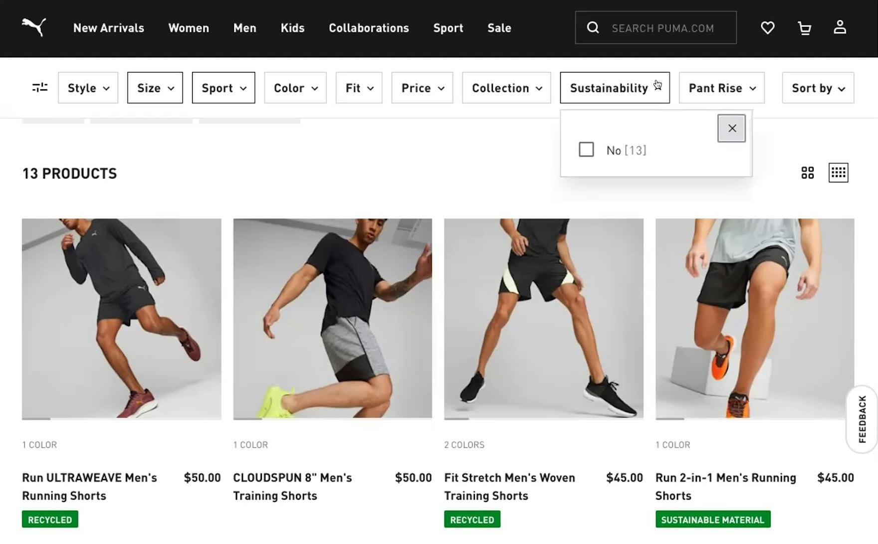
“‘Sustainability’, I’m not sure again…what’s defined as sustainable or not? There’s a lot of filters here. At first glance, I don’t know what a lot of these mean, so they’re not that useful to me.” If they don’t know what filter types mean, users like this participant at Puma may avoid them, thus potentially overlooking suitable items that could be returned by applying this filter.
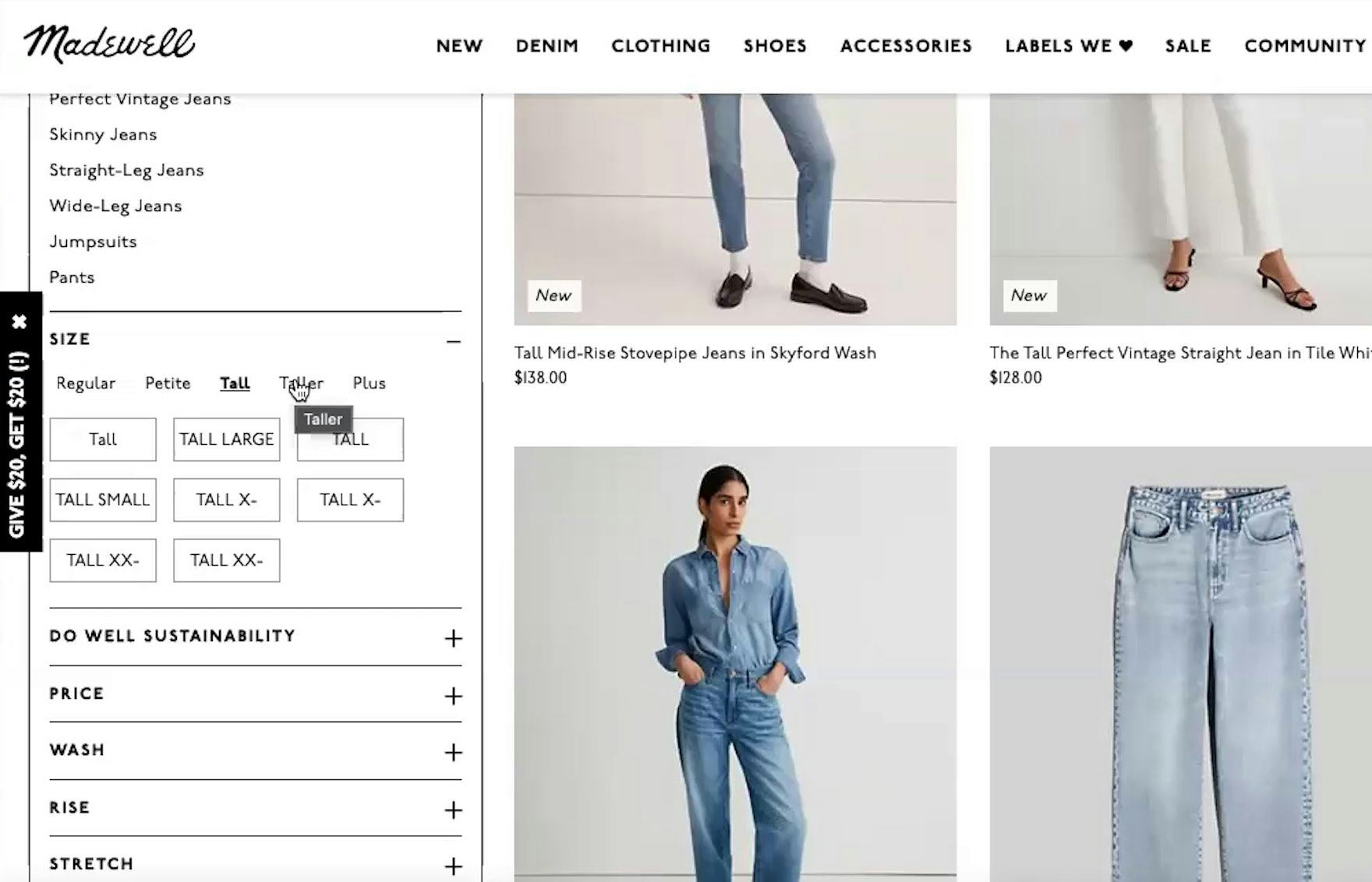
“Oh wow, they have ‘Tall’ and ‘Taller’. I’ve never seen ‘Taller’…I wonder how tall that is.” Without knowing more specifics about the filters, users at Madewell may not apply them and instead have to wade through a larger list with unsuitable items.
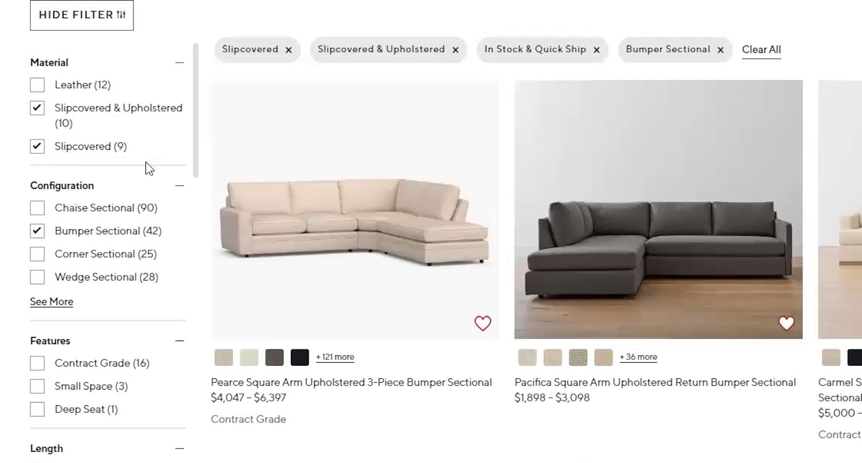
“‘Slip cover’…can they just say ‘fabric’? …I don’t know what that is. I’m just not too familiar with the terminology, I guess.” While some users at Pottery Barn will understand the term “Slipcover”, those who don’t may overlook suitable items mixed in with many undesired ones simply because filters were misunderstood or unapplied.
“Now it’s throwing me off…I know ‘Linen’ and ‘Wool’ are different, but then what’s the difference between ‘Cotton Blend’, ‘Cotton’, and ‘Linen Blend’? Ugh…[I want to see] fewer options, more mainstream. Like, what is this B-O-U-C-L-É? Now you want me to Google this to figure out what that even is?… Should I get something [when] I don’t know what it is?” When users don’t understand filter names, they’re likely to avoid them, like this participant at CB2. If users go offsite to learn the unknown term, there’s a risk they won’t return.
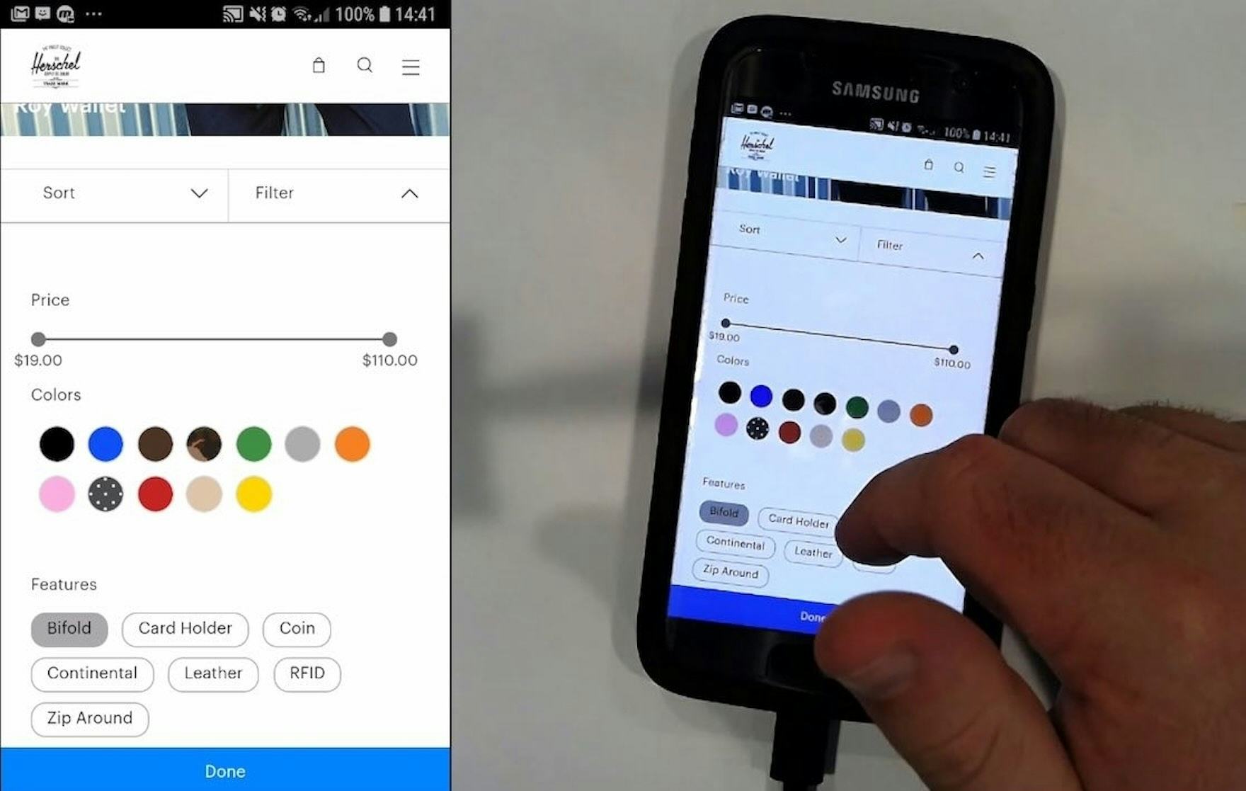
“‘Continental’. Not necessarily sure what ‘Continental’ would refer to, if I’m honest. So, I wouldn’t be looking for that as a feature.” Unclear filters are often left unused if they aren’t immediately understood, as was the case with this participant at Herschel. Another participant struggled with the “RFID” filter option shown here and decided to ignore it: “I don’t know what ‘RFID’ means so, probably a bad call.”
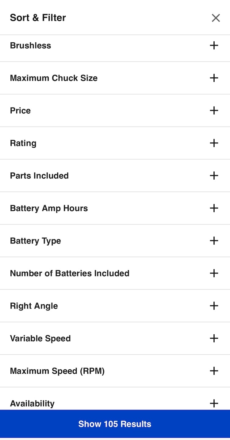
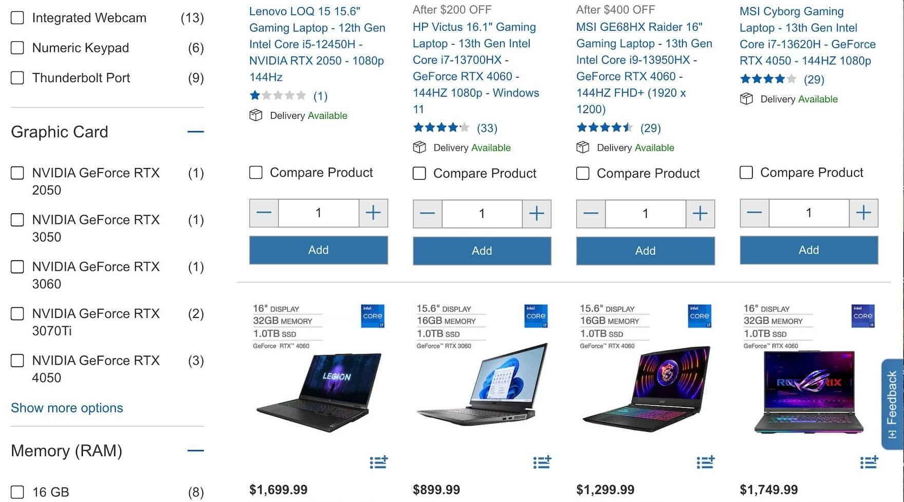
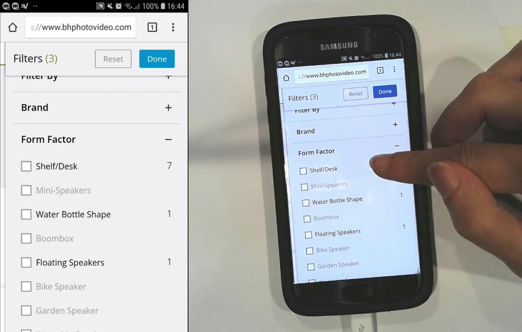
“There’s a lot of them that I wouldn’t even know what they’re for. Like what’s ‘Form Factor’? I wouldn’t even use that filter ‘cause I don’t know what it’s for.” Unclear terms can lead users to miss out on potentially useful filter options and impede their ability to narrow the product list to only items of interest.
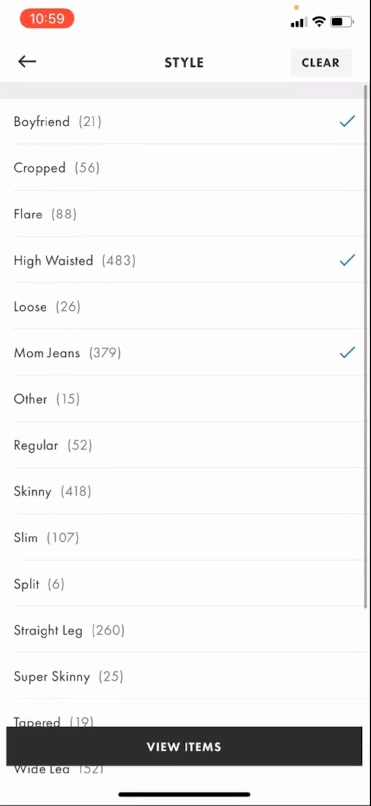
“I don’t know the difference between ‘Skinny’ and ‘Super Skinny’, or ‘Other’ — I mean, I don’t know what that would be.” Apparel “Style” filters can also be confusing for users as was the case for this participant using the Urban Outfitters app (iOS).
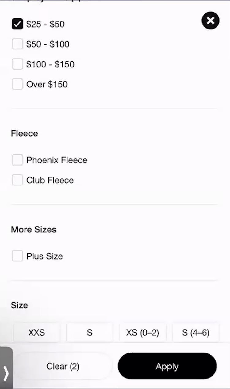
“I don’t know the differences between those types of fleece or else I might pick one, but I’ll just leave it since I don’t know the difference.” By avoiding the filter option she didn’t understand at Nike, this participant may have included many unsuitable items in the product list.
When sites use technical or unfamiliar language in filter types or options, users may be less likely to apply filters — and overlook what in reality are very suitable filters.
For example, a user shopping for sofas who doesn’t know the term “Slipcover” may avoid selecting it but still select other options — meaning that the filtered product list might contain no sofas with this feature.
Thus, if this style were in fact suitable, users could miss out on ideal products.
On the other hand, failing to understand a site’s filter terms could also mean that users may apply filters that they thought meant something else, resulting in product lists that show too many unsuitable items or too few suitable ones.
For example, if a user misunderstood the term “Bouclé” and applied that option, the list could contain so many unsuitable items — if this style didn’t appeal to them — that they would struggle to find a suitable one.
Additionally, users who encounter ambiguous filter options can end up spending time applying and removing filter options just to understand their effect on the product list.
This becomes a tedious process, in particular when the information or thumbnails for each item in the product list do not adequately convey the differences in specs or features between the products.
Mobile users will have an especially difficult time if they must use a separate filtering interface that sends them back to the product list after each filter option is selected.
Finally, a subgroup of users intent on looking up the meaning of an unclear filtering term might leave the site just to figure out what a word or phrase means (“I’ll just Google it”) — which carries the risk that they find alternative product options on other sites and not return.
3 Ways to Clarify Filtering Terms
Clearly labeled filters help users reduce the noise by narrowing down a large list to a smaller, more relevant list that improves the odds users will find a suitable product.
Throughout testing, 3 approaches proved effective in reducing terminology-related issues with regard to filters:
- Avoid industry jargon altogether, if possible
- Explain industry-specific or ambiguous terms that must be retained
- Provide thumbnail images for filters with attributes that can be assessed visually
1) Avoid Industry Jargon
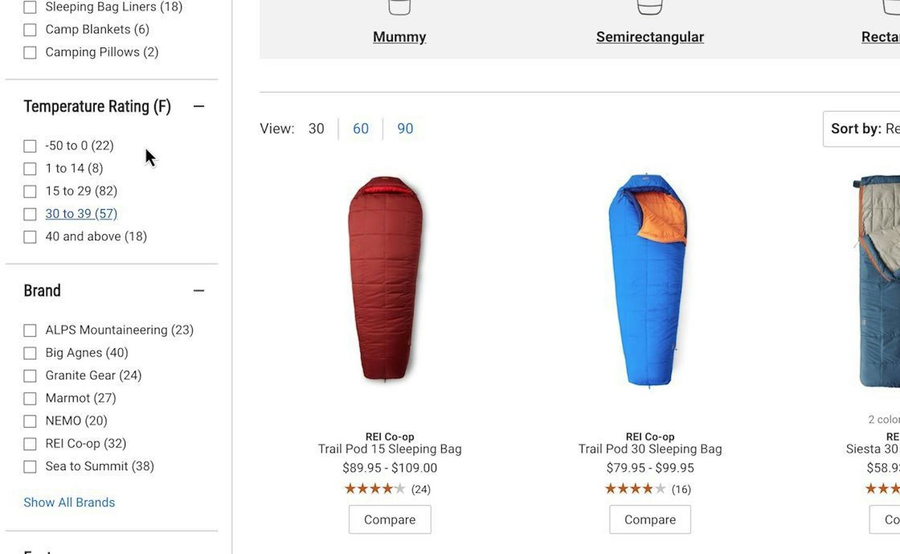
Instead of using jargon like “Season Rating” to label a filter type, REI used a more relatable and common “Temperature” label. As a result, every participant looking to filter sleeping bags by degree of warmth immediately found the correct filter.
If possible, the best solution is to avoid industry jargon entirely.
Instead, use terms in filter types and options that better match the language that your greater audience is likely to find familiar (e.g., “temperature” instead of “season rating”, or “security protection” instead of “RFID”).
Doing so will ensure that the majority of users will understand all filtering options and be able to tailor the product list without unnecessary friction.
2) Explain Industry-Specific or Ambiguous Filters
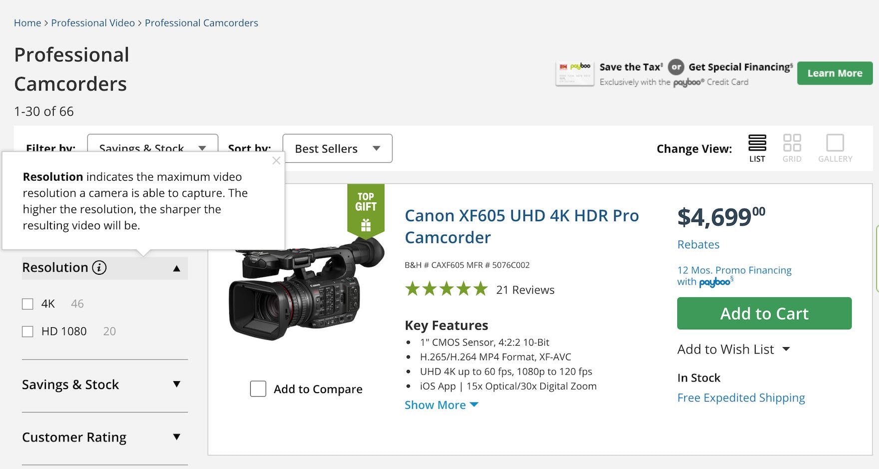
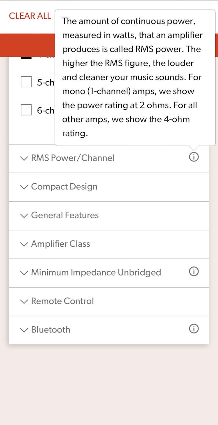
B&H Photo provides tooltips that explain technical terms like video “Resolution”, making it easier for novices to select from the available options (first image). On Crutchfield’s mobile site (second image), industry jargon terms such as “RMS Power/Channel” — likely only understood by audio or electronics enthusiasts — are explained using tooltips that display by tapping on an icon, allowing all users to understand the terms.
Sometimes industry jargon is the only option available or it holds significant value for expert users who rely on it to differentiate products — which means the jargon should be kept.
However, it’s important to then explain the terminology in a way that non-experts can understand, saving users the trouble of leaving the site to search for its meaning: “‘RAM’ means random-access memory. This helps your computer tackle multiple tasks at once. A minimum of 2GB is required for basic tasks, but 8GB or more is recommended for gaming or video editing.”
The explanatory content should be placed right where the tricky terms are found in the filtering component — typically at the filter-type level or at the filtering options themselves.
Helpful definitions are best served up in a tooltip on desktop sites or as a tappable link or icon on mobile platforms.
On mobile, take care to ensure that the link or icon for viewing the explanations are sufficiently sized and have enough space around them to ensure that they are easy to tap.
When considering which filtering terms need to be explained, we recommend running tests with novice users to identify any problematic filtering labels that could benefit from more clarity.
However, a good rule of thumb is to provide explanations for category-specific filters, as these can vary from industry to industry — and even from site to site — and are most likely to be unfamiliar to users.
3) Provide Thumbnail Images for Visual Filters
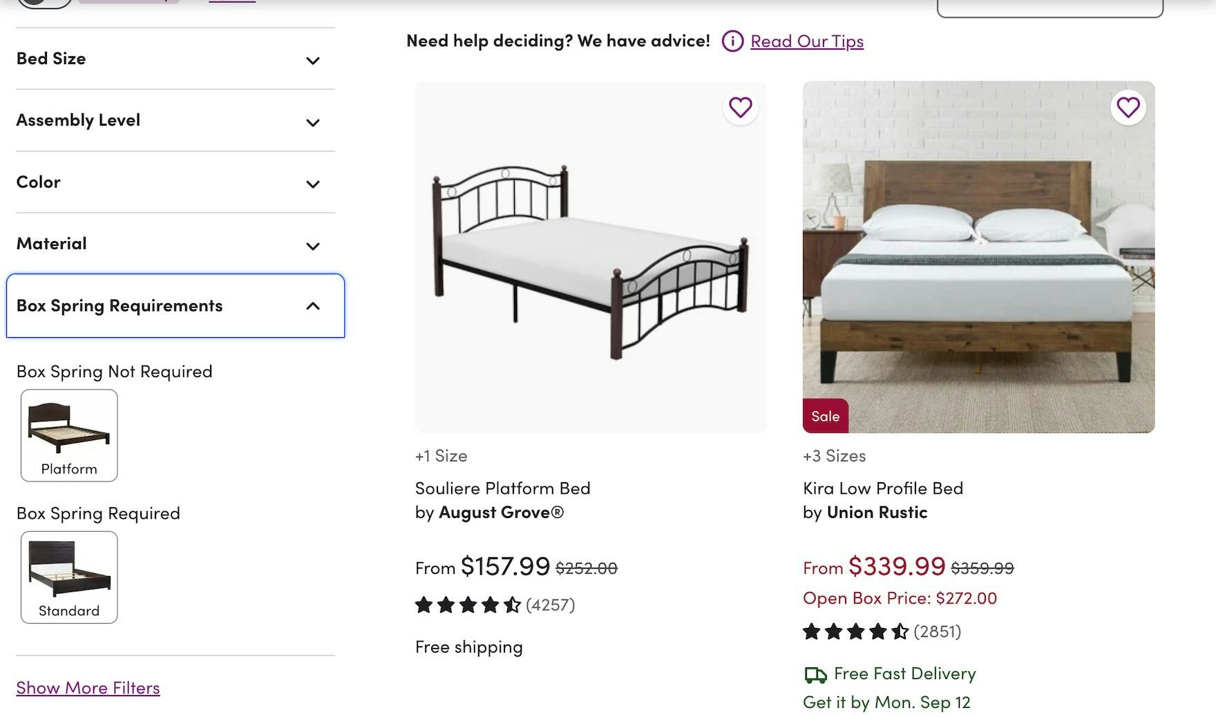
Filter options for “Box Spring Requirements” here at Wayfair are accompanied by thumbnails that illustrate each of the 2 options, allowing users who have never encountered the term “Box Springs” before to choose the right option for their needs.
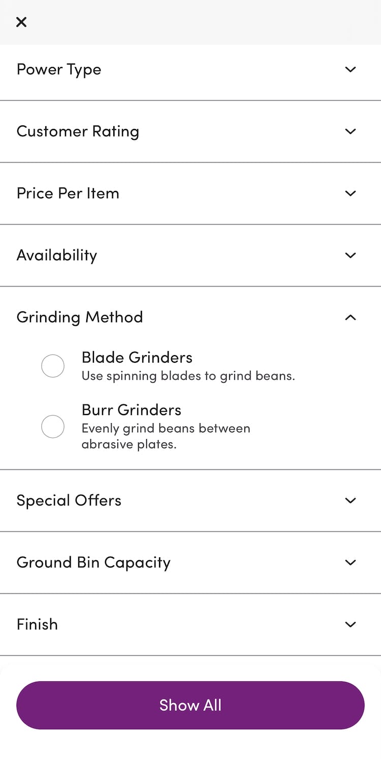
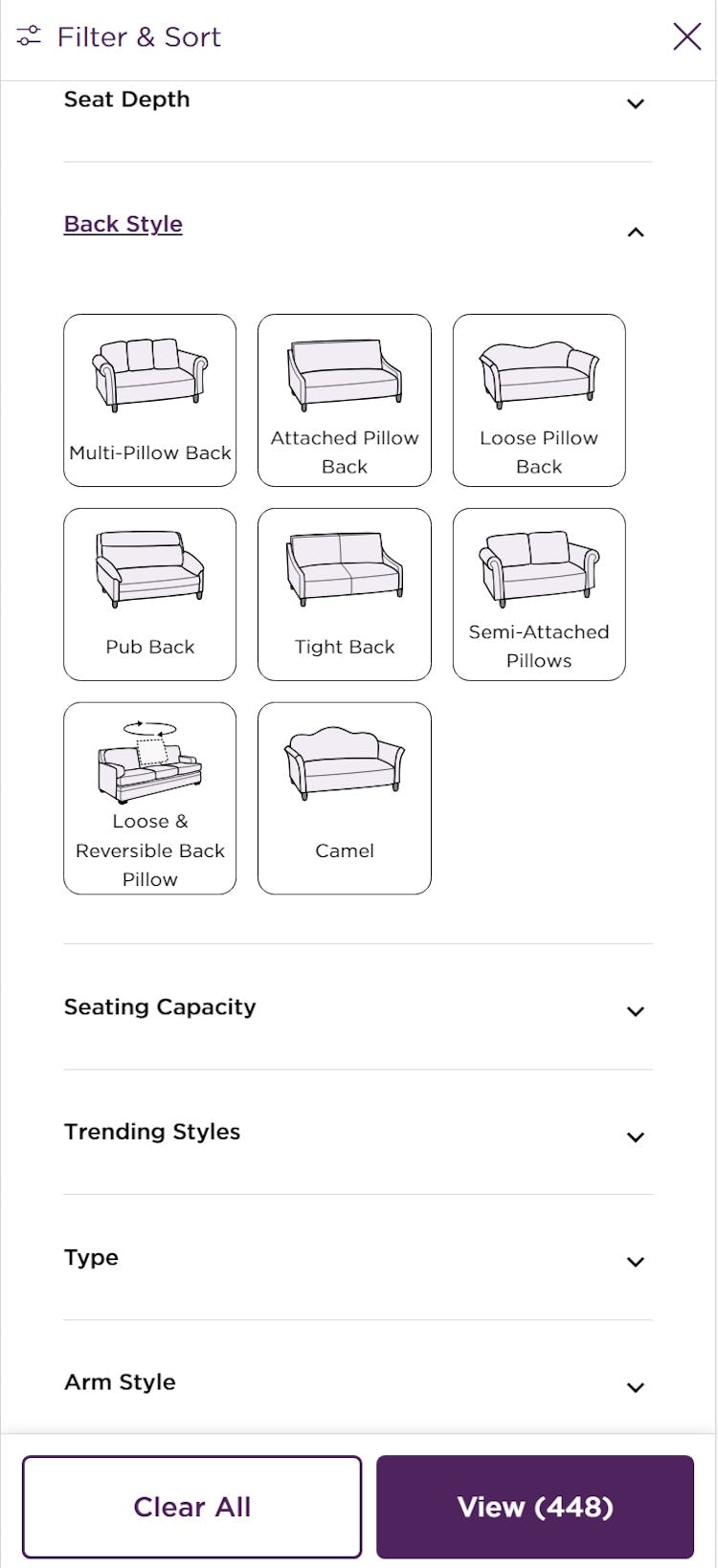
If the filtering relies on visual characteristics to differentiate the options, using thumbnails alongside the name of the filter type or option makes it easier for users to identify those distinguishing attributes without having to rely only on text labels — for example, thumbnails of different types of wine racks or sofas enable users to identify differences at a glance without necessarily having had any prior experience with the product type.
Clarify Filter Language to Improve the Accuracy of Filtered Product Lists
As our research has shown, exploring and refining e-commerce product lists can be challenging for users.
Thus, to encourage customer stickiness, it’s important that all users, not just domain experts, are able to use product filters quickly and accurately.
It’s therefore important to
- forgo jargon or provide explanations of filter types and options or
- provide explanations for industry-specific filters (including visual explanations such as thumbnails where appropriate).
Doing so will allow users to adequately narrow product lists.
Yet 62% of sites use technical or ambiguous filtering language (with no in-component help for users) or lack visual thumbnails that more easily identify product attributes, forcing some users to leave sites due to filtering problems.
This article presents the research findings from just 1 of the 700+ UX guidelines in Baymard – get full access to learn how to create a “State of the Art” ecommerce user experience.
If you want to know how your desktop site, mobile site, or app performs and compares, then learn more about getting Baymard to conduct a UX Audit of your site or app.

![“Now it’s throwing me off…I know ‘Linen’ and ‘Wool’ are different, but then what’s the difference between ‘Cotton Blend’, ‘Cotton’, and ‘Linen Blend’? Ugh…[I want to see] fewer options, more mainstream. Like, what is this B-O-U-C-L-É? Now you want me to Google this to figure out what that even is?… Should I get something [when] I don’t know what it is?” When users don’t understand filter names, they’re likely to avoid them, like this participant at CB2. If users go offsite to learn the unknown term, there’s a risk they won’t return.](https://baymard-assets-cdn.imgix.net/research/media_files/attachments/93933/original/research-media-file-0332a5ffc8eee8d4be9952cb63785716.jpg?auto=format&dpr=2&fit=max&q=50&w=880)
![“I probably wouldn’t filter cause I don’t know how helpful that would be…I was trying to see if there’s pictures when you filter. Out of all those options, I knew what ‘Mid Century’ was, but I don’t know about all the other ones. So this would definitely add to my searching process. If they had pictures, [it] would make it a lot quicker.” The lack of any visual aids to explain the meaning of each filter option made finding suitable items that much more difficult for this participant at Ashley Furniture.](https://baymard-assets-cdn.imgix.net/research/media_files/attachments/93841/original/research-media-file-9adbcc657a43b2b067b89d78b204df66.jpg?auto=format&dpr=2&fit=max&q=50&w=880)
![“You can actually really narrow it down a lot more effectively here because I don’t know what many of these words [mean]…’Trestle’ is a little out of my regular lexicon. So having a visual aid is super helpful there.” Similarly, on Wayfair’s mobile site, thumbnails illustrating the different types of tables help users — even those who haven’t shopped for these items before — pick the right filter option.](https://baymard-assets-cdn.imgix.net/research/media_files/attachments/93844/original/research-media-file-09ade7465e59998c122ce881f6e8904c.jpg?auto=format&dpr=2&fit=max&q=50&w=880)
