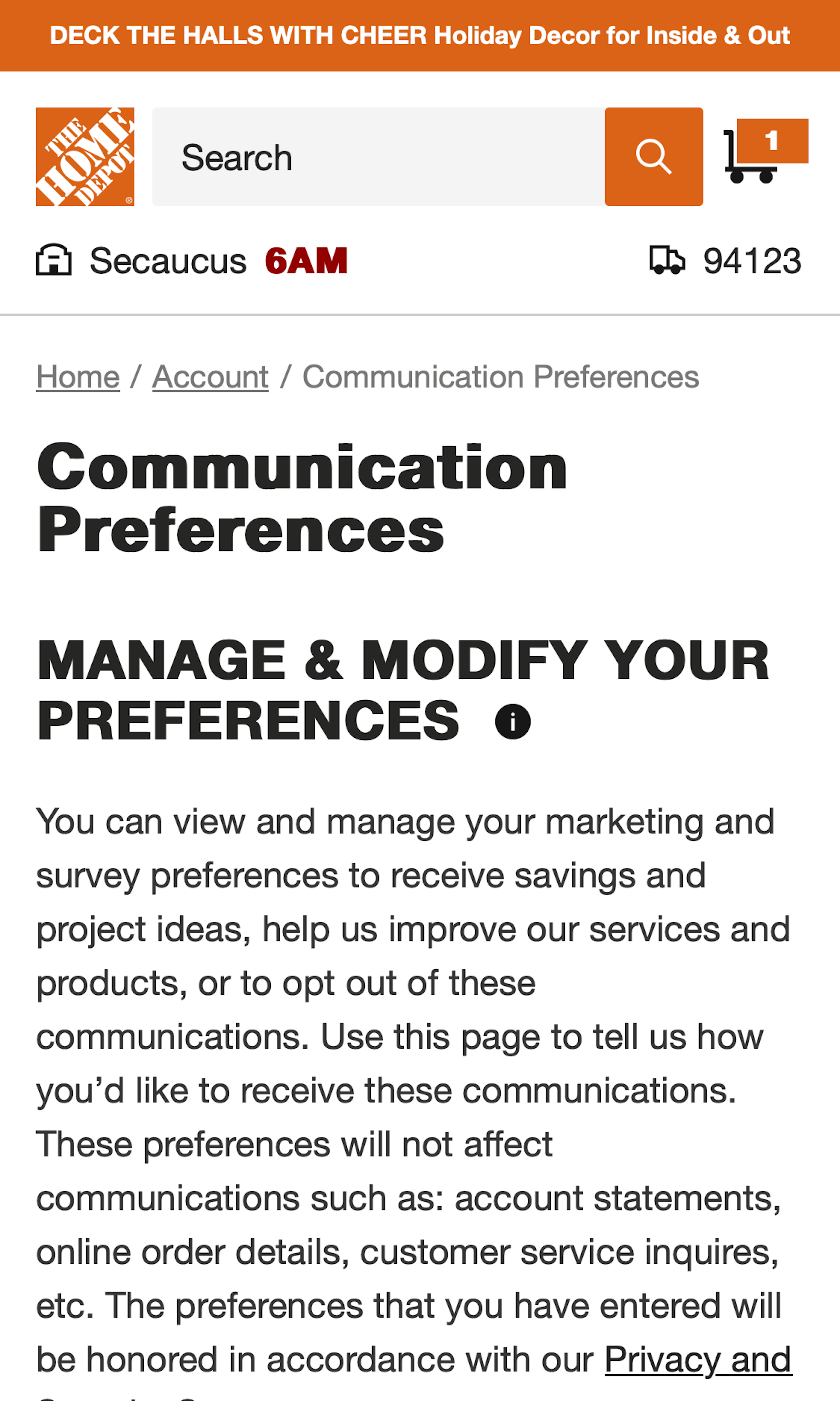
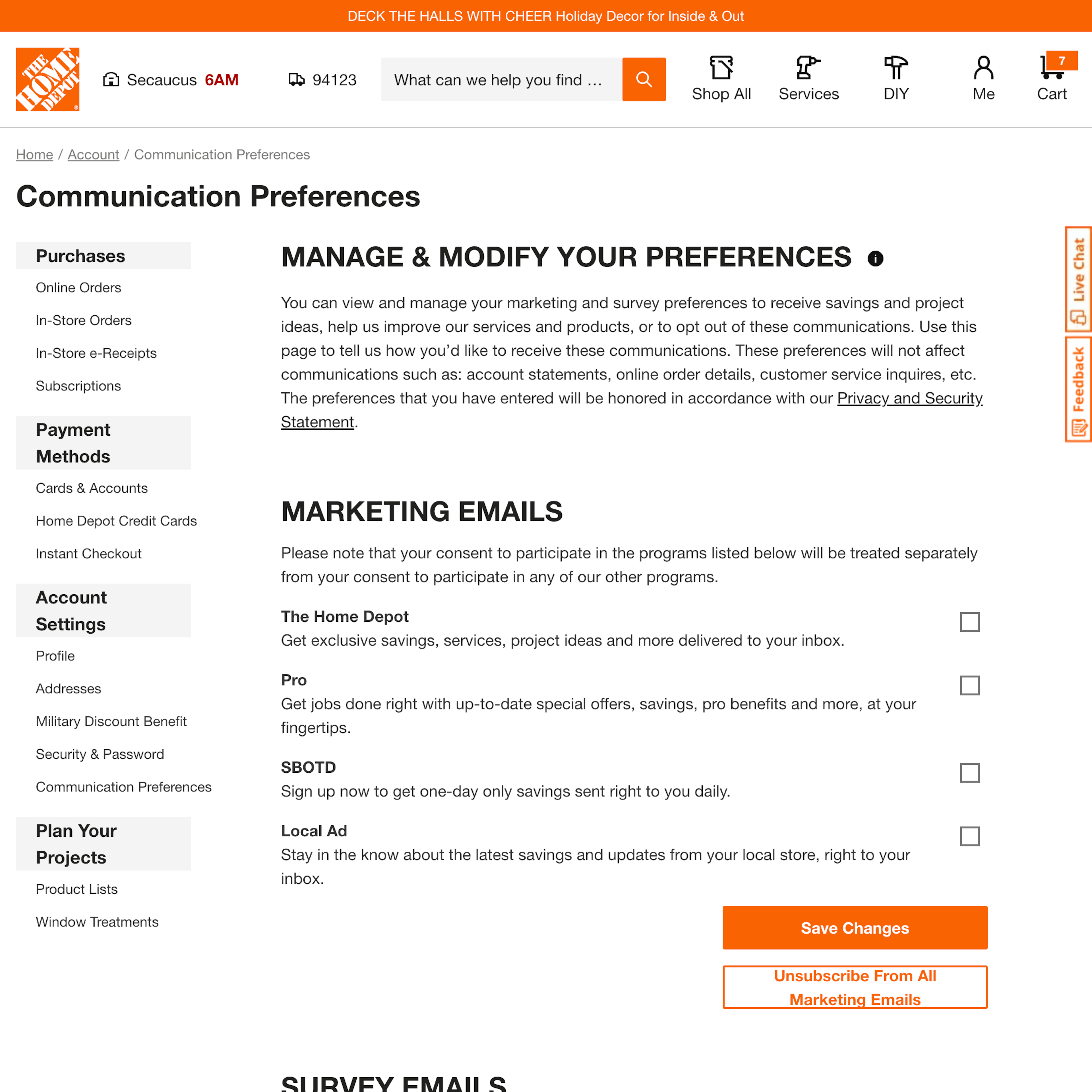
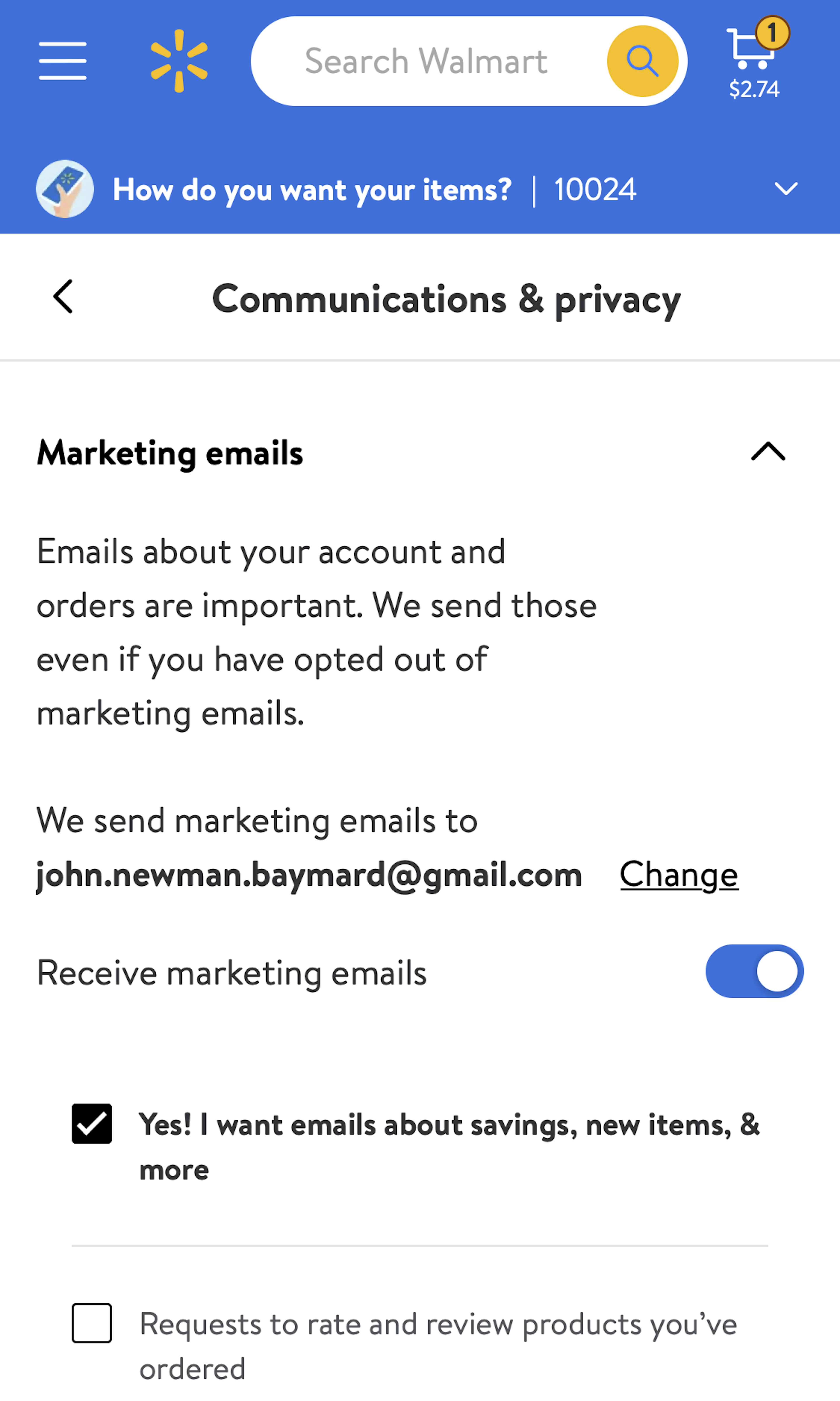
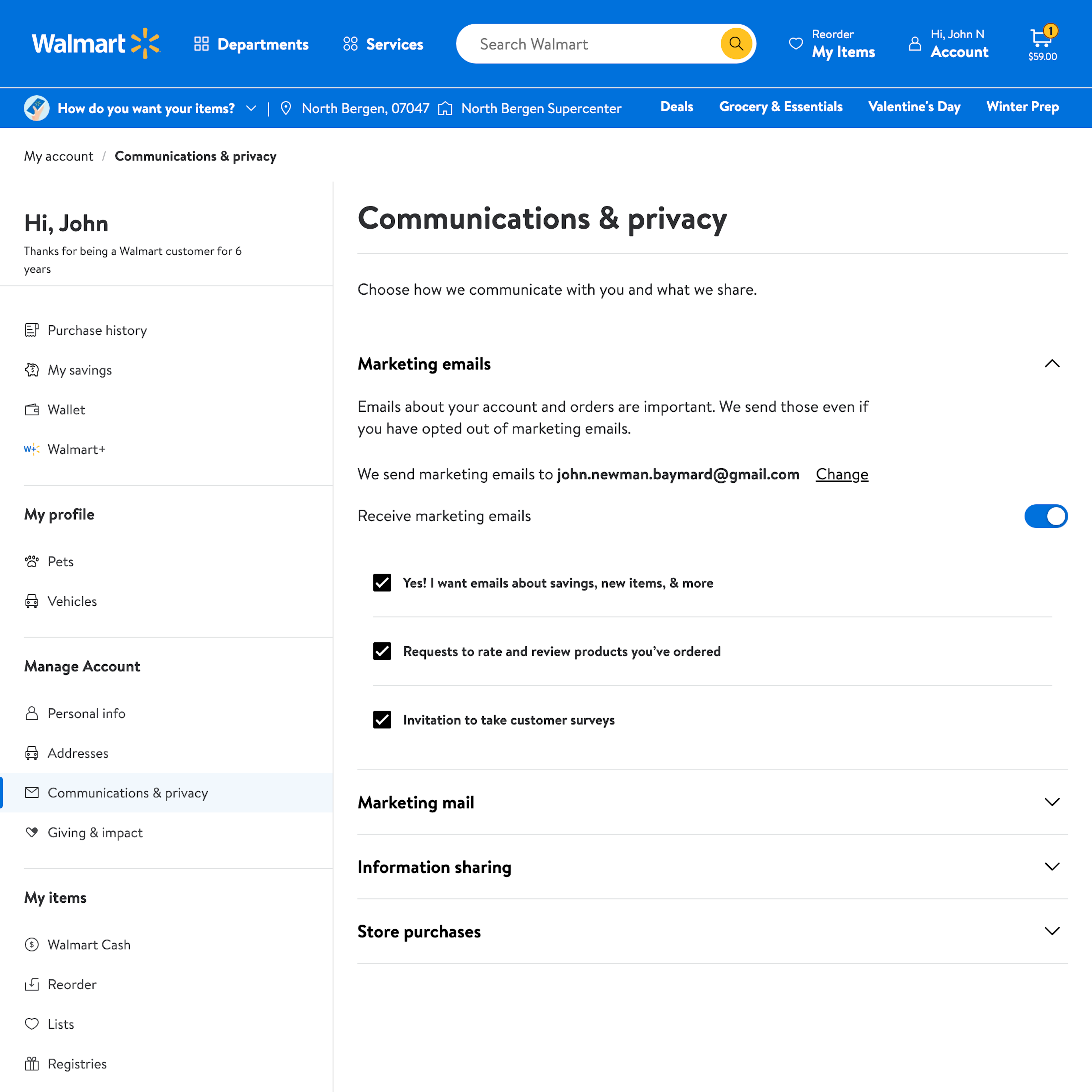
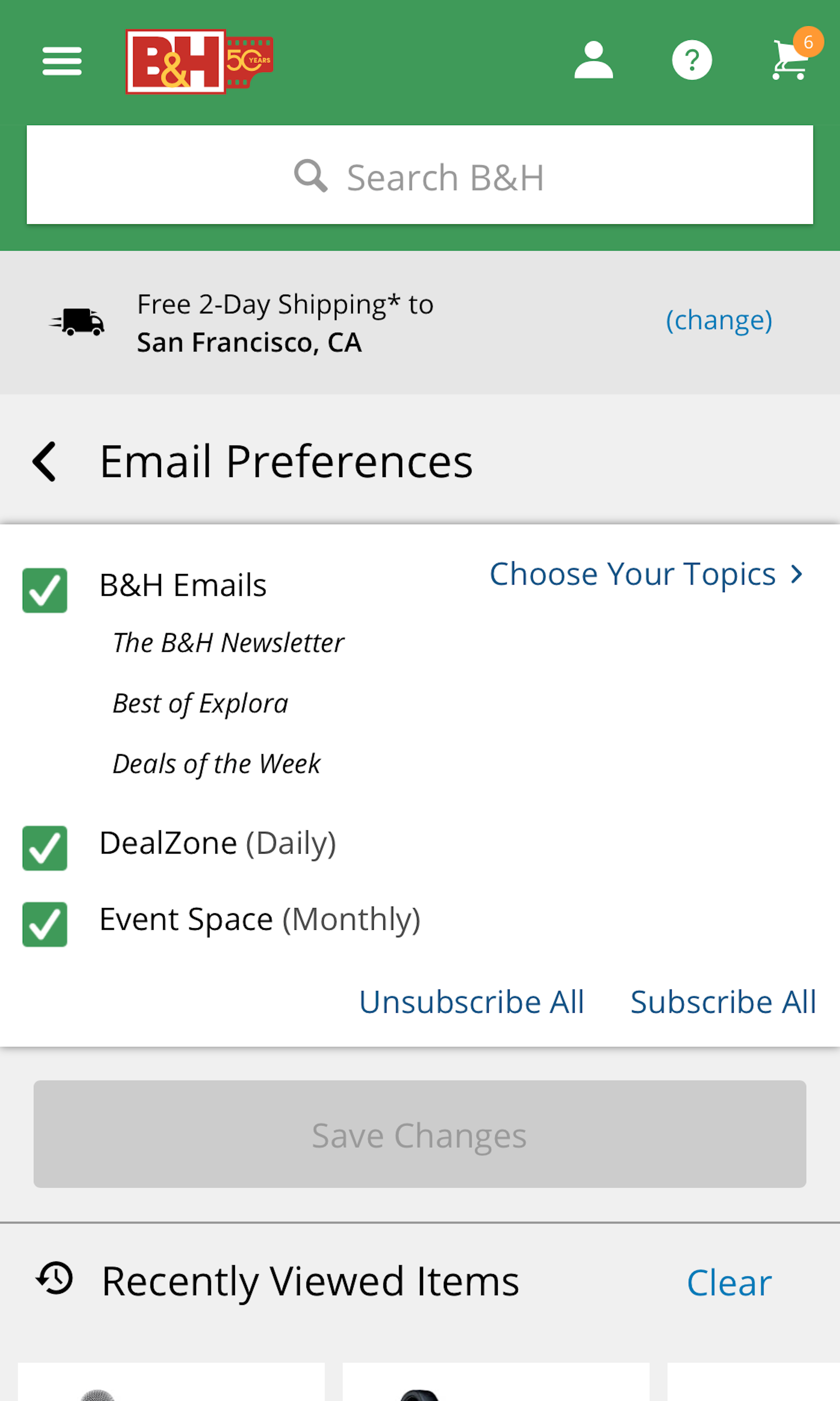
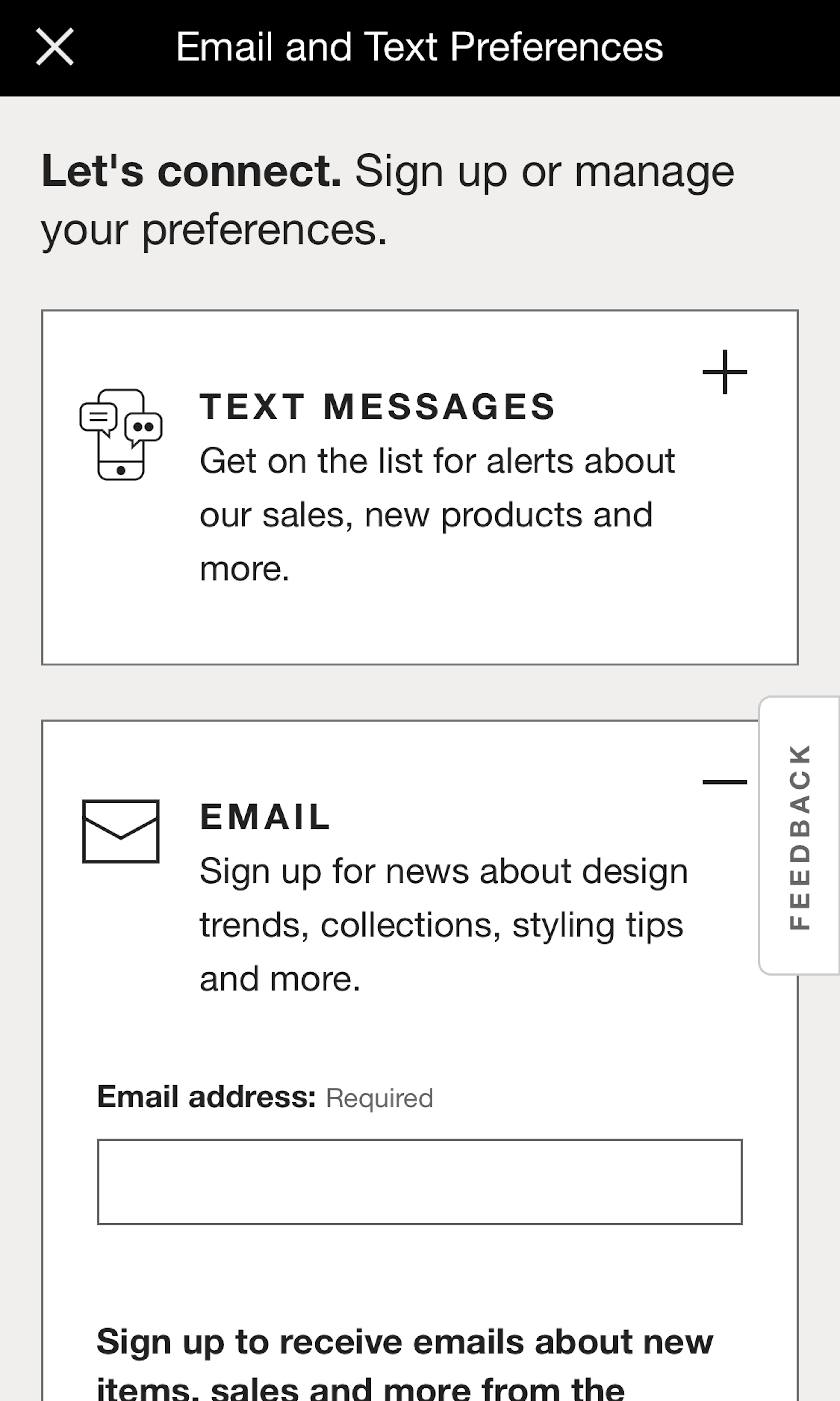
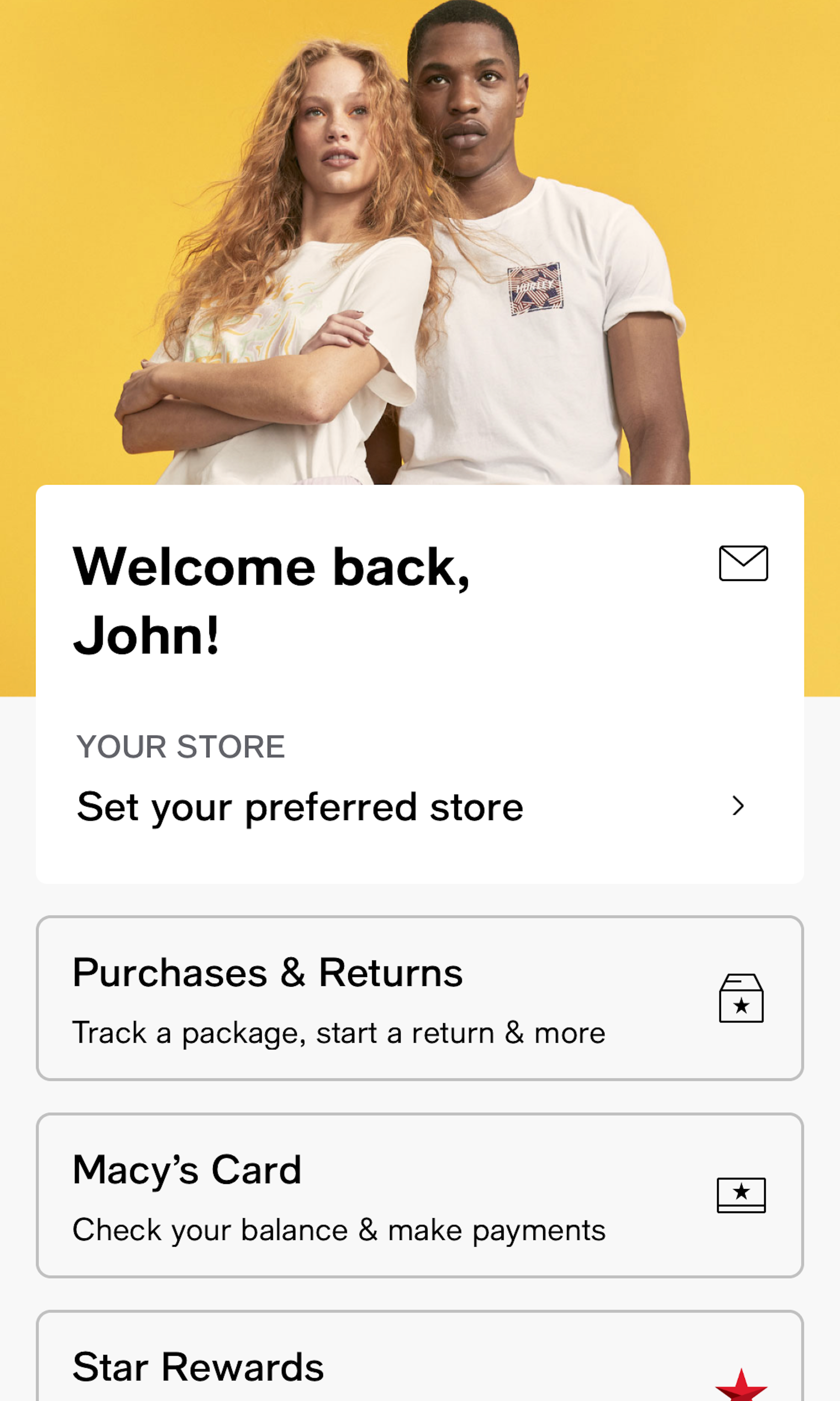
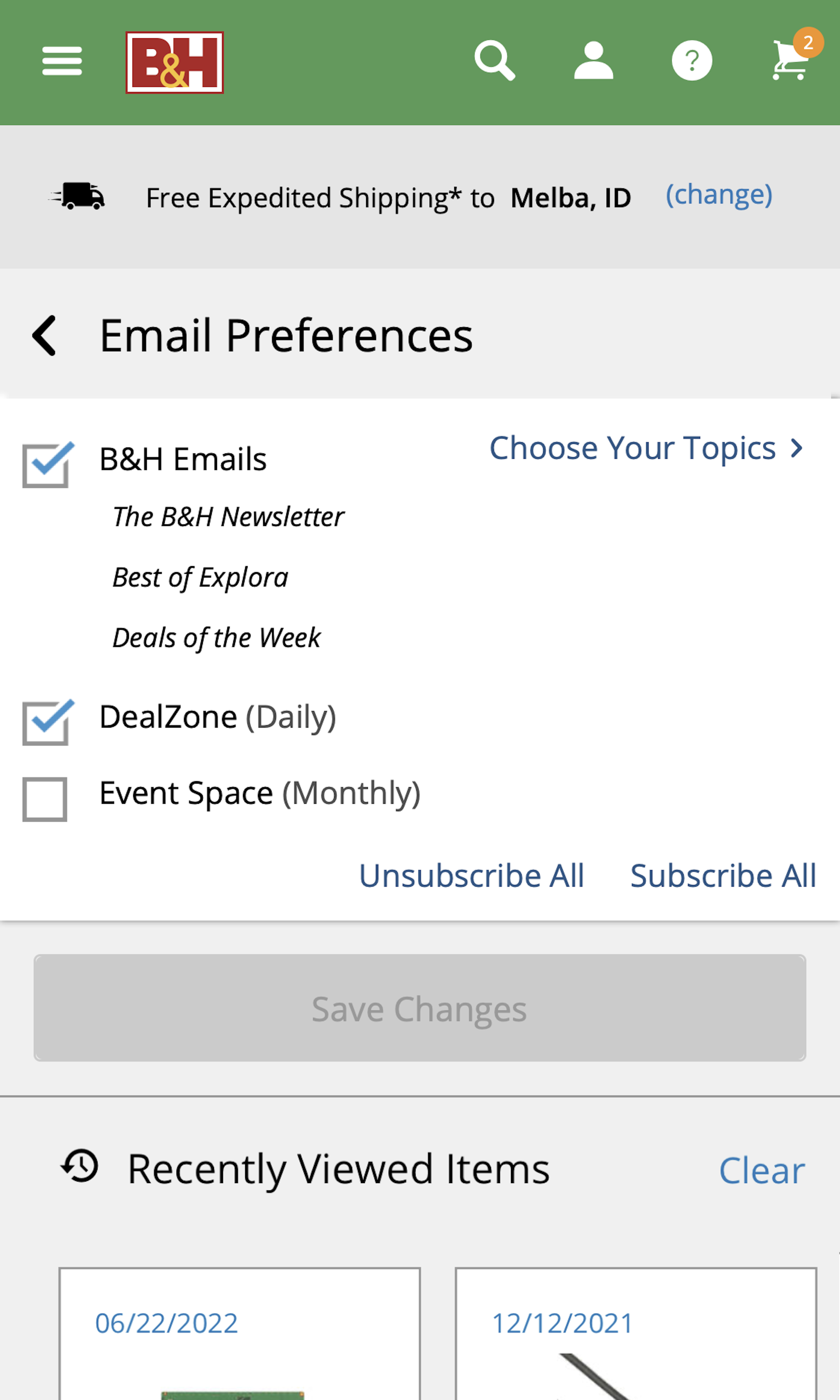
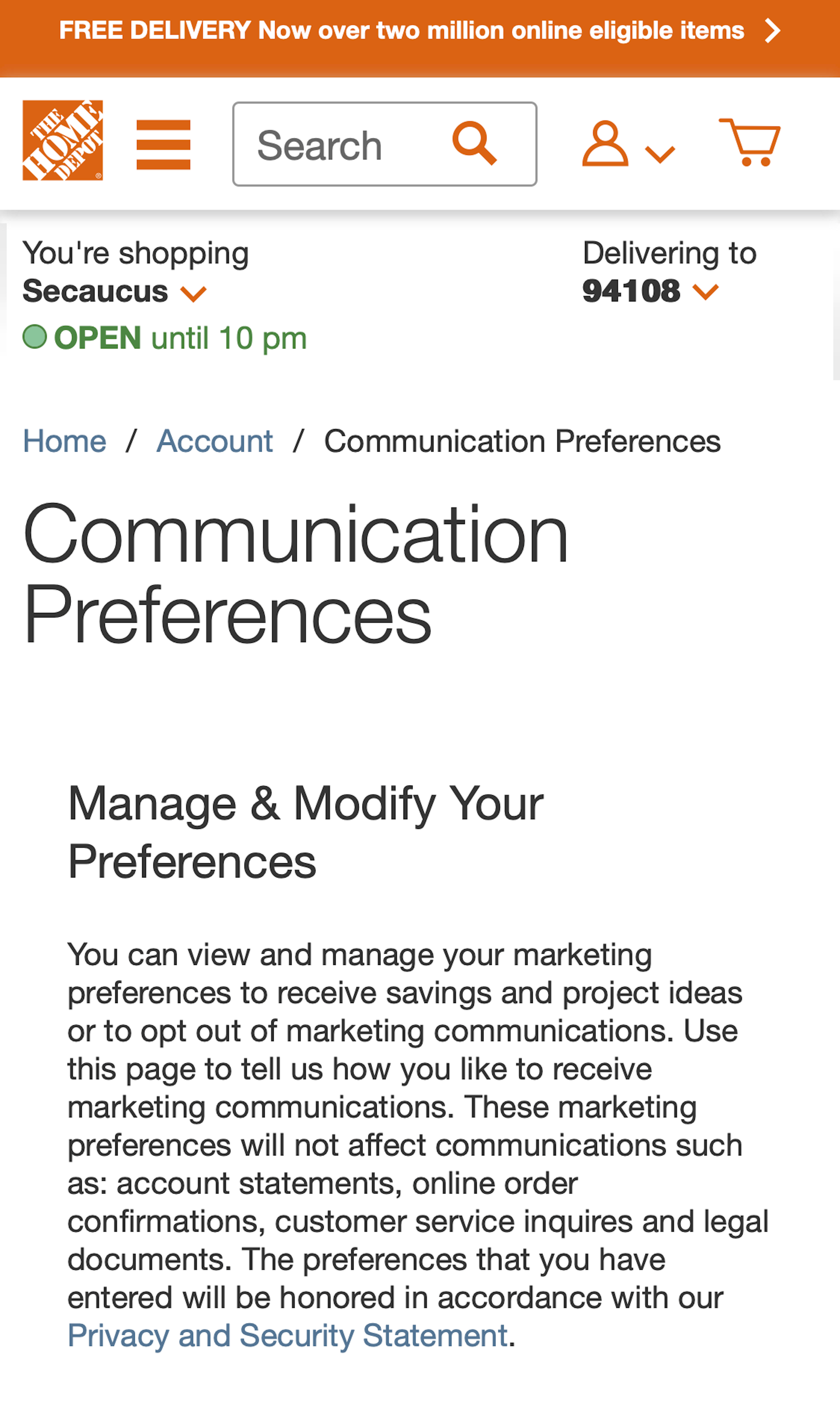
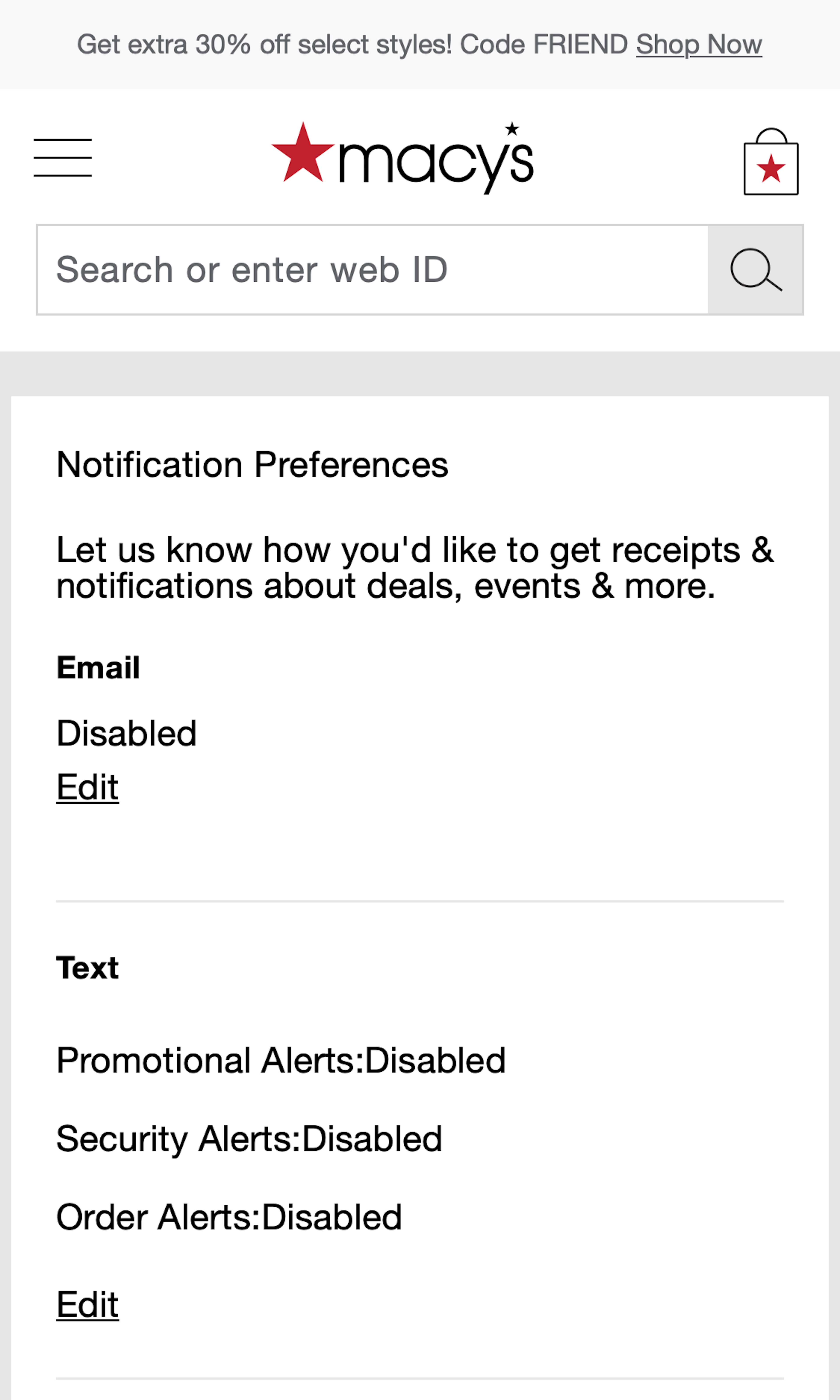
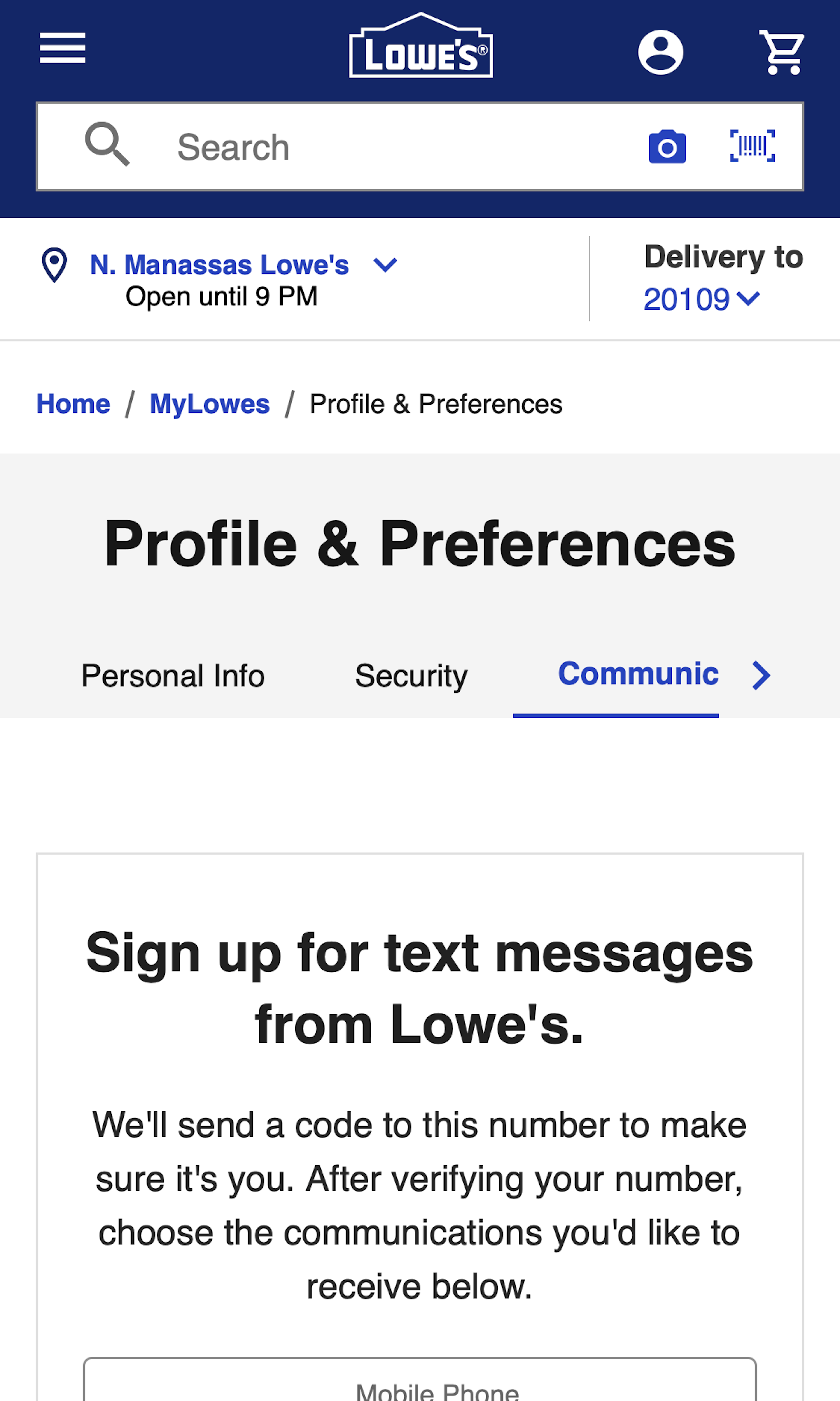
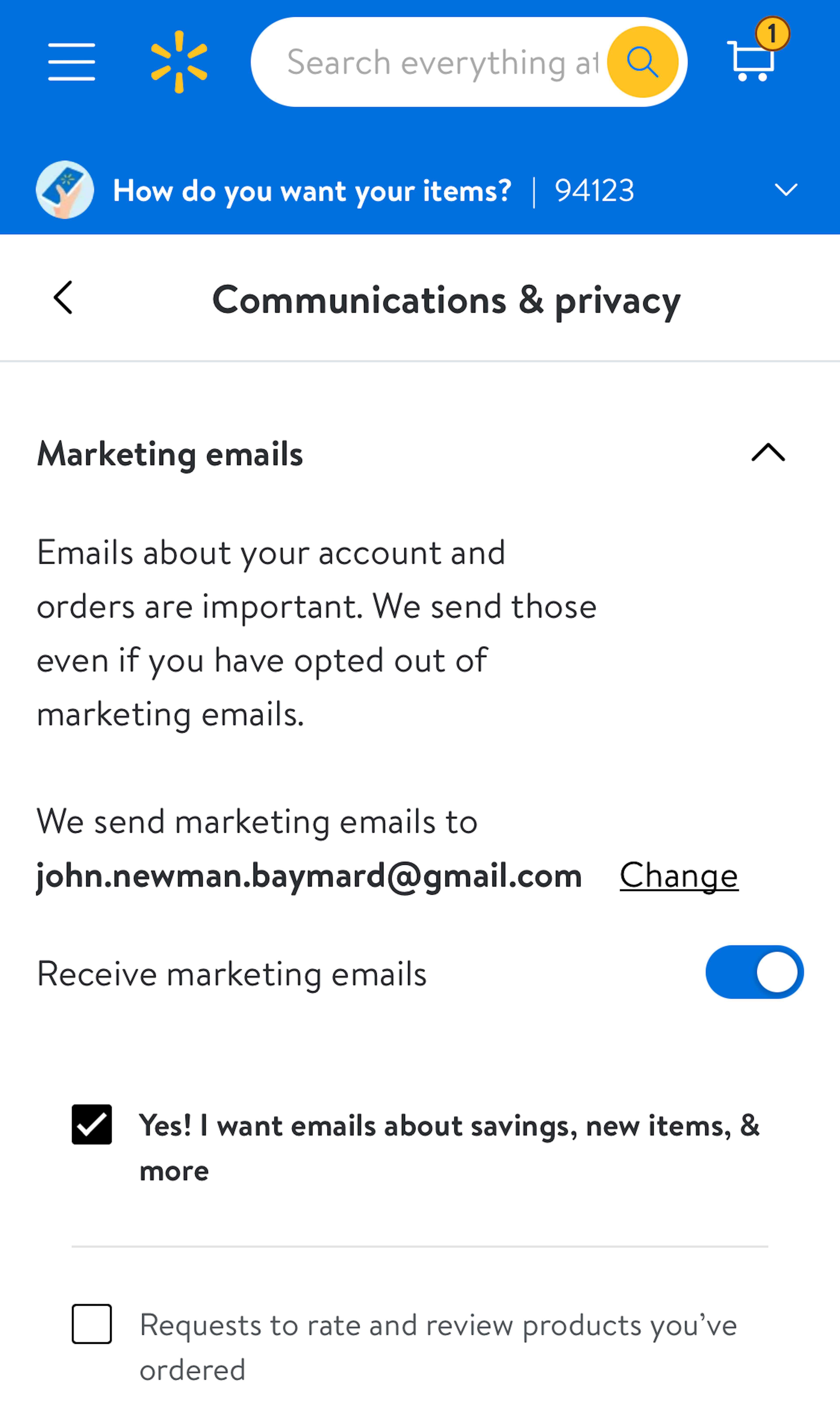
544 ‘Newsletter Management’ Design Examples
Also referred to as: Newsletter Preferences, Newsletter Subscriptions
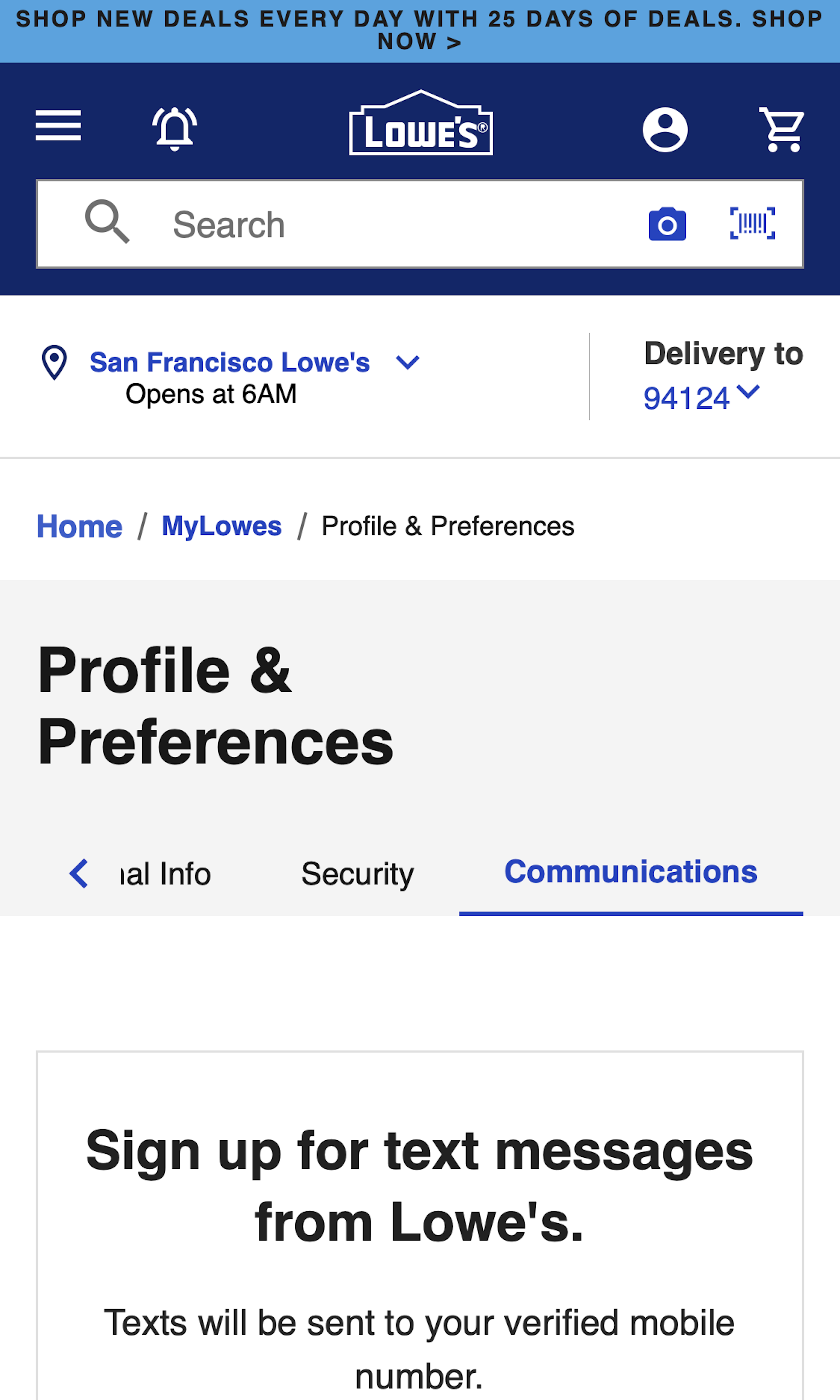
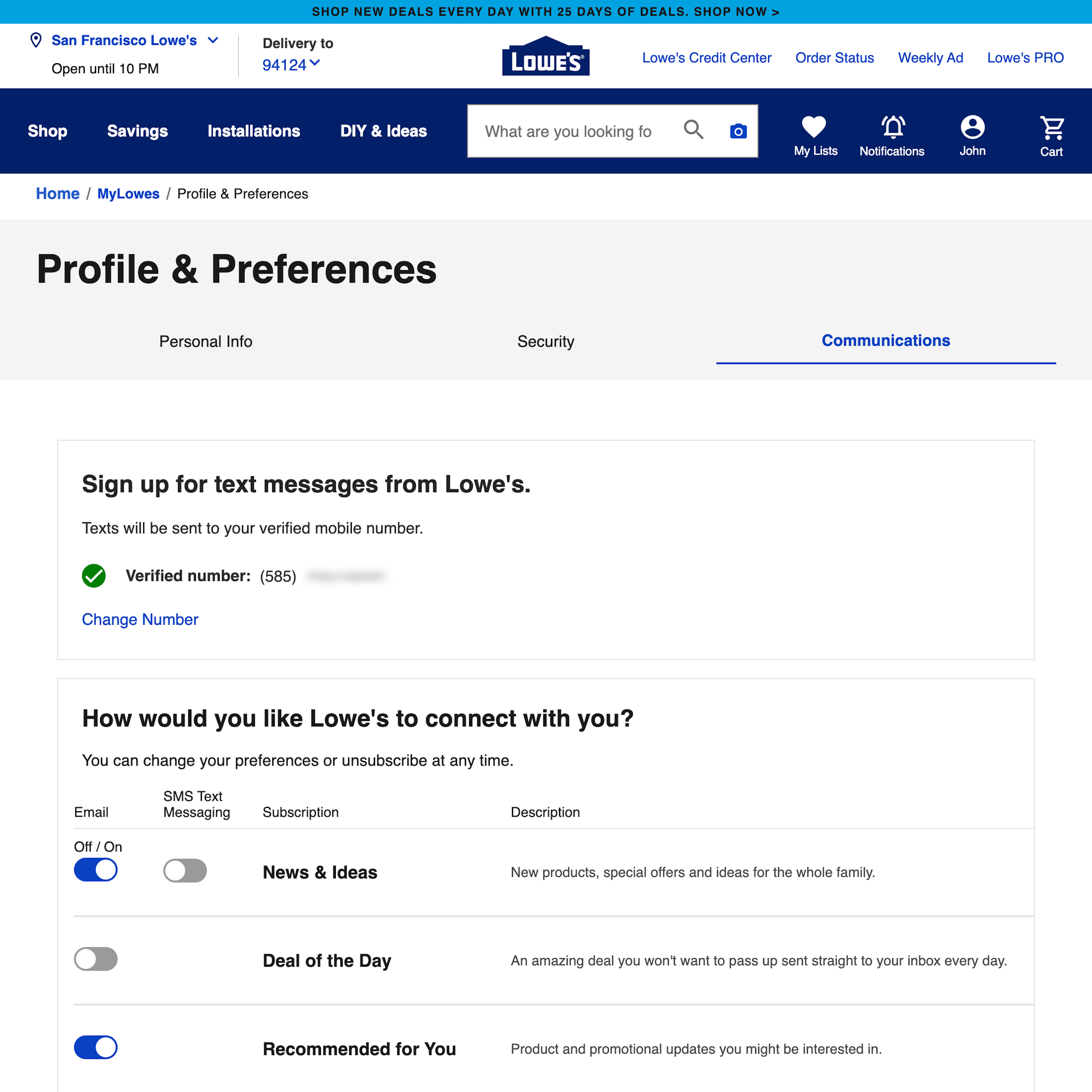
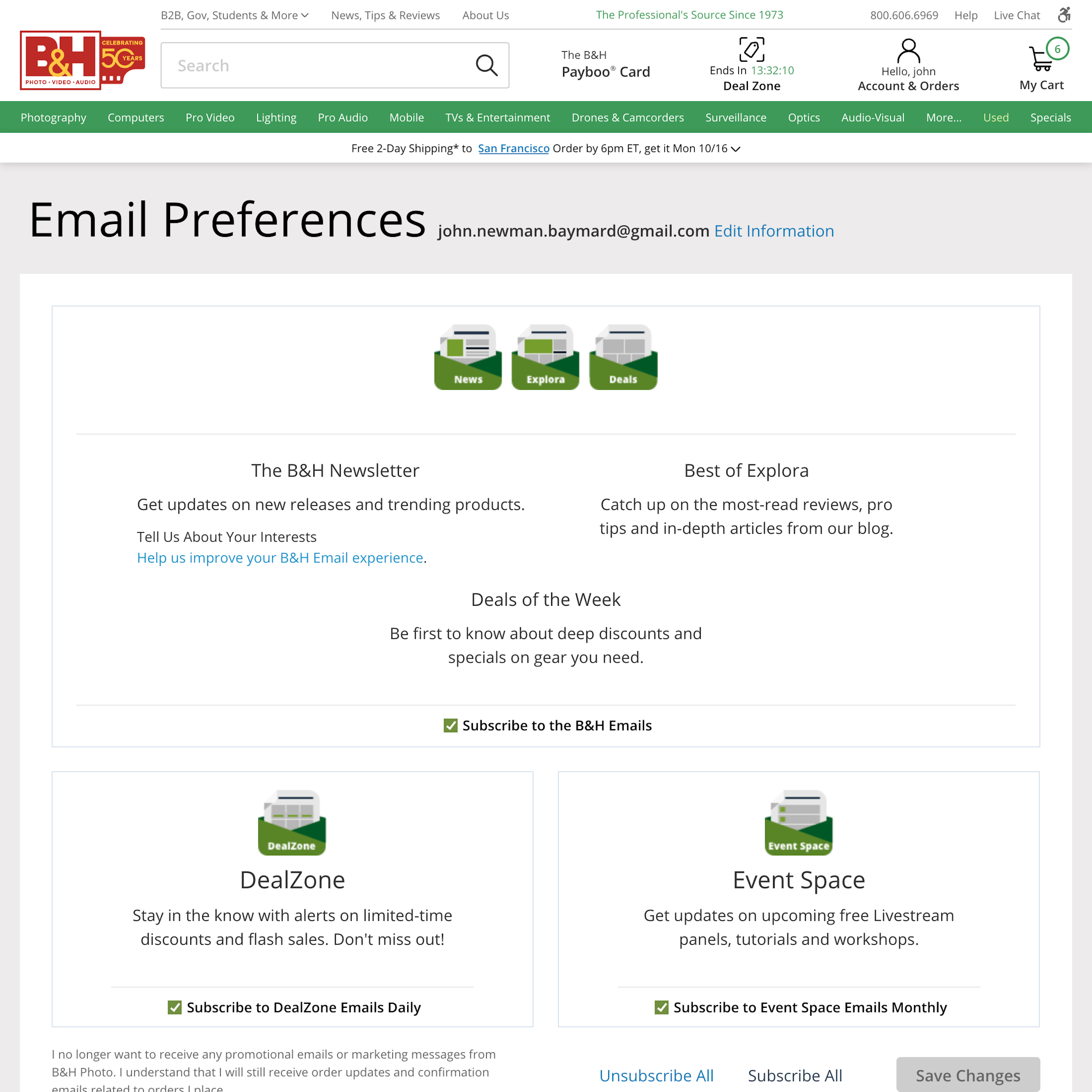
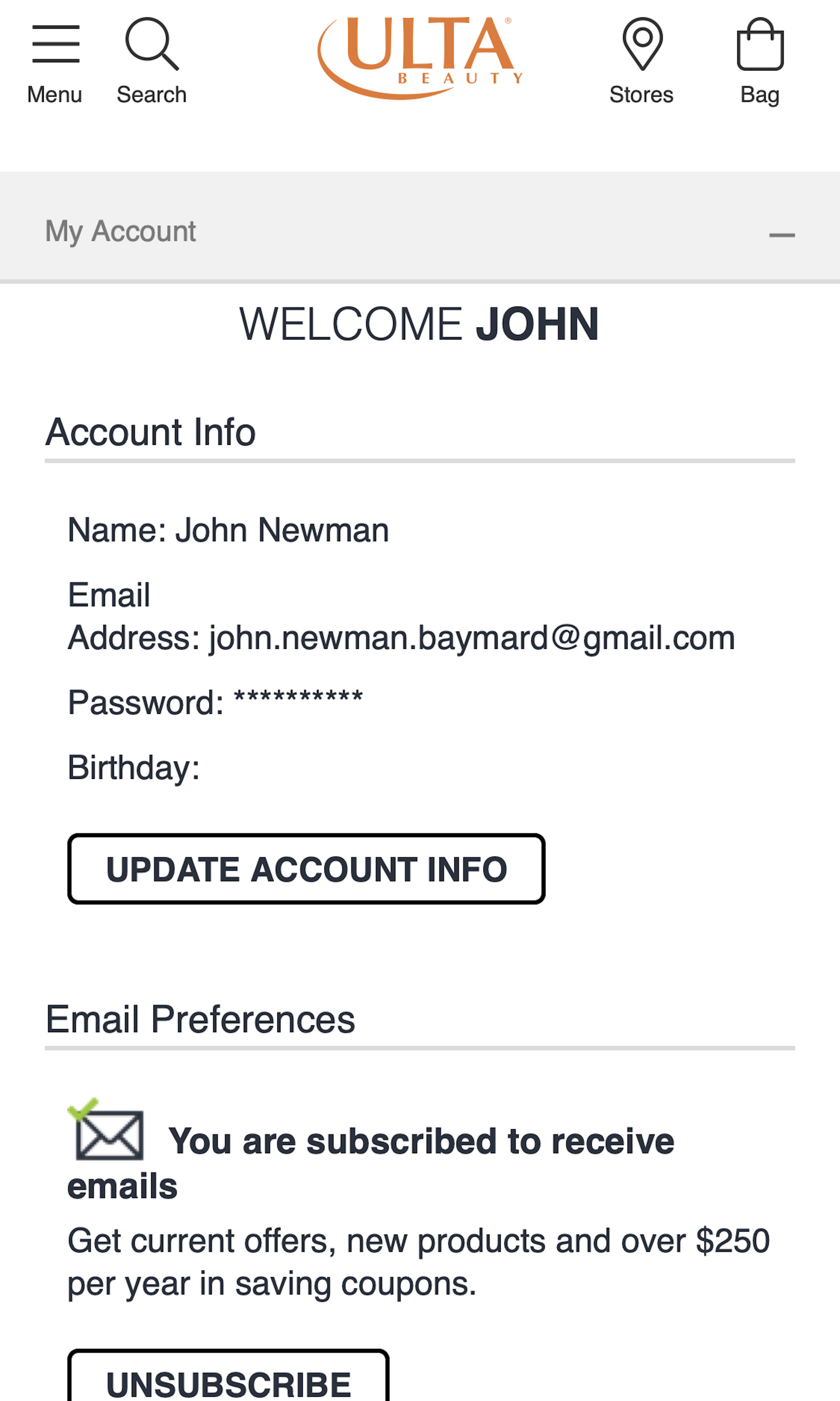
What’s this? Here you’ll find 544 “Newsletter Management” full-page screenshots annotated with research-based UX insights, sourced from Baymard’s UX benchmark of 326 e-commerce sites. (Note: this is less than 1% of the full research catalog.)
Newsletters are still the main way most e-commerce sites communicate with users on a regular basis. Yet, our large-scale usability testing of Accounts & Self-Service features revealed that many e-commerce sites have sub-standard newsletter management features. To take just one example, we’ve found that the second-most common reason why users unsubscribe from newsletters is because they get too many from a specific e-commerce site. At the same time our testing reveal that many e-commerce sites don’t even allow users to adjust how frequently they want to receive newsletters — forcing many users to simply unsubscribe entirely from the site’s newsletters.
More ‘Newsletter Management’ Insights
Our quantitative study of why users choose to unsubscribe from e-commerce newsletters.
-
We also observe that the online newsletter management interface often fail to use recognizable terminology to make it easy for users to locate and understand their newsletter subscriptions, along with often suffering from issues related to how users actually “Apply” changes to their newsletter setting.
-
Learn More: Besides exploring the 544 “Newsletter Management” design examples below, you may also want to read our related article on New Research Findings on ‘Accounts & Self-Service’ UX”.
-
Get Full Access: To see all of Baymard’s design guidelines on Accounts & Self-Service pages and features you’ll need Baymard Premium access. (Premium also provides you full access to 200,000+ hours of UX research findings, 650+ e-commerce UX guidelines, and 275,000+ UX performance scores.)
User Experience Research, Delivered Weekly
Join 60,000+ UX professionals and get a new UX article every week.

User Experience Research, Delivered Weekly
Join 60,000+ UX professionals and get a new UX article every week.

Explore Other Research Content

300+ free UX articles based on large-scale research.

326 top sites ranked by UX performance.

Code samples, demos, and key stats for usability.


