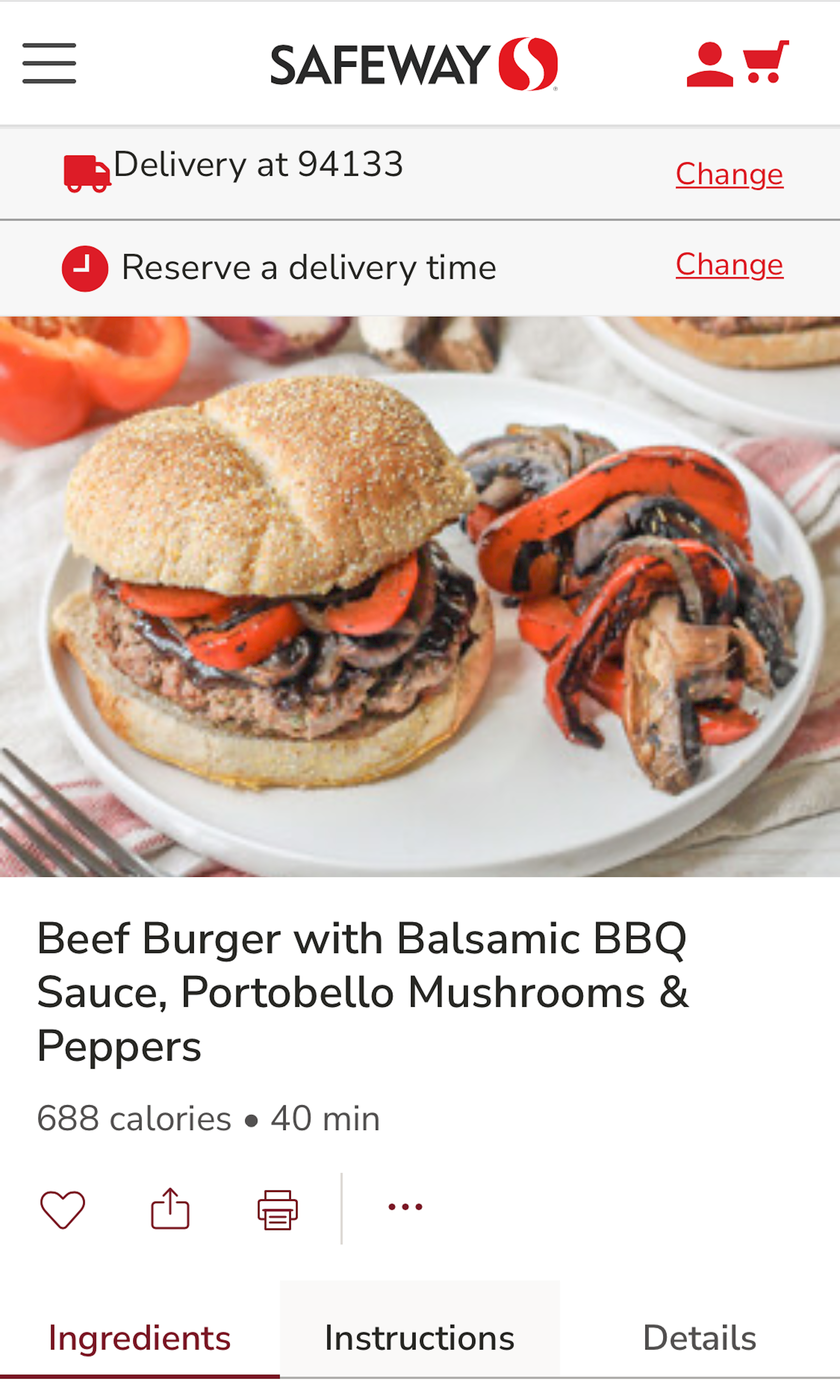
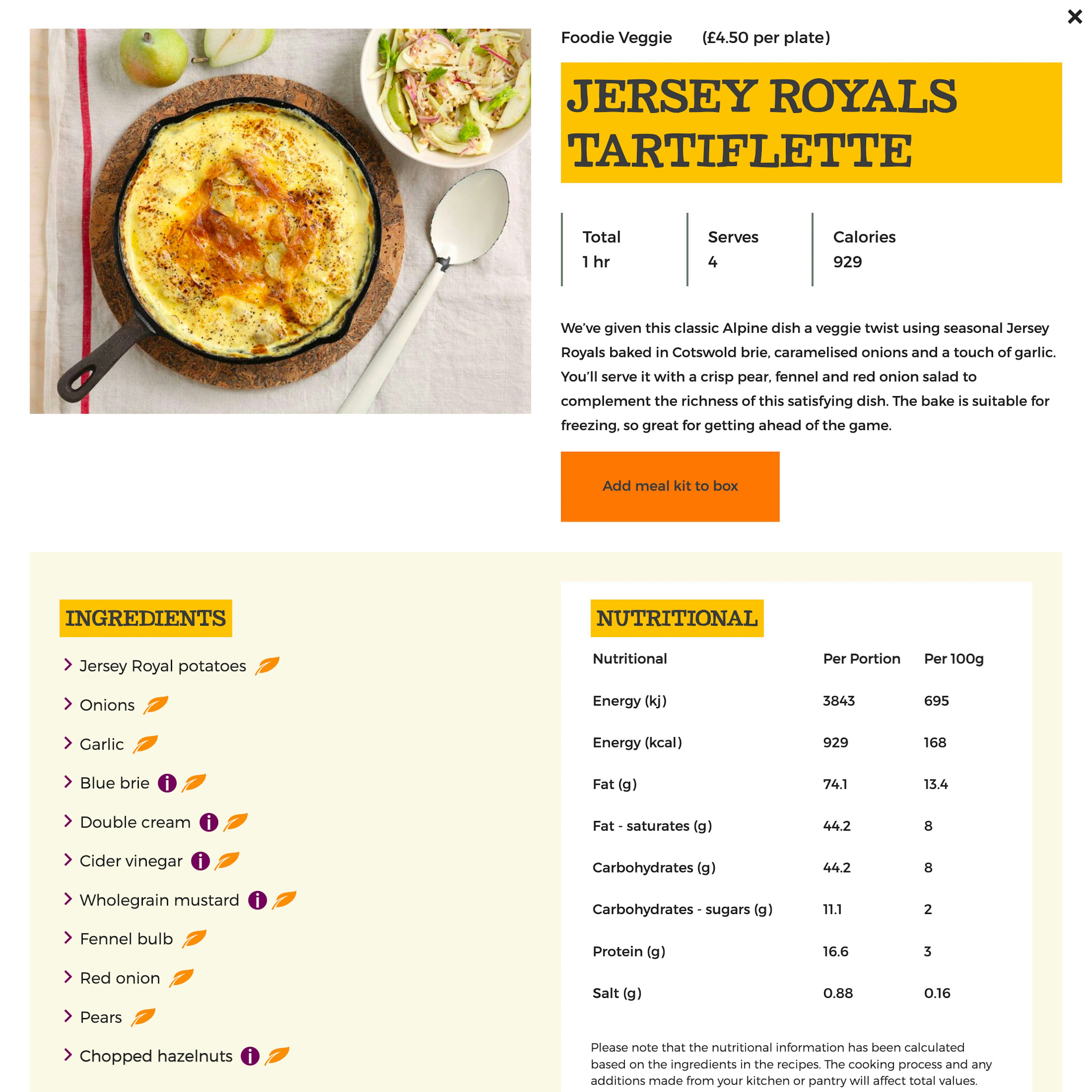
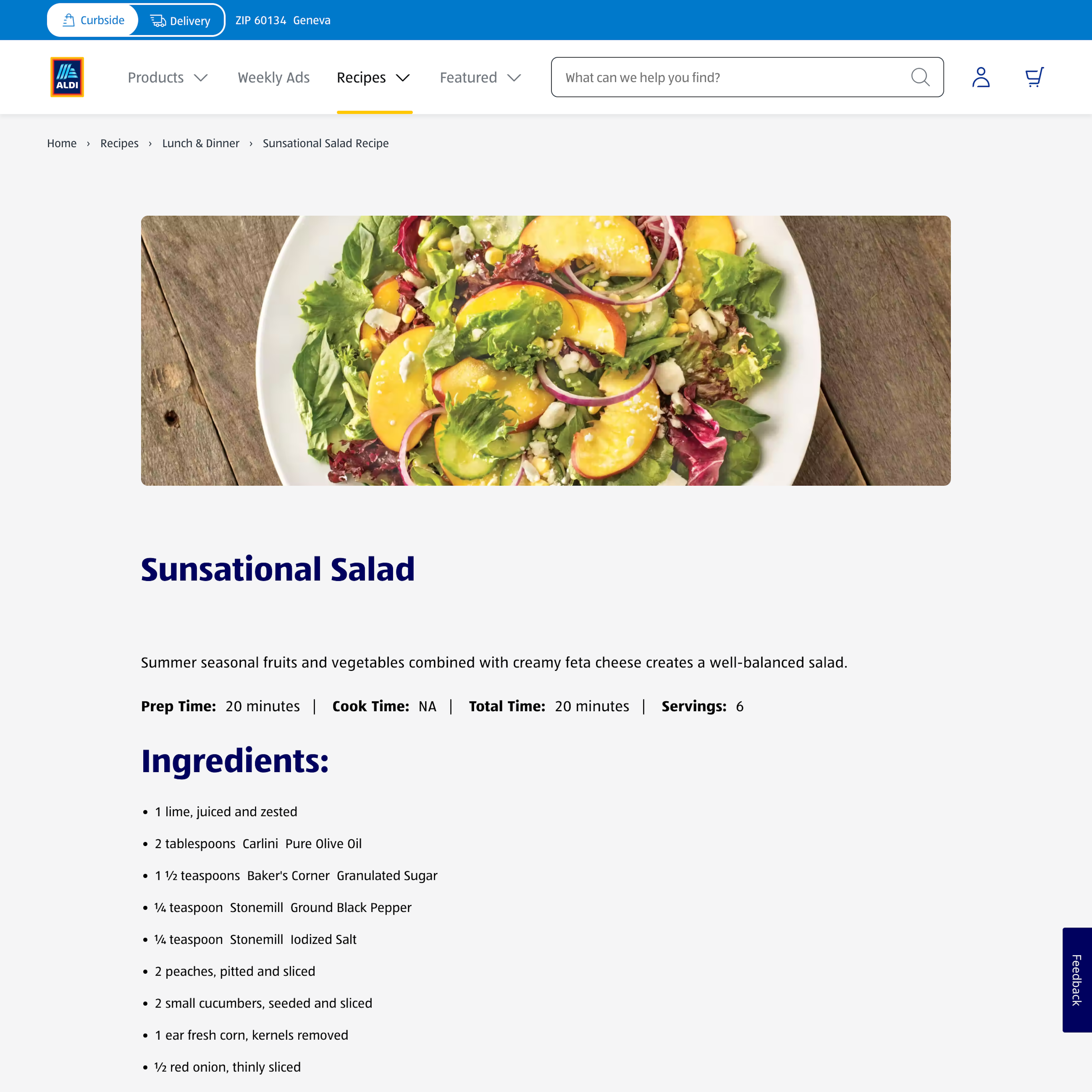
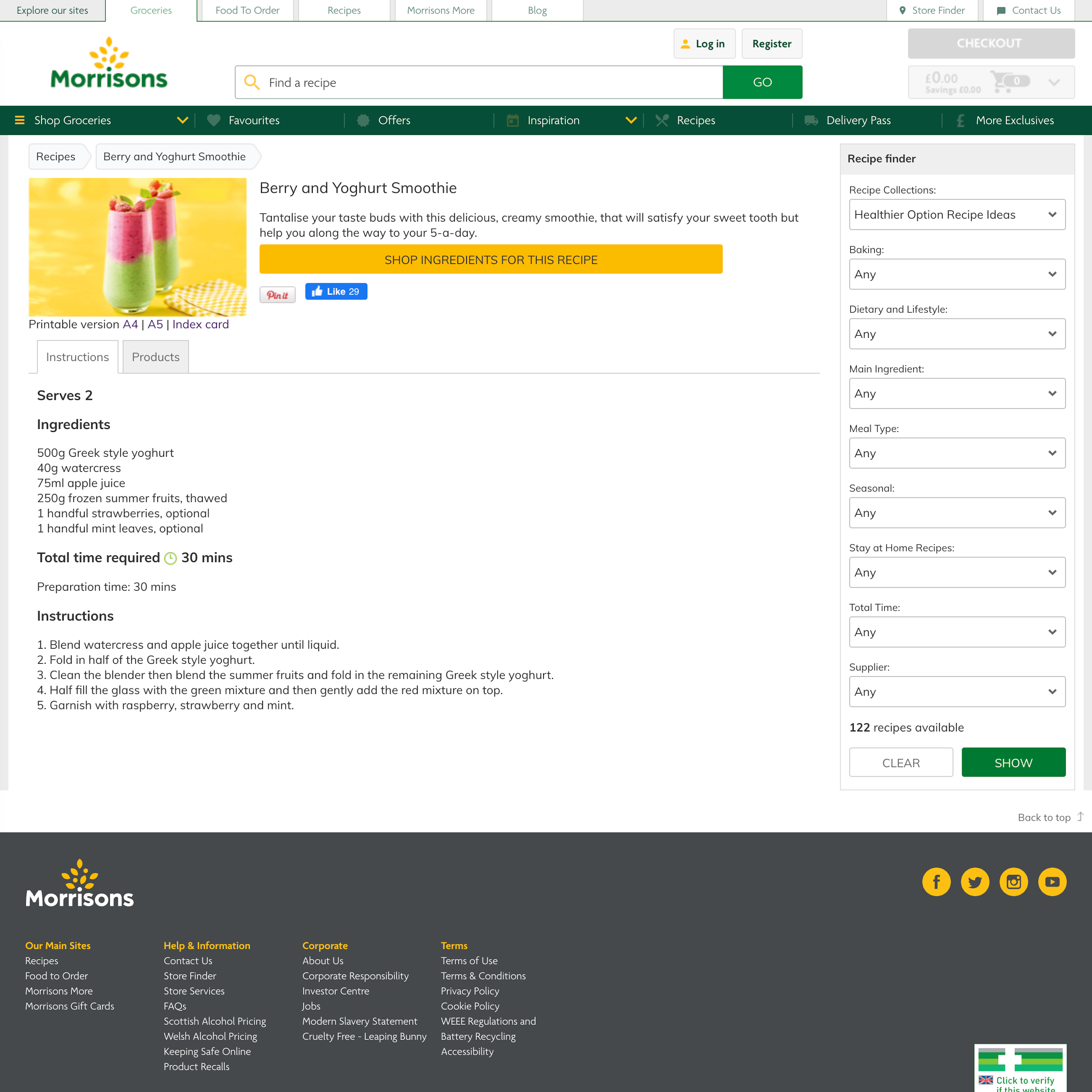
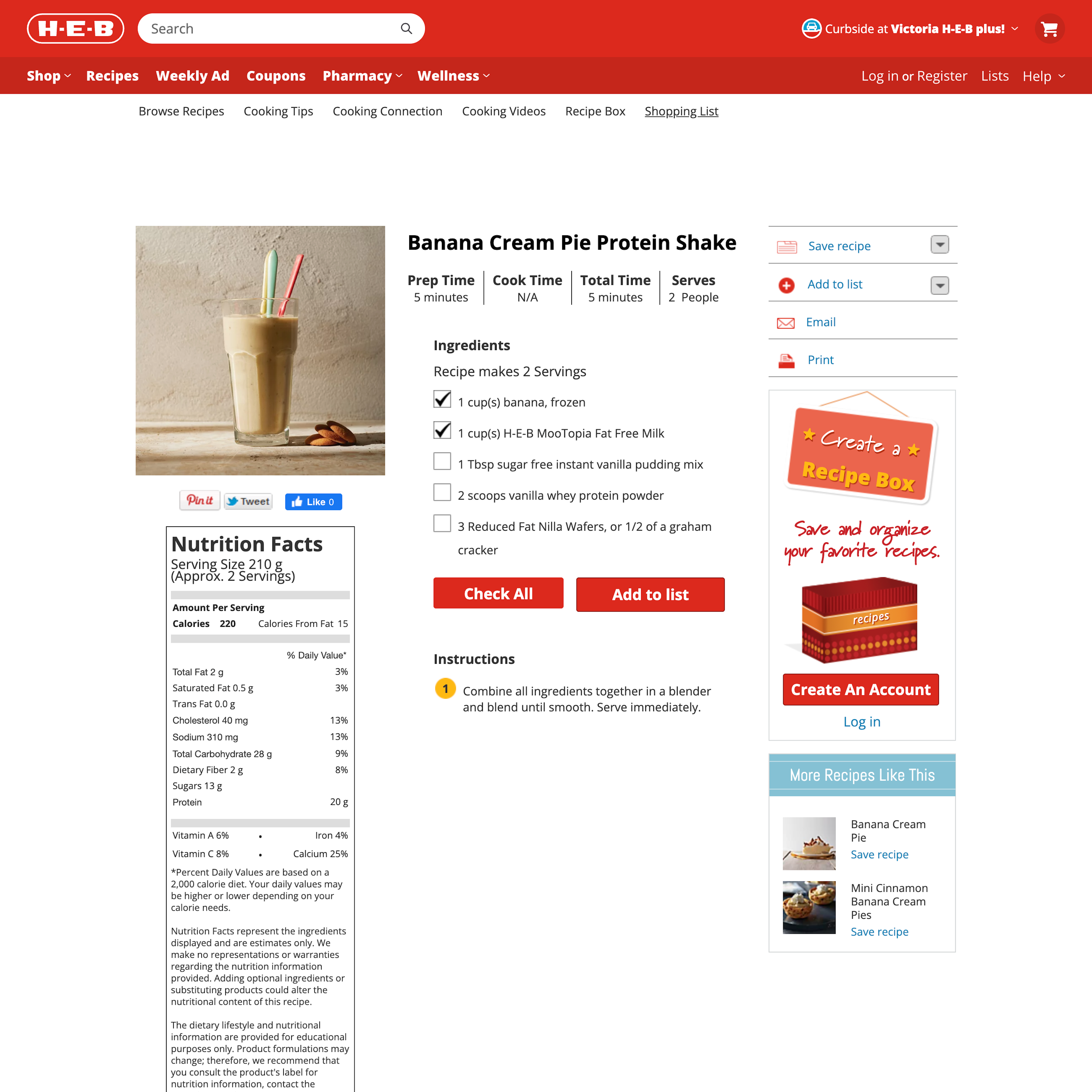
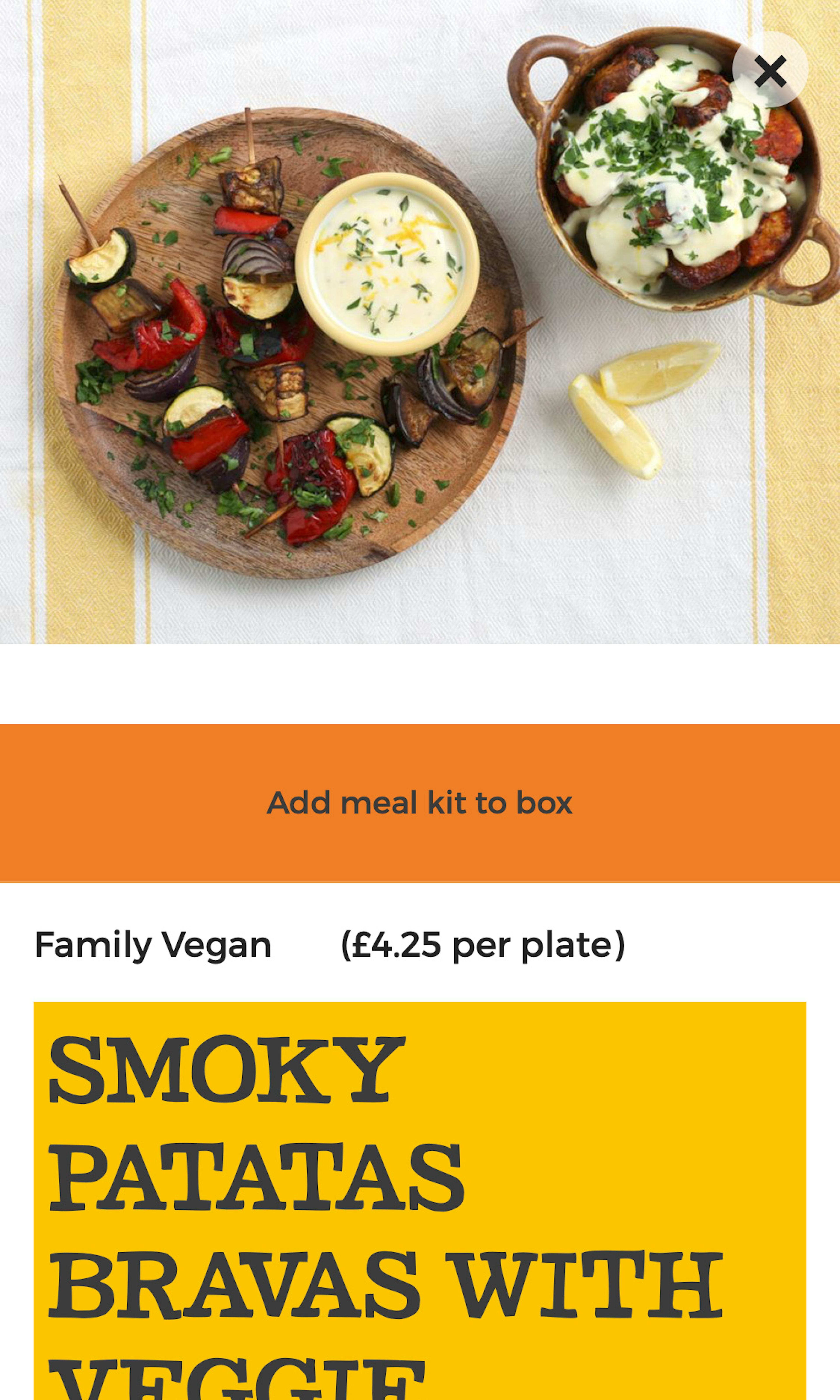
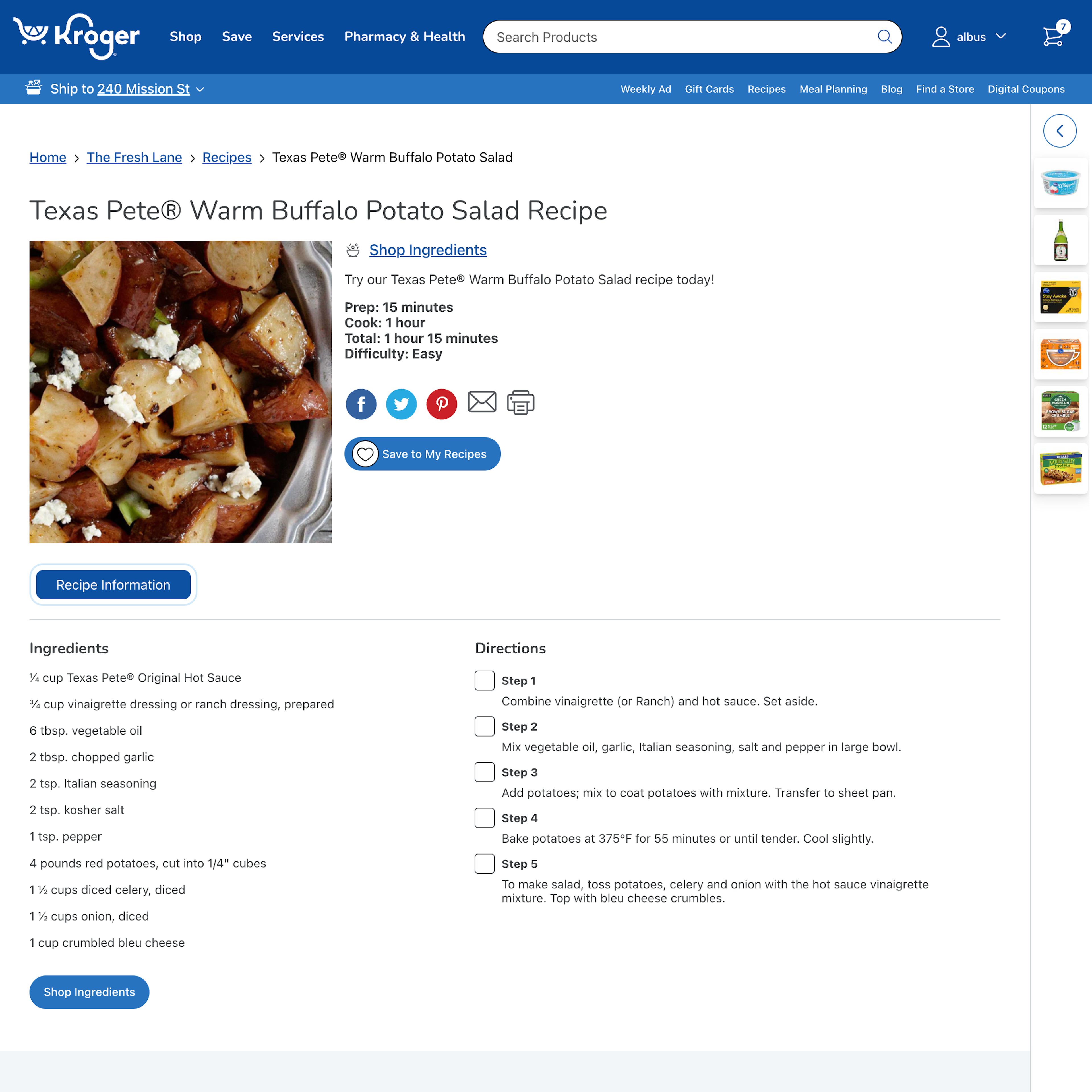
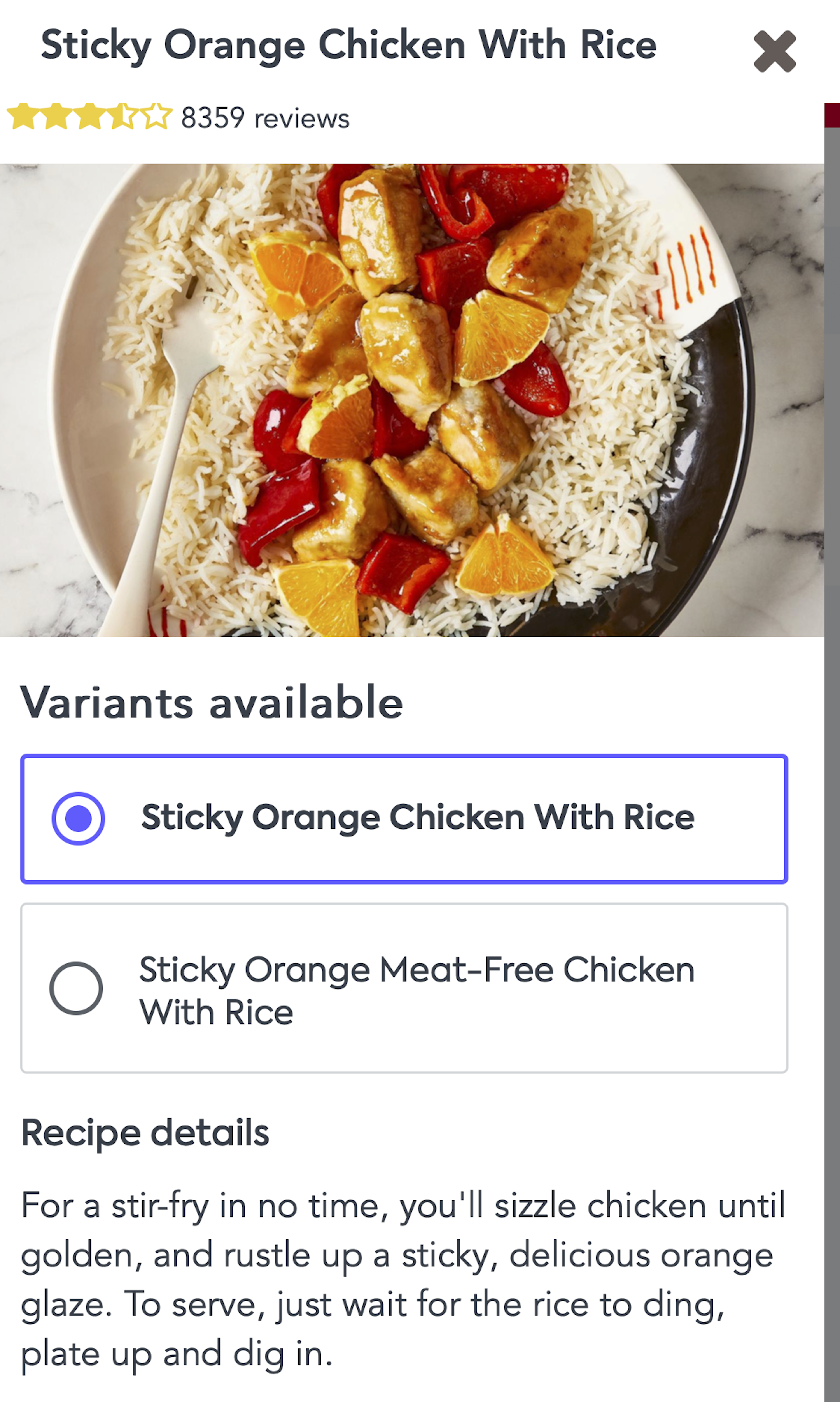
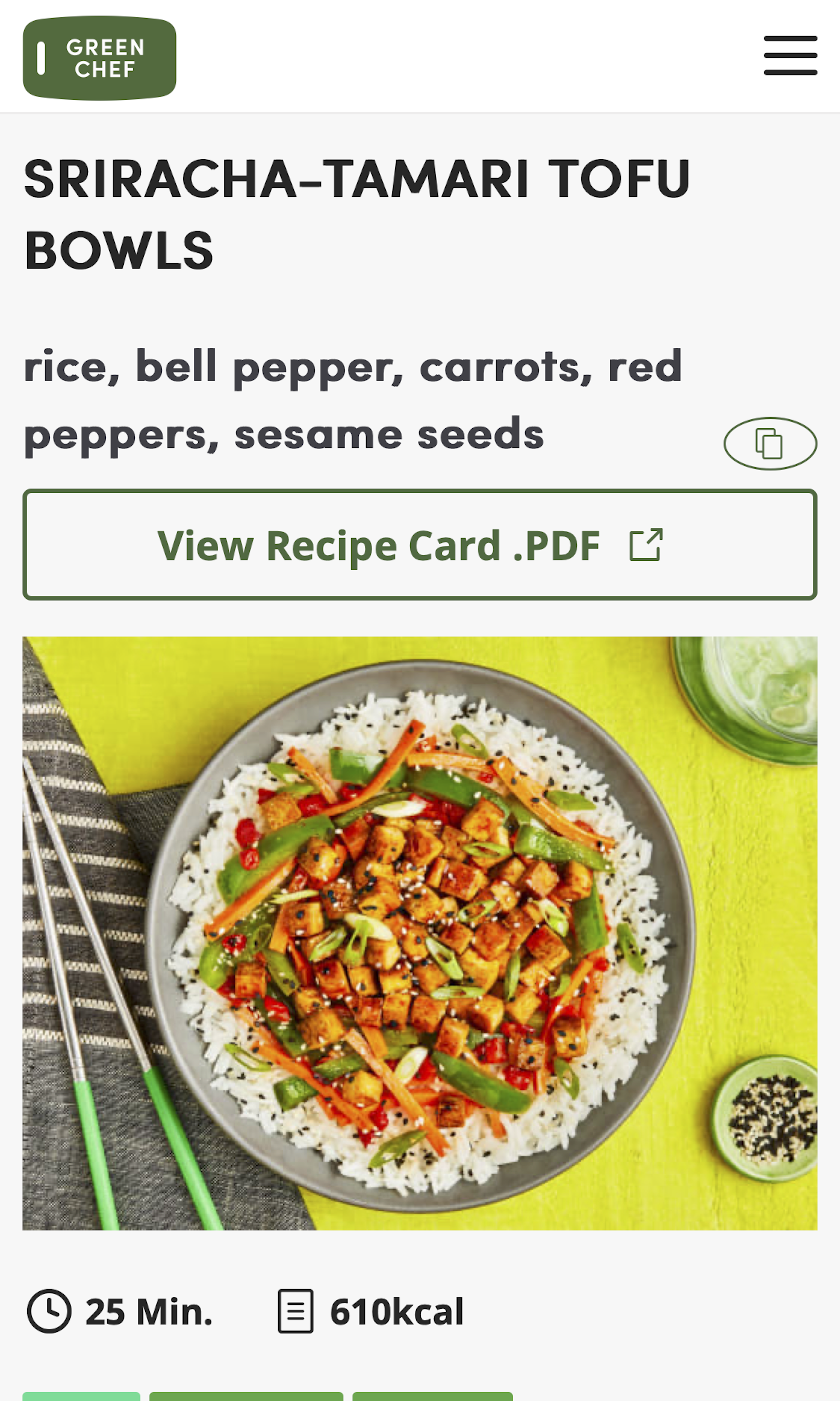
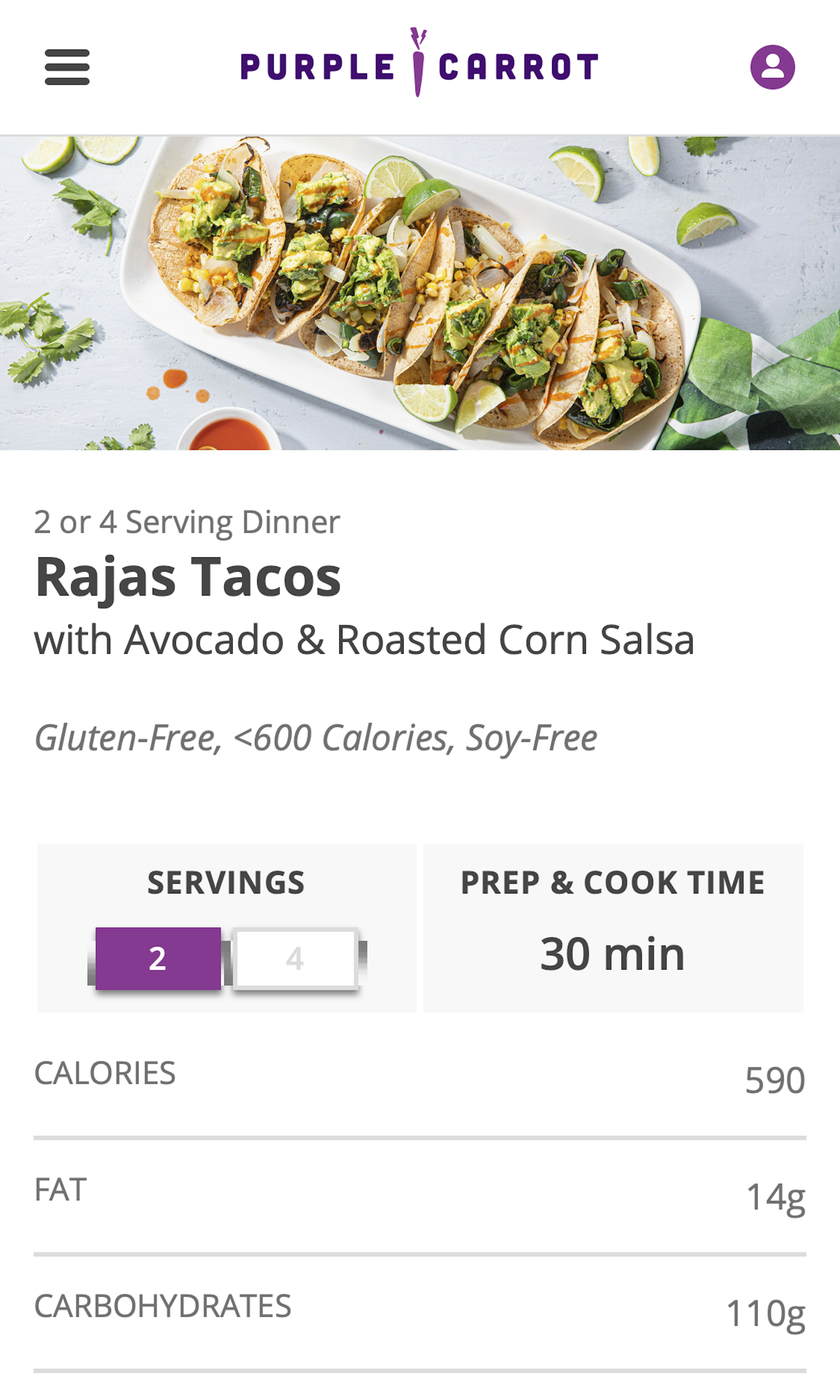
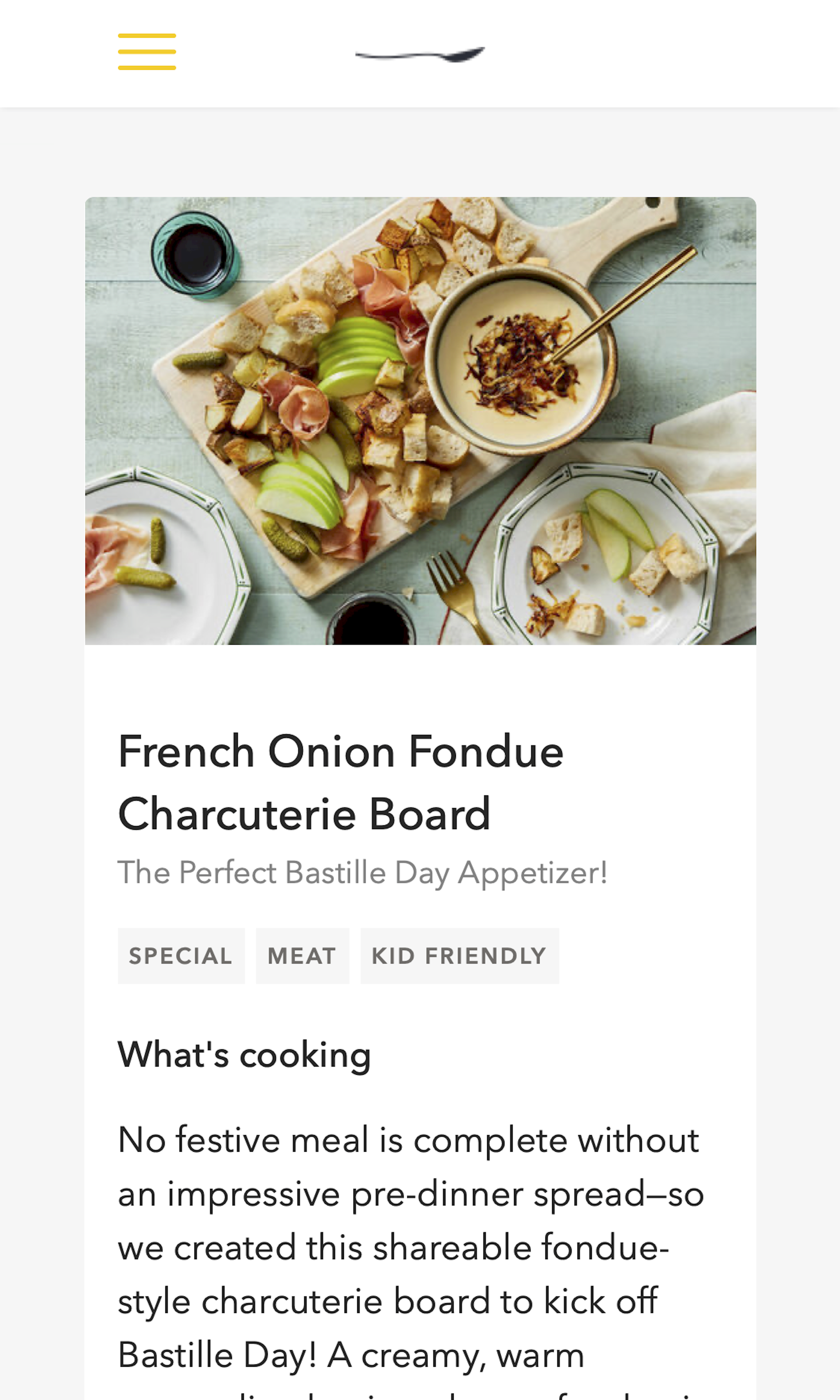
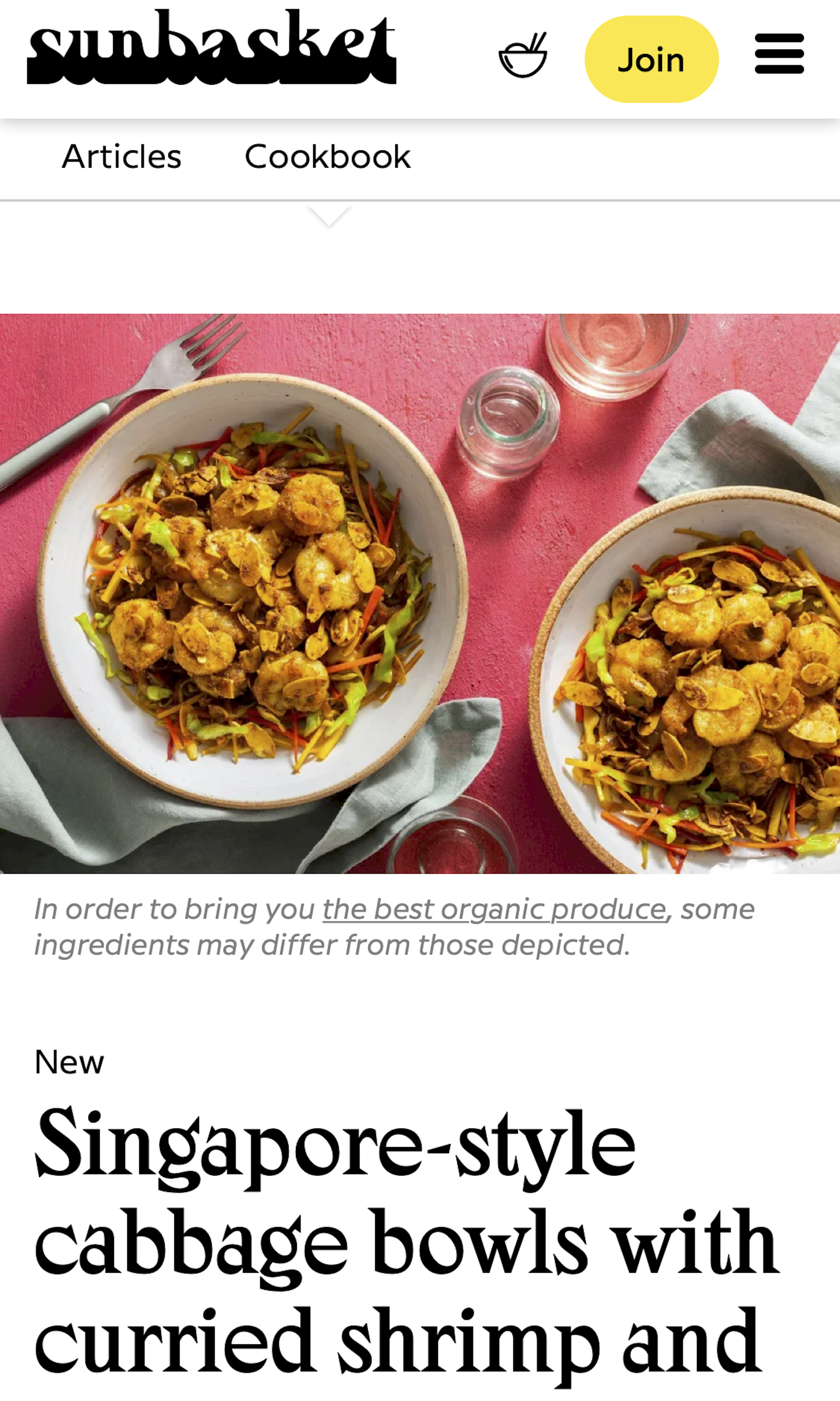
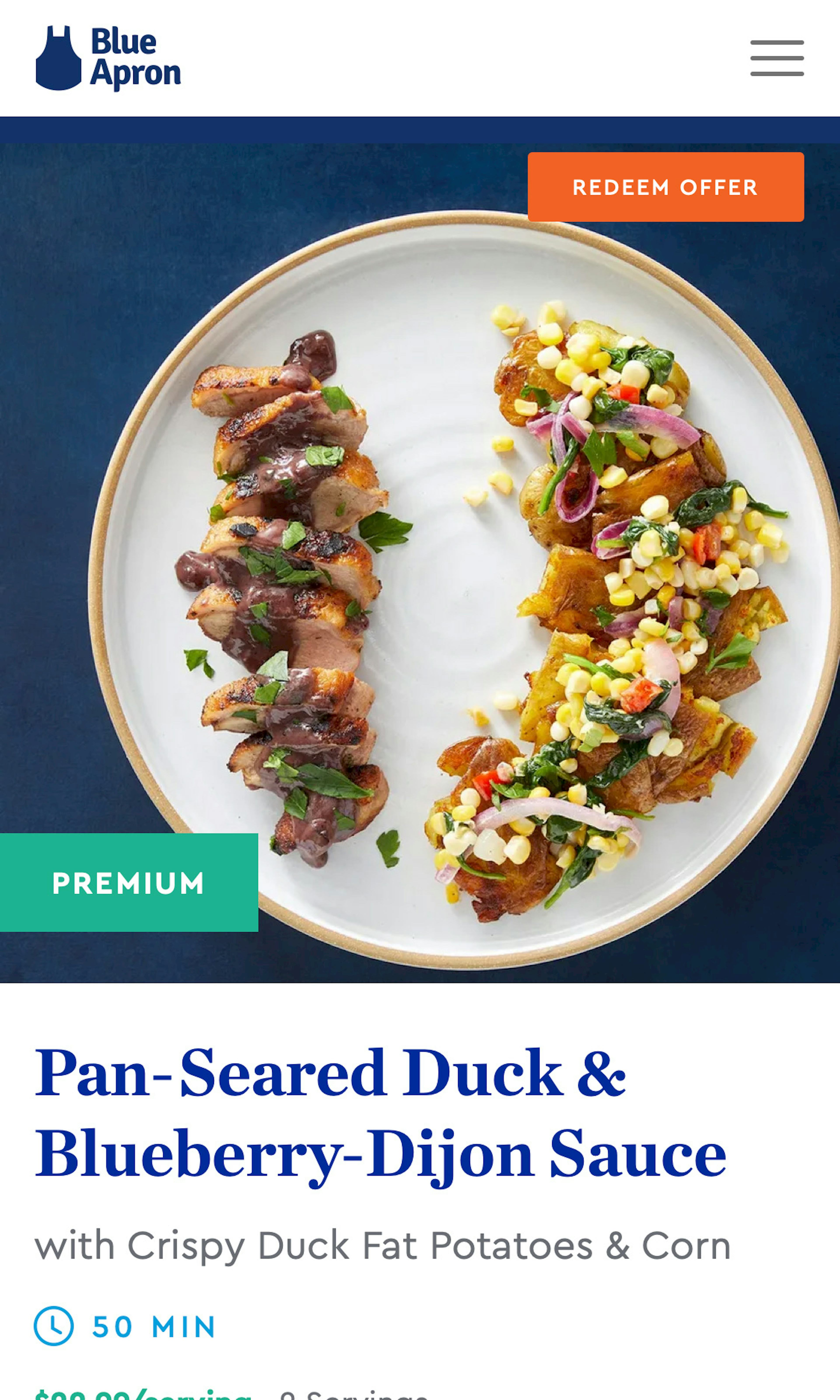
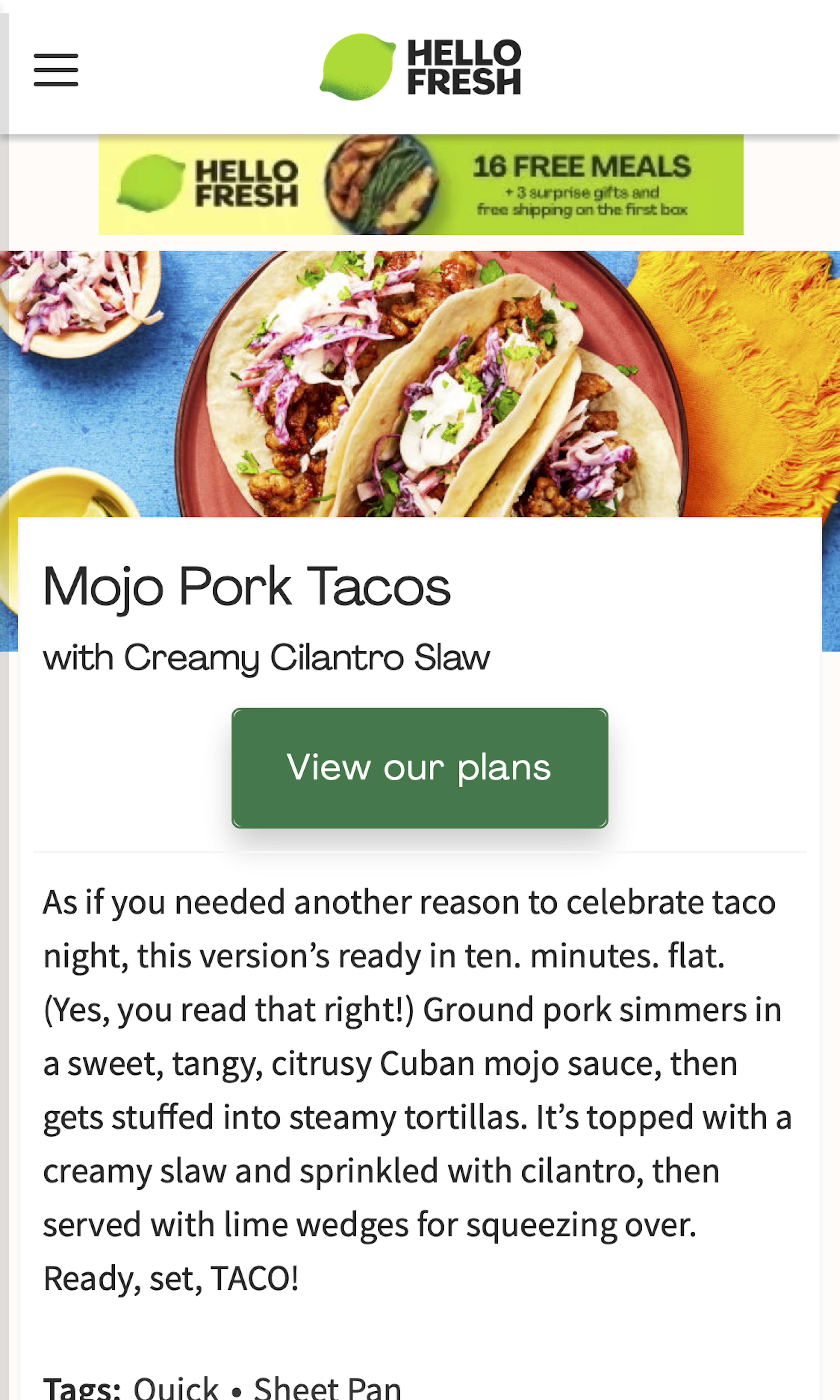
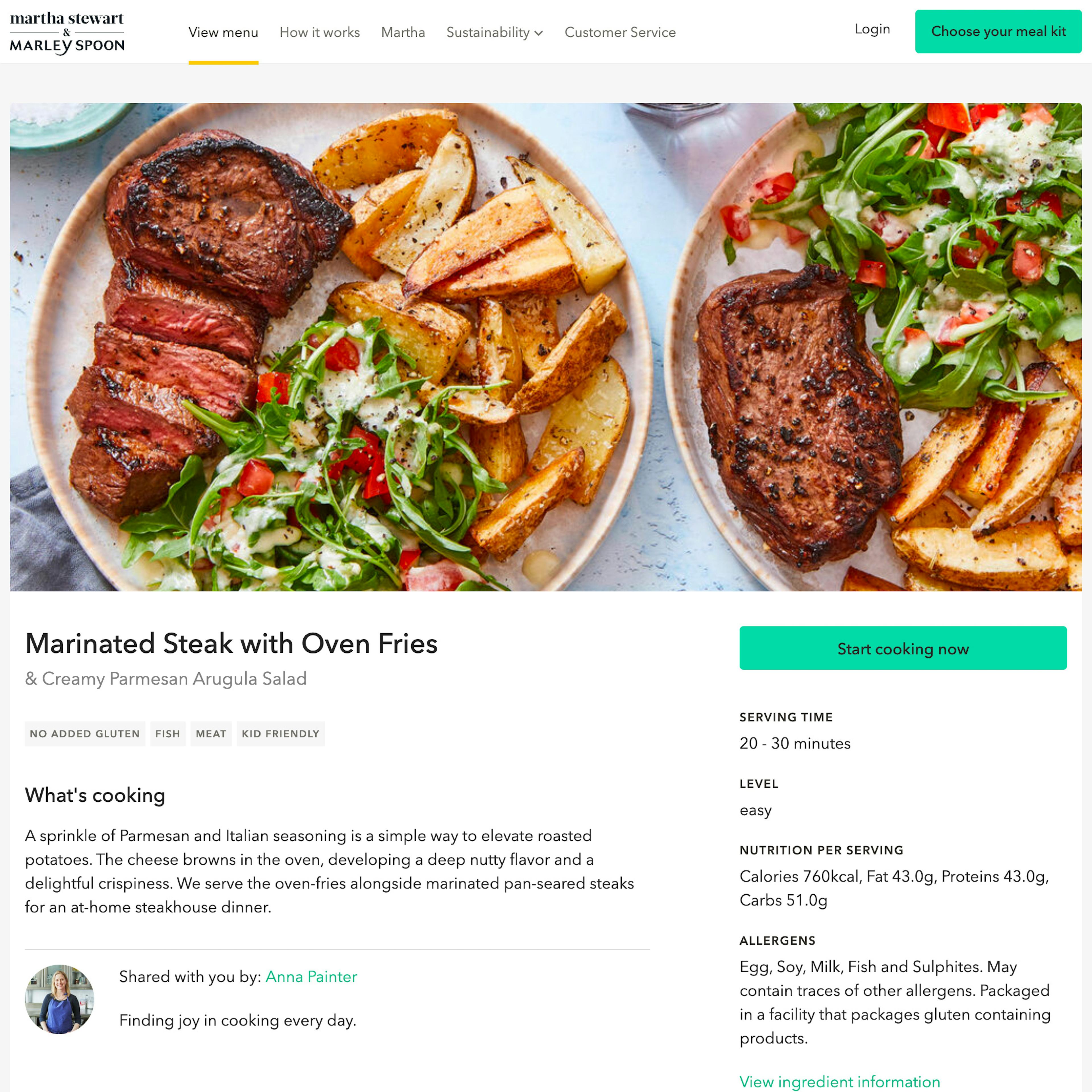
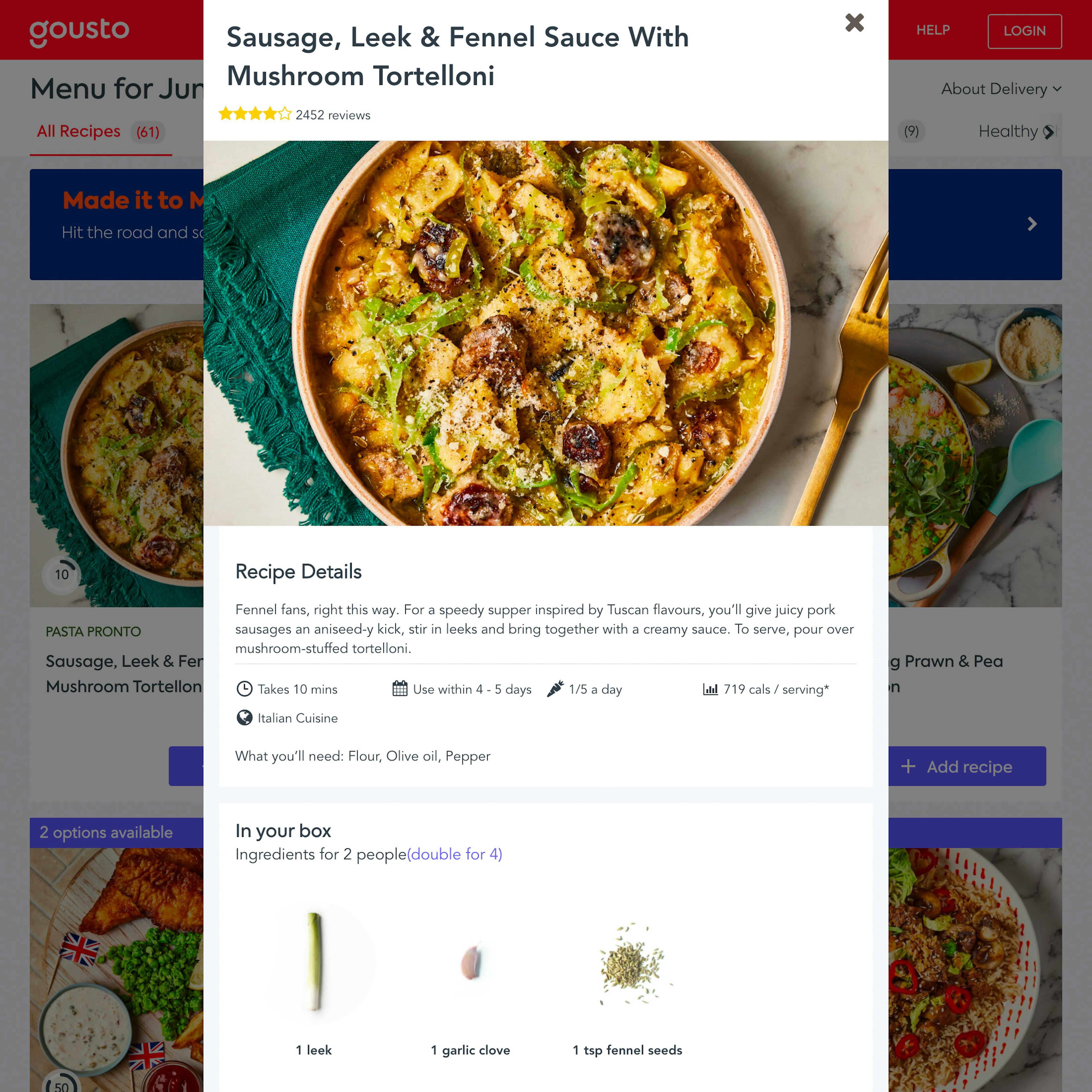
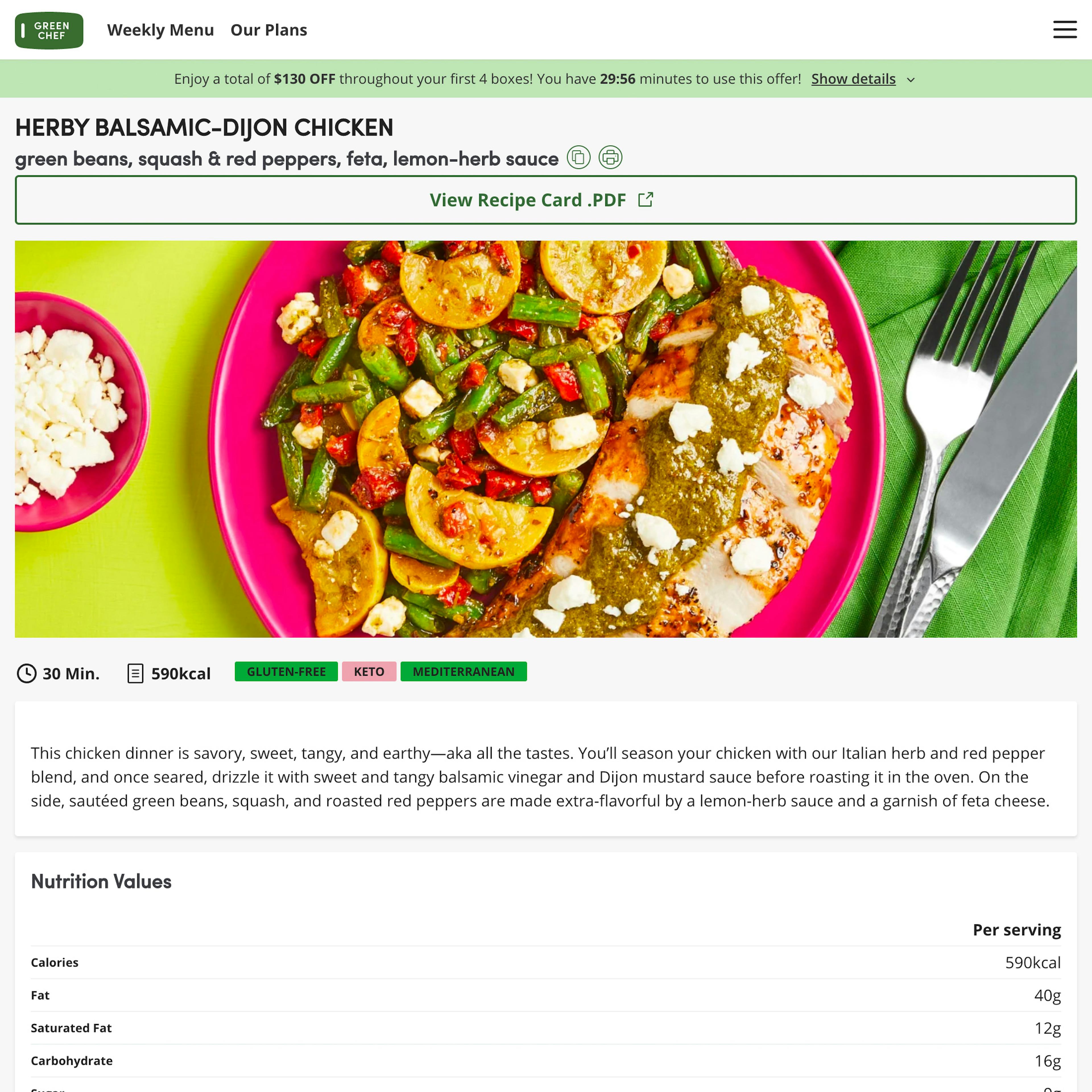
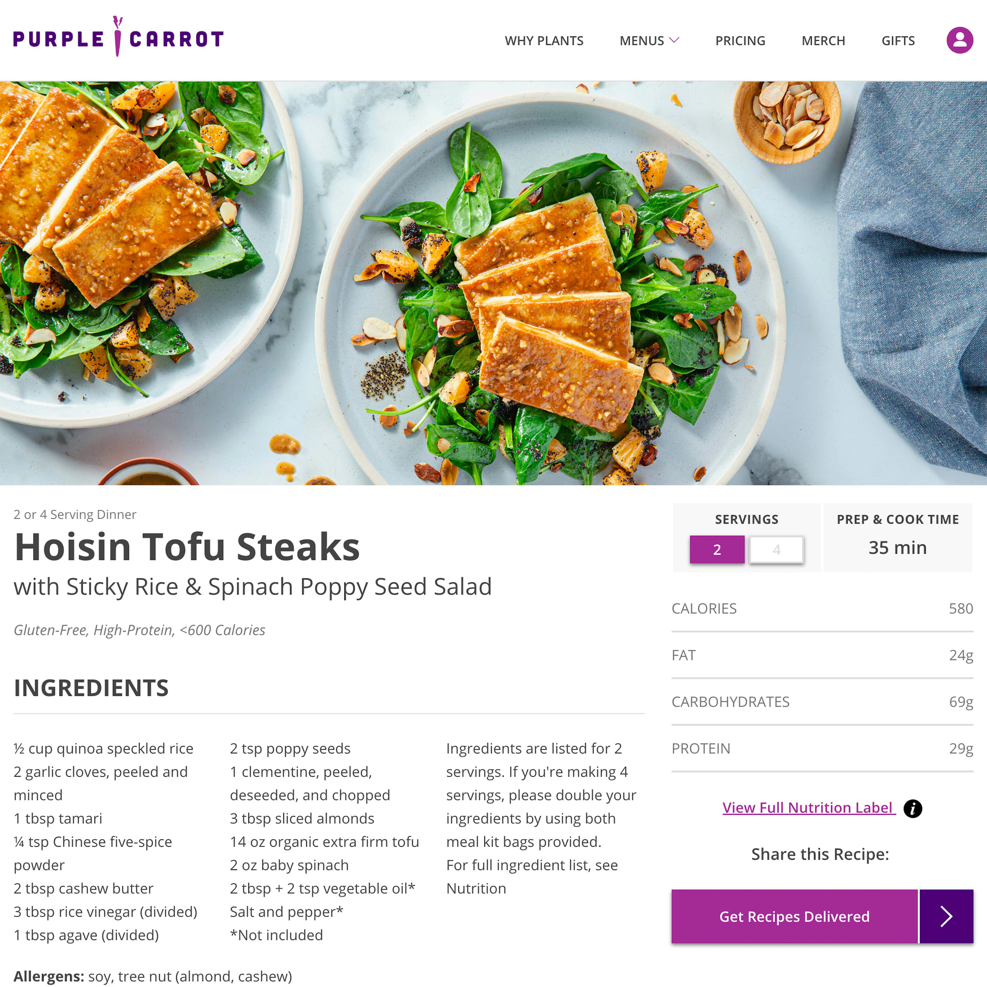
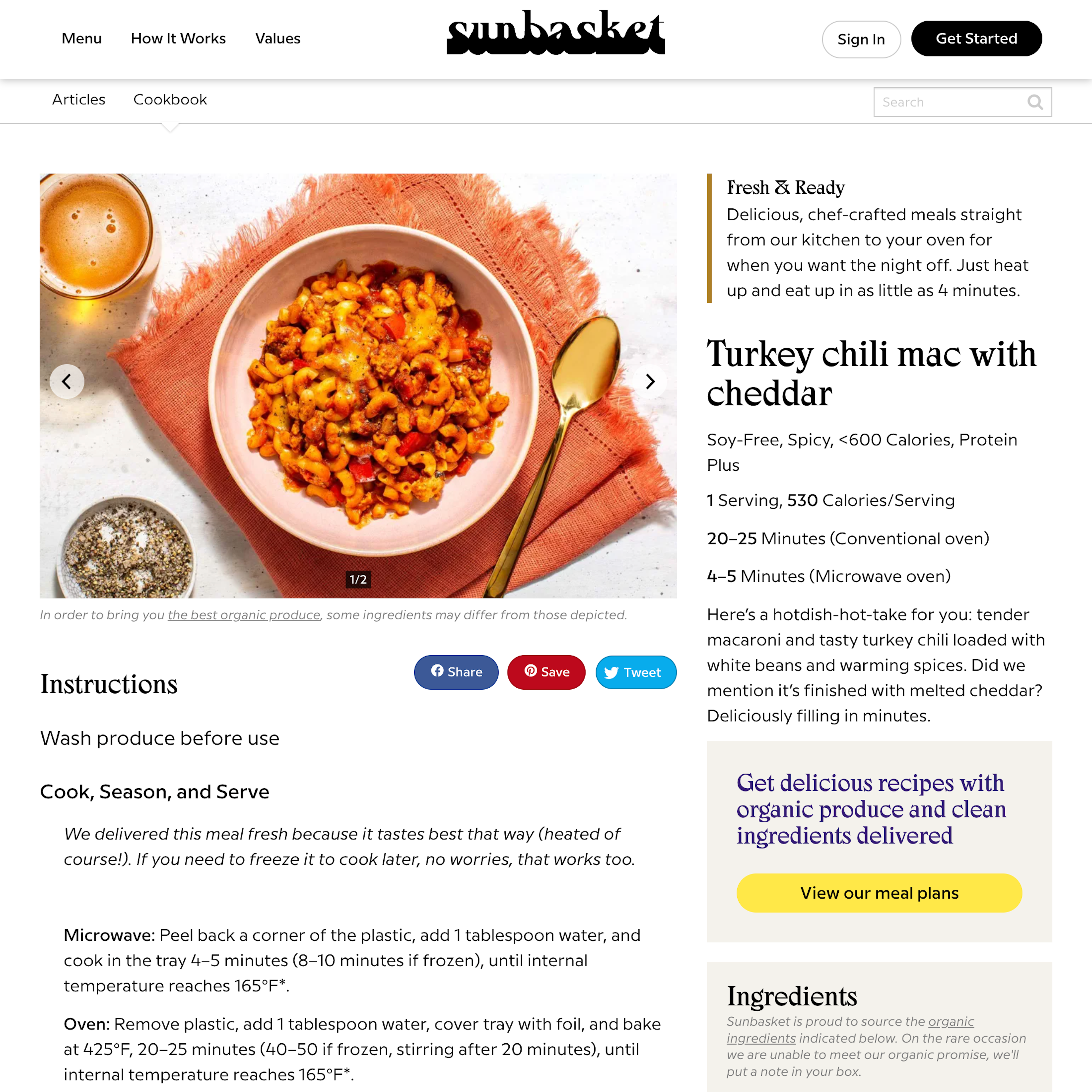
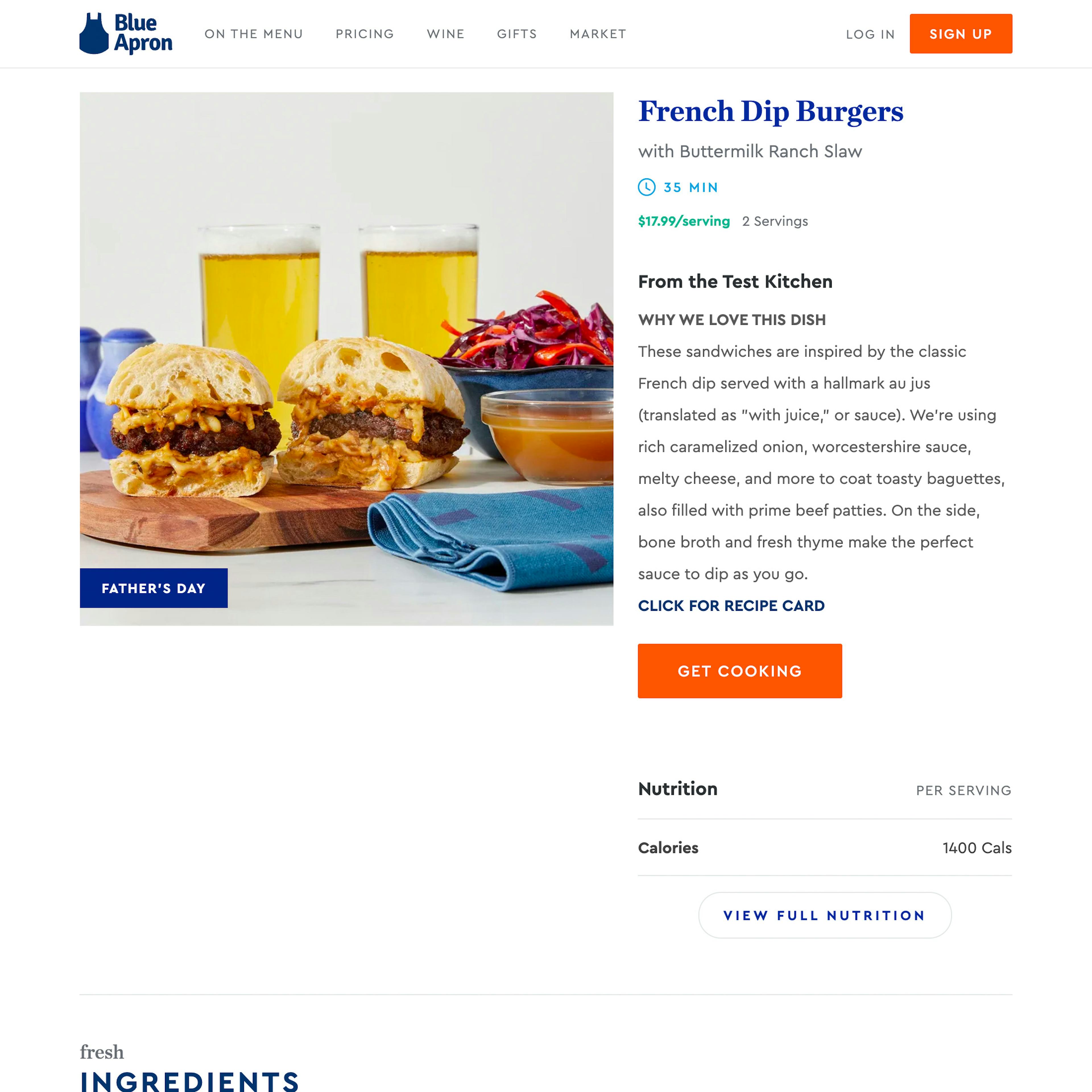
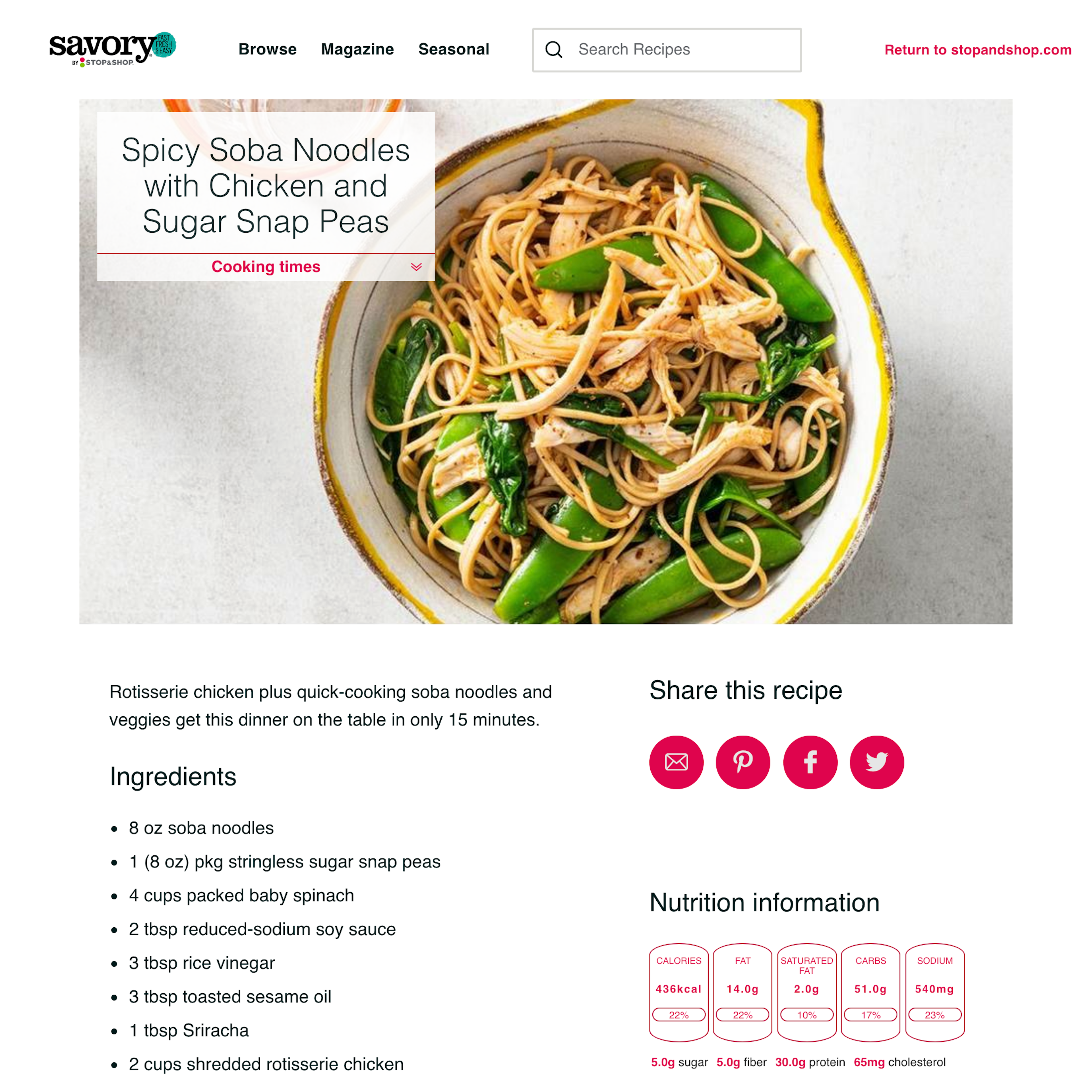
30 ‘Recipe Page’ Design Examples
Also referred to as: Online Recipe
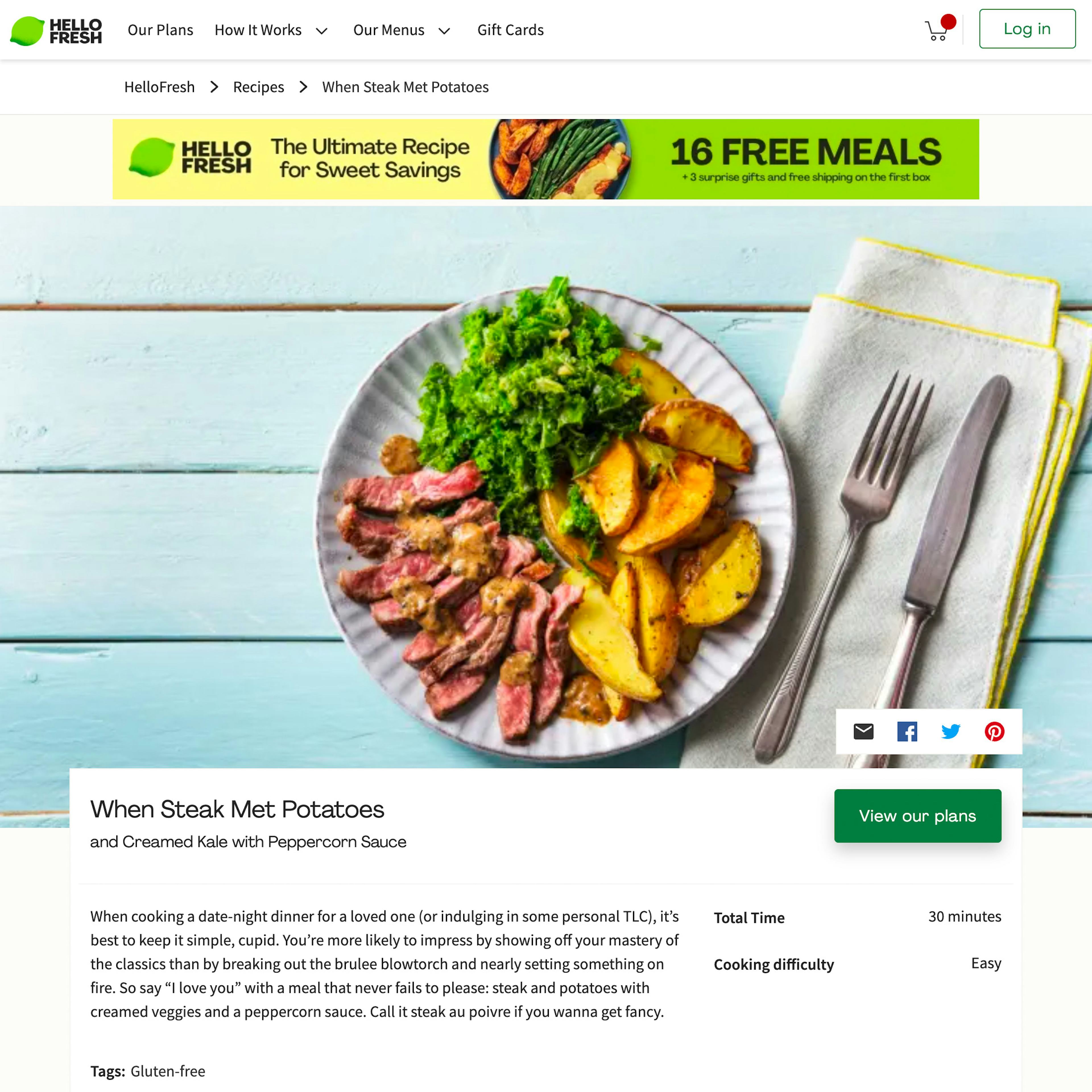
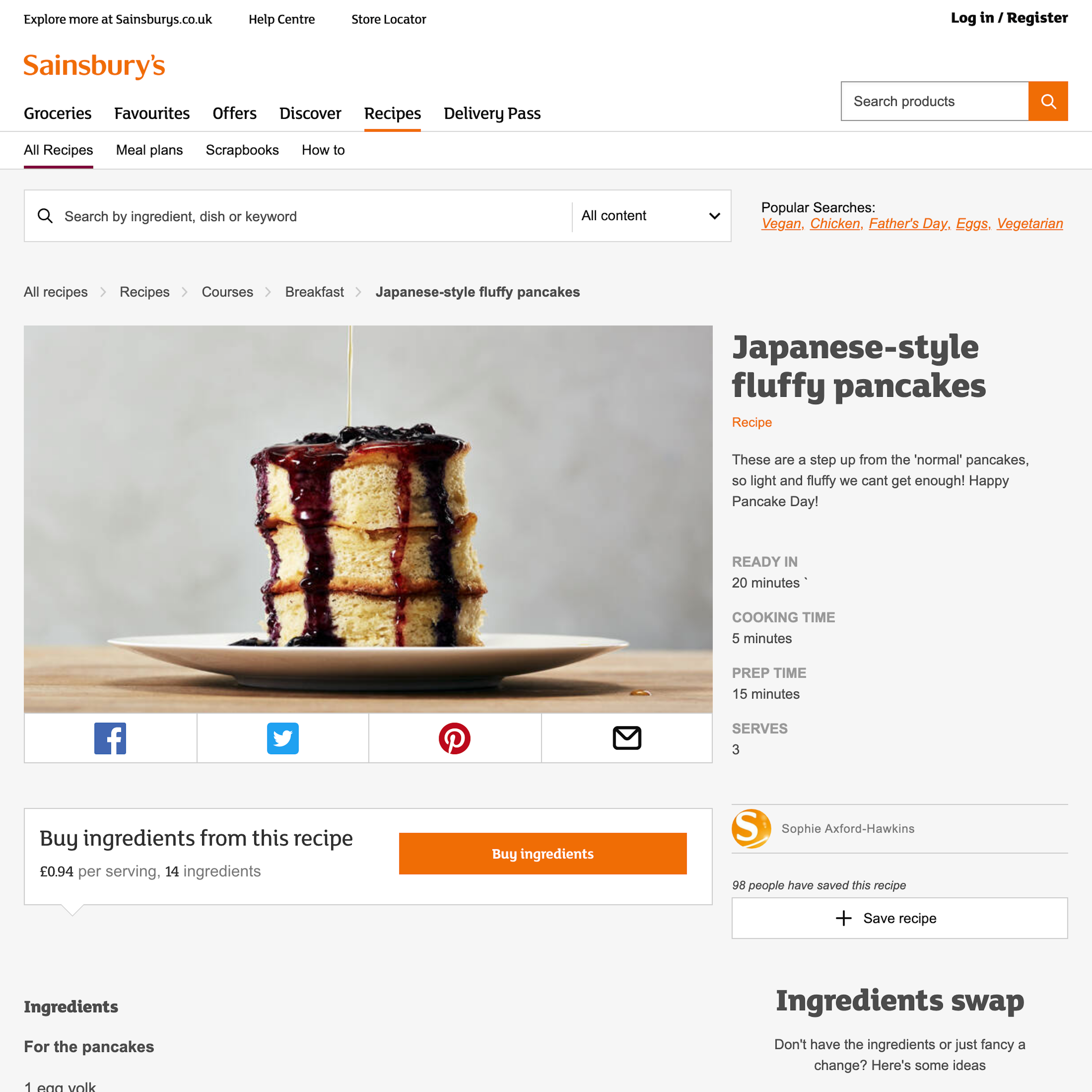
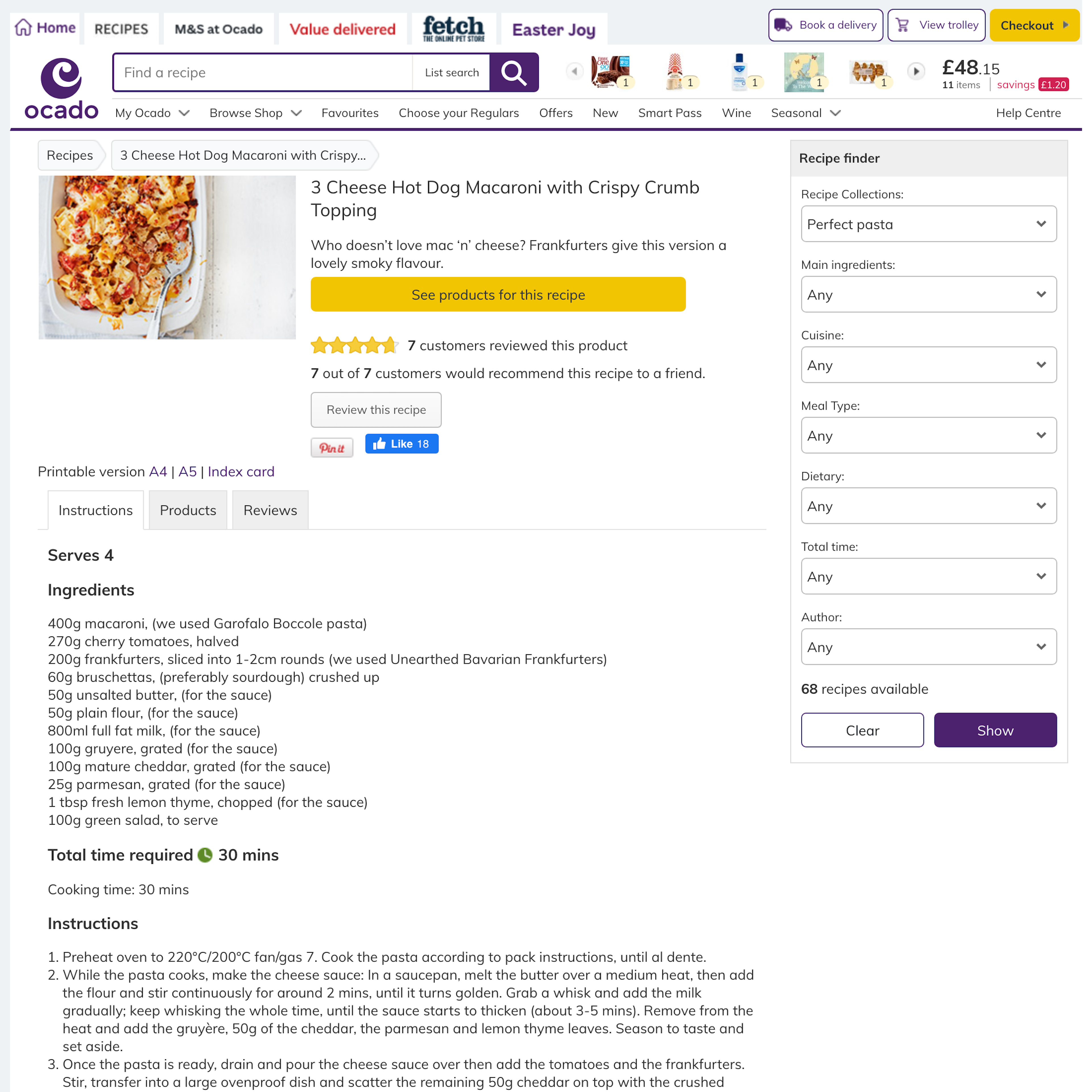
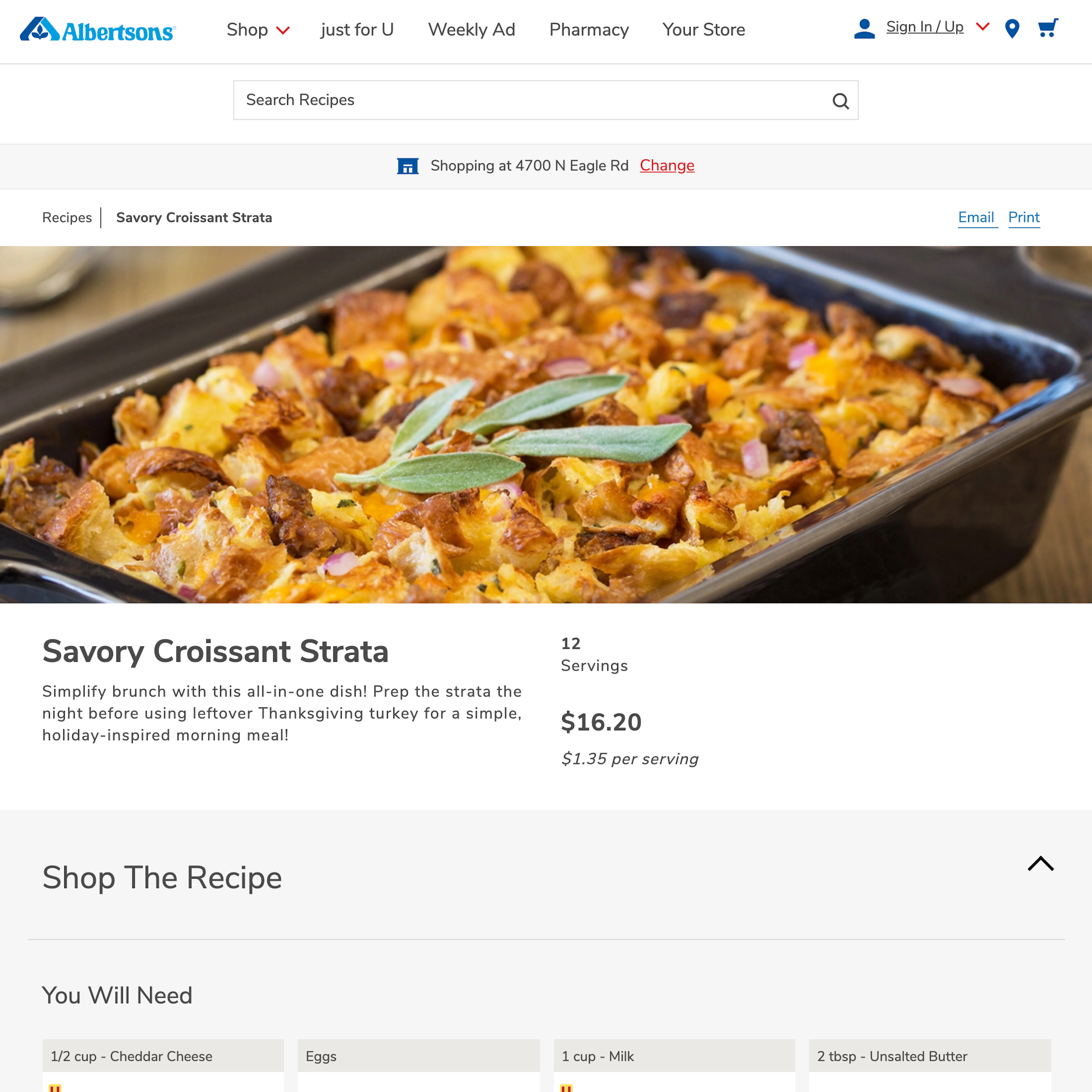
What’s this? Here you’ll find 30 “Recipe Page” full-page screenshots annotated with research-based UX insights, sourced from Baymard’s UX benchmark of 325 e-commerce sites. (Note: this is less than 1% of the full research catalog.)
Recipe pages beyond showing recipes can have different purposes; on Meal Kits sites, they act as the site’s centerpiece, and nearly all Meal Kit users will visit a recipe page, and on Grocery sites, they function as a meal idea page that can also drive more sales, but they remain with secondary function. No matter what the primary purpose of the recipe page is, its features and elements closely match what a user would expect on product pages with some additional industry-specific features.
More ‘Recipe Page’ Insights
-
On Meal Kits sites, the combination of the recipe page being the centerpiece page in users’ purchasing decisions and users’ varying use contexts makes it vital that the recipe page implementation is “state-of-the-art”. Failure in the recipe page implementation will often lead to failure in the user’s e-commerce experience.
-
Learn More: Besides exploring the 30 “Recipe Page” design examples below, you may also want to read our related article “3 High-Level UX Takeaways from 950+ Hours of Testing Leading Meal Kits Sites”.
-
Get Full Access: To see all of Baymard’s “Recipe Page” research findings you’ll need Baymard Premium access. (Premium also provides you full access to 200,000+ hours of UX research findings, 650+ e-commerce UX guidelines, and 275,000+ UX performance scores.)
User Experience Research, Delivered Weekly
Join 60,000+ UX professionals and get a new UX article every week.

Explore Other Research Content

300+ free UX articles based on large-scale research.

325 top sites ranked by UX performance.

Code samples, demos, and key stats for usability.


