Key Takeaways
- Our new research has uncovered 1,000+ usability issues specific to meal kit sites
- The research has resulted in 350+ guidelines that describe the issues, as well as design patterns verified to perform well for users
- In particular, the research provides insights on the content and features meal kit sites need to provide users to ensure they’re able to make a purchase decision — and the content and features they don’t
At Baymard our research team has just spent 950+ hours usability testing and researching meal kit websites’ features, layouts, content, and designs — leading to our new UX research study on Meal Kit UX.
The research is based on more than 128 qualitative user/site usability test sessions following the “Think Aloud” protocol (1:1 remote moderated testing).
The test sites included 6 of the top sites in the meal kit industry: Blue Apron, Dinnerly, Gobble, HelloFresh, Home Chef, and Sunbasket.
Yet despite testing some of the largest meal kit sites, users frequently ran into issues that severely disrupted their ability or desire to subscribe to a meal kit service — issues that are likely to increase many meal kit sites’ cart abandonment rate.
Indeed, during testing the users encountered 1000+ medium-to-severe usability issues. These issues have subsequently been analyzed and distilled into the 350+ UX guidelines found within our meal kit UX research study (all of which are available as part of our Premium UX research).
The 350+ guidelines cover most aspects of the meal kit experience, at both a high level of general user behavior as well as at a more granular level of specific issues users are likely to encounter.
In this article we’ll introduce 3 of our high-level findings for meal kit sites:
- Requiring users to enter personal information to browse basic site information can be a competitive disadvantage
- Having the primary site CTA lead to a page requesting user information will result in abandonments
- Despite having a unique product offering, meal kit sites need to provide much of the same basic information and functionality as general e-commerce sites
1) Requiring Users to Enter Personal Information to Browse Basic Site Information Can Be a Competitive Disadvantage
“I had a feeling that they were gonna want me to ‘Sign Up’ and my suspicions were correct. I get frustrated very quickly when I don’t get what I want, and I’m very quick to be like, ‘Okay, I’m done’…If you’re gonna make me create an account just to get some basic information, I’ll just make the ‘Chimichurri Fish Tacos’ myself.”
During testing, many of the test sites had account walls at some point during the site-exploration process.
Now, when it comes to account walls — which should largely be avoided on general e-commerce sites — the case could be made that the context is different for smaller, subscription-based meal kit sites, compared to traditional, large, B2C sites (e.g., Amazon or Target), which typically don’t require users to create an account to browse basic site information.
Indeed, on meal kit sites, creating an account is often a requirement to complete checkout (which it shouldn’t be for traditional e-commerce sites). Meal kit sites have in many cases reasonably concluded that users should be required to have an account at the site to complete a purchase, as the recurring nature of the commerce requires that users are registered.
However, when account walls prevent users from browsing basic site information, testing revealed that they lead to an overall negative user experience, negative brand interpretation, and direct abandonments.
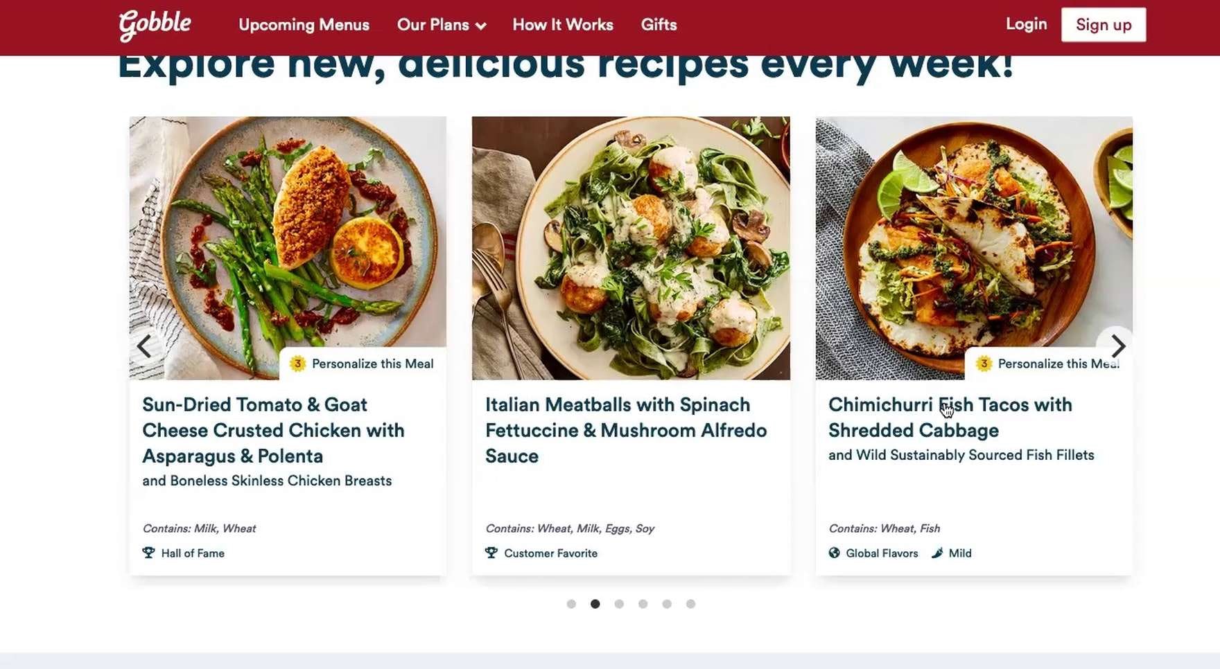
A user on Gobble (the source of the quote beginning this section), seeking information on a meal (first image), encountered an account wall (second image). To many users, having an account wall to see “basic site information” — in this case, the meal details for a taco meal — is a reason to consider a different meal kit site that provides more information about its offerings.
For example, 81% of users during testing who encountered account walls at Gobble while seeking basic product information abandoned.
The abandonments occurred prior to users getting into a checkout flow and instead as they were attempting to learn more about the service and products — that is, while they were still in an “initial service exploration” mode.
“Why do I have to sign up before I can even look at anything? Come on Gobble, be better. I’d probably click another one to see if it’s…No, it really is across the board.” Another user on Gobble, similarly wanting to see meal details, became extremely frustrated and was ready to abandon when confronted with an account wall.
And, notably, these account walls seem to “come out of nowhere” at seemingly random times while browsing the site.
As one user stated, encountering an account wall after clicking to take a site quiz, “I wish it was a little bit more upfront with showing the cost and how the actual process worked without requiring an application…It still is making me log in to actually take the quiz, which, again, just feels kind of restrictive.”
Besides the friction of filling out form fields and thinking up a password, much of the reluctance toward registering for an account is rooted in privacy concerns and unsolicited email marketing.
Indeed, requiring users to create an account will for most users also be perceived as forcing them to receive newsletters, or “spam”, as most called it, unless it is explicitly stated otherwise during registration. Moreover, some users will make up a fake email in order to see the product selection — polluting the account dataset and increasing the amount of email flagged as spam, as the fake data submitted may match an existing “innocent” email address.
In the end, it’s important to remember that users need to sell themselves on the service before they decide to take a leap and sign up — and providing in-depth information about the service offerings is a good way to help convince users to take a chance on a new service.
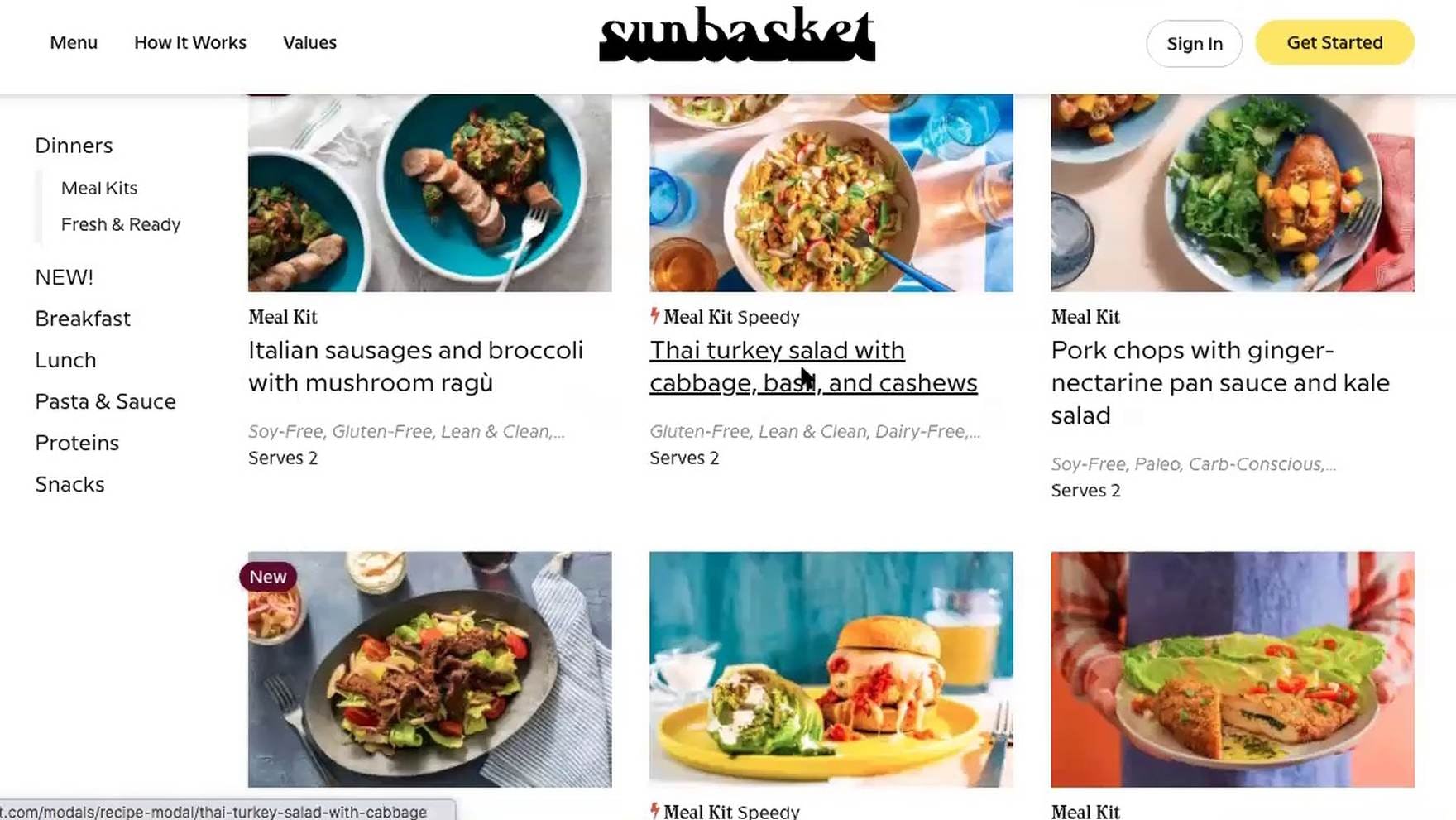
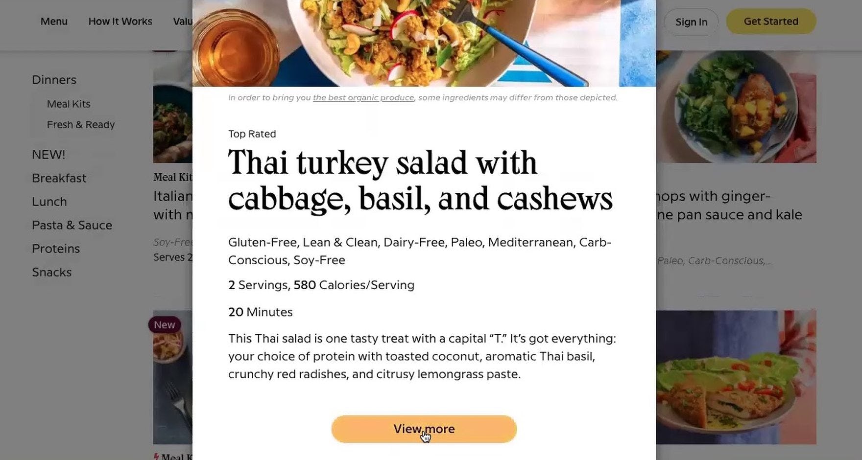
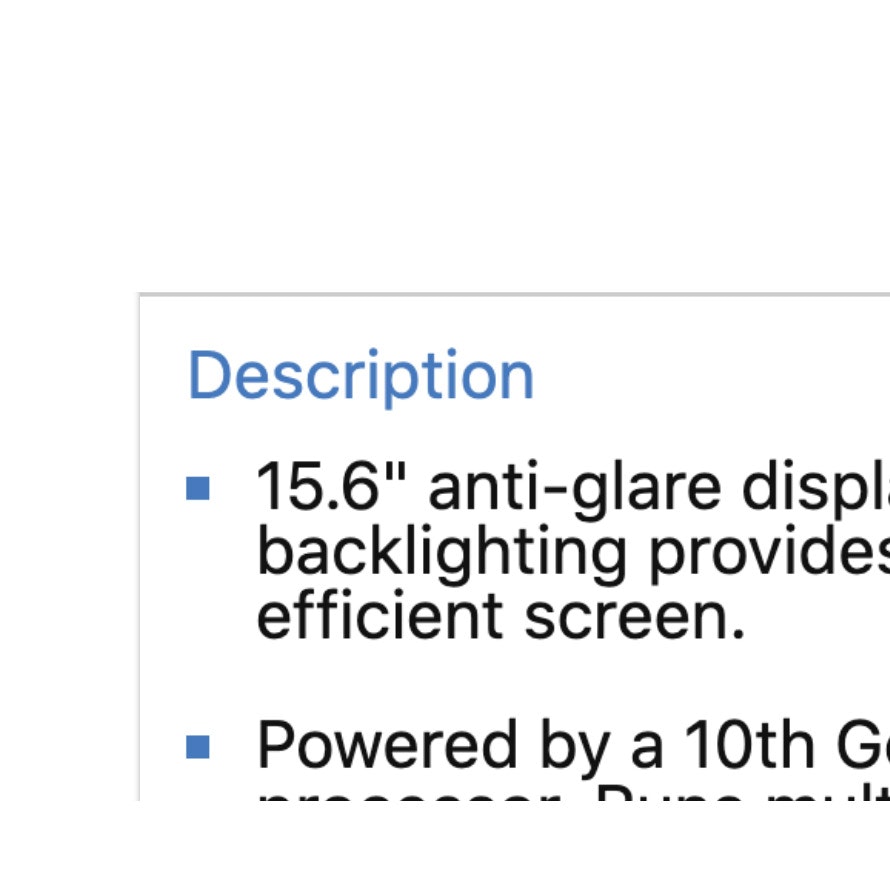
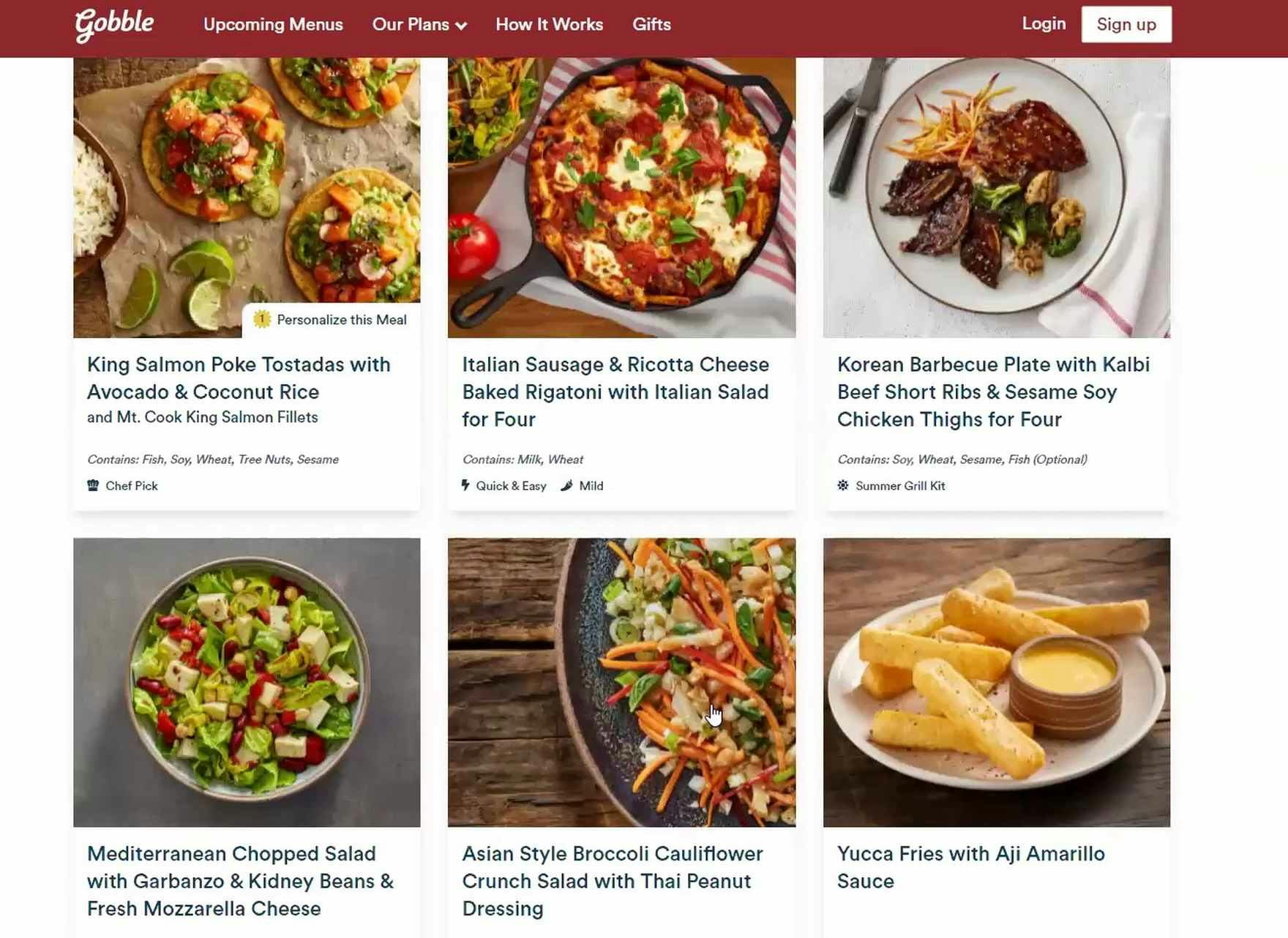
“So this is nice, it lists everything for you. ‘Serving size’, ‘Calories’, and then all this extra information.” At Sunbasket, users were able to click a meal featured on a listing page (first image) to access additional product details (second image) without having to enter their email or set up an account. This information was often vital to users assessing whether or not a site was “worth” giving their emails and other private information to.
Therefore, only require users to provide personal info after they’ve drilled a little farther into the site hierarchy and have had a chance to explore some basic information.
Users are often swayed to sign up for a service or purchase a product from a site only after they’ve thoroughly convinced themselves of its value, which typically occurs after having consumed adequate information about the service.
As a rule of thumb, saving account walls for the “last possible moment” — when it’s simply a site requirement to proceed — will help to avoid unnecessary abandonments.
2) Having the Primary Site CTA Lead to a Page Requesting User Information Will Result in Abandonments
“So I guess maybe I’ll just click [user clicks the ‘Get Started’ button]. Oh gosh. I’d rather not have to log in before…I can’t get to pricing, I can’t get to the schedule. I can’t get to anything that I really care about [laughing] without logging in. I don’t love that. I don’t need spam — especially if I’m in the research phase…I don’t need to sign up and get a hundred emails a day from these guys. Yeah, I’m gonna skip that one.”
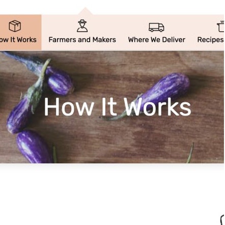
During testing of meal kit subscription sites, many users were drawn to prominently displayed CTA buttons and links — on the homepage, in the main navigation, on “How It Works” pages, or elsewhere on the site.
However, after clicking the CTA, users were often immediately sent to a page that requested an email address or other personal information, which wasn’t what they expected.
From the site’s perspective, primary CTAs like “Get Started” might clearly imply that clicking the button will start the sign up process by asking users for their name and email.
However, for most users, a generically labeled CTA like “Get Started” implies that the following page will introduce them to the service — that is, “get them started” exploring the products and services — rather than take them to the beginning of the sign up process.
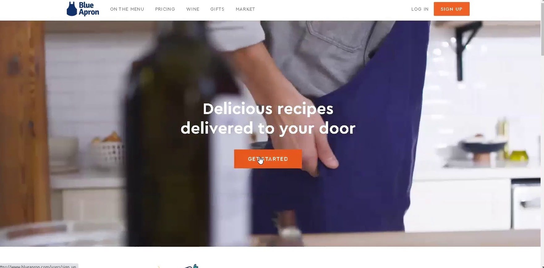
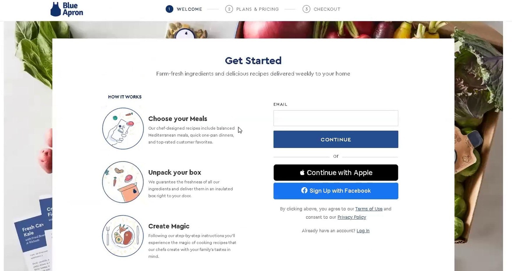
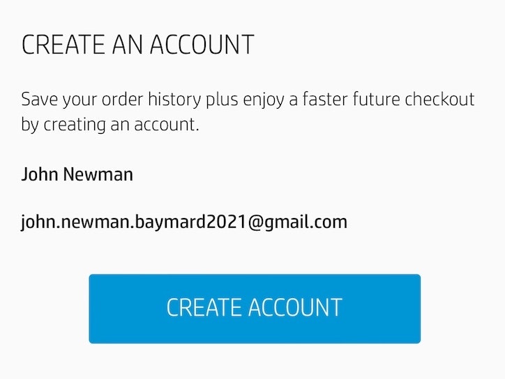
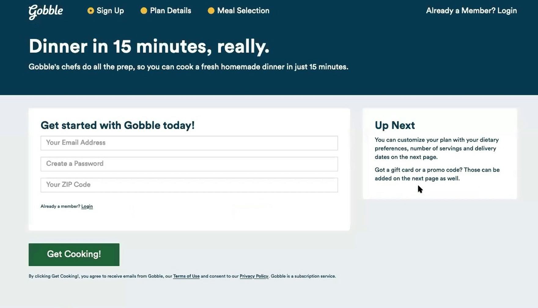
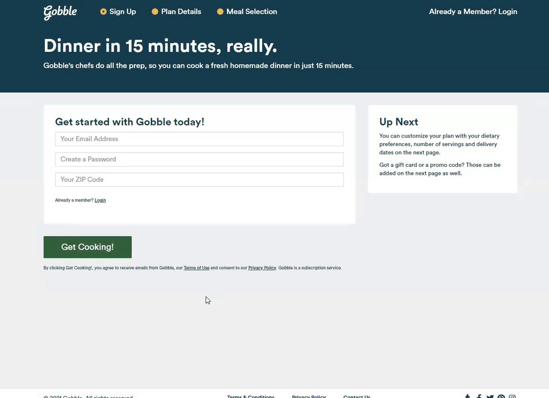
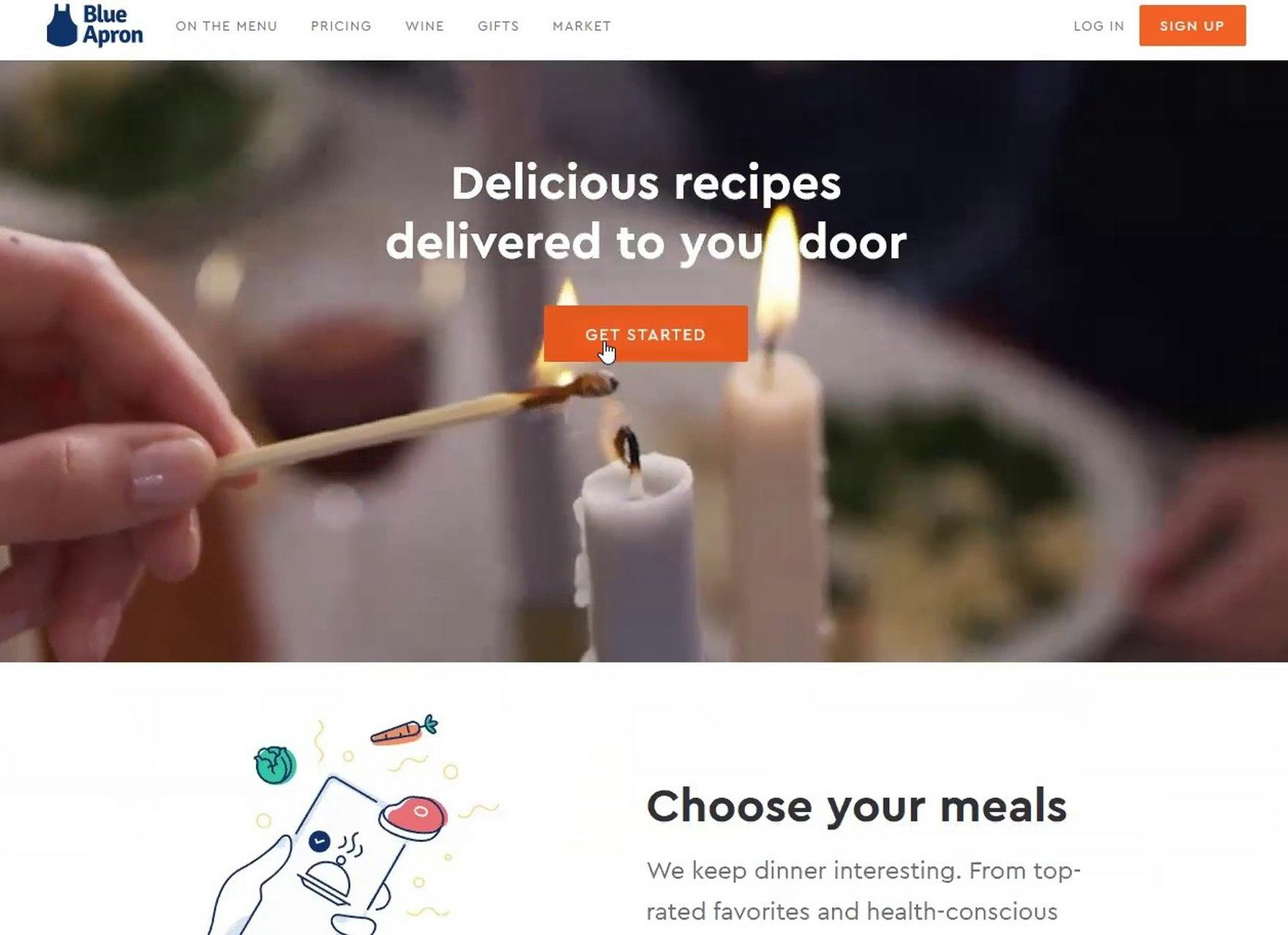
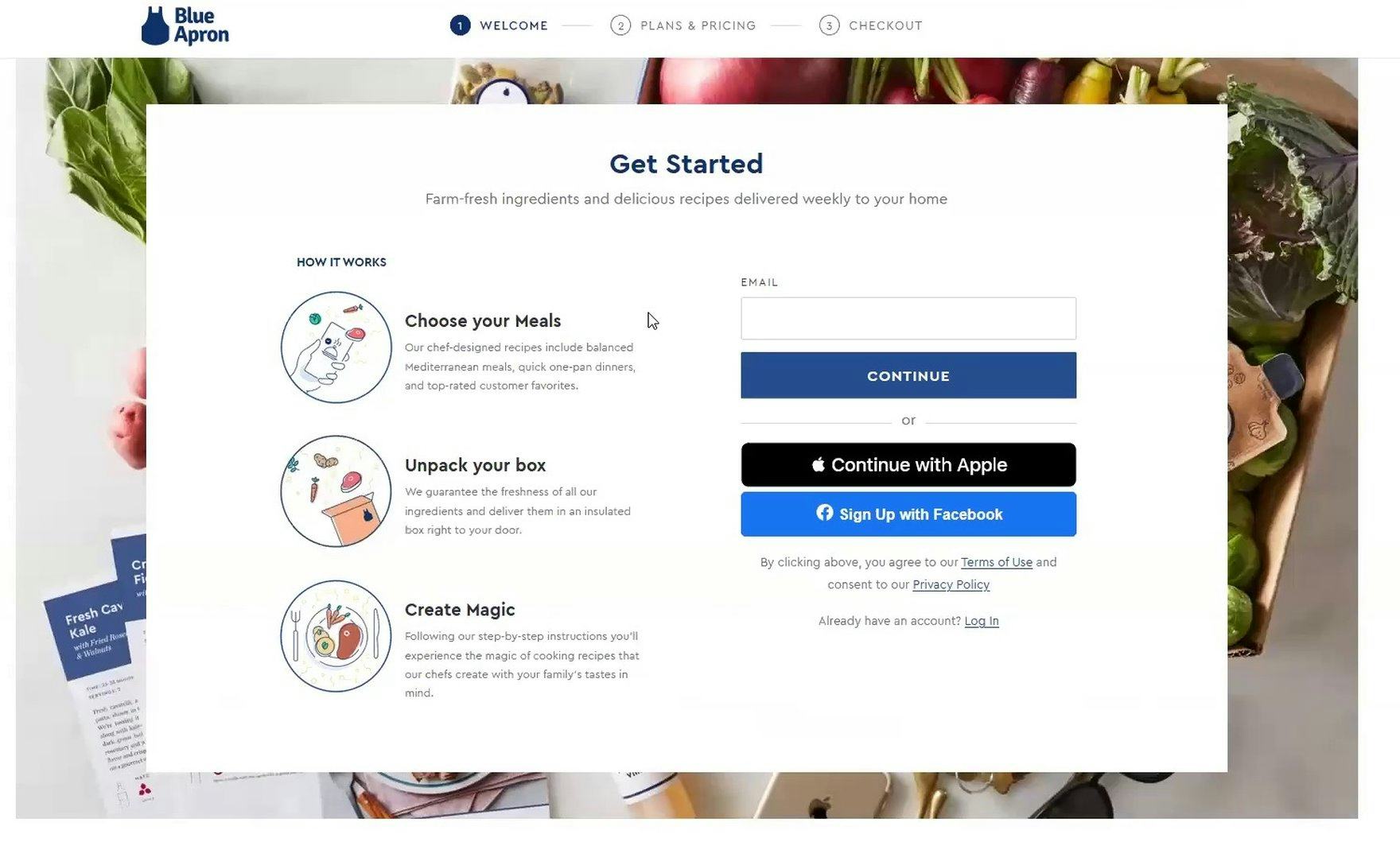
“I can’t seem to go anywhere else. [I’ve gone] as far as [I can] looking at information without signing up [and] giving another person my email. I thought the ‘Get Started’ was gonna take me somewhere [with more information], but it only took me to a page where I was forced to sign up before deciding if I wanted to sign up.” At Blue Apron, a user clicked the primary CTA — “Get Started” (first image) — to learn more about the subscription service but was unexpectedly stopped by an account wall asking for an email address (second image).
While seemingly a minor detail, during testing the issues caused by generically labeled primary CTAs like “Get Started” caused severe issues for users since the destination — an account wall — didn’t match their expectations, and were the direct cause of several abandonments.
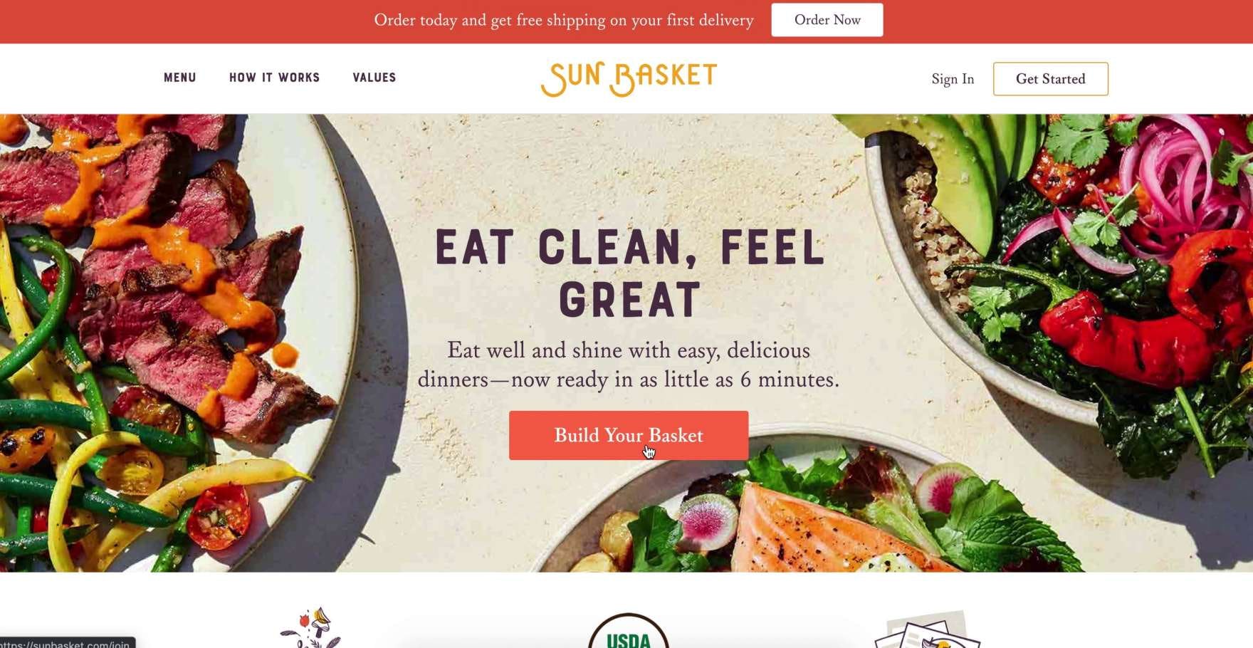
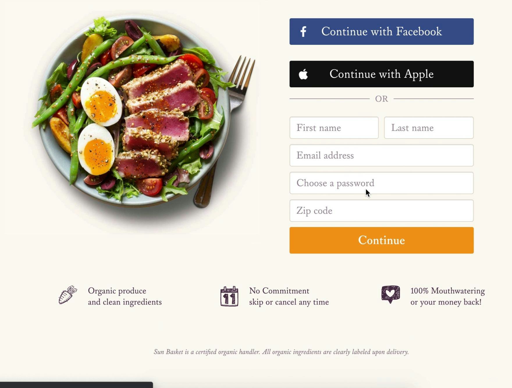
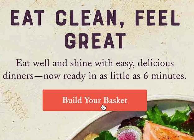
“Maybe I’ll try this [‘Build Your Basket’], instead of ‘Get Started’. No! I want to see…if I can choose 2 days a week, or 3 days a week.” At Sunbasket, a user was disappointed by both generically titled CTAs (i.e., “Get Started” and “Build Your Basket”; first image) as they both led to an account wall (second image).
Besides “Get Started”, other common primary CTAs have CTA microcopy such as “Build Your Box” or “Choose Your Plan”. In the end, however, it’s not the labeling of the primary CTA that matters as much as what users see immediately after clicking the CTA.
As one user on Sunbasket put it, “Let’s see if we can ‘Build our basket’. [Clicks CTA.] Nope. These guys are all in cahoots to make sure they get your personal email before you get to look behind the curtain.”
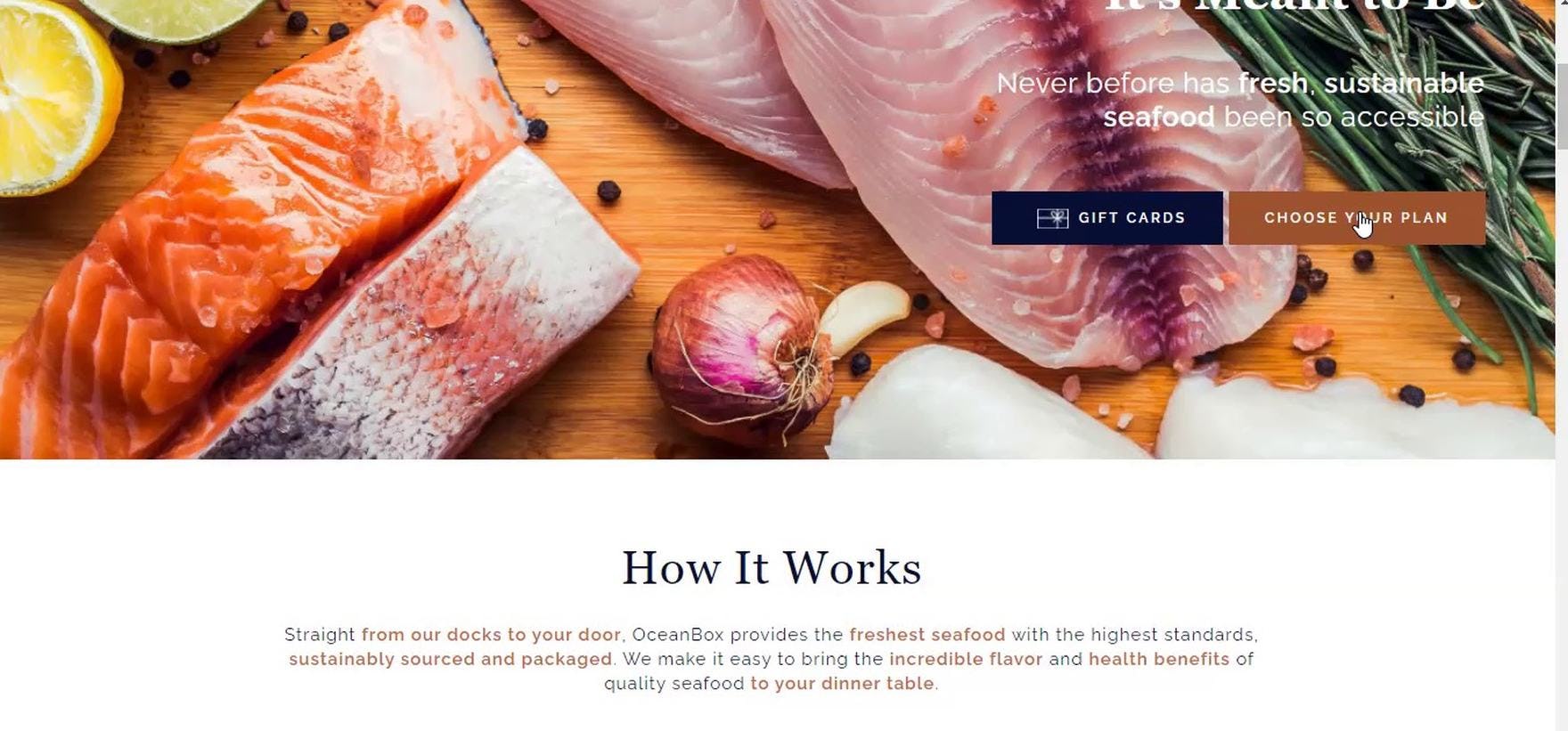
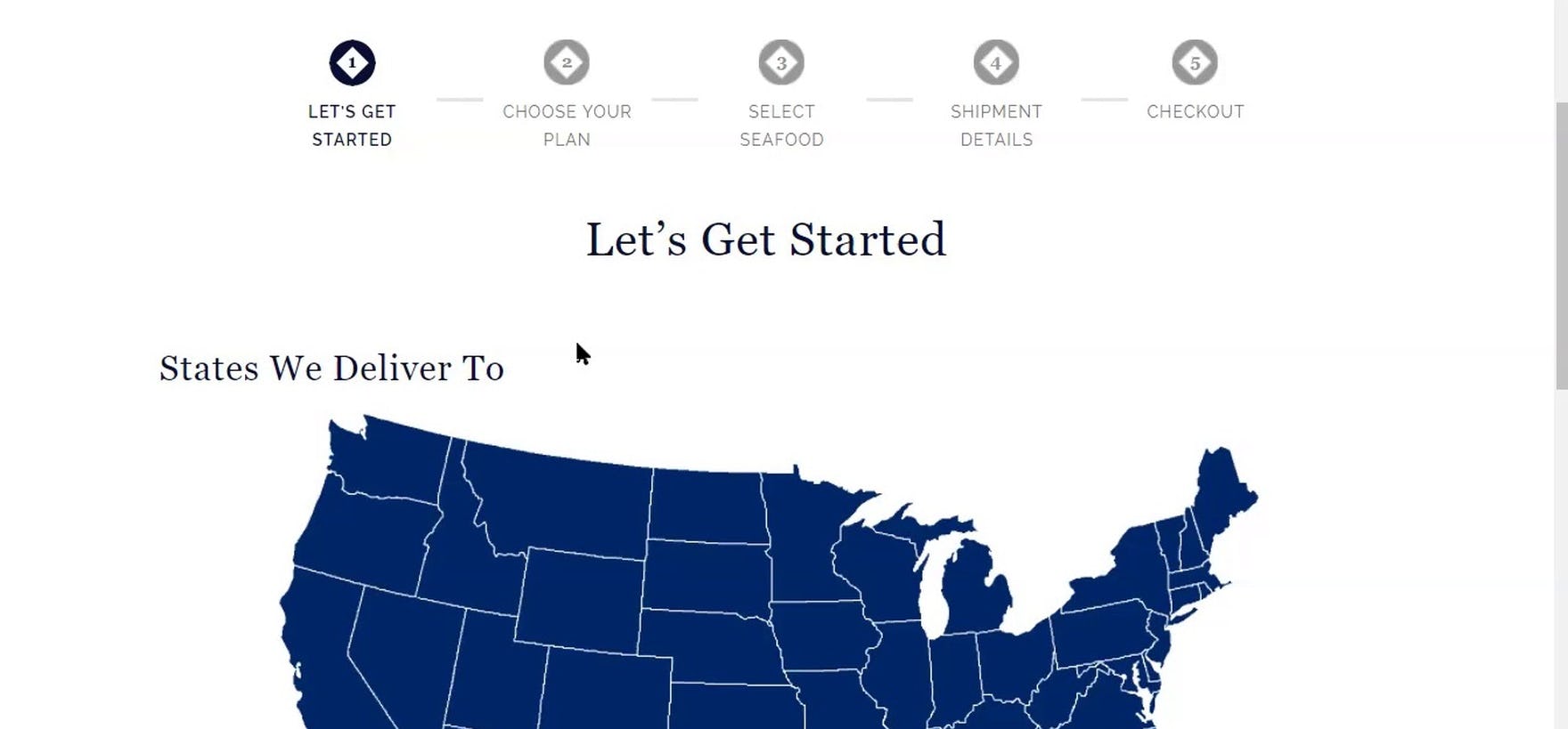
“‘Choose My Plan’. Let’s see if it’s any different than [Butcherbox] was.” At Oceanbox, the primary CTA was titled “Choose Your Plan” (first image). However, instead of leading to an unexpected account wall — as the user had experienced at both Crowdcow and Butcherbox — the user was brought to the first step in the plan-selection process, where the only information required was a zip code, requested at the bottom of the first step (second image). Oceanbox only asks users for personal information at step 5 of the plan-selection process (“Checkout”), after users have selected a plan, determined a frequency of delivery, and learned a bit more about the process.
To avoid users becoming disoriented and upset at where they wind up after clicking a primary CTA, avoid requesting personal information immediately after users click the CTA.
Instead, save such requests for later in a user’s site journey — ideally, during the checkout flow, or at least at the end of a plan-selection flow, quiz, or page that first describes the service in more detail.
Notably, however, a request for general location information, such as a zip code, was tolerated by all users during testing, who understood that basic information was necessary to tailor the information and options shown.
3) Meal Kit Sites Need to Perform Well in Many Other Typical E-Commerce Areas
During meal kit testing, requests or requirements for personal information were observed to be very common and very detrimental to users’ experience on the sites.
While such issues also occur on general e-commerce sites, they tend to be much less prevalent — indeed, the issues caused by requests for personal information are where the experience of users on meal kit sites tends to differ most from their experience on general e-commerce sites.
Yet, when it comes to exploring individual meals or recipes, users on meal kit subscription sites, perhaps surprisingly, have much the same needs as general e-commerce users.
For example, many users on meal kit sites are likely to begin by scanning the homepage of the site in an attempt to get a broad overview of the service — much like users who are new to a general e-commerce site do.
Yet some sites during testing failed to provide “the basics” on this key page, or made it overly difficult to access critical information — making it more likely that users will decide to simply drop the site from consideration.
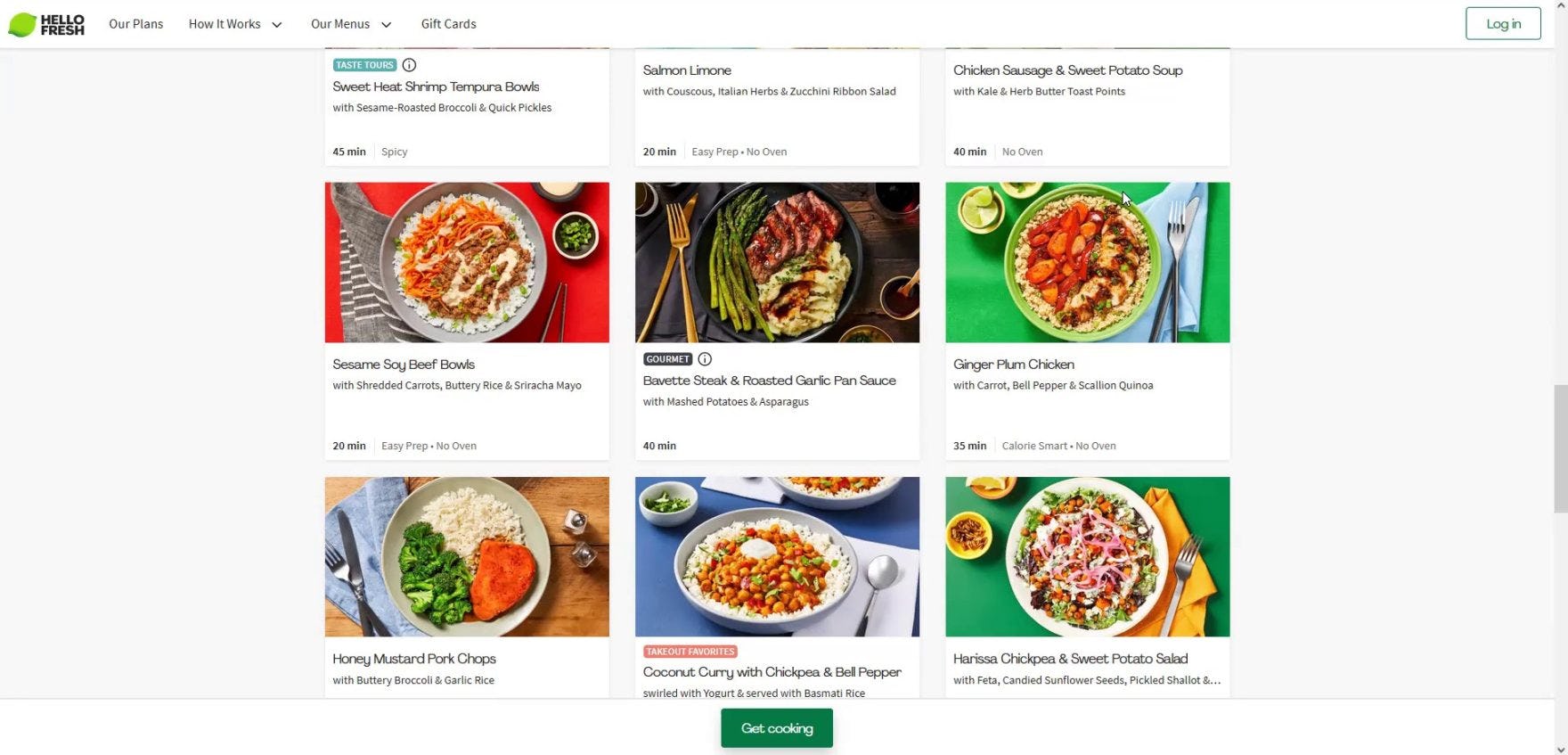
“I really like the way the recipes look. Just scrolling quickly, it looks like they’re well balanced. You know, a third meat, a third vegetables, on top of a carb.” At HelloFresh, users appreciated seeing lifestyle thumbnail images on the product list as they were visually appealing — and thus more likely to get users excited about the meal kit subscription service.
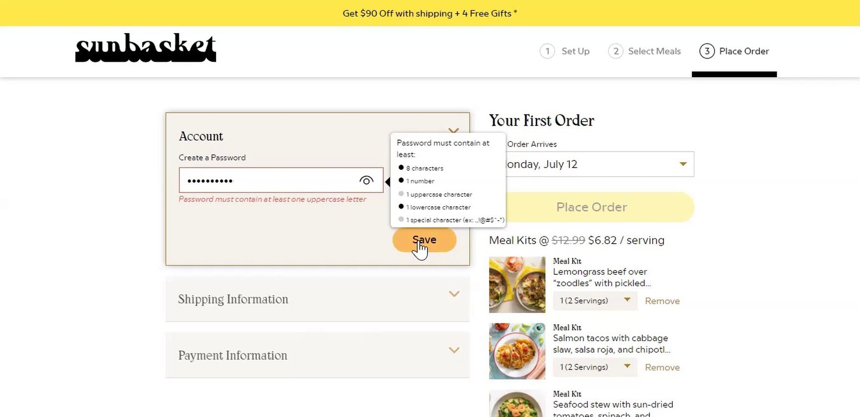
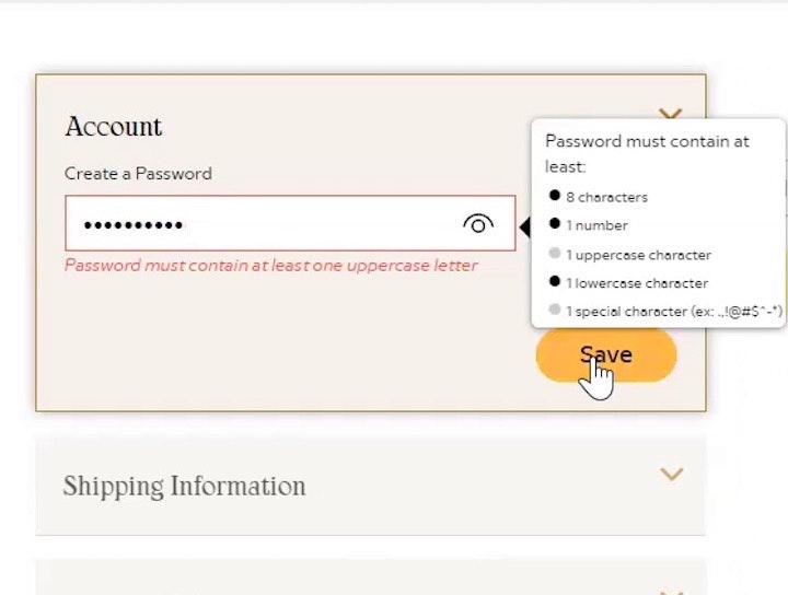
“It needs at least one lowercase letter, one uppercase letter. Are you kidding me?” At Sunbasket, password-creation requirements were overly complex for some users, who couldn’t use their “go-to” password for shopping online.
Additionally, much of the other information and features common to nearly all e-commerce sites were also found to be important on meal kit sites, including
- effective and well-organized filters,
- detailed product (i.e., meal) descriptions and specs (e.g., ingredients, nutritional information, etc.),
- an engaging product image gallery,
- a clear, well-organized, and easy-to-navigate checkout flow, and
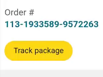
- order tracking and other account-management features.
Therefore, meal kit testing confirmed many of our existing guidelines — with some modifications to fit the meal kit context — indicating that meal kit sites need to ensure their site performs well on many of the e-commerce UX metrics that we’ve described in our other, general e-commerce research studies.
Help Your Meal Kit Site Stand Out among the Crowd
“Well, the first thing I would click is ‘Get Started’, because that’s obviously where they want you to start…And immediately, this is why I don’t use Blue Apron. Immediately, they want you to enter an email address to continue.” A user at Blue Apron was extremely annoyed that the “Get Started” CTA led to an account sign up page.
When it comes to meal kit services, testing made clear that users are willing to consider among an abundance of choices.
While there are certainly differences between the different services, users during testing were quick to abandon the meal kit site they were on if the site wasn’t performing as they expected.
Thus, it’s crucial that meal kit sites focus on ensuring the site experience performs at a high level to avoid losing potential customers.
In particular, it’s especially important to pay close attention to 3 high-level aspects of the meal kit UX:
- Provide users with as much information as possible without requiring them to sign in
- Avoid immediately asking or requiring personal information from users after they click the primary CTA
- Ensure the site performs well across as many of our other e-commerce guidelines as possible
Ensuring your meal kit site performs well across these 3 high-level aspects of meal kit UX will help your site stand out from the crowd — and will likely result in a better-performing e-commerce conversion rate.
Getting access: all 350+ meal kit UX guidelines are available today via Baymard Premium access. (If you already have an account open the Meal Kit Study.) You may also want to visit our audit page for information on booking an audit of a meal kit site with a Baymard auditor.