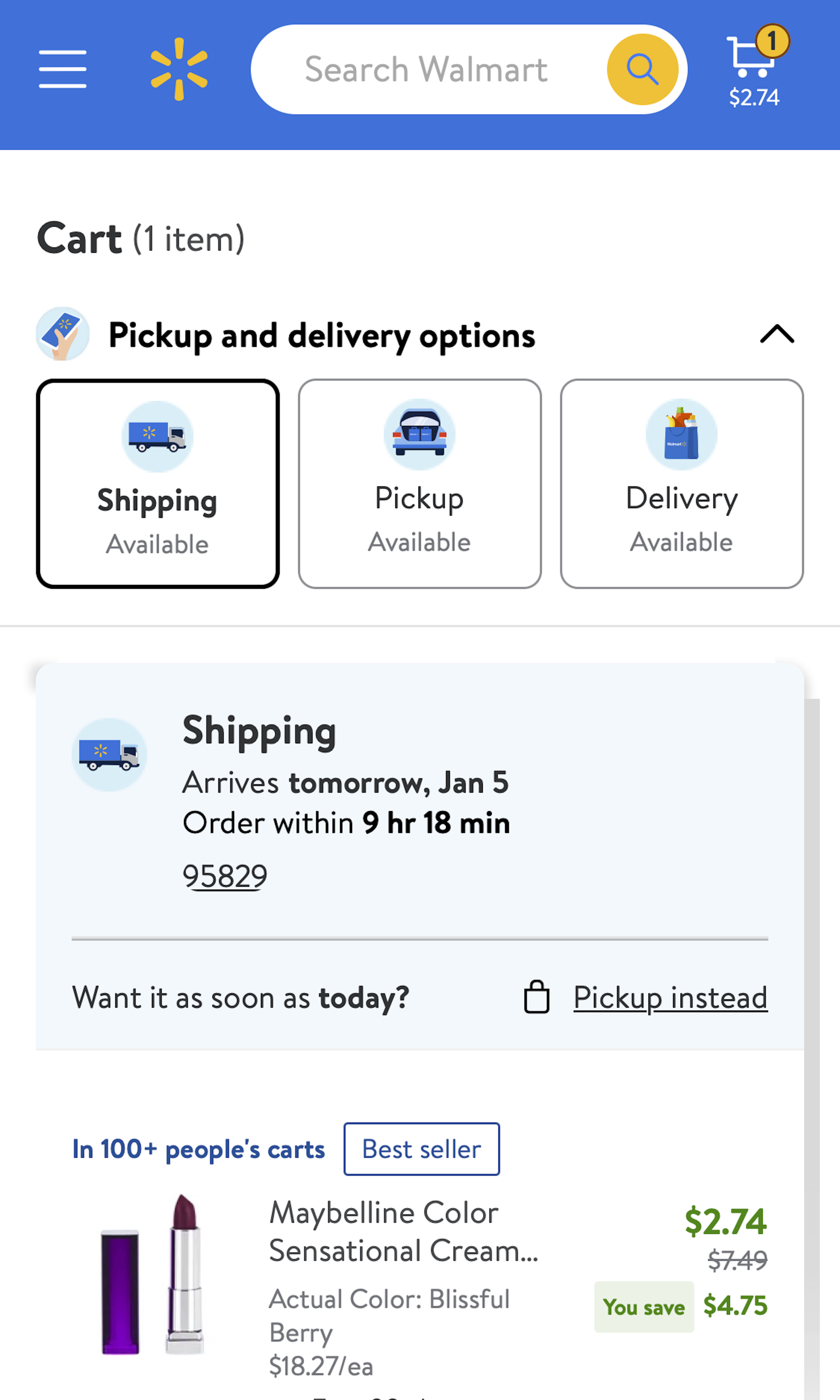
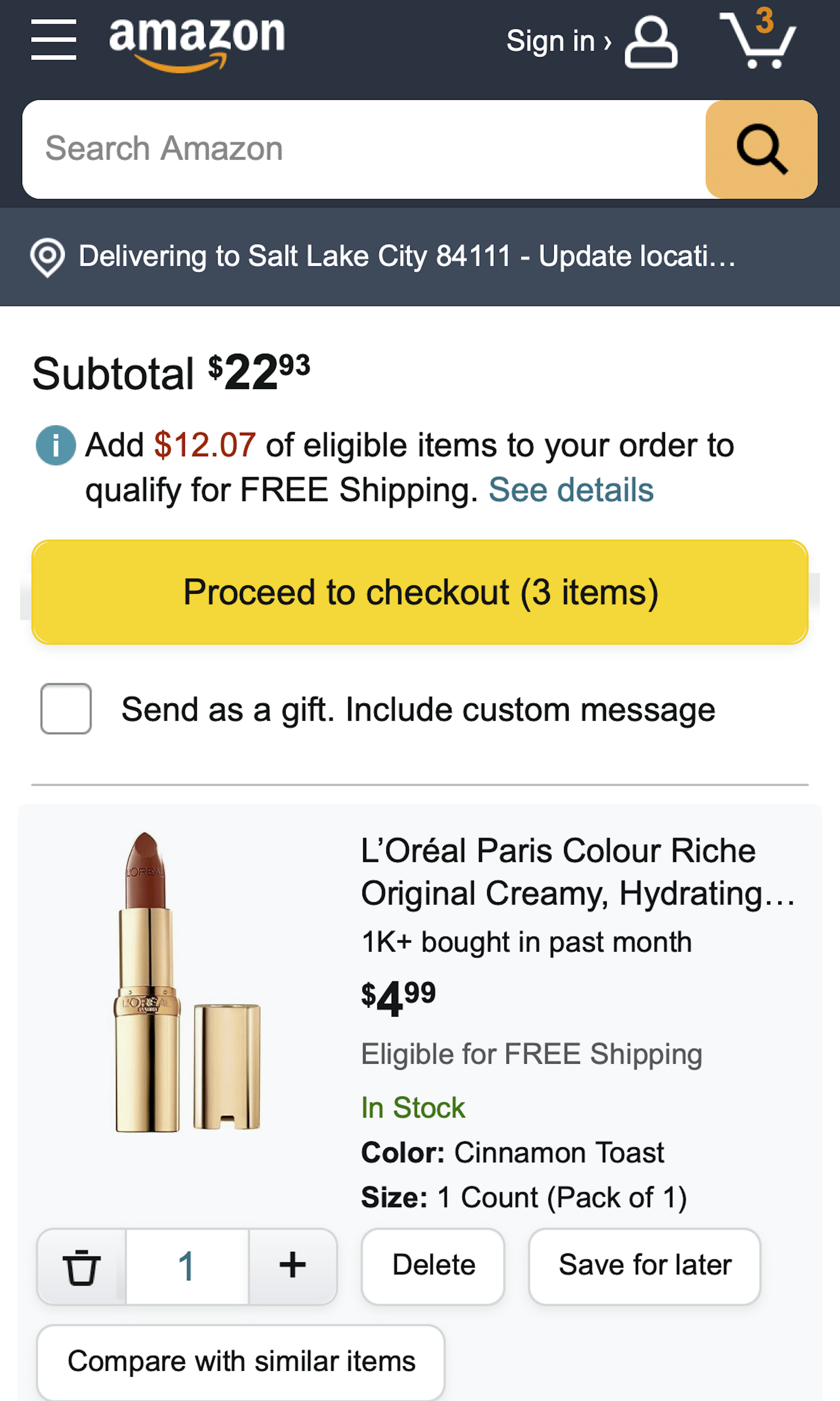
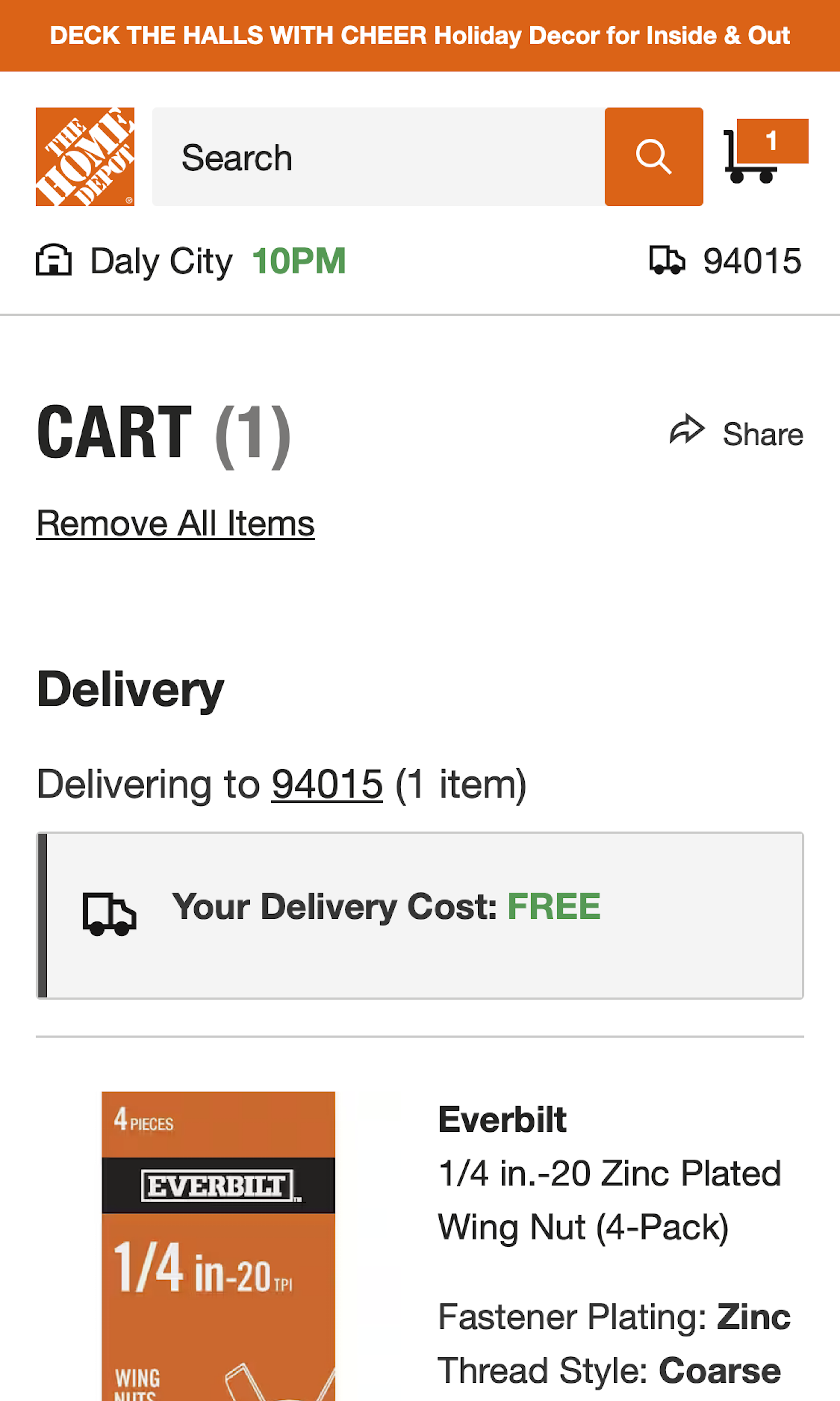
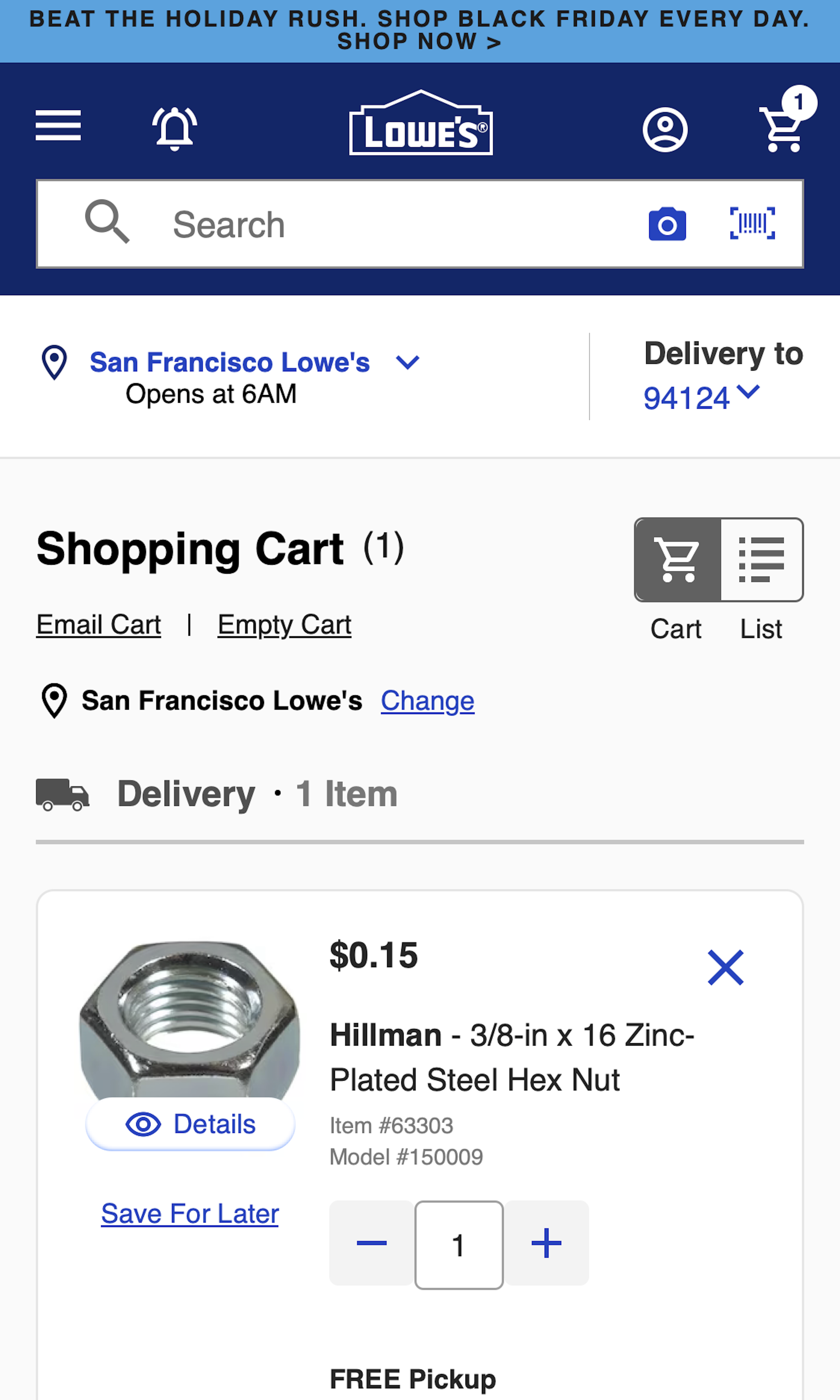
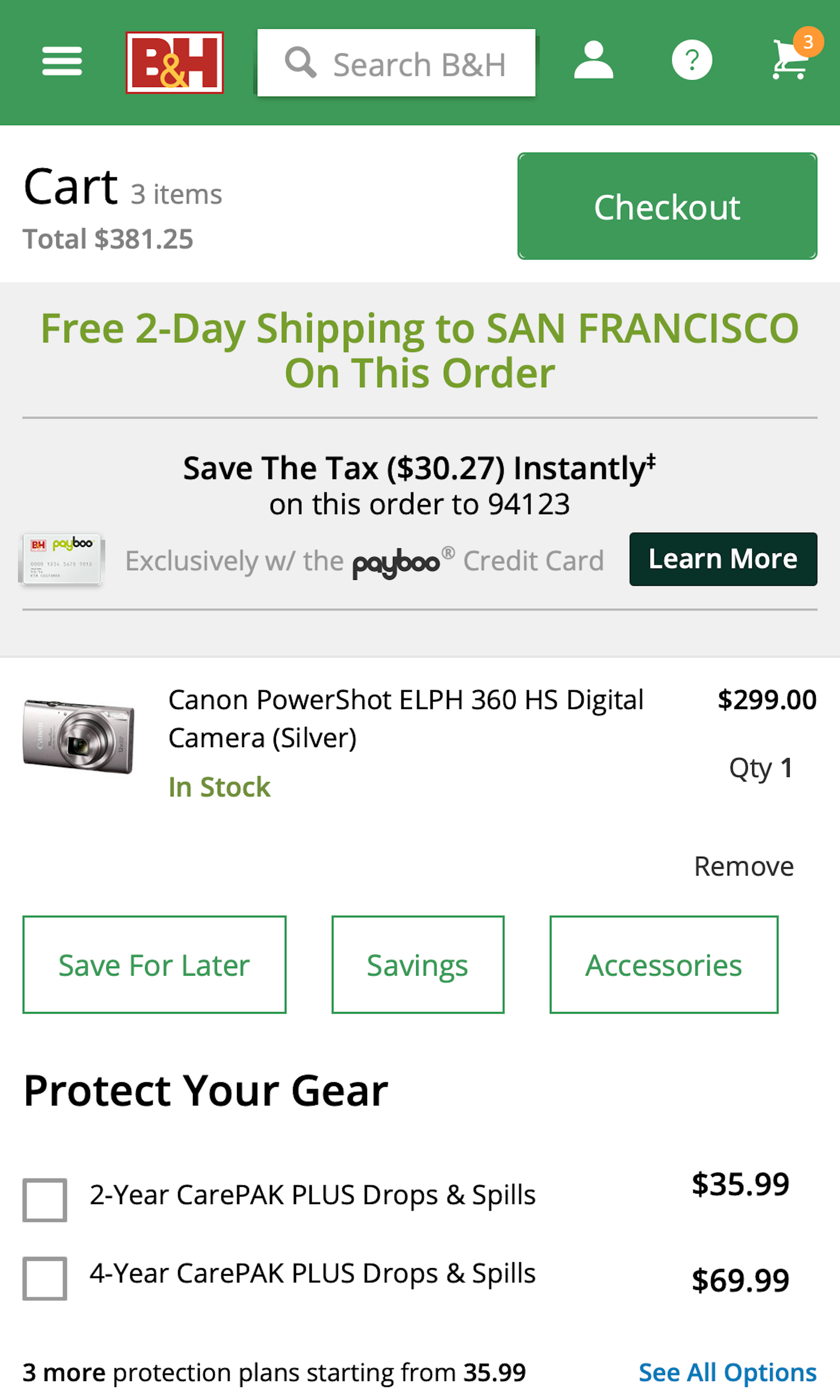
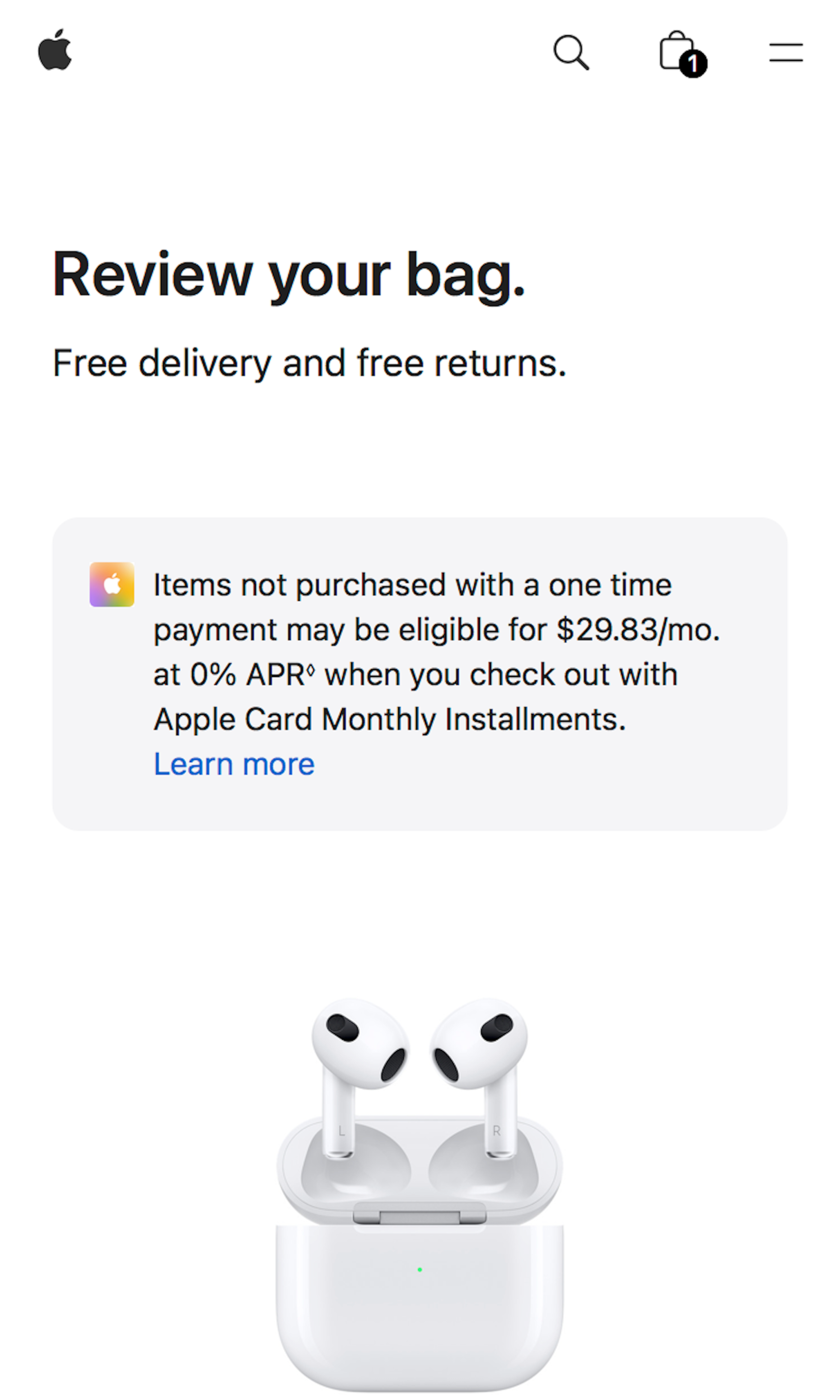
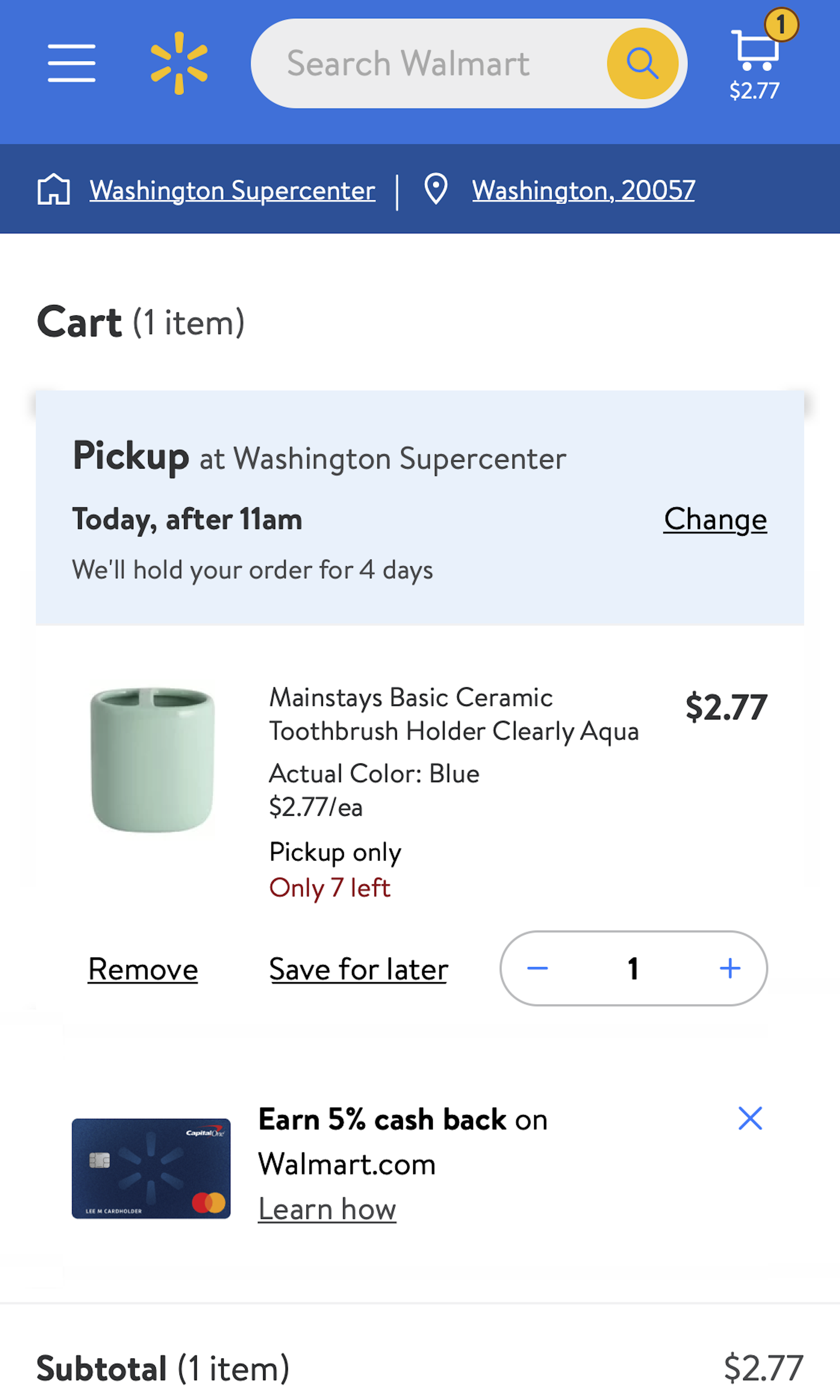
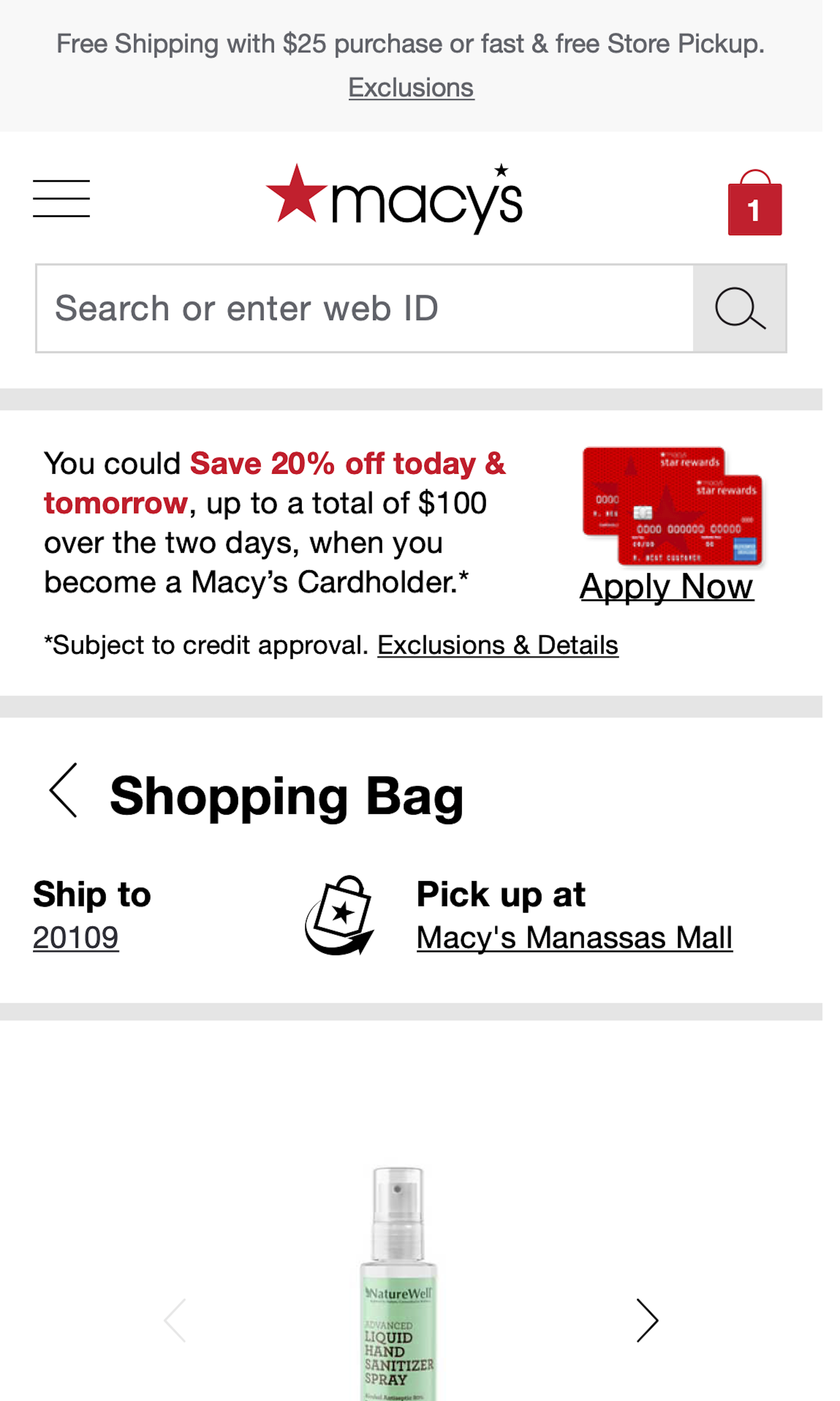
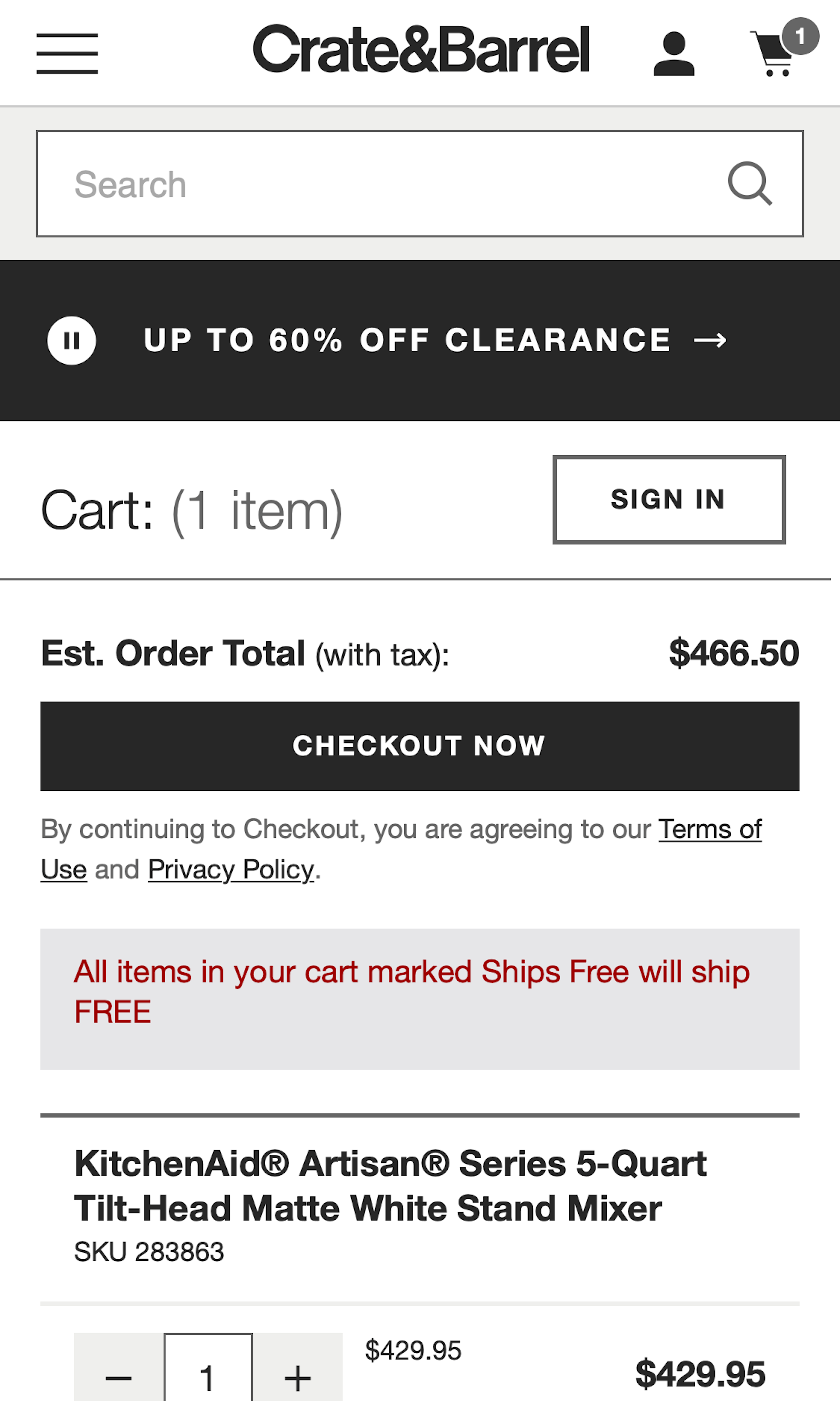
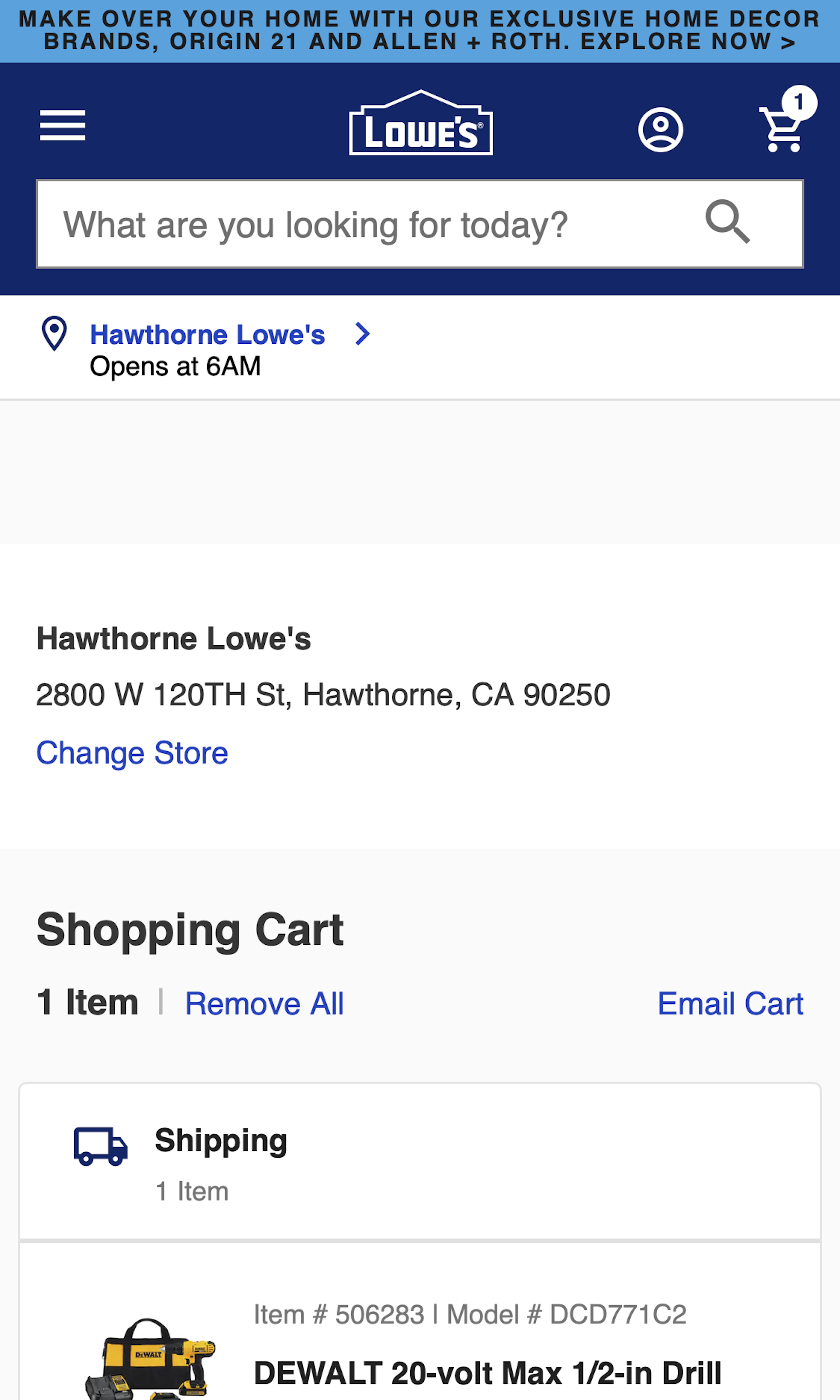
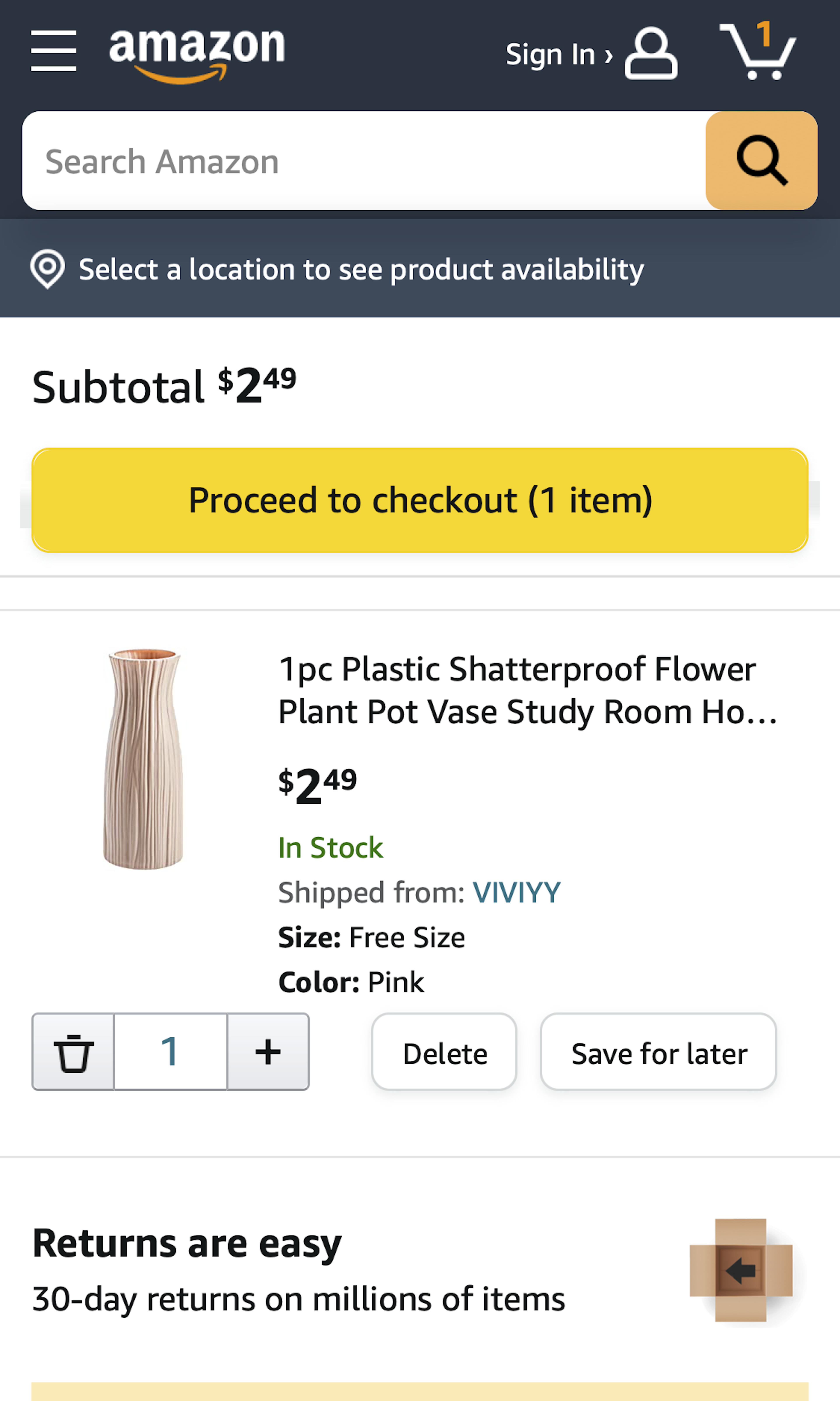
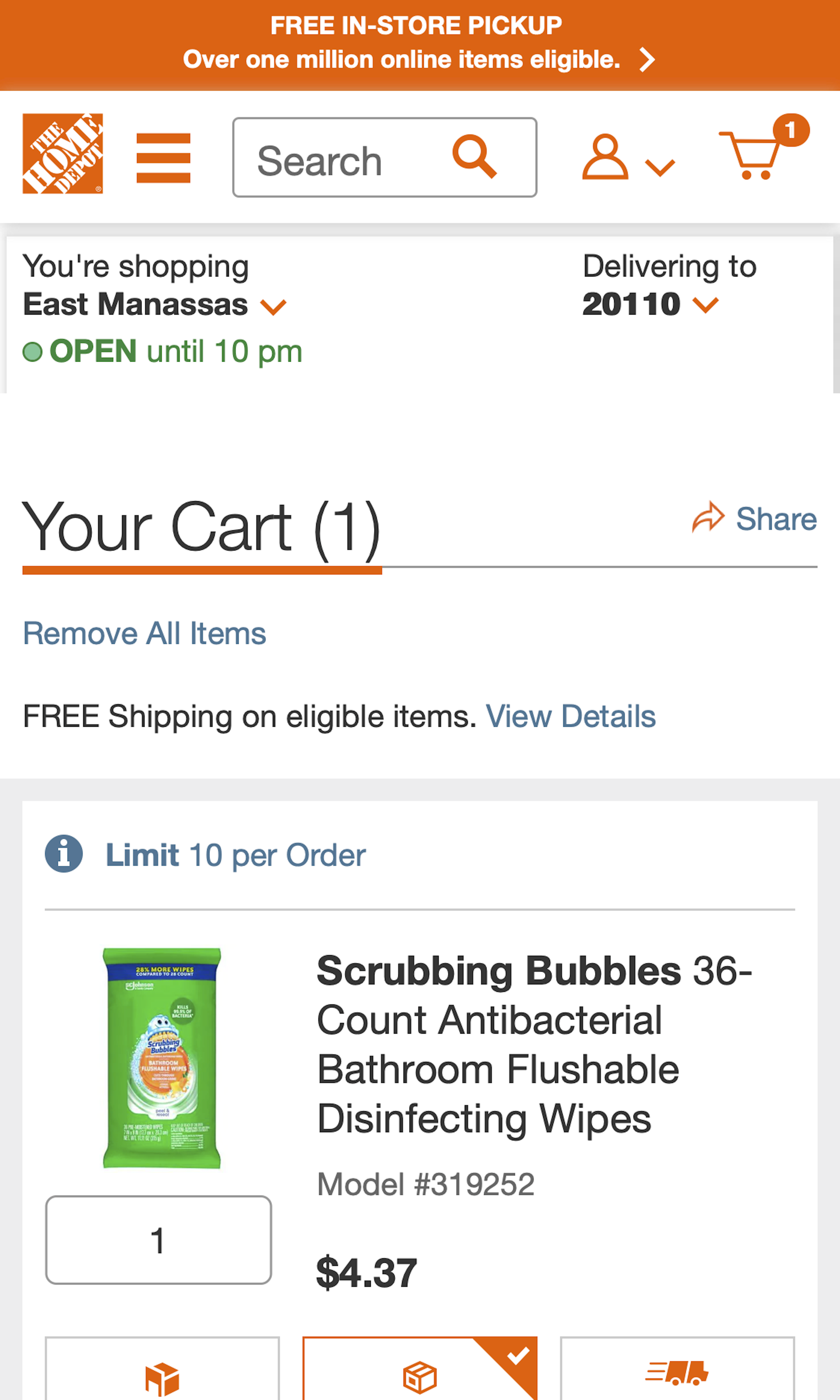
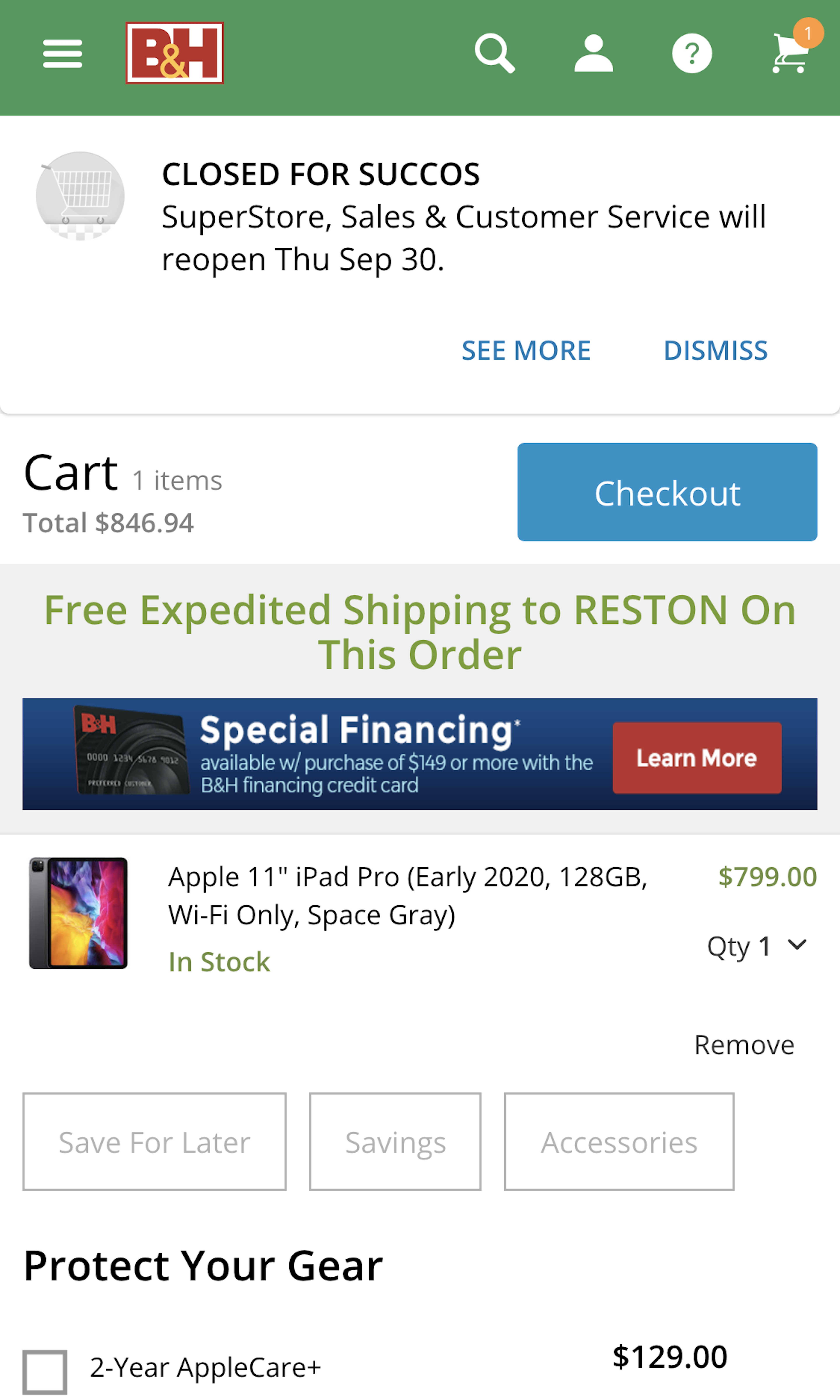
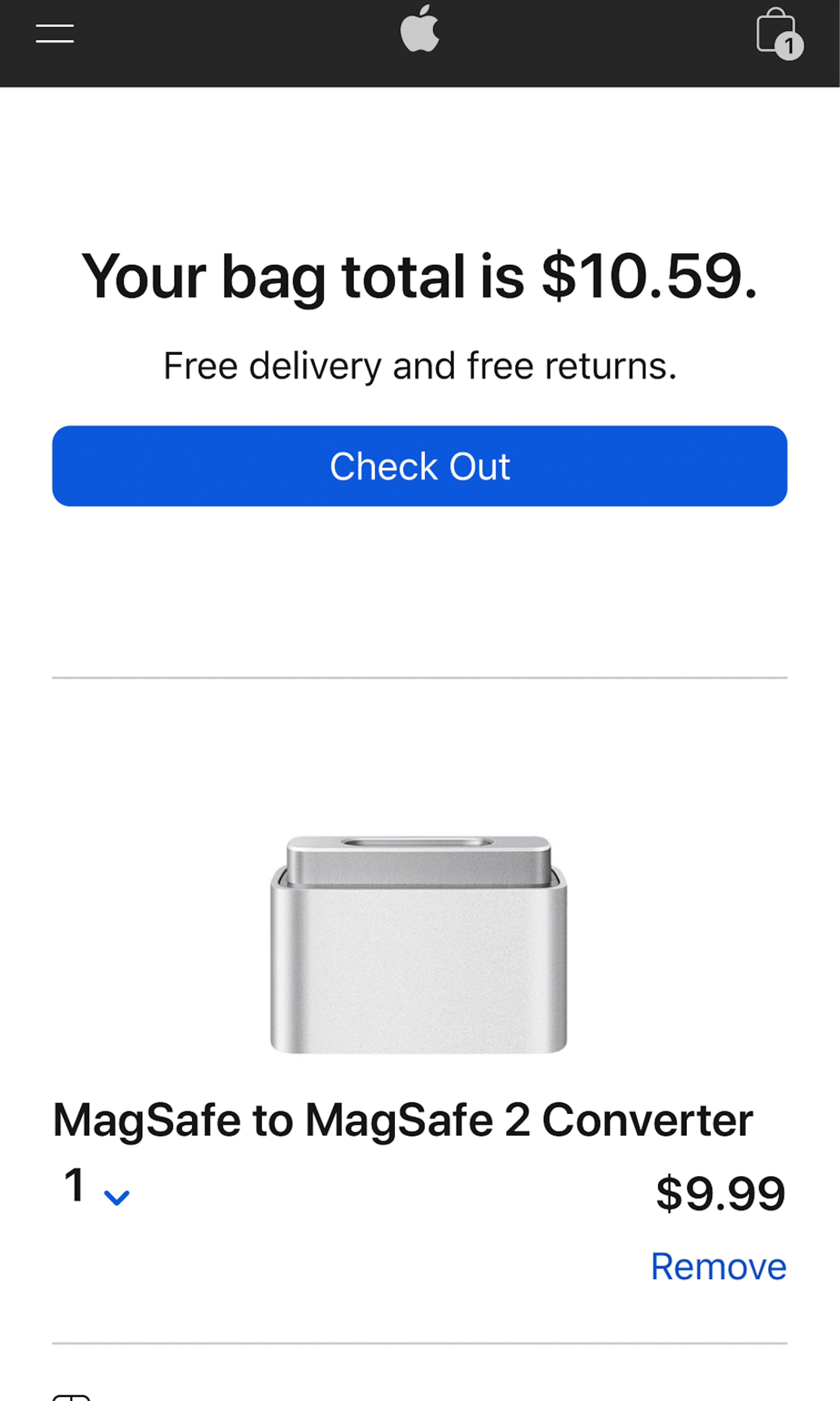
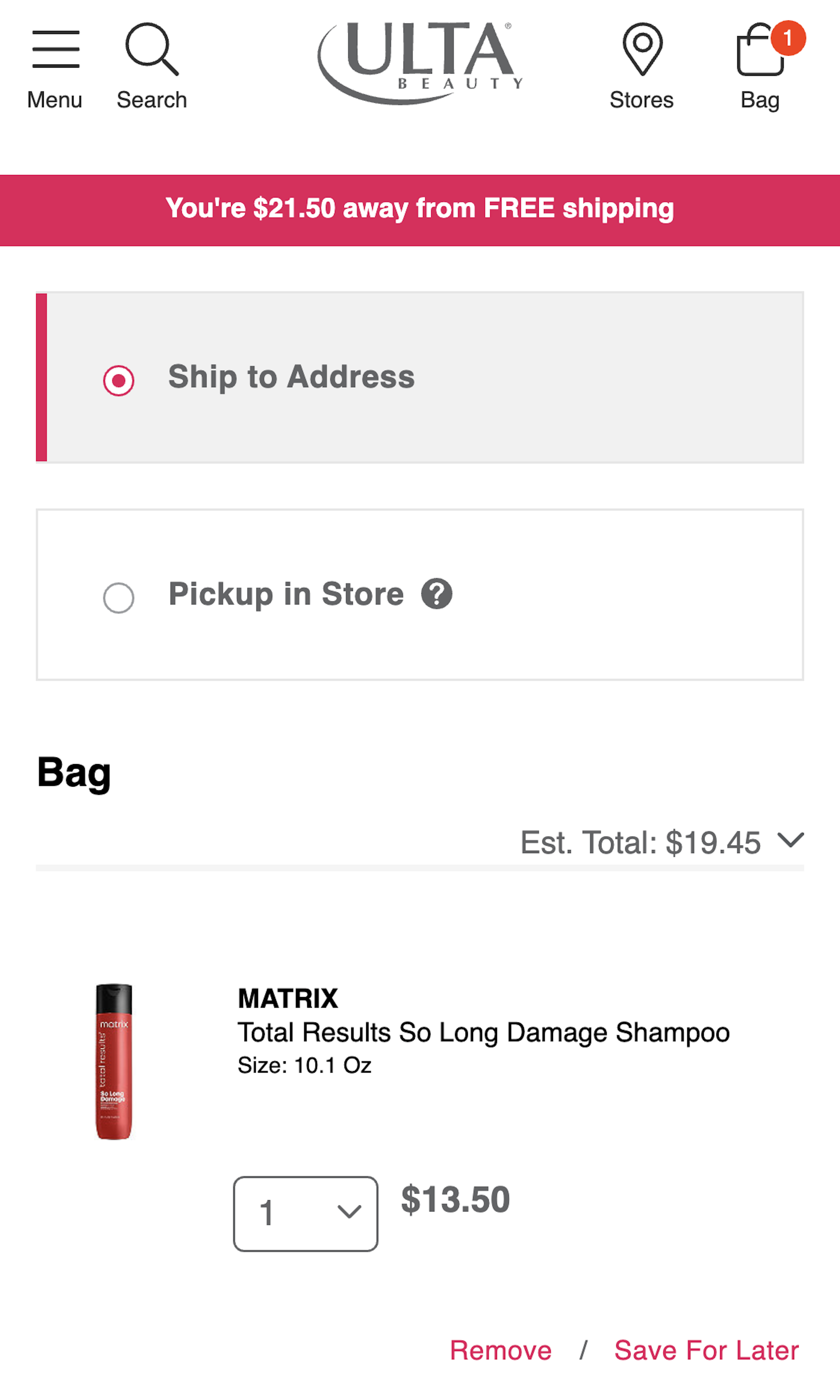
What’s this? Here you’ll find 506 “Mobile: Cart” full-page screenshots annotated with research-based UX insights, sourced from Baymard’s UX benchmark of 93 ecommerce sites. (Note: this is less than 1% of the full research catalog.)
In our large-scale usability testing we consistently observe that the mobile Shopping Cart is used differently than on desktop websites. Due to the more cumbersome mobile navigation, the mobile cart is very often used as “a convenient placeholder for temporarily storing and comparing products of interest”. As in, users put several similar items in their cart only to then explore the items fully and then remove most products. This user behavior sets strict design requirements for the mobile shopping cart.
More ‘Cart’ Insights
-
Desktop Examples: Besides the mobile examples below, we also have 115+ desktop examples of Cart implementations.
-
Learn More: Besides exploring the 84 “mobile shopping cart” design examples below, you may also want to read our related article “The State of Mobile Ecommerce Search and Category Navigation”.
-
Get Full Access: To see all of Baymard’s 351 mobile research findings you’ll need Baymard Premium access. (Premium also provides you full access to 200,000+ hours of UX research findings, 650+ ecommerce UX guidelines, and 275,000+ UX performance scores.))
User Experience Research, Delivered Weekly
Join 60,000+ UX professionals and get a new UX article every week.

User Experience Research, Delivered Weekly
Join 60,000+ UX professionals and get a new UX article every week.

Explore Other Research Content

300+ free UX articles based on large-scale research.

327 top sites ranked by UX performance.

Code samples, demos, and key stats for usability.


