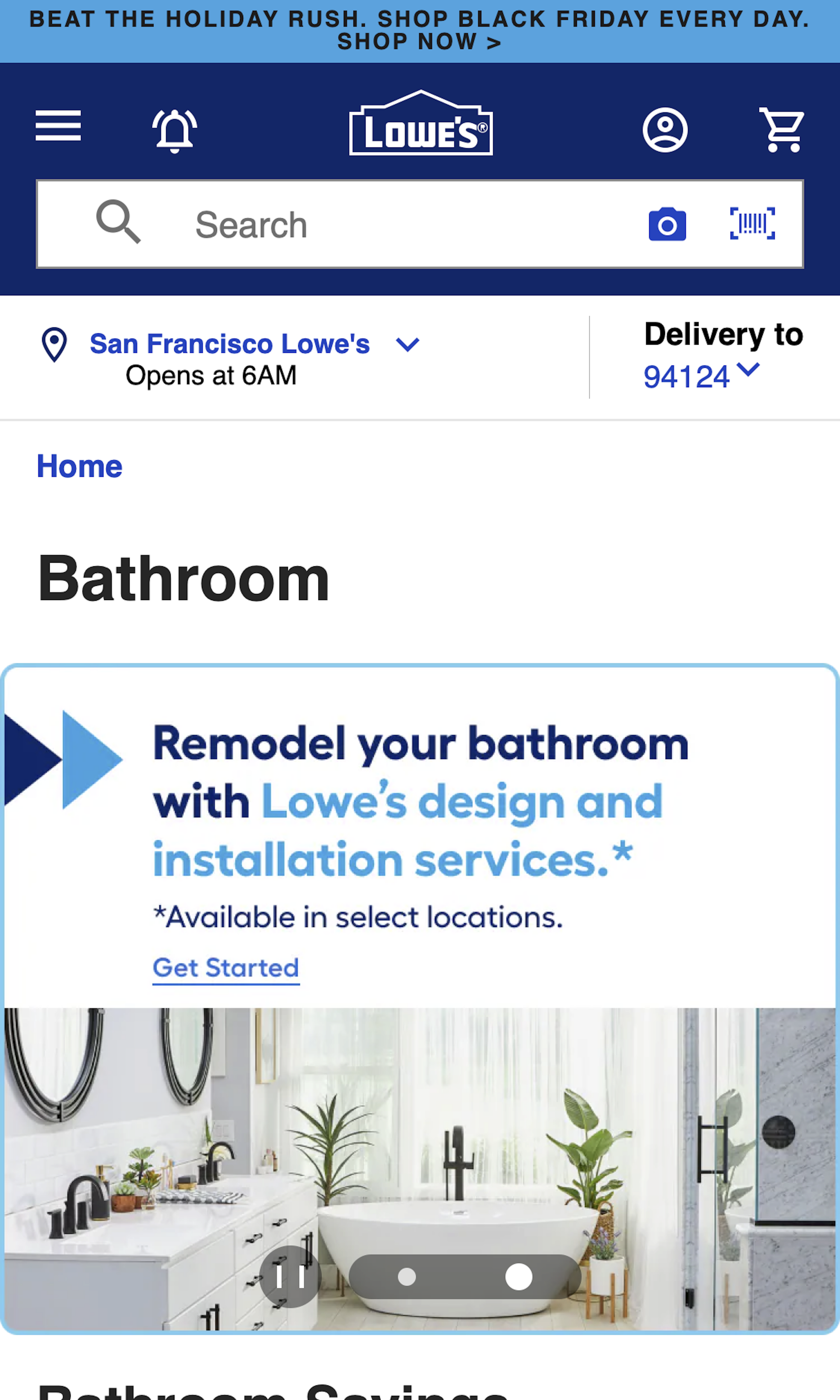
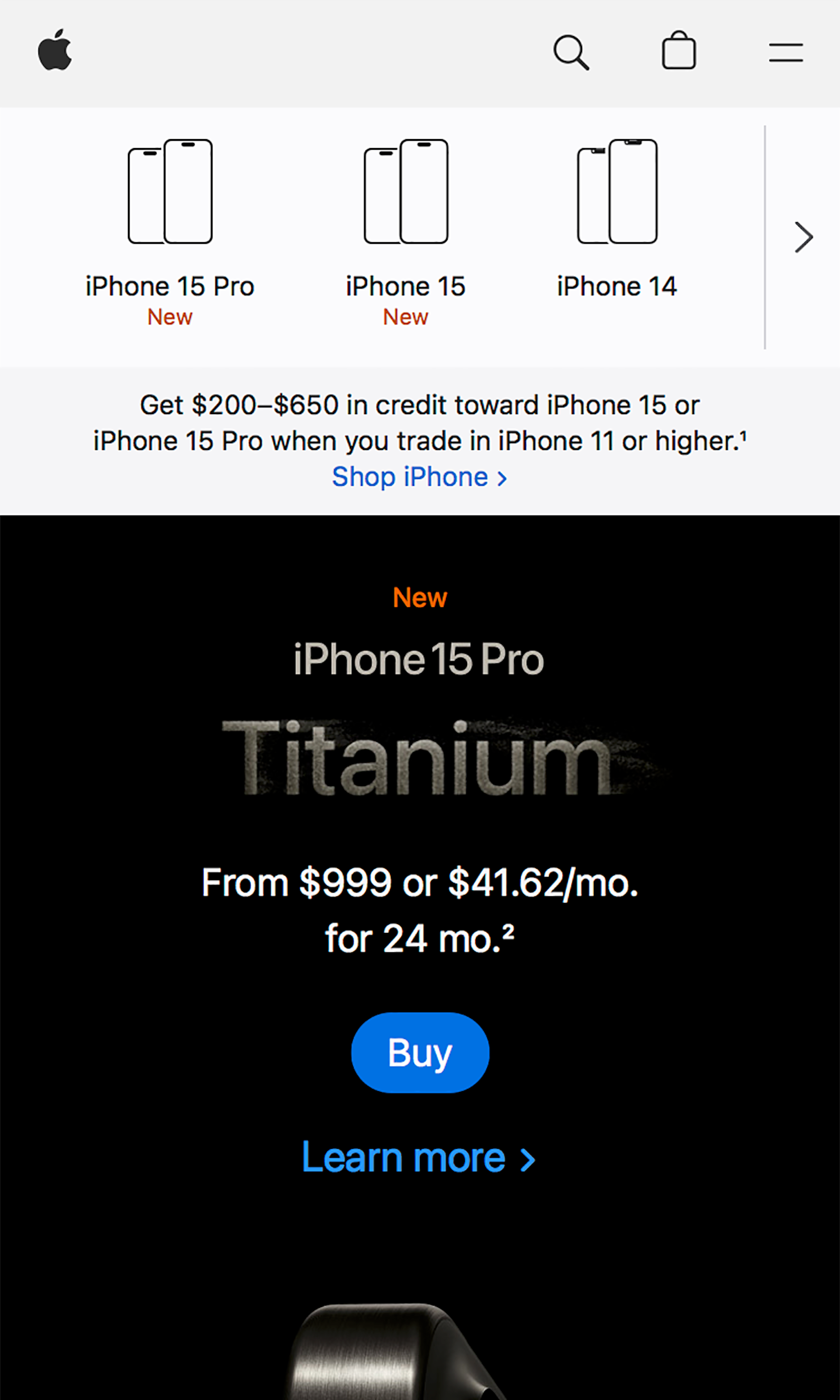
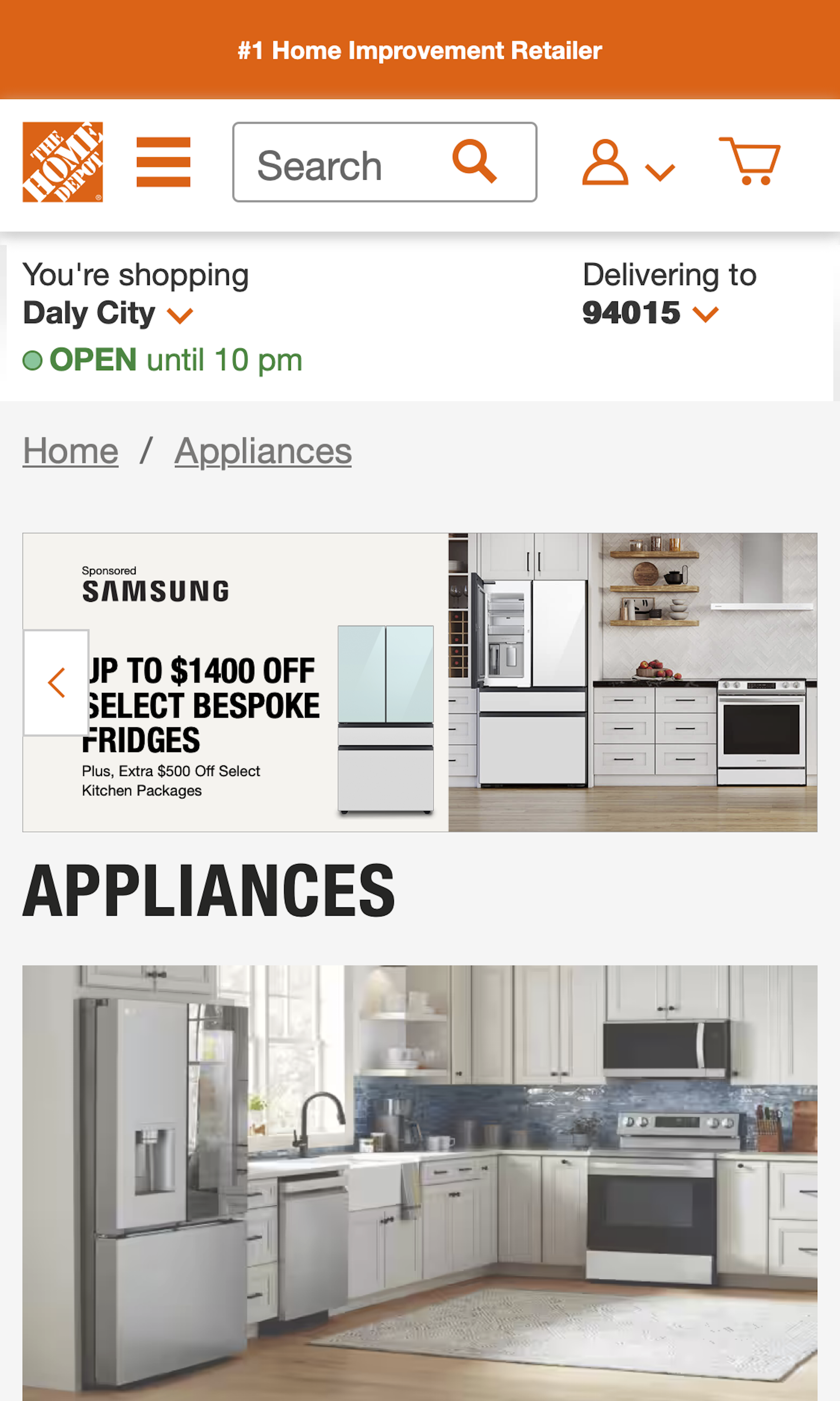
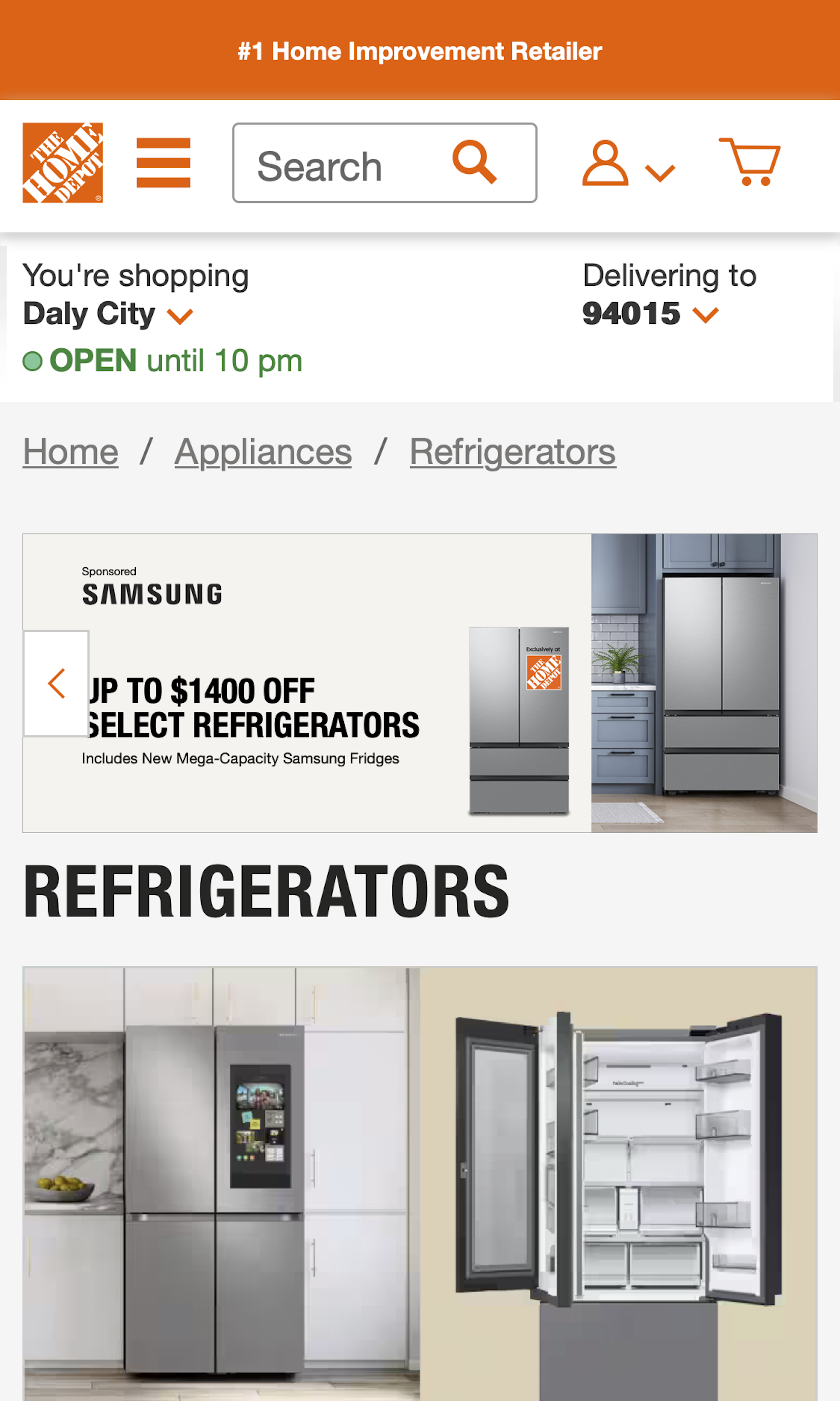
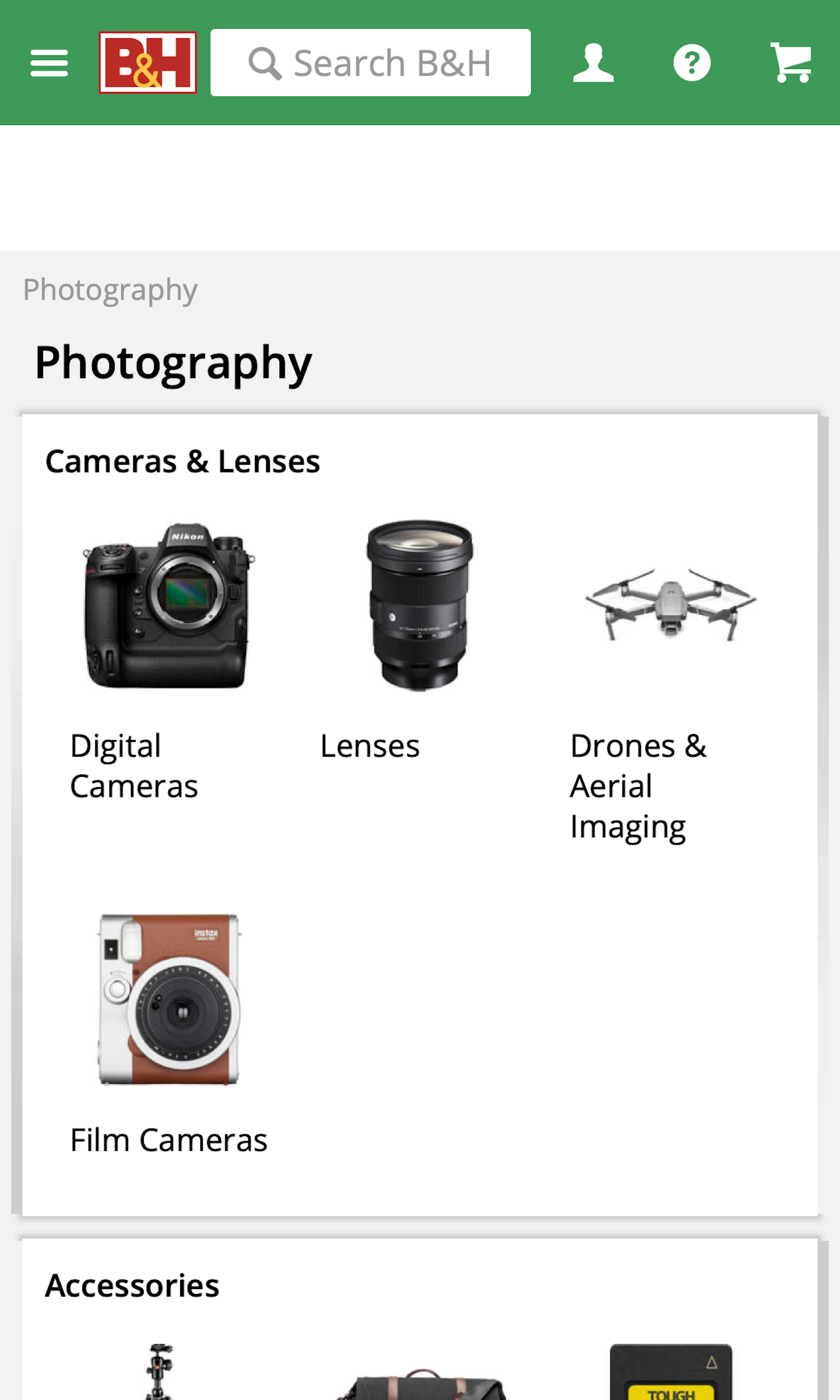
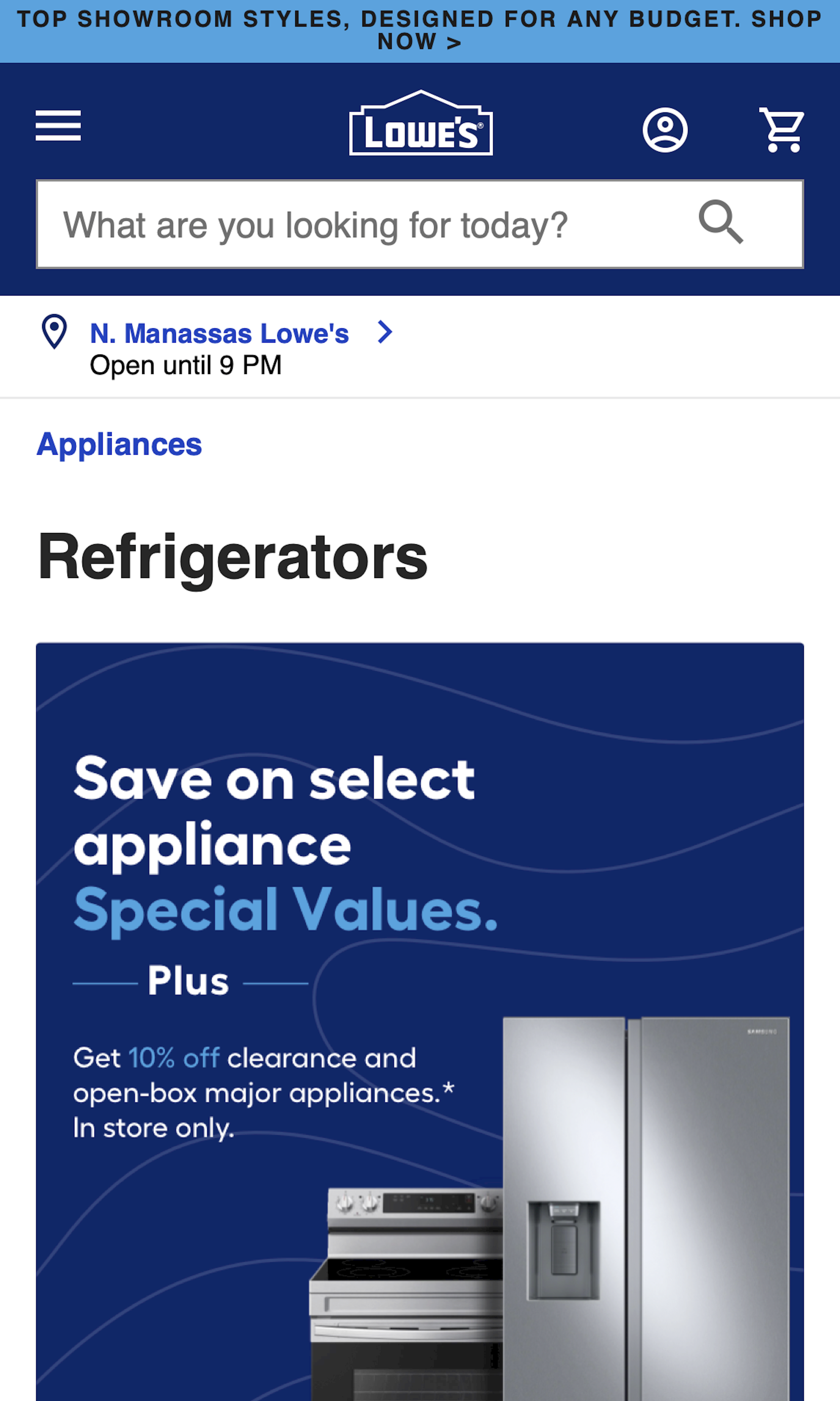
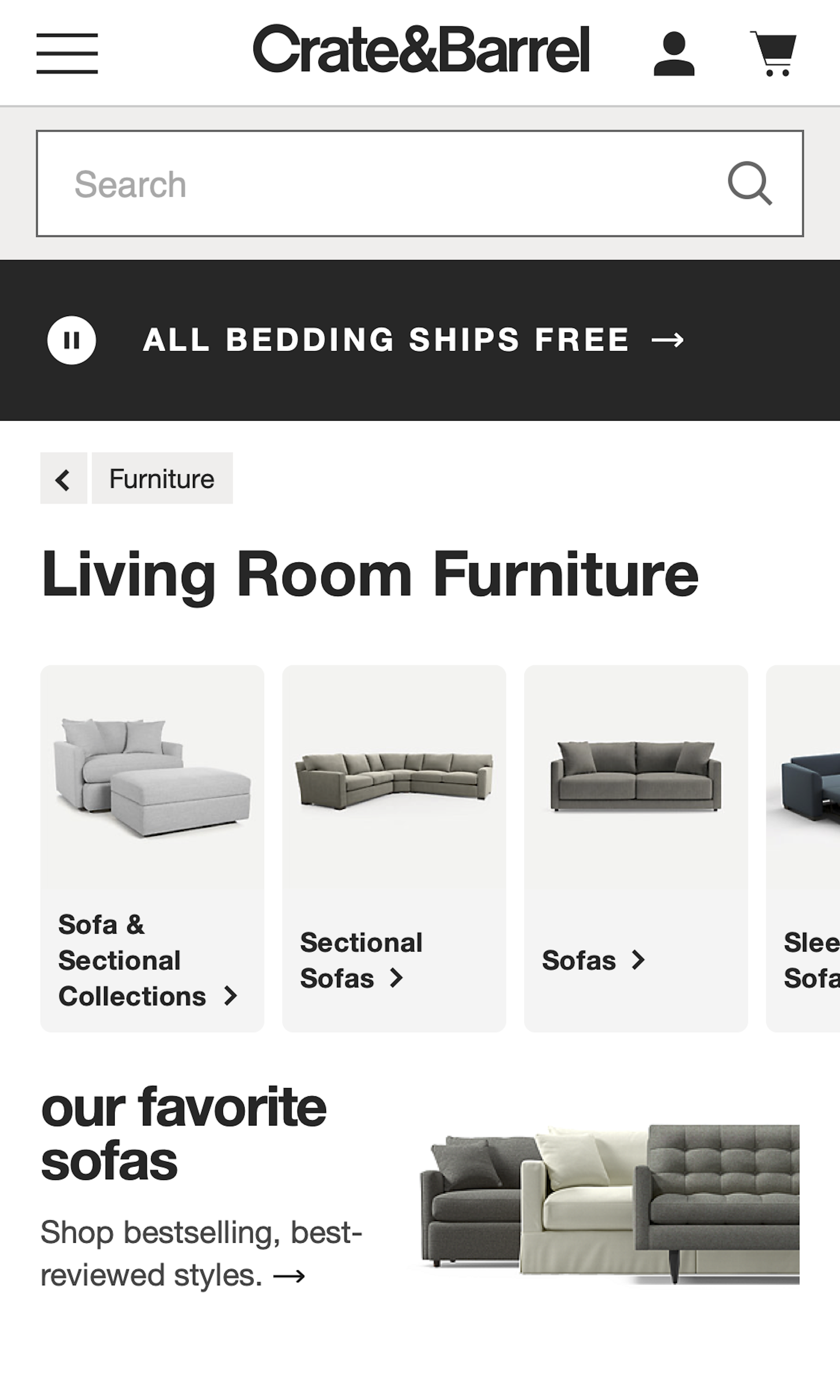
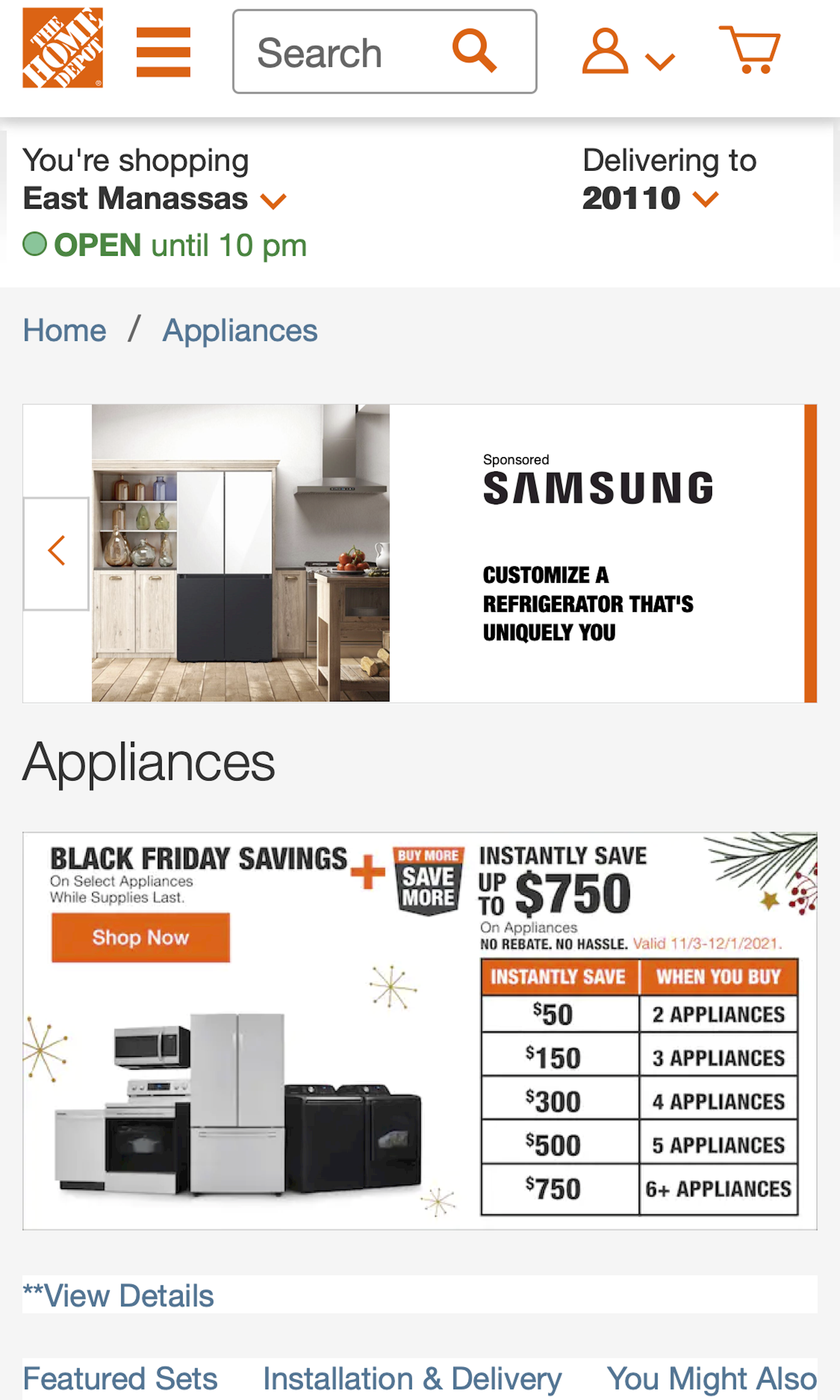
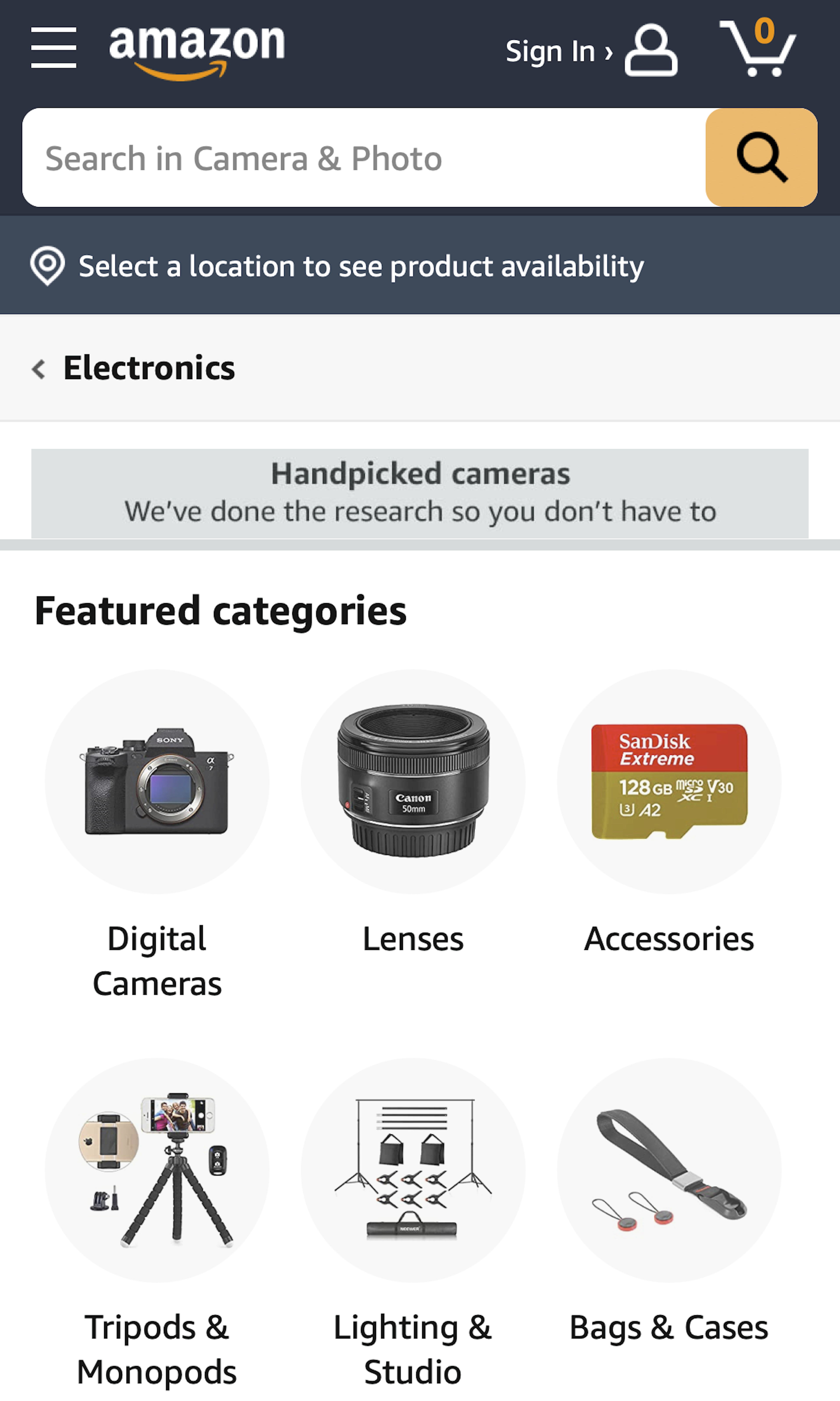
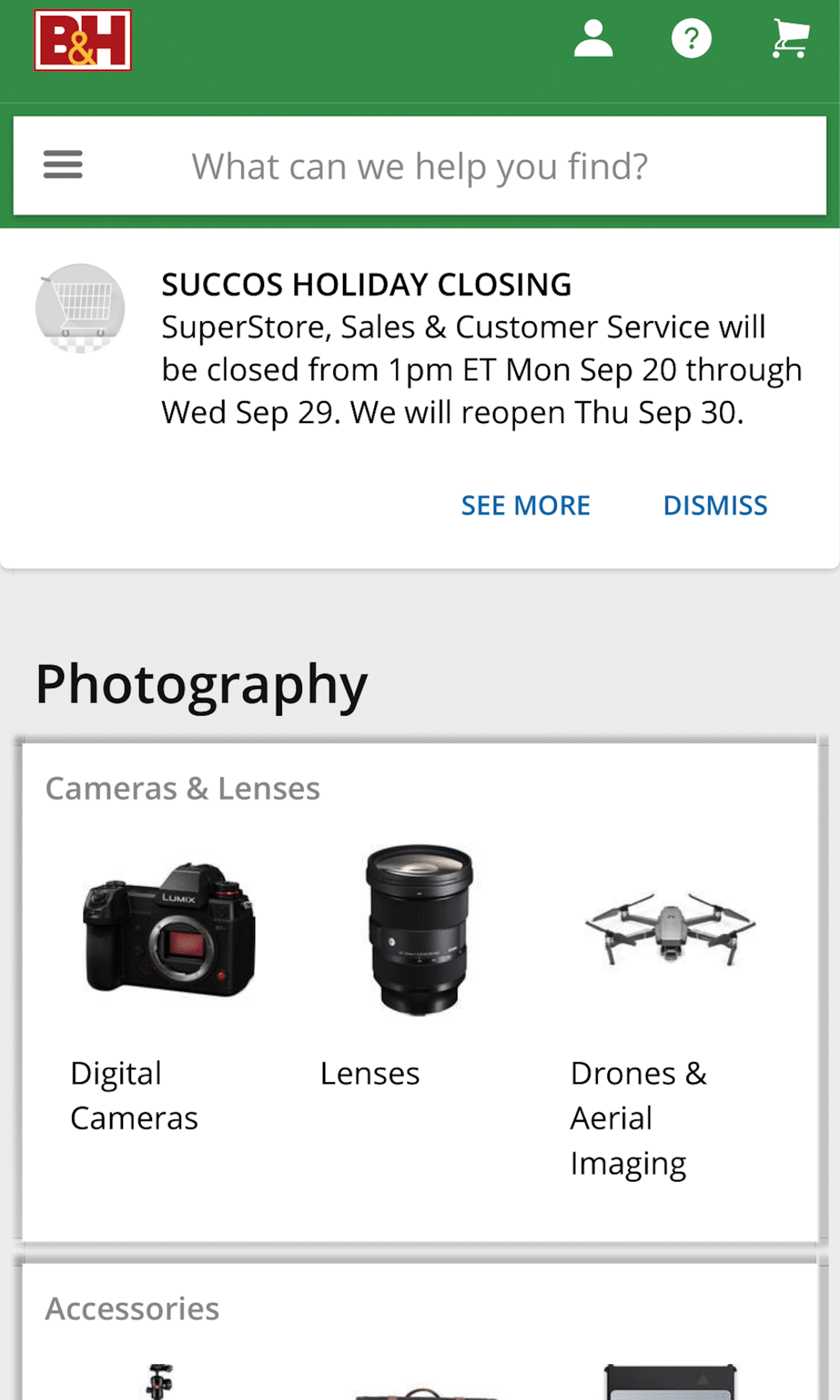
What’s this? Here you’ll find 344 “Mobile: Category Page” full-page screenshots annotated with research-based UX insights, sourced from Baymard’s UX benchmark of 93 ecommerce sites. (Note: this is less than 1% of the full research catalog.)
Category Pages are typically used only for broad top-level categories that are so broad it doesn’t make sense to show users a product listing page. On mobile sites, these pages are particularly difficult to design, as the small mobile screen makes it difficult to simply scale down the desktop design and get good results, where users are provided with a decent overview of all the subcategories within the top-level category.
More ‘Category Page’ Insights
-
Desktop Examples: Besides the mobile examples below, we also have 200+ desktop examples of Intermediary Category Page implementations.
-
Learn More: Besides exploring the 64 mobile “Category Page” design examples below, you may also want to read our related article “The State of Mobile Ecommerce Search and Category Navigation”.
-
Get Full Access: To see all of Baymard’s 351 mobile research findings you’ll need Baymard Premium access. (Premium also provides you full access to 200,000+ hours of UX research findings, 650+ ecommerce UX guidelines, and 275,000+ UX performance scores.))
User Experience Research, Delivered Weekly
Join 60,000+ UX professionals and get a new UX article every week.

User Experience Research, Delivered Weekly
Join 60,000+ UX professionals and get a new UX article every week.

Explore Other Research Content

300+ free UX articles based on large-scale research.

326 top sites ranked by UX performance.

Code samples, demos, and key stats for usability.


