Apple and Walmart have two very different approaches to an e-commerce homepage.
When people are visiting your site, do you know what they are looking for? Is it obvious to your visitors what you want to promote? Or is your homepage cluttered with all sorts of different products, trying to cater to everybody, but in reality, end up catering to nobody?
When you have a big site, lots of people in the company (sometimes even entire departments) end up fighting for screen real estate on the homepage. Everyone wants a spot. This inevitably leads to clutter and unfocused homepage.
Whether or not a cluttered homepage is actually a bad thing is difficult to say. It depends on the type of business you’re in, and your brand. Because this is individual to each business it’s something you should split-test intensively. That being said, you can generally divide these types of businesses into two categories with two different paths to go down:
- Companies that produce products themselves – product companies such as Apple – can get away with promoting a single or only a few of their (own) products on their homepage.
- Companies that sell the products of other companies – retailers such as Walmart – can get away with displaying lots of products on their homepage (as long as they are different types of products).
Let’s take a look at Apple’s and Walmart’s homepages respectively.
Apple’s Homepage
It’s pretty obvious that Apple wants their visitors to learn more about the MacBook Air. One big image of the product they want to promote, accompanied by 4 small boxes below, 3 of which directly relate to the main product they’re promoting. This is a heavily curated homepage.
This screenshot of Apple’s homepage was taken shortly after they released their updated version of the MacBook Air – when you’re able to accurately predict the content your audience is interested in, hyper-focused homepages can work well.
Putting this much focus on a single product make sense because Apple know that the vast majority of their visitors will be coming to their homepage because they’ve heard about the launch of a new product and wants to learn more about it.
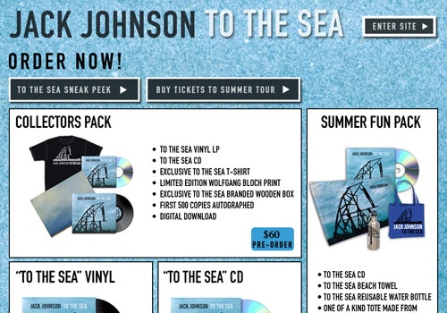
As a product company you’re most likely proud of your products and wish to promote them all whenever possible. However, understanding when your customers want to be promoted to is key to a successful homepage, as we’ve talked about earlier with Jack Johnsons homepage.
You may have 5 other products you’re really proud of (in this case iPhone, iPad and iPod), and some of these products may even have a higher profit margin, but never underestimate how much easier it is to sell a product your customers are actively seeking out.
Walmart’s Homepage
When you’re a retailer with thousands upon thousands of products, your visitors will be looking for so many different items upon arrival to your website, that you have no other option than to get them deeper into your site, by selecting a category or a specific product.
Walmart does a decent job of highlighting search and navigation while still using the product thumbnails to grab the attention of visitors who don’t really know what they are looking for.
You can’t curate the same way a product company can. Your job is to figure out which of your categories are the most popular (or most profitable), and promote those. 10 product thumbnails is a viable solution as long as it’s unique types of products, each catering to a large portion of your customer base.
Because you can’t precisely predict what a new customer will be looking for, it’s crucial to highlight search and navigation. The products you display on your homepage are for grabbing the attention of visitors who don’t really know what they are looking for, while search and navigation is for the customer who are actively seeking out something specific. The visual importance of the search feature should increase as your product catalog grows.
While you can’t predict what new customers are looking for, you can somewhat accurately predict what returning visitors are looking for. It’s particularly important for retailers to track what product(s) each visitor is looking at and then highlight related products when the visitor returns to the homepage four days later. Amazon does a good job of this.
Walmart has a far from perfect website as a whole, but their homepage isn’t the problem.
Wrapping Things Up
While we as designers and experienced web-users highly appreciate the aesthetic quality and clear-cut focus of Apple’s homepage, we can’t ignore that when it comes to retailers, a more cluttered approach can sell better.
Amazon’s homepage is a hybrid of the two examples presented above – a solution that makes sense for their unique business context.
Interestingly, Amazon has evolved from being just a retailer to also being a product company, and there’s now a more or less permanent Kindle-ad on their homepage, while still keeping the usual retailer approach of a grid of thumbnails, just a bit further down the homepage.
A good homepage design builds on the nature of the business and brand it represents. There’s no on-fits-all solution. The above examples are generalities, so while they work for most, they will not work for all. You should always do split-tests to see which work better for your business.
Do you know of homepages that work well? Or just homepages you like?


